Abstract Expressionism at the Royal Academy of Arts, London
© ARS, NY and DACS, London 2016. Digital image © 2016. The Metropolitan Museum of Art/Art Resource/Scala, Florence
To mixed reviews, the eagerly awaited Abstract Expressionism show has opened at the Royal Academy. On AbCrit, a UK based blog dedicated to discussions on abstract painting and sculpture, artist and writer John Bunker had predicted, well in advance of the opening, that: “The RA blockbuster autumn extravaganza promises to seduce us with its knock-out line up of Abstract Expressionist paintings in its lofty neoclassical halls.”
So, I suspect it was with great anticipation that people visited the RA, where twelve galleries of mostly paintings, but also sculptures, works on paper and photographs clearly gave room for displaying the broad church that is Abstract Expressionism. As a display there were strong punctuations of sets of individual’s works – paintings from Gorky, Pollock, Still, De Kooning, Rothko, Newman, Kline, Reinhardt, plus David Smith’s sculptures. A carefully selected addition of other key players – most notably Gottlieb, Tobey, Francis, Guston and Motherwell – gave all visitors something they could treasure.
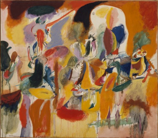
But the paucity of works by female artists, especially Krasner, Mitchell and Frankenthaler, was a probably disappointment for many. Perhaps the room of photos etc. could have been omitted to create extra wall space for these three? Arguably, the works on paper could have sufficed as catalogue content or, ideally, another show? Although the Robert Motherwell composition, ‘New York City Collage’ (1959), suggested the possibility for more collage works to be included in this section, or to form a more significant collage and print display within the show. A smaller work by Motherwell, ‘At Five in the Afternoon’ (1948-49), and Kline’s ‘Untitled’ (c.1951), an oil on paper, demonstrated that diminutive size can equate to large scale irrespective of format.
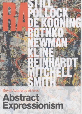
The essentially male ‘line-up’ was certainly impressive, with the RA promotions department highlighting the surnames of Still, Pollock, De Kooning, Rothko, Newman, Kline, Reinhardt, Mitchell and Smith on the advertising leaflet for the show. Just the one female featured on the list was enough to hint at the lack of works by women to be included. This was confirmed by the inclusion of just two of Joan Mitchell’s paintings; including, ‘Mandres’ of 1961-62, which particularly impressed – challenging and extending De Kooning’s gesture induced, painterly skeins towards an unashamed and indulgent painterly abstraction. Surprisingly, there was just the one Helen Frankenthaler (the pale, stained, ‘Europa’, from 1957), which must have left visitors wanting more. If you caught the ‘Making Painting: Helen Frankenthaler and J.M.W. Turner’ in Margate a couple of years back, you would have seen what a contribution her work would have made at the RA.
Taken together, so few canvases from some significant individuals diluted the much broader range of the show as the women are clearly underrepresented. This was despite David Anfam, co-curator, stating that, “… presenting Ab Ex as a male preserve is a clanger that should be silenced for good”. (Note: see the recent Huffington Post article on a dozen of Abstract Expressionism’s women.)
But I should not quibble too much, for we are treated to several small, but significant, one-man shows that overlap and segue accordingly. In fact, the Arshile Gorky display in Room 2 was a real and unexpected treat, and his name could have replaced Mitchell on the aforementioned promotional leaflet as he was so well represented.
And as for the ‘seduction’ that John Bunker promised, so it did – to some extent. But something niggles. No doubt every visitor will eyeball something that they find outstanding and exciting en route from start to finish. For me this was provided by the painterly dynamics of gestural compositions by Pollock, De Kooning and Mitchell; and with quiet reverence experienced from viewing Clifford Still’s understated, yet daring (or stubborn?), vertical patchworks of jagged colour shapes. Without a trip to the Clifford Still Museum in Denver, visitors would never have expected to see these canvases in London.

With relatively few Abstract Expressionist works in public collections in the UK, (although the Tate has six Pollocks and 13 Rothkos), the distant locations of much of this great body of work, added to romantic notions of the New York School (and California), might conflate a fascination for the post-war era as a Golden Age of sorts. The great canon of European painting (especially) had been extended across the Atlantic, supporting the development of an American art, albeit with promotional assistance from the CIA.
This may beg the question as to why Pollock, De Kooning and Rothko are seemingly as revered as many of the Old and Modern painting ‘masters’? Should they be added to a list including Fra Angelico, Jan van Eyck, Caravaggio, Rubens, Rembrandt, Velasquez, Goya, Turner, Cézanne, Degas, Gauguin, Van Gogh, Monet, Matisse, Picasso, Dali, Bacon? Add and subtract as you wish. (And why no women, or non-white artists?)
Or do we hold these three American masters in too high esteem? It seems to be a problem when looking at work by the ‘greats’. Arguably, objective seeing is impure, for we seek structures and contexts to formulate understanding; and we can be in danger of developing biased views that wrap tentacles around all we peruse. But already the gender argument has appeared in this discussion, and the cold-war political aspect lurks in the background too. Objectivity is a challenge if an unquestioned bias exists. But I am sure that visitors will more-or-less have received what they expected, most especially from Pollock, Rothko and De Kooning.
But, irrespective of personal art historical interests, and awareness of the wider social and political contexts looking at abstract images should ideally be about experiencing something of the essentially visual, leading to or from the conceptual. The very notion of abstraction (in art) offers the experience of seeing beyond the figurative reference, sign or symbol. Harold Rosenberg stated it much better in 1952 when he claimed that the Abstract Expressionist canvas is, “an arena in which to act… the canvas was not a picture but an event.”
This ‘event’ is the subject matter, perhaps a reflection of the ‘self’ at times: even if, for example, De Kooning’s ‘glimpses’ of realism might slip in, or be evoked, from time to time.
On other occasions, in other exhibitions, anticipation can lead to disappointment. Expectations, especially positive ones, can be thwarted by over enthusiastic presumption. But this was not the case. Which, paradoxically and perversely, is a shame. Very little was truly disappointing, as so much was on display. But, as with any large exhibition, trying to take everything in is impossible. This is a show that needs at least two, or even three, visits.

Actually, the Rothko room (not the one we all love in Tate Modern), but Room 7 at the RA, created a visual conundrum: selection and arrangement-wise. Despite being placed in the Wohl Central Hall, a Temple-like sanctum that added to the reverence afforded to Rothko, we were shown too much in too small a space. These various canvases would have been better presented in a white cube environment, with more empty space around them. This arrangement was too staged and claustrophobic.
Interestingly, Rothko is Pollock’s foil in a survey exhibition of this type. Commonalities and differences between the various artists can create a visual dynamic if selected and presented carefully. Rothko presents the quieter antithesis of Pollock’s more gestural engagement with the image. Not that Rothko’s floating islands of colour cannot suggest a deep and spiritual dimension – if you are so inclined – and can circumscribe clichéd readings.
With his less conventional use of the brush, Pollock’s use of tins of house paint appear to have liberated his process of image-making for the better, where chaos is avoided with dexterity and control. Pollock’s work really takes off when he flicks and pours, or puts down the brush. He could be quite ‘cack-handed’, with inappropriate (traditional) painting techniques for what he needed, or eventually found himself saying, with paint. For example, ‘Portrait of HM’ (1945) is a transitional work that renders stick-like figures that retain a graphic element of the symbol: but soon after, Pollock develops the all-overness of the non-easel image in ‘Phosphorescence’ (1947) and other prematurely late works. In his last decade he unleashes a less laboured process of painting and embarks on an all too short journey towards his tragic (and idiotic) death: but establishes his reputation forever. Or to offer another example of this transition, a marked curatorial highlight conjures the impressive, ‘Blue Poles’ (1952), opposite the important, but transitory, ‘Mural’ (1943). This pairing demonstrates Pollock’s rise to a higher level of accomplishment as the revolutionary American painter of the 20th century.

Another intriguing curatorial decision was made in selecting and placing Lee Krasner’s, ‘The Eye Is The First Circle’ (1960), on a dominant wall in Room 3. Within breathing distance of, and as if to confront her late husband’s final period, the massive ‘Eye’ takes pride of place. But Pollock’s ‘Number 7’ (1950), much smaller and painted a decade earlier, and in almost the same colour scheme, wins the argument. In ‘Number 7’, Pollock has carefully placed black and white arabesques against a graffiti-like background. The painting looks assured and orderly to imply a decorative intent.
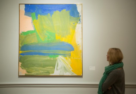
As with the female painters already mentioned, I also wanted to see more of Hans Hofmann’s paintings – there were just two included. One of these, “In Sober Ecstasy’ (1965), stood out from the crowd and even dominates the catalogue if you flick through quickly. Hofmann was also pouring paint back in the early 1940s and, as with Mitchell and Frankenthaler, seemed to have been considered almost marginal with so little representation.
Oil, enamel and charcoal on canvas, 149.9 x 109.3 cm
The Museum of Modern Art, New York. Gift of Blanchette Hooker Rockefeller, 1995© 2016 The Willem de Kooning Foundation / Artists Rights Society (ARS), New York and DACS, London 2016. Digital image © 2016. The Museum of Modern Art, New York/Scala, Florence.
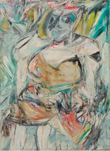
But, understandably, we do get a lot of De Kooning. From ‘Collage’ (1950), an interesting placement at the close of Gorky’s display in Room 2, to several women. This included the unforgettable, ‘Woman’ (1949-50), ‘Woman II’ (1952) and, ‘Woman as Landscape’ (1955). One of the curatorial highlights was the placing of, ‘Villa Borghese’ (1960) and ‘Untitled’ (1961) either side of an exit you could not pass through without spending time with this tremendous pairing. Typically, the paint wrestles on the surface and the painter continues to slip and slide fortuitously with aspects of figurative ‘reality’ – in this case a sense of landscape. This is better illustrated in De Kooning’s own words:
“You know, the real world, this so-called world, is just something you put up with like everybody else. I’m in my element when I’m a little bit out of this world: then I’m in the real world – I’m on the beam. Because when I’m falling, I’m doing alright. When I’m slipping, I say, ‘Hey, this is interesting.’ It’s when I’m standing upright that bothers me… As a matter of fact, I’m really slipping most of the time. I’m like a slipping glimpser.”
Another memorable feature of the exhibition was seeing David Smith’s sculptures arranged throughout the show on floor-bound plinths. Some Calder’s suspended from above would have been interesting from a curatorial point-of-view (though we have already been treated to the ‘Alexander Calder: Performing Sculpture’ exhibition at Tate Modern earlier this year). Also, Pollock’s, ‘Summertime: Number 9A’ (1948), contained Gorky and Calderesque primary coloured organic shapes (predominantly blues and yellows, with a few crimson reds) and this invited the inclusion of a Calder in this particular location.
On reflection, whilst travelling home on the train back to Brighton in the evening, I wondered if my expectations of the great Abstract Expressionism show had been fulfilled by this selection? The ideal Ab Ex show is probably impossible to arrange given the challenges and great expense of loaning all of the works necessary. Pre-show enthusiasm had created that sense of waiting eagerly for the big event. But we probably cannot expect any shock of the new from Abstract Expressionism given the historical perspective, although the relevance of this ‘American-type painting’ (a la Greenberg, 1955) will still resonate for painters today who knowingly and programmatically engage with the medium specific characteristics of their trade. We also see what was considered as cutting edge painting just before conceptualism promoted the power of intellect, and irony, over the visual.
This me left thinking about the proverbial ‘elephant in the room’ for some members of a British audience. Namely, an underlying disenchantment that the British artists of the same generation as the Americans now have less of an international standing. How would the likes of Patrick Heron, Peter Lanyon, Roger Hilton, Bryan Wynter, Anthony Caro and John Hoyland (plus the post-painterly, Bridget Riley and maybe, Gillian Ayres) compare? A combined show would be more than interesting. After all who, apart from Rothko and Hoffman, could begin to compete with Heron’s claim and achievement, that – ‘Colour is both the subject and the means, the form and the content, the image and the meaning in my painting today.’ (Painter as Critic, 1998).
Yes, that’s it: even with the works already mentioned; the acres of Barnett Newman’s canvases on display and Sam Francis’ overtly colourful patchworks and drip-scapes, I probably wanted even more colorito and less disegno.
Less of Florence and more of Venice.

These are some great artistis, have you been studying art for awhile? I am always looking for new artists to explore and understand in order to make my art and poetry even better. If you;d like check out my page, I am alwyas open for suggestions.
LikeLike