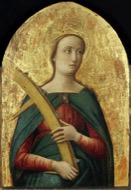
 Vivarini – Santa Caterina d’Alessadria
It is sometimes said that there are too many images in the world, particularly in this great information age. Visiting both Frieze Art Fair and Frieze Masters in Regents Park, London this autumn certainly enabled us to indulge in mixing the past and the present in a particularly concentrated and carefully selected celebration of some of the highest quality and thought provoking examples of fine art from many countries, cultures and eras. Now, of course, we move on to more great venues and exhibitions that reveal the seemingly exponential nature of the visual arts. Despite the endless production of works of art, contemplating the many forms of practice from all ages confirms the universal, humanistic nature of the plastic arts that often combine mystery with a visualised clarity of thought.
As with all art fairs, something will linger in the memory for longer than the duration of the event. From Frieze Masters one of our abiding experiences that we are still recollecting and discussing was the fascinating triptych presentation by Moretti Fine Art of Antonio Vivarini’s, ‘Saint Catharine of Alexandria’ (‘Santa Caterina d’Alessandria’) hung between Gerhard Richter’s two slightly smaller abstract paintings (‘Abstract Bild’ 454-4 and 454-5). Moretti had shown this same combination at the Biennale des Antiqaires in Paris a few weeks ago and this was a decision well worth repeating for a new, and broader, audience.
The reading of painted, European, images made some 500 years apart will be oriented to a stylistic contrast for it is sometimes impossible to separate art historical knowledge from perception. When first confronting these three small paintings, we were compelled to look at and to read what was instantaneous: The iconography and well-known story line in Vivarini’s painting, and the medium-specific, painterly, abstract, materiality of Richter’s pair of canvases were immediately obvious, The clever, but simple, juxtaposition of these works on the Moretti stand immediately set up a figurative/abstract comparison that could, potentially, construe a dialectical opposition, whether this was intentional or not by the curators. However, we found that these immediate readings could be reversed, emphasizing the surface, materiality and non-narrative features in the Saint Catharine; and the framework of a metaphysical abstraction in the potential of a less formalistic, Greenbergian, reading of the non-figurative compositions.
To some extent the work of both painters are paradigmatic: Vivarini’s style provides an example of Venetian late Gothic, albeit with subtle elements of the ‘new’ perspective and anatomically conscious scientific knowledge shifting the visual language from flatness to roundedness and the space of the world inhabited by the viewer. For example, despite the typically two dimensional halo, there is, in her crown, a hint of perspective that, with the three-quarters view of the portrait, ‘modernises’ St Catherine as a fellow human-being rather than as a symbolic representation. Also, Vivarini has attempted, although not fully realised, to depict the hand as structurally convincing rather than as a flat approximation or template. However, the gothic elements are pervasive, as a monumental St Catharine is set against a blank background (a Florentine master, such as Botticelli, would by now have included an architectural space) and the image, probably part of an altarpiece, was made for a church rather than a palace.
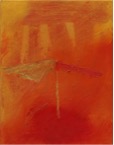 Richter – Abstraktes Bild 454-4
 Richter – Abstraktes Bild 454-6
Richter knowingly, and perhaps in an act of appropriation of style, presents an example of 20th-century abstraction: in this case, of the painterly and expressive kind rather than hard-edged and overtly systematic. The colour scheme is essentially rich and fiery – which, when associated, and seen, with the Martyr Saint Catherine, could be interpreted as pertaining to the spiritual desire of her faith. Yet it is this simple, blank backdrop that makes the visual link to the Richter paintings and to a sense of the mystery, and metaphysical meaning, of colour. The Italian master applies tempera onto a gold ground panel through which an orange-red spiritual space is enhanced by the close proximity of the oils in Richter’s paintings. The visual influence is reciprocated as the subtle green and flat geometric forms in ‘Abstract Bild 454-6’, to the right, echo colours and shapes in the St. Catharine. We also perceive a correspondence between the broken spoke that suggests piercing, and perhaps crucifixion (martyrdom), and the yellow diagonal in the bottom left-hand quarter of Richter’s abstract composition. In either case, each painter’s work is seen afresh because of this presentation.
There will, doubtless, be many more ‘readings’ and connections, convincing or not, between these paintings and it might be more significant that paintings from very different eras in the fine arts are capable of generating interpretations and opportunities for co-existence than for any specific links we are constructing at the moment. This potentiality in contemporary curatorship, to align art works from all periods and cultures to produce holistic meanings or conflicting debates, can only be proof that a notion of community speaks across the ages, making notions of the ‘modern’ and of ‘progress’ questionable.
Geoff Hands (October 2014)
Moretti Gallery – https://morettigallery.com


