TESTING 1,2,1,2 UNIT 3 – A.S.C. Studios
(25 March – 2 April, 2017)

The argument over Abstraction in art (especially painting) still drags on. In Elephant magazine, issue 29 (Winter 2016/17), the prestigious American painter Kerry James Marshall makes some interesting, if debateable, comments on “Abstract picture making” as little more than an “academic mode”. He claims that “The fundamental principle of art making is representation… There are quite enough problems to solve to keep you going for sometime. If you never succeed there, and you go to abstraction because it seems easier, you miss the philosophical and aesthetic questions involved. Besides, how many more abstract pictures do we need to see in the world, really?”
Though tempting, it would be too easy, and crass, to say that there are also too many figurative paintings in the world. There are probably far too many bad paintings of any classification. But there can never be enough good ones – which is partly what drives an artist on, if that’s not too romantic a notion.
A strangely contrasting point-of-view was made more recently on the (highly recommended) Two Coats of Paint blog. Sharon Butler, reviewing ‘A New subjectivity: Figurative Painting after 2000’ at the Pratt Manhattan Gallery, makes the fascinating observation that, “In adopting imagery without direct reference to the objects that underlie them, the artists seem to be noting – indeed, demonstrating – the disconnected manner in which life is now lived. Fragmentation and detachment – a kind of existential abstraction – are the norm.”
Whether appropriated by some contemporary figurative painters or aligned with some sort of new figuration, where the painters “find everything to be a matter of images” (to quote Barry Schwabsky from the online catalogue for ‘A New Subjectivity’), Abstraction clearly and demonstratively engages with the problems of painting (and collage and sculpture) despite the surprising conservatism of Kerry James Marshall. Indeed, Schwabsky’s comment hits the proverbial nail on the head – for the result of Abstraction is always the image (2D or 3D) – which is, surely, the ‘thing’ we engage with in the gallery?

Take the current, but brief, show in Unit 3’s gallery space. Conceived of by John Bunker, Testing 1,2,1,2 gives a little taster of the current scene in Abstraction as a snapshot experience for the viewer. The comfortable 3:2 dimensions of the gallery (about 14X22 feet) introduced an appropriate containment for the display. If there was a temptation to show more, or larger, examples the impulse was well controlled as the exhibitors had approximately adhered to similarly sized works.
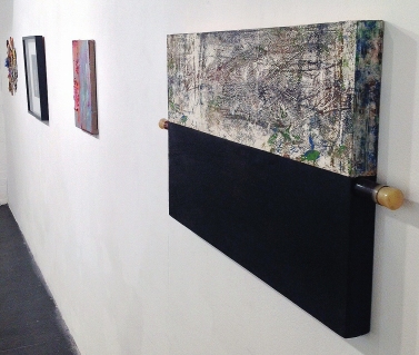
Bunker’s personal, professional and critical enthusiasm for Abstraction (and a genuine, open-minded, belief in the value of complementary and contrasting relationships in the abstract community) is speculatively explored. In curatorial mode, John Bunker invited six artists to invite a peer to forward a piece for the show. Hence, fourteen works are on display. No doubt, had the show been more conventionally engineered there might have been a tighter mix of materially similar works – confined to collage and painting perhaps. But the open-minded mixed-media characteristic of the selection as a whole pushed boundaries to include Matt Hale’s , ‘Oilscape’ (oil on gesso on board with plastic tube, engine oil/grease and rubber stops) and Nick Cash’s, ‘Drumming Part IV. 9 mins 47 secs 2″ @15ips’, which was covered by sellotape.

Intriguingly, the lone sculpture (Stephen Lewis’, ‘Confluence’) and the framed collagraph (Georgina King’s, ‘Threshold’) sit comfortably amongst the other twelve works. In fact the presence of a sculpture opened an imaginative door for future combinations of a constructivist and additive type of forming of image and/or object that would sit easily with painting and collage.
This sense of a building and overlaying process was conveyed in particular by two collages which happened to be placed opposite one another: namely Matt Dennis’, ‘Easy, Tiger’, which offered a more geometric counterpart to Bunker’s organic and busy, ‘Umwelt’.


As he has been so pro-active, it is appropriate to say a little more about John Bunker’s contribution. There is an inherent passion and (positive) bloody-mindedness in Bunker’s wall-mounted collages that has benefitted from escaping the confines of the frame. This lends his work a sculptural/objectified sense of colour and shape as materialised imagery. His work presents, and holds, a chaotic frisson that is somehow controlled by the careful placement and juxtaposition of disparate elements of colour, shape and the revived materiality of potentially discardable ingredients. In ‘Umwelt’, a mixed media, shaped collage, a frame would be superfluous as the various sections visually hold together, whilst allowing the immediate environment of the gallery space to notionally ‘frame’ the work – if you should need it.

Also presenting a considered collision of fragments was ‘Brouhaha’ by EC (as she likes to be known professionally). Despite being the smallest piece in the show, this rectangular amalgamation of oil paint, acrylic paint, household paint, varnish and mixed media collage on canvas (then mounted on board) had that rare feeling of monumentality. ‘Brouhaha’ suggesting a maximalist indebtedness to the likes of Robert Motherwell: proving the point that bigger does not always mean better. As with Lewis’ sculpture, one wanted to see more from the enigmatic EC – and a combined show by these two artists would be fascinating to devise.

As already mentioned, half of the exhibitors had chosen a guest collaborator, but the works had not been programmatically paired up side-by-side, or opposite, one another on the four walls. There were however inevitable pairings to be made. Amongst the paintings there was a reflection of sorts between some images: for example, in Stephen Buckeridge’s, ‘We have expanded our space and intensified our time!’ and Karl Bielik’s ‘Target’, an affinity for a dissolving geometry and a shallow watery space, with some strong red visual punctuations in each, provided a kind of visual anchor (one of John Constable’s tricks of the trade) for entering each mini-environment.

Another correspondence, of painterly contrasts in this case, between Lisa Denyer’s, architectonic, ‘Sands’, and Tony Smith’s more organic, ‘Magnitude’, was proposed. Where the pixelated but dissolving grid surface and multicoloured cross in the former could have somehow fragmented and morphed into the looser rivulets of curved meandering lines in the latter: the qualities of one emphasising the features of the other as a binary contrast of sorts.


Where a characteristic, (and maybe temperamental?), visual language appeared autobiographical, though unconnected, there was a ‘mapping’ or terrain-like association between Emyr Williams’, ‘RATS’ and Simon Pike’s, ‘Untitled’. Williams’ canvas had that colourful, painterly exuberance (with some texture paste added) which is a well-established feature of his work – whereas Pike’s immaculately controlled painting skills referenced a surface grid or net, overlayered by ordnance-survey type contour lines. One painting may have been waving, or undulating, to the other.

Of course, there is no preordained or planned correspondence between any of these superficial pairings that I am making, but the conversations (of a sort) were made in a social context by the almost arbitrary coming together of a loose affiliation of like-minded people and their artworks. Old friends making new friends, as it were.

Ideally, some future version of Testing 1,2,1,2 should be seen in a more prestigious space – although the gallery amongst studios provides a rare treat. John Bunker’s conception for a communal form of presentation and collaboration has created a prototype for a larger show, which expands on several previous exhibitions, revealing the broad and multifaceted range of Abstract art. Examples would include ‘Slow Burn’ (from way back in 1998 at The Mead Gallery in Warwick – featuring Mali Morris who attended the opening of Testing); ‘The Indiscipline of Painting”, curated by Daniel Sturgis in 2012; ‘Ha Ha What Does This Represent?’ (curated by Katrina Blannin and Francesca Simon in 2012); and ‘From Centre’ (2015), a Slate & Saturation Point Project which included Charley Peters who showed ‘Hard Edge/Soft Focus’ in this show.
Good abstract art is far from easy to achieve – and this exhibition presents various deliberations, findings and conclusions that should be seen by a larger audience.

Note – Copyright of artwork is with the artists listed.


