Returning home from the Private View for ‘We Like The Taste of Certain Poisons’, I am compelled to write something immediately about this small but compelling exhibition of Richard Graville’s paintings at NoHawkers Gallery, which is situated in the Rodhus complex of studios and workshops in Brighton.
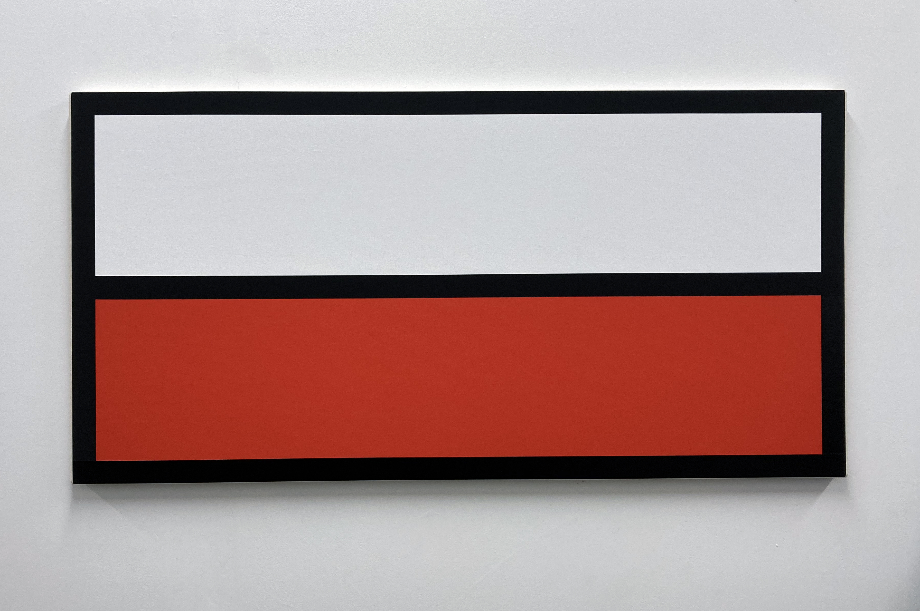
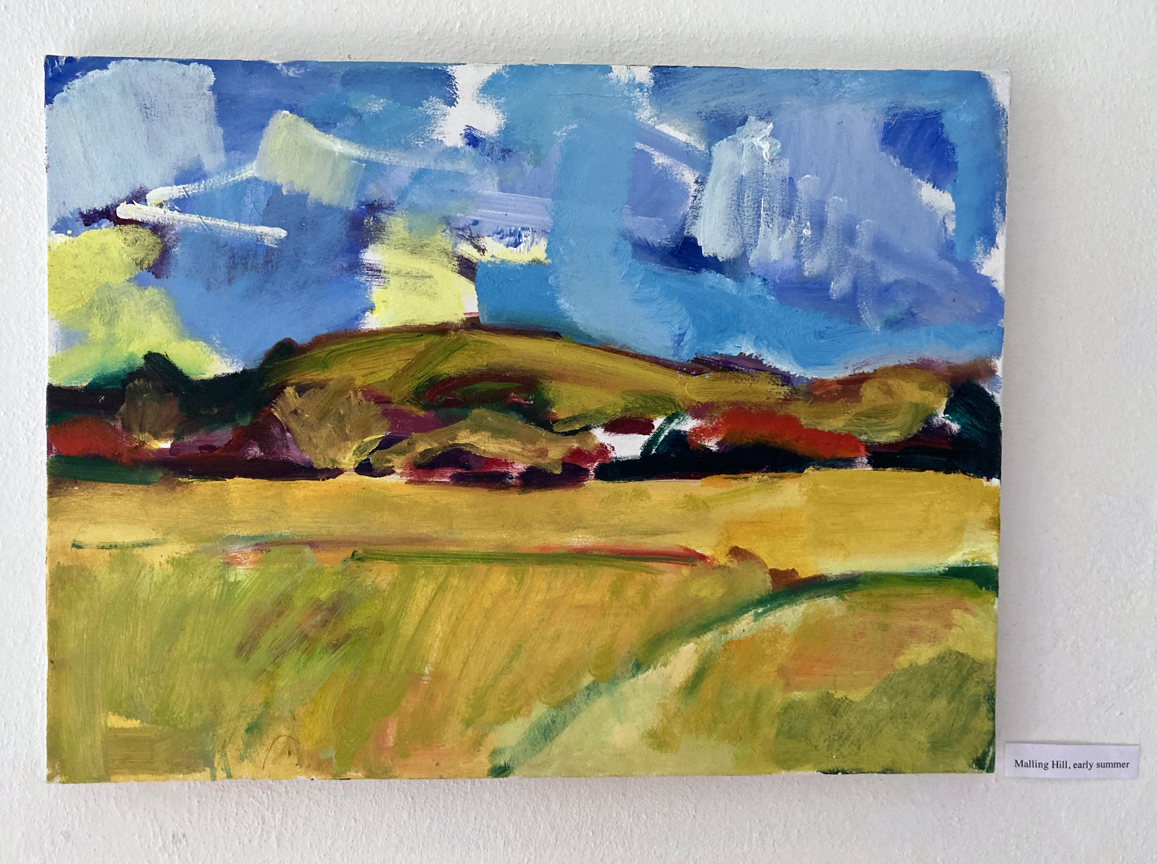
Richard Graville– ‘WIDE’ 2022 (60x120cm) Flashe & acrylic on canvas
Some sense of urgency (including the use of my iPhone photographs – so apologies to the artist) is due to the fact that the show is only open for two days and that if someone were to read this hurried review in time they might make it to see the exhibition. But another aspect of this impulse is due to my having spent a large proportion of the day preparing a teaching session, in which I shall ask my students to consider our shared human history of the landscape environment and might consider why this is still an interest for contemporary painters.
I had been re-reading Timothy Morton’s, ‘Being Ecological’, in which he posits the notion that:
“Picture postcards are descendents of what came before Romanticism in art, namely the picturesque. In the picturesque, the world is designed to look like a picture – like it’s already been interpreted and packaged by a human. You can easily see what’s what: there’s a mountain over there, a lake, maybe there’s a tree in the foreground… this is pretty much what humans saw in the savannah millions of years ago. Having a body of water nearby and some shade (those trees), encircled safely by mountains where you know there is water descending to feed the lake (for instance), is pretty handy if you’re some kind of ancient human. The picturesque is keyed to a fundamental human-centred way looking at things: it is anthropocentric.”
This seems strangely fortuitous, for although Graville’s paintings would certainly not be identified as landscapes as such (though they hold that possibility for a viewer who might be so inclined to wear their landscape-tinted spectacles), some kind of deep psychological and ‘pre-historical’ possibilities are pertinent to Graville’s project within a minimalist, systems/coding kind of approach to hard-edged abstract painting.
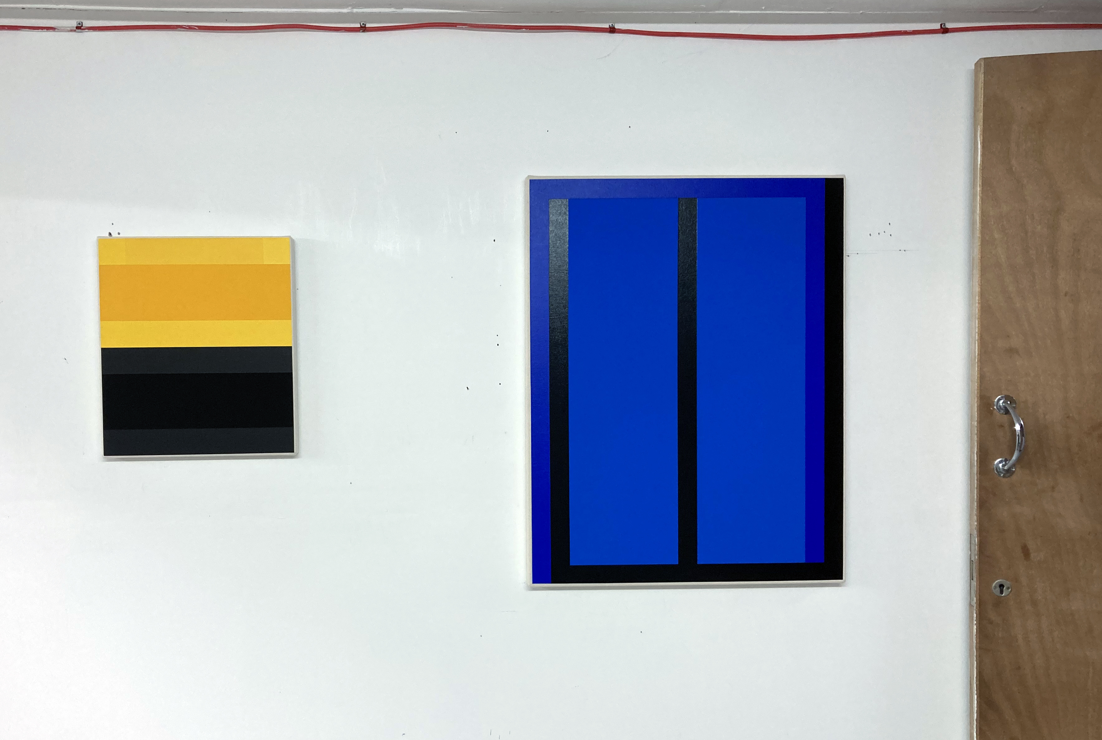
Richard Graville – ‘SOLUTION’ 2022 (100x100cm) and ‘CLEAR’ 2022 (80x80cm) both Flashe and acrylic on canvas
The last time I saw a Richard Graville painting (in the flesh, as opposed to on Instagam) was in H_A_R_D_P_A_I_N_T_I_N_G_x2 (Part 1) at the Phoenix Art Space in Brighton at the beginning of 2020. I wrote then that:
“Even Richard Graville’s pair of canvases, ‘Blushing Phantom’ and ‘Red Banded’, that come the closest to accruing accusations of painterly abstraction, have an aura of careful, premeditated control. That they echo the similar stripes on the workforce vans outside the building is either unfortunate or reminds us that abstract art is everywhere.”
This was my personal, uninformed but simplistically and naively honest response to two rather satisfying paintings. We search for meaning, some allusion, illusion or just good old subject matter in paintings. It’s habitual. That the red and yellow stripes on the Highway Maintenance vans had any connection with the natural world, as in animal colouration and patterning, I must admit was beyond me at the time.
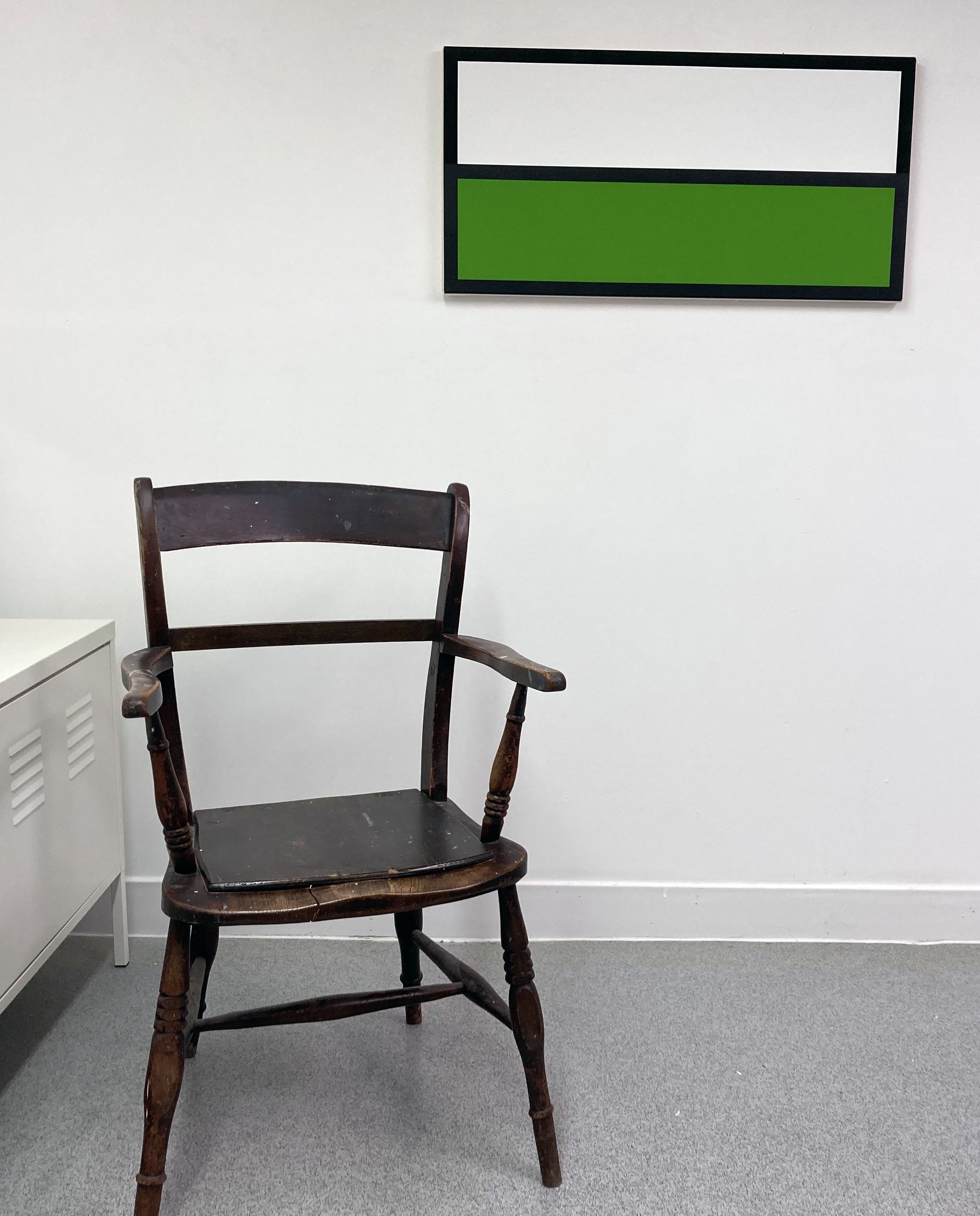
Richard Graville – Studio view
From this solo show of ten new works by the artist (plus several more in his studio on-site) an information sheet presents this comment:
“Humans were once able to navigate and track subtle clues in nature. Now flat signs in primary colours tell us which way to go and what to do. I continue down that path to see where it leads.” (Richard Graville)
Hence my connection with Morton’s view on the picturesque, in that we humans create systems of understanding to navigate and understand the environments we live in – as do the other animals. Morton’s observations reference a perception of the world from a clearly human viewpoint (the anthropocentric), although also in the book he makes it clear that a worm’s experience of an apple is somewhat different to a human’s. Nevertheless, on all sorts of levels, data is interpreted, via various access modes, to be acted upon.
A wall mounted information display adjacent to the exhibition room tells the viewer that animal colouration systems, categorized as aposematism, inform potential predators that an animal is poisonous, venomous, or otherwise dangerous. All animals (which include us humans), to some extent, live (and die) by preventing attack (or not). Data requires interpretation, which is a form of code, taking us back to the work of the artist.
Not that Graville’s works could be categorized as ‘landscape’, but various painted arenas (canvases) are presented for interpretation and contemplation. Sensory input, from the simple act of looking, enables the mind to process information that we categorise typically as colour, size, shape, texture and finish or sheen. Each composition is relatively simple and geometrical and often references (purposely or not) windows and road signs. The colour palette is always limited (sometimes monochrome), though sophisticated and astute enough to prompt some reaction from the viewer. Every work is immaculately and carefully composed, painted and visually constructed. I suspect that the paintings might feel different depending on one’s mood and known or unknown frame of reference at different times. If you can accept a minimalist type of simplicity, aligned to a deep interest in colour (for its own sake, never mind any aposematic coding or sign) try to see this show – or look out for the next opportunity.
Geoff Hands (October 2022)
Richard Graville – Studio view
Notes:
‘Being Ecological’ by Timothy Morton (quotation from pp.24/25 Pelican, 2018)
In a post-industrial revolution context the English countryside, for so long a subject for painters, can still be a strangely ‘other’ environment for so many. Nowadays this space we call the ‘countryside’ is a place of escape and rest, suitable for a day out or for a camping holiday. For the daily traveller going about their business the countryside is a fleeting arena placed in between centres of commerce and mass housing. Viewed from the train, bus or car window lack of access may even create tension. Despite being loaded with mythology, folk tales, notions of paradise (very much lost), agrarian history and, for the south of England in particular (arguably the birthplace of capitalism) a mode of enquiry for the contemporary artist continues on to the ecological crisis that now impacts our “green and pleasant land” (to reference William Blake).
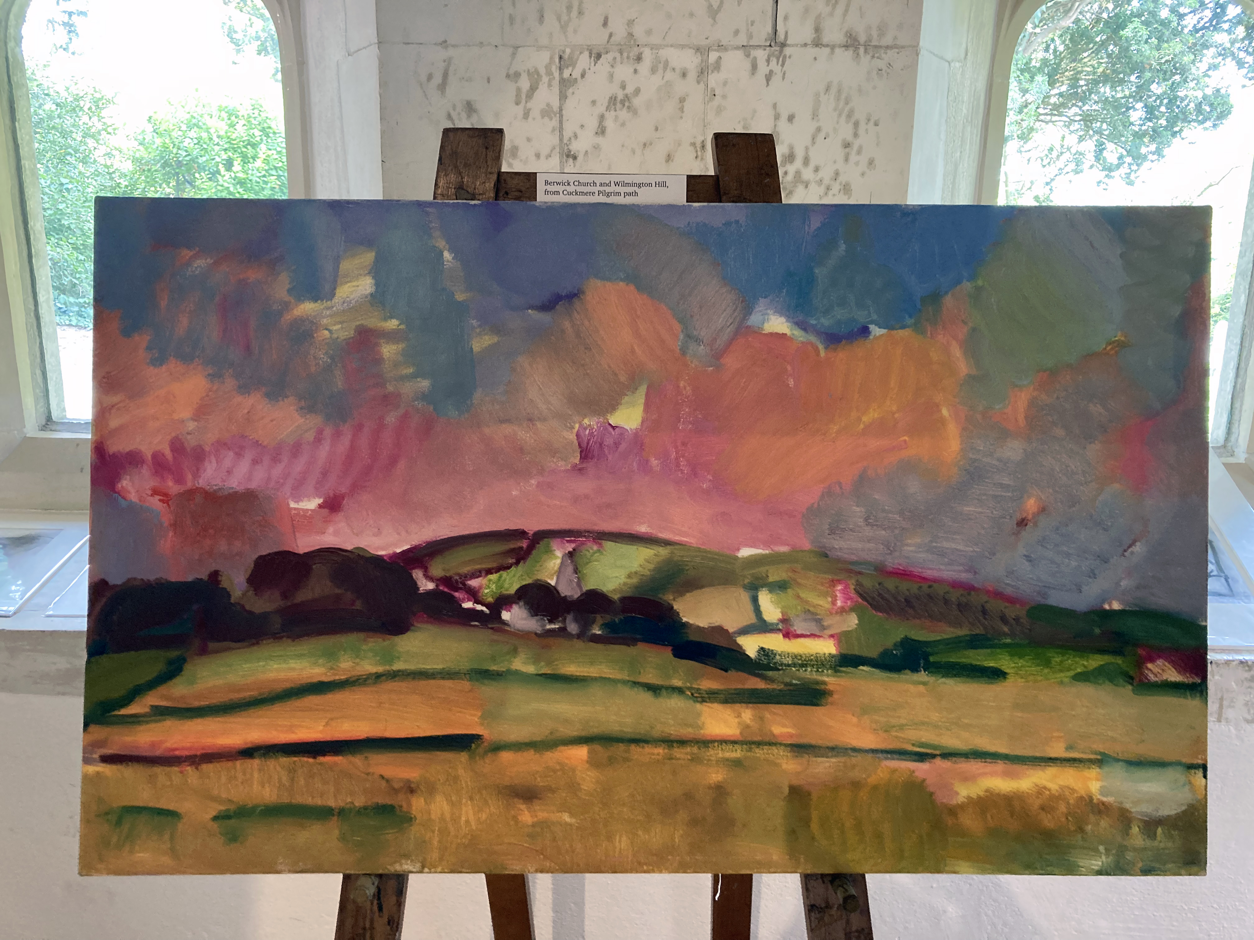
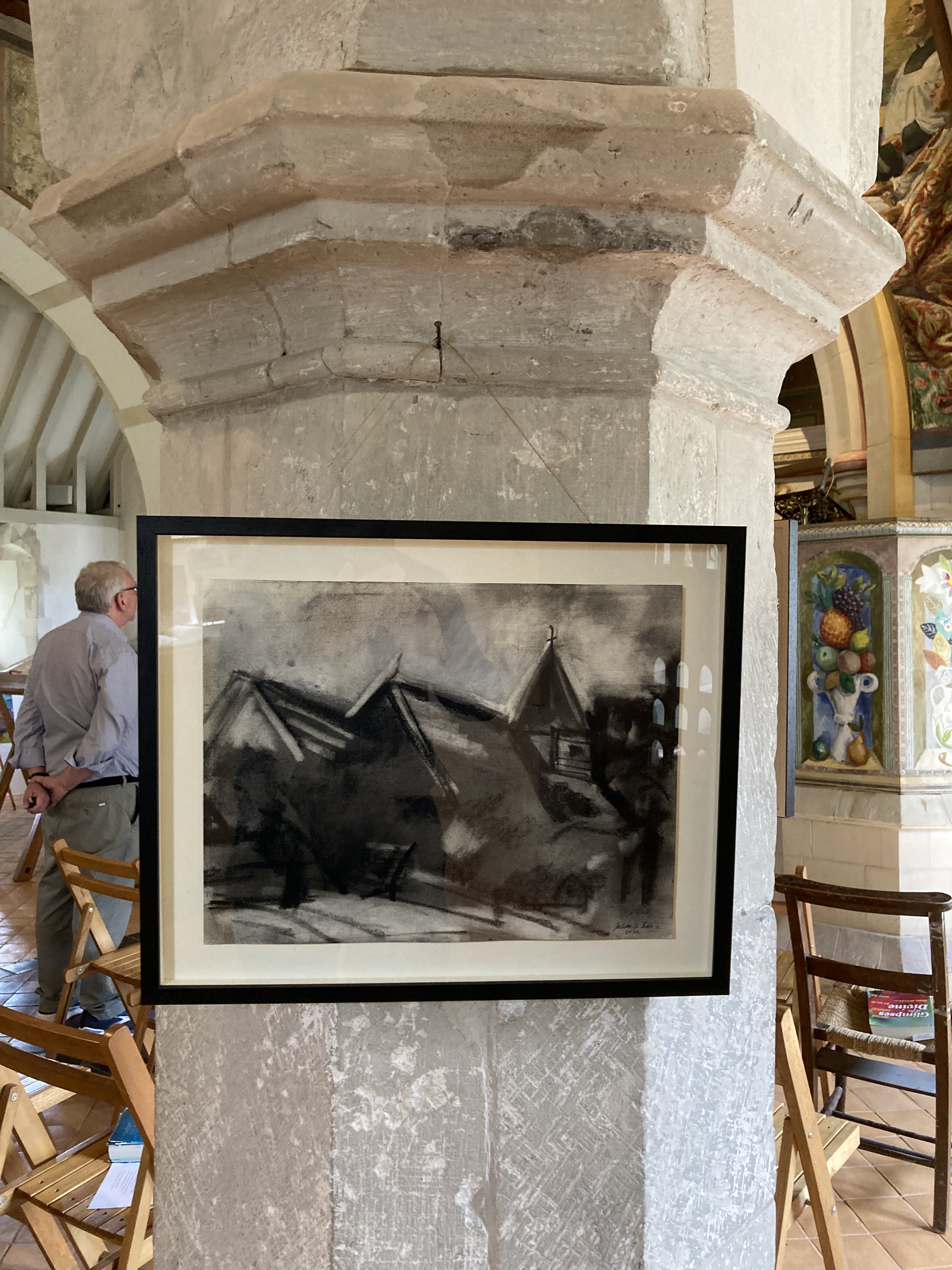
Julian Le Bas is a painter, perhaps the contemporary painter, of the Sussex section of the South Downs and the adjoining coast. Le Bas bares witness to this typically splendid and beautiful geography of chalk hills and woodland as he engages with his, and our, local world on a journey that has been his indefatigable undertaking for over forty years. What lesson we might learn from his ongoing life-long project is that every day and every scene presents a seemingly revived landscape offering a new vista, and a fresh encounter, with the apparently commonplace. The landscapes from Le Bas are tirelessly offered up, renewed, for continuous engagement and revelation.
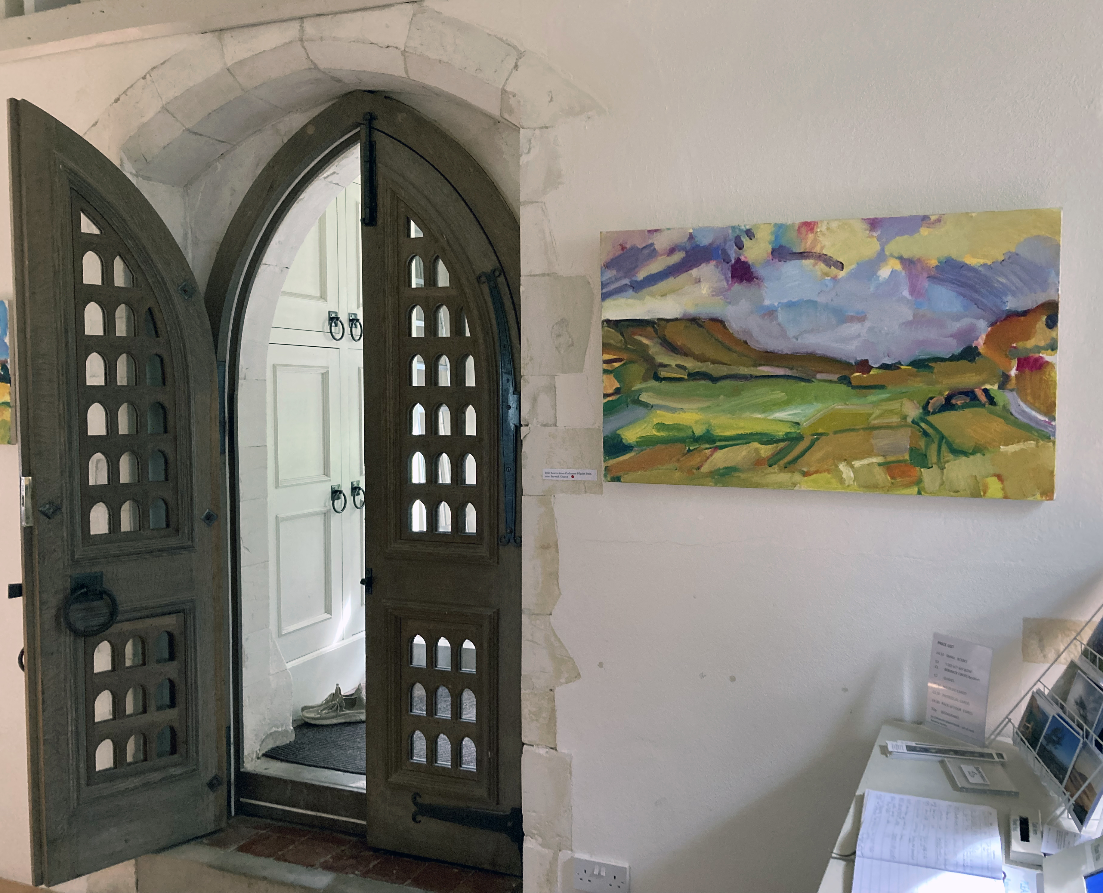
Paintings and drawings, made en plein air and in isolation as he travels alone, invite a congregation of onlookers in a small exhibition of paintings and drawings at Berwick Church for this year’s Lewes Artwave Festival. Le Bas’ paintings exalt and revere his subject matter – and how fitting that we see these works in a place of worship. This particular church might be considered a wonderful art installation in itself, purposely referencing the pre-Reformation model of the church as the historical forerunner to the ‘art gallery’, permanently containing murals by Vanessa Bell and Duncan Grant, plus the recently commissioned altar reredos panels by Julian Bell.
The paintings and drawings from Le Bas, however, are secular in subject matter and intent but unequivocally express awe at the natural world. Le Bas is the epitome of the artist engaging in the role of shamanic consort, expressing the elevating metaphysicality of the everyday through the ordinarily magical presence of the landscape. It may take a leap of faith to accept such a purposely contradictory definition of this particular artist, but the work continuously appears to convey this sense of the uniqueness of the quotidian and the local which changes in appearance – not only due to time of day or season, but is subject to the artist’s own mood or degree of engagement at any particular time.
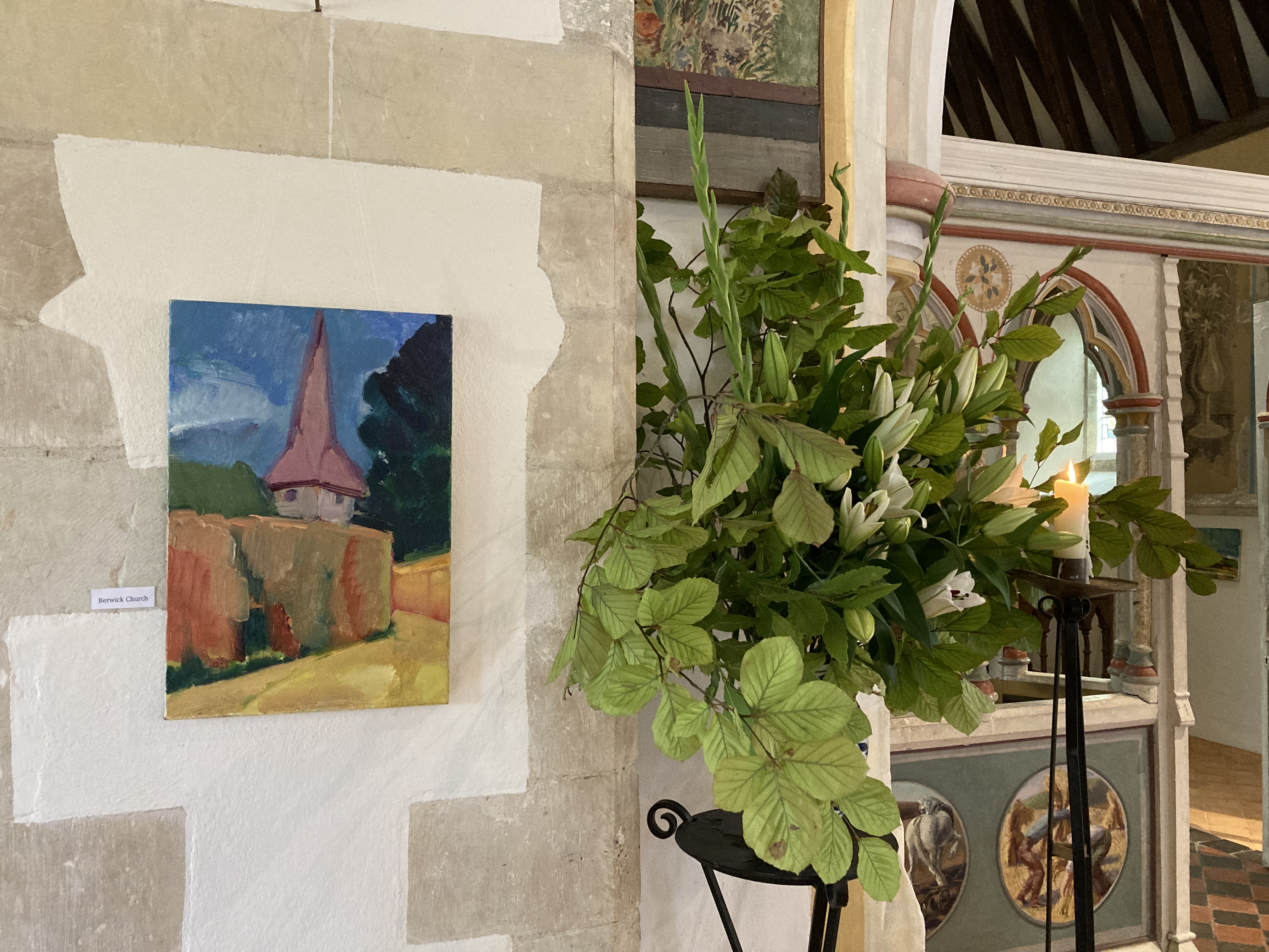
These paintings are of the moment – a duration measured in hours we might assume. Le Bas uses an English post-Impressionist palette where high key colour combines with earthy local colour. His engagement with colour reveals both a romantic and a matter-of-fact connection with the notion of landscape experience. But what does this mean if it’s a correct interpretation? I would argue that some exaggeration, a visual proclamation in his use of colour and insistent mark making, is intended to bring the viewer into the work and to remind us that the magical landscape is still a worthy and increasingly important genre – especially as it contributes to our burgeoning awareness of global environmental issues.
The personal capacity required of a contemporary painter, with an arguably dated assignment to record the landscape, and at first glance unshackled by what might be on trend at present, is necessarily blinkered to enable a deep focus on such a potentially numinous experience of landscape. A logical pragmatist, a post-modernist, might reject Landskip as relevant now (unless it provides a context for other, grander, socially and politically qualified narratives), but one role of the artist might still be to say: “look at what I have seen, see what is available to all”.
Or, to take most of the words of R. S. Thomas from the poem, ‘The Small Window’:
“… there are jewels
To gather, but with the eye
Only. A hill lights up
Suddenly; a field trembles
With colour and goes out
In its turn; in one day
You can witness the extent
Of the spectrum and grow rich
With looking…”
Like this poet, associated with the Llŷn Peninsula in north Wales, Le Bas is tuned in to the sheer visual experience of his own landscape, not withstanding its potential to transform our experiences. Le Bas reminds the viewer that this environment is bursting with colour as much as any city has to offer and that it has the indefatigable capacity to ‘move’ us and to provide space to think, to plan and reflect and to explore. On a trite level, even a small canvas of Le Bas’ in the urban home will break down the barriers between the town and the country; but also on a metaphysical level, based on concrete experience, a transformative understanding of the landscape environment is possible too. Perhaps usefully, we cannot seem to let go of our obsession with ‘the countryside’. Landscape as a genre, engaged with constantly by the Sunday painter and the obsessive, committed practitioner alike, persists in our culture – which is quite assuring.
Whilst there is a certain, expressionistic conventionality in Julian Le Bas’ paintings and drawings (which I say in a positive sense), the gestural yet restrained visual language, honed and perfected after years of hard practice and utter devotion, results in a compelling engagement with his subject matter. For some observers he may exaggerate colour and mark making at times, approaching a general expectation of abstraction, but this is the hook that pulls one in and presents the eye and mind with spatial conundrums of simultaneous senses of flatness and depth. The generally bold brush marks are laid in areas that intermix, overlap or abut, amounting to a distinctive patchwork of organic shapes. Local colour and colour in its own right – straight out of the tube, Fauve-like – or mixed on the canvas as well as the palette to create secondary and tertiary mixes, make a variety of colour combinations. Realised as mark and gesture as well as for their tones and values, these colour-shapes are at once based on responding to visual reality and to testifying to a daily practice that celebrates the act of painting, whatever degree of verisimilitude is sought. There is clearly an extrovert inclination in these paintings, revealing an emotional involvement steered by rigorous and disciplined draughtsmanship. This engagement with the physical qualities of medium, from compressed charcoal in his drawings to oil paint on canvas, Le Bas’ works are somehow a summation of perceived experience with an aspect that says, “look at this world around you and engage with your whole being”. This is very much a serious undertaking, where pleasure is often an outcome.
In Le Bas’ paintings the drawing content morphs, via the brush, into painted lines that delineate shapes and forms, often flat rather than rounded, but creating visual space on the canvas. Perspective is loosely reduced within the network of colour-shapes but an abstract, surface acknowledging, arrangement of colours and gestures there is also an essence of movement. The observer might detect a degree of improvisation too, as taking liberties with mark and colour is a strong characteristic in Le Bas’ work. The paintings are made from a totally immersive activity of looking at sections, and spatial passages where the eye has been lead in deep concentration, engaging with various parts, structures, surfaces and atmospheres that make up the whole. A ‘whole’ that actually includes the observer, for if the environment is captured in spirit, it also captures us. In these paintings there is a record of being that is symbiotic with ‘nature’ as, in a real sense there is no divide. If we learn to appreciate this environment, starting with the local, with what’s in front of us, we might start to protect it better and therefore see that Le Bas’ paintings are as relevant as any other contemporaneous projects that have a more immediately political purpose.
Philosopher and Ecologist, Timothy Morton has written:
“Somewhere a bird is singing and clouds pass overhead. You stop reading this book and look around you.” (‘Being Ecological’)
We might stop looking at paintings and look around too, but engaging with the art might be the doorway we need to see what’s in front of us.
This was an exhibition I had to visit twice and I may have been once more by the time this rumination has been written.
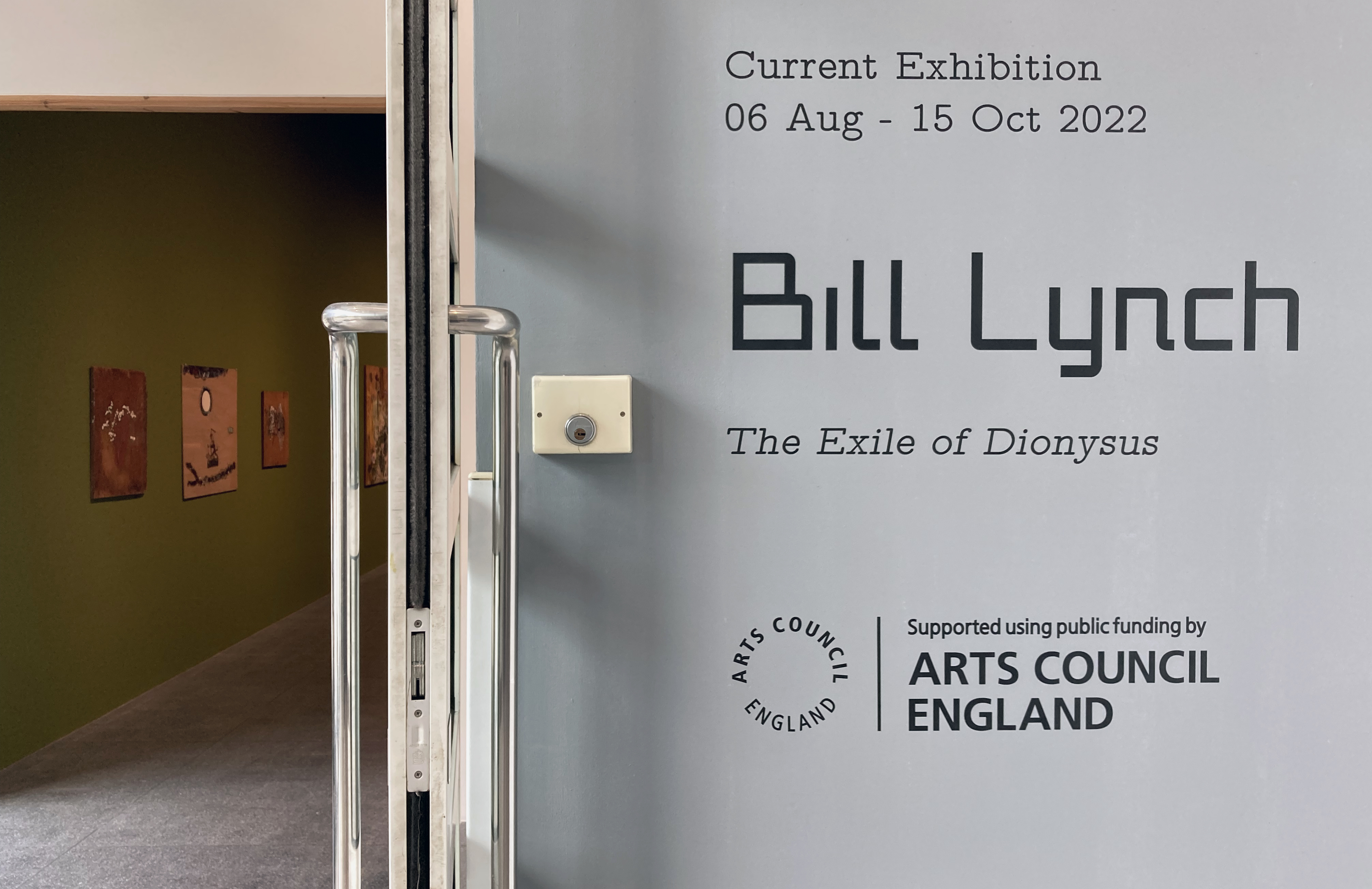
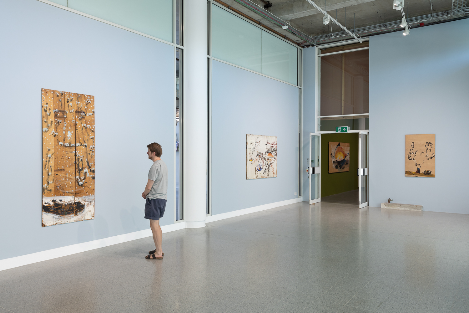
The Brighton Centre for Contemporary Arts is a relatively new gallery hub in Grand Parade and Dorset Place, which is situated at the University of Brighton. As such a large community of artists live in the city, many graduating from the university itself, the institution might now be expected to lead the way in highlighting contemporary themes and developments in the broad area of fine art. The Grand Parade gallery was reopened (and rejuvenated) in 2019 after several decades as a general gallery space that often showcased student work from the visual arts and design courses at the university. The last exhibition I saw there, at the beginning of this year, was Lloyd Corporation, a thought provoking (‘research lead project’) on material accumulation and social space, with the inevitable installation and slide show presentation. The show certainly made me review the garbage still stored in my attic at home, but as a painter who writes the occasional review, I have felt some disappointment in the possibility of new initiatives and expositions from the visually creative communities in Brighton to exclude, or at least downplay, painting. We appear to live in an age where issue-lead forms of ‘information’ and ‘message’ are a key requirement for supportive funding too. Video, photography, installation and text-based works, in particular, have been on trend for some time now. So a painting show, by an artist new to me, provided a good excuse to get out of the studio. A five star review of The Exile of Dionysus, the first major show of paintings by Bill Lynch in the UK, from Laura Cumming in The Observer was also a powerful prompt.
Bill Lynch: The Exile of Dionysus
“In these pictures everything is alive and communicating wildly. Lynch’s connection to subjects and landscapes, both in life and painting, was empathic: a flower or tree branch sings just as strongly as any bird; … and he listened acutely, transcribing their conversation so you could hear it too. Their secrets opened up to him. Everywhere is meaning. Surrounded by his work, you can’t help but be struck by this vibrant language; his sincere belief, his love.”(Michael Wilde, White Columns, September 2014)
Déjà vu: to my unexpected surprise, as I first wandered (and wondered) through this immediately memorable exhibition of Bill Lynch’s paintings, I was reminded of the viewer experience from the Brett Goodroad: Toe Buoy exhibition held at the Phoenix Art Space here in Brighton in 2018. In both instances a relatively unknown North American artist, for a UK audience at least, brought a fresh voice and personalised vision to picturing, and actively celebrating, the world around him. Both artists’ respective projects augmented and amplified ‘reality’ with a sense of reverie and submersive attachment to the subject matter. Goodroad often explores a drama of figures in landscape settings, whilst Lynch more often highlights aspects (and objects) of his environment, for example, depicting flowers, trees and birds from nature or bowls, fruits and vases from more personal spaces. He was deeply interested in Chinese ink drawing too, hence a clearly affected visual language and subject matter in many instances of his work.
Unfortunately, Bill Lynch is now deceased (he died in 2013 from throat cancer aged just 53) and had mental health issues (schizophrenia) and these facts may well add to the inherent pathos of the works. The viewer cannot help but be affected by some aspects of autobiography (van Gogh being the classic case) when seeing an artist’s work, even in reproduction. But whilst a certain amount of knowledge and context of an artist’s work is necessary to understand and find a way into their artwork there is an argument for going straight to the work itself – inevitably accompanied by one’s own contexts and prejudices. This purist attitude is not one to always prevail, and we might seek to eschew habit, but it’s a conscious way in – most especially to such directly affective and demanding imagery. Theses are paintings that are impossible to ignore.
No doubt, every viewer will be struck by Lynch’s use of salvaged plywood as support. It’s a common material to use in place of canvas, solid wood or aluminium panels. It’s far from usual to use this base as found material and form (hence a variety of sizes and an acceptance of imperfections such as bashed corners and cut intrusions) without a backing frame and carefully primed and prepared grounds. The use of paint and the visual language is raw too. But Lynch did use oil paint and the subject matter fits into the tradition of landscape painting, notably influenced by an eastern (Chinese) tradition that celebrated nature.
Installation view in South Gallery
There may be an unsophisticated irony at work here too, although I doubt it. Lynch was an art student in New York in the late 1970s and early ‘80s, although he lived “on the fringes” and did not succeed on the gallery scene. Irony, as a post-modernist conceit, came a little later, and Lynch’s work appears beyond parody or intellectual conceptualism. One reading might be that Lynch was (metaphorically speaking) sticking two fingers up to the art world establishment. The works certainly have a feeling of individual strength and reveal a desire to stay tuned to painting as a way of mediating with the world, and oneself, irrespective of fashion or gallery pressures. Perhaps painting was a balm for his personal troubles, a way of coping with and of celebrating being alive.
His imagery, whether influenced by Chinese painting or not, has that sense of direct engagement with the subject. This of course includes the imagination, based on a story-telling kind of attitude, alongside concrete experiences and observations. The works are unashamedly ‘rough and ready’. They look like first drafts, but go beyond sketches or rough plans. The physicality of application of the paint matches the honest acceptance of the medium too, as if to suggest the illusion of visual reality as being quite matter of fact – a form of philosophical irony steeped in Buddhist traditions.
Installation view North Gallery
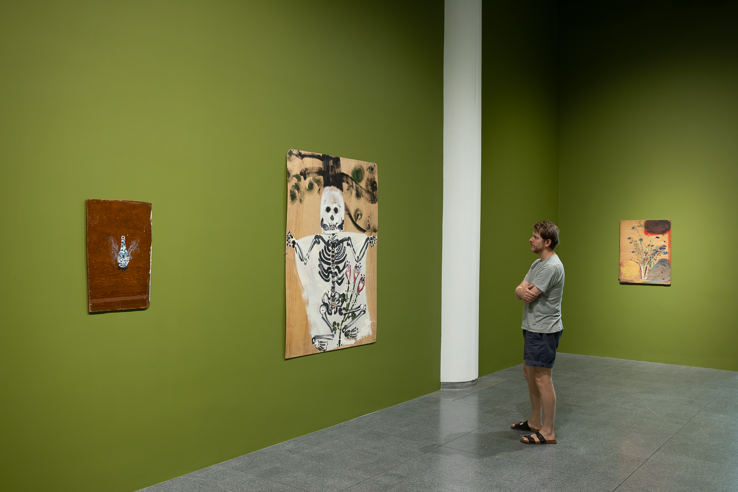
The Exile of Dionysus is divided into two main spaces, plus a reading room at one end. The North and South Galleries house the works. The former has some suffused natural light, which was strangely welcome despite the noise of the traffic from outside. But from the main entrance into the building the visitor enters a high ceilinged space containing ten of the fifteen works selected. Here the internal walls are painted green, which oddly reminded me of the National Portrait Gallery in London. We are so used to white walls now that colour can come as a shock. But the works bedded in well and the green was congenial and not dominating. Intended or not, this gave a sense of being in a rather special, natural, kind of space. I mention this, as any gallery environment imposes an unavoidable immediate context for the work. White would have been okay, but the use of a colour brought the paintings together, whilst in the adjoining setting the five other works felt separate. As a space with the additional construction of surrounding walls the traffic sounds were heavily muffled. A chair or bench to sit and ponder Lynch’s painting would have been most welcome too, not only to discourage the common gallery walk through, but also to facilitate an even more contemplative experience. But, no matter, for the works will make the visitor stop and stare.
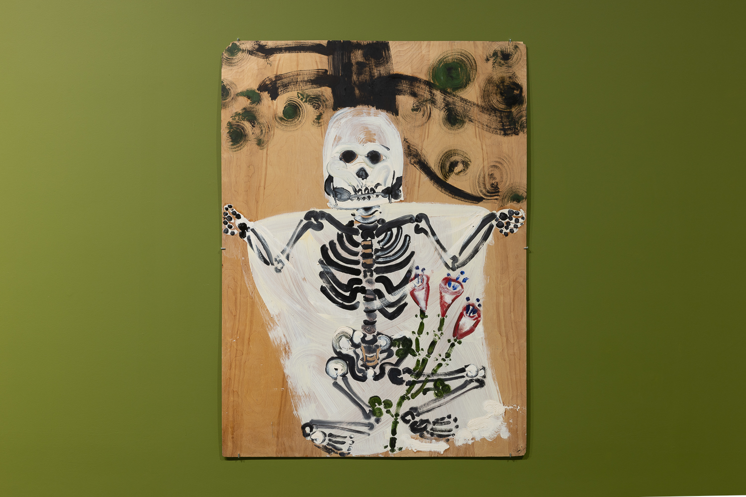
Once the shock of the materiality of the works is accepted, the imagery can come to the fore. In the South Gallery I suspect that the almost, but not quite, light-hearted imagery of a human skeleton in ‘Untitled (Skeleton)’ will stand out first. A white shroud, suggestively the beginning of applying a primer to the board, slightly foregrounds the serious looking skeleton that is accompanied by a flowering plant between its legs, with part of a tree trunk and branches behind. Not that perspective as a necessary element bothers Lynch too much.
Bill Lynch – ‘No title (Skeleton)’ oil on wood
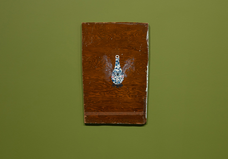
To the left of this relatively large work is, ‘Emperor’s Erection’, which depicts a vase with two ghostly wings (linear depictions of four legged animals in fact) that levitates the form against the board that has a pre-painted layer of varnish from a previous life as a piece of furniture. The still-life reference of the found board, like a piece of Cubist assemblage, accommodates the rather beautifully painted vessel decorated with plant forms. Lynch tends to draw with the paint, especially when getting a little more detailed and specific.
Bill Lynch – ‘Emperor’s Erection’ (1988) oil on wood
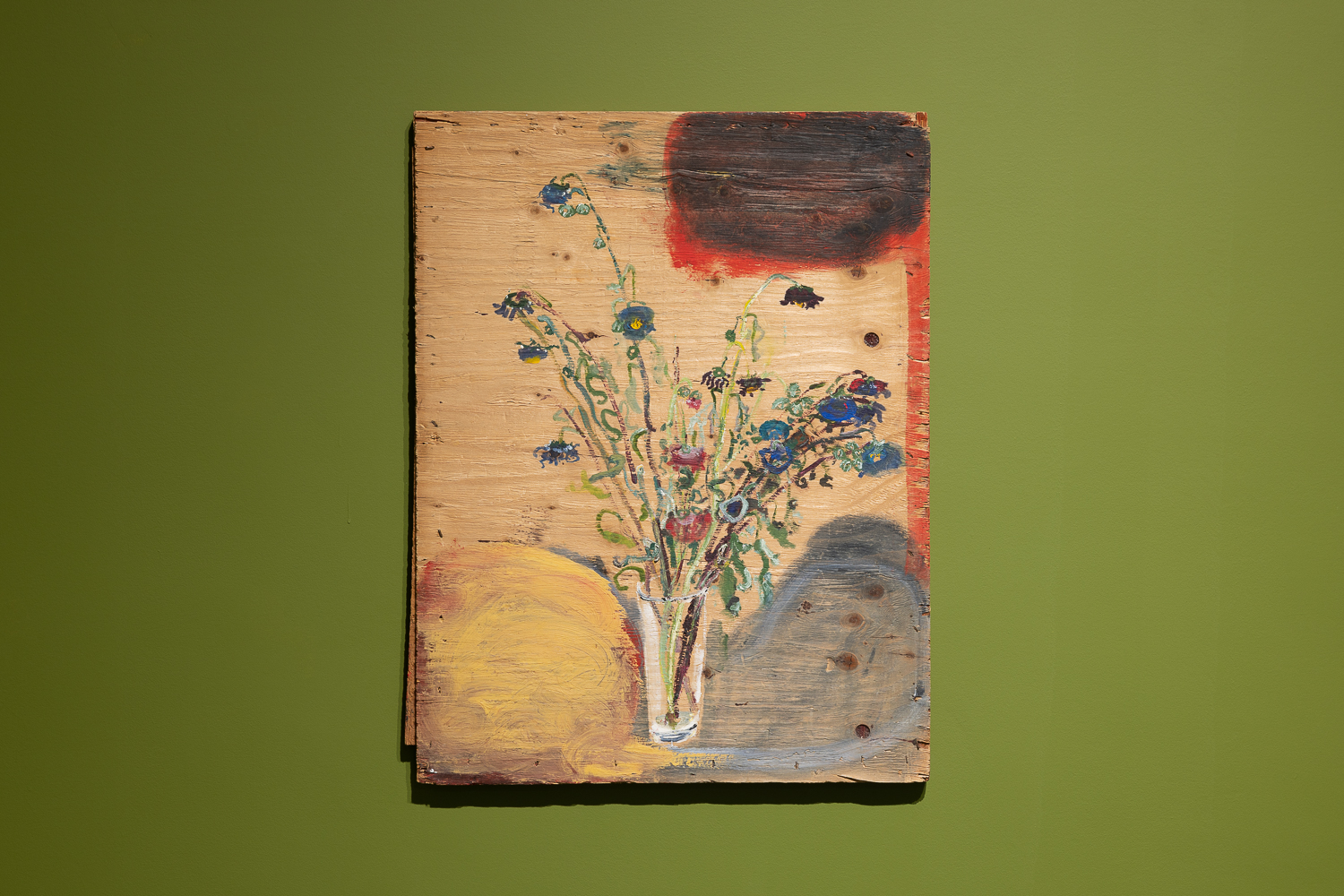
Nearby hangs, ‘No title (Vase with Blue and Purple Flowers)’ which, despite almost hiding in a corner, demanded my attention as much as any other of the works in the show. A Rothko-esque cloud of colour fills the top right-hand corner of the composition before a rather scraggly looking vase of flowers demands more viewer focus and attention. These may have been cut-plants in need of water as the stems are beginning to droop. I imagine they may have once existed in Lynch’s studio, or wherever he painted. Dotted across the board are knots in the plywood layers that suggest planets to the imagination, though they are more ‘real’ than any painted representation of anything. Around the base of the glass vase is a pair of wing-like forms. Or perhaps they are clouds of unknowing. On one level, this scruffy little painting might be considered as superficially trite, but holds a galaxy of potential meaning and viewer interpretation.
Bill Lynch – ‘No title (Vase with Blue and Purple Flowers)’ oil on wood
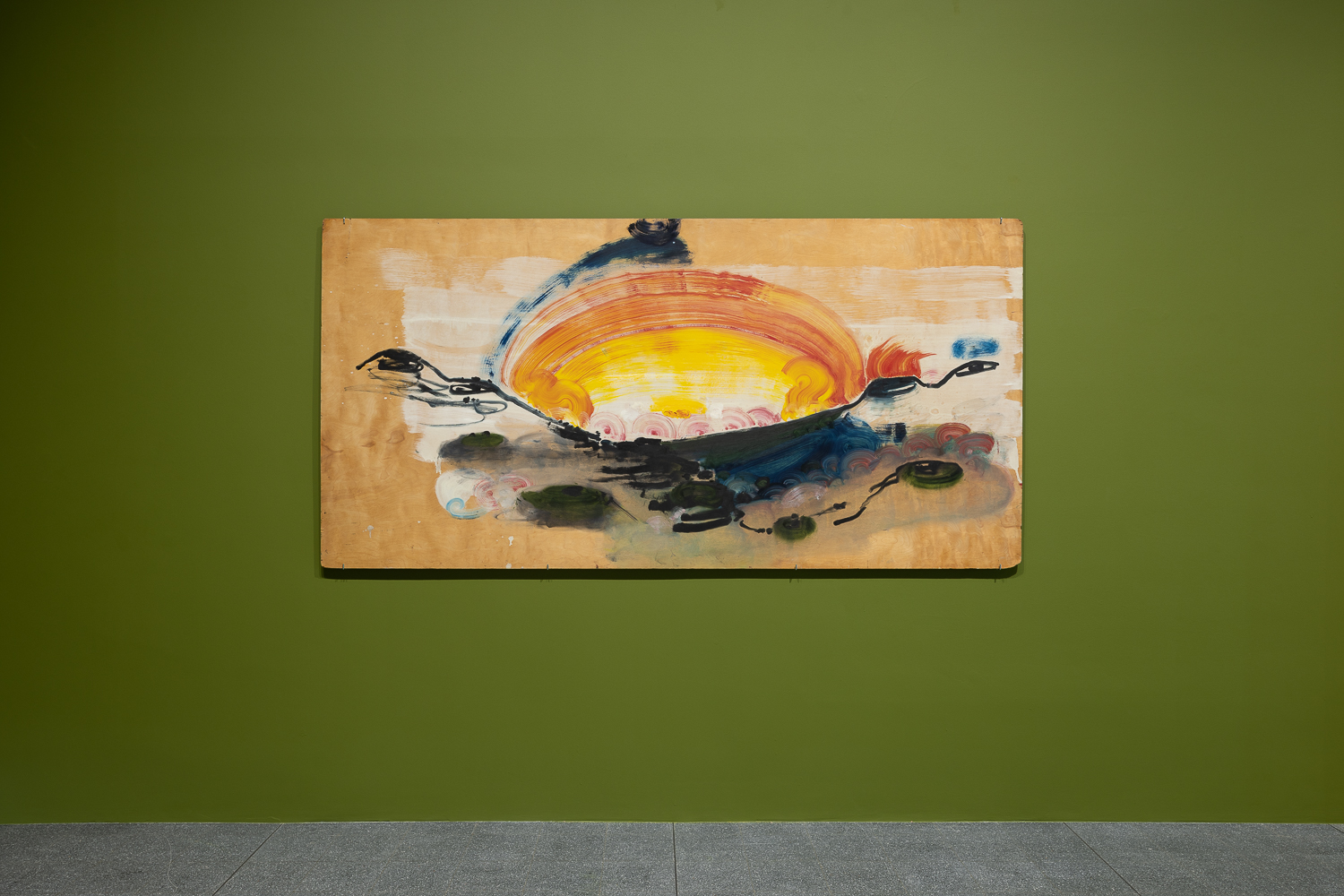
Before entering the North Gallery the visitor will certainly be stopped in their tracks by, ‘Four Corners Sunset’ from 1994, one of only three works dated in the exhibition, and the largest. I wonder if Lynch was so pleased to obtain such an expanse of plywood that it invited a glorious sunset, worthy of the attention of a 19th century Hudson Valley painter, inspired by the implied sublimity of a J.M.W. Turner sunset. The red circular forms throbbing in a suggestively psychedelic pulse line across the horizon, like a row of coloured spotlights from a rock concert, contrasts with the dark cratered lunar-like landforms below and to either side of the setting sun. The world can be a strange place indeed, though we need painters to remind us sometimes.
Bill Lynch – ‘Four Corners Sunset’ (1994) oil on wood
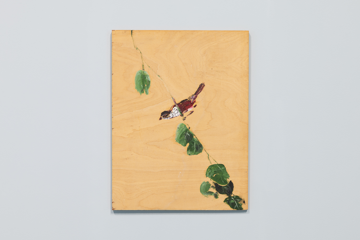
Lynch’s work, however, seems to be appropriately and healthily placed in the often commonplace. In the North Gallery one of the outstanding works is one of the simplest compositions in the show. ‘No title (Bird on Branch)’ depicts a bird perched on a tree branch, with leaves above and below on a single stem. The leaves are gently modulated with tone and shift in sequence from being closed in the top left, to open (in the middle), to dropping apart in the bottom right hand corner. One might sense the passing of time in this small painting, as the bird’s weight holds the branch in a diagonal position within the composition. I assume that the bird was copied from a reproduction, not that it matters. It’s an image that far surpasses its simplistic representation and it’s no big deal that it’s not painted on canvas. It is just about the end of the show at this point, although the green glade behind will pull you back in for another look.
Bill Lynch – ‘No title Bird on Branch)’ oil on wood
Laura Cumming may have been purposely, and journalistically, provoking the reader for attention in suggesting that Lynch was “…the greatest American artist you’ve never heard of”, but she was correct when she stated that, “Bill Lynch’s paintings on salvaged wood transfix with their dual power of primitive joy and high sophistication.”
This really is a show to visit and the arts community of Brighton dare not miss the spectacle. Painting can go far beyond the provision of mere information.
Artworks have been borrowed from The Approach, The Bill Lynch Family Estate and several private collectors.
Note: In the Brighton CCA reading room a wall-based text has been written by the poet Vanessa Onwuemezi in response to Bill Lynch’s paintings. Hear her read it here:‘Lines of Chance’