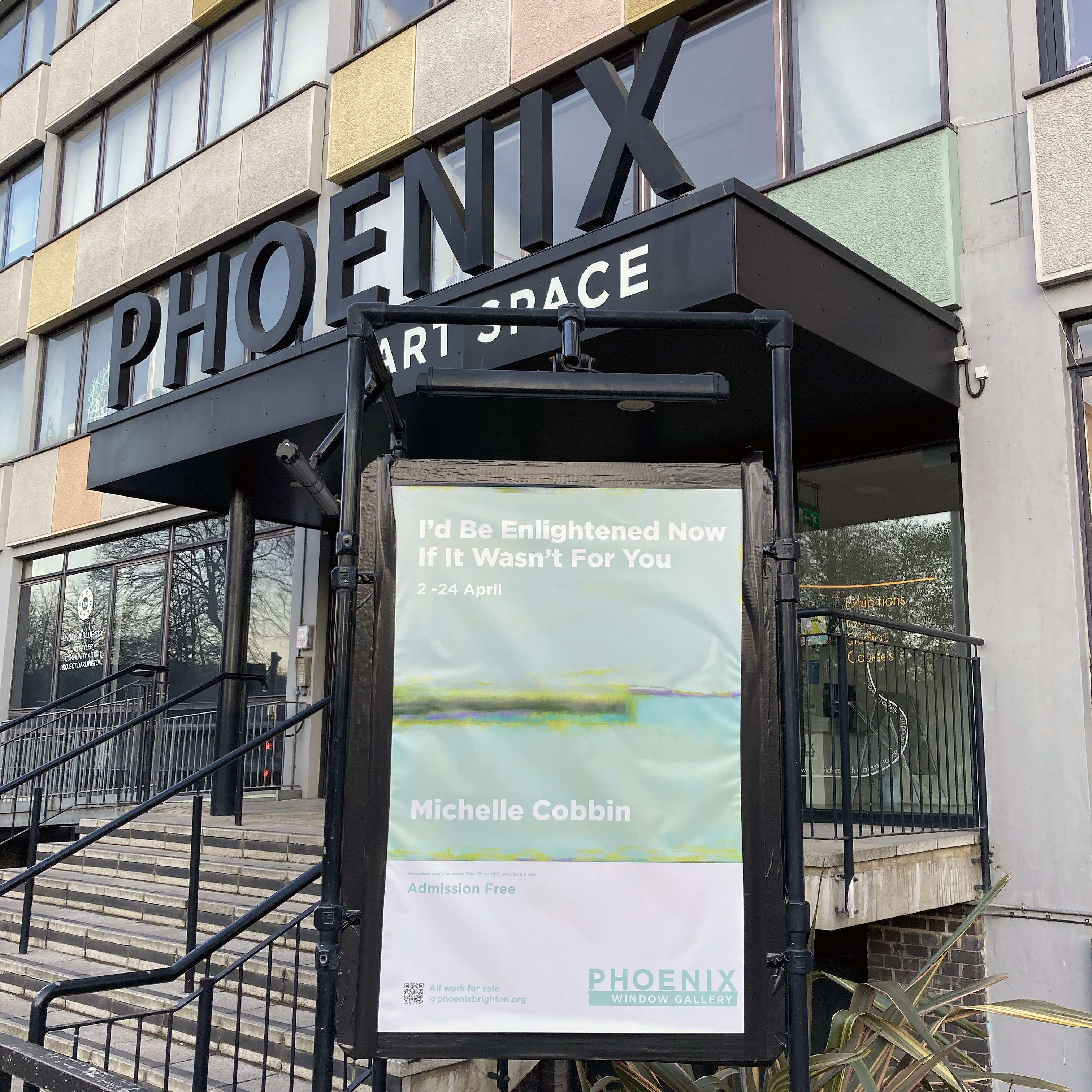
At Tension, Maple Road, London SE20 8LP
18 October to 29 November 2025

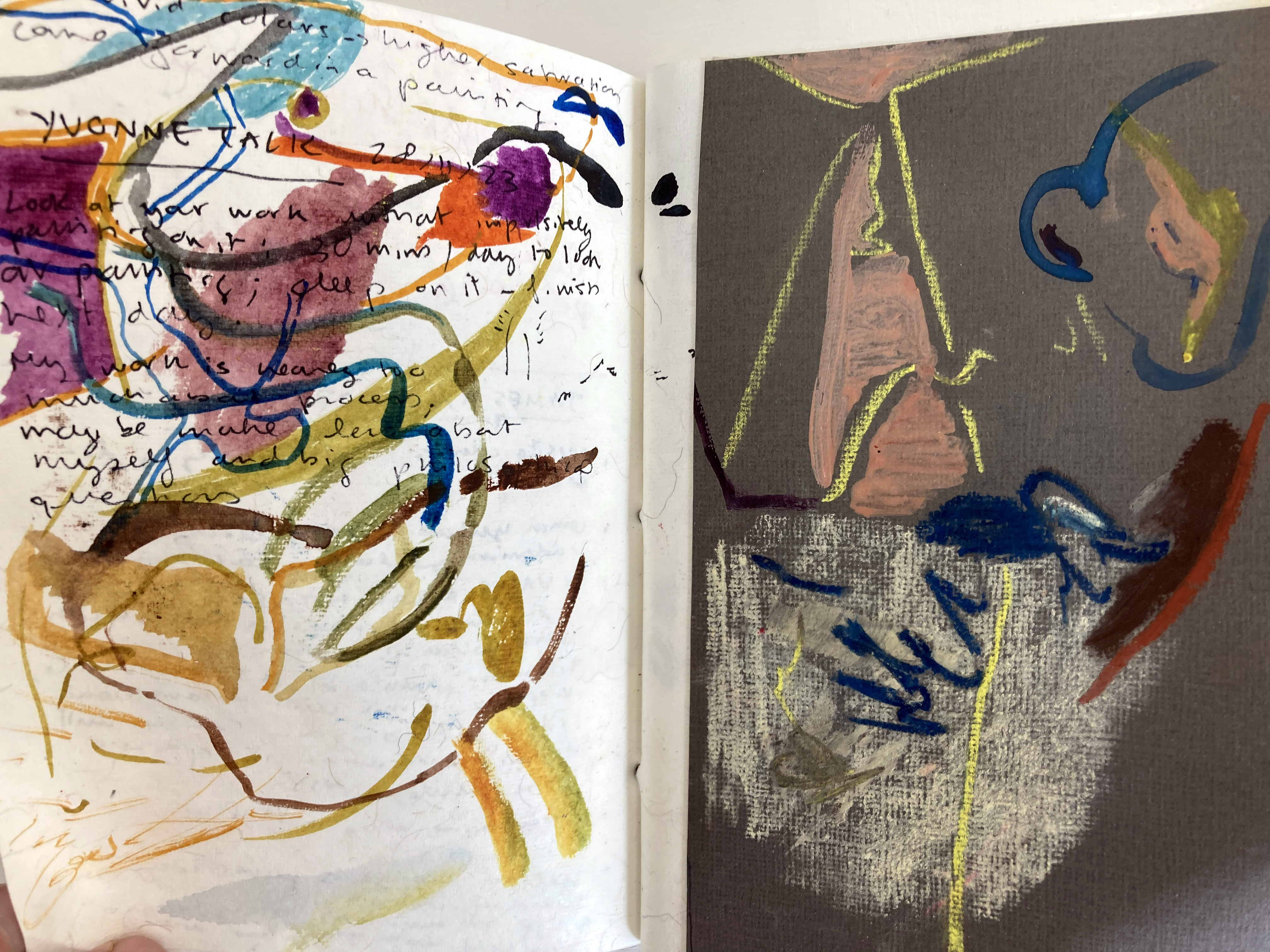
I paint therefore I think…
AI Overview: Thinking is the mental process of manipulating information to form concepts, reason, and make decisions. It is a form of cognition that involves activities like problem solving, judgment, and memory retrieval, and it allows us to interpret, categorize, and make sense of the world around us. (From Google)
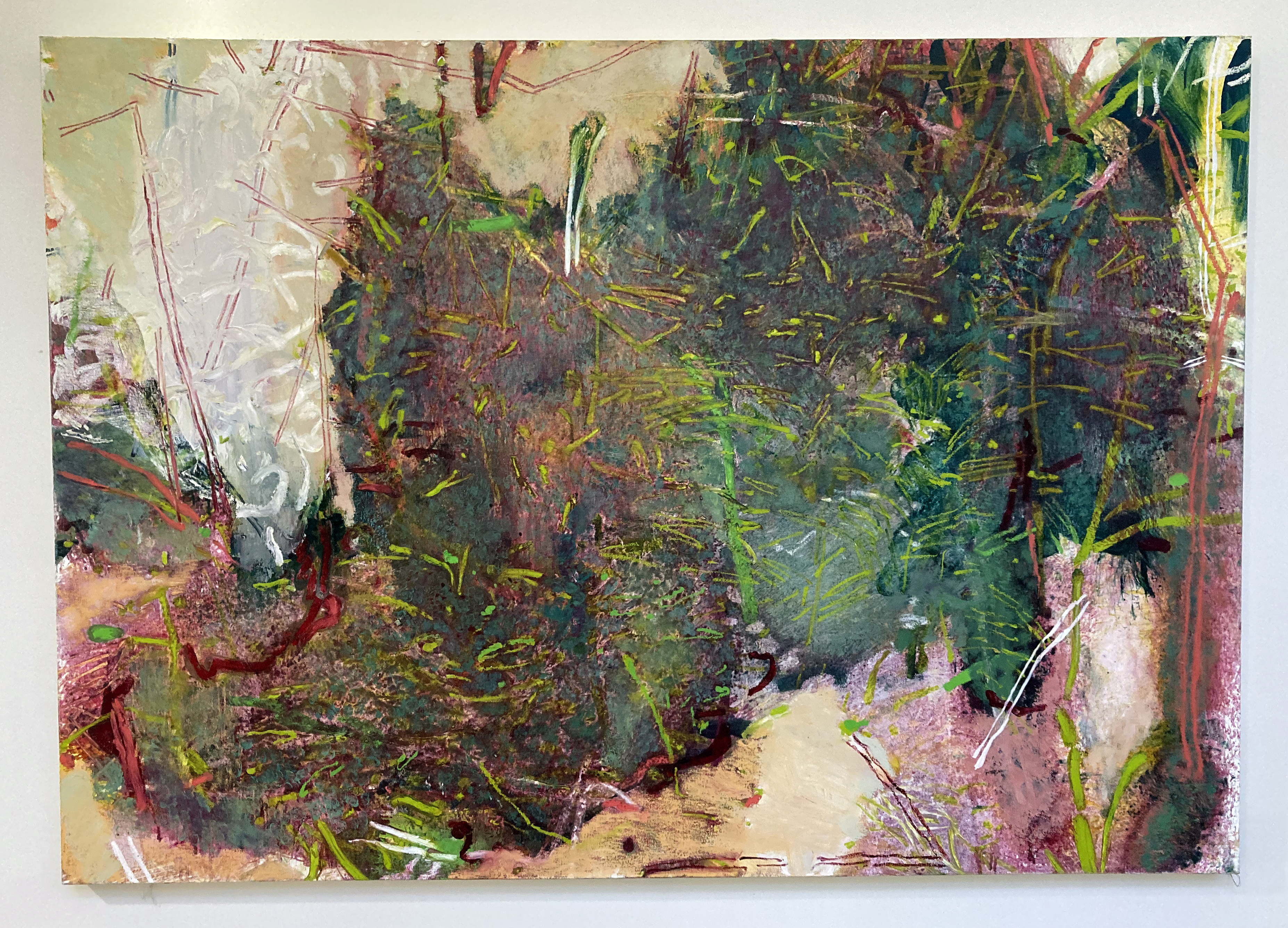
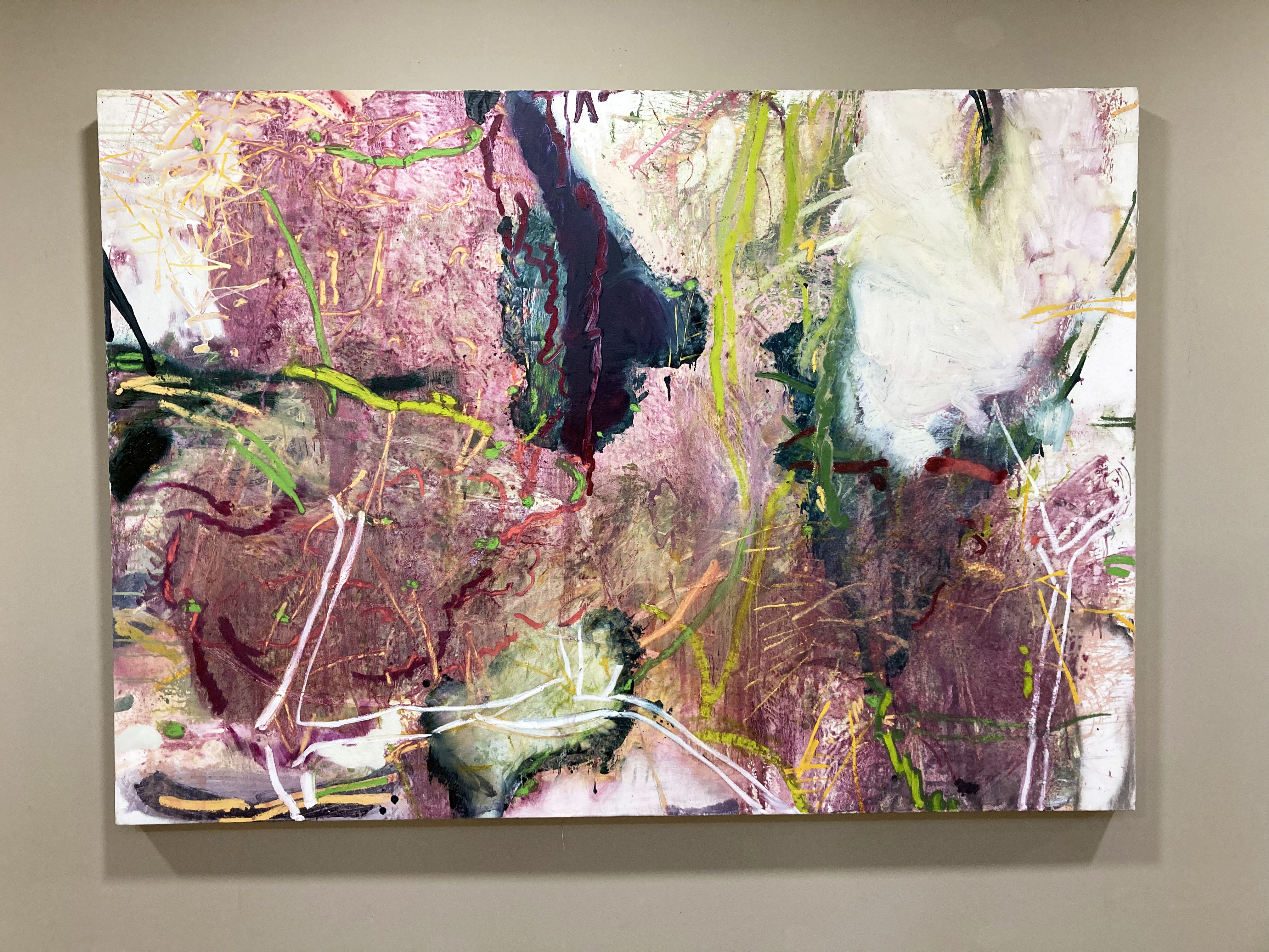
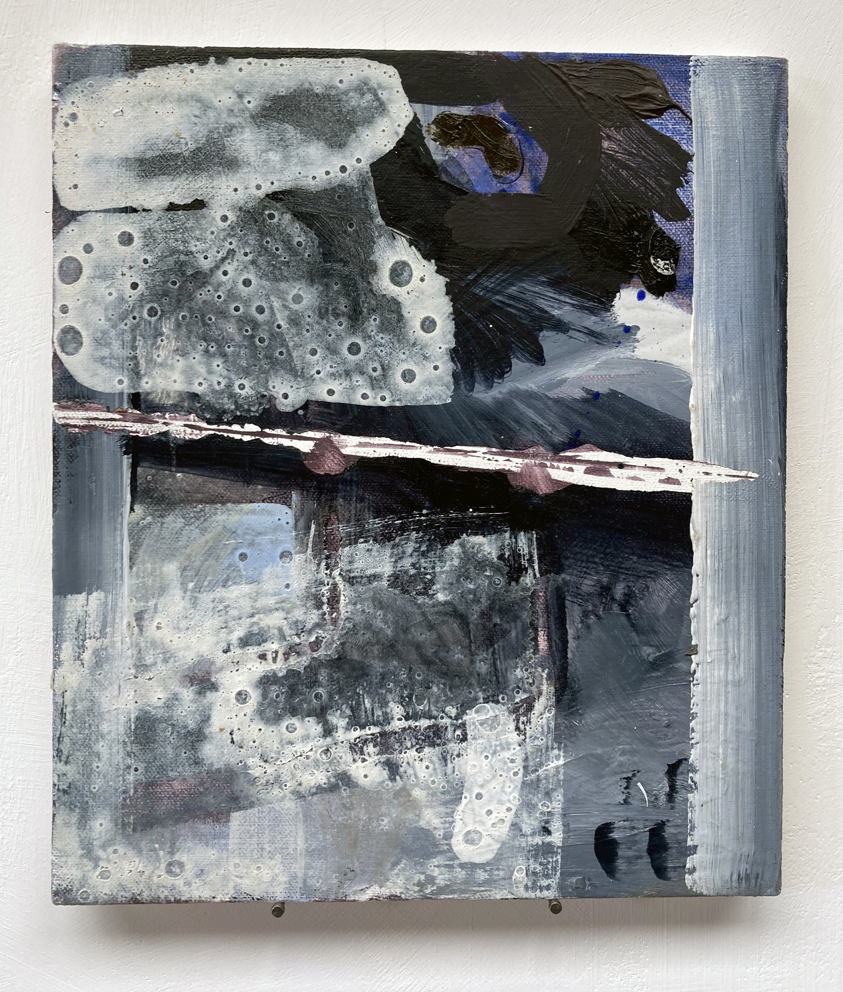
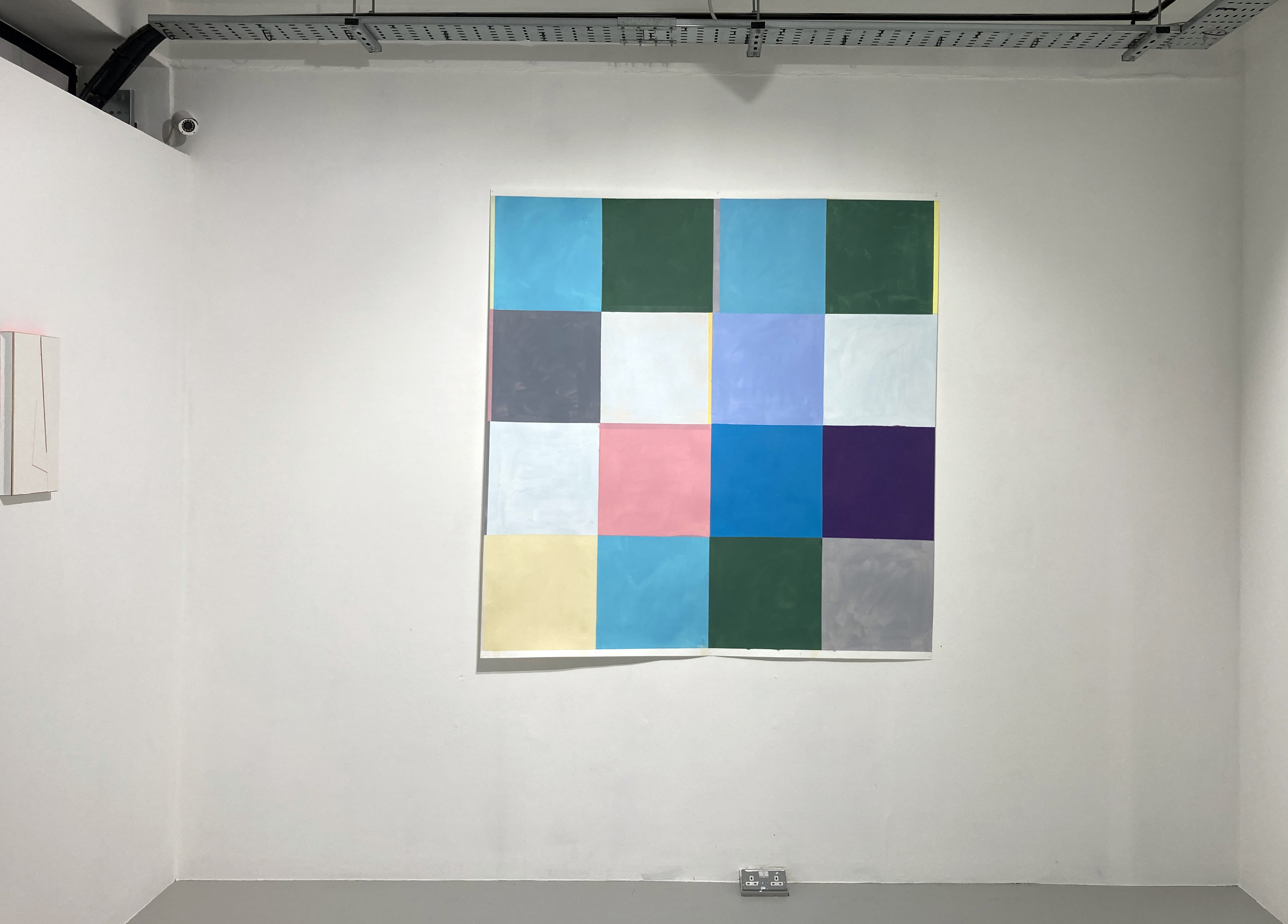
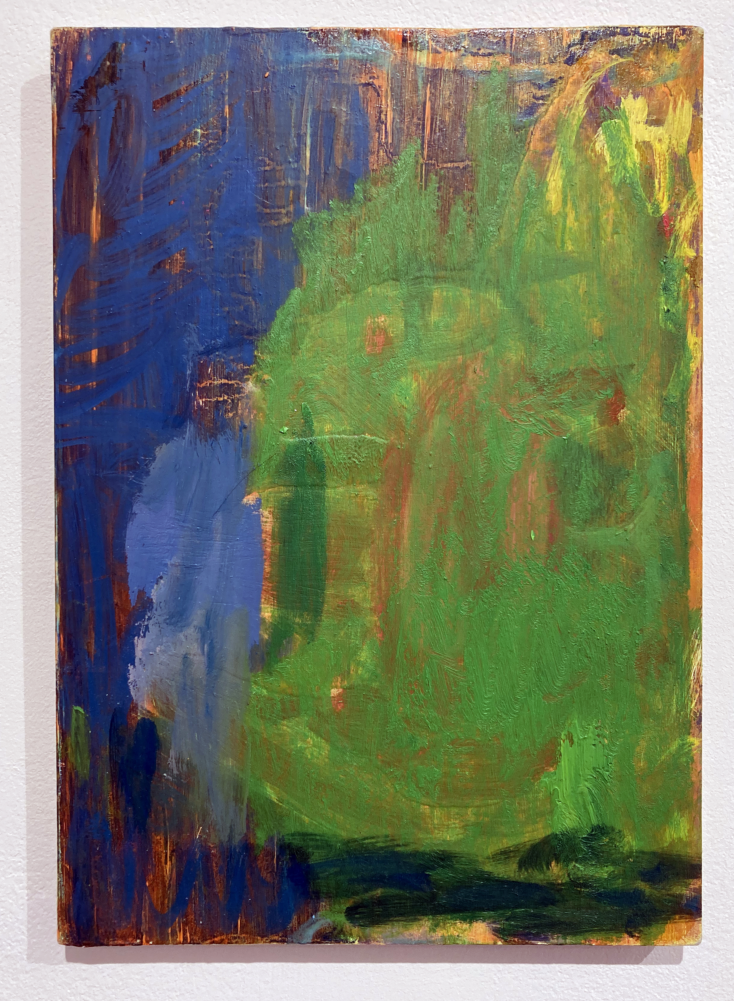
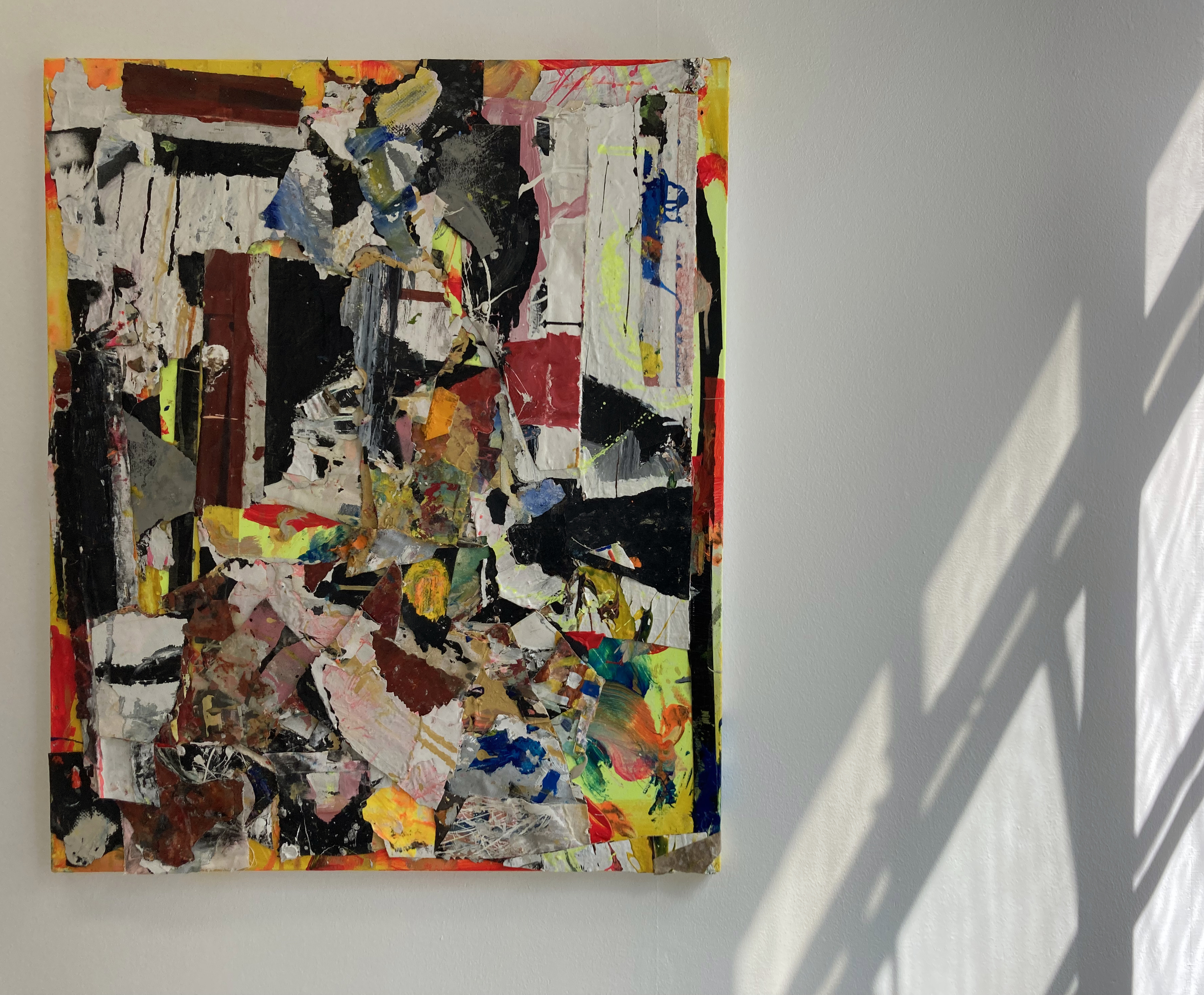
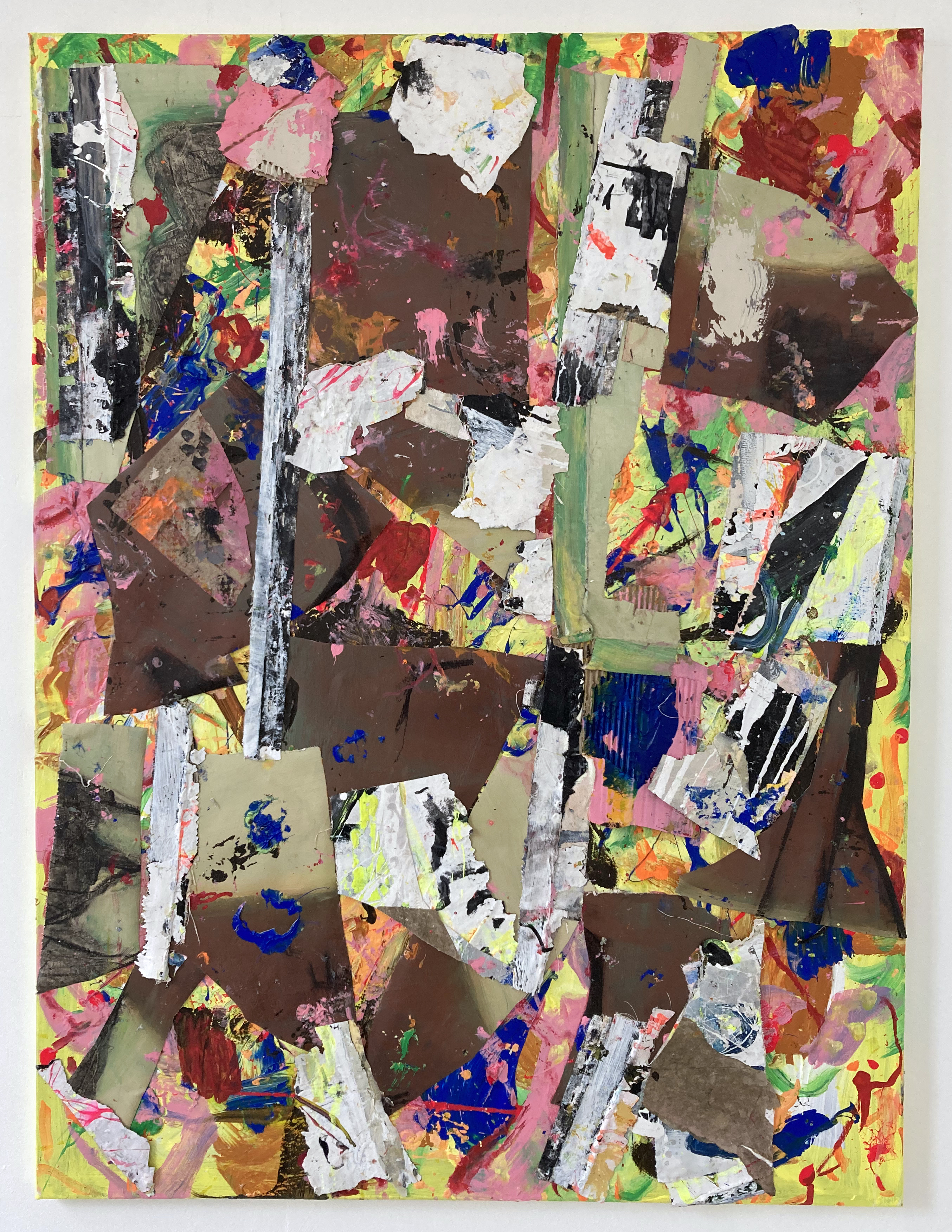
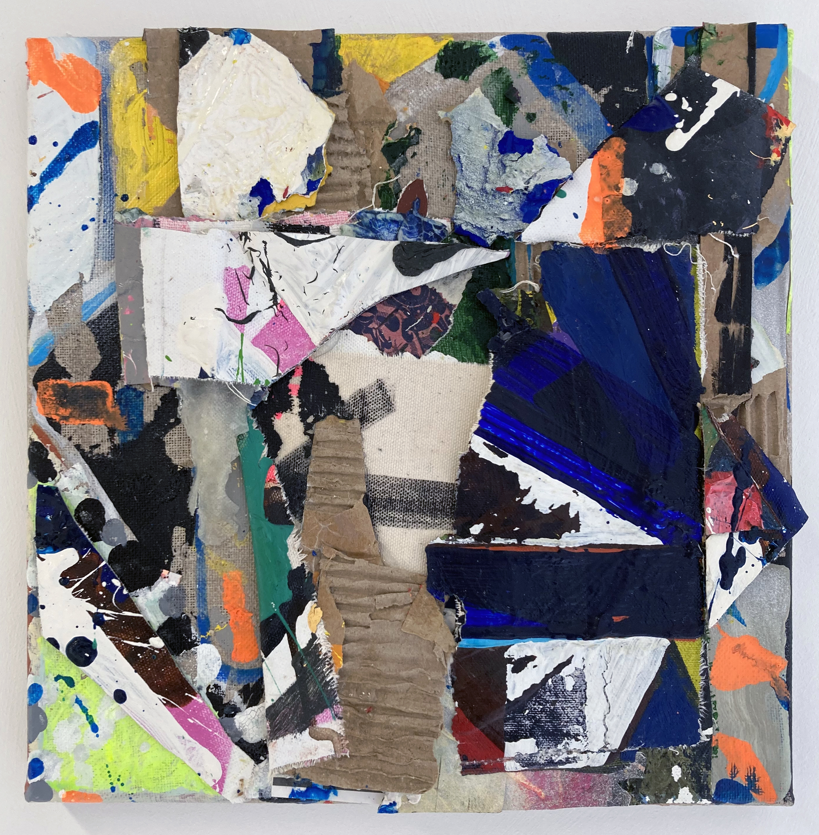
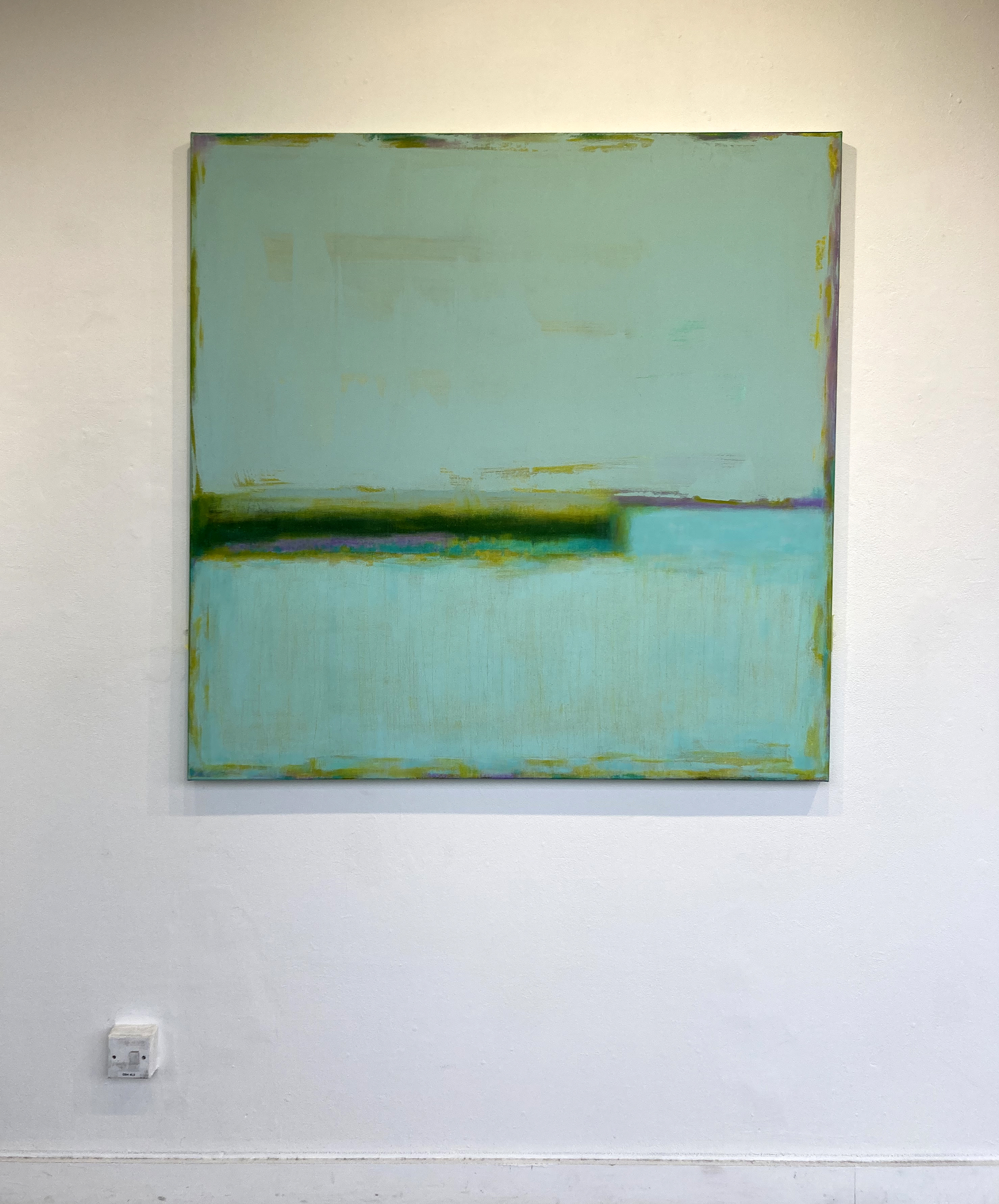
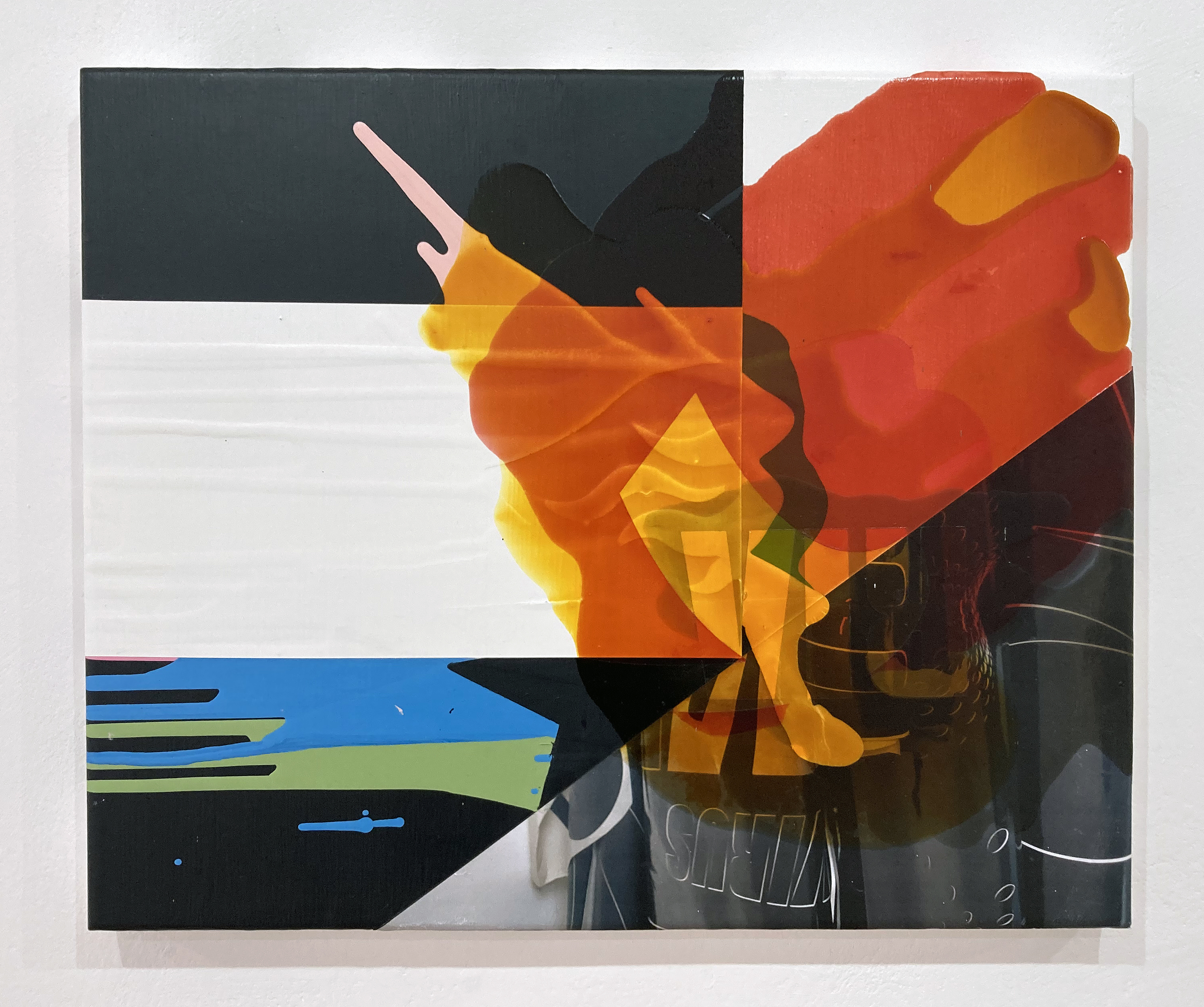
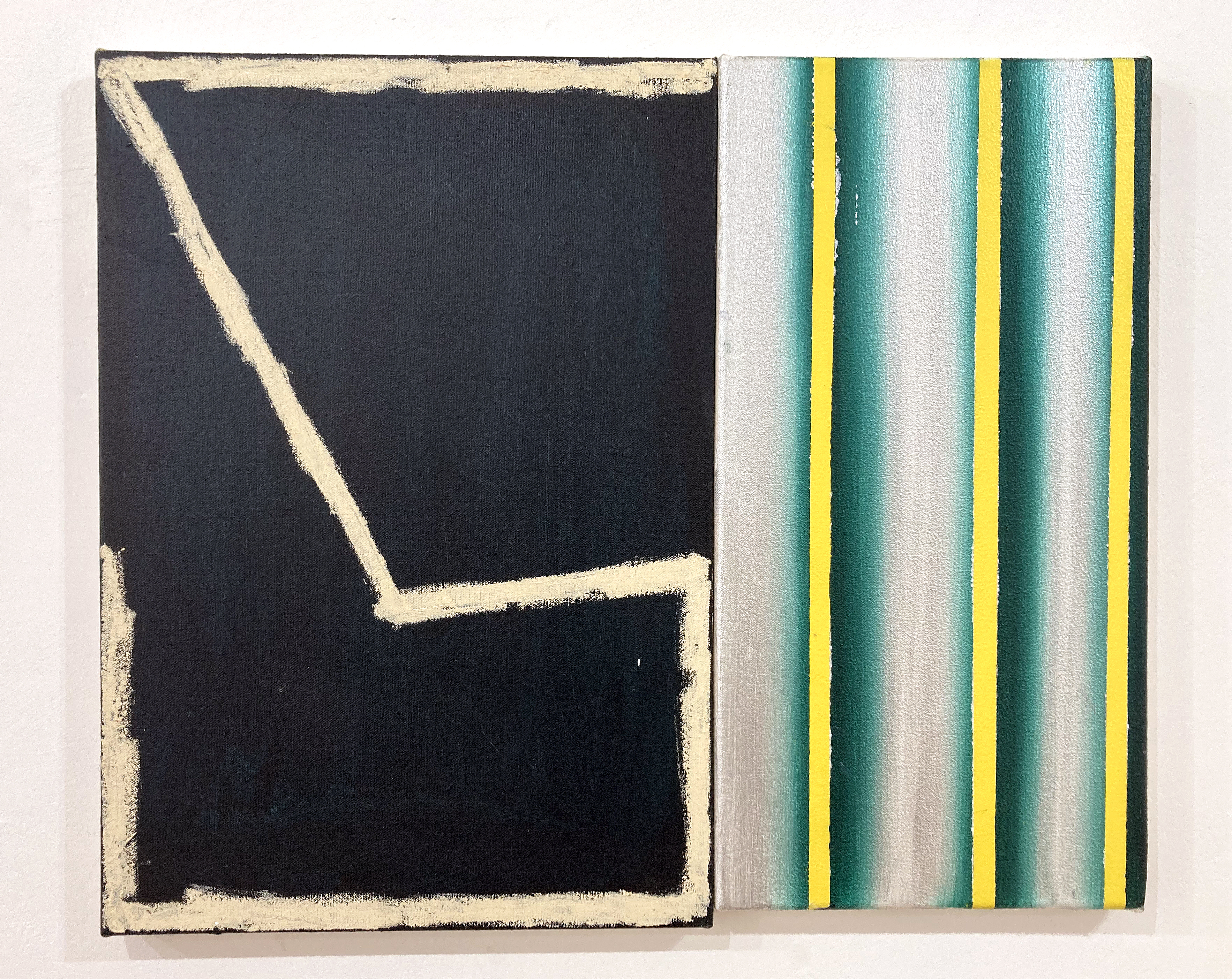
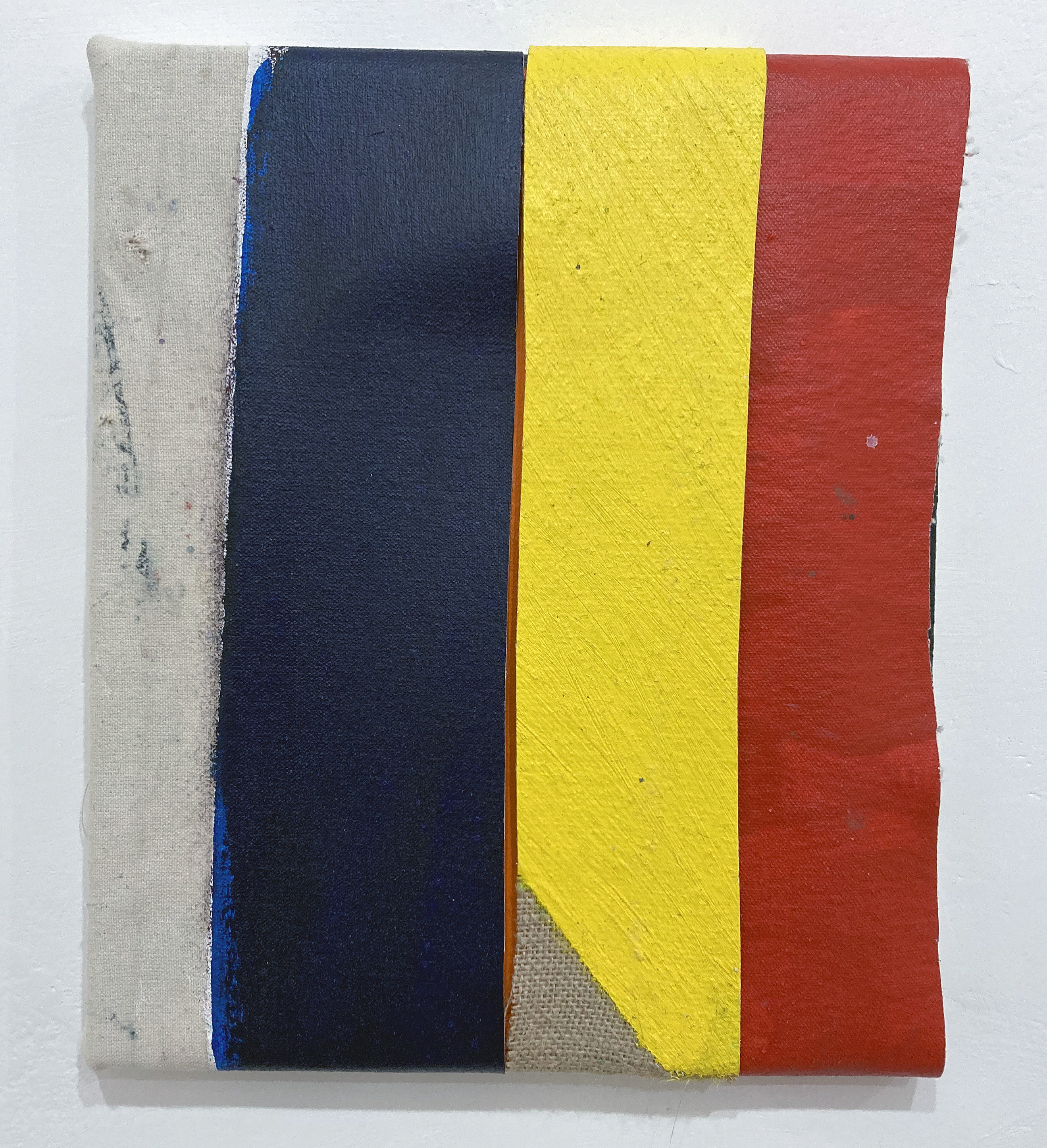
We surely do not know for sure what Michael Stubbs, Ken Turner and Julian Wakelin were thinking whilst making these works for Thinking In Paint. But we certainly have something to see, to experience and to think about ourselves now that their works have been selected and presented.
As an immediate reaction I prefer to avoid (for as long as I can) such sentiments as I like this or dislike that. Reactions can be direct and instantaneous, but ideally require a little time to ferment. Initial thinking, at least, can be characterised by simply taking various formal and material aspects in, such as colours, shapes, textures and the relationships between such features. This thinking might initially be described as feeling and perhaps usefully delays anything too conclusive. One can also see with the benefits of art historical knowledge – sometimes a prejudiced lense – and from personal experience of looking at paintings before, or from being painters ourselves. We may be susceptible to personal preference (I know what I like) and bias at times, but hopefully reasoning and rational judgement will enable an honest experience. Even uncertainty or ambiguity might take hold.
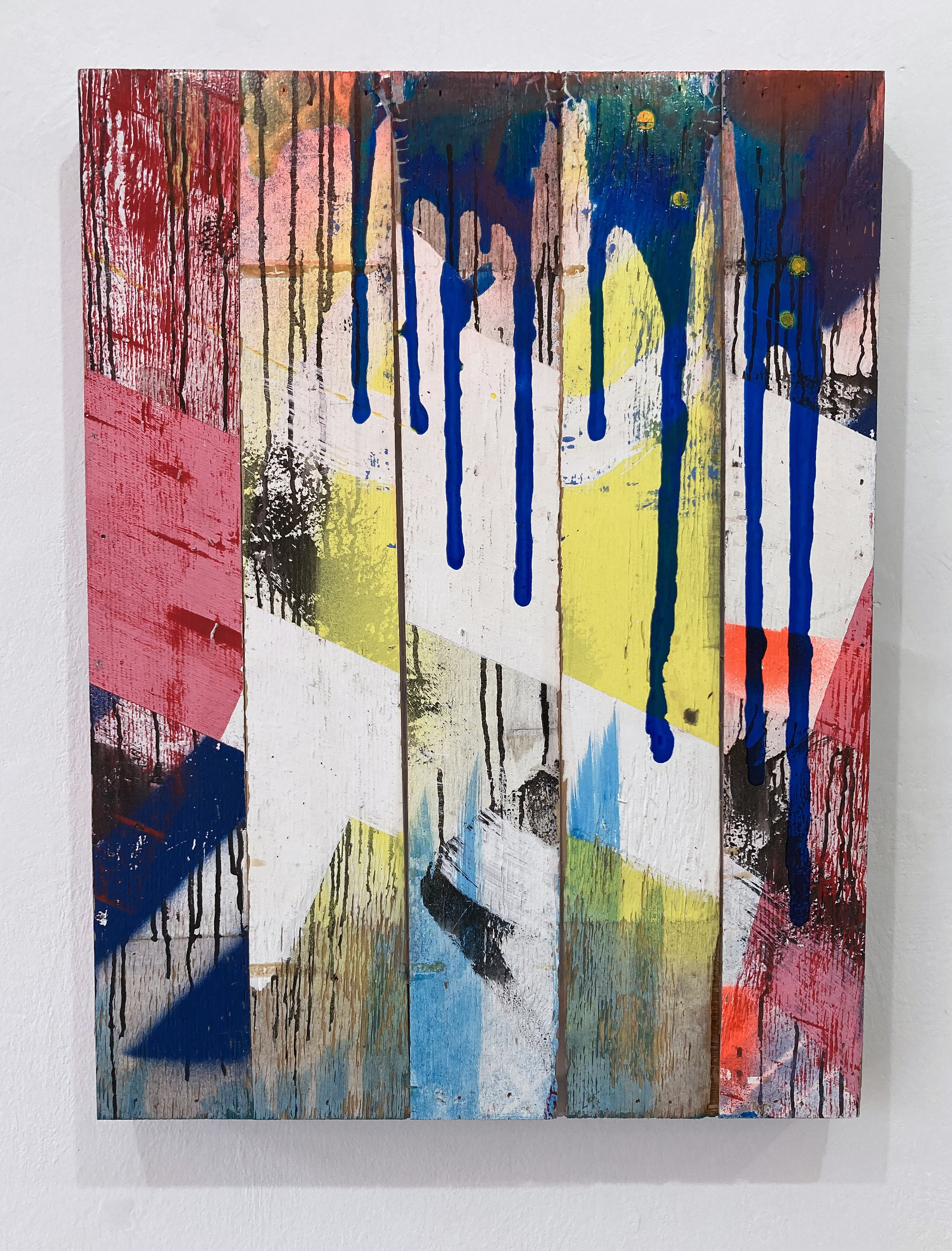
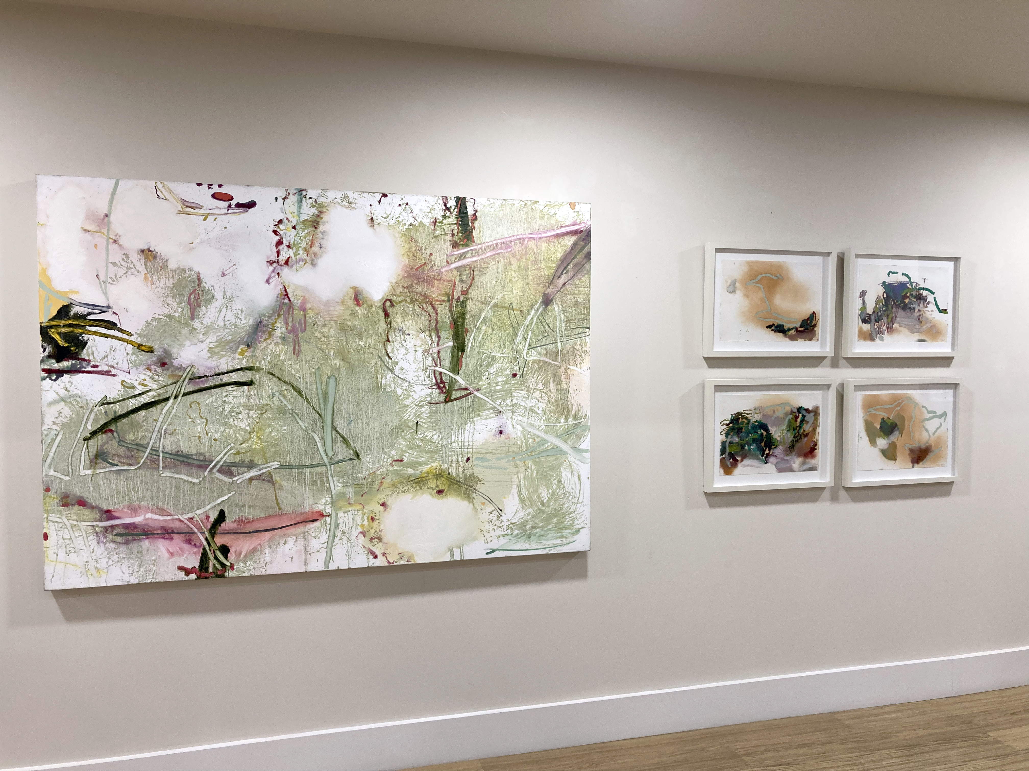
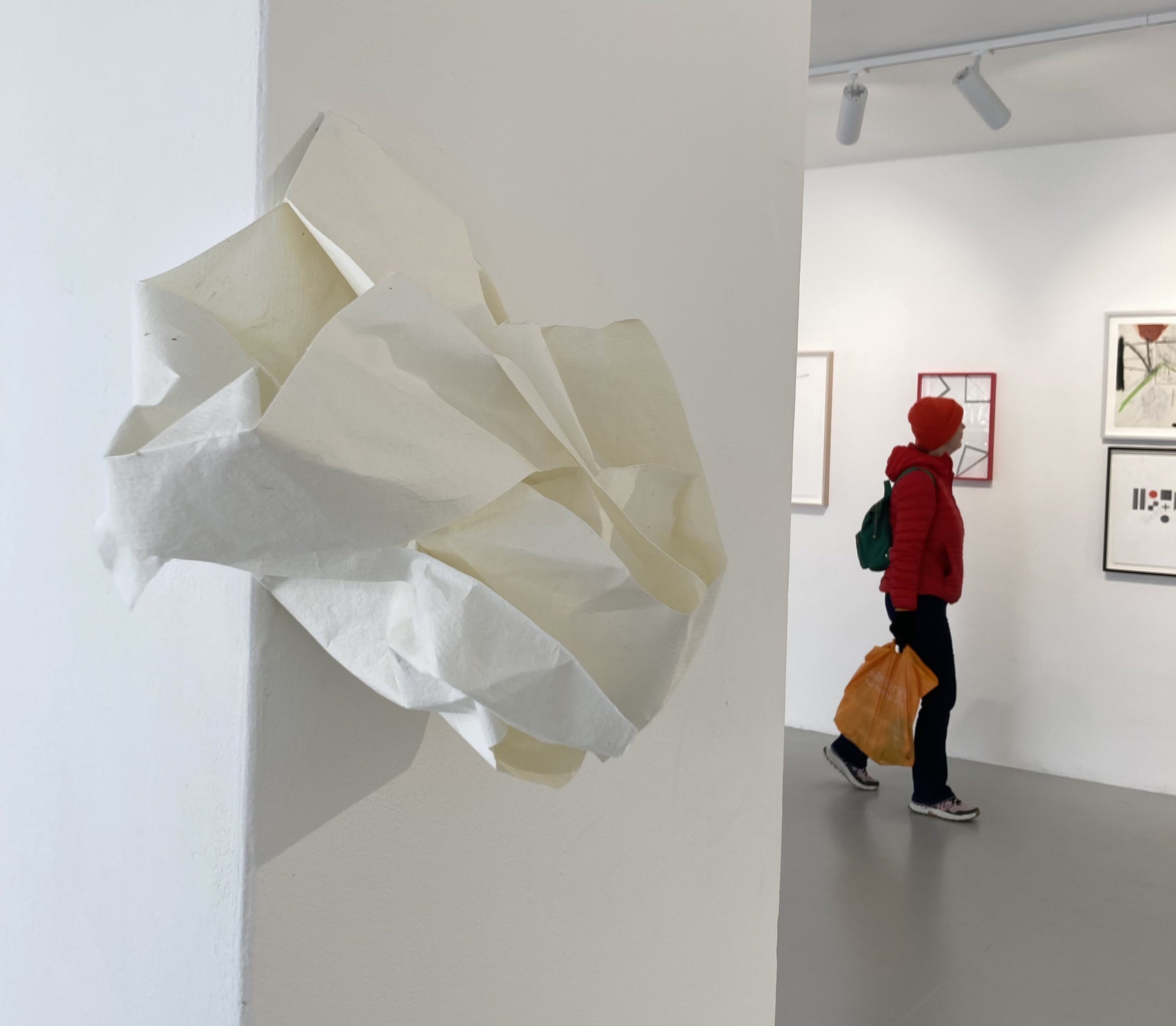
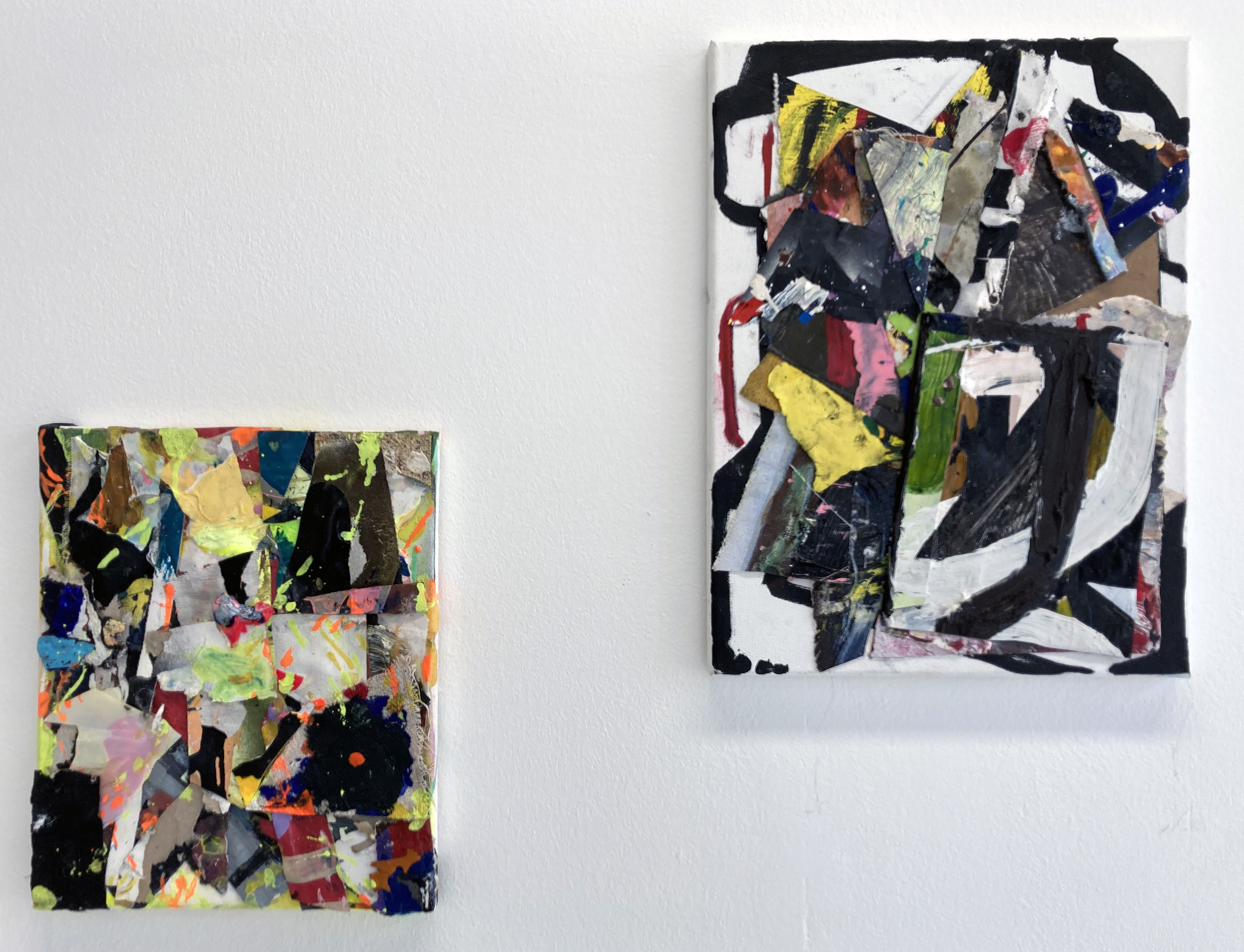
A group of paintings, whether by an individual or three individuals, sets up possible contrasts too. Yet I prefer to register works individually, even though my own practice invariably produces the series. Visual judgements can change of course, particularly as works sink in. Taking photographs of the works on the iPhone to view later is highly beneficial too, despite forming a bit of a contradiction as a real reproduction. For an exhibition called Thinking In Paint, that might eschew the digital in favour of the material object, it is imperative that the paintings are (ideally) viewed as they were created in their corporeal, material reality. Add sufficient time with the individual works in question to become accustomed, as it were, will also be a necessary factor. A lifetime might be ideal. But we generally only have our exhibition visits to provide such an experience.
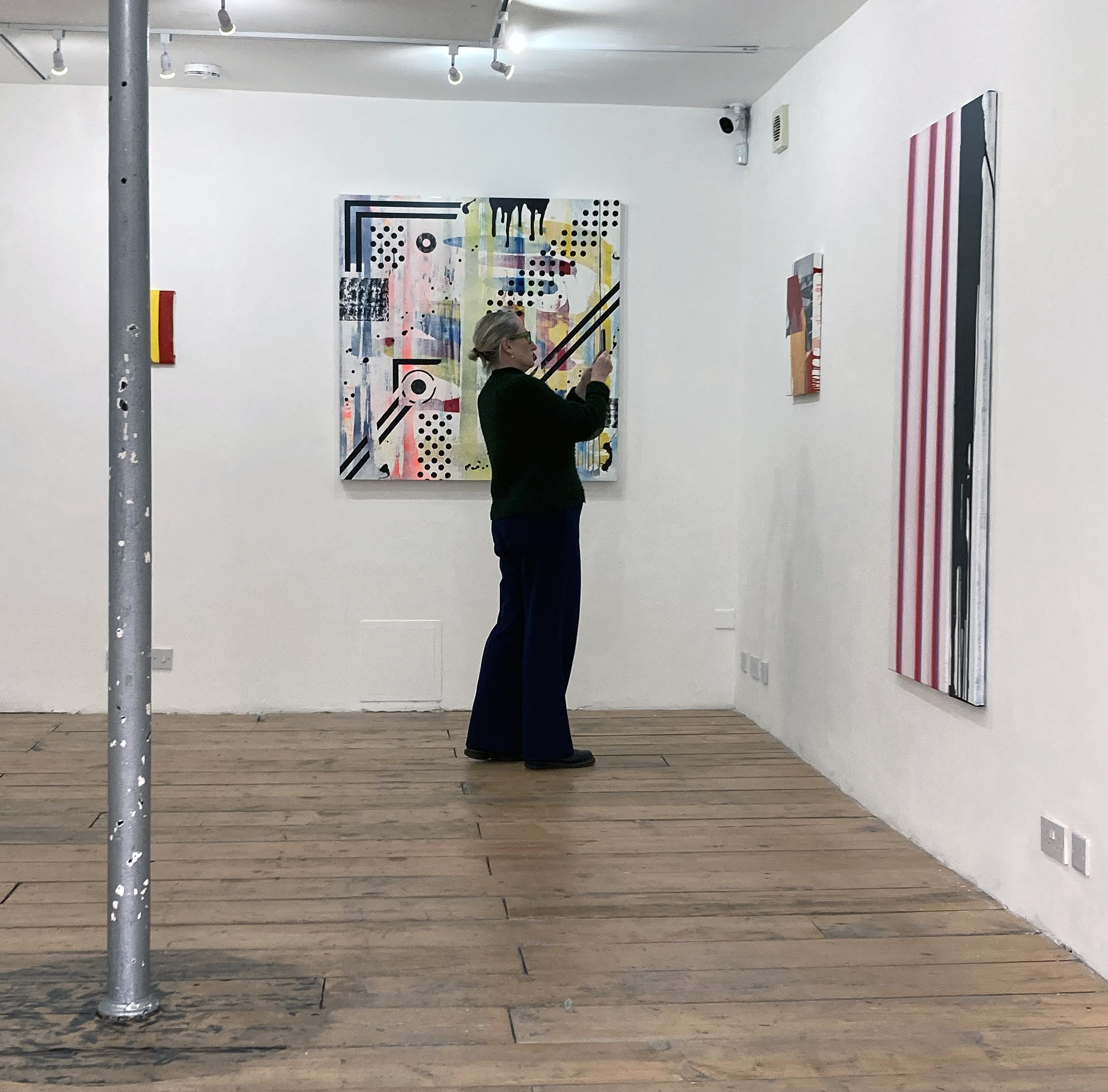
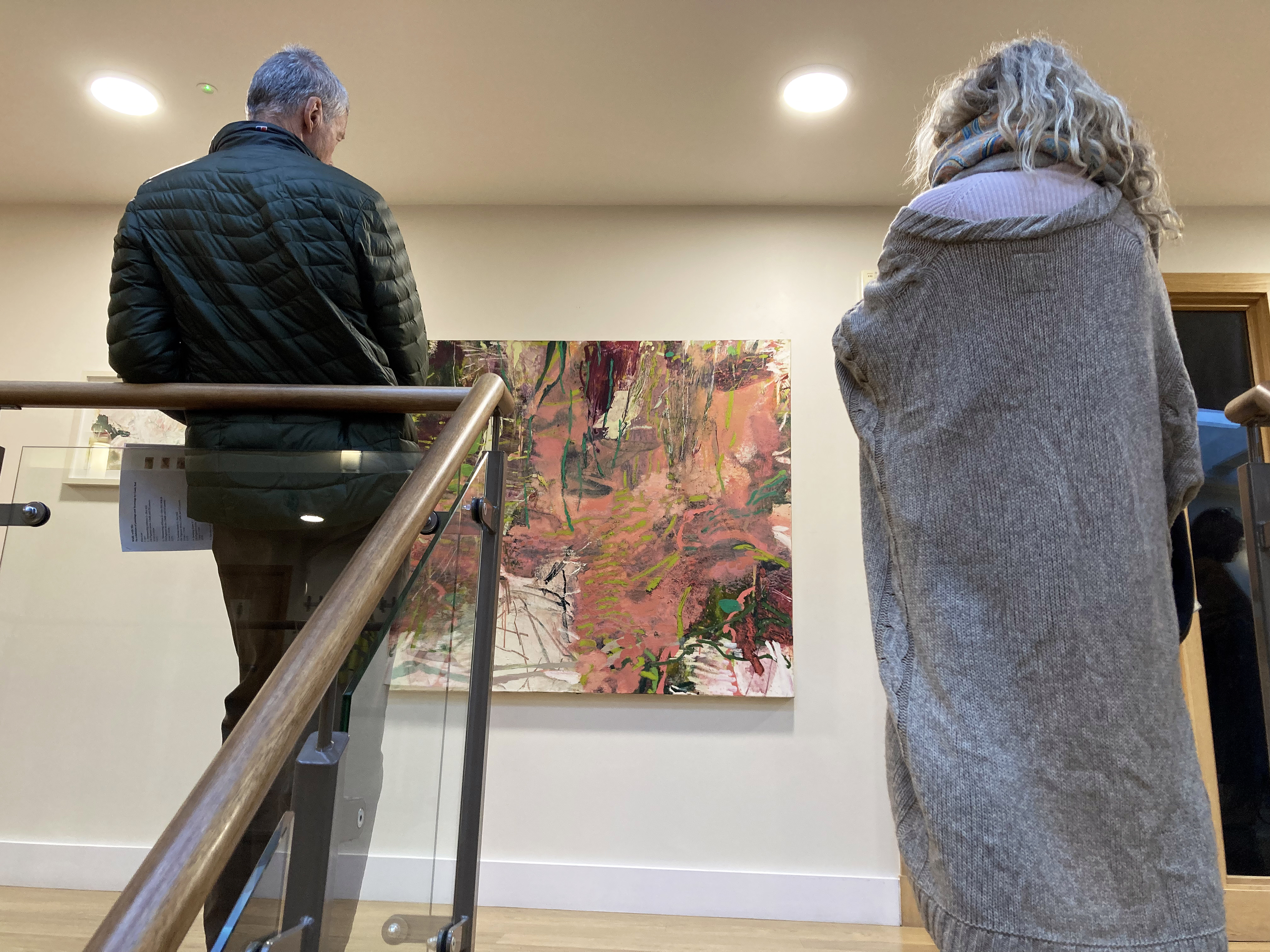
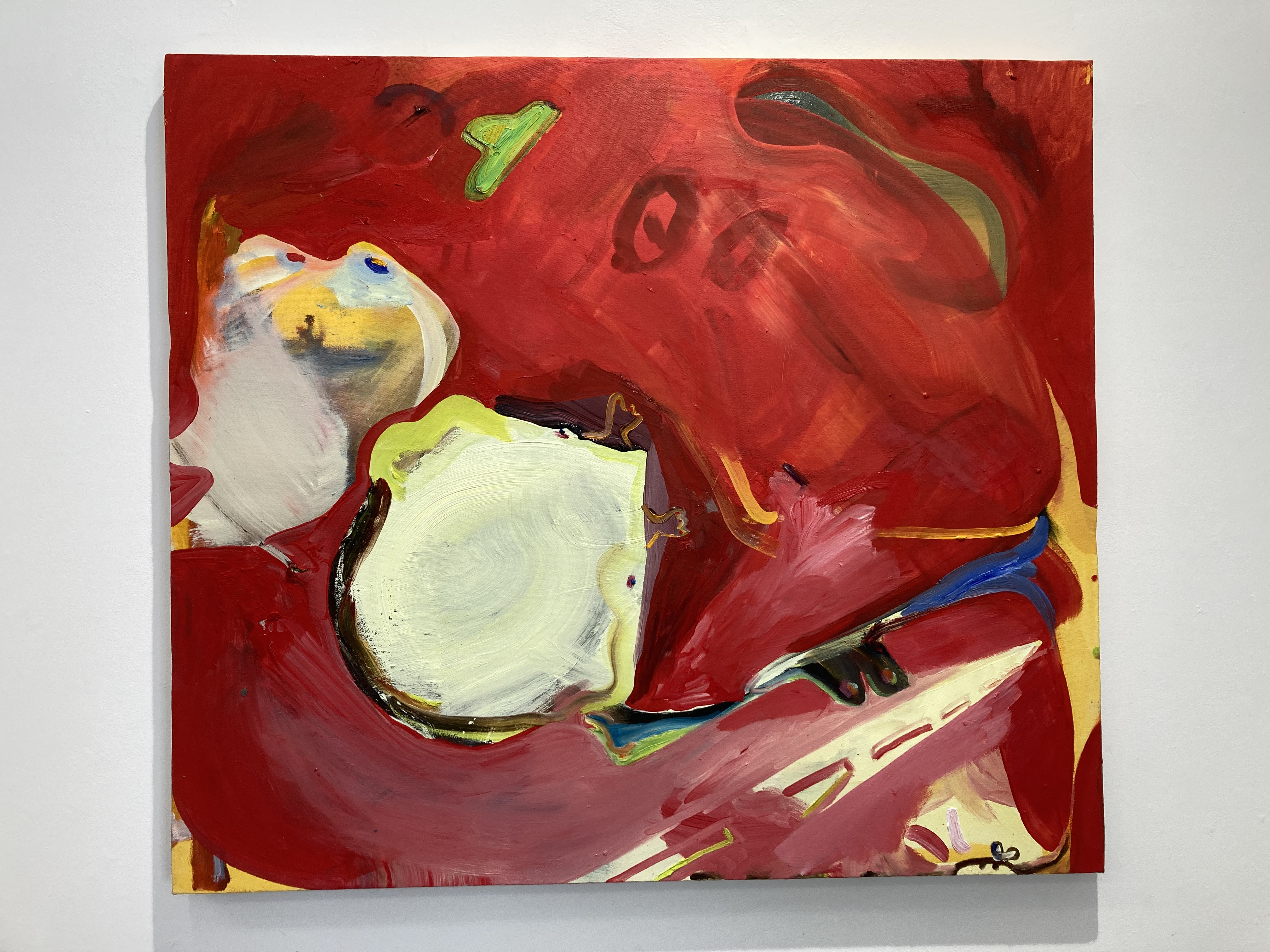
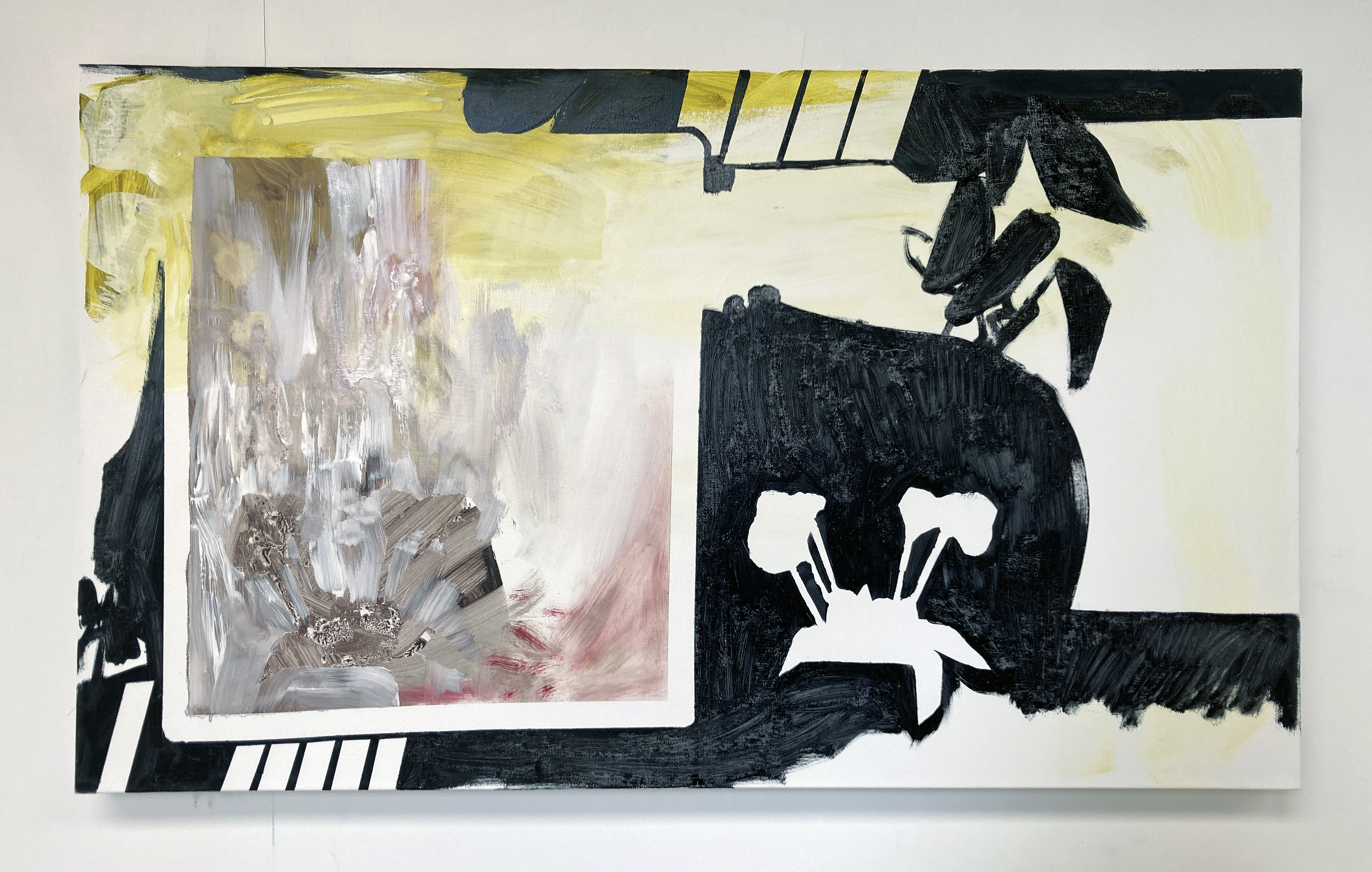
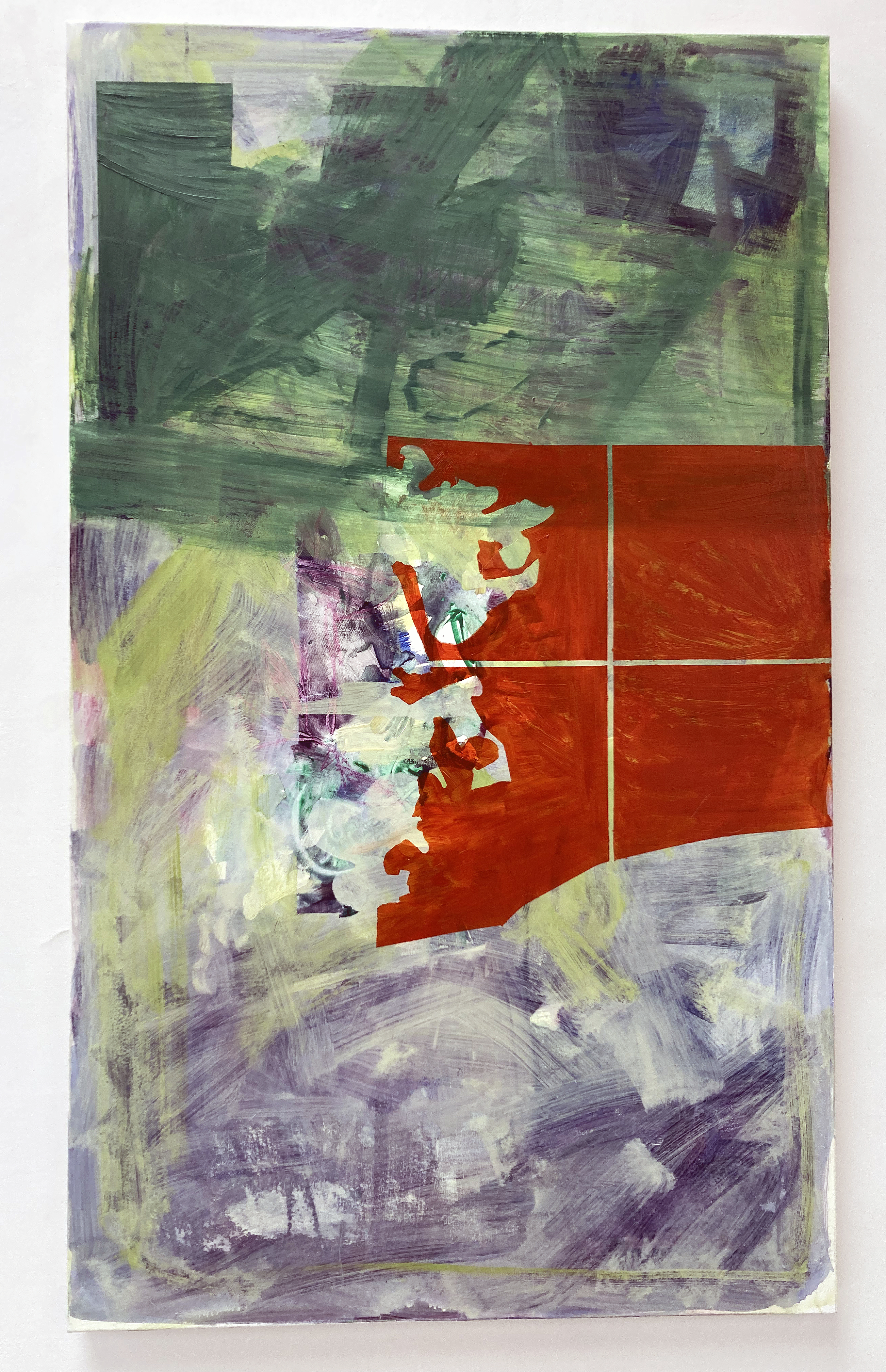
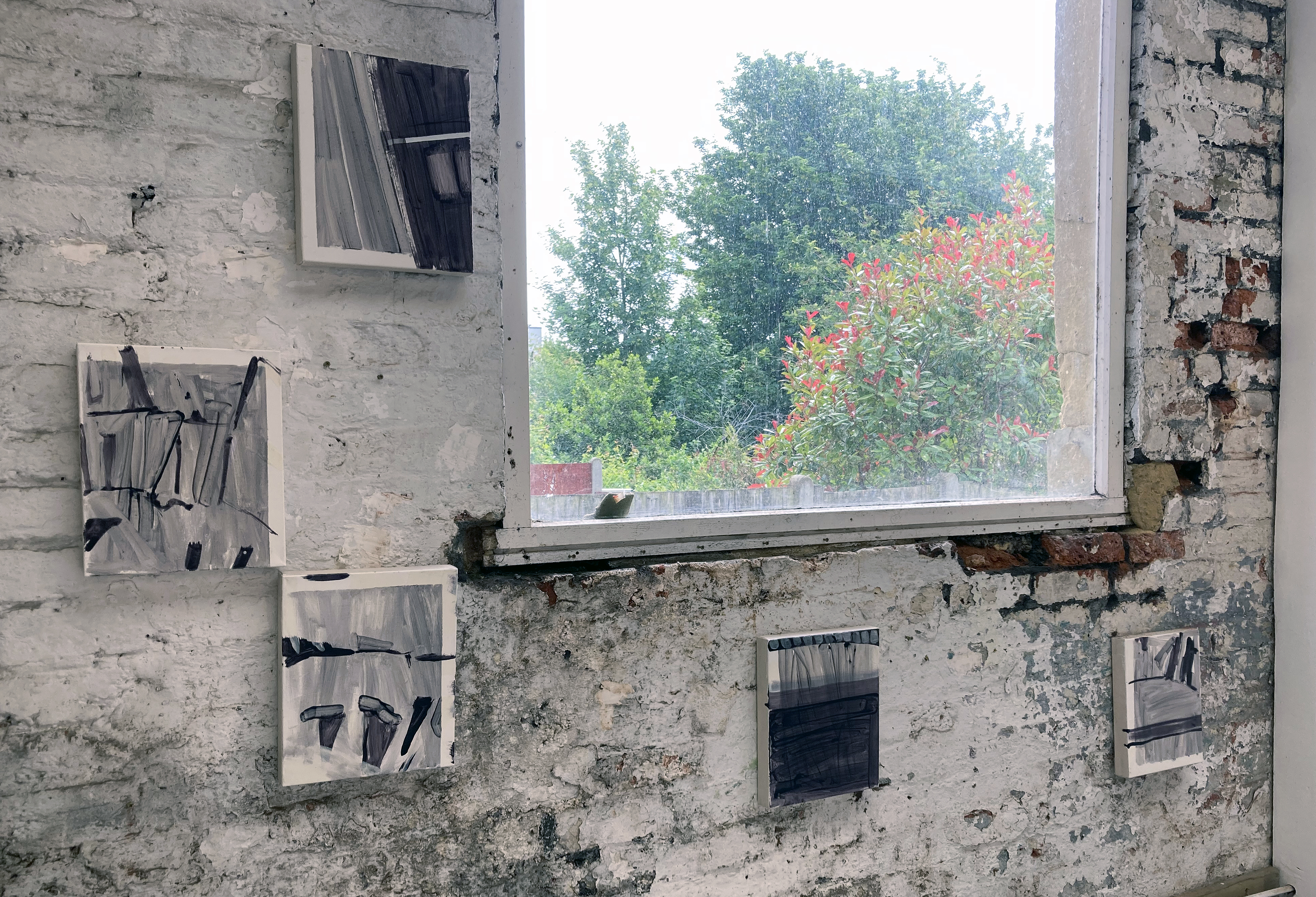
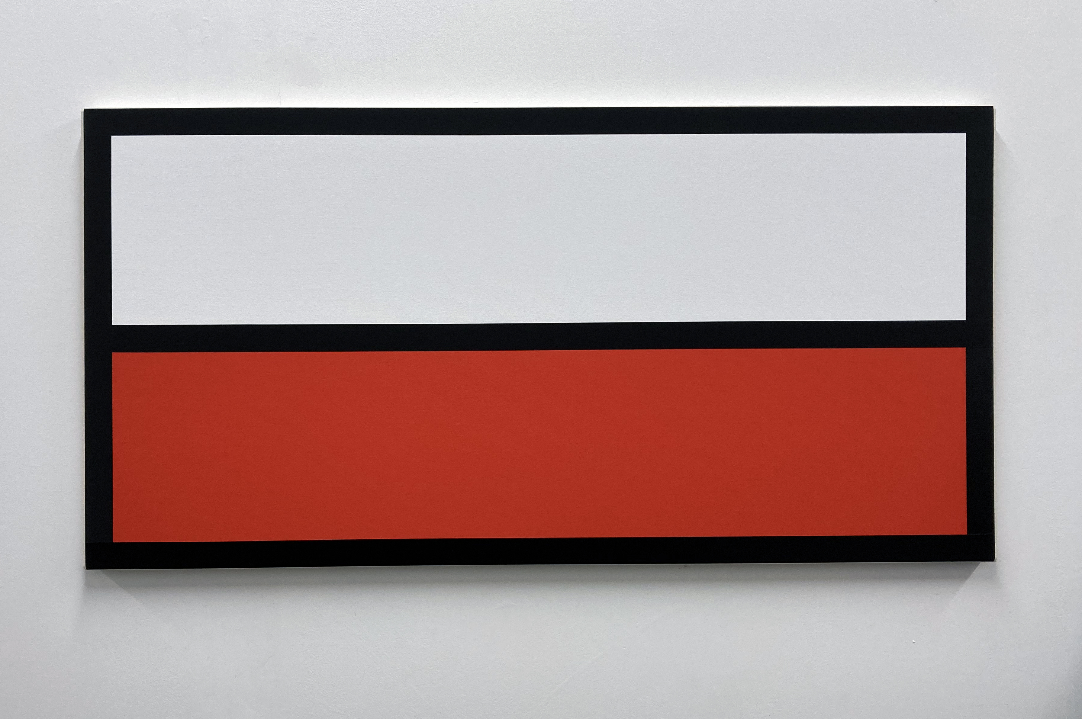
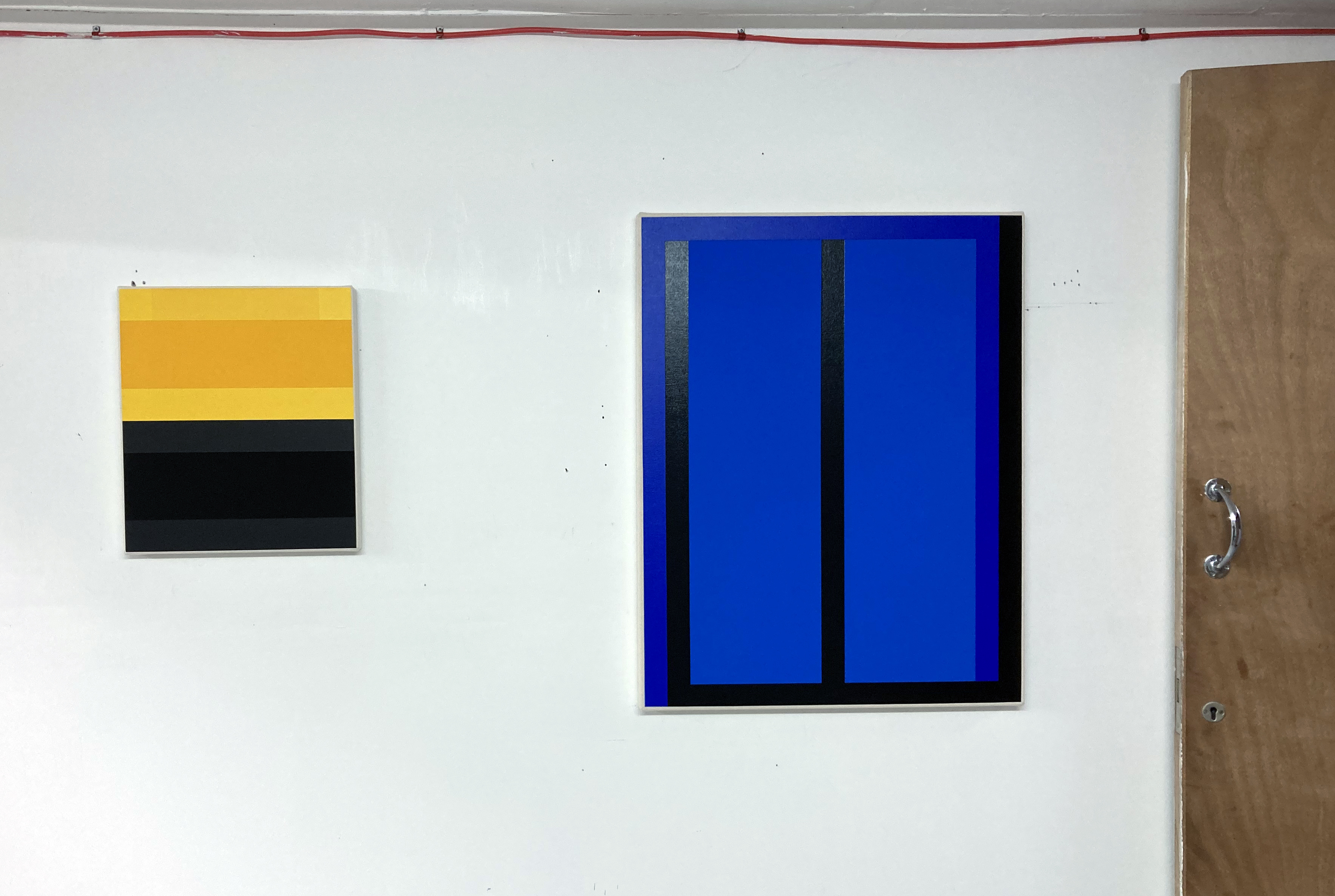
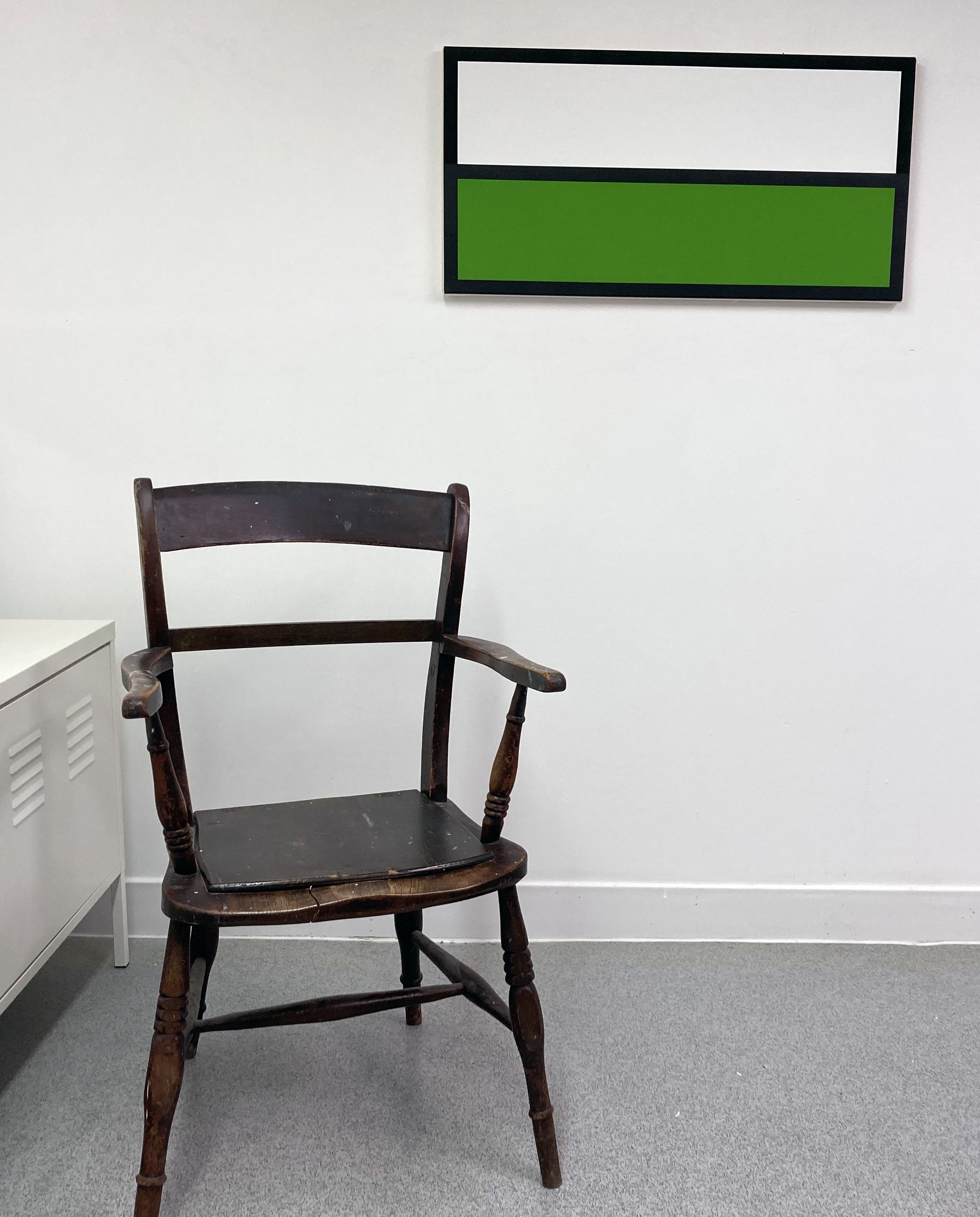
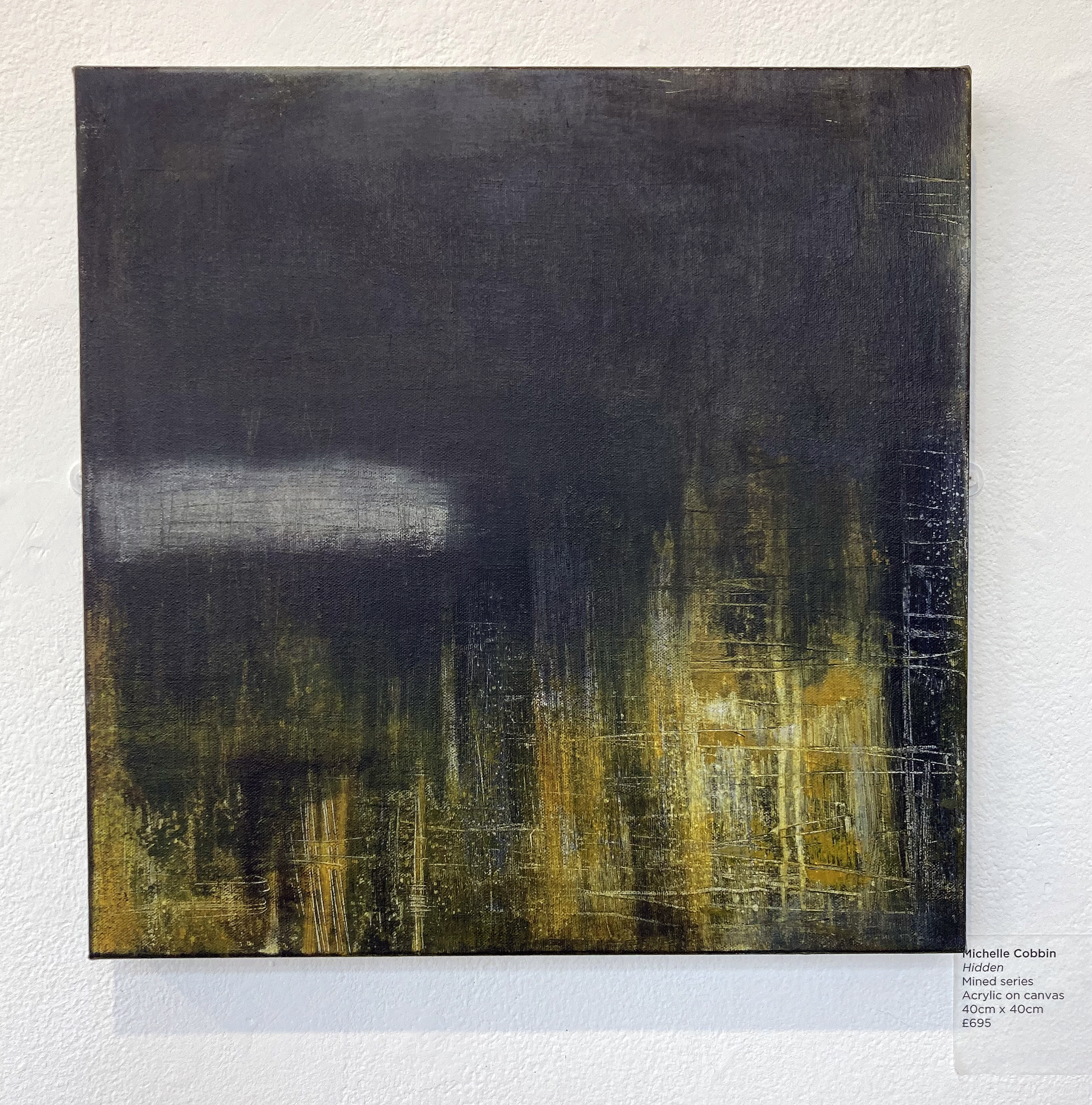
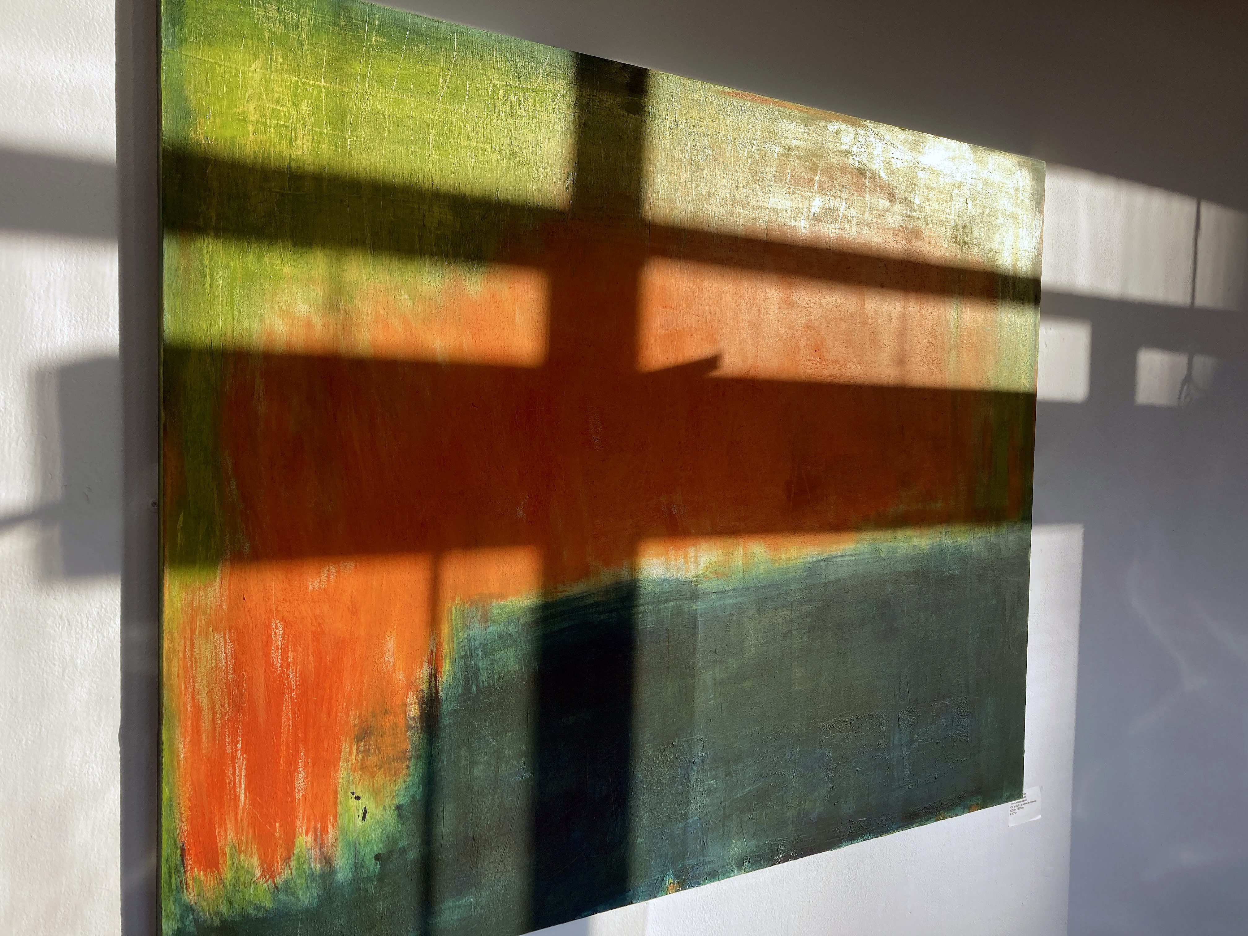
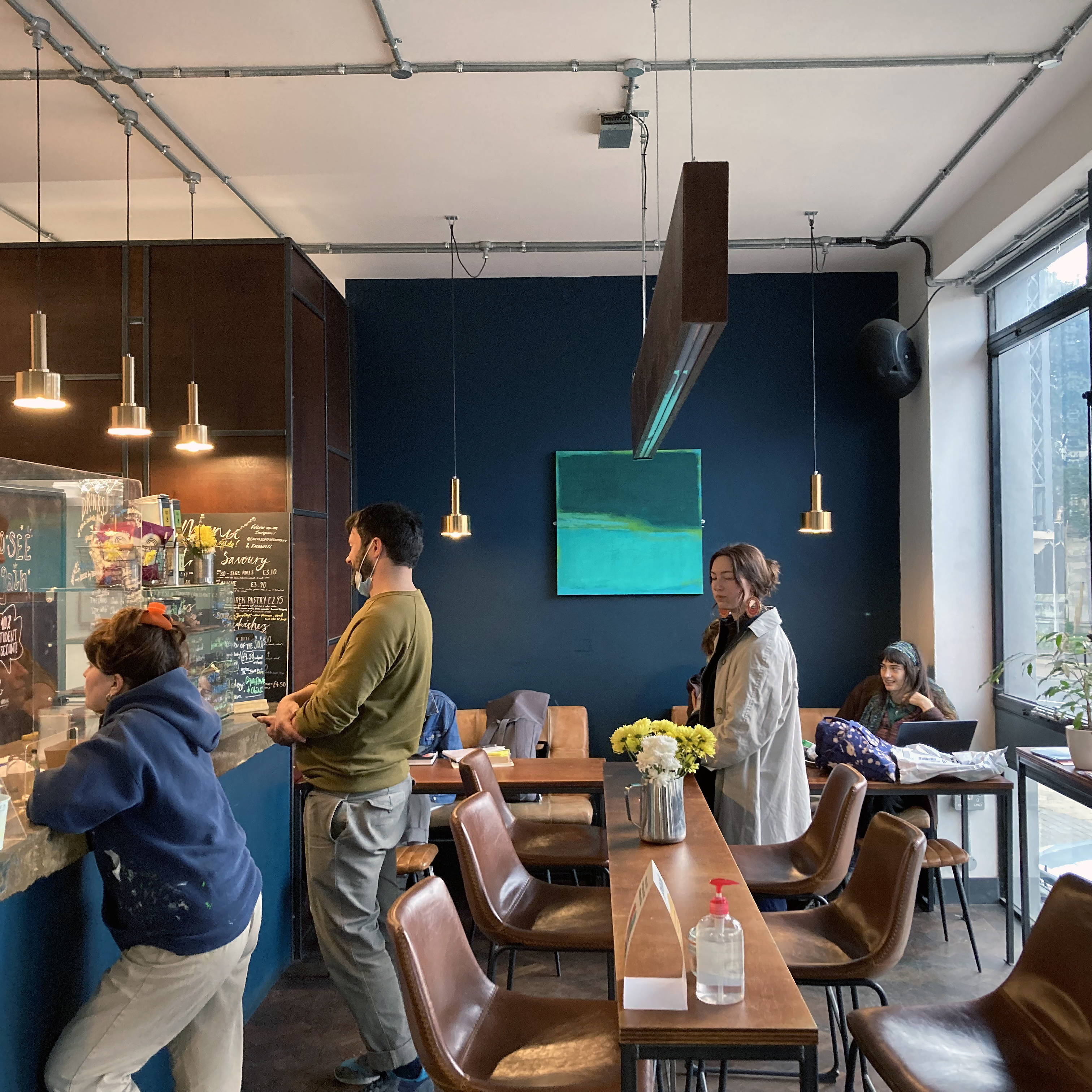
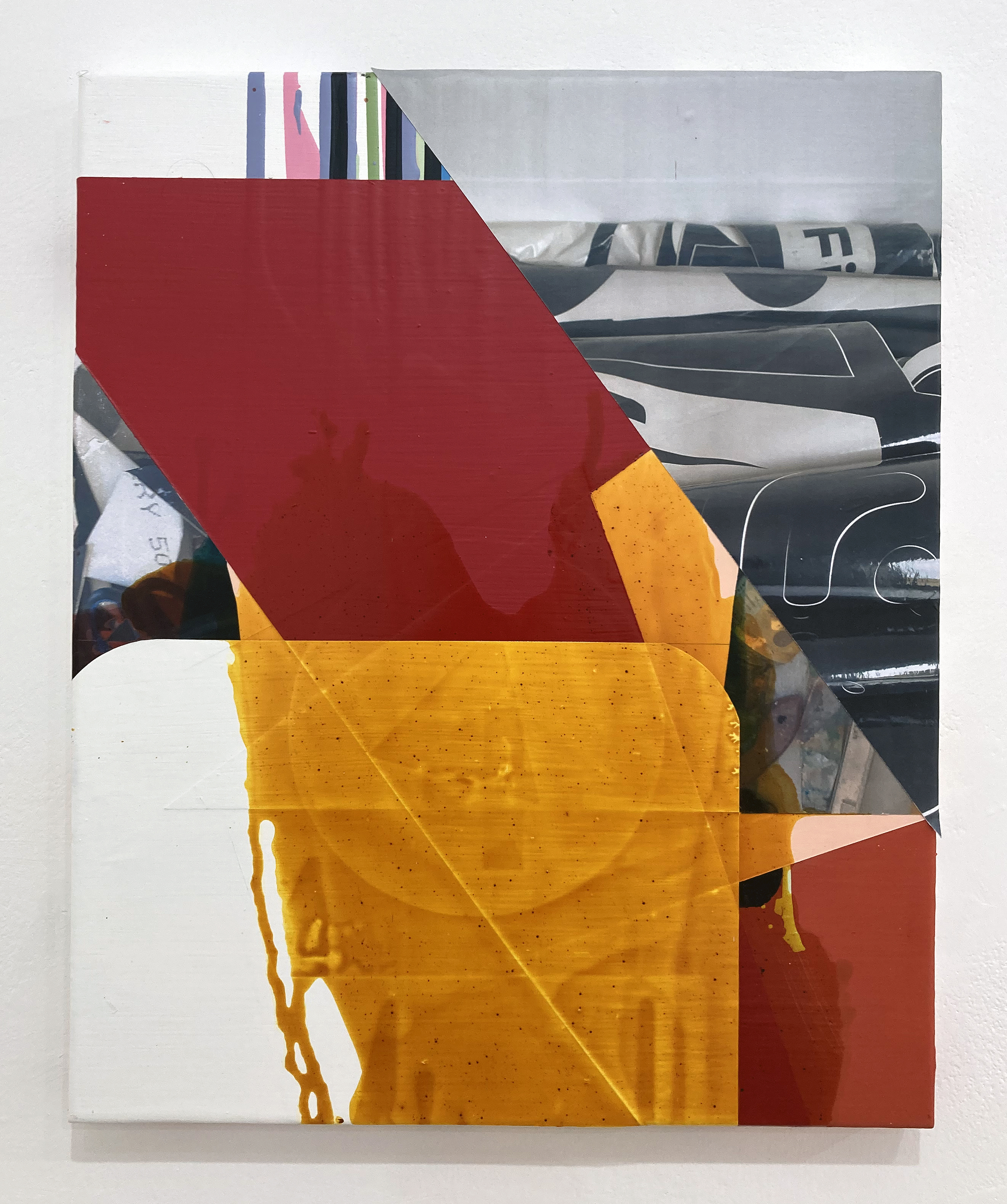
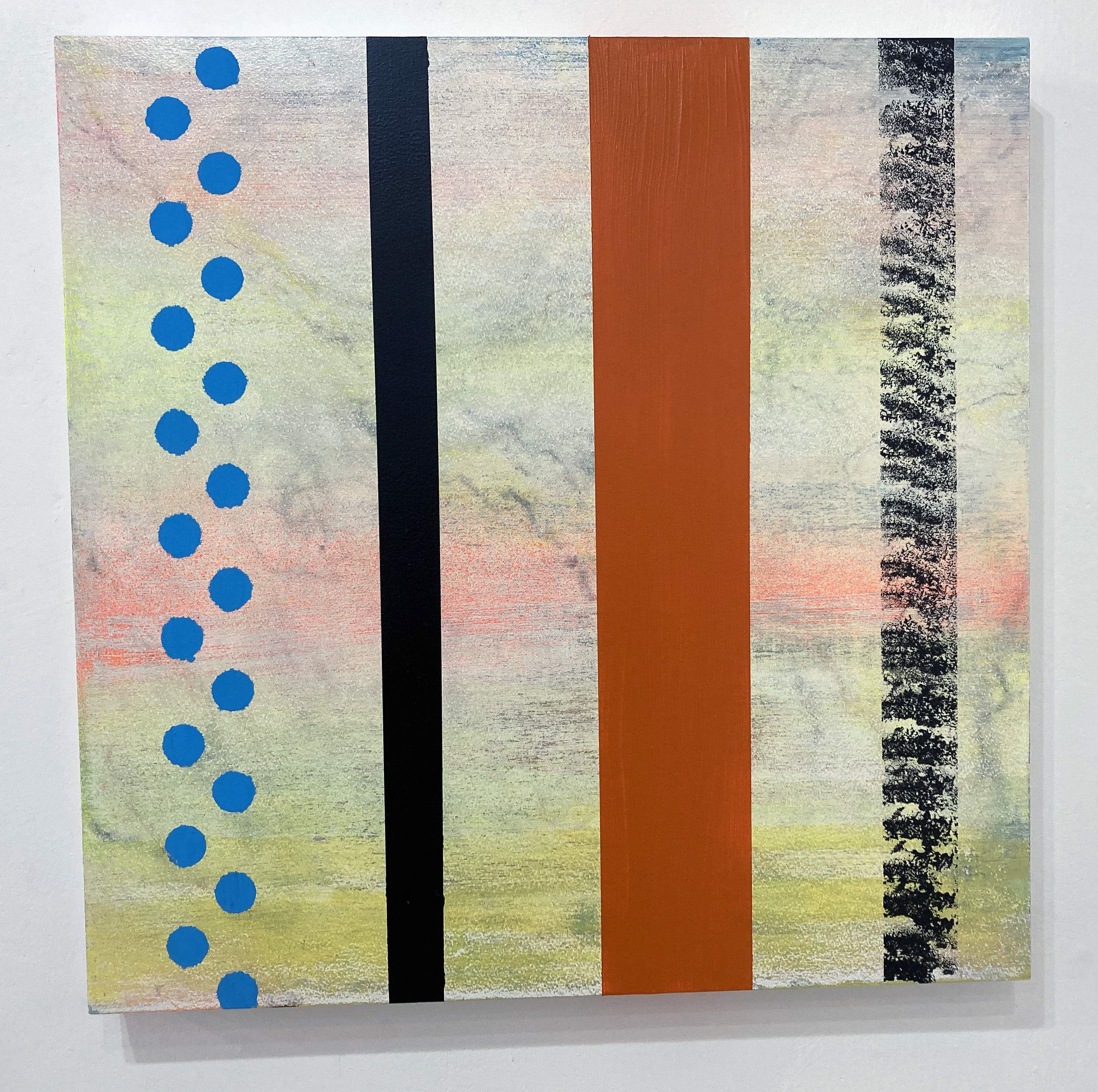
At long last I had travelled up to London to visit Tension gallery. It’s a trip that has been on my arty bucket list for some time now and the promise of coinciding a visit with a live Instagram discussion between Ken Turner and Michael Stubbs – lead by John Bunker – was bound to add something special and noteworthy to the occasion. So, whilst the Instagramers on-line could see the exhibition content (ten paintings in all) on their computer or mobile screens I had the benefit of seeing the works for real. Gallery host, Alison Aye recorded the event for close to an hour as she smoothly and expertly moved from one painting to another with her iPhone guided by the conversation.
It all felt a little like a contradiction in terms as the event was benefitting from digital technology by bringing us all together, despite not being in the same location as the paintings. Another distinctive and unique aspect for me was that, rather than having to generate my own thoughts and reactions as I looked at the works, I could jot down the commentary given to me in real time by the speakers. About this I have mixed feelings as focussing on one’s own thoughts whilst looking at the work on the walls is the usual – and most crucial – thing to do. I therefore had to suppress this activity somewhat and go with the contributions of the faces on the little screen held in my hand. I guess this is a little like being back at Uni making notes as the lecturer(s) speaks. One’s own thoughts, hopefully, emerge later.
Listening to three knowledgeable speakers, however, interweaving with each other verbally, and clearly being on the same wavelength turned out to be quite comfortable to deal with. In fact in some way I had been appropriately set up for this as I had spoken to John Bunker at his own exhibition called Antinomies at ASC Unit 3 gallery just the week before. As an abstract artist and an art writer himself he has that ability to distance himself into discussing works of abstraction in broad terms and then to apply his more intimate knowledge and experience as appropriate.
A few quotes follow in this paragraph, but they are not purely verbatim or chronological, so I shall not add quotation marks. The dominant theme that commanded the discussion was, as the title of the exhibition clearly states, thought (and its association with word related thinking) and the pure activity of painting that results in the abstract rather than the figurative. The notion of time, perhaps of a contemplative nature and being of a far longer duration than the immediacy of the digital culture that engulfs our visual experiences, was expressed by Bunker as thinking in paint, a slowing down form of looking and of contemplation. Stubbs added that when you are painting you are proceeding and that actions are made in advance of thought. Therefore thinking is contradictory and extends beyond itself. To this Turner added that thoughts and ideas couldn’t always be expressed in words, but by painting one is doing it (thinking) in different ways and that the activity of thinking is a long, drawn out process. There are overlaps too, an in-betweenness, a liminality in thought and painting, as there are things we feel but cannot say in words.
Bunker expanded the notion or understanding of thinking to the eye, mind and body – to which Stubbs referenced the studio and its literal, material content. The digital cropped up once more when Turner reminded us that subtle marks and textures in painting cannot be seen on a screen and that through painting we make some kind of sense of the world. This act of doing was crucial, he stated, between him and the canvas. To bring the absent Julian Wakelin in, Bunker remarked on the uncaniness about what Wakelin is doing and that in stillness there was that contradictory sense of paint moving. He pondered on whether the abstract painter might be hunting for stories and that by looking at the work (whilst in production) starts a dialogue with painting, giving a physical power to the work that cannot be underestimated.
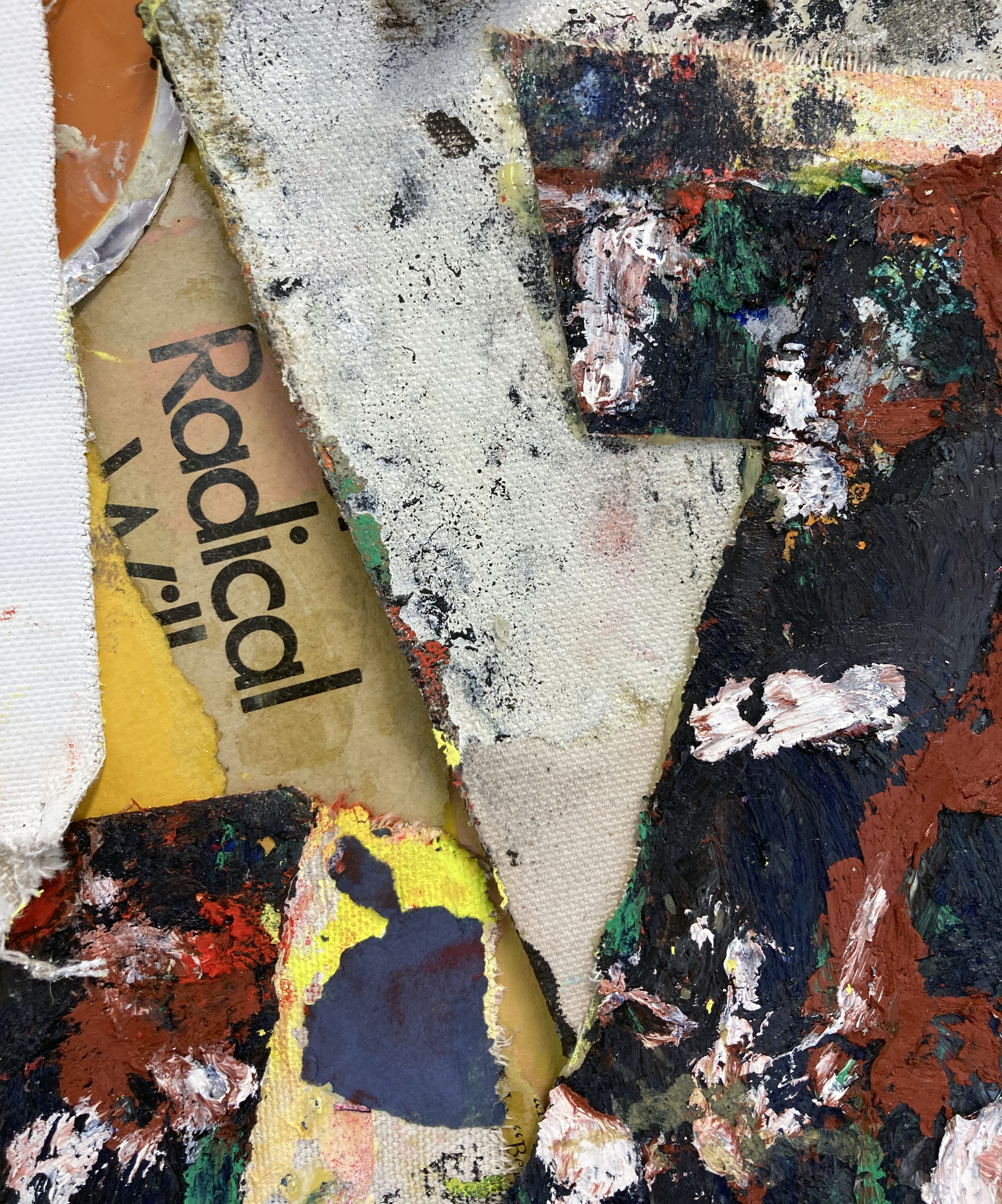
In a broader context, and perhaps one that can separate painters from (superficially) opposing camps at times, Stubbs referenced the process based and the procedural – and perhaps the contradiction of the less saying more. The abstract painter might add or subtract things to rupture ideas of figurative painting. But the abstract painter, today, has the burden of the history of abstraction e.g. the expressive or American abstraction. But, to place his work in the digital present and the contemporary reality, he could bring the outside world in, juxtaposing signage with abstraction.
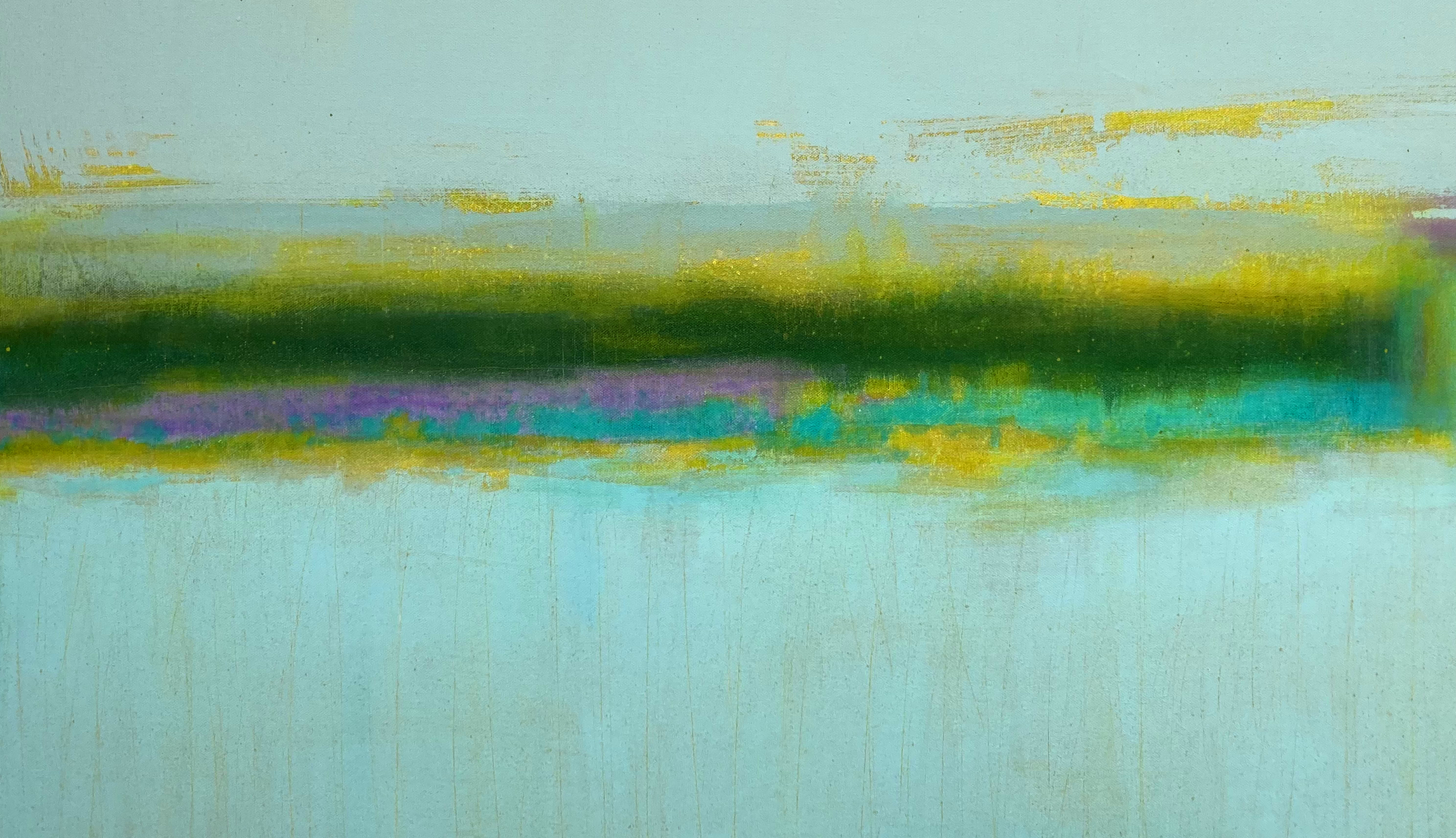
From this exhibition, not just the discussion, I was left with that welcome feeling of abstract paintings accommodating a real sense of place and space in the world – as concluded items. Finished and fixed so that the observer might concentrate on the paint and any additional media over the history of its painting. Works no longer in progress in the studio but here and now. Offering the promise of something maybe worth thinking or talking about. Or even reacting to, and accepting, in a pure mode or silence, just pure acceptance.
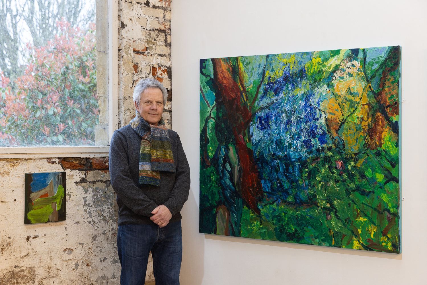
Geoff Hands – November 2025
Links:
We are an artist run gallery dedicated to showcasing the work and raising the profiles of emerging and mid career local, national and international artists. We show a mixture of contemporary & experimental art that questions what art is and what art could be.