Visual art is never totally a form of escapism, even if a gallery visit takes us out of our ordinary, everyday for a while. In the UK we inherit a long-standing interest in the represented landscape and the people and places therein. Stepping into the temporary exhibition space on the ground floor of the Towner the visitor, like me, who essentially was there to see the J.M.W. Turner watercolours on display in ImpressionsinWatercolour, might already have felt more than satisfied with their visit having viewed a multitude of landscapes either aesthetically breathtaking or superbly sublime.
But an organisation such as the Towner pursues a positive remit to celebrate both the past and the present for a broad range of visitors. Thus, the Towner Emerging Artist Fund has supported a slightly reduced version of Dana Awartani’s exhibition, Standing by the Ruins, originally shown at the Arnolfini in Bristol earlier this year. Awartani, a Palestinian-Saudi artist now based in New York, references the craft, history and traditions of the Middle East in her broad ranging practice and applies her universal themes to the present day. This is a highly thought provoking exhibition – and I cannot see Awartani being designated as emerging for too long. She has also been chosen to show her work in the National Pavilion of Saudi Arabia in the Venice Biennale in 2026 and if you Google her name there’s much to read on-line already and this makes it unnecessary for me to echo what other writers have already written about this work.
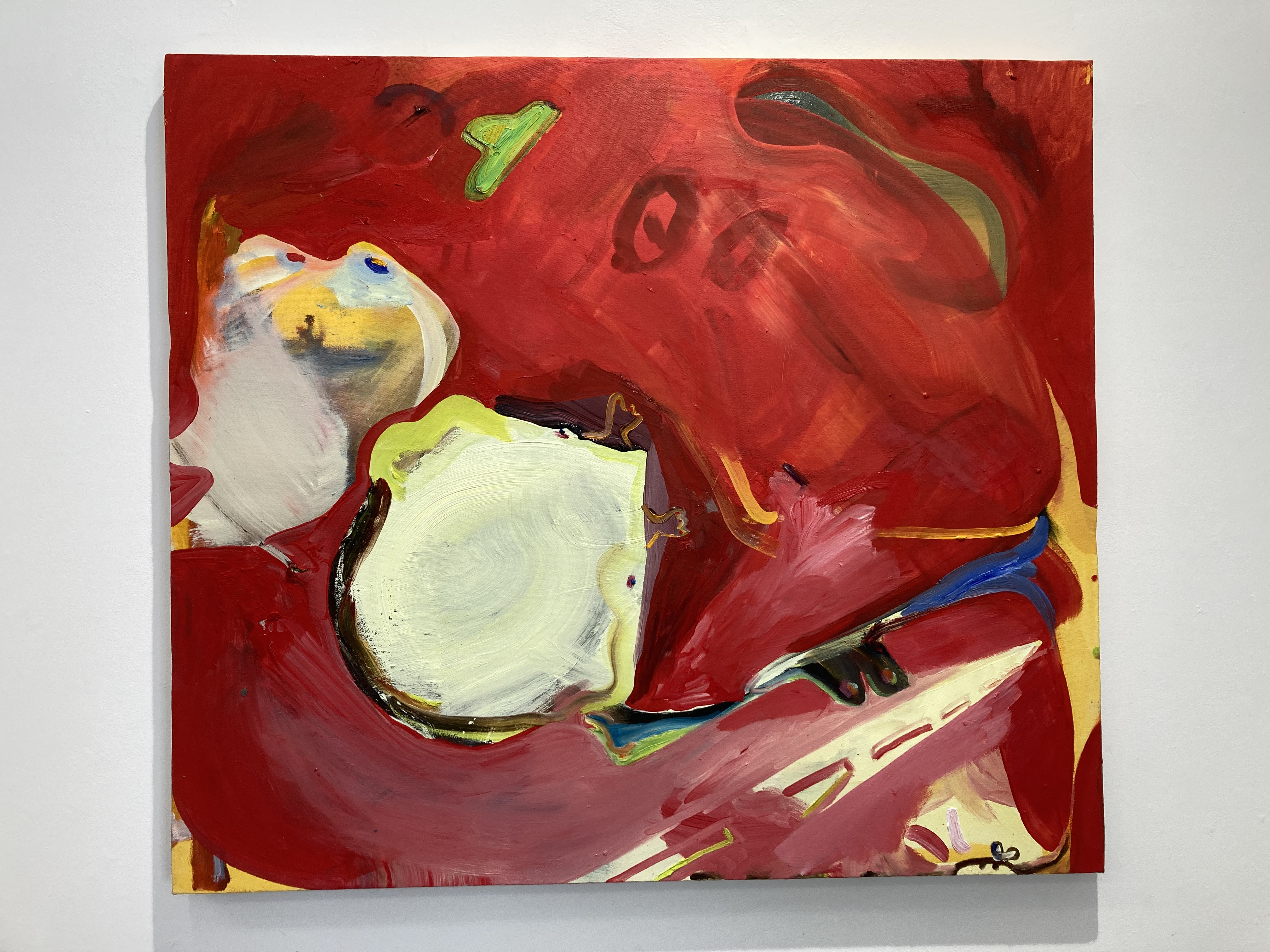
Dana Awartani – Standing by the Ruins III
I do not really know what others will have thought of the Towner display, particularly as I was there on the opening night before I have had an opportunity to talk to friends who have seen it for themselves. Not all exhibitions linger in the mind for too long either – but I suspect that this one will. At least it should do, even if for lamentable and distressing reasons. Sadly, but necessarily, we are aware to some degree of the religiously and politically inspired cultural and economic destruction that is going on in the wider world right now. We may well be shouting at our TV screens most nights, but I doubt we regret the choice available to switch off both literally and mentally before retiring for the evening. There might be a sense of the elsewhere that protects us emotionally. Meanwhile we can have a good old gripe about the potholes the local Council fails to fix, the frequently poor performance of our various water companies, or that yet another public library is closing due to lack of funds. If we do still manage to follow the TV news without depression and/or anger setting in too overwhelmingly (choose your own issues to be frustrated by) we can always counter this by getting out and securing an aesthetic fix from visiting an art gallery. Oddly, though positively, in Standing by the Ruins both positive and negative emotions can organically combine.
Dans Awartani – Standing by the Ruins III
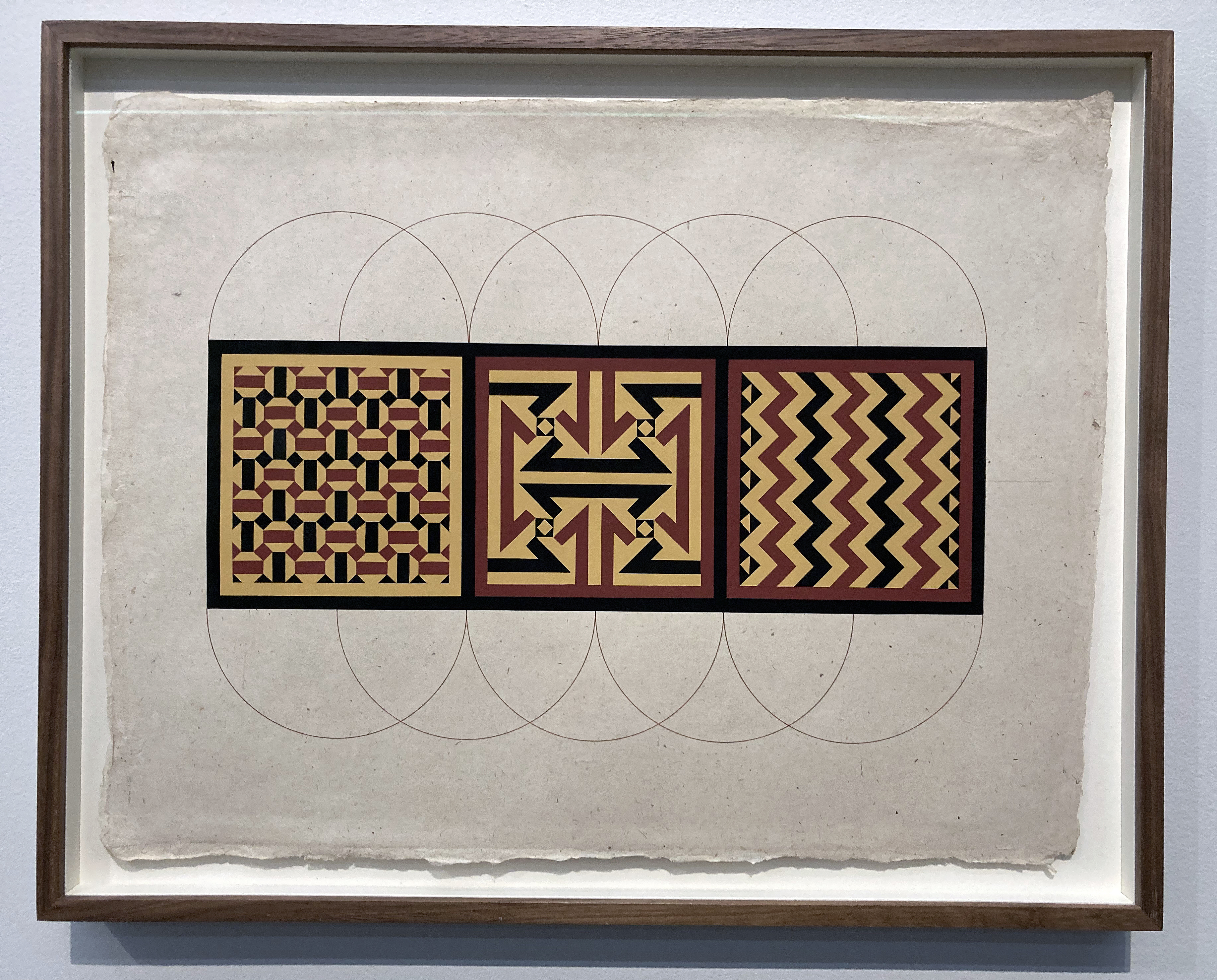
In Awartani’s work that element of visual delight, dexterity and excellence is certainly foremost, particularly in an applied design sense. The drawings and paintings for her Standing by the Ruins series in 2D and 3D outcomes, reveals an impressive level of skill in applying a traditional, age-old geometric system of drawing and pattern making employing a compass and ruler (not a digital program) into architectural references. Something that looks good draws us in. Form and content interweave.
Dana Awartani – Study Drawing 3 2025
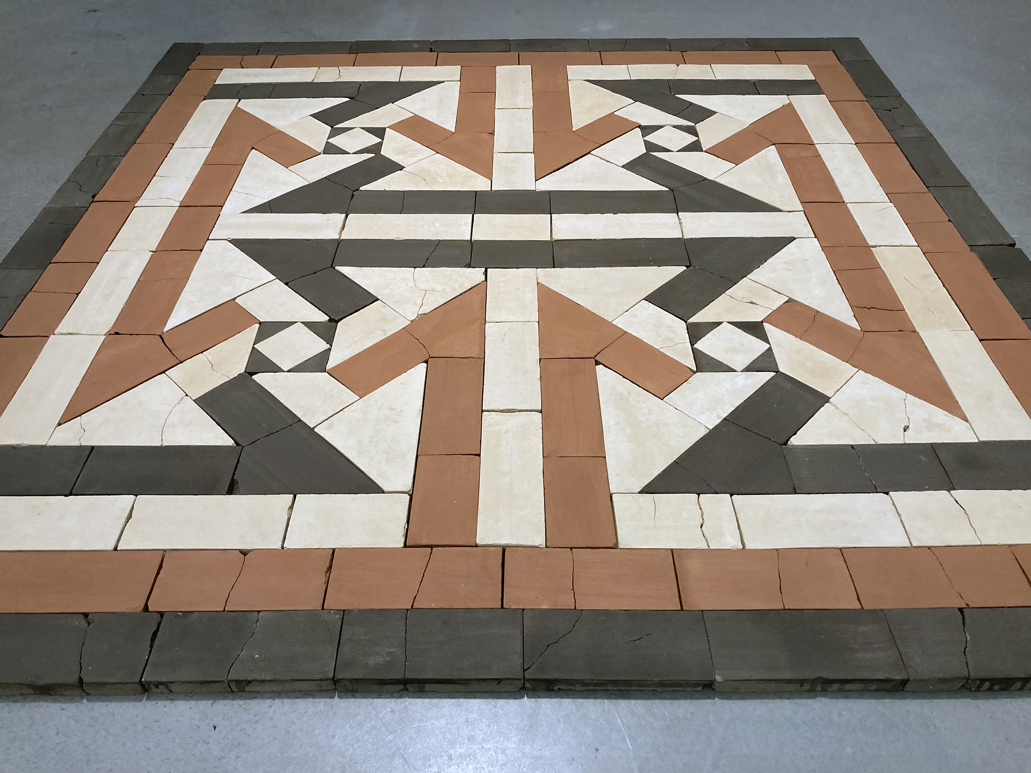
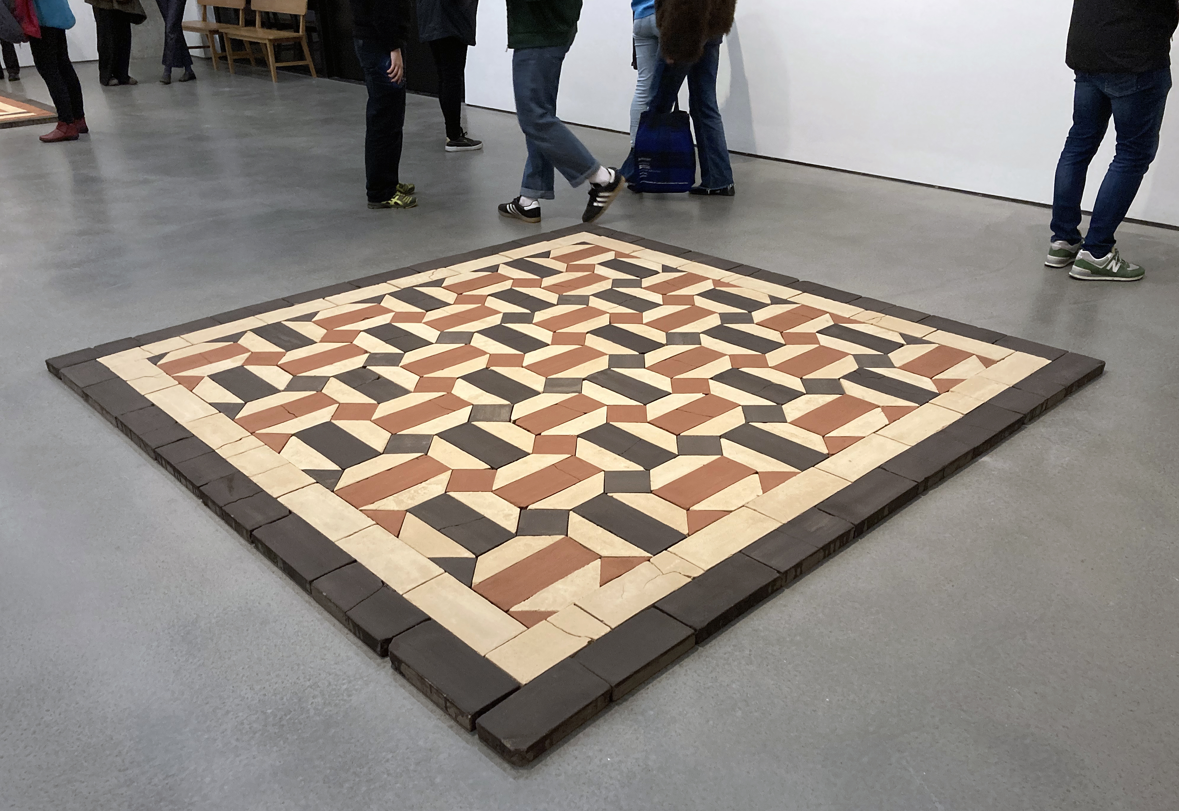
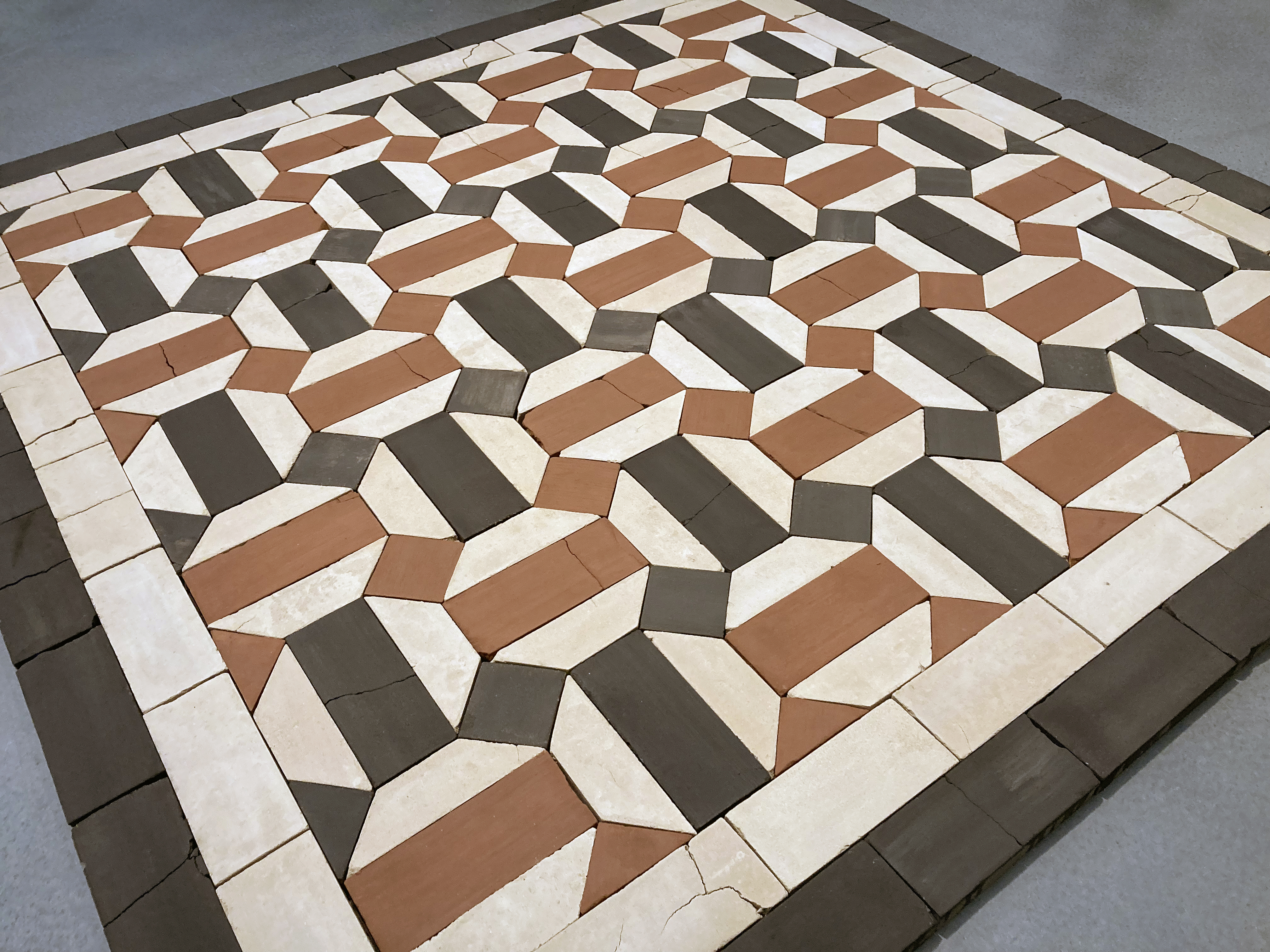
But before being drawn to the works displayed on the walls the works that the visitor will probably notice first are three floor-based arrangements of coloured bricks that the designs on the wall back up. These are the ruins that the exhibition title references – recreated sections of the floor of the Hammam al-Samara in Gaza, one of the oldest bathhouses in the region, but which has now probably been destroyed. To enhance the notion of destruction and obliteration the bricks are cracked and well on the way to further decimation. The artist worked with a collective of adobe brick makers (craftspeople of Syrian, Afghan and Pakistani origin) and deliberately left out the binding agent (hay) so the works are purposely intended to break up.
Whilst these would-be floors are adequately placed for the visitor to walk around there is a slight sense of the possibility of tripping, though no one does. The works are clearly installed rather than functioning as sculptures. Quite soon college tutor mode kicks in for me and, if I was questioning the young maker in an end of project tutorial, I may have commented that I want to see people walk on these floor coverings. Get on trend – employ the audience as active participants. In fact, I imagine being one of them myself. I visualise seeing the piece(s) destroyed, not because I dislike the work, but because the volume of the heavily implied message might, metaphorically, be turned up. If we accept that somewhere down the line we, and the governments we elect, are all complicit to some degree in the endless tragedies of the world, we are, by implication, the destroyers too, so lets be more physically involved here. Thereafter, more bricks could be made to replace the sculpture anyway, for a never-ending sequence of works to be installed elsewhere. But this is a male response. And that’s the problem.
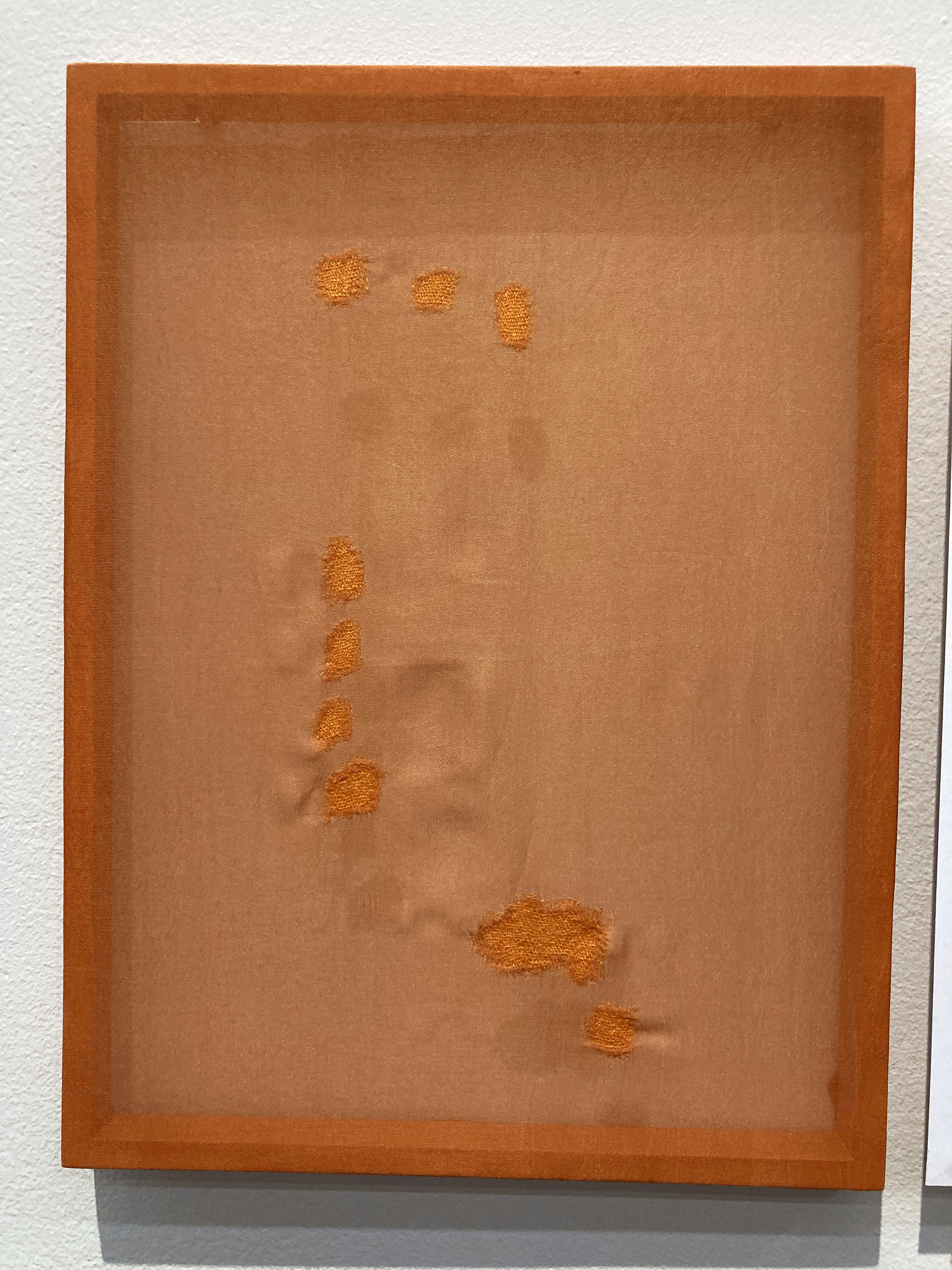
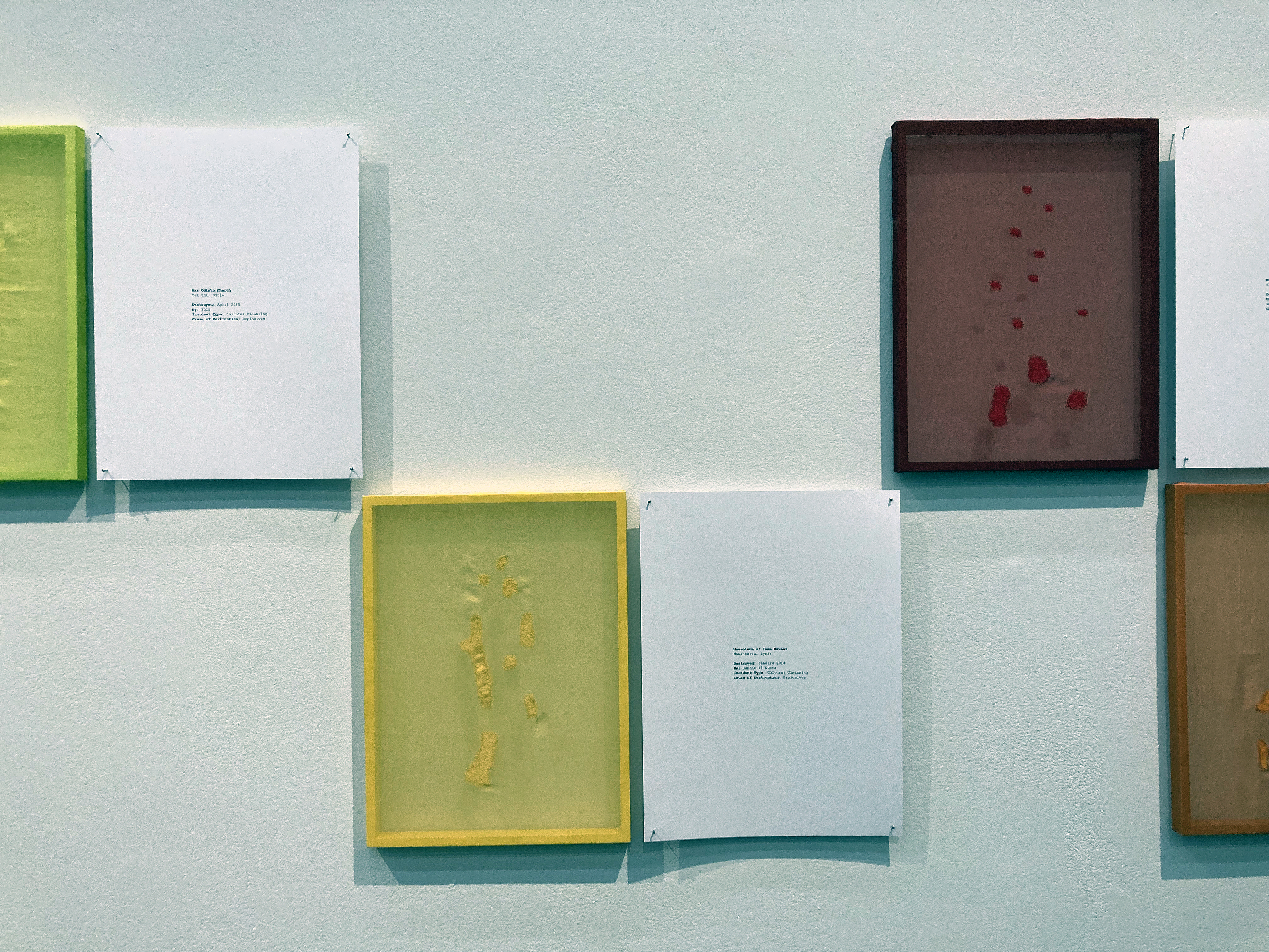
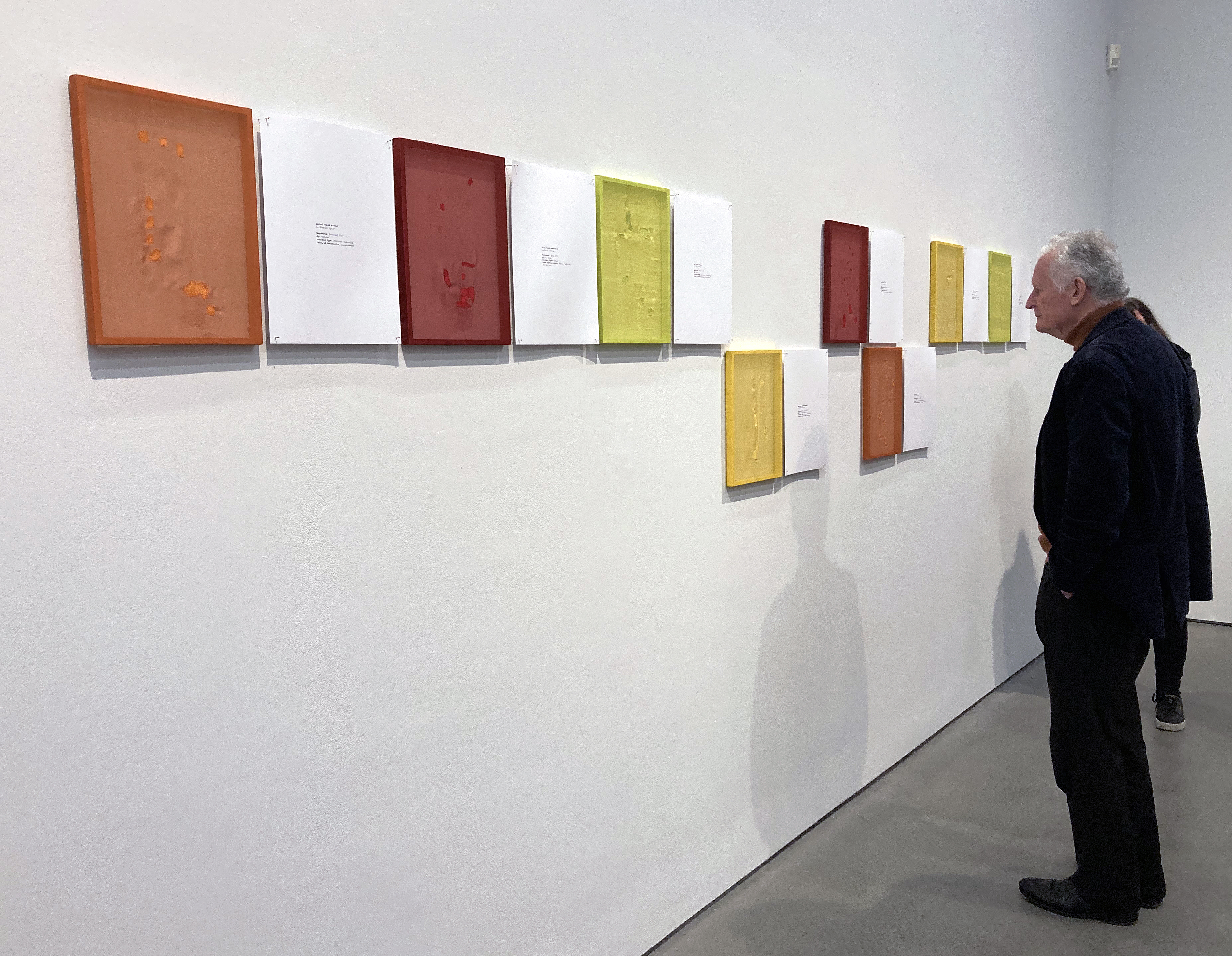
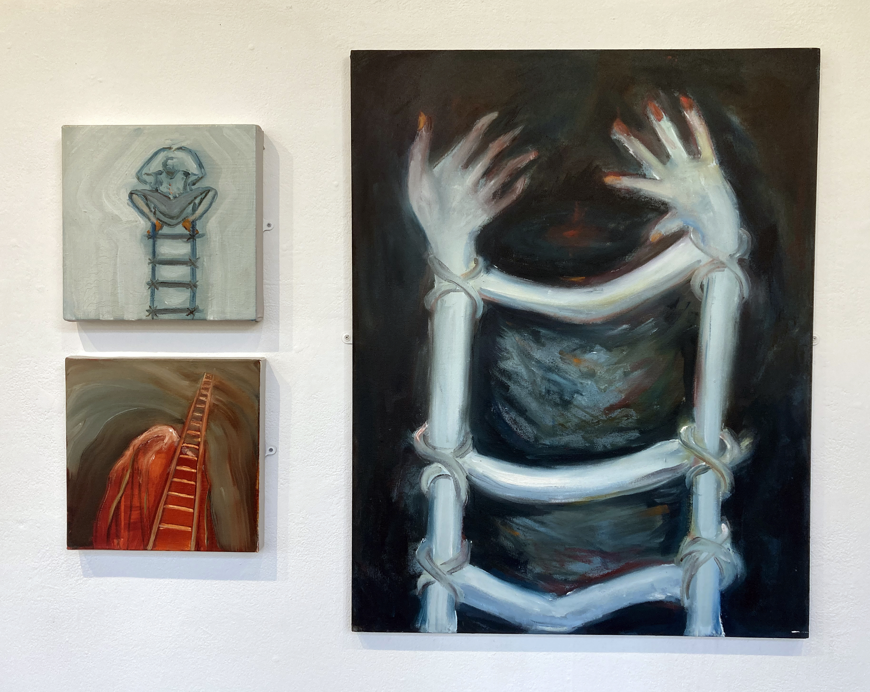
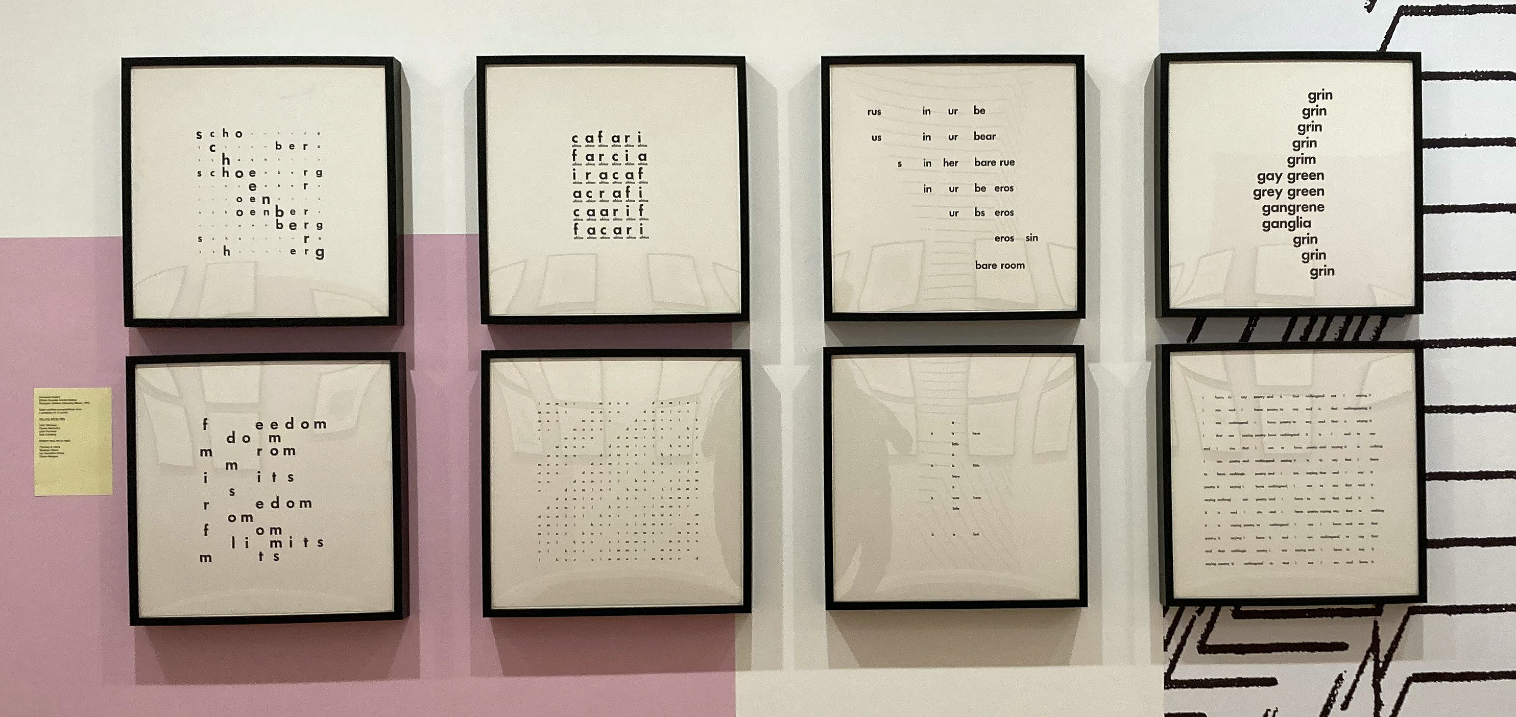
To reflect on this initial reaction, a quick summarising that has its routes in a previous modusoperandi in fine art education, I was possibly thrown by that term emerging. I had too soon adopted an attitude that wanted to question and to advise this young artist. Arrogance, I know, but bear with me. My imaginary student might next have advised me to consider a set of other works displayed on the wall. These are from the Let me mend your broken bones series. In these works she has employed others to participate. Not in destroying but in making and mending by darning on medicinally dyed silk and implying a more positive attitude to life of preserving rather than wrecking. A female response – albeit embodied in hard reality.
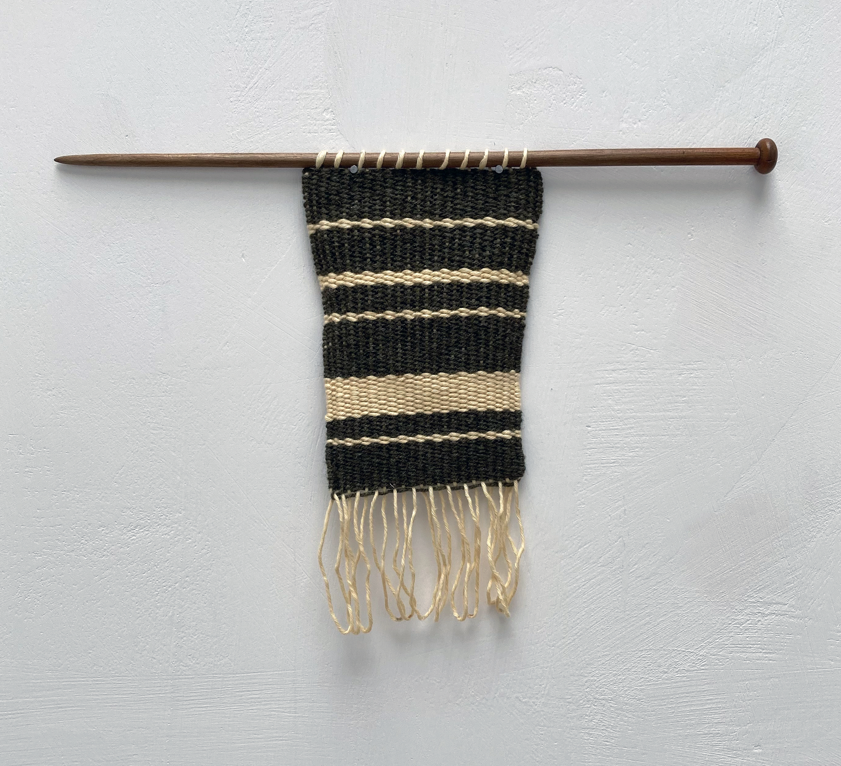
Dana Awartani – Let me Mend Your Broken Bones
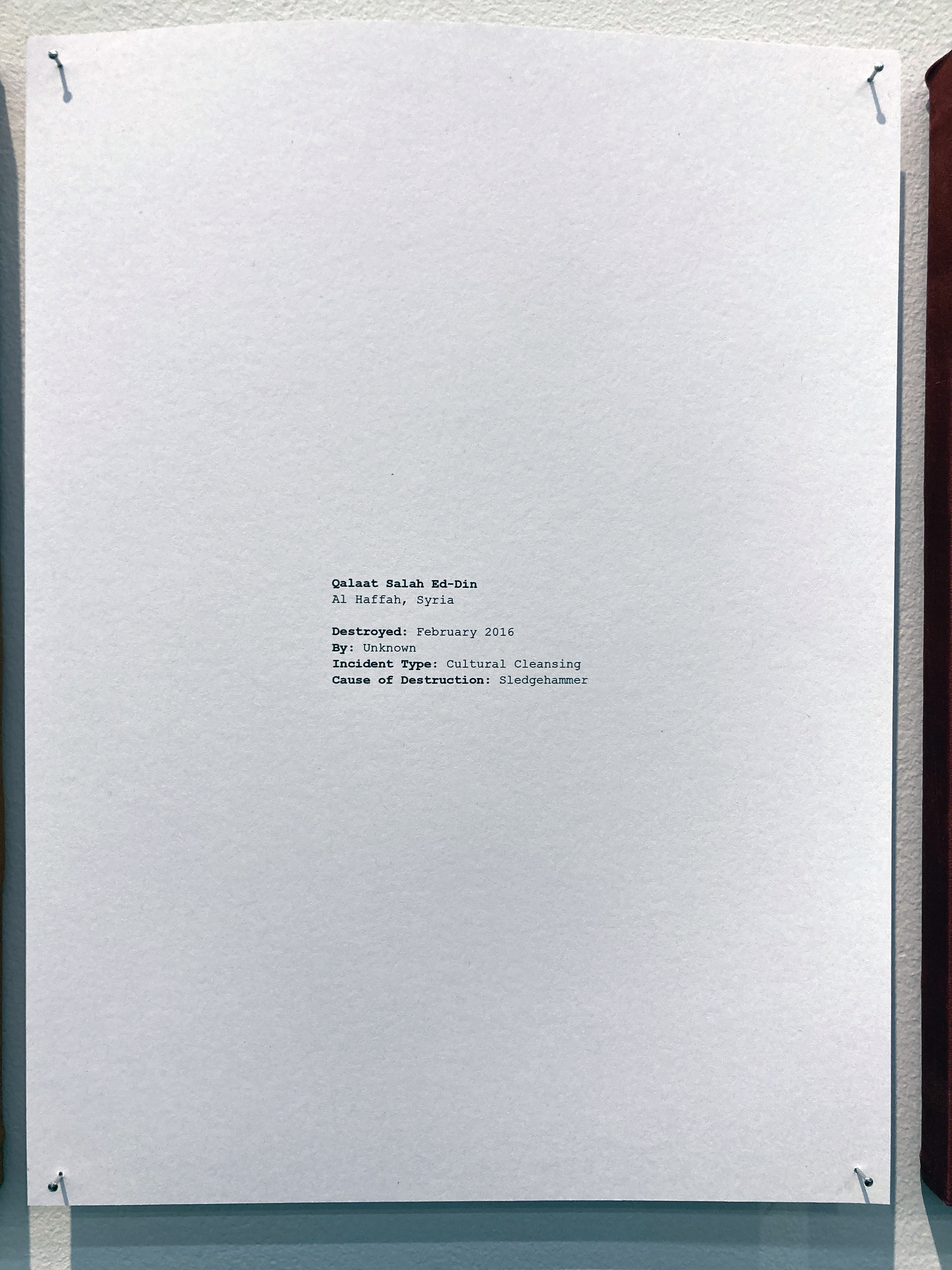
Initially the colour range might draw the observer to them, with attractive dyes of orange, red yellow and green. But get up close and we see a previously, a purposely, distressed surface that is fixed but permanently scarred. Paired paper panels display a text that records the scene’s recent history. The where, when, by whom, incident type and cause – listed methodically. Cold black text on a white background. Record keeping. Factual. Cultural cleansing is a term that terrifies and is certainly not confined to the Middle East. The interests, cultural background and broader context of an individual – such as an artist or any of the visitors to this exhibition – are always part of a much larger whole. This, of course, is stating the obvious. What may not always be so apparent or impactful is the fact that what might initially be considered as happening elsewhere, instigated by others, relates to our own history too. In a postcolonial age we now might think it’s in the past. Seeing this exhibition and letting it sink in for days after is sobering.
Dana Awartani – Let me Mend Your Broken Bones (text)
Standing by the Ruins is how Awartani operates. It constitutes an active positioning. Her work responds a little more quietly and contemplatively than a reactive, impulsive temperament might. The work acknowledges creation as a response to death and ruination; counters destruction with gentleness, positive even if piecemeal, literally re-making and mending. A slow and time-consuming process that is appropriate, for lives and lands are precious, and the relationship between each other and others can be far more accommodating of perceived differences. Hence the importance of landscape related themes in art from any era and of what is, and was, witnessed in various locations. So, if I might cheekily paraphrase a short statement from an essay in the catalogue* from the Impressions in Watercolour exhibition by Ian Warrell: “Turner had… contributed substantially to the transformation of perceptions of landscape subject matter…”
Dana Awartani changes our perception and understanding too.
Dana Awartani – Let me Mend Your Broken Bones
Geoff Hands, Brighton (December 2025)
* Essay: Nature raw or cooked: Approaches to Sketching in British Landscape Watercolours by Ian Warrell, published in Impressions In Watercolour: Turner and his Contemporaries. (Holburne Museum, Bath, 2025)
Forms of postcolonial destruction continues today, aided and abetted by super powers to the east and west – even here in Brighton where L3Harris (the sixth largest defence contractor in the USA – and the world’s largest manufacturer of precision weapons) produces parts for the F-35 fighter jets used by the Israeli government to help destroy Gaza and the Palestinians living there.
AI Overview: Thinking is the mental process of manipulating information to form concepts, reason, and make decisions. It is a form of cognition that involves activities like problem solving, judgment, and memory retrieval, and it allows us to interpret, categorize, and make sense of the world around us. (From Google)
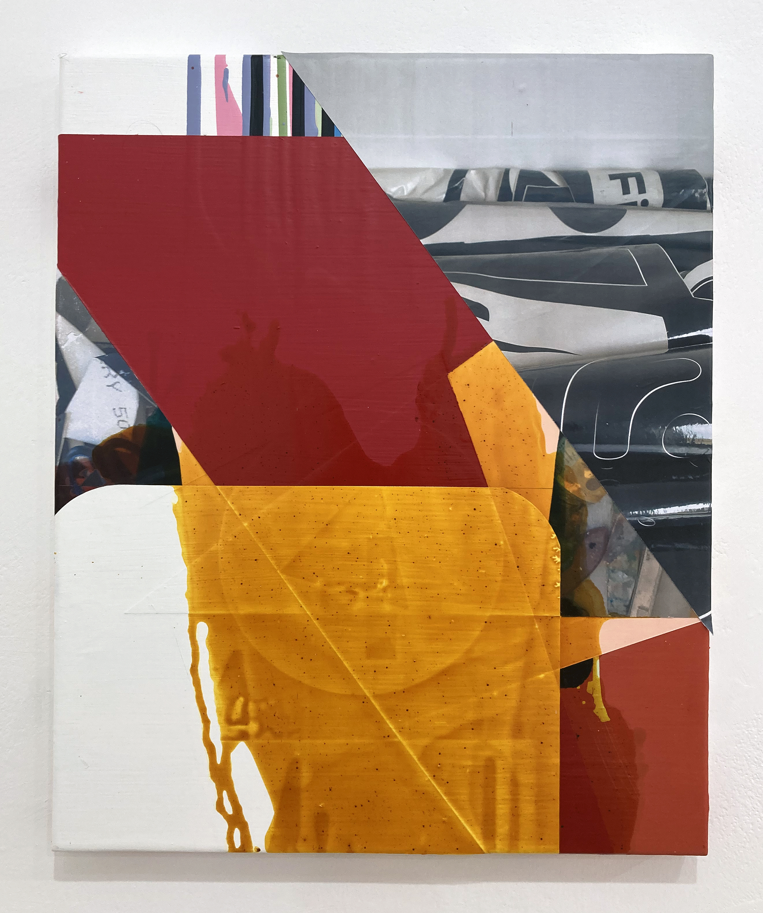
We surely do not know for sure what Michael Stubbs, Ken Turner and Julian Wakelin were thinking whilst making these works for Thinking In Paint. But we certainly have something to see, to experience and to think about ourselves now that their works have been selected and presented.
Michael Stubbs – Signal 502 [2024]
As an immediate reaction I prefer to avoid (for as long as I can) such sentiments as I like this or dislike that. Reactions can be direct and instantaneous, but ideally require a little time to ferment. Initial thinking, at least, can be characterised by simply taking various formal and material aspects in, such as colours, shapes, textures and the relationships between such features. This thinking might initially be described as feeling and perhaps usefully delays anything too conclusive. One can also see with the benefits of art historical knowledge – sometimes a prejudiced lense – and from personal experience of looking at paintings before, or from being painters ourselves. We may be susceptible to personal preference (I know what I like) and bias at times, but hopefully reasoning and rational judgement will enable an honest experience. Even uncertainty or ambiguity might take hold.
Ken Turner – Reformed [2025]
A group of paintings, whether by an individual or three individuals, sets up possible contrasts too. Yet I prefer to register works individually, even though my own practice invariably produces the series. Visual judgements can change of course, particularly as works sink in. Taking photographs of the works on the iPhone to view later is highly beneficial too, despite forming a bit of a contradiction as a realreproduction. For an exhibition called Thinking In Paint, that might eschew the digital in favour of the material object, it is imperative that the paintings are (ideally) viewed as they were created in their corporeal, material reality. Add sufficient time with the individual works in question to become accustomed, as it were, will also be a necessary factor. A lifetime might be ideal. But we generally only have our exhibition visits to provide such an experience.
At long last I had travelled up to London to visit Tension gallery. It’s a trip that has been on my arty bucket list for some time now and the promise of coinciding a visit with a live Instagram discussion between Ken Turner and Michael Stubbs – lead by John Bunker – was bound to add something special and noteworthy to the occasion. So, whilst the Instagramers on-line could see the exhibition content (ten paintings in all) on their computer or mobile screens I had the benefit of seeing the works for real. Gallery host, Alison Aye recorded the event for close to an hour as she smoothly and expertly moved from one painting to another with her iPhone guided by the conversation.
Michael Stubbs – Virus Bleed [2024]
It all felt a little like a contradiction in terms as the event was benefitting from digital technology by bringing us all together, despite not being in the same location as the paintings. Another distinctive and unique aspect for me was that, rather than having to generate my own thoughts and reactions as I looked at the works, I could jot down the commentary given to me in real time by the speakers. About this I have mixed feelings as focussing on one’s own thoughts whilst looking at the work on the walls is the usual – and most crucial – thing to do. I therefore had to suppress this activity somewhat and go with the contributions of the faces on the little screen held in my hand. I guess this is a little like being back at Uni making notes as the lecturer(s) speaks. One’s own thoughts, hopefully, emerge later.
Listening to three knowledgeable speakers, however, interweaving with each other verbally, and clearly being on the same wavelength turned out to be quite comfortable to deal with. In fact in some way I had been appropriately set up for this as I had spoken to John Bunker at his own exhibition called Antinomies at ASC Unit 3 gallery just the week before. As an abstract artist and an art writer himself he has that ability to distance himself into discussing works of abstraction in broad terms and then to apply his more intimate knowledge and experience as appropriate.
Julian Wakelin- Time (lag) [2025}
A few quotes follow in this paragraph, but they are not purely verbatim or chronological, so I shall not add quotation marks. The dominant theme that commanded the discussion was, as the title of the exhibition clearly states, thought (and its association with word related thinking) and the pure activity of painting that results in the abstract rather than the figurative. The notion of time, perhaps of a contemplative nature and being of a far longer duration than the immediacy of the digital culture that engulfs our visual experiences, was expressed by Bunker as thinking in paint, a slowing down form of looking and of contemplation. Stubbs added that when you are painting you are proceeding and that actions are made in advance of thought. Therefore thinking is contradictory and extends beyond itself. To this Turner added that thoughts and ideas couldn’t always be expressed in words, but by painting one is doing it (thinking) in different ways and that the activity of thinking is a long, drawn out process. There are overlaps too, an in-betweenness, a liminality in thought and painting, as there are things we feel but cannot say in words.
Julian Wakelin – Untitled [2025]
Bunker expanded the notion or understanding of thinking to the eye, mind and body – to which Stubbs referenced the studio and its literal, material content. The digital cropped up once more when Turner reminded us that subtle marks and textures in painting cannot be seen on a screen and that through painting we make some kind of sense of the world. This act of doing was crucial, he stated, between him and the canvas. To bring the absent Julian Wakelin in, Bunker remarked on the uncaniness about what Wakelin is doing and that in stillness there was that contradictory sense of paint moving. He pondered on whether the abstract painter might be hunting for stories and that by looking at the work (whilst in production) starts a dialogue with painting, giving a physical power to the work that cannot be underestimated.
In a broader context, and perhaps one that can separate painters from (superficially) opposing camps at times, Stubbs referenced the process based and the procedural – and perhaps the contradiction of the less saying more. The abstract painter might add or subtract things to rupture ideas of figurative painting. But the abstract painter, today, has the burden of the history of abstraction e.g. the expressive or American abstraction. But, to place his work in the digital present and the contemporary reality, he could bring the outside world in, juxtaposing signage with abstraction.
Ken Turner – Look into the distance [2025]
From this exhibition, not just the discussion, I was left with that welcome feeling of abstract paintings accommodating a real sense of place and space in the world – as concluded items. Finished and fixed so that the observer might concentrate on the paint and any additional media over the history of its painting. Works no longer in progress in the studio but here and now. Offering the promise of something maybe worth thinking or talking about. Or even reacting to, and accepting, in a pure mode or silence, just pure acceptance.
We are an artist run gallery dedicated to showcasing the work and raising the profiles of emerging and mid career local, national and international artists. We show a mixture of contemporary & experimental art that questions what art is and what art could be.
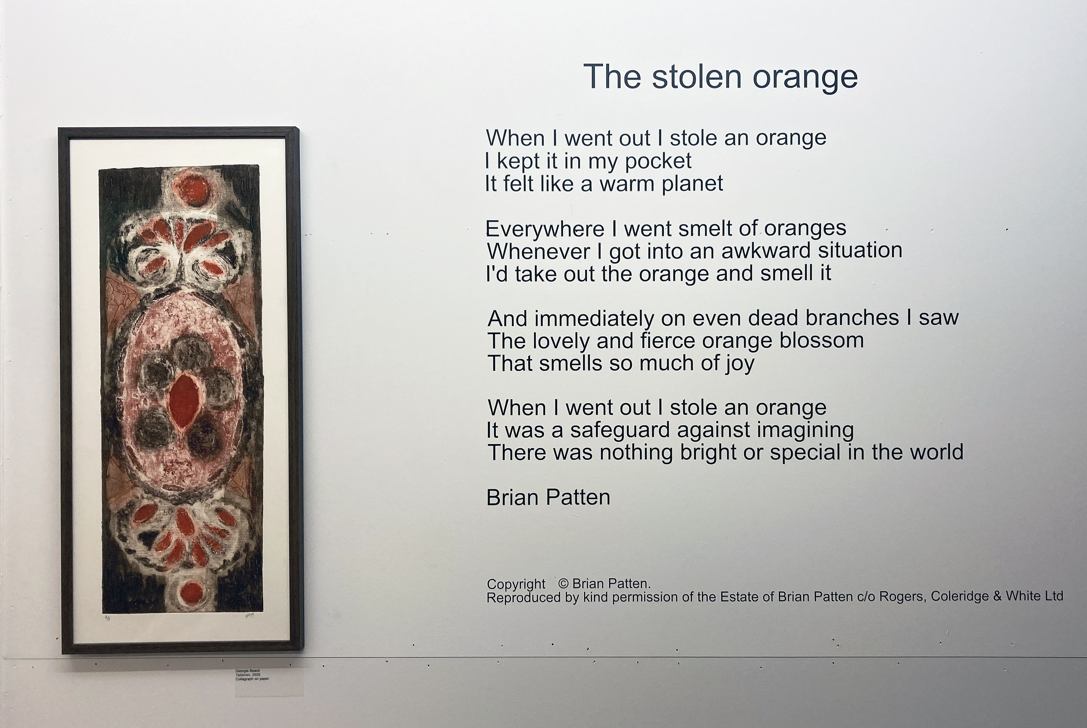
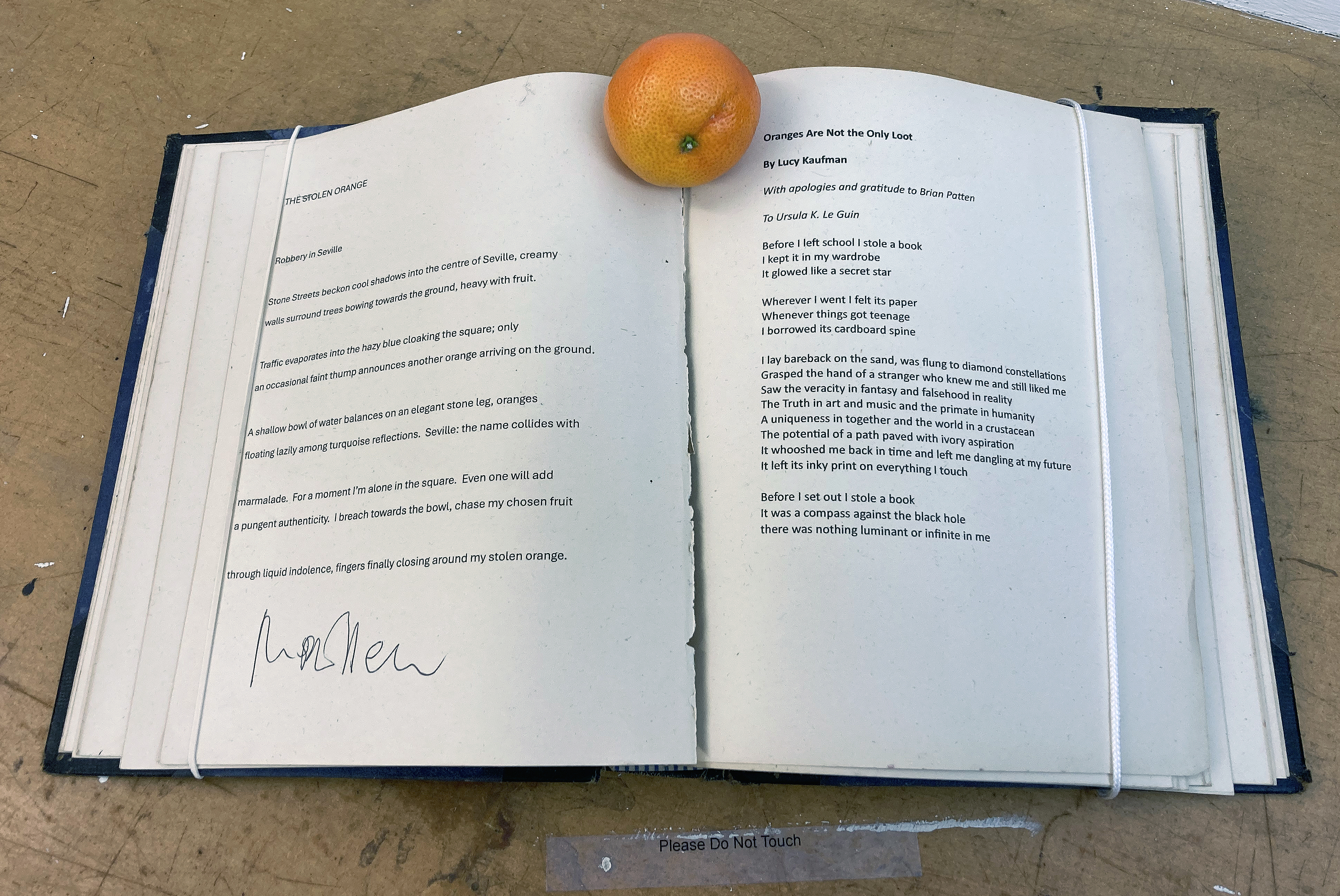
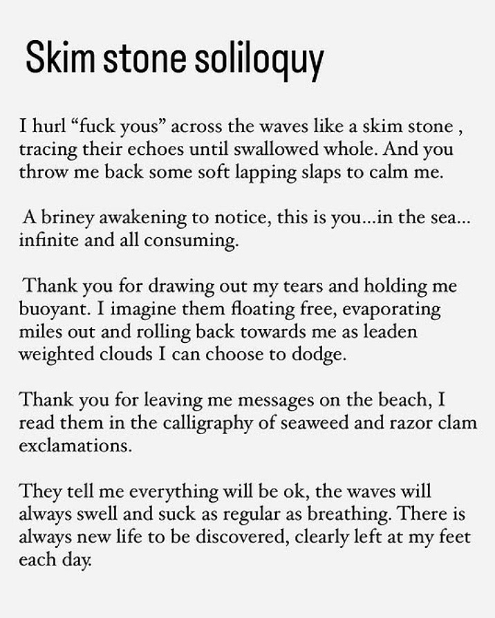
“Poetry helps us understand what we’ve forgotten to remember. It reminds us of things that are important to us when the world overtakes us emotionally.” (Brian Patten)
Georgie Beach – Talisman 2025 and Brian Patten – The stolen orange
What might bring artists together for an exhibition? Well, a suitable space, a curator or three (who can contact artists already known to them) and of course, our Instagram community ready and waiting for a call up. Sarah Shaw, Hal Maughan and Anthony de Brissac present The Stolen Orange, inspired by the well-known Brian Patten poem, at a central Brighton studio space that has been turned into a gallery for the duration of this show. It’s a great initiative, particularly when suitable spaces are few and far between considering the significantly large community of artists and craftspeople who live here. Galleries are generally in short supply – although there is positive traction in the development of high quality exhibition spaces in the city with The Adelaide Salon, Kellie Miller Arts and Indelible Fine Art (amongst others) developing apace.
With the opening of The Stolen Orange clashing with the Anna Phoebe concert at the Hope And Ruin venue last week I was unable to attend the opening (Brighton is a great place for live gigs, by the way). In retrospect this wasn’t so bad as the event was fully booked and looking at the works on display – eighty or so – must have been challenging. So on a very sunny Monday lunchtime I took a break away from my Phoenix Art Space studio to recharge the visual batteries. This was a trip well worth making, not only for seeing several works by friends from the region, but for being introduced to some new names from near and afar. The installation was also very impressive. Poorly arranged displays can highlight the proverbial sore thumb(s) – but in this exhibition nothing looked out of place or clashed with unsuitable wall-partners. Figurative and more abstract works hung well together, and simple or more complicated and elaborate paintings (especially) commanded their own respective spaces. This was partly due to sizes not being too far apart with dimensions within 20 to 50cm in height or width, plus a handful a little larger or smaller. I also counted over a dozen 3-D pieces and a couple of videos – and the catalogue gave us two poems to take away, as well as the original poem from Brian Patten.
Mary Allen and Lucy Kaufman poems
Of course, the show was also held together in an organic aura rather than straightjacketed by any polemic. As stated in the catalogue the much-needed themes of joy and hope were intended as a positive theme to encourage a communion of spirit:
“Over the past few months, we have heard people talk of their stolen oranges as metaphors for something hopeful and totemic; something to hold onto.” (Hal Maughan)
The notion of joy as a positive and obligatory strength for the individual (artist or not) was also insisted upon for social cohesion:
“The exhibition reflects on how creativity can sustain optimism, humour, and connection in uncertain times, standing firm in insisting that joy isn’t optional, it’s necessary. Joy as an act of resistance. Joy as friction; a way to keep going, both with each other and for each other.” (The curators)
Carrie Stanley – I see the crescent 2025
Whilst walking back to the studio I pondered on the notion that a purist view of the visual arts (I plead guilty at times) to sustain a completely aesthetic independence for one’s work – unadulterated by ephemeral themes of the day – is nonsense. The content of this exhibition celebrates our many diversities and disparate interests. It’s what we share in common. It also keeps the memory of the amazing poem by Brian Patten alive. There is so much that is bright and special in the world.
Geoff Hands
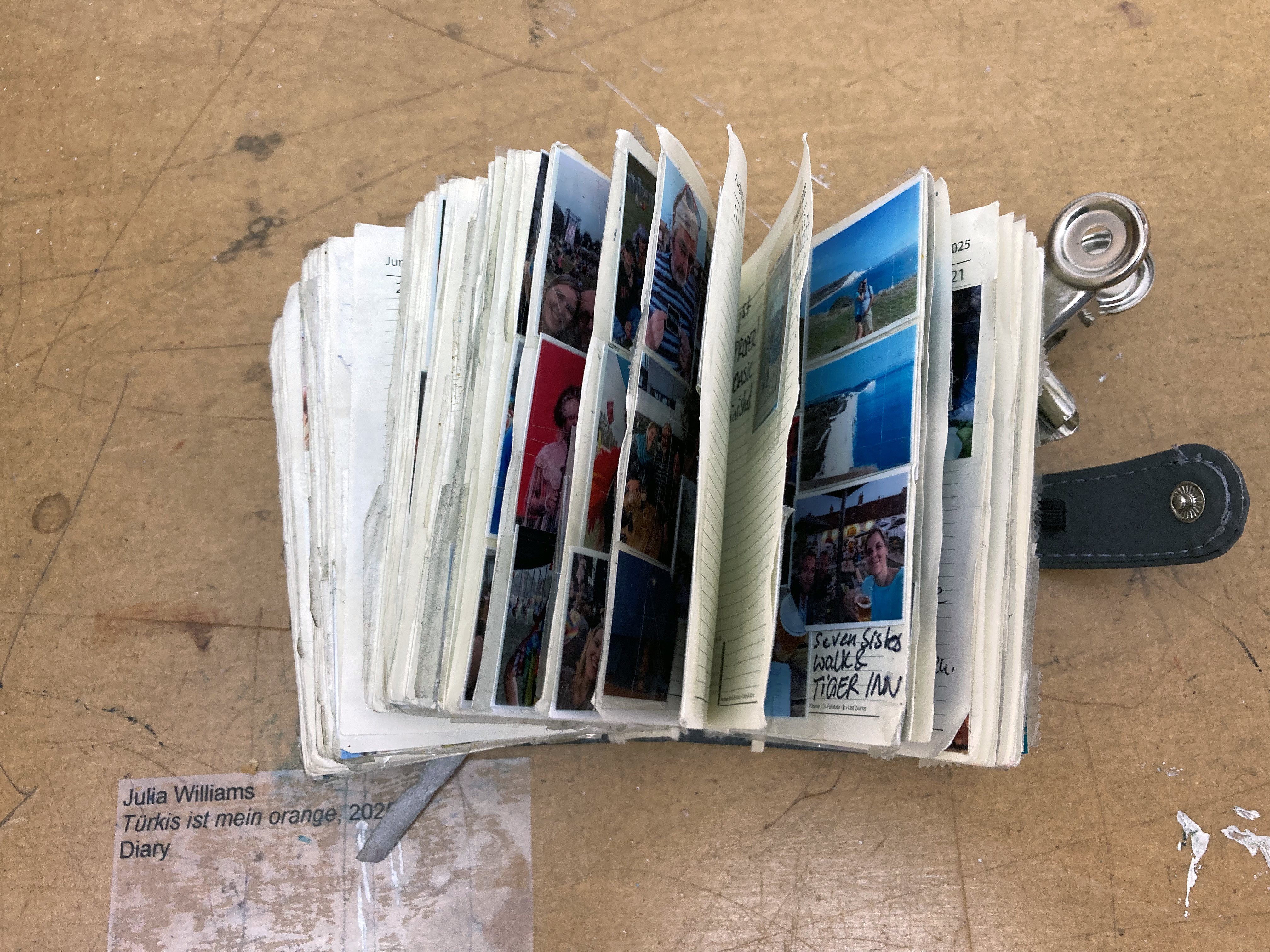
Julia Williams – Türkis ist mein orange 2025 Diary
Note:
I have purposely not focussed on or highlighted any individuals from the exhibition, as there are just too many. I cannot feature all of the work here either, so please treat my choice of installation and specific artwork photographs as random. Although a special mention might be permitted for Phyl Callaghan’s fantastic cotton, silk and terylene oranges that are readymade for the pocket at just a fiver each – I bought a few for Father Christmas to distribute next month. I must add that there is a very well produced catalogue available from the gallery that features all of the participants’ work – and visit the website too.
Taking eight completed pieces out of the studio and re-seeing them, experiencing them afresh and re-contextualised in a carefully considered arrangement might be considered a luxury for some artists. But a room reserved for this purpose at ASC Unit 3 Gallery, a short walk from Bromley-By-Bow underground station, provides such an opportunity.
In turn, John Bunker has invited visitors to come and see the selection, thus creating an exhibition. Add the opportunity to visit his studio, just along the corridor, to see numerous works not displayed alongside works in progress is a real treat. But it’s quite informal and apart from stacking some chairs out of the way later on it’s ready for use. A stock of materials stored in readiness for creative activity over the coming months adds a little more depth to the whole experience of the visit.
Assorted works in the studio
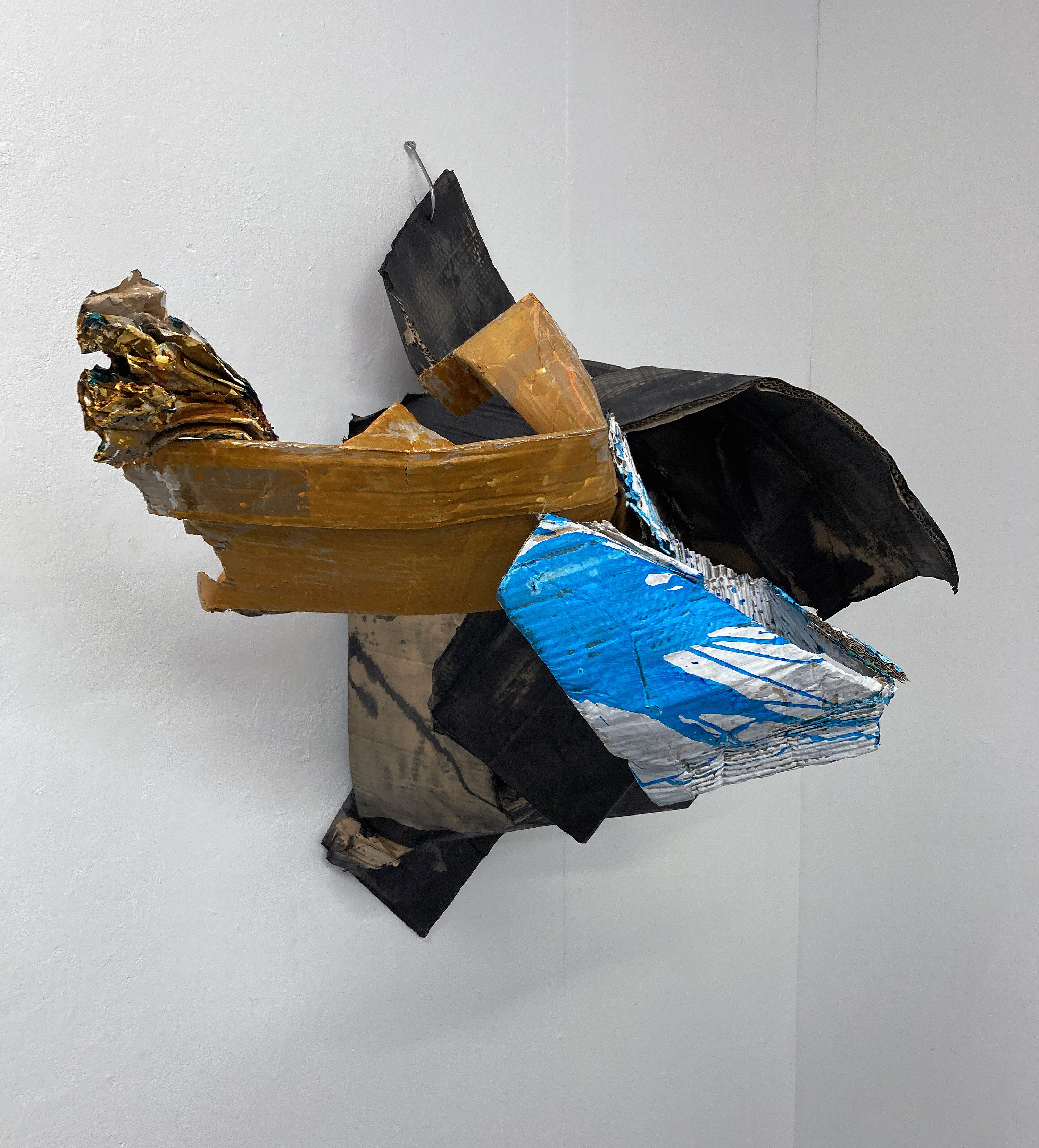
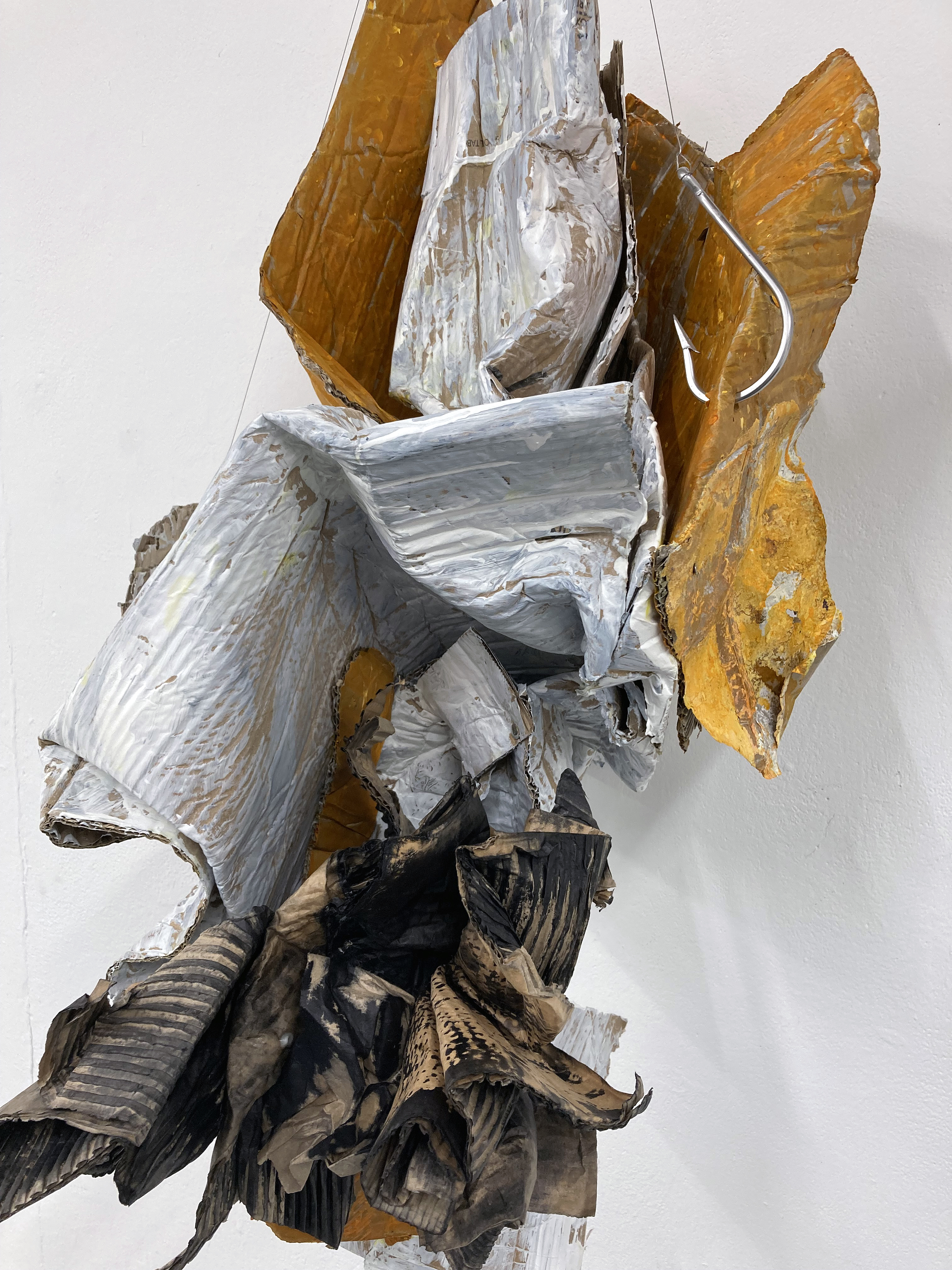
In both spaces the visitors can chat socially and also engage in responding to the works displayed. There is certainly an atmosphere of excitement and respect. Everyone seems well acquainted with Bunker’s oeuvre and it’s a compliment that they continue to come back for more. In current artspeak this is surely an interrelational situation. But it’s the actual works on formal display that truly matters today and if there’s a hint or nuance of hierarchy I get it from the four wall-hung sculptures that may turn out to be the precursors of what comes next.
John Bunker – Mithras 2025
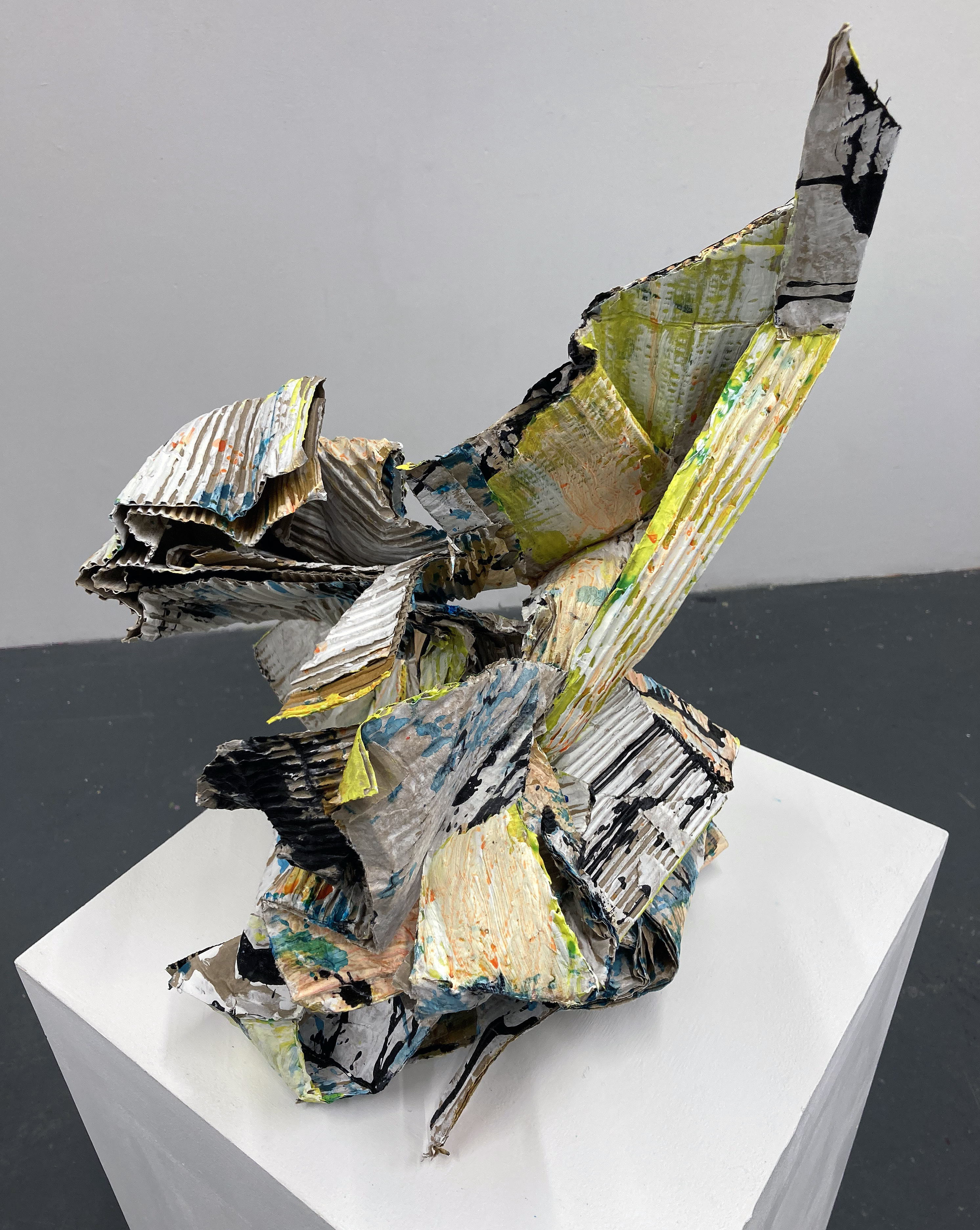
I have been fascinated by Bunker’s work for the best part of a decade after writing about TRIBE. New & recent collages by John Bunker at Westminster Reference Library in 2016 for Robin Greenwood’s much missed AbCrit. A significant number of artists, particularly painters and sculptors, continue the exploration and development of abstraction in the UK. In Bunker’s case, he plays (seriously, that is) in both camps, as the exhibition leaflet explains:
“Bunker’s abstractions are born of eccentric and paradoxical spaces that he has opened up between painting and sculpture. Known for his materially diverse approach to both disciplines, ‘Antinomies’ focuses down on cardboard. Bunker uses and abuses this ubiquitous everyday material by loading paint on its highly absorbent layered surfaces and, at the same time, engaging with it as a highly expressive sculptural material in its own right.”
This appeal, captivation, enchantment and enthralment with the phenomenon of a materially and visually based production of a cultural phenomenon we conveniently call ‘abstract art’ continues – despite the current expectation of a political correctness, a politicised demand from various quarters (including Higher Education), to engage with certain external convictions might blind the viewer to what the actual work contains, attains and demands of the viewer. Which, I guess, is my too wordy way of saying just look at the work! It is kind of purist, sure, but this is the real thing, in front of you – which maybe there is not enough of as we visually consume the (constructed and ready-made) world via the screen.
John Bunker – Rausch II 2025
Fellow painter, E.C. made an impassioned comment on her Instagram account after visiting Antinomies as:
“An antidote to the absurd, bloated gluttony, to the slick gallery shops and to the often frantic, frenzied and disinterested ambitions that can try to batter the life out of making… The kind of making that is about (to my mind) necessary and unfurling change and movement and not an efficiently quantifiable, capitalist product. Than goodness for this.” (EC 2025)
And added:
“I was thinking about the relationship to the wall and painting with some of these works and how they seem to occupy a cusp… slipping in and out of categories… imagining some sliding off the walls onto plinths or the floor. Where do things belong? Category crisis? Excellent!” (EC 2025)
In consciously looking at these works, most especially the wall hung sculptures and the two works on plinths I was captivated too. Comments from fellow viewers enforced this individual and collective sense of how engaging the new sculptures are. The eye/mind submerges into small spaces, pulled along by subdivisions of form and mass. Little distances, ins and outs, that pertains to the actual environment always in and around us. The paint is as much part of, as well as added to, the cardboard structures. The application is deliberately unfussy, hinting at the unpainterly but suggesting a conglomeration of parts or identities within the sculptural forms through the colour changes. There are dimensions that appear solid and still, but if you are in the zone, generate a sense of implied movement to quicken and invigorate. Are these works dedicated to physicality and consciousness? This is joyous and I wonder why. Is there not enough time? Get on with it, Bunker appears to be saying. Let’s make, share, manipulate and engage with materials in the world before we leave. So, yes joy, utter joy.
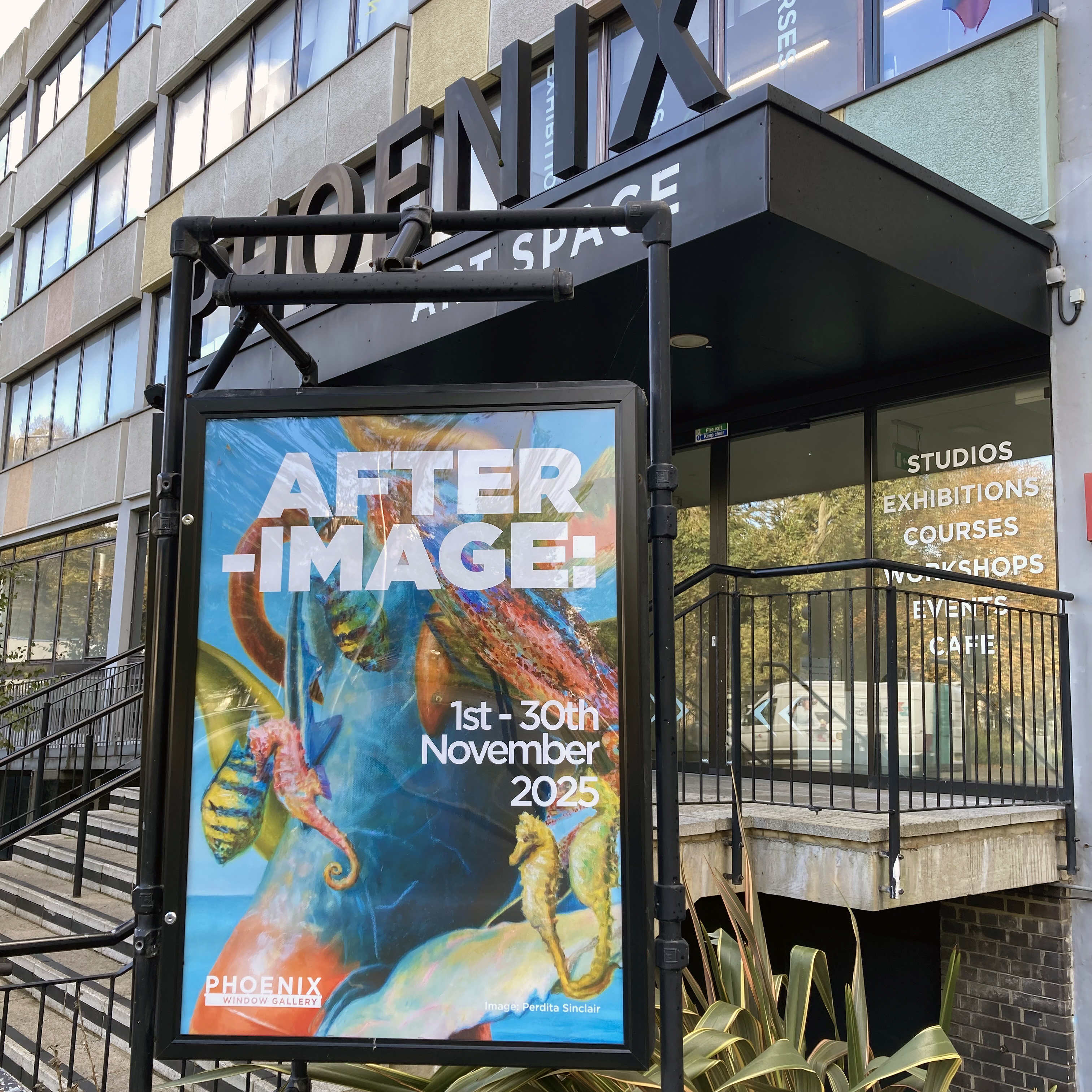
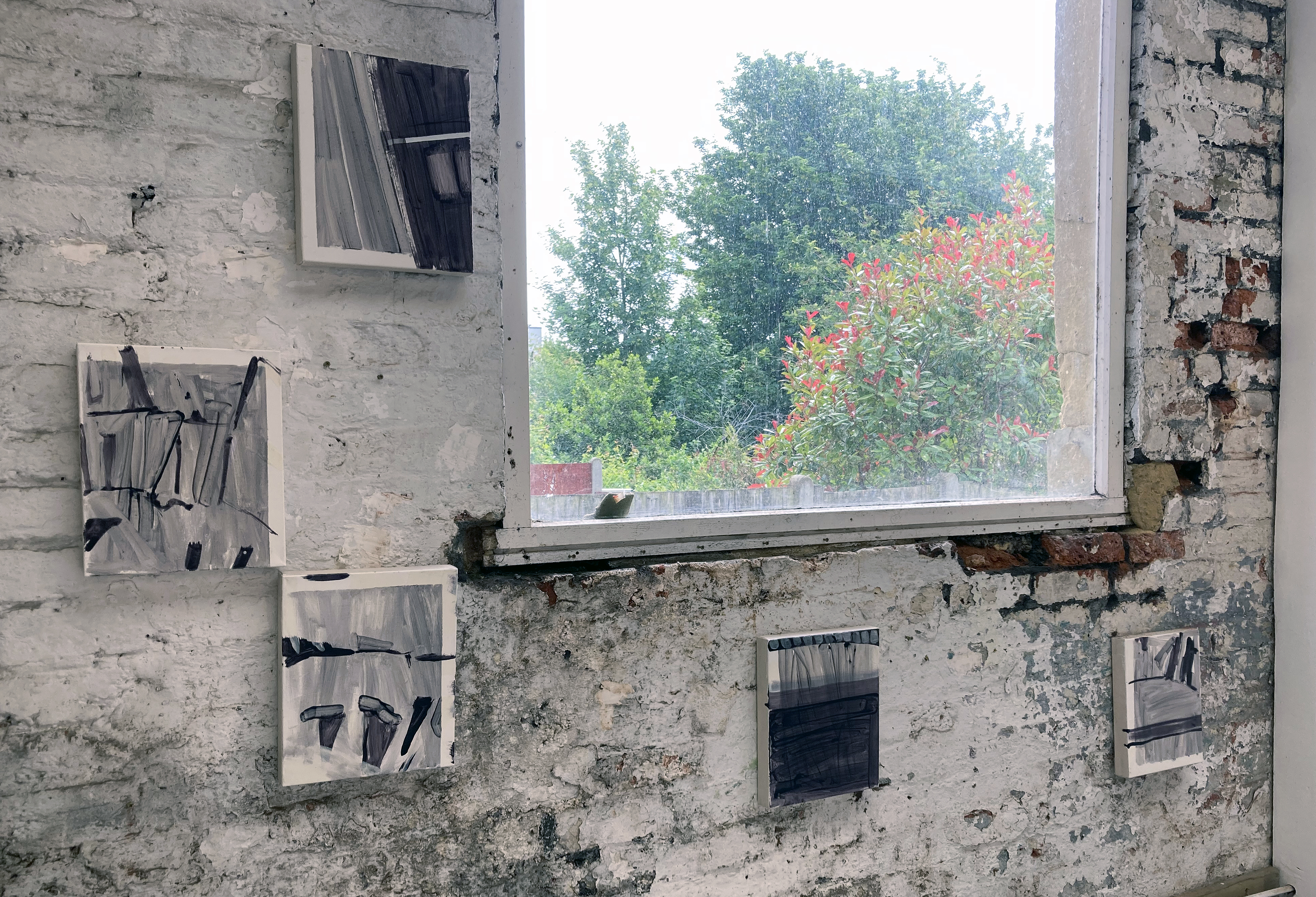
AFTER-IMAGE: Works inspired by the Brighton Museum & Art Gallery Collection
Window Gallery, Phoenix Art Space, Brighton
1 to 30 November 2025
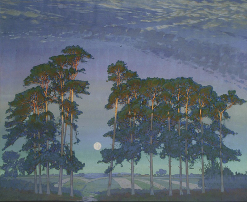
A few years ago, as a break from the painting studio, I had visited the nearby Brighton Museum & Art Gallery to view the Prof. Paul Heyer bequest that includes works by Jules Olitski, Frank Stella and Larry Poons. Just before leaving, whilst still in front of the Olitski, I noticed a lonely painting from an adjoining gallery that I imagined waving at me, perhaps exclaiming, “Hey, look at me – I’m a modern painting too!”
I went straight over to this relatively small oil painting, encased in a dominating gold leafed frame, already sensing something special. It was a landscape by Thomas Gainsborough. The experience reinforced a belief I have that all paintings have a potential to remain vital and relevant today – for painters and viewers alike. So its production date during the 1740s when he was still developing his skills was not an issue. This is a somewhat intuitive notion – but Gainsborough sets the bar for painting (not only landscape imagery) way back in the 18th century. He may well have his technical equals today, but there’s none better. Nor do visually powerful paintings have to be as big as the painters of the New York School often produced.
My first photograph of Gainsborough’s Open Landscape at the Edge of a Wood 1744-45 Brighton Museum & Art Gallery collection
This intriguing painting by Gainsborough, Open Landscape at the Edge of a Wood, lacks the presence of human figures (referencing the Classical Antique tradition that earlier generations of painters indulged in, or including the so-called peasants or the wealthy landowners of the day, such as Mr. and Mrs. Andrews), sometimes seen in his works. Though it has that constructed feel so typical of the European tradition of landscape imagery (post-Claude), an informal sense of place prevails. The viewer is invited to gaze upon the corner of a field, some local Suffolk woodland I assume, and the typically cloudy English sky. The implied narrative might be concerned with the everyday, as the artist invites the viewer to appreciate the countryside. I took a photograph with my new iPhone that usefully recorded the date as October 20, 2017 at 15:38.
I decided to revisit my photograph of the painting in 2024 after I received the go ahead to curate the AFTER-IMAGE exhibition for the Window Gallery at the Phoenix Art Space with the inclusion of other studio members. (An earlier proposal in 2022 had been rejected, perhaps because I was eying up the larger Main Gallery and lacked the funds to rent the space.) The prompt to my Phoenix contemporaries was for them to visit the Museum and to choose anything to react to in whatever way they wished.
One of the benefits of having a studio at the Phoenix is its close vicinity to the Museum and Art Gallery, where a publically owned collection of artworks are available to see all year round, subject to curatorial changes and re-hangs. I decided to stick with my choice of the Gainsborough landscape despite temptations to respond to other works that also drew my attention. The fact that it has not been on display for a while was not an issue as I had my photograph and the memory of that encounter eight years ago. In fact, a kind offer by Laurie Bassam (Curator of Decorative & Fine Art) from the museum was not taken up to get the painting out of storage, as I preferred not to see the Gainsborough in the flesh quite yet. I had my photograph and my visual recollection. Yet I would, of course, maintain that it is always necessary for artists to see and experience original artworks ‘in the flesh’, rather than only in print and/or online. Painters, and photographers, are typically well aware of the history behind their respective practices and engage with displays of original works in a way that others may not. Any reaction can be to emulate, to be inspired by, or to creatively adjust and re-present or re-order subject matter for one’s own purposes. Imagery and objects from the past will therefore be linked to the present either directly or more obliquely, depending on the inclination of the invested observer. The remit gave this small group from the Phoenix the opportunity to produce whatever they wished. I expected a wide range of responses, and have not been disappointed. I asked each in the group to write a brief (or not so brief) statement to explain their respective choices of works to respond to. With some respectful editing, and starting with the photographers, here is what they had to say:
Statements from the exhibitors:
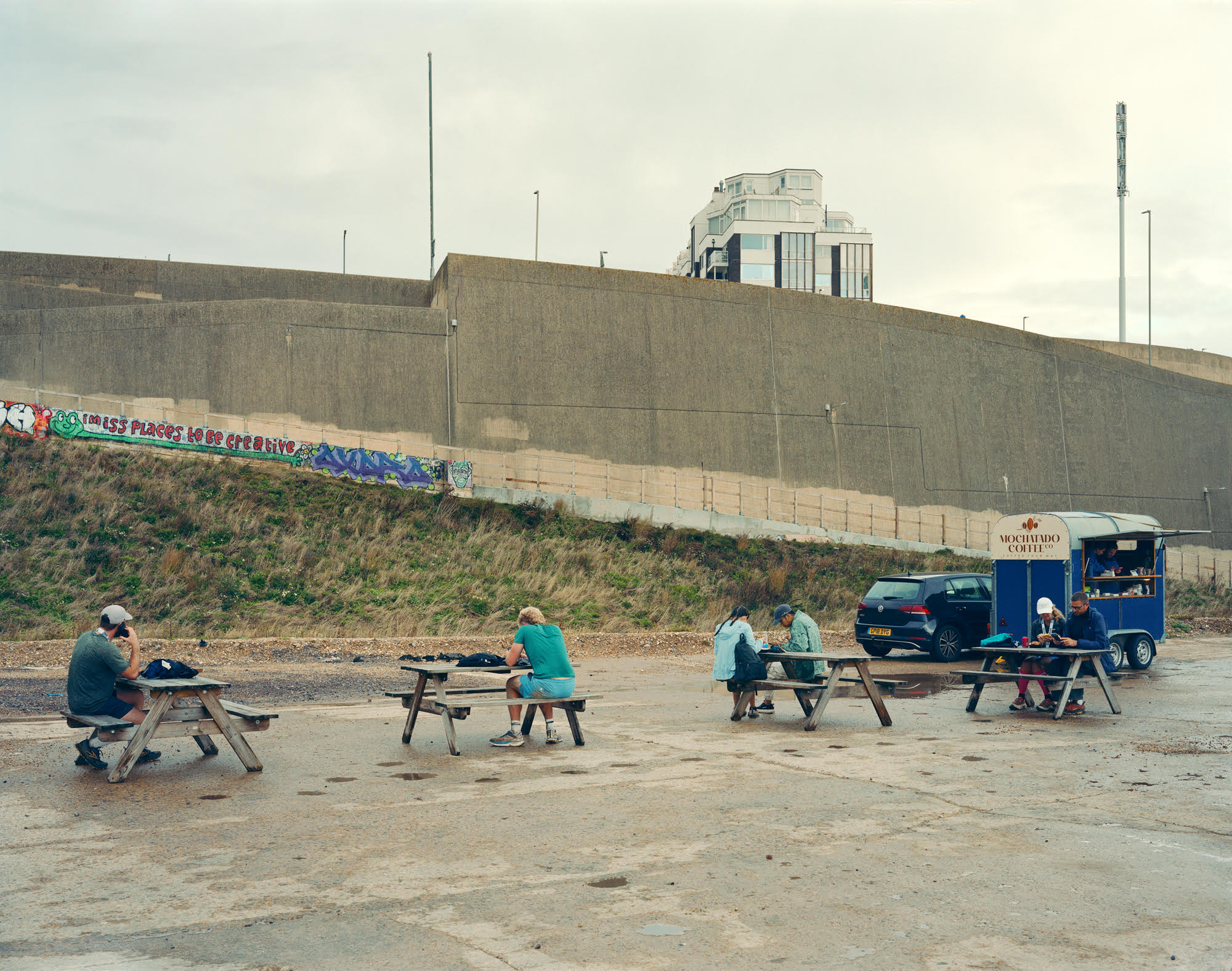
Murray Ballard – Black Rock, Brighton. C type print.
Murray Ballard – Black Rock, Brighton
Jacques-Emile Blanche – Black Rock Brighton 1938 Image credit: Brighton & Hove Museums
Jacques-Émile Blanche’s painting of Black Rock, Brighton presents a composed summer scene, its figures formally dressed, children at play, artists at work along the shoreline. Returning to the same site with a large-format field camera, I was struck by the extent of its transformation. Once considered the eastern edge of Brighton, Black Rock has shifted through many identities: from coal-landing beach, to lido, and a gateway to the Marina. Today the space is often empty, yet on this occasion it served as the end point of a long-distance trail race. My photograph reflects on this layered history and the changing uses of place.
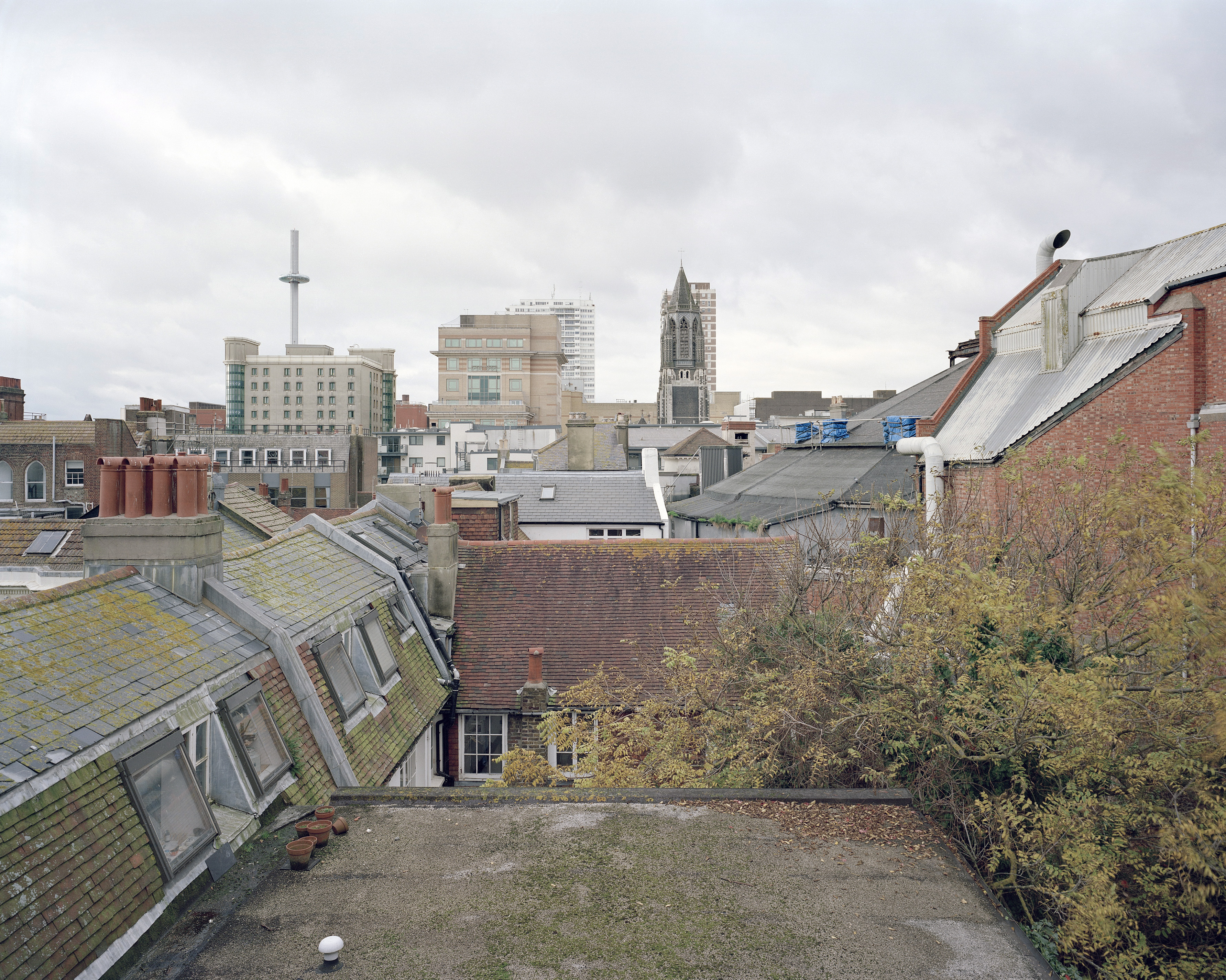
Fergus Heron – Ship Street Gardens, Brighton, England, 2016/2025. C type print.
Fergus Heron – Ship Street Gardens, Brighton, England, 2016/2025
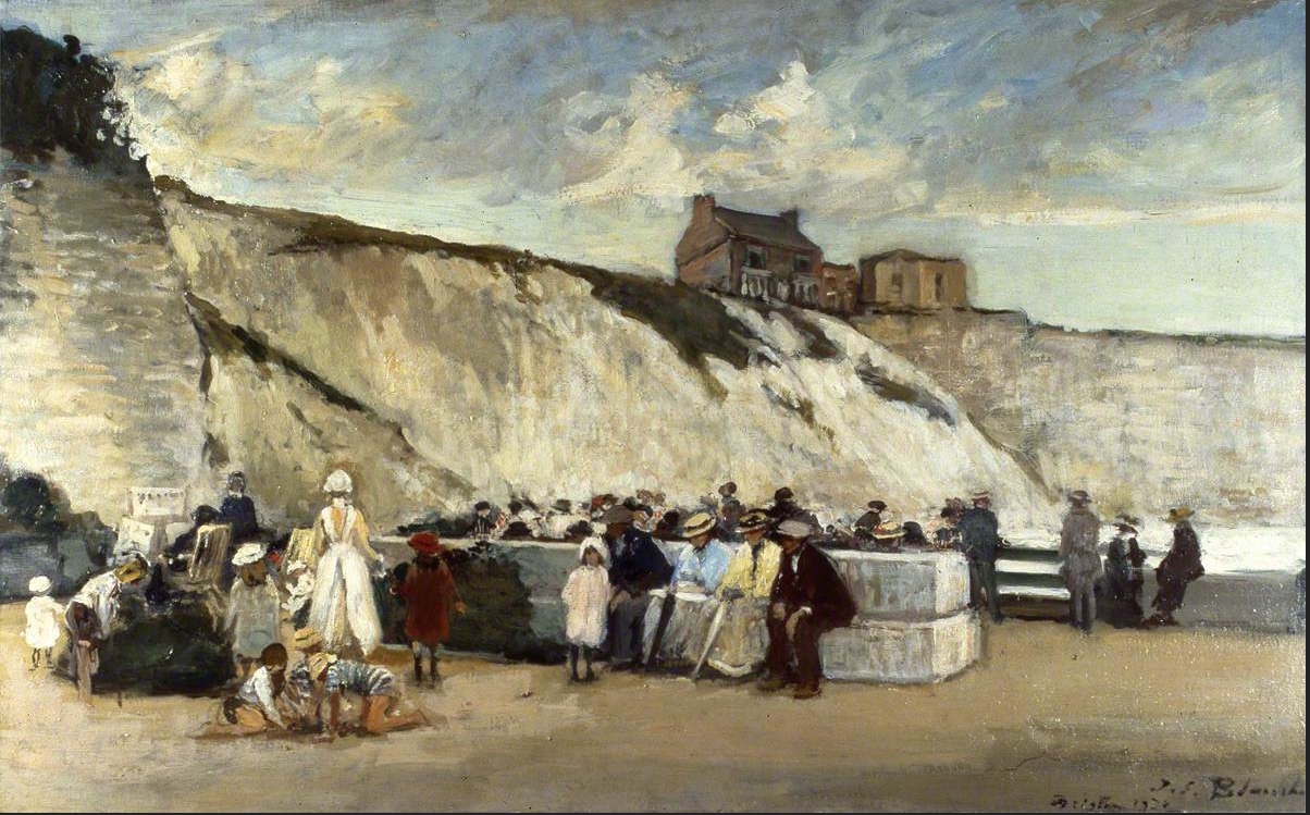
George Callow – The Chain Pier Brighton Image credit: Brighton & Hove Museums
I am interested in how the places of the studio and museum offer different but related ways to imagine Brighton as an urban landscape through pictures. I was initially interested in the pictures of the chain pier by George Callow and another by John Fraser.
The connections with my works being relations of land and water, distance, scale, looking at structures from which looking is practiced and that change perspective on place.
Ship Street Gardens, Brighton is a colour photograph on paper showing a view to the west over rooftops in the Lanes area of Brighton. The image describes the appearance of relations between buildings and natural features in soft overcast light with a high degree of detail. A dialogue with George Callow’s painting Chain Pier, Brighton is offered by the photograph with contrasts including direction and viewpoint, plus the presence of the i360 as a modern ‘vertical pier’ and the absence of the beach. My photograph forms a landscape that brings coastal, urban, and new and old aspects of place into relation.
Perdita Sinclair – How the Whale Got His Throat and Gen 9. Both oil on canvas.
Perdita Sinclair – How the Whale Got His Throat
Joe Tyler – Replica Saxon shield (2018) Image credit: Joe Tyler and Brighton & Hove MuseumsGrant Cox – Black Rock Mammoth and Rhino Image credit: Brighton & Hove Museums
Both the animation and the shield influenced both of my paintings, How the Whale Got His Throat and Gen 9. They made me think about how animals and landscapes are captured and recreated by humans using tools. The tool being something practical, like a shield or information animation, but the symbols of animals representing something psychological or spiritual, like a connection to deeptime. The paintings that I have in After-Image use the tool of AI to generate imagery and my own physical and psychological connection to Brighton and my home.
Perdita Sinclair – Gen 9
Denise Harrison – Water of Leith: Flow / Pause / Return. Acrylic on wood.
Denise Harrison – Waters of Leith: Flow / Pause / Return
In July, after the death of my sister, I spent three weeks alone by the Water of Leith in Edinburgh. This place, connected to my past, became somewhere I could be quiet and reflect. Each day I walked along the river or sat still in one spot, taking in the sounds, movement and atmosphere of the landscape. In my paintings, I translate sensations as well as views.
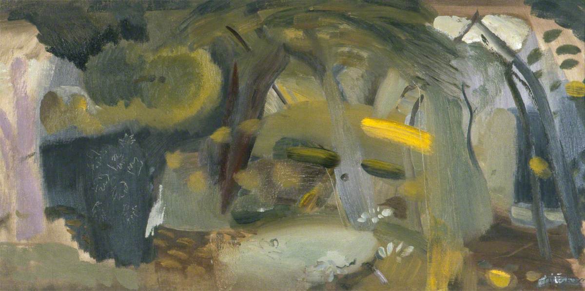
I was inspired by Ivon Hitchens’ painting, Forest and the way he immersed himself in his surroundings. I used acrylic paint on blocks of wood, adopting the panoramic format to reflect how the landscape is seen as a continuous space, without edges. Through gesture and colour, my paintings capture the feeling of being fully present in the landscape, where memory, grief and nature come together.
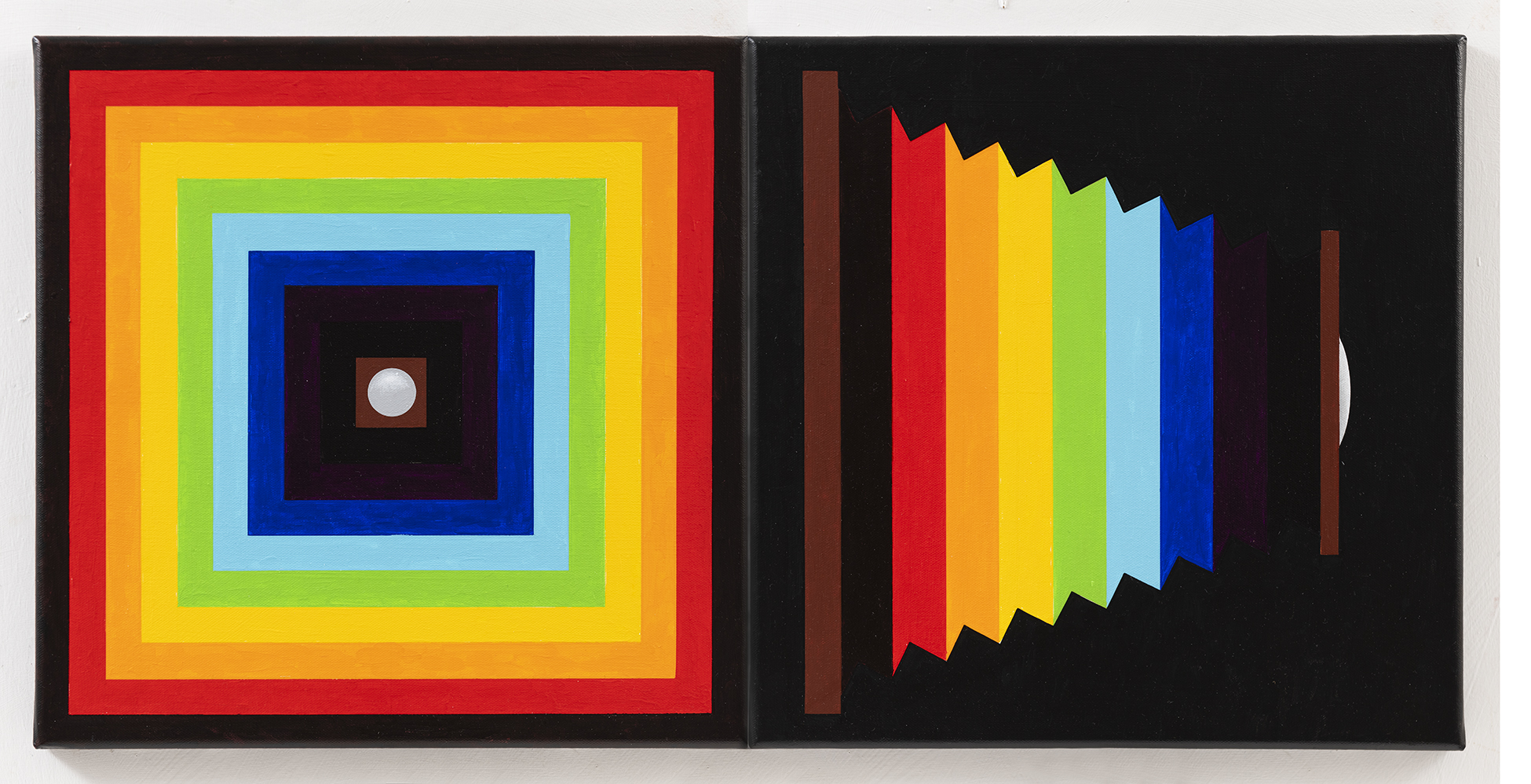
Bernard G. Mills – Bellows. Liquitex on canvas (diptych).
Bernard G. Mills – Bellows
Frank Stella – Red Scramble 1977 Image credit: Brighton & Hove Museums
When viewing the work on a visit to the gallery and a talk about their twentieth century collection I was struck, not so much by the design, physical execution or colours in Red Scramble, but by the resemblance of Frank Stella’s painting’s concentric squares to the folds in a camera’s bellows. As I was (and am) engaged in producing a series of paintings that I call Photographic Paintings – paintings that relate to aspects of photography, I decided to incorporate the response to Stella’s piece with a diptych entitled Bellows.
I had originally decided to include twenty-four painting in the series (one has to draw a line somewhere) – either twenty-four or thirty-six (referring to the number of frames in a 35mm film cassette). With the Stella being a diptych, I decided to extend it to twenty-five because, in the interest of economy, if one loaded a 35mm film into a camera judiciously, one could squeeze in an extra exposure at the end of the film.
June Nelson – Fire Spotting, Where All Ladders Start and Every Rung Shone Strangely. All oil on canvas.
June Nelson – Fire Spotting(t/l), Where All Ladders Start (b/l)and Every Rung Shone Strangely (r)
Toyokuni Kunisada – Firemen performing acrobatic feats at New Year (1840) Image credit: Brighton & Hove Museums
My initial response to a Japanese woodcut depicting firemen performing acrobatic feats took the form of a few small paintings – direct transcriptions of the image. After a long break working on another series of paintings, I returned to the ladder motif. Evoking ideas of balance, emergence, precarity, and triumph, the ladder has become the starting point for a new body of work, comprising paintings and sculpture. These works extend threads from earlier explorations of “impossible objects”: mirrors that refuse to reflect, faces that cannot be fully seen and shadow ladders that offer no passage. Together they forge a shifting vocabulary that hovers between the literal and the illusory, the structural and the dreamlike.
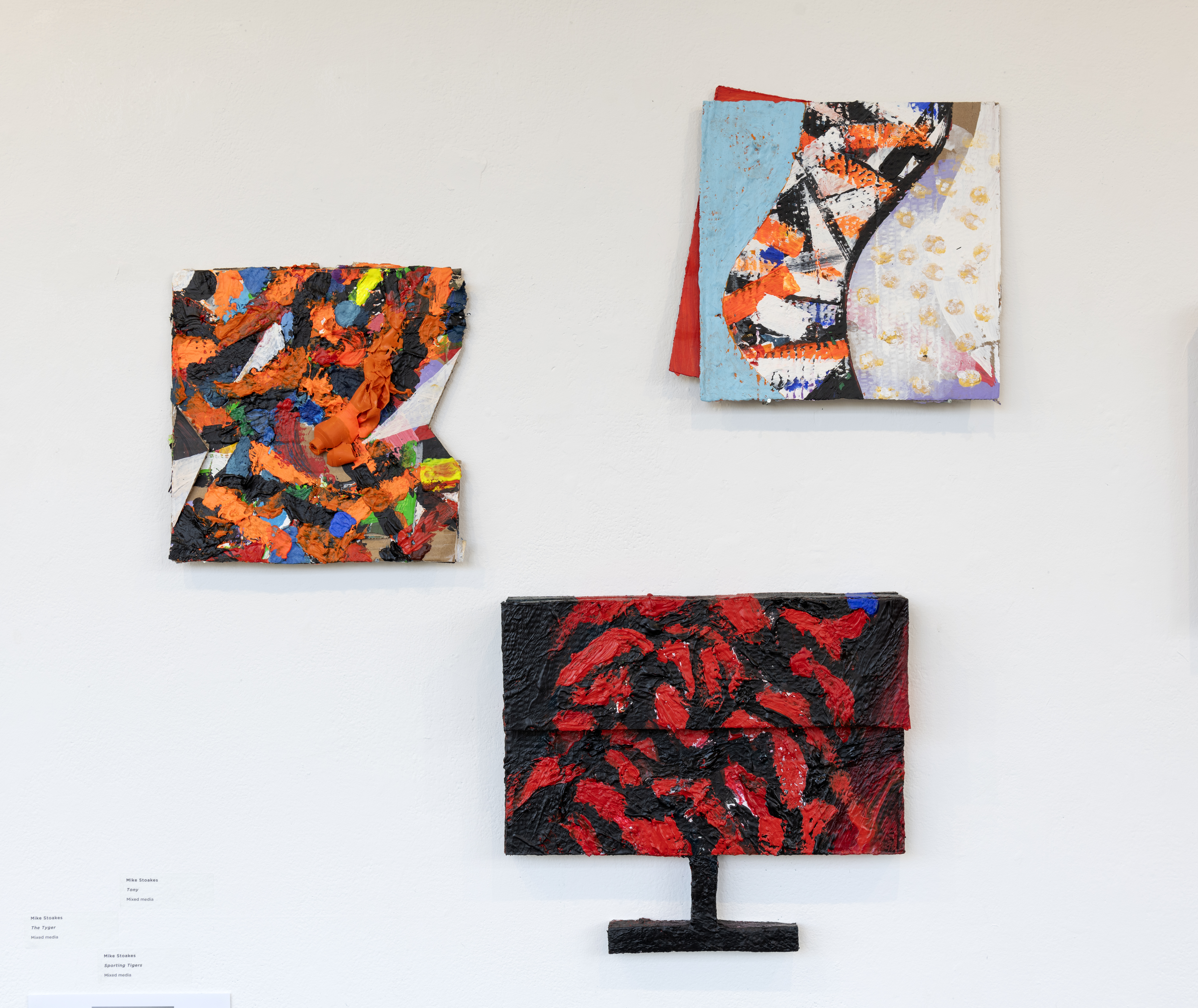
Mike Stoakes – The Tyger, Tony the Tiger and Sporting Tigers. Mixed media.
Mike Stoakes – The Tyger, Tony the Tiger and Sporting Tigers. Mixed media.Figure Group of a tiger mauling a soldier, c1825. From the Willett Collection of Popular Pottery Image credit: Brighton & Hove Museums
Though I’ve recently been working on the subject of my colonial past I have chosen this work for After Image out of pure interest. It represents an actual event where Hector/Hugh Sutherland Munro serving as a cadet for the East India Company was seized by the head and dragged away by a tiger, succumbing to his injuries even after the tiger was shot. The event was widely reported and subsequently (1820s) became the subject of a series of Staffordshire ceramic figures and more recently foreign fakes.
Not long after Munro’s death, Tipu Sultan of Mysore, who loathed the British, commissioned an automata of the incident that produced movement and wailing and growling noises activated by a crank. The body of the tiger also contained an organ. The styling of the piece draws on South Indian traditions of sculpture and is one example of many images Tipu caused to be made of British meeting their demise, with the tiger being a significant repeated personal motif. Uncannily the iconography of the tiger mauling a soldier had been used by him prior to the Munro tragedy. Tipu was killed by the British in a siege and his tiger brought to Britain as plunder and is now in the V&A. The style was likely the basis for the Staffordshire figures and the subject for William Blake’s poem The Tyger.
The work I have made uses the tiger image to explore human projection onto nature through various media representations. Three paintings each about 35cm square are titled The Tyger, Tony the Tiger and Sporting Tigers. The Tyger is from Blake’s poem in all likelihood inspired by the Munro story. Tony the Tiger is the Frosties breakfast cereal mascot who was animated with a Brooklyn accent – which gives him a name and location link to Tony Manera from Saturday Night Fever. Tony and the Esso tiger (in your tank) had cordial relations until Esso used it was to promote foodstuffs at which point the relationship became frosty. sporting tigers refers to a scene from if…. where Malcolm McDowell and Christine Noonan wrestle naked on the floor of a transport cafe impersonating tigers.
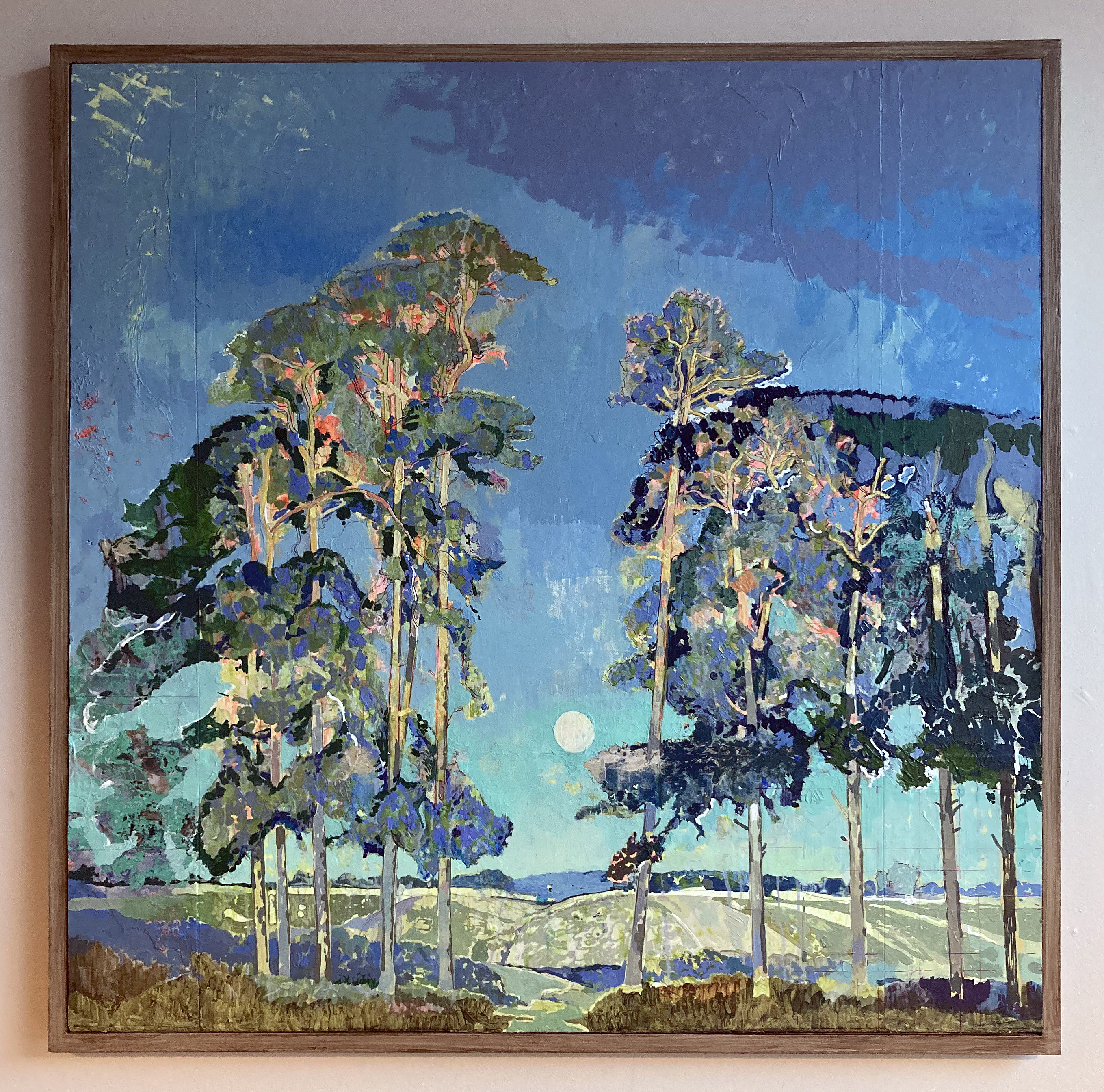
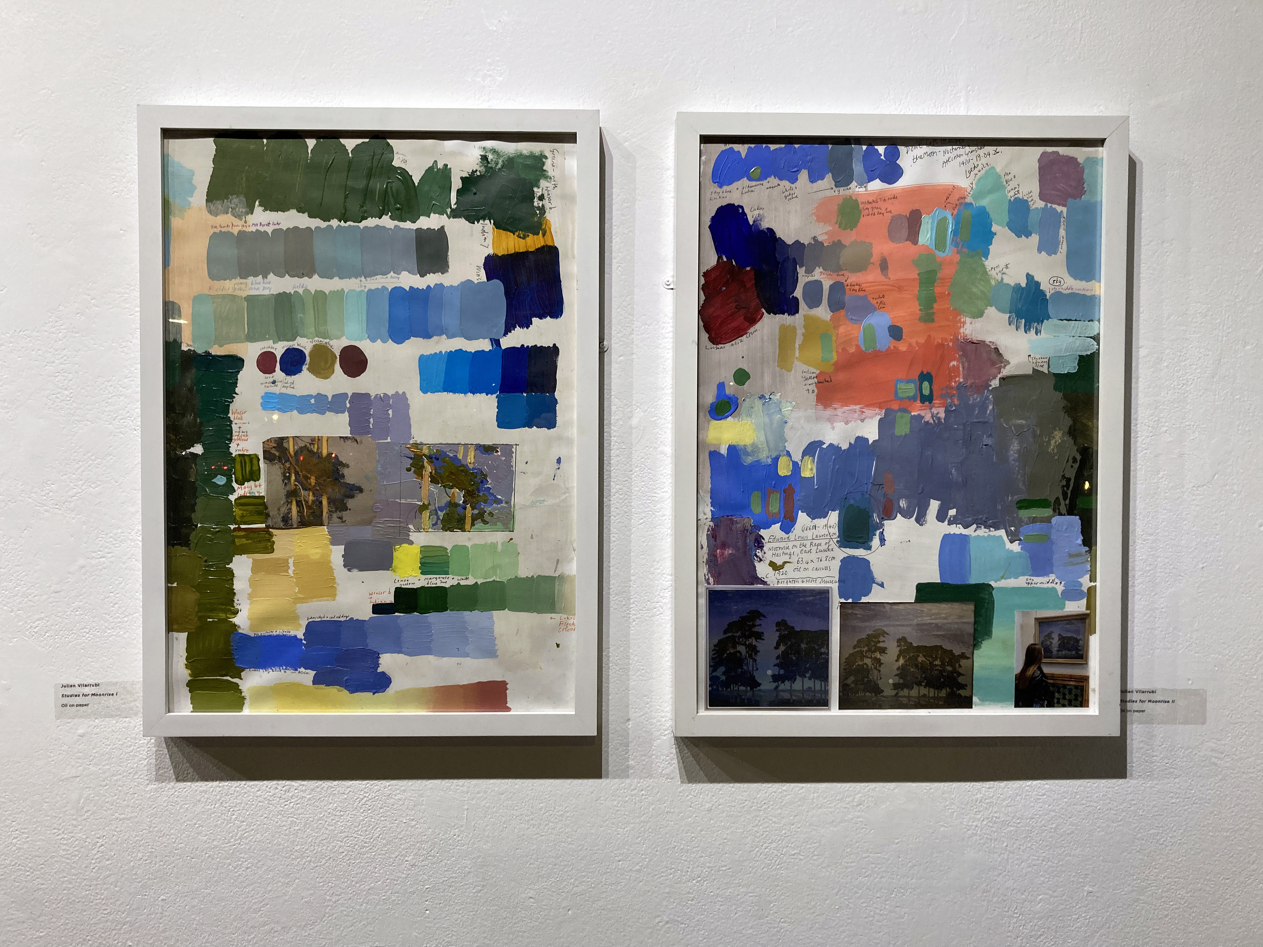
Julian Vilarrubi – Study for Moonrise on the Rape of Hastings. Oil on board.
And Studies for Moonrise I and II. Oil on paper.
Julian Vilarrubi – Study for Moonrise on the Rape of Hastings
Edward Louis Lawrenson – Moonrise on the Rape of Hastings, East Sussex (c.1920) Image credit: Brighton & Hove Museums
Caught in the liminal transition between day and night, the full moon ascends in direct opposition to the setting sun. The scene evokes an early evening in late September, sometime in the 1920s. The final warm, golden rays illuminate the treetops – light that is soon to yield to the cooler chromatic palette dominating the remainder of the composition. This fleeting equilibrium between sunlight and moonlight – the gradual succession of one form of illumination by another – imbues the image with a poetic transience. It captures the precise moment when day recedes and night begins its quiet ascent. The viewer becomes aware of the inevitable passing of time, as the low sun behind us slips beneath the horizon, signaling the arrival of autumn light and the encroaching darkness of the months ahead.
I first encountered this painting on 13 August 2023 at the Brighton Museum and Art Gallery. That single viewing has remained vividly imprinted in my memory. The work’s compositional and atmospheric qualities exerted such a profound influence on my painterly sensibility that I have since felt compelled to reproduce it, not as an act of imitation, but as an analytical engagement intended to uncover aspects of its making.
This undertaking is not an interpretation or a personal reimagining of the original. Rather, it represents a dialogue between my own practice and that of another painter. Through this process, I seek to concentrate on specific technical concerns allowing the act of reproduction to function as a form of enquiry. It is an attempt to locate, through practice, the intersections where two artistic methodologies might converge.
The objective is to study, replicate, and thereby understand how and why certain images resonate with such lasting intensity. Art museums provide a unique pedagogical context for such investigations: they preserve not only the works themselves but also the potential for experiential learning embedded within them. In this instance Lawrenson has already resolved many compositional decisions and I am thus liberated from considerations of subject or framing and can direct my attention entirely toward process, structure, and surface.
In total, my direct encounter with the painting amounted to less than ten minutes. My subsequent work has relied exclusively on photographic reproductions – an approach far from ideal. Reproductions inevitably introduce distortions of colour, scale, facture, and detail, yet they remain my only means of sustained engagement. As a student of historical painting practice, this project constitutes a deliberate methodological exercise: a means of interrogating pictorial construction, tonal balance, and chromatic harmony. By attempting to reconstruct the processes underpinning this work, I aim to absorb and internalise its lessons, thereby extending my own understanding of painting as both material practice and visual language.
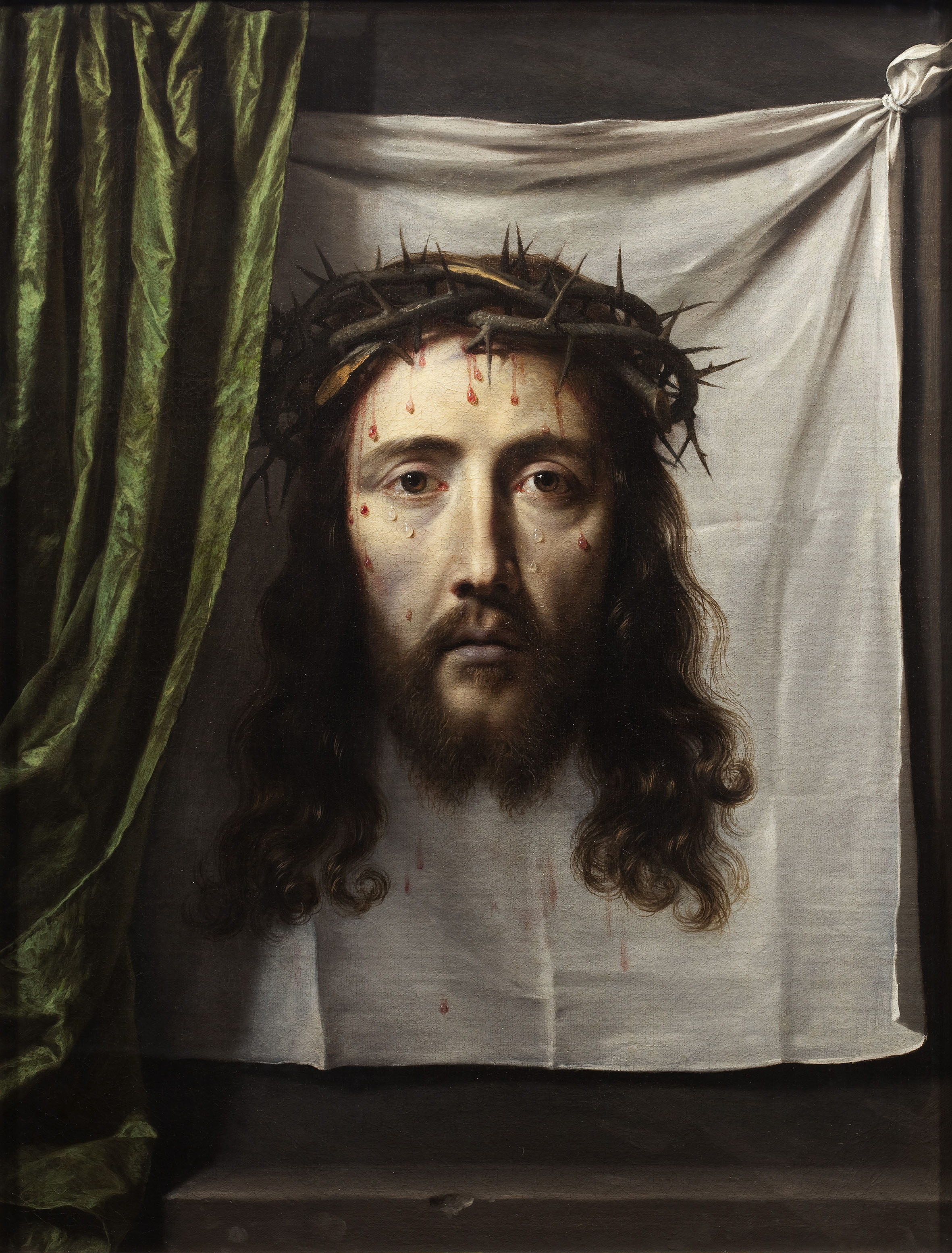
Stig Evans – Unveil. Graphite and acrylic on canvas + curtain.
Stig Evans – Unveil
Philippe de Champaigne – St Veronica’s Veil (c.1640) Image credit: Brighton & Hove Museums
To “draw a curtain” can mean two apparently contradictory things: to pull it aside to reveal what it had concealed, and to pull it in front of an object, in order to hide it. To draw, and to paint, a curtain is thus both to cover and discover.
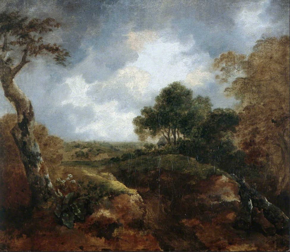
Geoff Hands – After Gainsborough I and II. Oil on canvas.
And Open Landscape (Oval). Oil on board/frame
Geoff Hands – After Gainsborough I
Thomas Gainsborough – Open Landscape at the Edge of a Wood (1744-45) Image credit: Brighton & Hove Museums
Gainsborough’s painting chose me, in a sense. As I explained in the AFTER-IMAGE essay (above), I was looking at works by Olitski, Stella and Poons from the Prof. Paul Heyer bequest and the almost unnoticed small oil painting beckoned me from afar. As a contemporary painter I am always on the lookout for paintings to excite me, irrespective of when they were produced. So I love visiting the National Gallery in London as much as visiting displays of new paintings in the contemporary and independent galleries. My focus on painters from the past increased during the Covid pandemic, perhaps because I was usefully confined to my Phoenix studio and a packed bookshelf of artist’s monographs kept in there. So I was looking at painters such as Caravaggio, Rubens, Watteau, Gainsborough and Gillian Ayers, particularly intrigued by pictorial composition. As much as content and historical readings are essential in understanding paintings from any era, I was particularly focused on the more formal aspects of painting. Not only in composition, but also in internal shapes, passages of light and dark, and just how the paint medium has been applied onto the surface. Looking with a fellow painter’s eye I guess, though not as an equal of course.
When the NG re-opened I visited the Titian: Love, Desire, Death exhibition and was also pleased to see Gainsborough’s Mr and Mrs Andrews for real in the general display. Later on, a postcard of Titian’s Perseus and Andromeda, bought from the NG shop, influenced my painting back in the studio. This attention to the image followed great discontent with a landscape painting made the day before, to which I now added the appropriated figures. Around this time, the experience of seeing the Gainsborough painting in the Brighton Museum in 2017 came back to me. So when the opportunity to make AFTER-IMAGE happen it felt appropriate to transcribe Open Landscape at the Edge of a Wood rather than another work from the Museum collection (I was also tempted by Ruskin Spear’s Brighton Beach and Gillian Ayres’ Sappho – and may yet produce something from either of these).
In addition to making three main transcriptions from the Gainsborough, a study entitled Open Landscape (Oval) integrated the frame that referenced seeing the Gainsborough in its historical gold frame, although I went with a more Hodgkinesque connection of the frame into the painting. In the AFTER-IMAGE exhibition I have hung this work slightly away from the main display as I am hoping that it is not immediately seen by visitors, but has that opportunity to say “Hey, look at me!”
Geoff Hands (October 2025)
Julian Vilarrubi – Studies for Moonrise I and II
Thanks:
Laurie Bassam and Lucy Faithful from Brighton Museum & Art Gallery
Laurence Hill and Ainoa Burgos Gonzalez from Phoenix Art Space
Installation assistance – Bernard G. Mills from Phoenix Art Space
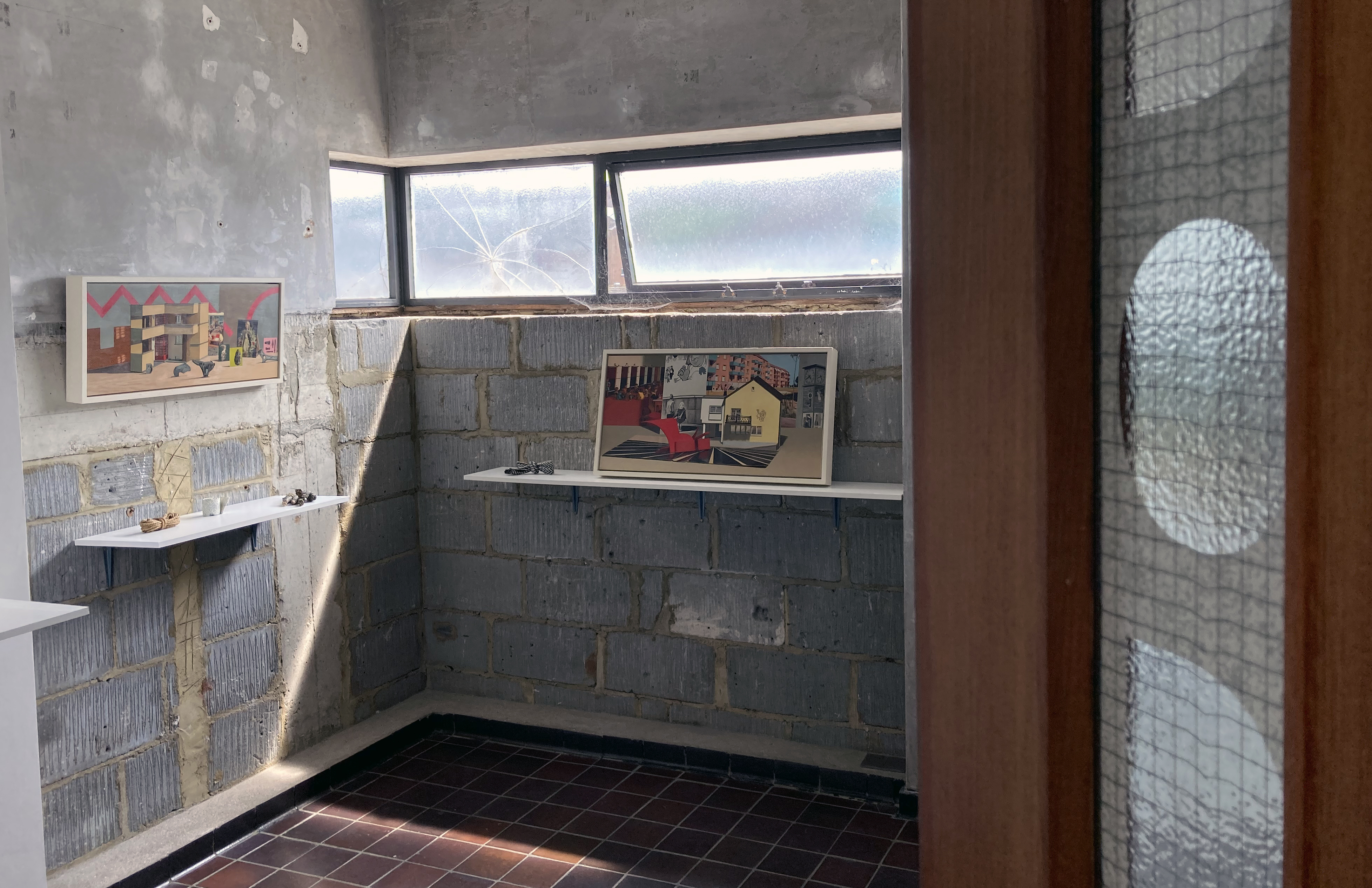
If you are already familiar with the artwork of Louise Bristow and Russell Webb you will know how fastidious they both are in the craft of their art making. Their respective and uncompromising working practices demand scrupulous attention to detail and full command of their chosen materials, processes and subject matters. I had not previously considered their work being shown together, but here they are in and other trivial matters at the Gallery Dodo in Phoenix Art Space. The results are impressive, not least because they have installed their work in complimentary fashion without either dominating the other and with a careful juxtaposition of contrasting imagery and objects. The works link under a broad still-life categorisation with the small (life size) sculptures sitting comfortably with the reduced scale of painted objects depicted in the paintings. As is typical of the still-life genre the imagery can be as straightforward, or as loaded, as the artist intends and the viewer is able to interpret.
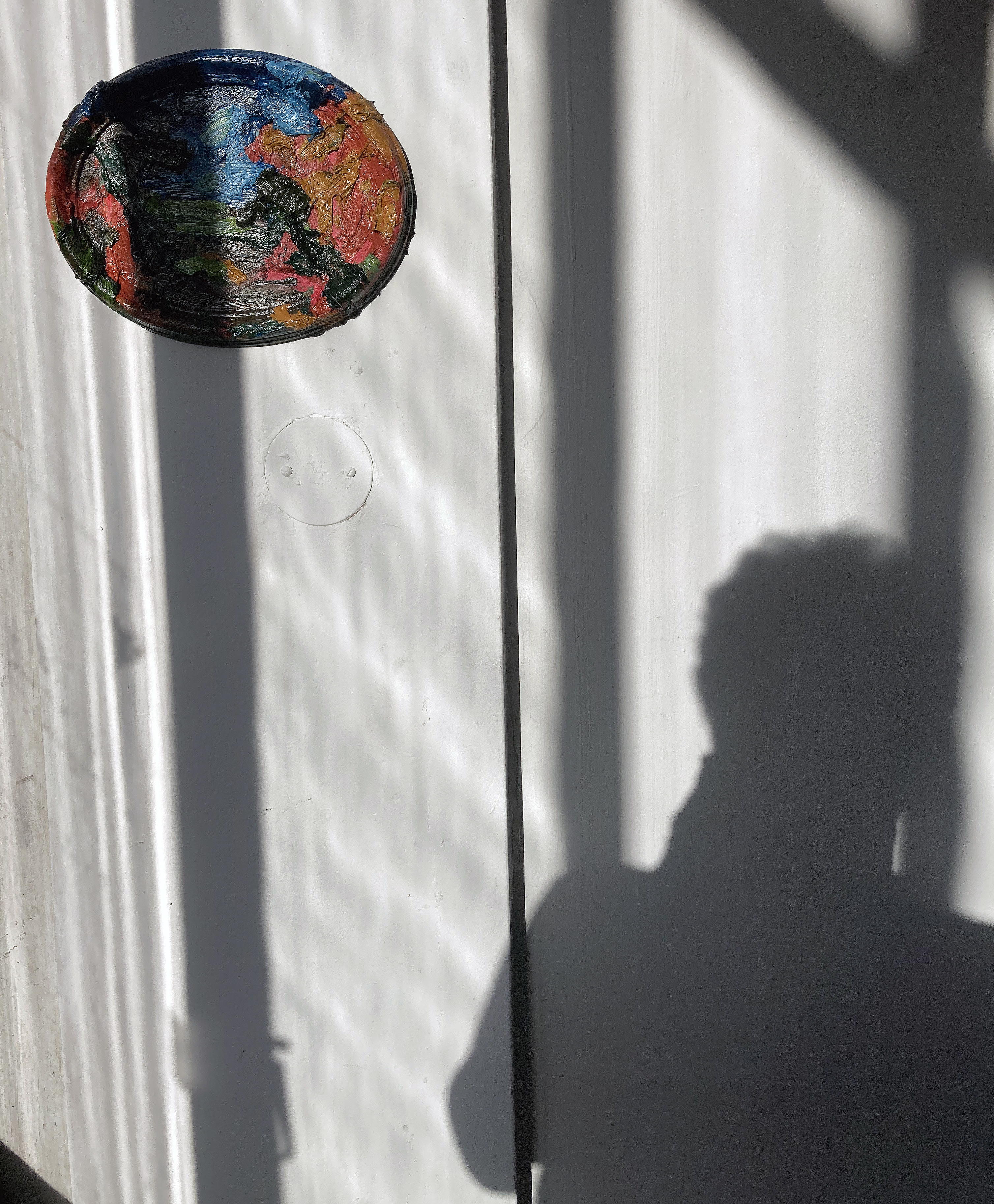
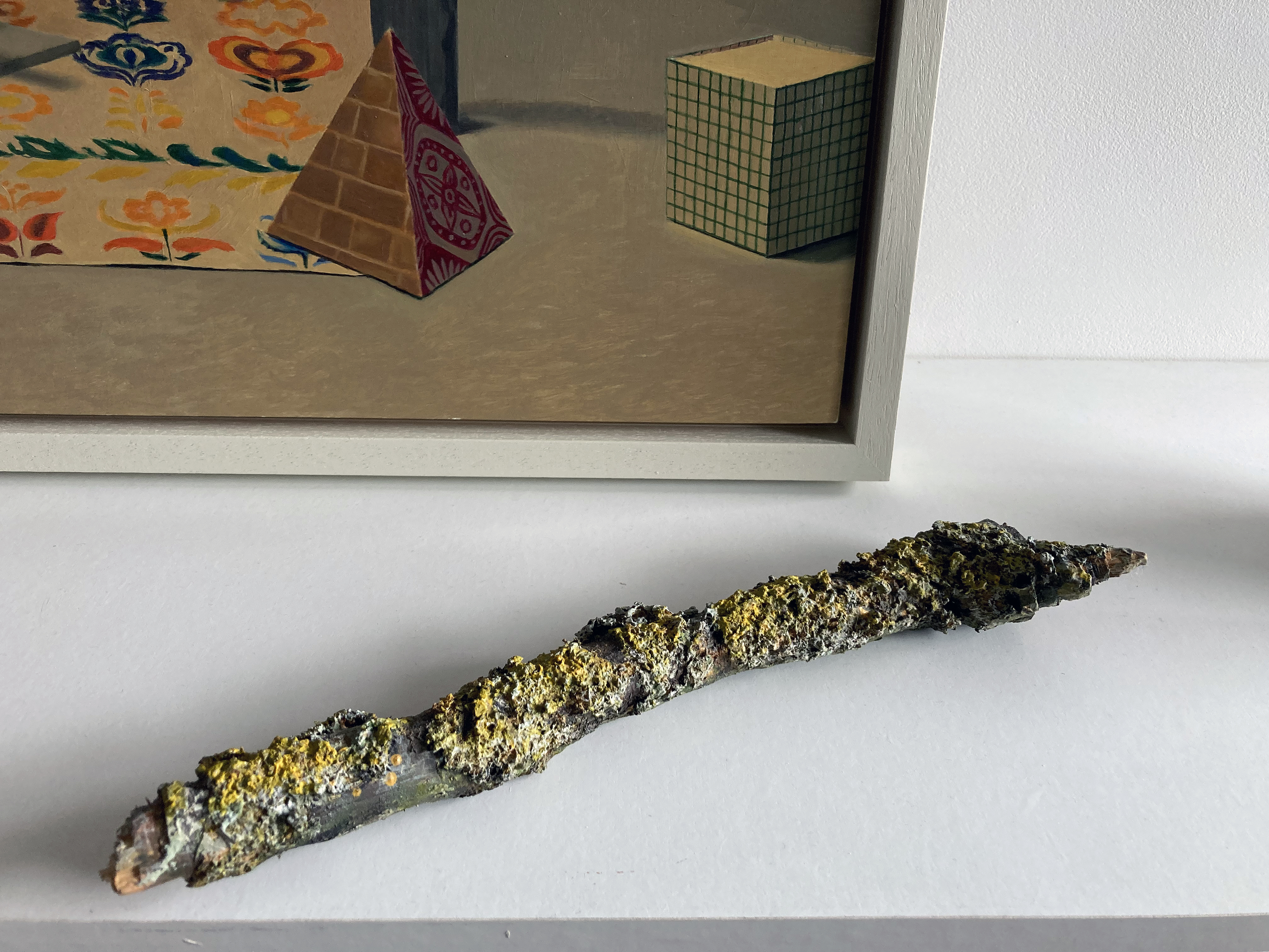
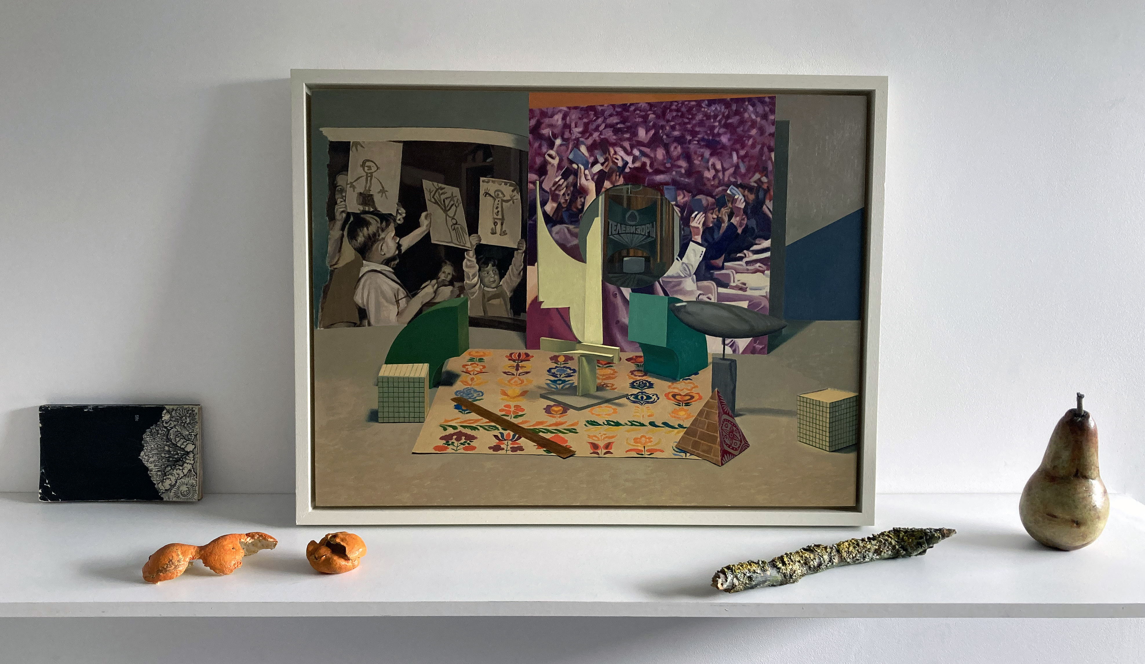
My initial visit to the exhibition was hurried and fleeting as I had my own studio to get to at the recent Phoenix Open Studios weekend for the Brighton Festival. A few days later I was able to return to the space and to peruse the contents for as long as was necessary. But that first fleeting visit was surprisingly useful, for a stick had stuck in my mind. This was Russell Webb’s Stick Surgery (viii) to be precise. For when is a stick not a stick? When it’s a (found) curtain pole, with sawdust and acrylic paint applied, of course. But when this combination of materials is transformed, or re-naturalised, into an object/ornament that you might display on your mantelpiece at home you must remember not to be deceived and put it on the open fire – or you will have lost a sculpture. Why the mantelpiece? Well that’s where one might typically display a found object from a countryside walk. An objet trouvé become perdu (holding aesthetic value) – maybe with a hint of the wabi-sabi aesthetic. But it’s not a found object; it’s a sculpture, I dare say, of the unmonumental category. So whilst it references the natural and the everyday, the quotidian in contemporary artspeak, as a designed or constructed object it may have a different sense of value to the found object. At which point I am getting confused between any old stick and the one that the artist has made. Is this his intention?
A mental fixation on just one piece of artwork encountered at the start of an exhibition is rare in my experience, as I have a habit to scan for an initial impression and to have a walk around to acclimatise myself. But as the Gallery Dodo space is relatively small, and I was pushed for time, this particular example of Webb’s selected pieces caught my attention first. Of course, in contrast to noticing this one individual item, I was also aware that, in a sense, the whole room was full of objects. In addition to the thirteen three-dimensional objects displayed on four shelves there were over forty still-life items represented in the four paintings. A return was clearly required.
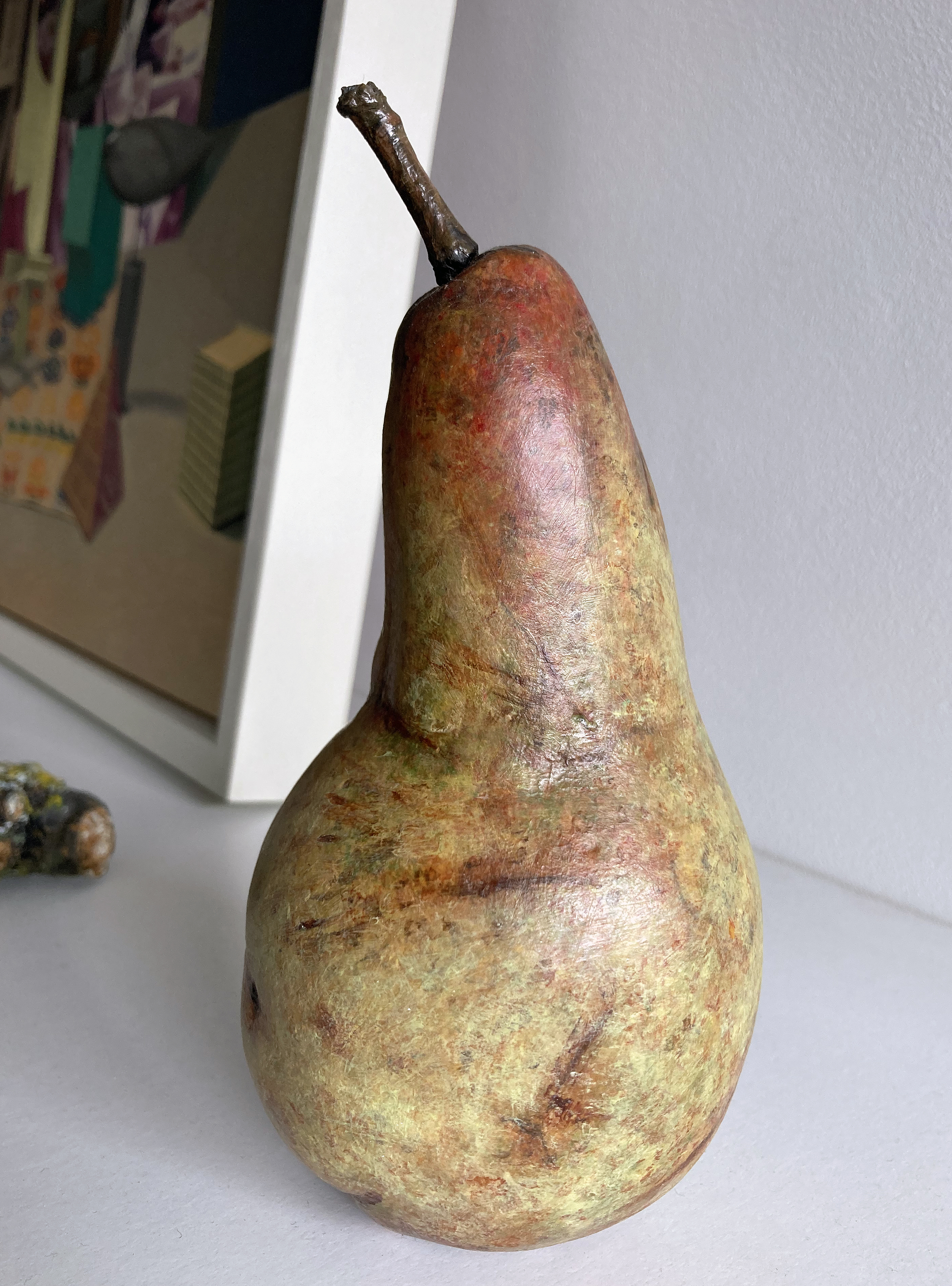
Sitting in the Dodo space on my own for a private viewing a few days later was immediately quite calming. My inclination was to just relax and look, scribble a few notes as preparation for this review, and try to dismiss personal expectations. Simply respond to the physical content before me. Whenever I look at Louise Bristow’s paintings I slip into a state of calm anyway. They are so quiet, not even a hum emanates even if the imagery, a painting of a photograph perhaps, suggests a particular soundtrack from the contextual content. But this is not a display to sit and look at from a distance. It is imperative to stand up and move closer to each of the four groupings of an individual painting with various sculptural forms arranged on a shelf beneath the image. Both sets of work invoke an admiration of how they have been painted. In a sense, they are super-realist – though certainly not photo-realist. Webb’s sculptures might be termed as object-realist. They are utterly convincing as being the real thing, such as the orange peel or the piece of string. There is a common factor of the discarded, damaged or moving beyond some notion of a perfect state (e.g. Venus Figure – a slightly over ripe pear that appears to be tottering in terms of balance and tastiness) in his selection of reproduced items. They might typically be found in the kitchen, the garden shed, on the street or from that aforementioned woodland walk.
His titles are fundamentally important too: Lost Memory (a knotted length of material), LittleVictories (two successfully removed orange peels that each remain as one piece of skin), or FamilyTree, a broken off twig with three shrivelling berries remaining and the slightly spiky and pointed receptacle bases of the original flower where the missing berries developed. The titles can be nostalgic, jokey or deep. Aspiration (Manet) might reveal the aspiration of the young art student or the long-standing ideal of the older painter. His titles certainly guide the viewer towards a particular thought or interpretation.
Bristow’s titles are also loaded with possibilities of analysis and exposition. There is also an element of nostalgia in the mid and eastern European and Soviet imagery where (for example) education, high-art, architectural design and social housing meet political idealism. On a formal level, the figurative-realist visual language of Bristow’s paintings appears to invoke that notion of apparent ‘reality’ that might align with objectivity. The People’s Forum, Red Vienna, CommonMarket and Playground are titles that certainly suggest further reading and investigation. But here, as paintings, and as objects, they invoke speculation and demand time for thought, probably over a long period of time. By implication, as observers of ‘art’ in a gallery, we might by extension question our own society today and critically consider our received political and social ideals and inspirations. But let’s not go down that rabbit hole now.
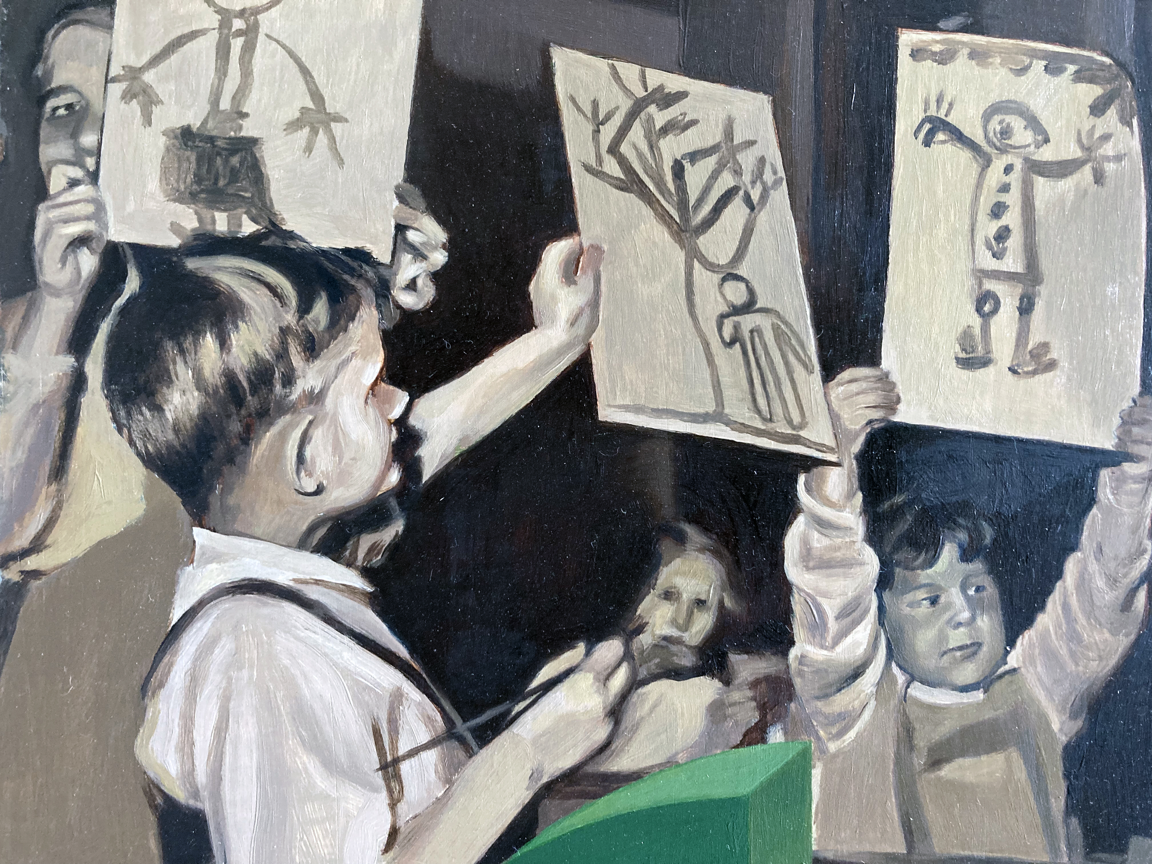
If one of Webb’s sticks remains in my memory, the image from Bristow’s paintings that stays with me is a section in the top left quarter from The People’s Forum that is a torn out page from a book or magazine. It re-presents a black and white photograph of a small group of young school children. Three of the four kids hold up their paintings for others to see and admire. The child (a girl?) in the top left corner of the composition looks at the photographer, and by extension us the viewers, so many years later. We might wonder who this person and the other young people were. What did they go on to achieve later in life, where did they live and what society were they were a part of. An objectively painted image (a reproduction) of a non-digital, black and white photographic print earlier reproduced in a physical publication might, semantically, become very subjective of course. It would also be a mistake to distance this image from the rest of the composition, visually engineered by the artist. What are we to make of another image of older (but maybe relatively young) people holding up small books? A few figures in the foreground are in focus with an out of focus background suggesting another photographic source, albeit in colour (maybe suggesting a later historical date than the aforementioned black and white photograph). Is that a sheet of wrapping paper on the tabletop? Does it introduce an element of nostalgia? What are those three-dimensional, architectural or modernistic objects doing there? Is that an ‘abstract’ type sculpture placed in the centre of the composition? None of Bristow’s compositions look random, in terms of content or compositional spacing. From the history of art, Piero della Francesca, Clara Peeters or the multi-talented El Lissitsky could well have inspired and guided her development as a painter – but she creates a voice of her own in the context of a politically complex world.
Physical objects (materialculture in Semiotic theory) are inevitably reconstructed and interpreted by the artist and the observer, in this instance via the still-life repertoire and the notional gallery space that Louise Bristow and Russell Webb have all too briefly occupied. A sense of the personal and the political shifts between and within these works. As an audience we might question what visual artists do, and how they do it – especially the painters in a digital age. Biased as I surely am, seeing 2-D and 3-D paintings as impressively skilful as these, I sense an argument for the continued relevance of painting that both references a deep history and provokes or coaxes the imagination of the viewer. There may be more to this show than meets the eye. Where’s Duchamp, when you need him…
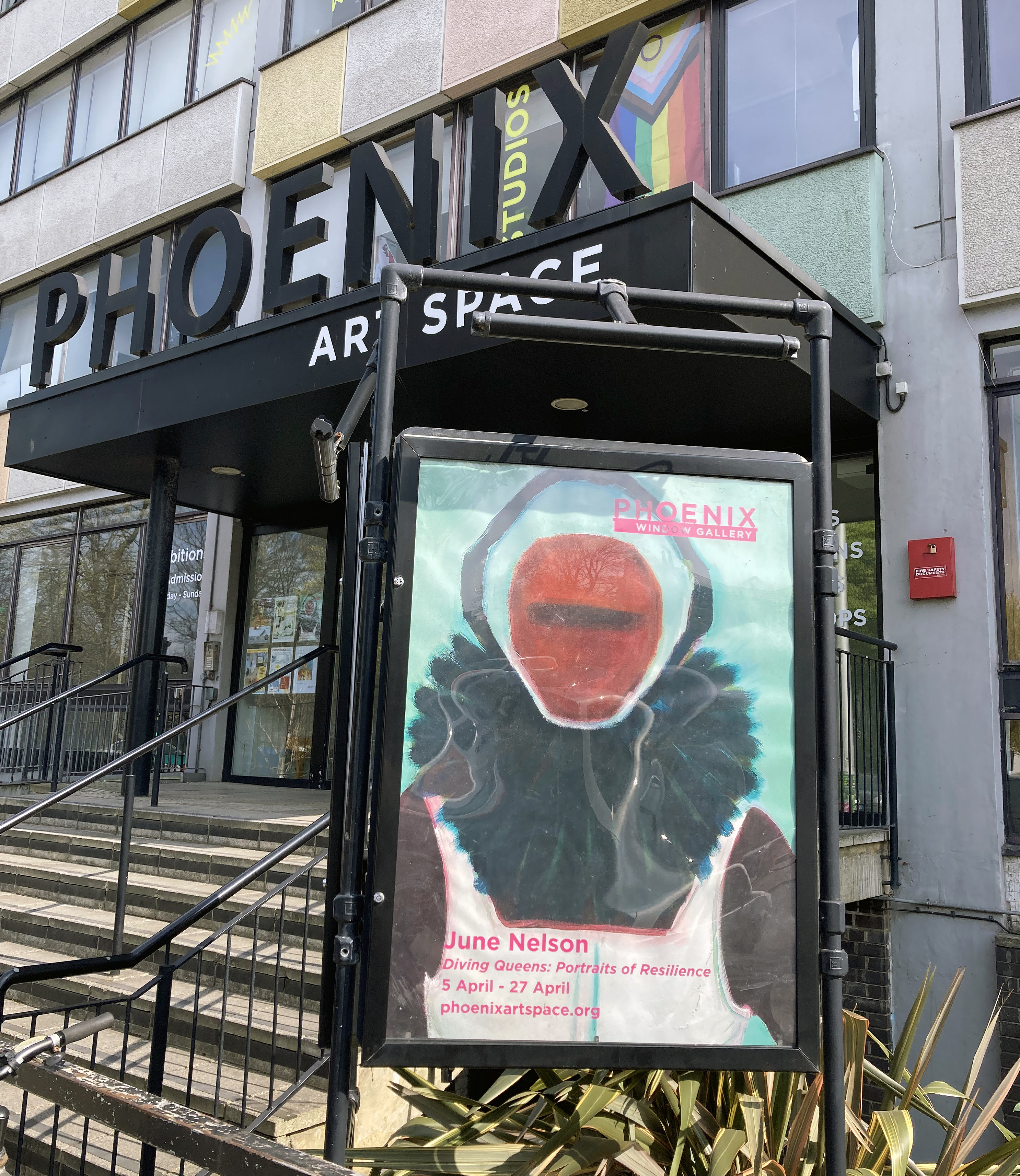
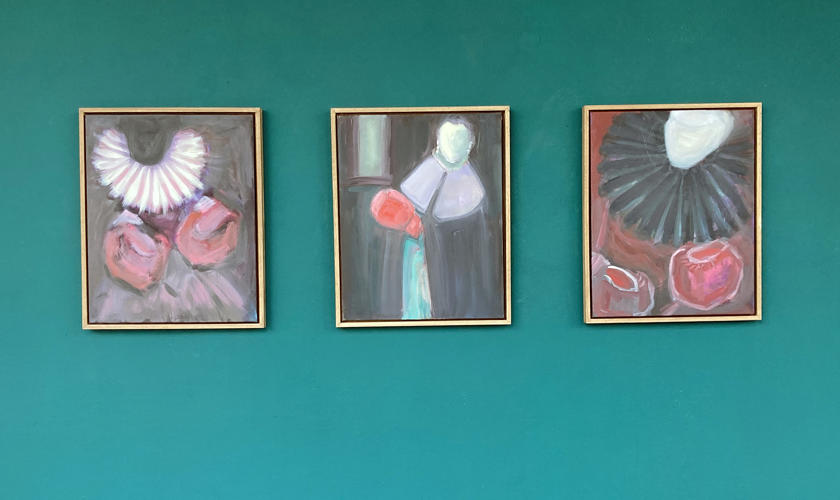
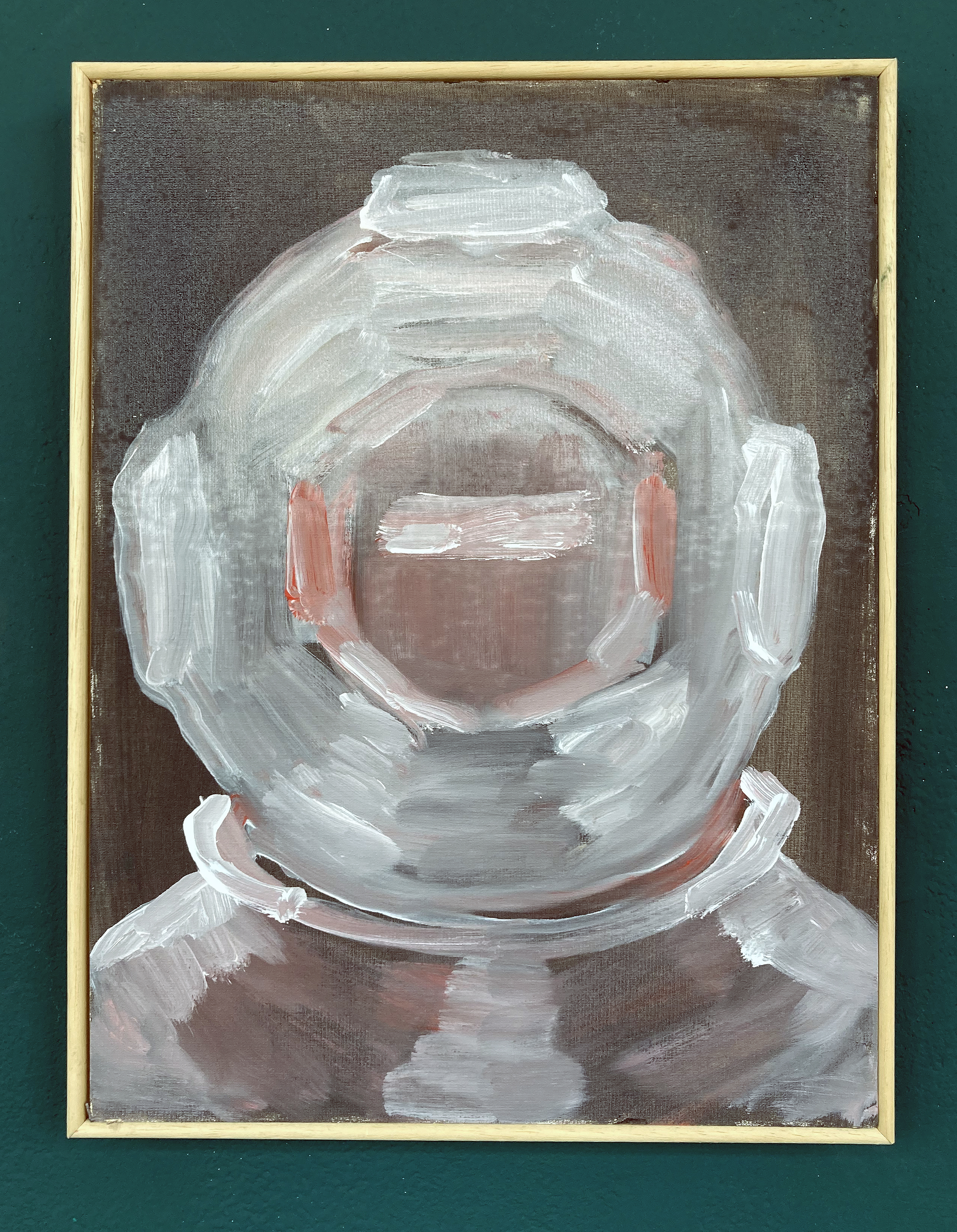
The gloves are off, or rather on. Diver’s helmets too, plus rigid ruffs and helmet-like attire from Elizabethan and Flemish portraiture. In this impactful exhibition by June Nelson the viewer will most certainly sense the presence of an implied wittiness and sense of humour conjoined in a serious and profound range of imagery.
The dramatis personae are unidentifiable as they are everywoman and, I surmise, the artist herself. It’s a clearly contemporary collection of works too, that take in historical references for the present day. What makes the choice of imagery for this exhibition at the Phoenix Art Space so pertinent for today are not only the almost cartoonish and comical images that might (but do not) undermine a serious visual discussion, but also forms a presentation of evidence of a dynamic and self-questioning undertaking aligning a feminist perspective with images to match. These portraits of resilience proclaim a contemporary voice operating from the painting studio, rather than from some alternative social media pulpit. Punches are not pulled.
June Nelson – Beyond Countenance, Regalia and At The Court of the Pugilist (all 2025)
Aligned to a notion of portraiture, that is in fact far from trite or superficial, the works create, with narrative devices such as gestures, gender related costume and the blank gaze, a stage on which to enlighten the viewer. In these sixteen paintings, Nelson holds back from presenting too much detail and is being cleverly and purposely simplistic in not overworking the visual language or the immediately readable content. There’s something here about proclaiming painting as relevant as any other medium too, with a feeling for the materiality of this colourful but sometimes crude substance that is what it is – just as any implied narrative is presented with a rawness of self-awareness and realisation through the crucial activity of painting. Paint, and painting, offers itself up as alchemical process, turning emotion, anger, thoughts and feelings (personal, social and, maybe, familial) into a positive, dynamic realisation and outcome.
In a statement on her website, Nelson has stated:
“I am fuelled by an interest in female agency and our sense of self, using history, mythology, and personal memories to stand witness to often hidden or silenced lives, particularly those of women.”
With this declaration in mind, I therefore assume that there is both a rallying cry, aimed at female observers who share a common sense of unfair, ingrained prejudices in society, alongside a wake up message to the male audience. This could be challenging subject matter for someone like me (a male, liberal, Late-Boomer) who likes to think that he is liberated from gender-based prejudices, when in fact he knows that he still has a lot to learn and to understand. Nelson therefore imposes, via engaging imagery and painterly expertise, a perspective and a position that should not be ignored or discounted.
June Nelson – Diver, Deep Brown (2024)
The artist further explains that:
“Recent paintings… continue to explore the same themes and motifs – seeing and silencing, suppression and repression. In a union of the personal and the historical, paintings portray women wearing deep-sea diving helmets, ruffs or boxing gloves. Often taking Tudor portraits or medieval ‘Doom” paintings as a starting point, uncanny faces gaze out at or hide from the viewer. As a modern woman looking back along the matriarchal line, not much has changed.”
This is certainly an absorbing theme and the exhibition, which initially invites a stroll from one end to the other in the corridor-type viewing space, has enough range to encourage looking at individual works as well as carefully selected groupings of pairings or threesomes. This display policy creates a healthy sense of the artworks as an ongoing project, with further possibilities for all sorts of juxtapositions or giving individual paintings their own space. There is both a sense of self and of belonging to a community offered up in this project. With similarities in content, such as entrapment, silencing, battling against the odds, and understandable frustration with progressive developments in ‘modern’ society changing so slowly, there is yet the sense of a series growing quite organically rather than as a too forcefully premeditated or programmatic endeavour. On a more individualistic level for the painter herself, I sensed that there is a form of self-revelation through the practice of being a visual artist, expanding and advancing a challenging discipline, which might always be on the verge of failure. I mean this in a positive context, as both an exploration into conditions of identity and as a necessary condition of painting.
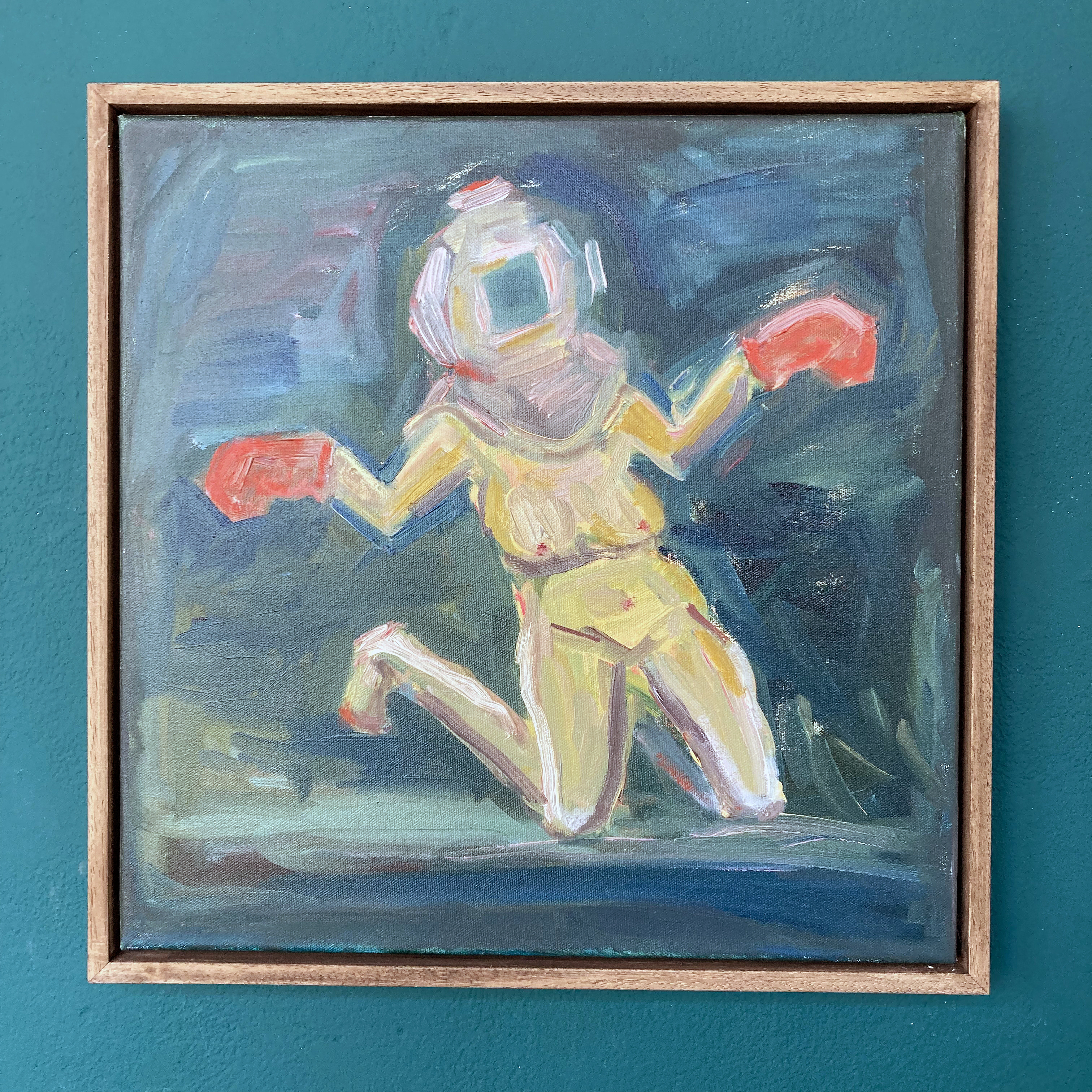
June Nelson – Red Gloves (2024)
There is also a sense of the work-in-progress, as the artist engages in a creative studio-bound journey that is open to trial and error and who refuses to fall into the trap of producing some colourful decoration for the living-room wall. This, I hope, is the kind of project that makes the viewer stop and think, to be unsure, and even to be left feeling a little uncomfortable – particularly if the image initially looks somewhat humorous. For example, as in ‘Red Gloves’ that reveals a naked woman, not conventionally delivered for the male gaze, but almost as a take on a crucifixion of sorts. The outstretched arms, with red bulbous, stump-like ends representing boxing gloves, rather than blood, has a potentially defeated feel to it, but, ironically proclaims a rising strength of character.
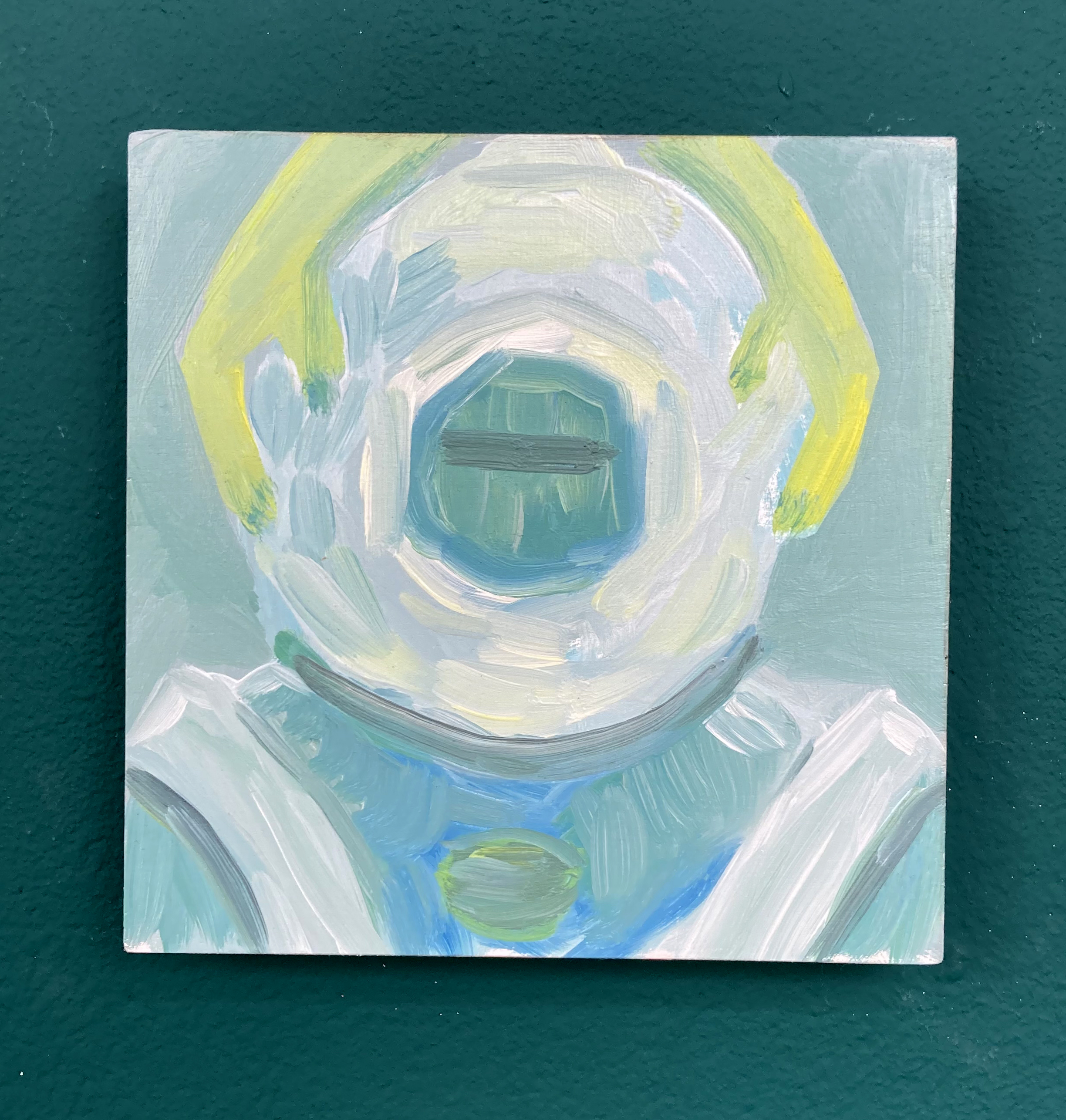
June Nelson – Helping Hands (June 2024)
I also felt (but could be totally wrong) a measure of sadness and loss. This unexpected reaction initially emerged from a very small work, ‘Helping Hands’. This was not so much from the caring yellow hands that cradle either side of the outside of the diving helmet, but there is something about the paint application and the gently applied, painterly wash of blues and greys, with perhaps three horizontal strokes of the brush blanking out the eyes, that implied a melancholic theme. A greenish oval floats beneath the helmet like a brooch, a medal or a heart. There is enough scope here for the viewer to bring his or her own interpretation to a subtle yet robust image.
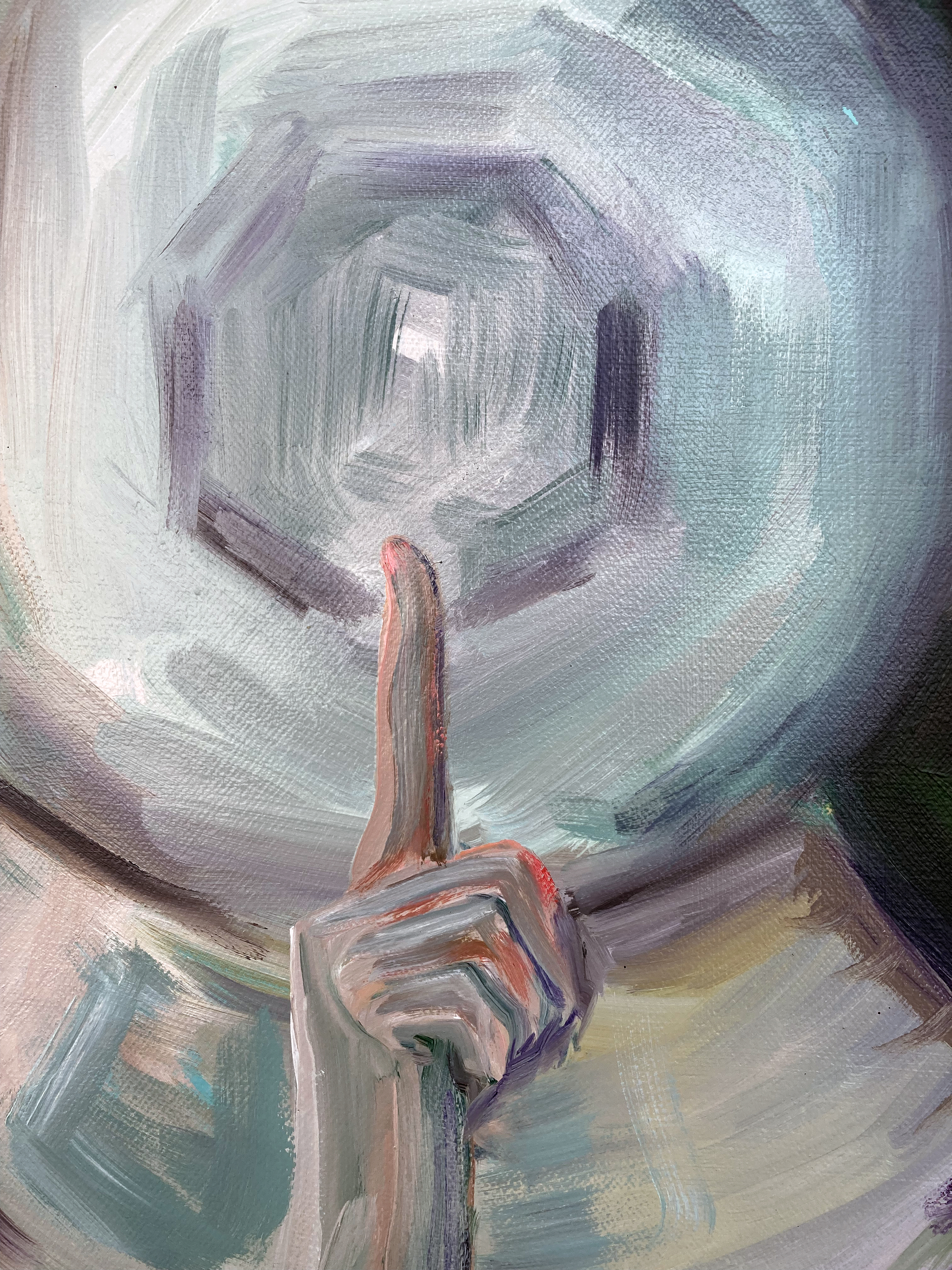
June Nelson – detail from Silence Sealed (2025)
Above this small work was a more immediate kind of message, a hand gesture implying secrecy or suppression, conveyed in ‘In Silence Sealed’. This striking portrait brought to mind the anonymous imagery of a nun from a silent order, with an almost halo-like disc that hid the face of the unaccredited portrait. Yet the icon-like image was not so much religious in a denominational sense, but more universal and quietly empowering, representing a vow of collective, female, knowingness. These are paintings well worth taking time out to see and to allow the imagery to enter one’s own thought-space. To prompt recollection of the roles, say, that our historical (and/or family) predecessors played, or that our contemporaries in society undertake today. Nelson’s characters form a sort of Commedia dell’arte for the past, the present and the future. But any implied comedic element is wittily and unambiguously turned into serious content. The female viewer is both in the ring and in the audience.
June Nelson – Diver, Deep Brown, Pink Diver and Diver, Jade (all 2024)
Often the best paintings, literature, music etc. take time to come through. The first impression may well be the one to not give too much credence to. A degree of complexity in any art form deserves a period of further thought. After five or six visits to Grant Foster’s exhibition at the Phoenix Art Space I know that I need to look again and again. This is good.
Q. What do you think about when you are looking at an exhibition of paintings?
What is the mind of any onlooker doing? Searching for something recognisable? Prepared and preconditioned by our shared culture we might be expecting something general or commonplace, such as a human figure, a landscape or objects constructing a narrative as a way into the work. What, potentially, could these visual references add up to? What might the storyline be, if there is one? And if the narrator/artist is describing something, making a serious statement or spinning a yarn, can you relate to the theme? Alternatively you might be more of a formalist with an eye for the aesthetic hit. The purely visual, via systems or improvisation, might be your thing. Either way, so-called content can be very complex or minimal. Of course, if the exhibition has a title you are already geared up with some expectations. Home To My Teenage Bedroom sounds perilously loaded.
There may be some idealised notion of preparing to see an exhibition as objectively as possible with the mind emptied. Ideally the extraneous thoughts of those other aspects of one’s life are put aside, at least for a while. It may be an artificial approach, but imagine entering a show with a mental blank slate. No preconceptions or expectations. What is experienced afresh? Nope. This is just not possible, or even desirable. Our various histories create our personalities (however flawed or enlightened) and enable a personal take on what we see and understand. In the case of this show we might consider that that teenage past was an under investigated portal that might throw some light onto who we became in adulthood. Grant Foster acknowledges this potentially rich period of life in a wall statement:
“It’s often said that our teenage years are the most decisive – our interests, obsessions, and passions are innocently formed and planted like seeds, taking root over time.”
But without any foreknowledge beyond the title of the show, visiting Foster’s exhibition at the Phoenix Art Space initially left me more impressed with the thoughtfully and dynamically prepared arrangement of works by the artist with the new Phoenix Art Space curator Laurence Hill, than with the paintings. I made no connection with the content, despite knowing the title of the show. I was surprised and sensed that this was a body of work requiring more viewings. In retrospect I guess I was a little overawed by the presentation. But I sensed that a few visits might be necessary, if only because my thoughts were probably too elsewhere – especially at an opening event that was extremely well attended as the crowds flooded in for three painting exhibitions under one roof.
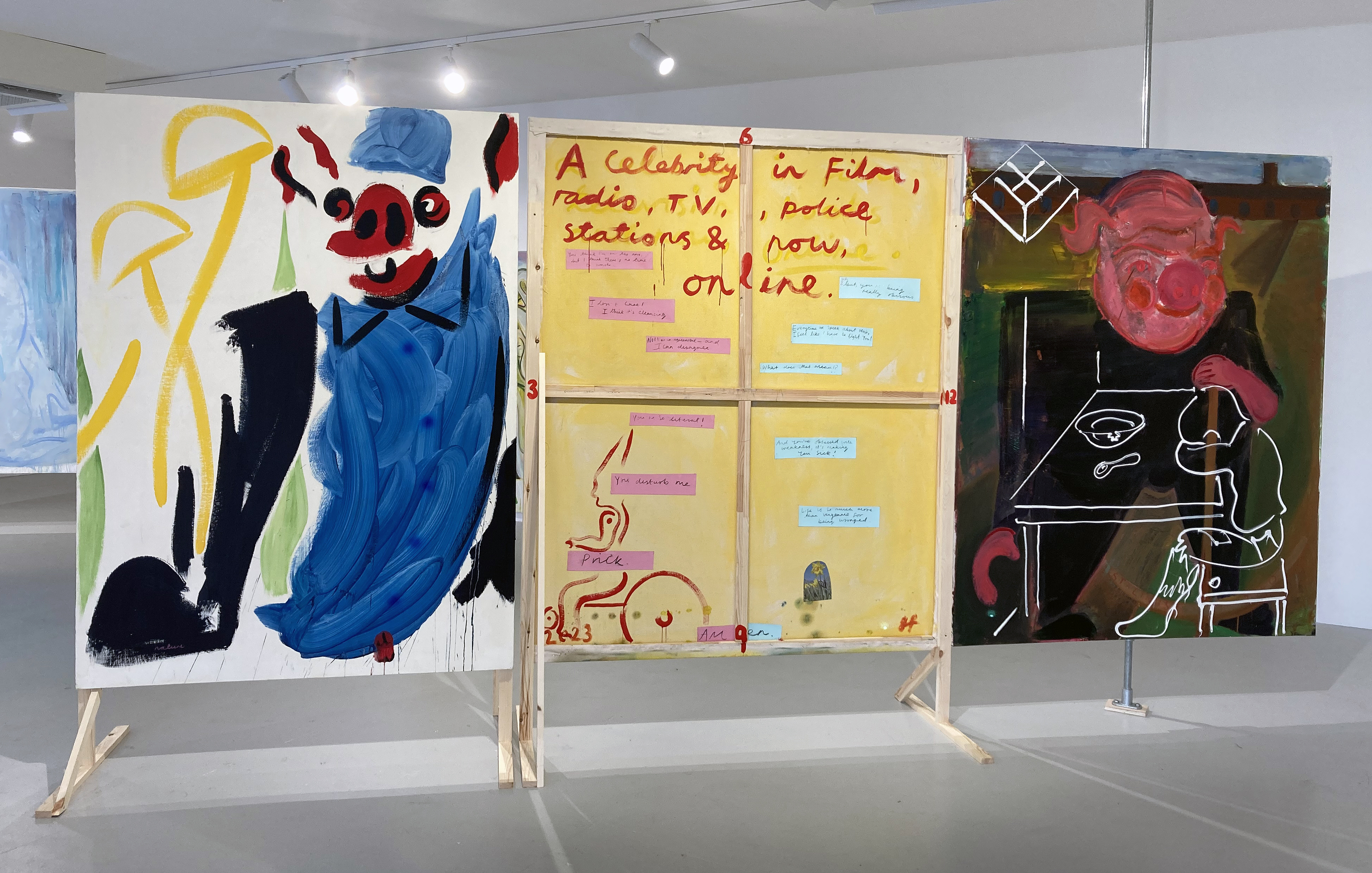
Grant Foster – Nature V. Nurture (2024) Help (2023) back and Psychiatric Hospitals, Full, No. 3 (2020)
Back home at the computer keyboard I recalled my first visit, and an all too brief second pop-in the next day, by describing, albeit generally, those initial impressions. The earliest typed out observations prompted the following text:
The visitor very much walks into this exhibition. Into a structured, planned space – but not forced, obliged or coerced to travel in a particular way. This installation invites a weaving, walking, stopping and starting, slow dance in, around and even through the works. In the large main gallery the majority of the fifteen paintings are free standing, fixed on wooden structures that are equivalent to the human scale. Some have vertical poles, like spines, attached from floor to ceiling to prompt the visitor to actually touch the work of art and to carefully turn it around, thereby opening a door of sorts and changing the arrangement where, in two instances, accompanying canvases are set up next to each other as a triptych…
Grant Foster – St Francis (To the Stars) (Matter without Hierarchy) (2024)
But I was clearly missing so much more. On my third visit I found myself tuning in to the echoes of the art historical that, generally, permeates all contemporary painting. Plus, the painterly visual language and the way that Foster generally draws with the paint media – perhaps as an expression of his personality – was immersing me into the imagery. For example, in the four St. Francis paintings, representing statuesque Giotto-type figures that are placed as two separate implied diptychs on the walls, the paint application is fluid and almost shorthand. The figures have turned away from the viewer. Are we to follow – through some kind of portal? Then there is evidence, no more than implied, of other figurative content. A cat in one composition and a swan in another. There may be some wings too and a building type passageway where there might otherwise be legs. Is there a rural environment too, with a little taste of landscape beyond? The uncertainty must be deliberate.
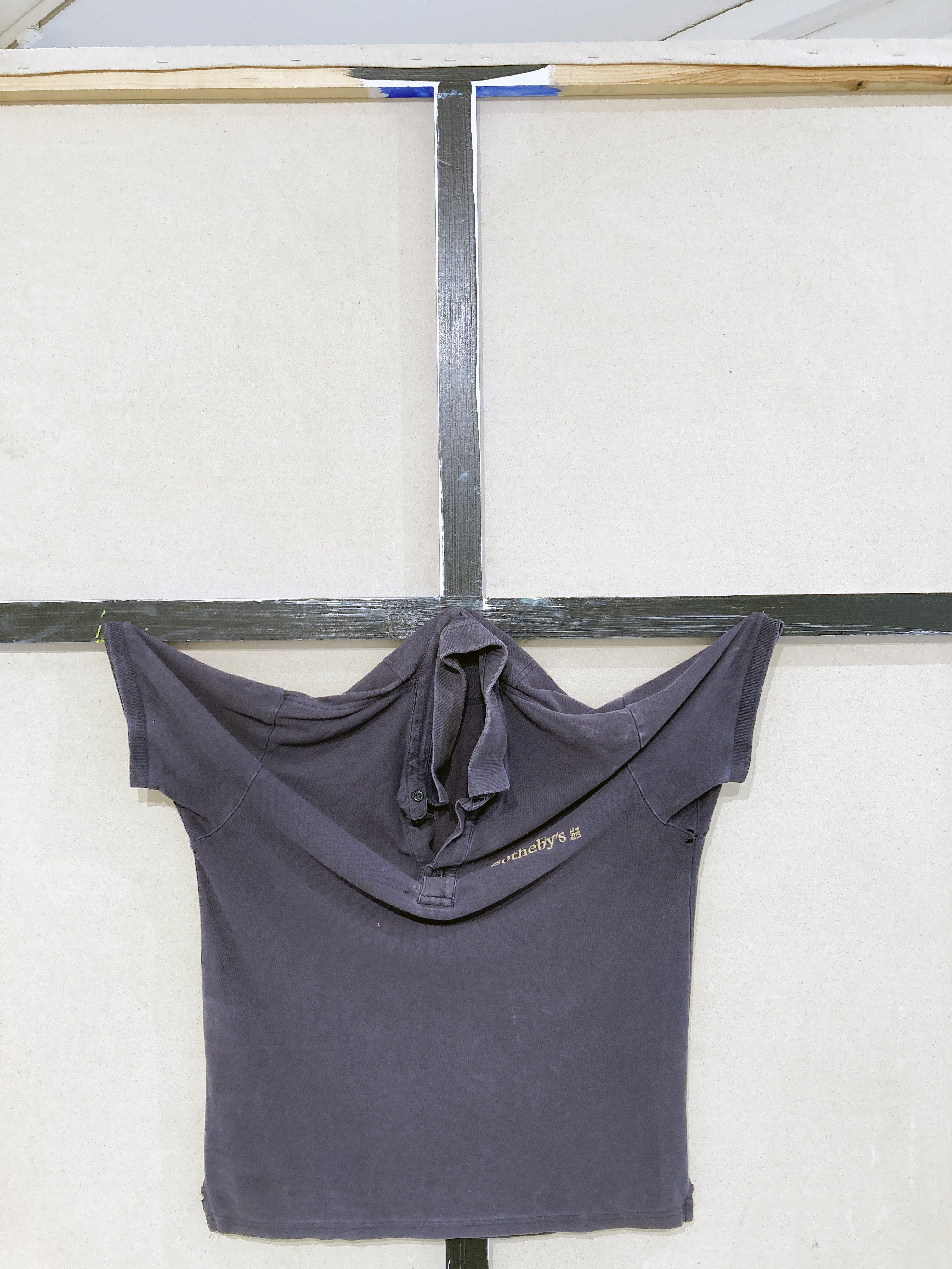
Grant Foster – Nature v Nurture (2024) rear
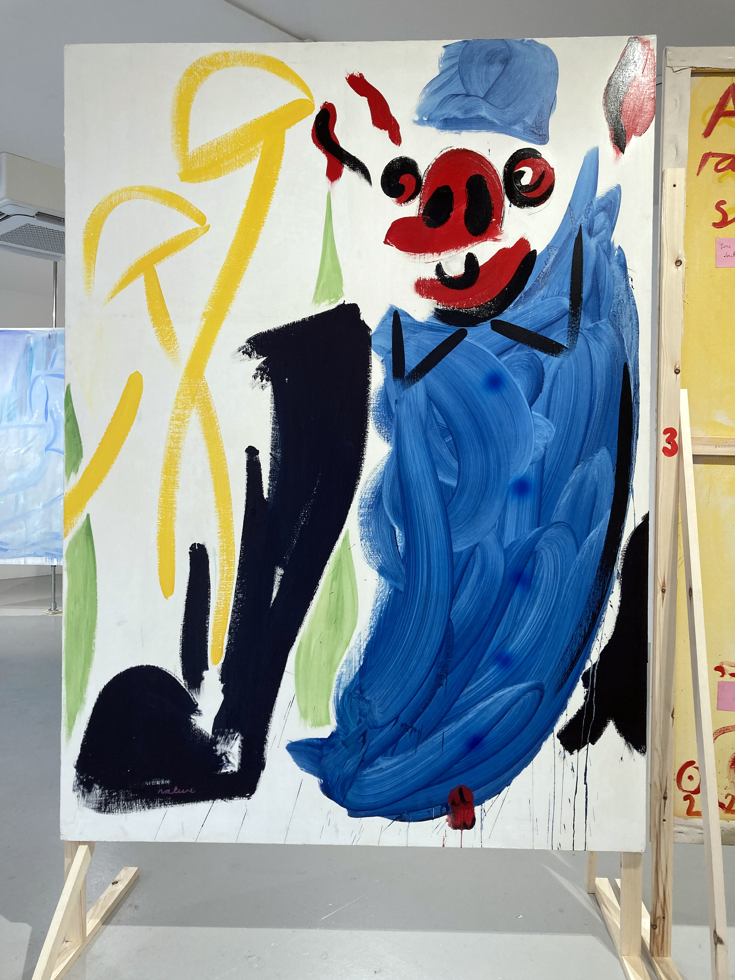
Another art historical reference might be the Sotheby’s work shirt fixed to the reverse of one of the freestanding canvases, Nature V Nurture, to suggest the Crucifixion. Perhaps I am reading too much into this, but others have made the same conclusion. On the front of this canvas a cartoon-like figure dressed in blue, but with red and black facial features appears animated by what might be two large yellow (psilocybin) mushrooms. This could be a retrospective self-portrait. It may not matter. Already, external contexts (facts or fictions) are expanding the reading of the works, even if I am mistaken. I am thinking again about the almost sketchy way that Foster applies the paint. In some of the works, many of them in fact, there’s a slightly underworked feel to the painterly execution, as if too much effort is to be avoided. This equates to a notebook-type intention, a formal device, which I interpret as a reference to a way of thinking and to the nature of mental recall. Events of the past, however strongly remembered or not, become a form of visual shorthand. Yet two canvases in particular stand out as comparatively overworked (even if they are not). These are Psychiatric Hospitals, Full, No 3 and Queendom which are each a part of two different floor-based triptychs.
Grant Foster – Nature v Nurture (2024) front
Each of these compositions appears quite different in subject and imagery. The former depicts a building (the hospital?) in mid-distance with a bloated pig-like character in the foreground, stood behind a table where a sad child sits with a discarded spoon and an empty bowl. In the latter, foregrounded figures appear to be involved in a judo move. Like the boy and table in the other painting these grappling forms are created with a squeezing out of white paint straight from the tube. Despite the two contrasting painting styles this incongruity works.
Grant Foster – Queendom (2024) front
Queendom is the more complex, visually loaded image. Over time the observer will make out other forms including a naked figure in the top left corner (which reminds me of figures from both Titian and Matisse); two animal forms (formerly cartoon characters from a childhood comic book?) and even a flat smiley face symbol, albeit with a nose, just below the centre of the composition but in shadow. I am sure that there is more here to emerge from a ghostly, shroud like confusion that threads throughout the composition. The looking experience is truly durational, suggesting that more could well emerge.
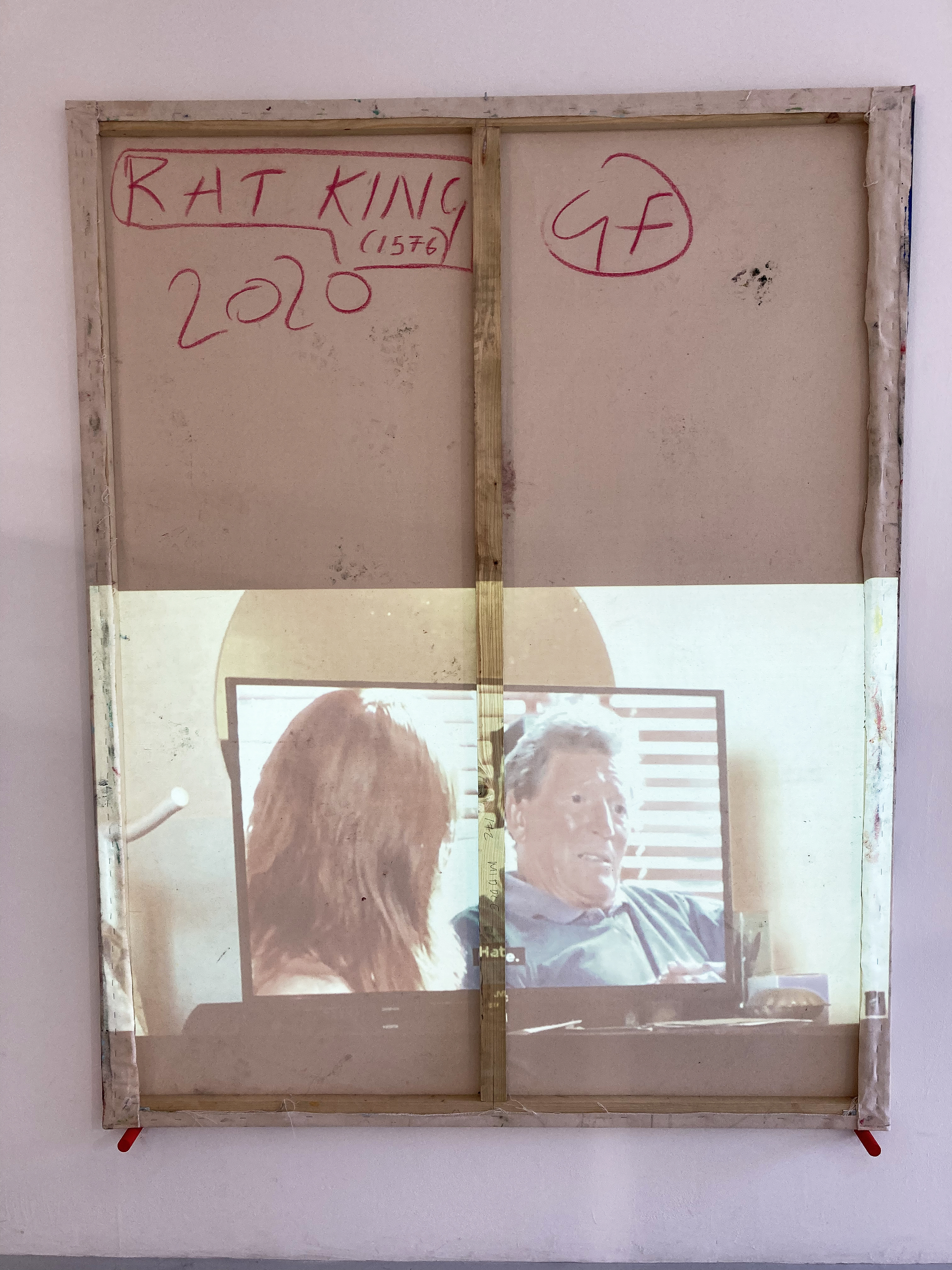
Grant Foster – Rat King (1576) (2024)
On this time-base note Rat King (1576), which has the de facto front pressed to the wall, adds a digital layer provided by the projection of the Telly with Mum video repeating every 43 seconds. This small element of the digital might be a pointer to future developments in Foster’s work – or a remnant of a past engagement with the once trendy art college digital projections that can be somewhat passé. But the projected content does provide a moving image element of collage that references watching television, which was the precursor to the computer screen and now the mobile devices that cling to our hands like an extra organ, back when Foster was a teenager.
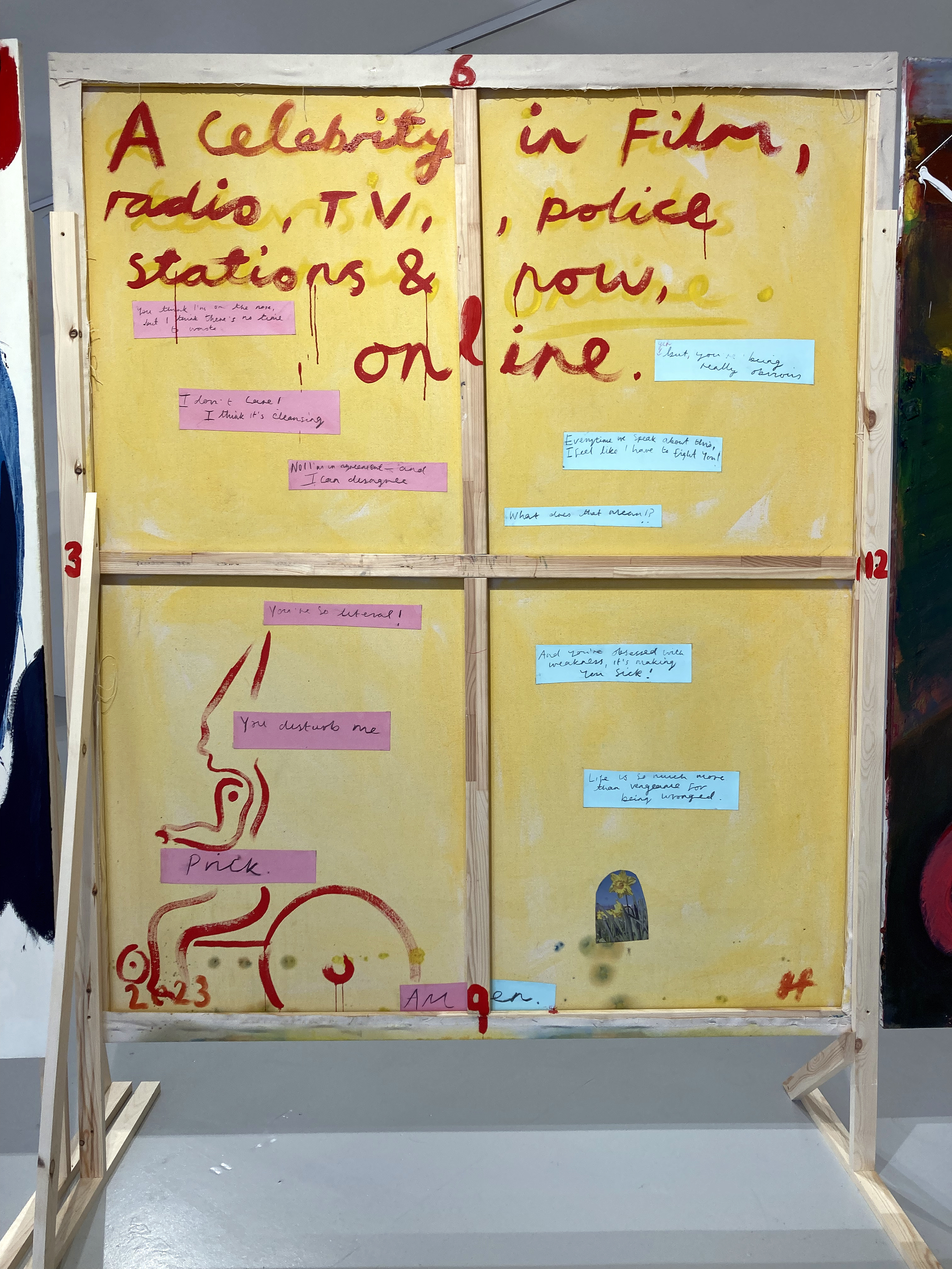
Which brings us to a literal emergence: the backs of the paintings. The majority of the works have backs to be viewed as additional fronts, which will be an interesting challenge for collectors of Foster’s works. The convention of writing a title and adding a signature on the reverse of the canvas is developed from what might be seen as the private space (like a sketchbook or a notebook) that actually wants to be quite public. With the further addition of painted imagery, photographs and extended text, they are clearly beyond being auxiliary or supplemental to the conventionally expected paintings made on the front of the canvases. The stand out rear view to me was on Help, which included a small printed image of a daffodil, a painted pixie-type figure riding a bicycle, a possibly alternative title (‘A celebrity in film, radio, TV, police stations & now online’) and a conversational collage of hand written text that was a recalling of a conversation between the artist and his partner. Foster’s jokiness feels deadly serious.
Grant Foster – Help (2023) reverse
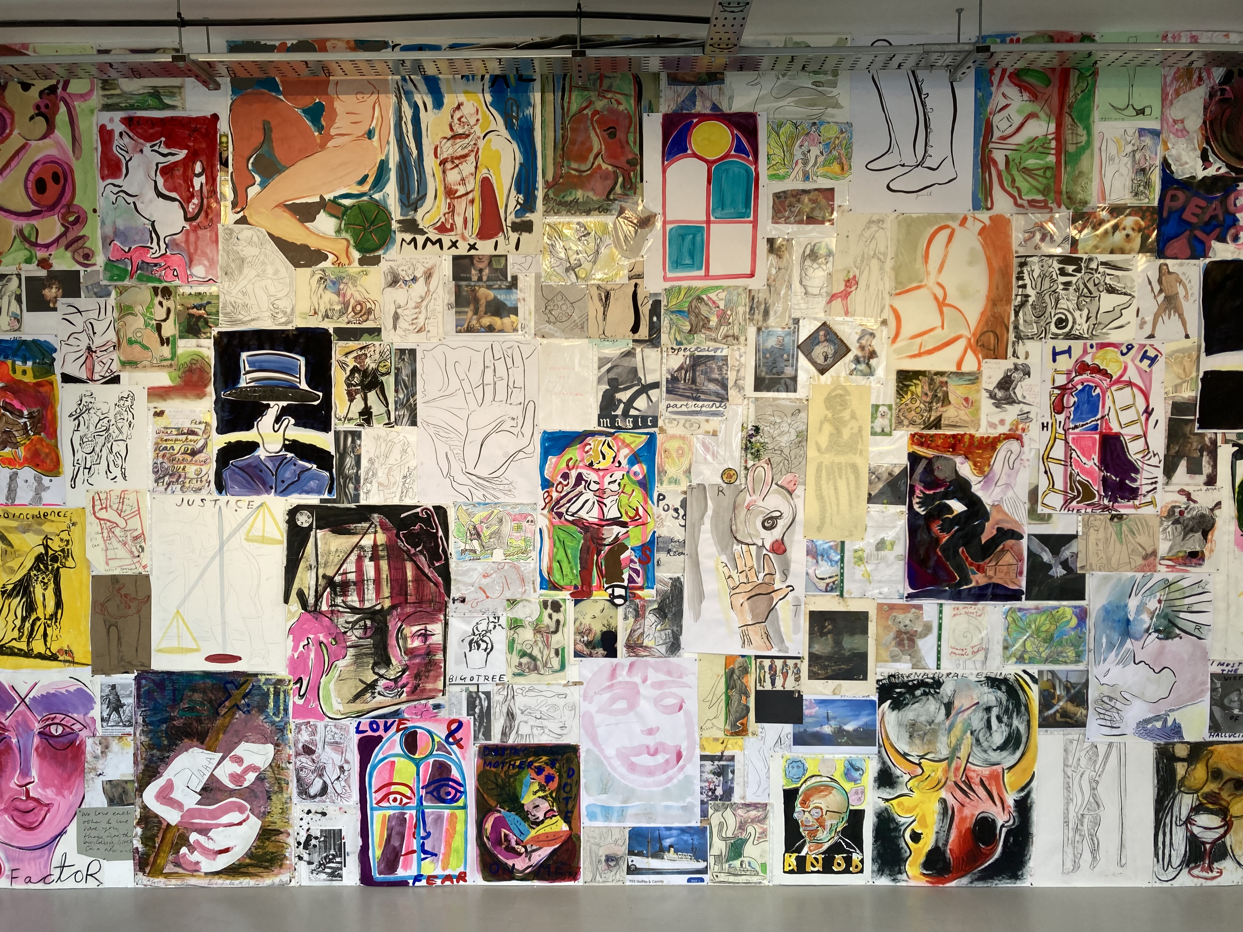
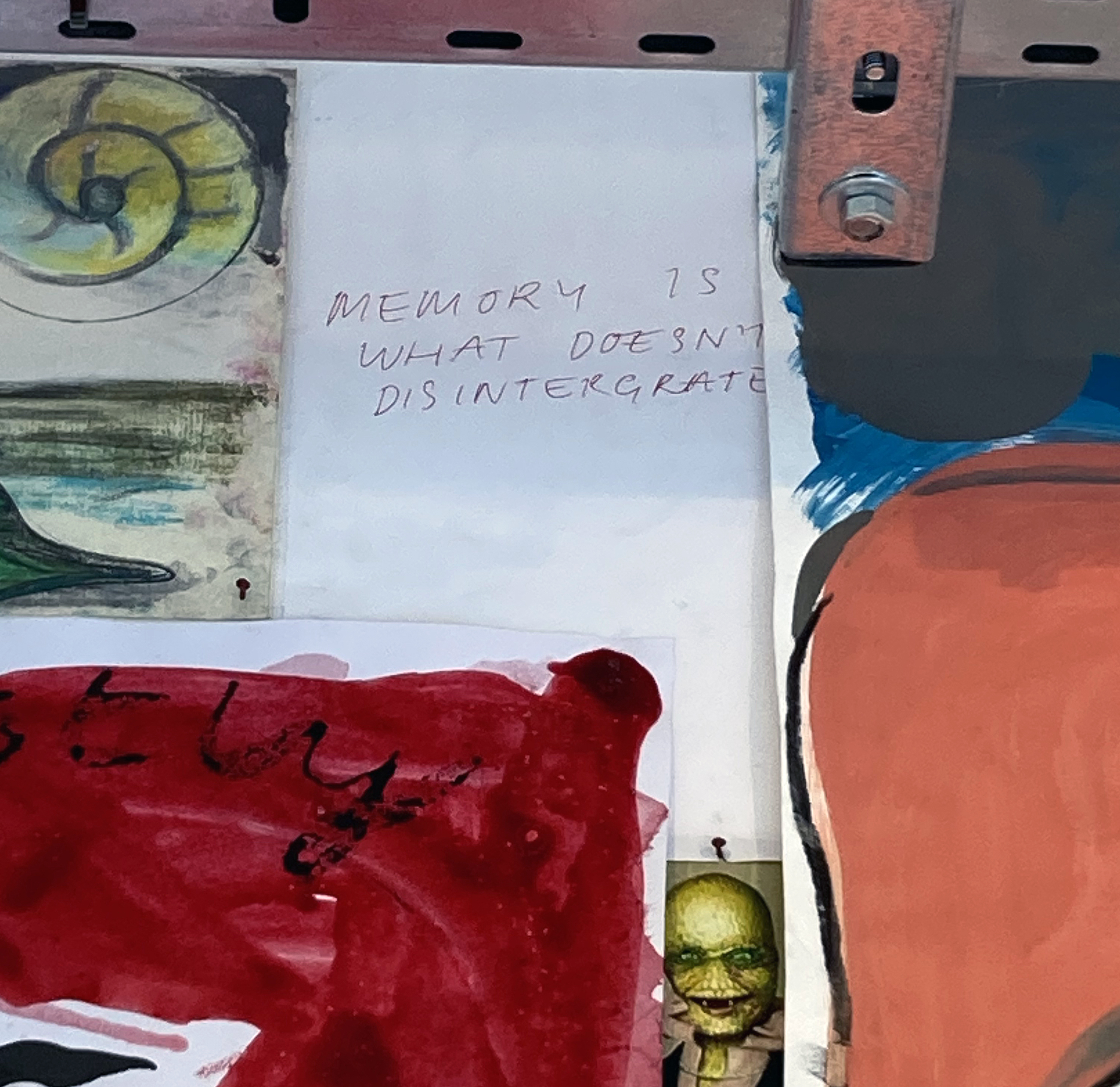
But delve further. Beyond this environment of paintings on the floor and walls the visitor, as a possible means of escape, enters what (in retrospect) may have been the implied bedroom of the artist’s youth. An annex off the main gallery with a large wall displays at least two hundred (I wasn’t counting) drawings, paintings, written notes and printed reproductions on paper. I jotted down a few of the phrases: Love and fear, All life is innocent, I must be the victim of a Hallucination, Innocence, Be Good People, and my favourite: MEMORY IS WHAT DOESN’T DISINTERGRATE (sic). Pictures (from books, art, TV, newspapers, magazines and the Internet) are so important to us all – and virtually unavoidable, then and now. Imagery from all and any context feed the imagination. There’s a sense of being inside an image-based thought process in Foster’s work that is constantly nourishing the potential of what the formative and the now fully realised artist continues to imbibe and assimilate. It’s the magical ordinary extracted from an image and text obsessed world – that was surely first started back in the caves of pre-historic humankind when the fundamental technology of mark making and visual language was really no different to now.
Grant Foster – Wall of works on paper installation
Foster’s wall text at the entrance explains more about the accumulation and assemblage of text and imagery:
“My studio is a haptic, experimental environment, where I continue to collect images, organising through free association: drawings, phone-screen grabs, newspaper clippings, children’s book illustrations, advertisements, and fragments of text.”
So, if the teenage bedroom was a place of seclusion that conversely expanded the imagination, then the adult studio clearly continues this function. Connected to thoughts and memories a touchy-feely collage type process, aided and abetted by literal touch as imagery that can be moved around, has expanded to and created the paintings in this show. On a more universal level we, as viewers, can surely connect with this phenomenon of the imagination, which runs alongside the everyday. Like the artist, we are always reconstructing and re-remembering: memories of memories, whether it was earlier today or decades ago, the happy and sad places, the images we made/make and those that we receive voluntarily or not. Narratives may not always be trusted as truth but new meaning or continuing misunderstanding may be of greater value and emotional impact as we age.
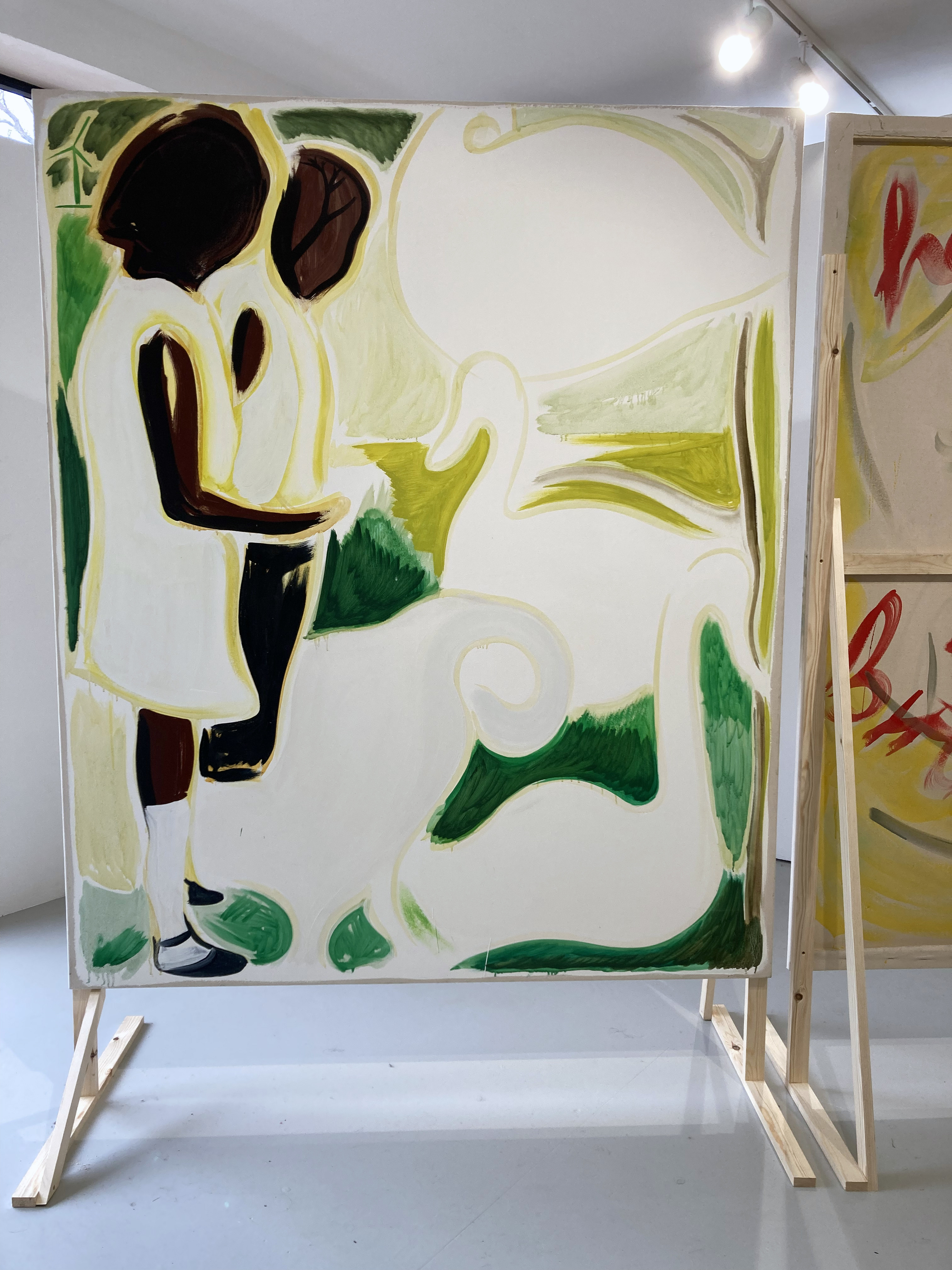
Grant Foster – Panspermia (2024)
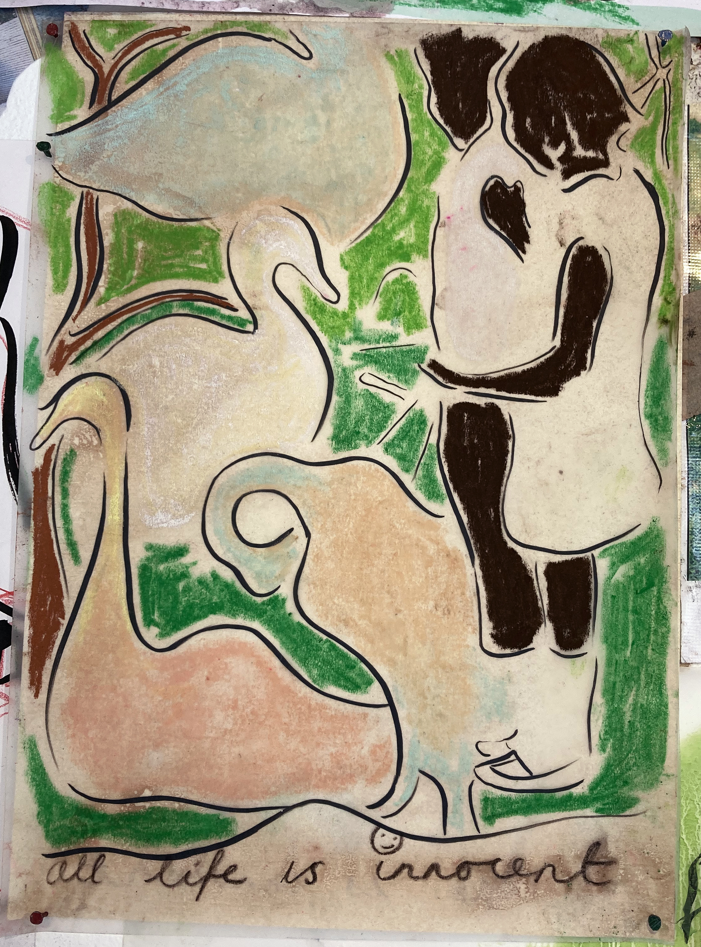
At this point as I consider wrapping up this review I recall a reoccurring image from the exhibition. There is just one photograph reproduced in the publication, A Year of Kindness that Foster has published and presented as the first listed work in Home to My Teenage Bedroom. It shows (I believe) the artist’s mother and uncle standing close to water where a swan has approached. The image is first encountered in the exhibition in the painting entitled ‘Panspermia’ (which Wikipedia informs us “is the hypothesis that life exists throughout the Universe, distributed by space dust, meteoroids, asteroids, comets, and planetoids…The theory argues that life did not originate on Earth, but instead evolved somewhere else and seeded life as we know it.”). The image crops up again on the amazing collage wall of imagery in what must be a preliminary drawing for the painting later on. Now there are four swans, curvaceously morphing into organic shapes. The drawing could easily have been missed amongst so many images, but may have stood out for its line of handwriting at the bottom of the page: “all life is innocent”.
Grant Foster – Drawing for Panspermia
Returning to the painting, Panspermia, one sees that the swans could be read as decorative visual elements and that the black lines in the earlier drawing are now changed to a more yellowish green hue that visually suggests an organic environment. The branch of a tree fills the head shape of one of the two figures. Is that a wind farm sail in the top left hand corner that hints at the environmental concerns of today? It makes for a somewhat dreamy image whereby the unconscious is given as much credit as anything rational.
Near the start of my response to this exhibition I posed the question: What do you think about when you are looking at an exhibition? Perhaps, what you and I think about after seeing an exhibition is more pertinent. Our memories of previous experiences, times and places are embedded in our imaginations as we engage in recall. There might be hidden treasure in a photograph album too. Timelessly it’s all a here and now that, for some, becomes stronger as we get older. Foster provides much for the viewer to consider. Nothing is necessarily too clear to merely illustrate. This project sets us up. The viewer has work to do.
Geoff Hands (March 2025)
Grant Foster – From the works on paper installation
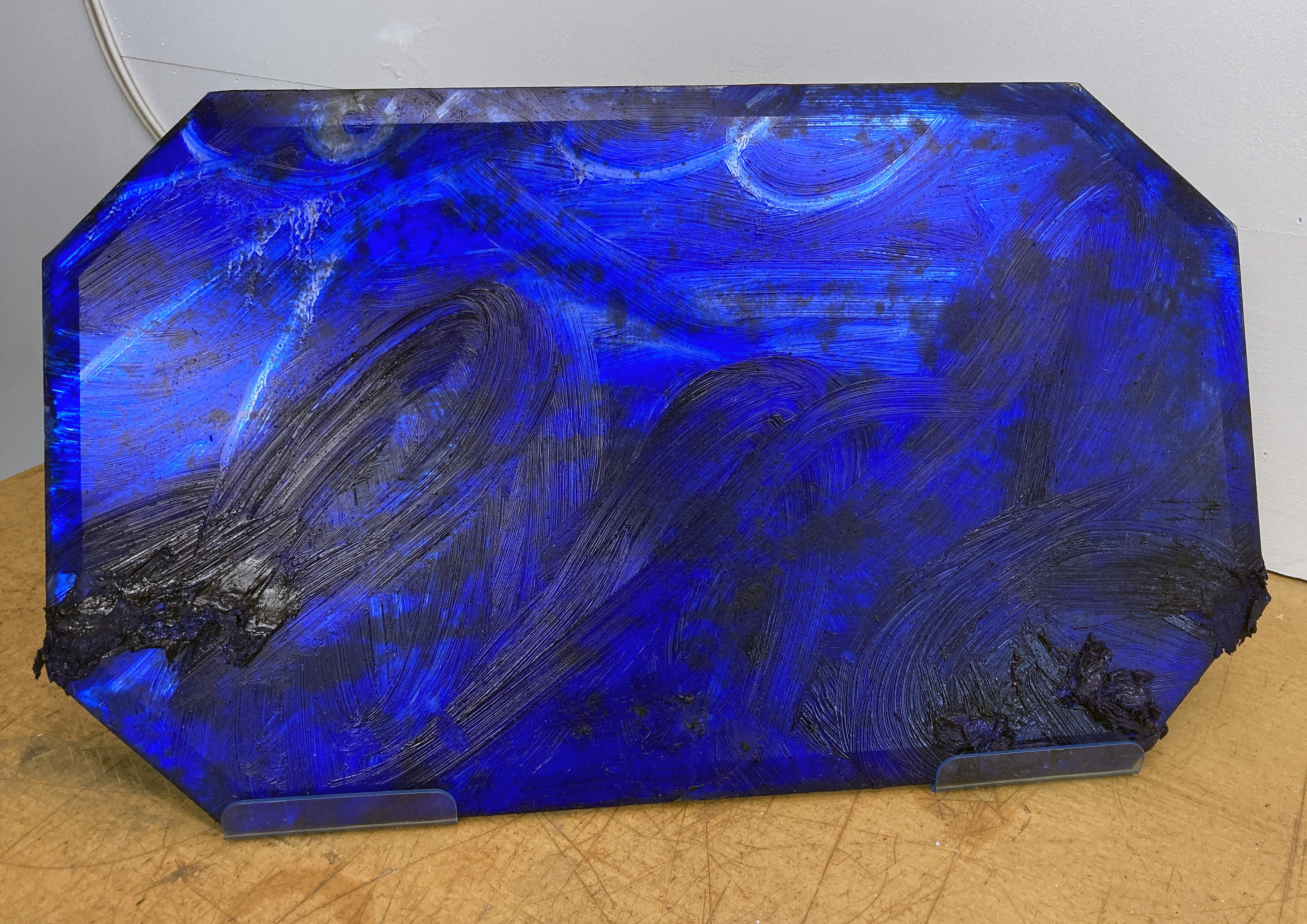
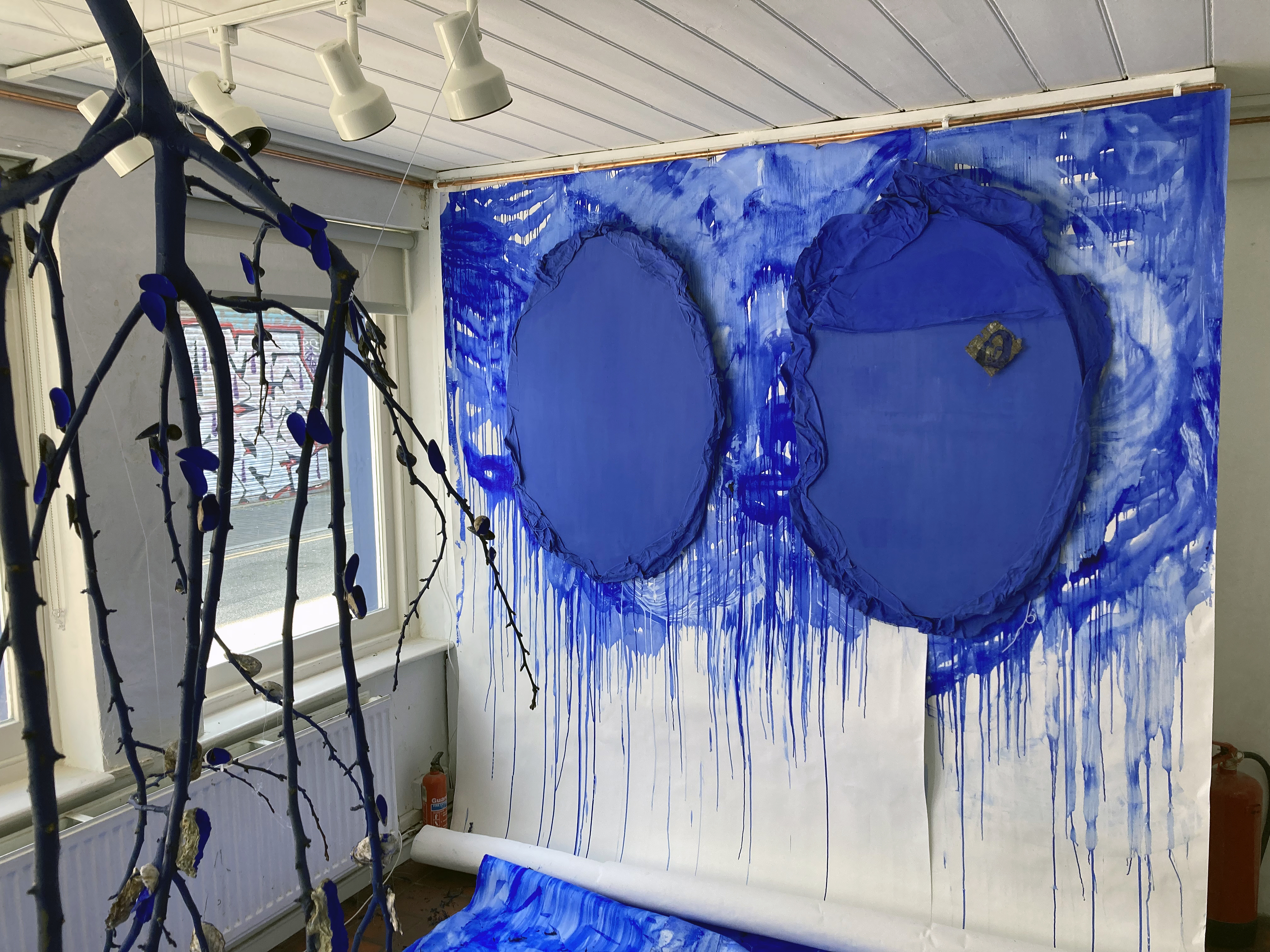
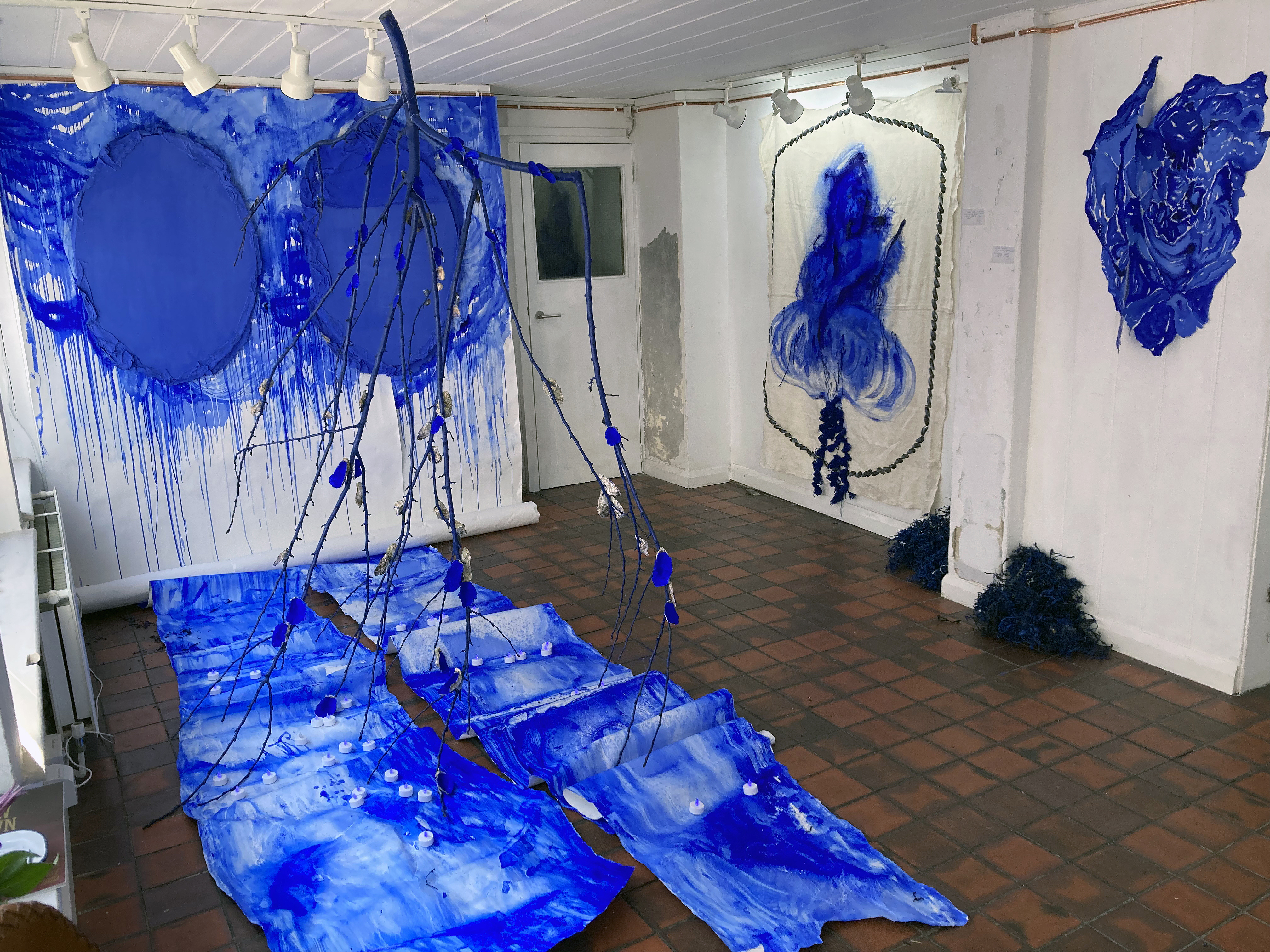
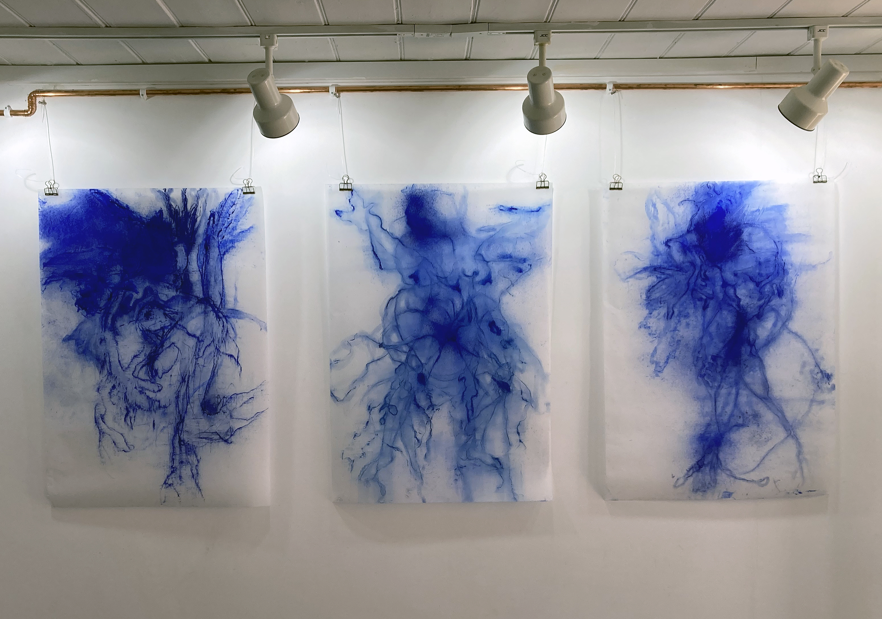
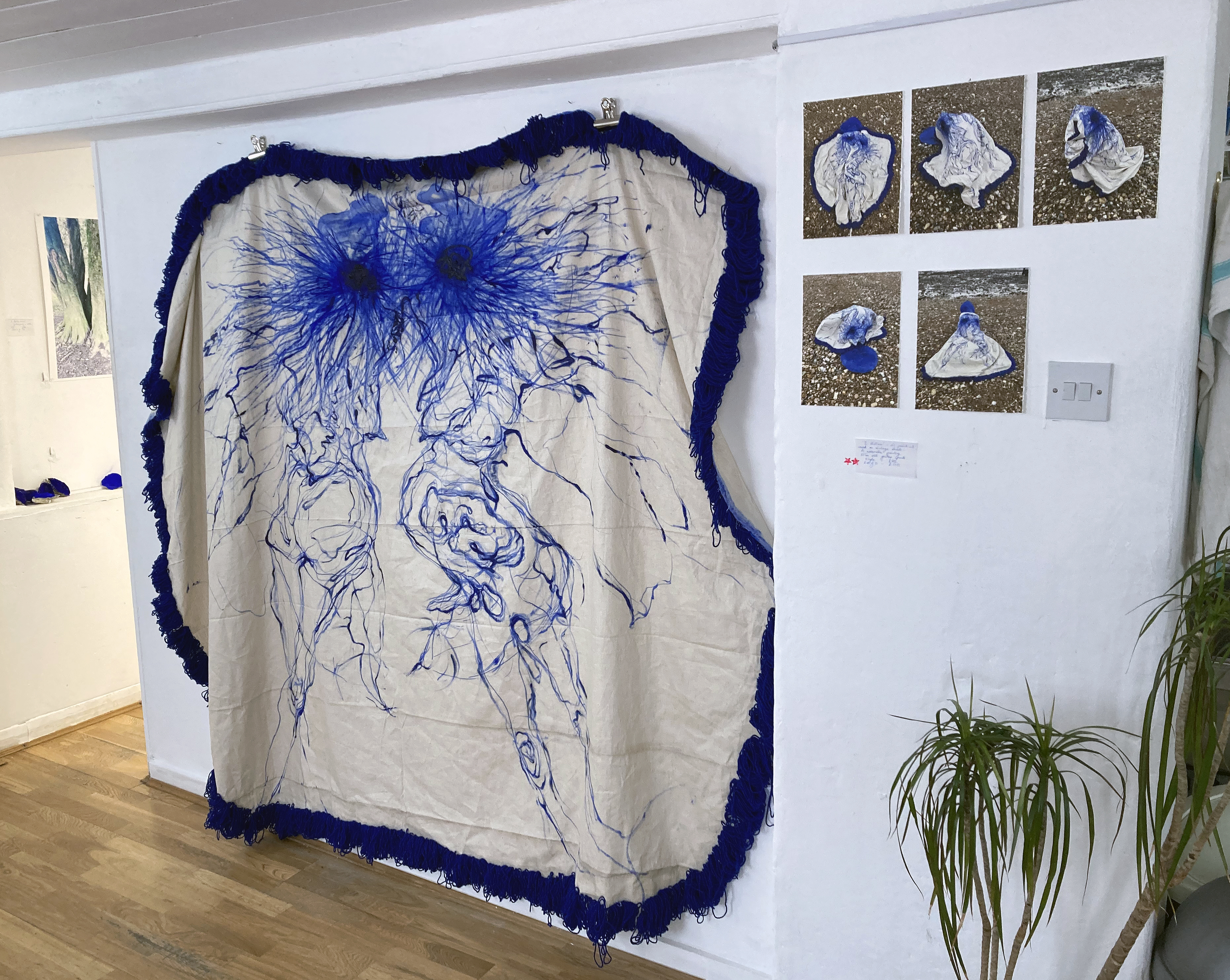
“Ultramarine Blue is the language that unifies the artwork in this show… I use it for its energy, and its magical and infinite possibilities. It brings a sense of calm yet has huge vibrational energy.”(Carrie Stanley)
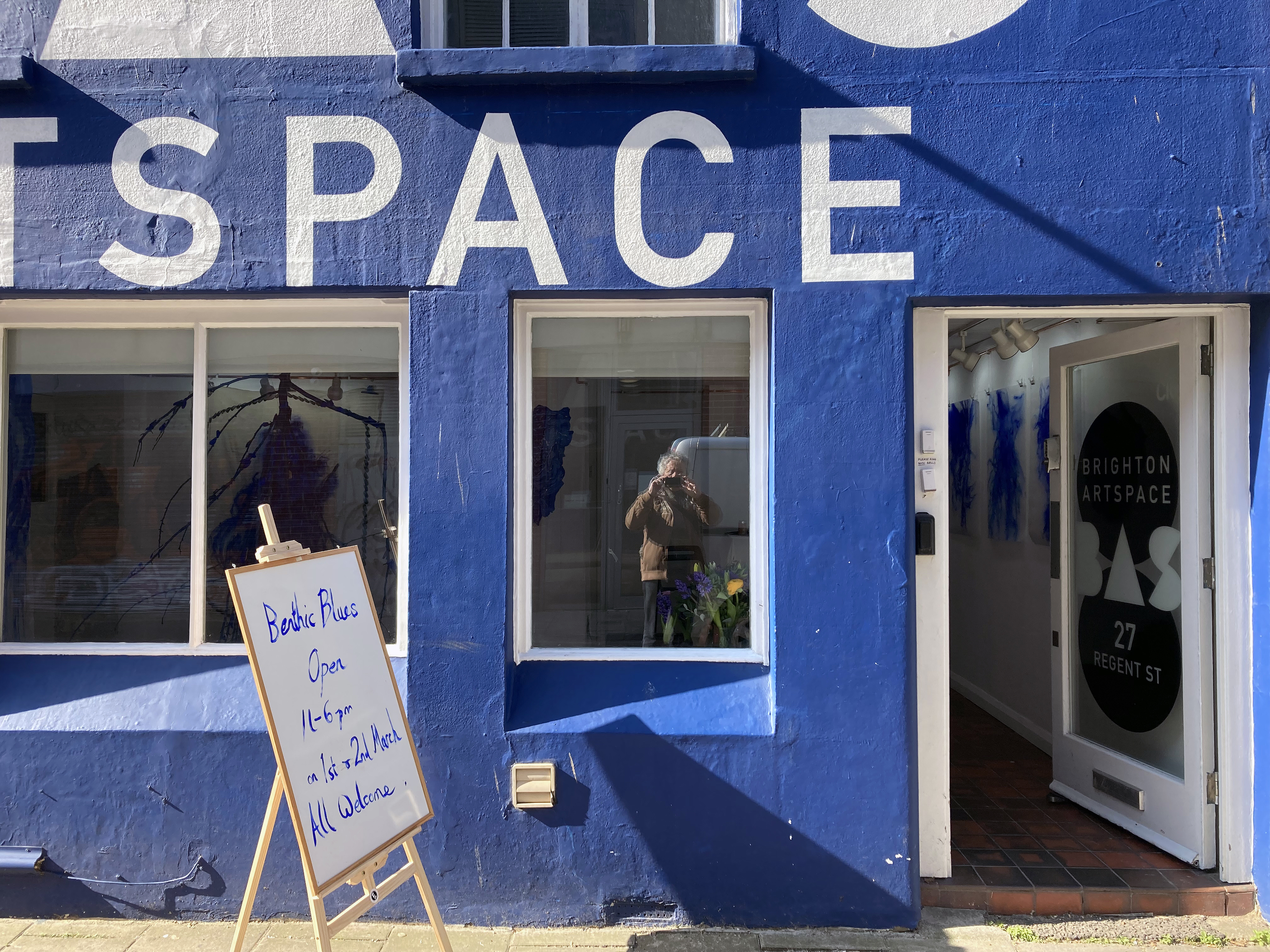
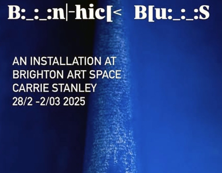
This impressive exhibition, Benthic Blues, is of just three days duration and I have arrived on the final day. I was compelled to visit a.s.a.p. as the Brighton Art Space is a fairly new venue in the city and I have already missed a couple of shows I wanted to see but had diary clashes. Via Carrie Stanley’s Instagram account I was intrigued by her seeming obsession with ultramarine blue and a shifting display from the gallery wall to the floor. As it happens, ultramarine blue is my favourite colour and the recent Turner Prize had rekindled an interest in the phenomenon of the installation. Other visitors may have visited knowing of the underlying theme relating to grief from suicide and that Arts Council England have supported the artist with a Developing your Creative Practice grant.
So much can depend on one’s own predilections when choosing to visit a show, but what we think we might like or dislike, of course, is too limited a reason for engaging with the general spectacle of the exhibition. We are all more or less experienced than others, so if an artist is presenting a celebratory theme (my interpretation of this exhibition) with a tragic, family related background it’s incumbent upon us to give that work time – and respect.
Carrie Stanley is a multidisciplinary artist and motivating her practice is a highly personal commitment to exploring mental health and trauma healing through the creative processes of painting, drawing and printmaking, re-presenting found objects and sound, and creative writing. Her interest in ultramarine goes beyond the visual aesthetics of colour. She links the colour to the sea, memory, the unconscious (e.g. dreams), ocean and land, the organic, materiality, play and potential healing.
There was a strong sense from the exhibition of the artist committing herself, against all the odds, to being positive, transformative and emotionally brave. By making, following a process and discovering something, or just knowing (or sensing) that she is in the right space at this time, permeates this body of work. Sharing the fruits of this journey amongst a community, known and unknown that may benefit many in some way is also akin to a celebration of sorts. Via the unfathomable depths of our emotions, the lowest region of despair, where light (as metaphor) cannot penetrate, the sometimes difficult to express or verbalise can be delivered through visual art. It reminds us that we are not alone, we are community. Stanley’s installation takes the viewer into the littoral zone, where light, and therefore colour, enables us to see – or at least begin to make something felt tangibly from the magical aspect of our world where messages await our readiness to receive them.
Considering the exhibition later that evening (before actually reading the exhibition statement), I sensed that the display was something of a showcase, intimating a larger, more realised, show in the future. The route forward might be towards an even more immersive viewer experience. The canvas/objects might reach out into the space even more. The suspended works might come further away from the walls. Works might be enlarged, like they want to shout out loud. Sound might be more dominant. Benthic Blues may in fact be a taster of more to come as I read that it forms part of a larger project, Together in Electric Dreams, which is in progress.
In visual art generally the artist’s personal background, wider societal issues, a political context or theme might be foregrounded as manifesto – or no more than subtlety implied in the artist’s offering. A strong or moving theme might be best kept a little sunken down to avoid the equivalent to the party political placard, which can trigger unreflective agreement or discord. It may be incumbent on the viewer to make some effort rather than rely on the artist to be too literal, as spelt out it becomes verbal language. Visual art is, well, visual and this aspect is a great strength in Benthic Blues as Stanley works with impressive skills, energy and commitment towards both herself, her family and a shared social community through an engaging body of work. She doesn’t shout. She allows us to cry with her.
Links:
Carrie Stanley on Instagram – @carrie_stanley_artist
ORGAN PROJECTS at One Church – Florence Road, Brighton
24 to 29 January 2025
Going to church can be so rewarding. Naturally it’s a Sunday and I find myself outside the One Church building in suburban Brighton, quite close to my home. I have been here on a couple of occasions before for the crafts market, but now I learn that there is a studio where Lydia Stonehouse produces her paintings and that a space has been commandeered for a gallery.
Lydia Stonehouse – ‘Arrangements’ (2024) Oil on canvas (97x107cm)
Just the one small room, but highly suitable for looking at a carefully selected group of works. Eight paintings from last year are more than enough to give the visitor a good idea of what imagery Stonehouse is developing after graduating from The University of Brighton in 2022 and spending a year at the Phoenix studios as the receiver of the CASS Art X Phoenix Art Space Studio award that supports graduates in that potentially challenging year after completing their first degree.
Six of the paintings are seen at first glance, displayed on three of the walls. Two of these are ‘An ongoing birth’, with a strong landscape feel; which vies with ‘Arrangements’, transforming this sense of a distant view with (possibly) two figures dominating the foregrounded pictorial space. They initially dominate the immediate impression of the display. Four other smaller works, however, actually work well by alternating the various sizes of the works. The viewer must step forward or back to immerse the eye into the variously sized compositions.
Lydia Stonehouse – ‘An Ongoing Birth’ (117x127cm) and ‘Lotus Birth’ (26x21cm) both 2014
Lydia Stonehouse – ‘Book Scan’ (2024) Oil and coloured crayon on canvas (35.5x51cm)
After tuning myself into looking at the works, being aware that first impressions can be misleading, I realised that I was attracted most to ‘Bookscan’, a relatively small canvas that was predominantly a subdued green mini-vista that actually felt quite expansive, way beyond the 35.5 X 51 centimeters of its physical reality. The floating linear and rectangular drawn shape within the confines of the canvas edges certainly suggests (is that a contradiction?) an opened book. The impression of a patchy rectangle of light close to the bottom left corner of the canvas brings a notion of time revealed through the light of day. What we perceive, what things are, where we are, are on a continuum. All is in flux, despite the painter’s foolish project to fix things as they are. Yet Stonehouse does not illustrate this; rather, she appears to be engaged on a mission of sorts. Her painting project is nakedly, vulnerably open and questioning. There is no sense of superficiality in these works. She knows when to stop and not to over reach the phenomenon of observation as a painting trope; of visual rhetoric as a too-certain reality.
Then, I feel a little foolish. An arrow prominently marked on the floor points, most unequivocally, to the corner of a curtain. I have been in here for a good 30 minutes or so, totally absorbed by these engaging paintings, but where does this arrow lead? Parting the curtains I am welcomed into this intimate space by two (literally) glowing paintings. ‘Church State’, on my left, feels so small (21X26cm) compared to its equally lustrous ‘Not Even Trying’ (117x127cm) that might be exploding in slow motion. Each work has an embedded set of electric lights behind each canvas. I would like to sit here for a while. This feels like such a quite, meditative space.
Lydia Stonehouse – ‘Church State’ (2014) Oil and carbon print on canvas. (21x26cm)
I need a chair. I can imagine one. Or perhaps my consciousness is the idea of a chair. Either way, the emanating light and colour creates a sense of the physical painting embodying a phenomenon engaging with me rather than simply being observed. The much smaller work, ‘Church State’ (maybe it’s a landscape) includes a small Christian cross that floats in pictorial space on the right hand side. The larger canvas, ‘Not Even Trying’ is suggestively bodily, physical, earthbound – yet amorphous. I am not sure.
Lydia Stonehouse – ‘Not Even Trying’ (2024) Oil on canvas (117x127cm)
This uncertainty (if I am on the right track) is starkly honest I feel, in Stonehouse’s work. The work is explorative, which is healthy. The fatuous notion of the artist as unattached observer is dissolved. The reward for looking at this work is to know that our sometimes felt disconnection with the world out there is ultimately one, non-dual.
Notes:
Organ Projects is an artist-run space founded in January 2024 and is located within a small room in a church in Brighton. The space exists to bring together and show the work of visual artists both local to Brighton and further afield. They are committed to working with artists and curators to provide space for experimentation, share parts of their practice they don’t often get to show, test ideas, and encourage dialogue with one another.
Friday 22 November, the original date for an elephant, a room at Gallery Dodo in Phoenix Art Space, came and went. Then a poster displayed on a window next to the front door of the main entrance announced that the exhibition had been postponed. Expectation supplanted by disappointment. But this was to be an exhibition presented by a conceptualartist, Calum Louis Adams. So, that’s it – wait with Godot. Brilliant I thought – the anti-climax palpably real. No show (yet) constituted a show. Or at least the idea of a show, which happened imaginatively in real time and space, constructed in my mind. The potential object of an exhibition that was fabricated by a poster (a form of text) to manifest itself as an illusion of sorts. But no.
Then a new poster appeared in the window just a couple of weeks ago. There is an exhibition after all. I was disappointed initially, as the joke was on me. But hang on; I am getting two shows for the price of one here so long as I visit the exhibition.
During the afternoon of Friday 24 January I got a sneak preview of an elephant, a room that Jon Carritt, Dodo organiser, has installed. You really have to see this space, a former toilet and washroom, to appreciate how unique and rather special it is. How fitting, therefore, it was to hear the soundtrack of a woman urinating, recorded on a single channel looped video, from a screen placed on the back wall floor. Or at least the phenomenon of a common sound from this electronic device would convince the perceiver of the actuality of a necessary kind of daily performance: now become art in this physical and conceptual context.
The door entrance (it’s just one room) was wedged open with a carefully folded up sheet of the single page A4 gallery handout that had to be the right thickness to hold the door in place. This was the second of the three works presented. The third was the text and digital image printed on the reverse of the handout, though the stack of handouts were placed on top of a wooden plinth, which might be counted as part of the installation. Extrapolating from this of course, the floor, ceiling and walls are the exhibition too. As is any visitor. I found myself taking some photographs of the partly renovated walls, wondering if an elephant might lurk somewhere.
This interestingly rambling/stream of consciousness text, written by Adams (I assume), consists of three paragraphs that link stories of a “startled crow”; the notion of a “Brood”, a collective spirit, a small car parking on the nut that the aforementioned crow has previously been eating, an abandoned house, smashed windows, a previous exhibition of the artist’s during which, on hearing a line from a song by the singer Clairo, changes their thoughts about a moment during which a window changes its functional self identity. Next there is a reference to a woman who drinks her own urine (from the American TV series My Strange Addiction) – which may or may not link to the urination soundtrack mentioned above. The final section of writing summarises these various parts as personal thoughts about choice and the possibilities of the crow’s possible awareness of the observer and the car having some sense of the crushed nut under its tyre. It is quite possible that the visitor who picks up the printed sheet will not read the text until later. A common habit (of which I am guilty) is to read the text handout on the journey home or even later. I would now guess that Adams wants the text read whilst in the show as it is listed as one of the exhibits. Although it is possible that this does not matter as the text read later, elsewhere, extends the exhibition and enables the reader to possess one of the artworks and to create something through the act of reading.
So where’s the elephant from the exhibition’s title? Well, to be literal, there is a minimalistic linear sketch of an elephant printed on the front of the handout. A visual representation, alongside the word elephant itself, which only makes cognitive sense if such a word (a label or name) is already in the viewer’s cognitive lexicon. Alternatively, the creature may actually reside in the mind of the viewer as the imaginative synonym of the elephant in the room – which may or not be in the room at all but perhaps appeals to an art practice that explores arty aesthetic ideas and objects. I wonder if there is a self-deprecating aspect here too, including a possible negation of the artist (a form of identity and an idea as well as a career choice for an actual human being, an object of sorts) as being worthy of explanation.
I was told that the artist would not be attending the opening evening due to rail travel difficulties during inclement weather conditions in Wales, where they live. Or perhaps this was fortuitous, as perhaps the physical presence of the artist is not so relevant as it could detract from the show, the physical work and the non-physical ideas or potential concepts. How suitably anti-climactic.
Futurism and the Origins of Experimental Poetry /Dom Sylvester Houédard and Concrete Poetry in Post-war Britain
Estorick Collection of Modern Italian Art 15 January to 11 May 2025
These two exhibitions, historically related but decades apart, make for a fascinating visual experience at the Estorick Collection. Housed in the two rooms reserved for temporary exhibitions, usefully on the same floor, there is a palpable excitement about the graphical form of text and the (early) expanded field form of print that links poetry to the visual arts. The display as a whole has the feel of a contemporary installation work with texts enlarged to cover significant expanses of wall. Framed text works dominate, as one might expect, but video screens enable the page turning of books that are otherwise displayed in glass cabinets.
On the walls in both spaces there is much to read and/or to observe purely visually. Usefully, the expository texts are reproduced in the newspaper-type catalogue that further expands the exhibition to wherever the visitor might take it. In fact to miss the catalogue, designed by Studio Bergini, the visitor would be missing part of the exhibition.
Along with the other visitors at the Press preview I turned right into the Futurism and the Origins of Experimental Poetry display. Carlo Carrà’s ‘Atmospheric Swirls – A Bursting Shell’ (1914) from the Estorick Collection, stands out immediately. TUMB, ZANG, TUUUM, ZANG and EEE, onomatopoeia – sound words – are integrated with painterly applied ink, charcoal and collage on paper. In these present times (well, maybe all times) such as aesthetic celebration of the sounds of missiles seems somewhat absurd and in poor taste. But the potential elephant in the room, the Italian Futurist links with Fascism (in particular the poet Filippo Tommaso Marinetti who founded Futurism), was not ignored as the wall texts and the catalogue acknowledge this disturbing context.
Carlo Carra – ‘Atmospheric Swirls – A Burning Shell’, 1914 Courtesy Estorick Collection
Christopher Adams and other members of the Estorick’s curatorial team have, in effect, stood back to allow the visitor to make what they will of this discomforting aspect in the exhibition. But they have not downplayed the sheer visual exuberance of how poets and visual artists freed the conventions of text display in publications such as ‘L’Italia Futurista’ (published from 1916 to 1918) through to Carlo Belloli’s ‘Texts-Poems for Walls’ (1944) that predicted the very public space of walls (and now the digital screen) as the common space for readers/viewers to be impacted and affected by the word. The show also includes rare original editions of works including Fortunato Depero’s famous book, ‘Depero futurista’ (1927) which is now more commonly known as the ‘Bolted Book’ with two aluminium bolts binding the pages together.
Transferring to the second display, Dom Sylvester Houédard and Concrete Poetry in Post-war Britain celebrates the work of Dom Sylvester Houédard (aka dsh), a Benedictine monk who is a contender for godfather of Concrete Poetry up to the present day. As the visitor would expect, dsh’s work is well represented here with works loaned from the Lisson Gallery. There is also material from Edition Hansjorg Mayer via the Chelsea College of the Arts Library (UAL) including Carlo Belloli’s ‘sole solo’ (futura14, 1966).
As with any exhibition holding works in cabinets you just want to get in there, although all six concrete poems from the Brighton Festival of 1967 are laid out for all to see. There are also works by several other British exponents of concrete poetry, including Ian Hamilton Finlay, John Furnival and Bob Cobbing. A signed copy of Cobbing’s ‘chamber music’ (futura19, 1967) adds a human dimension to the strongly graphical ingredients of the show. I mention this as a bombardment of the graphical might get wearisome if your main interest is in painting – the Estorick is full of paintings, of course.
I was also wondering whom the audience might include over the next few months. In addition to the loyal Estorick crowd I would hope that poets, graphic designers and art and design students from all disciplines, new cohorts perhaps, will see the show. For the fine artist with an involvement with text and collage the exhibition will not disappoint either. If anyone is unsure, just go along and support this organisation. The bookshop is full of goodies too – including that highly collectable catalogue.
“Walk with me over cushioned moss; your feet sinking into the soft leaf mould. Pick your way through tangles of bramble and bracken. Stand still and feel held in the quietness beneath the trees. Listen to the birdsong and clatter of leaves. Look up through slats of light between branches. Smell the damp and chill in the air.”
(Emily Ball, December 2024)
We play (mentally and physically) to learn, to discover, to realise. If this attitude diminishes nothing more will change and life will be mundane. It’s especially important for painters, or rather, it’s what I see in the painters who interest me. That’s my personal bias, but I am sure it’s a stance far from unique.
Emily Ball’s work has been on my adoration list for years, so making a fourteen-mile road trip in atrocious weather from Brighton was not a problem. Fortunately Storm Darragh had diminished significantly during the morning, which made the more scenic route north, via Henfield, possible. The countryside is fantastic along the meandering roads that gently rise and fall on the Sussex Weald. A feeling of being in the landscape is so strong, even if travelling in a car. Unknown to me, I was being mentally (and perhaps psychogeographically) tuned in for what was to be seen and experienced quite soon.
Installation including ‘Longing and Sweet Sadness’ – oil on canvas (120x170cm)
Many will know of Seawhites of Brighton (who moved to Partridge Green many years ago) as a great source of art materials, especially sketchbooks. But they have hosted exhibitions for several years too and with this show an expanded office space in an adjacent building to the one with the shop is perfect for a decent sized display that provides more than a taster of someone’s work. This is my first visit to the Atrium Gallery and first thoughts are assured and affirmative: wow, what a space, this is proper painting, everything is interesting (all 44 paintings and drawings). Then, unexpectedly: You don’t see this in the Turner Prize nowadays.
Indeed not. But initial impressions can change with reflection. So I walked around the ground floor for a while longer and was pleased to see that the floor above hosted many more works expertly arranged and hung. After a few minutes upstairs another visitor walked past talking to his partner, and I eavesdrop: “This isn’t kiss me quick or celebrity art”. He was referencing the nearby Brighton (but not so much Hove) art scene. It’s a little unfair, but I get what he means. There’s an abundance of excellent painters whose work is not seen enough down at the coast where the post/neo-Pop, street arty scene dominates. But I had to put that gripe aside for the afternoon and indulge in this engaging imagery from Emily Ball. After all, her work is unequivocally right here, right now whatever the trends might be.
Emily Ball – ‘Dig Deep’ – oil on canvas (120x170cm)
The work in Walk with me is totally absorbing. Many of the other visitors were either standing fully engaged with a particular work for several minutes or strolling around looking and looking again at the display. This is not so commonplace in the gallery environment where looks can be fleeting and it confirmed my sense of the high quality of the works displayed.
Emily Ball’s work in this show might simply be categorised as abstract landscape, but that would not be specific enough to account for a clear individuality of purpose in a lifelong project that engages with a searching, animated and exuberant understanding of the world as experienced. A being in the world, fully connected but including mystery. The works are full of implied movement, visually and physically expressed, by an observer fully engrossed in the act of drawing and painting. The imagery graciously pulls the observer’s gaze into a dynamic conglomeration of forms, coloured patchworks and passages through woodland spaces from the Algarve in Portugal (the HotHill collection) back to the artist’s home in Sussex (an ongoing series called WoodlandWeave). The paint is applied skilfully with dexterity, self-confidence and years of practice – but healthily retains an aspect, or an edge, of testing out applications and combinations of sometimes raw but playful brush marks. There is a sense of a positive and intentional work in progress, or a springboard for future works yet to be realised. This animated feeling confirms that environments are never really still or are only observed with a rational eye. Nature’s spaces are in and around us, containing histories and yet moving on.
Emily Ball – ‘Shimmer 1’ – oil on canvas (16x24cm)
So, in the future, we can look forward to an expanded Woodland Weave exhibition that explores the woods at the rear of the artist’s childhood home, merging with her parents’ garden. As with any space that Emily Ball draws and paints this will be as much an emotional as a geographical space. It will be past, present and future. We might be reminded, or prompted, to recall our own equivalent spaces to conjure the psychogeographic nature of environments that are personal, familial and, ultimately, social. This is a distinctive potential for the age-old practice of painting and drawing.
First impressions can even improve, too. See Emily play.
Geoff Hands (December 2024)
Emily Ball – ‘Shimmering Jewel Study I to VI’ mixed media drawings
A visitor to the latest Discover exhibition at The National Gallery could be forgiven for missing the star of the show, John Constable’s The Hay Wain, even as it is prominently displayed for visitors entering the main space of the Sunley Room area. The eager viewer might almost dismiss this magnum opus of British art as they might think they know it so well, as close to thirty other works fill this superbly curated space to engage their attention. This is one of the strengths of this exhibition as there is so much to look at and consider. It’s the kind of show that will, I am sure, not become tiresome if you can make several visits and that you could drop in to see just the one item on display.
In fact on first entering a kind of vestibule the curators had cleverly set up a palpable dichotomy of preparatory nudges to influence the visitors before the main space was entered. Constable is not only in the past, but is also now in terms of setting an example of painting as personal expression and for subject matter (*see another reference to Constable and contemporary painting in the notes section). The phenomenon of the European landscape tradition in art generally, and of English landskip in particular, is one of the more positive contributions that this sometimes narrow minded ScepteredIsle has, and continues, to contribute to the phenomenon of ‘art’. Our collective love and appreciation of the landscape (in some ways a constructed notion from the natural world that might best be called the environment) is worth celebrating and preserving.
But also displayed here in the introductory room are ten reproductions that sets up a duplexity that makes the exhibition so relevant, and modern, for today and tomorrow. These disparate but related images reveal, and in an odd sense celebrate, evidence of Constable’s ongoing influence on Britain’s visual culture. Including well-known imagery from Hockney (who like Constable no longer requires a first name), Peter Kennard and Frank Auerbach the viewer might casually eyeball the imagery and move on, feeling the magnetic pull of The Hay Wain. This is what I did, but something niggled.
But still in this first room, the viewer, if already a Constable fan, could be well satisfied with seeing Constable’s Cenotaph to the Memory of Sir Joshua Reynolds, that was the last painting he exhibited at the Royal Academy in 1836, to prepare them for an experience of looking back on an era when British painting finally made its mark on the already well developed great European tradition. After all, ‘Constable’ is one of those names, along with Hogarth, Reynolds, Gainsborough, Stubbs, Turner etal that harks back to the Golden Age of British painting. On this singular wall Cenotaph takes on the feel of an altarpiece.
So, appropriately on view in this space are a map of Constable Country (a.k.a. Suffolk), partly to make the point that the Grand Tour was not absolutely essential, plus the medal that the painter was awarded by King Charles X of France in 1824 for showing The Hay Wain in the Paris Salon that year (which, coincidently, was the year when the NG first opened in Angerstein’s London townhouse in Pall Mall – moving to its current location in 1838). The Centotaph canvas demonstrates Constable’s appreciation of the first president of the Royal Academy who insisted that ‘modern’ artists engage with the classical art of the past to reinforce their pictorial interests in depicting, and celebrating Nature in the present.
Then, on approaching The Hay Wain in the main space a wonderful Thomas Gainsborough, Cornard Wood, near Sudbury, Suffolk (1748) commands attention and shows the viewer where Constable was coming from geographically, aesthetically and stylistically in a contemporary context, via the influence and example from the painters who emerged in the previous generation. With Gainsborough the exhibition adds George Stubbs (The Reapers of 1783 hangs next to the Gainsborough) and George Morland (amongst others) as crucial forerunners, plus Constable’s near contemporaries including John Crome, Francis Danby, John Linnell and Richard Parkes Bonnington. As expected, J.M.W. Turner is here too, though perhaps in a quiet way as pundits could argue forever over who is the greatest British landscape painter. Turner was far more of an entrepreneur than Constable and so to some degree represents the development of the marketplace, often via the print or the washing line of watercolours drying above his bathtub, than Constable the rural conservative. Undoubtedly, this function of the landscape picture production as a moneymaking artefact was an aesthetically pleasant aspect of the growth of the capitalist marketplace that, as it happens, was born in the agrarian context of English countryside (see Ellen Meiksins Wood: The Origin of Capitalism).
Maybe it was this culturally sober yet complex young man from Suffolk who took British art into Europe (well, Paris and Berlin) despite his tendency to balance professional London life with his beloved Dedham Vale in his home countryside. Constable painted Landscape: Noon (The Hay Wain) in 1821 when he was just 44 years old. Not unusually, the large painting that we know and love was actually produced in London. Also on display are the ‘six footer’ study (the third of six), and a relatively tiny study, Sketch for ‘The Hay Wain’ (c.1820), that can be considered the first version of his most revered work. This latter work is the one I think I could return to see if only one painting was made available on my next visit to the NG, particularly as it will have to be returned to the Yale Center for British Art in Connecticut when the show ends next February. Being hung next to the ‘six footer’ was curatorially daring but apt and demonstrates to any aspiring painter that preliminary works can be any size in relation to the final product.
But I had surely been taunted by those other images and so returned with some sense that something very relevant right here, right now, was being manifested. After my preliminary stroll around the show to tune in, looking more attentively at the last three images I was a little unnerved, perhaps intimidated. After all, I assume that like most visitors I am here to marvel at some impressive landscape works. Social reality (Chris Shaw), satire and humour (Cold War Steve) and climate change (Quentin Devine) was implied so strongly yet so innocently by the reproductions, undermined, or at least questions and recategorises every other image in the exhibition. Miss the display wall of contemporary works and an engaging display of paintings, prints and drawings – plus a rather quaint set of country folk figures purportedly made by Constable himself (though, I dare say, unlikely) – is certainly visually pleasurable, aesthetically satisfying and informative. The show is rich in social and political history, and in setting the historical context that Constable was affected by, engaged with and duly influenced himself. Constable is in our lives, in our visual psyches. How many homes in the UK have a landscape print, photograph or painting on a wall? The art historical thrust of this exhibition – of the whole institution – confidently insists, as always, that the viewer should be aware of any artist’s influences and the context of periods of style and subject matter. Paintings are never just lonesome, singular, objects even in the broadest context and are not merely decoration for the living room (** see personal memories in the notes). But the modern works, even as reproductions, give the viewing an unexpected frisson.
In a way, Kennard’s Haywain with Cruise Missiles (1980) sets up what could have been far more exploited as the major theme for this exhibition, as imagery from this later generation of artists, (Shaw, Cold War Steve and Devine) reinforce a message of shock and despair, obliging the viewer to take stock of any so-called beautiful or awesomely sublime landscape scenario as various regimes wage war with nuclear arms in the background and as global warming continues to affect the climate. Though, to be fair to the curators, this political aspect is acknowledged in the catalogue – which if you cannot get to see the exhibition I fully recommend that you acquire the publication, as it not only records this marvellous display, but also is a useful primer for the burgeoning art history aficionado who must understand that the visual arts always has a social, cultural, economic and political context, and a reinterpretive one at that.
Ignore the contemporary works at your peril. Are they (to appropriate a Constable term for highflying clouds) Messengers? Via Constable, these contemporary artists may well be saying something we all need to hear. With the revered Constable to reference they might challenge the mindset of the masses with less derision from some quarters than the environmental protesters. Which made me wonder if they attack the wrong targets? These passionate and well-meaning iconoclasts could choose to celebrate rather than diminish their respective responsibilities of protecting our cultural as well as our natural environments by preserving and developing our survivalist consciousness with more integrity. Art might save us yet – and Constable was right there as the agrarian revolution took hold.
“A woman and her partner are standing in front of A Farmhouse near the Water’s Edge (‘On the Stour’) by John Constable. “Does he ask questions?” she reactively inquires. I think it’s a rhetorical question. It’s certainly a gift of a question and I now wonder, was the painting asking questions about subject matter; perception; time; self; the painting process or the fiction of imagery and invented composition? Constable also appears to have gouged his palette knife into the surface of the oil painting and it is an unsettling image. I doubt that the subject matter is merely a farmhouse or a landscape. Paintings have so much to offer and so much potential for interpretation, with endless ground to cover. It’s no wonder they continue to intrigue viewer and maker alike.”
** The first ‘work of art’ I recall in my parental home, way back in the mid-1960s, was a reproduction of The Hay Wain that came free with the electric fire that my mother purchased to replace the coal fire in our living room. About ten years later I was an art student and, on my first trip to a London gallery (18 February 1976), I was fortunate enough to see the Constable: Paintings, Watercolours & Drawings exhibition at The Tate Gallery, which of course included, The Hay Wain. Many thanks to Mr Vettise at Shrewsbury School of Art.
Paintings are fascinating things. They have the potential to extend beyond imagery and the object hung on the wall as they provoke thought and, sometimes, a sense of common subjectivity, but with open-endedness and multiple yet authentic timelines. There can be a sense of not being finalised or prescriptive but suggest a more speculative, active domain of resolution. Arthur Lanyon’s exhibition at Anima Mundi in St Ives celebrates a three-year period of intensive work in the artist’s Penzance studio and these works have that sense of being both finished and in progress. It makes for a fascinating contradiction.
Whenever I visit Cornwall, thanks to the family holidays (close to thirty years now), a trip to St Ives is unquestioned. The first gallery visit is, almost certainly, to Anima Mundi. Way back when (the children were very young) it was the New Millennium and the Tate Gallery that drew us in to town. Anima Mundi has developed and matured and the quality of work displayed is consistently high and thoughtfully curated. Either way, this is the best independent gallery in St Ives. No contest. There really is no contest. This is a fact we should regret, as there are so many talented visual artists in, or linked, to Cornwall. There should be a dozen Anima Mundis in this non-London part of the British Isles.
This is my first post-Covid visit to the town. Too long, I know. I have my Tate membership ticket at the ready – but it’s the Arthur Lanyon show, A Moon With A View, that tops my list of desires. I was not disappointed. With no intention to write a review, my partner and I have a good look around. There are three floors of displayed works to investigate but we are engaged in conversation on the ground floor for quite a while. We are attuning. No kids with us this year (we are a little sad and despondent). The conversation was quite formalist: line, mark, gesture, shape, space, surface, process, choice of medium – all that (important) stuff. It’s the way in we always take. As for subject matter. Not so sure. Not necessarily concerned. Not yet anyhow. Inevitably, the pen comes out of the pocket and I start my scribbles on the exhibition handout that I always hesitate to read before viewing the works it lists and promotes. This is my choice not to be too primed, although in retrospect Lanyon’s own commentary was very useful. For example, the centrepiece of the exhibition is the large work entitled, A Moon With A View, which sets up a frame of reference in his use of the term ‘shapeshifting’ that can be born in mind for any of the works displayed:
“The problem and solution to a lot of paintings is in the shapeshifting between background and foreground. In ‘The Full Moon Over Water’ by Turner, the painted waterscape represents the finite and the moon – seemingly painted but actually bare background paper – is the infinite. The relationship between water and moon – and, in my son Rory’s drawing, between tree and owl hole – draws the viewer closer to the non-material, further into the mysteries.”
And his use of the term ‘unfamiliar knowing’ in another extract also attunes the viewer:
“A childhood drawing can filter through your system like ‘chinese whispers’ and come out as something new. Call it an unfamiliar knowing… It is strangely intimate because the nature of the mind seems to expand inwards to a place that cannot be found in the world of objects.”
Drawings are embedded in the paintings. Surfaces are physically loaded and layered as well as scraped, scratched or sanded back. The canvas is a place of work. A place of purposeful action. Improvised and adjusted as he goes along, I would imagine. These certainly are hard won images. Drawings are crucial ingredients in Lanyon’s practice, collage too. His work can be described as gestural, abstract and certainly speculative and (dare I say) ruminatory through active image/mark making. They acknowledge an inherently cubist sense of time and space in a sense. Very real and encapsulating a nurtured progress through sheer hard work and commitment. There is no irony intended either and some content is childlike, not childish. Given time in an exhibition, and patiently letting the imagery in, goes a long way towards shedding unnecessary luggage. Which is what happens fairly quickly with Lanyon’s work. This may be because the works, of whatever size, are visually very busy, mysterious and demand the viewer’s undivided attention. I feel a sense of the everyday/extraordinary too. His commentary also spoke of the ‘moodboard’, which might well be a useful model for the true nature of narratives concerning the everyday simultaneously affected by the past and present – including long hours spent in the studio.
Fortuitously, I have just read painter, Rebecca Partridge’s recent paper for the Journal of Contemporary Painting in which she explores the post ‘Modernism/Postmodernism’ of the metamodern, which can be characterised by “Simultaneity, depth, a ‘structure’ of feeling and a return to meta-narrative.” This term includes subjective experience, authenticity, romantic subject matter and multiple subjectivities. For his narratives (which, like ours, can be solidly clear, barely recountable or obscure), Lanyon appropriates the physical, material world of the here and now. But he also includes familial memories, sometimes of an historical nature across generations, in a painterly present in which personal iconography is embedded and emerges to make highly engaging imagery. Like a movie represented in its entirety by one still – which perhaps only painting, songwriting and poetry can do effectively.
An initial impression of the exhibition was that this is good stuff. It’s not immediately obvious or illustrative. Why? The work seems kind of honest. I am not sure what this might mean right now even as I type up my reactions almost a week later. That’s good, or at least promising. Looking and, subsequently writing, is a journey of sorts, though you can travel backwards and forwards through the text. The writer might fool the reader into thinking that this was all a first draft. That’s not so easy with a painting. Painting is often a more conspicuous struggle. Painting is vulnerable to scorn or indifference and misunderstanding. Painting is a statement often unchangeable. It certainly cannot hide whilst on display.
Painting is sometimes ‘metaphysical’. What does that even mean? Emotions are in there, for sure, and some sense of transcendence. Is the metaphysical universal (too Jungian a definition?) – for surely, one should not need to read about Metaphysics to experience it? Definition follows experience. Aspects of this evolving theory, the metamodern, are here in Lanyon’s work too. To take just three examples, or traits, from Partridge’s article:
“A pervasive ‘structure of feeling’, a return to affect, to multiple subjectivities”; “Construction as well as deconstruction, the expression of sincerity and depth as well as irony or critical remove”; and “Re-engagement with historicity and meta-narrative.”
Refreshingly, in his work something of the child remains and is addressed almost naively:
“A boy draws a tree for the first time. It’s tall, no branches, just a trunk shooting up to a leafy looking cloud (all simple cartoons are the same). But he forgets what lives in trees: owls. Looking at the skinny trunk he decides to put the owl hole out on the left – a free-floating circle. He thinks his drawing looks good. So he doesn’t screw it up. His dad blue-tacks it up on the wall by the light switch.”
This approach produces a visual poetry of emotion generated by the personal memory and the mark making activity. This set me thinking about the marks we all make and our human ingenuity for language in all its manifestations. When language first developed was it from a gesture (body language) or a sound (made from the body) – or from found objects reconfigured for use? Anyhow, in time, a mark of some kind was made that carried meaning. With some sort of tool – the finger, a stick – we shall never now. But Lanyon’s practice conjures a form of the metanarrative from the instinctive urge to make painterly and colourful marks and shapes that will literally surface in the studio-based activity.
Unexpectedly upon leaving the gallery I found myself looking at the exterior walls and the pavement as a continuation of the paintings – an experience my partner confirmed for herself. This has happened before, but not often. This emphasises to me that Lanyon’s paintings are in and of the physical, playful and creative world, which is all around us and at all times.
Back home in Brighton I check my notes: “Battle between abstraction and fig. Not only visually busy but also content/lyrically.” That was enough to start writing this Rumination. How can one appraise artwork from a one-off visit? It’s more impressions gained than a sustained ingestion and understanding. But how do you separate the art from the viewer anyway? Paintings need a viewer, often strangers, not just the artist. We turn up with our tastes, our troubles, our pre-conceptions, misconceptions, expectations and prejudices, but ripe to be transformed and refreshed. Yes, refreshed.
I am unable to make the Private View so have visited Gallery 19a the day before the initial gathering of friends and fans to have a sneak preview of Curb-Bound, a one-person show by Archie Rogers. The installation appears complete, unless any wall text or other information is yet to be introduced. As visitors we may well seek out some explanatory content but I am not so sure it’s needed.
Archie Rogers – ‘Copsewood’ Oilstick on two wooden panels (20x25cm)
Titles usefully act as signage towards subject matter and, usually, enable a more informed or focussed reading. But without such prompts the emphasis is on the viewer’s imagination to make some sense of the creator’s intentions. I was not counting but there were close to twenty pieces hung on the walls and about a dozen other items arranged on the floor and on a long shelf. Sculptures might be the incorrect term for the various objects; I prefer the latter term, objects, as it acknowledges the ‘found’ nature of many of the pieces on display.
If the viewer knows of the Japanese term Wabi-Sabi, an appreciation of the found object, now defunct and showing evidence of natural aging, impermanence and transience, a context usefully envelops these works. But, interestingly, Rogers has continued any natural transformation with a carpentry and woodcraft type activity. In this sense the objects drift back towards some notion of the constructed and designed object. By collecting many wooden items (though not exclusively as chalk, oil, Bakelite and string make an appearance too) and sawing, drilling or carving up these materials, that could otherwise have been heading for the beach or home fire as kindling, are transformed by the simplest of means. This flotsam and jetsam from the street, and the beach, takes on a new purpose as art – and the hand is always present to make purposely-unsophisticated changes.
Archie Rogers
Some constructions are wall mounted and others are arranged on a long shelf or stored in a box. One such box held many pebble-like pieces of wood from the beach. A smooth little piece of wood had ten holes drilled in it that were surely added after being found. (I was reminded of Roger Ackling’s works that he embellished with burnt lines from the sun’s rays focussed through a magnifying glass and are currently on display in Norwich.) These holes suggest some semblance of transformation, perhaps from a primitive and seemingly unsophisticated starting point. Without obvious purpose the object remains abstract but is highly suggestive of human interaction
Another box held more cuboid and cylindrical forms that had clearly been carefully placed to enable all of the pieces to fit in. I thought of keepsakes, emotional treasure, something you might need one day, or just can’t bear to part with. The stuff found in parents’ lofts many years after the children have left home.
Archie Rogers – ‘Weaving’ String and wood
The standout item for me was a small weaving made from the artist’s very small hand made loom. In fact it was the second loom made, as the first, also on display, appeared flawed, broken or unfinished. The warp and weft item was suspended from a large wooden knitting needle. Although nearby, on the shelf, were three items, including a spoon, that equally drew my attention. Again, the subtle hint of earliest design and technology directed towards everyday needs, the real treasures of life, was refreshingly present. Wood, and associated materials have literally transformed our lives. Wood must be present in our creative and imaginative DNA.
Archie Rogers
Britain was once heavily forested, almost completely, 7000 years after the last ice age. Now we live in one of the most de-forested countries in Europe. With the Green revolution well underway our relationship to the natural world will surely rejuvenate. Archie Rogers appears to be discovering this material legacy in the curbsides and on the pebbly beach here in Brighton.
Geoff Hands (July 2024)
Archie Rogers – Wall installation
Note:
Archie Rogers is a co-founder and curator for Fresh Salad Art, a platform supporting emerging artists through the organisation of group art exhibitions around the UK and internationally through virtual gallery spaces. He is a University of Brighton graduate from 2022.
“My smaller works are predominantly made using found wood and other discarded materials, so surface takes on a whole new significance. An object which has been intensely used, worn, fixed, and abandoned bears evidence of its past life and can only become more beautiful as time passes. I enjoy reacting to these marks with the intention of complementing, not merely to conceal them. I believe in tactility and rejecting boldness in favour of subtlety, thoughts which are reflected also in my recent sculptural and functional pieces.” (UOB website, see link below)
As a painter, I love to write as part of the painting process. I have kept handwritten studio notebooks (Journals) since 1995, which I am intermittently word processing (18,000 words so far – about two thirds of the content, I estimate).
This adjunct to the painting commitment was taken to a more formalised level by studying on the M.A. Creative Writing programme at the University of Sussex (1998-2000) whilst I was course leader for the Foundation Studies Art & Design course at Northbrook College in Worthing. The painter Mary Lloyd-Jones, who knew Prof. Peter Abbs the course director, recommended the course at Sussex to me. This shift from one educational field of study to another might have been rejected out of hand, but as an avid fan of Patrick Heron’s paintings and writings I could see that these two disciplines were not incompatible (although Heron eventually put a hold on his writing for the sake of maintaining enough time to devote to his painting).
I have been considering including some extracts from the Journals here on fineartruminations but have been unsure where to start (chronologically seemed logical but did not appeal). Throughout the seven books filled with my scribbled thoughts (I have no.8 in progress at the studio) I had also made a few notes on exhibitions visited, but have largely left these observations out of the typed up version as they were not written in the studio. But in Journal no.5 I came across a very lengthy set of notes written after attending The Hayward Gallery on the Southbank in London for The Painting of Modern Life show in 2007. Unlike most other exhibition annotations, which are typically written in the gallery setting, the documented thoughts for this show were written in my home studio in Brighton two days after my 51st birthday. Perhaps the Hayward visit had been a birthday treat?
Jumping forward in time, in June 2014 I began to write exhibition reviews in earnest for Conceptual Fine Arts (with thanks to the Editor, Stefano Pirovano) and I started fineartruminations of (mainly) exhibition reviews shortly afterwards in August 2014. (I expanded to writing for AbCrit the following year, invited by Robin Greenwood.) It appears that my potential Hayward review was written a little too early, although I would hope that a ruminatory flavour comes across in the writing. Apart from checking the spelling and changing the layout a little, the transcription from the Journal is relatively unchanged. This is not a formal review of the show, it’s a first draft at best, so please bear with the slightly fragmentary nature of the format.
JOURNAL 5 / 31
25 October 2007
The Painting of Modern Life at The Hayward Gallery
Many paintings possess a banality of image. An equally banal, flat (emotionally) surface. I feel the labour of the making of these works. Many (paintings) feel slowly knocked out. A few days/weeks (of) painting. Nonetheless there is a transformation from the original photographs. (How interesting it would have been to have seen the original photographs presented with the paintings.)
There is a sense of the integration of the lens. The mechanical/digital technology that distances the image from the viewer. Maybe this is a coolness or a dead-pan emotional aspect of such images. I suppose one might ask if it was worth the effort to make the paintings given that these images already existed in the photographic print medium. Do the paintings give the viewer something more, or significantly different, to what the photograph could have achieved?
On a materialistic level of course there is a difference – the medium, scale, choice of colours (or monochromatic), qualities of paint in terms of surface textures, thick and thinness of the paint. Are the ‘better’ paintings those that really transform/change and become more than just a reproduction? Might they oppose the medium of photography? Or go with the mechanical image up to a point but ultimately undermine? Is the evidence that upholds the tradition of painting? Some paintings certainly say more than the immediate lens derived image. For example, Peter Doig’s ‘Lapeyrouse Wall’ (2004) in which, in his own words captures a “measured stillness”.
“My painting is born out of a genuine distrust of imagery” Luc Tuymans (2005)
In many instances the paintings’ surfaces, and the physical manipulation and application, of paint is much the same. Is the simple crudeness of these paintings deliberate? (Probably.) Often there is a burden factor, the ennui of our built environments.
For example, Johanna Kandl’s ‘Untitled (Ein sehr heisser Spätnachmittag…)’ 1999. (Translation – “a very hot afternoon”)
I am not so sure that I could live with this on the wall. There is a half finished feel about much of the picture. As if the artist could not be concerned about a more sophisticated completion (that we would see in a David Hockney painting from the same show). Perhaps the younger generation of painters invest that contemporaneous acknowledgement of the incomplete. Taste it, then move on.
There’s a sense of this apparent dismissal of a qualitative rendering of image and paint in Marlena Dumas’ work too.
A change of authorship takes place. Whether the artist made/took the original photograph or not seems irrelevant. I am most impressed by Gerhard Richter’s and Peter Doig’s works. There is a marked sense of a complete transformation of the original image into the artist’s own story. Richter seems particularly able to achieve in his black and white paintings (e.g. ‘Renate and Mariannne’ 1964). He masterfully exploits the potential of his paint medium (oil). So too Peter Doig – though he employs his (often) washed out colours (achieved by an overpainting of a thin veil of white).
It’s a shame that Dan Hays was not included in this exhibition too. I’m thinking of his Internet derived Colorado paintings with digital pixellated references (though Wilhelm Sasnal’s ‘Untitled (Hunters)’ from 2001 is made with reference to an internet hunt – but fails to acknowledge this in his painterly language).
The tradition of composition is significantly challenged. Essentially by the snapshot image – in both formal (Morley, Hockney and Bechtle) and informal ways (Richter, Peyton and Kandl). In Robert Bectle’s work second hand information becomes first hand – as if the photographic print or slide exists first (rather than as an image received from the photographically recorded situation).
Can the traditional artist who uses paint fantasise that from today ‘photography is dead’ by the evidence of this exhibition? Well, maybe this is too simple. There are many photographs that are vastly superior to a million mediocre paintings, and of course as many paintings that evoke and celebrate existence that countless billions of photographs do not. Is this an argument for painting? Or simply to register the accessibility of the lens-based image for painterly usage.
A photograph? Take it or leave it – that’s a message for painters today. In this postmodern sense the photograph is there to be acquired, appropriated or manipulated for painting purposes. Painting does not desperately need the photograph. But perhaps I has helped, in a contradictory way, to support and sustain painting in this technological age.
A spurious argument?
Is there a dialogue between the photograph and the painting? (Not for all painters.)
Painters paint. We refer to whatever is usefully available including photographs.
Painting is always informed and influenced by the technologies and ideas of the times.
“I want to slow down the reading of an image; I want to say, this is important – look at this.” (Elizabeth Peyton – The Painting of Modern Life catalogue p.133)
“I’ve become my own camera.”
Malcolm Morley Interview with Klaus Kertess in Art Forum (Summer 1980)
Materiality of the paint. A foil to the photographic plane. Surface tension. A veil of pigment.
I have this unexpected feeling that I have been outside for a walk. I am not so sure about the weather conditions, or where I have ventured. I may have been alone but I was definitely walking – probably at a leisurely pace. Rupert Hartley’s paintings presented at Gallery 19a in Brighton have this feeling of gentle serenity nuanced with a sense of fresh air and time flowing, though not fixed or too specific. The journey is the destination in itself, somewhere in between A and B. It is no surprise that psychogeography, a wandering multi-experiential activity, interests this artist. But the works are quite formalist too, with no requirement to read them figuratively.
In true ‘white cube’ tradition it has been a dominant convention not to display titles on the white gallery walls for many years now. Sometimes this purist ‘rule’ is annoying or occasionally quite helpful (maybe for figurative works?). In this show, however, it feels appropriate not to place wall labels that could distract from the works on display. The viewer, at least initially, is thrown in to the deep end of abstraction. The works might be described as minimalist or geometric in nature. The use of colour is paramount, with a predilection for the handcrafted, painterly approach. Though there are some signs of the use of masking tape making a tantalising approach towards the hard-edge.
After a general look around for about ten minutes, to tune in as it were, I take a look at the list of paintings in Rising in the start of its arc, quite possibly affected by how I have initially received the works. Echoing a moving gaze that shifted within each composition and from canvas to canvas, reading the titles randomly, not necessarily from the first to the last on the A4 sheets, was uncharacteristic of me. Many sequences are possible from just eight titles:
Totals; Leave here for large external world; Green lights both their smokes; Blue black on yellow smile; False dawn; Lights bathe you in red-blue-red; Afterlight; Totals…
Rupert Hartley – ‘Blue black on yellow smile’ 2023 (55x45cm) acrylic on canvas
How does the title of a painting function? In ‘Blue black on yellow smile’ we see the blue and black squares on a yellow background or surround (to avoid too spatial a reading), yet I am not sure about the smile. This is good. Let’s not get too literal or descriptive. The titles, perhaps they are best considered as sub-headings as the paintings are paramount as visual phenomena, from Hartley’s selection of paintings certainly have poetic potential as pure text. They could conjure an imaginative scenario of people and places or be presented as a form of Concrete poetry. In actual fact the titles are taken from Infinite Jest, a novel by the late American writer, David Foster Wallace. If these works are actually urbanscapes (and close to the seafront in Hove where the artist lives and has his studio) the notion of the literary arc is appropriate given a sense of place and some sentiment or hunch of the fictional nature of reality as it might be retold or represented in a literary or visually creative mode. But unlike a text rendered narrative a painting is usually manifested as a kind of one-off statement, even if part of a larger grouping. Such a form of ‘reading’ (if that is the right term to use) can be challenging, simple, or both.
Rupert Hartley – ‘Green lights both their smokes’ 2023 (55x45cm) acrylic on canvas
Hartley’s works are both objective and subjective. They are formalist and tantalisingly impressionistic. Light and colour are strong characteristics. Implied affects, from the paintings, include floating or an about to shift sensation. The process of the making of a painting could be sited as its essential subject, as a form of narrative, in this category of abstract painting. But that old-fashioned term needs a capital letter: Impressionistic, crops up as the works emulate moments of lived experience (a development of Realism in art history). Nowadays we might prefer the term environmental, as the works may well allude to the land/seascape and the constructed social space. Living on the south coast is an environment that local visitors to the exhibition might well recognise, even if indirectly or obliquely. The viewer could see or sense something in the work from the outside world they inhabit, as this is an aspect of traditional expectations too. The mind will often want to make sense of/from the abstract. But in Hartley’s works there is no illusionism. There is certainly a concrete feel, or sensation of space and structure, and some sense of figure and ground, whether intended or not. Viewpoints are potentially here too as one could be looking down on (an aerial view or map) or across to (a group of buildings or even a still life). The frame might even imply a window view, in pixelated fashion. There can be a sense of illusionism too, as in ‘Green lights both their smokes’ gives a hint of floating and shadow.
Rupert Hartley – ‘Afterlight 1’ 2023 (160x135cm) acrylic and flashe on canvas.
In all works, to slightly varying degrees, there are layers or just the one coat of paint, in a specific square or rectangle. The bottom section of each painting is either bare canvas or (mostly) painted with one colour for the whole width and might be read as an unintentional, though minimalist, predella. (The bottom section of a Gothic or Early Renaissance altarpiece that typically illustrates the life of a saint.) In all eight paintings the bottom section appears separate from the grid above, as if it could have been cut off before being stretched on to the supporting frame. Reading figuratively this strip/rectangle could be an urban, geographic pathway (and in ‘Leave here for large external world’ a blue stripe at the top, suggests the sky). Repeated greens in several of the works might suggest trees or bushes, but this literal reading that any viewer might have, though revealing a subconscious pictorial habit that is hard to suppress, is unnecessary.
Rupert Hartley – ‘Leave here for large external world’ 2023 (86×70.5cm) acrylic on canvas
There is a subtle predominance of blues and greys and a few reds and pinks in the selected works. Perhaps this made the earthy yellows stand out, particularly in ‘Leave here for large external world’. Colours are generally subdued, but retain vitality, from intermixing in most instances. Seldom does the acrylic appear squeezed directly from the tube or out of the manufacturer’s paint pot. The colours are key, not just individually but in relation to each other. The general square shapes and grid structures maintain an implied order and structure that holds it all together. The canvas surface is also part of the visual content. I frequently found myself stepping very close the works, especially ‘Green lights both their smokes’, to simply take in the woven texture. So too with various brushmarky laminations of colour in some of the squares. A handmade quality is retained in the painting process at all times. Nor do the works look pre-planned or overtly systematic, despite a studio-based system of some degree leading to these outcomes. In Hartley’s works we see infinite variety in a restricted, and sophisticated, practice.
Another reading might be of a form of deconstruction of the seen and experienced, leading to a constructed amalgamation of visually encountered environments to be realised as a work of art – something new in the world that we call a painting. On a more subject level I sensed a sort of breathing element too, as the imagery might be taken in to be exhaled. The visual becoming air as a calm softness of encounter accommodates a sense of changing viewpoints as well as general and specific identities. A kind of sense of place that is literally psychogeographic.
Before visiting Rising in the start of its arc, the last time I saw a painting of Hartley’s was in the memorable H_A_R_D_P_A_P_E_R exhibition at the Phoenix Art Space just four months ago. In my review of that show I avoided choosing a favourite, as there were so many works on display and my shortlist was too long anyhow. But I was tempted to choose Hartley’s contribution as my personal front-runner for the fictitious gold medal. I was not sure why though, and seeing this more comprehensive selection of his work helps me to realise that it might have been for the skills and ability to produce a work that appropriately requires a long look and a calm kind of gaze. The imagery sinks in rather than imposes itself upon the viewer. The colour range also adhered to this methodology of encouraging a mind-merging/thought process linking with the visual experience, rather than an all too obvious revealing of subject matter. In this new exhibition there is a purposive yet contradictory sense of the finished suggesting the unfinished in each work. There is also a sense of the process of becoming and of being made, with colour, shape and slightly imprecise or loose grids. But clearly being finished and resolved enough to merit the imaginative responses from the audience.
Geoff Hands, July 2024
Rupert Hartley – ‘Totals 3’ 2023 (120x120cm) acrylic on canvas
Wow! Some paintings, some actual, real, “look at me I’m a painting”, paintings. Sometimes the best things happen when you least expect.
It has been a busy day and I am rushing around town. Dad’s taxi, paintings to collect from the framer’s, pick up a few things from Sainsbury’s, park at the studio (yes! there’s a space), say ‘hi’ to people in the corridor (make out all is well), pick up a notebook, water the plants and then, as I almost depart… there’s a new show just been installed in the Project Space at the Phoenix. But there’s no time to stop, but one has to.
Olivia Guillot, a recent graduate from the University of Brighton, has installed a display of seven paintings and a sketchbook in her first solo show, Swallowed A Fly. I am immediately drawn in by the painterliness and the strong colour hit. I might only have a few minutes, maybe 10 or 15 if I can dismiss the future awhile. Painting is so much more than the here and now, of course.
Olivia Guillot – Swallowed A Fly 2024 (120x150cm) oil on canvas
The works are lively and painterly, oh so painterly, and as fresh as the perennial daisy. This artist clearly has an almost unchecked love of paint and colour and image. I say ‘almost unchecked’ because there is a visual intelligence emanating from these canvases. There is a restraint too; revealing a painterly design sense that I suspect is intuitive. Whatever, these works are so refreshing to see with their vitality and energy. Paint and image are in transition, despite the fixed nature of the resolved canvas. What are these images peopled by? The figurative and the abstract meld. The act of painting, sucking something up from the imagination (whatever that is) makes new scenarios. Magic.
Olivia Guillot – Walkies 2024 (20x40cm) and Anteater 2024 (100x100cm) both oil on canvas
More joy: There’s a sketchbook (item no.3 on the exhibition plan, which gives an equal status with the paintings) that the visitor can leaf through. Why can’t artists show their sketchbooks more often? In some way this is an unusual, even a brave, decision. A document like this is such a personal document. Containing good and indifferent drawings and colour studies; notes from a tutorial; bare thoughts. But viewers should get the bigger picture (pun intended) and see some of the working and thinking process that determines the end result. That final canvas has a studio history. Discussions have taken place. Doubts work alongside discoveries and day to day planning. Ruminatory thoughts have floated by, sometimes recorded in scribbled notations. Perhaps there should be a clause that every painting exhibition includes a sketchbook or two.
Olivia Guillot – Sketchbook
Painters have to have confidence of course, a resolve to climb on board for the journey. It’s an attitude thing. Guillot has this in abundance.
For contemporary painters the gallery system is not always open enough. The Gatekeepers are not always into painting, after all. Painters have to raid the bank account and rent spaces. Painters have to be self-confident and brave. But, despite obsessions with alternative media, painting persists. Painting courses, such as the one at the University of Brighton, attract students of a highly visual persuasion. The medium encourages investigation and thought; self discovery and realisation. Out there in the ‘real world’ there are so many painters – and they are, for the most part, a national treasure.
The end result, like this small but expansive show, is akin to a music gig. The various parts are given extended strength by the grouping, the set list. See the show if you can, get the ‘hit’. Let the experience dissolve into your consciousness forever.
Geoff Hands, June 2024
Olivia Guillot – I Cant Stop Making Mush 2024 (100x100cm) oil on canvas
Harriette Lloyd – ‘After The Dust Settles’ 2024 Oil on canvas (67x112cm)
What are the painterly visual equivalents for the recollection of time and place? At a simple level we might think of the dark and the light, forms and space, the near and the far. Shapes, layers and geometric or organic forms, which despite the very clever invention and illusion of perspective, combine as an environment. Compositions from the visual field in the here and now, and potentially from memory (or become a version of memory), offer evidence. The future’s not so certain. There’s a sense of permanency unfolding into change of what is or was. Building, deteriorating or soon to be replaced scenarios are here or there. Surfaces reflecting or absorbing light enable differentiation in the visual field. Oh how we need light, and touch, of course.
Harriette Lloyd’s exhibitions of a dozen or so paintings at Gallery 19a in Hollingdean, Brighton conjure these notions of time and space as she makes these evidential documents. The painted memorials appear quite individual but make links from one to another and might be categorised as an extension of the traditional still-life, albeit expanded into architecturally interior spaces such as walls, floors and corners. The seventeenth century Dutch still-life painters of the vanitas recorded and presented objects as a sub-genre of the still-life that reflected a Protestant acknowledgment of the all too short duration of life and of the ultimately limited value of possessions. Lloyd’s project is also embedded in the everyday as a commemoration, but specific objects appear less important than the remarkable visuality of anything and everything around us – including the very process of painting which produces a kind of visual diary from actively engaging with a seeing in action. The application of and engagement with the stuff of painting is certainly endearing as I found myself imagining wanting to apply more of the medium, but Lloyd holds back. She does not get carried away or seduced by the oil paint. This is a promising sign of confidence and calmness in a demanding process. Graduating from the University of Brighton Fine Art Painting course she has clearly been well tutored.
Harriette Lloyd – ‘Grout’ 2024 Oil on canvas (138x82cm)
Lloyd’s visual vocabulary, including the inclusion and reference to of distortions or glitches in digital photography (a generationally related trope from a young painter?), of a near abstract style of painting appear wedded to a language of realism but allow for some degree of improvisation and, as she explains in her exhibition statement:
“The works individually are fragments that together archive fleeting beauty in melancholia.”
Melancholia implies depression or despondency but my take on this collection of paintings overturned any degree of personal dejection into a somewhat positive and celebratory frame of reference. These paintings might affect the viewer in a surprisingly positive and optimistic sense of being alive right now and of a consciousness of the here and now, even in apparent banality, as hugely wonderful. The viewer might leave the exhibition having been prompted to look around wherever they might be and to comprehend and value what’s here rather than some illusion of the elsewhere. This seeing does not have to be denoted as good or bad, or beautiful or ugly. These works might encourage us to accept what is, even if nostalgia, a sense of loss or even premonition creeps in. The paintings certainly stand up to a prolonged viewing as a quick glance was quickly developed into a compulsion to stay put. These paintings generously invite the viewer to stay calm and to carry on – and to deserve a place in your home.