ARTHUR LANYON: A Moon With A View

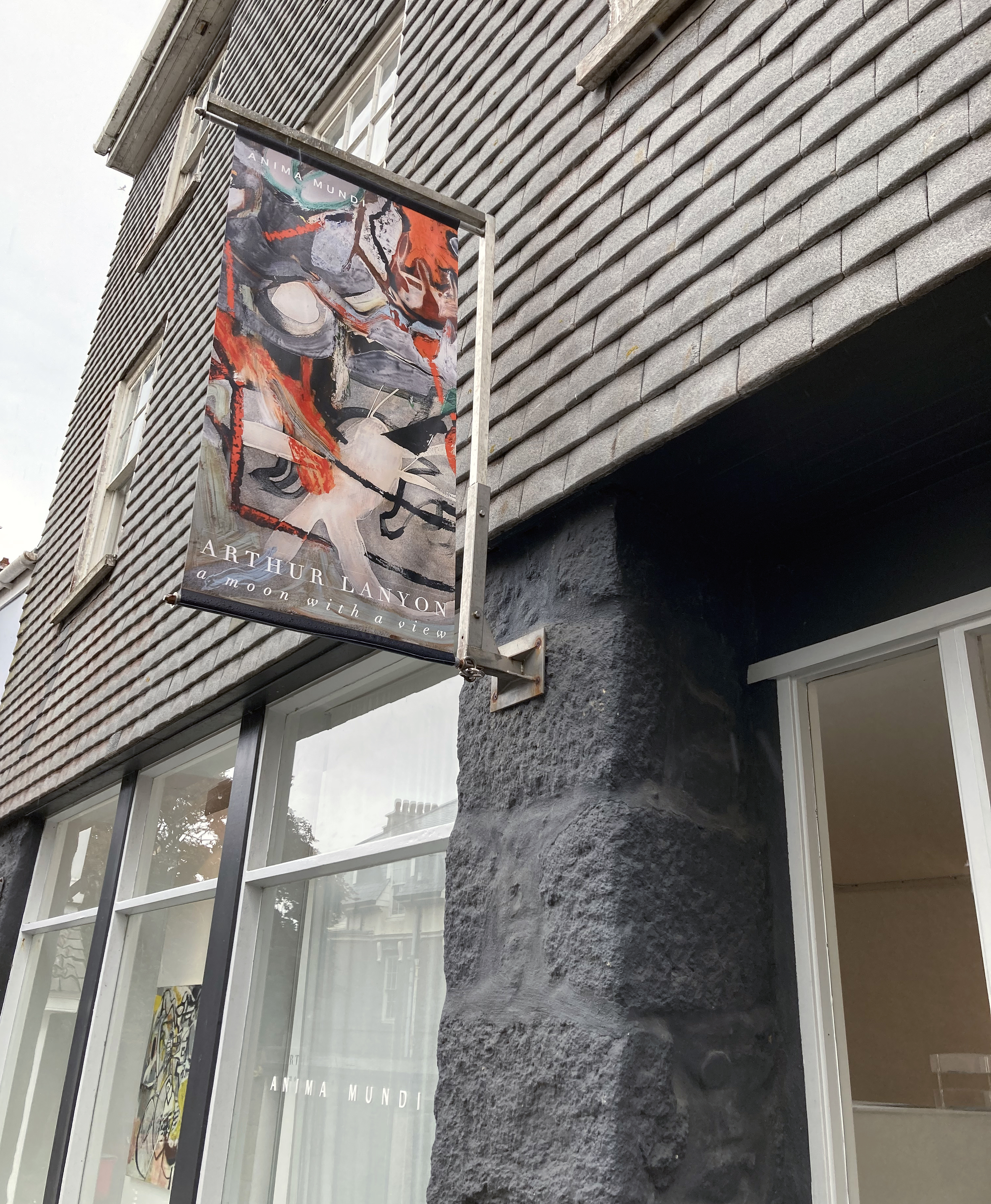
Anima Mundi, St Ives

19 July to 31 August 2024

Paintings are fascinating things. They have the potential to extend beyond imagery and the object hung on the wall as they provoke thought and, sometimes, a sense of common subjectivity, but with open-endedness and multiple yet authentic timelines. There can be a sense of not being finalised or prescriptive but suggest a more speculative, active domain of resolution. Arthur Lanyon’s exhibition at Anima Mundi in St Ives celebrates a three-year period of intensive work in the artist’s Penzance studio and these works have that sense of being both finished and in progress. It makes for a fascinating contradiction.

Whenever I visit Cornwall, thanks to the family holidays (close to thirty years now), a trip to St Ives is unquestioned. The first gallery visit is, almost certainly, to Anima Mundi. Way back when (the children were very young) it was the New Millennium and the Tate Gallery that drew us in to town. Anima Mundi has developed and matured and the quality of work displayed is consistently high and thoughtfully curated. Either way, this is the best independent gallery in St Ives. No contest. There really is no contest. This is a fact we should regret, as there are so many talented visual artists in, or linked, to Cornwall. There should be a dozen Anima Mundis in this non-London part of the British Isles.

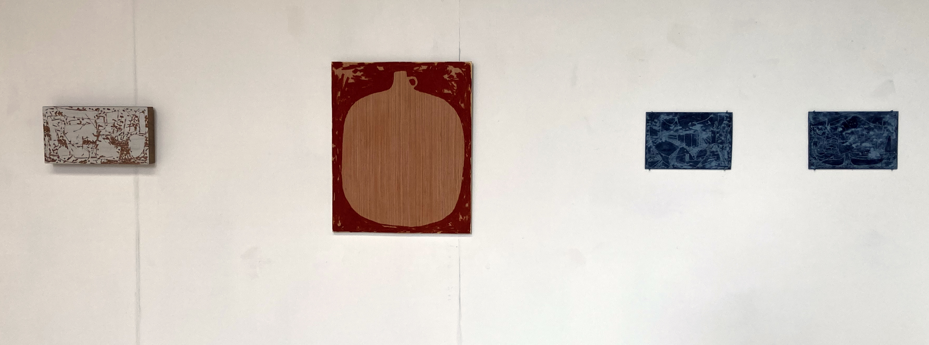
This is my first post-Covid visit to the town. Too long, I know. I have my Tate membership ticket at the ready – but it’s the Arthur Lanyon show, A Moon With A View, that tops my list of desires. I was not disappointed. With no intention to write a review, my partner and I have a good look around. There are three floors of displayed works to investigate but we are engaged in conversation on the ground floor for quite a while. We are attuning. No kids with us this year (we are a little sad and despondent). The conversation was quite formalist: line, mark, gesture, shape, space, surface, process, choice of medium – all that (important) stuff. It’s the way in we always take. As for subject matter. Not so sure. Not necessarily concerned. Not yet anyhow. Inevitably, the pen comes out of the pocket and I start my scribbles on the exhibition handout that I always hesitate to read before viewing the works it lists and promotes. This is my choice not to be too primed, although in retrospect Lanyon’s own commentary was very useful. For example, the centrepiece of the exhibition is the large work entitled, A Moon With A View, which sets up a frame of reference in his use of the term ‘shapeshifting’ that can be born in mind for any of the works displayed:

“The problem and solution to a lot of paintings is in the shapeshifting between background and foreground. In ‘The Full Moon Over Water’ by Turner, the painted waterscape represents the finite and the moon – seemingly painted but actually bare background paper – is the infinite. The relationship between water and moon – and, in my son Rory’s drawing, between tree and owl hole – draws the viewer closer to the non-material, further into the mysteries.”

And his use of the term ‘unfamiliar knowing’ in another extract also attunes the viewer:

“A childhood drawing can filter through your system like ‘chinese whispers’ and come out as something new. Call it an unfamiliar knowing… It is strangely intimate because the nature of the mind seems to expand inwards to a place that cannot be found in the world of objects.”

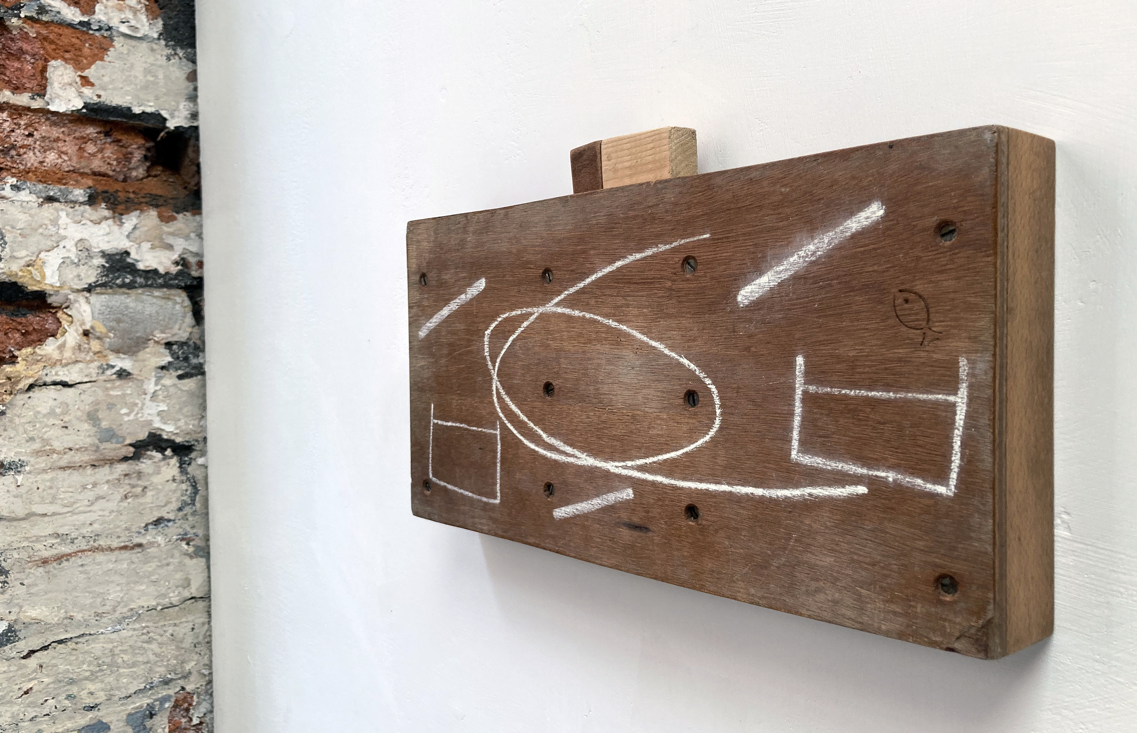
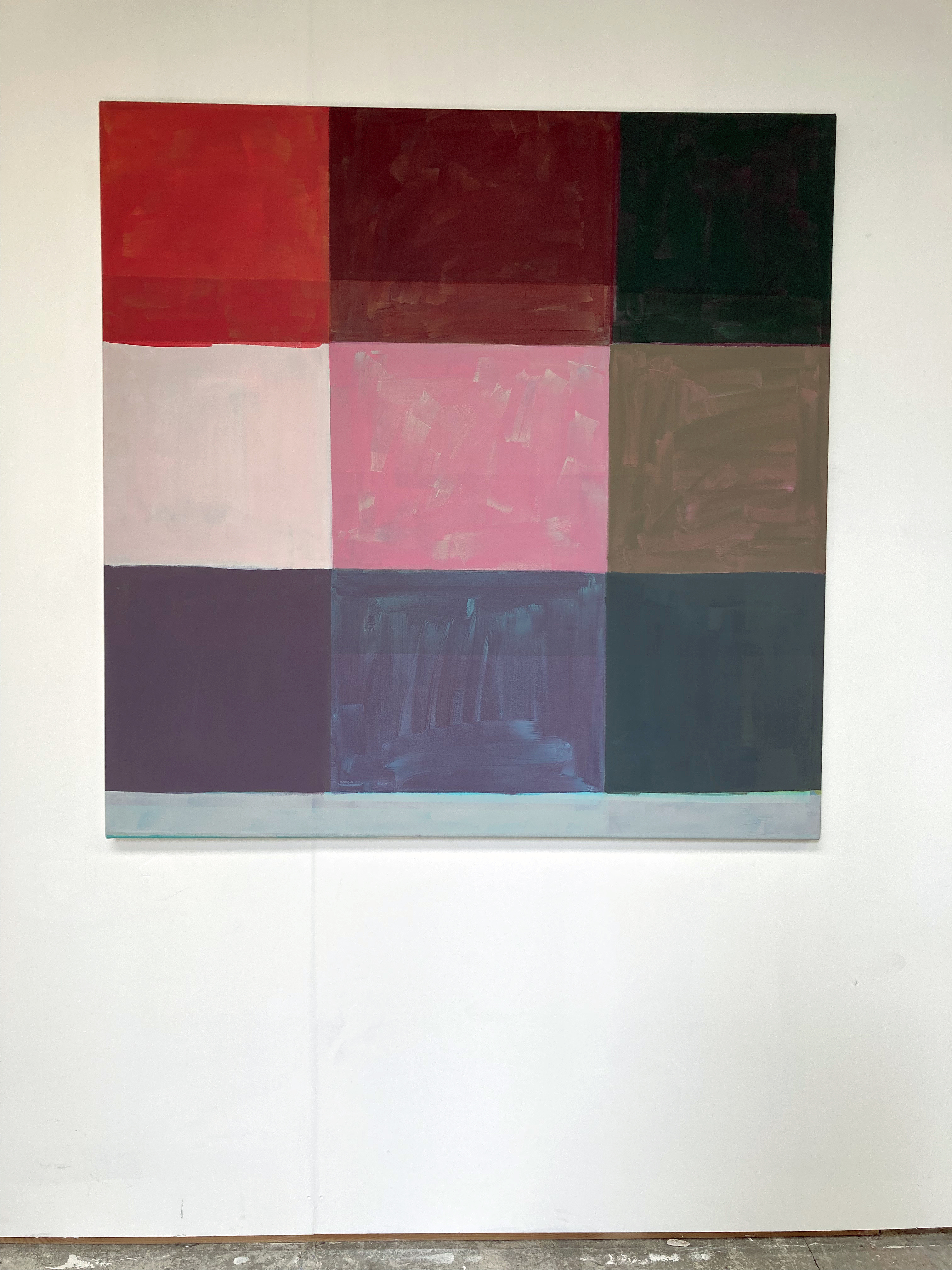
Drawings are embedded in the paintings. Surfaces are physically loaded and layered as well as scraped, scratched or sanded back. The canvas is a place of work. A place of purposeful action. Improvised and adjusted as he goes along, I would imagine. These certainly are hard won images. Drawings are crucial ingredients in Lanyon’s practice, collage too. His work can be described as gestural, abstract and certainly speculative and (dare I say) ruminatory through active image/mark making. They acknowledge an inherently cubist sense of time and space in a sense. Very real and encapsulating a nurtured progress through sheer hard work and commitment. There is no irony intended either and some content is childlike, not childish. Given time in an exhibition, and patiently letting the imagery in, goes a long way towards shedding unnecessary luggage. Which is what happens fairly quickly with Lanyon’s work. This may be because the works, of whatever size, are visually very busy, mysterious and demand the viewer’s undivided attention. I feel a sense of the everyday/extraordinary too. His commentary also spoke of the ‘moodboard’, which might well be a useful model for the true nature of narratives concerning the everyday simultaneously affected by the past and present – including long hours spent in the studio.

Fortuitously, I have just read painter, Rebecca Partridge’s recent paper for the Journal of Contemporary Painting in which she explores the post ‘Modernism/Postmodernism’ of the metamodern, which can be characterised by “Simultaneity, depth, a ‘structure’ of feeling and a return to meta-narrative.” This term includes subjective experience, authenticity, romantic subject matter and multiple subjectivities. For his narratives (which, like ours, can be solidly clear, barely recountable or obscure), Lanyon appropriates the physical, material world of the here and now. But he also includes familial memories, sometimes of an historical nature across generations, in a painterly present in which personal iconography is embedded and emerges to make highly engaging imagery. Like a movie represented in its entirety by one still – which perhaps only painting, songwriting and poetry can do effectively.

An initial impression of the exhibition was that this is good stuff. It’s not immediately obvious or illustrative. Why? The work seems kind of honest. I am not sure what this might mean right now even as I type up my reactions almost a week later. That’s good, or at least promising. Looking and, subsequently writing, is a journey of sorts, though you can travel backwards and forwards through the text. The writer might fool the reader into thinking that this was all a first draft. That’s not so easy with a painting. Painting is often a more conspicuous struggle. Painting is vulnerable to scorn or indifference and misunderstanding. Painting is a statement often unchangeable. It certainly cannot hide whilst on display.

Painting is sometimes ‘metaphysical’. What does that even mean? Emotions are in there, for sure, and some sense of transcendence. Is the metaphysical universal (too Jungian a definition?) – for surely, one should not need to read about Metaphysics to experience it? Definition follows experience. Aspects of this evolving theory, the metamodern, are here in Lanyon’s work too. To take just three examples, or traits, from Partridge’s article:

“A pervasive ‘structure of feeling’, a return to affect, to multiple subjectivities”; “Construction as well as deconstruction, the expression of sincerity and depth as well as irony or critical remove”; and “Re-engagement with historicity and meta-narrative.”

Refreshingly, in his work something of the child remains and is addressed almost naively:

“A boy draws a tree for the first time. It’s tall, no branches, just a trunk shooting up to a leafy looking cloud (all simple cartoons are the same). But he forgets what lives in trees: owls. Looking at the skinny trunk he decides to put the owl hole out on the left – a free-floating circle. He thinks his drawing looks good. So he doesn’t screw it up. His dad blue-tacks it up on the wall by the light switch.”

This approach produces a visual poetry of emotion generated by the personal memory and the mark making activity. This set me thinking about the marks we all make and our human ingenuity for language in all its manifestations. When language first developed was it from a gesture (body language) or a sound (made from the body) – or from found objects reconfigured for use? Anyhow, in time, a mark of some kind was made that carried meaning. With some sort of tool – the finger, a stick – we shall never now. But Lanyon’s practice conjures a form of the metanarrative from the instinctive urge to make painterly and colourful marks and shapes that will literally surface in the studio-based activity.

Unexpectedly upon leaving the gallery I found myself looking at the exterior walls and the pavement as a continuation of the paintings – an experience my partner confirmed for herself. This has happened before, but not often. This emphasises to me that Lanyon’s paintings are in and of the physical, playful and creative world, which is all around us and at all times.

Back home in Brighton I check my notes: “Battle between abstraction and fig. Not only visually busy but also content/lyrically.” That was enough to start writing this Rumination. How can one appraise artwork from a one-off visit? It’s more impressions gained than a sustained ingestion and understanding. But how do you separate the art from the viewer anyway? Paintings need a viewer, often strangers, not just the artist. We turn up with our tastes, our troubles, our pre-conceptions, misconceptions, expectations and prejudices, but ripe to be transformed and refreshed. Yes, refreshed.

Geoff Hands, July 2024

LINKS:

Anima Mundi Gallery

Instagram – @animamundigallery

Arthur Lanyon

Instagram – @arthur.lanyon

Journal of Contemporary Painting (Rebecca Partridge)

Ten Basic Principles of Metamodernism

ARCHIE ROGERS: curb-bound

crafted material from an urban world

Gallery 19a, Brighton

20 to 31 July 2024

I am unable to make the Private View so have visited Gallery 19a the day before the initial gathering of friends and fans to have a sneak preview of Curb-Bound, a one-person show by Archie Rogers. The installation appears complete, unless any wall text or other information is yet to be introduced. As visitors we may well seek out some explanatory content but I am not so sure it’s needed.

Archie Rogers – ‘Copsewood’ Oilstick on two wooden panels (20x25cm)

Titles usefully act as signage towards subject matter and, usually, enable a more informed or focussed reading. But without such prompts the emphasis is on the viewer’s imagination to make some sense of the creator’s intentions. I was not counting but there were close to twenty pieces hung on the walls and about a dozen other items arranged on the floor and on a long shelf. Sculptures might be the incorrect term for the various objects; I prefer the latter term, objects, as it acknowledges the ‘found’ nature of many of the pieces on display.

If the viewer knows of the Japanese term Wabi-Sabi, an appreciation of the found object, now defunct and showing evidence of natural aging, impermanence and transience, a context usefully envelops these works. But, interestingly, Rogers has continued any natural transformation with a carpentry and woodcraft type activity. In this sense the objects drift back towards some notion of the constructed and designed object. By collecting many wooden items (though not exclusively as chalk, oil, Bakelite and string make an appearance too) and sawing, drilling or carving up these materials, that could otherwise have been heading for the beach or home fire as kindling, are transformed by the simplest of means. This flotsam and jetsam from the street, and the beach, takes on a new purpose as art – and the hand is always present to make purposely-unsophisticated changes.

Archie Rogers

Some constructions are wall mounted and others are arranged on a long shelf or stored in a box. One such box held many pebble-like pieces of wood from the beach. A smooth little piece of wood had ten holes drilled in it that were surely added after being found. (I was reminded of Roger Ackling’s works that he embellished with burnt lines from the sun’s rays focussed through a magnifying glass and are currently on display in Norwich.) These holes suggest some semblance of transformation, perhaps from a primitive and seemingly unsophisticated starting point. Without obvious purpose the object remains abstract but is highly suggestive of human interaction

Another box held more cuboid and cylindrical forms that had clearly been carefully placed to enable all of the pieces to fit in. I thought of keepsakes, emotional treasure, something you might need one day, or just can’t bear to part with. The stuff found in parents’ lofts many years after the children have left home.

Archie Rogers – ‘Weaving’ String and wood

The standout item for me was a small weaving made from the artist’s very small hand made loom. In fact it was the second loom made, as the first, also on display, appeared flawed, broken or unfinished. The warp and weft item was suspended from a large wooden knitting needle. Although nearby, on the shelf, were three items, including a spoon, that equally drew my attention. Again, the subtle hint of earliest design and technology directed towards everyday needs, the real treasures of life, was refreshingly present. Wood, and associated materials have literally transformed our lives. Wood must be present in our creative and imaginative DNA.

Archie Rogers

Britain was once heavily forested, almost completely, 7000 years after the last ice age. Now we live in one of the most de-forested countries in Europe. With the Green revolution well underway our relationship to the natural world will surely rejuvenate. Archie Rogers appears to be discovering this material legacy in the curbsides and on the pebbly beach here in Brighton.

Geoff Hands (July 2024)

Archie Rogers – Wall installation

Note:

Archie Rogers is a co-founder and curator for Fresh Salad Art, a platform supporting emerging artists through the organisation of group art exhibitions around the UK and internationally through virtual gallery spaces. He is a University of Brighton graduate from 2022.

“My smaller works are predominantly made using found wood and other discarded materials, so surface takes on a whole new significance. An object which has been intensely used, worn, fixed, and abandoned bears evidence of its past life and can only become more beautiful as time passes. I enjoy reacting to these marks with the intention of complementing, not merely to conceal them. I believe in tactility and rejecting boldness in favour of subtlety, thoughts which are reflected also in my recent sculptural and functional pieces.” (UOB website, see link below)

Archie Rogers – Shelf installation

LINKS:

Instagram – @ar.chie.art

Gallery 19a

University of Brighton

Fresh Salad

Roger Ackling

Archie Rogers – ‘Oversounds (16-23 December)’– Found wood and chalk

STUDIO JOURNAL: The Painting of Modern Life

At The Hayward Gallery, London

October 4 to December 30 2007

As a painter, I love to write as part of the painting process. I have kept handwritten studio notebooks (Journals) since 1995, which I am intermittently word processing (18,000 words so far – about two thirds of the content, I estimate).

This adjunct to the painting commitment was taken to a more formalised level by studying on the M.A. Creative Writing programme at the University of Sussex (1998-2000) whilst I was course leader for the Foundation Studies Art & Design course at Northbrook College in Worthing. The painter Mary Lloyd-Jones, who knew Prof. Peter Abbs the course director, recommended the course at Sussex to me. This shift from one educational field of study to another might have been rejected out of hand, but as an avid fan of Patrick Heron’s paintings and writings I could see that these two disciplines were not incompatible (although Heron eventually put a hold on his writing for the sake of maintaining enough time to devote to his painting).

I have been considering including some extracts from the Journals here on fineartruminations but have been unsure where to start (chronologically seemed logical but did not appeal). Throughout the seven books filled with my scribbled thoughts (I have no.8 in progress at the studio) I had also made a few notes on exhibitions visited, but have largely left these observations out of the typed up version as they were not written in the studio. But in Journal no.5 I came across a very lengthy set of notes written after attending The Hayward Gallery on the Southbank in London for The Painting of Modern Life show in 2007. Unlike most other exhibition annotations, which are typically written in the gallery setting, the documented thoughts for this show were written in my home studio in Brighton two days after my 51st birthday. Perhaps the Hayward visit had been a birthday treat?

Jumping forward in time, in June 2014 I began to write exhibition reviews in earnest for Conceptual Fine Arts (with thanks to the Editor, Stefano Pirovano) and I started fineartruminations of (mainly) exhibition reviews shortly afterwards in August 2014. (I expanded to writing for AbCrit the following year, invited by Robin Greenwood.) It appears that my potential Hayward review was written a little too early, although I would hope that a ruminatory flavour comes across in the writing. Apart from checking the spelling and changing the layout a little, the transcription from the Journal is relatively unchanged. This is not a formal review of the show, it’s a first draft at best, so please bear with the slightly fragmentary nature of the format.

JOURNAL 5 / 31

25 October 2007

The Painting of Modern Life at The Hayward Gallery

Many paintings possess a banality of image. An equally banal, flat (emotionally) surface. I feel the labour of the making of these works. Many (paintings) feel slowly knocked out. A few days/weeks (of) painting. Nonetheless there is a transformation from the original photographs. (How interesting it would have been to have seen the original photographs presented with the paintings.)

There is a sense of the integration of the lens. The mechanical/digital technology that distances the image from the viewer. Maybe this is a coolness or a dead-pan emotional aspect of such images. I suppose one might ask if it was worth the effort to make the paintings given that these images already existed in the photographic print medium. Do the paintings give the viewer something more, or significantly different, to what the photograph could have achieved?

On a materialistic level of course there is a difference – the medium, scale, choice of colours (or monochromatic), qualities of paint in terms of surface textures, thick and thinness of the paint. Are the ‘better’ paintings those that really transform/change and become more than just a reproduction? Might they oppose the medium of photography? Or go with the mechanical image up to a point but ultimately undermine? Is the evidence that upholds the tradition of painting? Some paintings certainly say more than the immediate lens derived image. For example, Peter Doig’s ‘Lapeyrouse Wall’ (2004) in which, in his own words captures a “measured stillness”.

“My painting is born out of a genuine distrust of imagery” Luc Tuymans (2005)

In many instances the paintings’ surfaces, and the physical manipulation and application, of paint is much the same. Is the simple crudeness of these paintings deliberate? (Probably.)
Often there is a burden factor, the ennui of our built environments.

For example, Johanna Kandl’s ‘Untitled (Ein sehr heisser Spätnachmittag…)’ 1999. (Translation – “a very hot afternoon”)

I am not so sure that I could live with this on the wall. There is a half finished feel about much of the picture. As if the artist could not be concerned about a more sophisticated completion (that we would see in a David Hockney painting from the same show). Perhaps the younger generation of painters invest that contemporaneous acknowledgement of the incomplete. Taste it, then move on.

There’s a sense of this apparent dismissal of a qualitative rendering of image and paint in Marlena Dumas’ work too.

A change of authorship takes place. Whether the artist made/took the original photograph or not seems irrelevant. I am most impressed by Gerhard Richter’s and Peter Doig’s works. There is a marked sense of a complete transformation of the original image into the artist’s own story. Richter seems particularly able to achieve in his black and white paintings (e.g. ‘Renate and Mariannne’ 1964). He masterfully exploits the potential of his paint medium (oil). So too Peter Doig – though he employs his (often) washed out colours (achieved by an overpainting of a thin veil of white).

It’s a shame that Dan Hays was not included in this exhibition too. I’m thinking of his Internet derived Colorado paintings with digital pixellated references (though Wilhelm Sasnal’s ‘Untitled (Hunters)’ from 2001 is made with reference to an internet hunt – but fails to acknowledge this in his painterly language).

The tradition of composition is significantly challenged. Essentially by the snapshot image – in both formal (Morley, Hockney and Bechtle) and informal ways (Richter, Peyton and Kandl). In Robert Bectle’s work second hand information becomes first hand – as if the photographic print or slide exists first (rather than as an image received from the photographically recorded situation).

Can the traditional artist who uses paint fantasise that from today ‘photography is dead’ by the evidence of this exhibition? Well, maybe this is too simple. There are many photographs that are vastly superior to a million mediocre paintings, and of course as many paintings that evoke and celebrate existence that countless billions of photographs do not. Is this an argument for painting? Or simply to register the accessibility of the lens-based image for painterly usage.

A photograph? Take it or leave it – that’s a message for painters today. In this postmodern sense the photograph is there to be acquired, appropriated or manipulated for painting purposes. Painting does not desperately need the photograph. But perhaps I has helped, in a contradictory way, to support and sustain painting in this technological age.

A spurious argument?

Is there a dialogue between the photograph and the painting? (Not for all painters.)

Painters paint. We refer to whatever is usefully available including photographs.

Painting is always informed and influenced by the technologies and ideas of the times.

“I want to slow down the reading of an image; I want to say, this is important – look at this.” (Elizabeth Peyton – The Painting of Modern Life catalogue p.133)

“I’ve become my own camera.”

Malcolm Morley Interview with Klaus Kertess in Art Forum (Summer 1980)

Materiality of the paint. A foil to the photographic plane. Surface tension. A veil of pigment.

Geoff Hands (from Studio Journal no.5 2006-2009)

LINKS:

The Hayward Galleryhttps://www.southbankcentre.co.uk/venues/hayward-gallery

Images from the exhibition from the Guardian newspaper -https://www.theguardian.com/arts/gallery/2007/aug/31/art

Artforum

https://www.artforum.com/features/malcolm-morley-talking-about-seeing-208842/

Conceptual Fine Arts

AbCrit

Mary Lloyd-Joneshttps://www.marylloydjones.co.uk/

Peter Abbshttps://www.sussex.ac.uk/broadcast/read/54348

RUPERT HARTLEY: Rising in the start of its arc

At Gallery 19a, Brighton

June 27 to July 6 2024

Entrance to Gallery 19a

I have this unexpected feeling that I have been outside for a walk. I am not so sure about the weather conditions, or where I have ventured. I may have been alone but I was definitely walking – probably at a leisurely pace. Rupert Hartley’s paintings presented at Gallery 19a in Brighton have this feeling of gentle serenity nuanced with a sense of fresh air and time flowing, though not fixed or too specific. The journey is the destination in itself, somewhere in between A and B. It is no surprise that psychogeography, a wandering multi-experiential activity, interests this artist. But the works are quite formalist too, with no requirement to read them figuratively.

Installation at Gallery 19a

In true ‘white cube’ tradition it has been a dominant convention not to display titles on the white gallery walls for many years now. Sometimes this purist ‘rule’ is annoying or occasionally quite helpful (maybe for figurative works?). In this show, however, it feels appropriate not to place wall labels that could distract from the works on display. The viewer, at least initially, is thrown in to the deep end of abstraction. The works might be described as minimalist or geometric in nature. The use of colour is paramount, with a predilection for the handcrafted, painterly approach. Though there are some signs of the use of masking tape making a tantalising approach towards the hard-edge.

After a general look around for about ten minutes, to tune in as it were, I take a look at the list of paintings in Rising in the start of its arc, quite possibly affected by how I have initially received the works. Echoing a moving gaze that shifted within each composition and from canvas to canvas, reading the titles randomly, not necessarily from the first to the last on the A4 sheets, was uncharacteristic of me. Many sequences are possible from just eight titles:

Totals; Leave here for large external world; Green lights both their smokes; Blue black on yellow smile; False dawn; Lights bathe you in red-blue-red; Afterlight; Totals…

Rupert Hartley – ‘Blue black on yellow smile’ 2023 (55x45cm) acrylic on canvas

How does the title of a painting function? In ‘Blue black on yellow smile’ we see the blue and black squares on a yellow background or surround (to avoid too spatial a reading), yet I am not sure about the smile. This is good. Let’s not get too literal or descriptive. The titles, perhaps they are best considered as sub-headings as the paintings are paramount as visual phenomena, from Hartley’s selection of paintings certainly have poetic potential as pure text. They could conjure an imaginative scenario of people and places or be presented as a form of Concrete poetry. In actual fact the titles are taken from Infinite Jest, a novel by the late American writer, David Foster Wallace. If these works are actually urbanscapes (and close to the seafront in Hove where the artist lives and has his studio) the notion of the literary arc is appropriate given a sense of place and some sentiment or hunch of the fictional nature of reality as it might be retold or represented in a literary or visually creative mode. But unlike a text rendered narrative a painting is usually manifested as a kind of one-off statement, even if part of a larger grouping. Such a form of ‘reading’ (if that is the right term to use) can be challenging, simple, or both.

Rupert Hartley – ‘Green lights both their smokes’ 2023 (55x45cm) acrylic on canvas

Hartley’s works are both objective and subjective. They are formalist and tantalisingly impressionistic. Light and colour are strong characteristics. Implied affects, from the paintings, include floating or an about to shift sensation. The process of the making of a painting could be sited as its essential subject, as a form of narrative, in this category of abstract painting. But that old-fashioned term needs a capital letter: Impressionistic, crops up as the works emulate moments of lived experience (a development of Realism in art history). Nowadays we might prefer the term environmental, as the works may well allude to the land/seascape and the constructed social space. Living on the south coast is an environment that local visitors to the exhibition might well recognise, even if indirectly or obliquely. The viewer could see or sense something in the work from the outside world they inhabit, as this is an aspect of traditional expectations too. The mind will often want to make sense of/from the abstract. But in Hartley’s works there is no illusionism. There is certainly a concrete feel, or sensation of space and structure, and some sense of figure and ground, whether intended or not. Viewpoints are potentially here too as one could be looking down on (an aerial view or map) or across to (a group of buildings or even a still life). The frame might even imply a window view, in pixelated fashion. There can be a sense of illusionism too, as in ‘Green lights both their smokes’ gives a hint of floating and shadow.

Rupert Hartley – ‘Afterlight 1’ 2023 (160x135cm) acrylic and flashe on canvas.

In all works, to slightly varying degrees, there are layers or just the one coat of paint, in a specific square or rectangle. The bottom section of each painting is either bare canvas or (mostly) painted with one colour for the whole width and might be read as an unintentional, though minimalist, predella. (The bottom section of a Gothic or Early Renaissance altarpiece that typically illustrates the life of a saint.) In all eight paintings the bottom section appears separate from the grid above, as if it could have been cut off before being stretched on to the supporting frame. Reading figuratively this strip/rectangle could be an urban, geographic pathway (and in ‘Leave here for large external world’ a blue stripe at the top, suggests the sky). Repeated greens in several of the works might suggest trees or bushes, but this literal reading that any viewer might have, though revealing a subconscious pictorial habit that is hard to suppress, is unnecessary.

Rupert Hartley – ‘Leave here for large external world’ 2023 (86×70.5cm) acrylic on canvas

There is a subtle predominance of blues and greys and a few reds and pinks in the selected works. Perhaps this made the earthy yellows stand out, particularly in ‘Leave here for large external world’. Colours are generally subdued, but retain vitality, from intermixing in most instances. Seldom does the acrylic appear squeezed directly from the tube or out of the manufacturer’s paint pot. The colours are key, not just individually but in relation to each other. The general square shapes and grid structures maintain an implied order and structure that holds it all together. The canvas surface is also part of the visual content. I frequently found myself stepping very close the works, especially ‘Green lights both their smokes’, to simply take in the woven texture. So too with various brushmarky laminations of colour in some of the squares. A handmade quality is retained in the painting process at all times. Nor do the works look pre-planned or overtly systematic, despite a studio-based system of some degree leading to these outcomes. In Hartley’s works we see infinite variety in a restricted, and sophisticated, practice.

Another reading might be of a form of deconstruction of the seen and experienced, leading to a constructed amalgamation of visually encountered environments to be realised as a work of art – something new in the world that we call a painting. On a more subject level I sensed a sort of breathing element too, as the imagery might be taken in to be exhaled. The visual becoming air as a calm softness of encounter accommodates a sense of changing viewpoints as well as general and specific identities. A kind of sense of place that is literally psychogeographic.

Before visiting Rising in the start of its arc, the last time I saw a painting of Hartley’s was in the memorable H_A_R_D_P_A_P_E_R exhibition at the Phoenix Art Space just four months ago. In my review of that show I avoided choosing a favourite, as there were so many works on display and my shortlist was too long anyhow. But I was tempted to choose Hartley’s contribution as my personal front-runner for the fictitious gold medal. I was not sure why though, and seeing this more comprehensive selection of his work helps me to realise that it might have been for the skills and ability to produce a work that appropriately requires a long look and a calm kind of gaze. The imagery sinks in rather than imposes itself upon the viewer. The colour range also adhered to this methodology of encouraging a mind-merging/thought process linking with the visual experience, rather than an all too obvious revealing of subject matter. In this new exhibition there is a purposive yet contradictory sense of the finished suggesting the unfinished in each work. There is also a sense of the process of becoming and of being made, with colour, shape and slightly imprecise or loose grids. But clearly being finished and resolved enough to merit the imaginative responses from the audience.

Geoff Hands, July 2024

Rupert Hartley – ‘Totals 3’ 2023 (120x120cm) acrylic on canvas

LINKS:

Rupert Hartley https://www.ruperthartley.com/

Nordic Art Agencyhttps://www.nordicartagency.com/rupert-hartley

Instagram – @ruperthartley

H_A_R_D_P_A_P_E_R review – https://fineartruminations.com/2024/03/07/h_a_r_d_p_a_p_e_r/

Gallery 19ahttps://19a.org/exhibitions