At Gallery 19a, Brighton
June 27 to July 6 2024

I have this unexpected feeling that I have been outside for a walk. I am not so sure about the weather conditions, or where I have ventured. I may have been alone but I was definitely walking – probably at a leisurely pace. Rupert Hartley’s paintings presented at Gallery 19a in Brighton have this feeling of gentle serenity nuanced with a sense of fresh air and time flowing, though not fixed or too specific. The journey is the destination in itself, somewhere in between A and B. It is no surprise that psychogeography, a wandering multi-experiential activity, interests this artist. But the works are quite formalist too, with no requirement to read them figuratively.

In true ‘white cube’ tradition it has been a dominant convention not to display titles on the white gallery walls for many years now. Sometimes this purist ‘rule’ is annoying or occasionally quite helpful (maybe for figurative works?). In this show, however, it feels appropriate not to place wall labels that could distract from the works on display. The viewer, at least initially, is thrown in to the deep end of abstraction. The works might be described as minimalist or geometric in nature. The use of colour is paramount, with a predilection for the handcrafted, painterly approach. Though there are some signs of the use of masking tape making a tantalising approach towards the hard-edge.

After a general look around for about ten minutes, to tune in as it were, I take a look at the list of paintings in Rising in the start of its arc, quite possibly affected by how I have initially received the works. Echoing a moving gaze that shifted within each composition and from canvas to canvas, reading the titles randomly, not necessarily from the first to the last on the A4 sheets, was uncharacteristic of me. Many sequences are possible from just eight titles:
Totals; Leave here for large external world; Green lights both their smokes; Blue black on yellow smile; False dawn; Lights bathe you in red-blue-red; Afterlight; Totals…

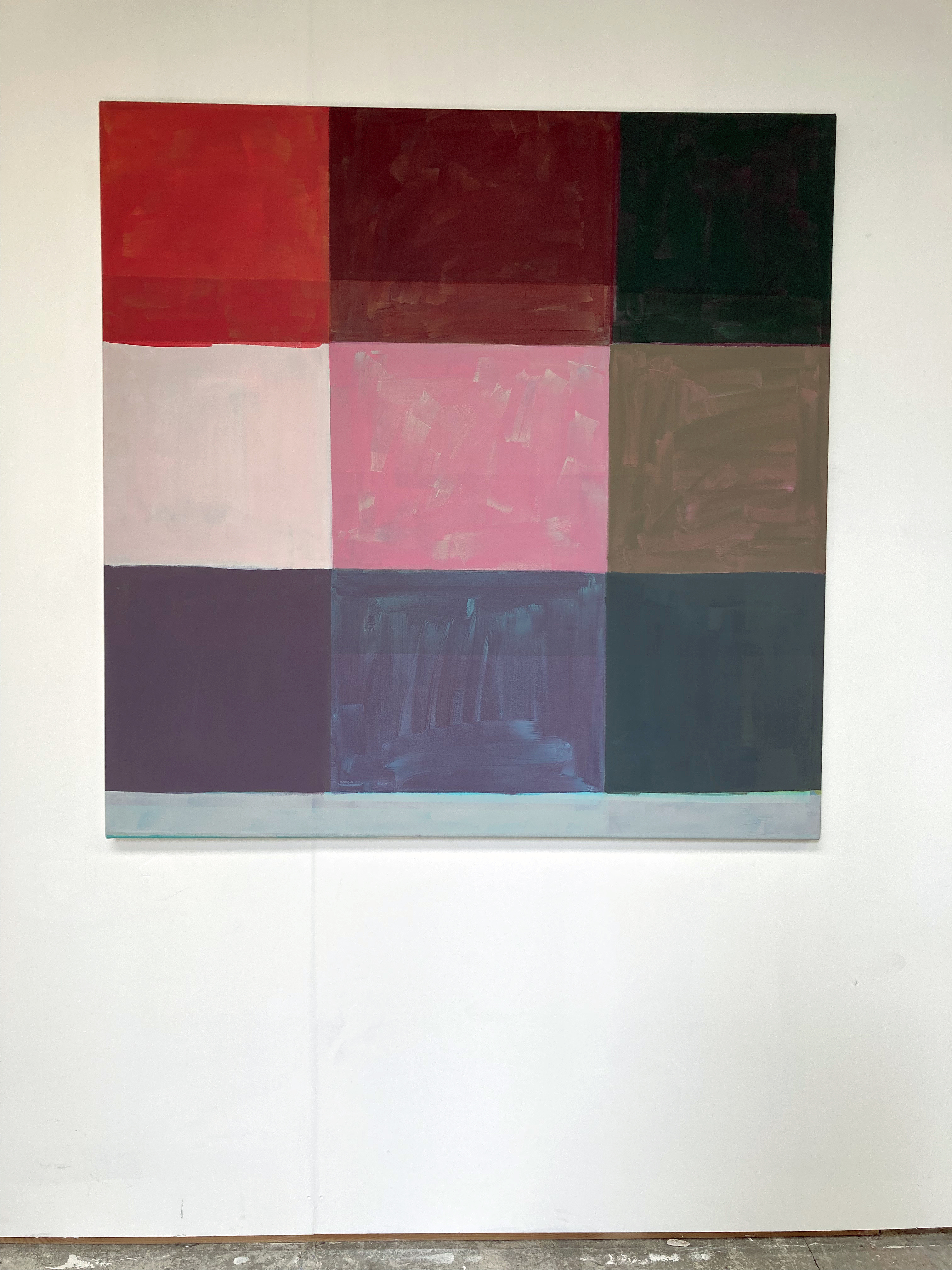
How does the title of a painting function? In ‘Blue black on yellow smile’ we see the blue and black squares on a yellow background or surround (to avoid too spatial a reading), yet I am not sure about the smile. This is good. Let’s not get too literal or descriptive. The titles, perhaps they are best considered as sub-headings as the paintings are paramount as visual phenomena, from Hartley’s selection of paintings certainly have poetic potential as pure text. They could conjure an imaginative scenario of people and places or be presented as a form of Concrete poetry. In actual fact the titles are taken from Infinite Jest, a novel by the late American writer, David Foster Wallace. If these works are actually urbanscapes (and close to the seafront in Hove where the artist lives and has his studio) the notion of the literary arc is appropriate given a sense of place and some sentiment or hunch of the fictional nature of reality as it might be retold or represented in a literary or visually creative mode. But unlike a text rendered narrative a painting is usually manifested as a kind of one-off statement, even if part of a larger grouping. Such a form of ‘reading’ (if that is the right term to use) can be challenging, simple, or both.

Hartley’s works are both objective and subjective. They are formalist and tantalisingly impressionistic. Light and colour are strong characteristics. Implied affects, from the paintings, include floating or an about to shift sensation. The process of the making of a painting could be sited as its essential subject, as a form of narrative, in this category of abstract painting. But that old-fashioned term needs a capital letter: Impressionistic, crops up as the works emulate moments of lived experience (a development of Realism in art history). Nowadays we might prefer the term environmental, as the works may well allude to the land/seascape and the constructed social space. Living on the south coast is an environment that local visitors to the exhibition might well recognise, even if indirectly or obliquely. The viewer could see or sense something in the work from the outside world they inhabit, as this is an aspect of traditional expectations too. The mind will often want to make sense of/from the abstract. But in Hartley’s works there is no illusionism. There is certainly a concrete feel, or sensation of space and structure, and some sense of figure and ground, whether intended or not. Viewpoints are potentially here too as one could be looking down on (an aerial view or map) or across to (a group of buildings or even a still life). The frame might even imply a window view, in pixelated fashion. There can be a sense of illusionism too, as in ‘Green lights both their smokes’ gives a hint of floating and shadow.

In all works, to slightly varying degrees, there are layers or just the one coat of paint, in a specific square or rectangle. The bottom section of each painting is either bare canvas or (mostly) painted with one colour for the whole width and might be read as an unintentional, though minimalist, predella. (The bottom section of a Gothic or Early Renaissance altarpiece that typically illustrates the life of a saint.) In all eight paintings the bottom section appears separate from the grid above, as if it could have been cut off before being stretched on to the supporting frame. Reading figuratively this strip/rectangle could be an urban, geographic pathway (and in ‘Leave here for large external world’ a blue stripe at the top, suggests the sky). Repeated greens in several of the works might suggest trees or bushes, but this literal reading that any viewer might have, though revealing a subconscious pictorial habit that is hard to suppress, is unnecessary.

There is a subtle predominance of blues and greys and a few reds and pinks in the selected works. Perhaps this made the earthy yellows stand out, particularly in ‘Leave here for large external world’. Colours are generally subdued, but retain vitality, from intermixing in most instances. Seldom does the acrylic appear squeezed directly from the tube or out of the manufacturer’s paint pot. The colours are key, not just individually but in relation to each other. The general square shapes and grid structures maintain an implied order and structure that holds it all together. The canvas surface is also part of the visual content. I frequently found myself stepping very close the works, especially ‘Green lights both their smokes’, to simply take in the woven texture. So too with various brushmarky laminations of colour in some of the squares. A handmade quality is retained in the painting process at all times. Nor do the works look pre-planned or overtly systematic, despite a studio-based system of some degree leading to these outcomes. In Hartley’s works we see infinite variety in a restricted, and sophisticated, practice.
Another reading might be of a form of deconstruction of the seen and experienced, leading to a constructed amalgamation of visually encountered environments to be realised as a work of art – something new in the world that we call a painting. On a more subject level I sensed a sort of breathing element too, as the imagery might be taken in to be exhaled. The visual becoming air as a calm softness of encounter accommodates a sense of changing viewpoints as well as general and specific identities. A kind of sense of place that is literally psychogeographic.
Before visiting Rising in the start of its arc, the last time I saw a painting of Hartley’s was in the memorable H_A_R_D_P_A_P_E_R exhibition at the Phoenix Art Space just four months ago. In my review of that show I avoided choosing a favourite, as there were so many works on display and my shortlist was too long anyhow. But I was tempted to choose Hartley’s contribution as my personal front-runner for the fictitious gold medal. I was not sure why though, and seeing this more comprehensive selection of his work helps me to realise that it might have been for the skills and ability to produce a work that appropriately requires a long look and a calm kind of gaze. The imagery sinks in rather than imposes itself upon the viewer. The colour range also adhered to this methodology of encouraging a mind-merging/thought process linking with the visual experience, rather than an all too obvious revealing of subject matter. In this new exhibition there is a purposive yet contradictory sense of the finished suggesting the unfinished in each work. There is also a sense of the process of becoming and of being made, with colour, shape and slightly imprecise or loose grids. But clearly being finished and resolved enough to merit the imaginative responses from the audience.
Geoff Hands, July 2024
LINKS:
Rupert Hartley – https://www.ruperthartley.com/
Nordic Art Agency – https://www.nordicartagency.com/rupert-hartley
Instagram – @ruperthartley
H_A_R_D_P_A_P_E_R review – https://fineartruminations.com/2024/03/07/h_a_r_d_p_a_p_e_r/
Gallery 19a – https://19a.org/exhibitions
