TRANSFORMATIONS: SPACEMEN

Transformations: Robin Greenwood and Gary Wragg

At Linden Hall Studio, Deal

001 - Transformations poster

Heather and John Corley developed Linden Hall Studio into a gallery space in 2014 and a visit to Transformations provides a good excuse to get out of the city and head for the Kent coast. Gazing out to sea from any location enhances our physical groundedness (literally) and we get a reinvigorated sense of that weird but ever-present phenomenon called ‘space’. Extended space is curious because of our own limited human dimensions, from which we perceptively judge all immediate senses of distance, size and scale. Distant space can be observed with some sense of safety, even if temporarily, as threats draw near. Looking to the distant horizon, especially when the sea has replaced the land, can evoke a mysterious sense of future times and places. Close space, within arms length, holds love and fear in equal measure.

Spatiality in visual art, especially painting, also provides an extending experience for the imagination, and the trickery of illusion (aided by the sophisticated perspectival inventions from Masaccio and Quattrocento painting onwards) has permeated the reception and reading of painting for a long, long time. Likewise, abstract painting engages with this experiential, psychological and forcefully visual engagement with notions of space. Colour and linearity, to varying degrees, are often a component part of this spatial scenario and Gary Wragg’s paintings have demonstrated this over several decades.

008 - Wragg - O T B D G 2 Yellow - 2016
Gary Wragg – ‘O T B D G, Yellow’ (2016)

Sculpture is another matter, where form (involving volume, weight, mass and monumentality), rather than an abstract notion of spatiality, has dominated its production and development. Anthony Caro changed all that in the 1960s, with the fusion of material (typically steel) creating structure in space – as space. Robin Greenwood was a student of Caro’s at Saint Martin’s School of Art in the early ‘seventies and so a loosely woven School of Caro (from the New Generation and beyond) might still be discerned at times, despite the endemic plurality of late modernism/postmodernism that has created a mixed bag of avenues and cul-de-sacs for artists to explore.

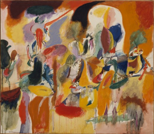
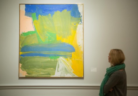
Gary Wragg’s formative painting education was forged at Camberwell and the Slade Schools of Fine Art, respectively. Wragg’s abstract expressionist influences are clearly New York School (Jack Tworkov and Willem DeKooning spring to mind) but his paintings are unmistakably identifiable as ‘Gary Wraggs’ and reveal his personal relationship with the practice of drawing and Tai Chi.

031 - Wragg - TTC 3 Freedom of Movement - 2015:16 detail
Gary Wragg – detail from ‘T T C 3, Freedom of Movement’ (2015/16)

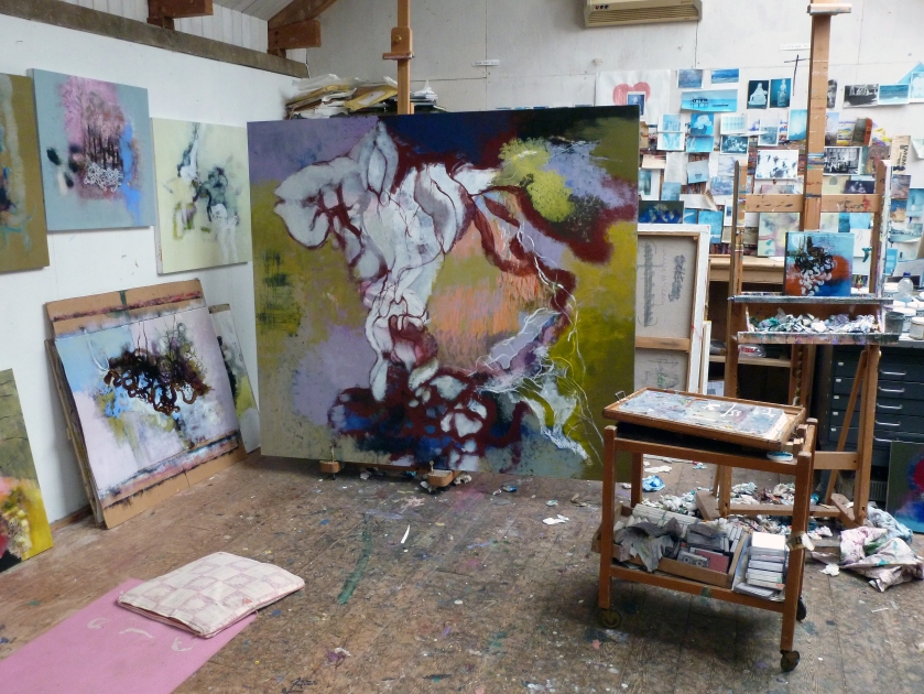
Wragg and Greenwood have evolved from the same generation and the Transformations exhibition, curated by Sam Cornish, provides a welcome combination of contrasting yet complimentary works. At Linden Hall Studio, the two exhibition floors are filled with natural and artificial light throughout the day. This light (as if it were a medium of the architecture) illuminates so effectively and is a feature of the gallery that presents the works exceptionally well.

005 - Transformations - Installation ground floor
Robin Greenwood – ‘Big Monmouth 138’ (2017) and ‘Aciris 131’ (2017)

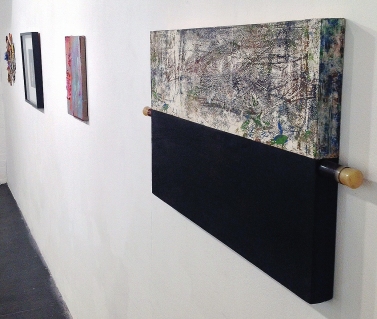
For a first impression, two of Wragg’s paintings have been placed in the front windows to give a taste of what will be inside the gallery. Above, on shelves, are six of John Corley’s glass ‘muffs’, or cylinders, of coloured glass. These are not part of the show but also hint at the colour and light that is a major feature of Wragg’s canvases. Entering through a double door, two of Greenwood’s sculptures have been placed to either side of this initial space and are bathed in natural light from windows above, where a mezzanine floor opens up the gallery space. Four of Wragg’s large canvasses (plus a tight configuration of eight small compositions on card that are from the same series as the works in the window) immediately create an impression of qualitative choice and arrangement. Although the building was originally a chapel, there is a comfortable domestic scale to the space and a staircase that takes visitors up to the first floor, with two more sculptures and over a dozen paintings, including three more large canvases, further hints at this homely aura.

There is much to see (39 works in total) and the surprisingly roomy walking area on each floor allows the viewer to stand back to find the correct viewing distance for each work. Except where paintings are purposely hung together (essentially the smaller compositions), the indicative relationship between paintings and sculptures in adjacent spaces are neither forced nor dependent upon each other. In addition to the obvious contrasts between painting and sculpture, Wragg’s colourful and light (in tone) paintings, and Greenwood’s dark and heavy (in weight) sculptures, creates a balance rather than a confrontation between very different works. The larger canvases relate to the sculptures particularly well as they occupy similar characteristics of size and presence, though any links will be circumstantial rather than programmatically devised.

024 - Transformations - Installation upstairs
Robin Greenwood – ‘Kwoke 166’ (2018) and ‘Tree of Ornans’ (2013)

But whether intentionally or not, questions were raised in Transformations: Do we look at and experience abstract sculptures the same way as abstract painting? And are our expectations different? From this pairing for the exhibition both forms of abstract art contain a sense of rhythm and flow within their respective linear configurations. Each artist appears to work intuitively and without strict expectation of the final outcome in a spirit of freedom for what might transpire in the creative process. Both work in series (which can falsely suggest predetermined forms) and there is also a tactile sense of materiality of the mediums (of paint and steel) that counters illusionism and figurative forms. Greenwood and Wragg are committed abstract artists who have never waivered in their personal quests to develop visually emboldened works within the field of abstraction.

One distinction, which equates the viewer with the work (as much as the artist’s intention), might be in the way the work is looked at or apprehended. Greenwood’s sculptures, which are made to be engaged with visually, and experienced in the round, can be viewed either standing still and in movement. Momentary compositions, made from pausing to take in and consider the work, are endless as even the slightest readjustment of positioning changes how a three dimensional form is seen. In Greenwood’s sculptures there is a mysterious, subtlety aggressive, ‘Gothic’ persona to the works. This latter designation may be rather superficially attached, but the metallic darkness, the sense of weight and the uncompromising nature of hard metal, pertains to the uncompromising nature of the works, especially those suspended from the ceiling. Looking up at ‘Kwoke 166’put the bundle of steel (with a little wood and plastic) into stark contrast with the spotlights on the ceiling and felt quite menacing.

025 - Transformations - Installation upstairs with Kwoke 166
Robin Greenwood – Underside of ‘Kwoke 166’ (2018)

Returning to notions of spatiality, with sculpture that is big enough, the viewer’s own physical space is encroached upon. Is this where sculpture can surprise or unnerve the viewer? Like another being before them that activates real space – not just headspace. And as the viewer moves around the forms, careful not to walk into or too dangerously underneath, the changing compositional framing of looking can never rest. With the sculptures there is the issue of gravity too – especially potent for Greenwood’s suspended forms. But also of weight, which in ‘Tree of Ornans’, lifts defiantly from the level of the floor with dexterous and agile movement that is surprisingly lyrical, as the fragmented industrial component parts become gestural branches suggesting arms and legs. It is balletic and poised.

Interestingly, Greenwood’s three suspended sculptures contrast with ‘Tree of Ornans’ more than with Wragg’s paintings. There is a tighter configuration, in the almost head-like suspended sculptures. The allusion to the head probably has more to do with their positioning off the ground/floor (131, 138 and 166cm). The viewer meets these pieces head-on, rather than at knee and chest level with the ‘Tree of Ornans’. The physicality of the sculptures fixes the implied bursts and movement of stilled implosion/explosion and rotation. By contrast, it is the viewer who must move around the works. The viewer becomes the kinetic component in a spatial performance.

With painting there is an obligation to stand still, rooted to the spot. The viewer’s eyes, and sometimes the head, will move as the gaze surveys and wanders. Abstract (visual) space will take the viewer in to its implied space, with the flat canvas surface as counterpoint. Wragg’s paintings, typified by his signature gestural calligraphy, instinctive and freeform colour combinations, and (almost) dangerously undone configurations of marks and shapes, are always expressively lyrical. The kinetic features are in the painting’s virtual space. The viewer is a little more physically passive.


010 - Wragg - PL 5 - 2015:16
Gary Wragg – ‘P L 5’ (2015/16)

‘PL5’, exhibited downstairs and ‘OTBDG, 2, Yellow’, shown upstairs, are two works of Wragg’s that could be juxtaposed with the sculptures as there seemed to enough air around the gestural configurations to describe forms in space. Behind and within a freeform dance of linear gestures, Wragg creates a sense of shallow space. But in each work various colour patches, splatters and gestural swirls sit on the surface of the visual field to deny the illusion of concrete, representational form.

I suspect that, by convention, the viewer does not look at abstract sculptures in quite the same way as abstract painting because expectations are different. Paintings suggest physical, geographical distances and ‘otherness’. Because of illusionistic functioning (‘picturing’) and inherent subject matter (“what/where is it?”), painting is somehow conjured from virtual realities. But sculptures are more overtly, formally, here and now – occupying the viewer’s own physical space. Does the viewer meet a sculpture – and observe a painting? Whatever conclusions can be made, Transformations poses questions that do not have to be answered with certainty, just as abstraction is far from over as a major genre in contemporary art.

034 - Wragg - OTBDG 5 Red - 2016
Gary Wragg – ‘O T B G, 5, Red’ (2016)

All artwork images © Robin Greenwood or Gary Wragg


Links:

Linden Hall Studio – 

https://lindenhallstudio.co.uk/current-exhibitions-at-linden-hall-studio/

Sam Cornish discussing Transformations at Linden Hall Studio –

https://www.youtube.com/watch?v=_MYjVLdFjWo

Robin Greenwood –

https://robingreenwood.com

http://www.poussin-gallery.com/site.php?artist=15

Gary Wragg –

http://www.garywraggstudio.co.uk

BRETT GOODROAD: TOE BUOY

Brett Goodroad: Toe Buoy

At Phoenix Gallery, Brighton.

9 – 27 May 2018 (closed Mondays and Tuesdays)

001 - Goodroad - Phoenix poster

This is an exhibition that cannot fail to intrigue. American artist, Brett Goodroad, has produced a major sequence of small ink drawings and they are displayed in various groupings in the largest room at the Phoenix Gallery for the Brighton Festival. Inevitably, the available space dictates a splitting up of so many works. One wall holds 15 drawings (or are they paintings?) and another presents ten works. There are also two drawings in one corner and a temporary wall with four on one side but just one on the reverse. Another dozen framed works adds up to a total of 44, so there is much to see.

The arrangement has some chronological sequencing but the adjustment to the exhibition environment prompts a reading of the works both as a sequential narrative structure and as individual scenarios to be considered. This, as it happens, is appropriate for Toe Buoy. The implied linearity of the series (as in A to B or left to right) is given an added dimension, as the viewer is obliged to peer closely at individual works and can allow the eye to be drawn into monochromatic depths of inferred space. This tonal aspect lends itself to creating a sense of envelopment and atmosphere: a sense of place, albeit with some degree of mystery.

003 - Goodroad - Viewer.jpg

Placed in Goodroad’s virtual environments, the viewer must bring his or her own interpretation of events – or just take it in without the need for clarity of message. It’s a poetics of space that is presented, where one must ‘be’, rather than judge or search for specific meaning.

But of course, there is a context beyond the images. The artist is resident in San Francisco and is developing a reputation as a painter of landscapes. He works on his colour dominated paintings in his garden, in a local landscape that is often damp and misty. Of his painting he has said: “I want to handle colour like Ingres and end up in the Nabis.” This reveals Goodroad’s knowledge of art history and places him in a Modernist context (the Nabis acknowledged flatness in painting long before Clement Greenberg made it a dictum for painting).

To broaden his creative portfolio, Goodroad is also a writer. The exhibition title, Toe Buoy, originates from a poem that the artist wrote in 2015. In the exhibition leaflet the author has explained that:

This poem is one of a set of poems I have written over the past five years surrounding the fictional characters Elm and Aleen. The poems work around a central image of Aleen floating in an ocean and a boundary: the seam of water, the line making her contour. We see her toes, her skin drying in the air and the ocean taking it away from her.

The question is: Is Aleen about revery? Or of fish or mammals?

 Aleen and Elm were painters who became sick because image and physical presence grew too much. She wrote: ‘when the world became oracular ecstasy left evening’.

A bowl of boiling
Oranges
             The deduction
Of line

Or is Aleen about painting? About bringing things together: let things be air and water. How can one compose them to make them musical? Or their history, the raising colour: resting nude under a tree, a leafy wink.

‘Or, my lyrical elephant, carry a lover’.

Goodroad is clearly leaving his poetry open to interpretation, but a notion of reverie and submersion has dream-like connotations. Visual content in Goodroad’s writing appears to be Imagistic (revealing his interest in the Wisconsin poet Lorine Niedecker – an Objectivist, Imagist, Surrealist writer) and as might be expected translates into actual imagery in his primary role as a visual artist. In the quieter, visual medium of the painter, the unspoken but revealed can be as equally clear or obscure as the written or spoken word.

008 - Goodroad.jpg

In Toe Buoy the painterly ink drawings have a sense of a state of becoming – rather like the process of under or over developing black and white photographic prints that were once produced in the darkroom before the advent of the digital medium. Some of the drawings even suggest multiple exposures, or the merging of normally disconnected events in a dream-state. This oblique coming together of imagery is relational in a cognitive and personal sense – but holds potential for notions of the collective unconscious that the Surrealist writers and artists explored in varying degrees.

015 - Goodroad

From the natural world, through which Goodroad channels his depictions, his tonal use of ink shows that the surroundings are constantly in a state of flux and continuously evolving. Distilled from the artist’s imagination, these are not necessarily strange lands. The sense of place might be from Europe as well as North America. The first impression is of a disturbing Goyaesque ambience to the imagery. But these might be stills from a low-budget film noir genre movie rather than etchings from the studio of a European master some 200 years ago. The works also have an air of immediacy that is often characteristic of what is essentially a drawing process. Working with Japanese Sumi ink, a medium favoured by Manga illustrators, Goodroad is making imagery that harks back to the European tradition of narrative ‘in’ painting. The works suggest a roster of influences, from Tiepolo (especially his drawings) to Titian’s tonally adjusted chromatic range of chiaroscuro in figures and environments: or from Watteau to Surrealism via Constable and Romanticism to Frederick Edwin Church and the 19thcentury Hudson River School.

005 - Goodroad.jpg

It may only be coincidental, but an intimate sense of the landscape – suggestive of Jean-Antoine Watteau, working a century before Goya, who produced fête galante canvases depicting outdoor entertainment and courtship, especially figures in wooded landscape – came to mind. But the Toe Buoy imagery is claustrophobic for the most part, especially when watery depths are depicted. In his introduction to the exhibition on the opening day, Goodroad said that ‘mold’ worked well as an analogy for the work. From this surprising off-the-cuff remark his organic approach to image making, in paint or ink, becomes apparent.

014 - Goodroad

Sumi ink is a medium that dries matt, and on cold white Bristol board it lacks warmth. The imagery sinks in to the surface like they are secrets. Dark, indistinct and incongruous forms invite closer looking. In one particular image, initial obscurity reveals a naked figure in the gloomy shadow space.  (An old friend once told me that he only dreamed in black and white – now I begin to understand the experience.) The unconscious is inferred where a poetic off-the-wall surrealism meets a narrative of the physical and the psychological: mixed with love and fear, homeland and wilderness. It’s all strangely perverse.

013 - Goodroad - detail

Some images give and have clarity. Others resist a reading or recognition. But not every image is located in the realm of the imagined. For example, one particular image referenced the Sun Dance Ceremony that the indigenous Plains Indians of North America once practiced. In this ceremony pain is tethered as an inducement to vision – and to healing.

011 - Goodroad detail a.jpg

In a 2015 interview with writer Claudia La Rocco, Goodroad acknowledged the curative potential of his painting practice:

“I make the paintings and see illness and religion. I see that I am trying to heal something through my process, and that the solving is a part of this.”

Perhaps this related to Aleen and Elm’s sickness as painters in Goodroad’s poem? This might sound fanciful, but if healing in all societies is necessary, perhaps we need the painters, or more broadly, the creative and imaginative outpourings of writers, performers and visual artists to counter our increasingly technological and digitally controlled and neutered society?

The sequence of poetic illustrations demands that the viewer takes part in the storytelling by prodding at their own imaginative faculties. If you visit the show take your time to look at the work with an open mind – the reward might not be immediately felt, but the imagery will linger long after, and you can invent your own narratives and acknowledge your own creative powers.

002- Goodroad - Shrigley talking.jpg
David Shrigley, Guest Director of the Brighton Festival, introducing Brett Goodroad to the Phoenix audience at the opening of Toe Buoy.

All artwork images © Brett Goodroad.

Links

Brett Goodroad’s website:

https://lifeofatruckdrivinpainter.wordpress.com/page/1/

Gregory Lind Gallery interview with Claudia La Rocco:

http://www.gregorylindgallery.com/news/reviews/artpractical_goodroad_0515.php

JOHN TAYLOR: ABSTRACT VOICES

JT - Gallery Window 2018

ABSTRACT VOICES

Jeannie Avent Gallery, East Dulwich


There’s a certain persuasion about digital platforms. Despite their omnipresence and commonplace presence in our everyday lives, the prevalence of images on-line still gain some sort of elevated credence. Our computers and other digital devices place virtual galleries in our hands.

I first discovered John Taylor’s work on Instagram (or was it Twitter?) last year and have followed his work with increasing interest. Little more than a week ago a tweet alerted me to his latest exhibition and, even on an iPhone screen, where the diminutive 9X5cm portal presented a 5X5cm image, I was especially struck by the combination of abstract, minimalist compositions in ‘Nine Collages’. This was the necessary bait to coax me along to the Jeannie Avent Gallery.

JT - Nine Collages 26.5X21.5cm each Acrylic & card on board
John Taylor – ‘Nine Collages’ (26.5X21.5cm each). Acrylic and card on board.

In this small but light and uncluttered gallery space (just the one room of a former corner shop) these works that I initially sought out lived up to my expectations. Seeing and experiencing the ‘real thing’ was even more satisfying than the initial digital representation, particularly in the context of the exhibition that was something of a mini-retrospective. The ‘Geometric Incidents’ that make up ‘Nine Collages’ are relatively small works, but they combine perfectly in this grid-like configuration (maybe four would work fine as well, but 12 would be too many). As they are so small there’s a suggestion of intimacy in these collages. Initially, the implied spatial play is confined and locked-in, but after a while the flat colour-forms take on a teasingly monumental impact and reveal a more expansive, architectural sense of structure that suggests asymmetrical order in apparent arbitrariness. The shapely and geometric forms in these collages could have been a pared down version of a number of the more complex works on show that do not deny, but celebrate, some indebtedness to Ben Nicholson and the abstract wing of the St.Ives School.

JT - Sense of Occasion 40X50cm collage & acrylic on canvas
John Taylor – ‘Sense of Occasion’ (40X50cm) Collage and acrylic on canvas.

For example ‘Sense of Occasion’ features a modernist exploration of space on the picture plane. In this instance the visual play is typically both contained and fixed but with indications of a larger scaled environment of planar forms. There is enough information to suggest an interior arrangement on a tabletop and an airy opening (on the right hand side) where the grey forms bring in breathing space for the viewer’s imagination. A central window or mirror-type rectangle might suggest a head and shoulders – or a large goblet or other vessel. It probably doesn’t matter which, but this virtual and implicit content humanises the potentially anonymous abstract configurations.

JT - After Barcelona 34X41cm Acrylic & collage on card
John Taylor – ‘After Barcelona’ (34X41cm) Acrylic and collage on board.

In another work, ‘After Barcelona’, these interspatial collusions also reveal Taylor’s predilection for a spatial harmonics that, through restraint and clarity, speaks quietly, though insistently. The constrained and limited palette of colour combinations is carefully juxtaposed (rather than undermined) by mildly surprising colour appearances. In this composition the light blue vertical strip, with a wavy edge, evoked my own abstracted memory of Barceloneta; and the brown structures suggested the tight alleyway spaces and tiled roofs of the Gothic Quarter. Or maybe there are suggestions of wooden furniture or tables in a small bar. This Hodgkinesque response, triggered by both the composition and the title, demonstrates that the personal is transferable, yet inevitably transformable.

On further reflection, particularly with access to this imagery after leaving the exhibition (another plus point with regard to digital reproductions), further looking and contemplation of Taylor’s paintings and collages confirms his talent for creating visual harmony. Interestingly, there is also a subtle sense of melancholia (ennui is too strong a term). Is there a positive, or amiable, form of melancholy? Are these the Abstract Voices alluded to in the title of the show? The works will have to speak for themselves, through the filters of the viewer’s personal experiences. Emotional responses to people and places have not only made the work – but are passed on.

Geoff Hands

All images © John Taylor.

LINKS

“The ongoing development of my work continues as I constantly revisit, revise and explore abstraction. In my most recent works I have allowed my paintings to become their own voice.  Simple shapes are used in a very simplified or modernist way. 
I believe that by following my emotional response to the process of abstraction I am responding most genuinely to myself and my integrity as the artist. This is a challenging and sensitive process, a process with which I feel an increasingly emotional and confident connection.”

http://www.johntaylorpaintings.com

Additional images and information also on-line at:

http://www.rowleygallery.com/Artist-John-Taylor.aspx

and

https://www.jpartconsultancy.com/artists

An interview with the 650mAh curators

650mAh
Tabitha Steinberg and Ella Fleck are the co-curators of ‘Sorry I haven’t been’. After the successful opening I emailed the following questions to them:
Did you choose Brighton (Hove, actually) for any particular reason?

Brighton has a vast artist community that we were excited to engage with in a new way. We knew we wanted to do something in an untraditional gallery environment. We wanted to engage with the problems traditional art spaces are facing today and look at how we can work around that in a productive and critical way. We were lucky in being able to approach a friend who owns a vape business based in Brighton and ask if he would be interested in housing our gallery and he was. We’re very happy to be engaging in contemporary art outside London and it’s great that more contemporary art spaces are opening around the UK. There are also lots of galleries opening in coastal cities/towns – in Margate, Newgate Gap (which is in a Victorian toilet block on the beach) will open next year and Maureen Paley’s summer space Morena di Luna is just around the corner from us in Hove. Brighton also offers a very open perspective which is welcoming to artists with more experimental practices and ideas –  something we always support. There’s a sentimentality for both of us as well as we have had family here and spent a lot of time here as children. One of us (Tabitha) also studied at Sussex University. 

 
How did you locate the Mist Vape shop – it’s an unusual location for a gallery space?

As we say, a friend owns Mist and we were very fortunate that he was interested in our project. We see the fact that it’s located inside another business as a positive rather than a hindrance (which you can probably tell from the vape heavy design on our website). Of course, we’re trying to work around the lack of available space (especially in London) today but we’re also really into the unusual collaboration between this commercial business and our non-profit space. The vaping business is a really current phenomenon and it is interesting to see how such a contemporary business interacts with contemporary art. It raises questions about how art functions today, in terms of commerciality and commodity and how adaptive art and artists must be.

Do you have plans to organise more exhibitions in Brighton & Hove (and/or elsewhere)?

Yes. Currently, we are situated inside Mist Vape Shop for the foreseeable future and have an ongoing programme. Our current show with Jack Lavender closes on 16 March. We can’t say too much yet but our second show will open around the beginning of April and will be a group show of artists working at an intersection between art, clothing and fashion.

I first became aware of Jack Lavender’s work in Cura magazine in 2014; and later saw his work at Frieze London (2016) and his work clearly has a spirit of experimentation. Are there new developments in Jack’s work on display in this show?

Jack has always worked with sound, collage, drawing and found objects but in Sorry I haven’t been he has really pushed this into more of an installation rather than individual works – something he has not really done before. He has used his materials to construct an environment. Many of the themes are carried over from ongoing ideas in his practice, like objects imbued with memory, souvenirs and junk and this weird sense of spirituality that comes from such things. In 650mAh, he has constructed a space where you feel both like you’re looking into the future and looking back at the past and though this sense is similar to his show at BALTIC, the execution is totally different and new. He has also collaborated with Dul Fin Wah to make a full soundtrack for the exhibition which he has not done before. We always encourage experimentation in whoever we are working with. It was very natural for us to open with Jack as much of his work and aesthetic interests overlap with the aesthetics of the vape shop.

How would you describe the relationship between Jack’s visual content and audio collaborator, Dul Fin Wah’s sound pieces?
Jack and Dul Fin talked a lot about the installation and what type of feeling they wanted to have in the space in relation to ideas of memory and dreams. They discussed how a car could function as a vehicle to retrieve lost memories. Some of those conversations happened in a car. While it was important to have conversations around the themes of the show, Jack wanted Dul Fin to be able to take these ideas and generate something without limitations.
So the artwork is a catalyst for the soundscape?
We wouldn’t say that the soundtrack and Jack’s objects are separate from each other. They are more parts of the same thing. It’s the relationship between the physical work Jack has made and the audio work Dul Fin has made that make Sorry I haven’t been.

Coming from left-field: The future for the arts, in a broad sense, seems to be one that will specify and encourage more collaboration and cross-over between forms of expression and individuals. Maybe in line with positive notions of free access (including non-gallery spaces) and a meltdown of power-based hierarchies in a Post-Capitalist reaction to the Neo-Liberal agendas of the so-called free-West. Does this strike a chord for 650mAh?

We think it’s striking a chord with everyone currently but it’s another question as to whether anyone knows what to do about it. We’re being told that everything’s in turmoil (especially in the UK) but who knows what all of this will mean in 20, 50 or even 100 years? We’re not sure about the meltdown of power-based hierarchies – in actuality, is this happening at all? We guess cryptocurrency is the most likely way out towards free access and decentralisation but so was the Internet. 

Well, we live in exciting times! Thank you – I look forward to the next show at the Mist Vape Shop.


Jack Lavender
Sorry I haven’t been 
20 January – 16 March 2018 
www.650mah.com/sorry-i-havent-been.html
650mAh
Mist Vape Shop
41 Western Road
Hove, BN3 1JD
Instagram – @650mahhhhhhhhhh

JACK LAVENDER: Sorry I haven’t been

650mAh Project Space

Mist Vape Shop, 41 Western Road, Hove, BN3 1JD

20 January to 16 March 2018

004 - JL

Walk from Brighton into Hove. Enter the Mist Vape Shop. Edge carefully through the throng of guests – are they here for the show, the vapes or the beer? Continue to the back of the room, turn the silver handle, push open the door and enter the exhibition.

What might you expect?

Is this a carport or a funeral parlor? A shrouded form, about the size of a small charabanc, takes up most of the floor space. Is it really a car? A waterproof, protective car protector covers the squarish, stolid form. Nothing moves, but it does not look heavy or monumental. A sheath of sorts creates a sense of mystery – but it has a feeling of commonplaceness about it. The perverse pleasure of not lifting the sheet to see what’s underneath overpowers any attempt to take a peep. Strange contradiction.

003 - JL

At each end of the greyish form two vaguely eye-like slits might be considered as a sad and a happy cartoon face. From the world of theatre it’s comedy (Thalia) and tragedy (Melpomene). Both were daughters of Zeus and Mnemosyne. The latter was (is?) the Greek Goddess of Memory. Have we met before?

Standing on top is a singular, thin Chinese figurine. He’s certainly not Greek – but appears ancient nonetheless. Is this a shrine? He is anonymous, but strangely sentinel. He has authority. People giggle.

Around the form that is approached with an attitude of unexpected awe, the air is coloured purple and is comfortingly atmospheric. The LED monochrome light source from the floor produces a deep violet to lavender, misty dreamscape. The space around the form is rendered airy and cushion-like. It’s an eternal dawn or an evening twilight.

006 - JL

An ambient soundtrack created by audio collaborator Dul Fin Wah! emanates from the centerpiece of the installation. What we see, hear and feel is one integrated whole.

Are memories dream-like?

The artist Jack Lavender is here; along with Tabitha Steinberg and Ella Fleck the co-curators. We’ll talk later – I want to form my own interpretation of this event. But I don’t want to understand. I want to take a ride: destination unknown.

Sorry I haven’t been? Pleased I went.

Geoff Hands (20 September, 2018)

001 - 650mAh Flyer.jpg

Links –

See more of Jack Lavender’s work at: https://theapproach.co.uk/artists/jack-lavender/images/

Hear Dul Fin Wah! on: https://soundcloud.com/dul-fin-wah


PHOENIX RISING: HARDPAINTING

Preview for

H-A-R-D-P-A-I-N-T-I-N-G

at Phoenix Brighton

10-14 Waterloo Place, Brighton BN2 9NB

Preview night: 12 January 2018
Open: 13 January to 11 February (closed on Mondays and Tuesdays)
001 - Phoenix front - photo by M Stoakes
Phoenix Brighton (Photo – Mike Stoakes)

In preparation for writing a review of the H-A-R-D-P-A-I-N-T-I-N-G exhibition at the Phoenix gallery in Brighton, Ian Boutell allowed me a sneak preview of the some of the work as it was being arranged for display. As might be expected there was still much to do just four days before the opening event, but the essential decisions on placement of the many works had already been decided after a couple of days of ‘tweaking’. The signs were good for what might prove to be one of the visual arts highlights of 2018 in Brighton as good quality, contemporary painting is lacking a regular stage in the city.

Habitual visitors to Phoenix Brighton will probably be well aware of its history since it was established by a group of artists in 1992 with the primary aim of providing low cost studio space. Today the Phoenix has charitable status and is the largest artist run space in the South East of England, providing workspace and opportunities to share experiences for over 100 hundred local artists, designers and craftspeople. Situated near St. Peter’s Church, barely ten minutes walk from the beach (to the south) and a little closer to the main rail station, Phoenix Brighton provides studio spaces, short-term project space for community groups and supports a gallery and education programme. This brings together professional artists and the general public in a friendly and creative environment – but even more is being done to forge additional and meaningful associations.

Although well known as one of the major visual arts venues in the city (in addition to Brighton Museum & Art Gallery, Fabrica, ONCA, Coachwerks in Hollingdean and the University of Brighton, Faculty of Arts in Grand Parade) in many ways, the Phoenix Brighton is still an evolving institution with huge potential. With a view to taking the organisation to another level, last year the trustees appointed Sarah Davies as Executive Director to develop the range and scope of existing resources and to further develop a well-established public profile. This will clearly be a demanding task, but various developments (including the Exhibition, Spotlight and Forum programmes) are already enabling the Phoenix to engage the resident artists and visiting arts professionals with positive public engagement, enabling the charity to maintain one of its central aims.

002 - Ian Boutell – Composition 1, Hazard tape on board, 20cm x 20cm
Ian Boutell

For example, H_A_R_D_P_A_I_N_T_I_N_G will link the Exhibitions programme to the now regular Spotlight initiative in which Phoenix artists showcase their work and professional practice with opportunities for the public (and the other resident artists) to ask questions about any aspect from the daily life of the artist (thereby demystifying any pre-conceptions) and the conceptual basis of their work. The next Spotlight will be based around a tour of the show with five of the exhibiting artists: Ian Boutell, Philip Cole, Stig Evans, Johanna Melvin and Patrick O’Donnell. The artists have advertised that they will be discussing their practical working processes and what motivates the creation of their work, as well as exploring shared themes and affinities as painters. The selection of work will, in effect, aim to provide a visual forum for a wide-ranging and potentially rigorous dialogue around what might be considered as ‘non-expressionistic’ (or ‘controlled-gestural’?) abstract painting. We shall also see if the ‘show and tell’ session raises questions, and provides answers however tentative, concerning the continuation (some might say, re-emergence) of abstract painting vis-à-vis the pluralistic range of media and formats in contemporary art – or even of the so-called ‘death of painting’. At least that’s my assumption.

009 - Stig Evans - Ravished-image-ultra_420
Stig Evans

Interestingly, in H_A_R_D_P_A_I_N_T_I_N_G the temptation to exclusively show work by Phoenix artists alone has been avoided by inviting three other participants. Of particular interest for followers of hard-edge abstraction is Tess Jaray RA, who is represented by Karsten Schubert in London. There will just be one of Jaray’s works on show (a screenprint, ‘Minuet’ from 1967, which was at the framers when I visited), which I am expecting to provide an historical touchstone for the exhibition – despite not being a painting. The two other guests are London-based, Johanna Melvin and John Bunker. Melvin is primarily a painter (with a printmaking background), whilst Bunker works in a collage process with painted and printed papers and other materials. I do not know if there is an agenda here, but future collaborations with similar institutions around the country are possible – or even further afield if the Brexit decision plays out as less negative and narrow minded as it appears.

012 - John Bunker
John Bunker

I briefly mentioned the Forum events above, and linking this exhibition to a recent Phoenix event was the Curating: a Concept in Transition forum. This was a day formed of presentations, group discussion and debate, “…designed to explore the new possibilities that emerge when artists, researchers, curators, educators and their publics join forces to examine and re-specify what a gallery can be, what an artist is and how the borders between curating and creating might be tested and stretched.” (See link below.)

The four resident artists/curators in H_A_R_D_P_A_I_N_T_I_N_G (Ian Boutell, Philip Cole, Stig Evans and Patrick O’Donnell) have demonstrated, in a small but meaningful way, that distinctions between creating and curating are now overlapping. This is not unusual nowadays as curatorial practice merges with studio practice as two aspects of a contemporary artist’s life. Undoubtedly there will be many reasons for this, including limited access to commercial gallery opportunities; the influence of professional practice educational imperatives in higher education; and an inherent social-engagement agenda that motivates artists to share their practice in a positive community spirit that runs counter to some negative aspects of modern life. They also provide evidence (as if it was needed) that a range of professional expertise exists within the Phoenix studios that will, undoubtedly, continue to be nurtured by the Phoenix as an institution, which has the potential to lead the showcasing of contemporary visual arts in the city, not just for a local audience but for the many visitors who visit this unique coastal resort.

007 - Ian Boutell
Ian Boutell

To quote David Garcia (Vice Chair of Phoenix trustees), this show should go some way to supporting the current aims of the “Phoenix (as) an organisation in transition… Phoenix wants to think again about how we programme and use the gallery… The more recent shift in the role of curator will influence programming too, curating itself has become democratised, everyone is able to engage with personal curation projects such as ‘curating’ their Facebook page, also the function of the artist in relation to a curator should be explored.”

015 - Patrick ODonnell
Patrick O’Donnell

Well, here’s the exploration – not only of curating but also of painting – which is better than any digital or virtual format. H_A_R_D_P_A_I_N_T_I_N_G is the real thing, and I very much look forward to reviewing the exhibition for Abcrit after it opens. (Link below.)

Hard+Painting+eflyer


ABCRIT REVIEW

https://abcrit.org/2018/01/20/93-geoff-hands-writes-on-h_a_r_d_p_a_i_n_t_i_n_g-at-pheonix-brighton/

Abcrit 93

SPOTLIGHT
Monday 22 January, 6:30 – 8: 30 pm (doors open at 6 for drinks). Free, please email sarah@phoenixbrighton.org to book your place.

Spotlight-Jan22


LINKS TO EXHIBITORS:

Phillip Cole

004 - Philip Cole
Philip Cole

Stig Evans 

008 - Stig Evans
Stig Evans

Patrick O’Donnell

020 - Patrick ODonnell
Patrick O’Donnell

John Bunker

014 - John Bunker
John Bunker

Johanna Melvin

024 - Johanna Melvin
Johanna Melvin

Tess Jaray


LINKS TO GALLERIES/ORGANISATIONS:

Phoenix Brighton

https://www.phoenixbrighton.org

https://www.phoenixbrighton.org/events/forum-curating-a-concept-in-transition-2/

University of Brighton

http://arts.brighton.ac.uk/whats-on/university-gallery

Brighton Museum & Art Gallery

https://brightonmuseums.org.uk/brighton/

Fabrica

https://www.fabrica.org.uk

ONCA

https://onca.org.uk

Coachwerks

http://coachwerks.org/gallery/

Karsten Schubert

http://www.karstenschubert.com/artists/74-tess-jaray/works/

Abcrit

https://abcrit.org/category/geoff-hands/


WHERE ARE WE NOW? Uwe Henneken: The Teachings of the Transhistorical Flamingo

At Pippy Houldsworth, Heddon Street, London.

(From 8 September to 21 October 2017)

All images, ‘Courtesy the artist and Pippy Houldsworth Gallery’.

Uwe Henneken_The teachings_2017_Pippy Houldsworth Gallery_Installation (3)_300dpi
Uwe Henneken at Pippy Houldsworth – Installation shot.

The last time an extraterrestrial was spotted in Heddon Street, Ziggy Stardust had arrived from Mars. It was 1972 and the hippy-trippy ‘60s were well gone. But, where the imagination was required, Sci-Fi (even when glammed up for rock ‘n’ roll) was still creating a futuristic mythology for audiences and the promises of other lands were appealing, if only someone might lead us there. Escapism, perhaps, but visual artists and writers (poets and story tellers especially) have always enlisted and augmented their imaginations to extend the boundaries of the sensible and balanced mind-set. Historically, this is the role of the Shaman in a multitude of guises and cultures and the notion of a purely rational consciousness is surely too much of a limitation to account for the scope of the mind.

Enter: Uwe Henneken. In reviews from previous shows, and from the press release for this exhibition at Pippy Houldsworth, much has been said of the shamanistic nature of Henneken’s fictive world of diverse characters and settings. His first solo show in London presents eight canvases, all completed this year. Entitled, The Teachings of the Transhistorical Flamingo, the exhibition showcases deceptively challenging imagery for his expanding audience. The work offers fascinating portals into a strangely familiar world – but where the inhabitants are out of the ordinary. Henneken’s troupe of exotic, cartoon-like or flamboyant beings, some glowing with inner energies, seems to either beckon the viewer, or a second character in the painting. The relationship of the viewer to the imagery is either one of invitation to imagine, perhaps in a dream-like state; or to encourage and provoke a more probing desire to make sense of the evidence presented.

Henneken_A Lesson in Polarity_2017_H8755_300dpi
Uwe Henneken – ‘A Lesson in Polarity’ (2017)

Displayed slightly away from the central space of the gallery, but seen first on entering the exhibition, is ‘A History Lesson in Polarity’. This is the only landscape format canvas in the show and Henneken’s influences may have been affected by Paul Gauguin’s paintings, such is the sense of synthétisme in the implied narrative and settings. For example, at least three characters are subsumed into this rocky landscape (others are suggested with some sketchy use of pencil and paintbrush) and the figures and the environment merge as one undifferentiated fiction. Looking for something to make sense of, the animal on the left suggests The Lion King atop a rocky prominence, but the translucently white, big-eared creature opposite stares as if mesmerised. Overlaying the horizon line that might depict a raised escarpment, the young girl who will reappear in other paintings floats above an orange shape that might depict a field or a drawing of a bison from an ancient cave painting at Altamira. I don’t really have a clue – because the clues don’t add up. The lesson is a process, not a definitive statement of facts. Dream on.

As in the paintings that follow, the more you look the weirder it gets as a sense of initial comprehension is undermined by the various characters and beings who occupy these external spaces. A glance at the works before investigating close up immediately reveals a variety of environments. The inhabitants give them a narrative function integrated with the figures – even though these meanings might be unfathomable or deliberately open to interpretation. The various backdrops might be recognisable from personal experience (holidays abroad perhaps) because the scenery is not so otherworldly: starry night skies, mountainous vistas, rocky desert outcrops, and woodland or forest environments are earthly delights. These places provide the kind of theatrical or cinematic settings that we find in classic fairy tale illustrations from the past and popular, animated, children’s films for a more screen-engaged audience today.

Uwe Henneken_The teachings_2017_Pippy Houldsworth Gallery_Installation (5)_300dpi
Uwe Henneken – ‘Kin’ and ‘Transhistorical Waterfall’ (both 2017)

In ‘Kin’ and ‘Transhistorical Waterfall’, appropriately hung side-by-side, the two figures appearing in each could be located in far away locations that are new to the viewer. An implied exoticism, most especially in the latter composition, where the colour and visual style shifts between a post-impressionist, illustrative and cartoonesque style, is sensed in the (possibly) masked and wild-eyed creatures. These two wonderfully colourful, but unidentifiable figures, stand either side of a narrow V shape parting of trees. Just beyond is a waterfall and in the far distance a youngish human visage peers out from the cliff face – but it does not feel like a joke or play on words. The viewer is invited to approach, delving into the jungle simultaneously, into pictorial and imaginative space. What appears delightfully decorative, slowly takes on a nightmarish feel – it will freak you out.

In ‘Kin’ [2017] a pair of wide-eyed creatures, arranged (on first reading) in a Mother and Child pose from the Early Renaissance period, merge into the Spaghetti western landscape. Incongruously, mum wears a pair of spotted tights and a red-gloved hand reveals the child’s face to be a flower head, not a plump infant. Their facial features and body hair merge into cloud and frilly costume alike. As with ‘A History Lesson in Polarity’ discussed above, my visual and mental confusion seems to increase rather than clarify. Why are the characters exploding in bubbling, billowing colour? Am I hallucinating in the desert? Or is the implied viewer who must complete the story on LSD?

Henneken_The Art of Jumping Timeline_2017_H8815_300dpi
Uwe Henneken – ‘The Art of Jumping Timelines’ (2017)

What might be a mediaeval castle in, ‘The Art of Jumping Timelines’ (the largest work here) also suggests the modern urban cityscape, where we could assume a band of party revellers are winding their inebriated way through the streets. But two foreground figures suggest another reading. A young male leads a taller figure away, out of the picture framed setting. Both wear strange headgear, suggestive of exotic animals and ancient cultures. Whatever the implied narrative, Henneken leaves it to the viewer to transcribe the imagery into some kind of understandable tale – albeit aided or mystified by the various titles.

Henneken_A Meeting at the Desert Shore_2017_H8813_300dpi
Uwe Henneken – ‘A Meeting at the Desert Shore’ (2017)

Some images look complete, whilst others appear to be still in progress – ‘A Meeting at the Desert Shore’ is a case in point. The two foregrounded figures are ’coloured in’, as is the sunset and reflective surface of the lake backdrop. In between, the sketchy landscape appears to be reserved for the forlorn but glowing figure that observes the rainbow-girl and the Moomin character that gaze at each other. This latter personage might look quaint and child friendly at first, but closer inspection reveals a penis-like red serpent with three testicles hanging between his legs. This contradictory figure also holds a three pronged spear, or trident, which points down to the ground. If it’s a weapon it comes across as symbolic and ceremonial rather than menacing and its colouration from the sunset or the rainbow figure further diminishes foul intent. Perhaps two worlds are depicted here: one of colour, the other drained of unnecessary flamboyance.

Henneken_A Call_2017_H8807_300dpi
Uwe Henneken – ‘A Call’ (2017)

Above a woodland scene in, ‘A Call’, flower-like stars appear amongst the woodland forms. They could be imagined as fruits from the trees or as stars beyond the earth. A sickly yellow mist cuts across the base of the huge blue trees. One tree has been felled, its purple roots transformed into claws that imply danger in this eerie setting. Placed on a pathway that leads into (rather than out of) this space for the imagination, stands the child from three other works on display, including ‘Space in Space’. As if against the light, in both of these particular paintings, she is almost featureless, flat and blue and has the same emanating glow that might be protective in some way. The stars revealed within her body shape in the latter painting are missing in ‘A Call’, but at the end of the curvaceous pathway is a golden light, which must be her destination. Whether she gets there or not might be up to the viewer to imagine.

Henneken_Space in Space_2017_H8814_300dpi
Uwe Henneken – ‘Space in Space’ (2017)

In ‘Space in Space’ this cut-out figure appears to float in outer space whilst looking towards an implied planet or cosmic portal. The globe-like form to the left of centre is created by the Ouroboros – a serpent that bites its own tail – that symbolises the cycle of life and death in many cultures. The blobs of white paint within the inner circumference of the sleeping snake, its one visible eye closed, creates a planetary form – or an implied multitude of planets – and the white moon-like shapes are repeated within the human figure. Around these forms some of the stars resonate like wild flowers, creating a sense of animation. In this painting the notion of being at one with the cosmos (we are stardust after all) is implied. Contradictorily, because the meaning of the painting (including the title) might be the most obvious in the exhibition it might be limited by this degree of clarity. Obscurity or an implied, but unexplained, exegesis suggests a broader potential of meaning so that it is not fixed and holds more potential for the imagination.

As a phenomenon, the subject matter of Henneken’s paintings will surely appeal to an audience already interested in the likes of Rui Matsunaga, Raqib Shaw, or Chris Gilvan-Cartwright. A surreal, illustrative, narrative-heavy trait that enlists rather than rejects the past in contemporary practice appears fecund, alive and well. So, given the burgeoning problems of the world, whoever and wherever we are, we all may wish to escape somewhere at times. The shamanic spirit in any art form may not provide clear answers – but questions might prove more useful given our individual natures. That we experience inner and outer worlds simultaneously, and that the imagination is universal and timeless, might go some way to grasping the many potential meanings of Henneken’s paintings.

A final thought – in more recent times, the artist formerly known as Ziggy Stardust, asked: “Where are we now?” How apt.

Geoff Hands (September, 2017)

Note: Henneken adds his imagery to the shamanistic tradition that Professor Michael Tucker has examined in ‘Dreaming With Open Eyes: The Shamanic Spirit in Twentieth Century Art and Culture’. Tucker investigates the visionary and super/mythic-consciousness of the Shaman in world cultures – and especially in relation to the modern artist. (The book is out of print, but is easily available on Amazon.)

A HISTORY LESSON? – Paulo Nimer Pjota in Hove

‘The History in Repeat Mode – Symbol’ at Morena Di Luna, Hove

Open Saturday and Sunday from 12pm to 6pm. Until 15 October 2017.

So, the word on the street was true: Maureen Paley really is in town – or ‘Hove actually’, as the locals like to say. The gallery, named Morena di Luna, is Wolfgang Tillmans’ nickname for Paley and the renowned East End gallerist has further established her presence in the city as Maureen Paley was previously involved in the HOUSE 2016 event when, in partnership with the University of Brighton, Gillian Wearing’s ‘A Room With Your Views’ was presented during the annual Brighton Festival.

002 - Morena Di Luna front door

This inaugural exhibition at 3, Adelaide Crescent presents the Brazilian artist, Paulo Nimer Pjota, in a Regency town house that is situated in a prime location on the seafront. Pjota previously had a one-man show at Maureen Paley in Herald Street in Bethnal Green in 2016. The works displayed in Hove are similar to those displayed in London, and these additional works further establish Pjota’s reputation as fast developing name in contemporary practice – especially in the field of what is now labeled ‘expanded painting’ or ‘Post Medium practice’. The so-called expansion of course is into sculptural and installation-type manifestations of painting, where the space of the viewer is often encroached upon by physical elements in the artwork. The paint itself is not hierarchically superior to any other medium in use – and, likewise, the image becomes an object too.

In this exhibition the most immediately obvious intervention in the space is as much on the walls as on the parquet floors of the two main ground floor rooms. Pjota has used both acrylic and oil paint on canvas (another support is metal), which is conventional, but the paintings ‘hang’ unframed and feel like intrusions into a traditional domestic space that, historically, is designed to accommodate an oil or watercolour in a guilt frame.

024 - Pjota - Garfield
Paulo Nimer Pjota – ‘Garfield’ (2017)

Whilst still on the subject of the wall, a few of the cartoon-type images appear to have escaped from the paintings and appear in unlikely places. A teenager’s bedroom might be implied and the imagery could appeal mainly to a younger audience. For example, whether in the implied painting space, or let loose from the restrictions of the artwork, we see Garfield the cat; a grinning Halloween smiley face; a sad face; Pocahontas; and Skeletor from Masters of the Universe in various locations throughout the show. This creates a sense of a subliminal reference to a Gothic tendency in contemporary visual culture where the fictive but everyday becomes scary, even in the child-centred aesthetic of the cartoon (Garfield) or by twisting the sentimental or superficial lightness of the Smiley face, in what has become an emoji icon in an all pervading digital culture.

(Note – see Gilda Williams’ ‘The Gothic’ from the Whitechapel Gallery’s Documents of Contemporary Art series for a collection of writings examining this ‘Gothic’ phenomenon in art today.)

019 - Pjota - Skeletor 2017
Paulo Nimer Pjota – ‘Skeletor’ (2017)

Other imagery in Pjota’s work includes the representation of fruit that is commonly seen on walls, shop windows and, of course fresh fruit at the supermarket – whether in Brazil or other countries. This apparently innocent category of imagery in commercial visual culture – which takes on an indigenous identity – is juxtaposed with more traditional and non-European imagery too. For example, the Priestess Medusa from Greek mythology, shares the same space as modern, commercialised images of fruit in both ‘Black Paintings part 2’ and ‘Vacaciones in Europe’. This latter work, a diptych, has previously been exhibited with the two panels switched from left to right, casually subverting any fixed arrangement. The pink panel has a painterly area in the top left hand corner, but may be no more than an area used as a smeary palette. The over ripe bananas and a forlorn pineapple might reference traditional still life painting – but look quite unappetising. They are merely display objects, unfit for human consumption.

018 - Pjota - Vacaciones in Europe 2017
Paulo Nimer Pjota – ‘Vacaciones in Europe’ (2017)

In ‘3 reis magos part 2’ what look like three pre-Columbian mask images are presented, one in the centre of each of the metal sections of the triptych. The historical reference here might be to the Fortress of the Three Wise Men near Natal in Brazil but circular, geometric, contemporary glyph-type symbols bring the imagery into the present day, as if someone from the invisible hoard of street ‘artists’ have intervened in the gallery setting as a change from the high street. Eight melon or nut-like forms are casually arranged on the floor – they seem petrified like fossilized vegetation.

013 - Pjota - 3 reis magos part2 - 2017
Paulo Nimer Pjota – ‘3 reis magos part 2’ (2017)

The largest work in the show, ‘Black Paintings part 2’ appears to represent an aerial view of a four sided pyramid, with three heads from a mixture of world cultures. The five labels at the bottom seem to be passing through, as is indicated by a sixth symbol that is applied to the wall outside of any notion of the picture-plane. In front, and on the floor, are five resin cast basketballs. The colour gives them a melon-like appearance but the Nike sportswear symbol reduces the name of the Greek goddess of Victory to a graphical ‘tick’. It is not only the post-modern artist who appropriates – the mythological past is available for exploitation by big business too.

008 - Pjota - Black Paintings part 2 2017
Paulo Nimer Pjota – ‘Black Paintings part 2’ (2017)

In ‘The History of Colonialism’ several versions of Smiley faces are torn or turned upside down to invert the smile. Is this a visual joke or a sad reflection of notions of freedom or happiness? I guess it’s up to the viewer to decide. The four large water jugs, one on its side, another with a missing handle, seem to allude to something lost – but not in a nostalgic sense as the forms look infinitely reproducible. Pjota’s graffiti-artist past is referenced by a handwritten comment – “THIS GUYS TURNED MY CONTINENT IN BAD VIBES BABE” – which was written by a visitor to his studio in São Paulo. Pjota is as seriously irreverent about his own imagery as any other, offering another element of irony as he is clearly committed to his practice and his modus operandi as an urban artist.

005 - Pjota - The History of Colonialism 2017
Paulo Nimer Pjota – ‘The History of Colonialism’ (2017)

Are such facile, commercial interventions giving the finger to high-culture? The purposely-ironic contradiction here is that the contemporary art gallery is the epitome of such elevated status. Pjota’s engagement with the viewer seems to be one of presenting visual information from a world in which hierarchies have broken down and ‘history’ and ‘culture’ (high or low and interchangeable) are available as ‘product’, as much as a lesson to be learned. Images and objects from any era are indigenous artifacts of sorts. The ethnographic visual representations and symbols of modern cultures are as loaded as those from way back in history. In repeat mode? Maybe, time will tell.


All artwork images: ©Paulo Nimer Pjota courtesy Maureen Paley, London & Morena di Luna, Hove

A STUDIO VISIT: Louise McClary

DOING A GOOD THING IN ONE PLACE

Louise McClary is a native of Cornwall and is well known for producing evocative landscape paintings with an emphasis on colour, linear rhythm and an effective use of chiaroscuro. Her work is informed, geographically, by the Lizard Peninsula and from her own expansive garden developed with her partner, Matt Robinson. With a Quaker background and an interest in Buddhism her practice is more broadly, and politically, affected by vital ecological concerns.

McClary’s paintings are held in many private collections in the UK and USA, and several galleries represent her, including Artwavewest in Dorset. I travelled to Cornwall in the summer of 2016 to see the latest developments in her painting. On this occasion, I was left alone in the Caervallack studio at her home in St Martins, near Helston. In retrospect, this was a mini-writing residency, lasting just two hours or so. The subsequent realisation, and gestation, of this text took a further nine months to complete.

‘Doing A Good Thing In One Place’ not only constitutes an experiment in a form of reviewing a body of work, but also attempts to connect with the spirit of McClary’s painting that accompanies the visual into the metaphysical. Like the works in the artist’s studio, a text can be speculative, where language trips and meanders: extracting questions rather than answers. And, unlike a more ‘journalistic’ review that is written with some urgency to meet a deadline, the prose poem, with many possibilities for form and content, demands time to dig deeper into the relationship between the visual and the written form.

010 - LMc Large canvas in studio


DOING A GOOD THING IN ONE PLACE

(Louise McClary’s painting studio, Summer 2016)


In the silent studio

From the comfort of the sofa

Ambient sounds add a contingent counterpoint

To the visual contemplation


An invisible fly

Buzzing

Then birdsong from outside

One thing


After another

Then all is fused

Searching for a narrative

Interpretations of an imagined Eden emerge


Ominously, as questions are raised

The various hortus conclusus

Offer small vistas that perplex

And the canvases become portals


To lush gardens and intimate landscapes

Places of the cycle of life, death and re-birth

An immersive experience manifests strangeness and mystery

Germinating the numinous space of the imagination


All is energy where, incessantly,

The growth machine hums quietly and

Fixed liquid colours flow and dissolve into painterly mists

Suggesting forms, solid or ethereal


Echoing the Caervallack garden we walked in this morning.

The paintings reveal a spirit of place

Where seeds are sown

In the wind and the rain


In the light and dark hours

Forming a slow burn,

That engages with tacit, sympathetic looking

Igniting an increasingly restless gaze


Revealing the phenomenal

As event and material form.


*

After the downpour

The quietest place

Is now bursting from within

Evolving into a critical mass


The inner sanctum of the studio

Takes on an ever increasing sense of disquiet

Where the paintings toil against idealised notions

Of the picturesque landscape


Composing chaotic meanderings

Weaving disorderly diagonals

To celebrate impermanence

And new patterns in nature


In rhythms of visual energies

Variegated carpets of colour

Form a series of undulating nets

And structure can appear definitive


But with capricious qualities

A sense of change persists

Yet symmetry prevails, and

Balances are built


On quirkiness and uneven growth

Presenting an entangled domain

A liminal threshold

To be realised and entered by the observer


In patches of colour

Extracted from keen or dreamy observation

Intimate recollection or intuition

As spaces and forms are constructed


Guiding the eye purposefully

As the best paintings do

Forming a nucleus –

A Cubist-like configuration of pictorial space


The images are provocative

Allowing the indicative flatness

Of a particular kind of visualisation

To reject logical, selfish perspective


Wherein the viewer is never exhausted by variety

As the scenarios oblige active participation

To see through the dark glass

That clouds perception.


*

An alchemical process

Combines time

With visual experience,

Creating new territory


On the largest canvas

A crimson river, winding

Travelling across the multi-faceted surface

Via the twist and turn of a round headed brush


Ending in a single leaf-like form

And adjacent,

A scumbled light green

Suggests a leafy branch


A linear limpid overhang

Gesturally applied, reaching

Forward into space

Towards the viewer


Alternatively, a wall, a rock, or a tree form

Holds the two-dimensional plane and

Impedes the eye by occlusions

To send the looking on alternative routes


Backwards then forwards

Pushing and pulling an elasticised space

Where new thresholds open out, extending dimensions

Then to enfold, pinpoint, into small voids


The enclosing backgrounds

Which turn into foregrounds

In grey, gentle lime-green, or raw umber

Surfaces over-layered


By snail-slime white weaves

Forming entangled pathways

Mapping journeys

Towards a terrain without borders


Although this initial confusion requires time to digest

It is meditatively resolved

Prompting a still gaze

That gives way to accumulative scanning


Taking in detail, colours, shapes, textures

Then simultaneously, all variety is resolved

By the orchestration of content

To produce harmony and wholeness


Making relationships of contrasting colour fields

Skeins and linear strands

The mind’s eye feeds eagerly

As new configurations are constructed


And surprisingly

This conjured revelation

Comforts a poignant moment

Of potential loss and devastation.


*

On the studio sofa

A book has been discarded:


A page is randomly, or fatefully, opened

Skimming the lines a comment is noticed where the author has written:

“…doing a good thing in one place”

To fortuitously acknowledge the purpose of McClary’s labour


Where suspended and reconsidered decisions

Loosen into gestural outcomes

Offering a lingering sense of things falling

Apart, fractured


And where final images may not consciously conspire

To state anything profound

A metaphor of The Fall is coaxed from the imagery

Pricking the conscience, so subtly


A cryptic pathology bears itself

Of protest in the face of

Induced pandemonium

Divined in this localised subject matter


But the wild places are fighting back

By way of persistence

Becoming abstract, deregulated, burgeoning forms

In an enhanced cartographic language.


*

A warning is embodied

By skilful applications on the canvas surfaces

In a budding galaxy of small

But insistent, landscapes


These incomplete paintings reveal evidence

Of momentary skirmishes

Apparent dead ends

And chaotic entanglement


But, actively and obstinately

The paintings astound and seduce

With an indulgent palette

And chiaroscuro indulgence


From atmospheric islands of colour

Scumbled into deep shade pools

Leading to luminous passages of light

Making the compositions


Immediate and inevitable.

The imagery become fixed

Sieved through a relentless process

Realised in painterly configurations


That declares an ecstatic dance:

Seeing the moves, in silent rapture.


004 - LMc sofa


Note:

The book on the sofa – ‘Buddha Mind, Buddha Body’, by Thich Nhat Hanh. (Parallax Press, 2007)

PETER DREHER: Ce n’est pas un verre!

Day by Day Good Day

Peter Dreher at The Mayor Gallery, Cork Street, London

7 April – 2 June 2017

Dreher - Instalation at W


“What is abstraction? What is its purpose? Why does it not incorporate recognizable imagery? For two reasons. One is so it is neutral in its way. So it can be read equally… The second and even, especially now, more important is that it is a structure, a language that can be read out of context.” (Sean Scully, 2012)

PDreher_TagUmTagGuterTag_Nr.1334_Day_1997_300DPI
Peter Dreher – ‘Tag Um Tag Guter Tag’ Nr.1334 (Day), 1997

En route to attending a reading of extracts from ‘Inner: The Collected Writings and Selected Interviews of Sean Scully’ at Waterstones in Piccadilly, I had time to visit the Peter Dreher exhibition that was opening later that evening at The Mayor Gallery in Cork Street. I previously only knew of Dreher’s work from acquiring a copy of, ‘Peter Dreher – Just Painting’, (published by MK Gallery with Occasional Papers, 2014). Even in reproduction, Dreher’s studies of an empty but heavy, leaden-looking drinking glass placed on a flat surface have an engaging attraction for their apparent simplicity and matter-of-factness. In this instance, the reproductions are small and the paper glossy – which suits the reflective qualities of the glass receptacle depicted. But of course the ‘real thing’ is always different – for paint cannot (yet) be reproduced as facsimile. In the flesh, the carefully applied oil paint is not only textured by the brush and skilfully nuanced; it is also perceptively manipulated by the human hand and coordinated by the eye and the mind.

PDreher_TagUmTagGuterTag_Nr.2642_Night_2011_300DPI
Peter Dreher – ‘Tag Um Tag Guter Tag’ Nr.2642 (Night), 2011

At The Mayor Gallery, a small selection of Dreher’s 5000+ studies of the same drinking glass, typically painted in two sessions per day (since 1974), is presented on three walls. The sequence of 58 linen canvases are only interrupted by one barely noticeable corner break in the interior architecture, and the installation creates an integrated hang in a gallery space that is neither too large nor too small. The square format seating in the centre of the floor allows for contemplation of one wall at a time; but a slow, stop-start, walk along each horizontal expanse is ideal before the guests arrive for the Private View.

Initially, the observer might play at ‘spot-the difference’, but each painting is clearly unique. The sequencing is one of pairs; from the am/pm sessions that Dreher structures his typical painting day, providing a binary structure or mirroring of sorts; but in this arrangement you can look to left or right to make comparisons. At a stretch, you can compare any of the paintings, but each one pulls the viewer in to its own self-contained arena. A notion of non-identical twins, or an extended family portrait comes to mind, where the same faces will differ, despite a shared DNA. Or perhaps each image, an almost head sized 10X8 inches (25X20cm), is a self-portrait? But the inverted reflections in the glass do not reveal the artist’s face, although the evidence of his attentive gaze is clearly and astutely visible.

Each canvas could be considered a document of a visual manifestation of time, witnessing the lights and darks of both opaque and reflected surfaces in and around the glass, tabletop and backdrop wall. The surrounding but anonymous studio room, plus the external window view of a building, clouds and sky, adds a context or theme of the ‘inner’ and the ‘outer’ volumes of space that sends the eye in macro or microscopic directions.

PDreher_TagUmTagGuterTag_Nr.1229_Day_1996_300DPI
Peter Dreher – ‘Tag Um Tag Guter Tag’ Nr.1229 (Day), 1996

This is not photo-realist imagery (a painting made from a photographic print would look utterly different), but the pictures that appear to represent so many mundane moments have a snapshot quality. Thousands of observations within one sitting of several hours is not so much condensed, but expanded into the momentous grasp of a Cartesian endeavour to make an observed judgement reveal the complexity of the visual world. That Dreher admires Giorgio Morandi and Robert Ryman – and the serialist music of Philip Glass – is unsurprising. By comparison, Scully’s paintings might be too loud and vigorously constructed in comparison – though their works are similarly produced with reference to an inherently architectonic structure and the visual necessity of each unique image to travel beyond the literal.

In considering Morandi, Scully has written: “To see and to work. To paint in a way that was always virtually the same. Thus simultaneously to liberate the painting style which represented the subject without prejudice, as I would call it, and to read that subject as space, light, color and form.” (Sean Scully, 2005)

The same could be said of Dreher’s, ‘Every Day Is A Good Day’ paintings.

PDreher_TagUmTagGuterTag_Nr.1491_Night_1996_300dpi
Peter Dreher – ‘Tag Um Tag Guter Tag’ Nr.1491 (Night), 1996

Though I have co-incidentally brought Scully into a consideration of Dreher’s realist paintings, their respective achievements as painters may represent two sides of the same coin: where true value lies in a total commitment to painting – as substance and image. Both artists make paintings work making – and worth seeing. Therefore any argument about categorisation is superficial – or limiting.

Delving back into the ‘Just Painting’ publication, from his 80th birthday interview with Hans Ulrich Obrist in 2012, Dreher referenced abstraction in painting: “If someone finds the painting of the glass abstract, I don’t mind, for the painter simply sets down islands of colour next to each other, intent on reconciling the islands or letting them contrast with each other. He doesn’t think about producing the illusion of a glass, and is astonished when at the end, the illusion of a glass is there on the painting. Thus, an abstract painting has come into being, in which one can also see as glass… Paintings are – and always have been – abstractions, colour surfaces on surfaces.”

Aficionados of abstract painting should not miss this show.

Scully - Inner cover.jpegJust Ptg cover


HOW MANY ABSTRACT PAINTINGS DO WE NEED TO SEE IN THE WORLD, REALLY?

TESTING 1,2,1,2 UNIT 3 – A.S.C. Studios

(25 March – 2 April, 2017)

003 - Testing.JPG

The argument over Abstraction in art (especially painting) still drags on. In Elephant magazine, issue 29 (Winter 2016/17), the prestigious American painter Kerry James Marshall makes some interesting, if debateable, comments on “Abstract picture making” as little more than an “academic mode”. He claims that “The fundamental principle of art making is representation… There are quite enough problems to solve to keep you going for sometime. If you never succeed there, and you go to abstraction because it seems easier, you miss the philosophical and aesthetic questions involved. Besides, how many more abstract pictures do we need to see in the world, really?”

Though tempting, it would be too easy, and crass, to say that there are also too many figurative paintings in the world. There are probably far too many bad paintings of any classification. But there can never be enough good ones – which is partly what drives an artist on, if that’s not too romantic a notion.

A strangely contrasting point-of-view was made more recently on the (highly recommended) Two Coats of Paint blog. Sharon Butler, reviewing ‘A New subjectivity: Figurative Painting after 2000’ at the Pratt Manhattan Gallery, makes the fascinating observation that, “In adopting imagery without direct reference to the objects that underlie them, the artists seem to be noting – indeed, demonstrating – the disconnected manner in which life is now lived. Fragmentation and detachment – a kind of existential abstraction – are the norm.”

Whether appropriated by some contemporary figurative painters or aligned with some sort of new figuration, where the painters “find everything to be a matter of images” (to quote Barry Schwabsky from the online catalogue for ‘A New Subjectivity’), Abstraction clearly and demonstratively engages with the problems of painting (and collage and sculpture) despite the surprising conservatism of Kerry James Marshall. Indeed, Schwabsky’s comment hits the proverbial nail on the head – for the result of Abstraction is always the image (2D or 3D) – which is, surely, the ‘thing’ we engage with in the gallery?

Testing - Stephen Lewis - Confluence 2017.JPG
Stephen Lewis – ‘Confluence’ (2017)

Take the current, but brief, show in Unit 3’s gallery space. Conceived of by John Bunker, Testing 1,2,1,2 gives a little taster of the current scene in Abstraction as a snapshot experience for the viewer. The comfortable 3:2 dimensions of the gallery (about 14X22 feet) introduced an appropriate containment for the display. If there was a temptation to show more, or larger, examples the impulse was well controlled as the exhibitors had approximately adhered to similarly sized works.

Testing - Matt Hale - Oilscape.JPG
Matt Hale – ‘Oilscape’

Bunker’s personal, professional and critical enthusiasm for Abstraction (and a genuine, open-minded, belief in the value of complementary and contrasting relationships in the abstract community) is speculatively explored. In curatorial mode, John Bunker invited six artists to invite a peer to forward a piece for the show. Hence, fourteen works are on display. No doubt, had the show been more conventionally engineered there might have been a tighter mix of materially similar works – confined to collage and painting perhaps. But the open-minded mixed-media characteristic of the selection as a whole pushed boundaries to include Matt Hale’s , ‘Oilscape’ (oil on gesso on board with plastic tube, engine oil/grease and rubber stops) and Nick Cash’s, ‘Drumming Part IV. 9 mins 47 secs 2″ @15ips’, which was covered by sellotape.

Testing - Nick Cash - Drumming (left).JPG
Nick Cash – ‘Drumming Part IV…’ and Charley Peters – ‘Hard Edge/Soft Focus’

Intriguingly, the lone sculpture (Stephen Lewis’, ‘Confluence’) and the framed collagraph (Georgina King’s, ‘Threshold’) sit comfortably amongst the other twelve works. In fact the presence of a sculpture opened an imaginative door for future combinations of a constructivist and additive type of forming of image and/or object that would sit easily with painting and collage.

This sense of a building and overlaying process was conveyed in particular by two collages which happened to be placed opposite one another: namely Matt Dennis’, ‘Easy, Tiger’, which offered a more geometric counterpart to Bunker’s organic and busy, ‘Umwelt’.

Testing - Matt Dennis - Easy Tiger 2017.jpg
Matt Dennis – ‘Easy, Tiger’ (2017)
Testing - John Bunker - Umvelt 2017.JPG
John Bunker – ‘Umwelt’ (2017)

As he has been so pro-active, it is appropriate to say a little more about John Bunker’s contribution. There is an inherent passion and (positive) bloody-mindedness in Bunker’s wall-mounted collages that has benefitted from escaping the confines of the frame. This lends his work a sculptural/objectified sense of colour and shape as materialised imagery. His work presents, and holds, a chaotic frisson that is somehow controlled by the careful placement and juxtaposition of disparate elements of colour, shape and the revived materiality of potentially discardable ingredients. In ‘Umwelt’, a mixed media, shaped collage, a frame would be superfluous as the various sections visually hold together, whilst allowing the immediate environment of the gallery space to notionally ‘frame’ the work – if you should need it.

Testing - EC - Brouhaha 2017.JPG
EC – ‘Brouhaha’ (2017)

Also presenting a considered collision of fragments was ‘Brouhaha’ by EC (as she likes to be known professionally). Despite being the smallest piece in the show, this rectangular amalgamation of oil paint, acrylic paint, household paint, varnish and mixed media collage on canvas (then mounted on board) had that rare feeling of monumentality. ‘Brouhaha’ suggesting a maximalist indebtedness to the likes of Robert Motherwell: proving the point that bigger does not always mean better. As with Lewis’ sculpture, one wanted to see more from the enigmatic EC – and a combined show by these two artists would be fascinating to devise.

006 - Testing - Stephen Buckeridge 2017.JPG
Stephen Buckeridge – ‘We have expanded our space and intensified our time!’ (2017)

As already mentioned, half of the exhibitors had chosen a guest collaborator, but the works had not been programmatically paired up side-by-side, or opposite, one another on the four walls. There were however inevitable pairings to be made. Amongst the paintings there was a reflection of sorts between some images: for example, in Stephen Buckeridge’s, ‘We have expanded our space and intensified our time!’ and Karl Bielik’s ‘Target’, an affinity for a dissolving geometry and a shallow watery space, with some strong red visual punctuations in each, provided a kind of visual anchor (one of John Constable’s tricks of the trade) for entering each mini-environment.

Karl Bielik - Target.JPG
Karl Bielik – ‘Target’ (2017)

Another correspondence, of painterly contrasts in this case, between Lisa Denyer’s, architectonic, ‘Sands’, and Tony Smith’s more organic, ‘Magnitude’, was proposed. Where the pixelated but dissolving grid surface and multicoloured cross in the former could have somehow fragmented and morphed into the looser rivulets of curved meandering lines in the latter: the qualities of one emphasising the features of the other as a binary contrast of sorts.

Testing - Lisa Denyer - Sands 2017.JPG
Lisa Denyer – “Sands’ (2017)
Tony Smith - Magnitude.JPG
Tony Smith – “Magnitude’ (2017)

Where a characteristic, (and maybe temperamental?), visual language appeared autobiographical, though unconnected, there was a ‘mapping’ or terrain-like association between Emyr Williams’, ‘RATS’ and Simon Pike’s, ‘Untitled’. Williams’ canvas had that colourful, painterly exuberance (with some texture paste added) which is a well-established feature of his work – whereas Pike’s immaculately controlled painting skills referenced a surface grid or net, overlayered by ordnance-survey type contour lines. One painting may have been waving, or undulating, to the other.

Emyr Williams.jpg
Emir Williams – RATS’ (207)

Of course, there is no preordained or planned correspondence between any of these superficial pairings that I am making, but the conversations (of a sort) were made in a social context by the almost arbitrary coming together of a loose affiliation of like-minded people and their artworks. Old friends making new friends, as it were.

Simon Pike - Untitled 2017.JPG
Simon Pike – Untitled’ (2017)

Ideally, some future version of Testing 1,2,1,2 should be seen in a more prestigious space – although the gallery amongst studios provides a rare treat. John Bunker’s conception for a communal form of presentation and collaboration has created a prototype for a larger show, which expands on several previous exhibitions, revealing the broad and multifaceted range of Abstract art. Examples would include ‘Slow Burn’ (from way back in 1998 at The Mead Gallery in Warwick – featuring Mali Morris who attended the opening of Testing); ‘The Indiscipline of Painting”, curated by Daniel Sturgis in 2012; ‘Ha Ha What Does This Represent?’ (curated by Katrina Blannin and Francesca Simon in 2012); and ‘From Centre’ (2015), a Slate & Saturation Point Project which included Charley Peters who showed ‘Hard Edge/Soft Focus’ in this show.

Good abstract art is far from easy to achieve – and this exhibition presents various deliberations, findings and conclusions that should be seen by a larger audience.

IMG_8201.JPG
Charley Peters – ‘Hard Edge/Soft Focus’ (2017)

Note – Copyright of artwork is with the artists listed.

A QUICK ONE?

Catherine Lee: Ties That Blind

Onca Gallery, Brighton. (17-19 March 2017)

Phrases can be politically powerful and loaded – or just provide an effective shorthand of sorts in our daily lives. Trawling the media might provide a Phd student with pointers to the troubled collective unconscious in the current social climate – aided and abetted by consumer targeted song titles, advertising slogans, newspaper headlines and party political rhetoric (you know, all that Post-Truth truth). Good writers, and speechwriters especially, should avoid clichés of course – unless irony is intended. The double entendre (a British specialty) generally provides both mirth and sexual undertones: innocence is interchangeable with guilt; light becomes dark.

The titles of Cath Lee’s paintings exhibited in Ties That Blind at ONCA – “for one weekend only!” it has to be said, are loaded (or should I say, impregnated?) with various possibilities. Take the title of the show, (courtesy of listening to The Boss’ Ties That Bind) and look at some of the teasingly overt sexual imagery on display, and notions of forced role-play come to mind rather than positive familial and community ties that the Springsteen song eulogises. The culturally induced expectations, particularly of women, that render them as eye-candy for the male-gaze, provides an appropriate subject matter for a young female artist with an active feminist agenda to explore: but begs the question as to why audiences might need reminding of the pressures of appearance and behaviour that remain both insidiously and blatantly prevalent.

Notwithstanding the third-wave (post?) feminist view that might claim empowerment through the twerking exploits of Miley Cyrus or Nicki Minaj – who provide entertainment for men and women alike – there’s still an argument that contorting the image of the body (physically and visually) remains an exploitative and degrading expectation that society generally purports to challenge. Part of Cath Lee’s mission is to present such disquiet through her painting practice – particularly in the largest painting in the show, ‘Religion and Righteousness’ (a triptych) – and even more so in ‘Equality in the Workplace’, which is painfully difficult to look at if such a pose were imagined. Linked to human rights and enlightened by some common understanding of a fair society, the expression of ‘equality in the workplace’ is in danger of becoming a truism if it remains no more than a well meaning, but dull statement, and actions fail to speak louder than words. This graphic image is shocking for the right reasons.

008 - Cath Lee - (Installation South wall).JPG
Catherine Lee – Installation shot with ‘Equality In The Workplace’ (left).

‘A Woman’s Worth’ (Alicia Keys?); ‘Fight or Flight’; ‘Theft’ and ‘Whoopsie!’ are some of the other titles of the paintings in this early career show. Some of the imagery appears to have been appropriated from pornographic sources, but a wider net is cast by depicting unnervingly, child centred, imagery from the cartoon characters that incongruously appear in some of the paintings, to provide disturbing juxtapositions. For example, ‘Sweetie Pie’, depicts two Tweety Pie portraits, with their yellow bulbous heads illuminating a pink-bikini clad, buxom blonde, staring creepingly at her body. Perhaps it is the rendering in spray paint that lends a wide-eyed wickedness to their presence? Likewise, ‘Just Keep Praying’ includes a drooling Winnie The Pooh with three sad, grey figures holding empty vessels before them.

Also undermining an innocent reading of the infant(ile) imagery are a kissing pair of Smurfs, appearing in ‘True Blue Love’, presented against a painterly abstract-like background, displayed with half a dozen other canvases in the basement section of the show.

012 - Cath Lee - Just Keep Praying.JPG
Catherine Lee – ‘Just Keep Praying’

What the twenty paintings (there are also two drawings on display) also have in common – in addition to the figurative subject matter – is a predilection for the painterly brush marks and vivid colours of gestural abstraction. Here the influence of the work of Marlene Dumas, Cecily Brown and Willem De Kooning is clear. The use of the ubiquitous spray paint (Brighton is awash with self-centred name-tags and crudely rendered cartoon imagery to affront or please the eye) also intervenes in Lee’s developing style and working process and lends a suggestion of ‘street art’ subversiveness into the mix.

The most overt ‘abstract’ painting in the show is ‘Tripping’, wherein the near luminous psychedelic colour scheme dominates what appear to be graffiti-type body parts and three crudely rendered human faces. The dripping paint emphasizes the wall of colour on a surface that eschews visual perspective in favour of the abstract expressionist’s insistence on non-illusionistic imagery. As the drips flow in virtually all directions and the aforementioned heads are shown the right-way-up, diagonally placed and upside down, the steady gaze of the onlooker is also challenged.

013 - Cath Lee - Tripping.JPG
Catherine Lee: ‘Tripping’

Undoubtedly there is still work to do, with various avenues to explore on the blending of the imagery; with important decisions to be made whether to pursue the contrasting abstraction with the figurative imagery, or to drop one or the other; or to advance a knowing undermining of the tropes of abstraction (for example: autographic gesture, mark-making, colour and shape; formatted in to controlled aesthetic judgments and/or intuitive decision-making). But, as the opening comments reveal, there is much to be read into subject matter that remains current and vital – and will sustain a promising career.

This is just a fleeting show (less than three full days) but the now you see it – now you don’t format fortuitously suggests a peep into Cath Lee’s practice and leaves the viewer hungry for more.

Geoff Hands, March 2017


Look at her now! https://www.rosestorm.co.uk


OUT OF THIS WORLD: Rendlesham

KATE SHERMAN: Rendlesham – New Paintings

Onca Gallery, Brighton (5-13 November 2016)

Despite rumours of a UFO incident in 1980, from the evidence of Kate Sherman’s recent paintings, Rendlesham Forest in Suffolk retains a human characteristic: albeit deadpan, but with a fascinating personality that is revealed subtlety if you look long enough. Sherman has worked on this ‘portrait of a forest’ project for two years and the results are impressive.

rendlesham-8-2016-60x60cm
Kate Sherman – ‘Rendlesham 8’ (2016) 60X60cm

A quick scan of the display at the ONCA gallery, before a slower and more contemplative viewing, establishes the solemn, greenish-grey and essentially ordered nature of the modern forest site. Representative of this almost detached and nonchalant form of representation is, ‘Rendlesham 8’, which might remind us of John Constable’s, ‘Cenotaph to the Memory of Sir Joshua Reynolds’ (1833-6) or Paul Cézanne’s, ‘Avenue at Chantilly’ (1888), both of which can be seen in the National Gallery, London. In Sherman’s painting, a manmade pathway wide enough for a Forestry Commission tractor, leads the eye to a fuzzy portal, where space is occluded just before mid-distance. Initially, the subject seems obscure.

But if Constable was paying homage to the first President of the Royal Academy; whilst Cézanne explored the possibilities of rendering a subjective experience of landscape, objectively on to a flat surface; Sherman, it seems, contrasts an arguably outmoded Romantic subject matter with an instantaneous, and digital, sampling of the countryside that we might be passing rather than entering.

This dialectical proposition signifies the economically efficient arcadia that society strives for, whilst encoding environmental concerns that grate with a sense of foreboding and loss. Or, as a statement on Sherman’s website explains: “This photographic source is important because the paintings capture a reflective notion of memory, of the emotional distance between a real landscape and a photograph, between experience and longing.”

rendlesham-7-100x100cm
Kate Sherman – ‘Rendlesham 7’ (2016) 100X100cm

The deliberate transcription from photographic sources is strongly maintained in this body of work, and emphasises a certain distance from a more personally adoring, singular and emotional interpretation of landscape. Presciently, in many of the images in the show, the original photographic source is cropped at the bottom edge, or the viewfinder is raised above the immediate foreground, to cut the base of the trees from the land. Also, referencing the photographic, or more pertinently today, the digital is significant to what we might accept as the interface with the way we record and view the ‘natural’ environment. On a day-trip to the countryside most of us will frame the view through our iPhone or some lesser equivalent – and this may be enough to satisfy the peculiar need to record places we may otherwise forget.

Kate Sherman, however, has taken the time to carefully select and render such views in paint, offering a far more reflective and substantial experience than the snapshot. In her paintings, the compositions, influenced via the framing devise (a Panasonic DMC-GF6 to be precise), are pervasively structured to repeat how the camera ‘sees’. The subject matter, a seemingly regimented typology of ‘nature’, consisting mostly of trees, appears to offer a dispassionate view. But this would be a misinterpretation.

The considered viewing of these paintings, extending the gallery glance even just for a few minutes for each one, facilitated an interpretation of Sherman’s project that revealed a genuinely engaged analysis of picturing. Posing questions of the relationship, emotional or otherwise, between the viewer and a view of woodland (a deliberately manufactured forest of pines), and about the propensity of the medium of paint to engage the eye that the pixel cannot, is achieved with skillful, controlled, restrained application of oil on panels. Whilst photographs are instantaneously created, these paintings slow and extend the quickly fixed moment, due to a studio practice that is concentrated, disciplined and patient.

In the majority of these images there is also a sense of a comfortable, viewer’s distance. As we might observe a painting in an art gallery, the convention is to stand back from the ‘real’ subject that is ‘viewed’ in nature. And, just as we may not touch a painting, the forest is an alien place we may not venture in to, except in our imaginations.

Untitled (1) 2015 35X35cm.jpg
Kate Sherman – ‘Untitled (1)’ (2015) 35X35cm


Untitled (2) 2016 35X35cm.jpg
Kate Sherman – ‘Untitled (2)’ (2016) 35X35cm

By contrast, it provided some respite to look at two small but quietly emphatic paintings that contrasted in mood with the monochromatic greens and the tree-bark, greyness of the majority. ‘Untitled (1)’ and ‘Untitled (2)’ were each especially atmospheric in the context of the selection on display and a specific colour mood evoked a sense of time – the end of the day perhaps? The colour extended the images’ impact beyond the cold facts of a photographed scene and added a poetic feel and an evocative intimacy. Although most of the paintings projected a sense of detachment, ‘Untitled (2)’ pulls the observer in to the dark grey/blue entanglement of tree branches and sky. Whilst other works deflected the viewer’s gaze, undermining reflection by throwing back rather than absorbing the imagination, and, by implication, mirroring so much indifference to the plight of the natural world – these two studies invited the viewer in.

We might be there, at twilight – connected and integrated with the natural world – as we recognise the changing light of day: lost momentarily in sublime reverie. Or, imagination suspended, we might be here, estranged from the ecosystem, awaiting environmental apocalypse.

Rendlesham 9 100X100cm.jpg
Kate Sherman – ‘Rendlesham 9’ (2016) 100X100cm

Sadly, there is a self-defeating point of view that might think the planet a safer place without a human presence. In ‘Picnic Bench 4’ and ‘Rendlesham 9’, each include, in the bottom left hand corner, a typical wooden picnic table. (One of those badly designed benches that are challenging to get into, and harder still to extricate yourself from.) We can read this as a sign of conquered territory, but no one is there (except, by implication, the artist). In fact none of the paintings directly show any people at all. But visitors may be close by, as ‘Rendlesham 10’ includes a number of parked vehicles. They appear devoured by the light. Motionless and abandoned for a while, the cars are encamped forming a momentary settlement, as if the occupants were from the same nomadic tribe. Perhaps these anonymous visitors, natives from the metropolis, have ventured into the forest?

Rendlesham 10 60X60cm.jpg
Kate Sherman – ‘Rendlesham 10’ (2016) 60X60cm

As viewers – cultured folk who visit art galleries – would we dare to join them? If we are romantics at heart we might be too afraid, as woodland myth dictates that fairies, sprites, pixies and goblins animate these sites. And there’s the dilemma: our rational minds know that Jack-the-Green has scarpered, and we might, paradoxically, fear that the inhabitants of ancient myth are not there anymore. Removed to a safer place by the UFOs.

Geoff Hands (November 2016)

WASHING UP: Helene Appel at P420

WASHING UP: Helene Appel at P420, Bologna

24 September – 5 November 2016

The immaculately presented white walls of P420, invigorating the two generous, bright and voluminous spaces that might intimidate visitors and overpower any work installed in this arena, suitably acted to focus the gaze on Helene Appel’s recent work. Containing 13 paintings that conjoined somewhat disparate subject matters: shards of glass, a fishing net, pasta, sandy seashores, washing up water and images of raw meat, compelled close viewing of both image and surface qualities. In fact, such is the fiction and developing ubiquity of the digital screen, that, if you had first seen the images for Washing Up on the P420 website, you may have expected a form of photorealism. Fortunately, this was not so, for if a painted image eschews completely any of its painterly qualities, it may as well be something else entirely. In Appel’s images it is clearly paint media that we are observing. This matter-of-factness is emphasised by the simplicity of application, which often verges on minimal deliberation with the brush.

h-appel-washing-up-september-2016-installation-view-p420-bologna_7-courtesy-p420-bologna-ph-c-favero-fav0472
P420 installation view. Photograph C. Favela.

A sophisticated economy of practice is manifested in ‘Sink (2)’ (2016), where the outer framing device of the stainless steel form is almost crudely rendered – but the visual information is just enough to represent the domestic receptacle that holds the somewhat unpleasant state of the water that threatens to overflow beyond the sides of the canvas. The post-washing up debris that floats beneath the surface barely approaches the grandeur of, say, a Dutch still-life of the seventeenth century, and might prove disconcerting. But, like the Dutch genre painters’ predilection for representing everyday life, Appel’s selection of un-elevated imagery offers the viewer some threads of spaghetti, a little green vegetable, and a piece of salmon (perhaps) that might otherwise still be lodged between the diner’s teeth.

H.Appel, Sink (2), 2016, acrilico, acquerello e gouache su lino-acrylic, watercolour and gouache on linen, cm.49x39,5 (ph. M.Schneider_DSC8454).jpg
Helene Appel – ‘Sink (2)’ (2016) 49 X 39.5cm

Undoubtedly, there is a certain degree of quiet discomfort in some of these images, including ‘Shards (3)’ (2016), which instinctively generates a sense of the trompe l’oeil that so often renders images vacuous, faux and trite. Intriguingly, ‘Shards’, as just one example, avoids the pitfalls of mere imitation, as the simple imagery acts as a trigger for interpretation, despite an initial assumption that the subject matter contains little of substance. ‘Shards’ not only reveals Appel’s fine painting skills, but also invites the viewer to pick up the pieces with their eyes as a haptic rather than reflective response. And also, despite depicting glass, the visual self is not reflected in these fragments, as by visual implication the inert subject matter has its own sense of being. There is an implication of the before and after of an event (the breaking of the glass) and so time is implied in an instant.

H.Appel, Shards (3), 2016, acquerello e olio su lino_watercolour and oil on linen, cm.88,5x60,8 (ph. M.Schneider_DSC8447).jpg
Helene Appel – ‘Shards (3)’ (2016). 88.5 X 60.8cm

Illusionistic realism aside, a relationship between the hand made and the mechanically (and digitally) produced image is not the focus of debate in these paintings, but rather an implied dialogue between the cultural and experiential value of the depicted subject matter, and the qualities of painting, for promotion to the arena of the canvas.

There is also a sense of magnitude and substance of a particular cultural event generated by a very interesting curatorial decision to place relatively few paintings in such a privileged space. The juxtapositions of the images are neither arbitrary, nor overwhelmed, by the rarified gallery environment. Arguably, the most outrageous example of placement was made in the pairing of ‘Fishing Net’ (2016), a super-sized canvas at over two by four metres, situated alongside ‘Pasta’ (2016), a diminutive 6X2.5cm mini-work. Like an ill-matched pair of anything, it shouldn’t work. But it does. If there is a rulebook for the arrangement of paintings placed together, it breaks the rules splendidly.

H.Appel, Pasta, 2016, olio su tela_oil on canvas, cm.6x2,5 (ph. M.Schneider_DSC8472).jpg
Helene Appel – ‘Pasta’ (2016). 6X2.5cm

The viewer is also aware of walking in and around the space, by approaching each canvas directly as a degree of detail pulls one in to inspect, after surveying from many steps back. For example, the two versions of ‘Seashore’ (2016), one vertical the other horizontal, and ‘Water Spill’ (2014), also engage the viewer’s close scrutiny and a sense of surface as ‘real’ ground, whether it is sand or canvas. The actual linen transmits the fiction of the surface transformed from a visually experienced woven screen that is materially real to the illusionistic ground where space is occluded.

Pillow Case’ (2014) is an intriguing composition, where the implied materiality of an actual pillowcase that would typically be constructed from woven material, though preferably cotton and not linen, adds an extra degree of object-ness to the image. The interrelationship between reality, allusion and illusion permeates the reading of the image. Suggestively, if it were not for the presence of the buttons, there is also a hint of Agnes Martin’s minimalist aesthetic in the linearity and light colouration of the canvas, which may not be so arbitrary a reference for Appel’s ability to quietly and meditatively connect with the viewer.

H.Appel, Pillow case, 2014, acrilico e acquerello su lino_acrylic and watercolor on linen, cm.79x43 (hang).jpg
Helene Appel – ‘Pillow Case’ (2014). 79X43cm

Helene Appel’s paintings prompt reflection on things and situations, in various states of transformation (a net hung up to dry; meat waiting to be cooked; broken glass not yet swept up; a slow moving, shallow wave) – but such scenarios are situated on the edges of our attentive states, as we carry on with our everyday tasks. Provocatively, the actual, or original, materials and forms (pasta, water, cloth, glass) are neither the subject nor the object when rendered as painting. The artist may have painted the images from life, eidetic memory or from reproductions (e.g. a photographic image). We do not know (without asking her) and have the option of constructing our own mini-histories for the making and becoming of the images. Surprisingly, this process magically transforms generally unremarkable content and consequently produces a reverse transubstantiation, where the substance of the body of materials; liquid or apparently solid, natural or artificial, reveals a transformation from painterly materiality to a subtle staging for visual ingestion that is simply, but gloriously, perceptual.

And so, ideally, the paintings force the viewer to look afresh, knowing that one views, and analyses, a proposition of particular forms (pasta, meat, water etc.) presented quite humbly on a surface. Here, the physical depth is shallow, even when the illusion is otherwise. The touch, or gesture, that applied the medium, constructs a fiction. But, nonetheless, Appel’s paintings make concrete propositions that invite interpretations that go beyond superficial appearances.

Interestingly, and somewhat provocatively, the exhibition promotional essay claims that the:

“ …painting is anti-capitalist, because it lingers in a space of authentic and original reflection, hovering where the eye would otherwise skim rapidly, without interest… The artist’s quotidian universe seems to be purified, cleansed by the pictorial gesture whose slow pace might be seen as obsolete in the speed of the contemporary world.”

Certainly, the viewer consumes in the act of looking, which of course is a mental/conceptual process of consciousness, rather than a negative materialistic act. But an ingestion of this imagery might be closer in spirit to the Japanese notion of wabi-sabi, in which the discarded and the peripheral is appreciated for its inherent beauty and character, rather than encompassing an implied political act of defiance.

But hey, let’s lighten up. Any item or scenario can be significant, however unremarkable, on a number of levels. This work grows on you, and if it is ultimately successful, nothing can ever look the same again because you will have learned to take more notice – and will be all the richer for the experience.

Geoff Hands, October 2016

AB EX AT THE RA

Abstract Expressionism at the Royal Academy of Arts, London

key 305_Arshile Gorky, Water of the Flowery Mill, 1944.JPG
Archie Gorky –  ‘Water of the Flowery Mill’, 1944. Oil on canvas, 107.3 x 123.8 cm. The Metropolitan Museum of Art, New York
© ARS, NY and DACS, London 2016. Digital image © 2016. The Metropolitan Museum of Art/Art Resource/Scala, Florence

To mixed reviews, the eagerly awaited Abstract Expressionism show has opened at the Royal Academy. On AbCrit, a UK based blog dedicated to discussions on abstract painting and sculpture, artist and writer John Bunker had predicted, well in advance of the opening, that: “The RA blockbuster autumn extravaganza promises to seduce us with its knock-out line up of Abstract Expressionist paintings in its lofty neoclassical halls.”

So, I suspect it was with great anticipation that people visited the RA, where twelve galleries of mostly paintings, but also sculptures, works on paper and photographs clearly gave room for displaying the broad church that is Abstract Expressionism. As a display there were strong punctuations of sets of individual’s works – paintings from Gorky, Pollock, Still, De Kooning, Rothko, Newman, Kline, Reinhardt, plus David Smith’s sculptures. A carefully selected addition of other key players – most notably Gottlieb, Tobey, Francis, Guston and Motherwell – gave all visitors something they could treasure.

But the paucity of works by female artists, especially Krasner, Mitchell and Frankenthaler, was a probably disappointment for many. Perhaps the room of photos etc. could have been omitted to create extra wall space for these three? Arguably, the works on paper could have sufficed as catalogue content or, ideally, another show? Although the Robert Motherwell composition, ‘New York City Collage’ (1959), suggested the possibility for more collage works to be included in this section, or to form a more significant collage and print display within the show. A smaller work by Motherwell, ‘At Five in the Afternoon’ (1948-49), and Kline’s ‘Untitled’ (c.1951), an oil on paper, demonstrated that diminutive size can equate to large scale irrespective of format.

RA Ab Ex leaflet 2016.jpeg
Ab Ex leaflet. (c) Royal Academy.

The essentially male ‘line-up’ was certainly impressive, with the RA promotions department highlighting the surnames of Still, Pollock, De Kooning, Rothko, Newman, Kline, Reinhardt, Mitchell and Smith on the advertising leaflet for the show. Just the one female featured on the list was enough to hint at the lack of works by women to be included. This was confirmed by the inclusion of just two of Joan Mitchell’s paintings; including, ‘Mandres’ of 1961-62, which particularly impressed – challenging and extending De Kooning’s gesture induced, painterly skeins towards an unashamed and indulgent painterly abstraction. Surprisingly, there was just the one Helen Frankenthaler (the pale, stained, ‘Europa’, from 1957), which must have left visitors wanting more. If you caught the ‘Making Painting: Helen Frankenthaler and J.M.W. Turner’ in Margate a couple of years back, you would have seen what a contribution her work would have made at the RA.

Taken together, so few canvases from some significant individuals diluted the much broader range of the show as the women are clearly underrepresented. This was despite David Anfam, co-curator, stating that, “… presenting Ab Ex as a male preserve is a clanger that should be silenced for good”. (Note: see the recent Huffington Post article on a dozen of Abstract Expressionism’s women.)

But I should not quibble too much, for we are treated to several small, but significant, one-man shows that overlap and segue accordingly. In fact, the Arshile Gorky display in Room 2 was a real and unexpected treat, and his name could have replaced Mitchell on the aforementioned promotional leaflet as he was so well represented.

And as for the ‘seduction’ that John Bunker promised, so it did – to some extent. But  something niggles. No doubt every visitor will eyeball something that they find outstanding and exciting en route from start to finish. For me this was provided by the painterly dynamics of gestural compositions by Pollock, De Kooning and Mitchell; and with quiet reverence experienced from viewing Clifford Still’s understated, yet daring (or stubborn?), vertical patchworks of jagged colour shapes. Without a trip to the Clifford Still Museum in Denver, visitors would never have expected to see these canvases in London.

key 119_Clyfford Still, PH-950, 1950.jpg
Clyfford Still – ‘PH-950’, 1950.Oil on canvas, 233.7 x 177.8 cm. Clyfford Still Museum, Denver © City and County of Denver / DACS 2016. Photo courtesy the Clyfford Still Museum, Denver, CO

With relatively few Abstract Expressionist works in public collections in the UK, (although the Tate has six Pollocks and 13 Rothkos), the distant locations of much of this great body of work, added to romantic notions of the New York School (and California), might conflate a fascination for the post-war era as a Golden Age of sorts. The great canon of European painting (especially) had been extended across the Atlantic, supporting the development of an American art, albeit with promotional assistance from the CIA.

This may beg the question as to why Pollock, De Kooning and Rothko are seemingly as revered as many of the Old and Modern painting ‘masters’? Should they be added to a list including Fra Angelico, Jan van Eyck, Caravaggio, Rubens, Rembrandt, Velasquez, Goya, Turner, Cézanne, Degas, Gauguin, Van Gogh, Monet, Matisse, Picasso, Dali, Bacon? Add and subtract as you wish. (And why no women, or non-white artists?)

Or do we hold these three American masters in too high esteem? It seems to be a problem when looking at work by the ‘greats’. Arguably, objective seeing is impure, for we seek structures and contexts to formulate understanding; and we can be in danger of developing biased views that wrap tentacles around all we peruse. But already the gender argument has appeared in this discussion, and the cold-war political aspect lurks in the background too. Objectivity is a challenge if an unquestioned bias exists. But I am sure that visitors will more-or-less have received what they expected, most especially from Pollock, Rothko and De Kooning.

But, irrespective of personal art historical interests, and awareness of the wider social and political contexts  looking at abstract images should ideally be about experiencing something of the essentially visual, leading to or from the conceptual. The very notion of abstraction (in art) offers the experience of seeing beyond the figurative reference, sign or symbol. Harold Rosenberg stated it much better in 1952 when he claimed that the Abstract Expressionist canvas is, “an arena in which to act… the canvas was not a picture but an event.”

This ‘event’ is the subject matter, perhaps a reflection of the ‘self’ at times: even if, for example, De Kooning’s ‘glimpses’ of realism might slip in, or be evoked, from time to time.

On other occasions, in other exhibitions, anticipation can lead to disappointment. Expectations, especially positive ones, can be thwarted by over enthusiastic presumption. But this was not the case. Which, paradoxically and perversely, is a shame. Very little was truly disappointing, as so much was on display. But, as with any large exhibition, trying to take everything in is impossible. This is a show that needs at least two, or even three, visits.

AbEx-8.jpg
Mark Rothko display in the Wohl Central Hall. Installation image (c) David Parry.

Actually, the Rothko room (not the one we all love in Tate Modern), but Room 7 at the RA, created a visual conundrum: selection and arrangement-wise. Despite being placed in the Wohl Central Hall, a Temple-like sanctum that added to the reverence afforded to Rothko, we were shown too much in too small a space. These various canvases would have been better presented in a white cube environment, with more empty space around them. This arrangement was too staged and claustrophobic.

Interestingly, Rothko is Pollock’s foil in a survey exhibition of this type. Commonalities and differences between the various artists can create a visual dynamic if selected and presented carefully. Rothko presents the quieter antithesis of Pollock’s more gestural engagement with the image. Not that Rothko’s floating islands of colour cannot suggest a deep and spiritual dimension – if you are so inclined – and can circumscribe clichéd readings.

With his less conventional use of the brush, Pollock’s use of tins of house paint appear to have liberated his process of image-making for the better, where chaos is avoided with dexterity and control. Pollock’s work really takes off when he flicks and pours, or puts down the brush. He could be quite ‘cack-handed’, with inappropriate (traditional) painting techniques for what he needed, or eventually found himself saying, with paint. For example, ‘Portrait of HM’ (1945) is a transitional work that renders stick-like figures that retain a graphic element of the symbol: but soon after, Pollock develops the all-overness of the non-easel image in ‘Phosphorescence’ (1947) and other prematurely late works. In his last decade he unleashes a less laboured process of painting and embarks on an all too short journey towards his tragic (and idiotic) death: but establishes his reputation forever. Or to offer another example of this transition, a marked curatorial highlight conjures the impressive, ‘Blue Poles’ (1952), opposite the important, but transitory, ‘Mural’ (1943). This pairing demonstrates Pollock’s rise to a higher level of accomplishment as the revolutionary American painter of the 20th century.

AbEx-11.jpg
Jackson Pollock – ‘Blue Poles’, 1952.               Installation image (c) David Parry.

Another intriguing curatorial decision was made in selecting and placing Lee Krasner’s, ‘The Eye Is The First Circle’ (1960), on a dominant wall in Room 3. Within breathing distance of, and as if to confront her late husband’s final period, the massive ‘Eye’ takes pride of place. But Pollock’s ‘Number 7’ (1950), much smaller and painted a decade earlier, and in almost the same colour scheme, wins the argument. In ‘Number 7’, Pollock has carefully placed black and white arabesques against a graffiti-like background. The painting looks assured and orderly to imply a decorative intent.

key 97_Lee Krasner, The Eye is the First Circle, 1960.jpg
Lee Krasner – ‘The Eye is the First Circle’, 1960.Oil on canvas, 235.6 x 487.4 cm. Private collection, courtesy Robert Miller Gallery, New York. © ARS, NY and DACS, London 2016

As with the female painters already mentioned, I also wanted to see more of Hans Hofmann’s paintings – there were just two included. One of these, “In Sober Ecstasy’ (1965), stood out from the crowd and even dominates the catalogue if you flick through quickly. Hofmann was also pouring paint back in the early 1940s and, as with Mitchell and Frankenthaler, seemed to have been considered almost marginal with so little representation.

key 183_Willem de Kooning, Woman II, 1952.jpg
Willem De Kooning – ‘Woman II’, 1952.
Oil, enamel and charcoal on canvas, 149.9 x 109.3 cm
The Museum of Modern Art, New York. Gift of Blanchette Hooker Rockefeller, 1995© 2016 The Willem de Kooning Foundation / Artists Rights Society (ARS), New York and DACS, London 2016. Digital image © 2016. The Museum of Modern Art, New York/Scala, Florence.

But, understandably, we do get a lot of De Kooning. From ‘Collage’ (1950), an interesting placement at the close of Gorky’s display in Room 2, to several women. This included the unforgettable, ‘Woman’ (1949-50), ‘Woman II’ (1952) and, ‘Woman as Landscape’ (1955). One of the curatorial highlights was the placing of, ‘Villa Borghese’ (1960) and ‘Untitled’ (1961) either side of an exit you could not pass through without spending time with this tremendous pairing. Typically, the paint wrestles on the surface and the painter continues to slip and slide fortuitously with aspects of figurative ‘reality’ – in this case a sense of landscape. This is better illustrated in De Kooning’s own words:

“You know, the real world, this so-called world, is just something you put up with like everybody else. I’m in my element when I’m a little bit out of this world: then I’m in the real world – I’m on the beam. Because when I’m falling, I’m doing alright. When I’m slipping, I say, ‘Hey, this is interesting.’ It’s when I’m standing upright that bothers me… As a matter of fact, I’m really slipping most of the time. I’m like a slipping glimpser.”

AbEx-32.jpg
Willem De Kooning – ‘Villa Borghese’, 1960. Installation image (c) David Parry.

Another memorable feature of the exhibition was seeing David Smith’s sculptures arranged throughout the show on floor-bound plinths. Some Calder’s suspended from above would have been interesting from a curatorial point-of-view (though we have already been treated to the ‘Alexander Calder: Performing Sculpture’ exhibition at Tate Modern earlier this year). Also, Pollock’s, ‘Summertime: Number 9A’ (1948), contained Gorky and Calderesque primary coloured organic shapes (predominantly blues and yellows, with a few crimson reds) and this invited the inclusion of a Calder in this particular location.

On reflection, whilst travelling home on the train back to Brighton in the evening, I wondered if my expectations of the great Abstract Expressionism show had been fulfilled by this selection? The ideal Ab Ex show is probably impossible to arrange given the challenges and great expense of loaning all of the works necessary. Pre-show enthusiasm had created that sense of waiting eagerly for the big event. But we probably cannot expect any shock of the new from Abstract Expressionism given the historical perspective, although the relevance of this ‘American-type painting’ (a la Greenberg, 1955) will still resonate for painters today who knowingly and programmatically engage with the medium specific characteristics of their trade. We also see what was considered as cutting edge painting just before conceptualism promoted the power of intellect, and irony, over the visual.

This me left thinking about the proverbial ‘elephant in the room’ for some members of a British audience. Namely, an underlying disenchantment that the British artists of the same generation as the Americans now have less of an international standing. How would the likes of Patrick Heron, Peter Lanyon, Roger Hilton, Bryan Wynter, Anthony Caro and John Hoyland (plus the post-painterly, Bridget Riley and maybe, Gillian Ayres) compare? A combined show would be more than interesting. After all who, apart from Rothko and Hoffman, could begin to compete with Heron’s claim and achievement, that – ‘Colour is both the subject and the means, the form and the content, the image and the meaning in my painting today.’ (Painter as Critic, 1998).

Yes, that’s it: even with the works already mentioned; the acres of Barnett Newman’s canvases on display and Sam Francis’ overtly colourful patchworks and drip-scapes, I probably wanted even more colorito and less disegno.

Less of Florence and more of Venice.

TRACKS,TRAILS AND TARMAC

Tracks, Trails and Tarmac: Nick Bodimeade

St Anne’s Galleries, Lewes (15-30 October, 2016)

NB - Catalogue cover.jpeg

‘If you go down to the woods today’ with Nick Bodimeade… or rather, travel the highways and byways – the B roads and the dirt tracks of rural Sussex – you will not be troubled by any bears. At the various ‘cycle-rider-friendly times of the year, when inclement weather is not an issue, you will probably find what you expect: glimpses of green and yellow glades, clusters of leafy trees, vistas of blue skies punctuated by the odd telegraph pole or lamp post; plus undulating pathways of asphalt, briefly recording the fugitive chiaroscuro of shadow and light.

Presented in the homely setting of St Anne’s Galleries in Lewes, the vibrant and swooping mini-vistas of the quiet and intimate rural scenery immerses the visitor immediately. Initially this felt like curatorial overenthusiasm for an abundant body of work, but once fully enveloped by the blue/green/purple colour scheme it was clearly an appropriate way to set out the show.

NB - B133a 35x40cm.jpg
Nick Bodimeade – ‘B133a’. Oil on canvas (35X40cm)

Because the subject matter for the exhibition is so programmatically focused on a very particular aspect of the English countryside, one might sense a degree of repetition in this body of work. This is true to some extent, but after a while you start to notice variable characteristics in many of the paintings. It’s rather like a huge family portrait of one side of the family, where the various cousins are clearly related, but then the personalities (including their interesting oddities and idiosyncrasies) slowly emerge. For example, in ‘B133a’, a predominantly blue sky with fish-like vapour trails criss-crossing in a loose weave depicts a typical Sussex sky scene (thanks to the ever-present Gatwick and Heathrow pathways imprinting their presence on the earthbound sky-gazer). But on the left hand side of the composition, creating a diagonal intrusion from the bottom left hand corner, a thin sentinel-like figure intrudes. It’s just a street-lamp, but the dark visage seems to stare back at the onlooker. This may be a small reminder that the so-called landscape we generally think of as ‘natural’ is a constructed and technological space too. Or is this purely in the viewer’s imagination?

Interestingly, in an interview for his previous ‘B-Roads’ exhibition at the same gallery in 2013, Bodimeade spoke of the viewer’s role in completing the image. He wished, through the paintings, to meet the viewer, “on ground they are already familiar with”. In turn, we might interpret this position, as the landscape images are purposely un-romanticised, as encompassing a desire to present the world (or at least an aspect of it) without ideal or irony. For they are everyday scenes of the ‘countryside’, framed by our leisurely or impressionistic looking, and invariably linked to previous experiences of travel (especially by bus, bike or car – rather than train) where the localised features are encountered without surprise. A Romantic disposition, in art historical terms at least, might formally rearrange and overidealise from the tradition of Claude, via our inherited Constable or Turner-type cultural filters, to make something rather unnecessarily grand of such subject matter. But ‘Tracks, Trails and Tarmac’ simply presents the mundane and the ordinary – which, with a positive twist, achieves the opposite.

Certainly, to recognise the extraordinary in the commonplace is not uniquely Romantic or even surreal, and we all possess the ability to do this. To pitch a more redemptive note, these paintings might remind us of the opening lines of R.S.Thomas’ poem, ‘Bright Field’:

“I have seen the sun break through

to illuminate a small field

for a while, and gone my way

and forgotten it. But that was the

pearl of great price, the one field that had

treasure in it…”

From ‘Laboratories of the Spirit’, published by MacMillan


NB - B108 oil on canvas 66 x 77 cm.jpg
Nick Bodimeade – ‘B108’. Oil on canvas (66X77cm)

Alternatively, another example of the implicit extension from the taken-for-granted ‘everyday’ landscape view, to a more portentous or ominous presence was generated by, ‘B108’. The shadowy knot of entangled green forms virtually writhes on the canvas surface and a rich purple protuberance snakes across the unusually bright road. (Note to painters: try recording tarmac – it’s almost impossible.) The ‘snake’, of course, is in the eye of the beholder. And like all words applied to a form of abstraction, the personification or adaptation to the word for explanation is fundamentally flawed: these paintings demand to be consumed by the eye and felt by the body.

From the 28 paintings on view, the one that most immediately undermined any notion of unashamedly pretty landscape painting (for the subject is now dangerously clichéd) surreptitiously dominated the first room of the show. This was ‘B129a’. At a diminutive 35X40cm it could have been easily overlooked, as it was almost instantly located behind the viewer’s back when entering the gallery. The prospect of so many paintings pulled you into the colour-animated space.

The subdued light in B129a suggested the dawn or early evening; and a fellow viewer intriguingly described it as the Ur-landscape – by which he implied that it was the primitive, or original painting, for the show.

NB - B129a 35x40cm.jpg
Nick Bodimeade – ‘B129a’. Oil on canvas (35X40cm)

Whatever the implied time or place in any of the images, this may not matter, for we are looking at paintings, in the flesh, so-to-speak. The “dialogue with people” that Bodimeade seeks, transforms into a two-way process, or active meditation, on painting. So, although B129a might, at first glance, record a rain soaked or greasy strip of tarmac that reflects the colours from the sky, the medium of oil paint provides the true substance for our gaze. An apparent ease in applying the buttery medium reveals a painter of consummate skill, gained through the daily labour of the studio. The calligraphy of the handling is robust, but retains a vibrant, De Kooningesque freshness. The visual language teeters in that fascinating zone between the figurative and the abstract and so one might be attracted to either aspect. There is also a great intelligence and reflective questioning of the act (or task) of painting in an era that eschews the relevance of paint on canvas. This is answered by the celebratory impact of the paintings.

It would be perverse to be overtly expectant of paintings that clearly exude such confidence and a sense of arrival at a suitable outcome – but it will be interesting to see where this artist travels to next. The threshold into abstraction might provide the pull, or a reinforced figuration may prevail. Either way, we can look forward to the next stage of a long journey – where the arrival points are rendered en route – and not at some fictitious end.

Geoff Hands (October, 2016)

HARD BOILED WONDERLAND

Marcelle Hanselaar, Rui Matsunaga, Nahem Shoa

At Jessica Carlisle, London

Contemporary artists explore new media (doesn’t that sound dated) and expand (as in fields), or merge disciplines (post-medium): but the stubborn still choose painting. Not because they are bound to an anachronistic medium; but because paint, and the compulsion to imagine through the very process of painting, constructs a speculative relationship to the imagination.

On the northern edge of the burgeoning gallery district of Mayfair & St James’s, Jessica Carlisle continues to develop a fascinating and varied exhibition programme. The latest show at this venue, it’s only the fifth, presents recent paintings by three very different figurative painters: Marcelle Hanselaar, Rui Matsunaga and Nahem Shoa.

‘Hard Boiled Wonderland’, consists of relatively small-scale works, each drawing on an aspect of the Surrealist impulse to render the imagination visible. In this respect, these painters are linked conceptually rather than stylistically. Their particular differences (from the use of colour, incorporating drawing skills, to presenting varied subject matter scenarios) provide proof that imaginative ambition is relevant to any notion of contemporaneity.

The title of the show references Haruki Murakami’s surreal/sci-fi novel, ‘Hard Boiled Wonderland and The End of The World’, a double narrative tale of the imagination that explores notions of the ‘self’ and the necessity for memory and for history. Applied to this show, the depiction of our fellow humans, or spaces we might inhabit, connects us to the past and future in the present, or the presence, of the paintings.

There is a clear sense of historical tradition too, echoing back to the Symbolists and the Surrealists in particular. But Hanselaar, Matsunaga and Shoa demonstrate that artists continue in a particular role to be visual diviners and prophets for the 21st century and beyond. In these paintings, human relationships (personal and societal) are played out in the broader environment of endangered, or indifferent, nature. Without sentiment, a scenario of post-industrial breakdown, war on the streets and global conflict underlies much of the imagery. There is ample room for the imagination to make presumptions and assumptions – or to remain baffled but intrigued.

Marcelle Hanselaar is a London based, Dutch artist obsessed with drawing and has an established reputation as a printmaker. The paint application reveals her draughts(wo)manship bias as the medium is drawn on with the brush, or palette knifed just enough to just take the eye back to the surface of the support. The paint is generally thin and sparse – adding a visual frisson. The visual force of her work is Goyaesque in intensity and her imagery draws impressive parallels with the Portuguese/British artist Paula Rego. When we discussed the work recently, Hanselaar commented that she sees herself as a “straightforward painter” and that she wants her images to “rattle your cage”. And so she does.

She also acknowledges a feminist voice of dissent against the pressures forced on people, especially (though not exclusively) women, within a patriarchal society. In ‘Snake Charmer’ and ‘Sweet Nothings’ (both 2016) she presents two ‘busty’, but not so young, females – sexualised, as is their fate for the male gaze. Understandably, both are featured with dissatisfied expressions. In the former, the snake (or the serpent from the Garden?) is clutched at the neck, whilst two clown-like figures view her from a safe distance. In ‘Sweet Nothings’, another shapely female, dressed in athletic costume, indifferently holds a small monkey, suspended on a string or a lead. Perhaps the animal has untied or broken its tether? When asked about this painting she replied that, “my monkeys are like 17th century (Flemish) genre paintings, referring to lust etc. – but in this painting men/mankind. Often in paintings the monkey has a chain and is either chained to something or has escaped, for a bit at least.”

The most narratively loaded work in the show is undoubtedly, ‘Adoration in the Wilderness’ (2013), and she describes her process of composition as employing a “stream of consciousness” approach. ‘Adoration’ presents a small group of four figures that take part in a kind of psychodynamic ‘play for today’. They form a troubled band of commedia dell’arte performers – only the comedy presents a dark humour that clearly invites interpretation.

A naked woman, eyes closed, appears to kneel before a smoking chimney (bandaged as a limb would be) placed on a chair or stool. A tarpaulin, suggestive of a temporary shantytown feature (or a migrant shelter at Calais), is supported on four stakes, penetrated by the chimney. The adoration may be for a broken god of sorts and the viewer might interpret the Holocaust; a Freudian phallic symbol; a reference to Lautréamont’s surreal, “chance meeting on a dissecting-table of a sewing-machine and an umbrella”; or simply an absurd object that is no more than a chimney.

A figure to the left, (presumably a man) wears a rabbit mask and holds an ineffective whip – or a tail. To one side, and staring at the woman and various props in the centre, stands a black African boy – a child soldier – with two rifles tied to his upper body. But his arms are tied too, disabling any use of the weapons and enslaving him in a post-colonial war. In this instance, appropriated in part by Hanselaar from ‘Head of a Black Man’ (c.1640) by Govert Flinck (a pupil of Rembrandt), the link to her Dutch forbears is maintained.

Furthermore, in the distance, a factory-type building with a watchtower, reminds us of the proto-surreal atmosphere of De Chirico’s architectural settings. But the title of the composition focuses the mind and we see that not only the naked woman, but also the whole group, are arranged around the centrepiece as representatives of humankind. This, Hanselaar explained, creates an “adoration in togetherness (and) desires creating objects”. Therefore, her painted objects and figures act as signifiers, but the meanings are moveable and non-didactic.

If Hanselaar’s visceral imagery was hard-hitting, shocking and raw, the titles of Nahem Shoa’s images, including ‘Holy Family’, ‘New Dawn’, ‘Coke Head’ and ‘Drug Dealers’, might suggest an equally disturbing range of subject matter. But the stained patches of colour will draw you in seductively. Here the world is filtered through kaleidoscopic spectacles, but the characters are not so at ease, or they appear lost in thought.

The figures, and implied relationships between them, dominate but there is initially a pleasurable encounter with the backgrounds of greens, reds and blues. A symbolist feel, reminiscent of Paul Sérusier or Odilon Redon, is re-imagined into narratives that undermine simple aesthetic visual pleasures. There is some awkwardness in the depiction of the figures, but this potential flaw is overcome by the creation of immersive and vibrant atmospheres. This is especially so in, ‘Emerald Pool’ (2016), one of the more uplifting images on display, in which a yellow light filtered into a magical realism, lights up the sky. In the teal-blue pool a distant planet or star is reflected and glows with an aura. The lone observer reaches out as if about to embrace this otherworldly apparition.

Coming back to earth, ‘Brightly Coloured Birds of The Night’ (2016) appears to offer a surreal twist on the fateful encounters of individuals in dangerous places, such as the modern city. A central figure, a child, is lost in thought as a predator lurks from within a hedge and two other figures appear oblivious to any danger. With a poetic rather than a gritty sensibility, Shoa’s tantalisingly visionary images propose a social realism that eschews black and white starkness or the more obvious narratives of urban despair, and engages in pure joy with colour. This apparent contradiction heightens the visual impact.

Offering yet another set of characteristics to the semblance of another world – creepily related to our own, but distilled and disfigured by the imagination – Rui Matsunga, is developing a hybrid visual language from the background of her Japanese culture.

After graduating from the RA Schools in 2002, an inherent ‘hipness’ with hints of psychedelia and a pop cartoon scenario, her work has evolved more recently to acknowledge the more traditional Japanese aesthetic of a non-perspectival space. But the works on display here references an earthbound, physicality, albeit with spacious, empty backdrops that suggest we view the action from an elevated position.

These might be illustrations for fairy tales not yet written. The animated figures, slightly unhinged, enduring ritual, sleepy or playful, seem at home in their habitat. There is a painterly rendering amounting to a distinguished super-realism, demonstrating impressive technical skill, in Matsunga’s visual language. The great attention to detail makes her world convincing.

This invented landscape might be a place we could visit. Maybe it’s on the edge of town where the countryside begins; or perhaps this wonderland is ‘beyond the pale’, where we are no longer safe. Either way, it’s a strange, unknown domain. It’s a bit weird out there and scraps of cloth in some of the images indicate strong currents of air. There’s a lonesome kite too; plus numerous feathers, skulls (human and animal), live frogs and a lot of rabbits.

In ‘Chanting Chrysalis’ (2016) the frogs might be celebrating the end of the world and the beginning of a new dawn. Post apocalypse.

This time and place conundrum is perceptible in ‘Moonlight Muncher’ (2016) and ‘Traveller’s Track’ (2016), making a fascinating pairing. Skeletal remains represent the past and Matsunga’s own paintings are depicted on wall debris in an eerie futurescape. Again, the landscape is almost barren (as is Hanselaar’s), the trees indicate some semblance of a fecund nature, but are almost leafless.

Mother Nature got into trouble whilst were here. Though soon the animals will be free to do as they wish.

Matsunga’s strange scenarios add up to a believable fiction, which has the filmic quality of CBI animation meeting Hieronymus Bosch and Richard Dadd. It’s not-quite-Anime, but there’s a Japanese twist and the images are morphed into the future. These works, and her earlier series, make for an interesting hybrid that will be interesting to see in a future retrospective that charts a longer period of this artist’s nascent career.

Does this exhibition sound bleak? Not necessarily. This diverse, and at times perverse, range of imagery reinforces the characteristic of painting for making sense, and non-sense, of this world. Whatever other media are acquisitioned in the pursuit of having something to say; paint remains an option.

For painting works in its own unique realm and can impose unwavering conditions for apprehension. This includes duration, and paintings demand time to be comprehended (sometimes over decades). Paintings also rely very much on the viewer’s input and a willingness to suspend overreliance on the quotidian. We have to meet painting on its own terms, where any implied narrative is, first and foremost, purely visual and embodied in the medium itself – independent of verbal or written commentary. Which is not to say that criticality does not have a place, especially where the contemporary status of painting is concerned. But, if we thought that paintings were mute, in the literal sense, the images in Hard Boiled Wonderland might be setting off fireworks in the mind.

JEFF KOONS: Now

Jeff Koons: Now – Newport Street Gallery, London

Hallucinating On The Surrealist’s Pillow

Everyone is in high spirits. This includes the young gallery attendant who approached voluntarily and engaged in conversation about the generosity of Damien Hirst’s venture into gallery provision (free entrance for all); the restaurant manageress (in Pharmacy 2) also started up a conversation readily and we soon got on to great music of the 1960s and ‘70s (she remembered it all, as she had not been there – but her father had); so too, the bearded hipster in the gallery shop, who also thought the catalogue was a bargain… What’s not to like at the Newport Street Gallery?

This selection of Hirst’s collection of Jeff Koons’ art has a retrospective feel, as examples from throughout a 35-year period are on display. An initial impression, on entering Gallery 1, is that everything has its space. There’s plenty of room to stand back; and a lack of barriers allows viewers to get up close (the security team are both vigilant and trustful), making for comfortable viewing. These virtually unrestricted conditions continue throughout the whole show, in a space that is light and airy and accommodates all sizes of work. Despite the gallery protocol of not touching (it’s in our DNA by now), you might be in a department store. But whether this is the Pound Shop of Anytown, or Asprey of London, you cannot be sure.

Gallery 1 (1)_Photo by Prudence Cuming Associates, © Victor Mara Ltd, artwork © Jeff Koons

Gallery 1 – Photo by Prudence Cuming Associates, © Victor Mara Ltd. Artwork © Jeff Koons

The very notion of display, visual punch and spectacle is an important aspect of Koons’ oeuvre. Images and objects exude a sense of saying, “look at me – I’m a Jeff Koons”. There’s a strong feel of the ‘kitsch’ on show, especially when the transformed inflatable toys, the Jim Beam bourbon (train set) containers, or the Statuary are encountered. But, to make an oblique reference to Clement Greenberg’s ‘Avant-Garde and Kitsch’ essay (written way back in 1939), the boundary-pushing, avant-garde, pose of much of Koons’ artwork is now comfortably neo-pop mainstream and highly revered by aficionados of ‘high culture’ (as in the most affluent of collectors). There’s certainly no more of what the late Robert Hughes termed ‘the shock of the new’. For a contemporary audience aware of the YBA phenomenon of the late 1980s and the dissolution of painting and sculpture into appropriated and the installed, Koons might be the American Godfather of Kitsch – especially for Hirst. Interestingly, this post-modern facet of the avant-garde is not detached from society at all (as Greenberg warned us). It’s poptastically Warholian more than Duchampian, in the sense that Duchamp was in critical discourse with his fellow artists, and the media-savvy Warhol engaged more widely with a broader, celebrity conscious, public (and collector fan-base). Koons’ neo-liberal (as opposed to socialist) vision implies the aura of a malformed shamanism – capitalism and materialism forming a disingenuous and avaricious spirit world in the increasingly globalised culture we constantly hear of.

Koons is certainly a controversial figure, and he has as many detractors as supporters in critical circles and the art press. But despite the initial garishness of much of his output, Koons presents his ideas to provoke or induce the viewer to think with and through these images and objects. There is an implied permission to engage in a celebration of living and to be ‘in the moment’. At least we are invited to do so: the choice is ours. It’s dangerously spiritual.

With their various associations (cultural and personal; adult and infantile), his mini-spectacles of fun, absurdity and digression intrigue and annoy in equal measure. So, how seriously should we take this artist? Koons’ language of communication is constructed by the appropriated images and the insistent impact of objects: re-made, re-imagined and reproduced, albeit with the involvement of teams of manufacturing specialists and technicians. The work appears equally celebratory and mocking of the subject matter – including the audience. There’s a certain respect for craftsmanship and material excellence in most of the works: but is this apparent visual and material refinement no more than superficial display? There is often great attention given to surface, with depth implied by reflection, but this does not mean that the work is shallow – far from it. From the first view of the various types of Hoover cleaners, via various pneumatic forms (painted, printed and in stainless steel or polyethylene), enlarged toys, enlarged Jeff… the viewer is invited to get pumped up and to enjoy, nay, celebrate this wonderful, material world. Again, what’s not to like?

Throughout the show, colour and form, dominate – whether the meaning of the work is grasped readily or not. Electric colour, curvaceous reflection, smooth, baby-bottom, surfaces leave a lasting impression. If you choose not to intellectualise the work, you can simply enjoy the spectacle – which might just be the point. But Koons dumbs-up, not down.

New Hoover Quik Broom, New Hoover Celebrity IV, 1980_© Jeff Koons.jpg

‘New Hoover Quik Broom, New Hoover Celebrity IV’, 1980. © Jeff Koons

To take a stroll through the six galleries at Newport Street and pick out a small selection of the exhibits, the scope and homogeneity of Koons’ work is apparent. On the whole, it’s explicitly fun to look at, even if the meanings offer a dialectical paradigm of cultural questioning and interrogation; contrasted with a sense of celebrating alive-ness (being human) and of an acceptance of the often kitsch nature of commercialised, aspirational societies. There is no space for the abject.

That said, ‘Snorkel Vest’ [1985] and ‘Snorkel (Dacor)’ [1985], both bronze casts of ‘readymades’, appear as the odd couple in the exhibition. Perhaps this is because of the use of a traditional material, or due to a disheartening sense of death, as these items are denied the necessary air required to operate correctly. On the other hand, this phallic and vaginal pairing might be some kind of joke that Koons is inflicting on the erudite viewer who is looking for some deeper meaning in the work. Gravitas is superseded by witty crassness.

‘Balloon Monkey (Blue)’ [2006-13], at almost four meters high and six metres in length, occupies a room by itself. The metallic, blue-wow factor hits the eyes immediately; “fantastic”, is the initial response heard from a Japanese tourist, who’s partner follows from behind, already preparing his camera for another shot. In fact, many of Koons’ pieces are overtly photogenic, and there are no restrictions on photography, apart from in the next gallery displaying two sexually explicit images, which ironically, would be effectively photogenic in a pornographic context.

Back in the ‘sixties, on the classic psychedelic-rock ‘Surrealistic Pillow’ album, Marty Balin of Jefferson Airplane sang about a ‘plastic fantastic lover’ – well here was Koons’ reflective, inflatable monkey, with extended phallic tail, giving any itinerant Freudians a great day out. Manufactured from mirror-polished stainless steel with a transparent colour coating, this is a sculpture made to be seen ‘in the round’, inviting viewing from all angles, including from an upstairs balcony that this great space (in both senses of the word) enabled. But the inherent eroticism of ‘Balloon Monkey’ is countered by a sense of naive fun and the reference to innocent play.

Bowl with Eggs (Pink), 1994-2009_© Jeff Koons

‘Bowl with Eggs (Pink)’, 1994-2009. © Jeff Koons

As mentioned above, in Gallery 3 photography is forbidden. There is in fact no need to record the moment, as the two photo-silkscreened prints, ‘Exultation’ [1991], and ‘Ice – Jeff on Top Pulling Out’ [1991], will stick in the memory anyhow (and they are reproduced in the catalogue if you really must have the images). Incongruously, these two pictures appear after the initial confrontation with ‘Bowl with Eggs (Pink)’ [1994-2000], a polyethylene enlargement of a child’s toy that looks like it craves symbolic meaning. It may have been a calculated curatorial decision to juxtapose a child’s artefact with images of adult behaviour as a startling contrast, or as a form of visually blocking the explicit works. Or perhaps there is a closer connection between the sculpture and the prints. Whatever the intention, suggestion is often more potent than outright, ‘in your face’ imagery (literally for ex-wife Ilona Staller); and so the bowl of eggs might ultimately have more staying power than the photographs selected from the artist’s ‘Made in Heaven’ series. One could easily argue that a work of art that plants a seed of thought, for germination at a later date, has greater longevity than the type of image that provokes an immediate response.

But a Koons gets under (or into) your skin as, leaving the ground floor, the handrails of the ascending stairs are experienced as rounded off as the bowl and its eggs we have just been taking in. This satisfies a tactile urge established from viewing, ‘Inflatable Flowers (Short White, Tall Purple)’ [1979], that chronologically opened the show, to most of the sculptures already seen and still to be viewed.

Interlude in italics

Now the hallucinogenic fun finally kicks in. Every visitor seems drawn to ‘Play-Doh’ [1994-2014], and spend time circling this megalithic monstrosity. Initially, it looks like the biggest multi-scooped mountain of ice cream you could ever wish for. But it’s not melting, it’s freeze-dried.  This is a facsimile of Play-Doh. D’oh – it’s a Homer Simpson moment too as the colour is cartoon tinted. Nothing is real. Everything’s distorted and stupid; is this where the American Dream has taken us?

Gallery 6_Photo by Prudence Cuming Associates, © Victor Mara Ltd, artwork © Jeff Koons

Gallery 6 – Photo by Prudence Cuming Associates, © Victor Mara Ltd.

Artwork © Jeff Koons

Monumentalism in sculpture does not always have to be realised as bigness. This work is not imposing and nor is it made for a permanent public space – it’s gallery fodder – but fucking big nonetheless.

Most of Koons’ work would be categorised as sculpture, but there are many examples of print and painting too. There is something more convincing about his sculptures (which might also be said of Hirst). At the NSG the three-dimensional works make the biggest impression (even when they are suspended from the wall – such as the Hoovers), which emphasizes the realisation that Koons is neither a painter nor a photographer really. Appropriated Nike posters are framed and displayed like they should be returned to the company boardroom from where Koons seems to have acquired them. There may be some social, racial and cultural commentary going on here – but any due credit for the images should surely go to the advertising agency that conceptualised and produced these adverts.

‘Girl with Dolphin and Monkey’ [2009], is perhaps the most memorable painting on display. An oil on canvas, the image demands attention like an advertising hoarding (it’s 3.5 metres wide) and it’s colourful and brash. The imagery of the pin-up girl riding the dolphin, about to kiss the monkey (potentially with a ‘monkey kiss’), lacks any serious sensuality. She’s a tease. Two Hulk cartoon figures roar in the background. Is that a train carriage drawn in white paint? Whatever narrative can be discerned can be as simple or complex as you wish. The image is trite, but if you look close-up, you see that it is painted so expertly, that even the grain of the canvas pulls you in for inspection. Is the dolphin smirking or smiling?

One of Koons’ most well known works, ‘Three Ball 50/50 Tank (Spalding Dr. JK Silver Series)’ [1985], provides a tantalising link to Hirst’s own work (e.g. the unforgettable tiger shark in the formaldehyde filled vitrine). Of course, artists have always influenced each other and Hirst’s devotion to one of his heroes has probably paid off well for both of these purveyors of good taste.

DHC 5905.tif

‘Three Ball 50-50 Tank (Spalding Dr. JK Silver Series)’, 1985. © Jeff Koons

Koonsism raises issues: as appropriation hi-jacks anything and everything, with the context of fine art operating as a field of critical thought, albeit linked to the production of engaging objects. This is understandable if we accept that the artist is to be defined as director, or product manager. The giving over of the making process to others negates any necessity to learn the craft of making for the artist. This is an abdication of production that has ethical consequences and, effectively, leads to the end of the Artist as we traditionally envisage him/her. Just as the Novel has been pronounced dead at various times over the past 100 years or so (how slow can death be?), does the example of Koons (and Hirst et al) lead to the same conclusion? Do we blame or compliment technology for this? For, despite the sophistication of mechanical, and now digital, reproduction techniques, the gallery becomes a sort of Madame Taussauds showroom for visual art forms. Simulation replaces originality – but, damn, this is reality.In his Richard Hill memorial lecture in 2014 (an edited version appeared in the Guardian – and is still on-line for free, no printing necessary), Will Self proclaimed:

“I believe the serious novel will continue to be written and read, but it will be an art form on a par with easel painting or classical music: confined to a defined social and demographic group, requiring a degree of subsidy, a subject for historical scholarship rather than public discourse.” (Will Self, 2014)

Substitute novel for painting or sculpture and Self’s assertion might be applicable to the kinds of artwork that Koons’ work supercedes. Fine-arty seriousness becomes inverted; as new images are generated, produced and manufactured from a mass-media, design aesthetic.

Can you enjoy a show and yet feel deflated afterwards? Can you feel confused, yet certain? Much of the work oozes, and reflects, Koons’ self-confidence. The Guru Jeff spreads happiness. The Shaman of Appropriation is the smiling wise-guy and he invites His audience to swallow an entertaining elixir of joyful vulgarity, which is both gratuitous and excessive. This nightmare vision of our world might be a warning. And that’s why Jeff Koons is an artist not to dismiss too readily.

So, rest your head on Koons’ pillow and enjoy the Sleep of Reason.


elephant.tif

‘Titi’, 2004-2009. © Jeff Koons

Links:

Newport Street Gallery:

http://www.newportstreetgallery.com/exhibitions

Jefferson Airplane:

https://www.youtube.com/watch?list=SRjefferson%20airplane%20plastic%20fantastic%20lover&v=m1Hvp1Z10TI

The Guardian:

https://www.theguardian.com/books/2014/may/02/will-self-novel-dead-literary-fiction


KATRINA BLANNIN: ANNODAM

02 - Katrina Blannin - Annodam - Jessica Carlisle.jpg

At Jessica Carlisle 4 Mandeville Place, London W1U 2BF

Jessica Carlisle

“Paintings are there to be experienced, they are events. They are also to be meditated on and to be enjoyed by the senses; to be felt through the eye.”

John Hoyland (Serpentine Gallery, 1979)

Ruminations: Introduction

Looking at works of art gets us thinking, producing reactions of approval, disinterest or dissatisfaction. Such reactions appear instantaneous. Thereafter, one can move on or get involved. Further pondering, or ‘rumination’, might result in seeing a different painting, print or sculpture etc. Time is key.

In the quotation extracted from John Hoyland’s catalogue statement (above), the active and eventful meditation alluded to, fuses emotion (that which is ‘felt’ and ‘enjoyed’) with a visually stimulated encounter (via the ‘senses’). Paintings and other art forms are empowered by being perceived by the viewer. To “see through the eye”, rather than with the mind, is a statement affirming a visual poetics that has a particular, though not exclusive, relationship to abstract painting. Conceptually, and ironically, it establishes an anti-conceptual position.

Like all first-rate researchers, I checked on Wikipedia and read that the term ‘rumination’ has a passive aspect and may reveal a compulsive and repetitive frame of mind. I have to admit that I thought the term was more active, with thoughts taking one on a reflective journey that could accommodate doubt and unknowing as much as certainty and ignorance; albeit with speculation, surprise, questioning, revelation and summarizing all jostling for position. In other words: thought as a creative act.

Undoubtedly there are both positive and negative modes of ruminating. Perhaps meditation would be a better term – but meditation per se suggests an emptying of the mind. The unconstructive aspect of ‘rumination’ sounds self-defeating and, I assume, engages in circular reasoning at best. But the affirmative mode of reflection holds creative possibilities that might be realised if one perseveres with the material to hand. For example, in looking at abstract, non-narrative, non-figurative imagery: especially paintings.

Returning to Hoyland’s comment (above), he appears to be speaking on behalf of the viewer as well as himself. However, purely from an artist’s point of view, Gerhard Richter offers an intriguing insight when he says:

“Painting has nothing to do with thinking, because in painting thinking is painting. Thinking is language – record-keeping – and has to take place before and after. Einstein did not think when he was calculating: he calculated – producing the next equation in reaction to the one that went before – just as in painting one form is a response to another, and so on.”

(From the film ‘Gerhard Richter Painting’, 2011).

In some forms of abstract art at least, an aspect of open-ended, non-linear thinking is crucial in the making, or process, of production for many painters – but not all. A visual form of enquiry can, of course, involve mathematical planning and consciously ‘conceptualising’. Having looked so much at Hoyland’s work over the past couple of months, especially with the ‘Powers Stations’ show (and in re-reading Mel Gooding’s essential monograph, plus several catalogues from this and previous shows) I took a look at the more overtly geometric aspect of abstract painting by visiting ‘Annodam’, a solo show from Katrina Blannin at Jessica Carlisle.

Lady Madonna

Jessica Carlisle’s new gallery opened recently with an exhibition displaying a dozen or so of Katrina Blannin’s abstract/geometric paintings. The majority of the works were quite small, measuring 30X30cm, with three others at 100cm squared. All of the works are given ample space between them, despite the limitations of one room that has a domestic sense of size and scale about it. However, a modern, voluminous ‘white cube’ environment would have visually engulfed these works. So, even with the obligatory white walls, the hang invited intimate contemplation of each painting and, by extrapolation, mental space for rumination as active meditation.

I reference the ruminative aspect here because, despite the presence of a ‘packed house’ at the private view, where space was tight and the atmosphere was one of high spirits, I found myself attracted by a silent, meditative kind of engagement with the paintings: most especially the smaller ‘Blue Madonna’ (30X30cm), that calmly but insistently held my attention.

Blue Madonna.jpg
Katrina Blannin – ‘Blue Madonna’ 2016. Acrylic on flax. 30cmx30cm

This typical first engagement with an exhibition, where all too frequently there is hurried and inadequate engagement with the art, and a disproportionate amount of time given to social chit-chat, hardly encouraged a fair viewing of the work as I eased around the throng. But, contrarily, I found that engagement with ‘Blue Madonna’ was unfazed by the party-like atmosphere and, rather like the attractive girl (or boy) at the party whom you first set eyes upon, you cannot avert your gaze.

Even a quick hello to Trevor Sutton and Carol Robertson, two of London’s most interesting abstract-painting practitioners, did not distract me from my task. Task? Hardly a chore, per-se, but a pleasure. And the nature of this gratification? Pick any from: uplifting, elevating and inspirational, visually intoxicating, nourishing, blissful or calming. But none of these terms will quite do. It was all and more. It’s difficult to pinpoint or summarize.

Can I, dare I, propose an aesthetic experience, without sounding oddball? Rationality and image ‘deconstruction’ has moved on, surely? Nor was I was privy to something deep and profound that only a specialist audience might be enabled to experience, despite the cultural context of an art gallery. But, the ‘aesthetic’, is a culturally loaded term. The phrase might refer to having ‘good taste’, or an ‘educated’ visual palate. These definitions are uncomfortable and implicitly hierarchical in cultural terms, but I suspect that the purely visual, affective, impression is as dominant as any other reading of an image (e.g. forefronting symbolic, narrative, theoretical or technological imperatives).

In Blannin’s work, especially in the Madonna paintings, there was a measured and minimalist kind of beauty, featuring a limited range of tonal colours, infilling structures of deliberate clarity and simplicity rendered with exquisite control. Like ‘sublime’ or ‘affective’, ‘beauty’ is another difficult term if only because discussing the visual is not referencing a literal language. (See Simon O’Sullivan’s ‘The Aesthetics of Affect’ for a more informed discussion.)

If I were to assume that we would share the same engaging response I can only gauge this by saying, “go and see it for yourself” and then engage in discussion. There’s no guarantee we would agree, of course. Some might find geometric abstraction dull, too inorganic, or empty of expressive content. But expression, like body language, is communicative as much by still poses as in gestures.

What was the explanation for this particular uplifting experience? Certainly there are contextual frameworks. This could include personal mood, which is ephemeral; or fashion (as in what’s ‘in’ or ‘out’), which is best avoided. Then there are personal histories shared by generations: for example, from an extensive art and design education. Educational contexts mold and influence us, even if we have to purposely react against them, for better or worse. The second art historical textbook I read at Shrewsbury School of Art in the 1970s (the first was E.H. Gombrich’s ‘Story of Art’) was Clive Bell’s ‘Art’ (1914), in which he proposes ‘significant form’ as a quality of objects (especially paintings) that rouse our aesthetic emotions. This was probably in conjunction with reading Roger Fry to introduce our specialist fine art group (this was a pre-degree Foundation Studies art course) to Modernism and notions of the avant-garde. Not bad, considering our main studio tutor, Anthony Vettise, was also an art historian with an interest in the Early Renaissance. Does this formative exposure to art history and theory act as my rose tinted art-spectacles? Maybe.

As an active viewer (‘active’ sounds more reciprocal than ‘observer’) there is an opportunity to both access already acquired art historical knowledge, but with the promise of more, of the unexpected, by adding personal analysis. This interpretive paradigm can result in an affective state that eschews a clearly rational, word-bound, explanation or exegesis. The ‘authorship’ of the work transfers to the viewer – the artist must ‘let go’.

The proviso that the viewer contributes his or her own interpretation is a relatively modern concept and the belief that the artist is offering an experience highly dependent on the viewer making an effort to engage, with eye and mind, has a democratic implication. The ‘space’ where the viewer meets the painting is therefore both political and physical. The viewer completes the triangulation of artist/artwork/observer. Can we believe that Abstract art, developing from Post-Impressionism, appears ideal for this potentially classless and uncensored role for painting? It’s a purist notion.

The title of the show, ‘Annodam’, spells Madonna reversed, and gives prominence to four particular canvases: ‘Blue Madonna’ (two versions), ‘Red Madonna’ and ‘Green Madonna’ (all 2016). Whether the viewer is Christian or not, the Madonna image, as a kind of universal Mother Goddess, will possess human relevance. The Madonna of Christianity has various roles to play in the history of European iconography (and beyond) – most especially in painting. If we take Blannin’s pre-disposition towards geometry and a sense of the abstract, metaphysical aura, of form and colour, then add the Madonna into the mix, it is, perhaps, no surprise that Blannin has transposed and transformed the visual essence of a Piero della Francesca fresco (specifically his, ‘Madonna del Parto’ c.1455-60) into a Constructivist-type, systematic composition. The visual scaffolding or architecture, in a controlled colour scheme, appears to echo Piero’s original in Blannin’s various ‘Madonnas’.

Piero - madonna del parto.jpg
Piero della Francesca – ‘Madonna del Parto’ c.1455-60

Would thoughts and reactions be different if we did not know about Piero’s Madonna in considering Blannin’s ‘Madonnas’? I think that we need to, even if it was realised after attending the show, when images, especially good ones, linger in the memory. And we ought to, for an expanded experience, because the curated exhibition is always a conceptual event and the parts include ideas as well as paintings. But the bottom line of experience must be the physical paintings, even with an aura of mystery: metaphysical, spiritual or aesthetic.

Blannin’s images presented in ‘Annodam’; physically and visually, constituted by a support, flax and paint, are paramount to authentic, non-simulated and concrete, image realisations.

An antidote to the hyperreal.

I shall leave the last word to British artist, Ian McKeever:

“I think a painting that tells you everything has lost it, it’s revealed itself and it’s gone. Whilst I think really good paintings have this ability to draw you in but at the same time, at some point, to push you back out again.”

(Copyright: Louisiana Channel, Louisiana Museum of Modern Art, 2014. See Ian McKeever)

Previously published on AbCrit

NOT NAFF IN THE GAFF: Hoyland & Bunker

John Hoyland: Power Stations – At Newport Street Gallery, Newport Street, London

TRIBE. New & recent collages by John Bunker – at Westminster Reference Library, 35 St Martin’s Street, London

Originally published on AbCrit

NOT NAFF IN THE GAFF

NPSG facade_© Victor Mara Ltd, Photo Prudence Cuming_1.jpg
Newport Street Gallery. © Victor Mara Ltd, Photo Prudence Cuming

Choosing to visit two exhibitions on the same day should always be considered with care, for one might critically overshadow the other. If you are fortunate the two will complement, or resonate with one another in some way. So, having spent the morning looking at the predominantly cinematic John Hoyland canvases in the inaugural ‘Power Stations’ exhibition at Damien Hirst’s Newport Street Gallery (NSG), an afternoon session viewing John Bunker’s comparatively small collages at the Westminster Reference Library was a suitable combination and, by good chance, seen in the right order.

After the impressive, no-expense-spared, attraction of the curatorially upmarket Newport Street location (just a 15 minute walk from Tate Britain), the unassuming public library, almost surreptitiously skulking down a side street, but only a stone’s throw from the National Gallery and the National Portrait Gallery, provided a haven of quiet consideration amongst the all-pervading commercial enterprises of central London. This scholarly location encouraged silent contemplation.

old-roan-2015-70cmx85cm-mixed-media-shaped-collage.jpg
John Bunker, ‘Old Roan’, 2015, 70cmx85cm, mixed media

In a small but adequate space, eight of Bunker’s recent collages were arranged in linear fashion, encouraging the viewer to step up to each one to inspect the various elements. Something like double-portrait sized and displayed at head height, all but one of the collages were nailed to the wall – the odd one out was framed and a little superfluous. These islands of matter floating, though fixed, presented unassuming stuff from the urban world and, by association with the process of collage, the studio floor.

The collages were intimate, despite the attention of the spotlights, and fell silent in appropriate surroundings; whereas the high ceilinged, well-lit chambers, of Damian’s gaff in Newport Street created an uplifting sense of awe that could have elicited cries of “wow” from visitors. Not that a comparison between Hoyland’s paintings and Bunker’s collages is crucially relevant, or even fair, but the range of sizes and the visual impact of imagery in these works, posed questions of audience experience of the exhibition as spectacle – which can create a fulfilling encounter, large or small as the show might be.

Certainly, the aptly titled ‘Power Stations’ display would have impacted on the viewer for the sheer physical size of many of the canvases. And also, with an emphasis on visually explicit colour subject matter, and a celebratory exposition of the act of painting, the compelling experience of offering examples of a range of tour-de-force performances from the studio (a Rachmaninoff piano concerto perhaps – though with Hoyland there’s a New York city jazz twist) may not be too fanciful. It depends on the viewer’s preferences for painting, and music, I dare say.

Temperamentally, Hoyland was always an ‘action’ painter of sorts, at times not unrelated in fervour, to Jackson Pollock: but in nature (I want to say organically, but not sound naff) more European, like one of his esteemed seniors, Hans Hofmann. The show also provided a pointer to the hard to imagine optimism of the 1960s for young, and middling, generations of artists today might find disconcerting. A sub-theme might also reference the changed cultural and media specific, fine art, contexts from which the work was produced as the show is experienced now, in 2016.

On the subject of size, it should be noted that the dimensions of 28.10.65 (1965) by Hoyland (approximately 2.3X4.6m / HXW) is a little more than 10 metres square: translated into floor space this would provide a small studio in London right now – where prices are making both studio and gallery rental challenging. Is this comparison arbitrary? Not in the sense that available spaces, and materials, have always partly affected the possibilities and limits of what artists produce and, if London is to remain a centre of the international art community, there could be trouble ahead. Apparently, John Bunker’s studio in east London is twice the size of a Big Hoyland painting – a sobering thought.

But I digress.


Gallery 4 © Victor Mara Ltd, Photo by Prudence Cuming Associates.jpg
View of Gallery 4 © Victor Mara Ltd, Photo by Prudence Cuming Associates

Power Stations

Hoyland’s works, in Hirst’s 1964-1982 collection presented at the NSG, represented three distinct phases from the very early, post-figuration, years of Hoyland’s career. ‘Power Stations’ confirms Hoyland’s boundary-pushing attitude to embracing change and development in the history of modernist/abstract painting on a very personal level. Hoyland’s painterly, ‘expressionistically’ inclined, version of colour/shape abstraction steered clear of the sometimes aloof, emotionally reserved, minimalist aesthetic embraced by, say, Frank Stella, Ellsworth Kelly or Kenneth Noland. The inherent, expressive, visual, physically challenging characteristics, “dependent upon the act of looking”, to quote Andrew Lambirth of The Spectator, placed Hoyland in the European wing of abstraction, despite his career enhancing links to the New York avant garde.

But Hoyland was never obliged to be non-European. He indisputably straddles both a European and a North American, transatlantic, fusion of interests in developing the scope and subject of painting. The ‘classic’ Hoyland’s of the mid to late ‘60s present a commitment to colour-shape monumentalism, although this super-sized intimacy, generally constructed from a few rectangular shapes, or colour-fields, of greys, reds, oranges, blues and greens, could be imagined as the achievements of a Giorgio Morandi on LSD, taking colour on a trip and expanding canvas sizes to almost literal, mind-blowing proportions.

John Hoyland_28.6.67 © The John Hoyland Estate, Photo Prudence Cuming Associates.jpg

John Hoyland_28.6.67 © The John Hoyland Estate, Photo Prudence Cuming Associates

Hoyland was truly ‘out there’, unafraid to push his engagement with the visual and psychological experience of colour. He was untainted by any additional figurative referencing – despite possible representationalist readings of doorways, skyscrapers, monoliths, perspectival planes, cosmic portals or other associations generated by the viewer (not the paintings). Attempting to define abstract imagery for anything other than what we are actually experiencing in front of our eyes is understandable – but worth avoiding.

In spite of needing to stand well back to view these paintings: e.g. 12.6.66 [1966] is approximately 2.6X3.6 metres; 28.6.67 (1967) is 3 metres in height and 9.11.68 [1968] is over 3.6metres wide – to fit the whole of these compositions into your field of vision, you also have the contrary option to get up close to experience the colour, the shapes, and the very physical, almost haptic, presence of visual space. (A quality echoed later at the Bunker exhibition.) But this is not a didactic quality of the works – it’s more of an invitation to experience something quite straightforward, and raw. Indeed, to coin a phrase from Stella, “what you see is what you see”.

John Hoyland_28.2.71 © The John Hoyland Estate, Photo Prudence Cuming Associates.jpg
John HoylandJohn Hoyland – 28.2.71 © The John Hoyland Estate, Photo Prudence Cuming Associates

Coincidentally, the American art critic Barry Schwabsky references Morandi’s still life paintings in relation to the “pale tones of earth and flesh” (in the ‘Out of The Trap’ essay in the ‘Power Stations’ catalogue) from Hoyland’s next series on display (from 1970/71). These may have been the more challenging paintings to take on board if, as is generally the case, strongly hued colours are often expected in non-figurative painting (a misnomer, of course). In the nine canvases displayed, the pastel and tertiary mixes of colour, enlivened by controlled, expressionistic, splashes might be interpreted as manifestations of an exceptionally brave move away from the colour palette that Hoyland typically used in the preceding stage of his career. Perhaps being away, albeit intermittently, from New York and London at his Market Lavington, Wiltshire, retreat influenced his decision to add so much white? In this chalk downland landscape, not far from Neolithic Stonehenge and the Avebury stone circle, it is conceivable that Hoyland unconsciously absorbed a naturalistic palette mediated by the external environment. A heresy to some back on the East Coast, where the sublime was to be found on the canvas, and not in nature anymore.By some oblique association, I was reminded of Tuscan architectural colours in Hoyland’s canvases from this intermezzo period: namely, the chalky, coloured stucco walls in representations of those stage-like props of interiors and exteriors in 13th and 14th century Italian painting. Duccio’s ‘Maestà Predella’ panels in the NG are a prime example. In such works there is an aura of simplicity in constructing layers, segments or passages of visual space on a two-dimensional surface, which is not quite yet subjugated by the doctrine of clever perspectival systems and sophisticated illusionism. But I digress, again.

Duccio - Annunciation from Maesta Predella.jpg
Duccio, active 1278; died 1319. ‘The Annunciation’ 1307/8-11. Egg tempera on wood, 44.5 x 45.8 cm. Part of the group: ‘Maestà Predella Panels’.  National Gallery, London

At some point an artist will simply experience a need for change. Was there a struggle with personal doubt in the loneliness of the studio? Or was Hoyland extending his boundaries, vigorously challenging where his painting could go next? There is always a sense of optimism in his work, despite the risk of being denounced as being reactionary, or nature inspired, about what was developing from a body of work, still unfettered by figurative imagery. Whatever the circumstances, Hoyland’s paint application loosens up. He becomes more gestural and splashy, but retains a strong flavour of his own developing visual language in which there would always be a Hoylandesque characteristic present, who or whatever, was influencing him.

In the third and final stage of the show (1978 to 1982) Hirst presents eleven of Hoyland’s canvases that are now identified with a named title, in addition to the dating system he had been using for many years. ‘Longspeak 18.4.79’ [1979], still quite large at a little over 2.4X2.1 metres, like other works from the 1970s and ‘80s, appears to connect with Patrick Heron’s ever developing achievements for abstraction in painting, as much as Hoffman’s example clearly reveals itself for both of these painters.

John Hoyland_Advance Town 29.3.80 © The John Hoyland Estate, Photo Prudence Cuming Associates.jpg
John Hoyland – Advance Town 29.3.80 © The John Hoyland Estate, Photo Prudence Cuming Associates

Replete with more pronounced diagonal content than before, Hoyland’s project now emphasizes flatness and abstract pictorial space even more expertly. Interestingly, Bunker, who is actively interested in Hoyland as, for example, he has commented at length about the ‘Power Stations’ show and his contribution to British abstract painting for ABCRIT, is critical of this period of Hoyland’s output, characterising it as a “burn out”, and is distracted by his “old Marxist teachers”. My advice here would be, trust your own eyes, and not someone else’s theories or political agenda.

Though admittedly, in the wider context, both political and cultural (let’s blame the Conceptualists, the Punks, Reaganites, Thatcherites, Critical Theorists, the Higher Education system, the new wave of curators espousing the ‘new media’ of film and video, the Arts Council with their new-fangled ‘inclusive’ policies, ‘bureaucratisation’, futuristic agendas, other publically funded organisations anywhere and everywhere, the zeitgeist, Uncle Tom Cobley…) art is never produced in a vacuum. But Hoyland did go on to make loads more vital work that is not represented in Hirst’s collection as it ends as the dominion of the YBA’s was on the horizon. But I digress into territory beyond the scope of this article.

Tribe

John Bunker is a guest speaker at the Chelsea College of Arts (UAL) symposium – ‘Colour, Emotion, Non-Figuration: John Hoyland Revisited’ (March 2016), where “The day will explore Hoyland’s art and times, while opening his painting up to new perspectives and the peculiar pressures of the ‘expanded field’ in which art now operates.”

This expanded field for many painters has taken them into sculpture, often with an installation vibe. If this “pressure” still persists in questioning the relevance of painting today then, indeed, Hoyland might be a standard bearer for the ongoing interest in painting. Before Hoyland died in 2011 the ‘new media’ had started its transformation (more of a segue) into the digital realm, and subsequently, towards the post-Internet era that appropriates and references the phenomenon of the digital for the sake of modernity.

But that pesky painting and a ‘back to materials’ approach are not so unfashionable after all. For many young (ish), would-be-painters, it’s a form of ‘painterly-objecthood’ that the likes of Lydia Gifford, Helen Marten, Laura Owens; or Fiona Rae, Katharina Grosse and Pia Fries, (the latter, painters that appear to see paint as overtly medium specific), espouse in their work. And that’s just the girl-band. There you go lad, digressing again.

JB - 02.jpg

An aspect I found refreshing in this small exposé of Bunker’s collages in the Westminster Reference Library was in the materiality of the contents. Like all of those words and pictures reproduced in the books and periodicals (pre-Internet formats) under the same roof, you have to deal with the real. The collages, consisting of purposely fragmentary, torn and cut materials, we have all seen somewhere before in another form. Most especially if we are painters or collagists, these materials come back to confront us with a sense of redemption. The bits and pieces that litter our studio spaces, congeal in the Brownfield car park, or blow around in the alleyway, are materials with nine lives.

Bunker’s collages are disarmingly straight talking, pick ‘n’ mix patchworks of materials that have had other uses – maybe even as failed paintings, collages or out of date posters from advertising hoardings. Maybe as stuff ready-made for or from the bin or skip. Out of the discarded – and way beyond a corny aesthetic, school project, ‘up-cycling’ exercise, you can nail it to your wall without recourse to a designer trash Habitat readymade frame.

Additionally, looking like an arrow or a devil’s tail in one composition, the odd acrylic painted paper segment interjects like signs do in the metropolis outside might do. In the glass, metal, brick, asphalt and concrete jungle the colourful neon, stencilled or hand painted sign sometimes offers surprising visual delights.

JB - 05.jpg
John Bunker

That we live, work, and play in a collage – a competing assemblage of forms, structures, colours, textures, fragments, attention grabbing commercial visual dross, graffiti, pealing paint, sounds and actions – combining old and new materials in transitory environments – might be a matter of opinion, perspective, or reveal a Dystopian state of mind. But Bunker’s collages have a vitality and freshness about them that I found surprisingly uplifting, because out of the abject sprouts an optimistic reconfiguration. Bunker re-presents real surfaces, colours and shapes that we may otherwise have overlooked. It’s all very Wabi-sabi – but not in a precious, pseudo-spiritual kind of way.

For these collages (except Widows Son, [2015] which is framed) there is no physical ground or support. We see skins of paper and other fibres; two-dimensional objects that are image and object combined. There is no actual, physical, subjectile (to loosely reference Antonin Artaud), for there is nothing under the surface. This feature suggests sculpture – though not overtly in an extended field context. But the artworks are surely subject and object (to very loosely reference Jacques Derrida) and situate the work in the historic direction, of Kurt Schwitters and Dada, Arte Povera and the NeoConcretists, as much as from the tradition of abstract art. For undoubtedly there are abstract tropes too: colour shapes, suggested geometry, gesture and the performative – offering visual-spatial readings, formality and expression, clarity and mystification.

So, are they wall-mounted sculptures? Does it matter? (Bunker also produces larger pieces that are better termed constructions – and perhaps owe something to Rauschenberg). I also wondered if these were collages produced by a painter – and admonished myself immediately with the retort that they do not need to be. Collage, like drawing, does not, is not, and cannot be subservient to painting. The language, like the medium, is similar, only different.

Rather like Hoyland, Bunker’s project is not programmatic. There is plenty of healthy individualism on display without any pretentious, self-expressive indulgence. Both exhibitions demonstrated a conviction to explore the endless realm of the visual in the concrete. Abstract or otherwise.


IMG_5370.JPG