KARLA BLACK at Newhaven Art Space

Newhaven Art Space, 24 High Street, Newhaven, BN9 9PD

21 September to 2 December 2023

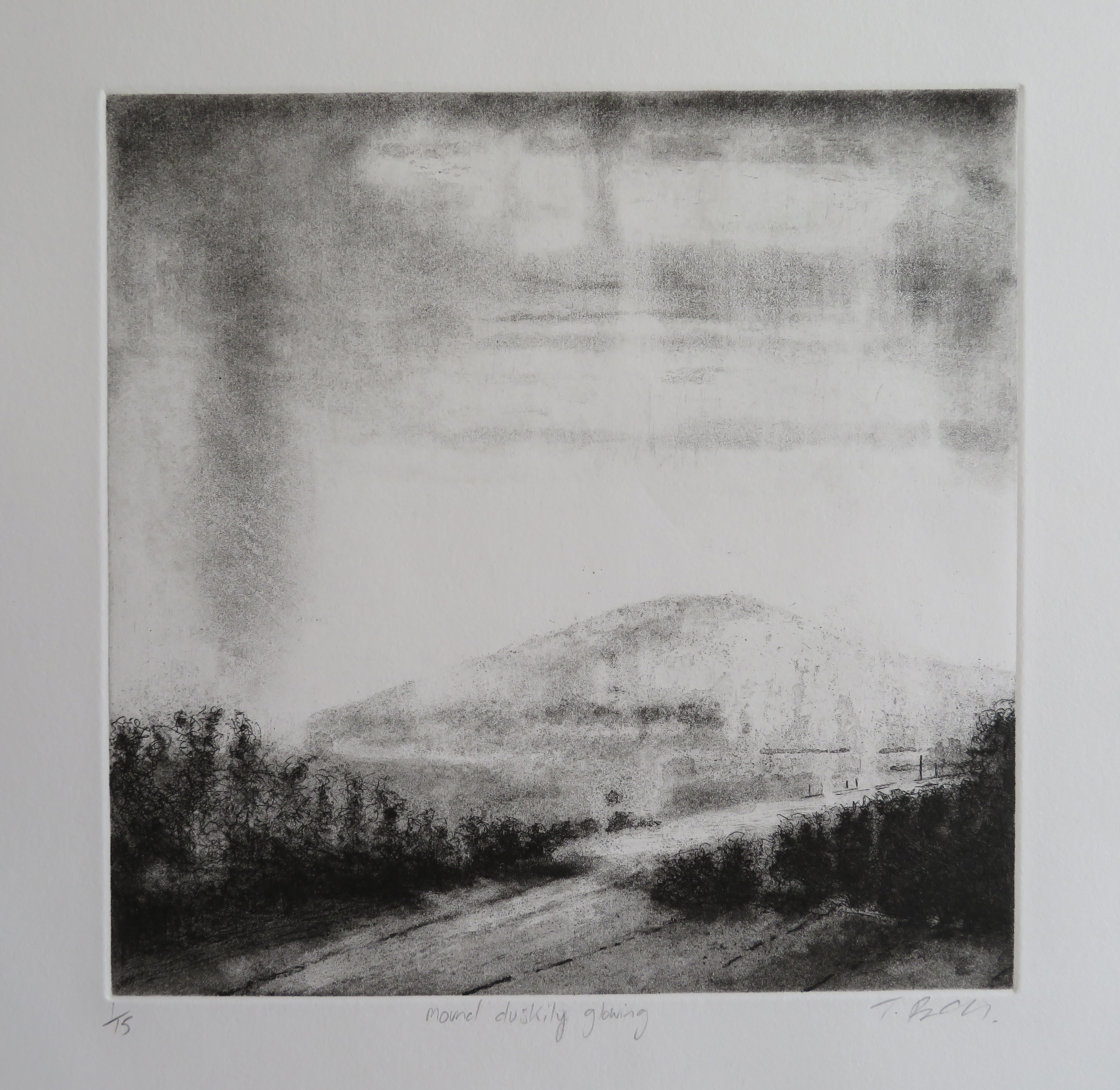
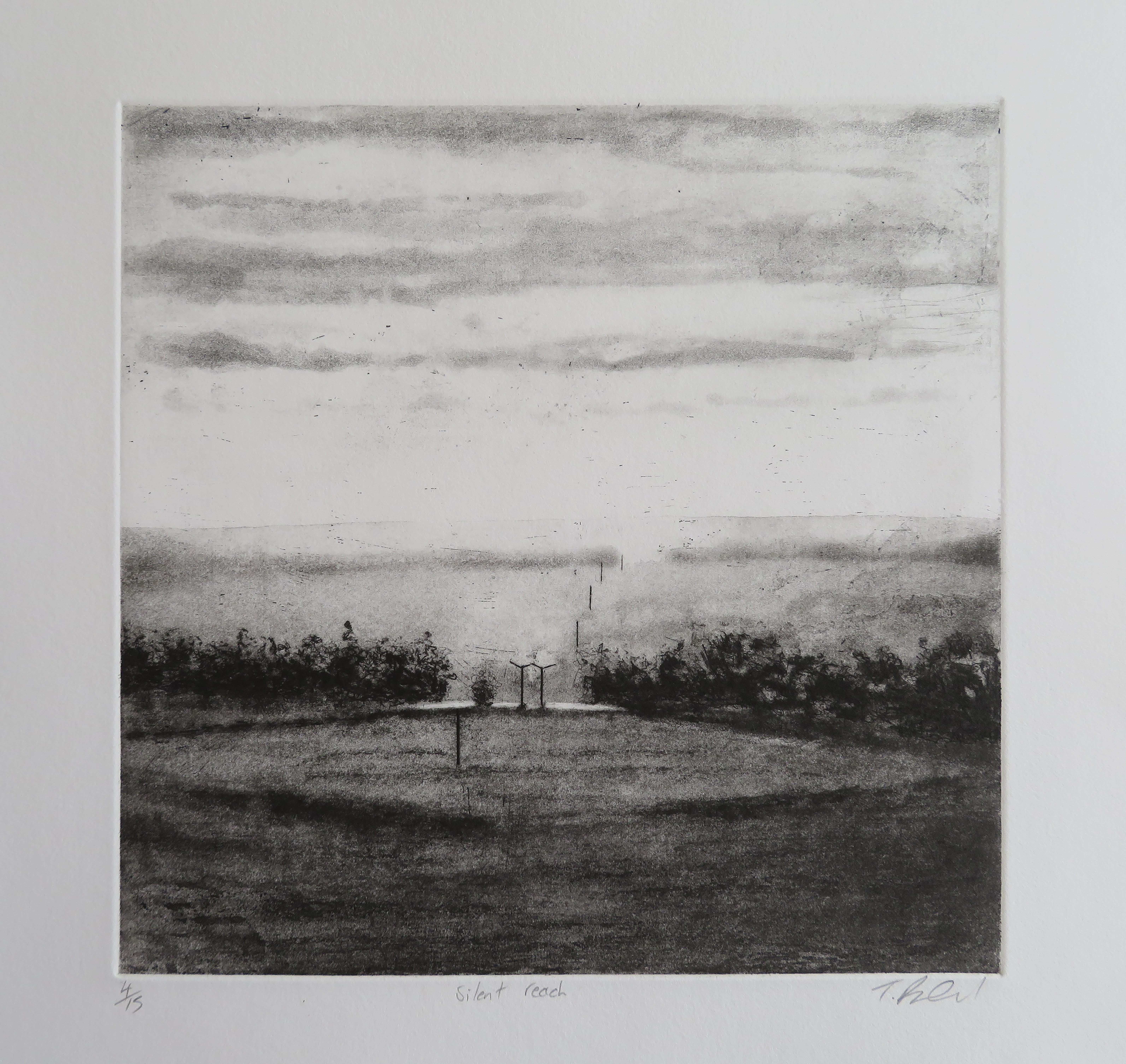
Sadly, the empty shop on the high street is a phenomenon exacerbated by the economic decline that characterises present-day Britain. It’s also hardly surprising now that we buy so many of our goodies online too. So an alternative reason to visit a town centre site might be to see and experience contemporary art. Why not? Newhaven Art Space is a gallery and community project venue supported by Arts Council England and the Newhaven Enterprise Zone and was set up by artists Helen Turner and Nicholas Marsh just over a year ago. They invited Glasgow based, Karla Black, a fan of such spaces, to install an exhibition of her work. It feels like a gift to the town and has hopefully brought in visitors from across the county.

I have arrived four weeks after the opening. I have to mention this fact, as I regret not attending sooner. ‘Karla Black’ is evidently a show that should, ideally, be revisited as the materials used to create many of the works have a life of their own. There is constant change going on, at a slow pace. If you are already a fan of Karla Black’s work you will be aware of her preference for the non-conventional, or just unexpected, type of art material. So perhaps you will expect to see Vaseline, lipsticks, bath bombs, blusher balls and helium balloons in addition to oil or powder paint. But the time aspect is crucial too, as the various materials will be smearing, melting or, in the case of helium filled balloons, degrading and deflating. Ideally it’s a show to visit day after day, or at least at the beginning, middle and end.

But my partner and I have arrived at long last and we enter the premises prepared only by a few images from social media. Good old Instagram. This point is made, as I am not aware of coverage from the mainstream media, which is a little surprising considering that the Turner Prize is currently being held at the Towner in Eastbourne. Plus various shows and activities are taking place in Charleston, Lewes and Hastings (though sadly very little in Brighton), which are frequently featured in Sussex media outlets. We did, however, meet a couple from London that had visited Karla Black’s recent exhibition at the New Art Gallery Walsall and so the awareness is out there.

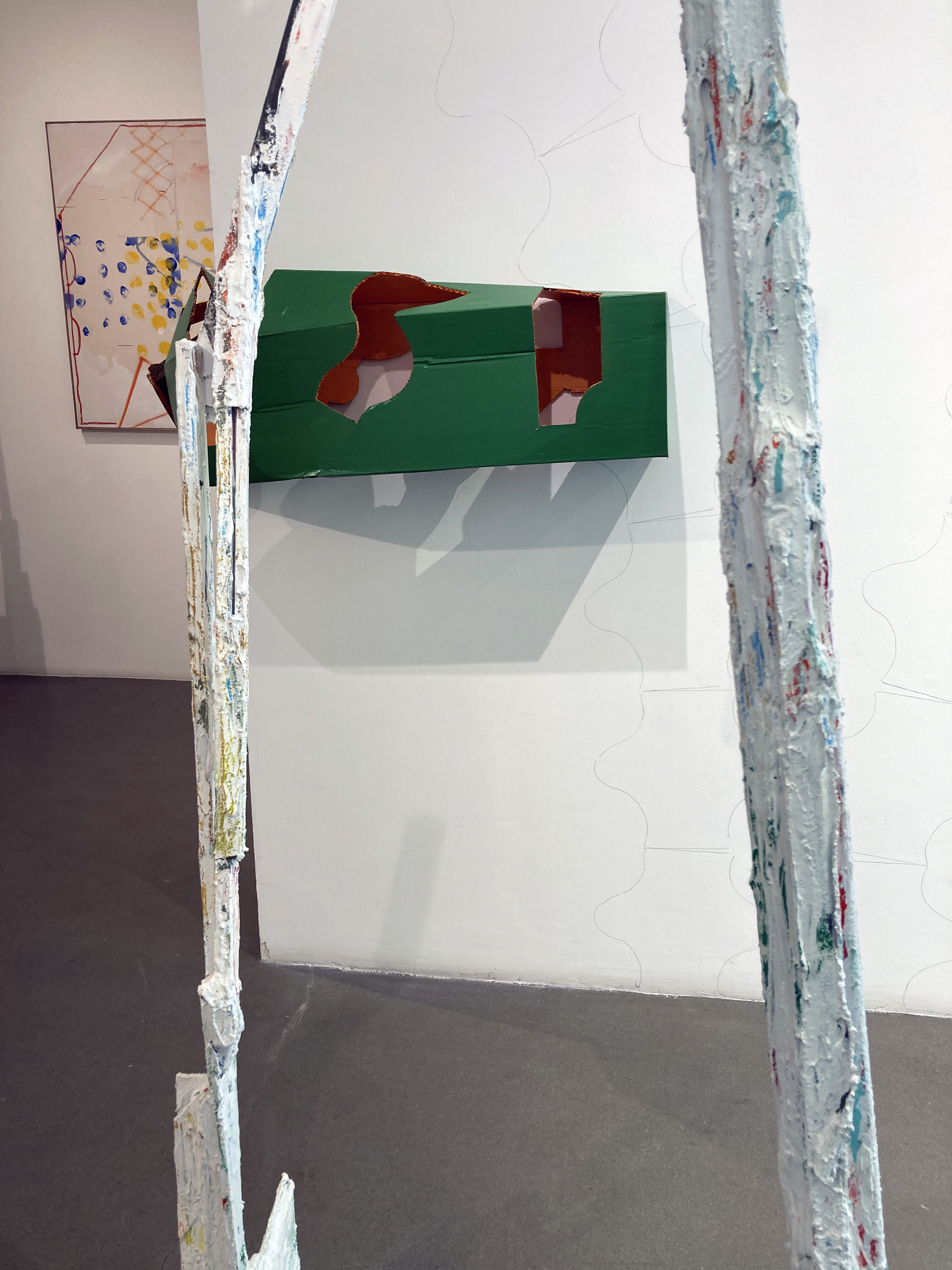
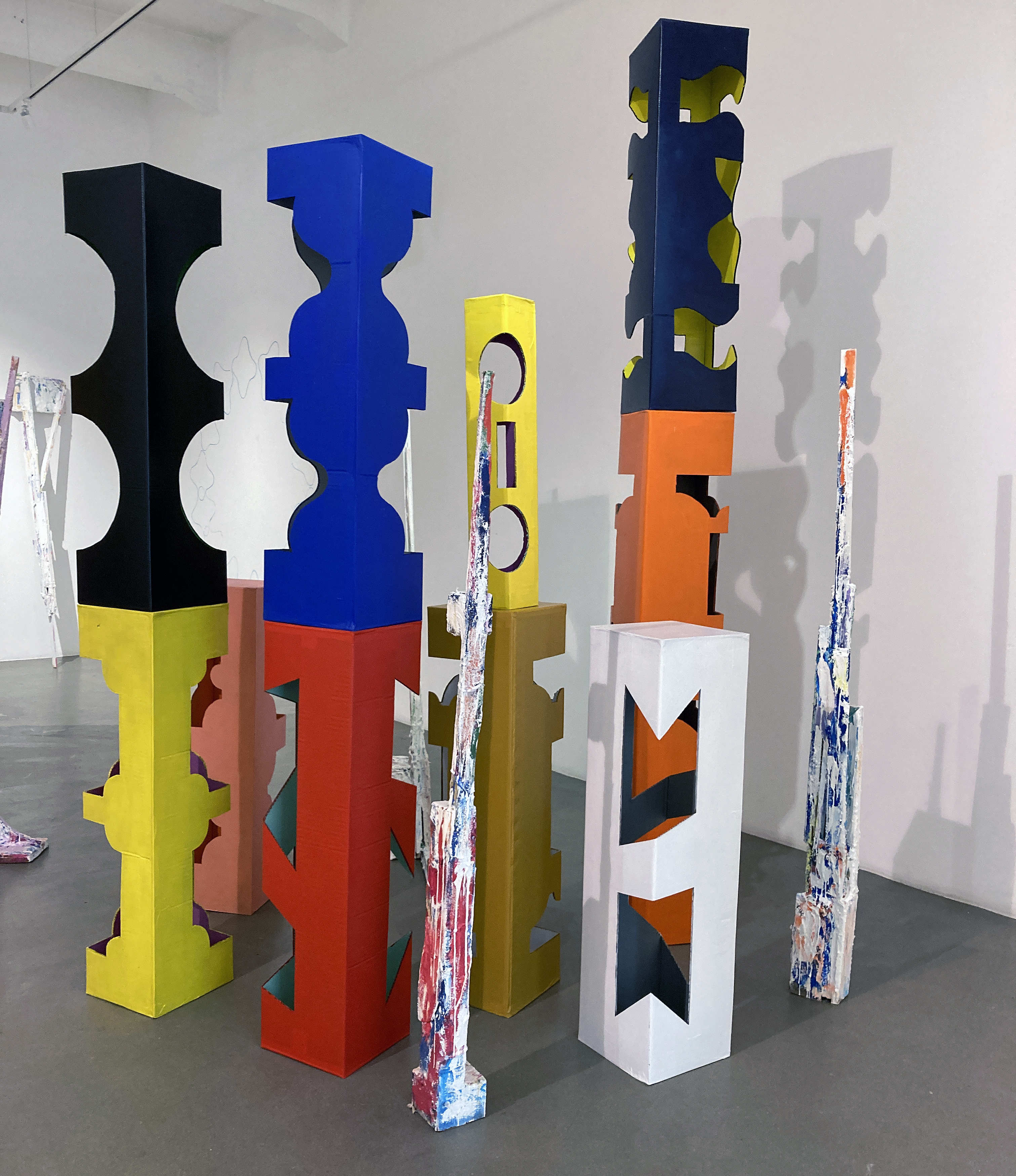
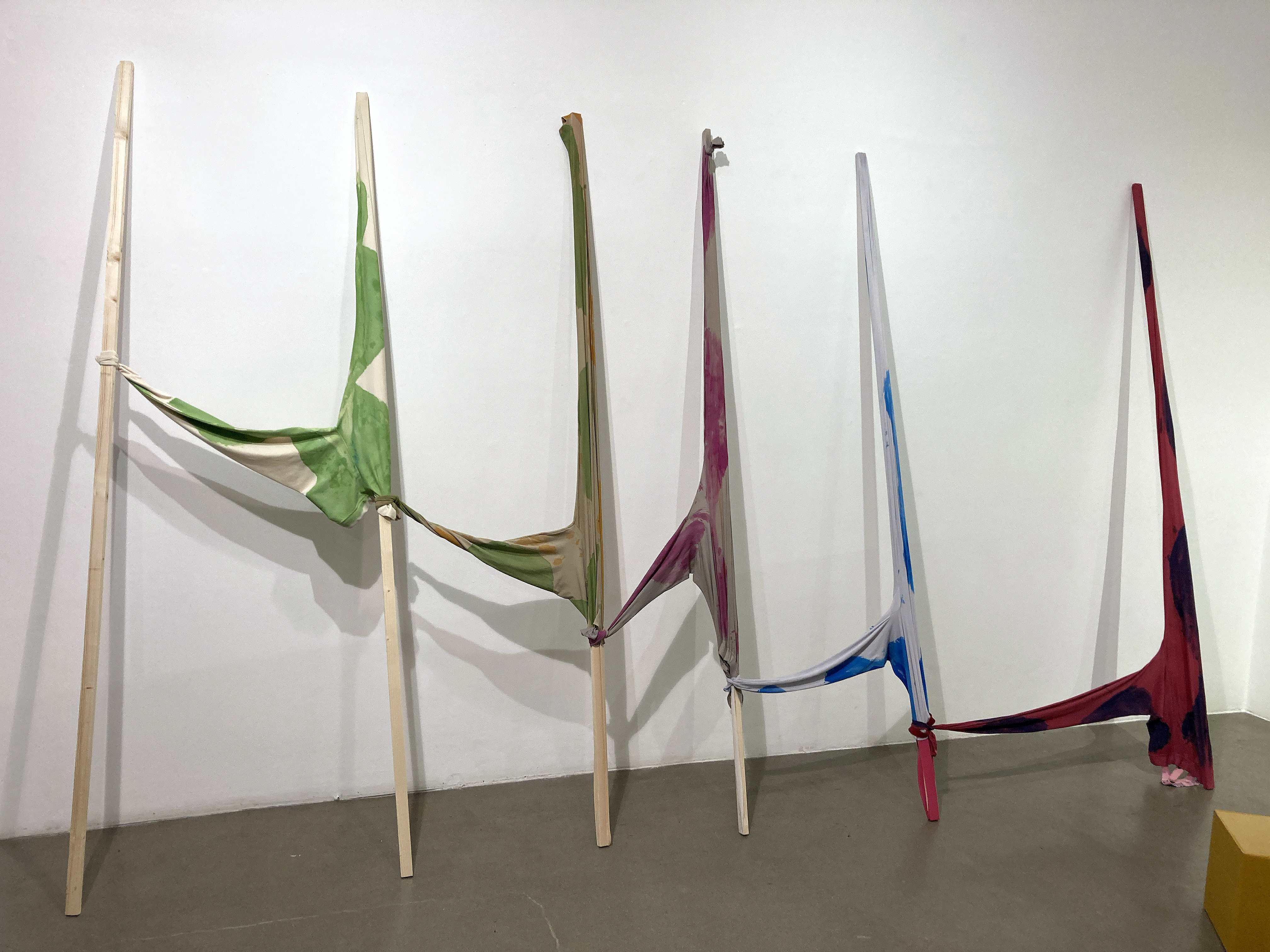
When Karla Black has intervened, you know you’re in for some fun.  She has conjured a sculpture installation that has a pronounced impact on the viewer, even if it is initially one of surprise at the materials chosen to make the sculptures. Or it could be the ephemeral nature of most of the works displayed, for they have been made for the occasion and the space rather than the art collector’s vault. The front windows of the former shop have something pink and sticky looking smeared onto the glass alongside the Vaseline.  Hand written smudges revealing the artist’s name take on a watery, flowing presence on the glass surface. Here today, gone tomorrow might be the sub-theme. The window decoration must have looked neat and tidy on day one, but a month later transformation has set in. Soapy pink blocks and blusher balls hearts have melted down the inside surface of the glass in the early autumn sunlight, which invokes natural processes on artificial mediums. The glass façade is strangely alive, albeit in slow motion.

The premises have been treated as a ready-made space with the potentially monotone grey floor of the larger of two rooms covered in a sandy looking substance, light pink plaster powder, which creates a landscape of sorts for four Barbie-standard pink heart shaped balloons and a row of blusher balls – one of which has unexpectedly but gently exploded at some point. The balloons, attached to a polythene dustsheet, must have moved around more obviously when first placed on view. The very slow motion of this raft (of sorts) is affected by air movement, and I assume the vessel gently decelerates as the helium diffuses from the balloons. A passageway has been left to one side for the visitors to stand in then walk further to a small back room with more deflating sculptures. En route are half a dozen or so small configurations of Vaseline, paint, blusher balls, lipstick, metallic thread and eye shadow affixed to the wall surface, attached by their inherent viscous tackiness. Again, impermanence is on display in pink, slimy glory. But these small and intimately configured compositions engage the viewer nonetheless.

There are small works on the walls in both rooms. They look like something, a process, is being tried out or tested. But this application of materials is a mode of sampling that is intentional and purposeful. The exploration and configuration of materials with the hand and eye is primary. Think what you wish afterwards.

How might a viewer react to this exhibition? There is equal potential for joy or sadness. On a colourful surface level there’s a child-like playfulness on display. But things come to an end. What does one read into materials that have, for the most part, changed their purpose? Or perhaps the conventional or typical use of any one medium (such as a party balloon) is only a limited starting point. Karla Black applies imagination and invention to materials. The materials are the key, whatever they are made of. In an interview for the New Art Gallery Walsall she considers materials as pre-linguistic. Our very distant ancestors had to deal with materials and processes before names and concepts were made up through a language medium. We are still conditioned to material processes, with language being far more expendable.

This exhibition lingers long after returning home. Days later I am still pondering about that sense of change, of a kind of indefiniteness, of the nature of time and duration, which opens the door for thoughts, for wordy language I guess. But no materials: no thoughts. The human condition is forged by play with materials. As children still do.

Links:

Newhaven Art Spacehttps://www.newhavenprojects.co.uk/newhaven-art-space/

Karla Black – @karlablackstudio

New Art Gallery Walsallhttps://thenewartgallerywalsall.org.uk/exhibition/karla-black/

Karla Black talking about her practicehttps://www.youtube.com/watch?v=OYBi-dG0OCw

262 CHAIRS: Molly Stredwick and Becky Hancock

Coachwerks, Brighton

11 to 22 January 2023

“A work of art is a whole, and this whole contains many parts – the material out of which it’s made being just one of them. We could include the interpretive horizons of the art’s consumers, for example, and the contexts in which the art materials were assembled… In this way it’s obvious that there are so many more parts than there is whole.” (Timothy Morton)

Molly Stredwick

The chair in the art gallery has never been quite the same again since Joseph Kosuth presented, ‘One and Three Chairs’ (1965), in a Duchampian spirit of challenging the viewer to question representation in art. Subsequently we have learned, or been reminded, that everything is loaded with possible interpretations – especially when context is accounted for. A context that includes the viewer, of course.

Molly Stredwick (wall installation) and Becky Hancock (drawing and sculpture)

In 262 CHAIRS, currently installed in the Coachwerks exhibition space in Brighton, I find myself looking for a chair to sit on, as I need to rest awhile. Alas, this is not an option, which I find ironically amusing. But there are chairs galore in this warmly welcoming environment, thanks to the blazing log burner, which are represented in many drawings and two sculptures. Adam Spain, Exhibition Manager at Volt, Eastbourne, has neatly curated the exhibition, which may account for a certain ‘just rightness’ about a selective display that does not go overboard visually and presents enough physical content to engage the viewer.

The two exhibitors, Becky Hancock and Molly Stredwick (both graduates of Camberwell College of Arts) are presenting works that simply work well together. Not just because the apparent subject matter might be the same, but also because there’s an almost unassuming simplicity and innocence about the imagery as well as the means of execution. Though I suspect the content could be loaded.

Becky Hancock

Take Becky Hancock’s five drawings, for example, where each composition includes a pair of chairs placed at, what might be, a dining table. Domestic space suggests relationships, often about couples, and by extension, families. Here the furniture is, in a sense, naked. There are no figures directly represented, although the placement of, and spaces between, the various pairs of chairs are perhaps melancholy and at odds. The viewer might clothe these scenarios with their own imaginative interpretations or real experiences and any one of these drawings would be ideal to start writing a short story from in a creative writing class. The more visually dominant element in these drawings is the table, which distorts itself into angular hieroglyphs. The table might be a body that undergoes both voluntary and, as a domestic situation might dictate, forced distortions and poses – though not so much as a referee or arbitrator, but functioning as a victim of sorts. As sketchbook drawings, presented on the wall unframed, they might well function as studies for paintings or installations but they are intriguingly finalised statements that are impressive and compelling enough to be fully resolved outcomes per se.

Becky Hancock

Also on display are two 3D pieces by Hancock. At first sight the viewer might read them as adjusted ‘real’ chairs. But they are human-scale simulacra. A chair can be an idea, a model, a prototype, an image, a word or even a functional item. Whatever a ‘chair’ has the potential to manifest itself as it can also be a sculpture, of sorts. These two pieces take on an anthropomorphic presence with one leaning forward, as if in prayer, adoration of the deity or submission, the other sat back in picnic mode – engaged in déjeuner sur l’herbe, perhaps. Either way, both are fallen, making a melancholic and downcast presence at the viewer’s feet. Or telling us that they are not really chairs, whatever our automatic reading probably is.

Molly Stredwick

Co-exhibitor, Molly Stredwick, has commandeered the largest, most expansive wall, upon which 176 small drawings of chairs are displayed (selected from a series of 251). These are, for all intents and purposes, imaginary chairs. The perspective is sometimes distorted, conventional three-point perspective reversed, or appearing to be floating or rendered flat without surrounding space or objects included. Any resemblance to Hancock’s 3-D chairs is superficial, though creating a coherent feel and appearance for the exhibition. This wall of 11X16 approximately postcard sized drawings might be a catalogue of chairs, but each is surely the same one, or maybe not, for very subtle personality traits might distinguish each speculative rendering. Drawn on G. F. Smith paper samples with the same red Muji Gel pen there is a suggestion of the series or the genus with variety being sight. The manufacturer’s printed text functions as an internal framing device too, with the different numbers, paper types and weight information changing along with the colours and the visual and tactile presence of the material. So what appears to be repetition and sameness calmly explodes into huge variety. In effect, this wall of assembled drawings functions as an installation that can be viewed as a whole grid-type shape or as individual drawings that must attract viewers to any one sample or part, which is nevertheless complete in itself.

Becky Hancock

In his book, ‘Being Ecological’, Timothy Morton has explained that an ecosystem of parts and wholes is an environment of “just lifeforms and their extended genomic expressions: think of spider’s webs and beaver’s dams.” That’s what artists do; they make their respective webs and dams alongside and sometimes in collaboration with others (or curators make the connections). The viewer is part of the situation too; not so much caught up in the web, as one of its constructors.

Note: Both quotations from: Morton, T. ‘Being Ecological’, Pelican, 2018 (p.113)

From the 262 exhibition leaflet

Links:

Becky Hancock – https://www.becky-hancock.com/bio

Molly Stredwick – https://mollystredwick.com

VOLT Eastbourne – https://www.volteastbourne.org.uk

G. F. Smith – https://gfsmith.com

Muji Gel pens – https://www.muji.eu/uk/stationery/stationery-gel-pens

MOMA – Joseph Kosuth – ‘One and Tree Chairs’ – https://www.moma.org/collection/works/81435

UP FOR GRABS at APT

Jonathan McCree, Bruce Ingram, Jonathan Goddard and Joe Walking

APT Gallery, Deptford

2 – 12 September 2021

APT Gallery

It was Thursday 9th September and Up For Grabs had been open for a week. A performance had already taken place some days before and the Private View was tomorrow. This was a two-week exhibition of painting, dance, sculpture and film. I had missed the dance and the film too, but a projector was being installed to show a video of the performance, but I couldn’t stay too long as I had a timed entrance ticket for something of apparent importance at the Royal Academy. So this would have to do, and thank goodness, it was probably the best part of the day. *

Bruce Ingram and Jonathan McCree

The front space was conventionally organised for an exhibition of sculpture and painting and Bruce Ingram and Jonathan McCree had three works each on display. By conventional I mean some works were placed on the wall at a comfortable viewing height and three more pieces were arranged on the floor with ample room to walk around. There was a balance. They were, it appeared, ‘finished pieces’ and ‘final’ as we expect artworks in exhibitions to be. As a first impression there was surely something going on about construction and deconstruction, about placement of the works and relationships within the works themselves. What was ‘up for grabs’ at this stage I wasn’t sure – maybe an opportunity to take something away from the show, or to suggest potential.

Jonathan McCree and Bruce Ingram

This initial selection and indeed this space could be complete in itself, but it proved to be something of a threshold to pass through, for in the next space that precedes the largest room at the rear, a clue to some playfulness was sensed from encountering an apparently disfigured column, a strongly vertical element, that was placed on the floor but had unexpectedly been folded at 90 degrees to fix itself to the wall to form an archway to tempt someone to stoop under and squeeze through. This piece was quickly followed by another of McCree’s stretched box forms wrapped around the protruding corner into the next space. Clearly an intervention had taken place at some point and as the artist was on duty to greet visitors today he explained to me a little later that one of the performers had previously indulged in interacting with the sculptures to adjust them to the gallery environment.

Bruce Ingram and Jonathan McCree

Also in this middle room were more of Ingram’s works and by now there was more of an obvious or staged interaction between the two artists’ works. Typically, Ingram’s works explore found materials in assemblage and collage-type painted forms employing plaster and various paints (household and artists’ acrylics) to fuse the various elements together. Placed on the floor rather than on the wall one of Ingram’s constructions formed a framework to look through to see another work beyond. A sense of destruction as much as building the artefacts of the environment was taking shape. As a visual tease, Ingram’s works have remnants of colour applied, similar to McCree’s suggestively ‘out of the tin’ coatings, to link the works. Contrasts of smoothness and rough surfaces distinguish the two to some extent but the pairing is not incongruous.

Bruce Ingram

My daughter and I walk around a while, tuning in still to a display that has transformed from calm quietude at the main entrance to visual and spatial cacophony in the largest room. I pick up a press release (which I shall read on the train back to Brighton later, as I want the work to speak to me first and foremost) and start to scribble some notes on the reverse:

Enter the labyrinth, parts, bits & pieces…

Plenty to see, though not too much…

Image / Object – which will predominate…

What is an exhibition for?

Jonathan McCree

What is an exhibition for? Now that’s interesting. In this instance, Up For Grabs is certainly entertaining, exciting and memorable. The individual paintings and sculptures work on their own terms, but as an arranged event (sadly for just over a week) the exhibition comes alive as a happening of sorts as much as a static display. I imagine the missed performance and projected film work that preceded today’s visit, which isn’t enough, but will have to do. The finished and unfinished, or work in progress nature of the works, suggests a similar modus operandi for the viewer. There is method in looking, in relating to the artworks physically, spatially and psychologically. Visual art is not exclusively about seeing; it offers possibilities for recognising the power of one’s own imagination (and sometimes a lack of). There are formal relationships to find or be presented with. There are colours and textures to indulge in. Likewise there are parts that seem to work perfectly and others that the viewer might desperately want to change – even to improve. The visual aesthetics provide a way into potential readings that could suggest social interaction, notions of community, interdependence, the built environment (including furniture) and the politics of choice, indulgence and creativity.

Jonathan McCree

My daughter described the assembly as “rocks and trees”. Jonathan McCree talked perceptively about “… delaying uncertainty in or from painting to the sculptures, which are moveable parts”. This gave his three-dimensional work edginess, like it was finished but not really. Or resolved, but hopefully not so as it invited some form of change.

This exhibition, no – this environment, concocted a landscape of sorts, an active space demanding an audience to interact by looking, moving, pacing, stopping; head up then head down, confronting occlusions to find surfaces, then seeing variously coloured or textured planes morphing into three-dimensions giving way to silently laughing, then becoming equally engrossed or bemused. Performing a journey, in effect, as an exhibition is not necessarily a final resting place for particular works – anything might be up for grabs; even our expectations.

Jonathan McCree

Note:

* This statement is a little disingenuous as I was also impressed with Mind’s Eye at Flowers in Cork Street where Carol Robertson’s geometric works had been displayed with Terry Frost’s. My review of this show has been published by Saturation Point. See the link below.

Bruce Ingram

Links:

Bruce Ingram

Jonathan McCree

High Folly: Jonathan McCree at Sim Smith

Saturation Point review of Mind’s Eye at Flowers

TANIA RUTLAND: Chip of flint – fragment of chalk

Tania Rutland: Chip of flint – fragment of chalk

Window Gallery, Phoenix Art Space, Brighton

2 – 24 November 2019

TR - Poster

‘Crowding the solitude’, ‘Ghost white path’, ‘Night’s first light’, ‘Silent reach’ and ‘Restless lane’ might be headings in a list of poems from a collection that constituted a volume of landscape inspired verse, but they are selected from the titles of drawings and prints from Tania Rutland’s exhibition at the Phoenix Art Space.

Another title, ‘Chip of flint – fragment of chalk’, makes reference to commonplace Sussex downland geological material that could have been gathered from her visits to Iron age Mount Caburn and Neolithic Cissbury Ring in East and West Sussex and is the intriguing title of this exhibition.

040 - TR - Chip of flint - fragment of chalk (28x21cm) pencil and graphite on paper.jpg
Tania Rutland – ‘Chip of flint – fragment of chalk’ (28x21cm). Pencil and graphite on paper.

The very idea of a ‘chip’ or a ‘flint’ suggests the collection of a memento, a physical token from a walk, picked up to place on a shelf when home. Such an item might be revered as a memory of a time and place spent in solitude or with a partner or friends from a Sunday walk. The cultural pursuit of walking might be a form of escape from everyday life, most especially the ‘working week’. A leisurely stroll or demanding hike, especially in the countryside, can be rejuvenating and refreshing. It might also be consoling during a time of stress. A walk is healthy for both mind and body; and for a landscape artist a place for research, inspiration and hard work.

Though superficially a landscape exhibition, on reflexion, ‘Chip of flint – fragment of chalk’ is loaded with speculative and thought provoking possibilities enabling the visitor to take away the non-physical souvenir: not to be placed on the mantelpiece but constituted in the form of ideas to consider and discuss further and, ultimately, leading to environmentally focussed action.

From the very start of the corridor space Window Gallery, making a de facto antechamber, two wall-mounted assemblies of small, unframed, preparatory drawings make it clear that drawing is at the core of Rutland’s practice. As an introductory display, sufficient in itself as a stand-alone exhibition, the 28 studies make an implied proposition that drawing is still of paramount importance towards painting, especially in landscape art. Whilst an en plein air approach is also possible, the drawing in advance of the essential schema for a final painting, even without colour content, provides the opportunity for intense consideration of composition and content; and for revision of the essential rectangular format. Rutland’s methodical approach also develops the initial ‘sketch’ to a more ‘finished’ state and therefore requires a more prolonged period of execution. In this respect, the lengthening of time to make what might simply become no more than a preliminary part of production, adds to the inherent conceptual aspect of Rutland’s greater project, namely that of time and duration.

001 - TR - Untitled 1 (Fatigue of early light - Mist's cover) (14x16) prep drawing
Tania Rutland – ‘Untitled 1 (Fatigue of early light – Mist’s cover)’ (14x16cm) Preparatory drawing.

Annotated on half a dozen of these relatively intense drawings are more titles, including: ‘Ghost lines’, ‘Eroded slope’, ‘Frozen light’ and ‘Fatigue of early light’. Without mounts, but with clearly measured and demarcated perimeters for consequent development into paintings, these studies may have come straight from the studio wall in her Phoenix studio. This informality in presentation might have initially diminished an observer’s attentive reaction to these works, but throughout the opening evening many visitors could be seen both standing back to view each of the two groupings of drawings and then be observed stepping closer to scrutinise each image as if through a magnifying glass. In relation to time a second aspect, that of concentrated visual observation of various locations, loaded with evidence of human interaction in and on the land (and sea), also implied itself in the bigger project.

029 - TR - White ghost path (200x150cm) pencil and graphite on paper.jpg
Tania Rutland – ‘Ghost white path’ (200x150cm). Pencil and graphite on paper.

Continuing into the main display space the biggest piece in the show first greets the visitor in contrast to the small studies just encountered. The pencil and graphite ‘Ghost white path’ impresses not just by size alone (200x150cm), but also by a display of controlled elegance in mark making and an example of compositional skill in which the viewer might literally fall into this Downland vista. As a completed drawing, ‘Ghost white path’ is as consummate and exhaustive as a painting might be and therefore expands the notion of drawing as going beyond the supportive role that it often takes.

In this significant work the viewer will certainly gain a sense of the past and the present day in one hit. In the bright distance, where the intense light dissolves the sea from sight, the Rampion wind farm turbines that now dominate the view from the Sussex coast have been recorded. Whether these technological structures please the viewer or not, like the telegraph poles we may barely notice anymore, or the electricity masts that cannot always be buried beneath the ground, we will inevitably have to become accustomed to this burgeoning technology for generations to come.

The past and present (an ancient landscape and an off-shore development) combine in one monumental vista so that a viewer has to contemplate a challenging and controversial journey to the future in this era of climate change awareness and necessary proactive behaviour.

031 - TR - Mound duskily glowing (24x24cm) etching.jpg
Tania Rutland – ‘Mound duskily glowing’ (24x24cm). Etching.

Four monochromatic etchings are displayed next, including ‘Mound duskily glowing’, a title merging topography with time and light, which again suggests a poetic counterpart (a haiku perhaps) that may one day be written. In ‘Silent reach’, telegraph poles located in a flattened mid-grey rhombus in the central area of the composition leads the eye from foreground to mid-distance. The poles could be traversing alongside a coastal area, or trace a communications route a few miles inland, leading to the next village or town. Very few regions of this relatively small island will be without such evidence of human habitation, as if such evidence of technology was as natural a phenomenon as the trees.

033 - TR - Silent reach (24x24cm) etching.jpg
Tania Rutland – ‘Silent reach’ (24x24cm). Etching.

With a change of process and medium Rutland allows a weathered, washed-out look in the thinned ink layers transferred from the surface of the metal that she has etched with. For example, in ‘Selvedge edge’ the distant hills are visually subject to mist dissolving form, whilst rain falls as weather conditions change appearances. In the bottom section of the image fence posts create a small enclosure, a signifier of order and land ownership. A telegraph pole, like a crucifix, in middle ground, merges at its base into foliage. Dark parallel lines in the foreground, perhaps suggesting the selvedge edge of fabric for the title, foretell the flint seams in the set of the four ‘Flint Seam’ drawings that are to follow.

032 - TR - Selvedge edge (24x24cm) etching.jpg
Tania Rutland – ‘Selvedge edge’ (24x24cm). Etching.

These more minimalist compositions, ‘Flint seam 1, 2, 3 and 4’, are placed at the centre of the show. They are undoubtedly complete in themselves but may well hold the prospect for further development as abstract paintings. Each is placed behind a clear acrylic sheet, rather than mounted in a conventional frame. Like its counterparts, ‘Flint seam 2’ is composed of a series of vertically placed horizontal bands of smudgy, burnished graphite drawn on to a gesso (i.e. chalky) coated, paper ground. Within these thin, dark, cloud-like strata are more defined linear marks suggesting a compressed handwriting with a slightly nervous, quivering organic edge.

035 - TR - Flint-seam 2 (66x46cm) pencil and graphite on gesso paper.jpg
Tania Rutland – ‘Flint seam 2’ (66x46cm). Pencil and graphite on gesso paper.

These often flat and smooth, mark-like shadow shapes are found in split flint nodules originating from sedimentary chalk that litter the farmland in Sussex and have been used as building materials for walls and buildings since the Roman era. Further back in time flint was fashioned as a Stone Age tool. But way beyond any human presence on earth they are a literal compression of geological time and materiality that seems beyond comprehension and may well suggest a natural kind of drawing. Dark and wave-like, these markings made from the chalk seabed reveal fissures of implied energy. As a form of visual poetics, the past is metaphysically now in these teasingly simple, but thought provoking and elegant drawings.

039 - TR - Crowding the solitude (28x21cm) pencil and graphite on paper.jpg
Tania Rutland – ‘Crowding the solitude’ (28x21cm). Pencil and graphite on paper.

At what appears to be the end of the display, a group of five framed drawings (including the title piece of the exhibition) are presented in suitably mounted and framed studies that, like the etchings, read as ‘finished’ works. They include ‘Crowding the solitude’ which is a similar composition to the aforementioned ‘White ghost path’. In the mid-ground the land builds steeply to two bulbous hills; to the right on the implied horizon are the perspectival rows of 14 vertical masts from the Wind farm out at sea. In the space between the hillocks, and particularly on the left hand feature, is a meandering configuration of chalky pathways. The closer foreground is patterned by a gentle arrangement of subtle tones that visually pock mark the paper surface. The notion of the landscape as corporeal and libidinous is difficult to deny.

042 - TR - Flint (42x42cm) pencil and graphite on paper.jpg
Tania Rutland – ‘Flint’ (42x42cm). Pencil and graphite on paper.

The last of these five drawings is titled ‘Flint’. Initially it could be a drawing that goes unnoticed, such is the insistent or subtle presence of so many of the other works. One feature, however, hooks the gaze as one might head for the coffee bar and the prospect of seeing a painting from Tania Rutland. Within this rendering of what may be a recently ploughed and almost featureless field, a tiny but visually dominant grid-like structure interrupts the shallow curve of the land, just before the dark masses of a thicket of trees on the close horizon, revealed contre-jour, emphasising a sense of infinite space beyond. Its identity is a mystery: could it be a wooden or metal framework? From the bottom right-hand corner of the drawing a purposely trodden pathway leads to the unknown construction and it could be that the track across the field has been rendered into the surface by either animals or humans.

043 - TR - Remote dwellings (40x40cm) oil on canvas.jpg
Tania Rutland – ‘Remote dwellings’ (40x40cm). Oil on canvas.

Outside of the Window Gallery, but in a suitable display space that extends all of the exhibitions, one of Rutland’s oil paintings, ‘Remote dwellings’ is presented on a dark grey wall. This provides an example for those who do not already know her work and is now interestingly and more than adequately informed from seeing the drawings and prints. One painting is probably just enough exposure in this context and holds out the prospect of seeing a future exhibition of Rutland’s paintings.

Significantly, this work in the more ecologically minded attitudes of society today is made more potent by its combined references to the past, present and future. The human conquest of the environment is, of course, aided and abetted by the genius of technologies, open to interpretation and revision. The drawings and prints presented in ‘Chip of flint – fragment of chalk’ not only record and reflect the history of particularly special locations, but provoke the observer to contemplate the future too.

Geoff Hands (November 2019)

All images © Tania Rutland

Links:

Tania Rutland’s website – http://www.taniarutland.com

Phoenix Art Space – https://www.phoenixbrighton.org/events/tania-rutland/

Rampion Wind Farm article from The Guardian –

https://www.theguardian.com/commentisfree/2017/nov/11/brighton-rampion-wind-farm-turbines-renewables

SERIAL THRILLER: Bridget Riley, The Curve Paintings 1961 – 2014 De La Warr Pavilion, Bexhill on Sea

Bridget Riley-3

Bridget Riley, The Curve Paintings 1961-2014 installation at DLWP.

© Bridget Riley 2015. All rights reserved, courtesy Karsten Schubert, London

Even an English flâneur may have imagined being on the Côte d’Azur in this heat, pausing on the Promenade des Anglais, to admire the view. On an outstandingly bright summer morning, if you looked south from the De La Warr Pavilion in Bexhill on Sea towards France, the sea and brilliantly dazzling sky dissolved the field of vision, eschewing aerial perspective. Space had flattened; somehow, confirming the shifting nature of perception as optically realised and, therefore (or thereafter), re-conceptualised, re-seen, rather than diminished without the culturally acquired safety net of perspective.

Bridget Riley might be categorised as a ‘classic’ abstract/geometric painter, whose practice engages with image making that, autobiographically, encapsulates her perfectionist tendencies. Her methodological practice is invariably characterised by tightly controlled, sensuously schematic, repetitive and minimalist, optically demanding imagery. She’s a serial, visual, thriller – of the highest order.

I am here today, as part of a small posse of writers from the press, to look at a selection of paintings and prints that explore Riley’s fascination with the curve. Petite and agile, Bridget Riley, one of the internationally most acknowledged British artists of the twentieth century, generously and energetically informs and entertains. In what approximated a subtle balletic performance, she is self-assuredly poised, both physically and intellectually, to address those present with great enthusiasm and vitality. Her explanations are as exacting and precise as her imagery and her confidence is assured.

My sense is that behind this apparent coolness, regularity and control in her work an engagement with the world as it is experienced (hence the opening paragraph), both visually and physically, continues to inform her whole oeuvre. Readers of Riley’s collected writings, cleverly titled ‘The Eyes Mind’, will be aware of her early visual and tactile childhood memories of the sea and sun. Confirming the particularly visual contingency of her paintings and prints, the non-perspectival experience of the sea front panorama referenced above was echoed and confirmed in Bridget Riley’s own words: “Pictorial space has to be about something on a two-dimensional surface, in which pictorial space happens by pictorial thinking… perspective is by no means the only way.”

A sense of the closeness of France was also fortuitous: “French and early Modernist art was clearly about perception… a connection with that line of looking.” Engaging with the works on display in this retrospective collection, and turning to scan her audience frequently, to explain the practical, formative training that her particular form of abstraction partly derives from, she referenced her traditional art school training in drawing from the figure: “Drawing can develop your insights – drawing is a tool that can open up the world.” But Riley also explains that the history of art (especially the painting tradition) creates influences, and visual language systems, as essential as the daily practice of planning, and making, work. From considering the spatial investigations of Cézanne and her journey to abstraction, via an interest in Cubism, she references Bonnard and Matisse to illustrate her defining interest in line and colour. Art historical knowledge, and a constant meditation on the rich history that informs her concepts and her entire output are consistently made clear, for there are many: “Respected and admired artists from the past and we can learn from them… according to [our] temperament.”

In explaining her burgeoning practice, as a young, aspiring artist in 1960s London, she says: “It was a sort of statement… I learnt to draw when I went to art school… I was taught to make figure drawings… I was very interested in colour… basic colour relationships… I would look at Matisse… How would Matisse be able to make that? From tonal painting, colour lightened and darkened… there had been an immense adventure in modern art… I went to work for J. Walter Thompson and in the lunch hour I went down to the ICA and Cork Street to listen to lectures by David Sylvester, Laurence Alloway and [Roland] Penrose…”

Her audience is captivated by now; she continued: “The development of modern art was halted by the two wars… I went to look at an exhibition of Futurists… (Visits to the Venice Biennale and Milan are mentioned too) … there were important and interesting things in it… abstract thinking… I carried on with making my own abstract work… instead of abstracting from things seen out there in reality… Bonnard and Matisse could do much more than Mondrian had done… I started from a line, what a line can do, a square, a circle… when I altered, changed or distorted something that was familiar to people… I found ways of making things active…”

Riley’s ability to clearly elucidate her practice as an abstract artist par excellence, and her measured use of a precise language, to objectively explain and describe the carefully selected examples from her Curve paintings, provided a simple exegesis of practice that absorbed the audience. That she believes that painting is still relevant was clear: “Painting is an incredible discipline and a great art form.” And again she emphasised tradition: “All my experiences [with the] figurative is a huge help in knowing what a painting needs if it’s to develop.”

Riley’s articulateness matched the refinement of her paintings. She drew the meaning out of the works, confirming the evidence presented to the viewer’s attentive mind. But her work is not purely cerebral, as the physical engagement and geometric coordination within her work is truly embodied: and not only in the eye. The sense of flow in the paintings echoes the movement of the human form and the environment that we occupy. Most especially, lines and angles of orientation are designed to evoke pictorial space: “Vertical had to bear the stripe… lead to the plane… the painting is very transitive… Verticals allowed one to have a rhythm, to contrast it with the curves.”

But, there was a period of 17 years of an insistence on the horizontal in her prints and paintings (1980-1997). This revelation had to be re-visited. Of the return to the curve she states, “the curve is more open to amazing changes than the straight line.” Again, Riley confirms her appreciation of the line, learnt from life drawing as a student, and that “The contrapposto is like frozen movement… The curve is so elastic and changeable.”

In discussing ‘Lagoon 2’ (1997) she admits that she was: “Trying to get the curve back”. And paradox is readily admitted: “Contour suggests a flat volume…” This elegant painting (quite large at approximately 1.5 X 2 metres, but absorbing visually, and not at all imposing) has the feel of a dense forest of colour-shapes, which is neo-Cubistic: Cézanne through Matisse’s eyes. Or, as Riley discloses, is based on the notion of her idea of looking at Matisse looking at Cézanne.

Superficially, Riley’s own personality, and temperament, as a painter appears less sensual than Matisse. But a flattened painterliness, where autobiographical marks are repressed, still allows colour and line to dominate with the joie de vivre we associate with the French master. The surface quality in Riley’s paintings is typically one of relentless smoothness, but colour sensation is still paramount.

In ‘Rêve’ (1999) contrasts and harmonies work with and against each other with a colour scheme of blue/green and cream/yellow. In ‘Painting with Verticals 3’ (2006) and ‘Rajasthan’ (2012) there is a pronounced sense of purposeful movement across the surface. In the latter, Riley describes the “march of the greens”, as this organic colour comes alive amongst orange, red, grey and white.

Bridget Riley’s abstract art is clearly modernist, but notwithstanding her traditional training as a painter (she still produces cartoons for her paintings), her work successfully combines a strongly characteristic feature of line through disegno (drawing) with form as colore (colour) to attain a synoptic temporality: intimating a psychogeographic relationship with space through physical positioning and perception; and a sense of time and rhythm integrated in and through the intrinsic properties of the images. The association of colour and line, especially the curve, is sensuous at a visual and an intellectual level. If this interpretation is correct, it might suggest that a purely non-objective abstraction is a fanciful notion – because contingency is unavoidable, so long as human beings continue to make art.

Geoff Hands

Links:

De La Warr

http://www.dlwp.com/event/bridget-riley-the-curve-paintings

AbCrit

https://abcrit.wordpress.com/2015/07/30/12-geoff-hands-writes-on-bridget-riley-at-dlwp/

Painters Table

http://painters-table.com/link/abcrit/bridget-riley-curve-paintings