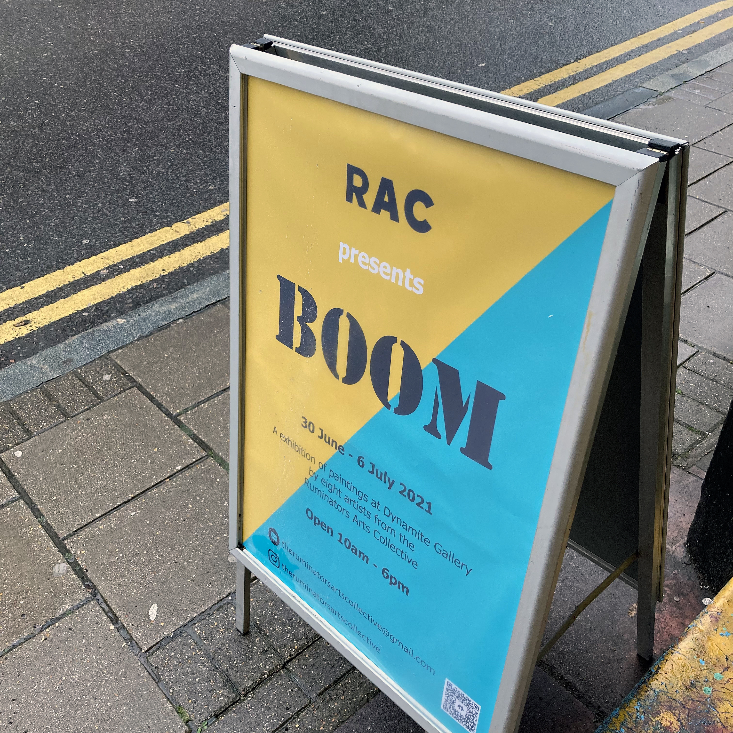
BOOM: The Ruminators Arts Collective
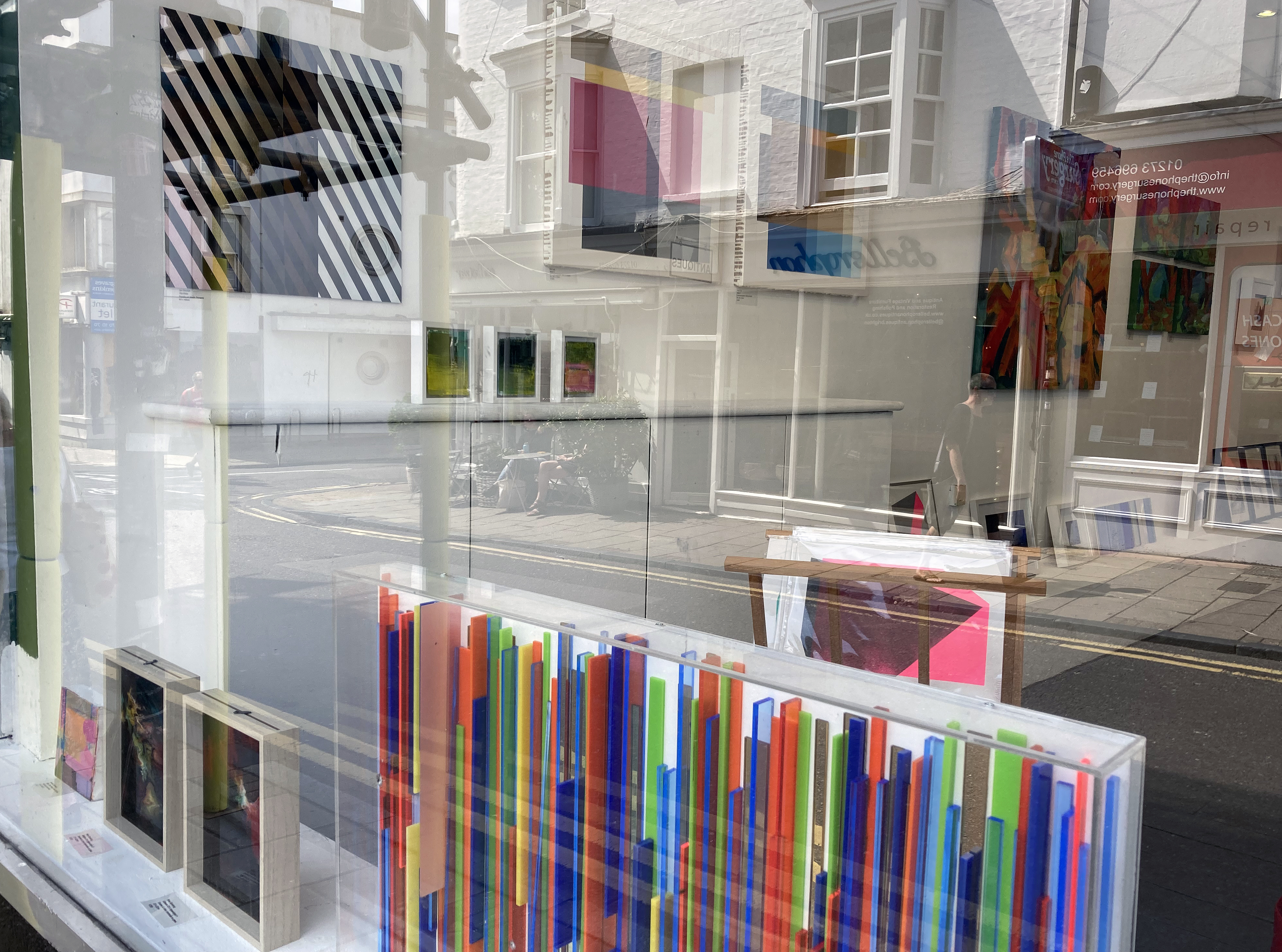
Dynamite Gallery, Brighton
30 June to 6 July 2021
What started at the Phoenix Art Space at the beginning of 2020 as a critical discussion group for ten painters has now developed into an exhibiting group named The Ruminators Arts Collective (RAC), our collective public designation. Whilst our main raison d’etre will be to encourage the sharing of practice based ideas and outcomes through constructive feedback as we meet up in our respective studios, we are also open to new developments and opportunities.
Many artists may well have inadvertently stockpiled their wares over the past fifteen months or so as exhibiting prospects were diminished as galleries closed for now or for good. Some artists prospered to varying extents from the Artists Support Pledge, an amazing Instagram based initiative instigated by Matthew Burrows, though this life support system cannot replace the established gallery system however either may evolve from now on. Back at the Phoenix Art Space we were disappointed to not being able to participate in the last two annual Open Studio weekends during the Brighton Festival. As a small but determined group within the larger community we felt that a desire to exhibit could only be resolved affirmatively by an enterprise to take a selection of works into the city centre with a ‘pop-up’ show. Closely missing out on a council lead initiative to fill otherwise empty shops with exhibitions of locally produced art eventually lead the group to take a more direct initiative and to approach Henry Gomez at the Dynamite Gallery for this inaugural show.
Eight of the RAC have been able to contribute to BOOM at this time and, as the member who also writes reviews, I suggested a feature here on fineartruminations. As a participant it would be inappropriate for me to scribe a glowing review, though I have waxed lyrical about solo shows from Philip Cole and Michelle Cobbin in the recent past. Reviews of the HARDPAINTING showpieces held at the Phoenix Art Space over the last few years also included my own responses to contributions from Ian Boutell, Patrick O’Donnell and the aforementioned Philip Cole. But given that media coverage of contemporary art, especially painting, is limited to the select few (you can make your own shortlist) it seemed like a reasonable decision to share the work of my accomplices on this platform.
Without consulting the rest of the group for affirmation it seems obvious that what we all have in common is a love of painting. The term ‘love’ is a loaded term of course but, in this context, I optimistically believe that a serious commitment to the cause of painting can be recognised in everyone’s work however diverse our practices may be. No one should be embarrassed by the term. There is also a strong sense that other worthy media never diminish painting, whether ‘expanded’ or even as a direct challenge within the post-modernist era, and that relationships are there to be forged in varying contexts. I therefore would hope that an underlying manifesto-type imperative in each Ruminator’s actual work is registered by potential viewers to pose an argument for painting beyond the merely decorative and the ‘on trend’ manifestations of the commercial sector that sits more comfortably with easy access imagery. Typically, the works from the RAC demand time for contemplation from an audience so that a casual scan would be insufficient to do justice to the work in question. It is unapologetically incumbent upon the individual viewer to complete the work in a sense, not a new argument of course, which necessitates some degree of faith. But do bear in mind that this ‘completion’ is just the beginning of a journey as a painting, akin to a living organism, is ideally something to live with and to re-visit over time.
The words that follow (not all mine) are simply intended to provide some helpful context with minimal biography, if any, so as not to fall into the contemporary trap of pushing the personal so far in front of the work that good old-fashioned aesthetic standards (even anti-aesthetic positions are valid) might be allowed to drop. If this assertion draws criticism, so be it.
My essential curatorial decisions are three-fold for this feature: to take each artist’s personal statement that I requested and to change the text into the third person if this had not already been done; to add and weave in my own thoughts and interpretations where relevant; and to include one image for each artist. Correctly, I appear at the end – so this section will be conveyed in the first person.
Denise Harrison
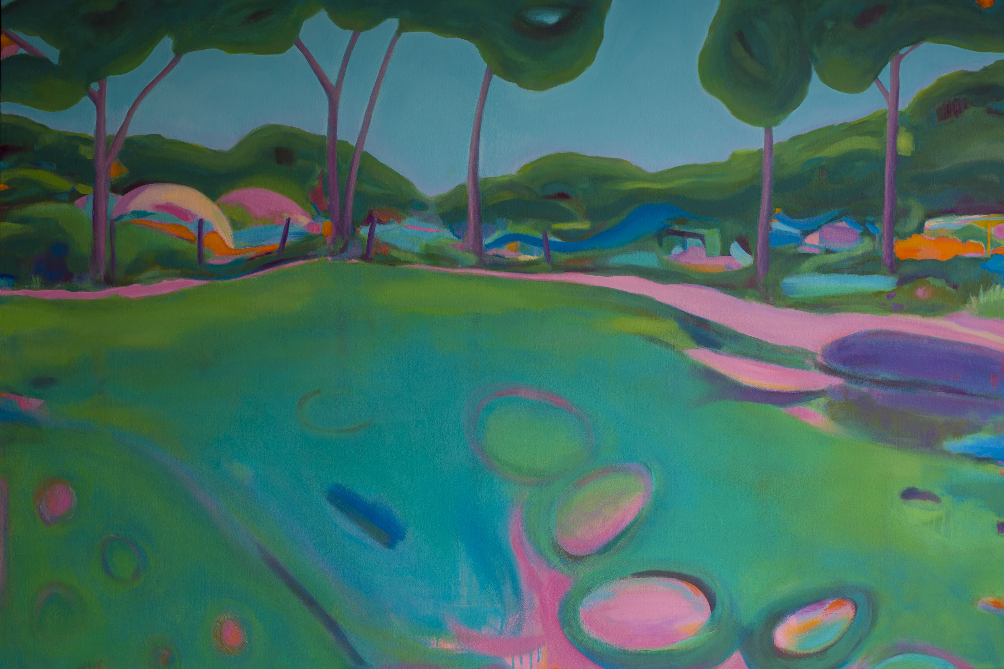
Harrison’s bold and colourful work focuses on landscape subject matter and a sympathetic emulation of, or rather from, the natural world. On smoothly seductive surfaces, Harrison’s colour range often blends or juxtaposes local hues with atmospheric and subjectively ethereal colour-shapes that mix the observed with the felt experience developed on the canvas. An often-understated painterliness also creates a tension of sorts with brash yet confident colour combinations. This distinctive feature relates to synaesthetic conditions that lend some delicious configurations of colour choices that ‘pop’ to make the surface feel lively and visually active. In these instances the abstract characteristics of such works might temporarily disengage the viewer from the ostensible subject matter – what disrupts these glimpses of paradise?
Harrison has not indulged in a purely colour obsessed jaunt through the landscape. Enquire of the work a little more and, beyond the immediately visible, a cultural awareness invested in imperative ecological concerns emerges. For Harrison is particularly interested in eco-systems and conservation spaces that are hidden or discovered on walks. Many people’s interaction with the physical landscape may often be for superficially picturesque pleasure (not necessarily a bad thing) but her on-going project aims to bring attention to these spaces and the work that is or is not being done to maintain sustainability.
June Frickleton
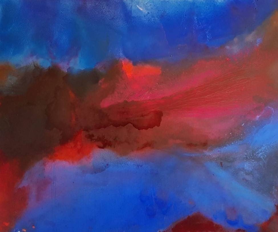
June Frickleton is known professionally for being involved with curating and consultancy as well as for her own practice as a painter. The Boom exhibition gives visitors an opportunity to see and experience her distinctive imagery developed from a visit to Iceland in early 2020 before the Covid-lockdown, which typically has a strong visual impact that combines landscape sources with painterly abstraction. Her palette is often, and intentionally, reduced to just two or three colours. Crimson reds and ultramarine blues dominate the recent works, which have a sumptuous and richly Baroque feeling of visual movement which the viewer may well feel physically and internally as much as visually.
Frickleton’s studio activity responds to the process of painting from an improvised and performatively enacted engagement with painterly qualities from working on the studio floor as well as with the conventions of the wall mounted canvas. From internalised experiences made during and after travelling the engagement with the paint medium develops the imagery in the studio environment and, though sometimes looking spontaneous, is cultivated and evolved over extended periods of time using a mixture of deliberate brush marks combined with thinned down layers of oil paint. By a process that involves pouring washes of turpentine over the surface to stain the canvas, Frickleton builds these various interlocking, overlapping and strongly tinctured fields of pure colour up into layers until the desired image emerges. The final result, particularly in her larger works that engulf the viewer’s gaze as spaces to float or fall into, might well convince the recipient that the experience of looking and engaging becomes their active role as much as the artist’s intention.
Michelle Cobbin
In a similar vein to Frickleton and Harrison, Michelle Cobbin’s work explores the relationship between colour, form and mood. She is interested in how her own mood dictates the colour palette she chooses to work with on any particular painting journey. She might start a painting in warm tones for example, and then feel completely out of sync with those colours the next time she is in the studio, so she either puts that work aside or paints over it. This surely frustrated her to begin with until she realised that her approach to painting is overtly visceral and intuitive – therefore choosing the right colour for her mood was essential and not arbitrary.
With a mode of operation that is reliant to an emotional response to colour it is no surprise that abstract images emerge without the necessity to formulate a figurative or recognisable ‘picture’. Cobbin’s practice is both brave and dependent on faith in a sense. She surely has to allow herself to psychologically, and certainly self-consciously, leave the painting process somehow, which sounds like a weird contradiction. This seeming loss of self that, probably, many painters experience (whatever their visual language) is a major component of Cobbin’s practice that might be better witnessed than explained in words – though it might be a necessity for the poet too.
In physical terms, some of Cobbin’s paintings are many layered, as their colour narratives develop and change as she works. She has revealed that, “other pieces that appear are born complete – rare species that flow through me occasionally when the stars align and I’m without ego or self-consciousness.” This necessitates the hard-won skill to recognise when a painting is finished relatively early, before subsequent layers are added out of habit or expectation. From this point onwards the work develops its own potential narratives that are projected on to it by the viewer, though one might be warned not to project into the work with one’s gaze, but to accept what is projected wordlessly by the visual impact of the work itself.
Enamel and other chemicals on glass
Nina Garstang
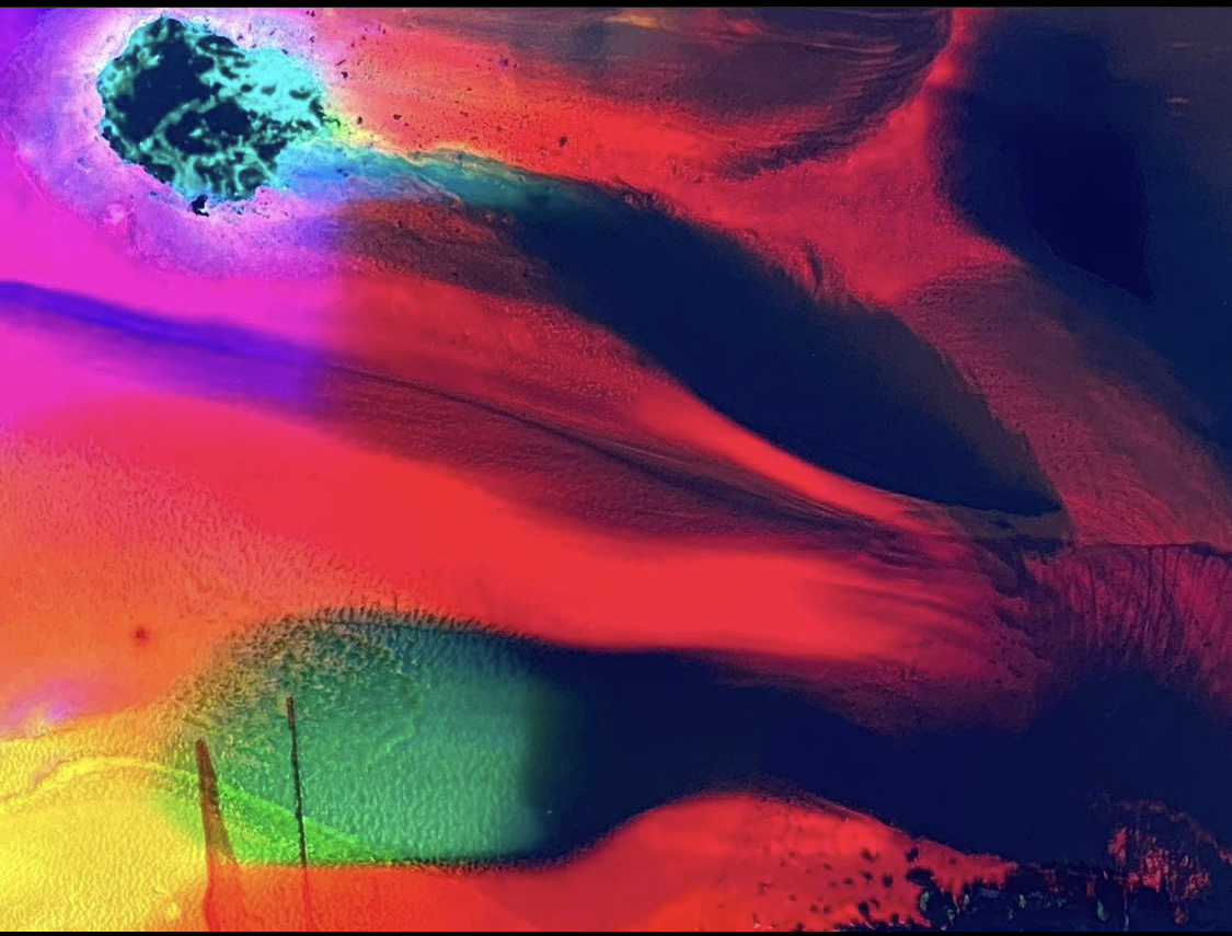
It seems appropriate to follow an appreciation of Michelle Cobbin’s painting practice with Nina Garstang’s as their working practice employs huge faith in avoiding over indulging in any form of didacticism and instead engages in a heavily subjective and autonomous approach to visual creativity that bypasses ego and self-absorption. Her work contemplates a middle ground between what is real and what is not, pushing the view of the objects she paints to the point where they lose their identity, thus revealing an altered view that suggests looking into the universe or travelling deep inside the body.
When immersed in her studio practice, Garstang carefully ponders the medium of paint and/or inks as if little else exists once the realm of painting as both noun and verb, thing and action conjoined, takes over. Her work explores the qualities and viscosity of coloured media as primary material with which to explore not only a state of mind but which are also evocative and redolent of current opinions of the tradition of painting in an increasingly ‘virtual’ world. This notion of the virtual is, arguably, inherent both historically (from the moment women made their hand prints on cave walls perhaps) to the on-going psychological experience of creating a painting at any time. For example, flirting with the idea of Rorschach cards and likening the state of mind to that of the theta brain wave state, which is akin to daydreaming and is free flowing, Garstang’s work presents both a thought provoking and aesthetically fabulous indulgence in painting that truly engages the viewer’s seeing experience beyond the here and now. Author and poet Richard Lewis’ description of Garstang’s glass paintings is evidence of this potential in her recent work:
“The colours hit me up with their intensity, like chemicals chasing through my blood. It’s a visceral thing at first and then meaning emerges: I get rivers, seas and mountains, then into cells under microscopes, maps of the earth from space bleeding into brains and embryos, soft tissues and weather systems all on a single sheet of glass, yet it is still. I’m getting flashes of old masters too, like faces and scenes from other things I’ve seen dissolving away from me.”
Ian Boutell
Ian Boutell, whose work reveals his architectural training and interest in Modernist pioneers including Malevich and Tatlin has influenced his investigations into how space is re-presented for the viewer as concrete fact rather than as perspectival illusion in his painting practice. Boutell incorporates Perspex and other materials, including paint, into his work to explore the shifting territory around contemporary and expanded painting. The relationship between displayed artwork and the physical space the works appear in acknowledges the physical context intentionally as integral to the conception of the works, albeit in the knowledge that venues and spaces may change between the institutional and the domestic for any particular work at different times. Such an intention requires any one work to function actively as an object as much as an image irrespective of the placement which conjures the paradoxical materialist necessity to be independent of yet very much part of the immediate environment.
For Primer02, a recent online feature with artist-led group epox_contemporary, Boutell commented:
“I did a few of these ‘corridor constructions’ where, when walking past, the vertical strips are revealed then hidden by others that project further and momentary flashes and reflections from bronze Perspex mirrors reveal the room, corridor or oneself. The onlooker, the viewer, the audience completes the work.”
Speaking further of his practice, Boutell also says, “Science and art each seek ways of understanding our world in concordance with these new ideas of cosmology and subatomic physics, and I am seeking visual metaphors in paintings and constructions for these ideas that are not directly visible. This is the paradox in both science and art; making objects and forms that are metaphors of their opposites, the abundance of space and the energy and waves that fill atomic space…”
As with Lewis’ reaction to Garstang’s ethereal imagery, Boutell’s more architectonic constructions act as a starting point for something sensed rather than spelt out as a diagram or illustration, thus engaging the mind in conjunction with the eye – yet demanding the viewer’s full focus and attention.
acrylic and emulsion on water resistant MDF
Patrick O’Donnell
Like June Frickleton, Patrick O’Donnell is also an artist and curator. His work has become increasingly non-figurative with an ongoing investigation into the perception of 2D shape in three-dimensional projected and real space creating a dynamic tension, both visually and conceptually, between the two phenomena.
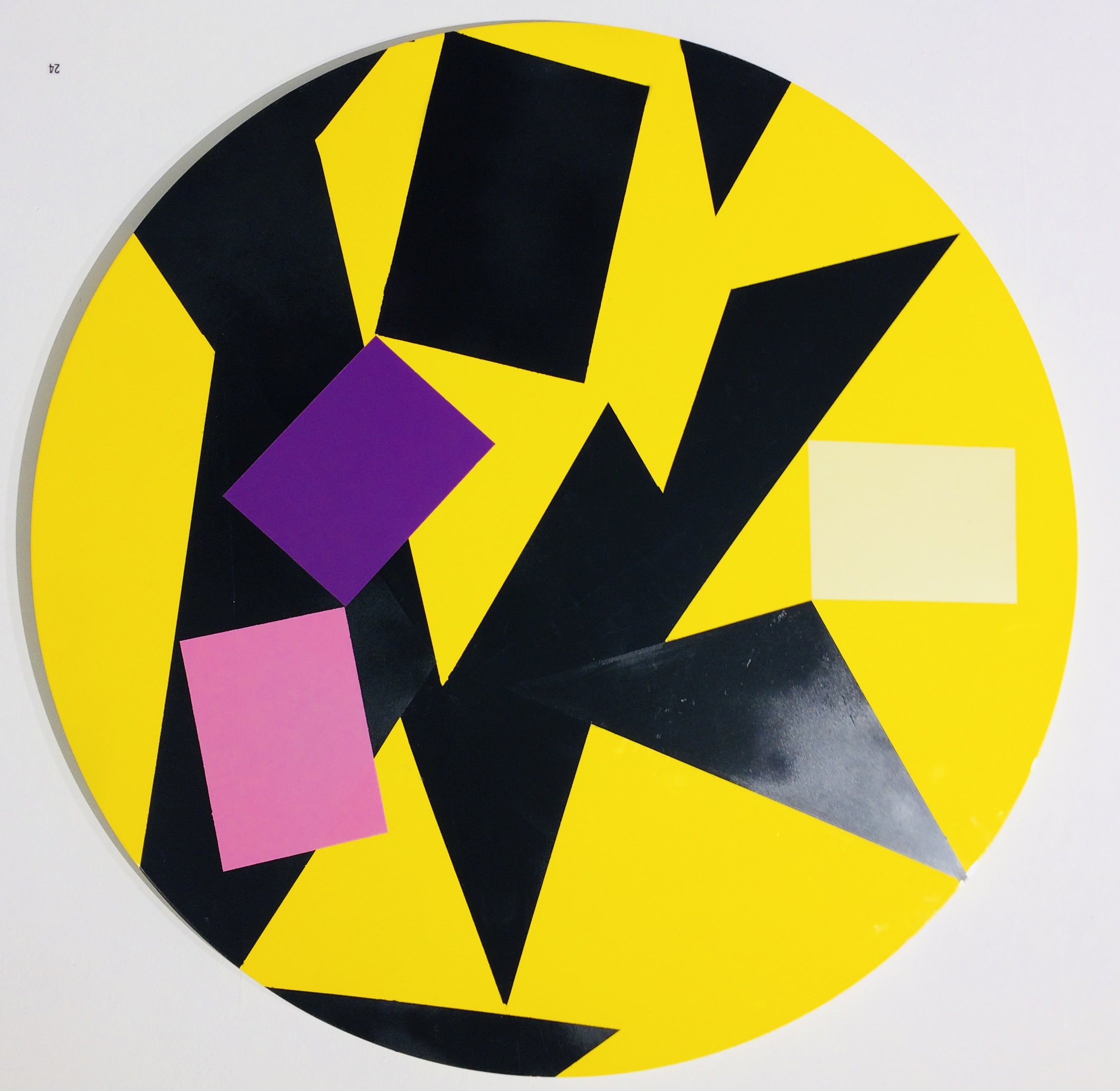
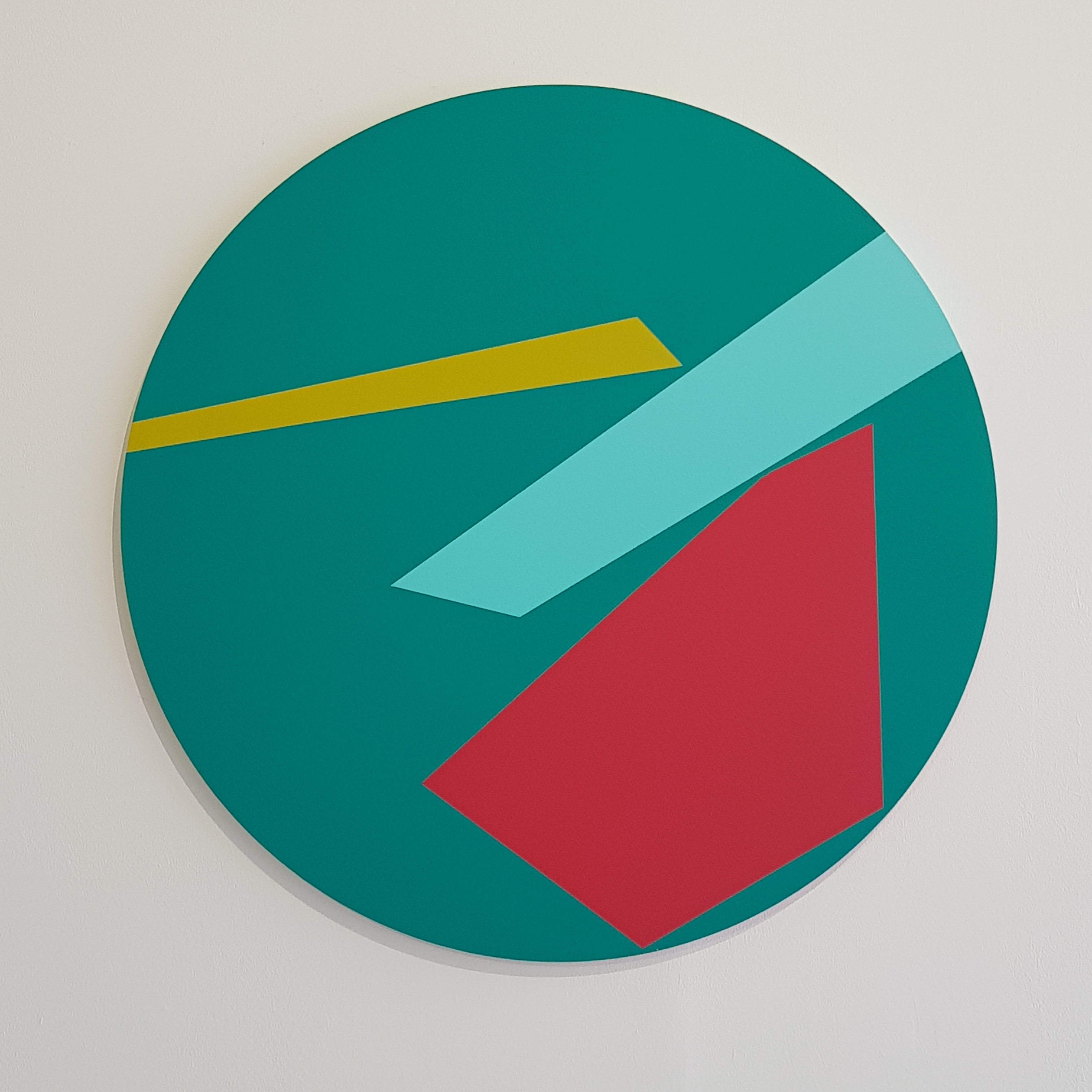
O’Donnell has been largely working on tondos (circular paintings) for the last year after fellow tondo-enthusiast, Ian Boutell, kindly passed a batch his way. The circle was a blessing in disguise as it offered him a neutrally balanced compositional arena with multiple orientation options allowing him to focus his enquiry into boundaries and opacities of colour, line and edge. The distribution of shapes in a specific kind of space, without the visual weight of any physical corner of the picture support, avoided the more commonplace phenomena of a portrait or landscape format. In this sense the disc becomes a model form to challenge the ubiquitous rectangle, although such shapes will appear within the physical parameters of his work alongside triangles and rhomboids.
If this sounds a little too systematic and brings back memories of times spent struggling in geometry lessons (that was my experience anyway) a more personal and subjective element is formulated into the mix by O’Donnell’s use of either straight or torn edges of tape, or a combination of both, to devise and realise his compositions. When using a torn line the tear has to be intuitively right or else it fails to convince him as an image. He started experimenting with the tension between the torn and clean line in charcoal works in 2016. A key work from this period was ‘Seven Sisters’ which consisting of seven essentially abstract shapes that echoed rather than depicted the iconic landscape features of the Sussex Coast. Working this way offers him the freedom to explore a variety of ideas through simple formal elements, including a highly sensitive choice of colour contrasts and combinations.
The ‘Toe the line’ series that incorporates straight and torn edges was initially prompted by observations of boundaries and territories within domestic settings, to then later include ideas filtered from the book, ‘Prisoners of Geography’ by Tim Marshall of natural / geographical versus political borders, imposed and accepted (or not). As we see in Harrison’s more organically characteristic paintings, O’Donnell’s geometric configurations that suggest a built or even psychologically constructed environment, there is so much more than meets the eye however pleasurable this experience may be.
Philip Cole
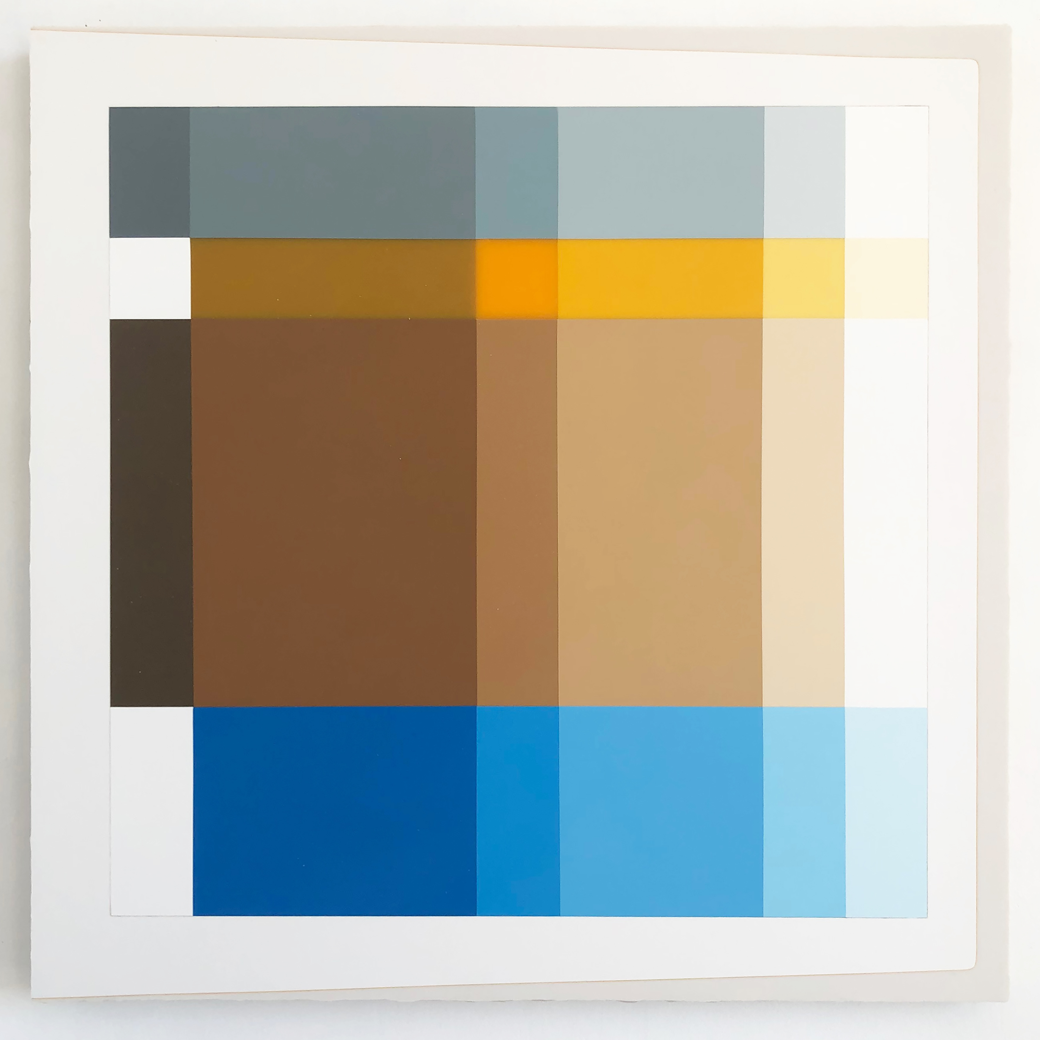
Philip Cole is a painter, maker and teacher. He has spent the past twelve years exploring the possibilities inherent in his chosen primary material, Polyester resin. As a Painter/Maker he uses unconventional materials and commonplace processes to produce qualitative painting objects. His use of polyester resin is intentional in order to elevate its status as a suitable material for ‘painting’. The work may be characterised by the use of simple colour combinations and tonal variations where the predominant geometric shapes are composed essentially of rectangles, and less frequently, discs. They sometimes suggest printers’ colour registration marks or aerial views of tins of paint, or even hints of perspectivally represented forms. But these associations are not necessarily of primary importance, even if a consequence is to reference similar organisations of colour and shape in the overlooked and marginal, or in architectural spaces (the interstices) of ‘real life’.
The production of a conventionally permanent object (a painting) is in contrast to the use of these materials to construct and mark temporary and throwaway vessels. His constructed, material/process-focused, object-type painting requires hard graft, perseverance and extended hours in the studio. Cole’s belief in the necessary work involved in the production of his paintings is rooted in deliberation and a craft aesthetic, rather than in a gestural approach to provide evidence of the painter or maker’s mark as a ‘personality’ is avoided. But the potential for a cold and indifferent outcome is avoided by the combination of wonderfully effective colours that could be contemplated forever and the sheer refined beauty of the ultra smooth surfaces.
From a review of ‘Making Painting +-’ at Phoenix Art Space in 2019 written for the Saturation Point website I commented:
“Cole’s practice may well have vestiges of the deconstructive and the reconstructive that more painterly practitioners might disdain, but this fascinating notion of ‘obtaining consciousness’ can be applied to Cole’s works from a viewer’s perspective. The experience of active looking takes the patient viewer into the work as a thing in itself, visually and physically, allowing the imagination space to breathe. Possibilities come alive, in explicitly authentic, concrete, non-virtual manifestations. These are characterised by instances of reduction and variation: geometry, regularity and logical developments, measuring and assaying exactitude, craft and reductive simplicity. Ingesting visually exciting combinations of colour and shape, with Cole’s carefully formulated contrasts, definitions and edges, produces end results which generate a rich and diverse encyclopaedic experience of possibilities.”
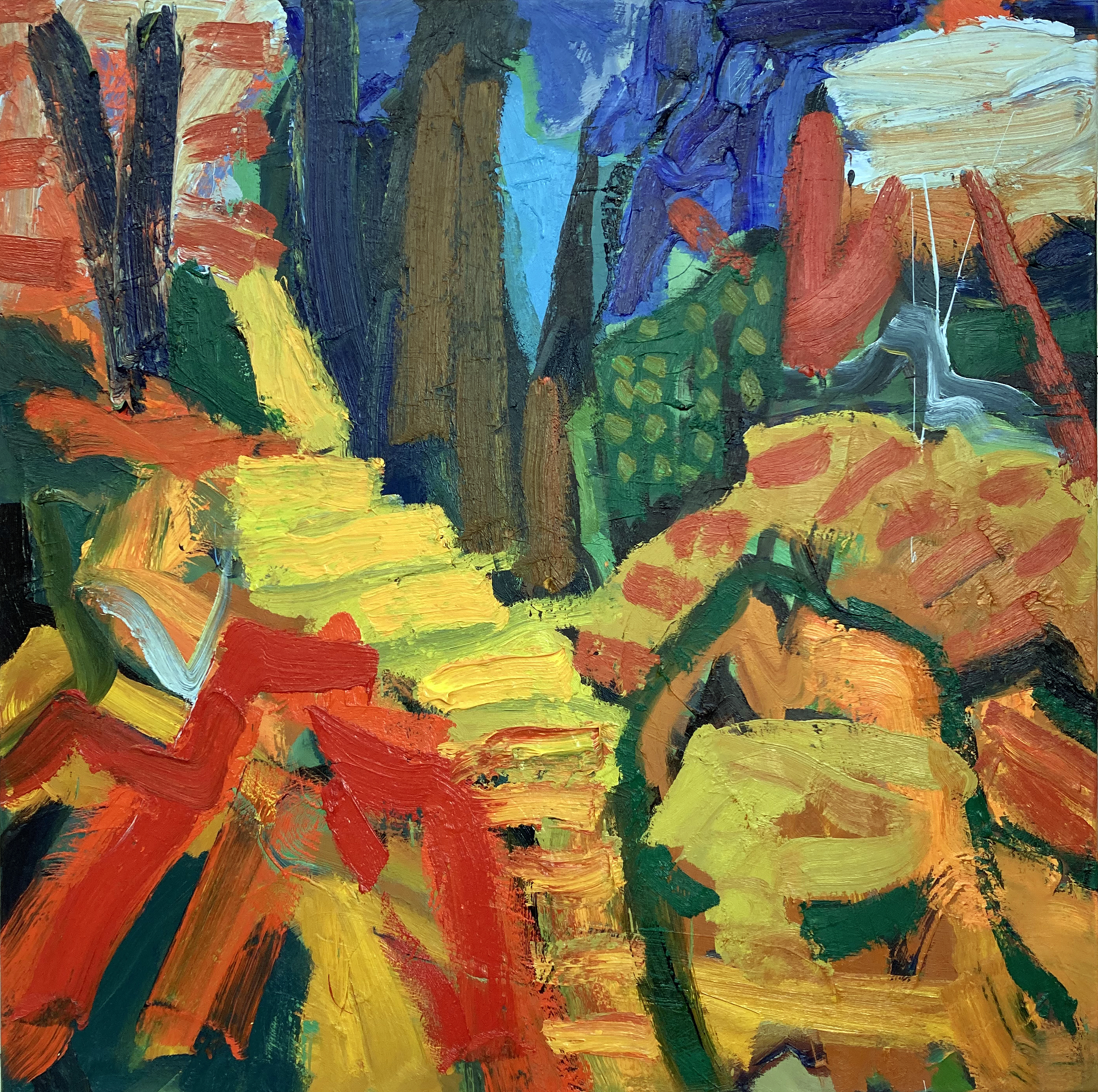
Geoff Hands
Since retiring from full-time teaching I have become involved in the short course programme at West Dean College near Chichester. I was asked to write a brief statement for potential students who might enrol on my ‘Abstracting from the Landscape’ three-day course. I wrote:
“I encourage students to work with a disciplined kind of freedom. As with writing you have to find your ‘voice’ and this often demands trial and error. The paint medium is on an equal footing with the potential subject matter and so you have to mediate and discover the real subject through the physical process of painting. Everyone will be encouraged to allow the paint to speak for itself.”
The paintings chosen for the Boom exhibition aim to fulfill this brief. I also chose oil paintings that I had not displayed publically before and which mark a shift in an even more ‘painterly’ approach to my practice.
Links:
All of the RAC painters currently have studios at the Phoenix Art Space in Brighton. https://www.phoenixbrighton.org
Ian Boutell: EPOX Contemporary
https://www.instagram.com/epox_contemporary/?hl=en
Ian Boutell also curates Cottage of Modern Art at his home on the outskirts of Brighton. The gallery shows just one painting at a time inspired by Winifred Nicholson’s Cumbrian cottage with a Mondrian on the wall.
https://www.instagram.com/cottage_of_modern_art/?hl=en
HARDPAINTING: AbCrit
An essay on one of the HARDPAINTING exhibitions: https://abcrit.org/2020/02/25/122-geoff-hands-writes-on-hardpaintingx2/
The first HARDPAINTING show (2018)
Philip Cole: Saturation Point https://www.saturationpoint.org.uk/Making%20painting.html
Michelle Cobbin: Fineartruminations


Some very impressive artists gathered here–looking forward to seeing the show!
LikeLike