IN THE GARDEN

Michelle Cobbin interview with Geoff Hands

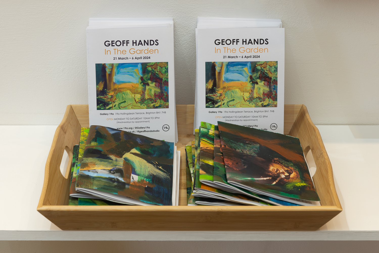
Gallery 19a, Brighton

March 21 to April 6 2024 (Closed Sundays / by appointment Wednedays)

Installation of In The Garden at Gallery 19a

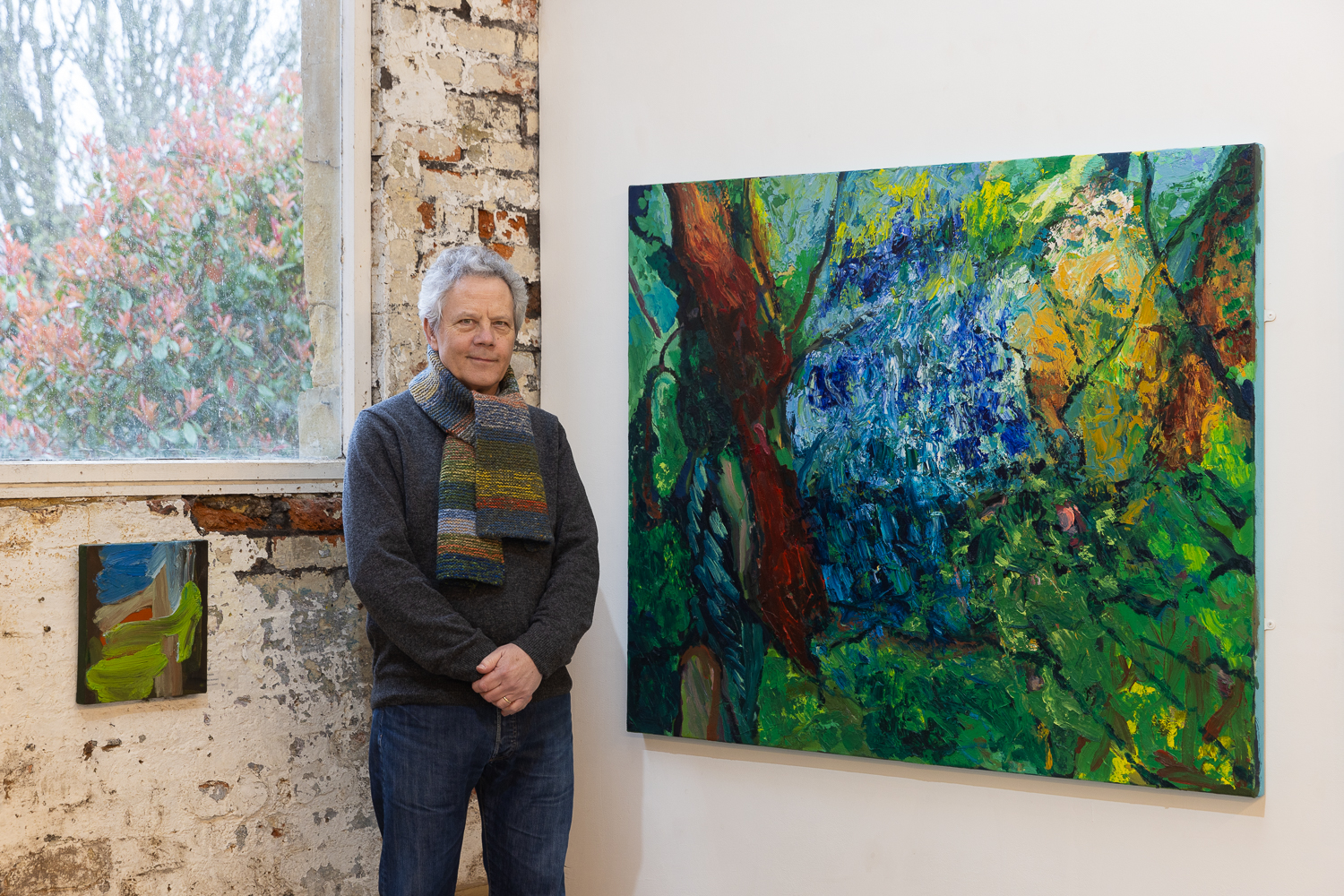
Michelle Cobbin, a fellow painter at the Phoenix Art Space, interviewed Geoff Hands as he prepared to install his exhibition, In The Garden, at Gallery 19a in Brighton.

Install photographs by Rob Harris.

Michelle Cobbin – What was the first painting that had an impact on you?

Geoff Hands – A Camille Pissarro woodland landscape. I was 18 or 19 years old and on a Shrewsbury School of Art visit to Manchester City Art Gallery and The Whitworth. It was not a particularly large work, but the paint was quite thickly applied in that Impressionistic manner. It sounds naive, but I was so accustomed to looking at reproductions of paintings in books that I must have assumed that paintings were essentially ironed flat. Today we probably talk about ‘materiality’ but back then, in the 1970s, it was ‘surface touch’. A visual touching of course, which is one of those fascinating dualities of experiencing painting that might only truly be comprehended on a feeling level.

I should also mention two other paintings recalled on another art school trip a little later to Liverpool. These are Stephen Farthing’s ‘Louis XV Rigaud’ and John Walker’s ‘Juggernaut with Plume – for P Neruda’ that were selected for the John Moores exhibition in 1976. They employed a technique of employing collage within the canvas, which expanded the painting process. Collaging, in a sense, is more ‘hands on’ than painting with a brush.

MC – That is really interesting. Your recent work utilises unctuous and thick oil paint and collage plays a part in your studio practice. Would you say that the ‘materiality’ of making work is essential to your practice? 

GH– I have always felt that the physical medium is a crucial ingredient in the realisation of the artwork. It’s experiential too, both for maker and viewer.  There’s a symbiosis at work, which is material, physical and visual. Oil paint is a wonderful medium, just from a feeling point of view. If my painting is going well, on a subjective level, the oil painting process is still a challenging and discomforting experience. That’s the contradictory nature of painting for me, which has been appropriately labelled the ‘hard won image’. I’m sure that sounds rather old fashioned and romantic.

Oh, but the thick layers of oil could be thin too. And I love the term ‘studio practice’ as it implies a never-ending quest for something. The recent work being presented in ‘In The Garden’, particularly from 2019/20, really continues work from before but with an added realisation that there’s a singular pursuit to make a painting that was worth the effort. That’s why I called my show at the Phoenix Art Space in 2020, ‘It’s All One Song’, after a comment made by Neil Young to an audience member who wanted to hear a specific song but he launched into something else. My interpretation was adjusted to the notion of my own singular pursuit, engaged with as a painting student so long ago, that is still manifested in repetition of some kind of desire.

‘Garden (Pilgrimage) – After Watteau II (for PJ Harvey)’ 2020-21 (121x150cm) and
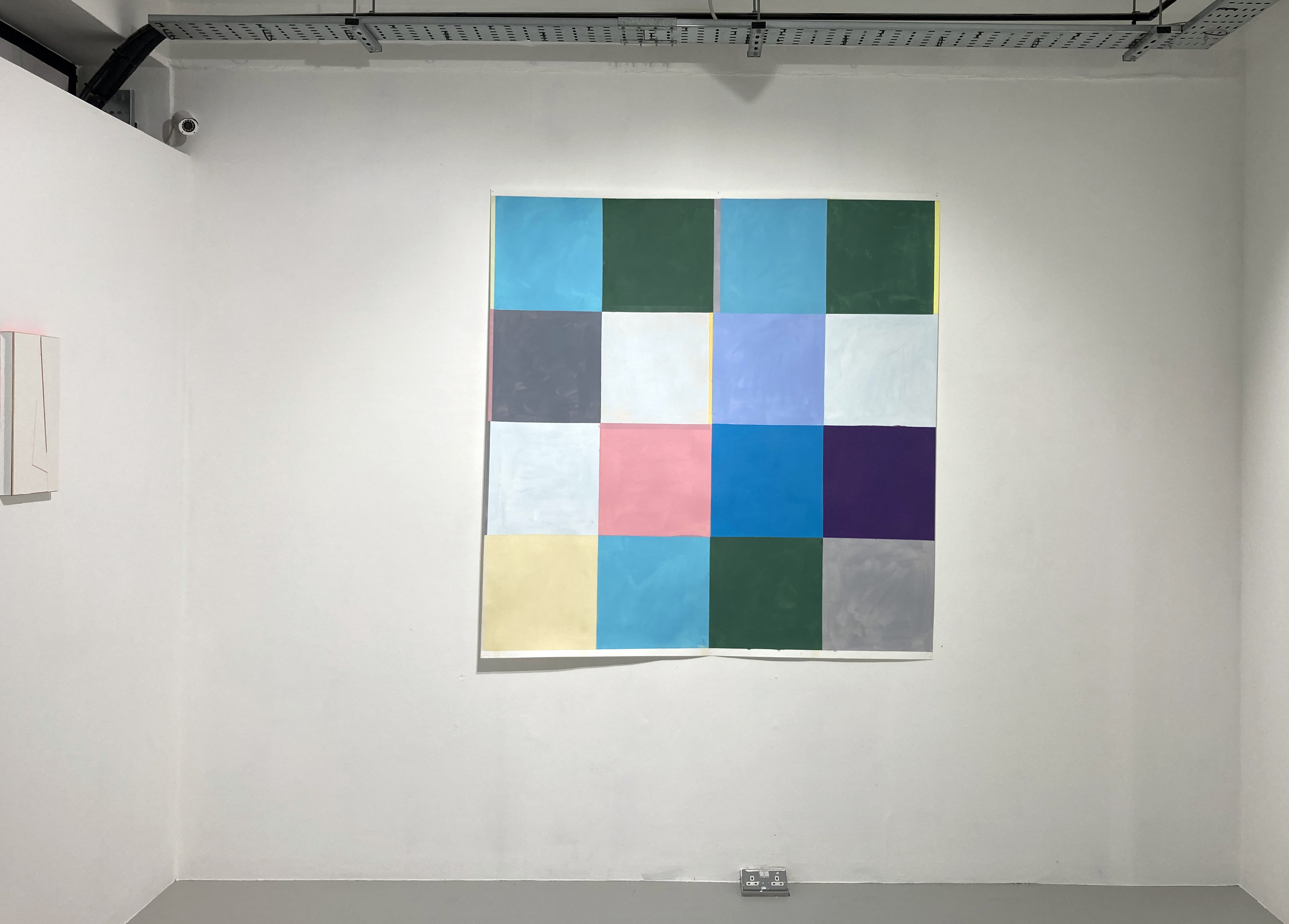
‘Garden (Pilgrimage) After Watteau I’ 2020-21 (121x150cm)

MC – That quote from Neil Young, ‘It’s All One Song’, you mention one way you apply that idea to your painting in that it is a repetition that forms part of your ‘studio practice’. Keeping with musical references I would suggest that you use a lyrical mark-making motif in many works that lead the eye from painting to painting in a rhythmic way. Are you conscious of that – is it deliberate or is it perhaps that you are listening to Shakey in the studio and the marks are spontaneous responses to the music?

GH – Well, I am conscious of a desire to create a feeling of movement and flow in the paintings. This starts with the looking and the observational drawing before the paintings are made back in the studio. This interest in rhythm, movement and atmosphere is concerned with consciousness, time and space. So there should be occlusion and fixed point too. This is everyday stuff, acknowledging the animism and agency of the here and now. The mark making can be described as ‘lyrical’ and I see it as an extension of the looking and the drawing but improvisation is key too, along with a journey into abstraction with colour.

I get the musical link too but I more often paint with some chilled ECM label jazz playing in the background. The occasional blast of Neil Young with Crazy Horse would be good to stop overthinking though!

It’s worth briefly mentioning that I am currently working with musician and composer, Tobias Wheal, on walking, drawing and painting with his music responding to my work and vice-versa. There’s a little poetry as well, but it’s still a little early to say much more as we are buried in the project at the moment.

Garden’ series, 2023 (25.5x31cm)
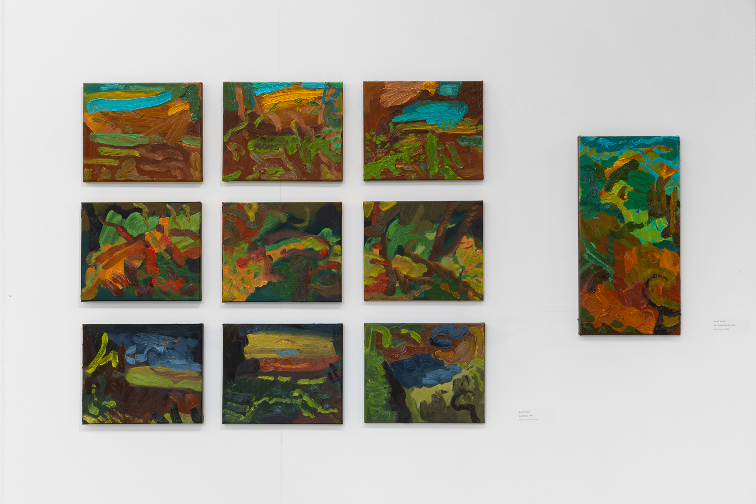
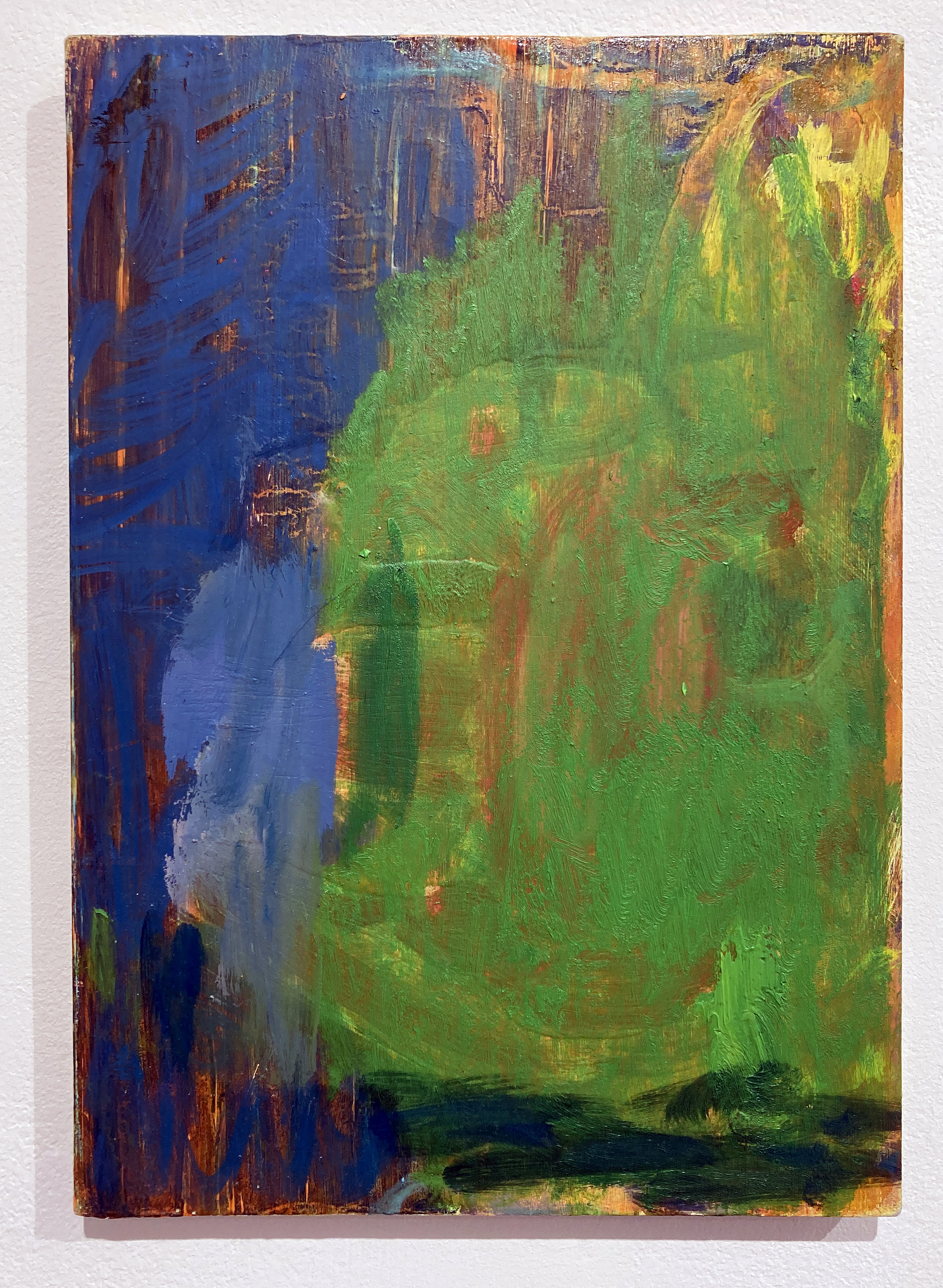
and ‘In The Garden (for V.M.)’ 2023 (51x26cm)

MC – The project with Tobias Wheal sounds like an interesting collaboration, I look forward to seeing how that develops. Recently your work has referenced paintings by historic landscape painters such as Watteau and Gainsborough. In particular I was drawn to the large painting inspired by ‘Mr and Mrs Andrews’. What drew you to riff off that particular Gainsborough painting?

GH – Between two of the lockdown periods I went to see the Titian show at the National Gallery and took a walk around the permanent collection. Gainsborough’s painting is one I know well from many visits there and it never fails to impress. I always expect it to be bigger than it is and his paint handling is astonishing. It’s a loaded image of course, not just from a feminist perspective concerned with the implied male ownership of the female partner, but it is also an unintended glorification of capitalism and land ownership from its early history of development in England. For anyone interested in the English Landscape tradition in painting it can’t be ignored either. All of these political frameworks are important and remain relevant today, but I think that we can look at paintings for what they are without having to add a societal context every time.

Anyway, at the time (during the pandemic) I was incorporating elements from paintings from the past into my own work. I was initially looking at a Ruben’s composition (‘Landscape with St George and the Dragon’ 1630-35) and adjusted a small series of my own paintings to include compositional references. This lead onto ‘appropriating’, the artist’s term for stealing, various elements from Titian, Watteau and Gainsborough to add to my own imagery. Some of the content from these painters has been intermixed, especially from Watteau’s, ‘The Embarkation for Cythera’  (the version in the Louvre) that has become a bit of an obsession. With the Gainsborough I have found that I can enjoy painting towards abstraction. The image just seems to lend itself to this painterly and colorful direction. All of this has been happening since about 2020 when I was becoming a little disillusioned with where my work was going, or rather, it was stuck in a groove that needed changing somehow. My forthcoming exhibition (In The Garden) at Gallery 19a will show a small selection from this quite large body of work and I shall have an opportunity to distance myself a little from the paintings so that I can see it from another perspective.

‘Andromeda’s Garden’ 2023 (145x200cm) oil on canvas

MC – As I think about you preparing to select paintings and curate your exhibition ‘In the Garden’ I wonder about titles of individual paintings and whether titles are important to you. As a whole you say the work is ‘all one song’, how does that effect how you title individual works?

GH – Well, there’s an obligation to title work but it’s useful. Just numbering works does not feel right for my works – although as I work in series there will be a roman numeral somewhere. A title is something of a portal, an entrance into the work for the viewer. With the works that reference another artist it seems ethically correct to add their name to the title. As for the importance on a personal level I often reference the source of the painting. This is often a particular location where I have typically visited with a sketchbook to draw in. The untitled option is always there though, and if I am looking at someone else’s paintings in an exhibition I generally avoid reading the wall label at first. The song reference is more of an acknowledgement of a lifetime’s quest or project.

The exhibition title for my show at Gallery 19a is deliberate reference to the feel of that particular song by Van Morrison. It’s quite personal, and perhaps only relevant to myself. The garden reference is also an allusion to the painting studio, especially during the pandemic lockdown periods, and an even more oblique reference to images of Mary in the Garden from the Gothic and Renaissance periods in art history. I like to think of this as a poetic decision, inviting the viewer to make whatever they wish from the references without any clear answers from me.

MC – I think that’s a good place to end.

Links:

Geoff Hands – https://www.geoffhands.co.uk/

Michelle Cobbin – https://www.michellecobbin.art/portfolio-abstract-paintings

Geoff Hands – ‘Emilia’s Garden’ 2023 (135×185.5cm) oil on canvas
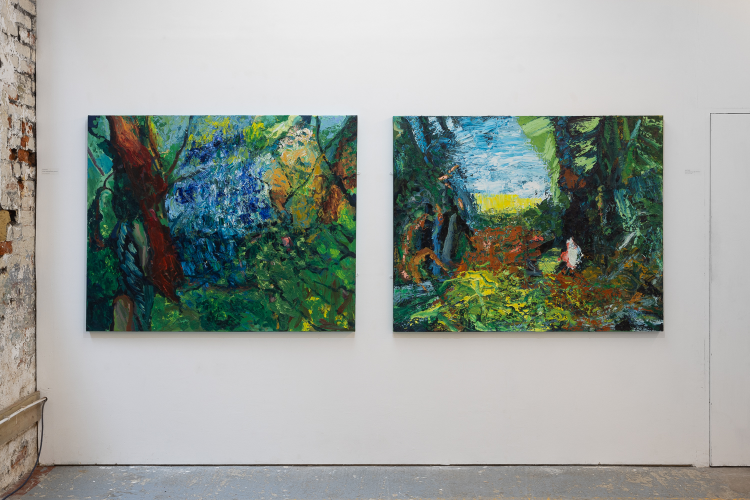
‘Andromeda’s Garden’ 2023 (145×200) oil on canvas
Catalogues, included limited edition of 32 with original paintings.

H_A_R_D_P_A_P_E_R

At Phoenix Art Space, Brighton

2 March to 14 April 2024

Paper has been around for ages, maybe 5000 years, especially if we include papyrus from ancient Egypt. Artists love this material. Even digital images end up being printed on it. Just as there will never be a paperless office, there will never be a paperless art studio.

Abstract art may have been around even longer than paper – I am thinking of pattern-like marks made on the body with mud or blood, or in the sand with a stick – before any notion of symbolism or figuration advanced visual language. Today abstraction continues to interest many painters and in Brighton we have been fortunate enough to see a good range of the more geometric, non-objective formulations in the H_A_R_D_P_A_I_N_T_I_N_G shows at the Phoenix Art Space in recent years.

When I first heard about plans for the H_A_R_D_P_A_P_E_R exhibition a few weeks ago I was pleased that drawing and collage – maybe even 3D forms too – might get a look in alongside the painting that I assumed would dominate this project. I wasn’t wrong.

Paper can be passive or add agency – by way of an effect of literally underlying subtlety or more overtly pronounced and structural. In this exhibition there are examples of a suggestively drawing or print-based approach as well as monochrome or limited palette imagery. As expected from geometric abstraction, linear grid-type configurations, systems based structures through to colourful, almost (dangerously) painterly imagery is included. Just over fifty artists have contributed works that they selected themselves. Perhaps this was a risky decision not to completely control and steer the selection by the four H_A_R_D_C_U_R_A_T_O_R_S (my tongue-in-cheek term for Ian Boutell, Patrick O’Donnell, Philip Cole and Stig Evans) as they went for the light touch and allowed things to happen. Based on a first impression I felt that the decision had worked well enough and, as with the previous painting shows, the viewers are given a little taster to seek out more from these practitioners.

An alternative point-of-view, however, might demand a much tighter range and a smaller group of participants, with far more in common linking the cohort. This has certainly been my feeling after a third visit as, for if there is an argument being promulgated, it is possibly diluted through diversity. That desire to see more from several of the artists, and to make a tighter and less assorted grouping will not go away. Another personal quibble could be even more paper related in that the surface and structures of the medium could have come more to the forefront. Seeing works unframed or breaking free of the rectangle might also emphasize the paper aspect. At this more critical level, a viewer (or a selector) might well insist on an elevated role for the choice of paper as a support and/or main material feature in all of the works. Admittedly, some works, such as several of the paintings could have been applied to a smooth canvas and appeared much the same except for a paper edge or floated mount showing up. Several works adjust or undermine the expected rectangle and hint at an expanded, or extended, field arena for painting. The painting media are, understandably, wide ranging. Some works are closer to drawing, or employ gouache, ink or watercolour. The acrylic medium was present in eight works with some use of oil. Although the unifying factor is paper, even if subservient to the applied medium at times, there could be an argument that demands a less collegiate approach to the final selection in which participants from the second show invited an additional artist to contribute something.

There are so many works on display that I am reluctant to single out a favourite piece. There were three works that remained strongly in my memory after the first visit, but three others after the last. Some works exude expertise and decades of experience, whilst others suggest an experimental attitude or even a sense of humour or play. Three works could loosely be categorised as sculptures – and so I wanted more. For the curators I would like to think that this showing inspires another paper-based show in the future – or even a H_A_R_D_S_C_U_L_P_T_U_R_E survey. But it must not become gimmicky or too broad. They might return to the desires felt for the first exhibition in 2018, which produced a highly memorable show. On this occasion the press release explained that works on display would be: “Painting that is hard edged, non-figurative and abstract / Painting that endures / Painting that is a complex and esoteric distillation of ideas” 

On a very positive social note the Phoenix was jam-packed on the open evening with over 400 attendees and when I visited again over the first weekend there were many more visitors than usual. On my Thursday afternoon visit, often a very quiet time, a steady flow of people were turning up. If it’s a sign of the times, and of an interest in contemporary art, we need more artist lead shows at this primary Brighton venue.

The artists:

Mohammad Ali Talpur, Richard Bell, Biggs and Collings, Helen G Blake, Katrina Blannin, Isabelle Borges, Ian Boutell, John Bunker, Matthew Burrows, Belinda Cadbury, John Carter, Cedric Christie, Nina Chua, Philip Cole, Deb Covell, Gina Cross, Matt Dennis, EC, Henrik Eiben, Stig Evans, Catherine Ferguson, Martina Geccelli, Della Gooden, Richard Graville, Dom Gray, Charlotte Winifred Guerard, Alexis Harding, Rupert Hartley, Pete Hoida, Zarah Hussain, Ditty Ketting, Roman Lang, Jo McGonigal, Matthew Meadows, Johanna Melvin, Mali Morris, Morrissey and Hancock, Jost Münster, James William Murray, Patrick O’Donnell, Tim Renshaw, Giulia Ricci, Carol Robertson, Sonia Stanyard, Daniel Sturgis, Trevor Sutton, G R Thomson, David Webb, Lars Wolter, Eleanor Wood, Mary Yacoob, Jessie Yates.

LINKS:

HARDPAINTINGhttps://www.hardpainting.com/

Phoenix Art Spacehttps://phoenixartspace.org

Also see:

Sam Cornish on Saturation Pointhttps://www.saturationpoint.org.uk/Hard%20Paper.html

The first Hardpainting show reviewed for Abcrithttps://abcrit.org/2018/01/20/93-geoff-hands-writes-on-h_a_r_d_p_a_i_n_t_i_n_g-at-pheonix-brighton/

MICHAEL CLARENCE: Full Catastrophe Painting

At Phoenix Art Space, Brighton

21 February to 3 March 2024

Michael Clarence – ‘Devily Dyke‘ 2024. (30X21.3 cm)
Oil on board.

Don’t go looking for the punctum. It will find you, only you. Not just in photographs, as Roland Barthes explored in the now classic ‘Camera Lucida’ nearly fifty years ago, but in any visual situation.

I am expanding this compelling theory of Barthes’ beyond its intended scope within photography as I attempt to ascertain why one painting in a small exhibition made a connection that did not rely on it standing out from the other works as bigger, better or more beautiful. Its title is irrelevant (to me at least, for now…) and, for the record, it was possibly the second or third smallest work on display. Maybe there are eight works, or nine. There was ample space for double or triple the number. Overfilling a space is easy. Just getting it right is an impressive skill.

Mind you, if I could fully understand and explain why this one particular oil painting ‘hit the spot’ I would be venturing into the studium as not only the language and form of an explanation would betray the impact of the singular act of seeing something, but I would be obliged to discuss (in general terms) figuration and abstraction in painting. The present day, an aspect of the historical moment before it is truly placed in some kind of past, would oblige a discussion of identity politics too (in specific, contemporaneous terms, no doubt).

Sometimes we should allow ourselves the thrill of the extended moment and should, or at least can choose, to put aside the societally inflicted art appreciation straightjacket awhile. Such an act is difficult and might be achieved in some act of play or weariness. It may happen by chance, just once in a while. The cultural obligation to look at, and judge, ‘art’ with an overburdening requirement to apprehend a painting whilst looking through the lens of current ideology can be challenged. I admit a form of blasphemy here, but I do not regret such a stance, however brief I might be able to hang on to it. There is surely an elemental and unsophisticated rawness to seeing some phenomenal aspect of painting without a framework that might impair judgment that relies on the theory and the concept that the painting must necessarily serve. This painting did that for me (I say ‘did’ because I don’t know how it will greet me when I next see it, probably tomorrow) and I have some reluctance to stress over understanding why. I suspect it’s something to do with the use and application of the paint medium, the simplicity of the composition and the colour combinations. But I have said too much already.

The work in question has been selected from paintings made during 2023 in Michael Clarence’s role as the Freelands Foundation Studio Fellow at the University of Brighton. He explores themes surrounding identity and a sense of place, situated somewhere between figuration and abstraction. Full Catastrophe Painting at the Phoenix Art Space fulfills the culmination of this fellowship before the artist returns to his native Glasgow. Many people will see this exhibition when they turn up to see three other shows that are also open at the Phoenix. How fortunate we all are, sometimes.

Image © Michael Clarence

LINKS:

Michael Clarencehttps://www.michaelclarence.com/

Freelands Foundationhttps://freelandsfoundation.co.uk/artist/michaelclarence

Museum of Education (explanation of Barthes studium and punctum)