Taking eight completed pieces out of the studio and re-seeing them, experiencing them afresh and re-contextualised in a carefully considered arrangement might be considered a luxury for some artists. But a room reserved for this purpose at ASC Unit 3 Gallery, a short walk from Bromley-By-Bow underground station, provides such an opportunity.
In turn, John Bunker has invited visitors to come and see the selection, thus creating an exhibition. Add the opportunity to visit his studio, just along the corridor, to see numerous works not displayed alongside works in progress is a real treat. But it’s quite informal and apart from stacking some chairs out of the way later on it’s ready for use. A stock of materials stored in readiness for creative activity over the coming months adds a little more depth to the whole experience of the visit.
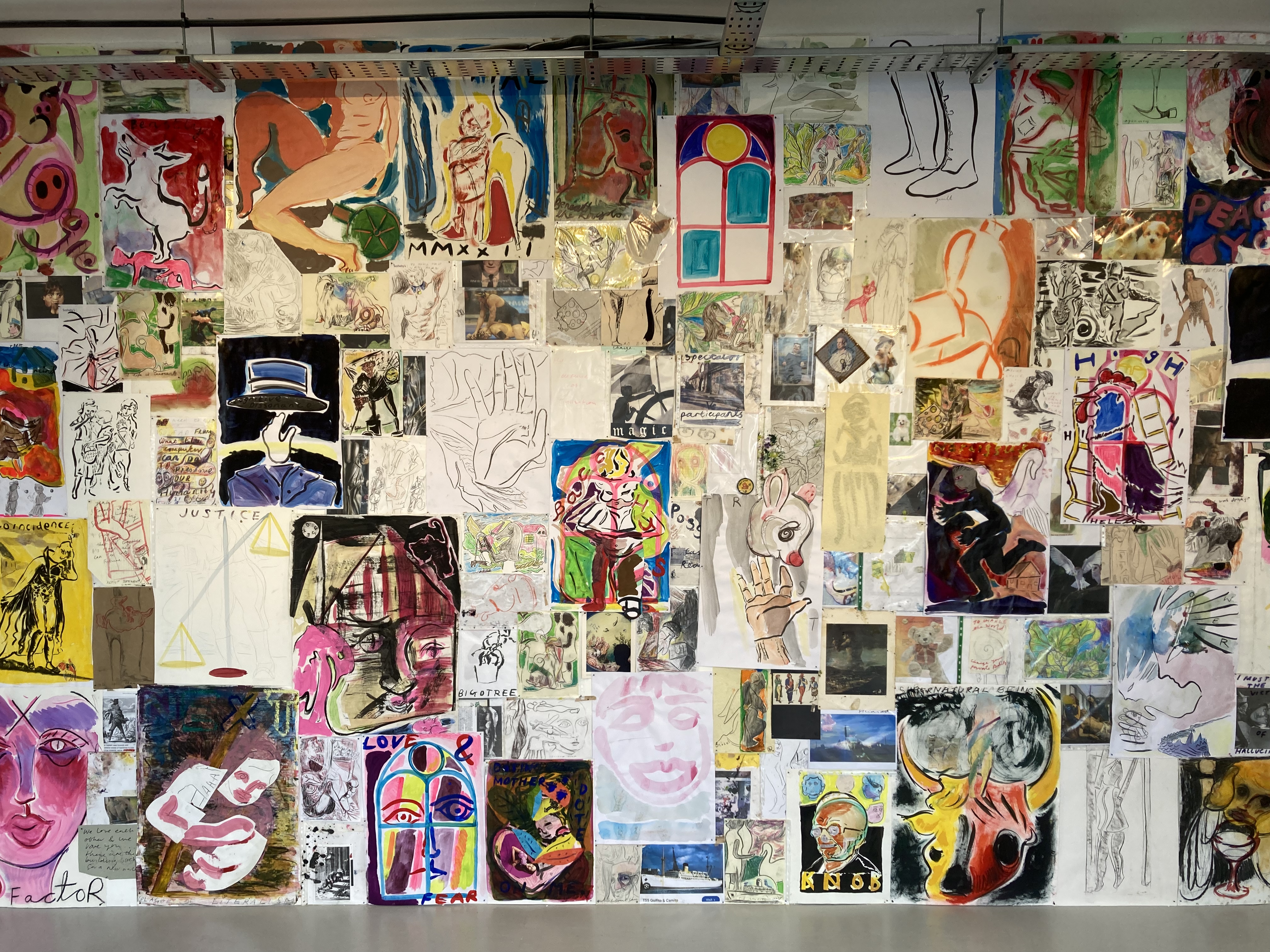
Assorted works in the studio
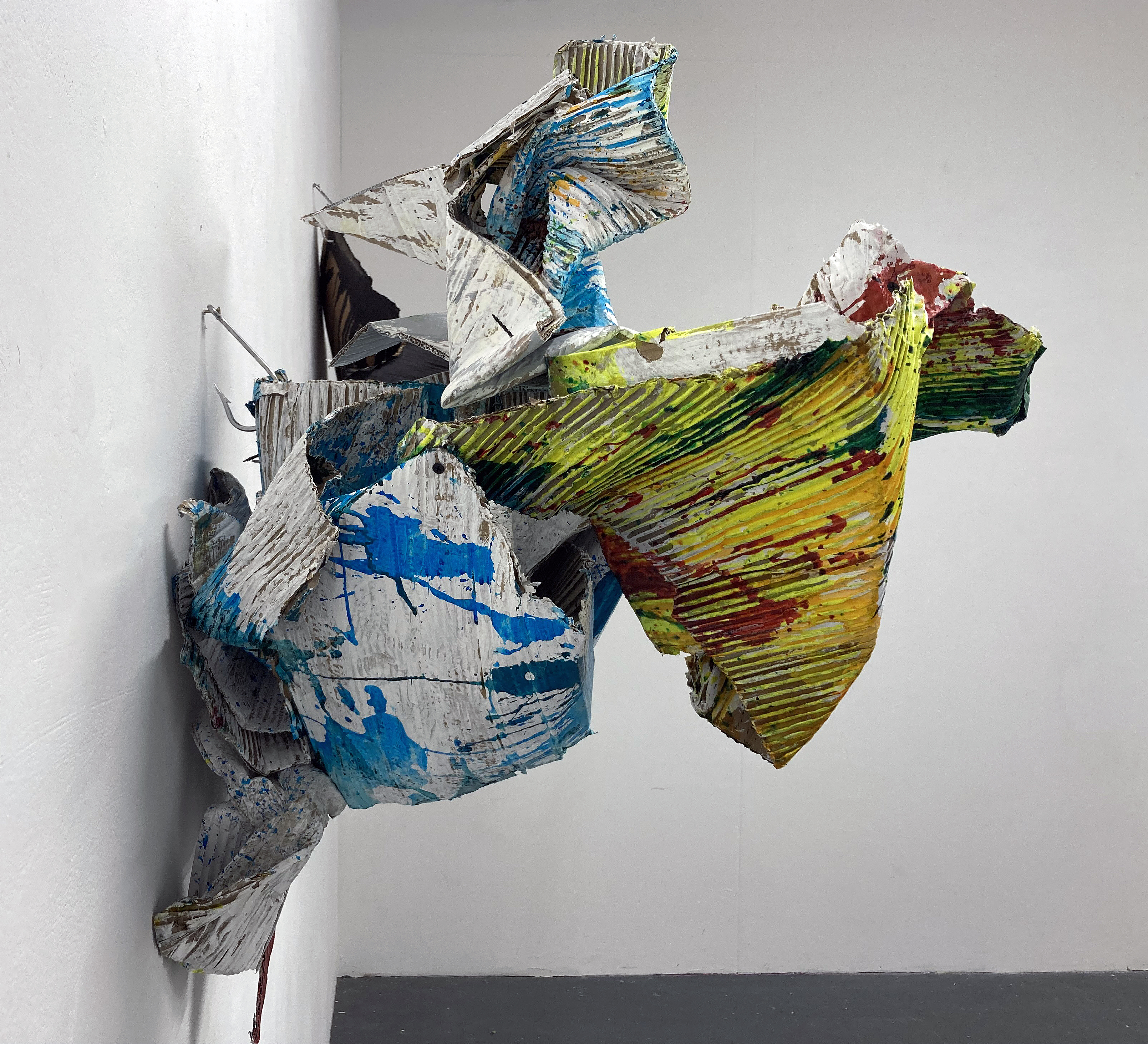
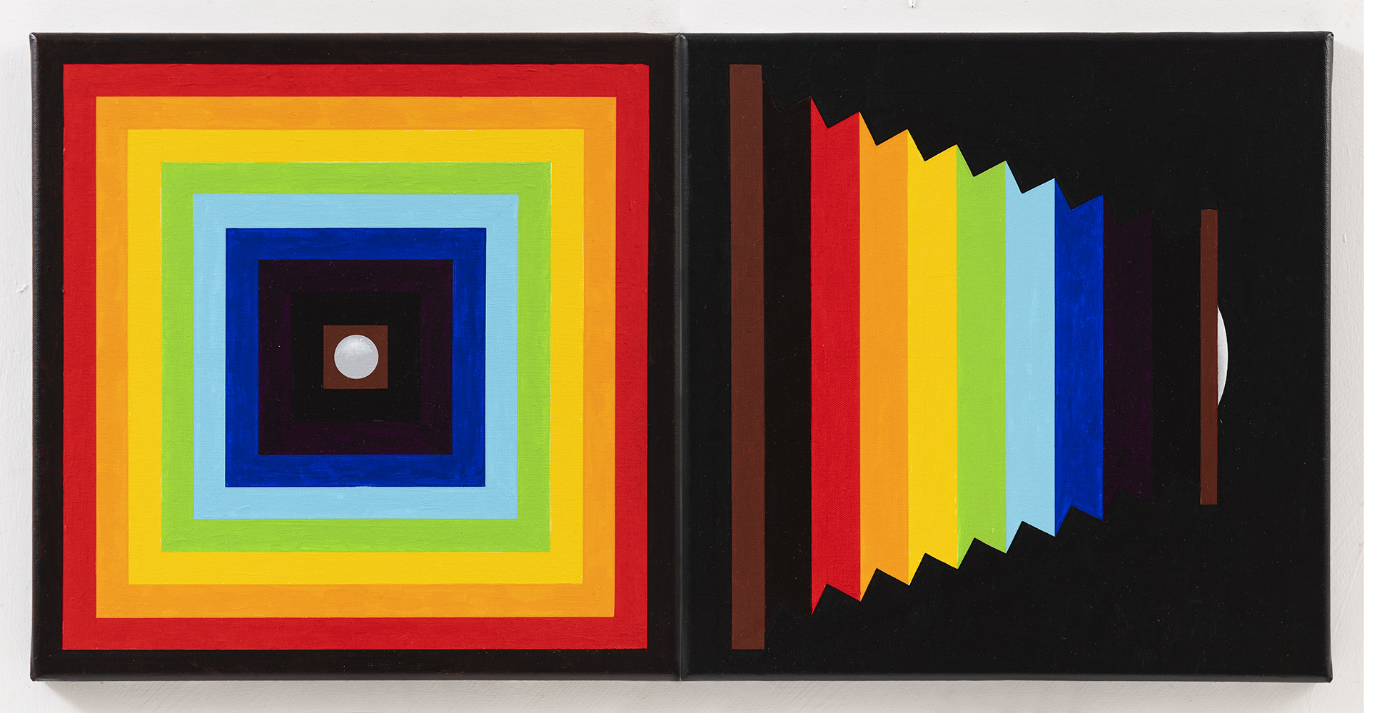
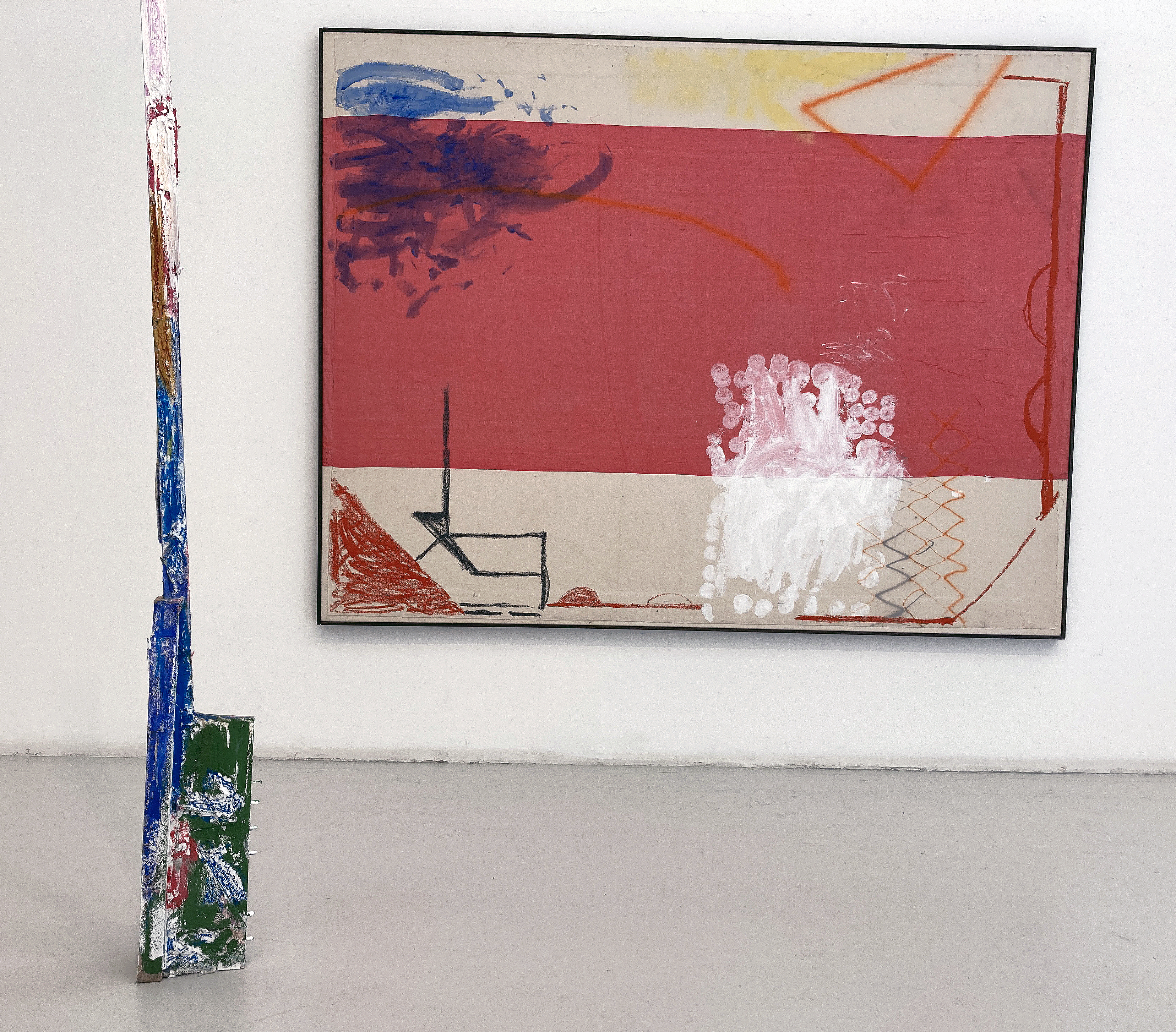
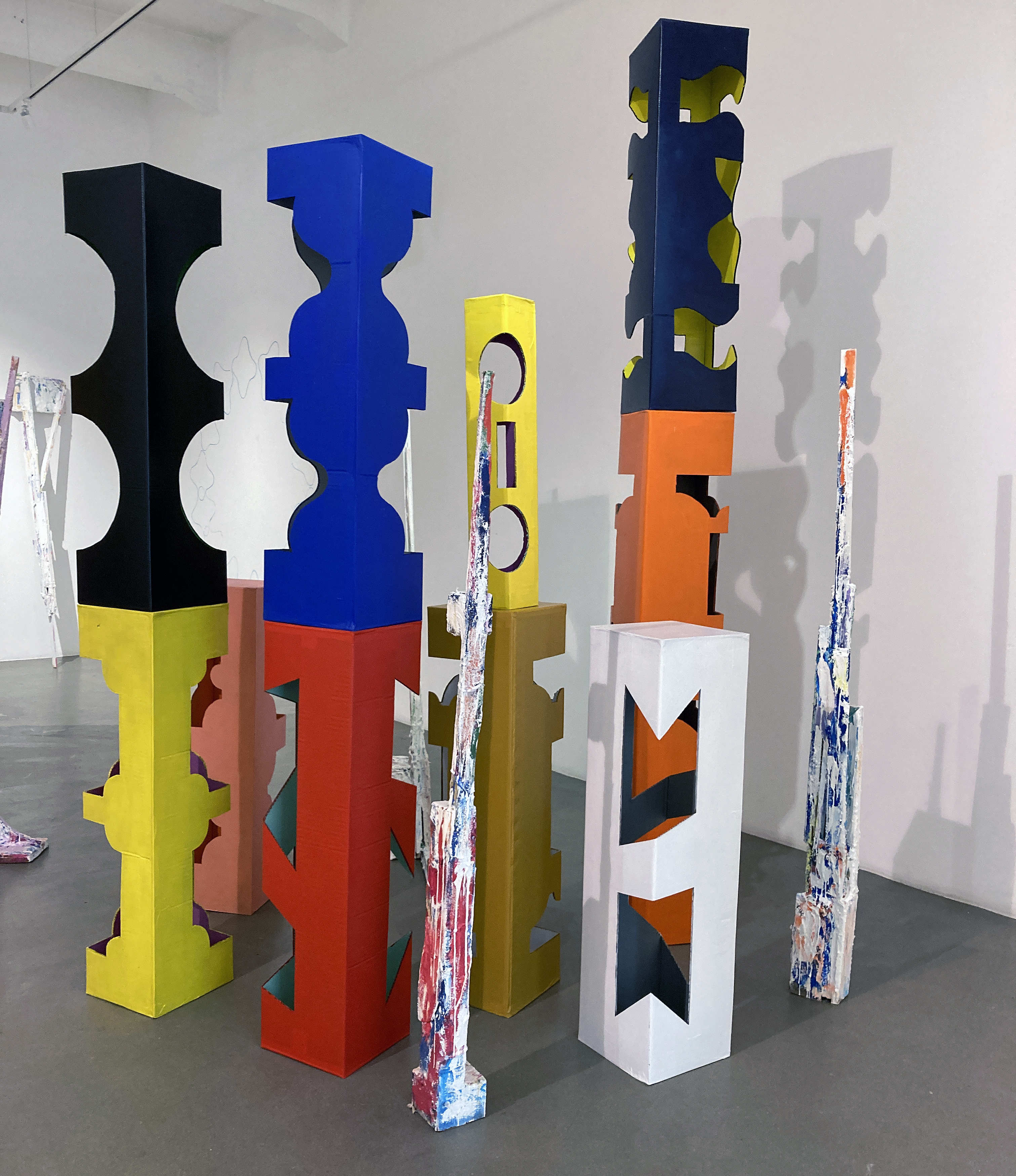
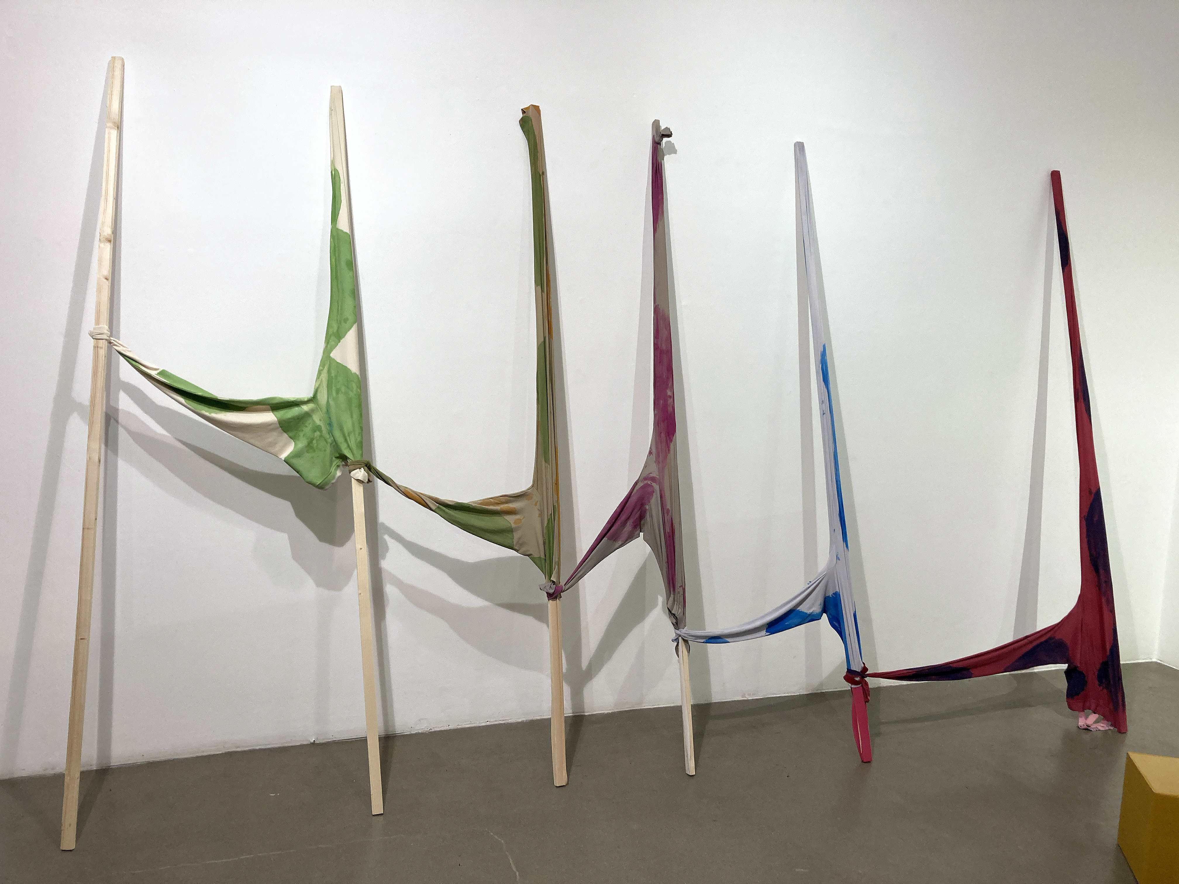
In both spaces the visitors can chat socially and also engage in responding to the works displayed. There is certainly an atmosphere of excitement and respect. Everyone seems well acquainted with Bunker’s oeuvre and it’s a compliment that they continue to come back for more. In current artspeak this is surely an interrelational situation. But it’s the actual works on formal display that truly matters today and if there’s a hint or nuance of hierarchy I get it from the four wall-hung sculptures that may turn out to be the precursors of what comes next.
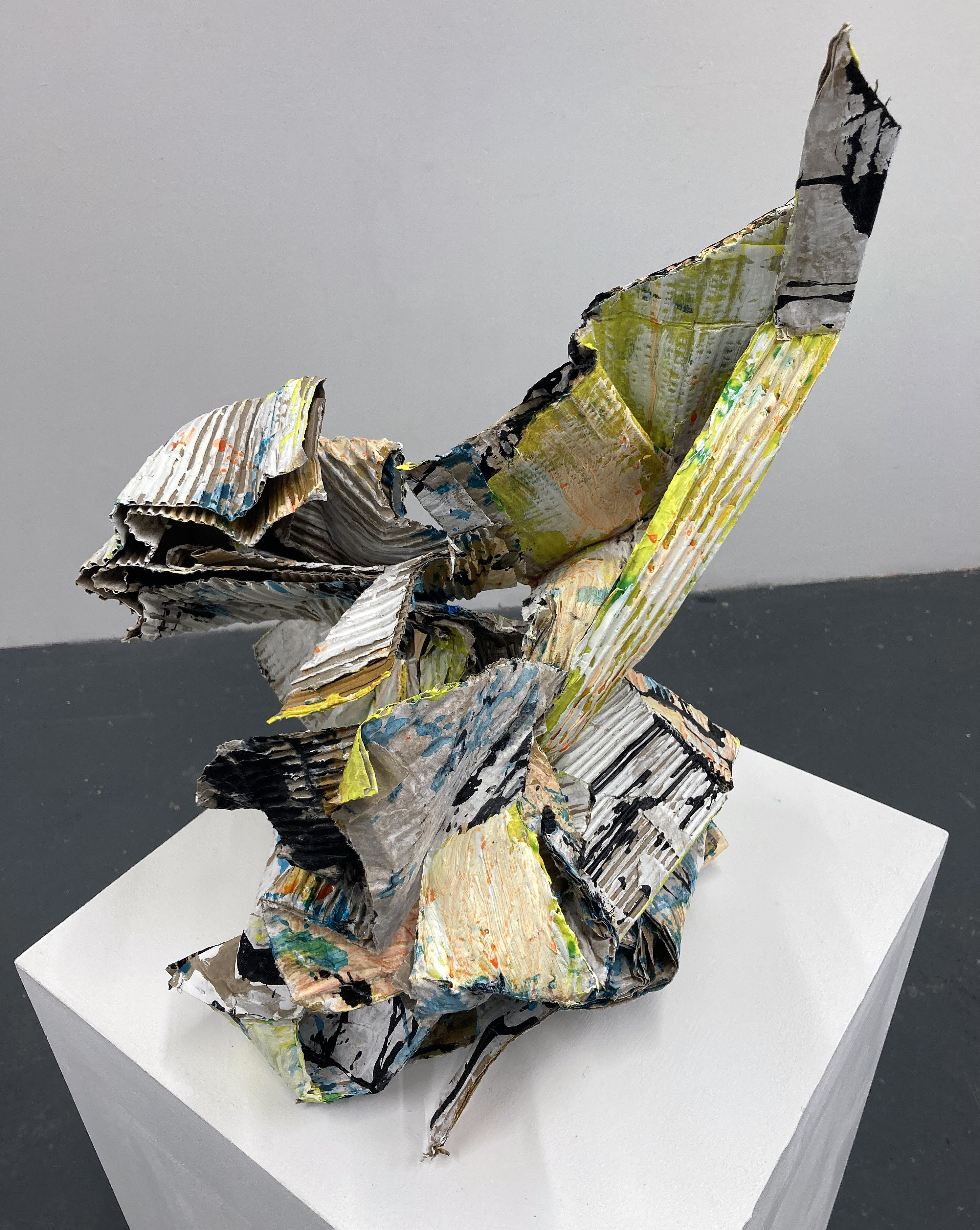
John Bunker – Mithras 2025
I have been fascinated by Bunker’s work for the best part of a decade after writing about TRIBE. New & recent collages by John Bunker at Westminster Reference Library in 2016 for Robin Greenwood’s much missed AbCrit. A significant number of artists, particularly painters and sculptors, continue the exploration and development of abstraction in the UK. In Bunker’s case, he plays (seriously, that is) in both camps, as the exhibition leaflet explains:
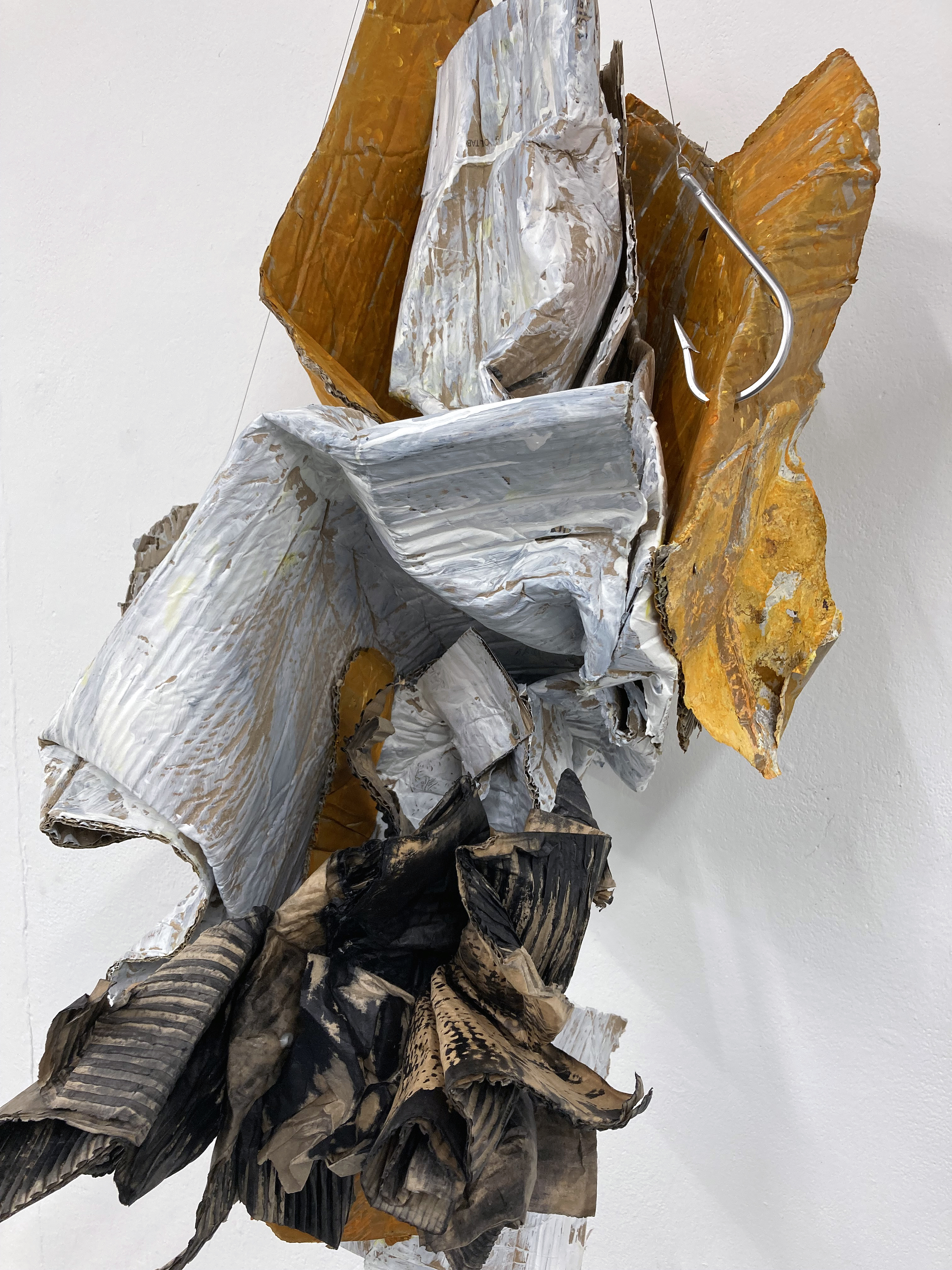
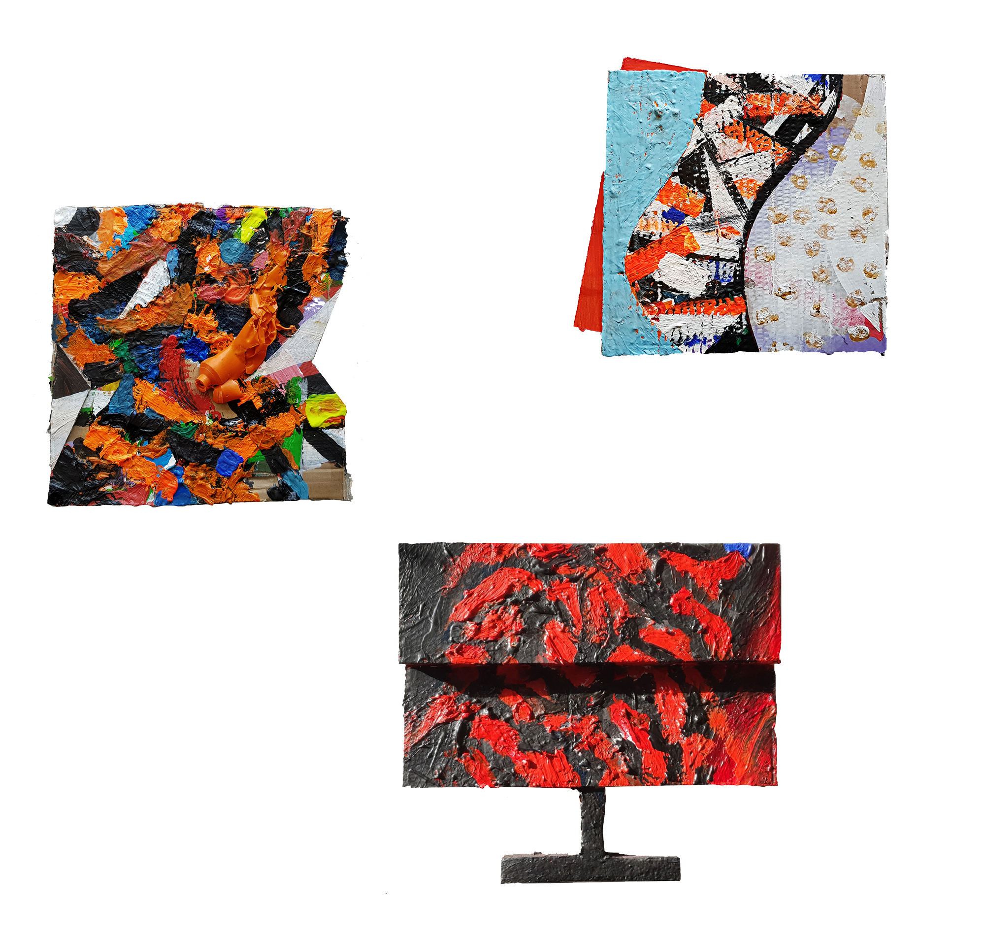
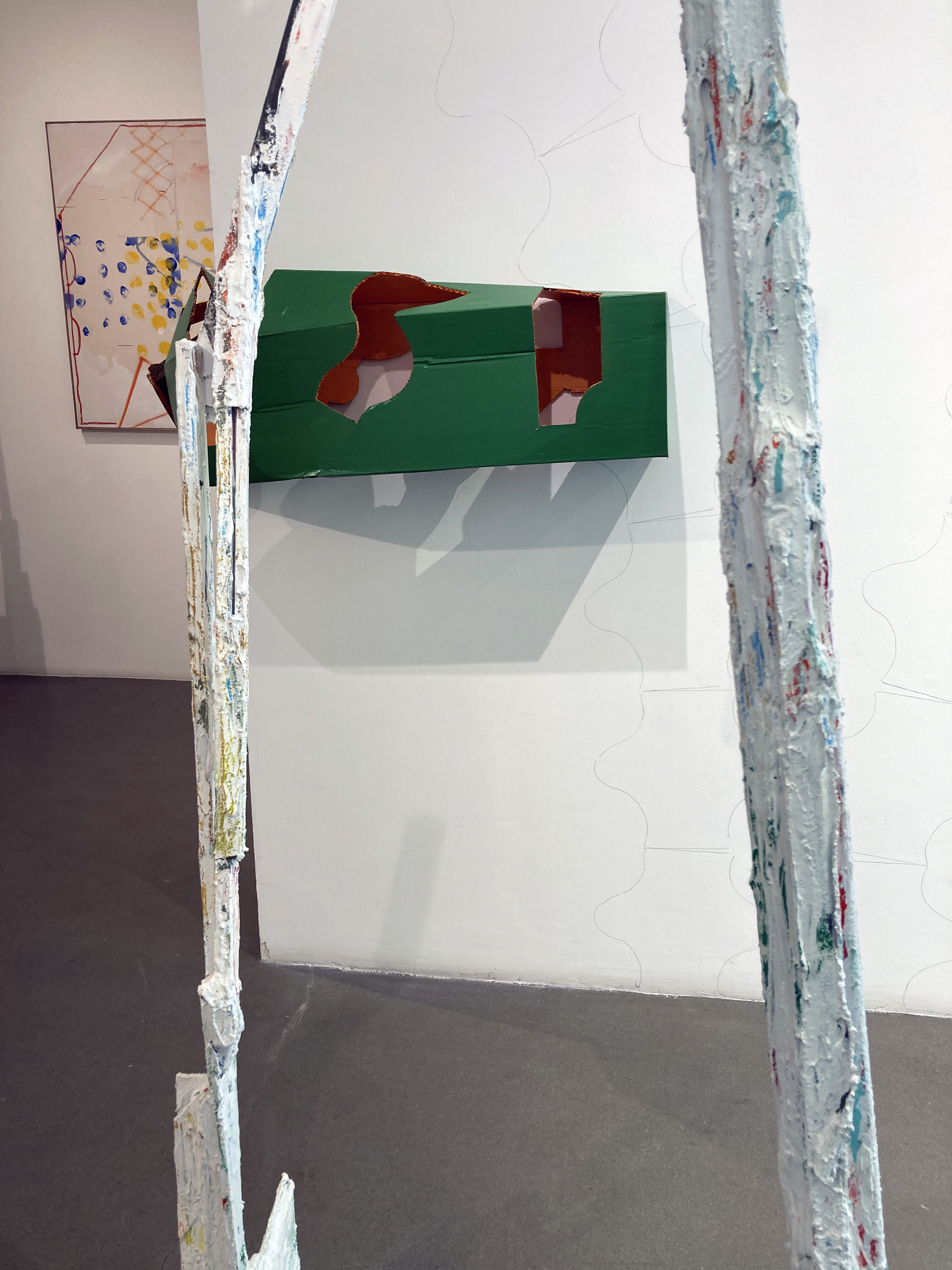
“Bunker’s abstractions are born of eccentric and paradoxical spaces that he has opened up between painting and sculpture. Known for his materially diverse approach to both disciplines, ‘Antinomies’ focuses down on cardboard. Bunker uses and abuses this ubiquitous everyday material by loading paint on its highly absorbent layered surfaces and, at the same time, engaging with it as a highly expressive sculptural material in its own right.”
This appeal, captivation, enchantment and enthralment with the phenomenon of a materially and visually based production of a cultural phenomenon we conveniently call ‘abstract art’ continues – despite the current expectation of a political correctness, a politicised demand from various quarters (including Higher Education), to engage with certain external convictions might blind the viewer to what the actual work contains, attains and demands of the viewer. Which, I guess, is my too wordy way of saying just look at the work! It is kind of purist, sure, but this is the real thing, in front of you – which maybe there is not enough of as we visually consume the (constructed and ready-made) world via the screen.
John Bunker – Rausch II 2025
Fellow painter, E.C. made an impassioned comment on her Instagram account after visiting Antinomies as:
“An antidote to the absurd, bloated gluttony, to the slick gallery shops and to the often frantic, frenzied and disinterested ambitions that can try to batter the life out of making… The kind of making that is about (to my mind) necessary and unfurling change and movement and not an efficiently quantifiable, capitalist product. Than goodness for this.” (EC 2025)
And added:
“I was thinking about the relationship to the wall and painting with some of these works and how they seem to occupy a cusp… slipping in and out of categories… imagining some sliding off the walls onto plinths or the floor. Where do things belong? Category crisis? Excellent!” (EC 2025)
In consciously looking at these works, most especially the wall hung sculptures and the two works on plinths I was captivated too. Comments from fellow viewers enforced this individual and collective sense of how engaging the new sculptures are. The eye/mind submerges into small spaces, pulled along by subdivisions of form and mass. Little distances, ins and outs, that pertains to the actual environment always in and around us. The paint is as much part of, as well as added to, the cardboard structures. The application is deliberately unfussy, hinting at the unpainterly but suggesting a conglomeration of parts or identities within the sculptural forms through the colour changes. There are dimensions that appear solid and still, but if you are in the zone, generate a sense of implied movement to quicken and invigorate. Are these works dedicated to physicality and consciousness? This is joyous and I wonder why. Is there not enough time? Get on with it, Bunker appears to be saying. Let’s make, share, manipulate and engage with materials in the world before we leave. So, yes joy, utter joy.
AFTER-IMAGE: Works inspired by the Brighton Museum & Art Gallery Collection
Window Gallery, Phoenix Art Space, Brighton
1 to 30 November 2025
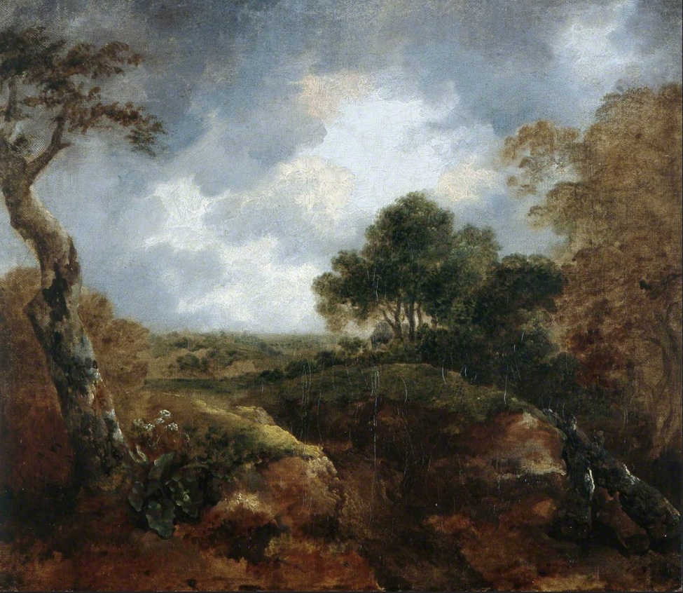
A few years ago, as a break from the painting studio, I had visited the nearby Brighton Museum & Art Gallery to view the Prof. Paul Heyer bequest that includes works by Jules Olitski, Frank Stella and Larry Poons. Just before leaving, whilst still in front of the Olitski, I noticed a lonely painting from an adjoining gallery that I imagined waving at me, perhaps exclaiming, “Hey, look at me – I’m a modern painting too!”
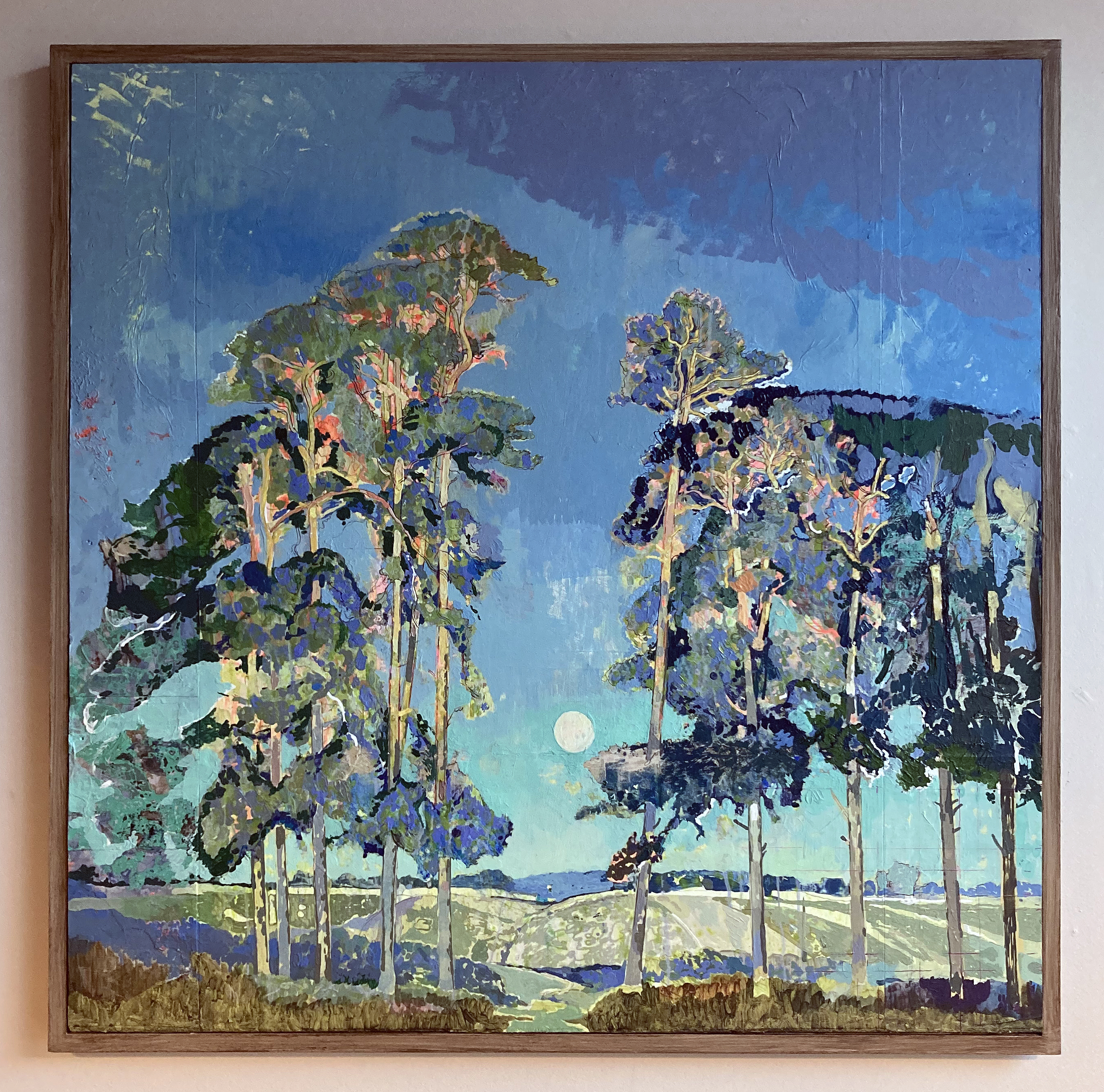
I went straight over to this relatively small oil painting, encased in a dominating gold leafed frame, already sensing something special. It was a landscape by Thomas Gainsborough. The experience reinforced a belief I have that all paintings have a potential to remain vital and relevant today – for painters and viewers alike. So its production date during the 1740s when he was still developing his skills was not an issue. This is a somewhat intuitive notion – but Gainsborough sets the bar for painting (not only landscape imagery) way back in the 18th century. He may well have his technical equals today, but there’s none better. Nor do visually powerful paintings have to be as big as the painters of the New York School often produced.
My first photograph of Gainsborough’s Open Landscape at the Edge of a Wood 1744-45 Brighton Museum & Art Gallery collection
This intriguing painting by Gainsborough, Open Landscape at the Edge of a Wood, lacks the presence of human figures (referencing the Classical Antique tradition that earlier generations of painters indulged in, or including the so-called peasants or the wealthy landowners of the day, such as Mr. and Mrs. Andrews), sometimes seen in his works. Though it has that constructed feel so typical of the European tradition of landscape imagery (post-Claude), an informal sense of place prevails. The viewer is invited to gaze upon the corner of a field, some local Suffolk woodland I assume, and the typically cloudy English sky. The implied narrative might be concerned with the everyday, as the artist invites the viewer to appreciate the countryside. I took a photograph with my new iPhone that usefully recorded the date as October 20, 2017 at 15:38.
I decided to revisit my photograph of the painting in 2024 after I received the go ahead to curate the AFTER-IMAGE exhibition for the Window Gallery at the Phoenix Art Space with the inclusion of other studio members. (An earlier proposal in 2022 had been rejected, perhaps because I was eying up the larger Main Gallery and lacked the funds to rent the space.) The prompt to my Phoenix contemporaries was for them to visit the Museum and to choose anything to react to in whatever way they wished.
One of the benefits of having a studio at the Phoenix is its close vicinity to the Museum and Art Gallery, where a publically owned collection of artworks are available to see all year round, subject to curatorial changes and re-hangs. I decided to stick with my choice of the Gainsborough landscape despite temptations to respond to other works that also drew my attention. The fact that it has not been on display for a while was not an issue as I had my photograph and the memory of that encounter eight years ago. In fact, a kind offer by Laurie Bassam (Curator of Decorative & Fine Art) from the museum was not taken up to get the painting out of storage, as I preferred not to see the Gainsborough in the flesh quite yet. I had my photograph and my visual recollection. Yet I would, of course, maintain that it is always necessary for artists to see and experience original artworks ‘in the flesh’, rather than only in print and/or online. Painters, and photographers, are typically well aware of the history behind their respective practices and engage with displays of original works in a way that others may not. Any reaction can be to emulate, to be inspired by, or to creatively adjust and re-present or re-order subject matter for one’s own purposes. Imagery and objects from the past will therefore be linked to the present either directly or more obliquely, depending on the inclination of the invested observer. The remit gave this small group from the Phoenix the opportunity to produce whatever they wished. I expected a wide range of responses, and have not been disappointed. I asked each in the group to write a brief (or not so brief) statement to explain their respective choices of works to respond to. With some respectful editing, and starting with the photographers, here is what they had to say:
Statements from the exhibitors:
Murray Ballard – Black Rock, Brighton. C type print.
Murray Ballard – Black Rock, Brighton
Jacques-Émile Blanche – Black Rock, Brighton, East Sussex (1938) Image credit: Brighton & Hove Museums
Jacques-Émile Blanche’s painting of Black Rock, Brighton presents a composed summer scene, its figures formally dressed, children at play, artists at work along the shoreline. Returning to the same site with a large-format field camera, I was struck by the extent of its transformation. Once considered the eastern edge of Brighton, Black Rock has shifted through many identities: from coal-landing beach, to lido, and a gateway to the Marina. Today the space is often empty, yet on this occasion it served as the end point of a long-distance trail race. My photograph reflects on this layered history and the changing uses of place.
Fergus Heron – Ship Street Gardens, Brighton, England, 2016/2025. C type print.
Fergus Heron – Ship Street Gardens, Brighton, England, 2016/2025
George Dodgson Callow – The Chain Pier, Brighton (1856) Image credit: Brighton & Hove Museums
I am interested in how the places of the studio and museum offer different but related ways to imagine Brighton as an urban landscape through pictures. I was initially interested in the pictures of the chain pier by George Callow and another by John Fraser.
The connections with my works being relations of land and water, distance, scale, looking at structures from which looking is practiced and that change perspective on place.
Ship Street Gardens, Brighton is a colour photograph on paper showing a view to the west over rooftops in the Lanes area of Brighton. The image describes the appearance of relations between buildings and natural features in soft overcast light with a high degree of detail. A dialogue with George Callow’s painting Chain Pier, Brighton is offered by the photograph with contrasts including direction and viewpoint, plus the presence of the i360 as a modern ‘vertical pier’ and the absence of the beach. My photograph forms a landscape that brings coastal, urban, and new and old aspects of place into relation.
Perdita Sinclair – How the Whale Got His Throat and Gen 9. Both oil on canvas.
Perdita Sinclair – How the Whale Got His Throat
Ice Age Black Rock AI fictitious digital animation in The Elaine Evans Archaeology Gallery by Grant Cox of Artasmedia (2019) Image credit: Grant Cox and Brighton & Hove MuseumsJoe Tyler – Replica Saxon shield (2018) Image credit: Joe Tyler and Brighton & Hove Museums
Both the animation and the shield influenced both of my paintings, How the Whale Got His Throat and Gen 9. They made me think about how animals and landscapes are captured and recreated by humans using tools. The tool being something practical, like a shield or information animation, but the symbols of animals representing something psychological or spiritual, like a connection to deeptime. The paintings that I have in After-Image use the tool of AI to generate imagery and my own physical and psychological connection to Brighton and my home.
Perdita Sinclair – Gen 9
Denise Harrison – Water of Leith: Flow / Pause / Return. Acrylic on wood.
Denise Harrison – Waters of Leith: Flow / Pause / Return
In July, after the death of my sister, I spent three weeks alone by the Water of Leith in Edinburgh. This place, connected to my past, became somewhere I could be quiet and reflect. Each day I walked along the river or sat still in one spot, taking in the sounds, movement and atmosphere of the landscape. In my paintings, I translate sensations as well as views.
I was inspired by Ivon Hitchens’ painting, Forest and the way he immersed himself in his surroundings. I used acrylic paint on blocks of wood, adopting the panoramic format to reflect how the landscape is seen as a continuous space, without edges. Through gesture and colour, my paintings capture the feeling of being fully present in the landscape, where memory, grief and nature come together.
Bernard G. Mills – Bellows. Liquitex on canvas (diptych).
When viewing the work on a visit to the gallery and a talk about their twentieth century collection I was struck, not so much by the design, physical execution or colours in Red Scramble, but by the resemblance of Frank Stella’s painting’s concentric squares to the folds in a camera’s bellows. As I was (and am) engaged in producing a series of paintings that I call Photographic Paintings – paintings that relate to aspects of photography, I decided to incorporate the response to Stella’s piece with a diptych entitled Bellows.
I had originally decided to include twenty-four painting in the series (one has to draw a line somewhere) – either twenty-four or thirty-six (referring to the number of frames in a 35mm film cassette). With the Stella being a diptych, I decided to extend it to twenty-five because, in the interest of economy, if one loaded a 35mm film into a camera judiciously, one could squeeze in an extra exposure at the end of the film.
June Nelson – Fire Spotting, Where All Ladders Start and Every Rung Shone Strangely. All oil on canvas.
June Nelson – Fire Spotting(t/l), Where All Ladders Start (b/l)and Every Rung Shone Strangely (r)
Toyokuni Kunisada – Firemen performing acrobatic feats at New Year (1840) Image credit: Brighton & Hove Museums
My initial response to a Japanese woodcut depicting firemen performing acrobatic feats took the form of a few small paintings – direct transcriptions of the image. After a long break working on another series of paintings, I returned to the ladder motif. Evoking ideas of balance, emergence, precarity, and triumph, the ladder has become the starting point for a new body of work, comprising paintings and sculpture. These works extend threads from earlier explorations of “impossible objects”: mirrors that refuse to reflect, faces that cannot be fully seen and shadow ladders that offer no passage. Together they forge a shifting vocabulary that hovers between the literal and the illusory, the structural and the dreamlike.
Mike Stoakes – The Tyger, Tony the Tiger and Sporting Tigers. Mixed media.
Mike Stoakes – The Tyger, Tony the Tiger and Sporting Tigers. Mixed media.Munro and the Hungry Tiger from the Willett Collection of Popular Pottery (c.1825) Image credit: Brighton & Hove Museums
Though I’ve recently been working on the subject of my colonial past I have chosen this work for After Image out of pure interest. It represents an actual event where Hector/Hugh Sutherland Munro serving as a cadet for the East India Company was seized by the head and dragged away by a tiger, succumbing to his injuries even after the tiger was shot. The event was widely reported and subsequently (1820s) became the subject of a series of Staffordshire ceramic figures and more recently foreign fakes.
Not long after Munro’s death, Tipu Sultan of Mysore, who loathed the British, commissioned an automata of the incident that produced movement and wailing and growling noises activated by a crank. The body of the tiger also contained an organ. The styling of the piece draws on South Indian traditions of sculpture and is one example of many images Tipu caused to be made of British meeting their demise, with the tiger being a significant repeated personal motif. Uncannily the iconography of the tiger mauling a soldier had been used by him prior to the Munro tragedy. Tipu was killed by the British in a siege and his tiger brought to Britain as plunder and is now in the V&A. The style was likely the basis for the Staffordshire figures and the subject for William Blake’s poem The Tyger.
The work I have made uses the tiger image to explore human projection onto nature through various media representations. Three paintings each about 35cm square are titled The Tyger, Tony the Tiger and Sporting Tigers. The Tyger is from Blake’s poem in all likelihood inspired by the Munro story. Tony the Tiger is the Frosties breakfast cereal mascot who was animated with a Brooklyn accent – which gives him a name and location link to Tony Manera from Saturday Night Fever. Tony and the Esso tiger (in your tank) had cordial relations until Esso used it was to promote foodstuffs at which point the relationship became frosty. sporting tigers refers to a scene from if…. where Malcolm McDowell and Christine Noonan wrestle naked on the floor of a transport cafe impersonating tigers.
Julian Vilarrubi – Study for Moonrise on the Rape of Hastings. Oil on board.
And Studies for Moonrise I and II. Oil on paper.
Julian Vilarrubi – Study for Moonrise on the Rape of Hastings
Edward Louis Lawrenson – Moonrise on the Rape of Hastings, East Sussex (c.1920) Image credit: Brighton & Hove Museums
Caught in the liminal transition between day and night, the full moon ascends in direct opposition to the setting sun. The scene evokes an early evening in late September, sometime in the 1920s. The final warm, golden rays illuminate the treetops – light that is soon to yield to the cooler chromatic palette dominating the remainder of the composition. This fleeting equilibrium between sunlight and moonlight – the gradual succession of one form of illumination by another – imbues the image with a poetic transience. It captures the precise moment when day recedes and night begins its quiet ascent. The viewer becomes aware of the inevitable passing of time, as the low sun behind us slips beneath the horizon, signaling the arrival of autumn light and the encroaching darkness of the months ahead.
I first encountered this painting on 13 August 2023 at the Brighton Museum and Art Gallery. That single viewing has remained vividly imprinted in my memory. The work’s compositional and atmospheric qualities exerted such a profound influence on my painterly sensibility that I have since felt compelled to reproduce it, not as an act of imitation, but as an analytical engagement intended to uncover aspects of its making.
This undertaking is not an interpretation or a personal reimagining of the original. Rather, it represents a dialogue between my own practice and that of another painter. Through this process, I seek to concentrate on specific technical concerns allowing the act of reproduction to function as a form of enquiry. It is an attempt to locate, through practice, the intersections where two artistic methodologies might converge.
The objective is to study, replicate, and thereby understand how and why certain images resonate with such lasting intensity. Art museums provide a unique pedagogical context for such investigations: they preserve not only the works themselves but also the potential for experiential learning embedded within them. In this instance Lawrenson has already resolved many compositional decisions and I am thus liberated from considerations of subject or framing and can direct my attention entirely toward process, structure, and surface.
In total, my direct encounter with the painting amounted to less than ten minutes. My subsequent work has relied exclusively on photographic reproductions – an approach far from ideal. Reproductions inevitably introduce distortions of colour, scale, facture, and detail, yet they remain my only means of sustained engagement. As a student of historical painting practice, this project constitutes a deliberate methodological exercise: a means of interrogating pictorial construction, tonal balance, and chromatic harmony. By attempting to reconstruct the processes underpinning this work, I aim to absorb and internalise its lessons, thereby extending my own understanding of painting as both material practice and visual language.
Stig Evans – Unveil. Graphite and acrylic on canvas + curtain.
Stig Evans – Unveil
Philippe de Champaigne – St Veronica’s Veil (c.1640) Image credit: Brighton & Hove Museums
To “draw a curtain” can mean two apparently contradictory things: to pull it aside to reveal what it had concealed, and to pull it in front of an object, in order to hide it. To draw, and to paint, a curtain is thus both to cover and discover.
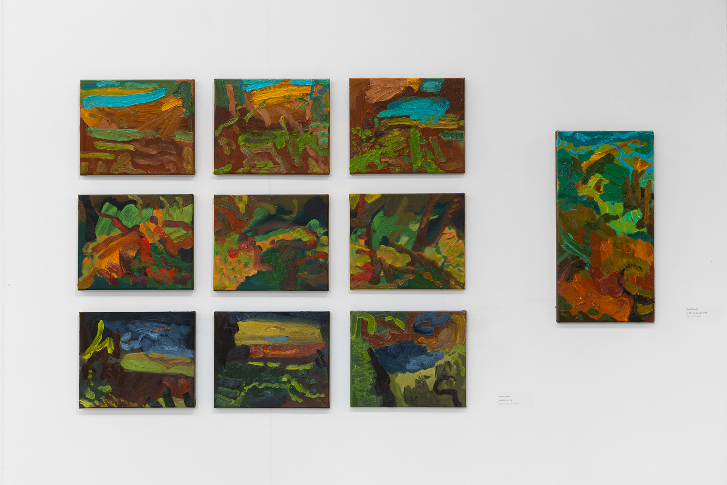
Geoff Hands – After Gainsborough I and II. Oil on canvas.
And Open Landscape (Oval). Oil on board/frame
Geoff Hands – After Gainsborough I
Thomas Gainsborough – Open Landscape at the Edge of a Wood (1744-45) Image credit: Brighton & Hove Museums
Gainsborough’s painting chose me, in a sense. As I explained in the AFTER-IMAGE essay (above), I was looking at works by Olitski, Stella and Poons from the Prof. Paul Heyer bequest and the almost unnoticed small oil painting beckoned me from afar. As a contemporary painter I am always on the lookout for paintings to excite me, irrespective of when they were produced. So I love visiting the National Gallery in London as much as visiting displays of new paintings in the contemporary and independent galleries. My focus on painters from the past increased during the Covid pandemic, perhaps because I was usefully confined to my Phoenix studio and a packed bookshelf of artist’s monographs kept in there. So I was looking at painters such as Caravaggio, Rubens, Watteau, Gainsborough and Gillian Ayers, particularly intrigued by pictorial composition. As much as content and historical readings are essential in understanding paintings from any era, I was particularly focused on the more formal aspects of painting. Not only in composition, but also in internal shapes, passages of light and dark, and just how the paint medium has been applied onto the surface. Looking with a fellow painter’s eye I guess, though not as an equal of course.
When the NG re-opened I visited the Titian: Love, Desire, Death exhibition and was also pleased to see Gainsborough’s Mr and Mrs Andrews for real in the general display. Later on, a postcard of Titian’s Perseus and Andromeda, bought from the NG shop, influenced my painting back in the studio. This attention to the image followed great discontent with a landscape painting made the day before, to which I now added the appropriated figures. Around this time, the experience of seeing the Gainsborough painting in the Brighton Museum in 2017 came back to me. So when the opportunity to make AFTER-IMAGE happen it felt appropriate to transcribe Open Landscape at the Edge of a Wood rather than another work from the Museum collection (I was also tempted by Ruskin Spear’s Brighton Beach and Gillian Ayres’ Sappho – and may yet produce something from either of these).
In addition to making three main transcriptions from the Gainsborough, a study entitled Open Landscape (Oval) integrated the frame that referenced seeing the Gainsborough in its historical gold frame, although I went with a more Hodgkinesque connection of the frame into the painting. In the AFTER-IMAGE exhibition I have hung this work slightly away from the main display as I am hoping that it is not immediately seen by visitors, but has that opportunity to say “Hey, look at me!”
Geoff Hands (October 2025)
Julian Vilarrubi – Studies for Moonrise I and II
Thanks:
Laurie Bassam and Lucy Faithful from Brighton Museum & Art Gallery
Laurence Hill and Ainoa Burgos Gonzalez from Phoenix Art Space
Installation assistance – Bernard G. Mills from Phoenix Art Space
If you are already familiar with the artwork of Louise Bristow and Russell Webb you will know how fastidious they both are in the craft of their art making. Their respective and uncompromising working practices demand scrupulous attention to detail and full command of their chosen materials, processes and subject matters. I had not previously considered their work being shown together, but here they are in and other trivial matters at the Gallery Dodo in Phoenix Art Space. The results are impressive, not least because they have installed their work in complimentary fashion without either dominating the other and with a careful juxtaposition of contrasting imagery and objects. The works link under a broad still-life categorisation with the small (life size) sculptures sitting comfortably with the reduced scale of painted objects depicted in the paintings. As is typical of the still-life genre the imagery can be as straightforward, or as loaded, as the artist intends and the viewer is able to interpret.
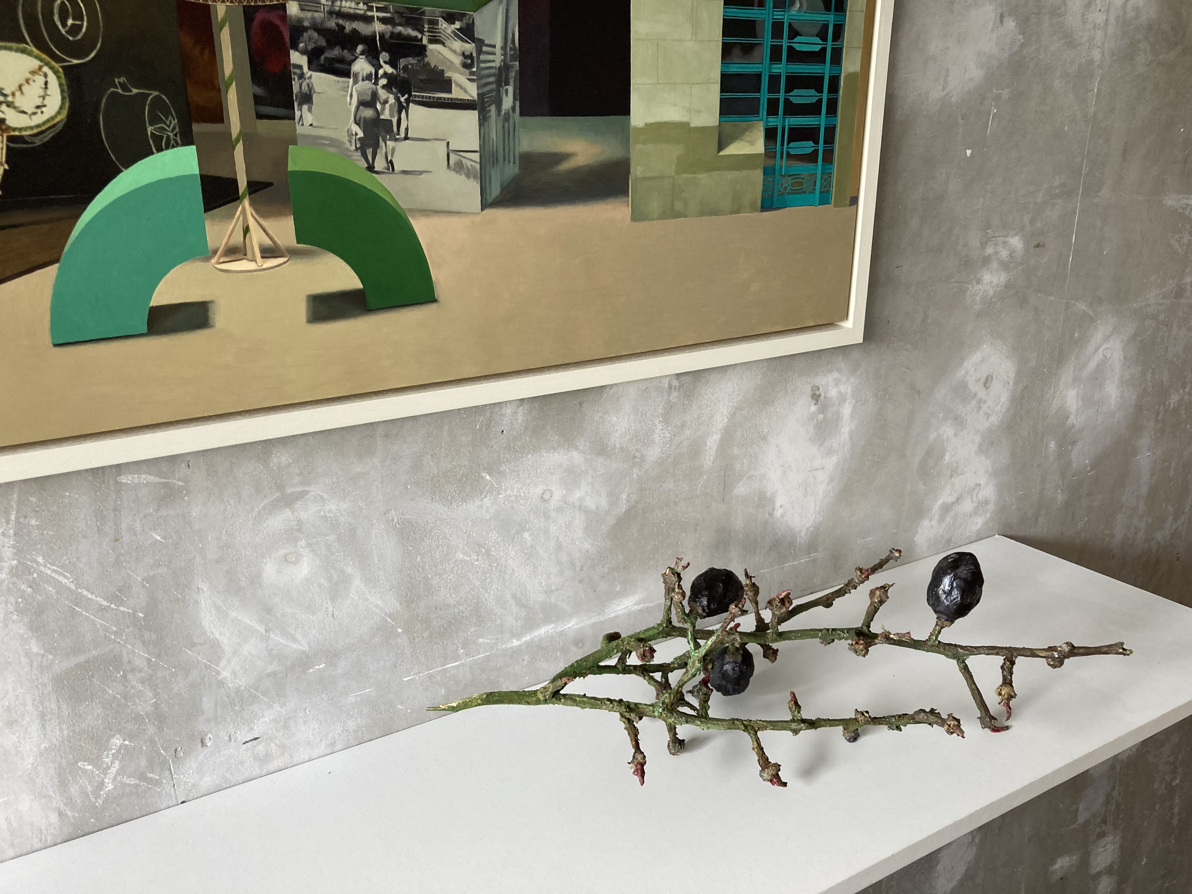
My initial visit to the exhibition was hurried and fleeting as I had my own studio to get to at the recent Phoenix Open Studios weekend for the Brighton Festival. A few days later I was able to return to the space and to peruse the contents for as long as was necessary. But that first fleeting visit was surprisingly useful, for a stick had stuck in my mind. This was Russell Webb’s Stick Surgery (viii) to be precise. For when is a stick not a stick? When it’s a (found) curtain pole, with sawdust and acrylic paint applied, of course. But when this combination of materials is transformed, or re-naturalised, into an object/ornament that you might display on your mantelpiece at home you must remember not to be deceived and put it on the open fire – or you will have lost a sculpture. Why the mantelpiece? Well that’s where one might typically display a found object from a countryside walk. An objet trouvé become perdu (holding aesthetic value) – maybe with a hint of the wabi-sabi aesthetic. But it’s not a found object; it’s a sculpture, I dare say, of the unmonumental category. So whilst it references the natural and the everyday, the quotidian in contemporary artspeak, as a designed or constructed object it may have a different sense of value to the found object. At which point I am getting confused between any old stick and the one that the artist has made. Is this his intention?
A mental fixation on just one piece of artwork encountered at the start of an exhibition is rare in my experience, as I have a habit to scan for an initial impression and to have a walk around to acclimatise myself. But as the Gallery Dodo space is relatively small, and I was pushed for time, this particular example of Webb’s selected pieces caught my attention first. Of course, in contrast to noticing this one individual item, I was also aware that, in a sense, the whole room was full of objects. In addition to the thirteen three-dimensional objects displayed on four shelves there were over forty still-life items represented in the four paintings. A return was clearly required.
Sitting in the Dodo space on my own for a private viewing a few days later was immediately quite calming. My inclination was to just relax and look, scribble a few notes as preparation for this review, and try to dismiss personal expectations. Simply respond to the physical content before me. Whenever I look at Louise Bristow’s paintings I slip into a state of calm anyway. They are so quiet, not even a hum emanates even if the imagery, a painting of a photograph perhaps, suggests a particular soundtrack from the contextual content. But this is not a display to sit and look at from a distance. It is imperative to stand up and move closer to each of the four groupings of an individual painting with various sculptural forms arranged on a shelf beneath the image. Both sets of work invoke an admiration of how they have been painted. In a sense, they are super-realist – though certainly not photo-realist. Webb’s sculptures might be termed as object-realist. They are utterly convincing as being the real thing, such as the orange peel or the piece of string. There is a common factor of the discarded, damaged or moving beyond some notion of a perfect state (e.g. Venus Figure – a slightly over ripe pear that appears to be tottering in terms of balance and tastiness) in his selection of reproduced items. They might typically be found in the kitchen, the garden shed, on the street or from that aforementioned woodland walk.
His titles are fundamentally important too: Lost Memory (a knotted length of material), LittleVictories (two successfully removed orange peels that each remain as one piece of skin), or FamilyTree, a broken off twig with three shrivelling berries remaining and the slightly spiky and pointed receptacle bases of the original flower where the missing berries developed. The titles can be nostalgic, jokey or deep. Aspiration (Manet) might reveal the aspiration of the young art student or the long-standing ideal of the older painter. His titles certainly guide the viewer towards a particular thought or interpretation.
Bristow’s titles are also loaded with possibilities of analysis and exposition. There is also an element of nostalgia in the mid and eastern European and Soviet imagery where (for example) education, high-art, architectural design and social housing meet political idealism. On a formal level, the figurative-realist visual language of Bristow’s paintings appears to invoke that notion of apparent ‘reality’ that might align with objectivity. The People’s Forum, Red Vienna, CommonMarket and Playground are titles that certainly suggest further reading and investigation. But here, as paintings, and as objects, they invoke speculation and demand time for thought, probably over a long period of time. By implication, as observers of ‘art’ in a gallery, we might by extension question our own society today and critically consider our received political and social ideals and inspirations. But let’s not go down that rabbit hole now.
If one of Webb’s sticks remains in my memory, the image from Bristow’s paintings that stays with me is a section in the top left quarter from The People’s Forum that is a torn out page from a book or magazine. It re-presents a black and white photograph of a small group of young school children. Three of the four kids hold up their paintings for others to see and admire. The child (a girl?) in the top left corner of the composition looks at the photographer, and by extension us the viewers, so many years later. We might wonder who this person and the other young people were. What did they go on to achieve later in life, where did they live and what society were they were a part of. An objectively painted image (a reproduction) of a non-digital, black and white photographic print earlier reproduced in a physical publication might, semantically, become very subjective of course. It would also be a mistake to distance this image from the rest of the composition, visually engineered by the artist. What are we to make of another image of older (but maybe relatively young) people holding up small books? A few figures in the foreground are in focus with an out of focus background suggesting another photographic source, albeit in colour (maybe suggesting a later historical date than the aforementioned black and white photograph). Is that a sheet of wrapping paper on the tabletop? Does it introduce an element of nostalgia? What are those three-dimensional, architectural or modernistic objects doing there? Is that an ‘abstract’ type sculpture placed in the centre of the composition? None of Bristow’s compositions look random, in terms of content or compositional spacing. From the history of art, Piero della Francesca, Clara Peeters or the multi-talented El Lissitsky could well have inspired and guided her development as a painter – but she creates a voice of her own in the context of a politically complex world.
Physical objects (materialculture in Semiotic theory) are inevitably reconstructed and interpreted by the artist and the observer, in this instance via the still-life repertoire and the notional gallery space that Louise Bristow and Russell Webb have all too briefly occupied. A sense of the personal and the political shifts between and within these works. As an audience we might question what visual artists do, and how they do it – especially the painters in a digital age. Biased as I surely am, seeing 2-D and 3-D paintings as impressively skilful as these, I sense an argument for the continued relevance of painting that both references a deep history and provokes or coaxes the imagination of the viewer. There may be more to this show than meets the eye. Where’s Duchamp, when you need him…
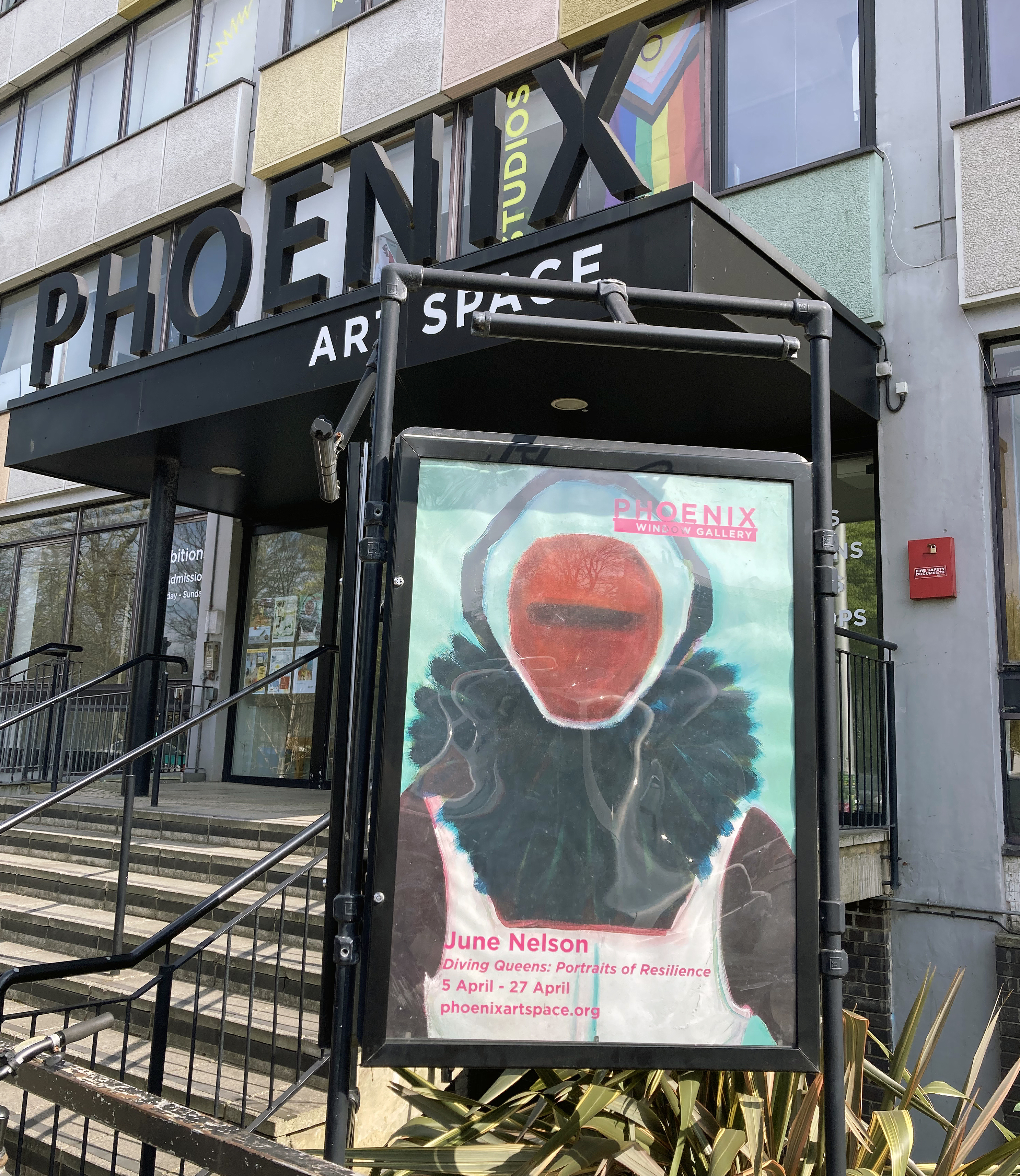
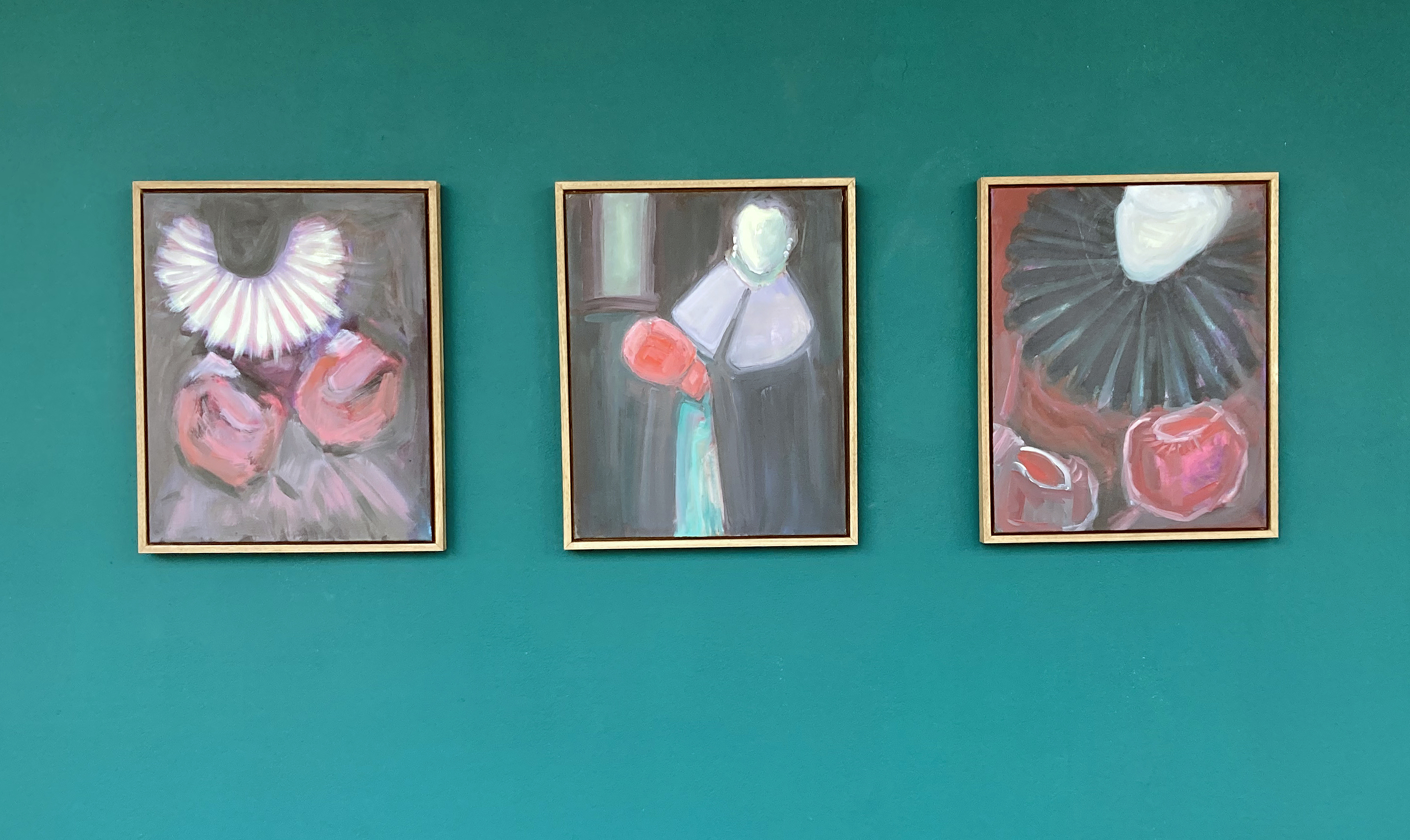
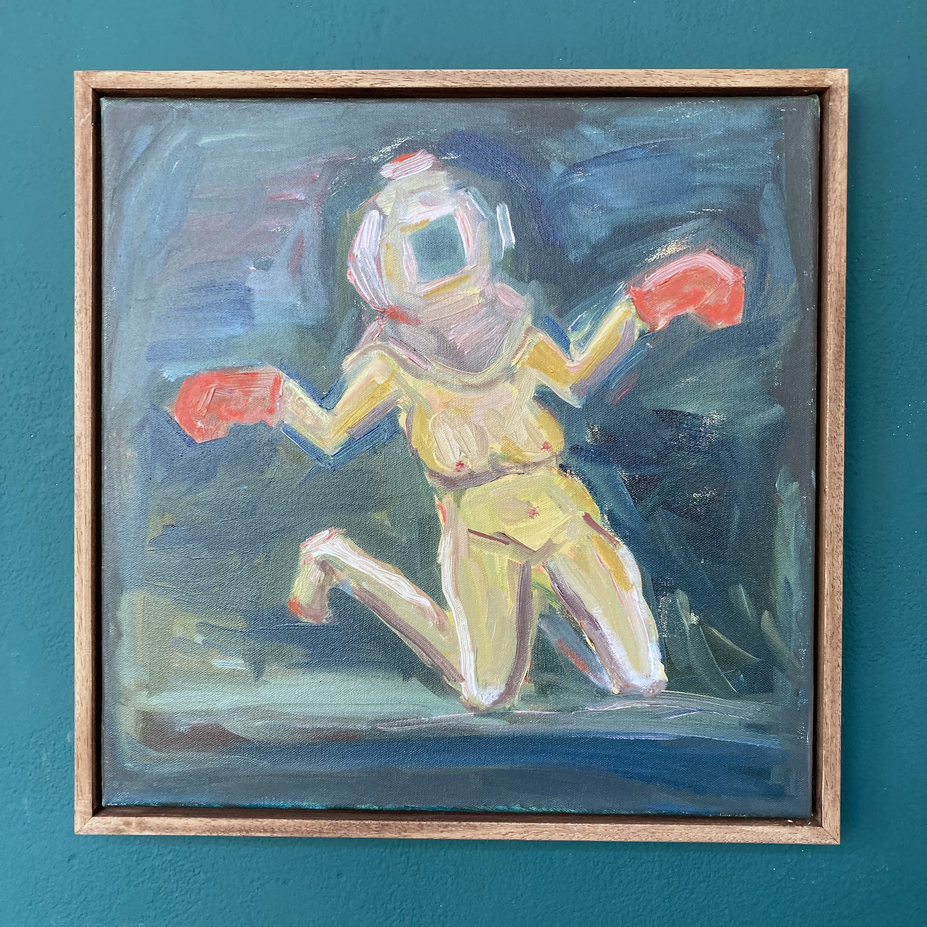
The gloves are off, or rather on. Diver’s helmets too, plus rigid ruffs and helmet-like attire from Elizabethan and Flemish portraiture. In this impactful exhibition by June Nelson the viewer will most certainly sense the presence of an implied wittiness and sense of humour conjoined in a serious and profound range of imagery.
The dramatis personae are unidentifiable as they are everywoman and, I surmise, the artist herself. It’s a clearly contemporary collection of works too, that take in historical references for the present day. What makes the choice of imagery for this exhibition at the Phoenix Art Space so pertinent for today are not only the almost cartoonish and comical images that might (but do not) undermine a serious visual discussion, but also forms a presentation of evidence of a dynamic and self-questioning undertaking aligning a feminist perspective with images to match. These portraits of resilience proclaim a contemporary voice operating from the painting studio, rather than from some alternative social media pulpit. Punches are not pulled.
June Nelson – Beyond Countenance, Regalia and At The Court of the Pugilist (all 2025)
Aligned to a notion of portraiture, that is in fact far from trite or superficial, the works create, with narrative devices such as gestures, gender related costume and the blank gaze, a stage on which to enlighten the viewer. In these sixteen paintings, Nelson holds back from presenting too much detail and is being cleverly and purposely simplistic in not overworking the visual language or the immediately readable content. There’s something here about proclaiming painting as relevant as any other medium too, with a feeling for the materiality of this colourful but sometimes crude substance that is what it is – just as any implied narrative is presented with a rawness of self-awareness and realisation through the crucial activity of painting. Paint, and painting, offers itself up as alchemical process, turning emotion, anger, thoughts and feelings (personal, social and, maybe, familial) into a positive, dynamic realisation and outcome.
In a statement on her website, Nelson has stated:
“I am fuelled by an interest in female agency and our sense of self, using history, mythology, and personal memories to stand witness to often hidden or silenced lives, particularly those of women.”
With this declaration in mind, I therefore assume that there is both a rallying cry, aimed at female observers who share a common sense of unfair, ingrained prejudices in society, alongside a wake up message to the male audience. This could be challenging subject matter for someone like me (a male, liberal, Late-Boomer) who likes to think that he is liberated from gender-based prejudices, when in fact he knows that he still has a lot to learn and to understand. Nelson therefore imposes, via engaging imagery and painterly expertise, a perspective and a position that should not be ignored or discounted.
June Nelson – Diver, Deep Brown (2024)
The artist further explains that:
“Recent paintings… continue to explore the same themes and motifs – seeing and silencing, suppression and repression. In a union of the personal and the historical, paintings portray women wearing deep-sea diving helmets, ruffs or boxing gloves. Often taking Tudor portraits or medieval ‘Doom” paintings as a starting point, uncanny faces gaze out at or hide from the viewer. As a modern woman looking back along the matriarchal line, not much has changed.”
This is certainly an absorbing theme and the exhibition, which initially invites a stroll from one end to the other in the corridor-type viewing space, has enough range to encourage looking at individual works as well as carefully selected groupings of pairings or threesomes. This display policy creates a healthy sense of the artworks as an ongoing project, with further possibilities for all sorts of juxtapositions or giving individual paintings their own space. There is both a sense of self and of belonging to a community offered up in this project. With similarities in content, such as entrapment, silencing, battling against the odds, and understandable frustration with progressive developments in ‘modern’ society changing so slowly, there is yet the sense of a series growing quite organically rather than as a too forcefully premeditated or programmatic endeavour. On a more individualistic level for the painter herself, I sensed that there is a form of self-revelation through the practice of being a visual artist, expanding and advancing a challenging discipline, which might always be on the verge of failure. I mean this in a positive context, as both an exploration into conditions of identity and as a necessary condition of painting.
June Nelson – Red Gloves (2024)
There is also a sense of the work-in-progress, as the artist engages in a creative studio-bound journey that is open to trial and error and who refuses to fall into the trap of producing some colourful decoration for the living-room wall. This, I hope, is the kind of project that makes the viewer stop and think, to be unsure, and even to be left feeling a little uncomfortable – particularly if the image initially looks somewhat humorous. For example, as in ‘Red Gloves’ that reveals a naked woman, not conventionally delivered for the male gaze, but almost as a take on a crucifixion of sorts. The outstretched arms, with red bulbous, stump-like ends representing boxing gloves, rather than blood, has a potentially defeated feel to it, but, ironically proclaims a rising strength of character.
June Nelson – Helping Hands (June 2024)
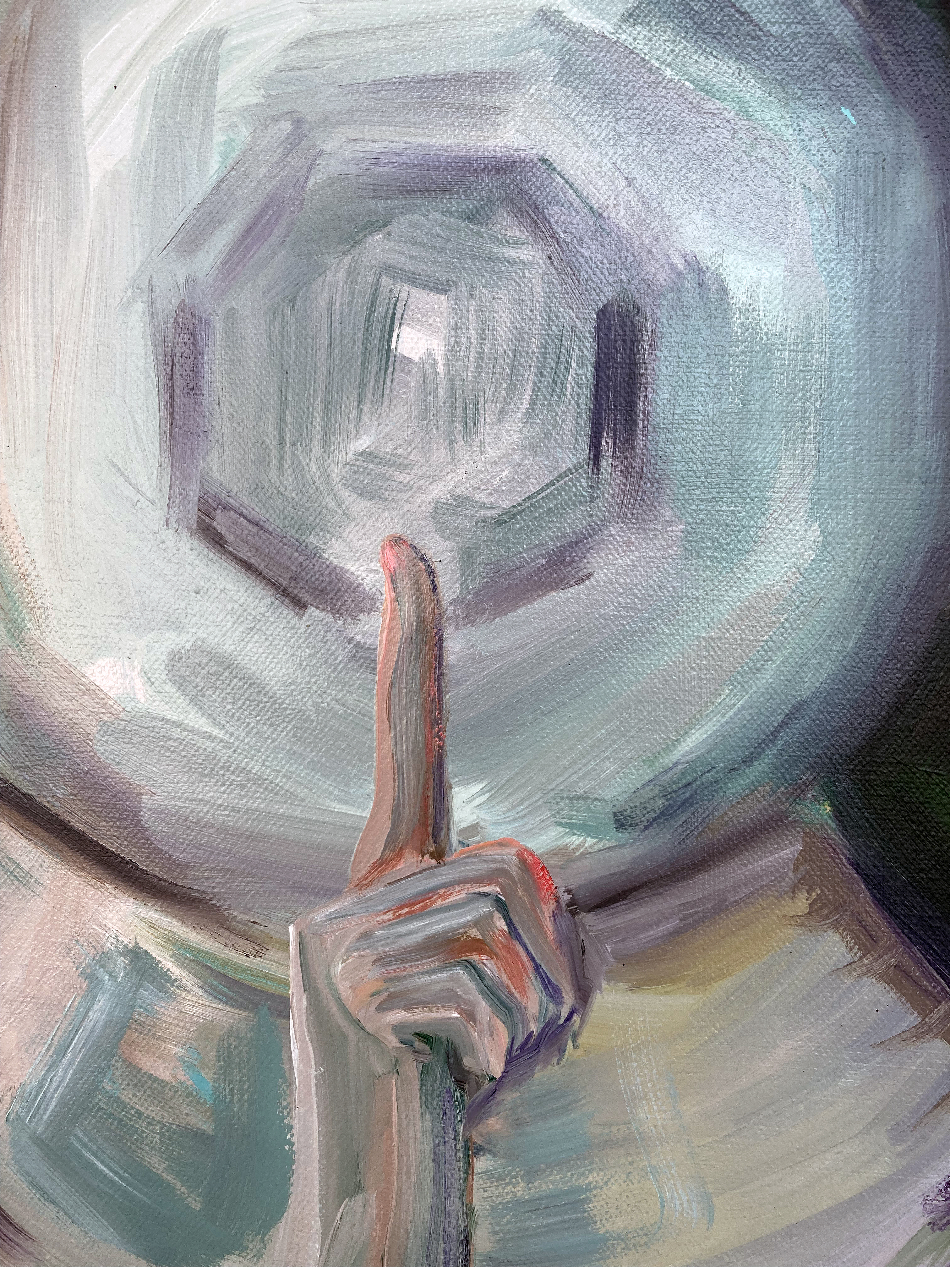
I also felt (but could be totally wrong) a measure of sadness and loss. This unexpected reaction initially emerged from a very small work, ‘Helping Hands’. This was not so much from the caring yellow hands that cradle either side of the outside of the diving helmet, but there is something about the paint application and the gently applied, painterly wash of blues and greys, with perhaps three horizontal strokes of the brush blanking out the eyes, that implied a melancholic theme. A greenish oval floats beneath the helmet like a brooch, a medal or a heart. There is enough scope here for the viewer to bring his or her own interpretation to a subtle yet robust image.
June Nelson – detail from Silence Sealed (2025)
Above this small work was a more immediate kind of message, a hand gesture implying secrecy or suppression, conveyed in ‘In Silence Sealed’. This striking portrait brought to mind the anonymous imagery of a nun from a silent order, with an almost halo-like disc that hid the face of the unaccredited portrait. Yet the icon-like image was not so much religious in a denominational sense, but more universal and quietly empowering, representing a vow of collective, female, knowingness. These are paintings well worth taking time out to see and to allow the imagery to enter one’s own thought-space. To prompt recollection of the roles, say, that our historical (and/or family) predecessors played, or that our contemporaries in society undertake today. Nelson’s characters form a sort of Commedia dell’arte for the past, the present and the future. But any implied comedic element is wittily and unambiguously turned into serious content. The female viewer is both in the ring and in the audience.
June Nelson – Diver, Deep Brown, Pink Diver and Diver, Jade (all 2024)
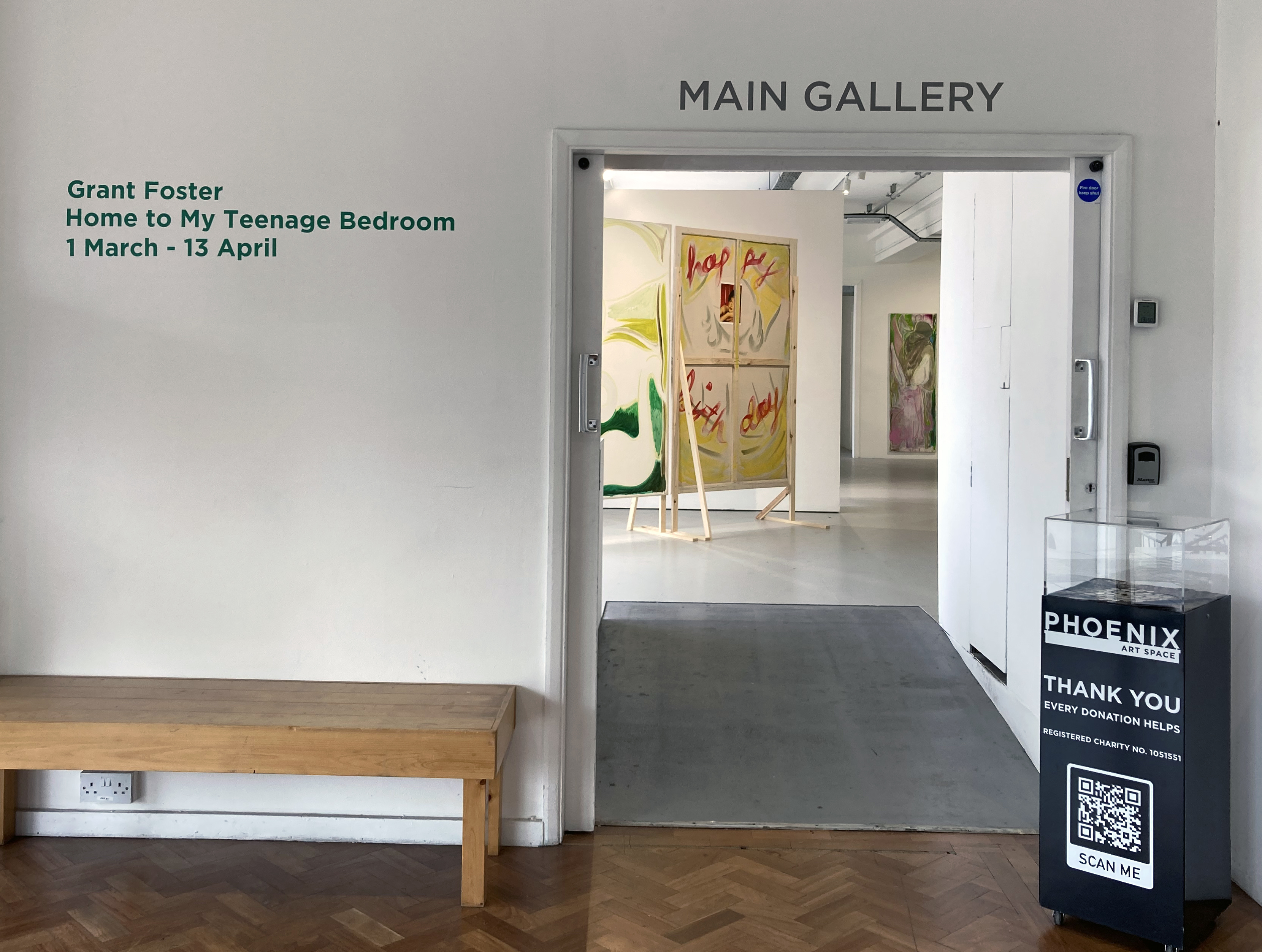
Often the best paintings, literature, music etc. take time to come through. The first impression may well be the one to not give too much credence to. A degree of complexity in any art form deserves a period of further thought. After five or six visits to Grant Foster’s exhibition at the Phoenix Art Space I know that I need to look again and again. This is good.
Q. What do you think about when you are looking at an exhibition of paintings?
What is the mind of any onlooker doing? Searching for something recognisable? Prepared and preconditioned by our shared culture we might be expecting something general or commonplace, such as a human figure, a landscape or objects constructing a narrative as a way into the work. What, potentially, could these visual references add up to? What might the storyline be, if there is one? And if the narrator/artist is describing something, making a serious statement or spinning a yarn, can you relate to the theme? Alternatively you might be more of a formalist with an eye for the aesthetic hit. The purely visual, via systems or improvisation, might be your thing. Either way, so-called content can be very complex or minimal. Of course, if the exhibition has a title you are already geared up with some expectations. Home To My Teenage Bedroom sounds perilously loaded.
There may be some idealised notion of preparing to see an exhibition as objectively as possible with the mind emptied. Ideally the extraneous thoughts of those other aspects of one’s life are put aside, at least for a while. It may be an artificial approach, but imagine entering a show with a mental blank slate. No preconceptions or expectations. What is experienced afresh? Nope. This is just not possible, or even desirable. Our various histories create our personalities (however flawed or enlightened) and enable a personal take on what we see and understand. In the case of this show we might consider that that teenage past was an under investigated portal that might throw some light onto who we became in adulthood. Grant Foster acknowledges this potentially rich period of life in a wall statement:
“It’s often said that our teenage years are the most decisive – our interests, obsessions, and passions are innocently formed and planted like seeds, taking root over time.”
But without any foreknowledge beyond the title of the show, visiting Foster’s exhibition at the Phoenix Art Space initially left me more impressed with the thoughtfully and dynamically prepared arrangement of works by the artist with the new Phoenix Art Space curator Laurence Hill, than with the paintings. I made no connection with the content, despite knowing the title of the show. I was surprised and sensed that this was a body of work requiring more viewings. In retrospect I guess I was a little overawed by the presentation. But I sensed that a few visits might be necessary, if only because my thoughts were probably too elsewhere – especially at an opening event that was extremely well attended as the crowds flooded in for three painting exhibitions under one roof.
Grant Foster – Nature V. Nurture (2024) Help (2023) back and Psychiatric Hospitals, Full, No. 3 (2020)
Back home at the computer keyboard I recalled my first visit, and an all too brief second pop-in the next day, by describing, albeit generally, those initial impressions. The earliest typed out observations prompted the following text:
The visitor very much walks into this exhibition. Into a structured, planned space – but not forced, obliged or coerced to travel in a particular way. This installation invites a weaving, walking, stopping and starting, slow dance in, around and even through the works. In the large main gallery the majority of the fifteen paintings are free standing, fixed on wooden structures that are equivalent to the human scale. Some have vertical poles, like spines, attached from floor to ceiling to prompt the visitor to actually touch the work of art and to carefully turn it around, thereby opening a door of sorts and changing the arrangement where, in two instances, accompanying canvases are set up next to each other as a triptych…
Grant Foster – St Francis (To the Stars) (Matter without Hierarchy) (2024)
But I was clearly missing so much more. On my third visit I found myself tuning in to the echoes of the art historical that, generally, permeates all contemporary painting. Plus, the painterly visual language and the way that Foster generally draws with the paint media – perhaps as an expression of his personality – was immersing me into the imagery. For example, in the four St. Francis paintings, representing statuesque Giotto-type figures that are placed as two separate implied diptychs on the walls, the paint application is fluid and almost shorthand. The figures have turned away from the viewer. Are we to follow – through some kind of portal? Then there is evidence, no more than implied, of other figurative content. A cat in one composition and a swan in another. There may be some wings too and a building type passageway where there might otherwise be legs. Is there a rural environment too, with a little taste of landscape beyond? The uncertainty must be deliberate.
Grant Foster – Nature v Nurture (2024) rear
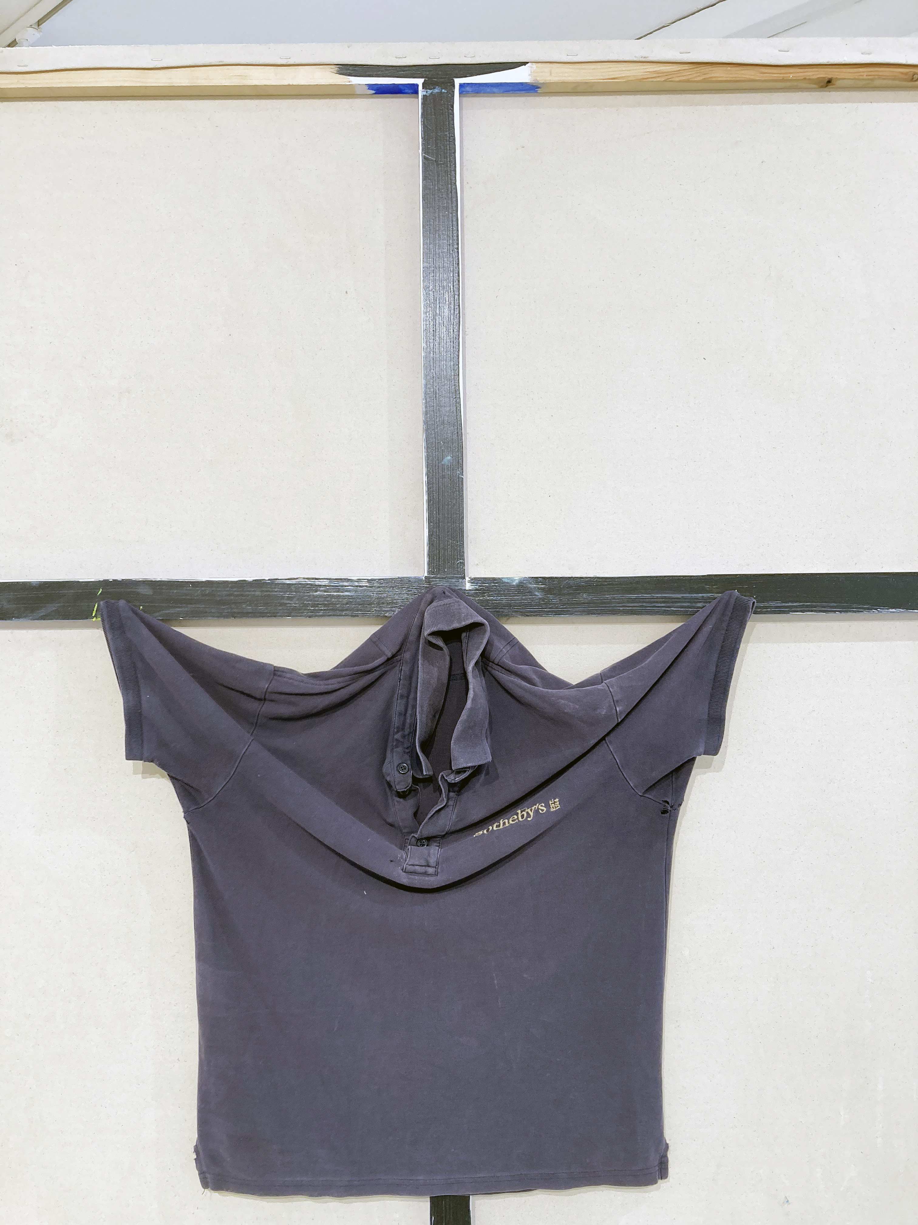
Another art historical reference might be the Sotheby’s work shirt fixed to the reverse of one of the freestanding canvases, Nature V Nurture, to suggest the Crucifixion. Perhaps I am reading too much into this, but others have made the same conclusion. On the front of this canvas a cartoon-like figure dressed in blue, but with red and black facial features appears animated by what might be two large yellow (psilocybin) mushrooms. This could be a retrospective self-portrait. It may not matter. Already, external contexts (facts or fictions) are expanding the reading of the works, even if I am mistaken. I am thinking again about the almost sketchy way that Foster applies the paint. In some of the works, many of them in fact, there’s a slightly underworked feel to the painterly execution, as if too much effort is to be avoided. This equates to a notebook-type intention, a formal device, which I interpret as a reference to a way of thinking and to the nature of mental recall. Events of the past, however strongly remembered or not, become a form of visual shorthand. Yet two canvases in particular stand out as comparatively overworked (even if they are not). These are Psychiatric Hospitals, Full, No 3 and Queendom which are each a part of two different floor-based triptychs.
Grant Foster – Nature v Nurture (2024) front
Each of these compositions appears quite different in subject and imagery. The former depicts a building (the hospital?) in mid-distance with a bloated pig-like character in the foreground, stood behind a table where a sad child sits with a discarded spoon and an empty bowl. In the latter, foregrounded figures appear to be involved in a judo move. Like the boy and table in the other painting these grappling forms are created with a squeezing out of white paint straight from the tube. Despite the two contrasting painting styles this incongruity works.
Grant Foster – Queendom (2024) front
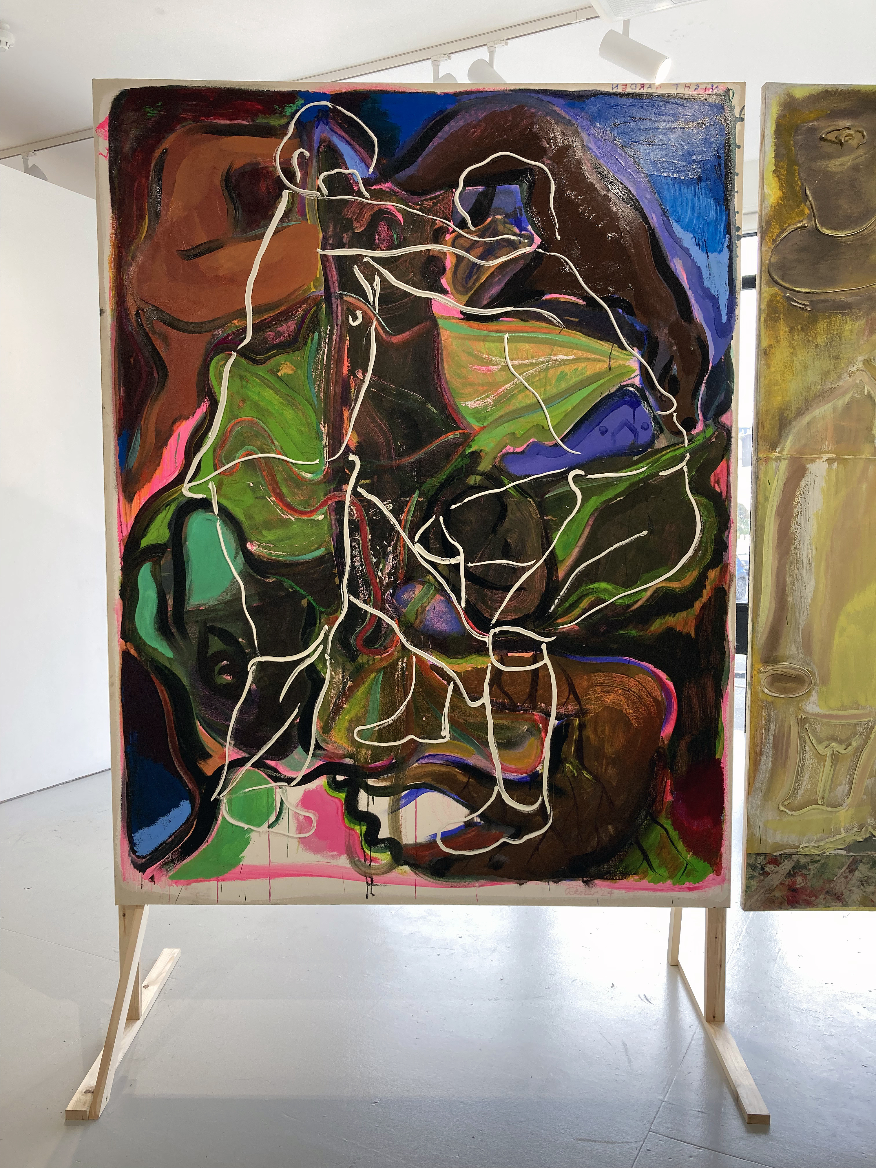
Queendom is the more complex, visually loaded image. Over time the observer will make out other forms including a naked figure in the top left corner (which reminds me of figures from both Titian and Matisse); two animal forms (formerly cartoon characters from a childhood comic book?) and even a flat smiley face symbol, albeit with a nose, just below the centre of the composition but in shadow. I am sure that there is more here to emerge from a ghostly, shroud like confusion that threads throughout the composition. The looking experience is truly durational, suggesting that more could well emerge.
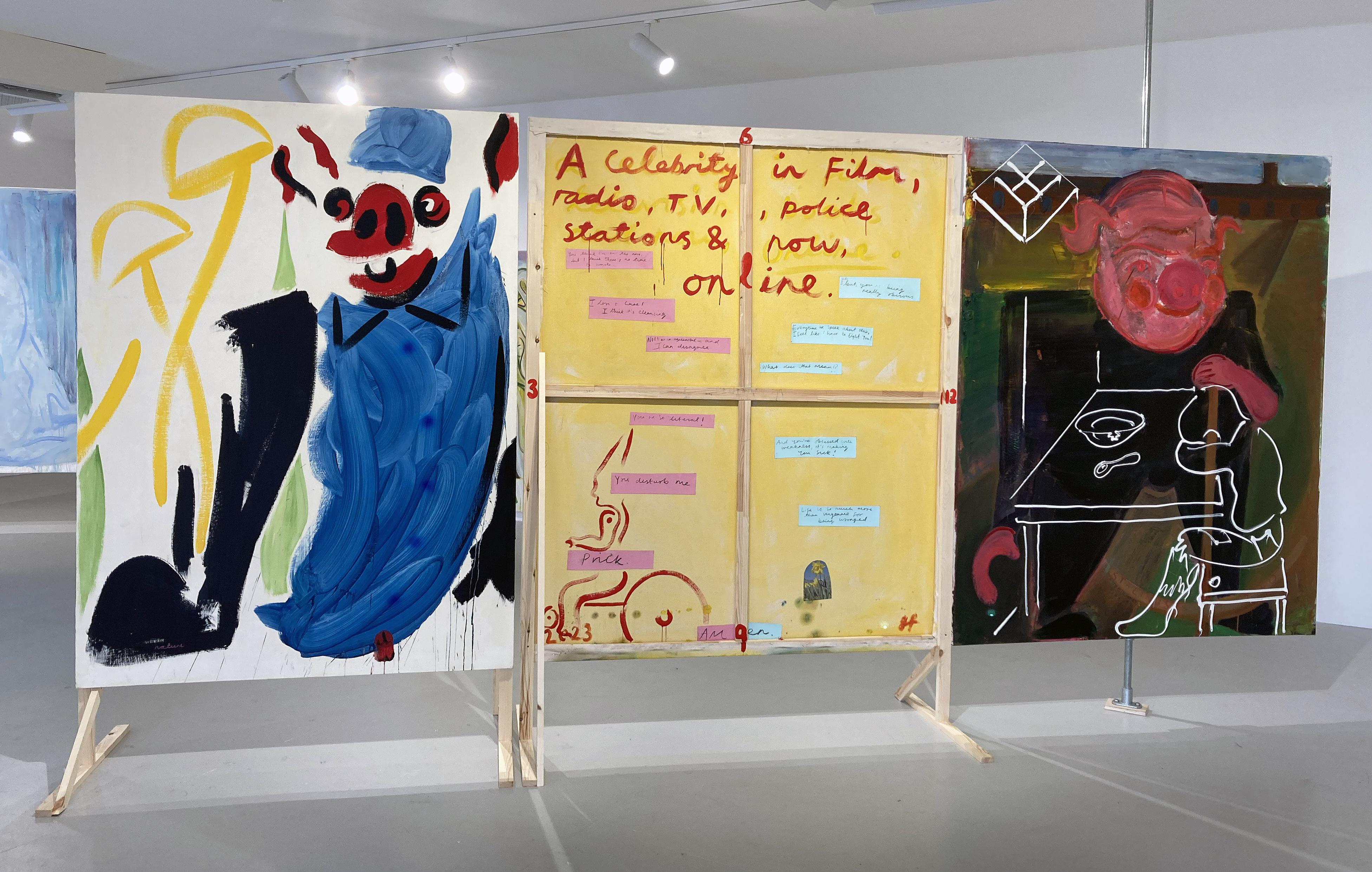
Grant Foster – Rat King (1576) (2024)
On this time-base note Rat King (1576), which has the de facto front pressed to the wall, adds a digital layer provided by the projection of the Telly with Mum video repeating every 43 seconds. This small element of the digital might be a pointer to future developments in Foster’s work – or a remnant of a past engagement with the once trendy art college digital projections that can be somewhat passé. But the projected content does provide a moving image element of collage that references watching television, which was the precursor to the computer screen and now the mobile devices that cling to our hands like an extra organ, back when Foster was a teenager.
Which brings us to a literal emergence: the backs of the paintings. The majority of the works have backs to be viewed as additional fronts, which will be an interesting challenge for collectors of Foster’s works. The convention of writing a title and adding a signature on the reverse of the canvas is developed from what might be seen as the private space (like a sketchbook or a notebook) that actually wants to be quite public. With the further addition of painted imagery, photographs and extended text, they are clearly beyond being auxiliary or supplemental to the conventionally expected paintings made on the front of the canvases. The stand out rear view to me was on Help, which included a small printed image of a daffodil, a painted pixie-type figure riding a bicycle, a possibly alternative title (‘A celebrity in film, radio, TV, police stations & now online’) and a conversational collage of hand written text that was a recalling of a conversation between the artist and his partner. Foster’s jokiness feels deadly serious.
Grant Foster – Help (2023) reverse
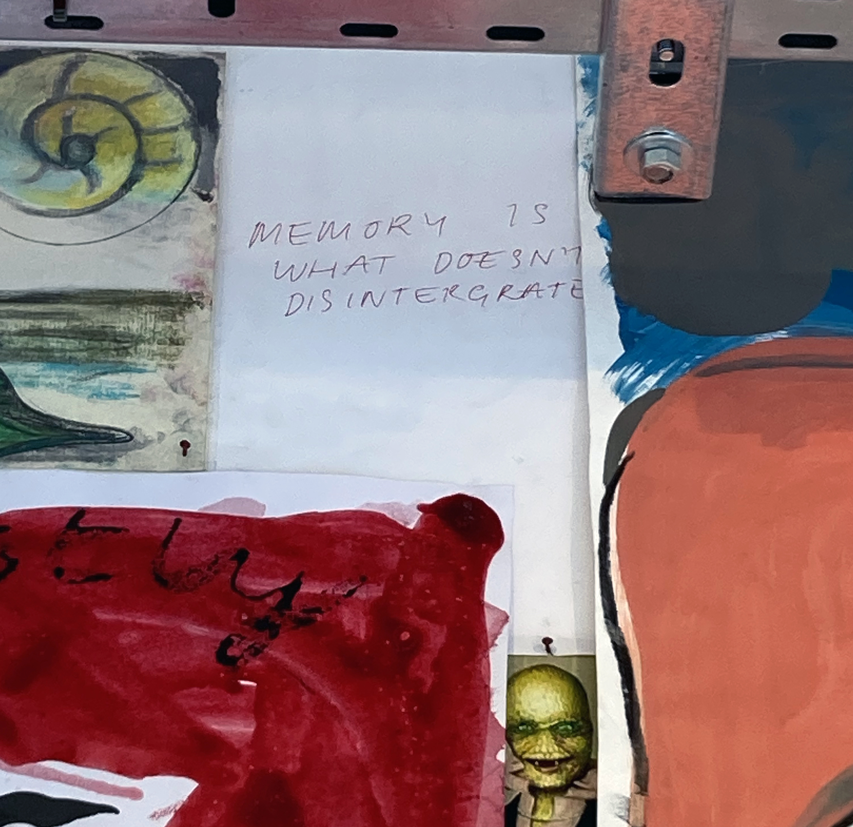
But delve further. Beyond this environment of paintings on the floor and walls the visitor, as a possible means of escape, enters what (in retrospect) may have been the implied bedroom of the artist’s youth. An annex off the main gallery with a large wall displays at least two hundred (I wasn’t counting) drawings, paintings, written notes and printed reproductions on paper. I jotted down a few of the phrases: Love and fear, All life is innocent, I must be the victim of a Hallucination, Innocence, Be Good People, and my favourite: MEMORY IS WHAT DOESN’T DISINTERGRATE (sic). Pictures (from books, art, TV, newspapers, magazines and the Internet) are so important to us all – and virtually unavoidable, then and now. Imagery from all and any context feed the imagination. There’s a sense of being inside an image-based thought process in Foster’s work that is constantly nourishing the potential of what the formative and the now fully realised artist continues to imbibe and assimilate. It’s the magical ordinary extracted from an image and text obsessed world – that was surely first started back in the caves of pre-historic humankind when the fundamental technology of mark making and visual language was really no different to now.
Grant Foster – Wall of works on paper installation
Foster’s wall text at the entrance explains more about the accumulation and assemblage of text and imagery:
“My studio is a haptic, experimental environment, where I continue to collect images, organising through free association: drawings, phone-screen grabs, newspaper clippings, children’s book illustrations, advertisements, and fragments of text.”
So, if the teenage bedroom was a place of seclusion that conversely expanded the imagination, then the adult studio clearly continues this function. Connected to thoughts and memories a touchy-feely collage type process, aided and abetted by literal touch as imagery that can be moved around, has expanded to and created the paintings in this show. On a more universal level we, as viewers, can surely connect with this phenomenon of the imagination, which runs alongside the everyday. Like the artist, we are always reconstructing and re-remembering: memories of memories, whether it was earlier today or decades ago, the happy and sad places, the images we made/make and those that we receive voluntarily or not. Narratives may not always be trusted as truth but new meaning or continuing misunderstanding may be of greater value and emotional impact as we age.
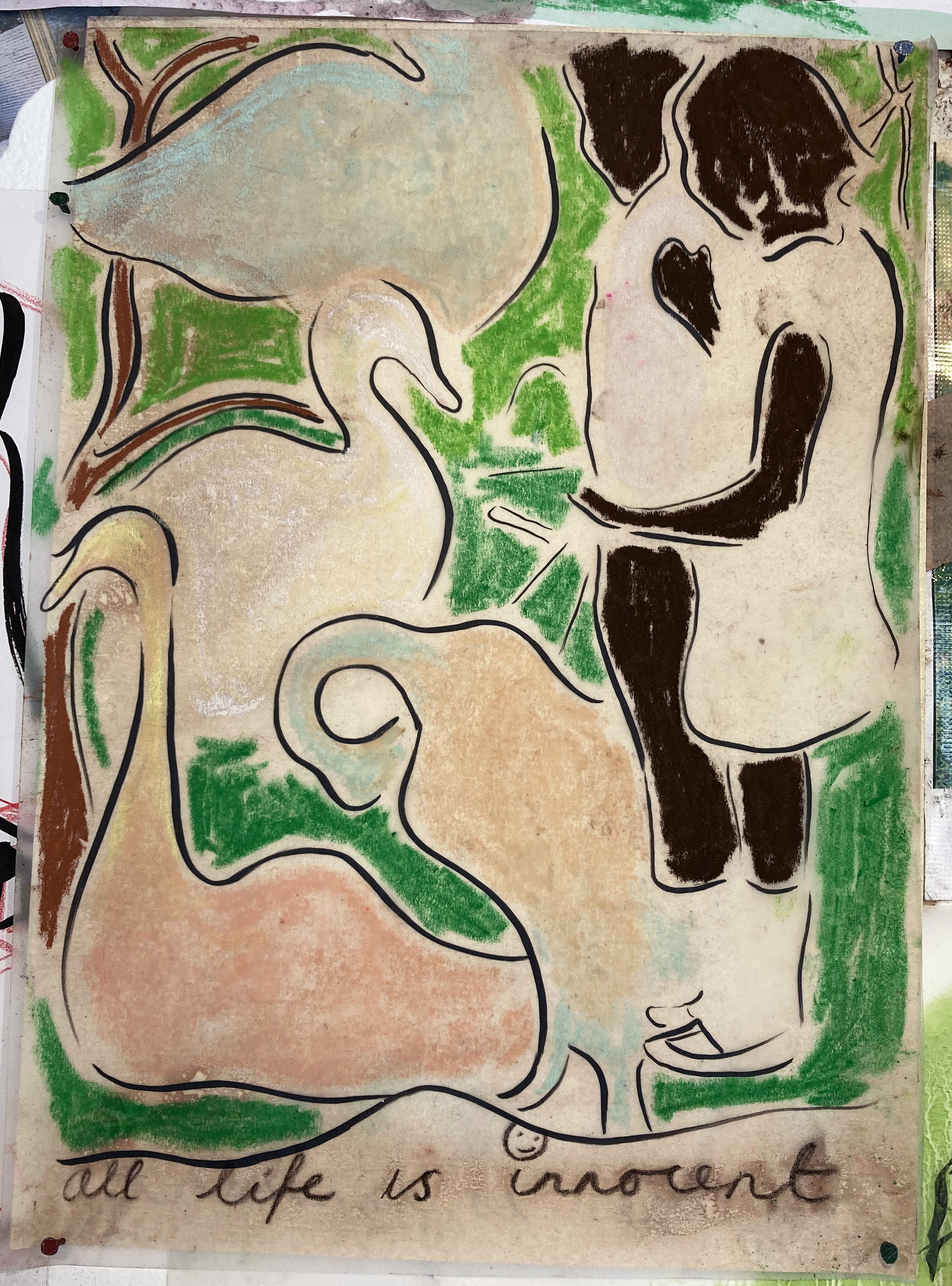
Grant Foster – Panspermia (2024)
At this point as I consider wrapping up this review I recall a reoccurring image from the exhibition. There is just one photograph reproduced in the publication, A Year of Kindness that Foster has published and presented as the first listed work in Home to My Teenage Bedroom. It shows (I believe) the artist’s mother and uncle standing close to water where a swan has approached. The image is first encountered in the exhibition in the painting entitled ‘Panspermia’ (which Wikipedia informs us “is the hypothesis that life exists throughout the Universe, distributed by space dust, meteoroids, asteroids, comets, and planetoids…The theory argues that life did not originate on Earth, but instead evolved somewhere else and seeded life as we know it.”). The image crops up again on the amazing collage wall of imagery in what must be a preliminary drawing for the painting later on. Now there are four swans, curvaceously morphing into organic shapes. The drawing could easily have been missed amongst so many images, but may have stood out for its line of handwriting at the bottom of the page: “all life is innocent”.
Grant Foster – Drawing for Panspermia
Returning to the painting, Panspermia, one sees that the swans could be read as decorative visual elements and that the black lines in the earlier drawing are now changed to a more yellowish green hue that visually suggests an organic environment. The branch of a tree fills the head shape of one of the two figures. Is that a wind farm sail in the top left hand corner that hints at the environmental concerns of today? It makes for a somewhat dreamy image whereby the unconscious is given as much credit as anything rational.
Near the start of my response to this exhibition I posed the question: What do you think about when you are looking at an exhibition? Perhaps, what you and I think about after seeing an exhibition is more pertinent. Our memories of previous experiences, times and places are embedded in our imaginations as we engage in recall. There might be hidden treasure in a photograph album too. Timelessly it’s all a here and now that, for some, becomes stronger as we get older. Foster provides much for the viewer to consider. Nothing is necessarily too clear to merely illustrate. This project sets us up. The viewer has work to do.
Geoff Hands (March 2025)
Grant Foster – From the works on paper installation
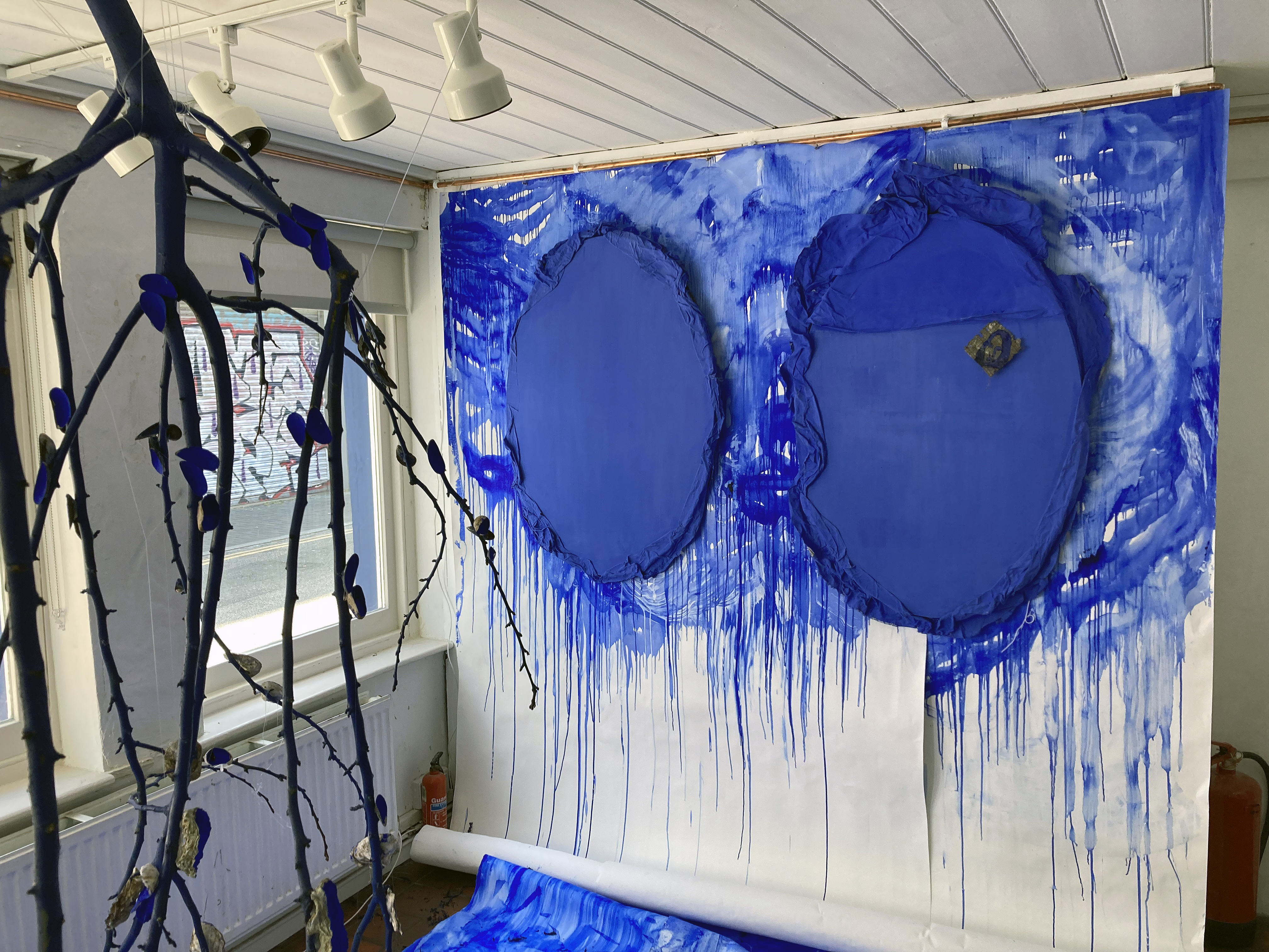
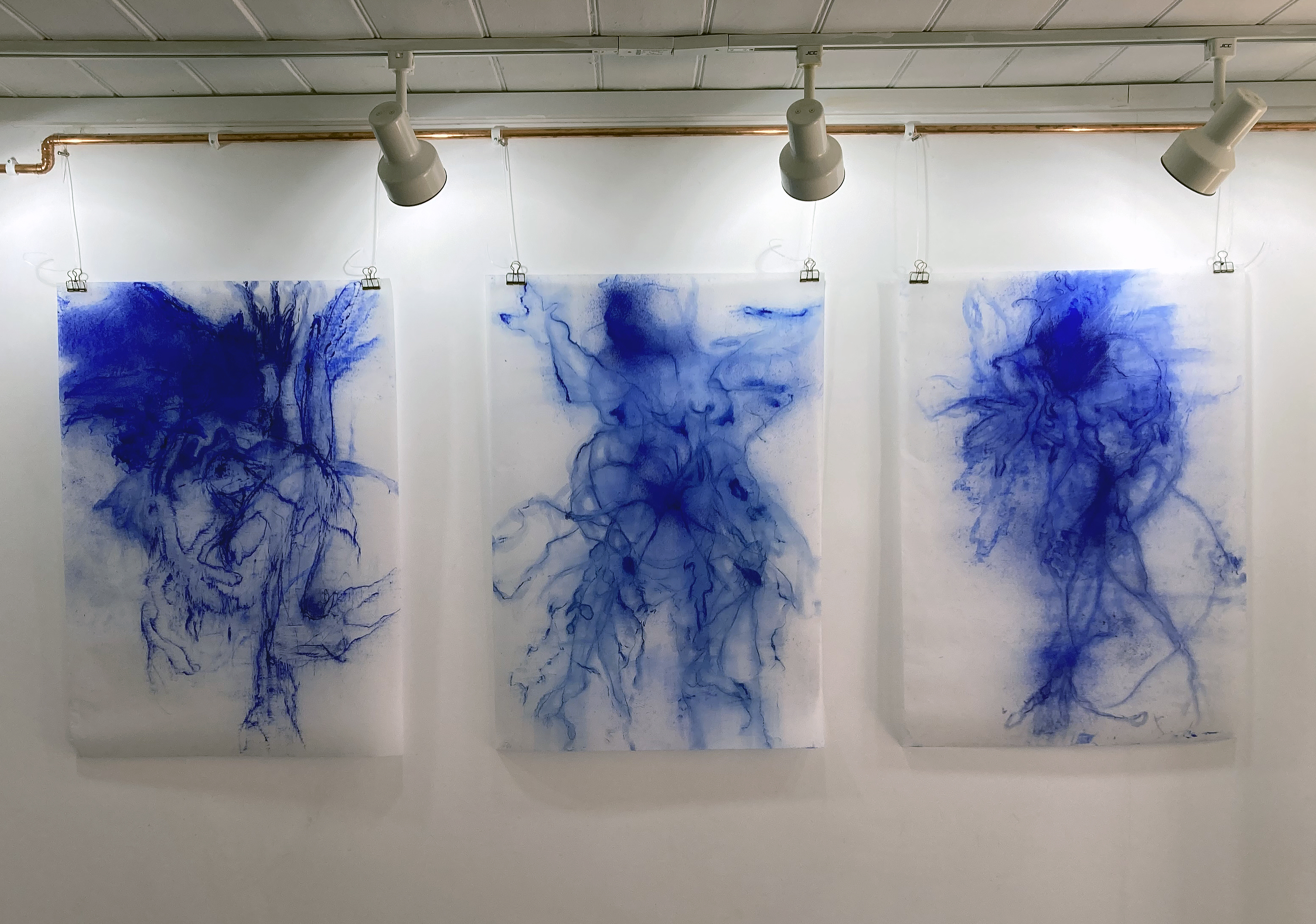
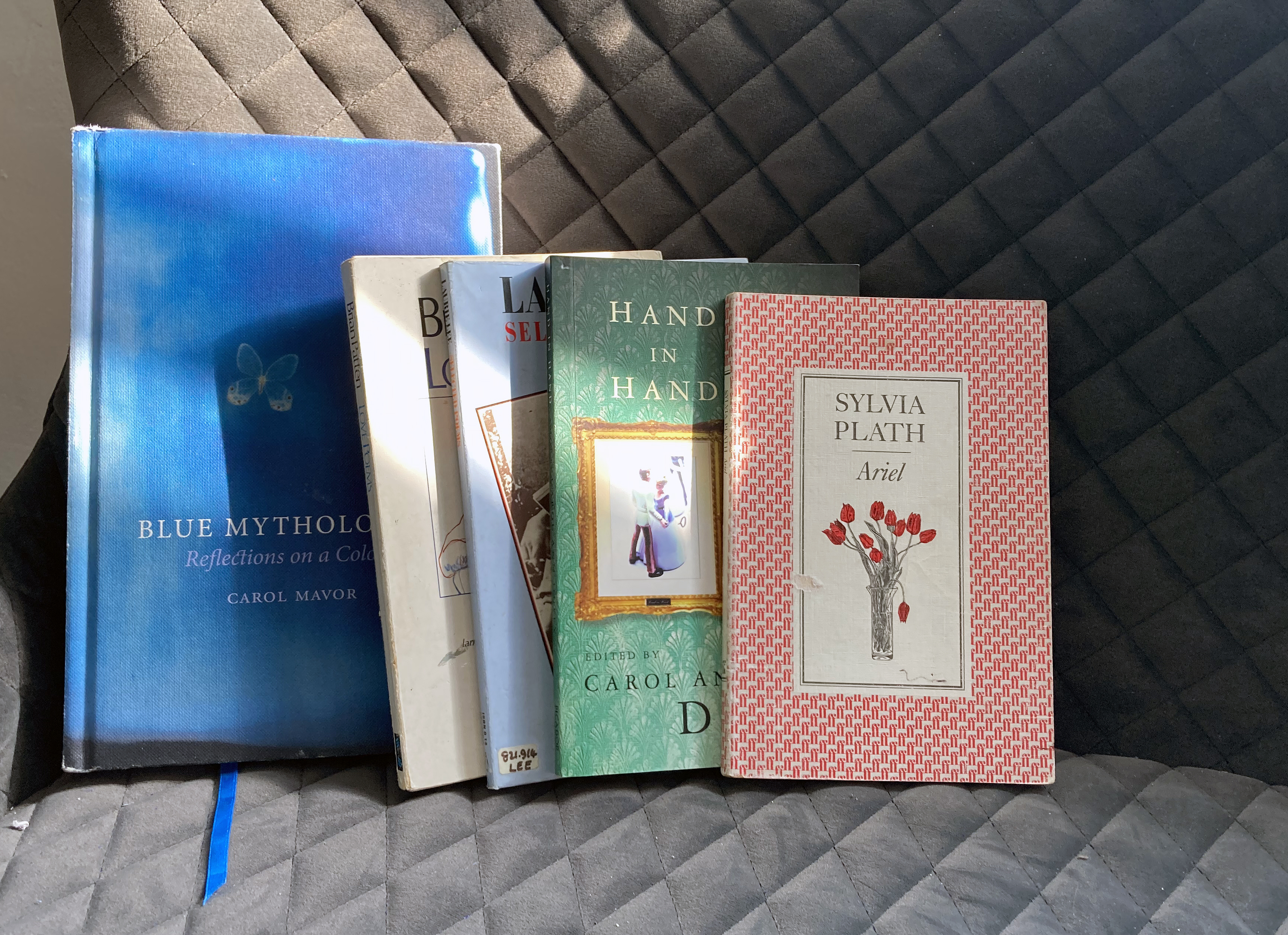
“Ultramarine Blue is the language that unifies the artwork in this show… I use it for its energy, and its magical and infinite possibilities. It brings a sense of calm yet has huge vibrational energy.”(Carrie Stanley)
This impressive exhibition, Benthic Blues, is of just three days duration and I have arrived on the final day. I was compelled to visit a.s.a.p. as the Brighton Art Space is a fairly new venue in the city and I have already missed a couple of shows I wanted to see but had diary clashes. Via Carrie Stanley’s Instagram account I was intrigued by her seeming obsession with ultramarine blue and a shifting display from the gallery wall to the floor. As it happens, ultramarine blue is my favourite colour and the recent Turner Prize had rekindled an interest in the phenomenon of the installation. Other visitors may have visited knowing of the underlying theme relating to grief from suicide and that Arts Council England have supported the artist with a Developing your Creative Practice grant.
So much can depend on one’s own predilections when choosing to visit a show, but what we think we might like or dislike, of course, is too limited a reason for engaging with the general spectacle of the exhibition. We are all more or less experienced than others, so if an artist is presenting a celebratory theme (my interpretation of this exhibition) with a tragic, family related background it’s incumbent upon us to give that work time – and respect.
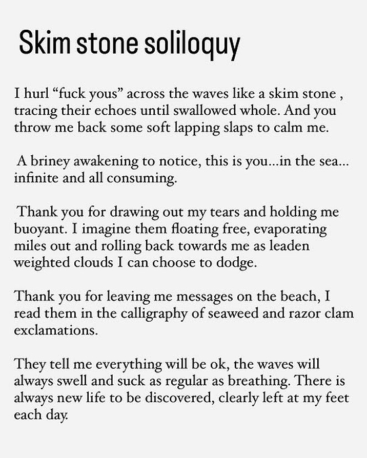
Carrie Stanley is a multidisciplinary artist and motivating her practice is a highly personal commitment to exploring mental health and trauma healing through the creative processes of painting, drawing and printmaking, re-presenting found objects and sound, and creative writing. Her interest in ultramarine goes beyond the visual aesthetics of colour. She links the colour to the sea, memory, the unconscious (e.g. dreams), ocean and land, the organic, materiality, play and potential healing.
There was a strong sense from the exhibition of the artist committing herself, against all the odds, to being positive, transformative and emotionally brave. By making, following a process and discovering something, or just knowing (or sensing) that she is in the right space at this time, permeates this body of work. Sharing the fruits of this journey amongst a community, known and unknown that may benefit many in some way is also akin to a celebration of sorts. Via the unfathomable depths of our emotions, the lowest region of despair, where light (as metaphor) cannot penetrate, the sometimes difficult to express or verbalise can be delivered through visual art. It reminds us that we are not alone, we are community. Stanley’s installation takes the viewer into the littoral zone, where light, and therefore colour, enables us to see – or at least begin to make something felt tangibly from the magical aspect of our world where messages await our readiness to receive them.
Considering the exhibition later that evening (before actually reading the exhibition statement), I sensed that the display was something of a showcase, intimating a larger, more realised, show in the future. The route forward might be towards an even more immersive viewer experience. The canvas/objects might reach out into the space even more. The suspended works might come further away from the walls. Works might be enlarged, like they want to shout out loud. Sound might be more dominant. Benthic Blues may in fact be a taster of more to come as I read that it forms part of a larger project, Together in Electric Dreams, which is in progress.
In visual art generally the artist’s personal background, wider societal issues, a political context or theme might be foregrounded as manifesto – or no more than subtlety implied in the artist’s offering. A strong or moving theme might be best kept a little sunken down to avoid the equivalent to the party political placard, which can trigger unreflective agreement or discord. It may be incumbent on the viewer to make some effort rather than rely on the artist to be too literal, as spelt out it becomes verbal language. Visual art is, well, visual and this aspect is a great strength in Benthic Blues as Stanley works with impressive skills, energy and commitment towards both herself, her family and a shared social community through an engaging body of work. She doesn’t shout. She allows us to cry with her.
Links:
Carrie Stanley on Instagram – @carrie_stanley_artist
Friday 22 November, the original date for an elephant, a room at Gallery Dodo in Phoenix Art Space, came and went. Then a poster displayed on a window next to the front door of the main entrance announced that the exhibition had been postponed. Expectation supplanted by disappointment. But this was to be an exhibition presented by a conceptualartist, Calum Louis Adams. So, that’s it – wait with Godot. Brilliant I thought – the anti-climax palpably real. No show (yet) constituted a show. Or at least the idea of a show, which happened imaginatively in real time and space, constructed in my mind. The potential object of an exhibition that was fabricated by a poster (a form of text) to manifest itself as an illusion of sorts. But no.
Then a new poster appeared in the window just a couple of weeks ago. There is an exhibition after all. I was disappointed initially, as the joke was on me. But hang on; I am getting two shows for the price of one here so long as I visit the exhibition.
During the afternoon of Friday 24 January I got a sneak preview of an elephant, a room that Jon Carritt, Dodo organiser, has installed. You really have to see this space, a former toilet and washroom, to appreciate how unique and rather special it is. How fitting, therefore, it was to hear the soundtrack of a woman urinating, recorded on a single channel looped video, from a screen placed on the back wall floor. Or at least the phenomenon of a common sound from this electronic device would convince the perceiver of the actuality of a necessary kind of daily performance: now become art in this physical and conceptual context.
The door entrance (it’s just one room) was wedged open with a carefully folded up sheet of the single page A4 gallery handout that had to be the right thickness to hold the door in place. This was the second of the three works presented. The third was the text and digital image printed on the reverse of the handout, though the stack of handouts were placed on top of a wooden plinth, which might be counted as part of the installation. Extrapolating from this of course, the floor, ceiling and walls are the exhibition too. As is any visitor. I found myself taking some photographs of the partly renovated walls, wondering if an elephant might lurk somewhere.
This interestingly rambling/stream of consciousness text, written by Adams (I assume), consists of three paragraphs that link stories of a “startled crow”; the notion of a “Brood”, a collective spirit, a small car parking on the nut that the aforementioned crow has previously been eating, an abandoned house, smashed windows, a previous exhibition of the artist’s during which, on hearing a line from a song by the singer Clairo, changes their thoughts about a moment during which a window changes its functional self identity. Next there is a reference to a woman who drinks her own urine (from the American TV series My Strange Addiction) – which may or may not link to the urination soundtrack mentioned above. The final section of writing summarises these various parts as personal thoughts about choice and the possibilities of the crow’s possible awareness of the observer and the car having some sense of the crushed nut under its tyre. It is quite possible that the visitor who picks up the printed sheet will not read the text until later. A common habit (of which I am guilty) is to read the text handout on the journey home or even later. I would now guess that Adams wants the text read whilst in the show as it is listed as one of the exhibits. Although it is possible that this does not matter as the text read later, elsewhere, extends the exhibition and enables the reader to possess one of the artworks and to create something through the act of reading.
So where’s the elephant from the exhibition’s title? Well, to be literal, there is a minimalistic linear sketch of an elephant printed on the front of the handout. A visual representation, alongside the word elephant itself, which only makes cognitive sense if such a word (a label or name) is already in the viewer’s cognitive lexicon. Alternatively, the creature may actually reside in the mind of the viewer as the imaginative synonym of the elephant in the room – which may or not be in the room at all but perhaps appeals to an art practice that explores arty aesthetic ideas and objects. I wonder if there is a self-deprecating aspect here too, including a possible negation of the artist (a form of identity and an idea as well as a career choice for an actual human being, an object of sorts) as being worthy of explanation.
I was told that the artist would not be attending the opening evening due to rail travel difficulties during inclement weather conditions in Wales, where they live. Or perhaps this was fortuitous, as perhaps the physical presence of the artist is not so relevant as it could detract from the show, the physical work and the non-physical ideas or potential concepts. How suitably anti-climactic.
Futurism and the Origins of Experimental Poetry /Dom Sylvester Houédard and Concrete Poetry in Post-war Britain
Estorick Collection of Modern Italian Art 15 January to 11 May 2025
These two exhibitions, historically related but decades apart, make for a fascinating visual experience at the Estorick Collection. Housed in the two rooms reserved for temporary exhibitions, usefully on the same floor, there is a palpable excitement about the graphical form of text and the (early) expanded field form of print that links poetry to the visual arts. The display as a whole has the feel of a contemporary installation work with texts enlarged to cover significant expanses of wall. Framed text works dominate, as one might expect, but video screens enable the page turning of books that are otherwise displayed in glass cabinets.
On the walls in both spaces there is much to read and/or to observe purely visually. Usefully, the expository texts are reproduced in the newspaper-type catalogue that further expands the exhibition to wherever the visitor might take it. In fact to miss the catalogue, designed by Studio Bergini, the visitor would be missing part of the exhibition.
Along with the other visitors at the Press preview I turned right into the Futurism and the Origins of Experimental Poetry display. Carlo Carrà’s ‘Atmospheric Swirls – A Bursting Shell’ (1914) from the Estorick Collection, stands out immediately. TUMB, ZANG, TUUUM, ZANG and EEE, onomatopoeia – sound words – are integrated with painterly applied ink, charcoal and collage on paper. In these present times (well, maybe all times) such as aesthetic celebration of the sounds of missiles seems somewhat absurd and in poor taste. But the potential elephant in the room, the Italian Futurist links with Fascism (in particular the poet Filippo Tommaso Marinetti who founded Futurism), was not ignored as the wall texts and the catalogue acknowledge this disturbing context.
Carlo Carra – ‘Atmospheric Swirls – A Burning Shell’, 1914 Courtesy Estorick Collection
Christopher Adams and other members of the Estorick’s curatorial team have, in effect, stood back to allow the visitor to make what they will of this discomforting aspect in the exhibition. But they have not downplayed the sheer visual exuberance of how poets and visual artists freed the conventions of text display in publications such as ‘L’Italia Futurista’ (published from 1916 to 1918) through to Carlo Belloli’s ‘Texts-Poems for Walls’ (1944) that predicted the very public space of walls (and now the digital screen) as the common space for readers/viewers to be impacted and affected by the word. The show also includes rare original editions of works including Fortunato Depero’s famous book, ‘Depero futurista’ (1927) which is now more commonly known as the ‘Bolted Book’ with two aluminium bolts binding the pages together.
Transferring to the second display, Dom Sylvester Houédard and Concrete Poetry in Post-war Britain celebrates the work of Dom Sylvester Houédard (aka dsh), a Benedictine monk who is a contender for godfather of Concrete Poetry up to the present day. As the visitor would expect, dsh’s work is well represented here with works loaned from the Lisson Gallery. There is also material from Edition Hansjorg Mayer via the Chelsea College of the Arts Library (UAL) including Carlo Belloli’s ‘sole solo’ (futura14, 1966).
As with any exhibition holding works in cabinets you just want to get in there, although all six concrete poems from the Brighton Festival of 1967 are laid out for all to see. There are also works by several other British exponents of concrete poetry, including Ian Hamilton Finlay, John Furnival and Bob Cobbing. A signed copy of Cobbing’s ‘chamber music’ (futura19, 1967) adds a human dimension to the strongly graphical ingredients of the show. I mention this as a bombardment of the graphical might get wearisome if your main interest is in painting – the Estorick is full of paintings, of course.
I was also wondering whom the audience might include over the next few months. In addition to the loyal Estorick crowd I would hope that poets, graphic designers and art and design students from all disciplines, new cohorts perhaps, will see the show. For the fine artist with an involvement with text and collage the exhibition will not disappoint either. If anyone is unsure, just go along and support this organisation. The bookshop is full of goodies too – including that highly collectable catalogue.
A visitor to the latest Discover exhibition at The National Gallery could be forgiven for missing the star of the show, John Constable’s The Hay Wain, even as it is prominently displayed for visitors entering the main space of the Sunley Room area. The eager viewer might almost dismiss this magnum opus of British art as they might think they know it so well, as close to thirty other works fill this superbly curated space to engage their attention. This is one of the strengths of this exhibition as there is so much to look at and consider. It’s the kind of show that will, I am sure, not become tiresome if you can make several visits and that you could drop in to see just the one item on display.
In fact on first entering a kind of vestibule the curators had cleverly set up a palpable dichotomy of preparatory nudges to influence the visitors before the main space was entered. Constable is not only in the past, but is also now in terms of setting an example of painting as personal expression and for subject matter (*see another reference to Constable and contemporary painting in the notes section). The phenomenon of the European landscape tradition in art generally, and of English landskip in particular, is one of the more positive contributions that this sometimes narrow minded ScepteredIsle has, and continues, to contribute to the phenomenon of ‘art’. Our collective love and appreciation of the landscape (in some ways a constructed notion from the natural world that might best be called the environment) is worth celebrating and preserving.
But also displayed here in the introductory room are ten reproductions that sets up a duplexity that makes the exhibition so relevant, and modern, for today and tomorrow. These disparate but related images reveal, and in an odd sense celebrate, evidence of Constable’s ongoing influence on Britain’s visual culture. Including well-known imagery from Hockney (who like Constable no longer requires a first name), Peter Kennard and Frank Auerbach the viewer might casually eyeball the imagery and move on, feeling the magnetic pull of The Hay Wain. This is what I did, but something niggled.
But still in this first room, the viewer, if already a Constable fan, could be well satisfied with seeing Constable’s Cenotaph to the Memory of Sir Joshua Reynolds, that was the last painting he exhibited at the Royal Academy in 1836, to prepare them for an experience of looking back on an era when British painting finally made its mark on the already well developed great European tradition. After all, ‘Constable’ is one of those names, along with Hogarth, Reynolds, Gainsborough, Stubbs, Turner etal that harks back to the Golden Age of British painting. On this singular wall Cenotaph takes on the feel of an altarpiece.
So, appropriately on view in this space are a map of Constable Country (a.k.a. Suffolk), partly to make the point that the Grand Tour was not absolutely essential, plus the medal that the painter was awarded by King Charles X of France in 1824 for showing The Hay Wain in the Paris Salon that year (which, coincidently, was the year when the NG first opened in Angerstein’s London townhouse in Pall Mall – moving to its current location in 1838). The Centotaph canvas demonstrates Constable’s appreciation of the first president of the Royal Academy who insisted that ‘modern’ artists engage with the classical art of the past to reinforce their pictorial interests in depicting, and celebrating Nature in the present.
Then, on approaching The Hay Wain in the main space a wonderful Thomas Gainsborough, Cornard Wood, near Sudbury, Suffolk (1748) commands attention and shows the viewer where Constable was coming from geographically, aesthetically and stylistically in a contemporary context, via the influence and example from the painters who emerged in the previous generation. With Gainsborough the exhibition adds George Stubbs (The Reapers of 1783 hangs next to the Gainsborough) and George Morland (amongst others) as crucial forerunners, plus Constable’s near contemporaries including John Crome, Francis Danby, John Linnell and Richard Parkes Bonnington. As expected, J.M.W. Turner is here too, though perhaps in a quiet way as pundits could argue forever over who is the greatest British landscape painter. Turner was far more of an entrepreneur than Constable and so to some degree represents the development of the marketplace, often via the print or the washing line of watercolours drying above his bathtub, than Constable the rural conservative. Undoubtedly, this function of the landscape picture production as a moneymaking artefact was an aesthetically pleasant aspect of the growth of the capitalist marketplace that, as it happens, was born in the agrarian context of English countryside (see Ellen Meiksins Wood: The Origin of Capitalism).
Maybe it was this culturally sober yet complex young man from Suffolk who took British art into Europe (well, Paris and Berlin) despite his tendency to balance professional London life with his beloved Dedham Vale in his home countryside. Constable painted Landscape: Noon (The Hay Wain) in 1821 when he was just 44 years old. Not unusually, the large painting that we know and love was actually produced in London. Also on display are the ‘six footer’ study (the third of six), and a relatively tiny study, Sketch for ‘The Hay Wain’ (c.1820), that can be considered the first version of his most revered work. This latter work is the one I think I could return to see if only one painting was made available on my next visit to the NG, particularly as it will have to be returned to the Yale Center for British Art in Connecticut when the show ends next February. Being hung next to the ‘six footer’ was curatorially daring but apt and demonstrates to any aspiring painter that preliminary works can be any size in relation to the final product.
But I had surely been taunted by those other images and so returned with some sense that something very relevant right here, right now, was being manifested. After my preliminary stroll around the show to tune in, looking more attentively at the last three images I was a little unnerved, perhaps intimidated. After all, I assume that like most visitors I am here to marvel at some impressive landscape works. Social reality (Chris Shaw), satire and humour (Cold War Steve) and climate change (Quentin Devine) was implied so strongly yet so innocently by the reproductions, undermined, or at least questions and recategorises every other image in the exhibition. Miss the display wall of contemporary works and an engaging display of paintings, prints and drawings – plus a rather quaint set of country folk figures purportedly made by Constable himself (though, I dare say, unlikely) – is certainly visually pleasurable, aesthetically satisfying and informative. The show is rich in social and political history, and in setting the historical context that Constable was affected by, engaged with and duly influenced himself. Constable is in our lives, in our visual psyches. How many homes in the UK have a landscape print, photograph or painting on a wall? The art historical thrust of this exhibition – of the whole institution – confidently insists, as always, that the viewer should be aware of any artist’s influences and the context of periods of style and subject matter. Paintings are never just lonesome, singular, objects even in the broadest context and are not merely decoration for the living room (** see personal memories in the notes). But the modern works, even as reproductions, give the viewing an unexpected frisson.
In a way, Kennard’s Haywain with Cruise Missiles (1980) sets up what could have been far more exploited as the major theme for this exhibition, as imagery from this later generation of artists, (Shaw, Cold War Steve and Devine) reinforce a message of shock and despair, obliging the viewer to take stock of any so-called beautiful or awesomely sublime landscape scenario as various regimes wage war with nuclear arms in the background and as global warming continues to affect the climate. Though, to be fair to the curators, this political aspect is acknowledged in the catalogue – which if you cannot get to see the exhibition I fully recommend that you acquire the publication, as it not only records this marvellous display, but also is a useful primer for the burgeoning art history aficionado who must understand that the visual arts always has a social, cultural, economic and political context, and a reinterpretive one at that.
Ignore the contemporary works at your peril. Are they (to appropriate a Constable term for highflying clouds) Messengers? Via Constable, these contemporary artists may well be saying something we all need to hear. With the revered Constable to reference they might challenge the mindset of the masses with less derision from some quarters than the environmental protesters. Which made me wonder if they attack the wrong targets? These passionate and well-meaning iconoclasts could choose to celebrate rather than diminish their respective responsibilities of protecting our cultural as well as our natural environments by preserving and developing our survivalist consciousness with more integrity. Art might save us yet – and Constable was right there as the agrarian revolution took hold.
“A woman and her partner are standing in front of A Farmhouse near the Water’s Edge (‘On the Stour’) by John Constable. “Does he ask questions?” she reactively inquires. I think it’s a rhetorical question. It’s certainly a gift of a question and I now wonder, was the painting asking questions about subject matter; perception; time; self; the painting process or the fiction of imagery and invented composition? Constable also appears to have gouged his palette knife into the surface of the oil painting and it is an unsettling image. I doubt that the subject matter is merely a farmhouse or a landscape. Paintings have so much to offer and so much potential for interpretation, with endless ground to cover. It’s no wonder they continue to intrigue viewer and maker alike.”
** The first ‘work of art’ I recall in my parental home, way back in the mid-1960s, was a reproduction of The Hay Wain that came free with the electric fire that my mother purchased to replace the coal fire in our living room. About ten years later I was an art student and, on my first trip to a London gallery (18 February 1976), I was fortunate enough to see the Constable: Paintings, Watercolours & Drawings exhibition at The Tate Gallery, which of course included, The Hay Wain. Many thanks to Mr Vettise at Shrewsbury School of Art.
March 21 to April 6 2024 (Closed Sundays / by appointment Wednedays)
Installation of In The Garden at Gallery 19a
Michelle Cobbin, a fellow painter at the Phoenix Art Space, interviewed Geoff Hands as he prepared to install his exhibition, In The Garden, at Gallery 19a in Brighton.
Install photographs by Rob Harris.
Michelle Cobbin – What was the first painting that had an impact on you?
Geoff Hands – A Camille Pissarro woodland landscape. I was 18 or 19 years old and on a Shrewsbury School of Art visit to Manchester City Art Gallery and The Whitworth. It was not a particularly large work, but the paint was quite thickly applied in that Impressionistic manner. It sounds naive, but I was so accustomed to looking at reproductions of paintings in books that I must have assumed that paintings were essentially ironed flat. Today we probably talk about ‘materiality’ but back then, in the 1970s, it was ‘surface touch’. A visual touching of course, which is one of those fascinating dualities of experiencing painting that might only truly be comprehended on a feeling level.
I should also mention two other paintings recalled on another art school trip a little later to Liverpool. These are Stephen Farthing’s ‘Louis XV Rigaud’ and John Walker’s ‘Juggernaut with Plume – for P Neruda’ that were selected for the John Moores exhibition in 1976. They employed a technique of employing collage within the canvas, which expanded the painting process. Collaging, in a sense, is more ‘hands on’ than painting with a brush.
MC – That is really interesting. Your recent work utilises unctuous and thick oil paint and collage plays a part in your studio practice. Would you say that the ‘materiality’ of making work is essential to your practice?
GH– I have always felt that the physical medium is a crucial ingredient in the realisation of the artwork. It’s experiential too, both for maker and viewer. There’s a symbiosis at work, which is material, physical and visual. Oil paint is a wonderful medium, just from a feeling point of view. If my painting is going well, on a subjective level, the oil painting process is still a challenging and discomforting experience. That’s the contradictory nature of painting for me, which has been appropriately labelled the ‘hard won image’. I’m sure that sounds rather old fashioned and romantic.
Oh, but the thick layers of oil could be thin too. And I love the term ‘studio practice’ as it implies a never-ending quest for something. The recent work being presented in ‘In The Garden’, particularly from 2019/20, really continues work from before but with an added realisation that there’s a singular pursuit to make a painting that was worth the effort. That’s why I called my show at the Phoenix Art Space in 2020, ‘It’s All One Song’, after a comment made by Neil Young to an audience member who wanted to hear a specific song but he launched into something else. My interpretation was adjusted to the notion of my own singular pursuit, engaged with as a painting student so long ago, that is still manifested in repetition of some kind of desire.
‘Garden (Pilgrimage) – After Watteau II (for PJ Harvey)’ 2020-21 (121x150cm) and ‘Garden (Pilgrimage) After Watteau I’ 2020-21 (121x150cm)
MC – That quote from Neil Young, ‘It’s All One Song’, you mention one way you apply that idea to your painting in that it is a repetition that forms part of your ‘studio practice’. Keeping with musical references I would suggest that you use a lyrical mark-making motif in many works that lead the eye from painting to painting in a rhythmic way. Are you conscious of that – is it deliberate or is it perhaps that you are listening to Shakey in the studio and the marks are spontaneous responses to the music?
GH – Well, I am conscious of a desire to create a feeling of movement and flow in the paintings. This starts with the looking and the observational drawing before the paintings are made back in the studio. This interest in rhythm, movement and atmosphere is concerned with consciousness, time and space. So there should be occlusion and fixed point too. This is everyday stuff, acknowledging the animism and agency of the here and now. The mark making can be described as ‘lyrical’ and I see it as an extension of the looking and the drawing but improvisation is key too, along with a journey into abstraction with colour.
I get the musical link too but I more often paint with some chilled ECM label jazz playing in the background. The occasional blast of Neil Young with Crazy Horse would be good to stop overthinking though!
It’s worth briefly mentioning that I am currently working with musician and composer, Tobias Wheal, on walking, drawing and painting with his music responding to my work and vice-versa. There’s a little poetry as well, but it’s still a little early to say much more as we are buried in the project at the moment.
‘Garden’ series, 2023 (25.5x31cm) and ‘In The Garden (for V.M.)’ 2023 (51x26cm)
MC – The project with Tobias Wheal sounds like an interesting collaboration, I look forward to seeing how that develops. Recently your work has referenced paintings by historic landscape painters such as Watteau and Gainsborough. In particular I was drawn to the large painting inspired by ‘Mr and Mrs Andrews’. What drew you to riff off that particular Gainsborough painting?
GH – Between two of the lockdown periods I went to see the Titian show at the National Gallery and took a walk around the permanent collection. Gainsborough’s painting is one I know well from many visits there and it never fails to impress. I always expect it to be bigger than it is and his paint handling is astonishing. It’s a loaded image of course, not just from a feminist perspective concerned with the implied male ownership of the female partner, but it is also an unintended glorification of capitalism and land ownership from its early history of development in England. For anyone interested in the English Landscape tradition in painting it can’t be ignored either. All of these political frameworks are important and remain relevant today, but I think that we can look at paintings for what they are without having to add a societal context every time.
Anyway, at the time (during the pandemic) I was incorporating elements from paintings from the past into my own work. I was initially looking at a Ruben’s composition (‘Landscape with St George and the Dragon’ 1630-35) and adjusted a small series of my own paintings to include compositional references. This lead onto ‘appropriating’, the artist’s term for stealing, various elements from Titian, Watteau and Gainsborough to add to my own imagery. Some of the content from these painters has been intermixed, especially from Watteau’s, ‘The Embarkation for Cythera’ (the version in the Louvre) that has become a bit of an obsession. With the Gainsborough I have found that I can enjoy painting towards abstraction. The image just seems to lend itself to this painterly and colorful direction. All of this has been happening since about 2020 when I was becoming a little disillusioned with where my work was going, or rather, it was stuck in a groove that needed changing somehow. My forthcoming exhibition (In The Garden) at Gallery 19a will show a small selection from this quite large body of work and I shall have an opportunity to distance myself a little from the paintings so that I can see it from another perspective.
‘Andromeda’s Garden’ 2023 (145x200cm) oil on canvas
MC – As I think about you preparing to select paintings and curate your exhibition ‘In the Garden’ I wonder about titles of individual paintings and whether titles are important to you. As a whole you say the work is ‘all one song’, how does that effect how you title individual works?
GH – Well, there’s an obligation to title work but it’s useful. Just numbering works does not feel right for my works – although as I work in series there will be a roman numeral somewhere. A title is something of a portal, an entrance into the work for the viewer. With the works that reference another artist it seems ethically correct to add their name to the title. As for the importance on a personal level I often reference the source of the painting. This is often a particular location where I have typically visited with a sketchbook to draw in. The untitled option is always there though, and if I am looking at someone else’s paintings in an exhibition I generally avoid reading the wall label at first. The song reference is more of an acknowledgement of a lifetime’s quest or project.
The exhibition title for my show at Gallery 19a is deliberate reference to the feel of that particular song by Van Morrison. It’s quite personal, and perhaps only relevant to myself. The garden reference is also an allusion to the painting studio, especially during the pandemic lockdown periods, and an even more oblique reference to images of Mary in the Garden from the Gothic and Renaissance periods in art history. I like to think of this as a poetic decision, inviting the viewer to make whatever they wish from the references without any clear answers from me.
Jonathan McCree, Bruce Ingram, Jonathan Goddard and Joe Walking
APT Gallery, Deptford
2 – 12 September 2021
APT Gallery
It was Thursday 9th September and Up For Grabs had been open for a week. A performance had already taken place some days before and the Private View was tomorrow. This was a two-week exhibition of painting, dance, sculpture and film. I had missed the dance and the film too, but a projector was being installed to show a video of the performance, but I couldn’t stay too long as I had a timed entrance ticket for something of apparent importance at the Royal Academy. So this would have to do, and thank goodness, it was probably the best part of the day. *
Bruce Ingram and Jonathan McCree
The front space was conventionally organised for an exhibition of sculpture and painting and Bruce Ingram and Jonathan McCree had three works each on display. By conventional I mean some works were placed on the wall at a comfortable viewing height and three more pieces were arranged on the floor with ample room to walk around. There was a balance. They were, it appeared, ‘finished pieces’ and ‘final’ as we expect artworks in exhibitions to be. As a first impression there was surely something going on about construction and deconstruction, about placement of the works and relationships within the works themselves. What was ‘up for grabs’ at this stage I wasn’t sure – maybe an opportunity to take something away from the show, or to suggest potential.
Jonathan McCree and Bruce Ingram
This initial selection and indeed this space could be complete in itself, but it proved to be something of a threshold to pass through, for in the next space that precedes the largest room at the rear, a clue to some playfulness was sensed from encountering an apparently disfigured column, a strongly vertical element, that was placed on the floor but had unexpectedly been folded at 90 degrees to fix itself to the wall to form an archway to tempt someone to stoop under and squeeze through. This piece was quickly followed by another of McCree’s stretched box forms wrapped around the protruding corner into the next space. Clearly an intervention had taken place at some point and as the artist was on duty to greet visitors today he explained to me a little later that one of the performers had previously indulged in interacting with the sculptures to adjust them to the gallery environment.
Bruce Ingram and Jonathan McCree
Also in this middle room were more of Ingram’s works and by now there was more of an obvious or staged interaction between the two artists’ works. Typically, Ingram’s works explore found materials in assemblage and collage-type painted forms employing plaster and various paints (household and artists’ acrylics) to fuse the various elements together. Placed on the floor rather than on the wall one of Ingram’s constructions formed a framework to look through to see another work beyond. A sense of destruction as much as building the artefacts of the environment was taking shape. As a visual tease, Ingram’s works have remnants of colour applied, similar to McCree’s suggestively ‘out of the tin’ coatings, to link the works. Contrasts of smoothness and rough surfaces distinguish the two to some extent but the pairing is not incongruous.
Bruce Ingram
My daughter and I walk around a while, tuning in still to a display that has transformed from calm quietude at the main entrance to visual and spatial cacophony in the largest room. I pick up a press release (which I shall read on the train back to Brighton later, as I want the work to speak to me first and foremost) and start to scribble some notes on the reverse:
Enter the labyrinth, parts, bits & pieces…
Plenty to see, though not too much…
Image / Object – which will predominate…
What is an exhibition for?
Jonathan McCree
What is an exhibition for? Now that’s interesting. In this instance, Up For Grabs is certainly entertaining, exciting and memorable. The individual paintings and sculptures work on their own terms, but as an arranged event (sadly for just over a week) the exhibition comes alive as a happening of sorts as much as a static display. I imagine the missed performance and projected film work that preceded today’s visit, which isn’t enough, but will have to do. The finished and unfinished, or work in progress nature of the works, suggests a similar modus operandi for the viewer. There is method in looking, in relating to the artworks physically, spatially and psychologically. Visual art is not exclusively about seeing; it offers possibilities for recognising the power of one’s own imagination (and sometimes a lack of). There are formal relationships to find or be presented with. There are colours and textures to indulge in. Likewise there are parts that seem to work perfectly and others that the viewer might desperately want to change – even to improve. The visual aesthetics provide a way into potential readings that could suggest social interaction, notions of community, interdependence, the built environment (including furniture) and the politics of choice, indulgence and creativity.
Jonathan McCree
My daughter described the assembly as “rocks and trees”. Jonathan McCree talked perceptively about “… delaying uncertainty in or from painting to the sculptures, which are moveable parts”. This gave his three-dimensional work edginess, like it was finished but not really. Or resolved, but hopefully not so as it invited some form of change.
This exhibition, no – this environment, concocted a landscape of sorts, an active space demanding an audience to interact by looking, moving, pacing, stopping; head up then head down, confronting occlusions to find surfaces, then seeing variously coloured or textured planes morphing into three-dimensions giving way to silently laughing, then becoming equally engrossed or bemused. Performing a journey, in effect, as an exhibition is not necessarily a final resting place for particular works – anything might be up for grabs; even our expectations.
Jonathan McCree
Note:
* This statement is a little disingenuous as I was also impressed with Mind’s Eye at Flowers in Cork Street where Carol Robertson’s geometric works had been displayed with Terry Frost’s. My review of this show has been published by Saturation Point. See the link below.
‘Crowding the solitude’, ‘Ghost white path’, ‘Night’s first light’, ‘Silent reach’ and ‘Restless lane’ might be headings in a list of poems from a collection that constituted a volume of landscape inspired verse, but they are selected from the titles of drawings and prints from Tania Rutland’s exhibition at the Phoenix Art Space.
Another title, ‘Chip of flint – fragment of chalk’, makes reference to commonplace Sussex downland geological material that could have been gathered from her visits to Iron age Mount Caburn and Neolithic Cissbury Ring in East and West Sussex and is the intriguing title of this exhibition.
Tania Rutland – ‘Chip of flint – fragment of chalk’ (28x21cm). Pencil and graphite on paper.
The very idea of a ‘chip’ or a ‘flint’ suggests the collection of a memento, a physical token from a walk, picked up to place on a shelf when home. Such an item might be revered as a memory of a time and place spent in solitude or with a partner or friends from a Sunday walk. The cultural pursuit of walking might be a form of escape from everyday life, most especially the ‘working week’. A leisurely stroll or demanding hike, especially in the countryside, can be rejuvenating and refreshing. It might also be consoling during a time of stress. A walk is healthy for both mind and body; and for a landscape artist a place for research, inspiration and hard work.
Though superficially a landscape exhibition, on reflexion, ‘Chip of flint – fragment of chalk’ is loaded with speculative and thought provoking possibilities enabling the visitor to take away the non-physical souvenir: not to be placed on the mantelpiece but constituted in the form of ideas to consider and discuss further and, ultimately, leading to environmentally focussed action.
From the very start of the corridor space Window Gallery, making a de facto antechamber, two wall-mounted assemblies of small, unframed, preparatory drawings make it clear that drawing is at the core of Rutland’s practice. As an introductory display, sufficient in itself as a stand-alone exhibition, the 28 studies make an implied proposition that drawing is still of paramount importance towards painting, especially in landscape art. Whilst an en plein air approach is also possible, the drawing in advance of the essential schema for a final painting, even without colour content, provides the opportunity for intense consideration of composition and content; and for revision of the essential rectangular format. Rutland’s methodical approach also develops the initial ‘sketch’ to a more ‘finished’ state and therefore requires a more prolonged period of execution. In this respect, the lengthening of time to make what might simply become no more than a preliminary part of production, adds to the inherent conceptual aspect of Rutland’s greater project, namely that of time and duration.
Tania Rutland – ‘Untitled 1 (Fatigue of early light – Mist’s cover)’ (14x16cm) Preparatory drawing.
Annotated on half a dozen of these relatively intense drawings are more titles, including: ‘Ghost lines’, ‘Eroded slope’, ‘Frozen light’ and ‘Fatigue of early light’. Without mounts, but with clearly measured and demarcated perimeters for consequent development into paintings, these studies may have come straight from the studio wall in her Phoenix studio. This informality in presentation might have initially diminished an observer’s attentive reaction to these works, but throughout the opening evening many visitors could be seen both standing back to view each of the two groupings of drawings and then be observed stepping closer to scrutinise each image as if through a magnifying glass. In relation to time a second aspect, that of concentrated visual observation of various locations, loaded with evidence of human interaction in and on the land (and sea), also implied itself in the bigger project.
Tania Rutland – ‘Ghost white path’ (200x150cm). Pencil and graphite on paper.
Continuing into the main display space the biggest piece in the show first greets the visitor in contrast to the small studies just encountered. The pencil and graphite ‘Ghost white path’ impresses not just by size alone (200x150cm), but also by a display of controlled elegance in mark making and an example of compositional skill in which the viewer might literally fall into this Downland vista. As a completed drawing, ‘Ghost white path’ is as consummate and exhaustive as a painting might be and therefore expands the notion of drawing as going beyond the supportive role that it often takes.
In this significant work the viewer will certainly gain a sense of the past and the present day in one hit. In the bright distance, where the intense light dissolves the sea from sight, the Rampion wind farm turbines that now dominate the view from the Sussex coast have been recorded. Whether these technological structures please the viewer or not, like the telegraph poles we may barely notice anymore, or the electricity masts that cannot always be buried beneath the ground, we will inevitably have to become accustomed to this burgeoning technology for generations to come.
The past and present (an ancient landscape and an off-shore development) combine in one monumental vista so that a viewer has to contemplate a challenging and controversial journey to the future in this era of climate change awareness and necessary proactive behaviour.
Four monochromatic etchings are displayed next, including ‘Mound duskily glowing’, a title merging topography with time and light, which again suggests a poetic counterpart (a haiku perhaps) that may one day be written. In ‘Silent reach’, telegraph poles located in a flattened mid-grey rhombus in the central area of the composition leads the eye from foreground to mid-distance. The poles could be traversing alongside a coastal area, or trace a communications route a few miles inland, leading to the next village or town. Very few regions of this relatively small island will be without such evidence of human habitation, as if such evidence of technology was as natural a phenomenon as the trees.
With a change of process and medium Rutland allows a weathered, washed-out look in the thinned ink layers transferred from the surface of the metal that she has etched with. For example, in ‘Selvedge edge’ the distant hills are visually subject to mist dissolving form, whilst rain falls as weather conditions change appearances. In the bottom section of the image fence posts create a small enclosure, a signifier of order and land ownership. A telegraph pole, like a crucifix, in middle ground, merges at its base into foliage. Dark parallel lines in the foreground, perhaps suggesting the selvedge edge of fabric for the title, foretell the flint seams in the set of the four ‘Flint Seam’ drawings that are to follow.
These more minimalist compositions, ‘Flint seam 1, 2, 3 and 4’, are placed at the centre of the show. They are undoubtedly complete in themselves but may well hold the prospect for further development as abstract paintings. Each is placed behind a clear acrylic sheet, rather than mounted in a conventional frame. Like its counterparts, ‘Flint seam 2’ is composed of a series of vertically placed horizontal bands of smudgy, burnished graphite drawn on to a gesso (i.e. chalky) coated, paper ground. Within these thin, dark, cloud-like strata are more defined linear marks suggesting a compressed handwriting with a slightly nervous, quivering organic edge.
Tania Rutland – ‘Flint seam 2’ (66x46cm). Pencil and graphite on gesso paper.
These often flat and smooth, mark-like shadow shapes are found in split flint nodules originating from sedimentary chalk that litter the farmland in Sussex and have been used as building materials for walls and buildings since the Roman era. Further back in time flint was fashioned as a Stone Age tool. But way beyond any human presence on earth they are a literal compression of geological time and materiality that seems beyond comprehension and may well suggest a natural kind of drawing. Dark and wave-like, these markings made from the chalk seabed reveal fissures of implied energy. As a form of visual poetics, the past is metaphysically now in these teasingly simple, but thought provoking and elegant drawings.
Tania Rutland – ‘Crowding the solitude’ (28x21cm). Pencil and graphite on paper.
At what appears to be the end of the display, a group of five framed drawings (including the title piece of the exhibition) are presented in suitably mounted and framed studies that, like the etchings, read as ‘finished’ works. They include ‘Crowding the solitude’ which is a similar composition to the aforementioned ‘White ghost path’. In the mid-ground the land builds steeply to two bulbous hills; to the right on the implied horizon are the perspectival rows of 14 vertical masts from the Wind farm out at sea. In the space between the hillocks, and particularly on the left hand feature, is a meandering configuration of chalky pathways. The closer foreground is patterned by a gentle arrangement of subtle tones that visually pock mark the paper surface. The notion of the landscape as corporeal and libidinous is difficult to deny.
Tania Rutland – ‘Flint’ (42x42cm). Pencil and graphite on paper.
The last of these five drawings is titled ‘Flint’. Initially it could be a drawing that goes unnoticed, such is the insistent or subtle presence of so many of the other works. One feature, however, hooks the gaze as one might head for the coffee bar and the prospect of seeing a painting from Tania Rutland. Within this rendering of what may be a recently ploughed and almost featureless field, a tiny but visually dominant grid-like structure interrupts the shallow curve of the land, just before the dark masses of a thicket of trees on the close horizon, revealed contre-jour, emphasising a sense of infinite space beyond. Its identity is a mystery: could it be a wooden or metal framework? From the bottom right-hand corner of the drawing a purposely trodden pathway leads to the unknown construction and it could be that the track across the field has been rendered into the surface by either animals or humans.
Tania Rutland – ‘Remote dwellings’ (40x40cm). Oil on canvas.
Outside of the Window Gallery, but in a suitable display space that extends all of the exhibitions, one of Rutland’s oil paintings, ‘Remote dwellings’ is presented on a dark grey wall. This provides an example for those who do not already know her work and is now interestingly and more than adequately informed from seeing the drawings and prints. One painting is probably just enough exposure in this context and holds out the prospect of seeing a future exhibition of Rutland’s paintings.
Significantly, this work in the more ecologically minded attitudes of society today is made more potent by its combined references to the past, present and future. The human conquest of the environment is, of course, aided and abetted by the genius of technologies, open to interpretation and revision. The drawings and prints presented in ‘Chip of flint – fragment of chalk’ not only record and reflect the history of particularly special locations, but provoke the observer to contemplate the future too.
Even an English flâneur may have imagined being on the Côte d’Azur in this heat, pausing on the Promenade des Anglais, to admire the view. On an outstandingly bright summer morning, if you looked south from the De La Warr Pavilion in Bexhill on Sea towards France, the sea and brilliantly dazzling sky dissolved the field of vision, eschewing aerial perspective. Space had flattened; somehow, confirming the shifting nature of perception as optically realised and, therefore (or thereafter), re-conceptualised, re-seen, rather than diminished without the culturally acquired safety net of perspective.
Bridget Riley might be categorised as a ‘classic’ abstract/geometric painter, whose practice engages with image making that, autobiographically, encapsulates her perfectionist tendencies. Her methodological practice is invariably characterised by tightly controlled, sensuously schematic, repetitive and minimalist, optically demanding imagery. She’s a serial, visual, thriller – of the highest order.
I am here today, as part of a small posse of writers from the press, to look at a selection of paintings and prints that explore Riley’s fascination with the curve. Petite and agile, Bridget Riley, one of the internationally most acknowledged British artists of the twentieth century, generously and energetically informs and entertains. In what approximated a subtle balletic performance, she is self-assuredly poised, both physically and intellectually, to address those present with great enthusiasm and vitality. Her explanations are as exacting and precise as her imagery and her confidence is assured.
My sense is that behind this apparent coolness, regularity and control in her work an engagement with the world as it is experienced (hence the opening paragraph), both visually and physically, continues to inform her whole oeuvre. Readers of Riley’s collected writings, cleverly titled ‘The Eyes Mind’, will be aware of her early visual and tactile childhood memories of the sea and sun. Confirming the particularly visual contingency of her paintings and prints, the non-perspectival experience of the sea front panorama referenced above was echoed and confirmed in Bridget Riley’s own words: “Pictorial space has to be about something on a two-dimensional surface, in which pictorial space happens by pictorial thinking… perspective is by no means the only way.”
A sense of the closeness of France was also fortuitous: “French and early Modernist art was clearly about perception… a connection with that line of looking.” Engaging with the works on display in this retrospective collection, and turning to scan her audience frequently, to explain the practical, formative training that her particular form of abstraction partly derives from, she referenced her traditional art school training in drawing from the figure: “Drawing can develop your insights – drawing is a tool that can open up the world.” But Riley also explains that the history of art (especially the painting tradition) creates influences, and visual language systems, as essential as the daily practice of planning, and making, work. From considering the spatial investigations of Cézanne and her journey to abstraction, via an interest in Cubism, she references Bonnard and Matisse to illustrate her defining interest in line and colour. Art historical knowledge, and a constant meditation on the rich history that informs her concepts and her entire output are consistently made clear, for there are many: “Respected and admired artists from the past and we can learn from them… according to [our] temperament.”
In explaining her burgeoning practice, as a young, aspiring artist in 1960s London, she says: “It was a sort of statement… I learnt to draw when I went to art school… I was taught to make figure drawings… I was very interested in colour… basic colour relationships… I would look at Matisse… How would Matisse be able to make that? From tonal painting, colour lightened and darkened… there had been an immense adventure in modern art… I went to work for J. Walter Thompson and in the lunch hour I went down to the ICA and Cork Street to listen to lectures by David Sylvester, Laurence Alloway and [Roland] Penrose…”
Her audience is captivated by now; she continued: “The development of modern art was halted by the two wars… I went to look at an exhibition of Futurists… (Visits to the Venice Biennale and Milan are mentioned too) … there were important and interesting things in it… abstract thinking… I carried on with making my own abstract work… instead of abstracting from things seen out there in reality… Bonnard and Matisse could do much more than Mondrian had done… I started from a line, what a line can do, a square, a circle… when I altered, changed or distorted something that was familiar to people… I found ways of making things active…”
Riley’s ability to clearly elucidate her practice as an abstract artist par excellence, and her measured use of a precise language, to objectively explain and describe the carefully selected examples from her Curve paintings, provided a simple exegesis of practice that absorbed the audience. That she believes that painting is still relevant was clear: “Painting is an incredible discipline and a great art form.” And again she emphasised tradition: “All my experiences [with the] figurative is a huge help in knowing what a painting needs if it’s to develop.”
Riley’s articulateness matched the refinement of her paintings. She drew the meaning out of the works, confirming the evidence presented to the viewer’s attentive mind. But her work is not purely cerebral, as the physical engagement and geometric coordination within her work is truly embodied: and not only in the eye. The sense of flow in the paintings echoes the movement of the human form and the environment that we occupy. Most especially, lines and angles of orientation are designed to evoke pictorial space: “Vertical had to bear the stripe… lead to the plane… the painting is very transitive… Verticals allowed one to have a rhythm, to contrast it with the curves.”
But, there was a period of 17 years of an insistence on the horizontal in her prints and paintings (1980-1997). This revelation had to be re-visited. Of the return to the curve she states, “the curve is more open to amazing changes than the straight line.” Again, Riley confirms her appreciation of the line, learnt from life drawing as a student, and that “The contrapposto is like frozen movement… The curve is so elastic and changeable.”
In discussing ‘Lagoon 2’ (1997) she admits that she was: “Trying to get the curve back”. And paradox is readily admitted: “Contour suggests a flat volume…” This elegant painting (quite large at approximately 1.5 X 2 metres, but absorbing visually, and not at all imposing) has the feel of a dense forest of colour-shapes, which is neo-Cubistic: Cézanne through Matisse’s eyes. Or, as Riley discloses, is based on the notion of her idea of looking at Matisse looking at Cézanne.
Superficially, Riley’s own personality, and temperament, as a painter appears less sensual than Matisse. But a flattened painterliness, where autobiographical marks are repressed, still allows colour and line to dominate with the joie de vivre we associate with the French master. The surface quality in Riley’s paintings is typically one of relentless smoothness, but colour sensation is still paramount.
In ‘Rêve’ (1999) contrasts and harmonies work with and against each other with a colour scheme of blue/green and cream/yellow. In ‘Painting with Verticals 3’ (2006) and ‘Rajasthan’ (2012) there is a pronounced sense of purposeful movement across the surface. In the latter, Riley describes the “march of the greens”, as this organic colour comes alive amongst orange, red, grey and white.
Bridget Riley’s abstract art is clearly modernist, but notwithstanding her traditional training as a painter (she still produces cartoons for her paintings), her work successfully combines a strongly characteristic feature of line through disegno (drawing) with form as colore (colour) to attain a synoptic temporality: intimating a psychogeographic relationship with space through physical positioning and perception; and a sense of time and rhythm integrated in and through the intrinsic properties of the images. The association of colour and line, especially the curve, is sensuous at a visual and an intellectual level. If this interpretation is correct, it might suggest that a purely non-objective abstraction is a fanciful notion – because contingency is unavoidable, so long as human beings continue to make art.