JULIAN LE BAS: New Work

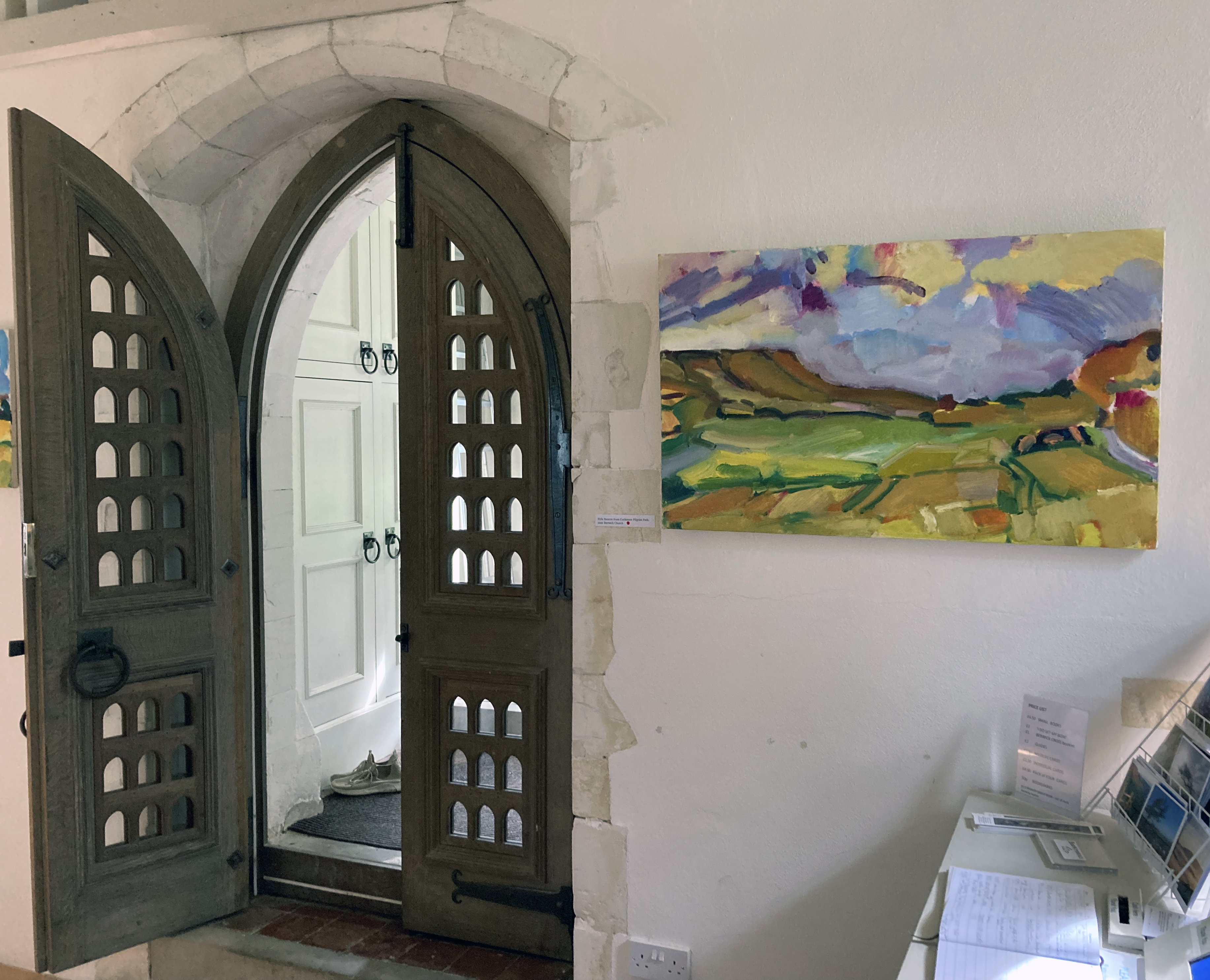
A Lewes Artwave exhibition at Berwick Church

September 2022

Growing Rich With Looking

In a post-industrial revolution context the English countryside, for so long a subject for painters, can still be a strangely ‘other’ environment for so many. Nowadays this space we call the ‘countryside’ is a place of escape and rest, suitable for a day out or for a camping holiday. For the daily traveller going about their business the countryside is a fleeting arena placed in between centres of commerce and mass housing. Viewed from the train, bus or car window lack of access may even create tension. Despite being loaded with mythology, folk tales, notions of paradise (very much lost), agrarian history and, for the south of England in particular (arguably the birthplace of capitalism) a mode of enquiry for the contemporary artist continues on to the ecological crisis that now impacts our “green and pleasant land” (to reference William Blake).

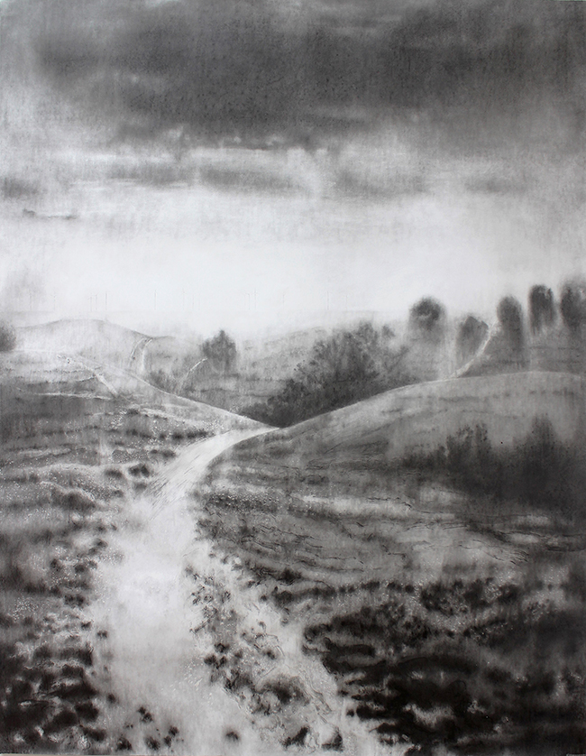
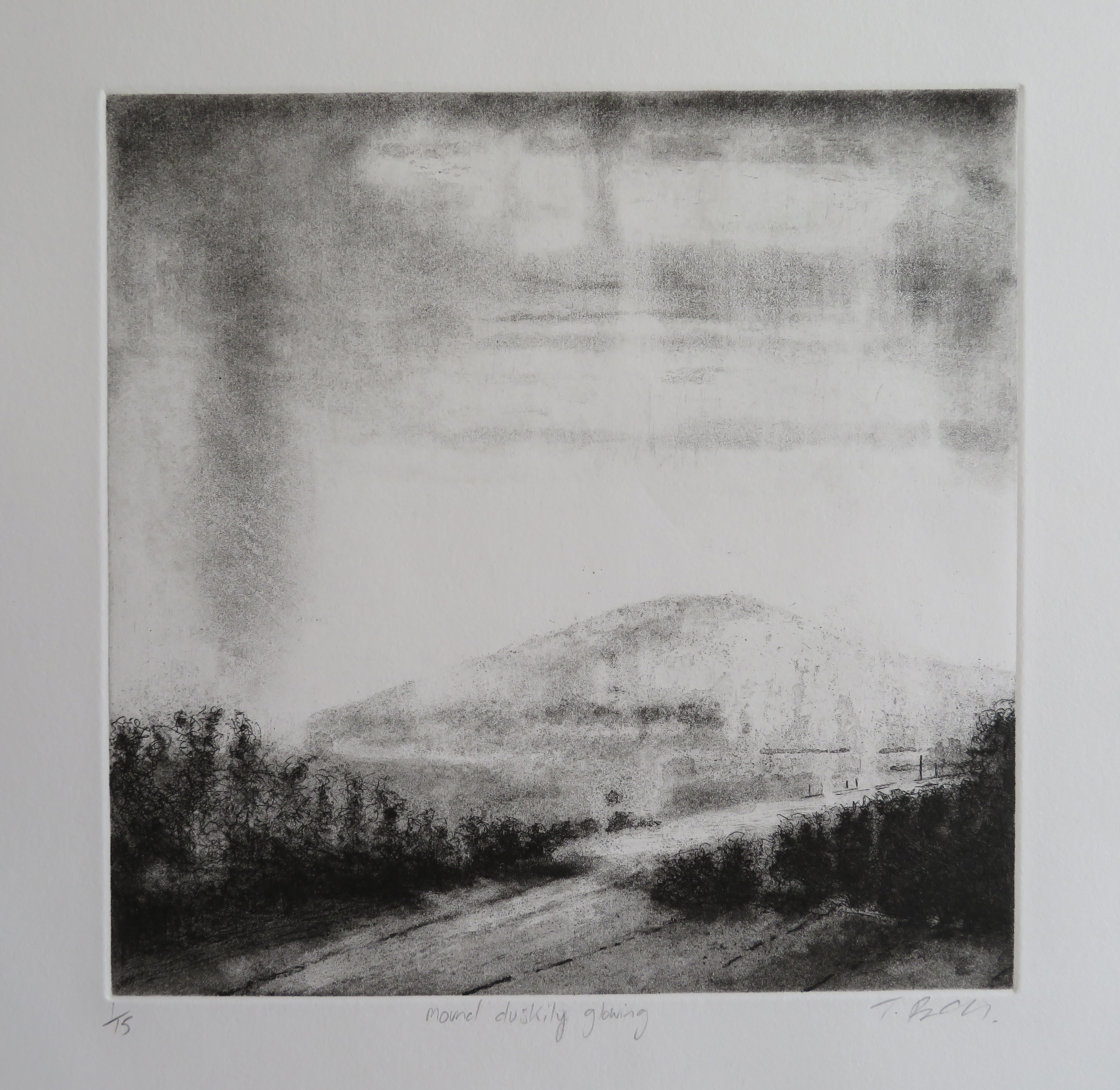
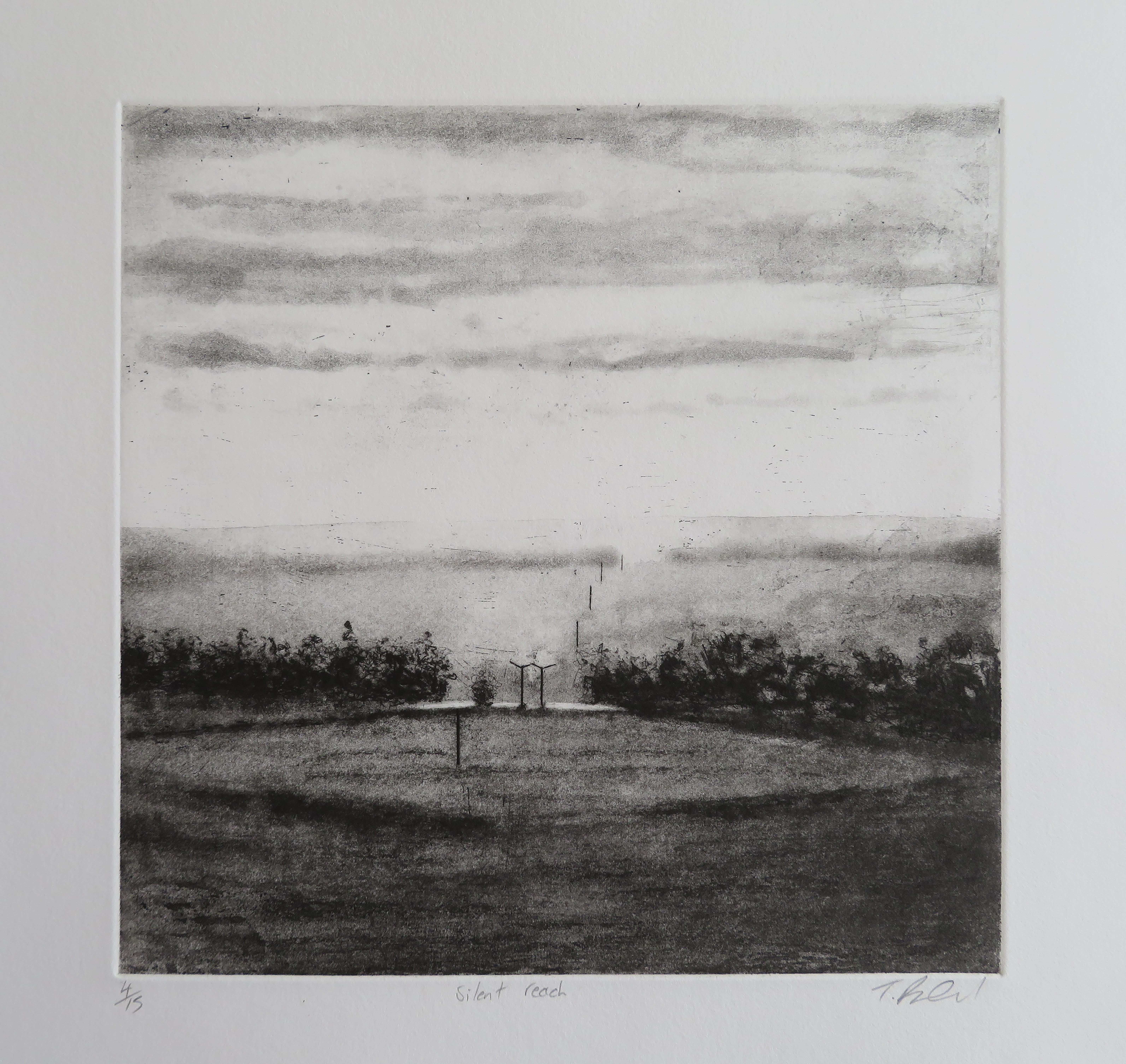
Julian Le Bas is a painter, perhaps the contemporary painter, of the Sussex section of the South Downs and the adjoining coast. Le Bas bares witness to this typically splendid and beautiful geography of chalk hills and woodland as he engages with his, and our, local world on a journey that has been his indefatigable undertaking for over forty years. What lesson we might learn from his ongoing life-long project is that every day and every scene presents a seemingly revived landscape offering a new vista, and a fresh encounter, with the apparently commonplace. The landscapes from Le Bas are tirelessly offered up, renewed, for continuous engagement and revelation.

Paintings and drawings, made en plein air and in isolation as he travels alone, invite a congregation of onlookers in a small exhibition of paintings and drawings at Berwick Church for this year’s Lewes Artwave Festival. Le Bas’ paintings exalt and revere his subject matter – and how fitting that we see these works in a place of worship. This particular church might be considered a wonderful art installation in itself, purposely referencing the pre-Reformation model of the church as the historical forerunner to the ‘art gallery’, permanently containing murals by Vanessa Bell and Duncan Grant, plus the recently commissioned altar reredos panels by Julian Bell.

The paintings and drawings from Le Bas, however, are secular in subject matter and intent but unequivocally express awe at the natural world. Le Bas is the epitome of the artist engaging in the role of shamanic consort, expressing the elevating metaphysicality of the everyday through the ordinarily magical presence of the landscape. It may take a leap of faith to accept such a purposely contradictory definition of this particular artist, but the work continuously appears to convey this sense of the uniqueness of the quotidian and the local which changes in appearance – not only due to time of day or season, but is subject to the artist’s own mood or degree of engagement at any particular time.

These paintings are of the moment – a duration measured in hours we might assume. Le Bas uses an English post-Impressionist palette where high key colour combines with earthy local colour. His engagement with colour reveals both a romantic and a matter-of-fact connection with the notion of landscape experience. But what does this mean if it’s a correct interpretation? I would argue that some exaggeration, a visual proclamation in his use of colour and insistent mark making, is intended to bring the viewer into the work and to remind us that the magical landscape is still a worthy and increasingly important genre – especially as it contributes to our burgeoning awareness of global environmental issues.

The personal capacity required of a contemporary painter, with an arguably dated assignment to record the landscape, and at first glance unshackled by what might be on trend at present, is necessarily blinkered to enable a deep focus on such a potentially numinous experience of landscape. A logical pragmatist, a post-modernist, might reject Landskip as relevant now (unless it provides a context for other, grander, socially and politically qualified narratives), but one role of the artist might still be to say: “look at what I have seen, see what is available to all”.

Or, to take most of the words of R. S. Thomas from the poem, ‘The Small Window’:

“… there are jewels

To gather, but with the eye

Only. A hill lights up

Suddenly; a field trembles

With colour and goes out

In its turn; in one day

You can witness the extent

Of the spectrum and grow rich

With looking…”

Like this poet, associated with the Llŷn Peninsula in north Wales, Le Bas is tuned in to the sheer visual experience of his own landscape, not withstanding its potential to transform our experiences. Le Bas reminds the viewer that this environment is bursting with colour as much as any city has to offer and that it has the indefatigable capacity to ‘move’ us and to provide space to think, to plan and reflect and to explore. On a trite level, even a small canvas of Le Bas’ in the urban home will break down the barriers between the town and the country; but also on a metaphysical level, based on concrete experience, a transformative understanding of the landscape environment is possible too. Perhaps usefully, we cannot seem to let go of our obsession with ‘the countryside’. Landscape as a genre, engaged with constantly by the Sunday painter and the obsessive, committed practitioner alike, persists in our culture – which is quite assuring.

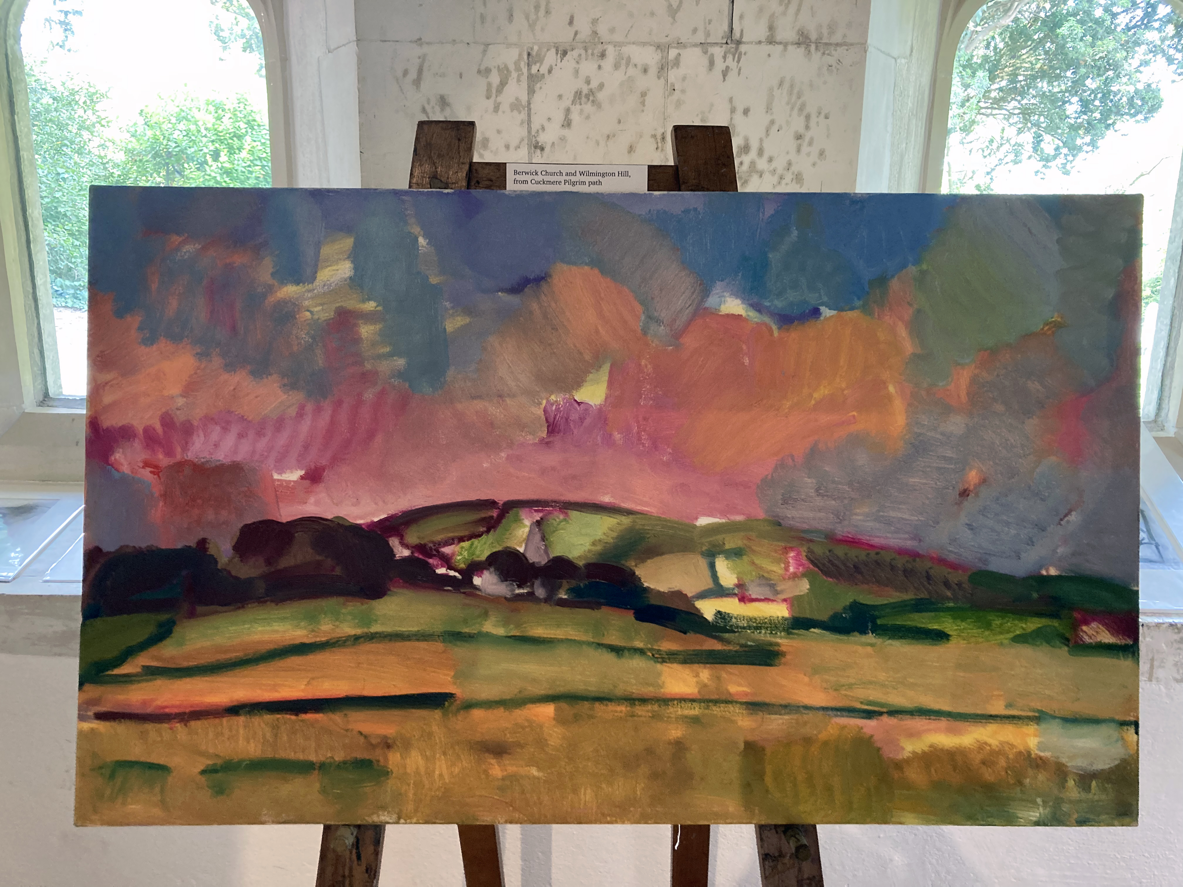
Whilst there is a certain, expressionistic conventionality in Julian Le Bas’ paintings and drawings (which I say in a positive sense), the gestural yet restrained visual language, honed and perfected after years of hard practice and utter devotion, results in a compelling engagement with his subject matter. For some observers he may exaggerate colour and mark making at times, approaching a general expectation of abstraction, but this is the hook that pulls one in and presents the eye and mind with spatial conundrums of simultaneous senses of flatness and depth. The generally bold brush marks are laid in areas that intermix, overlap or abut, amounting to a distinctive patchwork of organic shapes. Local colour and colour in its own right – straight out of the tube, Fauve-like – or mixed on the canvas as well as the palette to create secondary and tertiary mixes, make a variety of colour combinations. Realised as mark and gesture as well as for their tones and values, these colour-shapes are at once based on responding to visual reality and to testifying to a daily practice that celebrates the act of painting, whatever degree of verisimilitude is sought. There is clearly an extrovert inclination in these paintings, revealing an emotional involvement steered by rigorous and disciplined draughtsmanship. This engagement with the physical qualities of medium, from compressed charcoal in his drawings to oil paint on canvas, Le Bas’ works are somehow a summation of perceived experience with an aspect that says, “look at this world around you and engage with your whole being”. This is very much a serious undertaking, where pleasure is often an outcome.

In Le Bas’ paintings the drawing content morphs, via the brush, into painted lines that delineate shapes and forms, often flat rather than rounded, but creating visual space on the canvas. Perspective is loosely reduced within the network of colour-shapes but an abstract, surface acknowledging, arrangement of colours and gestures there is also an essence of movement. The observer might detect a degree of improvisation too, as taking liberties with mark and colour is a strong characteristic in Le Bas’ work. The paintings are made from a totally immersive activity of looking at sections, and spatial passages where the eye has been lead in deep concentration, engaging with various parts, structures, surfaces and atmospheres that make up the whole. A ‘whole’ that actually includes the observer, for if the environment is captured in spirit, it also captures us. In these paintings there is a record of being that is symbiotic with ‘nature’ as, in a real sense there is no divide. If we learn to appreciate this environment, starting with the local, with what’s in front of us, we might start to protect it better and therefore see that Le Bas’ paintings are as relevant as any other contemporaneous projects that have a more immediately political purpose.

Philosopher and Ecologist, Timothy Morton has written:

“Somewhere a bird is singing and clouds pass overhead. You stop reading this book and look around you.” (‘Being Ecological’)

We might stop looking at paintings and look around too, but engaging with the art might be the doorway we need to see what’s in front of us.

Geoff Hands ( September 2022)

Links:

Julian Le Bas – http://www.julianlebas.co.uk/home.html

Sarah O’Kane Contemporary Fine Art – https://www.sarahokane.co.uk/julian-le-bas-gallery

Berwick Church – https://www.berwickchurch.org.uk

R.S. Thomas – https://www.poetryfoundation.org/poets/r-s-thomas

Timothy Morton – https://www.theguardian.com/books/2018/jan/20/being-ecological-timothy-morton-review

“STRANGE ATTRACTORS” – Paintings by EC

AbCrit.org gallery, London

5 June to 3 July 2022

abcrit.org gallery

“This work does not conduct itself with grand gestures. The best of these paintings make themselves felt intuitively and structurally by measures quite human. They progress carefully, in challenging jumps and starts. They are full of free and varied thought, without self-importance, working towards new and distinct states of abstract reality.” (Robin Greenwood, AbCrit website)

After seven previous shows this is the first exhibition in the newly extended abcrit.org gallery in Bell Yard Mews near the White Cube gallery, showing paintings by EC. There are 24 works on display ranging in size from 30x20cm to 122x92cm, with various permutations in between. Five are square and others portrait or landscape format. For such a range of disparity in dimension this collection literally hangs together in unison. There is a sense of the ‘series’ about the selection, yet every work has an independent status and can be viewed as a discrete piece.

The various titles are intriguing too. They read like a list of poems. For example:“Your Exquisite Manners (Frankly)”; “Unforbidden Pleasure Seeker”; “It Takes Patience to Make a Disaster”; “Yellow Swing Yellow Swing”; and “All Trajectories are Unstable”. Although “PUNK JAZZ”, the only work titled in capital letters, pays homage to a Weather Report track from ‘Mr Gone’ (1978) in which, at the start of the composition, Jaco Pastorius launches his bass guitar expertly into an unforgettable percussive jazz fusion frenzy that is, nonetheless, totally controlled. Rather like EC’s works.

EC – ‘Strange Attractors’ (90x75cm) 2014-22

These mixed media collages, that we can call paintings, are typically busy, boldly delivering overlapping patchworks of fragmented physical elements, purposefully destroyed then re-worked, but never distraught. Painterly fragments (as if) from the studio floor or bin, or from managed intentions to destroy previously made compositions, are sensuously positioned over the surface of supporting canvases. There is a visceral sense of chaos controlled, or rather, accommodated as the natural order of things prevails. Asymmetric balances and compositional nous bring these paintings into the current period of abstraction as a breath of fresh air. For this is serious stuff. Not content with employing pretty colours, punchy but vacuous vistas or harmonious and undemanding safe passages of expressive playfulness arranged for decorating an interior space, EC’s project engages with hard-earned visuality and an inherent depth of thought. The works truly engage and demand attention so honestly that you can detect joy and frustration combined. EC is one of those artists who are not distracted by the whims of fashion, socio-political issues, political correctness or commercial endeavour. This makes her work all the more engaging, as it constitutes a somewhat precarious road to travel upon that does not seek a ready-formed market position for safety.

EC – ‘Bias Interruptor’ 2022 (122x92cm)

Is EC’s project Dada-esque in spirit? Not so much anti-art (which Dada never was, of course) but anti-comfort: deploying the punk impulse to rock the boat (before it was integrated into the mainstream) when challenges are required to wake us from our stupor. From a first impression the viewer might wonder if this is a chaotic mess – though even chaos has a hidden pattern and logic. After all, why not explore and present ‘mess’? Chaos eventually controlled or simply halted at a stage of completion that is subjectively felt, has lead to these captivating and provocative works in “Strange Attractors”. Yet in a painting such as ‘Bias Interruptor’, or ‘Sanity Project (Radical Will)’, by giving some time for the paint smears and splatters seemingly applied by chance some careful looking, the open distribution in the former or the painterly concentration in the latter, actually read as carefully placed and subtly balanced compositions that reveal an expert eye and an adeptness for composure. There’s the punk irony, which hooks the viewer with clattering surprise but cares passionately after all.

EC – ‘Yellow Swing Yellow Swing’ (31x25cm) 2018-22
and ‘Swelter’ (40x30cm) 2019-21

Notably, the colour black appears in all of these works, holding things together akin to the lead scaffolding in stained glass windows. A disparate framework unevenly dispensed at times gives structure to hold the roving eye. Amalgamated into and alongside relief patchworks, dynamic structures, colour-as-paint (and vice-versa), these seemingly accidental and fortuitous juxtapositions make for engaging visual judgements that are anything but flaccid or disorganised. In the previously mentioned ‘Sanity Project (‘Radical Will’)’, a fragment of black (ink) text appears unexpectedly. Maybe it is an oblique clue of sorts. The title page from an edition of ‘Styles of Radical Will’, a collection of essays by Susan Sontag has possibly been torn up, discarded and disclaimed. I want to doubt it somehow (show some respect!): but here it is, peeping through the collaged detritus close to the centre of the composition as a potential manifesto statement.

EC – ‘Sanity Project (Radical Will)’ detail

In Sontag’s essay, ‘The Aesthetics of Silence’ she writes:

“… art comes to be considered something to be overthrown. A new element enters the individual artwork and becomes constitutive of it: the appeal (tacit or overt) for its own abolition – and, ultimately, for the abolition of art itself.”

The text and the concept have taken visual arts aside far too much and must be subsumed within the work itself, not held part in judgement. I wonder if EC’s mission is to toy with this radical notion that favours a changing resolution of “the human situation” (Sontag) as a form or manifestation of “spirituality” (Sontag, again) as an ironically playful project in itself, creating (or finding) some sort of order in chaos. Do these works employ the abstract absurdity of consciousness and self; notions of reality and worth vis-à-vis the creative impulse – and the concrete materiality that is abstract art? It all adds up to everything and nothing. But it’s something most refreshing and attractive.

EC – ‘Unforbidden Pleasure Seeker’ (30x30cm) 2019-21

Notes:

abcrit.org – Block K, 13 Bell Yard Mews, 175 Bermondsey Street, London SE1 3UW

Visit by prior appointment. Text your name and requested date and time to 07866 583629, for return. The entrance to Bell Yard Mews is opposite White Cube.

Links:

Instagram: @ec_ismyname and @abcritgallery

Susan Sontag – Styles of Radical Will

http://www.susansontag.com/SusanSontag/books/stylesOfRadicalWillExerpt.shtml

PERDITA SINCLAIR: Small Towns

Window Gallery, Phoenix Art Space

15 January – 20 February 2022

Phoenix Art Space entrance (Photo: Bernard G Mills)

Visitors will surely be intrigued by the spectacle of the colourful, carefully and skilfully painted oil paintings that join together under the title of Small Towns, an exhibition from Phoenix Art Space member, Perdita Sinclair. Usefully there are chairs spaced along the broad corridor that encourage people to sit and take stock too. Paintings (especially good ones) deserve prolonged attention rather than the perfunctory or passing glance.

A sequence of eight canvases begins with ‘Pineapple’, which at 165x125cm is the largest work on display. The title is suggestive rather than descriptive as it could just as well allude to a portrait as much as an exotic fruit. But more about titles and interpretations later, for what we do see before us is a figurative painting of a mound of litmus-test-type strips of variously coloured papers. Or are these tickertape off-cuts from the studio floor? They look like discarded fragments purposely gathered together and fashioned into something specific but just out of reach of a clear identity.  Also, it’s an inventory of sorts, as if a student painting class has completed a day of mixing colours and these are the results, a fairly comprehensive range of all six primary and secondary colours plus black and white. As an extension to the task of mixing the paints perhaps a still-life has been produced wherein the painted shadows form greys and other tonal varieties of the colours. There are some striped pieces too, including red and white that might be paper bags from a sweet shop. As interpretation creeps into observation of the image one might sense that the coloured papers are hiding something. It might be a pineapple, as the title implies, or a vertically held up thumb or even a portrait of sorts. Is the title a trick? Is our humour being tested? Has the artist literally set something up for the viewer to interpret as they wish?

Perdita Sinclair – ‘Pineapple’ (165x125cm) oil on canvas

Seven more paintings are to follow and questions persist. Each is clearly an original statement but all link somehow. Colour pervades, as does clarity of form and skilful rendering. Are these portraits or still-lifes? Do the generally blue/grey backgrounds suggest skies, distances, neutral space? Are these singular forms still or floating in space? There is no clear external context in the paintings; all content is essentially contained within the implied forms. But let’s not forget the artist and/or the viewer. Could these be self-portraits or mirrors – or both?

Perdita Sinclair – ‘One In Hundreds and Thousands’ (80x60cm) oil on canvas

If the viewer takes in the whole sequence from left to right there is some suggestion of a progression, or morphing, from a still-life type configuration to a portrait of sorts. After ‘Pineapple’, ‘One in a Hundreds and Thousands‘ appears to be a form floating in a sky-coloured atmospheric space. Within and around what might be locks of long flowing hair there are triangles of painted papers or thin card. Some of these fragments are painterly wet into wet renderings that could reference landscape based fragments or abstract compositions. The striped papers are here too. There is a sense of the organic and the geometric making some kind of union. Next, in ‘Along the Coast from Yarmouth’ a similar sort of composite form has come back to earth, or rather an ethereal sea with reflections or submerged forms.

Perdita Sinclair – ‘Along The Coast from Yarmouth’ (80x60cm) oil on canvas

A mixture of flat triangular forms, mostly airborne, and flat on the picture plane slightly undermines a traditional perspectival reading. Predominantly there is a shallow or tightly enclosed space created from the spatial arrangement of the entangled forms in the foreground. A snaking red, blue, yellow and white candy stick at the apex of the arrangement meanders down to, or up from, the base. It is also partly submerged. Likewise, the tricolour ribbon also winds its way from the bottom of the composition to the apex. An echo or reflexion of the red, white and blue form is placed behind this mysterious configuration to suggest some depth and a flattening simultaneously. Solidly rendered, yet flat triangles (X7 white, X5 red, X2 blue and X1 black – for it seems pertinent to count them) float around or penetrate the central mass/form. Unexpectedly, centre-left, a curvaceous form that might be fish or snake skin, or possibly a hand-dyed scarf on a slender shoulder, links top to bottom or head to torso.

‘Inbetween Castles’ is more grounded, and candy-type tubes employing the colours from the paper stripes from ‘Pineapple’ replace the vertical, elongated form of the hair. A flat triangle of colour at the apex of the form is possibly turning into a set-square. Read this more organically and the soft sticks of seaside rock might otherwise suggest intestines. It’s uncanny – by which I mean weird. But not grotesque or creepy weird; more like playful everyday, ordinary, artefacts being open to interpretation and association in the eye of the beholder.

Perdita Sinclair – ‘Inbetween Castles’ (80x60cm) oil on canvas

‘Lickerty Split’, the penultimate image in the sequence certainly does look like a glorious head of long hair. The title suggests doing something quickly, though clearly not the making of the painting. Take a look at Sinclair’s website and you will see that this painting, along with ‘Baskin in Obliquity’ displayed next to it, belongs to her Wave Theory series. Sinclair’s painting titles are fascinating. There is a mixture of deadpan humour and scientific awareness – as provided by this pairing. Natural forces are at work. The small town reference starts to make some kind of sense. Whether we live in a village, town or city we belong to relatively small communities after all.

Perdita Sinclair – ‘Lickerty Split’ (80x60cm) oil on canvas

This selection from Sinclair’s various series of painting themes and projects (she has also produced sculpture and installation events) not only provides evidence of her undoubted commitment to painting but also prompts an intriguing meditation and reflection on what we think and feel about ourselves and our immediate familial situations and the world around us. A brief explanatory wall mounted statement adjacent to ‘Pineapple’, primes and sets up an opportunity for the viewer to see where the imagery might take their expanded thoughts:

My work reflects what I perceive as the dichotomy between the way the human mind confronts complex and serious issues and, at the same time, deals with the trivial ephemera of our everyday lives. I am interested in contradictions and tensions in human nature, which often express themselves through our interaction with the natural world.

Small Towns is an exploration of life cycles within confined spaces. The work is inspired by the geographical restraints that we have lived with which paradoxically turbo charge the mind into thinking about distance, difference and alternate realities. (Perdita Sinclair)

Thereafter the viewer is surely connected with each work beyond the immediate visual impact of the intriguingly titled pictures. As much as we might long for the day that we can forget about the ongoing pandemic that has restricted us physically and geographically, an unexpected benefit might be that we start to appreciate and more fully understand our truly global ecosystem that relies on cooperation rather than unabated competition and nationalistic introspection. Or at the very least, we might take what is near as a fascinating take off point for the imagination. For Sinclair it might be the trivial bits and pieces that one’s children might play with vis-à-vis the bigger issues that concern us.. This is an interpretation of superposition (another of her series of paintings) in which something (or a system) can be in multiple states at the same time until it is measured. It’s certainly the case that if we take the suggestion of the portrait from these paintings we must ultimately place the notion of self or identity within an environment, which can be either physical or metaphysical… but perhaps this is a step too far.

Perdita Sinclair – ‘The Infinite Gobstopper’ (80x60cm) (Photo: Bernard G Mills)

Returning to Sinclair’s work, she does not break with tradition to assert contemporary relevance and context. Despite alternative practices and technologies, painting has much more to say or remind the audience of. At a simple level, subject matter generally splits into and expands the categories of the portrait, still-life or landscape – with, arguably, the addition of abstract art. At a more nuanced and deeper level paintings perform (even when undermining or questioning) within conventions of visual culture, including iconography, aesthetics and culturally shared systems of visual language. Of course, within and beyond the visual arts painting also has to contend with ever developing technologies, particularly since the invention of photography and, far more recently, digital systems and the financially speculative advent of the NFT. But painting persists and potentially slows us down, in a useful self-reflective way.

Walking home from the exhibition, in my own small town, I unexpectedly thought of the work of the 16th century Milanese painter Giuseppe Arcimboldo, a Mannerist artist, who created portraits from a piling up of natural forms, especially flora, vegetables and fruits. The ‘Arcimboldo palindrome’ may also be suggested, whereby the apparent reading of a work is changed, not by turning the canvas through 90 or 180 degrees as the artist ingeniously invented, but by alternative conceptual readings and understandings of an imaginative invention, or inventory, as presented by Sinclair’s work. Intriguing, indeed.

Perdita Sinclair – ‘Baskin in Obliquity’ and ‘Lickerty Split’ (Photo: Bernard G Mills)

Copyright © of paintings remain with Perdita Sinclair (all are oil on canvas)

Installation images are copyright © 2022 Bernard G Mills. All rights reserved.

Links:

Perdita Sinclair – https://www.perditasinclair.com

Phoenix Art Space – https://www.phoenixbrighton.org/Events/perdita-sinclair-small-towns/

Giuseppe Arcimboldo – https://www.theartstory.org/artist/arcimboldo-giuseppe/

Also see –

Perdita Sinclair interview in The Organ – https://organthing.com/2022/01/17/13-questions-from-organ-perdita-sinclairs-paintings-are-alive-with-appeal-with-deceptively-soft-ice-creamy-colour-theres-an-undertone-though/

UP FOR GRABS at APT

Jonathan McCree, Bruce Ingram, Jonathan Goddard and Joe Walking

APT Gallery, Deptford

2 – 12 September 2021

APT Gallery

It was Thursday 9th September and Up For Grabs had been open for a week. A performance had already taken place some days before and the Private View was tomorrow. This was a two-week exhibition of painting, dance, sculpture and film. I had missed the dance and the film too, but a projector was being installed to show a video of the performance, but I couldn’t stay too long as I had a timed entrance ticket for something of apparent importance at the Royal Academy. So this would have to do, and thank goodness, it was probably the best part of the day. *

Bruce Ingram and Jonathan McCree

The front space was conventionally organised for an exhibition of sculpture and painting and Bruce Ingram and Jonathan McCree had three works each on display. By conventional I mean some works were placed on the wall at a comfortable viewing height and three more pieces were arranged on the floor with ample room to walk around. There was a balance. They were, it appeared, ‘finished pieces’ and ‘final’ as we expect artworks in exhibitions to be. As a first impression there was surely something going on about construction and deconstruction, about placement of the works and relationships within the works themselves. What was ‘up for grabs’ at this stage I wasn’t sure – maybe an opportunity to take something away from the show, or to suggest potential.

Jonathan McCree and Bruce Ingram

This initial selection and indeed this space could be complete in itself, but it proved to be something of a threshold to pass through, for in the next space that precedes the largest room at the rear, a clue to some playfulness was sensed from encountering an apparently disfigured column, a strongly vertical element, that was placed on the floor but had unexpectedly been folded at 90 degrees to fix itself to the wall to form an archway to tempt someone to stoop under and squeeze through. This piece was quickly followed by another of McCree’s stretched box forms wrapped around the protruding corner into the next space. Clearly an intervention had taken place at some point and as the artist was on duty to greet visitors today he explained to me a little later that one of the performers had previously indulged in interacting with the sculptures to adjust them to the gallery environment.

Bruce Ingram and Jonathan McCree

Also in this middle room were more of Ingram’s works and by now there was more of an obvious or staged interaction between the two artists’ works. Typically, Ingram’s works explore found materials in assemblage and collage-type painted forms employing plaster and various paints (household and artists’ acrylics) to fuse the various elements together. Placed on the floor rather than on the wall one of Ingram’s constructions formed a framework to look through to see another work beyond. A sense of destruction as much as building the artefacts of the environment was taking shape. As a visual tease, Ingram’s works have remnants of colour applied, similar to McCree’s suggestively ‘out of the tin’ coatings, to link the works. Contrasts of smoothness and rough surfaces distinguish the two to some extent but the pairing is not incongruous.

Bruce Ingram

My daughter and I walk around a while, tuning in still to a display that has transformed from calm quietude at the main entrance to visual and spatial cacophony in the largest room. I pick up a press release (which I shall read on the train back to Brighton later, as I want the work to speak to me first and foremost) and start to scribble some notes on the reverse:

Enter the labyrinth, parts, bits & pieces…

Plenty to see, though not too much…

Image / Object – which will predominate…

What is an exhibition for?

Jonathan McCree

What is an exhibition for? Now that’s interesting. In this instance, Up For Grabs is certainly entertaining, exciting and memorable. The individual paintings and sculptures work on their own terms, but as an arranged event (sadly for just over a week) the exhibition comes alive as a happening of sorts as much as a static display. I imagine the missed performance and projected film work that preceded today’s visit, which isn’t enough, but will have to do. The finished and unfinished, or work in progress nature of the works, suggests a similar modus operandi for the viewer. There is method in looking, in relating to the artworks physically, spatially and psychologically. Visual art is not exclusively about seeing; it offers possibilities for recognising the power of one’s own imagination (and sometimes a lack of). There are formal relationships to find or be presented with. There are colours and textures to indulge in. Likewise there are parts that seem to work perfectly and others that the viewer might desperately want to change – even to improve. The visual aesthetics provide a way into potential readings that could suggest social interaction, notions of community, interdependence, the built environment (including furniture) and the politics of choice, indulgence and creativity.

Jonathan McCree

My daughter described the assembly as “rocks and trees”. Jonathan McCree talked perceptively about “… delaying uncertainty in or from painting to the sculptures, which are moveable parts”. This gave his three-dimensional work edginess, like it was finished but not really. Or resolved, but hopefully not so as it invited some form of change.

This exhibition, no – this environment, concocted a landscape of sorts, an active space demanding an audience to interact by looking, moving, pacing, stopping; head up then head down, confronting occlusions to find surfaces, then seeing variously coloured or textured planes morphing into three-dimensions giving way to silently laughing, then becoming equally engrossed or bemused. Performing a journey, in effect, as an exhibition is not necessarily a final resting place for particular works – anything might be up for grabs; even our expectations.

Jonathan McCree

Note:

* This statement is a little disingenuous as I was also impressed with Mind’s Eye at Flowers in Cork Street where Carol Robertson’s geometric works had been displayed with Terry Frost’s. My review of this show has been published by Saturation Point. See the link below.

Bruce Ingram

Links:

Bruce Ingram

Jonathan McCree

High Folly: Jonathan McCree at Sim Smith

Saturation Point review of Mind’s Eye at Flowers

TANIA RUTLAND: Chip of flint – fragment of chalk

Tania Rutland: Chip of flint – fragment of chalk

Window Gallery, Phoenix Art Space, Brighton

2 – 24 November 2019

TR - Poster

‘Crowding the solitude’, ‘Ghost white path’, ‘Night’s first light’, ‘Silent reach’ and ‘Restless lane’ might be headings in a list of poems from a collection that constituted a volume of landscape inspired verse, but they are selected from the titles of drawings and prints from Tania Rutland’s exhibition at the Phoenix Art Space.

Another title, ‘Chip of flint – fragment of chalk’, makes reference to commonplace Sussex downland geological material that could have been gathered from her visits to Iron age Mount Caburn and Neolithic Cissbury Ring in East and West Sussex and is the intriguing title of this exhibition.

040 - TR - Chip of flint - fragment of chalk (28x21cm) pencil and graphite on paper.jpg
Tania Rutland – ‘Chip of flint – fragment of chalk’ (28x21cm). Pencil and graphite on paper.

The very idea of a ‘chip’ or a ‘flint’ suggests the collection of a memento, a physical token from a walk, picked up to place on a shelf when home. Such an item might be revered as a memory of a time and place spent in solitude or with a partner or friends from a Sunday walk. The cultural pursuit of walking might be a form of escape from everyday life, most especially the ‘working week’. A leisurely stroll or demanding hike, especially in the countryside, can be rejuvenating and refreshing. It might also be consoling during a time of stress. A walk is healthy for both mind and body; and for a landscape artist a place for research, inspiration and hard work.

Though superficially a landscape exhibition, on reflexion, ‘Chip of flint – fragment of chalk’ is loaded with speculative and thought provoking possibilities enabling the visitor to take away the non-physical souvenir: not to be placed on the mantelpiece but constituted in the form of ideas to consider and discuss further and, ultimately, leading to environmentally focussed action.

From the very start of the corridor space Window Gallery, making a de facto antechamber, two wall-mounted assemblies of small, unframed, preparatory drawings make it clear that drawing is at the core of Rutland’s practice. As an introductory display, sufficient in itself as a stand-alone exhibition, the 28 studies make an implied proposition that drawing is still of paramount importance towards painting, especially in landscape art. Whilst an en plein air approach is also possible, the drawing in advance of the essential schema for a final painting, even without colour content, provides the opportunity for intense consideration of composition and content; and for revision of the essential rectangular format. Rutland’s methodical approach also develops the initial ‘sketch’ to a more ‘finished’ state and therefore requires a more prolonged period of execution. In this respect, the lengthening of time to make what might simply become no more than a preliminary part of production, adds to the inherent conceptual aspect of Rutland’s greater project, namely that of time and duration.

001 - TR - Untitled 1 (Fatigue of early light - Mist's cover) (14x16) prep drawing
Tania Rutland – ‘Untitled 1 (Fatigue of early light – Mist’s cover)’ (14x16cm) Preparatory drawing.

Annotated on half a dozen of these relatively intense drawings are more titles, including: ‘Ghost lines’, ‘Eroded slope’, ‘Frozen light’ and ‘Fatigue of early light’. Without mounts, but with clearly measured and demarcated perimeters for consequent development into paintings, these studies may have come straight from the studio wall in her Phoenix studio. This informality in presentation might have initially diminished an observer’s attentive reaction to these works, but throughout the opening evening many visitors could be seen both standing back to view each of the two groupings of drawings and then be observed stepping closer to scrutinise each image as if through a magnifying glass. In relation to time a second aspect, that of concentrated visual observation of various locations, loaded with evidence of human interaction in and on the land (and sea), also implied itself in the bigger project.

029 - TR - White ghost path (200x150cm) pencil and graphite on paper.jpg
Tania Rutland – ‘Ghost white path’ (200x150cm). Pencil and graphite on paper.

Continuing into the main display space the biggest piece in the show first greets the visitor in contrast to the small studies just encountered. The pencil and graphite ‘Ghost white path’ impresses not just by size alone (200x150cm), but also by a display of controlled elegance in mark making and an example of compositional skill in which the viewer might literally fall into this Downland vista. As a completed drawing, ‘Ghost white path’ is as consummate and exhaustive as a painting might be and therefore expands the notion of drawing as going beyond the supportive role that it often takes.

In this significant work the viewer will certainly gain a sense of the past and the present day in one hit. In the bright distance, where the intense light dissolves the sea from sight, the Rampion wind farm turbines that now dominate the view from the Sussex coast have been recorded. Whether these technological structures please the viewer or not, like the telegraph poles we may barely notice anymore, or the electricity masts that cannot always be buried beneath the ground, we will inevitably have to become accustomed to this burgeoning technology for generations to come.

The past and present (an ancient landscape and an off-shore development) combine in one monumental vista so that a viewer has to contemplate a challenging and controversial journey to the future in this era of climate change awareness and necessary proactive behaviour.

031 - TR - Mound duskily glowing (24x24cm) etching.jpg
Tania Rutland – ‘Mound duskily glowing’ (24x24cm). Etching.

Four monochromatic etchings are displayed next, including ‘Mound duskily glowing’, a title merging topography with time and light, which again suggests a poetic counterpart (a haiku perhaps) that may one day be written. In ‘Silent reach’, telegraph poles located in a flattened mid-grey rhombus in the central area of the composition leads the eye from foreground to mid-distance. The poles could be traversing alongside a coastal area, or trace a communications route a few miles inland, leading to the next village or town. Very few regions of this relatively small island will be without such evidence of human habitation, as if such evidence of technology was as natural a phenomenon as the trees.

033 - TR - Silent reach (24x24cm) etching.jpg
Tania Rutland – ‘Silent reach’ (24x24cm). Etching.

With a change of process and medium Rutland allows a weathered, washed-out look in the thinned ink layers transferred from the surface of the metal that she has etched with. For example, in ‘Selvedge edge’ the distant hills are visually subject to mist dissolving form, whilst rain falls as weather conditions change appearances. In the bottom section of the image fence posts create a small enclosure, a signifier of order and land ownership. A telegraph pole, like a crucifix, in middle ground, merges at its base into foliage. Dark parallel lines in the foreground, perhaps suggesting the selvedge edge of fabric for the title, foretell the flint seams in the set of the four ‘Flint Seam’ drawings that are to follow.

032 - TR - Selvedge edge (24x24cm) etching.jpg
Tania Rutland – ‘Selvedge edge’ (24x24cm). Etching.

These more minimalist compositions, ‘Flint seam 1, 2, 3 and 4’, are placed at the centre of the show. They are undoubtedly complete in themselves but may well hold the prospect for further development as abstract paintings. Each is placed behind a clear acrylic sheet, rather than mounted in a conventional frame. Like its counterparts, ‘Flint seam 2’ is composed of a series of vertically placed horizontal bands of smudgy, burnished graphite drawn on to a gesso (i.e. chalky) coated, paper ground. Within these thin, dark, cloud-like strata are more defined linear marks suggesting a compressed handwriting with a slightly nervous, quivering organic edge.

035 - TR - Flint-seam 2 (66x46cm) pencil and graphite on gesso paper.jpg
Tania Rutland – ‘Flint seam 2’ (66x46cm). Pencil and graphite on gesso paper.

These often flat and smooth, mark-like shadow shapes are found in split flint nodules originating from sedimentary chalk that litter the farmland in Sussex and have been used as building materials for walls and buildings since the Roman era. Further back in time flint was fashioned as a Stone Age tool. But way beyond any human presence on earth they are a literal compression of geological time and materiality that seems beyond comprehension and may well suggest a natural kind of drawing. Dark and wave-like, these markings made from the chalk seabed reveal fissures of implied energy. As a form of visual poetics, the past is metaphysically now in these teasingly simple, but thought provoking and elegant drawings.

039 - TR - Crowding the solitude (28x21cm) pencil and graphite on paper.jpg
Tania Rutland – ‘Crowding the solitude’ (28x21cm). Pencil and graphite on paper.

At what appears to be the end of the display, a group of five framed drawings (including the title piece of the exhibition) are presented in suitably mounted and framed studies that, like the etchings, read as ‘finished’ works. They include ‘Crowding the solitude’ which is a similar composition to the aforementioned ‘White ghost path’. In the mid-ground the land builds steeply to two bulbous hills; to the right on the implied horizon are the perspectival rows of 14 vertical masts from the Wind farm out at sea. In the space between the hillocks, and particularly on the left hand feature, is a meandering configuration of chalky pathways. The closer foreground is patterned by a gentle arrangement of subtle tones that visually pock mark the paper surface. The notion of the landscape as corporeal and libidinous is difficult to deny.

042 - TR - Flint (42x42cm) pencil and graphite on paper.jpg
Tania Rutland – ‘Flint’ (42x42cm). Pencil and graphite on paper.

The last of these five drawings is titled ‘Flint’. Initially it could be a drawing that goes unnoticed, such is the insistent or subtle presence of so many of the other works. One feature, however, hooks the gaze as one might head for the coffee bar and the prospect of seeing a painting from Tania Rutland. Within this rendering of what may be a recently ploughed and almost featureless field, a tiny but visually dominant grid-like structure interrupts the shallow curve of the land, just before the dark masses of a thicket of trees on the close horizon, revealed contre-jour, emphasising a sense of infinite space beyond. Its identity is a mystery: could it be a wooden or metal framework? From the bottom right-hand corner of the drawing a purposely trodden pathway leads to the unknown construction and it could be that the track across the field has been rendered into the surface by either animals or humans.

043 - TR - Remote dwellings (40x40cm) oil on canvas.jpg
Tania Rutland – ‘Remote dwellings’ (40x40cm). Oil on canvas.

Outside of the Window Gallery, but in a suitable display space that extends all of the exhibitions, one of Rutland’s oil paintings, ‘Remote dwellings’ is presented on a dark grey wall. This provides an example for those who do not already know her work and is now interestingly and more than adequately informed from seeing the drawings and prints. One painting is probably just enough exposure in this context and holds out the prospect of seeing a future exhibition of Rutland’s paintings.

Significantly, this work in the more ecologically minded attitudes of society today is made more potent by its combined references to the past, present and future. The human conquest of the environment is, of course, aided and abetted by the genius of technologies, open to interpretation and revision. The drawings and prints presented in ‘Chip of flint – fragment of chalk’ not only record and reflect the history of particularly special locations, but provoke the observer to contemplate the future too.

Geoff Hands (November 2019)

All images © Tania Rutland

Links:

Tania Rutland’s website – http://www.taniarutland.com

Phoenix Art Space – https://www.phoenixbrighton.org/events/tania-rutland/

Rampion Wind Farm article from The Guardian –

https://www.theguardian.com/commentisfree/2017/nov/11/brighton-rampion-wind-farm-turbines-renewables

IAN MCKEEVER: WEIGHT & MEASURE

Ian McKeever:

Weight & Measure – Prints 1993-2018

Young Gallery, Salisbury (8th Sept–27th Oct 2018)

A gallery above a council library seems an unlikely place to see an exhibition of prints by one of the most pre-eminent of British abstract painters. But Peter Riley, curator of the Young Gallery in Salisbury, has arranged an exhibition that constitutes the most comprehensive retrospective of Ian McKeever’s etchings, lithographs and woodcuts to date. All that were missing from the print category were his silver-gelatin photographic works, although two polymer gravure prints, which involve a photo-mechanical process, from ‘Eagduru’ (2015) were displayed.

Followers of McKeever’s career will know that, as with his various drawing and gouache series, the print output has been consistent in relation to his painting. The prints might be (mis)understood as extensions or preliminary exercises between painting periods, but the print editions stand alone too, forming coherent and independent bodies of work from well-defined periods of production. Not that the prints are necessarily unrelated to the paintings for the essential imagery of the prints are connected with the paintings in terms of sustained and evolving investigations into the visual dynamics of line, form and ‘abstract’, visual impact. So, if you love the paintings for their visceral and emotional effect, for prompting a meditative, slow pace of looking, and for following an authentic and active journey into a dialectically nuanced abstraction, the range of works in this exhibition will not disappoint.

001 - Weight & Measure poster at Young Gallery

The Young Gallery is divided into three rooms, and ‘Weight & Measure’ amply fills Galleries 1 and 2. Ideally the whole selection of prints would be distributed in one space to enable a manageable overview, but the extra wall space provided by Gallery 2 allowed for the rare showing of the monumental ‘Hartgrove Woodcut Monoprints’ made in 1994 with Hugh Stoneman. Printed on paper as strong as card (the sheets were originally reserved for Jim Dine), the four prints selected were pinned in line on one stretch of wall, unframed and benefitting from not having the glossy sheen of glass that can make viewing (and photographing) difficult, overlaying the surface.

The prints were made (or is manufactured a better term?) by cutting biomorphic, net-like shapes out of industrial plywood with a jigsaw. Coated with ink, the huge plates of thick laminate were passed through an etching press. The whole process engages a practicality of method and procedure, and an active awareness of the relationship between materials (wood, ink, paper) and process (cutting, placing, pressing), which is very much in keeping with McKeever’s association of the visual with the bodily and the corporeal. Most importantly, the combination of materials and processes leads to, and is lead by, an abstract visual aesthetic which transforms the medium and methodology into potent end results.

003 - Hartgrove Woodcut Monoprint No8 45degree viewpoint
Ian McKeever: ‘Hartgrove Monoprint No.8’

Even without a reflective layer, the black-on-black combination of printed ink impressions for ‘Woodcut Monoprint No.8’ required the viewer to adjust to a 45° viewpoint to make out the double layer of printing. This subtlety of surface, of ink and paper combining with the overall impact of a portcullis-like form fixed to the dark, flat plane not only invited an obligation to both stand back to take in and experience the pictorial space, but also to approach the picture surface as an immersive field to be visually traversed at close quarters. Smaller prints can function as objects one can pick up or leaf through in a portfolio, but these giant monoprints compel the whole body to engage, not just the eye and hand, as an architectural sense of edifice and entry might pull one in to its ‘space’. Conversely, the size of the works make the viewer more physically aware of height and width; density and vacuum; depth and surface. These palpable modalities are as just as consequential as intellectualised visual perception and abstract cognitive faculties. Or to put it more simply, the physical is the visual and the visual is physical.

The significant difference between printmaking and painting for McKeever lies in the experience of making the prints and the real time experience required for production. In the exhibition leaflet, quoting from his 2013 essay on Gunter Damisch, McKeever explains:

“To make prints (…) is to feel the weight and pressure of the moment. For the printed image is formed under pressure and is held in the moment. It is this difference of time, weight and feel which attracts so many painters to make prints. Providing as it does, precious respite from the incessant incertitude of paintings’ often meandering time.” [i]

004 - Ian McKeever, That which appears, 1993 Artists' collaboration 22 woodcuts by Ian Mckeever and poems by Thomas A Clark, Published by Paragon Press, London
Ian McKeever and Thomas A. Clark: ‘that which appears’


Another characteristic of McKeever’s vocation as a painter/printmaker has been his interest in, and engagement with, the written word. In the same gallery space as the Woodcut Monoprints, ‘that which appears’ (1993), which generated 22 woodcut prints to go alongside, around and be placed in relation to a sequence of 80 poems by Thomas A. Clark, was represented by 15 of the 32 double page spreads. This is a particular treat as The Paragon Press produced just 50 numbered copies of the publication and so they are unlikely to be seen in public.

Responding to Clark’s poems in this publication in Modern Painters magazine in 1994, the author Iain Sinclair commented: “He delights, as does McKeever, in being at a distance, taking in the whole spread, horizon to horizon, and right up against the lichen on the granite: in the same instant.” [ii]

This sense of the expansive and the more confined was demonstrated by putting these very different sets of prints together making for a fascinating juxtaposition. Turning away from the larger ‘Woodcut Monoprints’ in the room, the black graphical forms of ‘that which appears’ are much reduced in size, transforming sheets of paper into pages, taking the viewer into the text for a more intimate and cerebral experience. On one such page we read: “in a wide / darkness / the touch / of rain”. In the imagination, small droplets of water might spatter and impress upon the skin. But the darkness is a shadow form, in an actual but poetic space on the page. The reader can relate the text to the images or vice-versa, for these are not illustrations to merely visualise the poem. Both elements are constituted as ink on paper and as disparate but related manifestations of language/sign made ready to be read, and interpreted, as one is able or prepared for – in a format that becomes personal and intimate.

005 - that which appears - in a wide darkness text
Ian McKeever and Thomas A. Clark: ‘that which appears’

The same could be said for McKeever’s visual explorations throughout his engagement with printmaking (his first prints, lithographs, were made in 1984) – where conjoined qualities, such as weight and measure, are factors of process and materiality that result in a particular visual and tactile consummation. The compulsive moods of light and dark, flow and stillness, essence and particularity are implicit, to varying degrees in the prints. From series to series, McKeever repeats, develops, lets go and introduces new features.

006 - Colour Etchings installation
Ian McKeever: ‘Colour Etchings’ installation at Young Gallery

Moving into the larger Gallery 1, six or more print series were amply represented in part or whole and demonstrated this explorative journey. This included all ten ‘Colour Etchings’ (1996), works that were first shown at the Alan Cristea Gallery in Cork Street in 1997. The ‘Colour Etchings’ wall was as impressive and almost as impactful as the ‘Woodcut Monoprints’ already discussed, though more closely configured into two rows, one above the other, forming a larger rectangle. But these are black and white images. In the catalogue for the Cristea show McKeever is quoted by Pat Gilmour as explaining the reference to colour, “to feel a form’s aura, to make it luminous.” [iii]

That luminosity should replace or equate with colour is fascinating. On a simple level, luminosity means brightness but we know that with the right conditions light refracts into colour. Luminosity could also be considered as a lack of greyness – or darker tones. With varying degrees of contrast, McKeever creates grey tones from the combination of black ink on white paper to create and enable luminosity in the imagery. From constructing sometimes strong contrasts of black and white, with wiry grids and an inner rectangle with arms on each of the four corners of this shield-like form, the resultant ambient luminosity the aura is generated and appears within and around the proportionately large central motif.

008 - Ian McKeever, Colour Etching, 1997, (1 out of 10) paper size 69 x 53cm, Published by Alan Cristea Gallery, London
Ian McKeever: ‘Colour Etching’ (1 out of 10)

On the two adjoining walls in six frames were the colophon (a kind of title page) and five painterly ‘Sentinel’ (2005) lithographic prints, opposite five of the original nine etchings from ‘Between Space and Time’ (1998-99). The latter is a potentially significant series in that colour content appears as prominent as line, tone and form – although one of the two red prints and the orange print were not included here. This series was made in close proximity to the oil and acrylic ‘Assumptio’ canvases (just before and after starting the paintings, it would appear) and the ‘Pause’ gouache on paper series constituted the third and final stage of this cycle. In an interview with Jill Lloyd, in another classic Cristea Gallery catalogue for a show in 2000, the artist confirms the prints as a very direct forerunner to the paintings:

“Things are thrown up in the printmaking which allow me a much more direct access back into paintings and to taking them further than I could see by looking at the paintings themselves. It’s very symbiotic in that sense. For me printmaking has become invaluable as a counterpoint to the paintings.” [iv]

The prints were produced with Hugh Stoneman in Penzance, which would have necessitated a trip away from the painting studio in Dorset. This geographical remove presumably helps to create some degree of separation of procedure, although the psychic mindset for the whole two-year endeavour was as cohesive as the range of works produced.

009 - Between Space and Time 7 1998-1999
Ian McKeever: ‘Between Space and Time’ (7 out of 9)

‘Sentinel’, as the title implies, made for a commanding series of lithographs to confront the viewer, but any assertiveness was softened by the impact of the round cornered stone with the fine grain, mouldmade 270g BFK Rives paper. These prints cleverly delivered both subtlety and contrast of tone with imagery returned to and developed later on in ‘Assembly Etchings’ and ‘Six from Twelve’. So, although complete in itself, in retrospect ‘Sentinel’ is a taster of things to come.

OLYMPUS DIGITAL CAMERA
Ian McKeever: ‘Sentinel’ (1 out of 5)

The net-like weaves of organic structure in ‘Between Space and Time’ are also apparent in ‘Six from Twelve’ (2009), printed from three traditional lithographic stones, to make a set of six. The ‘Six from Twelve’ prints are quite pale if viewed from a distance and are somewhat problematic seen behind glass. But in close proximity the nets of grey strands, implicit gateways, and loose and fragile liminal doorways are as compelling as in any other series. Vertical buffers, in some instances displaced within the rectangular format, might represent form dissolving or becoming. These were the prints that I thought were not done justice by a typical exhibition wall display as they need more time for viewing, and their own unencumbered space, for the viewer to assimilate more adequately. The significance of ‘Six from Twelve’ is surely worth further investigation as they lead to the ‘Twelve Standing’ series of painting, where in a contrasting state, spaces become claustrophobic and black, red and white dominate. It might be that McKeever is still in the ‘Six from Twelve’ zone, as the painting series ‘Three’ (2013-2014) and ‘Portrait of a Woman’ (2014-2015) owe something to the lithographs, which indicates an ongoing presence originated in the prints.

012 - Ian McKeever, Six from Twelve, 2009, lithograph, (1 out of 6) paper size 56 x 42cm, Published by Hostrup-Pedersen & Johansen, Copenhagen
Ian McKeever: ‘Six from Twelve’

Contrariwise, an adjacent wall displaying all five of the ‘Assembly Etchings’ (2007) which are characterised by bubble-like forms and overlapping discs, extend rather than pre-figure the ‘Temple Paintings’ (2004-2006) en route to the ‘Assembly Paintings’ (2006-2008). The print in McKeever’s oeuvre is something more than a substitute for painting. Certainly one cannot divorce the prints from the paintings totally and ‘Weight & Measure’ confirms the symbiotic and collusive relationship between all of McKeever’s various bodies of work.

013 - Ian McKeever, Assembly Etching, 2007, (1 out of 5) paper size 51 x 38cm, Published by Alan Cristea Gallery, London
Ian McKeever: ‘Assembly Etching’ (1 out of 5)

In the last section of the exhibition another image/text series confirms McKeever’s interest in this literary art form. Some 24 years on from the woodcut and text combinations of ‘that which appears’, the series of lithographs, entitled ‘The Measure’ (2017), made in response to a sequence of poems by the American poet Peter Levitt, are displayed alongside the ‘Henge’ lithographs. These prints were also produced far from home in the Faroe Islands, which again facilitates a way of standing back, positively removed, from the central preoccupation with painting in the studio.

014 - Ian McKeever, The Measure, 2016-2017 Artists'collaboration 6 lithographs by Ian McKeever and 5 poems by Peter Levitt, Published by Steinprent, Faroe Islands
Ian McKeever and Peter Levitt: ‘The Measure’

A poem from ‘Stones of the Sky’ by Pablo Neruda was also translated for ‘The Measure’ sequence. The Neruda poem ends: “Before wind / stone was there, / before man and dawn: / Its first movement / the first movement / of the river.”

Here the juxtaposition of solid, seemingly immovable stone with the flow of water (or maybe ink for the printmaker and paint for the painter?) echoes visual qualities and tropes in McKeever’s work. The essentially flat and monochromatic colours (typically black, red and green) function as curtains or moveable sections in the recent prints which segue into ‘Henge’ (2017), a series of lithographs that follow paintings of a similar diptych format and, superficially at least, a colourfield/minimalist/abstract theme that reminded me of McKeever’s interest in Barnet Newman. ‘Henge’ also appears to have links to ‘Hours of Darkness, Hours of Light’, which demonstrates a shifting from one body of work to another where processes and media (including paper, canvas and wood as variable surfaces to work on with ink, paint or photographs) promises and prompts in a varying, ever-changing, morphology. Despite echoes and repetitions, the combinations can only increase the possibilities for more cycles of work in the various media and the importance of printmaking is duly espoused by ‘Weight and Measure’.

015 - Ian McKeever, Henge, 2018, lithograph, (1 out of 4) paper size 80 x 98cm, Published by Nutmeg Editions, London
Ian McKeever: ‘Henge’ (1 out of 4)

How do McKeever’s prints relate to his particular take on abstraction? All of this work looks abstract enough, from any stage of his career. Typically it appears to reference or be fed by personal (though not autobiographical) experience. In a concrete, material sense, whether we bare in mind his landscape references from the early days or from the ongoing allusions to the body in all manner of discussions about his paintings, a phenomenological framework appears pertinent. Not being well read on Husserl, Heidegger et al I now enter dangerous ground of course and I can only direct you to Wikipedia for a way into this area of philosophical theory and speculation. [v]

In the meantime we could rely on McKeever’s own explanations for his, and other’s, work. Returning to his essay on Damisch, he says of his printmaking:

“Perhaps the solution is not to look at the work as image-picture as such, but instead as evocations of thought or of simply manifestations of being in the world; as states of being.” [vi]

And, in his interview with Jill Lloyd, also referenced earlier, McKeever says:

“In a way I would see it as being a kind of post-abstract figuration. It is as if I’m trying to sense an image that is on the other side of abstraction and moving away from the abstract rather than towards it. I try to find a point where the prototype of this post-abstract figuration can be sensed lurking, ghosting. Where it’s suggesting a figurative edge, an edge of recognition.” [vii]

On one level ‘Weight & Measure’ provided an opportunity to look back at a quarter of a century of printmaking practice. To truly weigh up and measure McKeever’s various printmaking projects in relation to his painting the prints will ideally be shown again alongside his paintings in the future. For a debate, discussion and understanding of the continued development of abstract art we shall also have to take on board notions of post-abstraction figuration too.

Geoff Hands

All images © Ian McKeever.

Note: ‘Ian McKeever: Paintings 1992-2018’ will be displayed at Ferens Art Gallery, Hull, from 20 October 2012 to 13 January 2019

Links:

Young Gallery https://younggallerysalisbury.co.uk

Ian McKeever’s website http://www.ianmckeever.com/prints/

Alan Cristea Gallery https://www.alancristea.com/artists/67-ian-mckeever/

Paragon Press http://paragonpress.co.uk/works/that-which-appears

Ferens Art Gallery https://artinyorkshire.org.uk/events/ian-mckeever-paintings-1992-2018/


Endnotes: 

[i]McKeever, I (2013) ‘Bouncing Back’ in Gunter Damisch: Macro Micro. Vienna, Albertina, Snoeck, p26

[ii]Sinclair, I. (1994) ‘Released By Light’ in Modern Painters,vol.7 no.4, pp38-41

[iii]Gilmour, P. (1997) Introduction for Ian McKeever Colour Etching. Alan Cristea Gallery Ltd., London

[iv]Lloyd, J. (2007) ‘Between Space and Time’ in Paintings and Works on Paper. Alan Cristea Gallery, London

[v]https://en.wikipedia.org/wiki/Phenomenology_(philosophy)

[vi]McKeever, I (2013) ‘Bouncing Back’ in Gunter Damisch: Macro Micro. Vienna, Albertina, Snoeck, p28

[vii]Lloyd, J. (2007) ‘Between Space and Time’ in Paintings and Works on Paper. Alan Cristea Gallery, London

SERIAL THRILLER: Bridget Riley, The Curve Paintings 1961 – 2014 De La Warr Pavilion, Bexhill on Sea

Bridget Riley-3

Bridget Riley, The Curve Paintings 1961-2014 installation at DLWP.

© Bridget Riley 2015. All rights reserved, courtesy Karsten Schubert, London

Even an English flâneur may have imagined being on the Côte d’Azur in this heat, pausing on the Promenade des Anglais, to admire the view. On an outstandingly bright summer morning, if you looked south from the De La Warr Pavilion in Bexhill on Sea towards France, the sea and brilliantly dazzling sky dissolved the field of vision, eschewing aerial perspective. Space had flattened; somehow, confirming the shifting nature of perception as optically realised and, therefore (or thereafter), re-conceptualised, re-seen, rather than diminished without the culturally acquired safety net of perspective.

Bridget Riley might be categorised as a ‘classic’ abstract/geometric painter, whose practice engages with image making that, autobiographically, encapsulates her perfectionist tendencies. Her methodological practice is invariably characterised by tightly controlled, sensuously schematic, repetitive and minimalist, optically demanding imagery. She’s a serial, visual, thriller – of the highest order.

I am here today, as part of a small posse of writers from the press, to look at a selection of paintings and prints that explore Riley’s fascination with the curve. Petite and agile, Bridget Riley, one of the internationally most acknowledged British artists of the twentieth century, generously and energetically informs and entertains. In what approximated a subtle balletic performance, she is self-assuredly poised, both physically and intellectually, to address those present with great enthusiasm and vitality. Her explanations are as exacting and precise as her imagery and her confidence is assured.

My sense is that behind this apparent coolness, regularity and control in her work an engagement with the world as it is experienced (hence the opening paragraph), both visually and physically, continues to inform her whole oeuvre. Readers of Riley’s collected writings, cleverly titled ‘The Eyes Mind’, will be aware of her early visual and tactile childhood memories of the sea and sun. Confirming the particularly visual contingency of her paintings and prints, the non-perspectival experience of the sea front panorama referenced above was echoed and confirmed in Bridget Riley’s own words: “Pictorial space has to be about something on a two-dimensional surface, in which pictorial space happens by pictorial thinking… perspective is by no means the only way.”

A sense of the closeness of France was also fortuitous: “French and early Modernist art was clearly about perception… a connection with that line of looking.” Engaging with the works on display in this retrospective collection, and turning to scan her audience frequently, to explain the practical, formative training that her particular form of abstraction partly derives from, she referenced her traditional art school training in drawing from the figure: “Drawing can develop your insights – drawing is a tool that can open up the world.” But Riley also explains that the history of art (especially the painting tradition) creates influences, and visual language systems, as essential as the daily practice of planning, and making, work. From considering the spatial investigations of Cézanne and her journey to abstraction, via an interest in Cubism, she references Bonnard and Matisse to illustrate her defining interest in line and colour. Art historical knowledge, and a constant meditation on the rich history that informs her concepts and her entire output are consistently made clear, for there are many: “Respected and admired artists from the past and we can learn from them… according to [our] temperament.”

In explaining her burgeoning practice, as a young, aspiring artist in 1960s London, she says: “It was a sort of statement… I learnt to draw when I went to art school… I was taught to make figure drawings… I was very interested in colour… basic colour relationships… I would look at Matisse… How would Matisse be able to make that? From tonal painting, colour lightened and darkened… there had been an immense adventure in modern art… I went to work for J. Walter Thompson and in the lunch hour I went down to the ICA and Cork Street to listen to lectures by David Sylvester, Laurence Alloway and [Roland] Penrose…”

Her audience is captivated by now; she continued: “The development of modern art was halted by the two wars… I went to look at an exhibition of Futurists… (Visits to the Venice Biennale and Milan are mentioned too) … there were important and interesting things in it… abstract thinking… I carried on with making my own abstract work… instead of abstracting from things seen out there in reality… Bonnard and Matisse could do much more than Mondrian had done… I started from a line, what a line can do, a square, a circle… when I altered, changed or distorted something that was familiar to people… I found ways of making things active…”

Riley’s ability to clearly elucidate her practice as an abstract artist par excellence, and her measured use of a precise language, to objectively explain and describe the carefully selected examples from her Curve paintings, provided a simple exegesis of practice that absorbed the audience. That she believes that painting is still relevant was clear: “Painting is an incredible discipline and a great art form.” And again she emphasised tradition: “All my experiences [with the] figurative is a huge help in knowing what a painting needs if it’s to develop.”

Riley’s articulateness matched the refinement of her paintings. She drew the meaning out of the works, confirming the evidence presented to the viewer’s attentive mind. But her work is not purely cerebral, as the physical engagement and geometric coordination within her work is truly embodied: and not only in the eye. The sense of flow in the paintings echoes the movement of the human form and the environment that we occupy. Most especially, lines and angles of orientation are designed to evoke pictorial space: “Vertical had to bear the stripe… lead to the plane… the painting is very transitive… Verticals allowed one to have a rhythm, to contrast it with the curves.”

But, there was a period of 17 years of an insistence on the horizontal in her prints and paintings (1980-1997). This revelation had to be re-visited. Of the return to the curve she states, “the curve is more open to amazing changes than the straight line.” Again, Riley confirms her appreciation of the line, learnt from life drawing as a student, and that “The contrapposto is like frozen movement… The curve is so elastic and changeable.”

In discussing ‘Lagoon 2’ (1997) she admits that she was: “Trying to get the curve back”. And paradox is readily admitted: “Contour suggests a flat volume…” This elegant painting (quite large at approximately 1.5 X 2 metres, but absorbing visually, and not at all imposing) has the feel of a dense forest of colour-shapes, which is neo-Cubistic: Cézanne through Matisse’s eyes. Or, as Riley discloses, is based on the notion of her idea of looking at Matisse looking at Cézanne.

Superficially, Riley’s own personality, and temperament, as a painter appears less sensual than Matisse. But a flattened painterliness, where autobiographical marks are repressed, still allows colour and line to dominate with the joie de vivre we associate with the French master. The surface quality in Riley’s paintings is typically one of relentless smoothness, but colour sensation is still paramount.

In ‘Rêve’ (1999) contrasts and harmonies work with and against each other with a colour scheme of blue/green and cream/yellow. In ‘Painting with Verticals 3’ (2006) and ‘Rajasthan’ (2012) there is a pronounced sense of purposeful movement across the surface. In the latter, Riley describes the “march of the greens”, as this organic colour comes alive amongst orange, red, grey and white.

Bridget Riley’s abstract art is clearly modernist, but notwithstanding her traditional training as a painter (she still produces cartoons for her paintings), her work successfully combines a strongly characteristic feature of line through disegno (drawing) with form as colore (colour) to attain a synoptic temporality: intimating a psychogeographic relationship with space through physical positioning and perception; and a sense of time and rhythm integrated in and through the intrinsic properties of the images. The association of colour and line, especially the curve, is sensuous at a visual and an intellectual level. If this interpretation is correct, it might suggest that a purely non-objective abstraction is a fanciful notion – because contingency is unavoidable, so long as human beings continue to make art.

Geoff Hands

Links:

De La Warr

http://www.dlwp.com/event/bridget-riley-the-curve-paintings

AbCrit

https://abcrit.wordpress.com/2015/07/30/12-geoff-hands-writes-on-bridget-riley-at-dlwp/

Painters Table

http://painters-table.com/link/abcrit/bridget-riley-curve-paintings