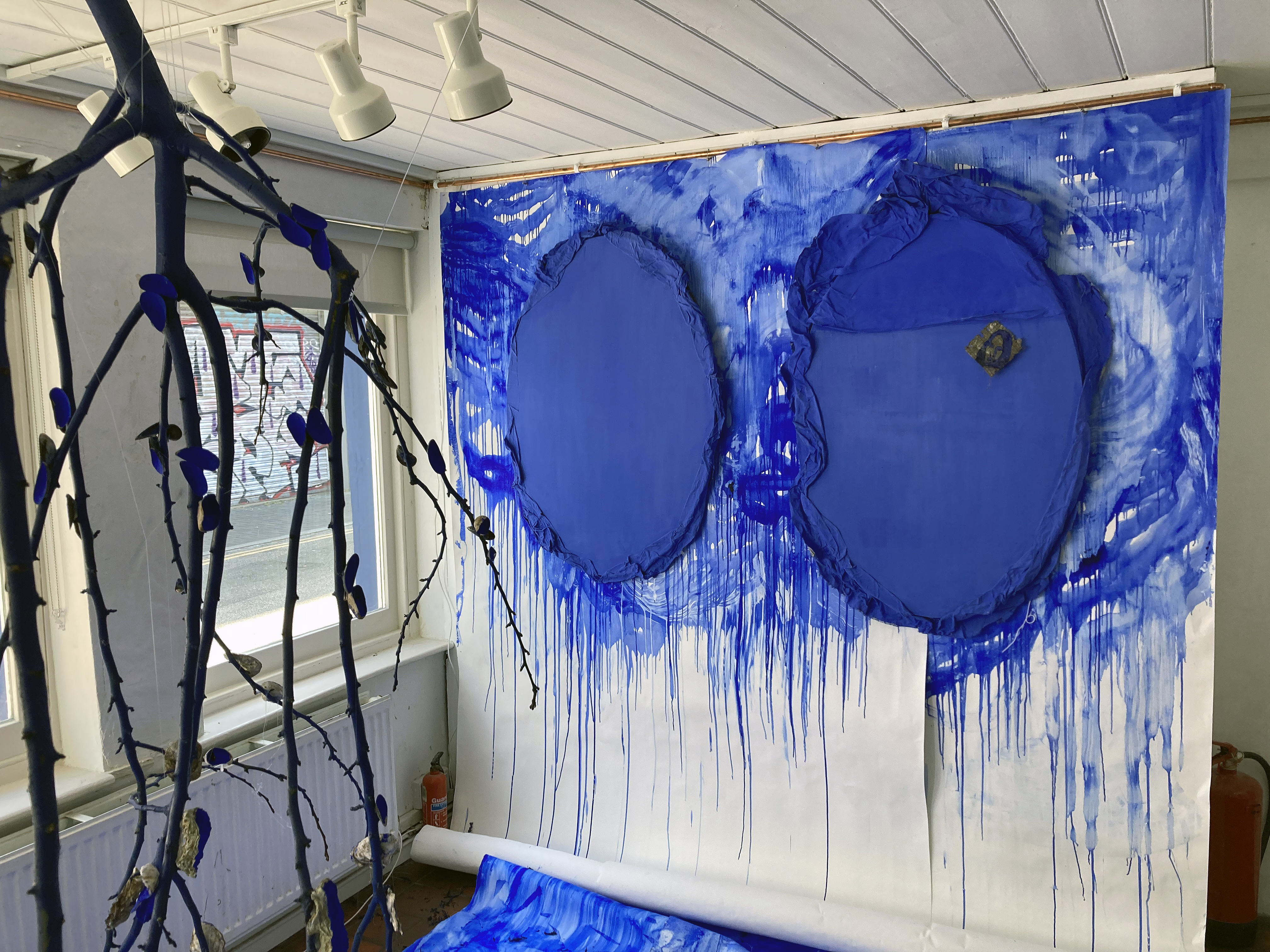
“Ultramarine Blue is the language that unifies the artwork in this show… I use it for its energy, and its magical and infinite possibilities. It brings a sense of calm yet has huge vibrational energy.”(Carrie Stanley)
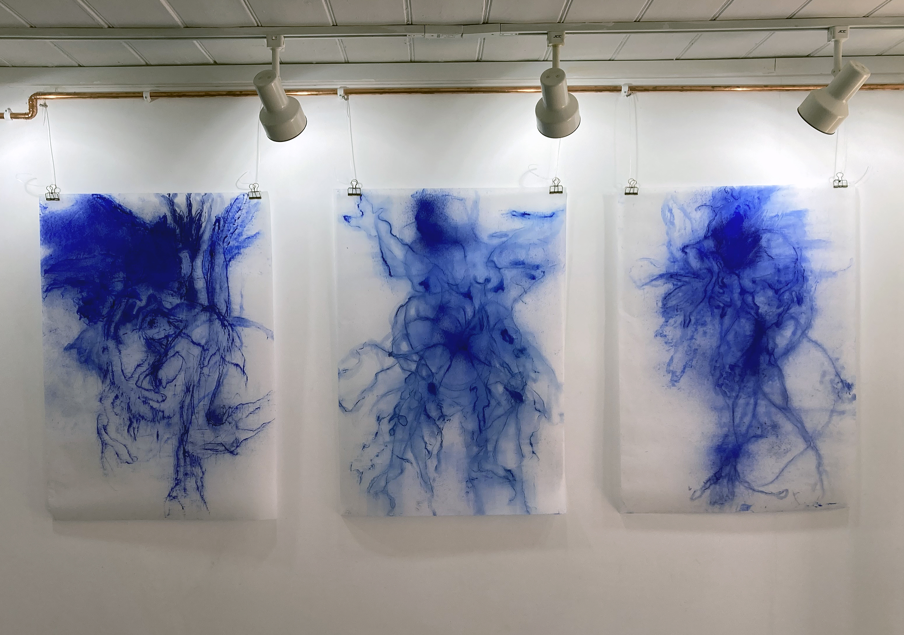
This impressive exhibition, Benthic Blues, is of just three days duration and I have arrived on the final day. I was compelled to visit a.s.a.p. as the Brighton Art Space is a fairly new venue in the city and I have already missed a couple of shows I wanted to see but had diary clashes. Via Carrie Stanley’s Instagram account I was intrigued by her seeming obsession with ultramarine blue and a shifting display from the gallery wall to the floor. As it happens, ultramarine blue is my favourite colour and the recent Turner Prize had rekindled an interest in the phenomenon of the installation. Other visitors may have visited knowing of the underlying theme relating to grief from suicide and that Arts Council England have supported the artist with a Developing your Creative Practice grant.
So much can depend on one’s own predilections when choosing to visit a show, but what we think we might like or dislike, of course, is too limited a reason for engaging with the general spectacle of the exhibition. We are all more or less experienced than others, so if an artist is presenting a celebratory theme (my interpretation of this exhibition) with a tragic, family related background it’s incumbent upon us to give that work time – and respect.
Carrie Stanley is a multidisciplinary artist and motivating her practice is a highly personal commitment to exploring mental health and trauma healing through the creative processes of painting, drawing and printmaking, re-presenting found objects and sound, and creative writing. Her interest in ultramarine goes beyond the visual aesthetics of colour. She links the colour to the sea, memory, the unconscious (e.g. dreams), ocean and land, the organic, materiality, play and potential healing.
There was a strong sense from the exhibition of the artist committing herself, against all the odds, to being positive, transformative and emotionally brave. By making, following a process and discovering something, or just knowing (or sensing) that she is in the right space at this time, permeates this body of work. Sharing the fruits of this journey amongst a community, known and unknown that may benefit many in some way is also akin to a celebration of sorts. Via the unfathomable depths of our emotions, the lowest region of despair, where light (as metaphor) cannot penetrate, the sometimes difficult to express or verbalise can be delivered through visual art. It reminds us that we are not alone, we are community. Stanley’s installation takes the viewer into the littoral zone, where light, and therefore colour, enables us to see – or at least begin to make something felt tangibly from the magical aspect of our world where messages await our readiness to receive them.
Considering the exhibition later that evening (before actually reading the exhibition statement), I sensed that the display was something of a showcase, intimating a larger, more realised, show in the future. The route forward might be towards an even more immersive viewer experience. The canvas/objects might reach out into the space even more. The suspended works might come further away from the walls. Works might be enlarged, like they want to shout out loud. Sound might be more dominant. Benthic Blues may in fact be a taster of more to come as I read that it forms part of a larger project, Together in Electric Dreams, which is in progress.
In visual art generally the artist’s personal background, wider societal issues, a political context or theme might be foregrounded as manifesto – or no more than subtlety implied in the artist’s offering. A strong or moving theme might be best kept a little sunken down to avoid the equivalent to the party political placard, which can trigger unreflective agreement or discord. It may be incumbent on the viewer to make some effort rather than rely on the artist to be too literal, as spelt out it becomes verbal language. Visual art is, well, visual and this aspect is a great strength in Benthic Blues as Stanley works with impressive skills, energy and commitment towards both herself, her family and a shared social community through an engaging body of work. She doesn’t shout. She allows us to cry with her.
Links:
Carrie Stanley on Instagram – @carrie_stanley_artist
“Walk with me over cushioned moss; your feet sinking into the soft leaf mould. Pick your way through tangles of bramble and bracken. Stand still and feel held in the quietness beneath the trees. Listen to the birdsong and clatter of leaves. Look up through slats of light between branches. Smell the damp and chill in the air.”
(Emily Ball, December 2024)
We play (mentally and physically) to learn, to discover, to realise. If this attitude diminishes nothing more will change and life will be mundane. It’s especially important for painters, or rather, it’s what I see in the painters who interest me. That’s my personal bias, but I am sure it’s a stance far from unique.
Emily Ball’s work has been on my adoration list for years, so making a fourteen-mile road trip in atrocious weather from Brighton was not a problem. Fortunately Storm Darragh had diminished significantly during the morning, which made the more scenic route north, via Henfield, possible. The countryside is fantastic along the meandering roads that gently rise and fall on the Sussex Weald. A feeling of being in the landscape is so strong, even if travelling in a car. Unknown to me, I was being mentally (and perhaps psychogeographically) tuned in for what was to be seen and experienced quite soon.
Installation including ‘Longing and Sweet Sadness’ – oil on canvas (120x170cm)
Many will know of Seawhites of Brighton (who moved to Partridge Green many years ago) as a great source of art materials, especially sketchbooks. But they have hosted exhibitions for several years too and with this show an expanded office space in an adjacent building to the one with the shop is perfect for a decent sized display that provides more than a taster of someone’s work. This is my first visit to the Atrium Gallery and first thoughts are assured and affirmative: wow, what a space, this is proper painting, everything is interesting (all 44 paintings and drawings). Then, unexpectedly: You don’t see this in the Turner Prize nowadays.
Indeed not. But initial impressions can change with reflection. So I walked around the ground floor for a while longer and was pleased to see that the floor above hosted many more works expertly arranged and hung. After a few minutes upstairs another visitor walked past talking to his partner, and I eavesdrop: “This isn’t kiss me quick or celebrity art”. He was referencing the nearby Brighton (but not so much Hove) art scene. It’s a little unfair, but I get what he means. There’s an abundance of excellent painters whose work is not seen enough down at the coast where the post/neo-Pop, street arty scene dominates. But I had to put that gripe aside for the afternoon and indulge in this engaging imagery from Emily Ball. After all, her work is unequivocally right here, right now whatever the trends might be.
Emily Ball – ‘Dig Deep’ – oil on canvas (120x170cm)
The work in Walk with me is totally absorbing. Many of the other visitors were either standing fully engaged with a particular work for several minutes or strolling around looking and looking again at the display. This is not so commonplace in the gallery environment where looks can be fleeting and it confirmed my sense of the high quality of the works displayed.
Emily Ball’s work in this show might simply be categorised as abstract landscape, but that would not be specific enough to account for a clear individuality of purpose in a lifelong project that engages with a searching, animated and exuberant understanding of the world as experienced. A being in the world, fully connected but including mystery. The works are full of implied movement, visually and physically expressed, by an observer fully engrossed in the act of drawing and painting. The imagery graciously pulls the observer’s gaze into a dynamic conglomeration of forms, coloured patchworks and passages through woodland spaces from the Algarve in Portugal (the HotHill collection) back to the artist’s home in Sussex (an ongoing series called WoodlandWeave). The paint is applied skilfully with dexterity, self-confidence and years of practice – but healthily retains an aspect, or an edge, of testing out applications and combinations of sometimes raw but playful brush marks. There is a sense of a positive and intentional work in progress, or a springboard for future works yet to be realised. This animated feeling confirms that environments are never really still or are only observed with a rational eye. Nature’s spaces are in and around us, containing histories and yet moving on.
Emily Ball – ‘Shimmer 1’ – oil on canvas (16x24cm)
So, in the future, we can look forward to an expanded Woodland Weave exhibition that explores the woods at the rear of the artist’s childhood home, merging with her parents’ garden. As with any space that Emily Ball draws and paints this will be as much an emotional as a geographical space. It will be past, present and future. We might be reminded, or prompted, to recall our own equivalent spaces to conjure the psychogeographic nature of environments that are personal, familial and, ultimately, social. This is a distinctive potential for the age-old practice of painting and drawing.
First impressions can even improve, too. See Emily play.
Geoff Hands (December 2024)
Emily Ball – ‘Shimmering Jewel Study I to VI’ mixed media drawings
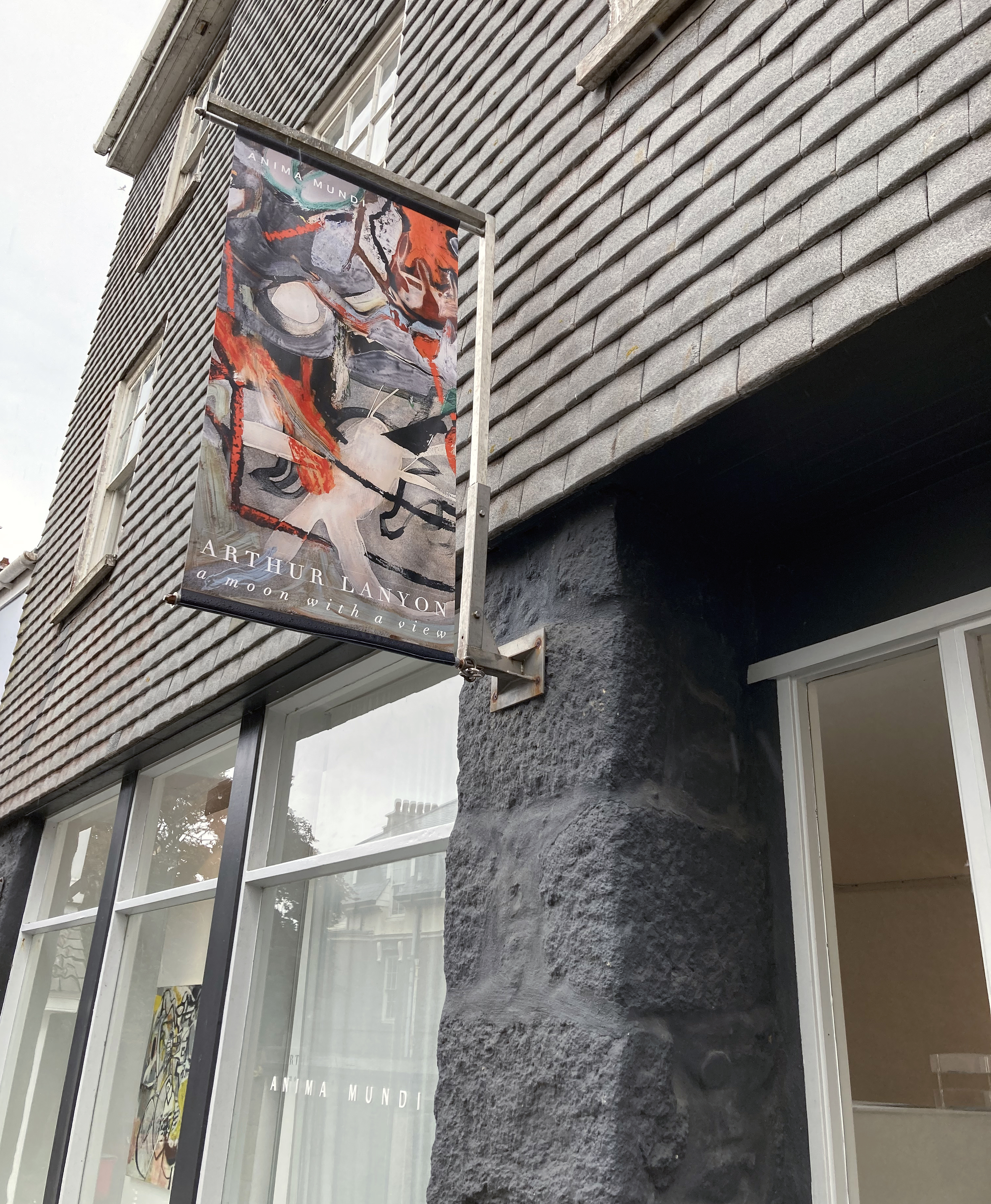
Paintings are fascinating things. They have the potential to extend beyond imagery and the object hung on the wall as they provoke thought and, sometimes, a sense of common subjectivity, but with open-endedness and multiple yet authentic timelines. There can be a sense of not being finalised or prescriptive but suggest a more speculative, active domain of resolution. Arthur Lanyon’s exhibition at Anima Mundi in St Ives celebrates a three-year period of intensive work in the artist’s Penzance studio and these works have that sense of being both finished and in progress. It makes for a fascinating contradiction.
Whenever I visit Cornwall, thanks to the family holidays (close to thirty years now), a trip to St Ives is unquestioned. The first gallery visit is, almost certainly, to Anima Mundi. Way back when (the children were very young) it was the New Millennium and the Tate Gallery that drew us in to town. Anima Mundi has developed and matured and the quality of work displayed is consistently high and thoughtfully curated. Either way, this is the best independent gallery in St Ives. No contest. There really is no contest. This is a fact we should regret, as there are so many talented visual artists in, or linked, to Cornwall. There should be a dozen Anima Mundis in this non-London part of the British Isles.
This is my first post-Covid visit to the town. Too long, I know. I have my Tate membership ticket at the ready – but it’s the Arthur Lanyon show, A Moon With A View, that tops my list of desires. I was not disappointed. With no intention to write a review, my partner and I have a good look around. There are three floors of displayed works to investigate but we are engaged in conversation on the ground floor for quite a while. We are attuning. No kids with us this year (we are a little sad and despondent). The conversation was quite formalist: line, mark, gesture, shape, space, surface, process, choice of medium – all that (important) stuff. It’s the way in we always take. As for subject matter. Not so sure. Not necessarily concerned. Not yet anyhow. Inevitably, the pen comes out of the pocket and I start my scribbles on the exhibition handout that I always hesitate to read before viewing the works it lists and promotes. This is my choice not to be too primed, although in retrospect Lanyon’s own commentary was very useful. For example, the centrepiece of the exhibition is the large work entitled, A Moon With A View, which sets up a frame of reference in his use of the term ‘shapeshifting’ that can be born in mind for any of the works displayed:
“The problem and solution to a lot of paintings is in the shapeshifting between background and foreground. In ‘The Full Moon Over Water’ by Turner, the painted waterscape represents the finite and the moon – seemingly painted but actually bare background paper – is the infinite. The relationship between water and moon – and, in my son Rory’s drawing, between tree and owl hole – draws the viewer closer to the non-material, further into the mysteries.”
And his use of the term ‘unfamiliar knowing’ in another extract also attunes the viewer:
“A childhood drawing can filter through your system like ‘chinese whispers’ and come out as something new. Call it an unfamiliar knowing… It is strangely intimate because the nature of the mind seems to expand inwards to a place that cannot be found in the world of objects.”
Drawings are embedded in the paintings. Surfaces are physically loaded and layered as well as scraped, scratched or sanded back. The canvas is a place of work. A place of purposeful action. Improvised and adjusted as he goes along, I would imagine. These certainly are hard won images. Drawings are crucial ingredients in Lanyon’s practice, collage too. His work can be described as gestural, abstract and certainly speculative and (dare I say) ruminatory through active image/mark making. They acknowledge an inherently cubist sense of time and space in a sense. Very real and encapsulating a nurtured progress through sheer hard work and commitment. There is no irony intended either and some content is childlike, not childish. Given time in an exhibition, and patiently letting the imagery in, goes a long way towards shedding unnecessary luggage. Which is what happens fairly quickly with Lanyon’s work. This may be because the works, of whatever size, are visually very busy, mysterious and demand the viewer’s undivided attention. I feel a sense of the everyday/extraordinary too. His commentary also spoke of the ‘moodboard’, which might well be a useful model for the true nature of narratives concerning the everyday simultaneously affected by the past and present – including long hours spent in the studio.
Fortuitously, I have just read painter, Rebecca Partridge’s recent paper for the Journal of Contemporary Painting in which she explores the post ‘Modernism/Postmodernism’ of the metamodern, which can be characterised by “Simultaneity, depth, a ‘structure’ of feeling and a return to meta-narrative.” This term includes subjective experience, authenticity, romantic subject matter and multiple subjectivities. For his narratives (which, like ours, can be solidly clear, barely recountable or obscure), Lanyon appropriates the physical, material world of the here and now. But he also includes familial memories, sometimes of an historical nature across generations, in a painterly present in which personal iconography is embedded and emerges to make highly engaging imagery. Like a movie represented in its entirety by one still – which perhaps only painting, songwriting and poetry can do effectively.
An initial impression of the exhibition was that this is good stuff. It’s not immediately obvious or illustrative. Why? The work seems kind of honest. I am not sure what this might mean right now even as I type up my reactions almost a week later. That’s good, or at least promising. Looking and, subsequently writing, is a journey of sorts, though you can travel backwards and forwards through the text. The writer might fool the reader into thinking that this was all a first draft. That’s not so easy with a painting. Painting is often a more conspicuous struggle. Painting is vulnerable to scorn or indifference and misunderstanding. Painting is a statement often unchangeable. It certainly cannot hide whilst on display.
Painting is sometimes ‘metaphysical’. What does that even mean? Emotions are in there, for sure, and some sense of transcendence. Is the metaphysical universal (too Jungian a definition?) – for surely, one should not need to read about Metaphysics to experience it? Definition follows experience. Aspects of this evolving theory, the metamodern, are here in Lanyon’s work too. To take just three examples, or traits, from Partridge’s article:
“A pervasive ‘structure of feeling’, a return to affect, to multiple subjectivities”; “Construction as well as deconstruction, the expression of sincerity and depth as well as irony or critical remove”; and “Re-engagement with historicity and meta-narrative.”
Refreshingly, in his work something of the child remains and is addressed almost naively:
“A boy draws a tree for the first time. It’s tall, no branches, just a trunk shooting up to a leafy looking cloud (all simple cartoons are the same). But he forgets what lives in trees: owls. Looking at the skinny trunk he decides to put the owl hole out on the left – a free-floating circle. He thinks his drawing looks good. So he doesn’t screw it up. His dad blue-tacks it up on the wall by the light switch.”
This approach produces a visual poetry of emotion generated by the personal memory and the mark making activity. This set me thinking about the marks we all make and our human ingenuity for language in all its manifestations. When language first developed was it from a gesture (body language) or a sound (made from the body) – or from found objects reconfigured for use? Anyhow, in time, a mark of some kind was made that carried meaning. With some sort of tool – the finger, a stick – we shall never now. But Lanyon’s practice conjures a form of the metanarrative from the instinctive urge to make painterly and colourful marks and shapes that will literally surface in the studio-based activity.
Unexpectedly upon leaving the gallery I found myself looking at the exterior walls and the pavement as a continuation of the paintings – an experience my partner confirmed for herself. This has happened before, but not often. This emphasises to me that Lanyon’s paintings are in and of the physical, playful and creative world, which is all around us and at all times.
Back home in Brighton I check my notes: “Battle between abstraction and fig. Not only visually busy but also content/lyrically.” That was enough to start writing this Rumination. How can one appraise artwork from a one-off visit? It’s more impressions gained than a sustained ingestion and understanding. But how do you separate the art from the viewer anyway? Paintings need a viewer, often strangers, not just the artist. We turn up with our tastes, our troubles, our pre-conceptions, misconceptions, expectations and prejudices, but ripe to be transformed and refreshed. Yes, refreshed.
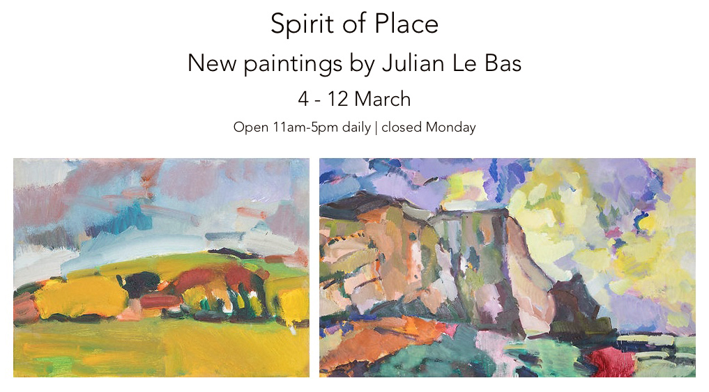
“Plein air painting on a large scale has heightened my sense of involvement. My use of colour is instrumental in expressing my feelings about form and light within the landscape. Inspired by some new subjects, a shift in my work has transpired.”
(Julian Le Bas, 2023)
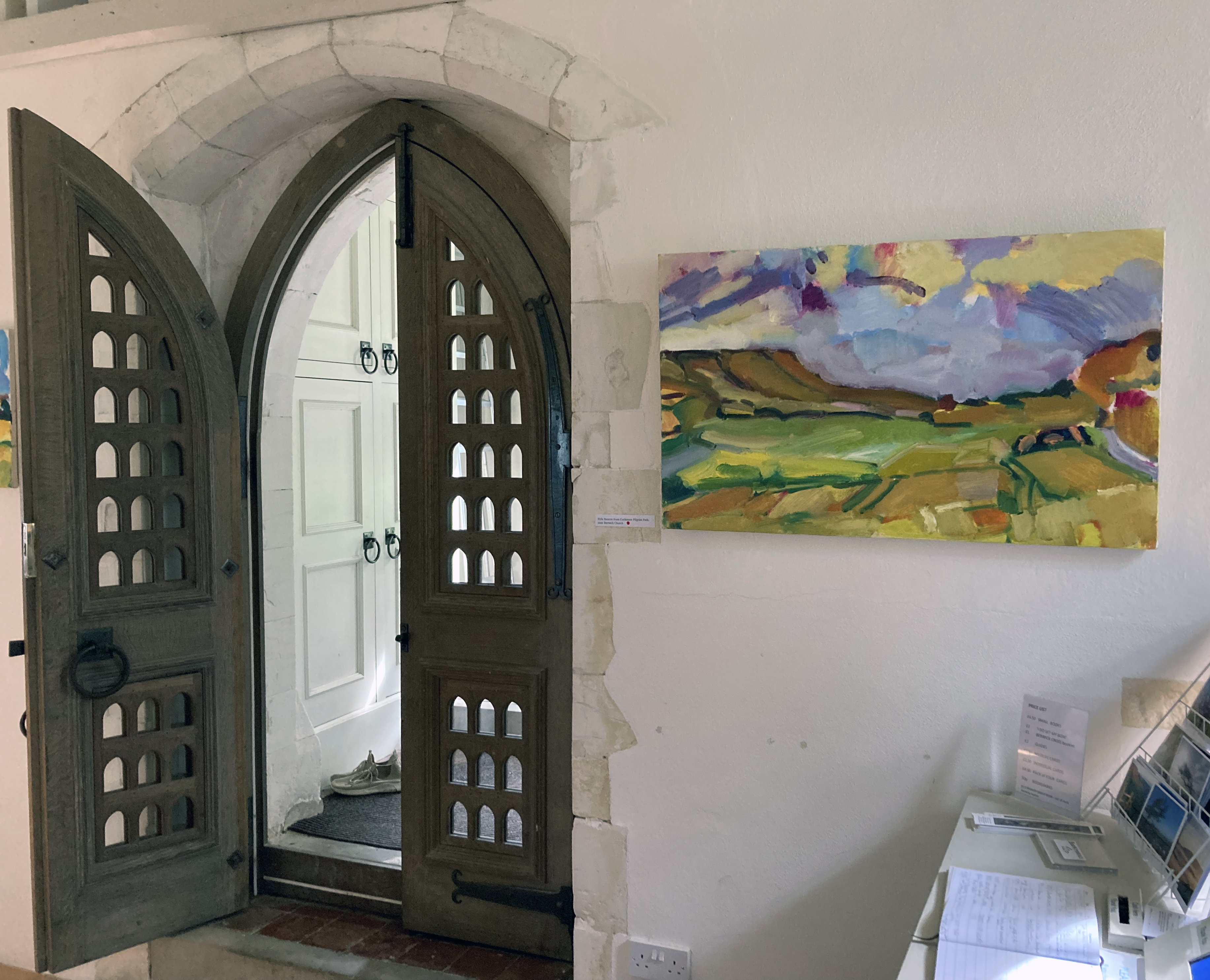
In preparation for Julian Le Bas’ much-anticipated exhibition at the Star Brewery Gallery in Lewes, I was asked by Sarah O’Kane (Sarah O’Kane Contemporary Fine Art) to write about Julian’s work, as she knew I was a follower of his career and had written about his show at Berwick Church for Lewes Artwave 2022. I made a visit to his studio last November to talk to him and to see completed canvases and a few works in progress for the exhibition in Lewes. Some of this new text has been included in the catalogue for the show and a suitably edited version is published on her gallery website.
With Sarah’s approval, here is the full version of the exhibition:
A Studio Visit
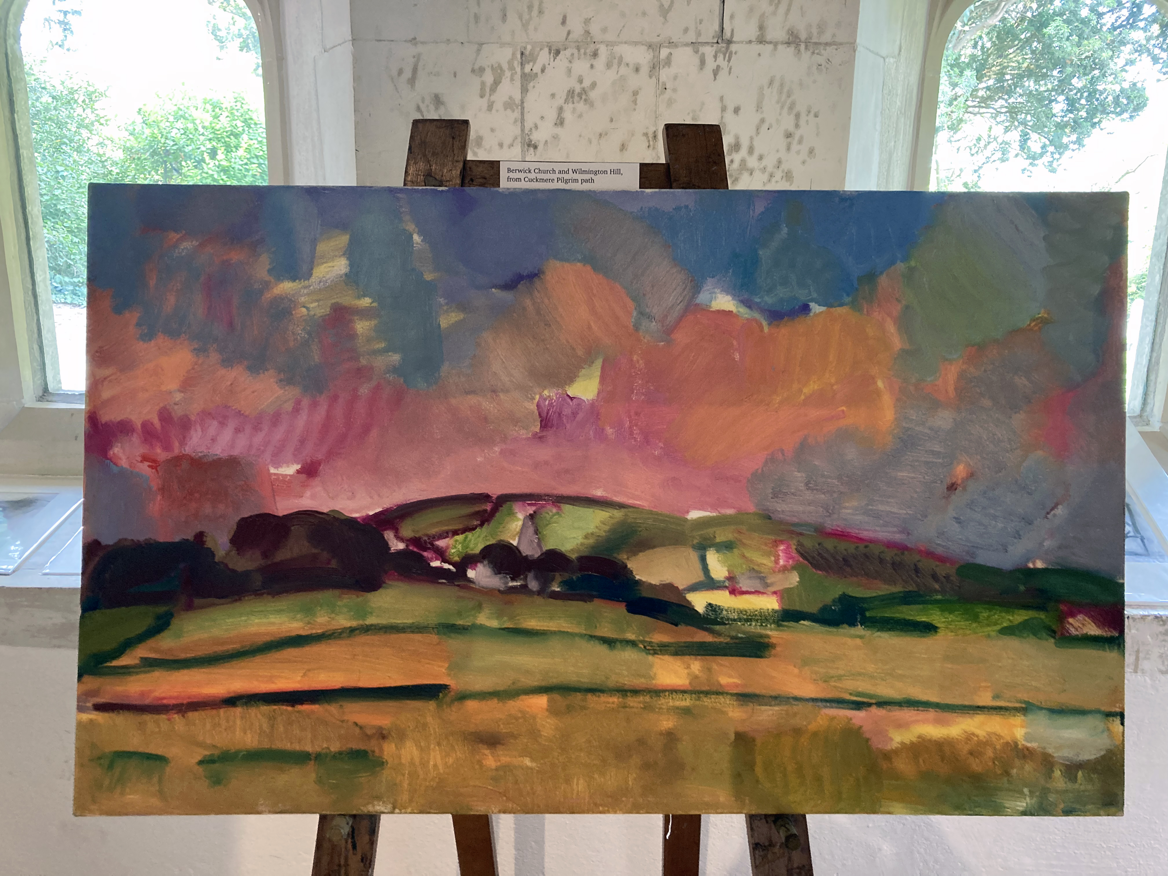
Julian Le Bas is a painter, perhaps the contemporary painter, of the Sussex section of the South Downs. His work bares witness to this characteristically splendid and captivating geography of chalk hills, meadows, woodland and the adjoining coastline. The Sussex landscape possesses a subtle drama that does not provide the instant awe of, say, the Peaks of the Yorkshire Dales or views from Snowdonia, but the chalk cliffs that stretch eastwards from Brighton and Seaford towards Eastbourne are unique enough to provide a painted image with the visual impact of location not always provided so explicitly in other locales.
If you know Sussex reasonably well you will be aware of Chanctonbury Ring, Black Cap, Mount Caburn and Firle Beacon, and will recollect on how these geographical landmarks change in mood and appearance depending on the weather, the season and the time of day. On a more micro-level you will know that as you travel around, away from the A roads, you will expect to see characteristic churches in the villages, such as at Berwick and Southease. You will also know that there are marvellous trees in the various churchyards, or alongside the fields that produce crops or are home to the cows and the pigs. Look closer still with this consummate painter and, depending on the time of year, see the bluebells, snowdrops or a defiantly red rosehip amongst the winter brambles. In other words, there is no hierarchy of place or incumbent: be it animal, mineral or vegetable.
I wonder, also, if the paintings are a form of storytelling. Many of these visual tales will find their way to new homes, perhaps above the hearth, in a bedroom, a study or in a corridor leading to the kitchen. The point being that the paintings will find, literally, a home to prompt a recollection of a known and familiar landmark, embedding an internal conversation not necessarily or exclusively about rural Sussex, but also beyond to landscape revealed through the act of painting. Prompted by various locations, painting as gesture, as abstraction and as colour obsession – in an era of the digital and the virtual that can loose the immediacy of a physical and mental interaction with light, form and space.
These many places visited by Le Bas, often with the imperative ritual of walking to them, are invested with powerful colour effects and combinations of brush marks too. The viewer might be convinced that they are as improvised as much as they are consciously planned and controlled. Le Bas balances these two complimentary aspects of the act of painting, which is so important for what I interpret as reflection in action, as a matter of course. He produces visually potent and efficacious oil paintings that retain this sense of having a heart beat, of being visually fixed but alive somehow and which have to be authentically realised in situ. These studies can only be so faithfully achieved, by necessity, out of the studio environment.
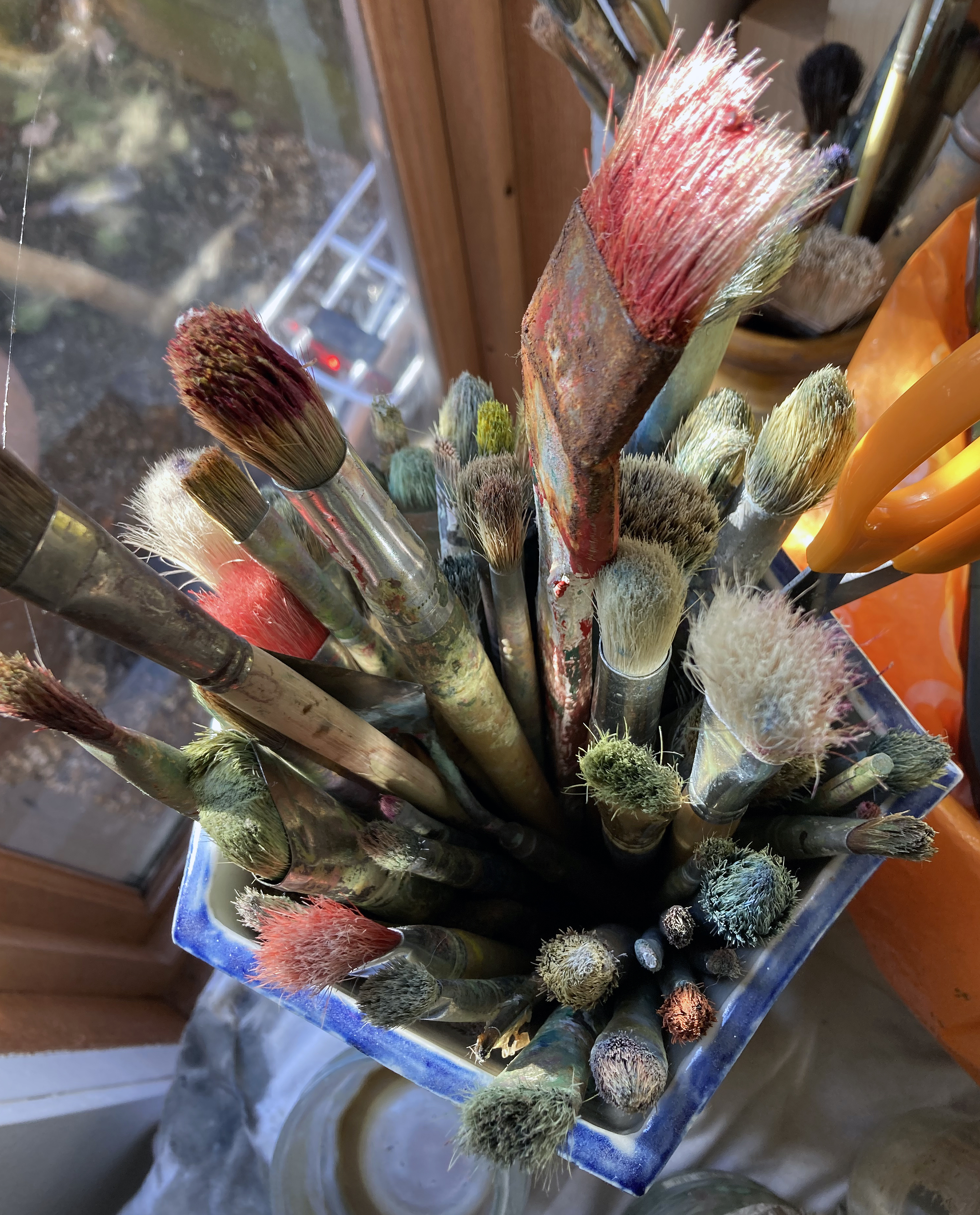
For the uncompromising en plein air painter the idea of the studio is, potentially, a notional one, as four walls do not restrict the site of production. So when I visited Le Bas’ studio in the back garden of his home in Seaford I was not sure what to expect. At 12 X 10 feet the space was significantly more than big enough for the lawn mower, gardening tools and cracked flowerpots that one might normally expect to come across, although thankfully there were no such items stored here. But this was more than simply a storage area for dozens of canvases of various sizes. The wicker chair and cushion, just the one, was evidence enough to reveal a space for the artist to sit and ponder on his latest day’s work. Space too, to rethink and assess the necessity to return to a particular location to complete a canvas not yet considered fully realised, hence the provision of three viewing walls. I asked Le Bas if he sometimes continued the paintings here, away from the subject. A simple ‘no’ was the answer. I need not have asked, for his many collectors and supporters will know that he is a purist of sorts; passionate and uncompromising in the most positive sense and completely at one with the traditions associated with the landscape/seascape painter who will go out in all weathers to attain their goals – and to constantly surprise themselves at the inexhaustible range of subject matters and moods that wait to be seen and experienced.
Such an approach is Le Bas’ unspoken manifesto. He just gets on with the task in hand, albeit as a healthy compulsion loaded with drive and sheer enthusiasm. The work is so memorable that it speaks not only for itself, but also for the inexhaustible landscape related encounters that somehow await the viewer’s comprehension, though intriguingly via the work itself. The paintings may well function as signposts, imploring the viewer to get back out there and look again, but they are more than mere signage of course. The canvases, as carriers of physical imagery, embody lived experience and a sense of time, where to pin down the visual realisation of a particular place, set in some notion of the abstractness of duration, is reliant on the paint medium and its expert treatment. Time and light is fluid too, which poses a contradiction to the solidity of form, of the interaction of colours and the myriad relationships that constitute fixed composition. Le Bas’ works bring the observer and observed together so that the works also realise the shared experience of seeing, through the manifestation of consciously formulated structures constructed by this communal gift of sight.
There is an inherent democracy at work, wherein the drawing content, the range of mark making, the colour range are all carefully balanced so that if anything dominates it is the difficult to define ‘spirit of place’. Le Bas can apply such an abstract notion in any aspect of the landscape environment, whether nearby or far away. Interestingly, the historical picturesque can be discounted in his approach to composition and content, as there is an honest acceptance of what is simply there. What lesson we might learn from Le Bas’ life-long project is that every day and every scene presents a seemingly revived landscape offering a new vista, and a fresh encounter, with the apparently commonplace. These landscapes are tirelessly offered up, re-imagined, for continuous engagement and revelation, so long as the viewer will give over their own time to enjoy and contemplate the imagery.
Le Bas’ paintings celebrate, exalt and revere the various locations and unequivocally express awe at the natural world. The role of shamanic consort, expressing the elevating metaphysical aspect of the everyday through the ordinarily magical presence of the landscape is his task. The work continuously appears to convey this sense of the uniqueness of the quotidian and the local which changes in appearance, not only due to time of day or season, but is subject to the artist’s own crucial engagement at any particular time. This notion of self, however, is not selfish as these paintings help the viewer to see afresh and to experience beyond subject matter.
There is an extrovert inclination in these paintings and drawings, revealing an emotional involvement steered by rigorous and disciplined draughtsmanship. This engagement with the physical qualities of medium, from compressed charcoal or chalk pastel in his drawings to oil paint on canvas, Le Bas’ works are somehow a summation of perceived experience that lives beyond his initial encounters in the landscape. High key colour combines with earthy local colour. His engagement with the glorious power of colour reveals both a romantic and a matter-of-fact connection with the landscape experience.
There is, I suspect, some deliberate exaggeration in Le Bas’ practice. A visual proclamation in his use of colour and insistent mark making, which is intended to bring the viewer into the work, and to make a lasting impression, reminds us that the landscape is still a worthy and increasingly important genre. Not solely for the sake of decorating our walls, or as a reminder of those places we love to visit, but as ecological imperative. For, as our burgeoning awareness of environmental issues develops for all the wrong reasons, Le Bas’ representations of the landscape may be reminding us that Arcadia is on our doorstep and, by implication, we need to stop trashing it a.s.a.p.
“A work of art is a whole, and this whole contains many parts – the material out of which it’s made being just one of them. We could include the interpretive horizons of the art’s consumers, for example, and the contexts in which the art materials were assembled… In this way it’s obvious that there are so many more parts than there is whole.” (Timothy Morton)
Molly Stredwick
The chair in the art gallery has never been quite the same again since Joseph Kosuth presented, ‘One and Three Chairs’ (1965), in a Duchampian spirit of challenging the viewer to question representation in art. Subsequently we have learned, or been reminded, that everything is loaded with possible interpretations – especially when context is accounted for. A context that includes the viewer, of course.
Molly Stredwick (wall installation) and Becky Hancock (drawing and sculpture)
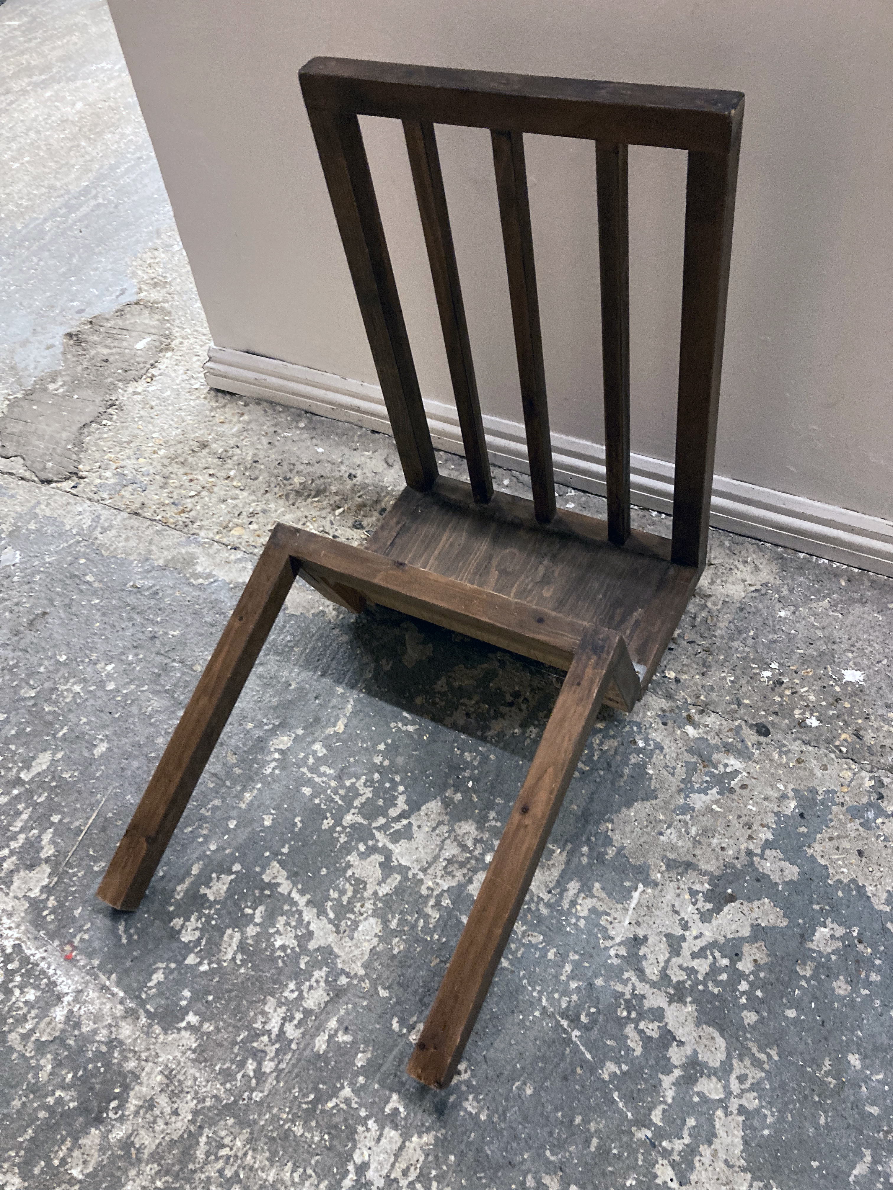
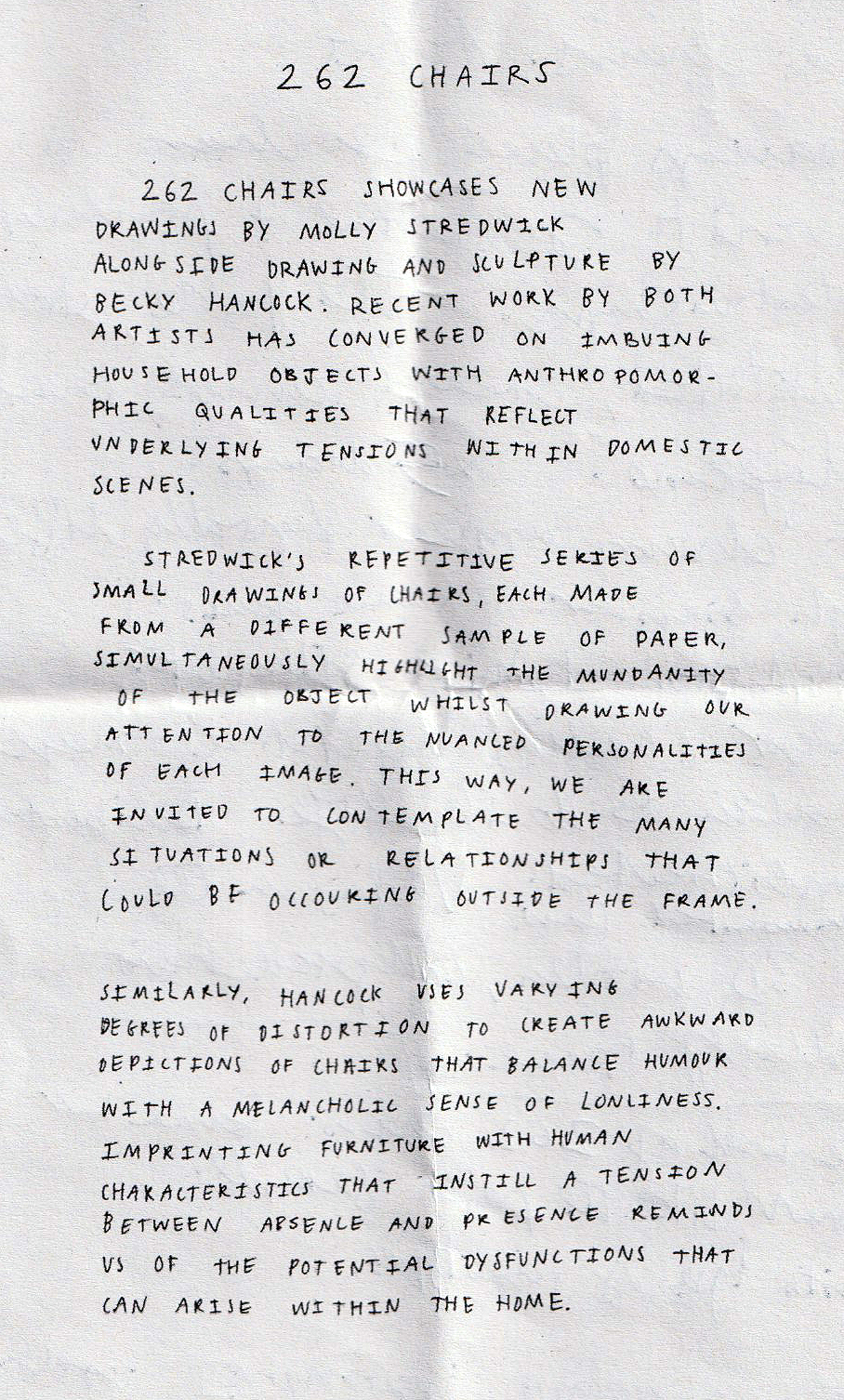
In 262 CHAIRS, currently installed in the Coachwerks exhibition space in Brighton, I find myself looking for a chair to sit on, as I need to rest awhile. Alas, this is not an option, which I find ironically amusing. But there are chairs galore in this warmly welcoming environment, thanks to the blazing log burner, which are represented in many drawings and two sculptures. Adam Spain, Exhibition Manager at Volt, Eastbourne, has neatly curated the exhibition, which may account for a certain ‘just rightness’ about a selective display that does not go overboard visually and presents enough physical content to engage the viewer.
The two exhibitors, Becky Hancock and Molly Stredwick (both graduates of Camberwell College of Arts) are presenting works that simply work well together. Not just because the apparent subject matter might be the same, but also because there’s an almost unassuming simplicity and innocence about the imagery as well as the means of execution. Though I suspect the content could be loaded.
Becky Hancock
Take Becky Hancock’s five drawings, for example, where each composition includes a pair of chairs placed at, what might be, a dining table. Domestic space suggests relationships, often about couples, and by extension, families. Here the furniture is, in a sense, naked. There are no figures directly represented, although the placement of, and spaces between, the various pairs of chairs are perhaps melancholy and at odds. The viewer might clothe these scenarios with their own imaginative interpretations or real experiences and any one of these drawings would be ideal to start writing a short story from in a creative writing class. The more visually dominant element in these drawings is the table, which distorts itself into angular hieroglyphs. The table might be a body that undergoes both voluntary and, as a domestic situation might dictate, forced distortions and poses – though not so much as a referee or arbitrator, but functioning as a victim of sorts. As sketchbook drawings, presented on the wall unframed, they might well function as studies for paintings or installations but they are intriguingly finalised statements that are impressive and compelling enough to be fully resolved outcomes per se.
Becky Hancock
Also on display are two 3D pieces by Hancock. At first sight the viewer might read them as adjusted ‘real’ chairs. But they are human-scale simulacra. A chair can be an idea, a model, a prototype, an image, a word or even a functional item. Whatever a ‘chair’ has the potential to manifest itself as it can also be a sculpture, of sorts. These two pieces take on an anthropomorphic presence with one leaning forward, as if in prayer, adoration of the deity or submission, the other sat back in picnic mode – engaged in déjeuner sur l’herbe, perhaps. Either way, both are fallen, making a melancholic and downcast presence at the viewer’s feet. Or telling us that they are not really chairs, whatever our automatic reading probably is.
Molly Stredwick
Co-exhibitor, Molly Stredwick, has commandeered the largest, most expansive wall, upon which 176 small drawings of chairs are displayed (selected from a series of 251). These are, for all intents and purposes, imaginary chairs. The perspective is sometimes distorted, conventional three-point perspective reversed, or appearing to be floating or rendered flat without surrounding space or objects included. Any resemblance to Hancock’s 3-D chairs is superficial, though creating a coherent feel and appearance for the exhibition. This wall of 11X16 approximately postcard sized drawings might be a catalogue of chairs, but each is surely the same one, or maybe not, for very subtle personality traits might distinguish each speculative rendering. Drawn on G. F. Smith paper samples with the same red Muji Gel pen there is a suggestion of the series or the genus with variety being sight. The manufacturer’s printed text functions as an internal framing device too, with the different numbers, paper types and weight information changing along with the colours and the visual and tactile presence of the material. So what appears to be repetition and sameness calmly explodes into huge variety. In effect, this wall of assembled drawings functions as an installation that can be viewed as a whole grid-type shape or as individual drawings that must attract viewers to any one sample or part, which is nevertheless complete in itself.
Becky Hancock
In his book, ‘Being Ecological’, Timothy Morton has explained that an ecosystem of parts and wholes is an environment of “just lifeforms and their extended genomic expressions: think of spider’s webs and beaver’s dams.” That’s what artists do; they make their respective webs and dams alongside and sometimes in collaboration with others (or curators make the connections). The viewer is part of the situation too; not so much caught up in the web, as one of its constructors.
Note: Both quotations from: Morton, T. ‘Being Ecological’, Pelican, 2018 (p.113)
In a post-industrial revolution context the English countryside, for so long a subject for painters, can still be a strangely ‘other’ environment for so many. Nowadays this space we call the ‘countryside’ is a place of escape and rest, suitable for a day out or for a camping holiday. For the daily traveller going about their business the countryside is a fleeting arena placed in between centres of commerce and mass housing. Viewed from the train, bus or car window lack of access may even create tension. Despite being loaded with mythology, folk tales, notions of paradise (very much lost), agrarian history and, for the south of England in particular (arguably the birthplace of capitalism) a mode of enquiry for the contemporary artist continues on to the ecological crisis that now impacts our “green and pleasant land” (to reference William Blake).
Julian Le Bas is a painter, perhaps the contemporary painter, of the Sussex section of the South Downs and the adjoining coast. Le Bas bares witness to this typically splendid and beautiful geography of chalk hills and woodland as he engages with his, and our, local world on a journey that has been his indefatigable undertaking for over forty years. What lesson we might learn from his ongoing life-long project is that every day and every scene presents a seemingly revived landscape offering a new vista, and a fresh encounter, with the apparently commonplace. The landscapes from Le Bas are tirelessly offered up, renewed, for continuous engagement and revelation.
Paintings and drawings, made en plein air and in isolation as he travels alone, invite a congregation of onlookers in a small exhibition of paintings and drawings at Berwick Church for this year’s Lewes Artwave Festival. Le Bas’ paintings exalt and revere his subject matter – and how fitting that we see these works in a place of worship. This particular church might be considered a wonderful art installation in itself, purposely referencing the pre-Reformation model of the church as the historical forerunner to the ‘art gallery’, permanently containing murals by Vanessa Bell and Duncan Grant, plus the recently commissioned altar reredos panels by Julian Bell.
The paintings and drawings from Le Bas, however, are secular in subject matter and intent but unequivocally express awe at the natural world. Le Bas is the epitome of the artist engaging in the role of shamanic consort, expressing the elevating metaphysicality of the everyday through the ordinarily magical presence of the landscape. It may take a leap of faith to accept such a purposely contradictory definition of this particular artist, but the work continuously appears to convey this sense of the uniqueness of the quotidian and the local which changes in appearance – not only due to time of day or season, but is subject to the artist’s own mood or degree of engagement at any particular time.
These paintings are of the moment – a duration measured in hours we might assume. Le Bas uses an English post-Impressionist palette where high key colour combines with earthy local colour. His engagement with colour reveals both a romantic and a matter-of-fact connection with the notion of landscape experience. But what does this mean if it’s a correct interpretation? I would argue that some exaggeration, a visual proclamation in his use of colour and insistent mark making, is intended to bring the viewer into the work and to remind us that the magical landscape is still a worthy and increasingly important genre – especially as it contributes to our burgeoning awareness of global environmental issues.
The personal capacity required of a contemporary painter, with an arguably dated assignment to record the landscape, and at first glance unshackled by what might be on trend at present, is necessarily blinkered to enable a deep focus on such a potentially numinous experience of landscape. A logical pragmatist, a post-modernist, might reject Landskip as relevant now (unless it provides a context for other, grander, socially and politically qualified narratives), but one role of the artist might still be to say: “look at what I have seen, see what is available to all”.
Or, to take most of the words of R. S. Thomas from the poem, ‘The Small Window’:
“… there are jewels
To gather, but with the eye
Only. A hill lights up
Suddenly; a field trembles
With colour and goes out
In its turn; in one day
You can witness the extent
Of the spectrum and grow rich
With looking…”
Like this poet, associated with the Llŷn Peninsula in north Wales, Le Bas is tuned in to the sheer visual experience of his own landscape, not withstanding its potential to transform our experiences. Le Bas reminds the viewer that this environment is bursting with colour as much as any city has to offer and that it has the indefatigable capacity to ‘move’ us and to provide space to think, to plan and reflect and to explore. On a trite level, even a small canvas of Le Bas’ in the urban home will break down the barriers between the town and the country; but also on a metaphysical level, based on concrete experience, a transformative understanding of the landscape environment is possible too. Perhaps usefully, we cannot seem to let go of our obsession with ‘the countryside’. Landscape as a genre, engaged with constantly by the Sunday painter and the obsessive, committed practitioner alike, persists in our culture – which is quite assuring.
Whilst there is a certain, expressionistic conventionality in Julian Le Bas’ paintings and drawings (which I say in a positive sense), the gestural yet restrained visual language, honed and perfected after years of hard practice and utter devotion, results in a compelling engagement with his subject matter. For some observers he may exaggerate colour and mark making at times, approaching a general expectation of abstraction, but this is the hook that pulls one in and presents the eye and mind with spatial conundrums of simultaneous senses of flatness and depth. The generally bold brush marks are laid in areas that intermix, overlap or abut, amounting to a distinctive patchwork of organic shapes. Local colour and colour in its own right – straight out of the tube, Fauve-like – or mixed on the canvas as well as the palette to create secondary and tertiary mixes, make a variety of colour combinations. Realised as mark and gesture as well as for their tones and values, these colour-shapes are at once based on responding to visual reality and to testifying to a daily practice that celebrates the act of painting, whatever degree of verisimilitude is sought. There is clearly an extrovert inclination in these paintings, revealing an emotional involvement steered by rigorous and disciplined draughtsmanship. This engagement with the physical qualities of medium, from compressed charcoal in his drawings to oil paint on canvas, Le Bas’ works are somehow a summation of perceived experience with an aspect that says, “look at this world around you and engage with your whole being”. This is very much a serious undertaking, where pleasure is often an outcome.
In Le Bas’ paintings the drawing content morphs, via the brush, into painted lines that delineate shapes and forms, often flat rather than rounded, but creating visual space on the canvas. Perspective is loosely reduced within the network of colour-shapes but an abstract, surface acknowledging, arrangement of colours and gestures there is also an essence of movement. The observer might detect a degree of improvisation too, as taking liberties with mark and colour is a strong characteristic in Le Bas’ work. The paintings are made from a totally immersive activity of looking at sections, and spatial passages where the eye has been lead in deep concentration, engaging with various parts, structures, surfaces and atmospheres that make up the whole. A ‘whole’ that actually includes the observer, for if the environment is captured in spirit, it also captures us. In these paintings there is a record of being that is symbiotic with ‘nature’ as, in a real sense there is no divide. If we learn to appreciate this environment, starting with the local, with what’s in front of us, we might start to protect it better and therefore see that Le Bas’ paintings are as relevant as any other contemporaneous projects that have a more immediately political purpose.
Philosopher and Ecologist, Timothy Morton has written:
“Somewhere a bird is singing and clouds pass overhead. You stop reading this book and look around you.” (‘Being Ecological’)
We might stop looking at paintings and look around too, but engaging with the art might be the doorway we need to see what’s in front of us.
Outer space is right here, right now. It’s in front of us and in us, one and all – for there’s an inner space too. In terms of individual consciousness the two may as well be the same. When we think, we travel too, even if we remain physically still. When there is nowhere left to go, when we are trapped, marooned or sheltering from the storm we can rely on mental space. Still, but adrift in time, when memory kicks in to take us out of ourselves there is a palpable sense of space as an extension of self. Such are the conditions of splendid isolation, afforded most recently during the early months of the global pandemic.
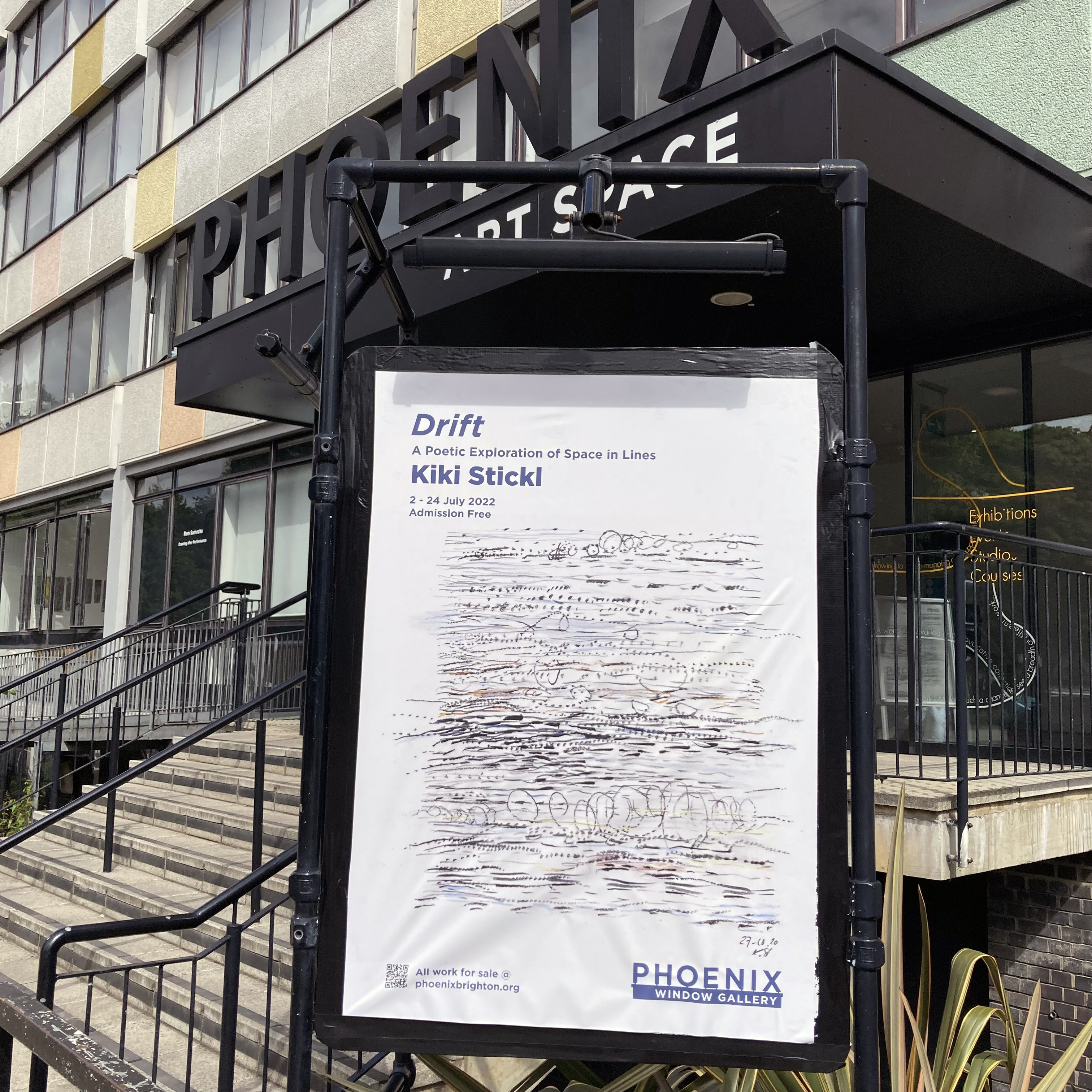
Kiki Stickl – ‘Breath In Breath Out V’, 2020
Kiki Stickl clearly made the most of her own experiences of her family’s six months spent in countryside near Munich during the first lockdown in 2020 when she produced her ‘Breath in Breath out’ series of drawings, several of which appear in Drift. Here she encountered ideal conditions for creativity: time and space, duration and environment – and possibly sound as well – especially when the world is hushed. In fact, as I awoke on the morning after seeing Drift being installed at the Phoenix Art Space a couple of days before the opening I was semiconsciously thinking of Stickl’s drawings as visual soundworks. Not necessarily apropos Cage’s 4’ 33”, but literally, and deafeningly, silent. Stickl’s drawings suggest small arenas of silent sound consisting of visual counterpoints, full of emptiness inviting a form of meaningful mark making as an abstract response to recalling time and space. These are drawings made as an end result as they are not subservient to, or necessarily leading to painting as might traditionally be the case. Stickl conjures drawings from a meditation in the everyday physical realm of being that amount to sensory, environment-based studies. From a landscape environment to the literal sheet of paper that she works on, the drawings map out themselves. Sometimes she cuts the paper to reference, literally, a sense of layering as well as amalgamating marks on the paper surface as a form of recording what has been seen and remains to be seen: Cartesian, with Buddhist overtones.
Kiki Stickl – ‘Breath In-Out (A Walk)’, 2020
Drift presents 19 works. One is a temporary wall drawing (employing paint); another is a painting (titled, ‘Lines of Disruption’); plus seventeen square format drawings on paper, simply but immaculately framed. The painting is placed in the adjoining coffee shop, but cannot be missed on the main show wall as a little taster of her painting practice. The wall-based work, ‘Drift’, at about two metres square, is the centrepiece in the long Window Gallery space. Composed as an essentially linear structure from two tones of grey paint on the white wall, with the addition of ground up glass beads applied to the lightest grey paint when it was still wet, the darker grey mass suggests a resting figure, perhaps in meditation pose. An ephemeral, time-based work such as this will disappear at the end of the exhibition later this month. This work, therefore, demands that we hold it in our memories, just as we may do from our personal experiences of places beyond the gallery.
Kiki Stickl – ‘Breath In Breath Out (Cosmic Matter)’, 2020
The bulk of the show consists of the drawings that have been selected from a much larger body of works, the aforementioned ‘Breath in Breath out’ series. From drawing to drawing, as they are arranged in blocks and rows, there is great variety of imagery and mark making. Subtle use of colour is occasionally employed, although they still read as essentially monochrome iterations. In many, linear rhythms consisting of scribbles, dots and short or flowing lines are accumulated suggesting light and weather conditions. Forms are deconstructed to some extent, invoking that sense of recall that does not rest, preferring flux and instability as performative, shorthand approximations. Imagery that might be solid is no longer fixed as a conventional photograph might replicate for the viewer. The paper cut-out sections present voids and absences, shadow and light, useful contrasts and visual paradoxes. Implied shapes and lively line is reductive though essential as imaginative remnants of remembrance celebrated. These are motion pictures, mapping the psyche as much as the terrain.
Kiki Stickl – ‘Breath Walk Dance’, 2020
Stickl is not so much taking a line for a walk (re: Paul Klee) as inventing and playing with accumulations, sometimes in counterpoint mode, un-egotistically presenting a notion of drift through time and space.
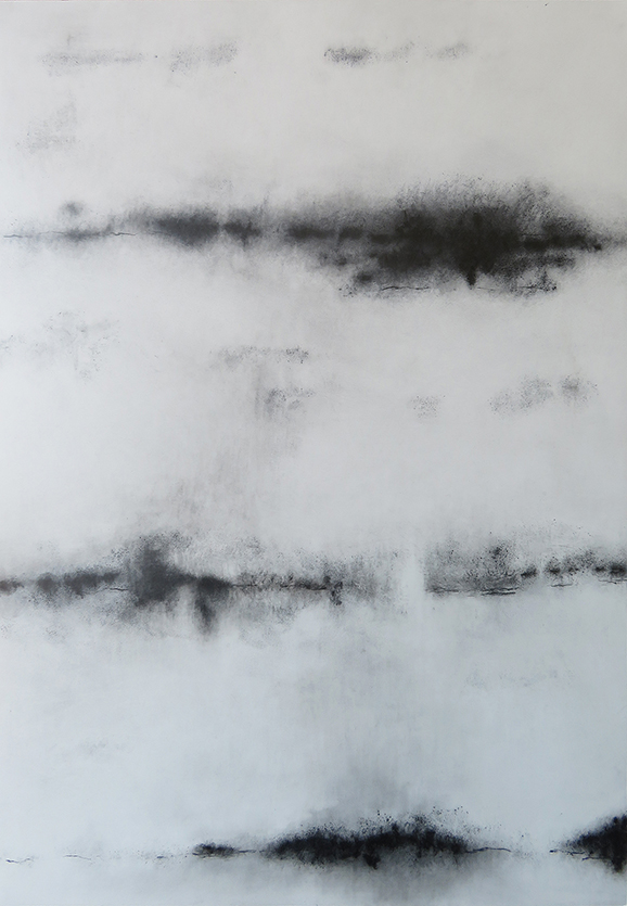
‘Crowding the solitude’, ‘Ghost white path’, ‘Night’s first light’, ‘Silent reach’ and ‘Restless lane’ might be headings in a list of poems from a collection that constituted a volume of landscape inspired verse, but they are selected from the titles of drawings and prints from Tania Rutland’s exhibition at the Phoenix Art Space.
Another title, ‘Chip of flint – fragment of chalk’, makes reference to commonplace Sussex downland geological material that could have been gathered from her visits to Iron age Mount Caburn and Neolithic Cissbury Ring in East and West Sussex and is the intriguing title of this exhibition.
Tania Rutland – ‘Chip of flint – fragment of chalk’ (28x21cm). Pencil and graphite on paper.
The very idea of a ‘chip’ or a ‘flint’ suggests the collection of a memento, a physical token from a walk, picked up to place on a shelf when home. Such an item might be revered as a memory of a time and place spent in solitude or with a partner or friends from a Sunday walk. The cultural pursuit of walking might be a form of escape from everyday life, most especially the ‘working week’. A leisurely stroll or demanding hike, especially in the countryside, can be rejuvenating and refreshing. It might also be consoling during a time of stress. A walk is healthy for both mind and body; and for a landscape artist a place for research, inspiration and hard work.
Though superficially a landscape exhibition, on reflexion, ‘Chip of flint – fragment of chalk’ is loaded with speculative and thought provoking possibilities enabling the visitor to take away the non-physical souvenir: not to be placed on the mantelpiece but constituted in the form of ideas to consider and discuss further and, ultimately, leading to environmentally focussed action.
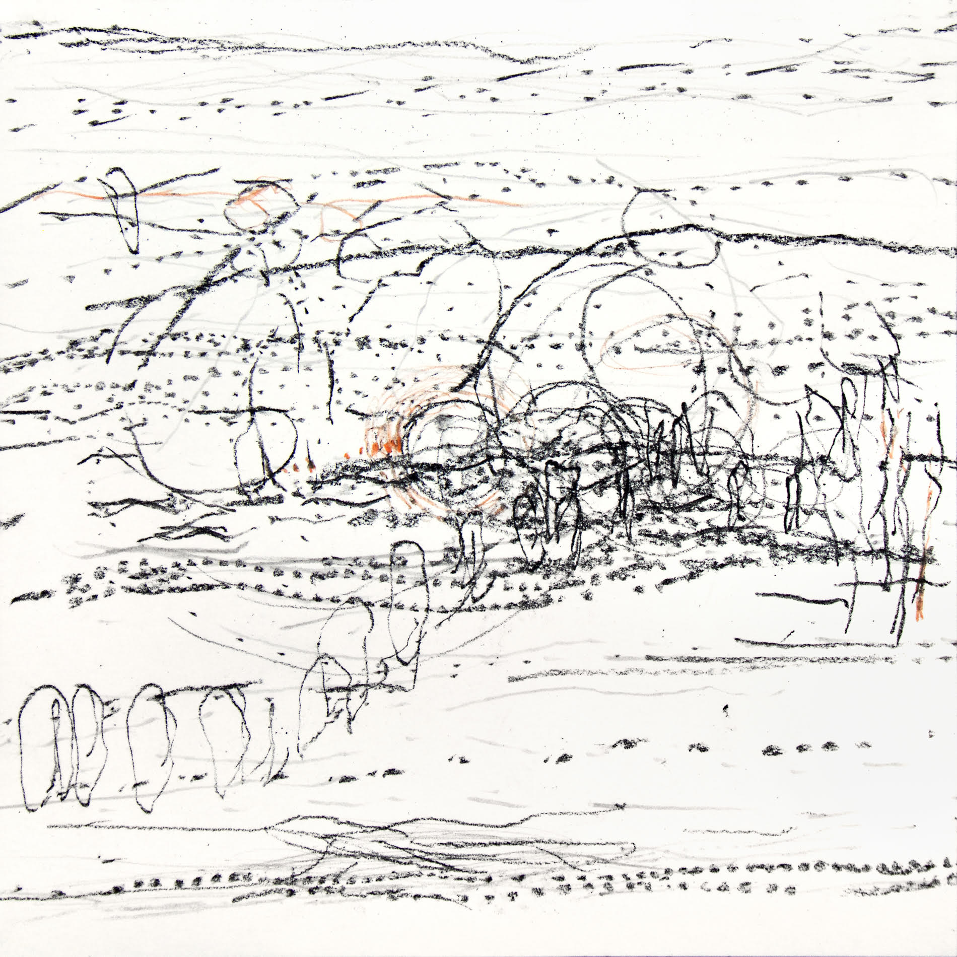
From the very start of the corridor space Window Gallery, making a de facto antechamber, two wall-mounted assemblies of small, unframed, preparatory drawings make it clear that drawing is at the core of Rutland’s practice. As an introductory display, sufficient in itself as a stand-alone exhibition, the 28 studies make an implied proposition that drawing is still of paramount importance towards painting, especially in landscape art. Whilst an en plein air approach is also possible, the drawing in advance of the essential schema for a final painting, even without colour content, provides the opportunity for intense consideration of composition and content; and for revision of the essential rectangular format. Rutland’s methodical approach also develops the initial ‘sketch’ to a more ‘finished’ state and therefore requires a more prolonged period of execution. In this respect, the lengthening of time to make what might simply become no more than a preliminary part of production, adds to the inherent conceptual aspect of Rutland’s greater project, namely that of time and duration.
Tania Rutland – ‘Untitled 1 (Fatigue of early light – Mist’s cover)’ (14x16cm) Preparatory drawing.
Annotated on half a dozen of these relatively intense drawings are more titles, including: ‘Ghost lines’, ‘Eroded slope’, ‘Frozen light’ and ‘Fatigue of early light’. Without mounts, but with clearly measured and demarcated perimeters for consequent development into paintings, these studies may have come straight from the studio wall in her Phoenix studio. This informality in presentation might have initially diminished an observer’s attentive reaction to these works, but throughout the opening evening many visitors could be seen both standing back to view each of the two groupings of drawings and then be observed stepping closer to scrutinise each image as if through a magnifying glass. In relation to time a second aspect, that of concentrated visual observation of various locations, loaded with evidence of human interaction in and on the land (and sea), also implied itself in the bigger project.
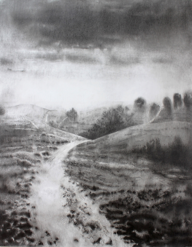
Tania Rutland – ‘Ghost white path’ (200x150cm). Pencil and graphite on paper.
Continuing into the main display space the biggest piece in the show first greets the visitor in contrast to the small studies just encountered. The pencil and graphite ‘Ghost white path’ impresses not just by size alone (200x150cm), but also by a display of controlled elegance in mark making and an example of compositional skill in which the viewer might literally fall into this Downland vista. As a completed drawing, ‘Ghost white path’ is as consummate and exhaustive as a painting might be and therefore expands the notion of drawing as going beyond the supportive role that it often takes.
In this significant work the viewer will certainly gain a sense of the past and the present day in one hit. In the bright distance, where the intense light dissolves the sea from sight, the Rampion wind farm turbines that now dominate the view from the Sussex coast have been recorded. Whether these technological structures please the viewer or not, like the telegraph poles we may barely notice anymore, or the electricity masts that cannot always be buried beneath the ground, we will inevitably have to become accustomed to this burgeoning technology for generations to come.
The past and present (an ancient landscape and an off-shore development) combine in one monumental vista so that a viewer has to contemplate a challenging and controversial journey to the future in this era of climate change awareness and necessary proactive behaviour.
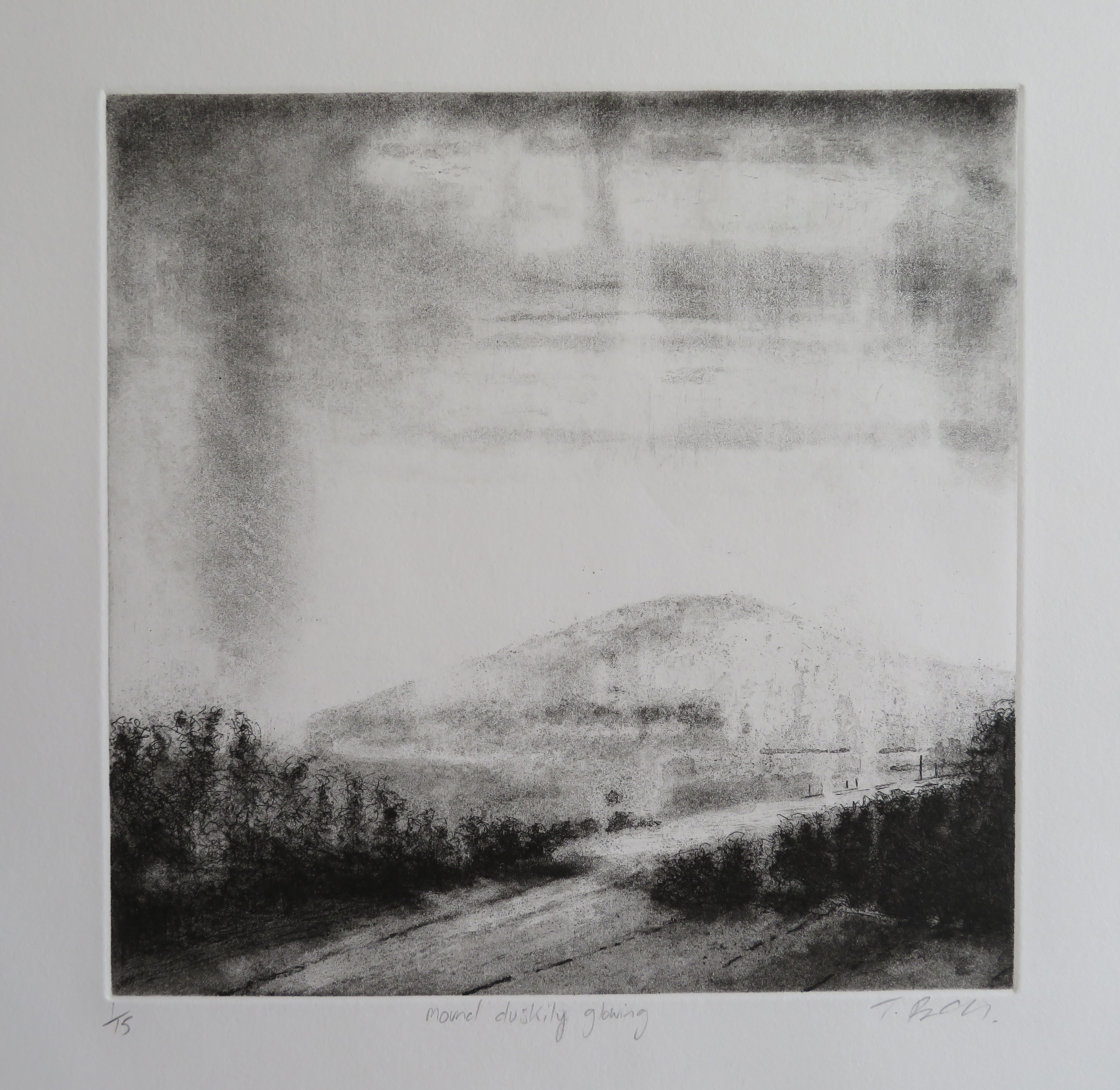
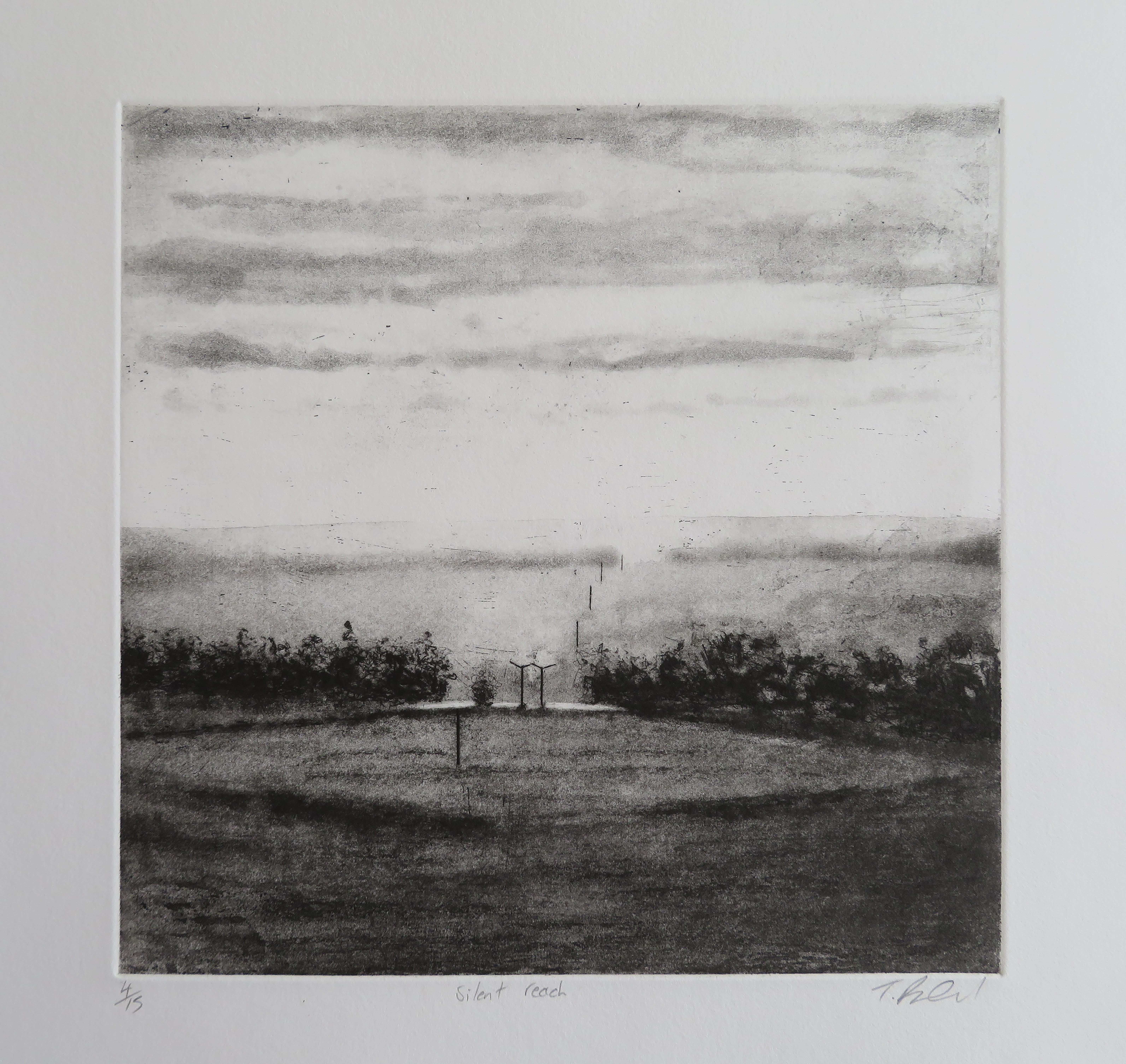
Four monochromatic etchings are displayed next, including ‘Mound duskily glowing’, a title merging topography with time and light, which again suggests a poetic counterpart (a haiku perhaps) that may one day be written. In ‘Silent reach’, telegraph poles located in a flattened mid-grey rhombus in the central area of the composition leads the eye from foreground to mid-distance. The poles could be traversing alongside a coastal area, or trace a communications route a few miles inland, leading to the next village or town. Very few regions of this relatively small island will be without such evidence of human habitation, as if such evidence of technology was as natural a phenomenon as the trees.
With a change of process and medium Rutland allows a weathered, washed-out look in the thinned ink layers transferred from the surface of the metal that she has etched with. For example, in ‘Selvedge edge’ the distant hills are visually subject to mist dissolving form, whilst rain falls as weather conditions change appearances. In the bottom section of the image fence posts create a small enclosure, a signifier of order and land ownership. A telegraph pole, like a crucifix, in middle ground, merges at its base into foliage. Dark parallel lines in the foreground, perhaps suggesting the selvedge edge of fabric for the title, foretell the flint seams in the set of the four ‘Flint Seam’ drawings that are to follow.
These more minimalist compositions, ‘Flint seam 1, 2, 3 and 4’, are placed at the centre of the show. They are undoubtedly complete in themselves but may well hold the prospect for further development as abstract paintings. Each is placed behind a clear acrylic sheet, rather than mounted in a conventional frame. Like its counterparts, ‘Flint seam 2’ is composed of a series of vertically placed horizontal bands of smudgy, burnished graphite drawn on to a gesso (i.e. chalky) coated, paper ground. Within these thin, dark, cloud-like strata are more defined linear marks suggesting a compressed handwriting with a slightly nervous, quivering organic edge.
Tania Rutland – ‘Flint seam 2’ (66x46cm). Pencil and graphite on gesso paper.
These often flat and smooth, mark-like shadow shapes are found in split flint nodules originating from sedimentary chalk that litter the farmland in Sussex and have been used as building materials for walls and buildings since the Roman era. Further back in time flint was fashioned as a Stone Age tool. But way beyond any human presence on earth they are a literal compression of geological time and materiality that seems beyond comprehension and may well suggest a natural kind of drawing. Dark and wave-like, these markings made from the chalk seabed reveal fissures of implied energy. As a form of visual poetics, the past is metaphysically now in these teasingly simple, but thought provoking and elegant drawings.
Tania Rutland – ‘Crowding the solitude’ (28x21cm). Pencil and graphite on paper.
At what appears to be the end of the display, a group of five framed drawings (including the title piece of the exhibition) are presented in suitably mounted and framed studies that, like the etchings, read as ‘finished’ works. They include ‘Crowding the solitude’ which is a similar composition to the aforementioned ‘White ghost path’. In the mid-ground the land builds steeply to two bulbous hills; to the right on the implied horizon are the perspectival rows of 14 vertical masts from the Wind farm out at sea. In the space between the hillocks, and particularly on the left hand feature, is a meandering configuration of chalky pathways. The closer foreground is patterned by a gentle arrangement of subtle tones that visually pock mark the paper surface. The notion of the landscape as corporeal and libidinous is difficult to deny.
Tania Rutland – ‘Flint’ (42x42cm). Pencil and graphite on paper.
The last of these five drawings is titled ‘Flint’. Initially it could be a drawing that goes unnoticed, such is the insistent or subtle presence of so many of the other works. One feature, however, hooks the gaze as one might head for the coffee bar and the prospect of seeing a painting from Tania Rutland. Within this rendering of what may be a recently ploughed and almost featureless field, a tiny but visually dominant grid-like structure interrupts the shallow curve of the land, just before the dark masses of a thicket of trees on the close horizon, revealed contre-jour, emphasising a sense of infinite space beyond. Its identity is a mystery: could it be a wooden or metal framework? From the bottom right-hand corner of the drawing a purposely trodden pathway leads to the unknown construction and it could be that the track across the field has been rendered into the surface by either animals or humans.
Tania Rutland – ‘Remote dwellings’ (40x40cm). Oil on canvas.
Outside of the Window Gallery, but in a suitable display space that extends all of the exhibitions, one of Rutland’s oil paintings, ‘Remote dwellings’ is presented on a dark grey wall. This provides an example for those who do not already know her work and is now interestingly and more than adequately informed from seeing the drawings and prints. One painting is probably just enough exposure in this context and holds out the prospect of seeing a future exhibition of Rutland’s paintings.
Significantly, this work in the more ecologically minded attitudes of society today is made more potent by its combined references to the past, present and future. The human conquest of the environment is, of course, aided and abetted by the genius of technologies, open to interpretation and revision. The drawings and prints presented in ‘Chip of flint – fragment of chalk’ not only record and reflect the history of particularly special locations, but provoke the observer to contemplate the future too.