ARCHIE ROGERS: curb-bound

crafted material from an urban world

Gallery 19a, Brighton

20 to 31 July 2024

I am unable to make the Private View so have visited Gallery 19a the day before the initial gathering of friends and fans to have a sneak preview of Curb-Bound, a one-person show by Archie Rogers. The installation appears complete, unless any wall text or other information is yet to be introduced. As visitors we may well seek out some explanatory content but I am not so sure it’s needed.

Archie Rogers – ‘Copsewood’ Oilstick on two wooden panels (20x25cm)

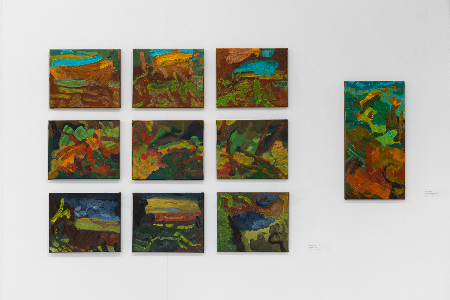
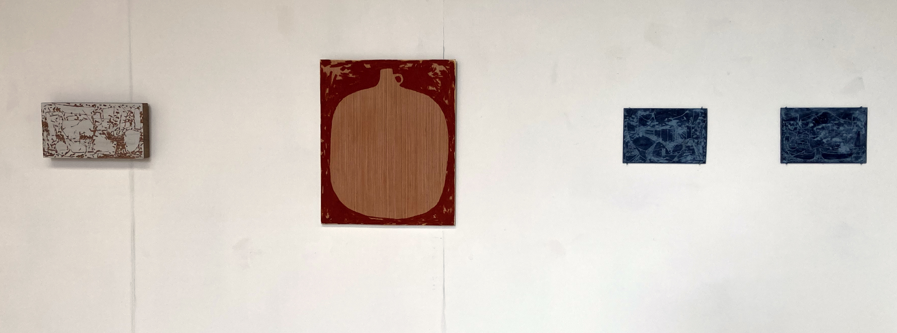
Titles usefully act as signage towards subject matter and, usually, enable a more informed or focussed reading. But without such prompts the emphasis is on the viewer’s imagination to make some sense of the creator’s intentions. I was not counting but there were close to twenty pieces hung on the walls and about a dozen other items arranged on the floor and on a long shelf. Sculptures might be the incorrect term for the various objects; I prefer the latter term, objects, as it acknowledges the ‘found’ nature of many of the pieces on display.

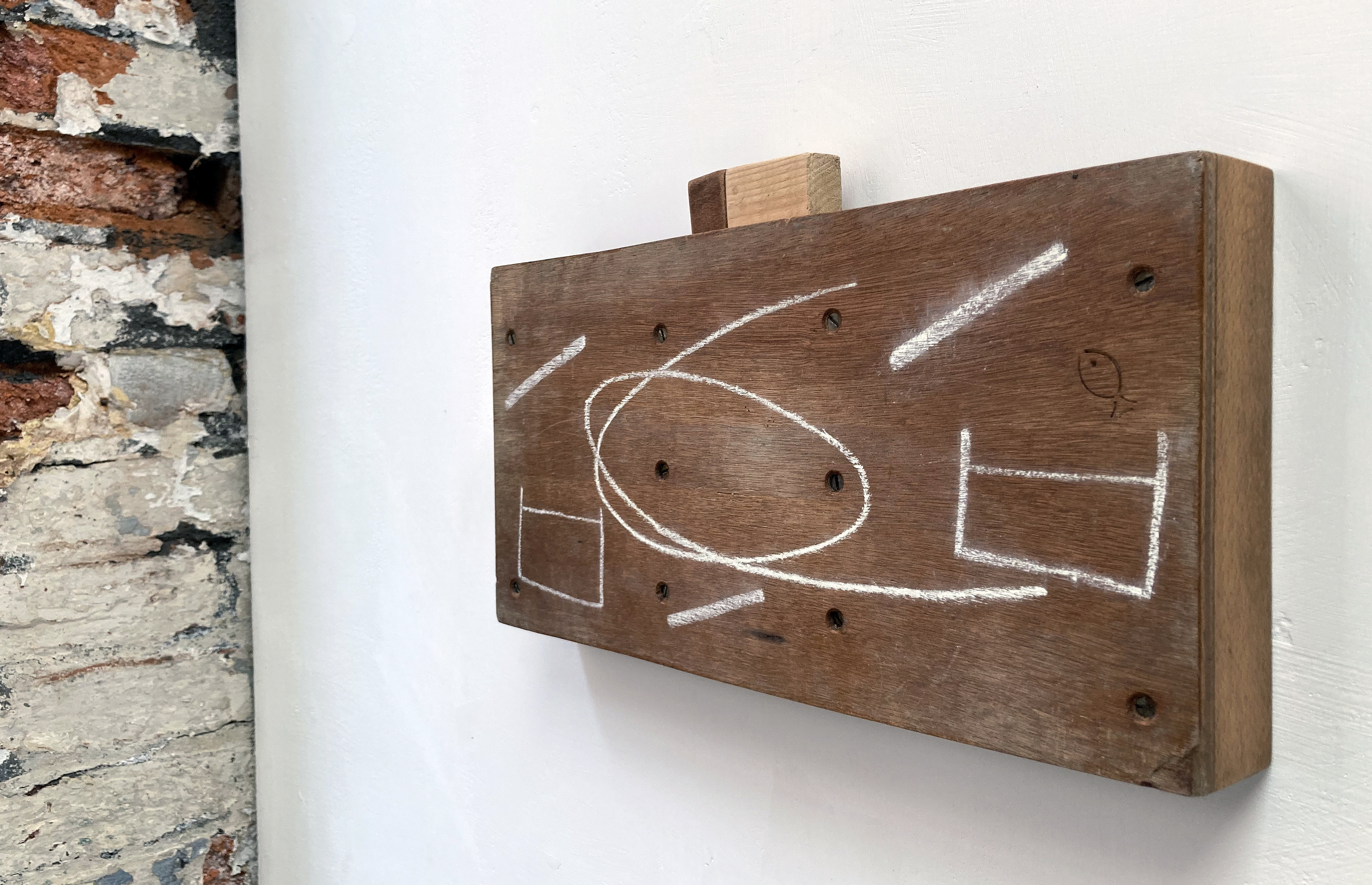
If the viewer knows of the Japanese term Wabi-Sabi, an appreciation of the found object, now defunct and showing evidence of natural aging, impermanence and transience, a context usefully envelops these works. But, interestingly, Rogers has continued any natural transformation with a carpentry and woodcraft type activity. In this sense the objects drift back towards some notion of the constructed and designed object. By collecting many wooden items (though not exclusively as chalk, oil, Bakelite and string make an appearance too) and sawing, drilling or carving up these materials, that could otherwise have been heading for the beach or home fire as kindling, are transformed by the simplest of means. This flotsam and jetsam from the street, and the beach, takes on a new purpose as art – and the hand is always present to make purposely-unsophisticated changes.

Archie Rogers

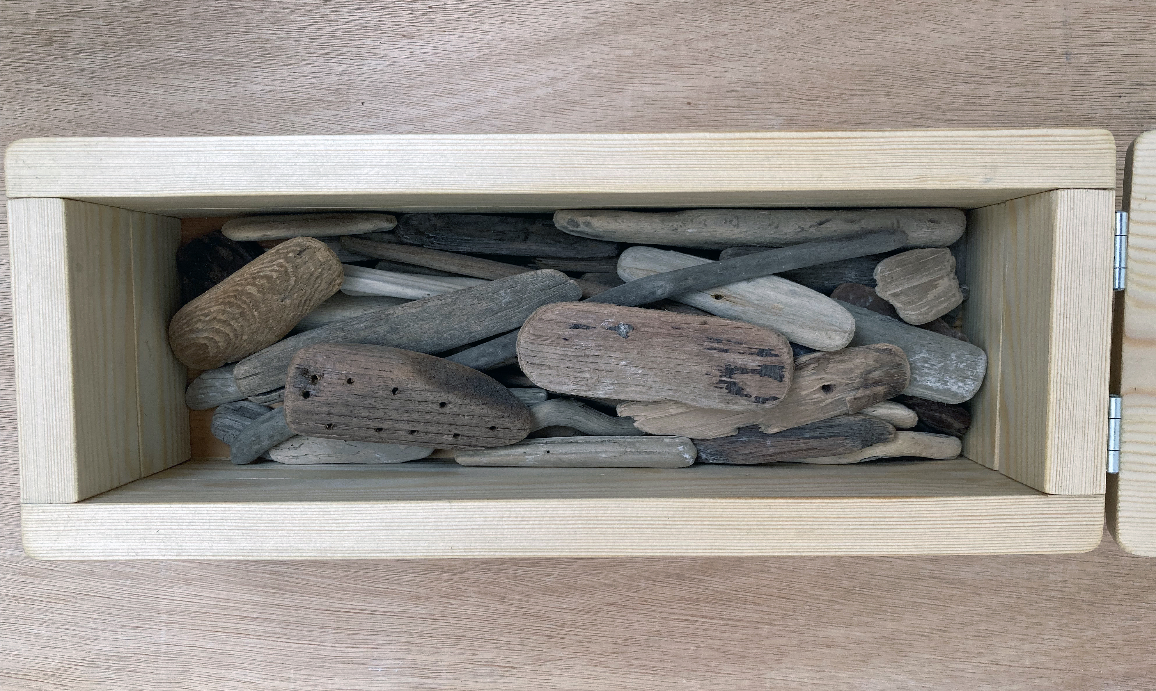
Some constructions are wall mounted and others are arranged on a long shelf or stored in a box. One such box held many pebble-like pieces of wood from the beach. A smooth little piece of wood had ten holes drilled in it that were surely added after being found. (I was reminded of Roger Ackling’s works that he embellished with burnt lines from the sun’s rays focussed through a magnifying glass and are currently on display in Norwich.) These holes suggest some semblance of transformation, perhaps from a primitive and seemingly unsophisticated starting point. Without obvious purpose the object remains abstract but is highly suggestive of human interaction

Another box held more cuboid and cylindrical forms that had clearly been carefully placed to enable all of the pieces to fit in. I thought of keepsakes, emotional treasure, something you might need one day, or just can’t bear to part with. The stuff found in parents’ lofts many years after the children have left home.

Archie Rogers – ‘Weaving’ String and wood

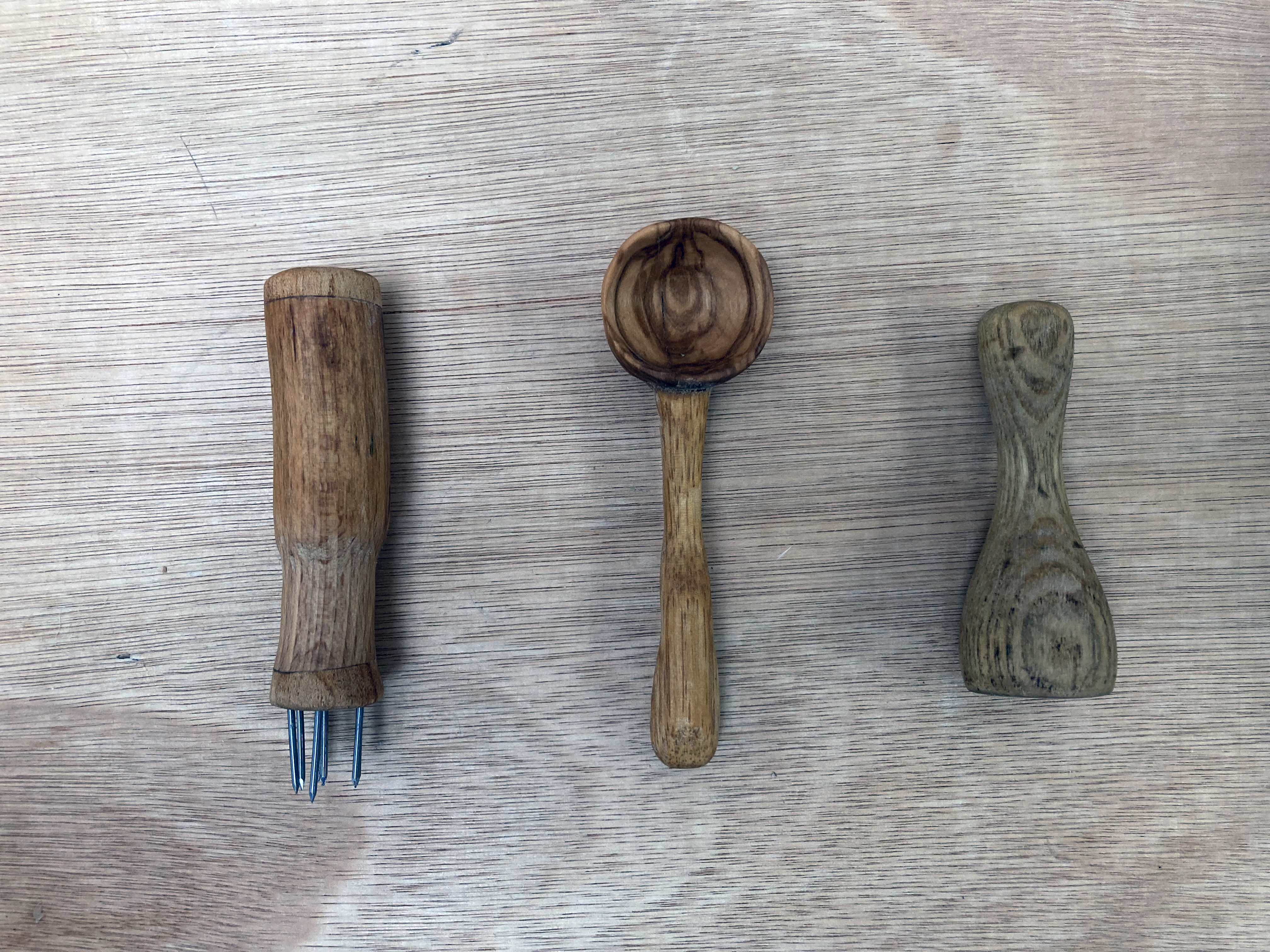
The standout item for me was a small weaving made from the artist’s very small hand made loom. In fact it was the second loom made, as the first, also on display, appeared flawed, broken or unfinished. The warp and weft item was suspended from a large wooden knitting needle. Although nearby, on the shelf, were three items, including a spoon, that equally drew my attention. Again, the subtle hint of earliest design and technology directed towards everyday needs, the real treasures of life, was refreshingly present. Wood, and associated materials have literally transformed our lives. Wood must be present in our creative and imaginative DNA.

Archie Rogers

Britain was once heavily forested, almost completely, 7000 years after the last ice age. Now we live in one of the most de-forested countries in Europe. With the Green revolution well underway our relationship to the natural world will surely rejuvenate. Archie Rogers appears to be discovering this material legacy in the curbsides and on the pebbly beach here in Brighton.

Geoff Hands (July 2024)

Archie Rogers – Wall installation

Note:

Archie Rogers is a co-founder and curator for Fresh Salad Art, a platform supporting emerging artists through the organisation of group art exhibitions around the UK and internationally through virtual gallery spaces. He is a University of Brighton graduate from 2022.

“My smaller works are predominantly made using found wood and other discarded materials, so surface takes on a whole new significance. An object which has been intensely used, worn, fixed, and abandoned bears evidence of its past life and can only become more beautiful as time passes. I enjoy reacting to these marks with the intention of complementing, not merely to conceal them. I believe in tactility and rejecting boldness in favour of subtlety, thoughts which are reflected also in my recent sculptural and functional pieces.” (UOB website, see link below)

Archie Rogers – Shelf installation

LINKS:

Instagram – @ar.chie.art

Gallery 19a

University of Brighton

Fresh Salad

Roger Ackling

Archie Rogers – ‘Oversounds (16-23 December)’– Found wood and chalk

RUPERT HARTLEY: Rising in the start of its arc

At Gallery 19a, Brighton

June 27 to July 6 2024

Entrance to Gallery 19a

I have this unexpected feeling that I have been outside for a walk. I am not so sure about the weather conditions, or where I have ventured. I may have been alone but I was definitely walking – probably at a leisurely pace. Rupert Hartley’s paintings presented at Gallery 19a in Brighton have this feeling of gentle serenity nuanced with a sense of fresh air and time flowing, though not fixed or too specific. The journey is the destination in itself, somewhere in between A and B. It is no surprise that psychogeography, a wandering multi-experiential activity, interests this artist. But the works are quite formalist too, with no requirement to read them figuratively.

Installation at Gallery 19a

In true ‘white cube’ tradition it has been a dominant convention not to display titles on the white gallery walls for many years now. Sometimes this purist ‘rule’ is annoying or occasionally quite helpful (maybe for figurative works?). In this show, however, it feels appropriate not to place wall labels that could distract from the works on display. The viewer, at least initially, is thrown in to the deep end of abstraction. The works might be described as minimalist or geometric in nature. The use of colour is paramount, with a predilection for the handcrafted, painterly approach. Though there are some signs of the use of masking tape making a tantalising approach towards the hard-edge.

After a general look around for about ten minutes, to tune in as it were, I take a look at the list of paintings in Rising in the start of its arc, quite possibly affected by how I have initially received the works. Echoing a moving gaze that shifted within each composition and from canvas to canvas, reading the titles randomly, not necessarily from the first to the last on the A4 sheets, was uncharacteristic of me. Many sequences are possible from just eight titles:

Totals; Leave here for large external world; Green lights both their smokes; Blue black on yellow smile; False dawn; Lights bathe you in red-blue-red; Afterlight; Totals…

Rupert Hartley – ‘Blue black on yellow smile’ 2023 (55x45cm) acrylic on canvas

How does the title of a painting function? In ‘Blue black on yellow smile’ we see the blue and black squares on a yellow background or surround (to avoid too spatial a reading), yet I am not sure about the smile. This is good. Let’s not get too literal or descriptive. The titles, perhaps they are best considered as sub-headings as the paintings are paramount as visual phenomena, from Hartley’s selection of paintings certainly have poetic potential as pure text. They could conjure an imaginative scenario of people and places or be presented as a form of Concrete poetry. In actual fact the titles are taken from Infinite Jest, a novel by the late American writer, David Foster Wallace. If these works are actually urbanscapes (and close to the seafront in Hove where the artist lives and has his studio) the notion of the literary arc is appropriate given a sense of place and some sentiment or hunch of the fictional nature of reality as it might be retold or represented in a literary or visually creative mode. But unlike a text rendered narrative a painting is usually manifested as a kind of one-off statement, even if part of a larger grouping. Such a form of ‘reading’ (if that is the right term to use) can be challenging, simple, or both.

Rupert Hartley – ‘Green lights both their smokes’ 2023 (55x45cm) acrylic on canvas

Hartley’s works are both objective and subjective. They are formalist and tantalisingly impressionistic. Light and colour are strong characteristics. Implied affects, from the paintings, include floating or an about to shift sensation. The process of the making of a painting could be sited as its essential subject, as a form of narrative, in this category of abstract painting. But that old-fashioned term needs a capital letter: Impressionistic, crops up as the works emulate moments of lived experience (a development of Realism in art history). Nowadays we might prefer the term environmental, as the works may well allude to the land/seascape and the constructed social space. Living on the south coast is an environment that local visitors to the exhibition might well recognise, even if indirectly or obliquely. The viewer could see or sense something in the work from the outside world they inhabit, as this is an aspect of traditional expectations too. The mind will often want to make sense of/from the abstract. But in Hartley’s works there is no illusionism. There is certainly a concrete feel, or sensation of space and structure, and some sense of figure and ground, whether intended or not. Viewpoints are potentially here too as one could be looking down on (an aerial view or map) or across to (a group of buildings or even a still life). The frame might even imply a window view, in pixelated fashion. There can be a sense of illusionism too, as in ‘Green lights both their smokes’ gives a hint of floating and shadow.

Rupert Hartley – ‘Afterlight 1’ 2023 (160x135cm) acrylic and flashe on canvas.

In all works, to slightly varying degrees, there are layers or just the one coat of paint, in a specific square or rectangle. The bottom section of each painting is either bare canvas or (mostly) painted with one colour for the whole width and might be read as an unintentional, though minimalist, predella. (The bottom section of a Gothic or Early Renaissance altarpiece that typically illustrates the life of a saint.) In all eight paintings the bottom section appears separate from the grid above, as if it could have been cut off before being stretched on to the supporting frame. Reading figuratively this strip/rectangle could be an urban, geographic pathway (and in ‘Leave here for large external world’ a blue stripe at the top, suggests the sky). Repeated greens in several of the works might suggest trees or bushes, but this literal reading that any viewer might have, though revealing a subconscious pictorial habit that is hard to suppress, is unnecessary.

Rupert Hartley – ‘Leave here for large external world’ 2023 (86×70.5cm) acrylic on canvas

There is a subtle predominance of blues and greys and a few reds and pinks in the selected works. Perhaps this made the earthy yellows stand out, particularly in ‘Leave here for large external world’. Colours are generally subdued, but retain vitality, from intermixing in most instances. Seldom does the acrylic appear squeezed directly from the tube or out of the manufacturer’s paint pot. The colours are key, not just individually but in relation to each other. The general square shapes and grid structures maintain an implied order and structure that holds it all together. The canvas surface is also part of the visual content. I frequently found myself stepping very close the works, especially ‘Green lights both their smokes’, to simply take in the woven texture. So too with various brushmarky laminations of colour in some of the squares. A handmade quality is retained in the painting process at all times. Nor do the works look pre-planned or overtly systematic, despite a studio-based system of some degree leading to these outcomes. In Hartley’s works we see infinite variety in a restricted, and sophisticated, practice.

Another reading might be of a form of deconstruction of the seen and experienced, leading to a constructed amalgamation of visually encountered environments to be realised as a work of art – something new in the world that we call a painting. On a more subject level I sensed a sort of breathing element too, as the imagery might be taken in to be exhaled. The visual becoming air as a calm softness of encounter accommodates a sense of changing viewpoints as well as general and specific identities. A kind of sense of place that is literally psychogeographic.

Before visiting Rising in the start of its arc, the last time I saw a painting of Hartley’s was in the memorable H_A_R_D_P_A_P_E_R exhibition at the Phoenix Art Space just four months ago. In my review of that show I avoided choosing a favourite, as there were so many works on display and my shortlist was too long anyhow. But I was tempted to choose Hartley’s contribution as my personal front-runner for the fictitious gold medal. I was not sure why though, and seeing this more comprehensive selection of his work helps me to realise that it might have been for the skills and ability to produce a work that appropriately requires a long look and a calm kind of gaze. The imagery sinks in rather than imposes itself upon the viewer. The colour range also adhered to this methodology of encouraging a mind-merging/thought process linking with the visual experience, rather than an all too obvious revealing of subject matter. In this new exhibition there is a purposive yet contradictory sense of the finished suggesting the unfinished in each work. There is also a sense of the process of becoming and of being made, with colour, shape and slightly imprecise or loose grids. But clearly being finished and resolved enough to merit the imaginative responses from the audience.

Geoff Hands, July 2024

Rupert Hartley – ‘Totals 3’ 2023 (120x120cm) acrylic on canvas

LINKS:

Rupert Hartley https://www.ruperthartley.com/

Nordic Art Agencyhttps://www.nordicartagency.com/rupert-hartley

Instagram – @ruperthartley

H_A_R_D_P_A_P_E_R review – https://fineartruminations.com/2024/03/07/h_a_r_d_p_a_p_e_r/

Gallery 19ahttps://19a.org/exhibitions

HARRIETTE LLOYD: When The Dust Settles

Gallery 19a, Hollingdean, Brighton

7 to 19 June 2024

Harriette Lloyd – ‘After The Dust Settles’ 2024 Oil on canvas (67x112cm)

What are the painterly visual equivalents for the recollection of time and place? At a simple level we might think of the dark and the light, forms and space, the near and the far. Shapes, layers and geometric or organic forms, which despite the very clever invention and illusion of perspective, combine as an environment. Compositions from the visual field in the here and now, and potentially from memory (or become a version of memory), offer evidence. The future’s not so certain. There’s a sense of permanency unfolding into change of what is or was. Building, deteriorating or soon to be replaced scenarios are here or there. Surfaces reflecting or absorbing light enable differentiation in the visual field. Oh how we need light, and touch, of course.

Harriette Lloyd’s exhibitions of a dozen or so paintings at Gallery 19a in Hollingdean, Brighton conjure these notions of time and space as she makes these evidential documents. The painted memorials appear quite individual but make links from one to another and might be categorised as an extension of the traditional still-life, albeit expanded into architecturally interior spaces such as walls, floors and corners. The seventeenth century Dutch still-life painters of the vanitas recorded and presented objects as a sub-genre of the still-life that reflected a Protestant acknowledgment of the all too short duration of life and of the ultimately limited value of possessions. Lloyd’s project is also embedded in the everyday as a commemoration, but specific objects appear less important than the remarkable visuality of anything and everything around us – including the very process of painting which produces a kind of visual diary from actively engaging with a seeing in action. The application of and engagement with the stuff of painting is certainly endearing as I found myself imagining wanting to apply more of the medium, but Lloyd holds back. She does not get carried away or seduced by the oil paint. This is a promising sign of confidence and calmness in a demanding process. Graduating from the University of Brighton Fine Art Painting course she has clearly been well tutored.

Harriette Lloyd – ‘Grout’ 2024 Oil on canvas (138x82cm)

Lloyd’s visual vocabulary, including the inclusion and reference to of distortions or glitches in digital photography (a generationally related trope from a young painter?), of a near abstract style of painting appear wedded to a language of realism but allow for some degree of improvisation and, as she explains in her exhibition statement:

“The works individually are fragments that together archive fleeting beauty in melancholia.”

Melancholia implies depression or despondency but my take on this collection of paintings overturned any degree of personal dejection into a somewhat positive and celebratory frame of reference. These paintings might affect the viewer in a surprisingly positive and optimistic sense of being alive right now and of a consciousness of the here and now, even in apparent banality, as hugely wonderful. The viewer might leave the exhibition having been prompted to look around wherever they might be and to comprehend and value what’s here rather than some illusion of the elsewhere. This seeing does not have to be denoted as good or bad, or beautiful or ugly. These works might encourage us to accept what is, even if nostalgia, a sense of loss or even premonition creeps in. The paintings certainly stand up to a prolonged viewing as a quick glance was quickly developed into a compulsion to stay put. These paintings generously invite the viewer to stay calm and to carry on – and to deserve a place in your home.

Geoff Hands (June 2024)

Harriette Lloyd – ‘Hot and Cold’ 2022 (30x27cm) Oil on board

LINKS

Harriette Lloyd – https://www.harriettelloyd.co.uk/

Gallery 19a – https://19a.org/exhibitions

IN THE GARDEN

Michelle Cobbin interview with Geoff Hands

Gallery 19a, Brighton

March 21 to April 6 2024 (Closed Sundays / by appointment Wednedays)

Installation of In The Garden at Gallery 19a

Michelle Cobbin, a fellow painter at the Phoenix Art Space, interviewed Geoff Hands as he prepared to install his exhibition, In The Garden, at Gallery 19a in Brighton.

Install photographs by Rob Harris.

Michelle Cobbin – What was the first painting that had an impact on you?

Geoff Hands – A Camille Pissarro woodland landscape. I was 18 or 19 years old and on a Shrewsbury School of Art visit to Manchester City Art Gallery and The Whitworth. It was not a particularly large work, but the paint was quite thickly applied in that Impressionistic manner. It sounds naive, but I was so accustomed to looking at reproductions of paintings in books that I must have assumed that paintings were essentially ironed flat. Today we probably talk about ‘materiality’ but back then, in the 1970s, it was ‘surface touch’. A visual touching of course, which is one of those fascinating dualities of experiencing painting that might only truly be comprehended on a feeling level.

I should also mention two other paintings recalled on another art school trip a little later to Liverpool. These are Stephen Farthing’s ‘Louis XV Rigaud’ and John Walker’s ‘Juggernaut with Plume – for P Neruda’ that were selected for the John Moores exhibition in 1976. They employed a technique of employing collage within the canvas, which expanded the painting process. Collaging, in a sense, is more ‘hands on’ than painting with a brush.

MC – That is really interesting. Your recent work utilises unctuous and thick oil paint and collage plays a part in your studio practice. Would you say that the ‘materiality’ of making work is essential to your practice? 

GH– I have always felt that the physical medium is a crucial ingredient in the realisation of the artwork. It’s experiential too, both for maker and viewer.  There’s a symbiosis at work, which is material, physical and visual. Oil paint is a wonderful medium, just from a feeling point of view. If my painting is going well, on a subjective level, the oil painting process is still a challenging and discomforting experience. That’s the contradictory nature of painting for me, which has been appropriately labelled the ‘hard won image’. I’m sure that sounds rather old fashioned and romantic.

Oh, but the thick layers of oil could be thin too. And I love the term ‘studio practice’ as it implies a never-ending quest for something. The recent work being presented in ‘In The Garden’, particularly from 2019/20, really continues work from before but with an added realisation that there’s a singular pursuit to make a painting that was worth the effort. That’s why I called my show at the Phoenix Art Space in 2020, ‘It’s All One Song’, after a comment made by Neil Young to an audience member who wanted to hear a specific song but he launched into something else. My interpretation was adjusted to the notion of my own singular pursuit, engaged with as a painting student so long ago, that is still manifested in repetition of some kind of desire.

‘Garden (Pilgrimage) – After Watteau II (for PJ Harvey)’ 2020-21 (121x150cm) and
‘Garden (Pilgrimage) After Watteau I’ 2020-21 (121x150cm)

MC – That quote from Neil Young, ‘It’s All One Song’, you mention one way you apply that idea to your painting in that it is a repetition that forms part of your ‘studio practice’. Keeping with musical references I would suggest that you use a lyrical mark-making motif in many works that lead the eye from painting to painting in a rhythmic way. Are you conscious of that – is it deliberate or is it perhaps that you are listening to Shakey in the studio and the marks are spontaneous responses to the music?

GH – Well, I am conscious of a desire to create a feeling of movement and flow in the paintings. This starts with the looking and the observational drawing before the paintings are made back in the studio. This interest in rhythm, movement and atmosphere is concerned with consciousness, time and space. So there should be occlusion and fixed point too. This is everyday stuff, acknowledging the animism and agency of the here and now. The mark making can be described as ‘lyrical’ and I see it as an extension of the looking and the drawing but improvisation is key too, along with a journey into abstraction with colour.

I get the musical link too but I more often paint with some chilled ECM label jazz playing in the background. The occasional blast of Neil Young with Crazy Horse would be good to stop overthinking though!

It’s worth briefly mentioning that I am currently working with musician and composer, Tobias Wheal, on walking, drawing and painting with his music responding to my work and vice-versa. There’s a little poetry as well, but it’s still a little early to say much more as we are buried in the project at the moment.

Garden’ series, 2023 (25.5x31cm)
and ‘In The Garden (for V.M.)’ 2023 (51x26cm)

MC – The project with Tobias Wheal sounds like an interesting collaboration, I look forward to seeing how that develops. Recently your work has referenced paintings by historic landscape painters such as Watteau and Gainsborough. In particular I was drawn to the large painting inspired by ‘Mr and Mrs Andrews’. What drew you to riff off that particular Gainsborough painting?

GH – Between two of the lockdown periods I went to see the Titian show at the National Gallery and took a walk around the permanent collection. Gainsborough’s painting is one I know well from many visits there and it never fails to impress. I always expect it to be bigger than it is and his paint handling is astonishing. It’s a loaded image of course, not just from a feminist perspective concerned with the implied male ownership of the female partner, but it is also an unintended glorification of capitalism and land ownership from its early history of development in England. For anyone interested in the English Landscape tradition in painting it can’t be ignored either. All of these political frameworks are important and remain relevant today, but I think that we can look at paintings for what they are without having to add a societal context every time.

Anyway, at the time (during the pandemic) I was incorporating elements from paintings from the past into my own work. I was initially looking at a Ruben’s composition (‘Landscape with St George and the Dragon’ 1630-35) and adjusted a small series of my own paintings to include compositional references. This lead onto ‘appropriating’, the artist’s term for stealing, various elements from Titian, Watteau and Gainsborough to add to my own imagery. Some of the content from these painters has been intermixed, especially from Watteau’s, ‘The Embarkation for Cythera’  (the version in the Louvre) that has become a bit of an obsession. With the Gainsborough I have found that I can enjoy painting towards abstraction. The image just seems to lend itself to this painterly and colorful direction. All of this has been happening since about 2020 when I was becoming a little disillusioned with where my work was going, or rather, it was stuck in a groove that needed changing somehow. My forthcoming exhibition (In The Garden) at Gallery 19a will show a small selection from this quite large body of work and I shall have an opportunity to distance myself a little from the paintings so that I can see it from another perspective.

‘Andromeda’s Garden’ 2023 (145x200cm) oil on canvas

MC – As I think about you preparing to select paintings and curate your exhibition ‘In the Garden’ I wonder about titles of individual paintings and whether titles are important to you. As a whole you say the work is ‘all one song’, how does that effect how you title individual works?

GH – Well, there’s an obligation to title work but it’s useful. Just numbering works does not feel right for my works – although as I work in series there will be a roman numeral somewhere. A title is something of a portal, an entrance into the work for the viewer. With the works that reference another artist it seems ethically correct to add their name to the title. As for the importance on a personal level I often reference the source of the painting. This is often a particular location where I have typically visited with a sketchbook to draw in. The untitled option is always there though, and if I am looking at someone else’s paintings in an exhibition I generally avoid reading the wall label at first. The song reference is more of an acknowledgement of a lifetime’s quest or project.

The exhibition title for my show at Gallery 19a is deliberate reference to the feel of that particular song by Van Morrison. It’s quite personal, and perhaps only relevant to myself. The garden reference is also an allusion to the painting studio, especially during the pandemic lockdown periods, and an even more oblique reference to images of Mary in the Garden from the Gothic and Renaissance periods in art history. I like to think of this as a poetic decision, inviting the viewer to make whatever they wish from the references without any clear answers from me.

MC – I think that’s a good place to end.

Links:

Geoff Hands – https://www.geoffhands.co.uk/

Michelle Cobbin – https://www.michellecobbin.art/portfolio-abstract-paintings

Geoff Hands – ‘Emilia’s Garden’ 2023 (135×185.5cm) oil on canvas
‘Andromeda’s Garden’ 2023 (145×200) oil on canvas
Catalogues, included limited edition of 32 with original paintings.