Paper has been around for ages, maybe 5000 years, especially if we include papyrus from ancient Egypt. Artists love this material. Even digital images end up being printed on it. Just as there will never be a paperless office, there will never be a paperless art studio.
Abstract art may have been around even longer than paper – I am thinking of pattern-like marks made on the body with mud or blood, or in the sand with a stick – before any notion of symbolism or figuration advanced visual language. Today abstraction continues to interest many painters and in Brighton we have been fortunate enough to see a good range of the more geometric, non-objective formulations in the H_A_R_D_P_A_I_N_T_I_N_G shows at the Phoenix Art Space in recent years.
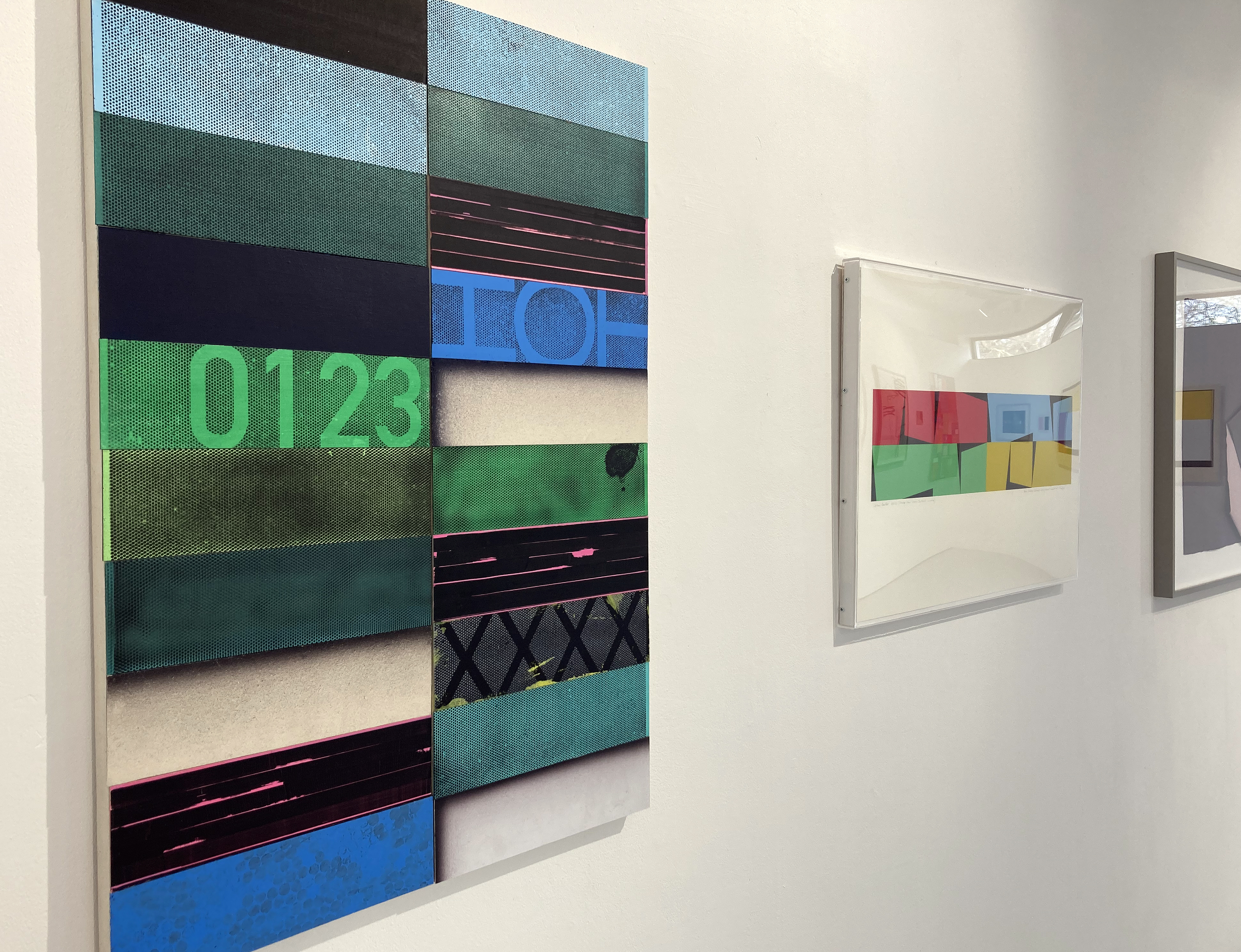
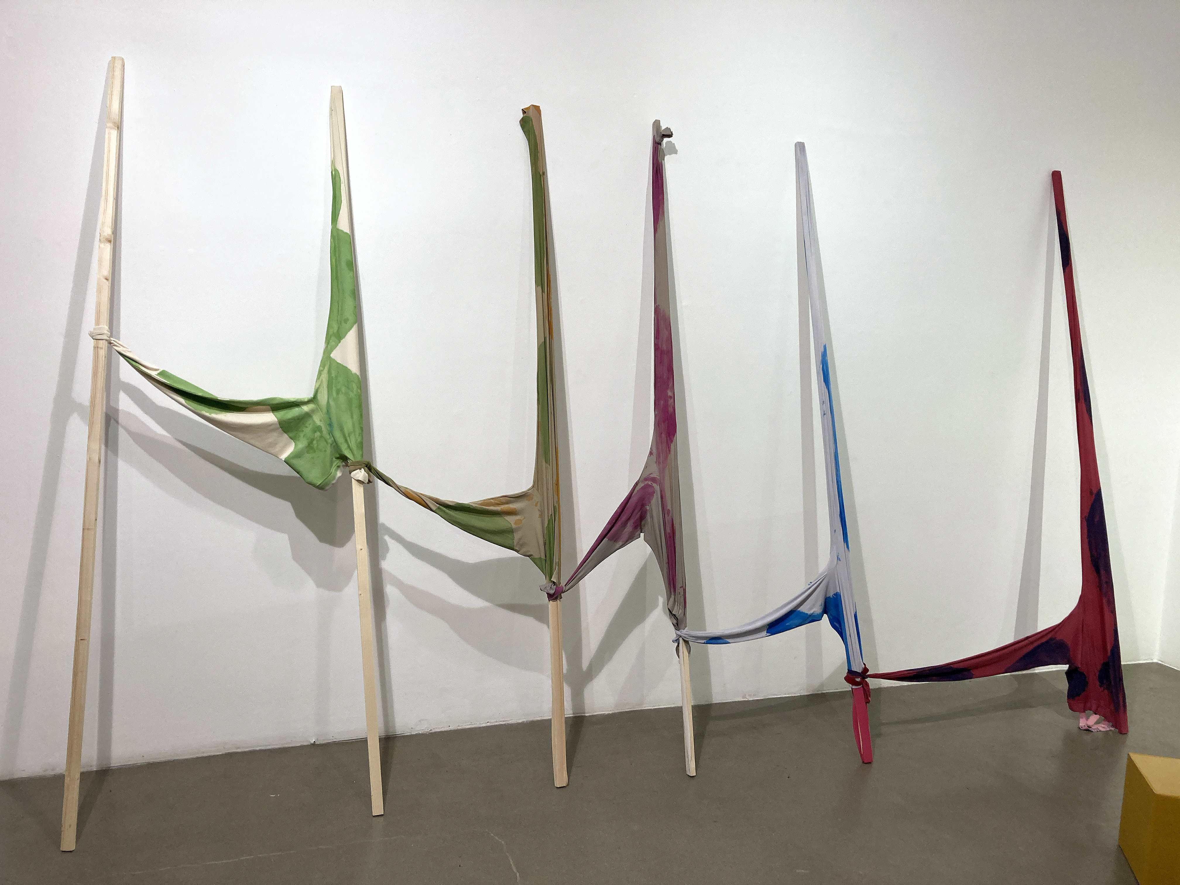
When I first heard about plans for the H_A_R_D_P_A_P_E_R exhibition a few weeks ago I was pleased that drawing and collage – maybe even 3D forms too – might get a look in alongside the painting that I assumed would dominate this project. I wasn’t wrong.
Paper can be passive or add agency – by way of an effect of literally underlying subtlety or more overtly pronounced and structural. In this exhibition there are examples of a suggestively drawing or print-based approach as well as monochrome or limited palette imagery. As expected from geometric abstraction, linear grid-type configurations, systems based structures through to colourful, almost (dangerously) painterly imagery is included. Just over fifty artists have contributed works that they selected themselves. Perhaps this was a risky decision not to completely control and steer the selection by the four H_A_R_D_C_U_R_A_T_O_R_S (my tongue-in-cheek term for Ian Boutell, Patrick O’Donnell, Philip Cole and Stig Evans) as they went for the light touch and allowed things to happen. Based on a first impression I felt that the decision had worked well enough and, as with the previous painting shows, the viewers are given a little taster to seek out more from these practitioners.
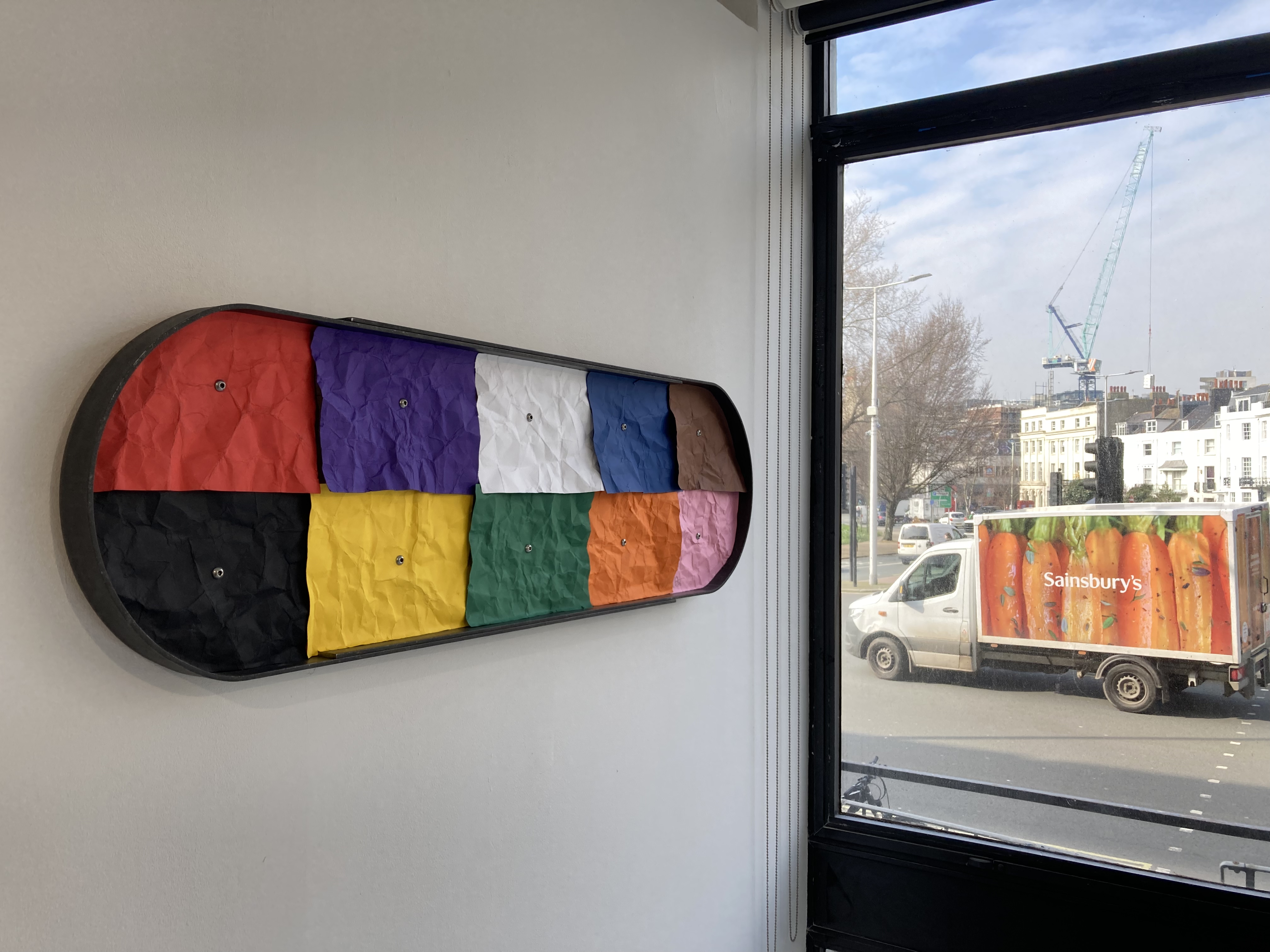
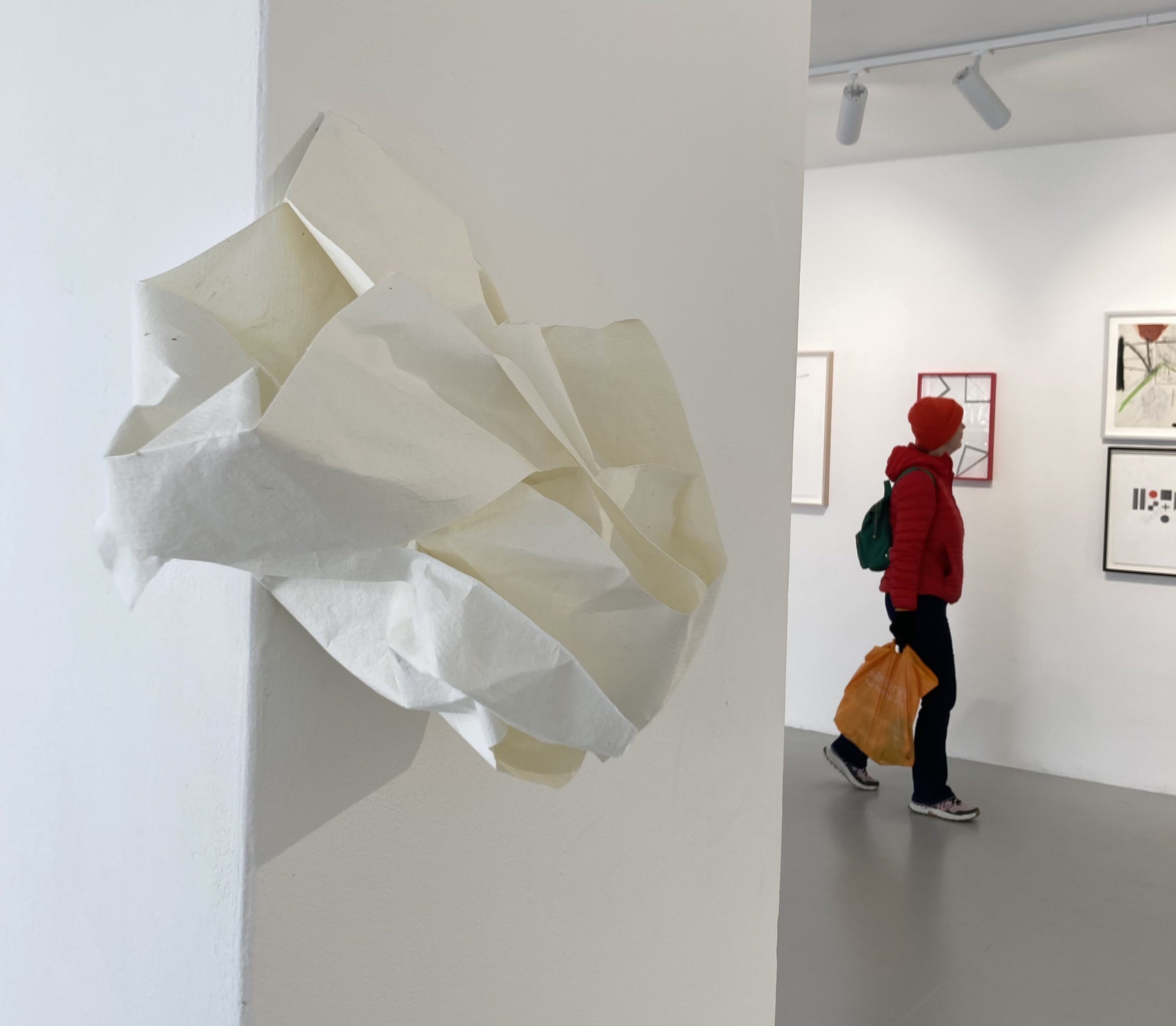
An alternative point-of-view, however, might demand a much tighter range and a smaller group of participants, with far more in common linking the cohort. This has certainly been my feeling after a third visit as, for if there is an argument being promulgated, it is possibly diluted through diversity. That desire to see more from several of the artists, and to make a tighter and less assorted grouping will not go away. Another personal quibble could be even more paper related in that the surface and structures of the medium could have come more to the forefront. Seeing works unframed or breaking free of the rectangle might also emphasize the paper aspect. At this more critical level, a viewer (or a selector) might well insist on an elevated role for the choice of paper as a support and/or main material feature in all of the works. Admittedly, some works, such as several of the paintings could have been applied to a smooth canvas and appeared much the same except for a paper edge or floated mount showing up. Several works adjust or undermine the expected rectangle and hint at an expanded, or extended, field arena for painting. The painting media are, understandably, wide ranging. Some works are closer to drawing, or employ gouache, ink or watercolour. The acrylic medium was present in eight works with some use of oil. Although the unifying factor is paper, even if subservient to the applied medium at times, there could be an argument that demands a less collegiate approach to the final selection in which participants from the second show invited an additional artist to contribute something.
There are so many works on display that I am reluctant to single out a favourite piece. There were three works that remained strongly in my memory after the first visit, but three others after the last. Some works exude expertise and decades of experience, whilst others suggest an experimental attitude or even a sense of humour or play. Three works could loosely be categorised as sculptures – and so I wanted more. For the curators I would like to think that this showing inspires another paper-based show in the future – or even a H_A_R_D_S_C_U_L_P_T_U_R_E survey. But it must not become gimmicky or too broad. They might return to the desires felt for the first exhibition in 2018, which produced a highly memorable show. On this occasion the press release explained that works on display would be: “Painting that is hard edged, non-figurative and abstract / Painting that endures / Painting that is a complex and esoteric distillation of ideas”
On a very positive social note the Phoenix was jam-packed on the open evening with over 400 attendees and when I visited again over the first weekend there were many more visitors than usual. On my Thursday afternoon visit, often a very quiet time, a steady flow of people were turning up. If it’s a sign of the times, and of an interest in contemporary art, we need more artist lead shows at this primary Brighton venue.
The artists:
Mohammad Ali Talpur, Richard Bell, Biggs and Collings, Helen G Blake, Katrina Blannin, Isabelle Borges, Ian Boutell, John Bunker, Matthew Burrows, Belinda Cadbury, John Carter, Cedric Christie, Nina Chua, Philip Cole, Deb Covell, Gina Cross, Matt Dennis, EC, Henrik Eiben, Stig Evans, Catherine Ferguson, Martina Geccelli, Della Gooden, Richard Graville, Dom Gray, Charlotte Winifred Guerard, Alexis Harding, Rupert Hartley, Pete Hoida, Zarah Hussain, Ditty Ketting, Roman Lang, Jo McGonigal, Matthew Meadows, Johanna Melvin, Mali Morris, Morrissey and Hancock, Jost Münster, James William Murray, Patrick O’Donnell, Tim Renshaw, Giulia Ricci, Carol Robertson, Sonia Stanyard, Daniel Sturgis, Trevor Sutton, G R Thomson, David Webb, Lars Wolter, Eleanor Wood, Mary Yacoob, Jessie Yates.
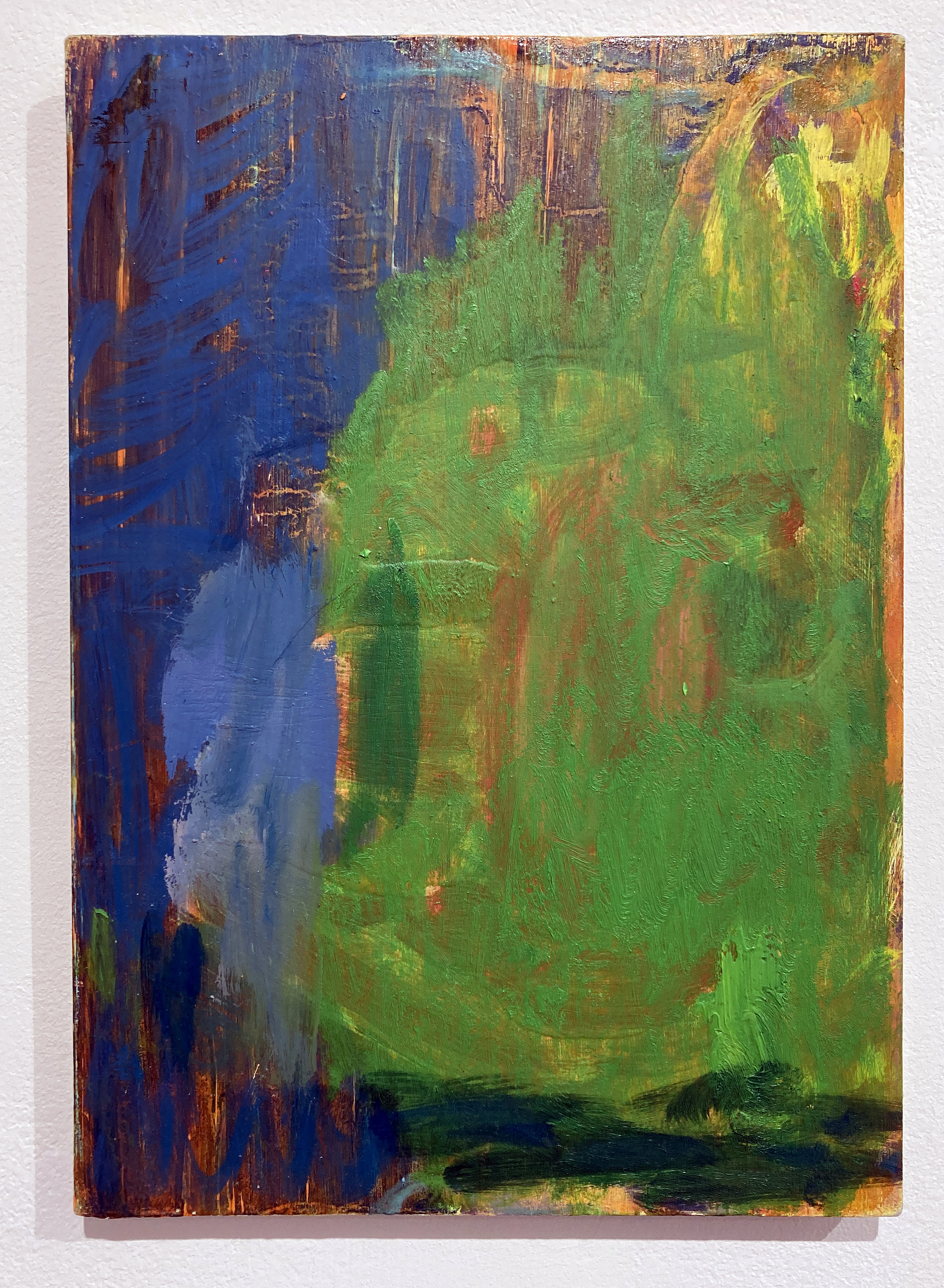
Michael Clarence – ‘Devily Dyke‘ 2024. (30X21.3 cm) Oil on board.
Don’t go looking for the punctum. It will find you, only you. Not just in photographs, as Roland Barthes explored in the now classic ‘Camera Lucida’ nearly fifty years ago, but in any visual situation.
I am expanding this compelling theory of Barthes’ beyond its intended scope within photography as I attempt to ascertain why one painting in a small exhibition made a connection that did not rely on it standing out from the other works as bigger, better or more beautiful. Its title is irrelevant (to me at least, for now…) and, for the record, it was possibly the second or third smallest work on display. Maybe there are eight works, or nine. There was ample space for double or triple the number. Overfilling a space is easy. Just getting it right is an impressive skill.
Mind you, if I could fully understand and explain why this one particular oil painting ‘hit the spot’ I would be venturing into the studium as not only the language and form of an explanation would betray the impact of the singular act of seeing something, but I would be obliged to discuss (in general terms) figuration and abstraction in painting. The present day, an aspect of the historical moment before it is truly placed in some kind of past, would oblige a discussion of identity politics too (in specific, contemporaneous terms, no doubt).
Sometimes we should allow ourselves the thrill of the extended moment and should, or at least can choose, to put aside the societally inflicted art appreciation straightjacket awhile. Such an act is difficult and might be achieved in some act of play or weariness. It may happen by chance, just once in a while. The cultural obligation to look at, and judge, ‘art’ with an overburdening requirement to apprehend a painting whilst looking through the lens of current ideology can be challenged. I admit a form of blasphemy here, but I do not regret such a stance, however brief I might be able to hang on to it. There is surely an elemental and unsophisticated rawness to seeing some phenomenal aspect of painting without a framework that might impair judgment that relies on the theory and the concept that the painting must necessarily serve. This painting did that for me (I say ‘did’ because I don’t know how it will greet me when I next see it, probably tomorrow) and I have some reluctance to stress over understanding why. I suspect it’s something to do with the use and application of the paint medium, the simplicity of the composition and the colour combinations. But I have said too much already.
The work in question has been selected from paintings made during 2023 in Michael Clarence’s role as the Freelands Foundation Studio Fellow at the University of Brighton. He explores themes surrounding identity and a sense of place, situated somewhere between figuration and abstraction. Full Catastrophe Painting at the Phoenix Art Space fulfills the culmination of this fellowship before the artist returns to his native Glasgow. Many people will see this exhibition when they turn up to see three other shows that are also open at the Phoenix. How fortunate we all are, sometimes.
It’s Saturday evening and I have spent part of the afternoon in Kemptown, the eastern quarter of Brighton. Sapele Neon Boy is the first show I have visited since attending the Turner Prize press preview in Eastbourne a couple of weeks ago. My review of the Turner is written but I am not happy with it. The show or the writing. But this small selection of works by Joshua Uvieghara at KOOPProjects has woken me from my slumbers. I am going to write this in one draft, check the grammar and publish with a few of my iPhone snapshots. Be damned.
Painting. Thank goodness someone is still painting. I mean, making really good paintings. Producing paintings that grab you and demand your attention. It’s a tough ask these days as visual artists work in so many media. Maybe some ‘alternative media’ artists are really painters at heart, but trends and expectations have taken them off course. For a while, at any rate.
Joshua Uvieghara has been painting for many years. His work should be seen more. Much more. Why? You may well ask. As a fellow painter I am hopelessly biased towards painting. So I know about the relentless challenges and frustrations, including the dangers of repetition and lying in a safety net of satisfaction with what’s okay. And I know that painting is nothing new. It’s been around for so long, after all. But painting is inexhaustible even though it has had to assert itself from modernist decade to post-modernist decade. Painting involves the application of paint onto a surface, often canvas. Paintings never really work on the computer or iPhone screen. There’s no true texture, the size is wrong and the exhibition context is destroyed. The human sense of visual experience and reception is curtailed by digital technology, as technologically clever as it is. Uvieghara’s paintings, like many others of course, have to be seen in the flesh. They should also be seen more because they are, actually, more than visual imagery.
Joshua Uvieghara – ‘The Cascading Wall’ 2018
Uvieghara’s paintings often visually unsettle. His tactile combinations of out of the tube colour can appear crude and raw. He uses all six primary and secondary colours – often on the same canvas. Going crazy with colour can create one hell of a mess – but not in Uvieghara’s work. The viewer must hang on in there when first looking at one of his canvases – or fourteen or so at KOOP. Thank goodness there is still somewhere in Brighton that displays quality contemporary painting from time to time. The city is full of artists, but there are few places to show work. Hopefully the situation will change before too many people have left for pastures new. But I digress.
Joshua Uvieghara – ‘Magodo Gate’ 2018
In Sapele Neon Boy figurative imagery jostles with the expressionistic abstraction of the twentieth century. Indications of landscapes, places and people coexist with paint applied, sometimes, in a hurry. But always with hard won experience, and certainly with self-confidence. Colour clashes; paint is laid down and left as it is. Paint sometimes drips, but mostly just sits there. The colour combinations could be enough for pure abstraction, but there is subject matter of a highly personal nature too. If there was nothing personal there would be no reason to paint, I suspect. This vicarious nature in/of painting is clearly intended. Taken into the illusionism of space and time, but soon (abruptly) brought into the present by the physical and visual qualities of the painting, Uvieghara’s paintings evoke a living body that is both coming into being and tragically disappearing into the past. Through incompleteness, or imagery taking hold of something concrete, there is a sense of searching too. The work is autobiographical yet universal. Identity is cultural and geopolitical as well as individual. The artist’s personal, familial history, linked to Nigerian and Dutch heritage, will encompass so many cultural and political facets – but there’s enough leeway for the viewer to consider their own sense of selfhood, individuality and identity. At least that was the effect the work had on me.
Joshua Uvieghara – ‘Head as Firmament’ 2022
I found some of the portraiture almost emotionally painful, despite the use of bright, gorgeous colour and even gold leaf in one work. Maybe ‘painful’ is too strong an expression. Mirrors and photographs reveal so much and so many people. Uvieghara’s portraits have this unfathomable quality. I was reminded that our pasts are present, even if not always across continents: even if remaining a mystery. The science of DNA has opened doors to the past. We are individuals who know that we are not totally so distinctive and unique. But so many stories are forgotten, secretly hidden or just too distant to recollect. Painting can reconstruct: even as simulacra, as substantive new territory as real as the forgotten or submerged real. Whatever that is.
Visit this exhibition if you can and watch out for any future shows from one of Brighton’s pre-eminent painters. Painting is alive and, well… available to conjure something for the restless imagination.
Joshua Uvieghara – ‘Fragments On a Riverine Ocean’ 2019
Founded in 2022 and based in Kemptown, Brighton, Koop Projects is a neighbourhood gallery with an international outlook.
The gallery believes in Contemporary African art and artists as a dynamic source for learning and change, promoting sustainable art practices through an interrogation of materiality and the contexts in which artists across Africa make and show their work.
We support our local art community through the gift of space. Opening doors for artists, curators and creative people with stories to tell, by providing them with space in which to realise their projects.
In the future, the gallery hopes to develop connections and conversations between creative communities in Africa, Brighton and beyond.
“Denise’s current body of work explores memory, loss and place using the rituals of the Seven Sacraments that marked the milestones of her family’s life-events and gatherings. These memories are then re-imagined with the additional knowledge that is acquired. This work is about exploring the loss of her mother to head and neck cancer. Each of the seven sacraments has a narrative, a memory. When exploring old photos and family memories, her relationship to these images change according to life experience, what was once a fleeting memory suddenly becomes a treasured and precious embrace that can now only be experienced in her thoughts and on her canvas.”(Phoenix Art Space website)
Entrance to Phoenix Art Space – Poster image ‘Baptism’
Why visit a painting exhibition? For pleasure, to be inspired, to engage in a sort of communion, to be challenged even? This is human behaviour best explained by an anthropologist, no doubt. I suspect we have performed this ritual in different ways and contexts for a wide variety of reasons, in many forms, since the era of the cave painting. Closer to home, and today, the introduction from the Phoenix web site (above) succinctly sets the visitor up for something more than a superficial aesthetic experience for Denise Harrison’s thought provoking exhibition, The Seven Sacraments.
I was able to initially see the seven paintings and two small mixed media works in advance of the official opening and before those last, final tweaks with wall labels and the switching on of a video player. This was usefully raw as the final polishing for display was still a day or two away. I had previously seen some of these works in progress in Harrison’s Phoenix studio over the past few months. But here they were, finally resolved and ready for viewing as a group rather than as singular items in various phases of completion. Perhaps the studio is the notional cave from which the work emerges, requiring a suitably lit and formal viewing context. There is no more disappearing into the depths of the earth to celebrate or ritualise through what we now call ‘art’. This is a truly powerful set of oil and acrylic paintings that carefully balance colour impact with emotional content. This is certainly not mere (contemporary) wall decoration made for interior design purposes; it’s a visual witness statement conjuring the moving, melancholic and sometimes distressing subject matter of religious expectations and obligations for the family – yet I believe reveals a thoughtful and affectionate reflection on the presence of love within a family across generations.
Denise Harrison – ‘First Communion’ – acrylic on canvas (120x90cm)
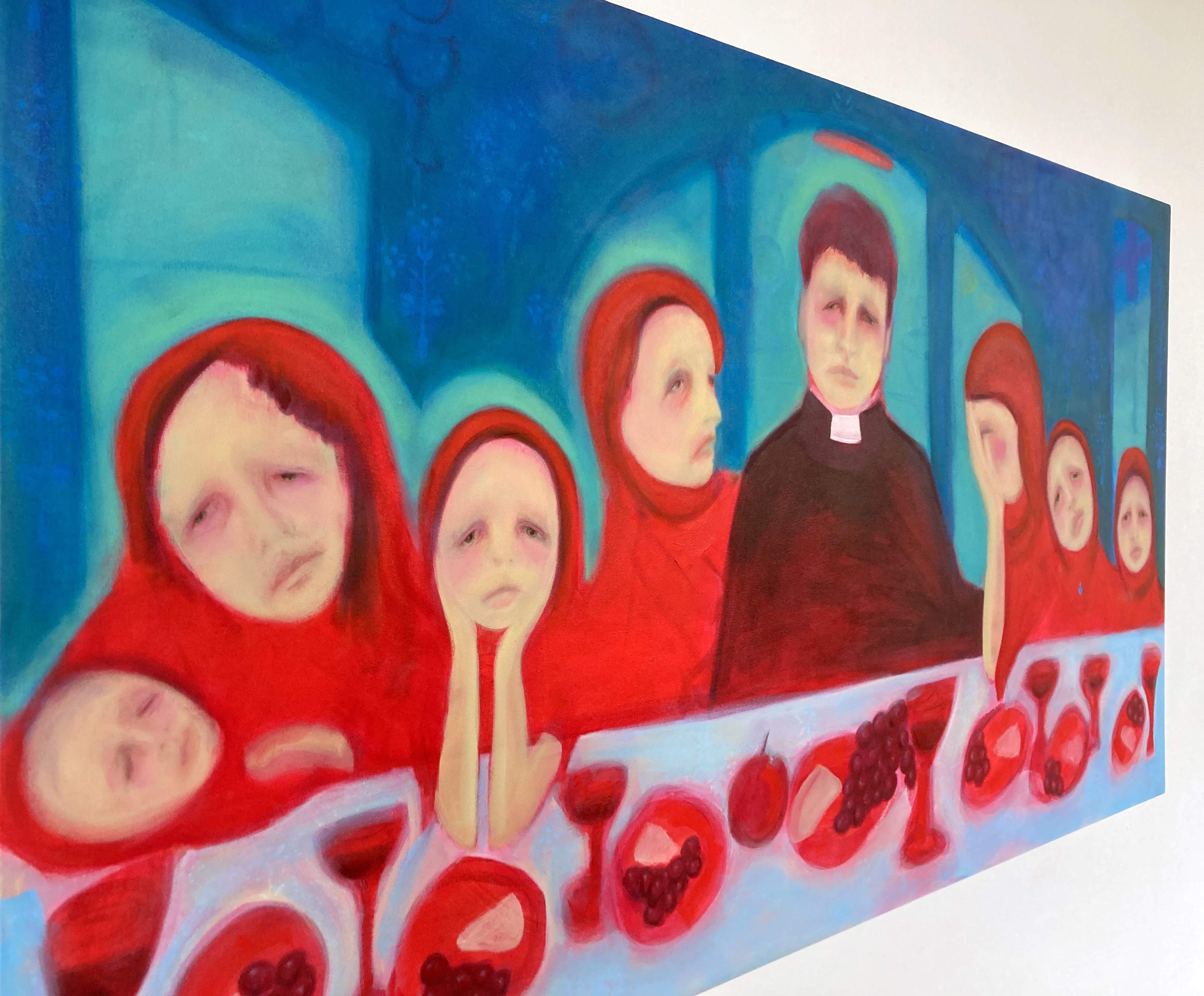
My first impressions were divided between a reading of the powerful narrative in the series of paintings, including a reconsideration of the notion of time, and the visual impact of the colour combinations and paint handling that pulled in the eye as well as the mind. The memorial content, based on individuals and familial groupings – from ten parents and children in ‘First Communion’, pairings in ‘Baptism’ and ‘Wedding’, to a rather sad looking ‘St Bernadette’ displayed in the annex of the café – connected the works as forms of portraiture and stage settings. There are Shakespearian echoes here as we may well eventually realise that, “All the world’s a stage, And all the men and women merely players…” But the players here of course are set in a religious, Catholic context. As an outsider to this faith I cannot really comment knowingly on the lived experience of adhering to the Seven Sacraments or of being directly involved in what appears to be a range of disturbing experiences for one particular family. The priest in ‘Ordination: Fr. Shannon’, the centrepiece of the display, doesn’t seem to represent any spiritual joy for himself or for his flock of seven red-clad females. As a counterpoint to any notion of spiritual exultation another emotionally moving image is ‘Last Rites: Despair’ where the ailing mother/grandmother appears alone despite the presence of three younger but ghostly figures in the foreground. The content sounds harrowing, but its production ultimately feels strangely rapturous. This reading is, admittedly, personal and intuitive on my part, but I think it has something to do with the painting and this sense of love that I mentioned above.
Denise Harrison – ‘Ordination: Fr. Shannon’ – oil on canvas (90x152cm)
In a more general sense there is a sense of time as well. Of duration rather than moments, despite the imagery being derived from family snap shots, and the artist’s memory. This time aspect might be more strongly felt by the older viewer, although the younger visitor will ‘get it’ intellectually. The implied presence of the camera is here too as the imagery is akin to looking at a photograph, or a photo-album. There could be a desire to know who, where, when and why but art works on universal levels as well as with local, specific histories. Although it’s not the case here, one might have found the original photographic prints (not on display) in a house clearance but the treatment and editing of the information is clearly specific to the artist’s own history. A story now shared to expand from the individual and the familial to the communal. Paintings cannot escape this fate once they become public and face scrutiny.
Denise Harrison – ‘Last Rites: Despair’ and ‘Confession: Sinners’
Still ruminating on this sense of time it struck me that as we age, time and memories collapse in a sense. Some degree of linearity remains but as we can all look back at our own histories through time we also belong to a family, like or unlike the one recorded here. This may not necessarily be nostalgic in a truly celebratory sense – this sounds too rosy spectacled. But the filters are removed decades on, or perhaps replaced by something at least a little clearer. You have to be outside and beyond to look in, sometimes feeling like a stranger or third party. But you’re still in there, somehow, and this forms identity broadened beyond oneself. Paintings can present contradictions that we can allow ourselves to go with. Paintings are poems, not screen plays.
With regard to painting the viewer might be struck initially by Harrison’s use of glowing pinky reds and airy blues in addition to the strong figurative content representing facial features, especially the eyes and the expressions of the mouth. The various colour shapes morph with their surroundings producing a dream-like, visual connectedness that forces, or frees up, the figurative confines of the photographic content to flow and expand by use of the paint medium. With its various aspects of selection, composition, colour choice, painterly application and materiality the paintings somehow challenge the original photographs to attempt to say more than a superficial reading might offer. A painting, a good one, might read more like a poem that does not explain all. A straightforward story will need some openness for the viewer’s own interpretation and meaning to arise. Narrative is potentially unsteady, open to interpretation and unavoidably filtered and synthesised by the onlooker. Meanings might change from one gaze to the next. Or at the very least we might adapt the various scenarios to our own histories and experiences as a way of dealing with trauma that is beyond the individual, residing in the family and across generations. I am aware that I am probably getting carried away here, beyond the intentions of the artist, but a visitor could not walk through this space without exchanging a ‘look’ with the various individuals depicted and possibly find an echo in there.
An affirmation of painting is also powerfully and skilfully evoked by a suggestion of the purposely unsophisticated veering on apparent clumsiness. For example a limb such as a leg that is too straight, or a head too big or childishly bulbous. This somewhat unfair attribution emerges as there is clearly something of the lens-based / photographic record in the visual language that sparks an expectation for some category of the photo-realistic. But this combination somehow works. The apparent distortions and simplifications are deliberate. The colour is sometimes acidic and contrasts are crudely intentional. Detail, for example, is reserved for eyes and mouths, whereas bodies and surrounding forms and spaces tend towards a more abstract language as backdrops from the theatre of the everyday to make the imagery emotionally real. These people are us, vulnerable and loving, lost and found.
Visit this exhibit if you can. Support for artists is about engagement with their works and ideas. Be baffled and be sure. Participate and trust. We need to share our stories and painting does this so well.
Geoff Hands
Denise Harrison – ‘St. Bernadette’ – oil on canvas (66x46cm)
Scarlett Segal’s exhibition, A Sense of Place, is briefly on display at Green and Stone in Chelsea. Before the show opened I enjoyed a visit to her studio in a village nestled in the South Downs, not far from the Long Man of Wilmington and equidistant from Seaford and Eastbourne.
This location is worth mentioning for its varied and quick changing geographical diversity of well kept fields, ancient patches of woodland and dramatically shaped, grass covered chalk hills. Within a short day’s wandering a healthy walker could find themselves enclosed by thickets of ash, beech and oak trees, tripping on stony ground or slipping on soaked grassy banks. There are plenty of dark, leafy copses, leading on to more open local vistas that coax and challenge further investigation. Steep stretches of smooth hillside that beckon the traveller upwards towards local summits can be enclosed in mist or clearly contrasted against clear blue skies. These climatic changes can take place within a day, let alone from season to season. For those who reach these various hilltops the views of the South Downs will stretch far and wide to invite aerial perspectives and to scale up vision. To the south, where the gaze can detect the sea view so surprisingly close by, there is a big enough hint to confirm the island upon which we can still sometimes lose ourselves in – a place of safe solitude, perhaps, despite the recent pandemic. To the landscape painter it’s a small paradise that can stretch as far as the eye can see, to beneath one’s feet, or to the finger-tips in search of the distinctively tactile.
We first spoke to each other after a presentation of Julian Le Bas’ paintings exhibited at The Star Gallery in Lewes. As with Le Bas, if you live in this wonderful corner of the county and you have an interest in painting, you cannot avoid the land and sea as subject matter. Historically Eric Ravilious, Vanessa Bell and Duncan Grant (at Charleston) plus Jean Cooke and Harold Mockford, amongst many others, have responded to and extracted and invented something from this chalky Downland that engages with the English Channel, or should I say La Manche, as Segal is a French citizen who will therefore not take this landscape for granted.
Meeting in an artist’s studio is always a special pleasure, and, with an interview a handy precursor to a formal exhibition presentation. Many of the paintings for A Sense of Place had been unwrapped and temporarily displayed in the library, mostly perched on shelves in front of the art books and French novels. The paintings were simply but effectively framed in white moulding which more than adequately served the purpose of completing the works for hanging in future homes. From seeing some of these paintings on the gallery website beforehand there was a degree of familiarity with the imagery, but the digital image can never substitute for the real thing. Colours and surface qualities have to be considered in the flesh – and a composition such as ‘Path in the South Downs’ came across as far more varied in painterly and scratchy, drawn textures and subtle tonalities than on the computer screen. At just 26X34 cm it is quite small, but the composition and paint handling evoked sensations of both the physicality of the terrain and the implied movement of the walking observer who will perceive the changing scenery as a time-based phenomenon.
I was intrigued by the art history books, but was curious as to how Segal had found herself in East Sussex and, as a painter myself, in her daily working practice.
Scarlett Segal – ‘Before the Storm’
GH: You originate from Paris and have lived and studied in London, so how have you found yourself in rural Sussex?
SS: I needed a change of scene literally and a reset button. I am a big city person at heart but the lockdown took the advantages of city living away. The culture had gone overnight and so did the possibility of socialising with friends. I have always liked to replenish in the countryside. My family had a country house in Normandy, which we always went to at weekends and on holidays. I also lived and raised my family in Surrey for many years. It did not feel rural enough and therefore I took the leap. Sussex is gorgeous with its hills and the sea nearby. It is a stones throw away from London. And it has its perks. I have also discovered the Towner and the glorious Charleston Trust. What is there not to like? I once wrote in a journal years ago that I needed to be in isolation in the calm and quiet to build a brand new body of work. And I did just that here. I am very adaptable and flexible. If money were no object I would live between London and here, and between England and France. I could certainly do with more sun and blue sky!
GH: What is your way of working? Do you have a routine?
SS: I am very self disciplined and a hard worker which does not prevent me from having fun and procrastinating somehow. I justify it as my thinking mode. I work most days and even on walks I look and sketch and think. I would read on a train journey. For me art is a way of life and thanks to it I learn valuable skills such as problem solving and perseverance. There are skilled artists. Talented ones even, but in order to make it, it is sheer hard work and resilience. I am fortunate that I can now devote my time entirely to a passion that originated in childhood. And even though I came to it later on in life I can now put all my energy and life experience into it. So yes, I draw most days and paint relentlessly. No routine as such but I make sure I go to my studio every day. To paint, to read, to tidy up. To prime surfaces which I love experimenting with. Boards are my favourite at the moment. I love being there. I love the smell of the various media. I feel time stands still except when there are important deadlines. I find solace and the more you do the easier it gets. I paint in both acrylics and oil and want to experiment with mixed media. But for landscapes I definitely prefer oil paint. I use very high quality pigments because it makes life easier and the process is so much more enjoyable. I use a limited palette and mix all of my colours.
GH: There must be ‘off days’?
SS: Of course – some days are just not meant to be. There are also the happy accidents and the times when everything falls into place. It is an ongoing learning curve. I feel so fortunate I can do what I love and express my emotions. If viewers are moved or reminisce or travel through my work then I am a very happy artist indeed. I never quite know what the next work will be and this makes the process exciting. The dream I have is to make a difference and collaborate with community projects.
GH: Art History is clearly important to you, as you have studied at Christies, Sotheby’s, The Courtauld Institute, and continue to do so at Charleston. Does this academic background affect and inform your painting practice in any specific kind of way? Does it help, or is it an academic hindrance?
SS: It certainly does help. I think the discourse is changing drastically right now and it is very exciting for female artists who have been so cast aside for centuries. Somehow I don’t think it had ever been questioned before Linda Nochlin’s essay (“Why Have There Been No Great Women Artists?”) in the 1970s. Since then, we have had women such as Judy Chicago, Siri Husvedt and Katy Hessel, among others, to thank for that. When you think that widely read and influential art historians such as Vasari and Gombrich could only name one woman each! So, yes, history of art informs my work through research but like all artists I am a magpie and will study real masterpieces in order to use what appeals to me. I love visiting galleries and I am sure I must be irritating to other museum goers as I love standing close to understand how a certain effect was achieved. I must confess that it can take the fun away which is why I tend to go to exhibitions often more than once if I can and take friends too. You cannot learn from books reproductions or art critics. And to see the brushstrokes of Cézanne or Morisot in the flesh brings tears to my eyes.
I am very aware of all the arts movements and their historical context. I wish I knew more about cross disciplines such as literature and music. I remember a splendid exhibition at the V&A a few years back called Opera: Passion, Power and Politics. The curator (Kate Bailey) had done just that putting all the facts together per city, where there was an opera house, on a blackboard. I remember thinking this is the way we should be taught before being taught the formal way of analysing works of art and the themes to look out for. It feels forced to some extent but you need a toolkit.
Cézanne, the Father of Modernism, is one of my favourite painters and we are so fortunate that his works are so easy to access. I also love Corot and Turner. My work is inspired mostly from Modernism, including Abstraction, and as such it is inevitable to have a very good understanding of what happened before, since Modernist artists pushed boundaries and endeavoured to break all the rules.
Scarlett Segal – ‘Autumn Reflection’
GH: Your exhibition at Green and Stone, A Sense of Place, has essentially a landscape theme. Are you moving on from your geometric/abstract work or do the two practices work alongside each other?
SS: Yes, it is actually all landscapes but not only – hence the title of the show. The works are painted in a varied style or language. Some move totally towards abstraction even. It comes back to what I was just saying. It is difficult to justify that you can do both and want to do both. Galleries will accept that you paint portraits and still lifes, or still lifes and landscapes, but not representational and abstract. I find this infuriating and short sighted. I think the explanation lies both in the difficulty of branding different looking aesthetics, or what could commonly be referred to as a “Jack of all trades”, and the classification and hierarchy of genres imposed by the Academies.
In the history of art timeline, artists evolved towards semi abstraction and abstraction from the 20th century until now. Very few reverted back to representational art. Vanessa Bell did try it all. The need to label and compartmentalise everything is a sign of our times whereby instant gratification and ready-made explanations are sought. But this is exactly what artists have always done (think of the Bauhaus or the Bloomsbury Group) and must carry on to do. Anyhow, conventions and limitations have always been imposed. Think of Gainsborough who painted portraits for a living but only ever wanted to be a landscape artist. Nothing new. Artists have free rein to express the way they see the world and seek to make a difference.
So to answer your question, yes I would like to find a way of making the two practices co-exist and look coherent. In my eyes they already are and show an evolution from Space to Place. This is just commercially difficult to explain.
Scarlett Segal – ‘Gone is the Long Man, Wilmington’
GH: There is quite some emphasis on water in many of the paintings in this new exhibition, with the Cuckmere river, streams and the coast nearby this is inevitable for a landscape painter living in this part of the county. Plus there’s snow in ‘Gone is the Long Man, Wilmington’ and ‘White Stillness’, plus mist (‘Misty River’) and the loaded, soaking, atmosphere in ‘Before the Storm’. Should the viewer read anything into this?
SS: I find water soothing. Its noise. Its rhythm. Its fluidity. And I love swimming. I am drawn to reflections, as I also like how it changes our perception of what we see above. It is like being confronted by two realities, one more transient that the other. I have also always been fascinated by the myth of Narcissus. I see water as a mirror of our soul.
GH: I am also intrigued by several of your titles, particularly ‘Let Go’, ‘Looking Up’ and ‘Serene Promise’. It suggests to me that a sense of place is more than a view or visual record. I feel a sense of time, particularly on a personal level, where one might acknowledge that sense of a lifetime journey. Am I reading too much into the titles?
SS: No you are not at all. It is true. Some works are drawn to certain memories and are very personal. Landscapes can be self-portraits too. I actually think you can dig deeper and express more this way without being obvious and imposing a reading of the work. I am a strong believer that once you finish a painting you need to let go and accept that some people will perceive other emotions than the ones you intended. Hearing the explanations given to some Old Masters’ and contemporary works sometimes make me laugh. I think of course that was not the intention, but who knows? If it gets people thinking and talking this is a great thing! I like the openness in a way. I dislike pedantic talks about art though. Art should not be elitist. It should be accessible to all. But knowledge is power in any field.
Scarlett Segal – ‘Serene Promise’
GH: A serious and a tongue in cheek question: Why not just photograph these landscape locations? Isn’t the genre of landscape painting quite outmoded nowadays?
SS: Well if you want to look at and frame a photograph then you can. It is a work of art in its own right. Photography has in fact forced painters to paint differently. Would the Impressionists have existed without its invention? Most unlikely, or not to that extent.
GH: Well photography probably created Realism (in France), from which Impressionism developed that sense of the now and the everyday. Monet is the classic example. I don’t equate your paintings with the camera at all.
SS: Even though I use my own photographs, I do not paint directly from them. I would find this boring and limiting. There would be no creativity. One could use grids or paint by numbers! Joking apart, I always work on compositions through sketches, and rebuilding photographic worlds in Photoshop or Procreate. And I really think my heavily constructed abstract geometric works made me work this way. Nothing is random or completely organic. I see myself as an architect of worlds. By contrast, the landscapes start with a mapped composition but evolve organically with shapes of colours. So no, a photograph could never achieve this in my view.
GH: As I said earlier, your work suggests a sense of place and the experience of perception in that place – far more than a view or visual record.
SS: I personally see shapes and colours dancing in front of my eyes all the time. I thought everyone did. It certainly makes drawing easier. It might be a form of synaesthesia or something else; I am not sure what the correct term would be. This perception informs the way I paint. Painting for me is recapturing the experience of seeing and feeling.
But I should add that I do not think that landscape painting is quite ‘outmoded’. Quite the contrary, in fact. I think landscape painting has a very long tradition for sure but that its ubiquity has been sidelined by more spectacular art forms such as Conceptual art, Installation art, Performance and Land Art, even. But I have noticed a resurgence of interest for landscape painting as demonstrated by the latest publications on contemporary landscape artworks. I find the works by David Hockney, Peter Doig (exquisite show at The Courtauld by the way), Anselm Kiefer and Luc Tuymans, to name but a few, very current. They have all reinvented the idea of landscape according to their artistic needs and the times they live in.
GH: That’s an extremely positive point to end on, to acknowledge that landscape related art is continuously reinvented. Thank you, Scarlett.
Scarlett Segal – ‘Stormy Stormy Weather’
Links:
If you miss the show you can contact Scarlett Segal directly via her website – https://scarlettsegal.com
“Remember, remember, this is now, and now, and now.”
Giorgio Morandi – ‘Still Life’ 1936
Visually primed from visiting the Cézanne exhibition at Tate Modern the day before, it was surely appropriate to move on to the Giorgio Morandi show the next day. Through his work Cézanne may have been saying, stop and look at the world (often the landscape) and construct it directly through the dynamic act of perception – but take your time. Calmly experience what is in front of you, he may have added, with the incomplete narrative of the here and now. Morandi appears to take this lesson from the master of modern art and subsequently devotes his painting mission to this, his unrelenting lifetime project.
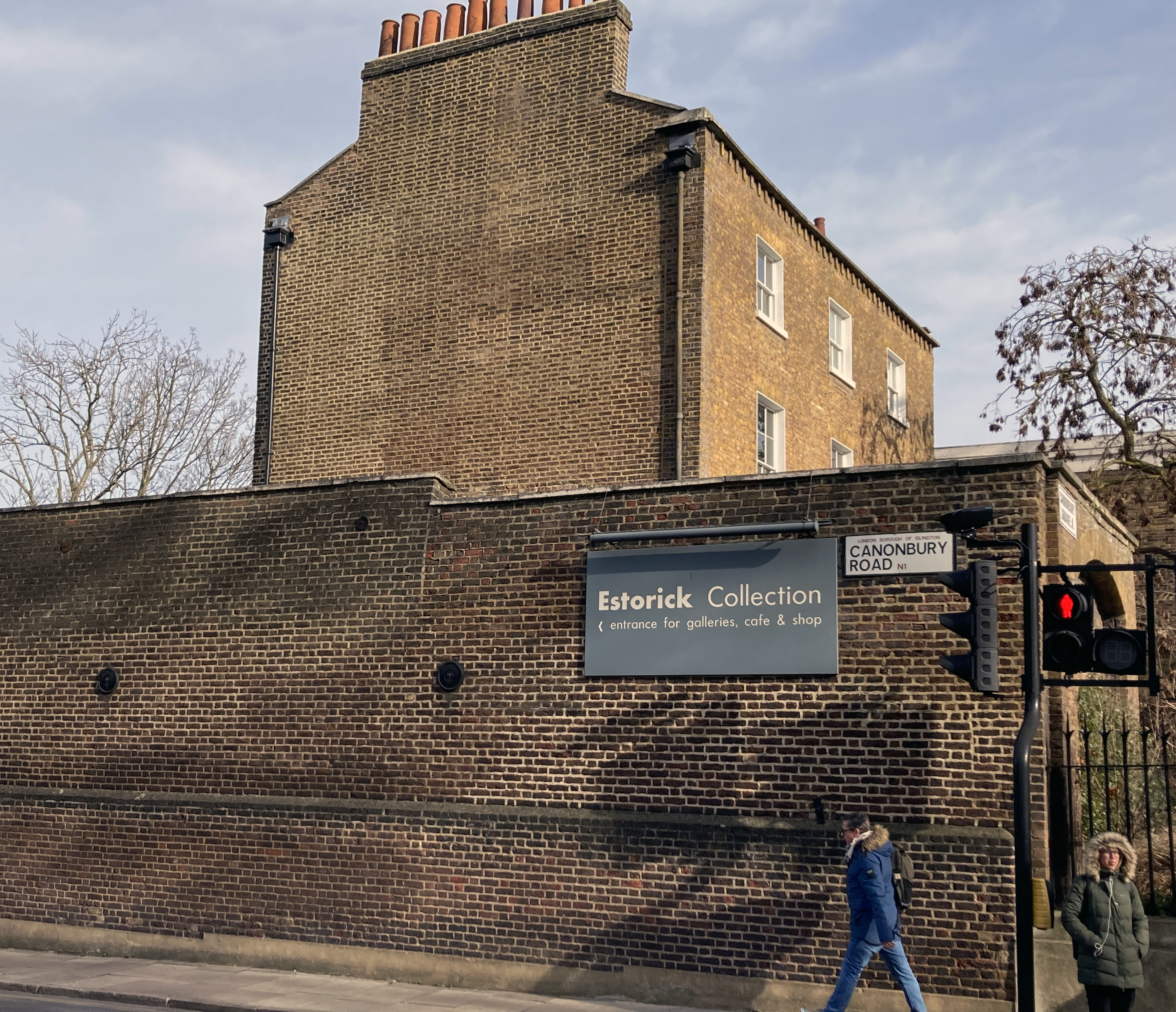
The literature on Morandi confirms that he was interested in Cézanne’s work (especially in Morandi’s own still lifes of 1914-15 onwards) and the viewer will sense it in many of the examples from future works in this marvelous show at the Estorick Collection in London. The exhibition has travelled from the Magnani-Rocca Foundation in Mamiagno in northern Italy – not so far from Bologna where Morandi lived and worked for the whole of his career. Normally for the UK based artist or keen gallery visitor, to see and contemplate Morandi’s works the opportunities are severely limited as there appear to be less than a dozen paintings in public collections. Outside of London, visits would be required to such places as Norwich, Birmingham and Edinburgh but one would only see individual works. The best and most obvious option is a weekend trip to Bologna to visit the collection in the Museo Morandi, part of the Museum of Modern Art of Bologna (better known as MAMbo). Fortunately, as the Magnani-Rocca Foundation undergoes some refurbishment, the Estorick has the honour of displaying seventeen paintings and 33 works on paper, including etchings, for four months.
Oddly, as I felt compelled to write about this exhibition I also had a contrary sense of there being no necessity to do so. What more can one say about such a relatively straightforward range of imagery. Morandi’s works, especially the oil paintings, are so matter-of-fact painterly that they are surely just what they are, no more, no less – or as Dan Flavin the American minimalist sculptor once said: “It is what it is and it ain’t nothing else”. So I hesitated for a couple of weeks or so, during which time I happened to read Italo Calvino’s ‘Six Memos for the Next Millennium’ and came across some ideas that could be applied to considering Morandi’s paintings – most especially the still life compositions. For example, Calvino writes about the transition from word to image and vice versa as a crucial aspect of writing for novelists. So I wondered if Morandi, perhaps instinctively, takes the viewer from image to image, but in the same work. That is, as an inseparable combination, conjoining the material object (the oil painting) and the mental image (the viewer’s) as one phenomenon. Referring to St. Ignatius, Calvino also wrote of the “…visual contemplation or meditation”. This viewing approach is crucial for any work of art, but especially so for Morandi. This point also reminded me of Giotto’s frescos in Assisi and most especially to the palette that Giotto had access to. This link, however pertinent or not, was realised as I flicked through an old copy of ‘Forma e Colore – Giotto Gli Affreschi di Assisi’ by Roberto Salvini (1965) that a friend had recently passed on to me. There’s probably more detail in Giotto’s work, and a clear religious narrative of course, but the overall sense of the essence of form and a restricted palette renders an insistence on contemplation, both spiritual and commonplace for both of these pre-eminent Italian painters.
Giorgio Morandi – ‘Still Life’ 1953
In a more modern sense (post Freud and Jung), Calvino brings psychological experience and time into the creative equation: “…to the individual or collective unconscious, for example, or to time regained through sensations that rise up from lost time, or to epiphanies or concentrations of being in a single point or moment.” Such experiences may be rare unless programmatically sought through meditation and so do we learn from Morandi that time, by extension, returns the viewer to a concrete notion and an awareness of now? His still-life paintings appear to acknowledge the past as present, even beyond his own lifetime. Or, to put it another way, Morandi realises the metaphysical nature of perception of the world without recourse to limiting or tying himself to the illustrational or imaginary aspects of Metaphysical artists such as Carlo Carrà and Giorgio di Chirico, both of whom he knew personally in his formative years. Morandi’s imagery is utterly solid and direct: he sees the wood for the trees.
Morandi must have dedicated countless hours of actively looking whilst painting, just as Cézanne did. We might wonder what Morandi may have been thinking about his restricted subject matter that was essentially local to Bologna and to his studio tabletop for so many years. Perhaps many days were necessary to make one small work, one more little addition to all of the pictures in the world. But the apparent narrative of the imagery, as there is always a context, returns to the moment when, typically, a group of objects that have been arranged to be studied, for no other reason than to make a painting that replaces the original objects, the lighting conditions and the local colours. This may suggest a very limited artistic programme, bordering on the absurd, for recording the instant in paint at least, requires great time and effort even to conjure something so simple. Would a photograph have sufficed? The problem with a photograph might be that it is, literally, an instant, albeit a split second, but a painting comes loaded with at least a notion of commitment to a long-winded task that can appear ridiculous considering the time and effort required to reach some kind of conclusion – again and again.
Giorgio Morandi – ‘Flowers’ 1942
Painting can be unashamedly romantic too. Does Morandi seduce the viewer? The artist is doing no more than selecting, composing, looking, recording and painting his direct experience with an implied narrative of light, colour and form overtly realised in a particular arrangement of an apparently small collection of very ordinary objects – though sometimes a small bunch of picked flowers will appear. But Morandi shows us that the human gaze can rest upon something as simple, as pedestrian and as everyday, as a few mundane bottles, jars, and vases – and utterly captivate the viewer. Anticipating Object Orientated Ontology and contemporary metaphysics, Morandi’s paintings might be convincing the viewer that these objects and/or the paintings will exist eternally whether we are there to witness them or not – despite the contradiction that the paintings, his collection of domestic items and the occasional building from his window views were designed, made and contextualised by humans in the first place. The sound of the falling tree may not need a witness after all.
Returning to Calvino, pictures are starting points (imagined or real) and he makes reference to the playwright and author Samuel Beckett “…reducing visual and linguistic elements to the bare minimum…” This reductive tendency could equally be applied to Morandi’s imagery. His still life paintings in particular need no extra content than that which has already been selected, arranged and recorded. The viewer can look and wait knowing that Godot will probably never arrive after all. But we are here with the painting, nonetheless.
Giorgio Morandi – ‘Courtyard on Via Fondazza’ 1954.
Just before, eventually, writing this essay I had the speculative thought that Morandi’s work might be of interest, his paintings in particular, because there is no overt or political narrative? Due to the omnipresence of the media and rolling news streams, notwithstanding the politically correct themes and causes that arts organisations have to embrace to secure funding, the curator and the viewer might sometimes lose sight of the aesthetics of the image? This is not to suggest that issues and contemporary subject matters are unimportant or unnecessary, but I sometimes fear that the immediacy of the painted image, including its inherent materiality, the appropriate choice of physical application and visual content becomes secondary to a particular narrative that ticks a societal, and therefore political, box.
The viewer might find some unexpected joy in visiting this exhibition. Luigi Magnani, the collector of these works said himself that Morandi’s “…works have no content”. So by not fulfilling a manifesto with which to frame the work Morandi does not appear to take sides or to insist upon a message. The work has to speak for itself, or as Stefano Roffi writes in the catalogue: “Just like angels, the works Magnani chose had to possess a soul, be characterized by essentiality, purity, formal perfection, a lack of agitation, of vain philosophizing; to convey silence rather than clamour, peace rather than anguish.”
Giorgio Morandi – ‘Still Life’ 1960
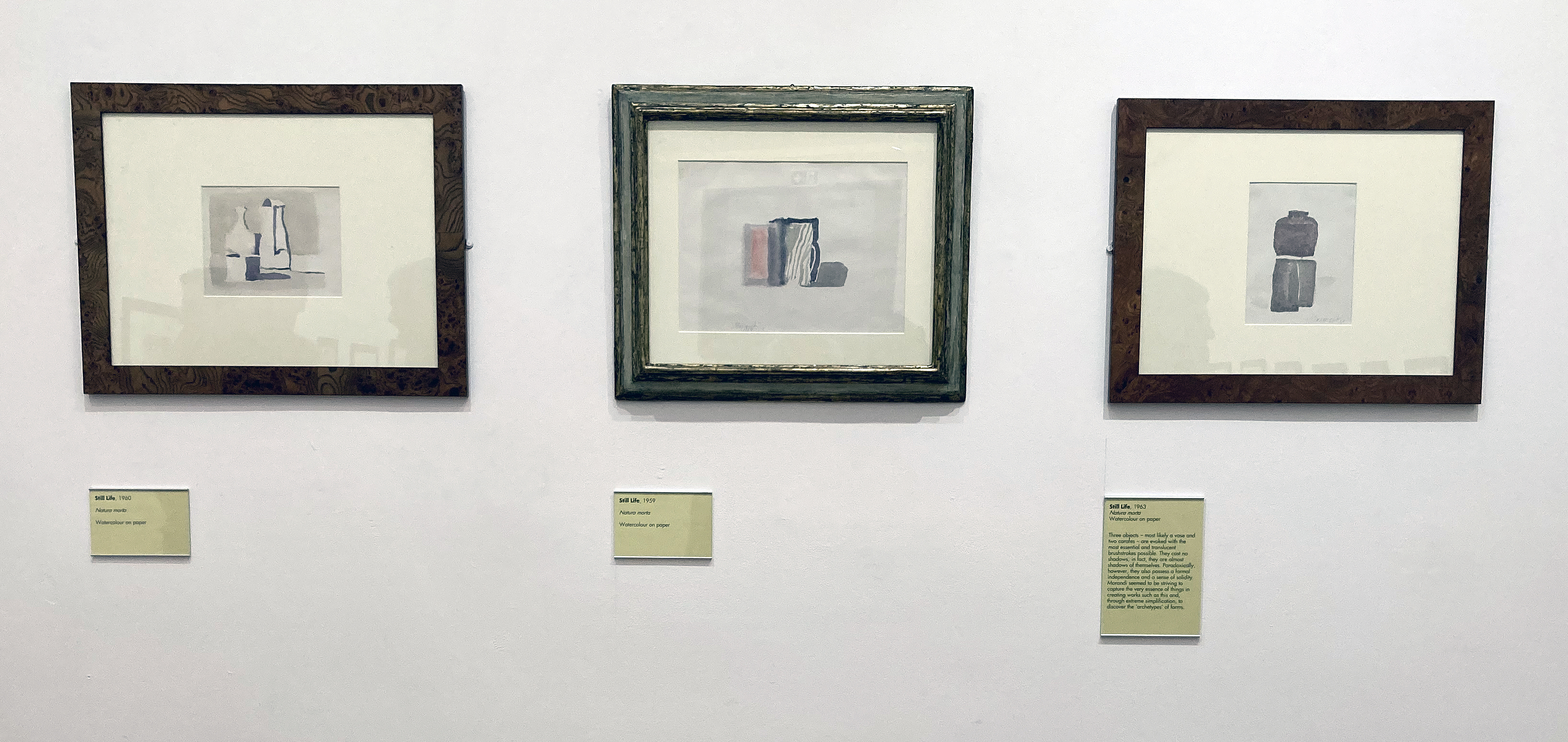
In writing this purposely ruminatory essay, and in not being bound by a publisher’s deadline, I was also able to ponder and let the work sink in further, albeit from my own photographs and others kindly provided by Alison Wright (PR) on behalf of the Estorick. As a painter myself I have a conscious bias of concentrating on the paintings in the exhibition, but I chose not to discuss any particular work on display in this instance. But as I check my scribbled notes from the day I visited, I am reminded that I returned to view three works on paper before I headed for the bookshop to buy the catalogue. Each titled, ‘Still Life’ (from 1963, 1959 and 1963) they verge on the edge of abstraction with a minimalist aesthetic. The viewer could indeed start from the final works and study Morandi’s visual journey in reverse chronological order to find that he was a proto-minimalist after all. As, perhaps, Cézanne was too.
Notes:
Review title from: “Remember, remember, this is now, and now, and now. Live it, feel it, cling to it. I want to be acutely aware of all I’ve taken for granted.” (Sylvia Plath, letter to Eddie Cohen, 1950)
“Plein air painting on a large scale has heightened my sense of involvement. My use of colour is instrumental in expressing my feelings about form and light within the landscape. Inspired by some new subjects, a shift in my work has transpired.”
(Julian Le Bas, 2023)
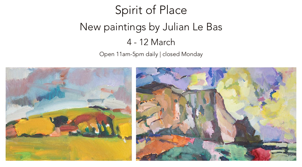
In preparation for Julian Le Bas’ much-anticipated exhibition at the Star Brewery Gallery in Lewes, I was asked by Sarah O’Kane (Sarah O’Kane Contemporary Fine Art) to write about Julian’s work, as she knew I was a follower of his career and had written about his show at Berwick Church for Lewes Artwave 2022. I made a visit to his studio last November to talk to him and to see completed canvases and a few works in progress for the exhibition in Lewes. Some of this new text has been included in the catalogue for the show and a suitably edited version is published on her gallery website.
With Sarah’s approval, here is the full version of the exhibition:
A Studio Visit
Julian Le Bas is a painter, perhaps the contemporary painter, of the Sussex section of the South Downs. His work bares witness to this characteristically splendid and captivating geography of chalk hills, meadows, woodland and the adjoining coastline. The Sussex landscape possesses a subtle drama that does not provide the instant awe of, say, the Peaks of the Yorkshire Dales or views from Snowdonia, but the chalk cliffs that stretch eastwards from Brighton and Seaford towards Eastbourne are unique enough to provide a painted image with the visual impact of location not always provided so explicitly in other locales.
If you know Sussex reasonably well you will be aware of Chanctonbury Ring, Black Cap, Mount Caburn and Firle Beacon, and will recollect on how these geographical landmarks change in mood and appearance depending on the weather, the season and the time of day. On a more micro-level you will know that as you travel around, away from the A roads, you will expect to see characteristic churches in the villages, such as at Berwick and Southease. You will also know that there are marvellous trees in the various churchyards, or alongside the fields that produce crops or are home to the cows and the pigs. Look closer still with this consummate painter and, depending on the time of year, see the bluebells, snowdrops or a defiantly red rosehip amongst the winter brambles. In other words, there is no hierarchy of place or incumbent: be it animal, mineral or vegetable.
I wonder, also, if the paintings are a form of storytelling. Many of these visual tales will find their way to new homes, perhaps above the hearth, in a bedroom, a study or in a corridor leading to the kitchen. The point being that the paintings will find, literally, a home to prompt a recollection of a known and familiar landmark, embedding an internal conversation not necessarily or exclusively about rural Sussex, but also beyond to landscape revealed through the act of painting. Prompted by various locations, painting as gesture, as abstraction and as colour obsession – in an era of the digital and the virtual that can loose the immediacy of a physical and mental interaction with light, form and space.
These many places visited by Le Bas, often with the imperative ritual of walking to them, are invested with powerful colour effects and combinations of brush marks too. The viewer might be convinced that they are as improvised as much as they are consciously planned and controlled. Le Bas balances these two complimentary aspects of the act of painting, which is so important for what I interpret as reflection in action, as a matter of course. He produces visually potent and efficacious oil paintings that retain this sense of having a heart beat, of being visually fixed but alive somehow and which have to be authentically realised in situ. These studies can only be so faithfully achieved, by necessity, out of the studio environment.
For the uncompromising en plein air painter the idea of the studio is, potentially, a notional one, as four walls do not restrict the site of production. So when I visited Le Bas’ studio in the back garden of his home in Seaford I was not sure what to expect. At 12 X 10 feet the space was significantly more than big enough for the lawn mower, gardening tools and cracked flowerpots that one might normally expect to come across, although thankfully there were no such items stored here. But this was more than simply a storage area for dozens of canvases of various sizes. The wicker chair and cushion, just the one, was evidence enough to reveal a space for the artist to sit and ponder on his latest day’s work. Space too, to rethink and assess the necessity to return to a particular location to complete a canvas not yet considered fully realised, hence the provision of three viewing walls. I asked Le Bas if he sometimes continued the paintings here, away from the subject. A simple ‘no’ was the answer. I need not have asked, for his many collectors and supporters will know that he is a purist of sorts; passionate and uncompromising in the most positive sense and completely at one with the traditions associated with the landscape/seascape painter who will go out in all weathers to attain their goals – and to constantly surprise themselves at the inexhaustible range of subject matters and moods that wait to be seen and experienced.
Such an approach is Le Bas’ unspoken manifesto. He just gets on with the task in hand, albeit as a healthy compulsion loaded with drive and sheer enthusiasm. The work is so memorable that it speaks not only for itself, but also for the inexhaustible landscape related encounters that somehow await the viewer’s comprehension, though intriguingly via the work itself. The paintings may well function as signposts, imploring the viewer to get back out there and look again, but they are more than mere signage of course. The canvases, as carriers of physical imagery, embody lived experience and a sense of time, where to pin down the visual realisation of a particular place, set in some notion of the abstractness of duration, is reliant on the paint medium and its expert treatment. Time and light is fluid too, which poses a contradiction to the solidity of form, of the interaction of colours and the myriad relationships that constitute fixed composition. Le Bas’ works bring the observer and observed together so that the works also realise the shared experience of seeing, through the manifestation of consciously formulated structures constructed by this communal gift of sight.
There is an inherent democracy at work, wherein the drawing content, the range of mark making, the colour range are all carefully balanced so that if anything dominates it is the difficult to define ‘spirit of place’. Le Bas can apply such an abstract notion in any aspect of the landscape environment, whether nearby or far away. Interestingly, the historical picturesque can be discounted in his approach to composition and content, as there is an honest acceptance of what is simply there. What lesson we might learn from Le Bas’ life-long project is that every day and every scene presents a seemingly revived landscape offering a new vista, and a fresh encounter, with the apparently commonplace. These landscapes are tirelessly offered up, re-imagined, for continuous engagement and revelation, so long as the viewer will give over their own time to enjoy and contemplate the imagery.
Le Bas’ paintings celebrate, exalt and revere the various locations and unequivocally express awe at the natural world. The role of shamanic consort, expressing the elevating metaphysical aspect of the everyday through the ordinarily magical presence of the landscape is his task. The work continuously appears to convey this sense of the uniqueness of the quotidian and the local which changes in appearance, not only due to time of day or season, but is subject to the artist’s own crucial engagement at any particular time. This notion of self, however, is not selfish as these paintings help the viewer to see afresh and to experience beyond subject matter.
There is an extrovert inclination in these paintings and drawings, revealing an emotional involvement steered by rigorous and disciplined draughtsmanship. This engagement with the physical qualities of medium, from compressed charcoal or chalk pastel in his drawings to oil paint on canvas, Le Bas’ works are somehow a summation of perceived experience that lives beyond his initial encounters in the landscape. High key colour combines with earthy local colour. His engagement with the glorious power of colour reveals both a romantic and a matter-of-fact connection with the landscape experience.
There is, I suspect, some deliberate exaggeration in Le Bas’ practice. A visual proclamation in his use of colour and insistent mark making, which is intended to bring the viewer into the work, and to make a lasting impression, reminds us that the landscape is still a worthy and increasingly important genre. Not solely for the sake of decorating our walls, or as a reminder of those places we love to visit, but as ecological imperative. For, as our burgeoning awareness of environmental issues develops for all the wrong reasons, Le Bas’ representations of the landscape may be reminding us that Arcadia is on our doorstep and, by implication, we need to stop trashing it a.s.a.p.
This was an exhibition I had to visit twice and I may have been once more by the time this rumination has been written.
The Brighton Centre for Contemporary Arts is a relatively new gallery hub in Grand Parade and Dorset Place, which is situated at the University of Brighton. As such a large community of artists live in the city, many graduating from the university itself, the institution might now be expected to lead the way in highlighting contemporary themes and developments in the broad area of fine art. The Grand Parade gallery was reopened (and rejuvenated) in 2019 after several decades as a general gallery space that often showcased student work from the visual arts and design courses at the university. The last exhibition I saw there, at the beginning of this year, was Lloyd Corporation, a thought provoking (‘research lead project’) on material accumulation and social space, with the inevitable installation and slide show presentation. The show certainly made me review the garbage still stored in my attic at home, but as a painter who writes the occasional review, I have felt some disappointment in the possibility of new initiatives and expositions from the visually creative communities in Brighton to exclude, or at least downplay, painting. We appear to live in an age where issue-lead forms of ‘information’ and ‘message’ are a key requirement for supportive funding too. Video, photography, installation and text-based works, in particular, have been on trend for some time now. So a painting show, by an artist new to me, provided a good excuse to get out of the studio. A five star review of The Exile of Dionysus, the first major show of paintings by Bill Lynch in the UK, from Laura Cumming in The Observer was also a powerful prompt.
Bill Lynch: The Exile of Dionysus
“In these pictures everything is alive and communicating wildly. Lynch’s connection to subjects and landscapes, both in life and painting, was empathic: a flower or tree branch sings just as strongly as any bird; … and he listened acutely, transcribing their conversation so you could hear it too. Their secrets opened up to him. Everywhere is meaning. Surrounded by his work, you can’t help but be struck by this vibrant language; his sincere belief, his love.”(Michael Wilde, White Columns, September 2014)
Déjà vu: to my unexpected surprise, as I first wandered (and wondered) through this immediately memorable exhibition of Bill Lynch’s paintings, I was reminded of the viewer experience from the Brett Goodroad: Toe Buoy exhibition held at the Phoenix Art Space here in Brighton in 2018. In both instances a relatively unknown North American artist, for a UK audience at least, brought a fresh voice and personalised vision to picturing, and actively celebrating, the world around him. Both artists’ respective projects augmented and amplified ‘reality’ with a sense of reverie and submersive attachment to the subject matter. Goodroad often explores a drama of figures in landscape settings, whilst Lynch more often highlights aspects (and objects) of his environment, for example, depicting flowers, trees and birds from nature or bowls, fruits and vases from more personal spaces. He was deeply interested in Chinese ink drawing too, hence a clearly affected visual language and subject matter in many instances of his work.
Unfortunately, Bill Lynch is now deceased (he died in 2013 from throat cancer aged just 53) and had mental health issues (schizophrenia) and these facts may well add to the inherent pathos of the works. The viewer cannot help but be affected by some aspects of autobiography (van Gogh being the classic case) when seeing an artist’s work, even in reproduction. But whilst a certain amount of knowledge and context of an artist’s work is necessary to understand and find a way into their artwork there is an argument for going straight to the work itself – inevitably accompanied by one’s own contexts and prejudices. This purist attitude is not one to always prevail, and we might seek to eschew habit, but it’s a conscious way in – most especially to such directly affective and demanding imagery. Theses are paintings that are impossible to ignore.
No doubt, every viewer will be struck by Lynch’s use of salvaged plywood as support. It’s a common material to use in place of canvas, solid wood or aluminium panels. It’s far from usual to use this base as found material and form (hence a variety of sizes and an acceptance of imperfections such as bashed corners and cut intrusions) without a backing frame and carefully primed and prepared grounds. The use of paint and the visual language is raw too. But Lynch did use oil paint and the subject matter fits into the tradition of landscape painting, notably influenced by an eastern (Chinese) tradition that celebrated nature.
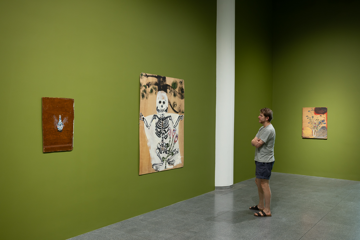
Installation view in South Gallery
There may be an unsophisticated irony at work here too, although I doubt it. Lynch was an art student in New York in the late 1970s and early ‘80s, although he lived “on the fringes” and did not succeed on the gallery scene. Irony, as a post-modernist conceit, came a little later, and Lynch’s work appears beyond parody or intellectual conceptualism. One reading might be that Lynch was (metaphorically speaking) sticking two fingers up to the art world establishment. The works certainly have a feeling of individual strength and reveal a desire to stay tuned to painting as a way of mediating with the world, and oneself, irrespective of fashion or gallery pressures. Perhaps painting was a balm for his personal troubles, a way of coping with and of celebrating being alive.
His imagery, whether influenced by Chinese painting or not, has that sense of direct engagement with the subject. This of course includes the imagination, based on a story-telling kind of attitude, alongside concrete experiences and observations. The works are unashamedly ‘rough and ready’. They look like first drafts, but go beyond sketches or rough plans. The physicality of application of the paint matches the honest acceptance of the medium too, as if to suggest the illusion of visual reality as being quite matter of fact – a form of philosophical irony steeped in Buddhist traditions.
Installation view North Gallery
The Exile of Dionysus is divided into two main spaces, plus a reading room at one end. The North and South Galleries house the works. The former has some suffused natural light, which was strangely welcome despite the noise of the traffic from outside. But from the main entrance into the building the visitor enters a high ceilinged space containing ten of the fifteen works selected. Here the internal walls are painted green, which oddly reminded me of the National Portrait Gallery in London. We are so used to white walls now that colour can come as a shock. But the works bedded in well and the green was congenial and not dominating. Intended or not, this gave a sense of being in a rather special, natural, kind of space. I mention this, as any gallery environment imposes an unavoidable immediate context for the work. White would have been okay, but the use of a colour brought the paintings together, whilst in the adjoining setting the five other works felt separate. As a space with the additional construction of surrounding walls the traffic sounds were heavily muffled. A chair or bench to sit and ponder Lynch’s painting would have been most welcome too, not only to discourage the common gallery walk through, but also to facilitate an even more contemplative experience. But, no matter, for the works will make the visitor stop and stare.
Once the shock of the materiality of the works is accepted, the imagery can come to the fore. In the South Gallery I suspect that the almost, but not quite, light-hearted imagery of a human skeleton in ‘Untitled (Skeleton)’ will stand out first. A white shroud, suggestively the beginning of applying a primer to the board, slightly foregrounds the serious looking skeleton that is accompanied by a flowering plant between its legs, with part of a tree trunk and branches behind. Not that perspective as a necessary element bothers Lynch too much.
Bill Lynch – ‘No title (Skeleton)’ oil on wood
To the left of this relatively large work is, ‘Emperor’s Erection’, which depicts a vase with two ghostly wings (linear depictions of four legged animals in fact) that levitates the form against the board that has a pre-painted layer of varnish from a previous life as a piece of furniture. The still-life reference of the found board, like a piece of Cubist assemblage, accommodates the rather beautifully painted vessel decorated with plant forms. Lynch tends to draw with the paint, especially when getting a little more detailed and specific.
Bill Lynch – ‘Emperor’s Erection’ (1988) oil on wood
Nearby hangs, ‘No title (Vase with Blue and Purple Flowers)’ which, despite almost hiding in a corner, demanded my attention as much as any other of the works in the show. A Rothko-esque cloud of colour fills the top right-hand corner of the composition before a rather scraggly looking vase of flowers demands more viewer focus and attention. These may have been cut-plants in need of water as the stems are beginning to droop. I imagine they may have once existed in Lynch’s studio, or wherever he painted. Dotted across the board are knots in the plywood layers that suggest planets to the imagination, though they are more ‘real’ than any painted representation of anything. Around the base of the glass vase is a pair of wing-like forms. Or perhaps they are clouds of unknowing. On one level, this scruffy little painting might be considered as superficially trite, but holds a galaxy of potential meaning and viewer interpretation.
Bill Lynch – ‘No title (Vase with Blue and Purple Flowers)’ oil on wood
Before entering the North Gallery the visitor will certainly be stopped in their tracks by, ‘Four Corners Sunset’ from 1994, one of only three works dated in the exhibition, and the largest. I wonder if Lynch was so pleased to obtain such an expanse of plywood that it invited a glorious sunset, worthy of the attention of a 19th century Hudson Valley painter, inspired by the implied sublimity of a J.M.W. Turner sunset. The red circular forms throbbing in a suggestively psychedelic pulse line across the horizon, like a row of coloured spotlights from a rock concert, contrasts with the dark cratered lunar-like landforms below and to either side of the setting sun. The world can be a strange place indeed, though we need painters to remind us sometimes.
Bill Lynch – ‘Four Corners Sunset’ (1994) oil on wood
Lynch’s work, however, seems to be appropriately and healthily placed in the often commonplace. In the North Gallery one of the outstanding works is one of the simplest compositions in the show. ‘No title (Bird on Branch)’ depicts a bird perched on a tree branch, with leaves above and below on a single stem. The leaves are gently modulated with tone and shift in sequence from being closed in the top left, to open (in the middle), to dropping apart in the bottom right hand corner. One might sense the passing of time in this small painting, as the bird’s weight holds the branch in a diagonal position within the composition. I assume that the bird was copied from a reproduction, not that it matters. It’s an image that far surpasses its simplistic representation and it’s no big deal that it’s not painted on canvas. It is just about the end of the show at this point, although the green glade behind will pull you back in for another look.
Bill Lynch – ‘No title Bird on Branch)’ oil on wood
Laura Cumming may have been purposely, and journalistically, provoking the reader for attention in suggesting that Lynch was “…the greatest American artist you’ve never heard of”, but she was correct when she stated that, “Bill Lynch’s paintings on salvaged wood transfix with their dual power of primitive joy and high sophistication.”
This really is a show to visit and the arts community of Brighton dare not miss the spectacle. Painting can go far beyond the provision of mere information.
Artworks have been borrowed from The Approach, The Bill Lynch Family Estate and several private collectors.
Note: In the Brighton CCA reading room a wall-based text has been written by the poet Vanessa Onwuemezi in response to Bill Lynch’s paintings. Hear her read it here:‘Lines of Chance’
Jonathan McCree, Bruce Ingram, Jonathan Goddard and Joe Walking
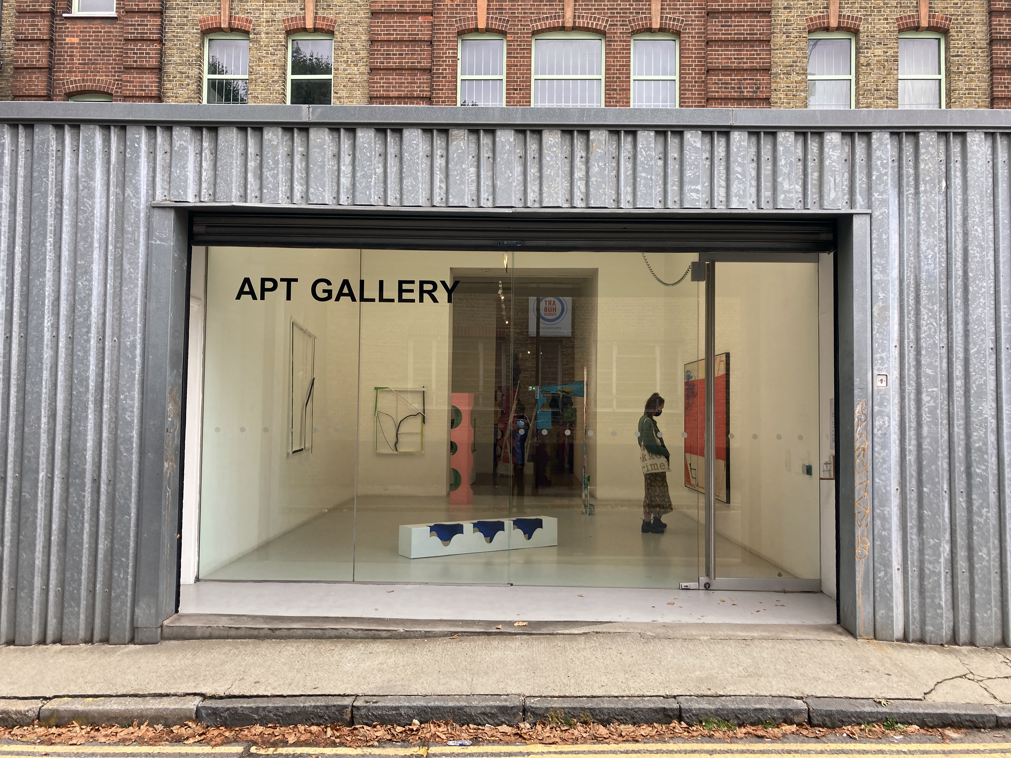
APT Gallery, Deptford
2 – 12 September 2021
APT Gallery
It was Thursday 9th September and Up For Grabs had been open for a week. A performance had already taken place some days before and the Private View was tomorrow. This was a two-week exhibition of painting, dance, sculpture and film. I had missed the dance and the film too, but a projector was being installed to show a video of the performance, but I couldn’t stay too long as I had a timed entrance ticket for something of apparent importance at the Royal Academy. So this would have to do, and thank goodness, it was probably the best part of the day. *
Bruce Ingram and Jonathan McCree
The front space was conventionally organised for an exhibition of sculpture and painting and Bruce Ingram and Jonathan McCree had three works each on display. By conventional I mean some works were placed on the wall at a comfortable viewing height and three more pieces were arranged on the floor with ample room to walk around. There was a balance. They were, it appeared, ‘finished pieces’ and ‘final’ as we expect artworks in exhibitions to be. As a first impression there was surely something going on about construction and deconstruction, about placement of the works and relationships within the works themselves. What was ‘up for grabs’ at this stage I wasn’t sure – maybe an opportunity to take something away from the show, or to suggest potential.
Jonathan McCree and Bruce Ingram
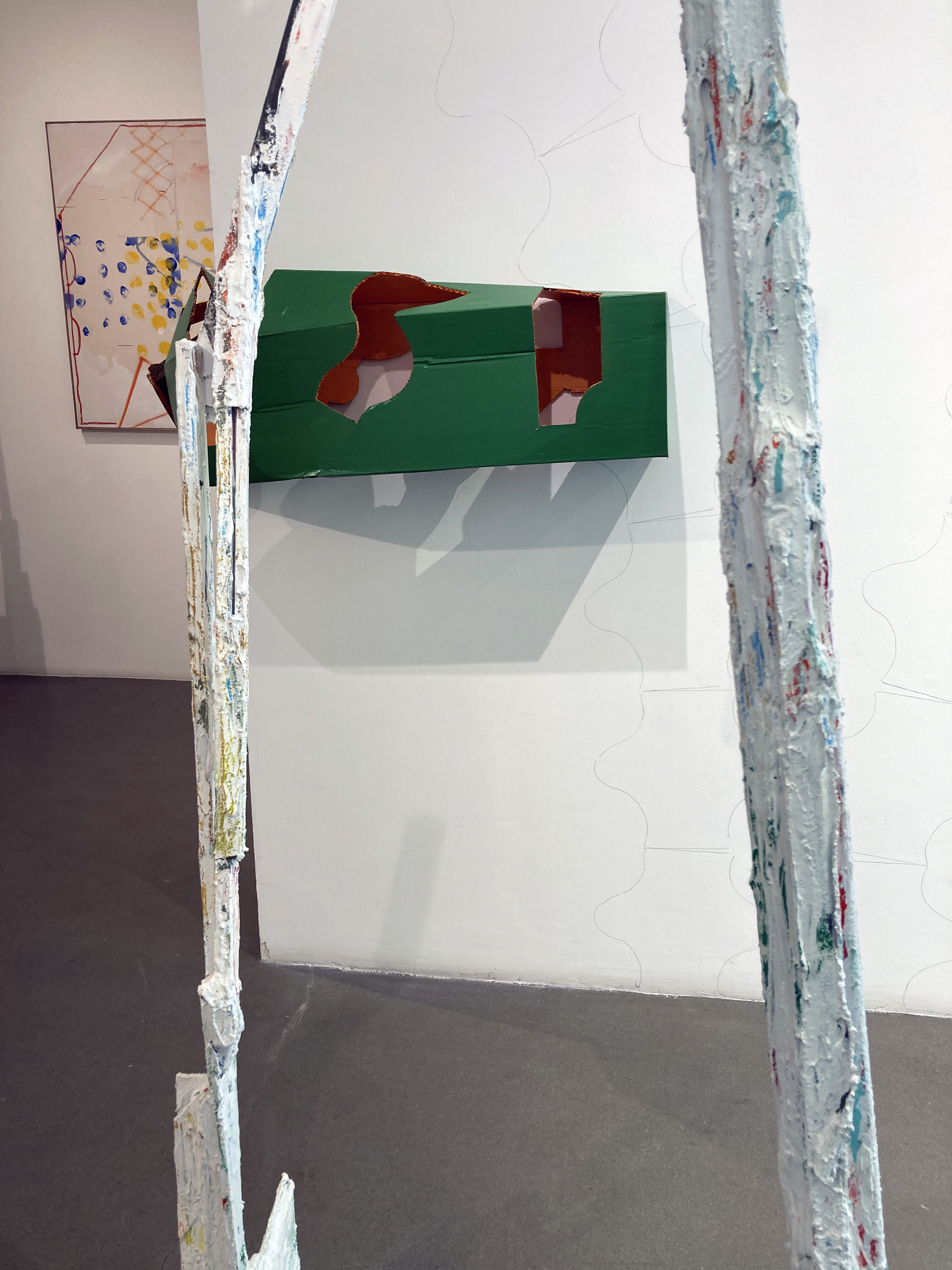
This initial selection and indeed this space could be complete in itself, but it proved to be something of a threshold to pass through, for in the next space that precedes the largest room at the rear, a clue to some playfulness was sensed from encountering an apparently disfigured column, a strongly vertical element, that was placed on the floor but had unexpectedly been folded at 90 degrees to fix itself to the wall to form an archway to tempt someone to stoop under and squeeze through. This piece was quickly followed by another of McCree’s stretched box forms wrapped around the protruding corner into the next space. Clearly an intervention had taken place at some point and as the artist was on duty to greet visitors today he explained to me a little later that one of the performers had previously indulged in interacting with the sculptures to adjust them to the gallery environment.
Bruce Ingram and Jonathan McCree
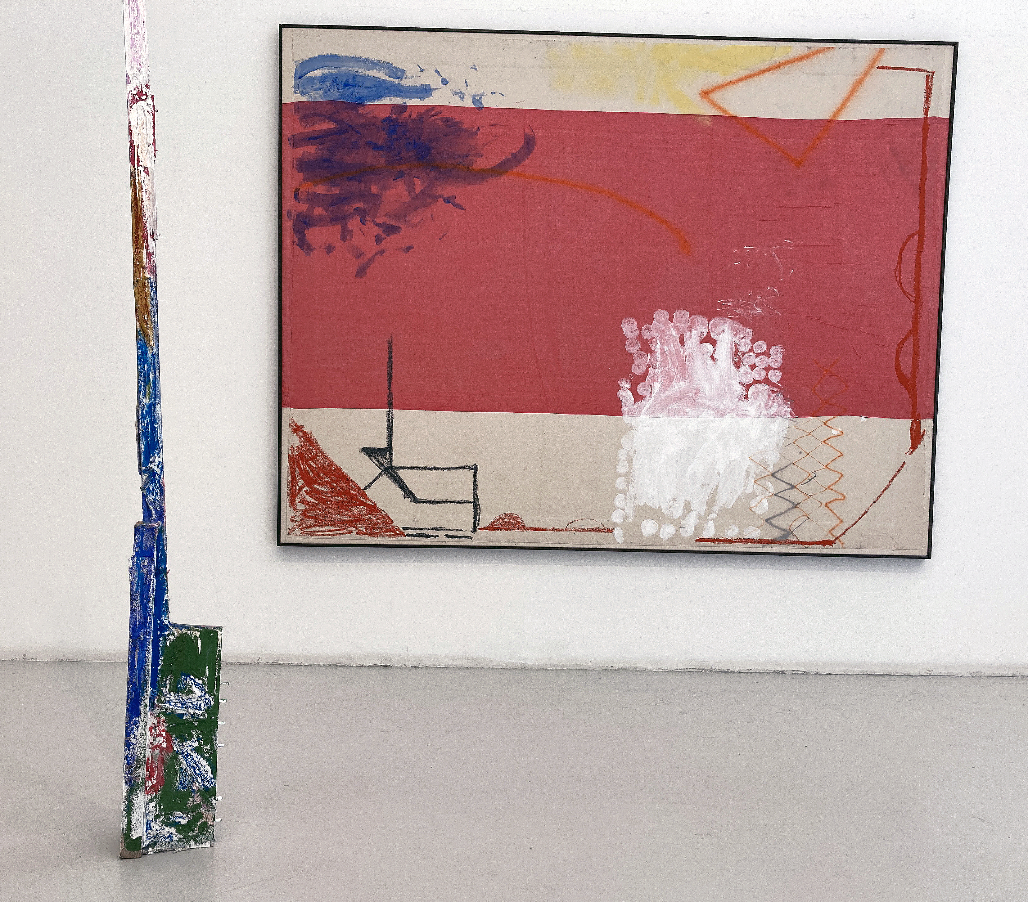
Also in this middle room were more of Ingram’s works and by now there was more of an obvious or staged interaction between the two artists’ works. Typically, Ingram’s works explore found materials in assemblage and collage-type painted forms employing plaster and various paints (household and artists’ acrylics) to fuse the various elements together. Placed on the floor rather than on the wall one of Ingram’s constructions formed a framework to look through to see another work beyond. A sense of destruction as much as building the artefacts of the environment was taking shape. As a visual tease, Ingram’s works have remnants of colour applied, similar to McCree’s suggestively ‘out of the tin’ coatings, to link the works. Contrasts of smoothness and rough surfaces distinguish the two to some extent but the pairing is not incongruous.
Bruce Ingram
My daughter and I walk around a while, tuning in still to a display that has transformed from calm quietude at the main entrance to visual and spatial cacophony in the largest room. I pick up a press release (which I shall read on the train back to Brighton later, as I want the work to speak to me first and foremost) and start to scribble some notes on the reverse:
Enter the labyrinth, parts, bits & pieces…
Plenty to see, though not too much…
Image / Object – which will predominate…
What is an exhibition for?
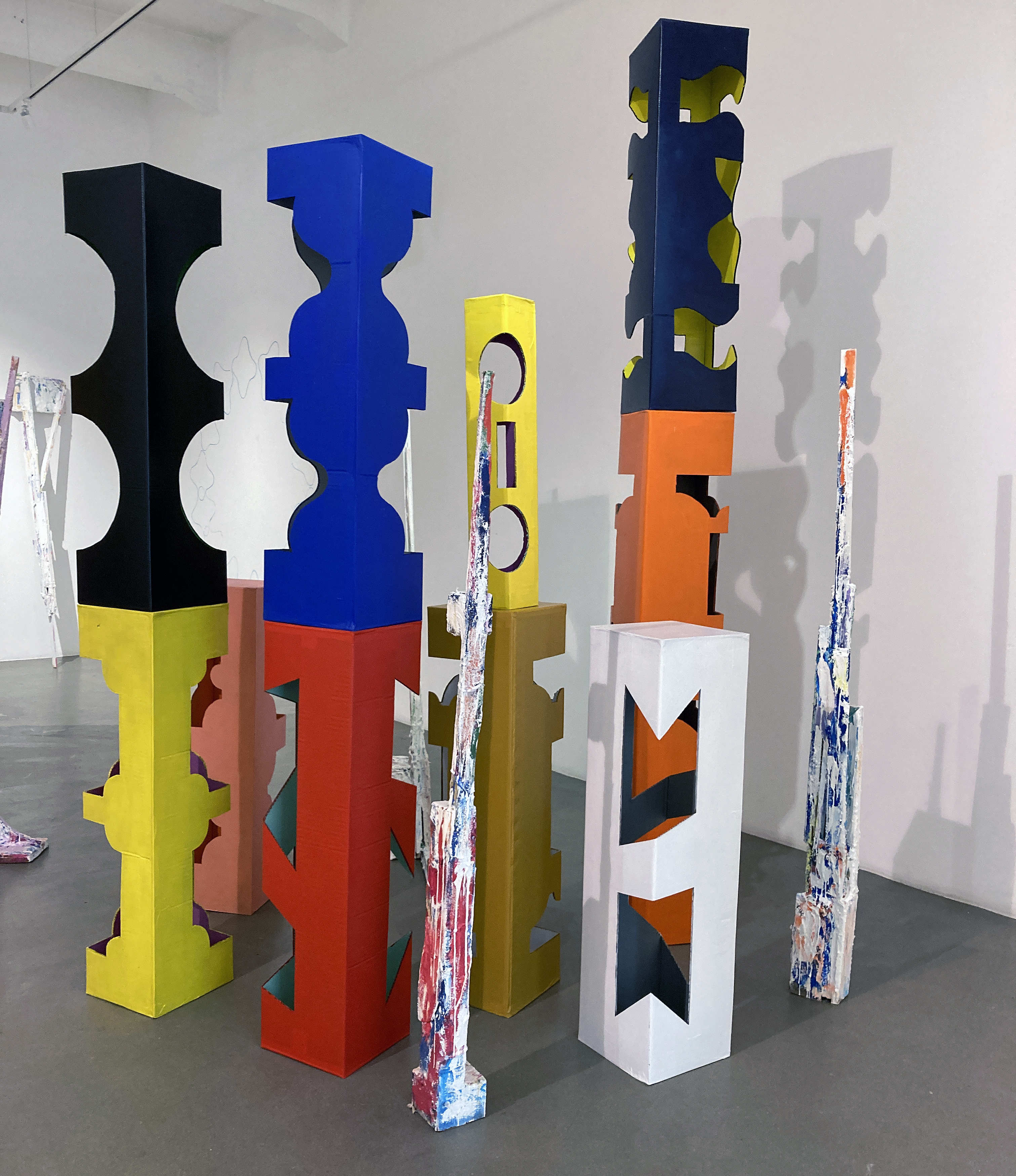
Jonathan McCree
What is an exhibition for? Now that’s interesting. In this instance, Up For Grabs is certainly entertaining, exciting and memorable. The individual paintings and sculptures work on their own terms, but as an arranged event (sadly for just over a week) the exhibition comes alive as a happening of sorts as much as a static display. I imagine the missed performance and projected film work that preceded today’s visit, which isn’t enough, but will have to do. The finished and unfinished, or work in progress nature of the works, suggests a similar modus operandi for the viewer. There is method in looking, in relating to the artworks physically, spatially and psychologically. Visual art is not exclusively about seeing; it offers possibilities for recognising the power of one’s own imagination (and sometimes a lack of). There are formal relationships to find or be presented with. There are colours and textures to indulge in. Likewise there are parts that seem to work perfectly and others that the viewer might desperately want to change – even to improve. The visual aesthetics provide a way into potential readings that could suggest social interaction, notions of community, interdependence, the built environment (including furniture) and the politics of choice, indulgence and creativity.
Jonathan McCree
My daughter described the assembly as “rocks and trees”. Jonathan McCree talked perceptively about “… delaying uncertainty in or from painting to the sculptures, which are moveable parts”. This gave his three-dimensional work edginess, like it was finished but not really. Or resolved, but hopefully not so as it invited some form of change.
This exhibition, no – this environment, concocted a landscape of sorts, an active space demanding an audience to interact by looking, moving, pacing, stopping; head up then head down, confronting occlusions to find surfaces, then seeing variously coloured or textured planes morphing into three-dimensions giving way to silently laughing, then becoming equally engrossed or bemused. Performing a journey, in effect, as an exhibition is not necessarily a final resting place for particular works – anything might be up for grabs; even our expectations.
Jonathan McCree
Note:
* This statement is a little disingenuous as I was also impressed with Mind’s Eye at Flowers in Cork Street where Carol Robertson’s geometric works had been displayed with Terry Frost’s. My review of this show has been published by Saturation Point. See the link below.
Even an English flâneur may have imagined being on the Côte d’Azur in this heat, pausing on the Promenade des Anglais, to admire the view. On an outstandingly bright summer morning, if you looked south from the De La Warr Pavilion in Bexhill on Sea towards France, the sea and brilliantly dazzling sky dissolved the field of vision, eschewing aerial perspective. Space had flattened; somehow, confirming the shifting nature of perception as optically realised and, therefore (or thereafter), re-conceptualised, re-seen, rather than diminished without the culturally acquired safety net of perspective.
Bridget Riley might be categorised as a ‘classic’ abstract/geometric painter, whose practice engages with image making that, autobiographically, encapsulates her perfectionist tendencies. Her methodological practice is invariably characterised by tightly controlled, sensuously schematic, repetitive and minimalist, optically demanding imagery. She’s a serial, visual, thriller – of the highest order.
I am here today, as part of a small posse of writers from the press, to look at a selection of paintings and prints that explore Riley’s fascination with the curve. Petite and agile, Bridget Riley, one of the internationally most acknowledged British artists of the twentieth century, generously and energetically informs and entertains. In what approximated a subtle balletic performance, she is self-assuredly poised, both physically and intellectually, to address those present with great enthusiasm and vitality. Her explanations are as exacting and precise as her imagery and her confidence is assured.
My sense is that behind this apparent coolness, regularity and control in her work an engagement with the world as it is experienced (hence the opening paragraph), both visually and physically, continues to inform her whole oeuvre. Readers of Riley’s collected writings, cleverly titled ‘The Eyes Mind’, will be aware of her early visual and tactile childhood memories of the sea and sun. Confirming the particularly visual contingency of her paintings and prints, the non-perspectival experience of the sea front panorama referenced above was echoed and confirmed in Bridget Riley’s own words: “Pictorial space has to be about something on a two-dimensional surface, in which pictorial space happens by pictorial thinking… perspective is by no means the only way.”
A sense of the closeness of France was also fortuitous: “French and early Modernist art was clearly about perception… a connection with that line of looking.” Engaging with the works on display in this retrospective collection, and turning to scan her audience frequently, to explain the practical, formative training that her particular form of abstraction partly derives from, she referenced her traditional art school training in drawing from the figure: “Drawing can develop your insights – drawing is a tool that can open up the world.” But Riley also explains that the history of art (especially the painting tradition) creates influences, and visual language systems, as essential as the daily practice of planning, and making, work. From considering the spatial investigations of Cézanne and her journey to abstraction, via an interest in Cubism, she references Bonnard and Matisse to illustrate her defining interest in line and colour. Art historical knowledge, and a constant meditation on the rich history that informs her concepts and her entire output are consistently made clear, for there are many: “Respected and admired artists from the past and we can learn from them… according to [our] temperament.”
In explaining her burgeoning practice, as a young, aspiring artist in 1960s London, she says: “It was a sort of statement… I learnt to draw when I went to art school… I was taught to make figure drawings… I was very interested in colour… basic colour relationships… I would look at Matisse… How would Matisse be able to make that? From tonal painting, colour lightened and darkened… there had been an immense adventure in modern art… I went to work for J. Walter Thompson and in the lunch hour I went down to the ICA and Cork Street to listen to lectures by David Sylvester, Laurence Alloway and [Roland] Penrose…”
Her audience is captivated by now; she continued: “The development of modern art was halted by the two wars… I went to look at an exhibition of Futurists… (Visits to the Venice Biennale and Milan are mentioned too) … there were important and interesting things in it… abstract thinking… I carried on with making my own abstract work… instead of abstracting from things seen out there in reality… Bonnard and Matisse could do much more than Mondrian had done… I started from a line, what a line can do, a square, a circle… when I altered, changed or distorted something that was familiar to people… I found ways of making things active…”
Riley’s ability to clearly elucidate her practice as an abstract artist par excellence, and her measured use of a precise language, to objectively explain and describe the carefully selected examples from her Curve paintings, provided a simple exegesis of practice that absorbed the audience. That she believes that painting is still relevant was clear: “Painting is an incredible discipline and a great art form.” And again she emphasised tradition: “All my experiences [with the] figurative is a huge help in knowing what a painting needs if it’s to develop.”
Riley’s articulateness matched the refinement of her paintings. She drew the meaning out of the works, confirming the evidence presented to the viewer’s attentive mind. But her work is not purely cerebral, as the physical engagement and geometric coordination within her work is truly embodied: and not only in the eye. The sense of flow in the paintings echoes the movement of the human form and the environment that we occupy. Most especially, lines and angles of orientation are designed to evoke pictorial space: “Vertical had to bear the stripe… lead to the plane… the painting is very transitive… Verticals allowed one to have a rhythm, to contrast it with the curves.”
But, there was a period of 17 years of an insistence on the horizontal in her prints and paintings (1980-1997). This revelation had to be re-visited. Of the return to the curve she states, “the curve is more open to amazing changes than the straight line.” Again, Riley confirms her appreciation of the line, learnt from life drawing as a student, and that “The contrapposto is like frozen movement… The curve is so elastic and changeable.”
In discussing ‘Lagoon 2’ (1997) she admits that she was: “Trying to get the curve back”. And paradox is readily admitted: “Contour suggests a flat volume…” This elegant painting (quite large at approximately 1.5 X 2 metres, but absorbing visually, and not at all imposing) has the feel of a dense forest of colour-shapes, which is neo-Cubistic: Cézanne through Matisse’s eyes. Or, as Riley discloses, is based on the notion of her idea of looking at Matisse looking at Cézanne.
Superficially, Riley’s own personality, and temperament, as a painter appears less sensual than Matisse. But a flattened painterliness, where autobiographical marks are repressed, still allows colour and line to dominate with the joie de vivre we associate with the French master. The surface quality in Riley’s paintings is typically one of relentless smoothness, but colour sensation is still paramount.
In ‘Rêve’ (1999) contrasts and harmonies work with and against each other with a colour scheme of blue/green and cream/yellow. In ‘Painting with Verticals 3’ (2006) and ‘Rajasthan’ (2012) there is a pronounced sense of purposeful movement across the surface. In the latter, Riley describes the “march of the greens”, as this organic colour comes alive amongst orange, red, grey and white.
Bridget Riley’s abstract art is clearly modernist, but notwithstanding her traditional training as a painter (she still produces cartoons for her paintings), her work successfully combines a strongly characteristic feature of line through disegno (drawing) with form as colore (colour) to attain a synoptic temporality: intimating a psychogeographic relationship with space through physical positioning and perception; and a sense of time and rhythm integrated in and through the intrinsic properties of the images. The association of colour and line, especially the curve, is sensuous at a visual and an intellectual level. If this interpretation is correct, it might suggest that a purely non-objective abstraction is a fanciful notion – because contingency is unavoidable, so long as human beings continue to make art.