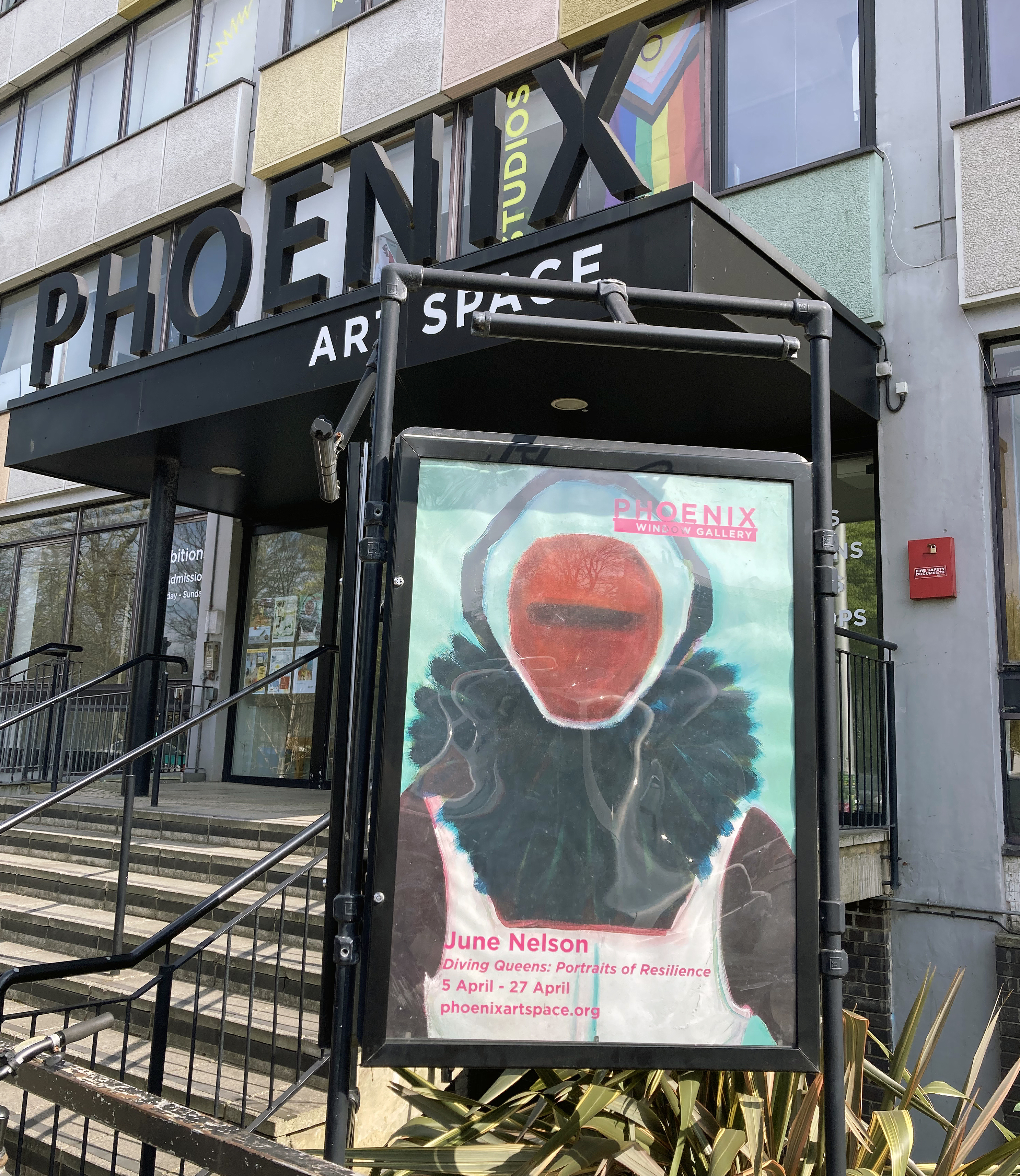
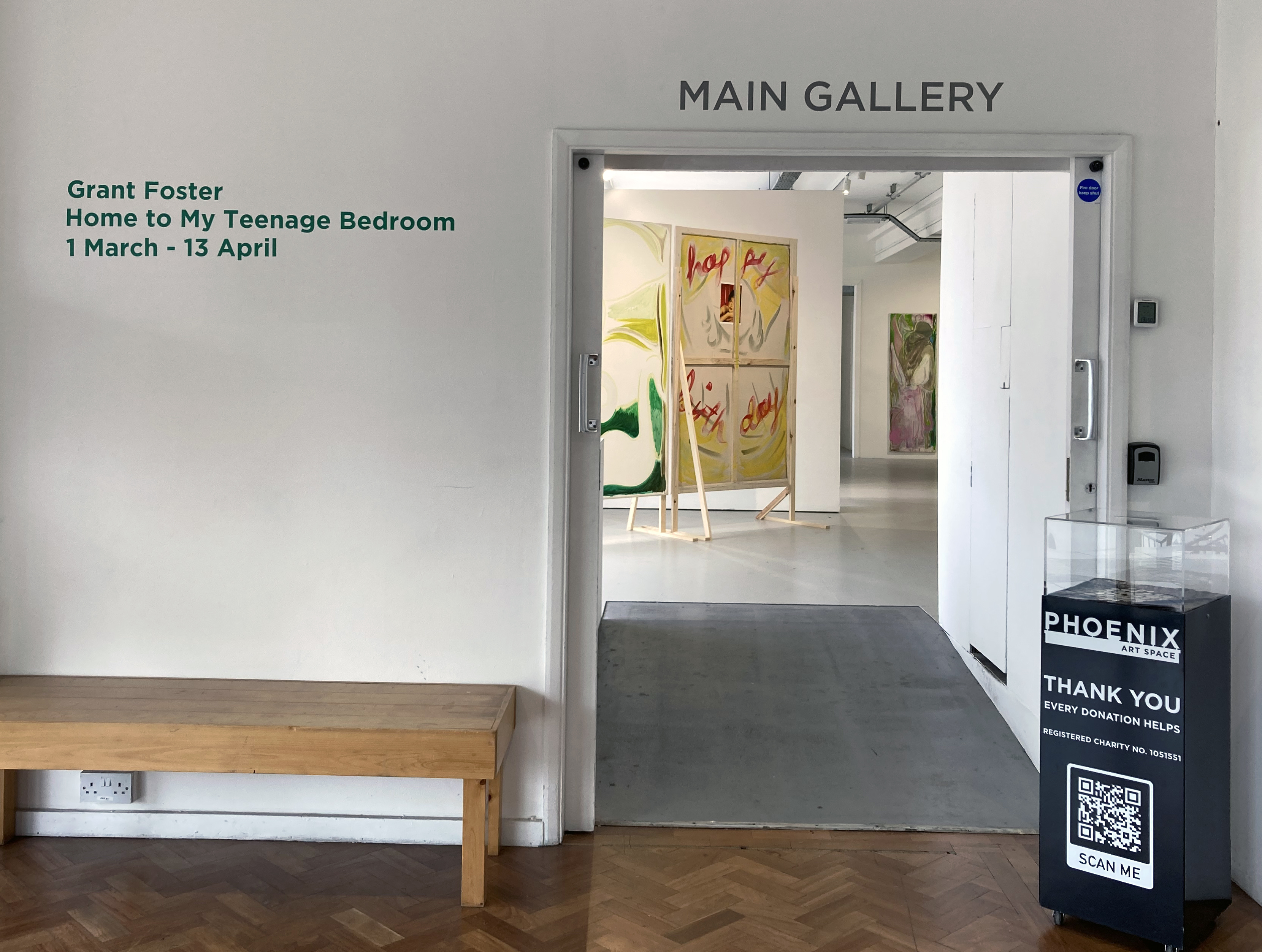
AFTER-IMAGE: Works inspired by the Brighton Museum & Art Gallery Collection
Window Gallery, Phoenix Art Space, Brighton
1 to 30 November 2025

A few years ago, as a break from the painting studio, I had visited the nearby Brighton Museum & Art Gallery to view the Prof. Paul Heyer bequest that includes works by Jules Olitski, Frank Stella and Larry Poons. Just before leaving, whilst still in front of the Olitski, I noticed a lonely painting from an adjoining gallery that I imagined waving at me, perhaps exclaiming, “Hey, look at me – I’m a modern painting too!”
I went straight over to this relatively small oil painting, encased in a dominating gold leafed frame, already sensing something special. It was a landscape by Thomas Gainsborough. The experience reinforced a belief I have that all paintings have a potential to remain vital and relevant today – for painters and viewers alike. So its production date during the 1740s when he was still developing his skills was not an issue. This is a somewhat intuitive notion – but Gainsborough sets the bar for painting (not only landscape imagery) way back in the 18th century. He may well have his technical equals today, but there’s none better. Nor do visually powerful paintings have to be as big as the painters of the New York School often produced.

Brighton Museum & Art Gallery collection
This intriguing painting by Gainsborough, Open Landscape at the Edge of a Wood, lacks the presence of human figures (referencing the Classical Antique tradition that earlier generations of painters indulged in, or including the so-called peasants or the wealthy landowners of the day, such as Mr. and Mrs. Andrews), sometimes seen in his works. Though it has that constructed feel so typical of the European tradition of landscape imagery (post-Claude), an informal sense of place prevails. The viewer is invited to gaze upon the corner of a field, some local Suffolk woodland I assume, and the typically cloudy English sky. The implied narrative might be concerned with the everyday, as the artist invites the viewer to appreciate the countryside. I took a photograph with my new iPhone that usefully recorded the date as October 20, 2017 at 15:38.
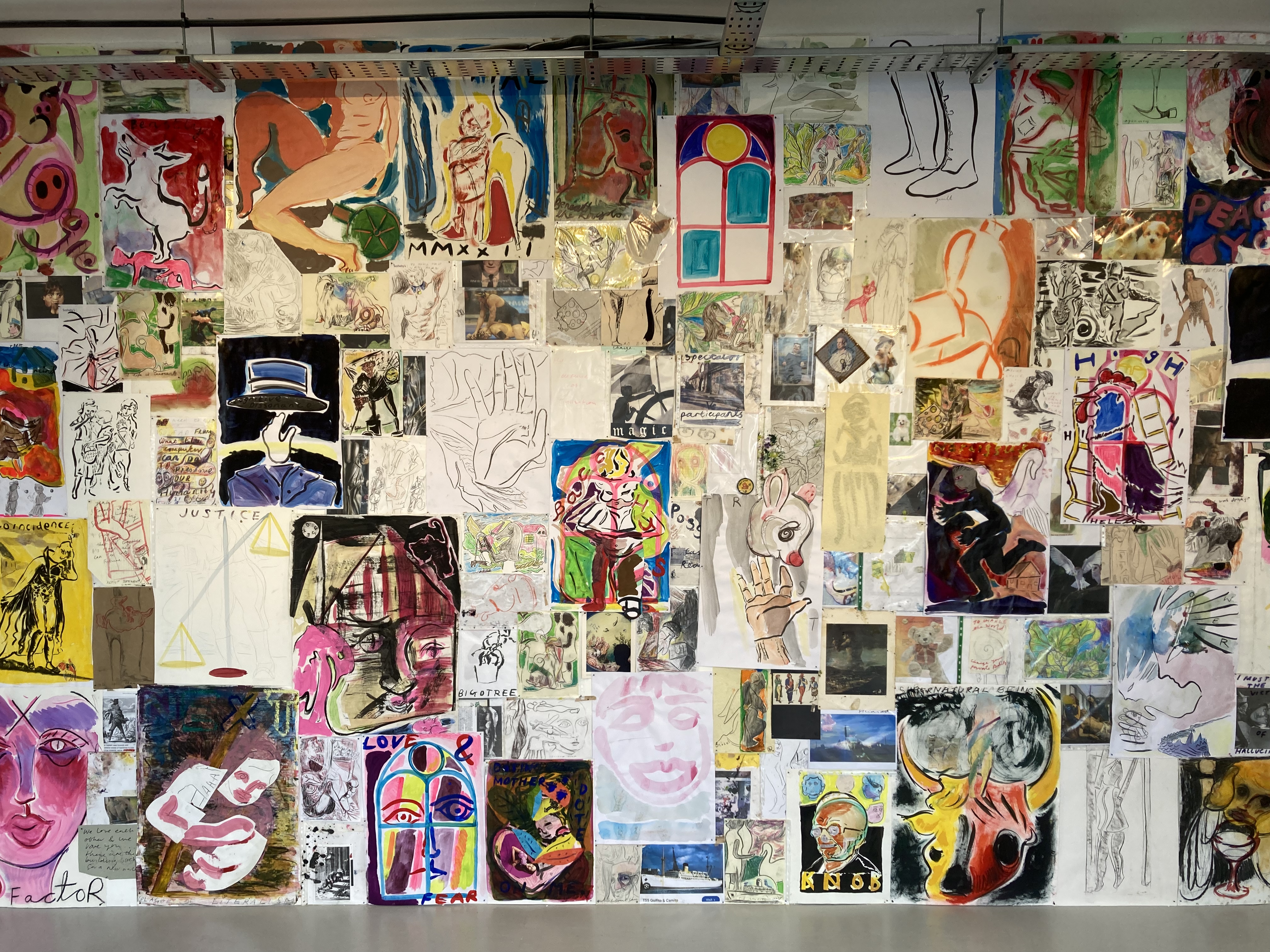
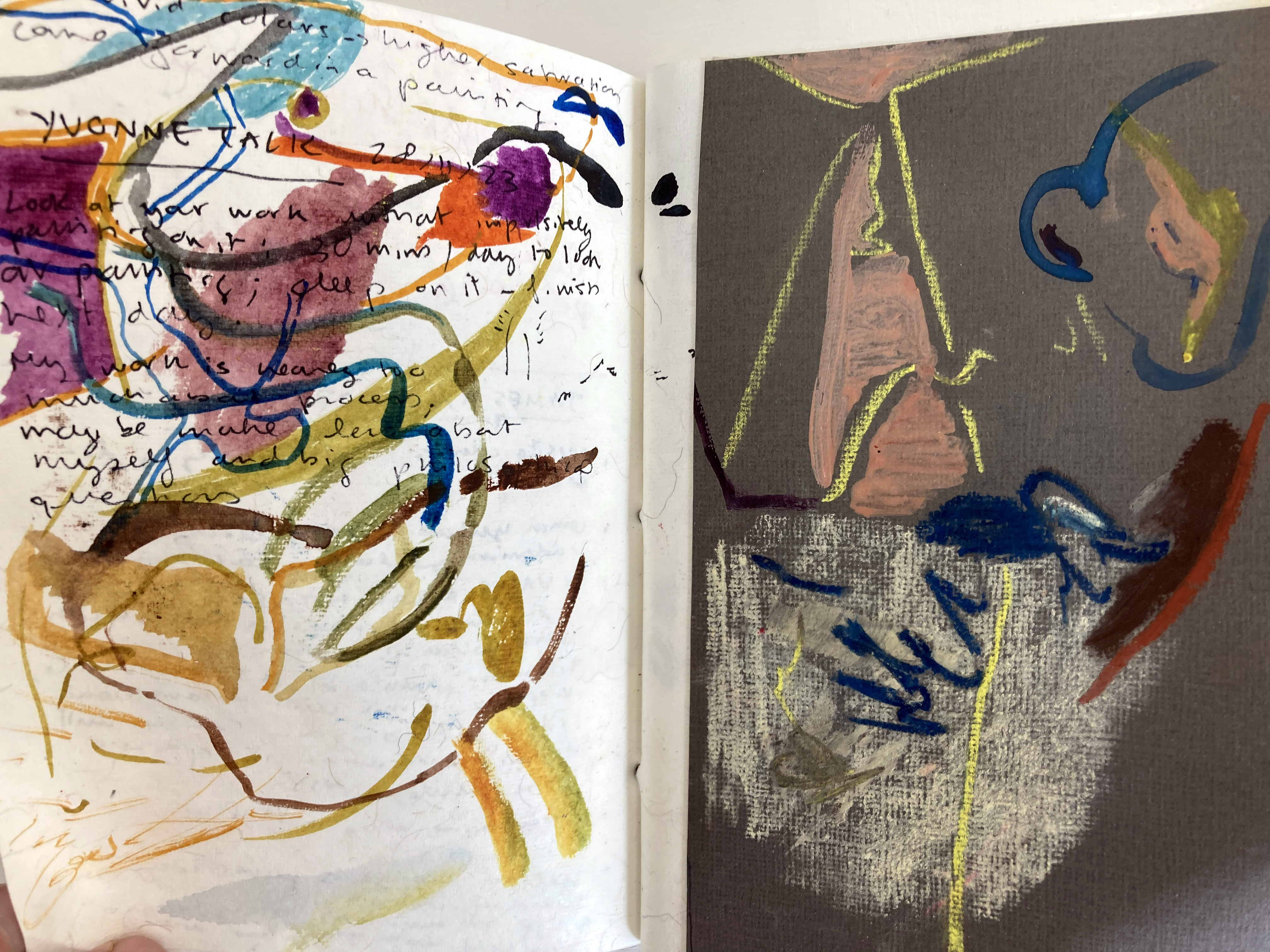
I decided to revisit my photograph of the painting in 2024 after I received the go ahead to curate the AFTER-IMAGE exhibition for the Window Gallery at the Phoenix Art Space with the inclusion of other studio members. (An earlier proposal in 2022 had been rejected, perhaps because I was eying up the larger Main Gallery and lacked the funds to rent the space.) The prompt to my Phoenix contemporaries was for them to visit the Museum and to choose anything to react to in whatever way they wished.
One of the benefits of having a studio at the Phoenix is its close vicinity to the Museum and Art Gallery, where a publically owned collection of artworks are available to see all year round, subject to curatorial changes and re-hangs. I decided to stick with my choice of the Gainsborough landscape despite temptations to respond to other works that also drew my attention. The fact that it has not been on display for a while was not an issue as I had my photograph and the memory of that encounter eight years ago. In fact, a kind offer by Laurie Bassam (Curator of Decorative & Fine Art) from the museum was not taken up to get the painting out of storage, as I preferred not to see the Gainsborough in the flesh quite yet. I had my photograph and my visual recollection. Yet I would, of course, maintain that it is always necessary for artists to see and experience original artworks ‘in the flesh’, rather than only in print and/or online. Painters, and photographers, are typically well aware of the history behind their respective practices and engage with displays of original works in a way that others may not. Any reaction can be to emulate, to be inspired by, or to creatively adjust and re-present or re-order subject matter for one’s own purposes. Imagery and objects from the past will therefore be linked to the present either directly or more obliquely, depending on the inclination of the invested observer. The remit gave this small group from the Phoenix the opportunity to produce whatever they wished. I expected a wide range of responses, and have not been disappointed. I asked each in the group to write a brief (or not so brief) statement to explain their respective choices of works to respond to. With some respectful editing, and starting with the photographers, here is what they had to say:
Statements from the exhibitors:
Murray Ballard – Black Rock, Brighton. C type print.


Image credit: Brighton & Hove Museums
Jacques-Émile Blanche’s painting of Black Rock, Brighton presents a composed summer scene, its figures formally dressed, children at play, artists at work along the shoreline. Returning to the same site with a large-format field camera, I was struck by the extent of its transformation. Once considered the eastern edge of Brighton, Black Rock has shifted through many identities: from coal-landing beach, to lido, and a gateway to the Marina. Today the space is often empty, yet on this occasion it served as the end point of a long-distance trail race. My photograph reflects on this layered history and the changing uses of place.
Fergus Heron – Ship Street Gardens, Brighton, England, 2016/2025. C type print.


I am interested in how the places of the studio and museum offer different but related ways to imagine Brighton as an urban landscape through pictures. I was initially interested in the pictures of the chain pier by George Callow and another by John Fraser.
The connections with my works being relations of land and water, distance, scale, looking at structures from which looking is practiced and that change perspective on place.
Ship Street Gardens, Brighton is a colour photograph on paper showing a view to the west over rooftops in the Lanes area of Brighton. The image describes the appearance of relations between buildings and natural features in soft overcast light with a high degree of detail. A dialogue with George Callow’s painting Chain Pier, Brighton is offered by the photograph with contrasts including direction and viewpoint, plus the presence of the i360 as a modern ‘vertical pier’ and the absence of the beach. My photograph forms a landscape that brings coastal, urban, and new and old aspects of place into relation.
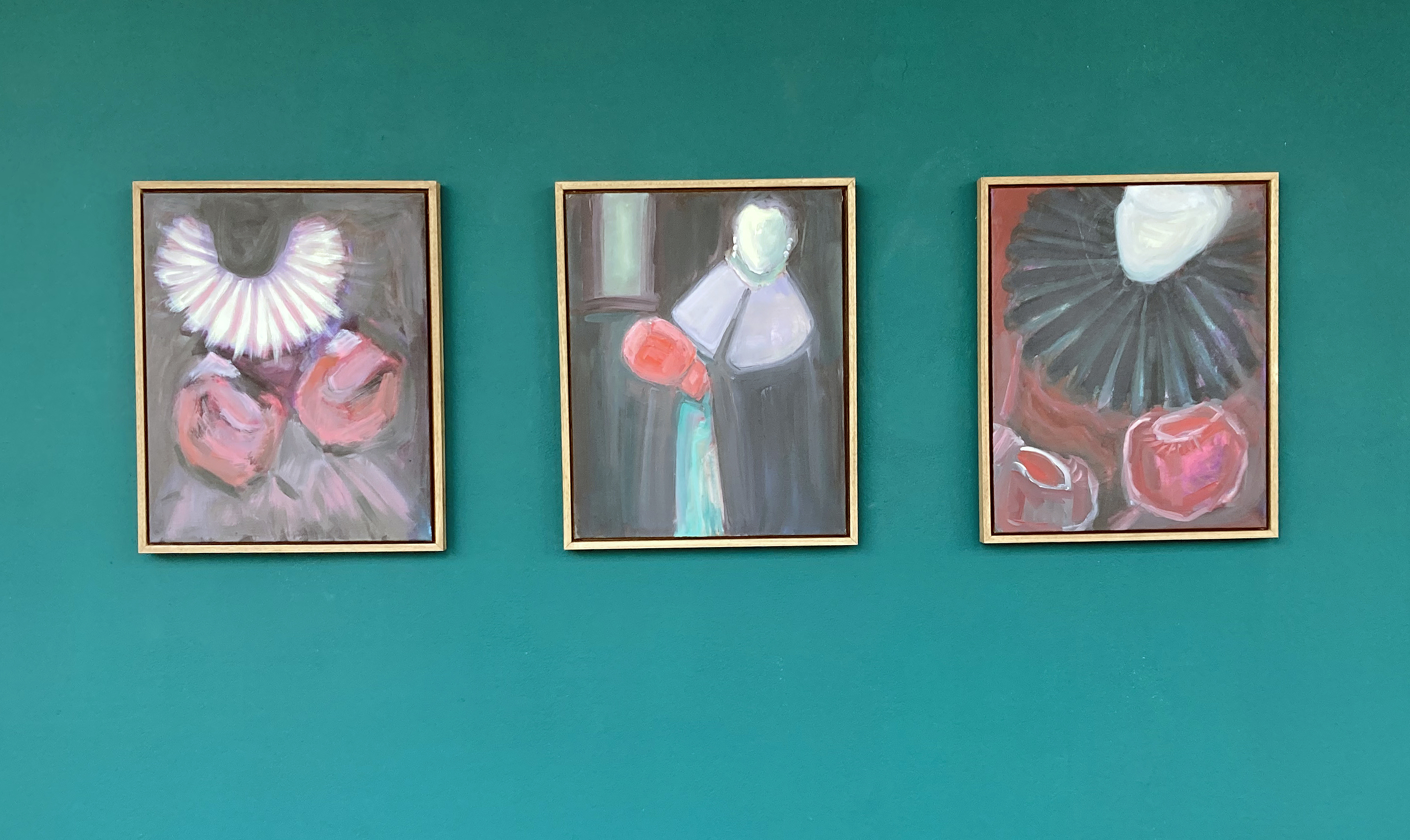
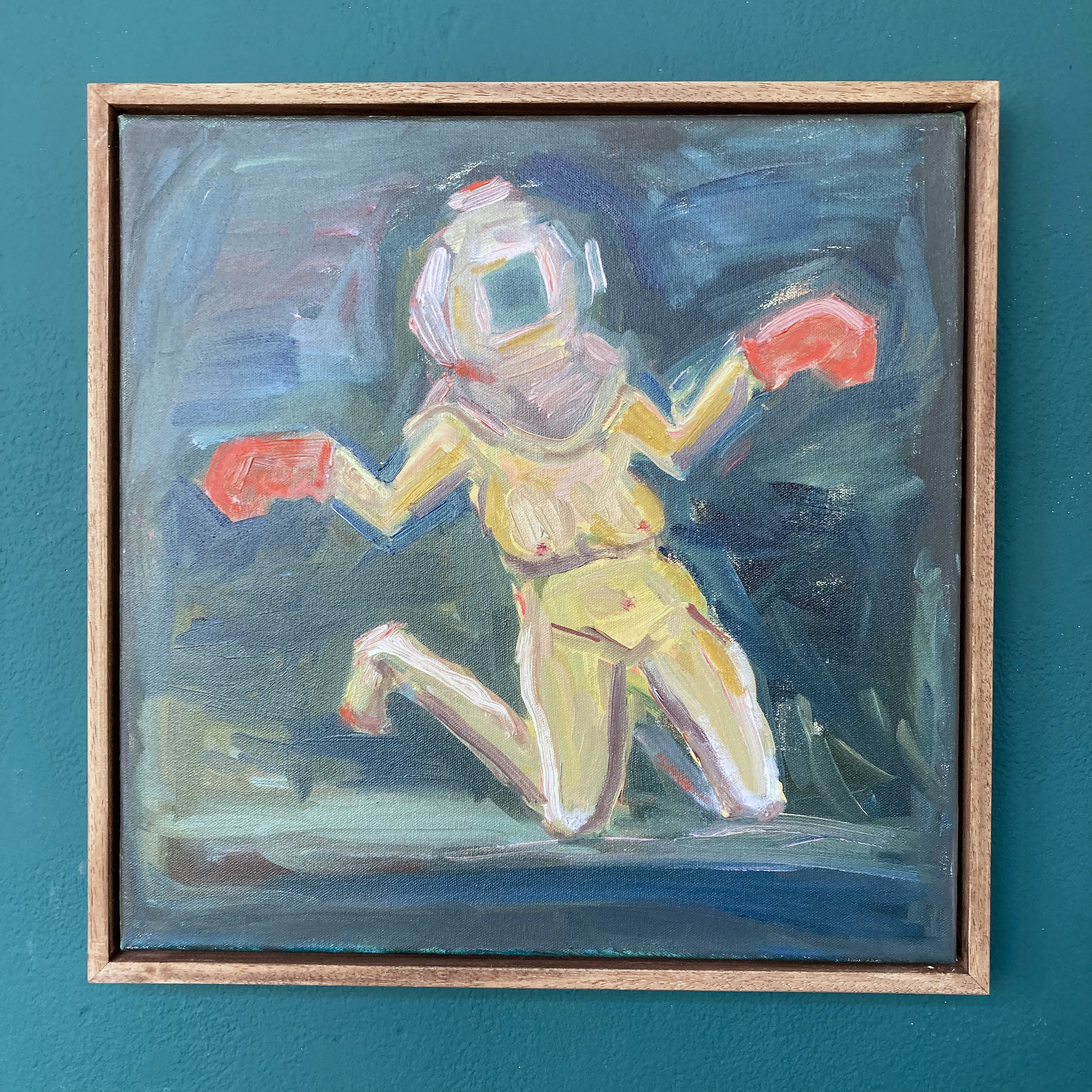
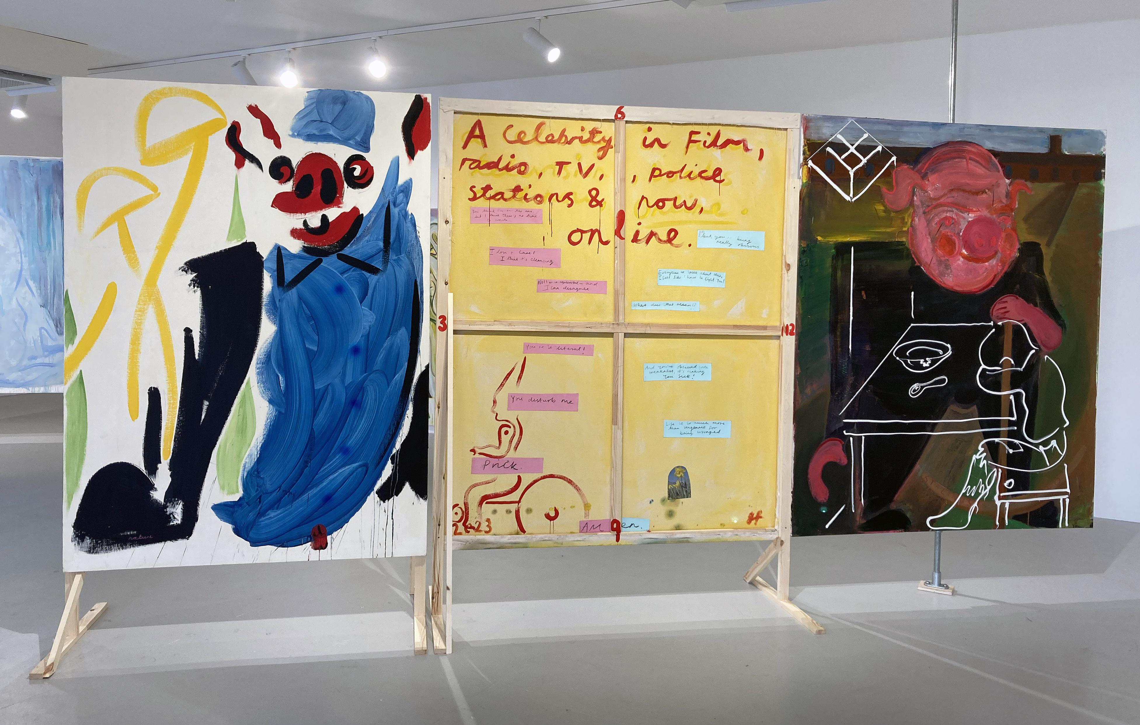
Perdita Sinclair – How the Whale Got His Throat and Gen 9. Both oil on canvas.


by Grant Cox of Artasmedia (2019) Image credit: Grant Cox and Brighton & Hove Museums
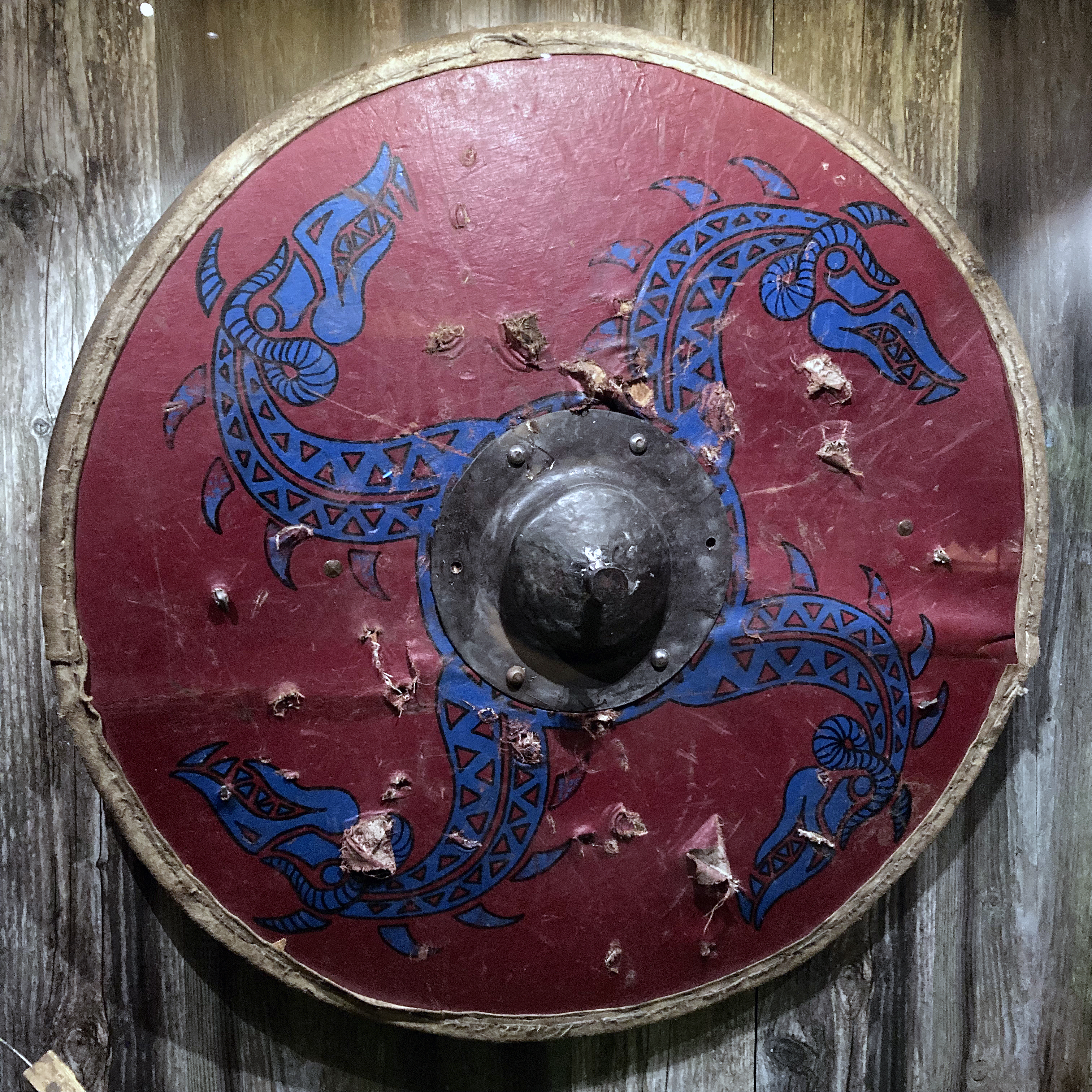
Both the animation and the shield influenced both of my paintings, How the Whale Got His Throat and Gen 9. They made me think about how animals and landscapes are captured and recreated by humans using tools. The tool being something practical, like a shield or information animation, but the symbols of animals representing something psychological or spiritual, like a connection to deep time. The paintings that I have in After-Image use the tool of AI to generate imagery and my own physical and psychological connection to Brighton and my home.

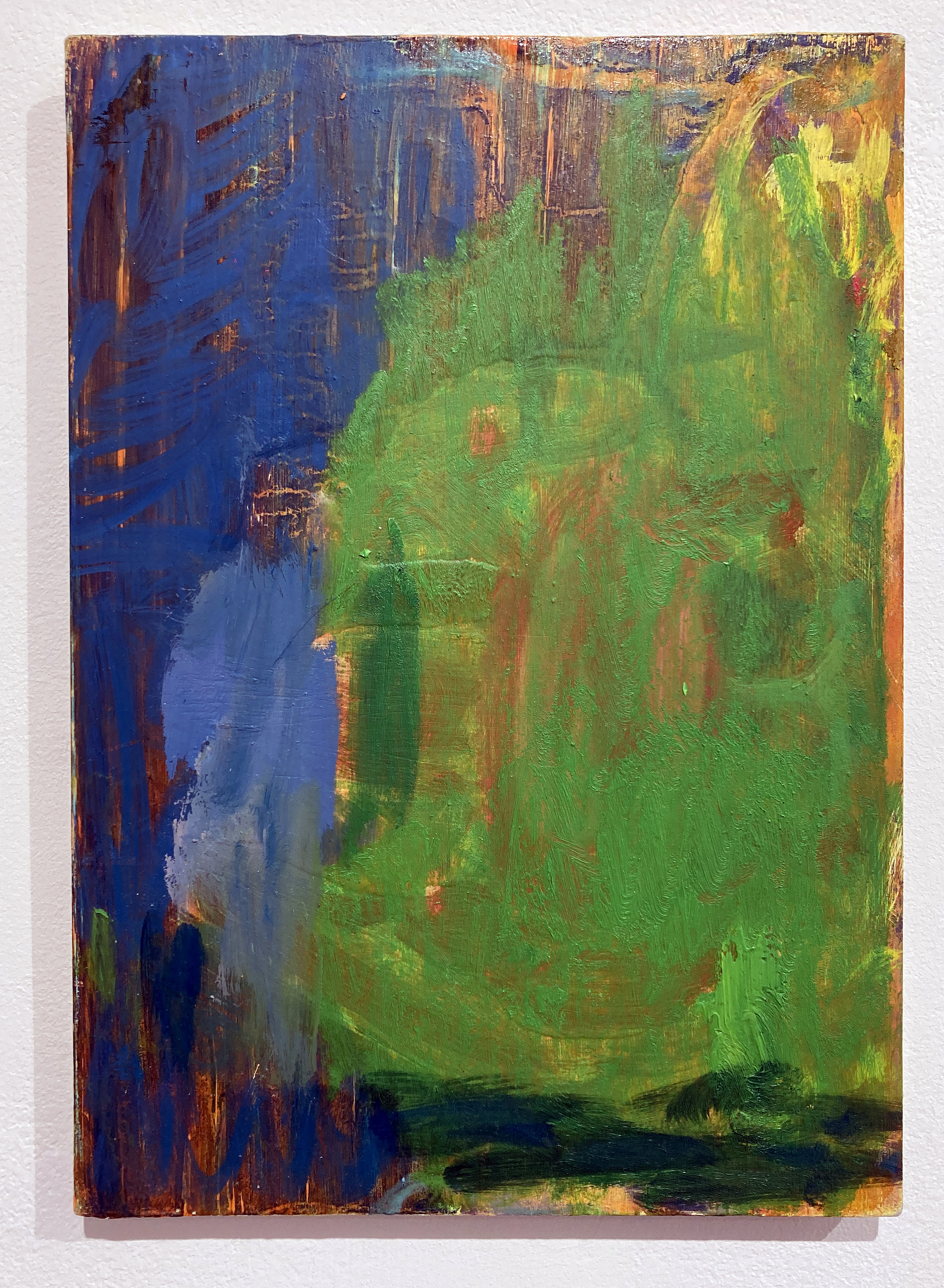
Denise Harrison – Water of Leith: Flow / Pause / Return. Acrylic on wood.


In July, after the death of my sister, I spent three weeks alone by the Water of Leith in Edinburgh. This place, connected to my past, became somewhere I could be quiet and reflect. Each day I walked along the river or sat still in one spot, taking in the sounds, movement and atmosphere of the landscape. In my paintings, I translate sensations as well as views.
I was inspired by Ivon Hitchens’ painting, Forest and the way he immersed himself in his surroundings. I used acrylic paint on blocks of wood, adopting the panoramic format to reflect how the landscape is seen as a continuous space, without edges. Through gesture and colour, my paintings capture the feeling of being fully present in the landscape, where memory, grief and nature come together.
Bernard G. Mills – Bellows. Liquitex on canvas (diptych).
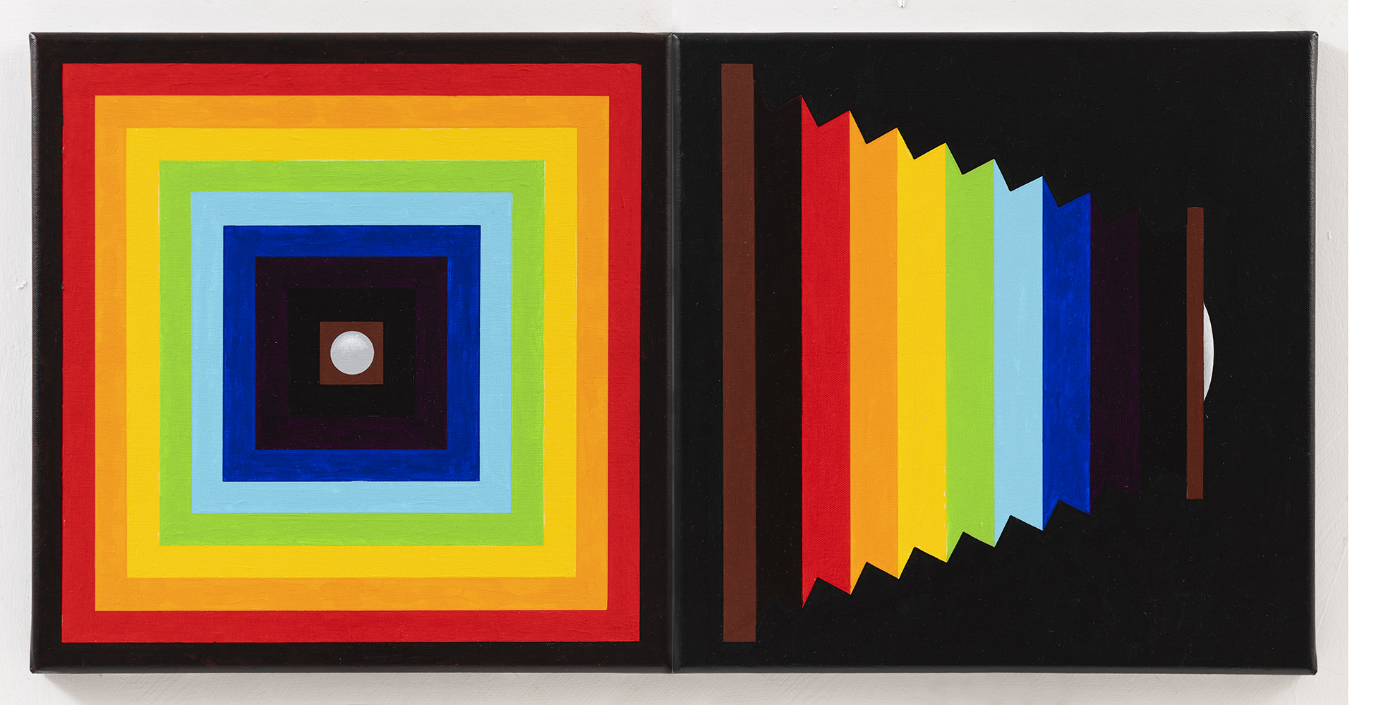

Image credit: © ARS, NY and DACS, London 2025
and Brighton & Hove Museums
When viewing the work on a visit to the gallery and a talk about their twentieth century collection I was struck, not so much by the design, physical execution or colours in Red Scramble, but by the resemblance of Frank Stella’s painting’s concentric squares to the folds in a camera’s bellows. As I was (and am) engaged in producing a series of paintings that I call Photographic Paintings – paintings that relate to aspects of photography, I decided to incorporate the response to Stella’s piece with a diptych entitled Bellows.
I had originally decided to include twenty-four painting in the series (one has to draw a line somewhere) – either twenty-four or thirty-six (referring to the number of frames in a 35mm film cassette). With the Stella being a diptych, I decided to extend it to twenty-five because, in the interest of economy, if one loaded a 35mm film into a camera judiciously, one could squeeze in an extra exposure at the end of the film.
June Nelson – Fire Spotting, Where All Ladders Start and Every Rung Shone Strangely. All oil on canvas.


Image credit: Brighton & Hove Museums
My initial response to a Japanese woodcut depicting firemen performing acrobatic feats took the form of a few small paintings – direct transcriptions of the image. After a long break working on another series of paintings, I returned to the ladder motif. Evoking ideas of balance, emergence, precarity, and triumph, the ladder has become the starting point for a new body of work, comprising paintings and sculpture. These works extend threads from earlier explorations of “impossible objects”: mirrors that refuse to reflect, faces that cannot be fully seen and shadow ladders that offer no passage. Together they forge a shifting vocabulary that hovers between the literal and the illusory, the structural and the dreamlike.
Mike Stoakes – The Tyger, Tony the Tiger and Sporting Tigers. Mixed media.
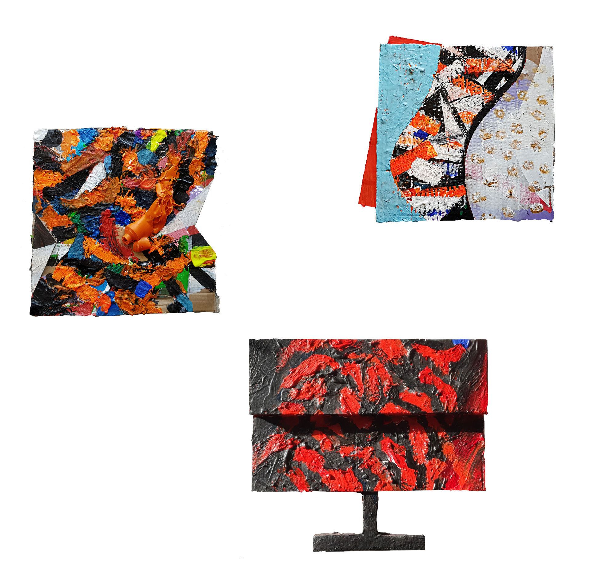

Image credit: Brighton & Hove Museums
Though I’ve recently been working on the subject of my colonial past I have chosen this work for After Image out of pure interest. It represents an actual event where Hector/Hugh Sutherland Munro serving as a cadet for the East India Company was seized by the head and dragged away by a tiger, succumbing to his injuries even after the tiger was shot. The event was widely reported and subsequently (1820s) became the subject of a series of Staffordshire ceramic figures and more recently foreign fakes.
Not long after Munro’s death, Tipu Sultan of Mysore, who loathed the British, commissioned an automata of the incident that produced movement and wailing and growling noises activated by a crank. The body of the tiger also contained an organ. The styling of the piece draws on South Indian traditions of sculpture and is one example of many images Tipu caused to be made of British meeting their demise, with the tiger being a significant repeated personal motif. Uncannily the iconography of the tiger mauling a soldier had been used by him prior to the Munro tragedy. Tipu was killed by the British in a siege and his tiger brought to Britain as plunder and is now in the V&A. The style was likely the basis for the Staffordshire figures and the subject for William Blake’s poem The Tyger.
The work I have made uses the tiger image to explore human projection onto nature through various media representations. Three paintings each about 35cm square are titled The Tyger, Tony the Tiger and Sporting Tigers. The Tyger is from Blake’s poem in all likelihood inspired by the Munro story. Tony the Tiger is the Frosties breakfast cereal mascot who was animated with a Brooklyn accent – which gives him a name and location link to Tony Manera from Saturday Night Fever. Tony and the Esso tiger (in your tank) had cordial relations until Esso used it was to promote foodstuffs at which point the relationship became frosty. sporting tigers refers to a scene from if…. where Malcolm McDowell and Christine Noonan wrestle naked on the floor of a transport cafe impersonating tigers.
Julian Vilarrubi – Study for Moonrise on the Rape of Hastings. Oil on board.
And Studies for Moonrise I and II. Oil on paper.
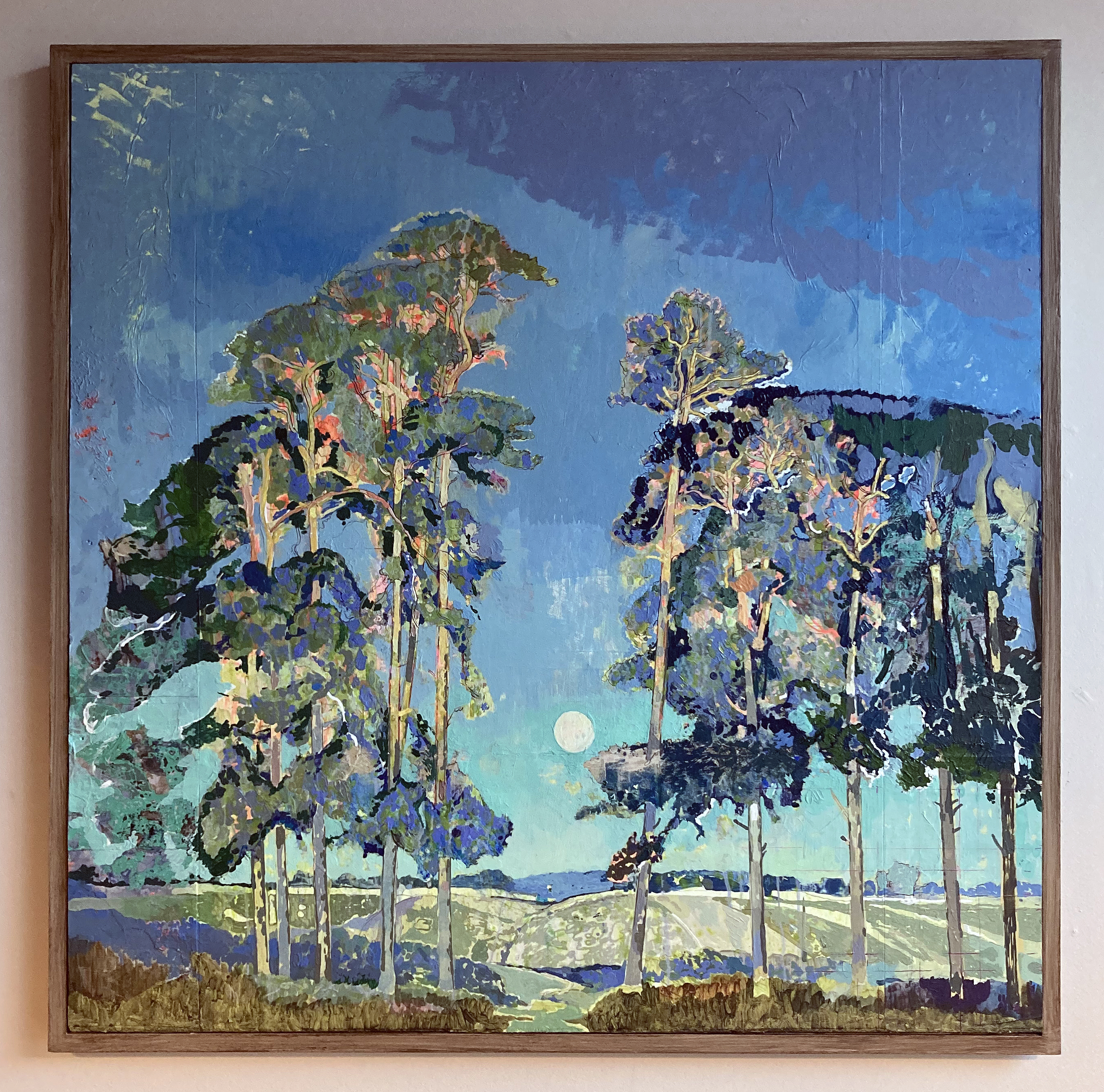

Image credit: Brighton & Hove Museums
Caught in the liminal transition between day and night, the full moon ascends in direct opposition to the setting sun. The scene evokes an early evening in late September, sometime in the 1920s. The final warm, golden rays illuminate the treetops – light that is soon to yield to the cooler chromatic palette dominating the remainder of the composition. This fleeting equilibrium between sunlight and moonlight – the gradual succession of one form of illumination by another – imbues the image with a poetic transience. It captures the precise moment when day recedes and night begins its quiet ascent. The viewer becomes aware of the inevitable passing of time, as the low sun behind us slips beneath the horizon, signaling the arrival of autumn light and the encroaching darkness of the months ahead.
I first encountered this painting on 13 August 2023 at the Brighton Museum and Art Gallery. That single viewing has remained vividly imprinted in my memory. The work’s compositional and atmospheric qualities exerted such a profound influence on my painterly sensibility that I have since felt compelled to reproduce it, not as an act of imitation, but as an analytical engagement intended to uncover aspects of its making.
This undertaking is not an interpretation or a personal reimagining of the original. Rather, it represents a dialogue between my own practice and that of another painter. Through this process, I seek to concentrate on specific technical concerns allowing the act of reproduction to function as a form of enquiry. It is an attempt to locate, through practice, the intersections where two artistic methodologies might converge.
The objective is to study, replicate, and thereby understand how and why certain images resonate with such lasting intensity. Art museums provide a unique pedagogical context for such investigations: they preserve not only the works themselves but also the potential for experiential learning embedded within them. In this instance Lawrenson has already resolved many compositional decisions and I am thus liberated from considerations of subject or framing and can direct my attention entirely toward process, structure, and surface.
In total, my direct encounter with the painting amounted to less than ten minutes. My subsequent work has relied exclusively on photographic reproductions – an approach far from ideal. Reproductions inevitably introduce distortions of colour, scale, facture, and detail, yet they remain my only means of sustained engagement. As a student of historical painting practice, this project constitutes a deliberate methodological exercise: a means of interrogating pictorial construction, tonal balance, and chromatic harmony. By attempting to reconstruct the processes underpinning this work, I aim to absorb and internalise its lessons, thereby extending my own understanding of painting as both material practice and visual language.
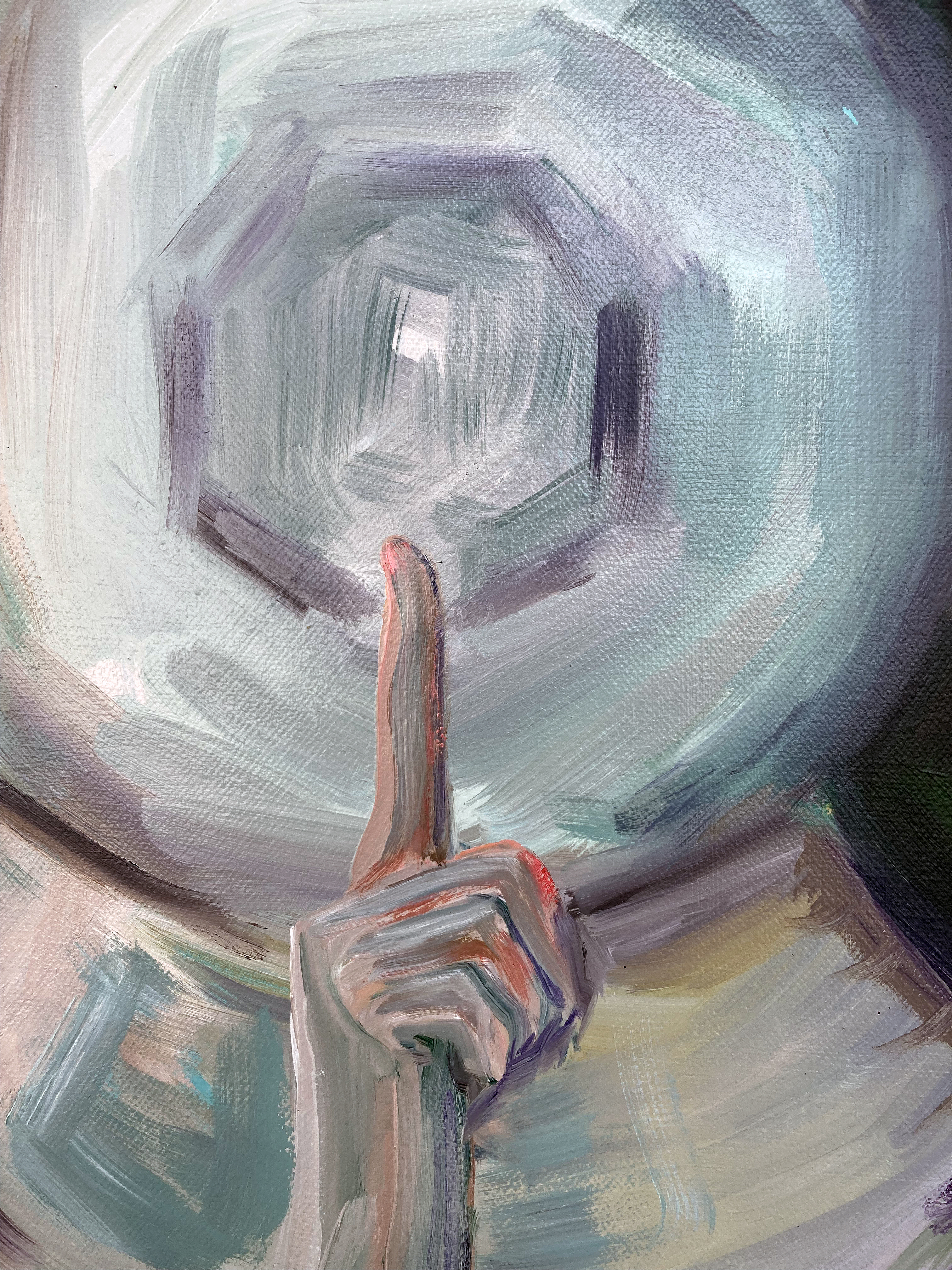
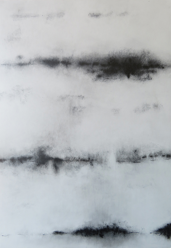
Stig Evans – Unveil. Graphite and acrylic on canvas + curtain.


Image credit: Brighton & Hove Museums
To “draw a curtain” can mean two apparently contradictory things: to pull it aside to reveal what it had concealed, and to pull it in front of an object, in order to hide it. To draw, and to paint, a curtain is thus both to cover and discover.
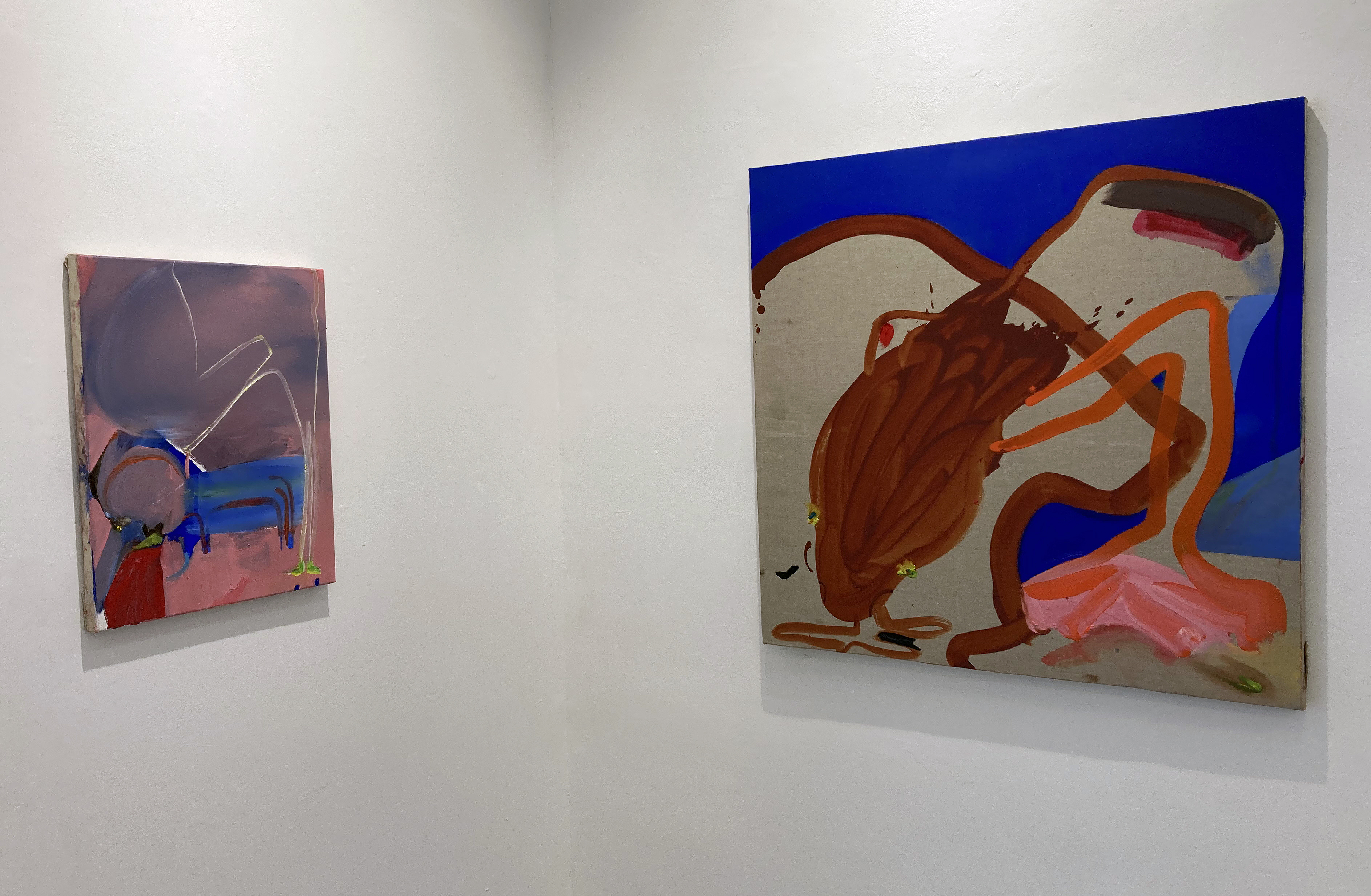
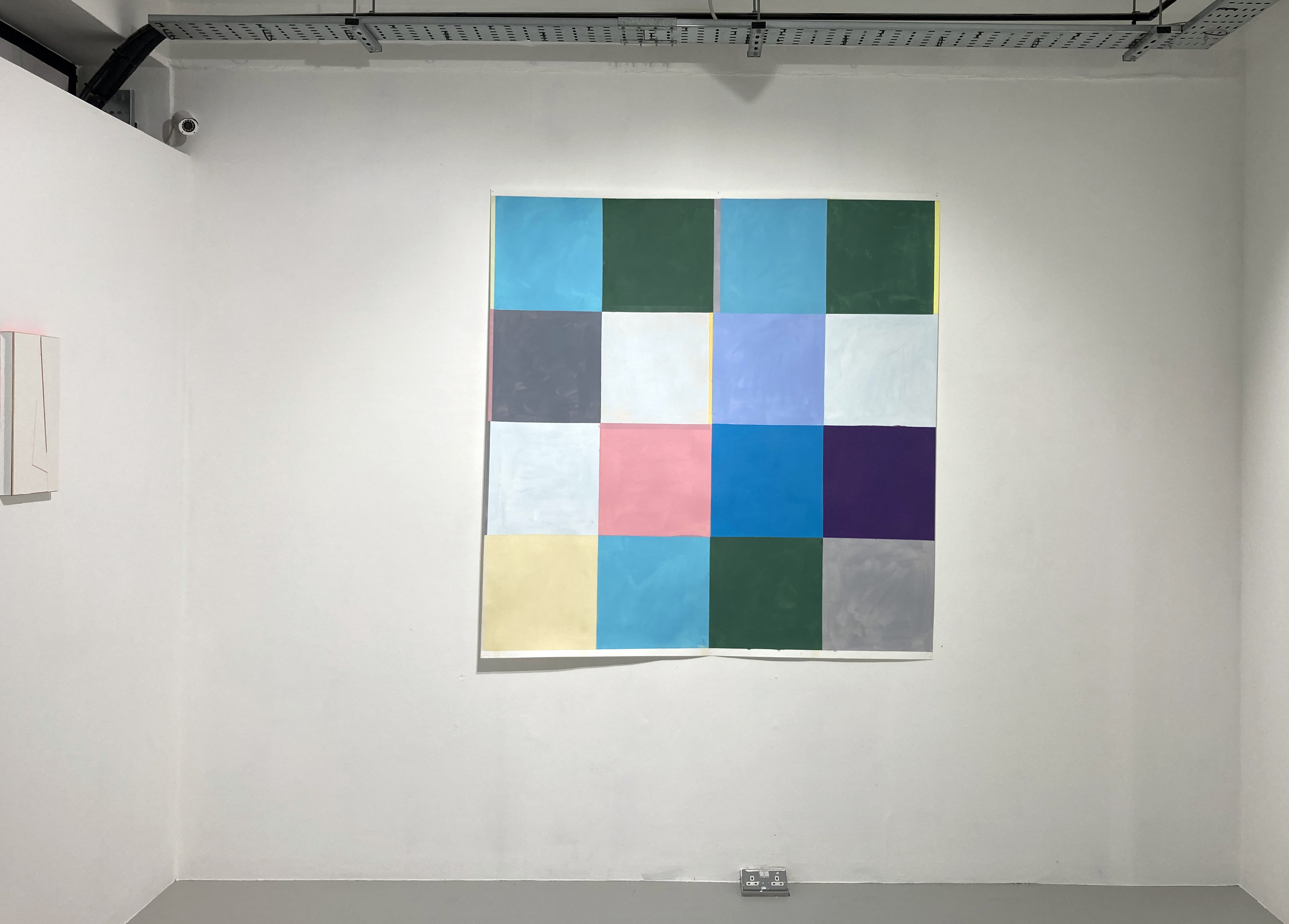
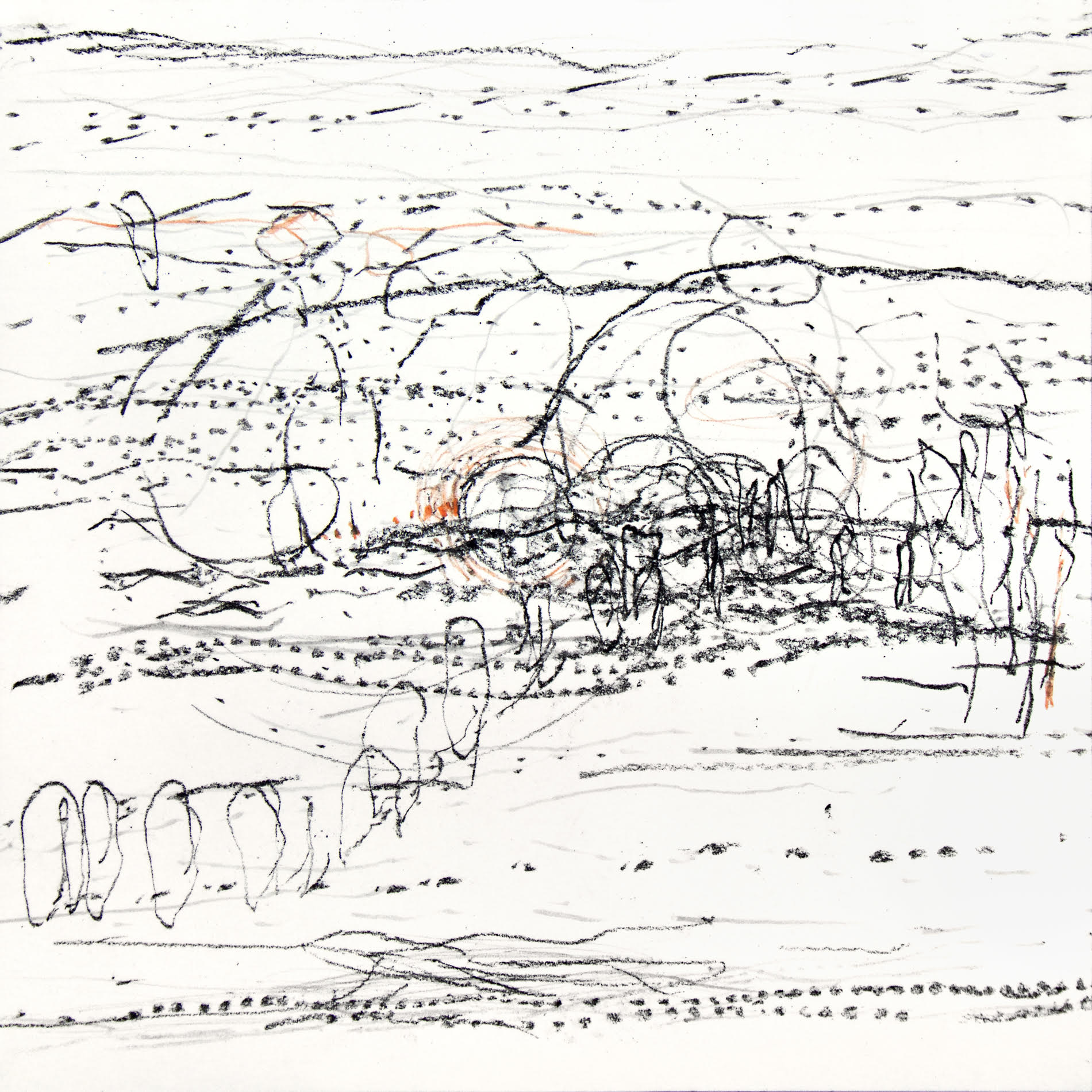
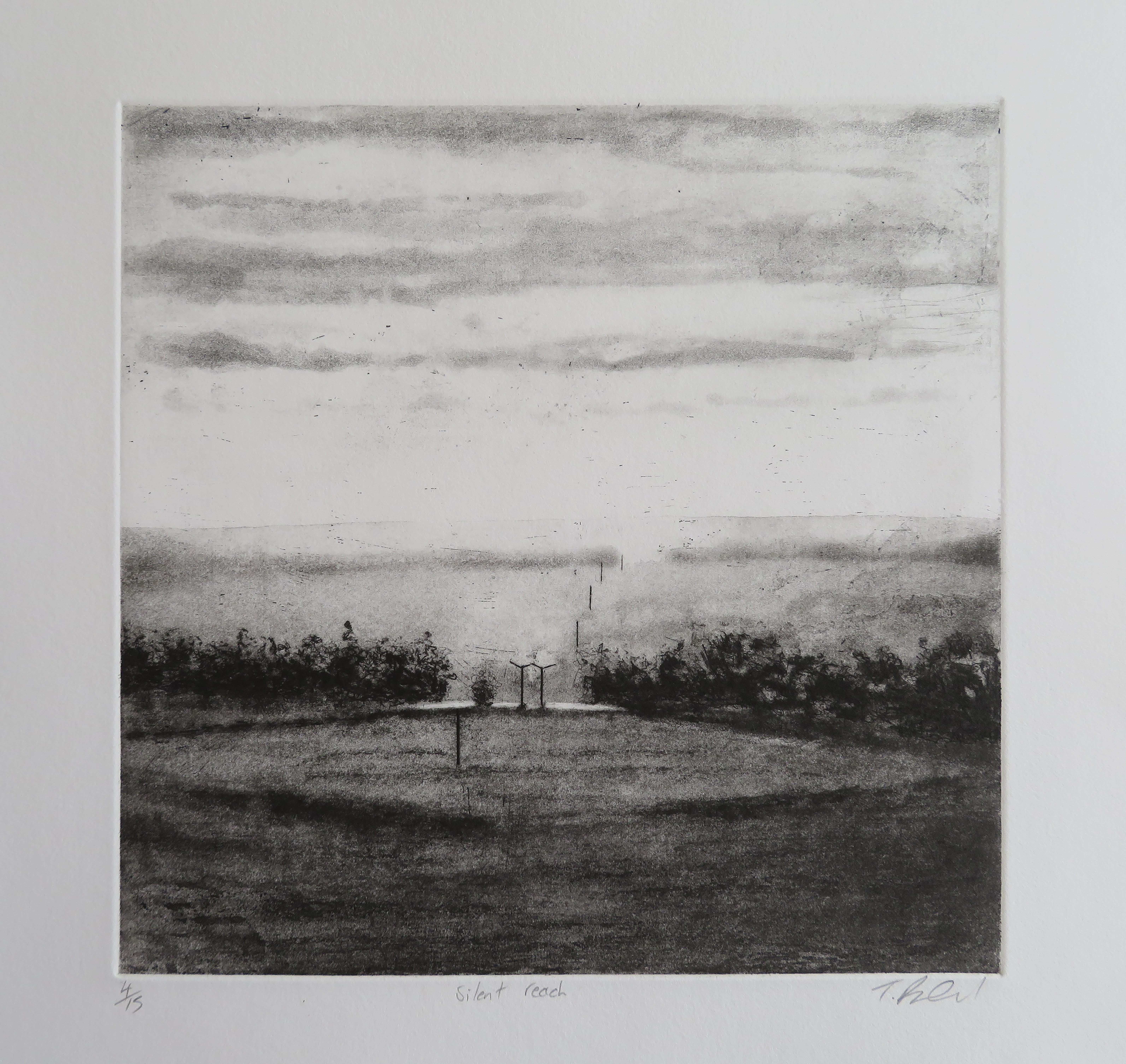
Geoff Hands – After Gainsborough I and II. Oil on canvas.
And Open Landscape (Oval). Oil on board/frame

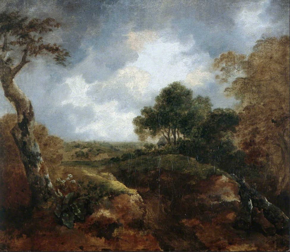
Image credit: Brighton & Hove Museums
Gainsborough’s painting chose me, in a sense. As I explained in the AFTER-IMAGE essay (above), I was looking at works by Olitski, Stella and Poons from the Prof. Paul Heyer bequest and the almost unnoticed small oil painting beckoned me from afar. As a contemporary painter I am always on the lookout for paintings to excite me, irrespective of when they were produced. So I love visiting the National Gallery in London as much as visiting displays of new paintings in the contemporary and independent galleries. My focus on painters from the past increased during the Covid pandemic, perhaps because I was usefully confined to my Phoenix studio and a packed bookshelf of artist’s monographs kept in there. So I was looking at painters such as Caravaggio, Rubens, Watteau, Gainsborough and Gillian Ayers, particularly intrigued by pictorial composition. As much as content and historical readings are essential in understanding paintings from any era, I was particularly focused on the more formal aspects of painting. Not only in composition, but also in internal shapes, passages of light and dark, and just how the paint medium has been applied onto the surface. Looking with a fellow painter’s eye I guess, though not as an equal of course.
When the NG re-opened I visited the Titian: Love, Desire, Death exhibition and was also pleased to see Gainsborough’s Mr and Mrs Andrews for real in the general display. Later on, a postcard of Titian’s Perseus and Andromeda, bought from the NG shop, influenced my painting back in the studio. This attention to the image followed great discontent with a landscape painting made the day before, to which I now added the appropriated figures. Around this time, the experience of seeing the Gainsborough painting in the Brighton Museum in 2017 came back to me. So when the opportunity to make AFTER-IMAGE happen it felt appropriate to transcribe Open Landscape at the Edge of a Wood rather than another work from the Museum collection (I was also tempted by Ruskin Spear’s Brighton Beach and Gillian Ayres’ Sappho – and may yet produce something from either of these).
In addition to making three main transcriptions from the Gainsborough, a study entitled Open Landscape (Oval) integrated the frame that referenced seeing the Gainsborough in its historical gold frame, although I went with a more Hodgkinesque connection of the frame into the painting. In the AFTER-IMAGE exhibition I have hung this work slightly away from the main display as I am hoping that it is not immediately seen by visitors, but has that opportunity to say “Hey, look at me!”
Geoff Hands (October 2025)

Thanks:
Laurie Bassam and Lucy Faithful from Brighton Museum & Art Gallery
Laurence Hill and Ainoa Burgos Gonzalez from Phoenix Art Space
Installation assistance – Bernard G. Mills from Phoenix Art Space
Poster design – Jiating Yang
Links:
Exhibitors’ Websites –
Instagram –