A Tapered Teardrop at Terrace Gallery
The William The Fourth, Leyton
Curated by Karl Bielik
19 September to 25 October 2019
It’s a warm September evening and on the big screens in the lounge bar Arsenal are on their way to beating Eintracht Frankfurt by a comfortable three goals to nil in the Europa League. Concurrently, in the rear annex of The William the Fourth public house located at the Walthamstow end of High Road Leyton, the reopening of Terrace Gallery has also kicked off. Both contexts demanded close scrutiny of the action, resulting in much delight and satisfaction at the final outcome.
Painter, curator and singer, Karl Bielik has selected this mix of artists to re-boot Terrace Gallery with a clear interest in abstract painting. ‘A Tapered Teardrop’ is the first of three group shows and these initiatives are to be welcomed, particularly in a climate where the artist as curator has become paramount in disseminating contemporary practice alongside the sometimes inaccessible and exclusive domain of the ‘gallery system’. It’s also fascinating to encounter an exhibition in a non-exclusive type of social space where the punters can socialise with the added option of visiting the gallery. Jo and Adam, the management team, are keen to make the Terrace Gallery part of the pub and not a disconnected add on and it will be interesting to see how this initiative develops with future shows.
There are 19 exhibitors, which constitute a healthy maximum for the space that is essentially one large room. With so many paintings on show there was bound to be a wide variety of approaches to image making on display, from the improvisatory to the meticulously planned and executed. To some extent the policy of one piece per person results in a series of de facto ‘calling cards’ and all of the exhibitors are well known contributors, to a greater or lesser extent, on the London art scene. Certainly, a (loosely knit) group show always has the potential to send the visitor off to see more by any favoured participant.
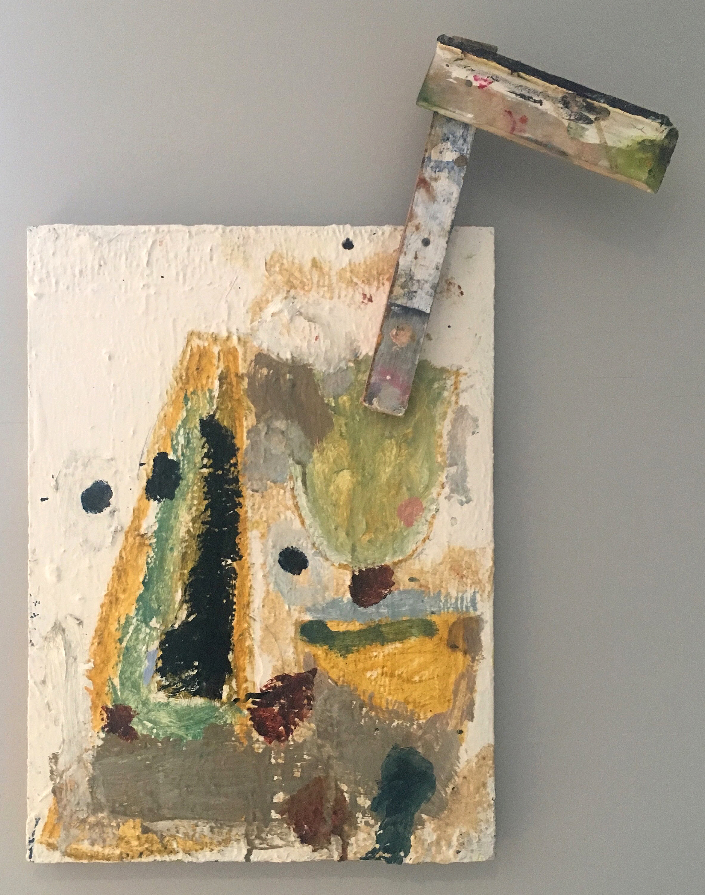
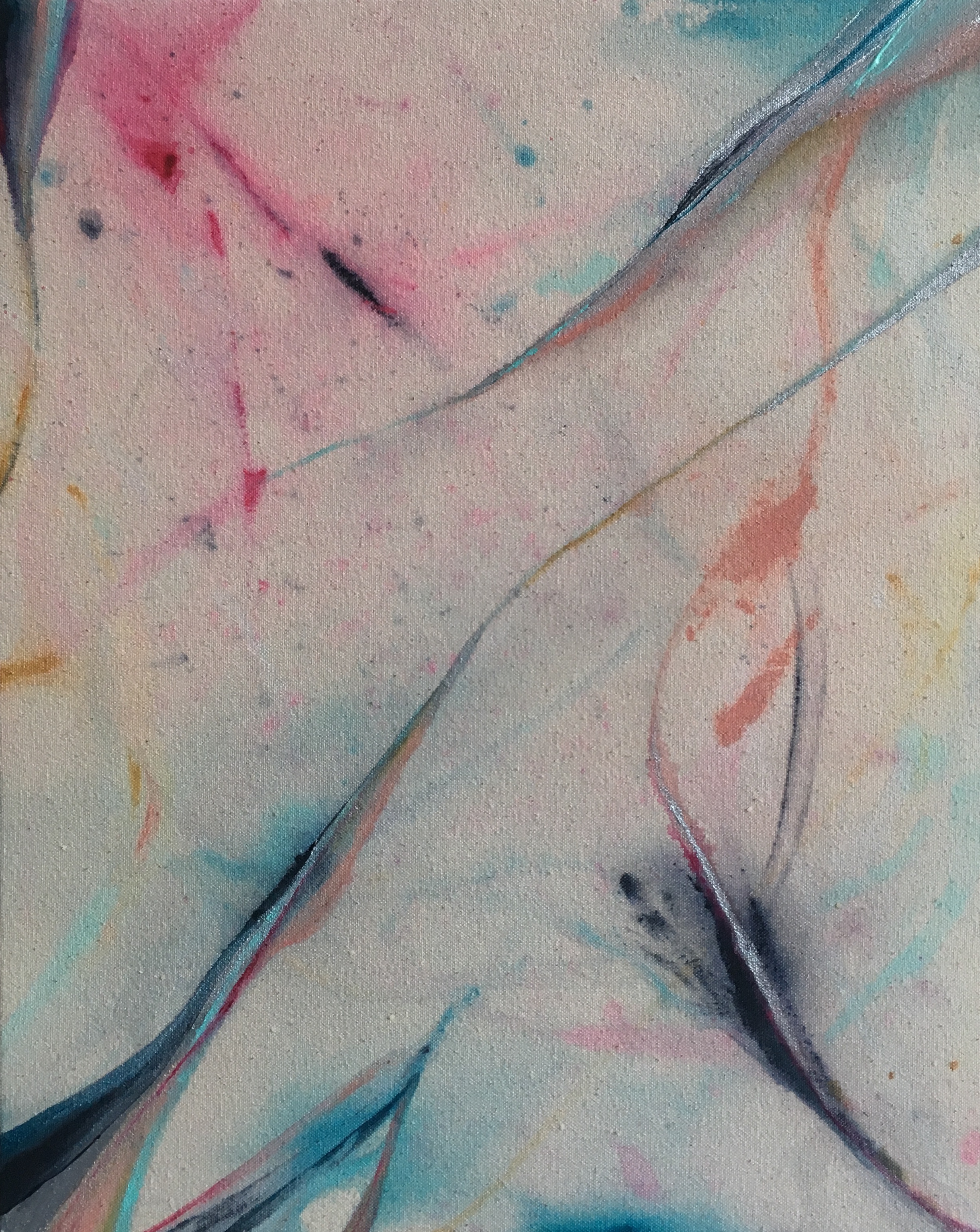
Should you view the works in sequence, from the implied start of the display you might turn immediately left on entering the Terrace space. Here, with some humour, Max Wade’s ‘Metronome’ appears to be throwing off what remains of a frame and a stretcher fragment, as a painted wooden limb gestures nonchalantly but pointedly towards EC’s ‘BOOM BACK’. This particular example from Wade’s studio has a sense of provisionality if you compare it with subsequent works made for his recent show at Sid Motion Gallery. ‘Metronome’ offers an impression of the unfinished, unrefined or abandoned, instigating a somewhat contained but punk-like sensibility that comes and goes throughout the show. Raw energy vies with measured and carefully nuanced processes, as each of the 19 paintings has to hold its own assured presence.
Almost immediately I found myself mentally rearranging the hang, not because of any inadequacy, but because the possibilities for new relationships are a feature of an intelligently selected body of works, constituting a multitude of new connections and associations. By suspending a typical, orderly walk through, a scan around the space soon picks up the mix of geometric, hard-edged abstraction intermingled with more gestural, spontaneous, painterly compositions. The sequencing mixes up similarities and contrasts alike, and the more overtly geometric examples from Katrina Blannin, David Webb and Shaan Syed have to hold their own within a strongly gestural demographic. From this changed vantage point one might decide to mix up the order of engagement by flitting purposefully from one wall to another – seeking initial security in a sense of order and immediate connection between similar attitudes in the works. But (viewer beware) first impressions must be challenged too, for the sense of an inherent provisionality of some works was initially perceived (though none were overworked) but it was eventually evident that, say, Katrina Blannin’s ‘Piero 5 (P)’, or Gabrielle Herzog’s ‘Untitled (Offbeat)’ were offering more than the sum of their parts.
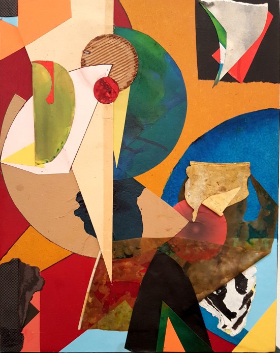
Another early reaction might be a desire to see more examples from any one particular exhibitor, depending on personal preference or familiarity with the various artists. In this instance I would have liked to have seen a larger example or two by John Bunker to break the monotony of a conventional, though efficient hang. (Although a solo show, ‘Faint Young Suns’ is opening at Unit 3 Projects space at ASC studios in November.) But on a more constructive note there is ample opportunity for experiencing the visual hit from all of the exhibits, including Bunker’s ‘Shady Hill Fugue’, which suggests a spatial constellation far beyond its 43.5x34cms. This busy and colourful composition takes collage (with its painted elements) on a physical as well as a visual journey almost as intensely as EC’s ‘BOOM BACK’ that might have been displayed alongside – but two boisterous children are best given space apart.
‘BOOM BACK’ is somewhat typical of EC’s oeuvre, although she typically takes it to the max from a visual engagement point of view where distribution and layering is always uncompromising. At 20x25cm this is one of the smaller works in the show (although nothing is particularly big) but the inner space is maximal and the eye can take an engaging and meandering staccato-esque, psychogeographic journey in a sequence of 90°, stop-start, urban perambulations in this painterly, collaged environment.

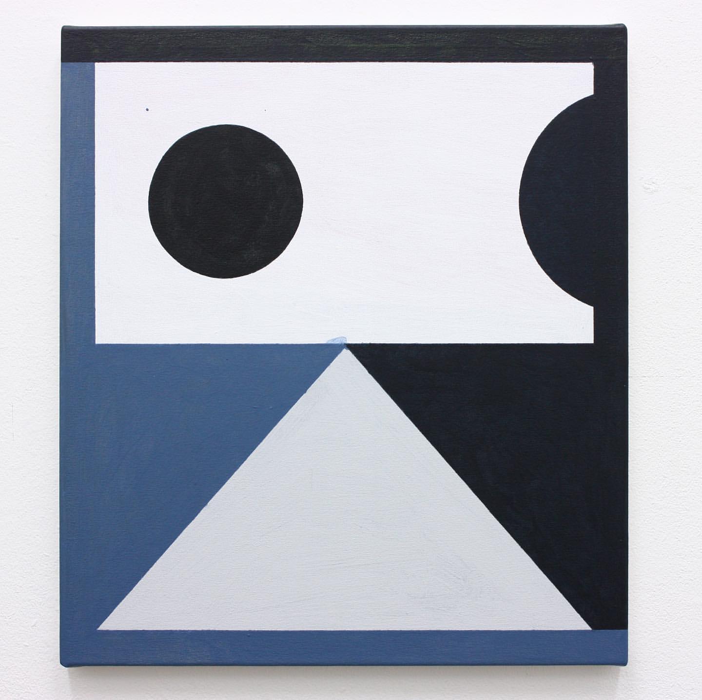
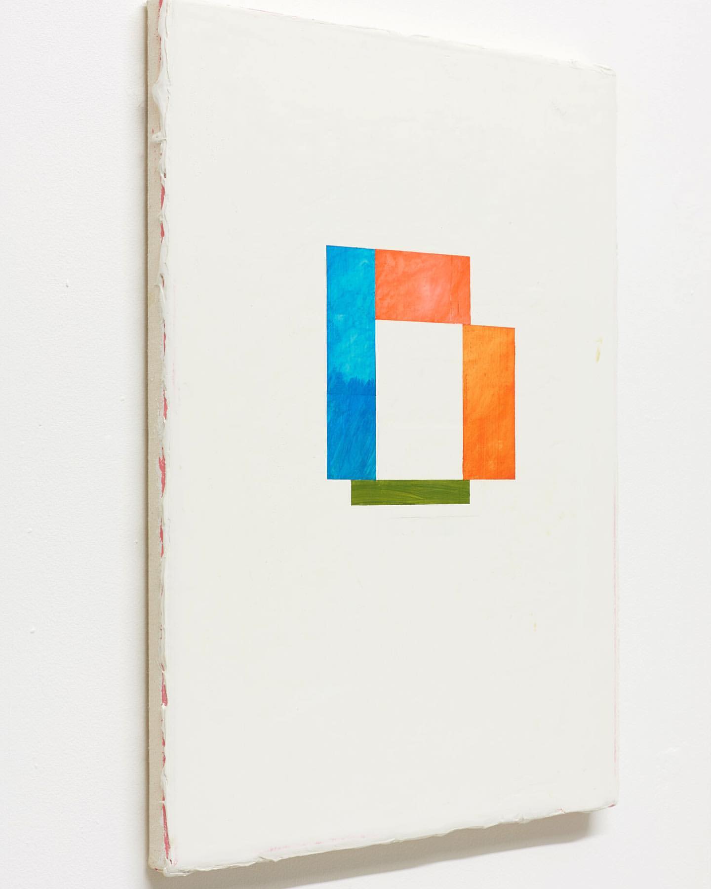
Blannin’s ‘Piero 5 (P)’ offers her usual impressive exactitude of application of medium and an immaculate geometric organisation of flat forms. As I studied this engaging work another viewer, visiting artist Will Stein, offered his observation that the image sinks rather satisfactorily into the patchy light and atmosphere of the space. It’s a feature of the installation of the whole show that the painted grey walls avoid the typical starkness of the white cube aesthetic and helps to integrate the works to provide some degree of consistency. This might partly explain why the neighbouring work by Karl Bielik lessens its contrasting juxtaposition with Blannin’s canvas. Bielik’s ‘Net’ might inadvertently be indicatively figurative as a stage-like scenario is occupied by two diamond-like forms that refer the observer back to the pairings of discs in ‘Piero 5 (P)’.
Bielik’s self-confessed unplanned approach to painting (as revealed in an interview for Abstract Critical in 2011) and his modus operandi of making paintings/images as a kind of performance, albeit on many canvases at one time, might be seen as a sort of magic act in which images are produced from a state of activity within the strict parameters of time spent exclusively in the studio. It’s certainly the case that the studio can be a lonely place where subjectivity can drown in introverted self-doubt or, conversely, emerge into the light from where, in a exhibition an audience can engage with the fruits of this curious labour. Indeed, the title of the show, ‘A Tapered Teardrop’ might constitute an unintended misnomer.

I asked Karl Bielik about the title and he explained that “the title is a collage of many thoughts and things going on, I’d been listening to ‘Trout Mask Replica’ by Captain Beefheart a lot at the time of coming up with a name for the show. ‘Tapered’ crept into my notes, so teardrop just sounded good and I view it like titling an album and it fitted. So some automatic writing, mixed with stuff going on, and that’s what got thrown up. Then after deciding on that as the title, the words began to take on a different meaning, kind of how we all somehow make our sadness fit and work for and against us – to like the sadness, a measured sadness, a tapered teardrop. I mean we are all painters, not the most functional creatures…”
Bielik’s comment reveals a shrewd understanding of the creative process. Whatever transpires in the studio, maybe the flipside to apparent “sadness” is a quiet and positive contemplation – Bielik’s “tapering”. The paradox of the (apparently) dysfunctional is that it can work in tandem with a dynamic creativity, especially for abstract art that is concretely and psychologically located ‘in the world’ of experience and honest endeavour.
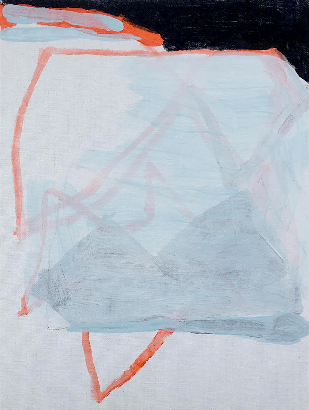
Also, I would posit that the external, social world often informs and seeps into works alongside the personal. For example, David Webb’s ‘Galata (Blue)’ is, on one level, a quiet and meditative affair depicting one flat white form on top another but is undoubtedly informed by his keen eye and relationship to places (including Galata – a village in Cyprus) as titles of so many of his other paintings often reveal. The human sense of balance, poise, lightness and weight, plus symmetrical and asymmetrical interrelationships between forms (geometric and organic), crucially relies on visual perception in his overall project. ‘Galata (Blue)’ possesses a 2D design aesthetic that nevertheless hints at the mass and three dimensionality of architecture. I was also fascinated by an easily missed small smudge of the blue acrylic paint that had thinly leaked from close to the apex of the triangular white base on to the rectangular shape above, as if to remind the observer that this is painting and not graphics. It also reminded me that all perception and thought is as sophisticated in simplicity of realisation as in sometimes necessary complexity.
Shaan Syed’s ‘Untitled’ also posses an architectonic and environmental, ‘built environment’ characteristic, despite an enclosed colour scheme of blue, green and sunset orange that hints of nature and landscape. Yet I have a feeling that I could be way off the mark here. The perfectly flat white surface that accounts for the majority of the composition’s frontal area is made from a filler of some sort and hides a primer or hidden background that is revealed almost surreptitiously around the edges.

A more overtly figurative element however is strongly suggested in Sharon Drew’s ‘Flip & Curl 6’, where a wide, flat brush has formed a curly breaking wave from the seashore. Set against an orange/red loosely striped backdrop the resulting image foregrounds a more independent, organic graphic that, in her own words evokes “the sensation of light, colour, rhythm and movement in the landscape…”

But associations with external subject matter are not always necessary or desirable. Kes Richardson’s ‘Uncletomcobley’ presents an essentially rectangular but jigsaw-like configuration, balancing a thinly applied, wobbly edged patchwork of colours. Figure-ground shifts create a shallow sense of space. The grid-like geometry is organic in nature rather than strictly formulated or measured out and it sits comfortably next to the Caterina Lewis and Mali Morris canvases. It would also be interesting to see this work next to Blannin’s ‘Piero 5 (P)’ as I find myself counting and comparing discs and squares from a ‘systems art’ perspective. On viewing ‘Piero 5 (P)’ for a second or third time I noticed the incredibly subtle tonal existence of grey on grey discs that reveal what is in effect a grid arrangement of 25 circular forms.
Johanna Melvin’s ‘Slipstream Dream’ straddles both camps of gestural and hard edge abstraction, as perhaps do EC’s and John Bunker’s hybrid collage/paintings. Though visually ‘busy’, the relationship between solid, flat forms (two bars of green and cream in this instance) and a deliberative and paced execution in the making seems apparent. If you know Melvin’s work already you will be aware that solid, flat shapes comingle within painterly arenas as forms shift between the positive and negative notions of space as visual experience.

The interstitial characteristics of space, the betweens as well as the withins, inherent in Melvin’s work makes an interesting juxtaposition with the overtly painterly and rich colours in Stephen Buckeridge’s, ‘The Bringing Together of what has been Parted’. But Buckeridge’s powerful and efficacious composition, which contains an element of collage and forms a challenging contrast with David Webb’s ‘Galata (Blue)’ which hangs alongside, suggests expansive proportions of territoriality despite the small size. The paintings are so different that neither interferes or segues into the other, yet each work has a similar characteristic of uncompromising boldness.
To varying degrees Nicky Hodge, Clare Price, Caterina Lewis, Sharon Drew and Mali Morris’ works add a luscious visuality that brings forms into more blended configurations. Hodge’s ‘Bereft’ is a restrained miniature colour field that might have been wrecked with the addition of another colour: it’s a brave decision. Likewise, Caterina Lewis holds back on the colour and knows how to not get carried away with overt enthusiasm for slapping on the paint.
Intriguingly, one of Lewis’ fellow exhibitors in ‘Stairway To Heaven: Abstraction Now’ (at Watson, Farley & Williams, presented by Coombs Contemporary until 18 October) Philip Allen, displays‘deepdrippings (hyper sensitive nose for the next new thing)’, just about the largest work in the show at 50x45cms. But the oil paint encrusted surface, tonally light and delicately coloured in pastel hues and frothily dense, is anything but slapped on. Despite the varied topography of the surface, the tactile nature of the work dominates visually, through the touch of the eye as if to conjoin senses. This sense of the bodily and the physical is also implicated in Clare Price’s, ‘This gossamer meniscus bomb’. On her Instagram feed the artist has described this as a “Fragile little painting”, which is revealing. A sense of a capricious, shifting and labile mode of thought and physicality appears to be directed by the work in a subtle use of acrylic that could be mistaken for watercolour.
Despite a diminutive 18x24cms, Mali Morris’ ‘Under and Over’ (the smallest work in the show) feels like it could be mural sized, possibly because three relatively large horizontal strokes of equally occluding, veiling and semi-transparent brushstrokes, set against three or four vertical gestures, dominate the ‘field’. In each corner of the composition almost similar green, crimson, orange and purple capsule-like markers lend an anti-clockwise sense of animation and a subtle kinetic force. An orange fingertip, to the right of the top centre edge, pins the image down.
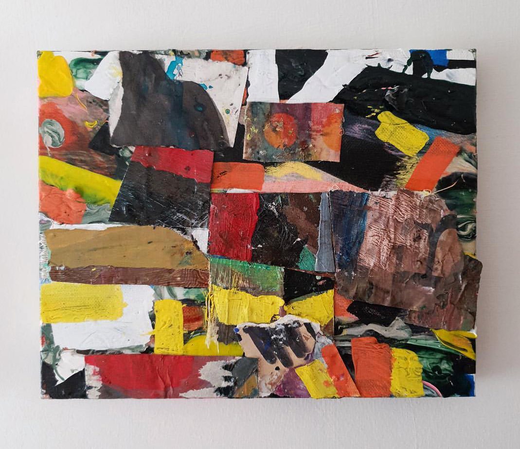
An apt grouping of canvases from Gabrielle Herzog, Henry Ward and Tony Antrobus emphasizes some similarities of a materialising structural integrity with a marked linear component, which suggests the potential of a future three-person show. It may be this drawing type component that gives these three canvases a sense of activity that has been stopped in its tracks. Herzog’s ‘Untitled (Offbeat)’ shares some affinity with Caterina Lewis’ reductive display of shorthand mark making that if it were a sound would be a whisper.
The slight heaviness of a black top edge to Herzog’s composition hints at the desire to fill the canvas that is often difficult to resist in making a painting, whilst the overpainted (formerly) black double triangle in the bottom half of the composition creates a counterpoint of deliberate negation to the black above. Despite its simplicity, the work increases in visuality the more time one gives it as a kind of ‘slow art’ component.
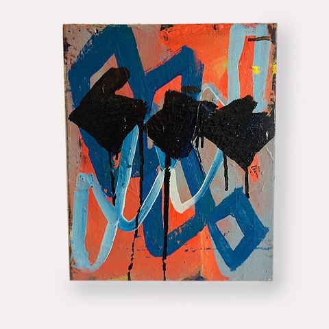
Ward’s ‘Weekend’ also has this element of unhidden overpainting, which contributes to a sense of drawn deliberation, which is particularly emphasized by a thicket of leggy stumps drawn with oil stick in the lower horizontal quarter of the composition. The colour range is closer to Mali Morris’ palette, which suggests yet another potential combination, although an edginess in the application of paint and pictorial character makes ‘Weekend’ a suitable partner for Tony Antrobus’ ‘Untitled’, wherein a loose repetition of three blacked out uncompromising lozenge-ish shields, that release tail-like drips down the bottom half of the canvas, provide an echo from Herzog’s less emphatic painting. Antrobus’ linear motifs dance almost (but not quite) frenziedly over a background that suggests a history of earlier decisions that refuse to disappear. As with everyone else, you just want to see more.
On another day I may have discussed these paintings in a very different order and made alternative connections of familiarity or contrast between them. If you can visit for yourself, more the better, for after such commitment in the studio the works deserve to be seen, enjoyed and debated. Like the football fans back in the bar, we observe with our own biased point of view, where objectivity is always compromised by personal preference as we tell our tales of what happened that night.
Links:
Venue: http://williamthefourth.co.uk
Exhibitors in order of display:
Max Wade https://maxwade.co.uk/
EC https://untitledpainting.wordpress.com
Stephen Buckeridge https://stephenbuckeridge.com
David Webb http://www.davidwebbpaintings.co.uk
Phillip Allen http://www.phillipallenartist.com
Nicky Hodge https://www.nickyhodge.com/index.html
Katrina Blannin http://www.katrinablannin.com/index.php
Karl Bielik http://www.karlbielik.com
Abstract Critical interview https://vimeo.com/24881576
Gabriele Herzog https://www.gabrieleherzog.eu/work
Henry Ward http://www.henryhward.com/paintings-2/
Tony Antrobus https://tonyantrobus.com/recent-paintings/
Clare Price http://www.clareprice.com/#home
John Bunker https://patternsthatconnext.wordpress.com/tag/john-bunker/
Kes Richardson http://www.kesrichardson.com
Caterina Lewis http://caterinalewis.com
Mali Morris http://www.malimorris.co.uk/index.html
Shaan Syed http://shaansyed.com/2018-2/
Johanna Melvin http://www.johannamelvin-art.com
Sharon Drew https://www.sharondrew.com
All images © of the artist

One thought on “A TAPERED TEARDROP AT TERRACE GALLERY”