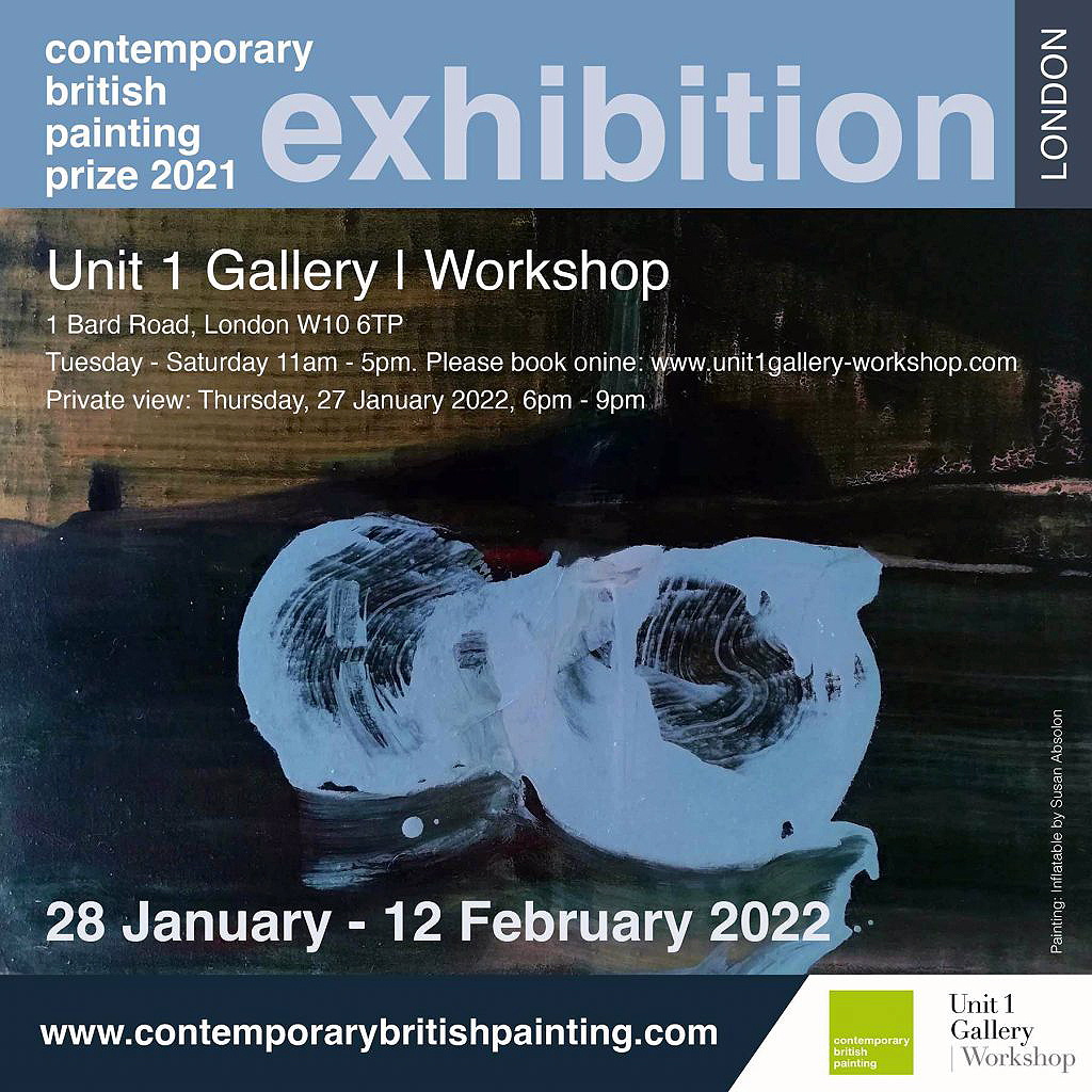
Exhibition poster with ‘Inflatable’ 2021 by Susan Absolon
“The stated aim of Contemporary British Painting is to explore and promote current painting. The subtext to this is giving voice back to the artist, the originator and source of painting. The real discourse around current painting is generated painter to painter and emanates from the studio and not from the boardrooms of institutions, directors’ offices, lecture halls or galleries. This prize is artists submitting themselves to consideration and selection by their peers.” (Simon Carter, co-founder CBP)
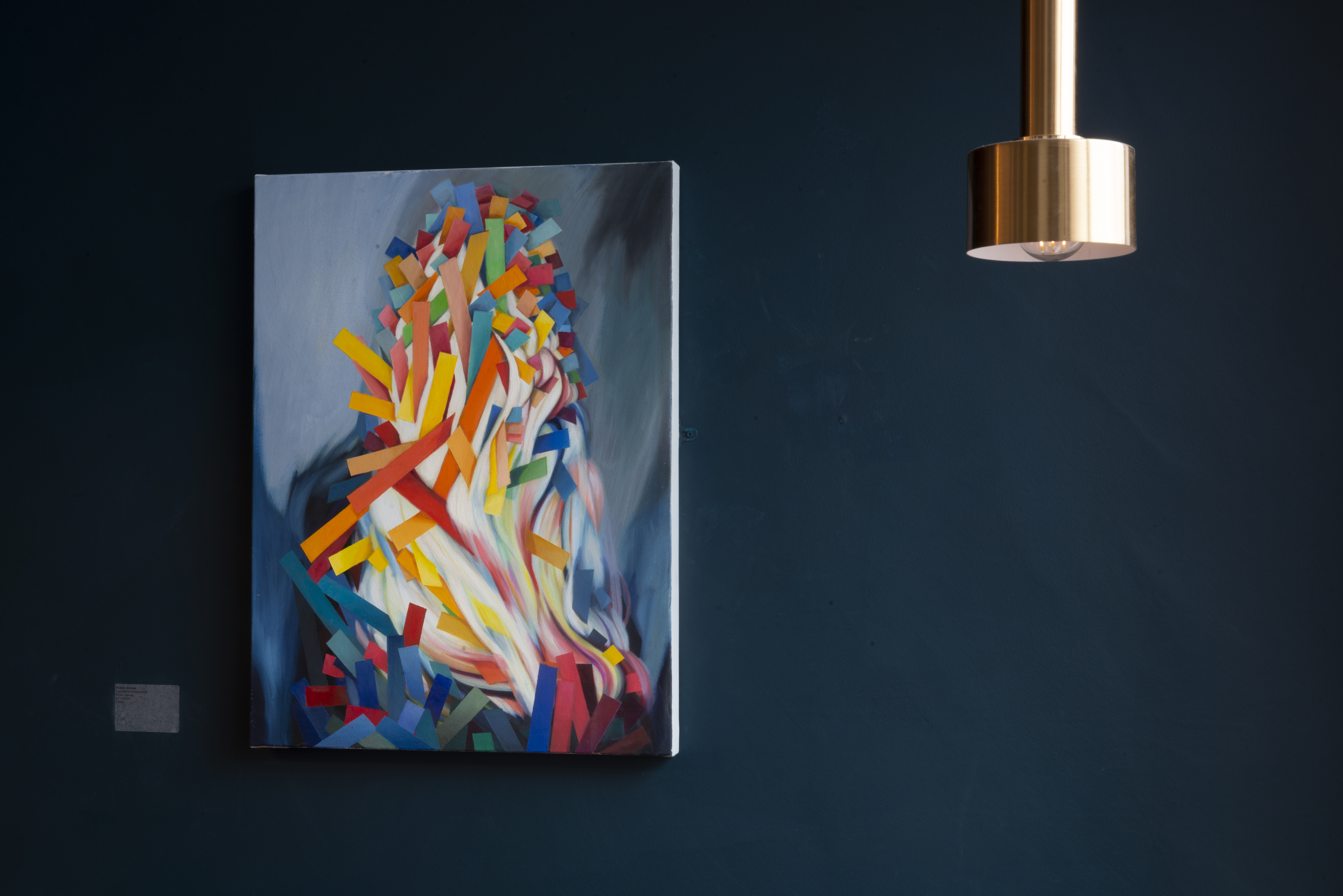
Tony Antrobus – ‘Narcissistic Wounds’ 2021 oil on board
A woman and her partner are standing in front of ‘A Farmhouse near the Water’s Edge (‘On the Stour’)’ by John Constable. “Does he ask questions?” she reactively inquires. I think it’s a rhetorical question. It’s certainly a gift of a question and I now wonder, was the painting asking questions about subject matter; perception; time; self; the painting process or the fiction of imagery and invented composition? Constable also appears to have gouged his palette knife into the surface of the oil painting and it is an unsettling image. I doubt that the subject matter is merely a farmhouse or a landscape. Paintings have so much to offer and so much potential for interpretation, with endless ground to cover. It’s no wonder they continue to intrigue viewer and maker alike.
What happened (is still happening) within the history of painting? Thousands of years on from the cave painting phenomenon, as Matthew Burrows would remind his audience at the opening of the London leg of the Contemporary British Painting Prize, current practice might point to the fact that many artists believe that the journey continues because painting is so inexhaustible and adaptable. Selected survey shows such as this point to the fact that the painting continuum trundles on, regardless of other media, technologies and contexts that artists employ to make certain points or simply investigate as life choices. But the CBP prize acts as both a celebration of, and a manifesto of sorts, exclusively for painting. The mission statement is, perhaps, understated, as there is no one predominant style, genre or parameter for painting being proclaimed – although an exploration and promotion of current trends in British painting, especially from the community of the painters rather than the gatekeepers, is paramount.
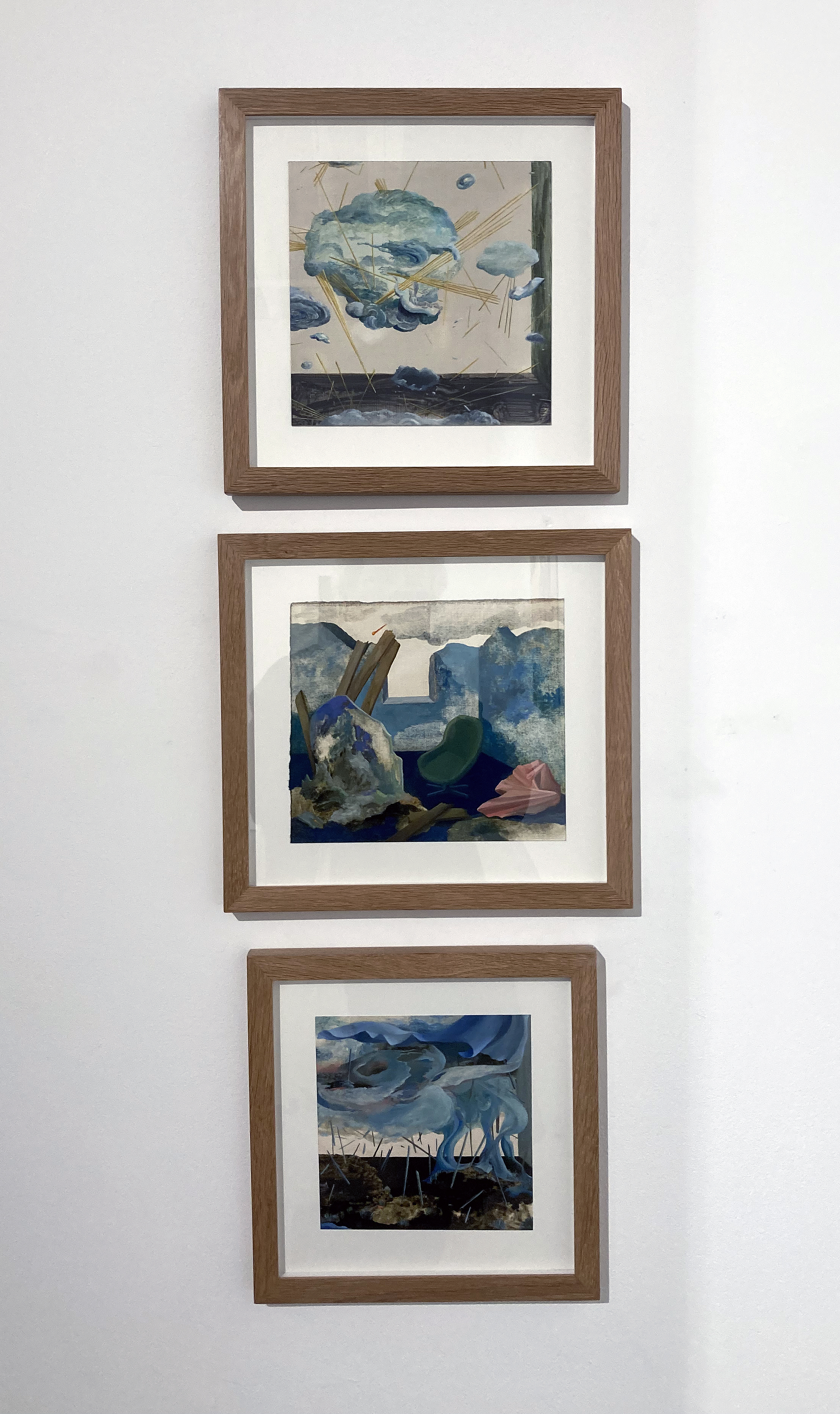
Martyna Lebryk – ‘Sirens’ and ‘Three riders of my fate’ (each 2021, oil and oil pastel on paper)
Before arriving for the Contemporary British Painting Prize 2021 – which consists of a selection of 15 artists’ work made by Unit 1 Director Stacie McCormick who had visited the prize show at Huddersfield Art Gallery a few weeks back – I had finally got around to jumping on a train, adorned with a facemask, to see a few London shows. The exhibition batteries had been running low, so the CBP show was ideal to touch base with some contemporary works and to see a few friendly faces. Beforehand, experiencing the Late Constable exhibition at the RA was bound to impress and, so too, was the Georges Braque show, The Poetry of Things, at the Bernard Jacobson Gallery that had fortuitously been extended to this very day. Both prestigious exhibitions might have overshadowed seeing anything else that day but it is always necessary, I believe, to put status aside when viewing the works of contemporary painters, otherwise there is a danger of being disrespectful to the endeavours of such an extraordinary community.
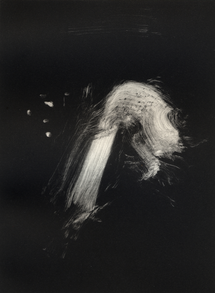
Sarah Poots – ‘Temporary Sculptures’ 2021 oil on canvas
The Unit 1 space had allowed for a selection of 27 works, including a small triptych set, depicting ‘Temporary Sculptures’ by Sarah Poots, without either being jam-packed or leaving acres of wall space empty. Arriving before the many visitors for the opening there was ample room to step back or to go in closer, particularly for the smaller and finely rendered paintings by Daisy Richardson. None of the paintings were inappropriately combined, which was testament to the careful hanging decisions. Some works were obvious to display together if by the same artist, such as Martyna Lebryk’s pair of drawing-type paintings on paper; Bill Stewart’s two commanding canvases and Jesse Leroy-Smith’s three compelling portraits. Other exhibitors had their respective works such as Gary Spratt, Tom Robinson, Zack Thorne and Donna Mclean interspersed with others, which enabled an overall cohesiveness to the selection and hang that clearly attempted to celebrate every participant rather than any one in particular. So, even the winner of the 2021 Prize, Susan Absolon, had her three works split into a small pair and one relatively large work, ‘Dugout’ intriguingly placed between Zac Thorne’s ‘The End Part XI’, a tight figurative work and Tom Robinson’s ‘Telmah’, one of the most painterly and abstract in the show. More object-oriented works came from Christina Niederberger (with a strong mimetic textile vibe) and Roland Hicks (constructivist, non-objective, found object become painting), whilst Tony Antrobus, Jan Valik, and Highly Commended Award winner Hannah Murgatroyd (with just about the largest canvas – ‘Night Mapping’ at 130x150cm on show), had just one canvas selected each, which perhaps left one wanting more.
Installation at Unit 1 with Thorne, Absolon and Robinson paintings
Hannah Murgatroyd – ‘Night Mapping’ 2021 oil on canvas and Jesse Leroy-Smith – ‘Father Figure’,‘Blowback’ and ‘Creator – Tricky’ (each 2021 oil on panel)
Picking out any one or two participants as favourites seems unfair in the context of this exhibition, though inevitably one will gravitate towards preferred visual languages or subject matter (though as an abstract painter I found myself gravitating towards Mclean’s ‘Cloud’ and Leroy-Smith’s portraits throughout the evening – yet still felt compelled to sneak of with Antrobus’ ‘Narcissistic Wounds’ that took a while to grow on me). The recommended approach to ingesting the show is to enjoy and be intrigued by this celebration of British painting. There is no overriding theme. Search for a subject if you wish, but do not establish a territory of preference. If works are resolved still see painting, generally, in a state of becoming and development, not only for the individual artists, but also for painting as an ongoing project.
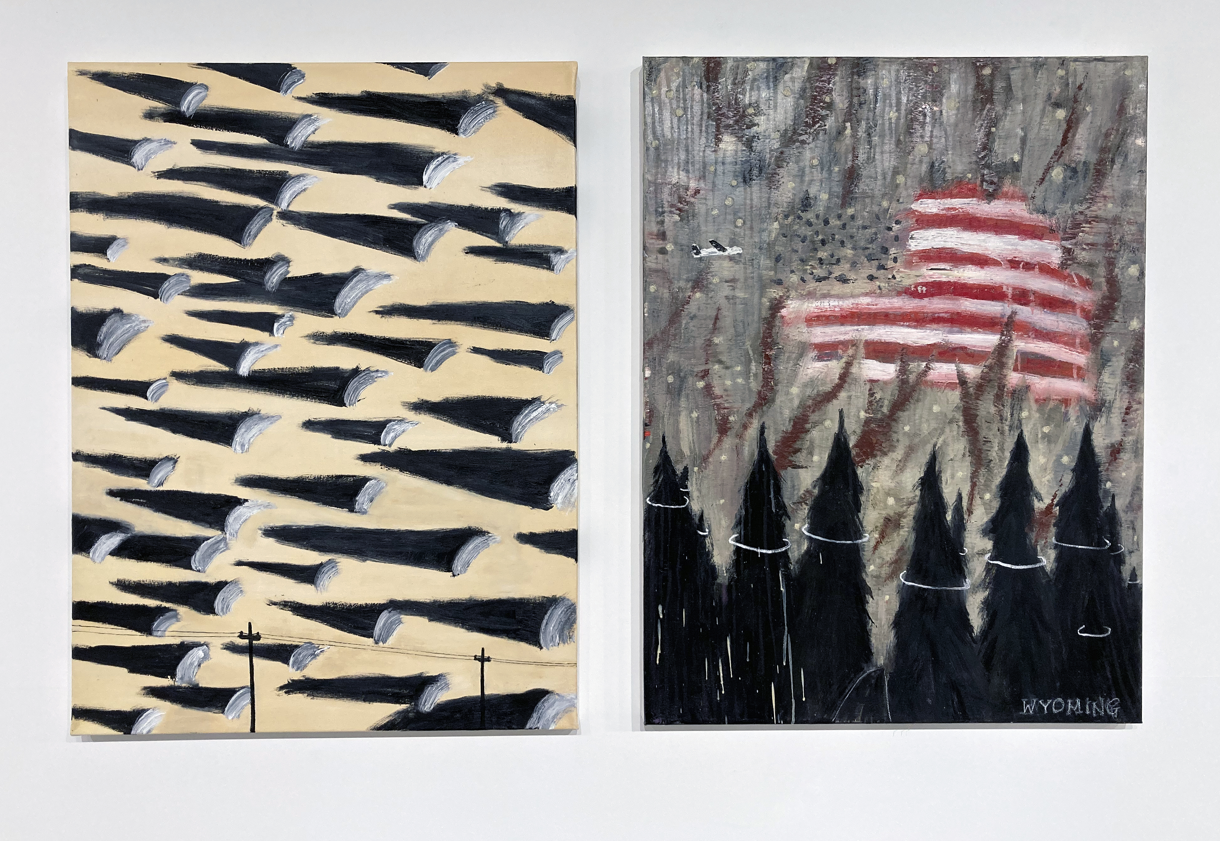
Bill Stewart – ‘Oklahoma’ and ‘TheDancingTreesOfYellowstoneAnthemStandingVibrationWyoming’ (both 2021, oil on canvas)
The catalogue for the aforementioned Braque show added poignancy to the day as it contains what I believe to be art historian, Mel Gooding’s final essay. In the last paragraph he writes of Braque’s nature morte paintings:
“They are real, indeed, but their actuality is within the painting. They give the mind a reality to contemplate, one that doesn’t and couldn’t exist elsewhere: only here…”
If there are relevant contemporary narratives in British painting emerging post-Brexit they seem to be about time and place; history and self; inside and outside. But it is still too early to see, I suspect. There has to be an argument for painting though, best developed from the studios of the dedicated practitioners who live in every town and community on this tiny little island. The selected work supports this cause for we are all on the same side, even if we disagree or appear to live in different realities sometimes.
Jan Valik – ‘It’s About Time’ 2021 oil on linen
Gary Spratt – ‘Odd Legs’ 2021 oil on canvas
Donna Mclean – ‘Sarah Lund’ 2019-20 oil on canvas
Christina Niederberger – ‘Revue (after de Kooning)’ 2018 oil on canvas
Zack Thorne – ‘The End Part IV’ 2020 oil on canvas
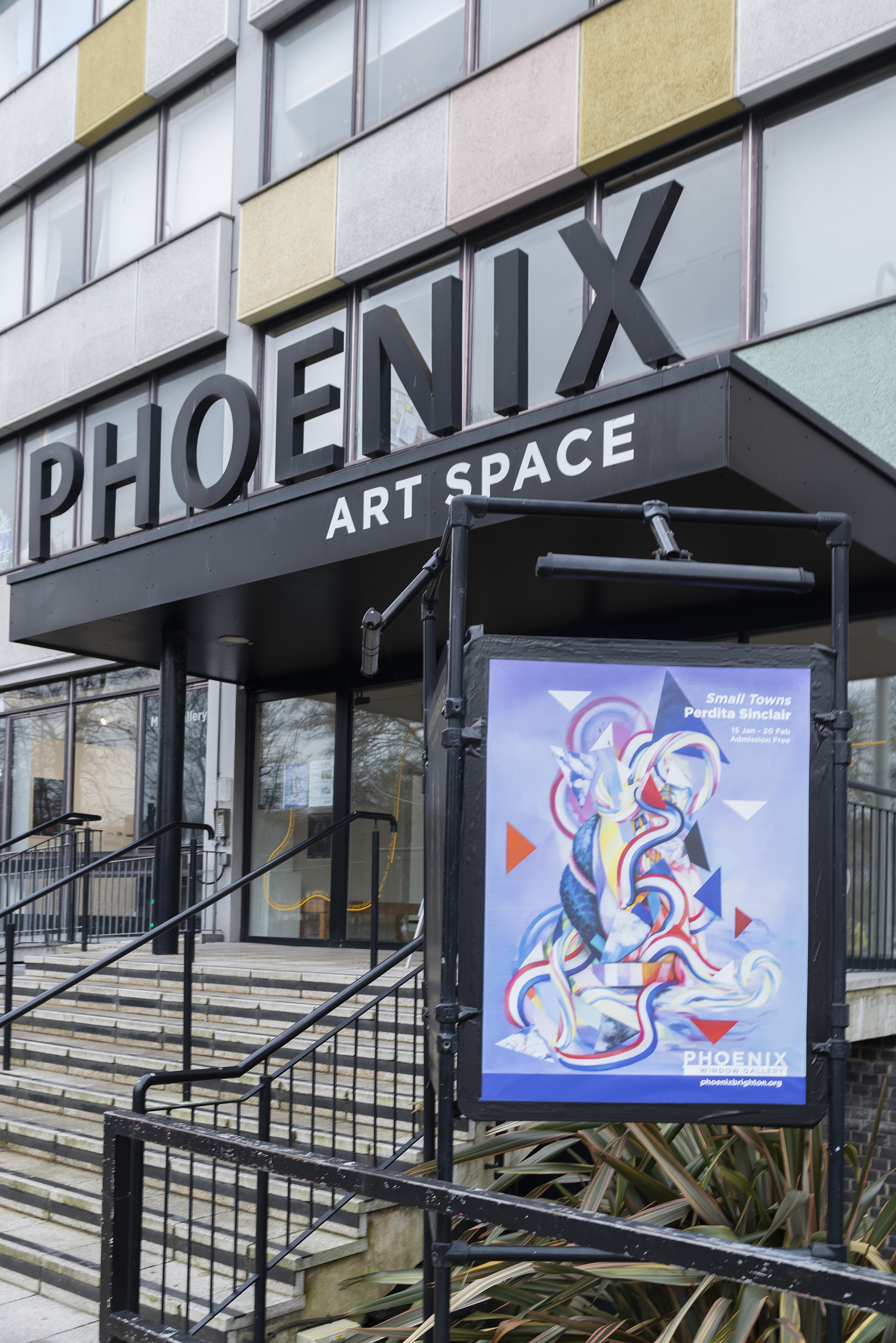
Phoenix Art Space entrance (Photo: Bernard G Mills)
Visitors will surely be intrigued by the spectacle of the colourful, carefully and skilfully painted oil paintings that join together under the title of Small Towns, an exhibition from Phoenix Art Space member, Perdita Sinclair. Usefully there are chairs spaced along the broad corridor that encourage people to sit and take stock too. Paintings (especially good ones) deserve prolonged attention rather than the perfunctory or passing glance.
A sequence of eight canvases begins with ‘Pineapple’, which at 165x125cm is the largest work on display. The title is suggestive rather than descriptive as it could just as well allude to a portrait as much as an exotic fruit. But more about titles and interpretations later, for what we do see before us is a figurative painting of a mound of litmus-test-type strips of variously coloured papers. Or are these tickertape off-cuts from the studio floor? They look like discarded fragments purposely gathered together and fashioned into something specific but just out of reach of a clear identity. Also, it’s an inventory of sorts, as if a student painting class has completed a day of mixing colours and these are the results, a fairly comprehensive range of all six primary and secondary colours plus black and white. As an extension to the task of mixing the paints perhaps a still-life has been produced wherein the painted shadows form greys and other tonal varieties of the colours. There are some striped pieces too, including red and white that might be paper bags from a sweet shop. As interpretation creeps into observation of the image one might sense that the coloured papers are hiding something. It might be a pineapple, as the title implies, or a vertically held up thumb or even a portrait of sorts. Is the title a trick? Is our humour being tested? Has the artist literally set something up for the viewer to interpret as they wish?
Perdita Sinclair – ‘Pineapple’ (165x125cm) oil on canvas
Seven more paintings are to follow and questions persist. Each is clearly an original statement but all link somehow. Colour pervades, as does clarity of form and skilful rendering. Are these portraits or still-lifes? Do the generally blue/grey backgrounds suggest skies, distances, neutral space? Are these singular forms still or floating in space? There is no clear external context in the paintings; all content is essentially contained within the implied forms. But let’s not forget the artist and/or the viewer. Could these be self-portraits or mirrors – or both?
Perdita Sinclair – ‘One In Hundreds and Thousands’ (80x60cm) oil on canvas
If the viewer takes in the whole sequence from left to right there is some suggestion of a progression, or morphing, from a still-life type configuration to a portrait of sorts. After ‘Pineapple’, ‘One in a Hundreds and Thousands‘ appears to be a form floating in a sky-coloured atmospheric space. Within and around what might be locks of long flowing hair there are triangles of painted papers or thin card. Some of these fragments are painterly wet into wet renderings that could reference landscape based fragments or abstract compositions. The striped papers are here too. There is a sense of the organic and the geometric making some kind of union. Next, in ‘Along the Coast from Yarmouth’ a similar sort of composite form has come back to earth, or rather an ethereal sea with reflections or submerged forms.
Perdita Sinclair – ‘Along The Coast from Yarmouth’ (80x60cm) oil on canvas
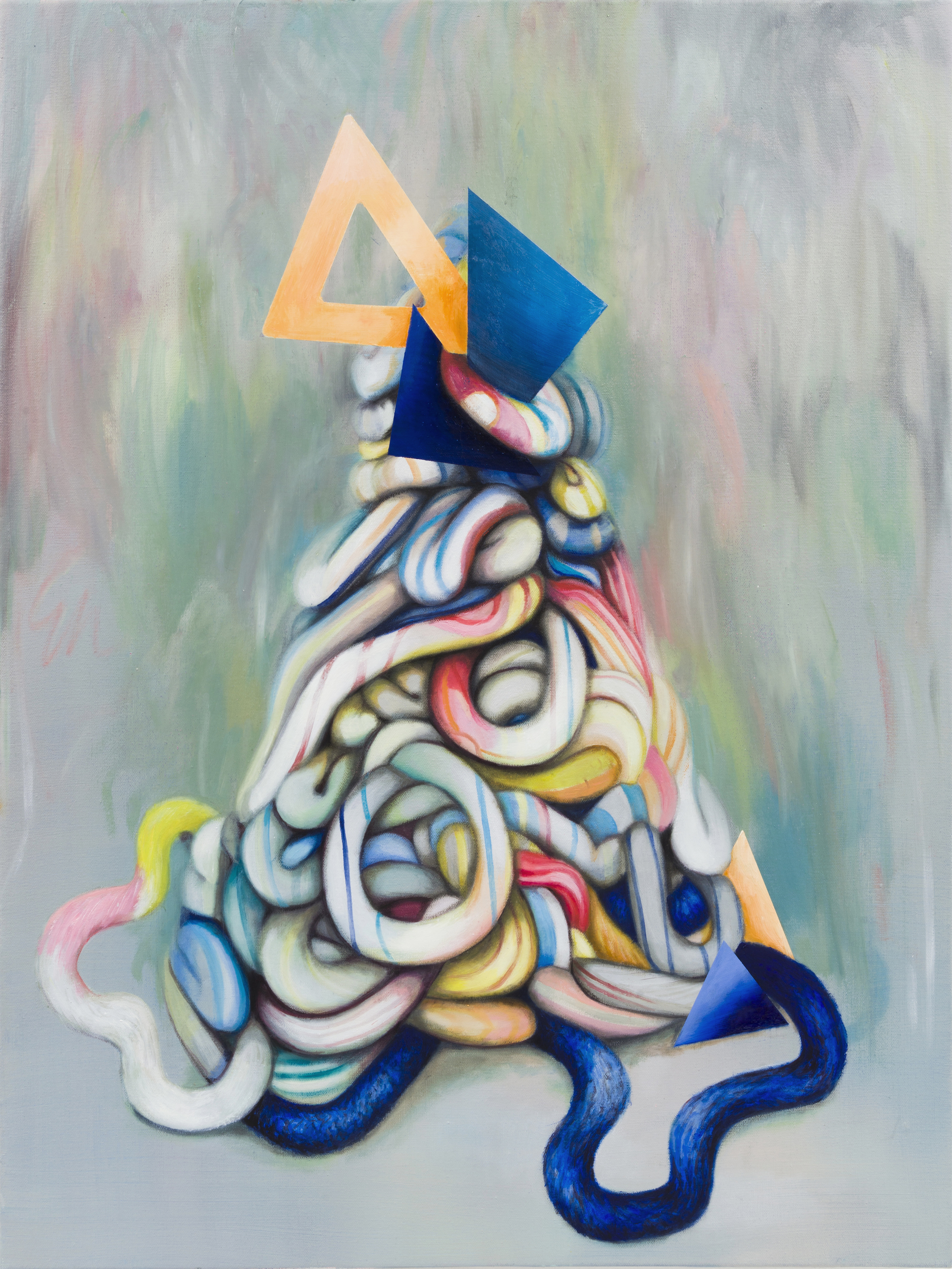
A mixture of flat triangular forms, mostly airborne, and flat on the picture plane slightly undermines a traditional perspectival reading. Predominantly there is a shallow or tightly enclosed space created from the spatial arrangement of the entangled forms in the foreground. A snaking red, blue, yellow and white candy stick at the apex of the arrangement meanders down to, or up from, the base. It is also partly submerged. Likewise, the tricolour ribbon also winds its way from the bottom of the composition to the apex. An echo or reflexion of the red, white and blue form is placed behind this mysterious configuration to suggest some depth and a flattening simultaneously. Solidly rendered, yet flat triangles (X7 white, X5 red, X2 blue and X1 black – for it seems pertinent to count them) float around or penetrate the central mass/form. Unexpectedly, centre-left, a curvaceous form that might be fish or snake skin, or possibly a hand-dyed scarf on a slender shoulder, links top to bottom or head to torso.
‘Inbetween Castles’ is more grounded, and candy-type tubes employing the colours from the paper stripes from ‘Pineapple’ replace the vertical, elongated form of the hair. A flat triangle of colour at the apex of the form is possibly turning into a set-square. Read this more organically and the soft sticks of seaside rock might otherwise suggest intestines. It’s uncanny – by which I mean weird. But not grotesque or creepy weird; more like playful everyday, ordinary, artefacts being open to interpretation and association in the eye of the beholder.
Perdita Sinclair – ‘Inbetween Castles’ (80x60cm) oil on canvas
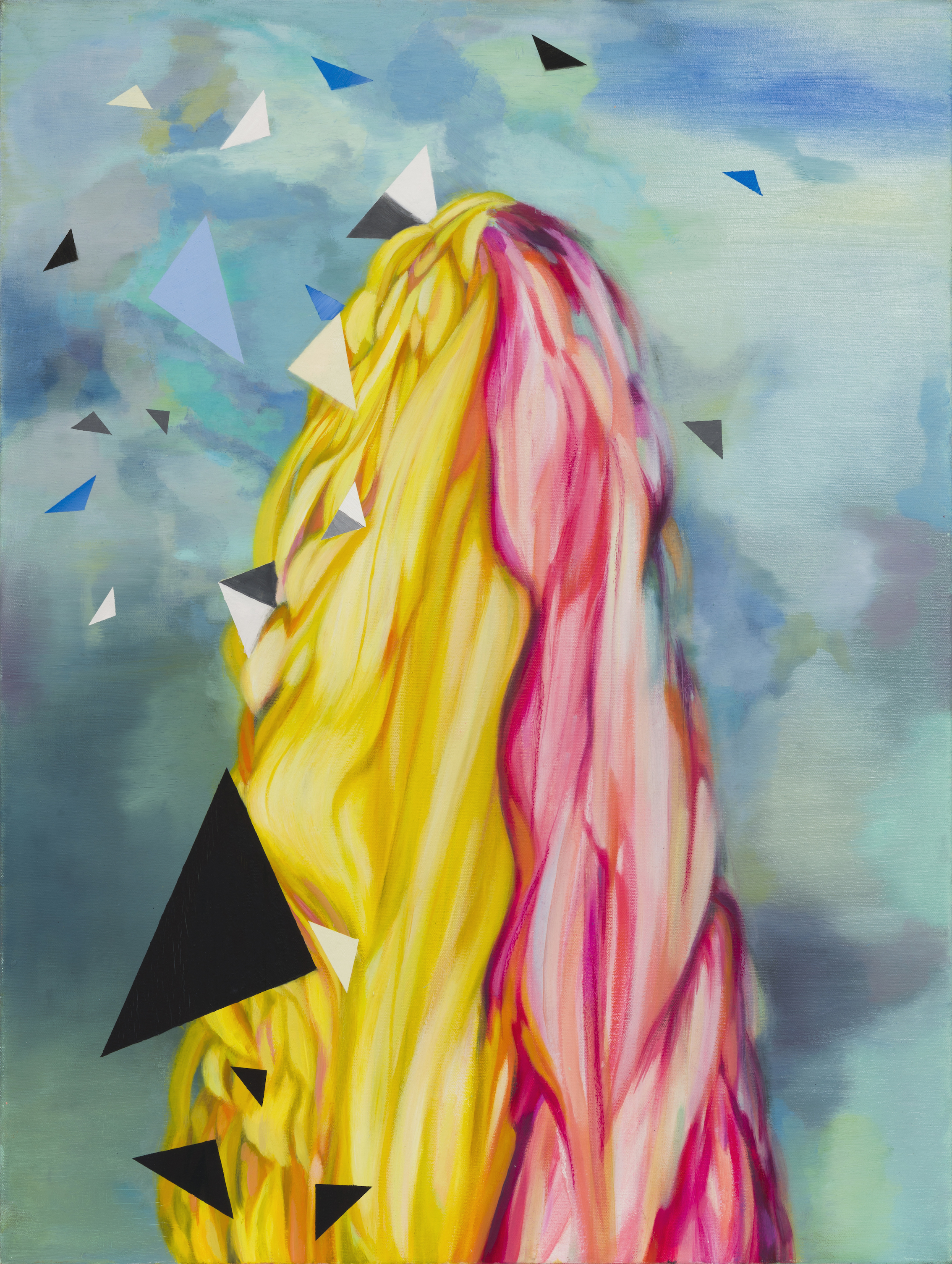
‘Lickerty Split’, the penultimate image in the sequence certainly does look like a glorious head of long hair. The title suggests doing something quickly, though clearly not the making of the painting. Take a look at Sinclair’s website and you will see that this painting, along with ‘Baskin in Obliquity’ displayed next to it, belongs to her Wave Theory series. Sinclair’s painting titles are fascinating. There is a mixture of deadpan humour and scientific awareness – as provided by this pairing. Natural forces are at work. The small town reference starts to make some kind of sense. Whether we live in a village, town or city we belong to relatively small communities after all.
Perdita Sinclair – ‘Lickerty Split’ (80x60cm) oil on canvas
This selection from Sinclair’s various series of painting themes and projects (she has also produced sculpture and installation events) not only provides evidence of her undoubted commitment to painting but also prompts an intriguing meditation and reflection on what we think and feel about ourselves and our immediate familial situations and the world around us. A brief explanatory wall mounted statement adjacent to ‘Pineapple’, primes and sets up an opportunity for the viewer to see where the imagery might take their expanded thoughts:
My work reflects what I perceive as the dichotomy between the way the human mind confronts complex and serious issues and, at the same time, deals with the trivial ephemera of our everyday lives. I am interested in contradictions and tensions in human nature, which often express themselves through our interaction with the natural world.
Small Towns is an exploration of life cycles within confined spaces. The work is inspired by the geographical restraints that we have lived with which paradoxically turbo charge the mind into thinking about distance, difference and alternate realities. (Perdita Sinclair)
Thereafter the viewer is surely connected with each work beyond the immediate visual impact of the intriguingly titled pictures. As much as we might long for the day that we can forget about the ongoing pandemic that has restricted us physically and geographically, an unexpected benefit might be that we start to appreciate and more fully understand our truly global ecosystem that relies on cooperation rather than unabated competition and nationalistic introspection. Or at the very least, we might take what is near as a fascinating take off point for the imagination. For Sinclair it might be the trivial bits and pieces that one’s children might play with vis-à-vis the bigger issues that concern us.. This is an interpretation of superposition (another of her series of paintings) in which something (or a system) can be in multiple states at the same time until it is measured. It’s certainly the case that if we take the suggestion of the portrait from these paintings we must ultimately place the notion of self or identity within an environment, which can be either physical or metaphysical… but perhaps this is a step too far.
Perdita Sinclair – ‘The Infinite Gobstopper’ (80x60cm) (Photo: Bernard G Mills)
Returning to Sinclair’s work, she does not break with tradition to assert contemporary relevance and context. Despite alternative practices and technologies, painting has much more to say or remind the audience of. At a simple level, subject matter generally splits into and expands the categories of the portrait, still-life or landscape – with, arguably, the addition of abstract art. At a more nuanced and deeper level paintings perform (even when undermining or questioning) within conventions of visual culture, including iconography, aesthetics and culturally shared systems of visual language. Of course, within and beyond the visual arts painting also has to contend with ever developing technologies, particularly since the invention of photography and, far more recently, digital systems and the financially speculative advent of the NFT. But painting persists and potentially slows us down, in a useful self-reflective way.
Walking home from the exhibition, in my own small town, I unexpectedly thought of the work of the 16th century Milanese painter Giuseppe Arcimboldo, a Mannerist artist, who created portraits from a piling up of natural forms, especially flora, vegetables and fruits. The ‘Arcimboldo palindrome’ may also be suggested, whereby the apparent reading of a work is changed, not by turning the canvas through 90 or 180 degrees as the artist ingeniously invented, but by alternative conceptual readings and understandings of an imaginative invention, or inventory, as presented by Sinclair’s work. Intriguing, indeed.
Perdita Sinclair – ‘Baskin in Obliquity’ and ‘Lickerty Split’ (Photo: Bernard G Mills)
What is it that makes a painting exhibition so memorable? It could be the whole collection of works or just one item in particular. This show at the Phoenix Art Space Window Gallery offers so many possibilities for that first ‘visual hit’.
A viewer might be struck by the strong and forceful imagery wherein the subjects stare relentlessly back at the hapless viewer, or by the acute feminist rhetoric that challenges the ‘male gaze’. In more formalist terms the audience could be impressed by the sheer abundance of colour that, though so varied a palette is employed, the ability to place one colour beside another in contrast or harmony reveals visual decisions that are not diverted by narrative content. Coaxed in by the colour and/or the subject matter, by getting up close to the painterly surfaces the confident paint handling keeps the imagery in check and tempers sheer expression that could otherwise overpower the project’s central message of female empowerment within a patriarchal society.
The notion of the viewer, as an individual or gender based, is particularly interesting in the context of seeing a one-person show. We might attend an exhibition to see the work of a specific artist, whatever the various potentials for subject matter may also present. In this instance the show’s title, ‘I’m Like Other Girls’ could draw attention to the artist herself or to notional characters, real or imagined, who are presented in the imagery. But, as well as these personalised references and dramatis personae, the viewer’s gaze is brought to the fore too.
This viewer/writer can only, really, react and write from his (my) own perspective and knowledge base of course, even if objectivity is genuinely sought. So I found myself scribbling down a few words and phrases as I pondered the possibilities of reviewing the exhibition. Negatives were recorded first: Don’t like. Not my thing. Unsettling. Unnerving. Daring. Shocking. Uncomfortable.
Then the notations became more conciliatory: Look at the paint handling. Clear decisions made. What does the paint do? The colour too. Confronted by the image and the colour/materiality of the medium. Narrative?
I suspect that at least one of Malcomson’s objectives had been confirmed by my initial reaction, particularly as a male viewer. From a statement on the University of Brighton blog at the time of graduation she wrote:
“I don’t want my paintings to be ‘nice’. I want them to hurt. I am testing the boundaries of taste. I am playing with the contradiction of attraction and repulsion. The figures in the paintings are strong, powerful, larger than life, not delicate, fragile or ‘nice’. They are not the way the male gaze has often portrayed women in art history. Throughout this history, women have been painted as passive objects.“
What will be memorable to me about this exhibition, in addition to confirming the relevance, and therefore the role of the viewer, is that Malcomson’s work does not reside in that compromising area where the ideas are stronger and more engaging than the physical outcomes – a phenomenon that is not unusual in ‘emerging artists’ work (and maybe a few established artists too) – but for the great skill and maturity displayed in the painting at such an early stage of her career.
Note:
‘I’m Like Other Girls’ is a celebratory event after being awarded the CASS Art/ Phoenix Art Space Studio Award for 2020/21. Since graduation this is Malcomson’s second solo show (the first, entitled ‘Sisters, Sisters, Sisters’ was held at New Art Projects, London in June of this year).
Jonathan McCree, Bruce Ingram, Jonathan Goddard and Joe Walking
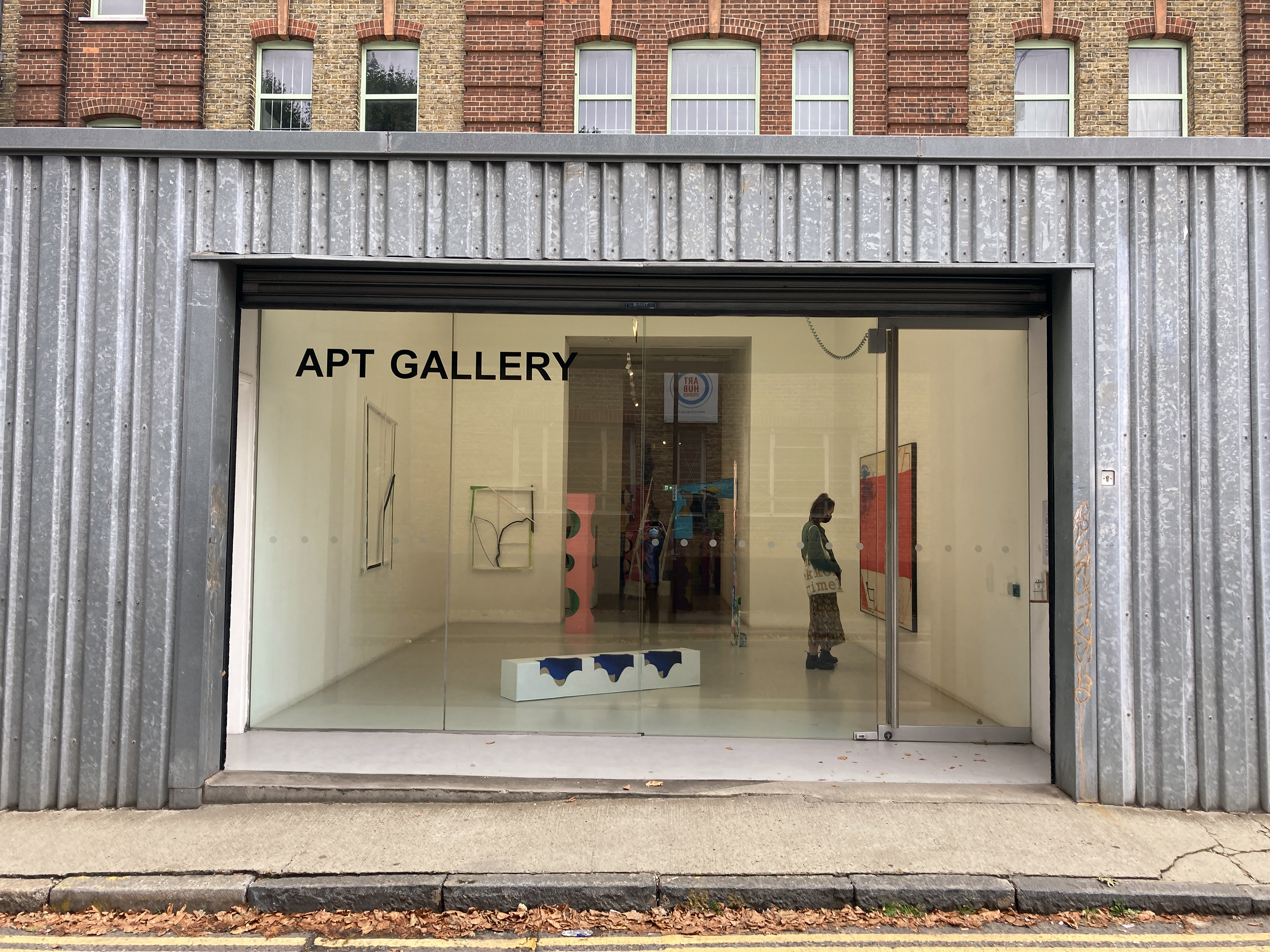
APT Gallery, Deptford
2 – 12 September 2021
APT Gallery
It was Thursday 9th September and Up For Grabs had been open for a week. A performance had already taken place some days before and the Private View was tomorrow. This was a two-week exhibition of painting, dance, sculpture and film. I had missed the dance and the film too, but a projector was being installed to show a video of the performance, but I couldn’t stay too long as I had a timed entrance ticket for something of apparent importance at the Royal Academy. So this would have to do, and thank goodness, it was probably the best part of the day. *
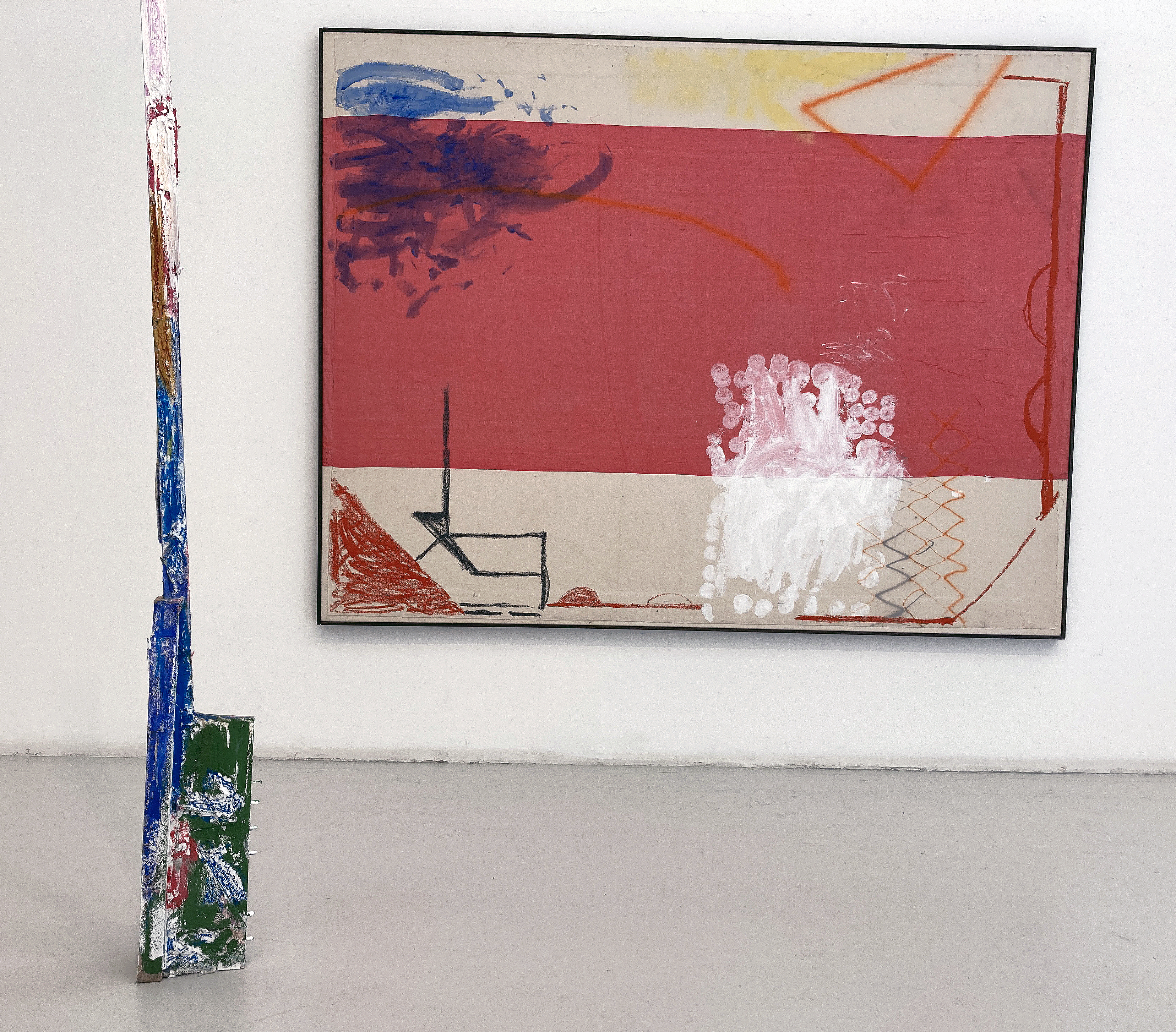
Bruce Ingram and Jonathan McCree
The front space was conventionally organised for an exhibition of sculpture and painting and Bruce Ingram and Jonathan McCree had three works each on display. By conventional I mean some works were placed on the wall at a comfortable viewing height and three more pieces were arranged on the floor with ample room to walk around. There was a balance. They were, it appeared, ‘finished pieces’ and ‘final’ as we expect artworks in exhibitions to be. As a first impression there was surely something going on about construction and deconstruction, about placement of the works and relationships within the works themselves. What was ‘up for grabs’ at this stage I wasn’t sure – maybe an opportunity to take something away from the show, or to suggest potential.
Jonathan McCree and Bruce Ingram
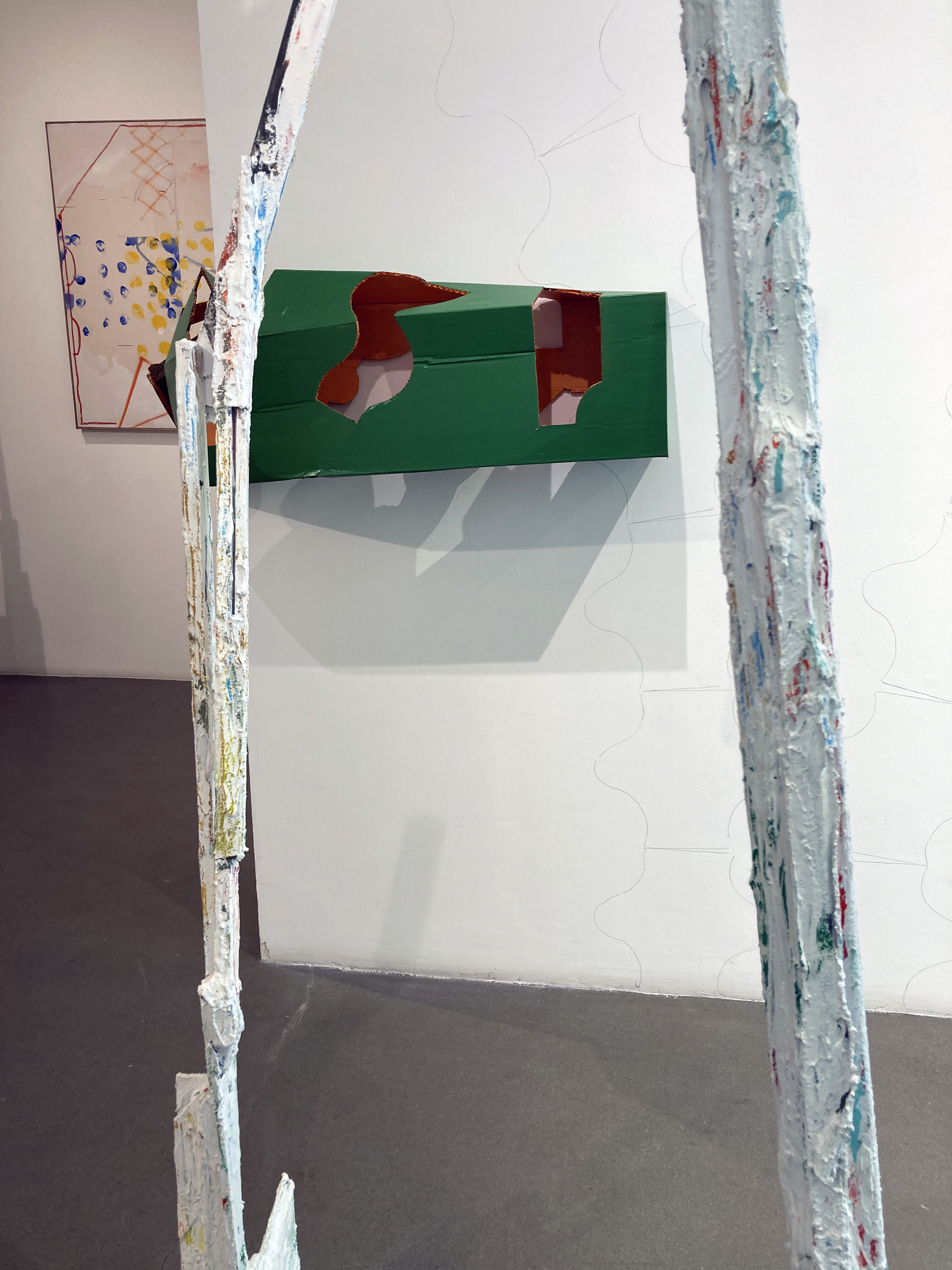
This initial selection and indeed this space could be complete in itself, but it proved to be something of a threshold to pass through, for in the next space that precedes the largest room at the rear, a clue to some playfulness was sensed from encountering an apparently disfigured column, a strongly vertical element, that was placed on the floor but had unexpectedly been folded at 90 degrees to fix itself to the wall to form an archway to tempt someone to stoop under and squeeze through. This piece was quickly followed by another of McCree’s stretched box forms wrapped around the protruding corner into the next space. Clearly an intervention had taken place at some point and as the artist was on duty to greet visitors today he explained to me a little later that one of the performers had previously indulged in interacting with the sculptures to adjust them to the gallery environment.
Bruce Ingram and Jonathan McCree
Also in this middle room were more of Ingram’s works and by now there was more of an obvious or staged interaction between the two artists’ works. Typically, Ingram’s works explore found materials in assemblage and collage-type painted forms employing plaster and various paints (household and artists’ acrylics) to fuse the various elements together. Placed on the floor rather than on the wall one of Ingram’s constructions formed a framework to look through to see another work beyond. A sense of destruction as much as building the artefacts of the environment was taking shape. As a visual tease, Ingram’s works have remnants of colour applied, similar to McCree’s suggestively ‘out of the tin’ coatings, to link the works. Contrasts of smoothness and rough surfaces distinguish the two to some extent but the pairing is not incongruous.
Bruce Ingram
My daughter and I walk around a while, tuning in still to a display that has transformed from calm quietude at the main entrance to visual and spatial cacophony in the largest room. I pick up a press release (which I shall read on the train back to Brighton later, as I want the work to speak to me first and foremost) and start to scribble some notes on the reverse:
Enter the labyrinth, parts, bits & pieces…
Plenty to see, though not too much…
Image / Object – which will predominate…
What is an exhibition for?
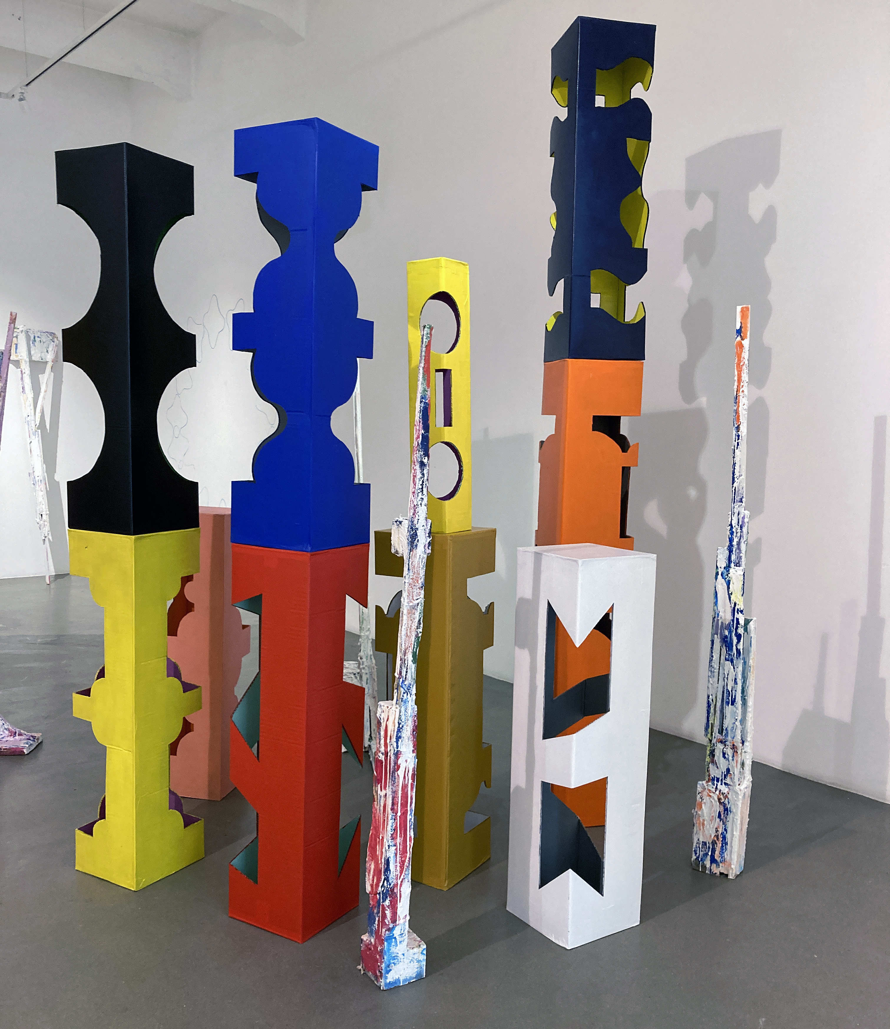
Jonathan McCree
What is an exhibition for? Now that’s interesting. In this instance, Up For Grabs is certainly entertaining, exciting and memorable. The individual paintings and sculptures work on their own terms, but as an arranged event (sadly for just over a week) the exhibition comes alive as a happening of sorts as much as a static display. I imagine the missed performance and projected film work that preceded today’s visit, which isn’t enough, but will have to do. The finished and unfinished, or work in progress nature of the works, suggests a similar modus operandi for the viewer. There is method in looking, in relating to the artworks physically, spatially and psychologically. Visual art is not exclusively about seeing; it offers possibilities for recognising the power of one’s own imagination (and sometimes a lack of). There are formal relationships to find or be presented with. There are colours and textures to indulge in. Likewise there are parts that seem to work perfectly and others that the viewer might desperately want to change – even to improve. The visual aesthetics provide a way into potential readings that could suggest social interaction, notions of community, interdependence, the built environment (including furniture) and the politics of choice, indulgence and creativity.
Jonathan McCree
My daughter described the assembly as “rocks and trees”. Jonathan McCree talked perceptively about “… delaying uncertainty in or from painting to the sculptures, which are moveable parts”. This gave his three-dimensional work edginess, like it was finished but not really. Or resolved, but hopefully not so as it invited some form of change.
This exhibition, no – this environment, concocted a landscape of sorts, an active space demanding an audience to interact by looking, moving, pacing, stopping; head up then head down, confronting occlusions to find surfaces, then seeing variously coloured or textured planes morphing into three-dimensions giving way to silently laughing, then becoming equally engrossed or bemused. Performing a journey, in effect, as an exhibition is not necessarily a final resting place for particular works – anything might be up for grabs; even our expectations.
Jonathan McCree
Note:
* This statement is a little disingenuous as I was also impressed with Mind’s Eye at Flowers in Cork Street where Carol Robertson’s geometric works had been displayed with Terry Frost’s. My review of this show has been published by Saturation Point. See the link below.
At Campden Gallery, Chipping Campden, Gloucestershire
18 September to 9 October 2021
Campden Gallery
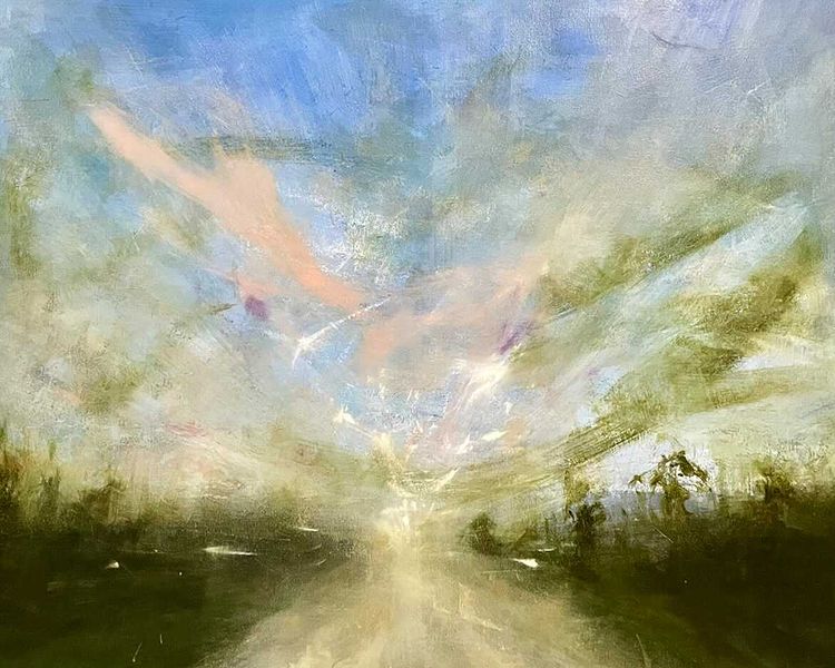
In preparation for Mary Grant’s exhibition entitled The Distance at Campden Gallery I had access to some of the works selected to enable me to write the catalogue essay. Here I present an extended version:
Looking at this body of recent work from Mary Grant’s studio in Sussex I am somehow more conscious of the past and present. There is a sense of clock-time imploding into the apparent contradiction of the past, yet still fused with the here and now as one visual manifestation. Via the individual memory of the artist, seeing and experiencing the landscape as any of us might, then transforming and translating this into a labile but fixed image. Any one of her paintings creates a memorial of sorts, a testimony for a time of looking and feeling. A landscape painting, especially a figurative one, might be considered a kind of snapshot, particularly as we are so accustomed to photographic imagery. But the painter, and the wise viewer, knows otherwise. A canvas holds the potential to be a palimpsest for feelings, whether joyful or sorrowful, celebratory or despairing – or simply captivating and inviting contemplation of the imagery over time.
Mary Grant – ‘Further’ (30x40cm)
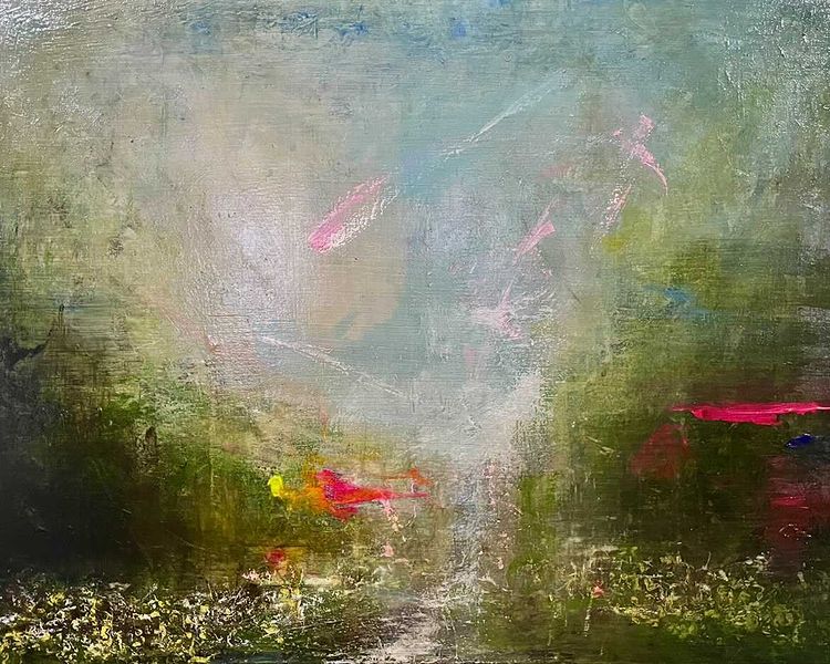
The English Landscape Tradition continues apace, though its longevity may prompt some to look for the ‘shock of the new’ in media beyond painting – especially oil painting. But you do not necessarily need to be acquainted with or particularly well informed about late eighteenth or early nineteenth century painting to find meaning, relevance and inspiration in contemporary painting that engages with what we generally refer to as the landscape genre. Critically, we have to remember that this imagery is loaded with reference to its own times – from any century. The art historian will have a handle on the picturesque and romantic enthusiasms of the painters from the past and this may well be part of the DNA of numerous contemporary painters – of whom Grant is one. But the best painters avoid pastiche (unless irony is their thing) and produce work that is genuinely set in the present day avoiding the trappings of shallow decoration or safe imagery, to express that which is contemporaneous. There is often a sense of risk taking in Grant’s paintings, whereby she might lose the vitality of the image but is supremely able to know how far to go and when to stop. Her work includes the viewer, indeed needs the viewer, to realise the project.
Mary Grant – ‘The Distance’ (100x120cm)
If you were not sure where to start with contemporary landscape you might take a look at Grant’s work, where an undeniable indebtedness to the history of her pictorial subject matter is acknowledged but is not derivative. Grant’s imagery is typically honest, recognisable and everyday – but the commonplace is surely as astonishing as the unexpected or rarely observed. If only we might observe this intensity of visual phenomena more often. We might take notice from a walk or from the car window as the world rushes by, in leisure or work time, but being ‘in the moment’ is an understandable challenge to the senses as we journey to or from other aspects of our busy lives. Perhaps this is why the prosaic is often unusual or unexpectedly powerful in Grant’s imagery. Figures seldom appear but these places are there for us. A road, street lamps, a view that implies the viewer through eye-level in the composition, a sense of the gaze that breathes life into the paintings.
Mary Grant – ‘Wilderness’ (60x80cm)
An important aspect of Grant’s paintings, which delivers the imagery, is the controlled but high-energy frisson in the paint handling. Put the notion of subject matter aside and engage with the immediate, unfussy, raw and expressionistic application of paint. There is tactility and colour to connect to, plus an engaging tonal impact to engage with. Such concrete qualities provide a transitional experience for the viewer. They are more than Romantic tropes because they are concrete and felt in the here and now. You might literally touch the sgraffito surfaces with your eyes and in some imagery the heightened colour intrusions of red, yellow or pink adds a tantalising hint of Magical Realism to the scenery. In these instances the content is also psychological, not only recording the painter’s psyche but also the viewer’s potential mental and physical experience. For sometimes the landscape is quietly exploding or churning, or it envelops us in a misty, comforting shroud. We are here in the works, but we are inevitably going somewhere from somewhere. Grant leaves a door open for the viewer to interpret at their will. The everyday – reminding the viewer of what visual glories are in front of us, often right here, right now.
“The initial meaning of work is increasingly lost, as it becomes a commodity or a product, reflected by its monetary value. This presents creatives with a moral dilemma. Art is more than a commodity; it is a movement, it is expression, it is power.”(Editors’ Letter, Gatekeeper, issue 01, Autumn 2020)
For convenience and convention, Siân Lester might be described as a textile artist but as a freelance textile designer, who finds her practice segueing from applied design to fine art via post-graduate study at Swansea College of Art, a less specific labelling might be ‘visual creative’, with functional distinctions being irrelevant or outmoded. From a fine art perspective there is nothing unusual, especially nowadays, for the painter or sculptor to develop their practice from a particular discipline (painting might be the obvious one) into the ‘expanded field’. Hence terms such as the un-monumental (re-sculpture), the ephemeral (a development of performance and the ‘happening’) and a celebration of non-hierarchical materialism (explored in Modernism as the objet trouvé, the collage, the Combine and the Readymade – leading to Conceptualism) where all and any media are worthy of the message they impart. This expansion of the artist’s role would also include curatorship, most especially into the domain of the ‘installation’ where project and praxis combines theory with materiality as event as much as for object production.
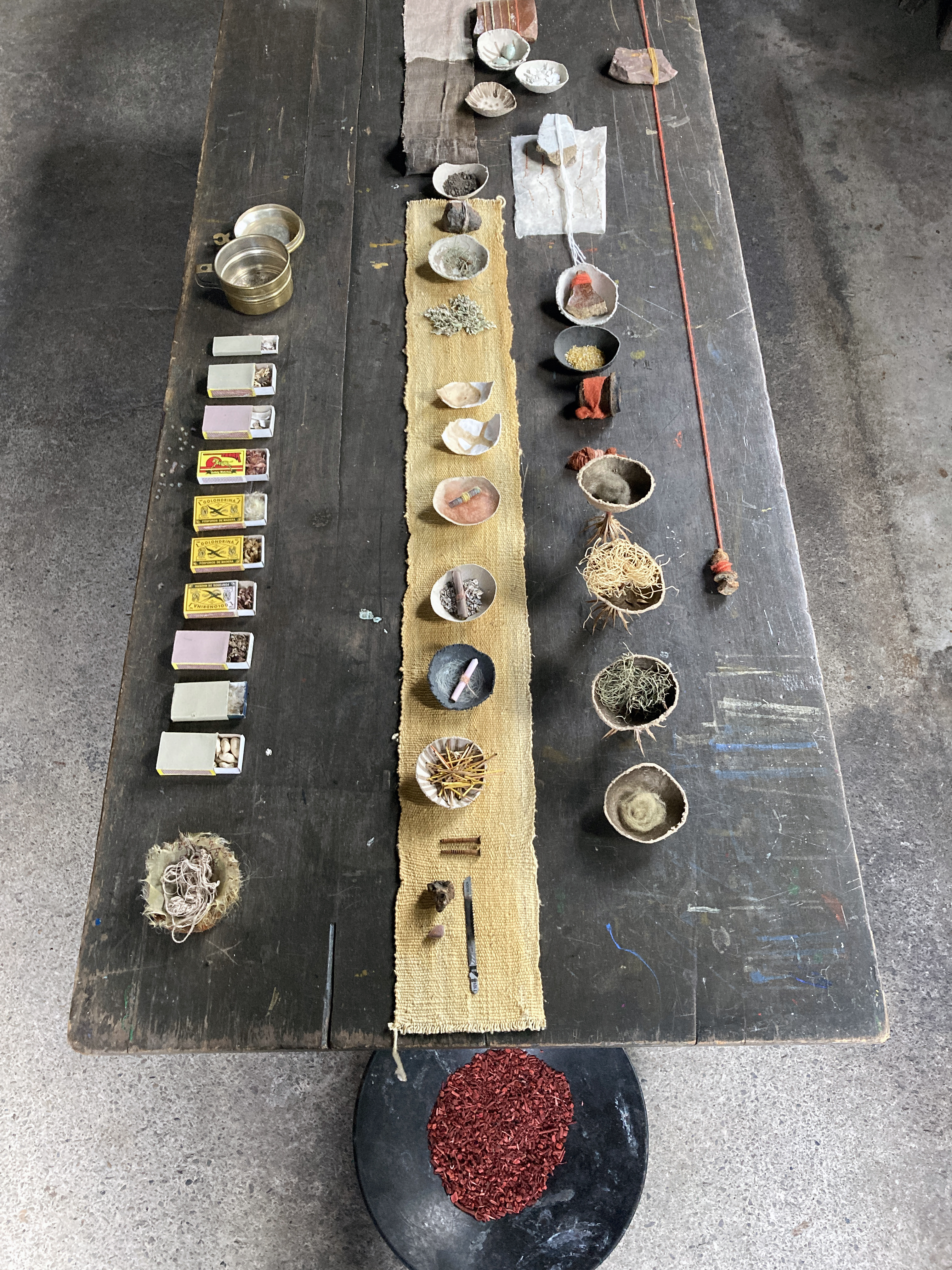
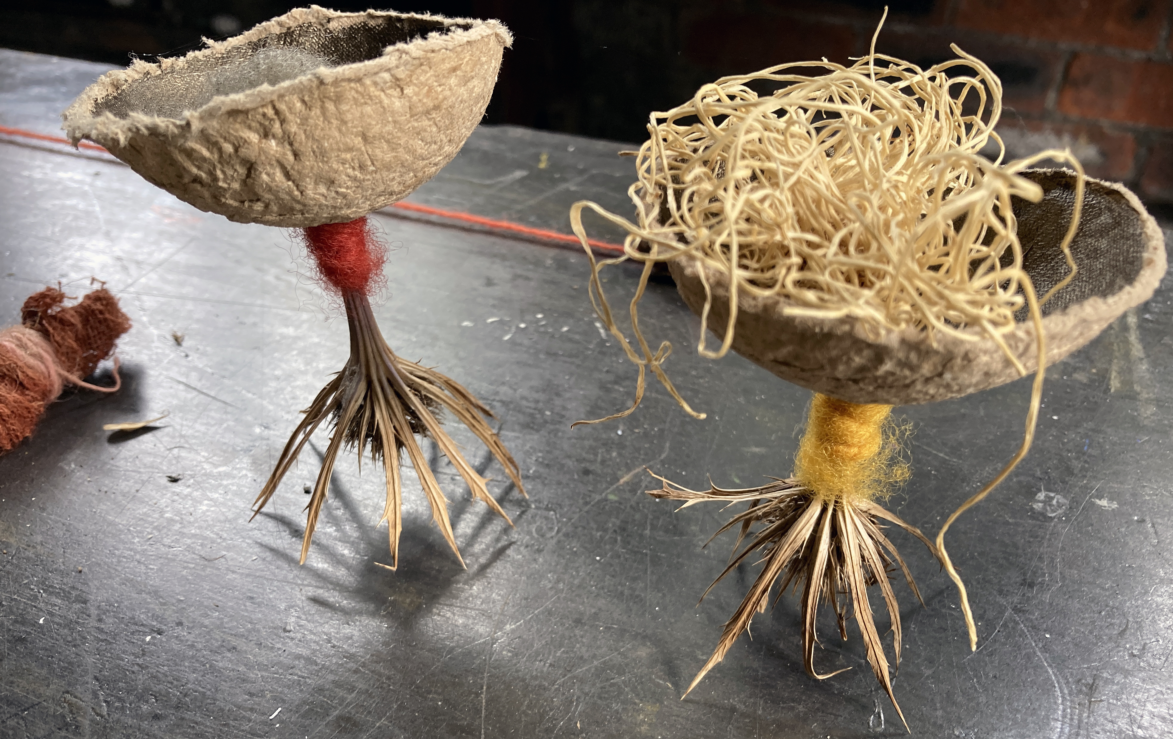
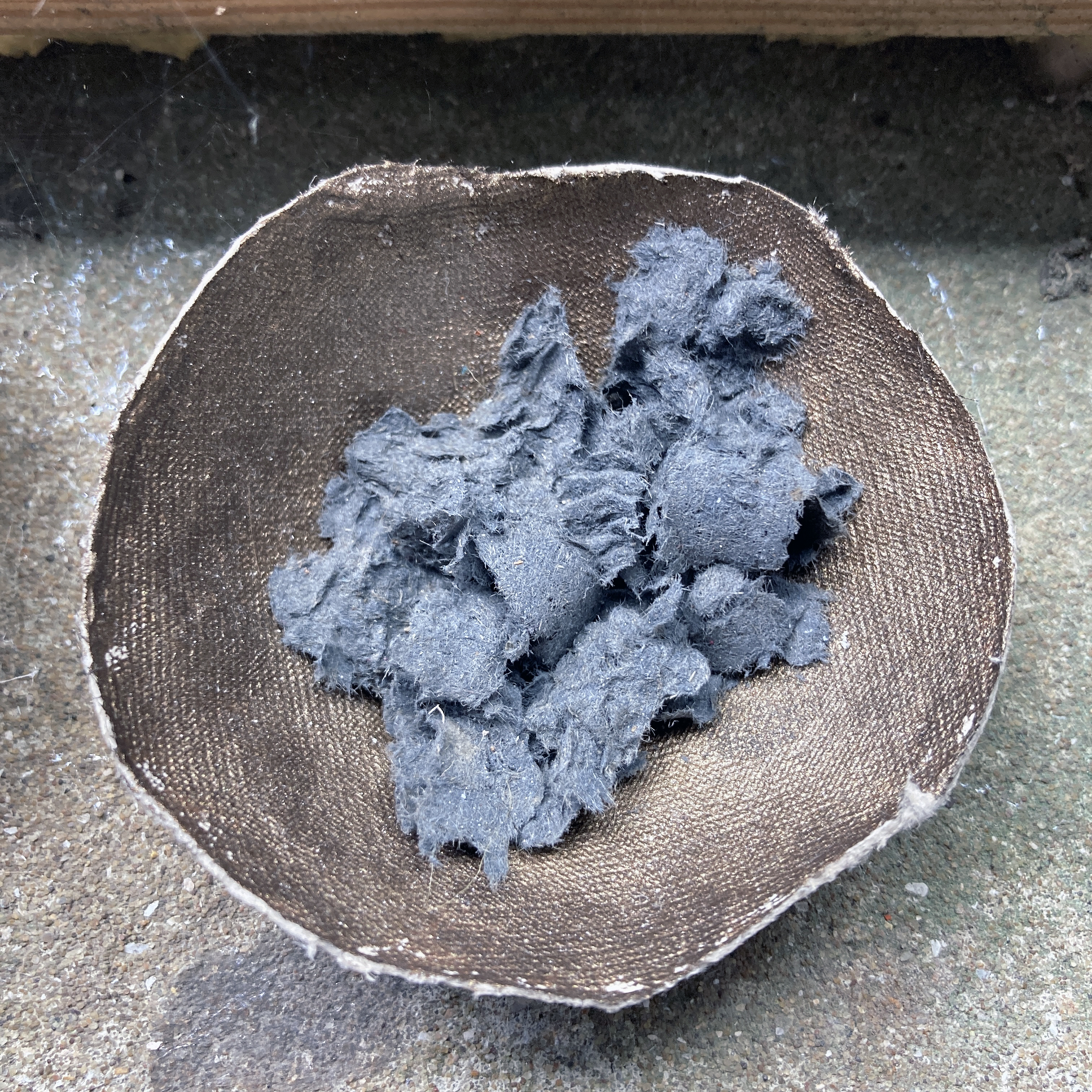
In the current world-wide political and economic climate that at long last is starting to consider environmentalism seriously, and slowly but surely questioning the way we all live with industrial and post-industrial technologies, we notice the visual arts community externally thinking things through in their various choices of materials, processes and outcomes with explorative vigour. Lester has identified that her local environment has much to offer up in the form of oak bark, fallen lichen, gorse flowers, nettles, madder root and birch leaves; she also utilises a knack for gathering, carefully manipulating and presenting her materials, including match boxes, artefacts such as string, matchsticks and woven materials in a variety of simple vessels. There are seed heads, dried flowers and other fibrous materials too – even a small Bosch saw blade. Her gatherings accept an environment’s history and character, whether from inside or out. She ‘goes with’ the selected materials as if it was a two way process where she has invited the remnants of her environment to participate.
In this comfortably sized space for the installation at Studio Cennen, situated underneath the main gallery housing the Borrowed Landscape exhibition, Brigid Loizou, gallery founder and curator, has given Lester free reign to organise and display her symbiotic samples where the spider webs have been left on display by the artist with her various examples of dyed cloths and natural objects (free gifts) placed carefully into small circular vessels made from packing sourced from her kitchen. Many of the offerings are placed on a central tabletop with other items lined up on a long shelf-like construction or the window shelf. Opposite the windows a line of botanically dyed woven samples are suspended from a piece of rope to suggest a washing line. These domestic suggestions are enhanced rather than disrupted by a sense of a place of worship in which relics have been stored and placed for the visitor to appreciate in relaxed reverence. Symbiosis might be seen as an installation that forms a hybrid configuration of temple and garden shed as a display case to walk into. This could be a secular place of worship that marries the natural environment with the human dwelling; or the holy shrine with the everyday stuff we seldom notice as a celebration of a form of Wabi-Sabi – the Japanese aesthetic of acknowledging the everyday, especially the transient and imperfect.
This ostensible storage area has been transformed into what may come across as a tidied up workshop wherein collections or categories of object and matter are neatly displayed. The visitor might walk around as if in Fortnum and Mason’s, enjoying the visual and textural delights of lots of goodies on display. Some are identifiable, other not so straightforward. Some content is pure (seeds and shells), whilst others are processed (especially string and twine) to prompt a sense of awe and reverence or even humour. The installation can be viewed as a diorama of sorts but the engagement is best explored as a visual journey to be taken by inspecting the parts that make up the whole. The temptation to touch is mitigated by the simple arrangement of material content that is a pleasure to observe. Some items line up or bunch together, whilst others act alone. The vessels may invite the viewer to pick up, even to shake or pour, but a sense of stillness pervades that slows the viewer down, edging towards meditation. Observation is ideally performed in silence, despite the road traffic outside, and the material objectness of the display goes beyond commodity offering the viewer an experience to ponder the world beyond the individual sense of self as observer in the direction of an opportunity to appreciate plant-type material whose historical ancestry started 500 million years ago – and will probably continue long after the humans have gone.
In the meantime, if you have the chance to visit Studio Cennen before mid-August you will not be disappointed.
“Textile is distinct, offering a unique opportunity to consider both the material and immaterial.
As part of the MA Contemporary Dialogues portfolio, you will be encouraged to engage with contemporary issues and material investigation, including critical and theoretical dialogues as fundamental to your progression and individual practice.
We offer workshops across disciplines, including photography, glass, ceramics, surface pattern and textiles, encouraging you to develop an interdisciplinary approach, involving those traditionally associated with textile practice and beyond. Hand-made as well as digital processes can be considered, as can writing and text as forms of textile making and thinking.”
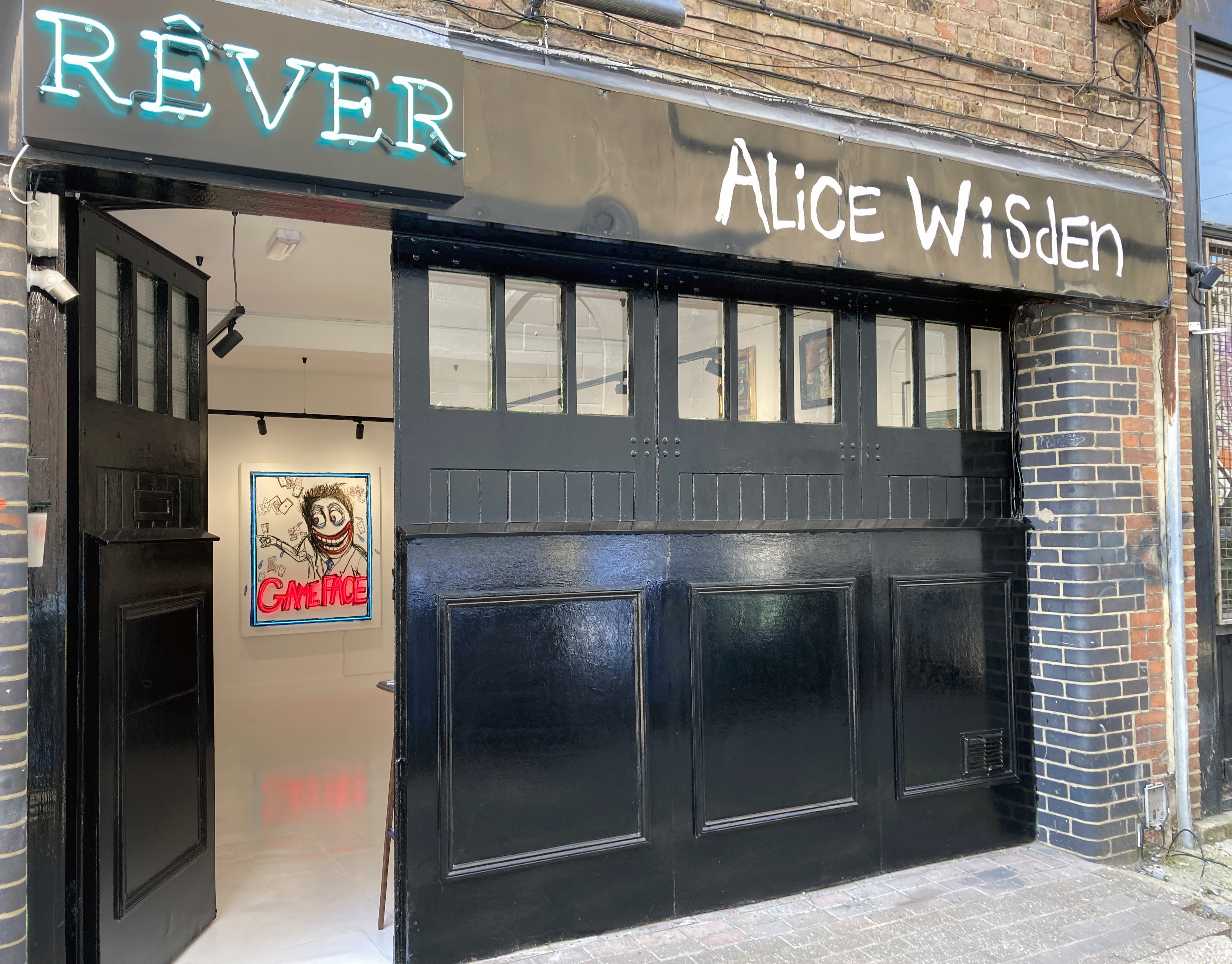
“Rêver Gallery is happy to announce our latest and newest collaboration with the very unique and talented Alice Wisden. When we first met Alice we automatically gained to understand the type of ‘realness’ that she brings to not only the Art industry but to how tangible the emotions and passion are behind the paintings.” (Gallery website)
The burgeoning art scene in Brighton continues to develop despite the underlying presence of the Covid pandemic. Excuse the cliché, but there’s a buzz about the city that owes more than just to the busy streets and the swarms of Deliveroo scooters that plague the roads. Life really does go on.
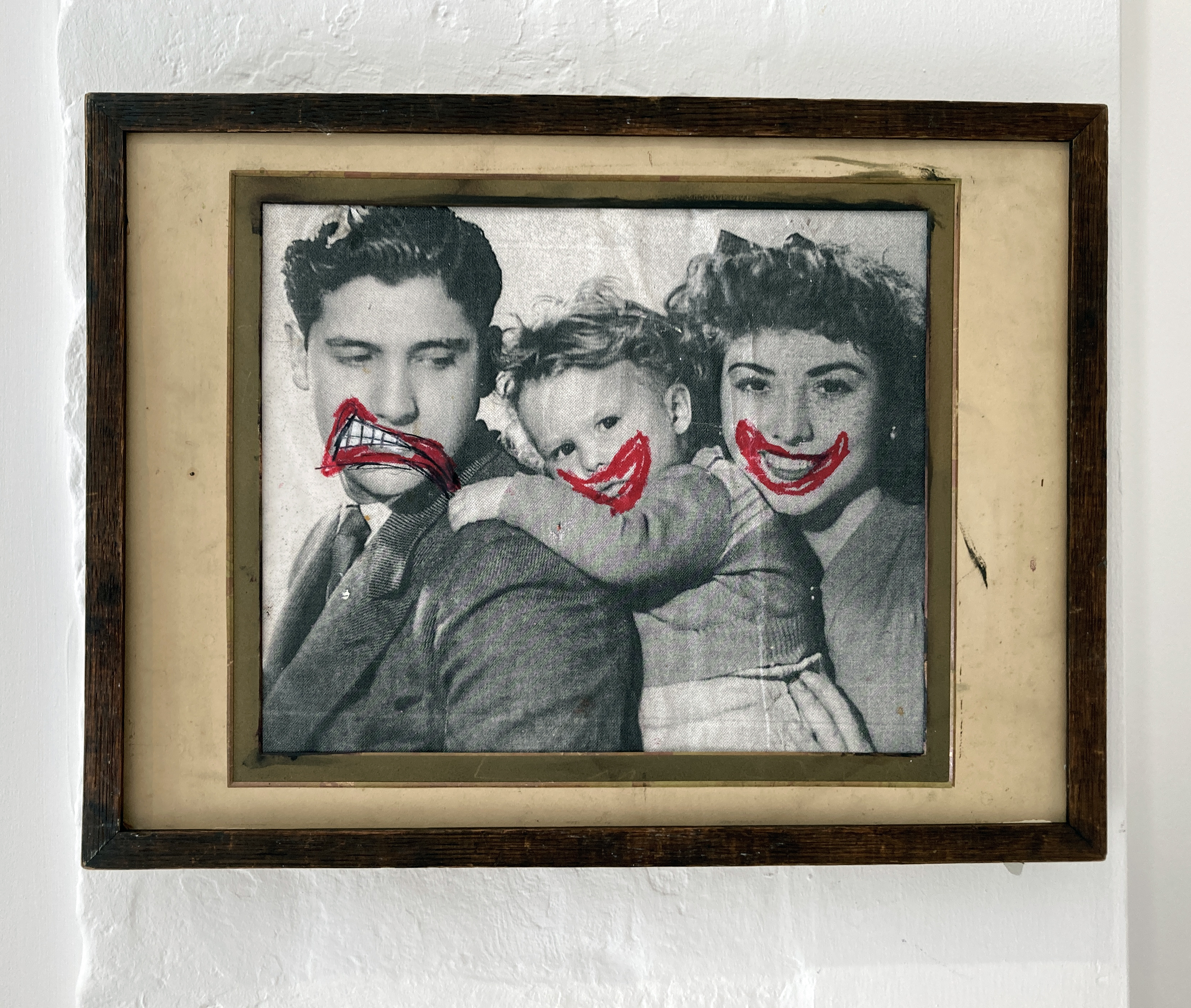
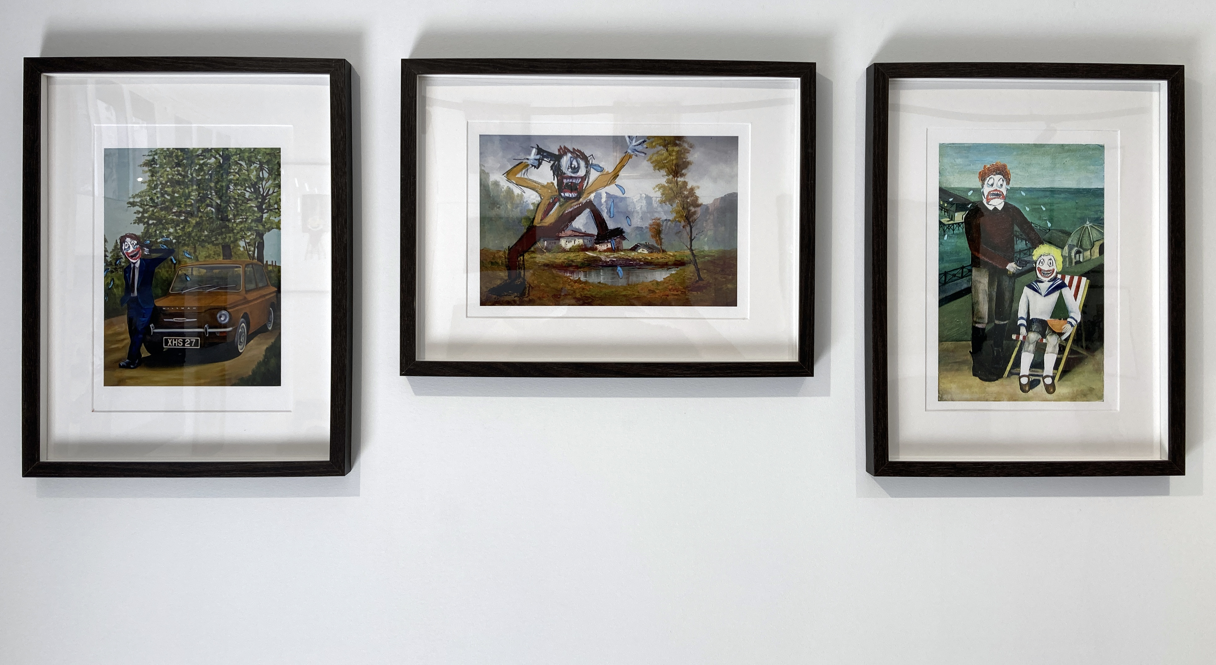
Brighton’s newest gallery is the wonderfully named Rêver, which has opened with a show for Alice Wisden from the local Phoenix Art Space studios. Off The Rails is an intriguing title for the exhibition, which might resonate with viewers generally as opportunities to see art in the flesh and to socialise at private views slowly comes back on track. Digital presentations and selling platforms are here to stay but you can’t beat seeing the real thing. This ‘realness’ that Rêver Gallery identifies is palpable in Wisden’s challenging imagery, most especially with the cartoon-like addition of big red happy or sad lips set within white masks that replace real people’s faces from old photographs. At least they were real, once. For the cast of hundreds, or even thousands, that have resurfaced into the world are resurrected from found photographs and prints, many reclaimed from the local council rubbish dump by her dad.
Enter the gallery and at once images of people, from recent but past generations, surround the viewer. At first one will notice the unforgettable white masked faces with contorted expressions and those aforementioned red lips. The largest work in the show, not a photographic piece, but a drawing with the addition of blue and red neon components is ‘Gameface’ has very thoughtfully been displayed to pull the passerby into the exhibition space. But this title, which describes the blank, deadpan face required in a game of cards so as not to give away any clues to the opponent, is instantly undermined by the combination of a huge teethy smile and bulbous tears bursting from the cartoon character’s eyes. This work sets the scene for all that follows to either side, not in a superficial sense, but in setting up the viewer to reconsider the apparent appearances we enact by facial expression and unconscious body language. Taken further, our thoughts and behaviour might be viewed as those of the actor. William Shakespeare recognised this in his play, ‘As You Like It’ when Jaques’ well known speech begins with the immortal lines: “All the world’s a stage, And all the men and women merely players; They have their exits and their entrances…” Surely we all sensed this in those mundane periods of lockdown during the last 18 months or so?
The various stages, or everyday settings, in Wisden’s constructed scenarios appear to be dredged from the everyday, albeit dated with the richness, and sadness of times gone by. The works invite the viewer to engage in the quotidian calamity with a cast of every Tom, Dick and Harriet. Their mums and dads, their children; countless cousins, uncles and aunts; the great British family it would appear. We find them in familiar settings too: in schools, at home, in the back garden or at fairgrounds; or to add a little more drama, in swimming pools, burning buildings and churches; and of course the countryside or the seaside. Add many weapons, especially guns; plus aeroplanes, bicycles and even the proletarian classic car – the Hilman Imp – and psychodrama abounds in the everyday. But that which might first appear bizarre is, in reality, quite ordinary. If only we noticed a little more often: or perhaps not.
Do we laugh or cry with Alice? Remove yourself awhile, as if you were a visiting Alien from another universe, and question what is going on in this potent imagery. You might think that the Earthlings take this fascinating drug called humour. It’s both darkly repressive and lightly refreshing at the same time. It must be intoxicating and is surely imbibed on a daily basis to ward off evil spirits. Even the daftest, or darkest, humour keeps the spirit going for the inhabitants of this strange little island. You have to laugh, inside at least.
Throughout the collection in Off The Rails, tying everything together, there is always this fiendishly smiling, anxious or sad mouth. Their function goes way beyond any women’s mouths that Willem De Kooning embedded in his abstract expressionist frenzies. There’s more of an affinity with the characters from Otto Dix, the German Expressionist if historical precedents are sought. These over sized and contorted additions to Wisden’s imagery might initially look jokey. But the boy in the deck chair in ‘Brotherly Love’ isn’t smiling convincingly, although the naughty big brother who is about to shoot the kid in the head sheds tears for the tragedy about to reach its climax. The viewer knows it’s a fiction, but then maybe everything else is too?
I don’t know Alice personally, but her welcoming speech to the audience at the exhibition opening settled everyone down and gave us all a laugh. She spoke a little about her medical condition that, it seems to me, gives her a perceptive insight into existence and the stages and scenarios that we occupy awhile. She must have a wonderfully supportive group of family and friends that encourage an individual’s humour in the face of the mystery of life and all that we foolishly, and sometimes wisely, get up to.
Returning to Shakespeare’s final scene for us all: “Sans teeth, sans eyes, sans taste, sans everything”, all is not necessarily lost as Wisden re-presents these ghostly souls, our de facto relatives, for our serious entertainment. Thanks too to the camera that required film and analogue printing; thanks to our elderly forbears who kept this stuff in old suitcases in the attic or garden shed. What’s it all about? Go ask Alice and give her work time. You will be rewarded via that crucial sense of humour that insanely keeps us going in adversity.
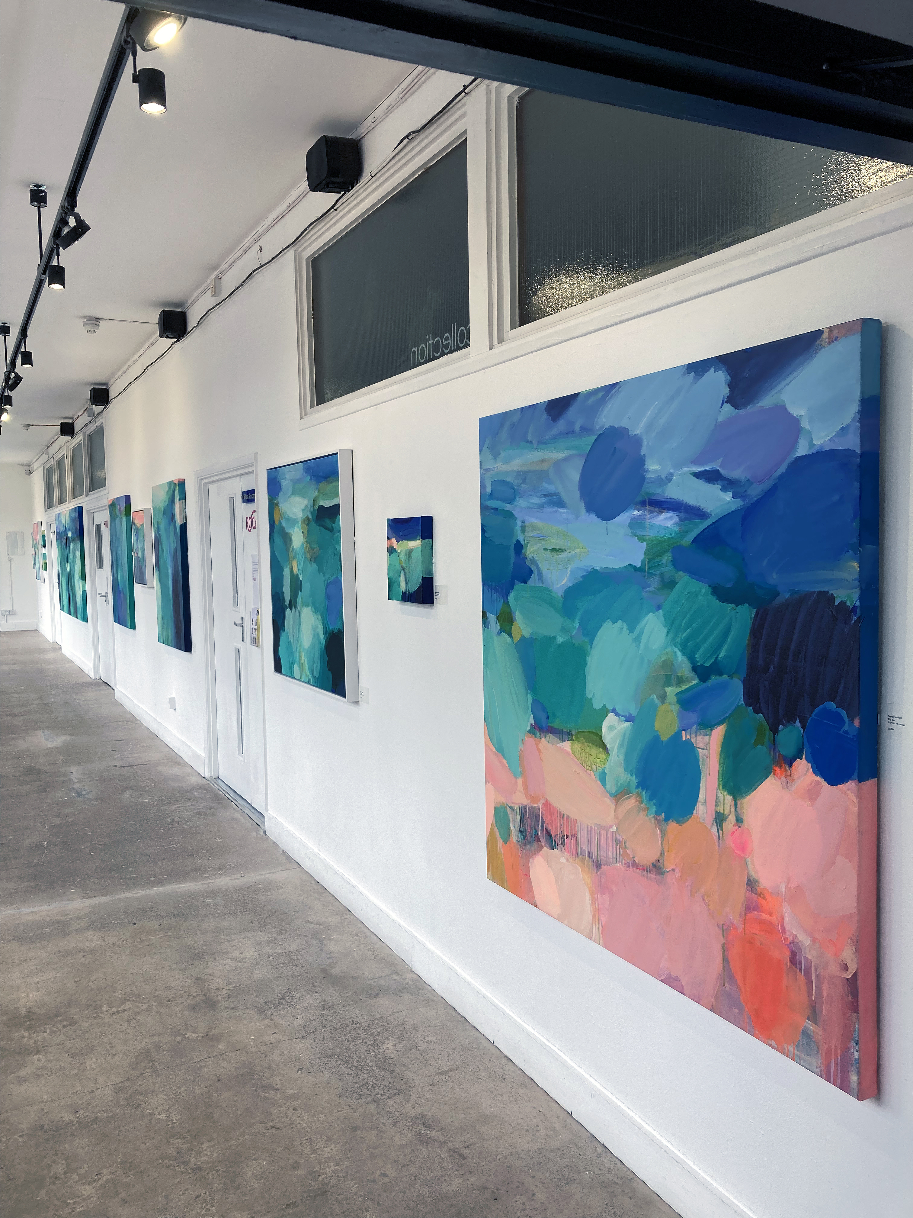
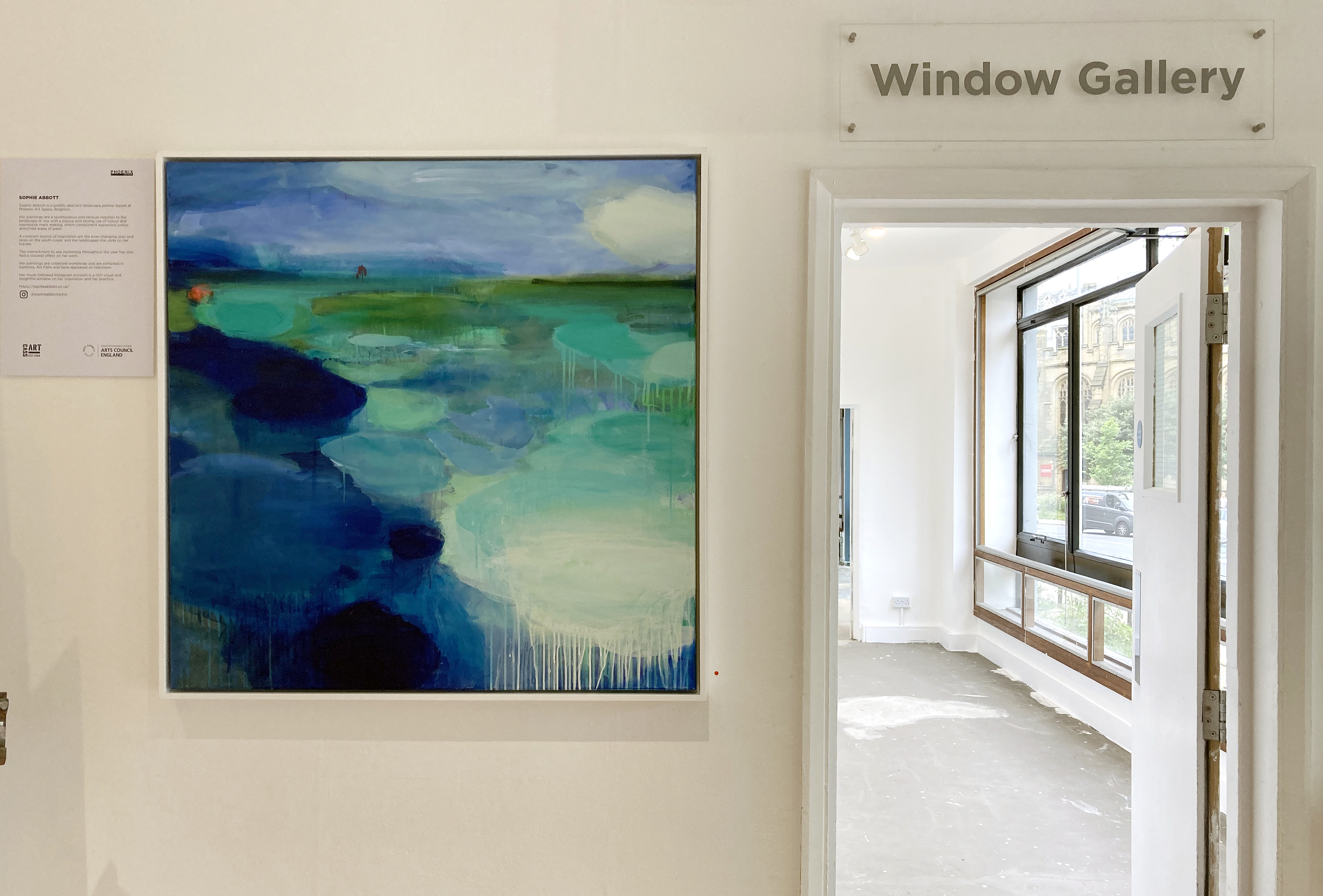
Immersed in the ocean, when varying degrees of coldness have been adjusted to, and when relieved of the weight of one’s body to counter the substance of our normally earthbound physicality, swimming in or just floating in the sea must be a wonderful place to be. Or if strolling on the promenade, in leisure time or between tasks and expectations from work or family, time and space can merge with the visible if we allow it to. Such experiences are freely available, though we may need reminding of this from time to time. Sophie Abbott’s current show, Shoreline, at Phoenix Art Space does just this.
On my third visit in as many days I sat in the gallery and felt calmed after an intensive few weeks spent preparing for and invigilating other exhibitions. This was a ‘time out’ experience that induced an unexpected ‘time in’. On my first two visits, when my mind was on other matters, I wondered if there was too much on display – albeit out of shear enthusiasm from the artist and her assistants to create a visual feast for the increasing number of visitors now able to attend exhibitions.
In the main Window Gallery space thirteen paintings are displayed on four white walls. Clusters of work, two, three or four paintings at a time, are punctuated at even intervals by the double doors that lead into the teaching spaces. Yet all of these paintings considered together create an immersive corridor to move along, prompting a viewer to switch back and forth. It could well be too busy a hang for some but, for me, maxes out to provide just the right impact to enable individual canvases to be contemplated, or to experience the whole frieze affect. But this is mere stocktaking.
Installation view with ‘Pink Sunrise’
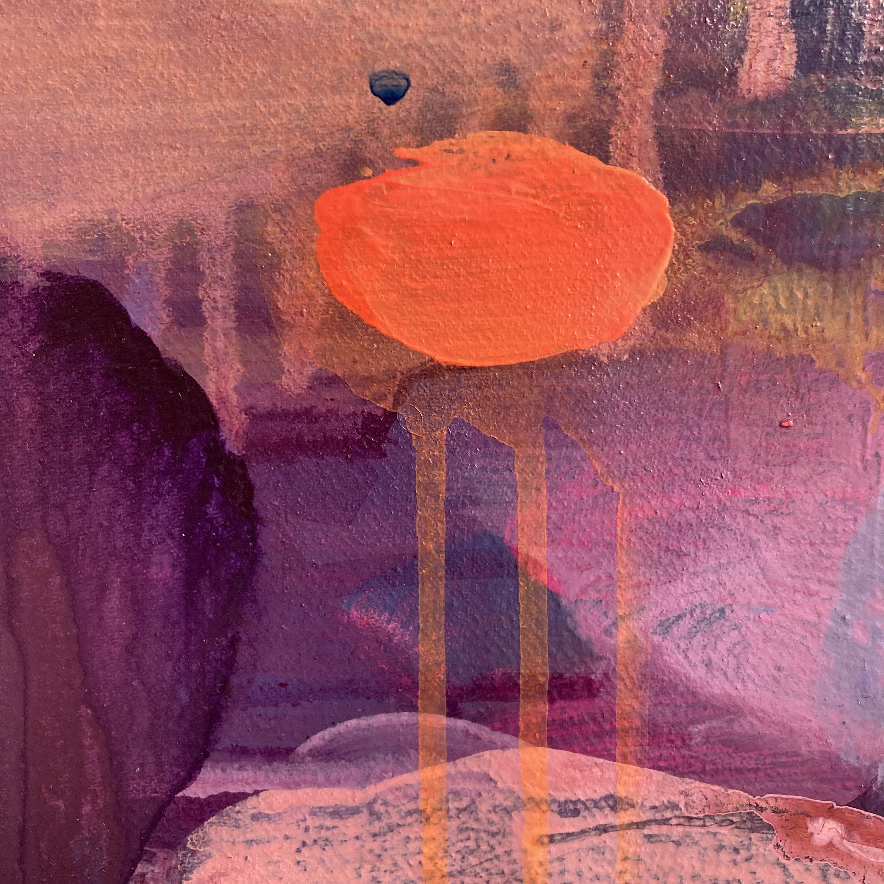
Sitting down at the central point of the corridor I found my gaze shifting from what was immediately in front of me to a work I had only notionally glanced at as I entered the show from the coffee shop (one of two entrances). Some literal perspective was pulling me in to ‘Pink Sunrise’. Colour-wise this work is the odd one out and a distinctive placement on a dark grey wall emphasises some kind of divergence. On the other hand the rising sun represents the generally considered start of day and so the show thematically begins here.
Sophie Abbott – ‘Pink Sunrise’ (95x120cm) acrylic on canvas
The all-over scan might be the way the viewer steps into most paintings but for this work I suspect that a relatively small, orange oval shape placed in the bottom right-hand section almost instantly commands a roving eye. I wondered if unconsciously and symbolically this was someone special in the crowd. The intensity of colour in relation to the rest of the composition is certainly strong. But it’s a momentary focal point from the experience of seeing as a larger but fuzzier orb mirrored on the left-hand side repeats the shape as if to provide balance. Amongst the eponymous pinks in this sunrise are crimsons and blues as well as larger but softer clouds of pink and orange in all areas. These vie for attention without recourse to hierarchy of size or saturation. The small orange shape that first stood out is a punctum of sorts (though Barthes identified this phenomenon in photography of course) as there is a subtle aura of subjectivity suggested by the abstract qualities of the work as a whole. Yet step back or shift your head around if you stay close by and this orange blob of delicious orange is subsumed into the whole composition and other, initially less noticeable, colour shapes stand out too. Visually, the viewer could be stilled by one shape or by the alloverness of the work. The phenomenology of sight perception can contradictorily oscillate between the gaze and the focus.
Sophie Abbott – ‘Pink Sunrise’ detail
There’s often a feeling of joy in Abbott’s painting, typically communicated through an exuberance of colour and a painterly glee. But it’s also the handling of the paint and an acceptance of its simple qualities of thickened or thinned; intermixed or stand alone; opaque or transparent; forceful or anonymous that lends a sophistication that can be overlooked if the decorative interior design feel is given too much credence. Although liquidised enough to avoid a literal heaviness the subject matter is never forced in her work. But there is often an everyday profundity at play.
Installation view
In the lengthy Window Gallery installation the colour scheme is markedly, though not completely, different from ‘Pink Sunrise’. Here we engage with watery blue-greens and more ultramarine sky-blues, often contrasted with pinks and oranges. Fairly strong hues shift to mixes with white (sometimes approaching chalkiness but not too much to kill the colour effect). This fine-tuning of colour adjusts the surface tensions and contributes to the visual and physical layers, including flattened labyrinths of atmospheric form.
Installation view
Controlled drips of paint – never over indulged in, but enough to remind the viewer of gravity (which even makes water earthbound) – plus seemingly independent colour patches form islands and archipelagos that ultimately add up to fully integrated and holistic arenas. Abstract reality is developed from the external environment, along and within the shoreline, with the potential for a frame of mind that, arguably, only visual abstraction and music can recreate. The viewer is invited to enter this (literal) acrylic/canvas space as an immersive experience. The result is an elegant state of grace.
Note: Approach the exhibition from the main entrance to the Phoenix Art Space for an extra painting from Sophie Abbott in the Plein Air exhibition in which her work is accompanied by works from fellow studio members Jane Campling and Julian Vilarrubi.
What started at the Phoenix Art Space at the beginning of 2020 as a critical discussion group for ten painters has now developed into an exhibiting group named The Ruminators Arts Collective (RAC), our collective public designation. Whilst our main raison d’etre will be to encourage the sharing of practice based ideas and outcomes through constructive feedback as we meet up in our respective studios, we are also open to new developments and opportunities.
Many artists may well have inadvertently stockpiled their wares over the past fifteen months or so as exhibiting prospects were diminished as galleries closed for now or for good. Some artists prospered to varying extents from the Artists Support Pledge, an amazing Instagram based initiative instigated by Matthew Burrows, though this life support system cannot replace the established gallery system however either may evolve from now on. Back at the Phoenix Art Space we were disappointed to not being able to participate in the last two annual Open Studio weekends during the Brighton Festival. As a small but determined group within the larger community we felt that a desire to exhibit could only be resolved affirmatively by an enterprise to take a selection of works into the city centre with a ‘pop-up’ show. Closely missing out on a council lead initiative to fill otherwise empty shops with exhibitions of locally produced art eventually lead the group to take a more direct initiative and to approach Henry Gomez at the Dynamite Gallery for this inaugural show.
Eight of the RAC have been able to contribute to BOOM at this time and, as the member who also writes reviews, I suggested a feature here on fineartruminations. As a participant it would be inappropriate for me to scribe a glowing review, though I have waxed lyrical about solo shows from Philip Cole and Michelle Cobbin in the recent past. Reviews of the HARDPAINTING showpieces held at the Phoenix Art Space over the last few years also included my own responses to contributions from Ian Boutell, Patrick O’Donnell and the aforementioned Philip Cole. But given that media coverage of contemporary art, especially painting, is limited to the select few (you can make your own shortlist) it seemed like a reasonable decision to share the work of my accomplices on this platform.
Without consulting the rest of the group for affirmation it seems obvious that what we all have in common is a love of painting. The term ‘love’ is a loaded term of course but, in this context, I optimistically believe that a serious commitment to the cause of painting can be recognised in everyone’s work however diverse our practices may be. No one should be embarrassed by the term. There is also a strong sense that other worthy media never diminish painting, whether ‘expanded’ or even as a direct challenge within the post-modernist era, and that relationships are there to be forged in varying contexts. I therefore would hope that an underlying manifesto-type imperative in each Ruminator’s actual work is registered by potential viewers to pose an argument for painting beyond the merely decorative and the ‘on trend’ manifestations of the commercial sector that sits more comfortably with easy access imagery. Typically, the works from the RAC demand time for contemplation from an audience so that a casual scan would be insufficient to do justice to the work in question. It is unapologetically incumbent upon the individual viewer to complete the work in a sense, not a new argument of course, which necessitates some degree of faith. But do bear in mind that this ‘completion’ is just the beginning of a journey as a painting, akin to a living organism, is ideally something to live with and to re-visit over time.
The words that follow (not all mine) are simply intended to provide some helpful context with minimal biography, if any, so as not to fall into the contemporary trap of pushing the personal so far in front of the work that good old-fashioned aesthetic standards (even anti-aesthetic positions are valid) might be allowed to drop. If this assertion draws criticism, so be it.
My essential curatorial decisions are three-fold for this feature: to take each artist’s personal statement that I requested and to change the text into the third person if this had not already been done; to add and weave in my own thoughts and interpretations where relevant; and to include one image for each artist. Correctly, I appear at the end – so this section will be conveyed in the first person.
Denise Harrison – Oil on canvas
Denise Harrison
Harrison’s bold and colourful work focuses on landscape subject matter and a sympathetic emulation of, or rather from, the natural world. On smoothly seductive surfaces, Harrison’s colour range often blends or juxtaposes local hues with atmospheric and subjectively ethereal colour-shapes that mix the observed with the felt experience developed on the canvas. An often-understated painterliness also creates a tension of sorts with brash yet confident colour combinations. This distinctive feature relates to synaesthetic conditions that lend some delicious configurations of colour choices that ‘pop’ to make the surface feel lively and visually active. In these instances the abstract characteristics of such works might temporarily disengage the viewer from the ostensible subject matter – what disrupts these glimpses of paradise?
Harrison has not indulged in a purely colour obsessed jaunt through the landscape. Enquire of the work a little more and, beyond the immediately visible, a cultural awareness invested in imperative ecological concerns emerges. For Harrison is particularly interested in eco-systems and conservation spaces that are hidden or discovered on walks. Many people’s interaction with the physical landscape may often be for superficially picturesque pleasure (not necessarily a bad thing) but her on-going project aims to bring attention to these spaces and the work that is or is not being done to maintain sustainability.
June Frickleton – ‘Gulfoss I’ (100x120cm) oil on canvas
June Frickleton
June Frickleton is known professionally for being involved with curating and consultancy as well as for her own practice as a painter. The Boom exhibition gives visitors an opportunity to see and experience her distinctive imagery developed from a visit to Iceland in early 2020 before the Covid-lockdown, which typically has a strong visual impact that combines landscape sources with painterly abstraction. Her palette is often, and intentionally, reduced to just two or three colours. Crimson reds and ultramarine blues dominate the recent works, which have a sumptuous and richly Baroque feeling of visual movement which the viewer may well feel physically and internally as much as visually.
Frickleton’s studio activity responds to the process of painting from an improvised and performatively enacted engagement with painterly qualities from working on the studio floor as well as with the conventions of the wall mounted canvas. From internalised experiences made during and after travelling the engagement with the paint medium develops the imagery in the studio environment and, though sometimes looking spontaneous, is cultivated and evolved over extended periods of time using a mixture of deliberate brush marks combined with thinned down layers of oil paint. By a process that involves pouring washes of turpentine over the surface to stain the canvas, Frickleton builds these various interlocking, overlapping and strongly tinctured fields of pure colour up into layers until the desired image emerges. The final result, particularly in her larger works that engulf the viewer’s gaze as spaces to float or fall into, might well convince the recipient that the experience of looking and engaging becomes their active role as much as the artist’s intention.
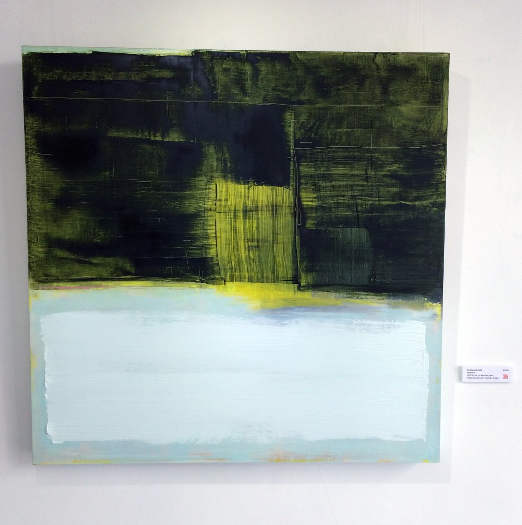
Michelle Cobbin – ‘Blanket’ (100x100cm) oil on canvas
Michelle Cobbin
In a similar vein to Frickleton and Harrison, Michelle Cobbin’s work explores the relationship between colour, form and mood. She is interested in how her own mood dictates the colour palette she chooses to work with on any particular painting journey. She might start a painting in warm tones for example, and then feel completely out of sync with those colours the next time she is in the studio, so she either puts that work aside or paints over it. This surely frustrated her to begin with until she realised that her approach to painting is overtly visceral and intuitive – therefore choosing the right colour for her mood was essential and not arbitrary.
With a mode of operation that is reliant to an emotional response to colour it is no surprise that abstract images emerge without the necessity to formulate a figurative or recognisable ‘picture’. Cobbin’s practice is both brave and dependent on faith in a sense. She surely has to allow herself to psychologically, and certainly self-consciously, leave the painting process somehow, which sounds like a weird contradiction. This seeming loss of self that, probably, many painters experience (whatever their visual language) is a major component of Cobbin’s practice that might be better witnessed than explained in words – though it might be a necessity for the poet too.
In physical terms, some of Cobbin’s paintings are many layered, as their colour narratives develop and change as she works. She has revealed that, “other pieces that appear are born complete – rare species that flow through me occasionally when the stars align and I’m without ego or self-consciousness.” This necessitates the hard-won skill to recognise when a painting is finished relatively early, before subsequent layers are added out of habit or expectation. From this point onwards the work develops its own potential narratives that are projected on to it by the viewer, though one might be warned not to project into the work with one’s gaze, but to accept what is projected wordlessly by the visual impact of the work itself.
Nina Garstang – ‘Internal Universe’ 2021 Enamel and other chemicals on glass
Nina Garstang
It seems appropriate to follow an appreciation of Michelle Cobbin’s painting practice with Nina Garstang’s as their working practice employs huge faith in avoiding over indulging in any form of didacticism and instead engages in a heavily subjective and autonomous approach to visual creativity that bypasses ego and self-absorption. Her work contemplates a middle ground between what is real and what is not, pushing the view of the objects she paints to the point where they lose their identity, thus revealing an altered view that suggests looking into the universe or travelling deep inside the body.
When immersed in her studio practice, Garstang carefully ponders the medium of paint and/or inks as if little else exists once the realm of painting as both noun and verb, thing and action conjoined, takes over. Her work explores the qualities and viscosity of coloured media as primary material with which to explore not only a state of mind but which are also evocative and redolent of current opinions of the tradition of painting in an increasingly ‘virtual’ world. This notion of the virtual is, arguably, inherent both historically (from the moment women made their hand prints on cave walls perhaps) to the on-going psychological experience of creating a painting at any time. For example, flirting with the idea of Rorschach cards and likening the state of mind to that of the theta brain wave state, which is akin to daydreaming and is free flowing, Garstang’s work presents both a thought provoking and aesthetically fabulous indulgence in painting that truly engages the viewer’s seeing experience beyond the here and now. Author and poet Richard Lewis’ description of Garstang’s glass paintings is evidence of this potential in her recent work:
“The colours hit me up with their intensity, like chemicals chasing through my blood. It’s a visceral thing at first and then meaning emerges: I get rivers, seas and mountains, then into cells under microscopes, maps of the earth from space bleeding into brains and embryos, soft tissues and weather systems all on a single sheet of glass, yet it is still. I’m getting flashes of old masters too, like faces and scenes from other things I’ve seen dissolving away from me.”
Ian Boutell – ‘Falling’ acrylic on board
Ian Boutell
Ian Boutell, whose work reveals his architectural training and interest in Modernist pioneers including Malevich and Tatlin has influenced his investigations into how space is re-presented for the viewer as concrete fact rather than as perspectival illusion in his painting practice. Boutell incorporates Perspex and other materials, including paint, into his work to explore the shifting territory around contemporary and expanded painting. The relationship between displayed artwork and the physical space the works appear in acknowledges the physical context intentionally as integral to the conception of the works, albeit in the knowledge that venues and spaces may change between the institutional and the domestic for any particular work at different times. Such an intention requires any one work to function actively as an object as much as an image irrespective of the placement which conjures the paradoxical materialist necessity to be independent of yet very much part of the immediate environment.
For Primer02, a recent online feature with artist-led group epox_contemporary, Boutell commented: “I did a few of these ‘corridor constructions’ where, when walking past, the vertical strips are revealed then hidden by others that project further and momentary flashes and reflections from bronze Perspex mirrors reveal the room, corridor or oneself. The onlooker, the viewer, the audience completes the work.”
Speaking further of his practice, Boutell also says, “Science and art each seek ways of understanding our world in concordance with these new ideas of cosmology and subatomic physics, and I am seeking visual metaphors in paintings and constructions for these ideas that are not directly visible. This is the paradox in both science and art; making objects and forms that are metaphors of their opposites, the abundance of space and the energy and waves that fill atomic space…”
As with Lewis’ reaction to Garstang’s ethereal imagery, Boutell’s more architectonic constructions act as a starting point for something sensed rather than spelt out as a diagram or illustration, thus engaging the mind in conjunction with the eye – yet demanding the viewer’s full focus and attention.
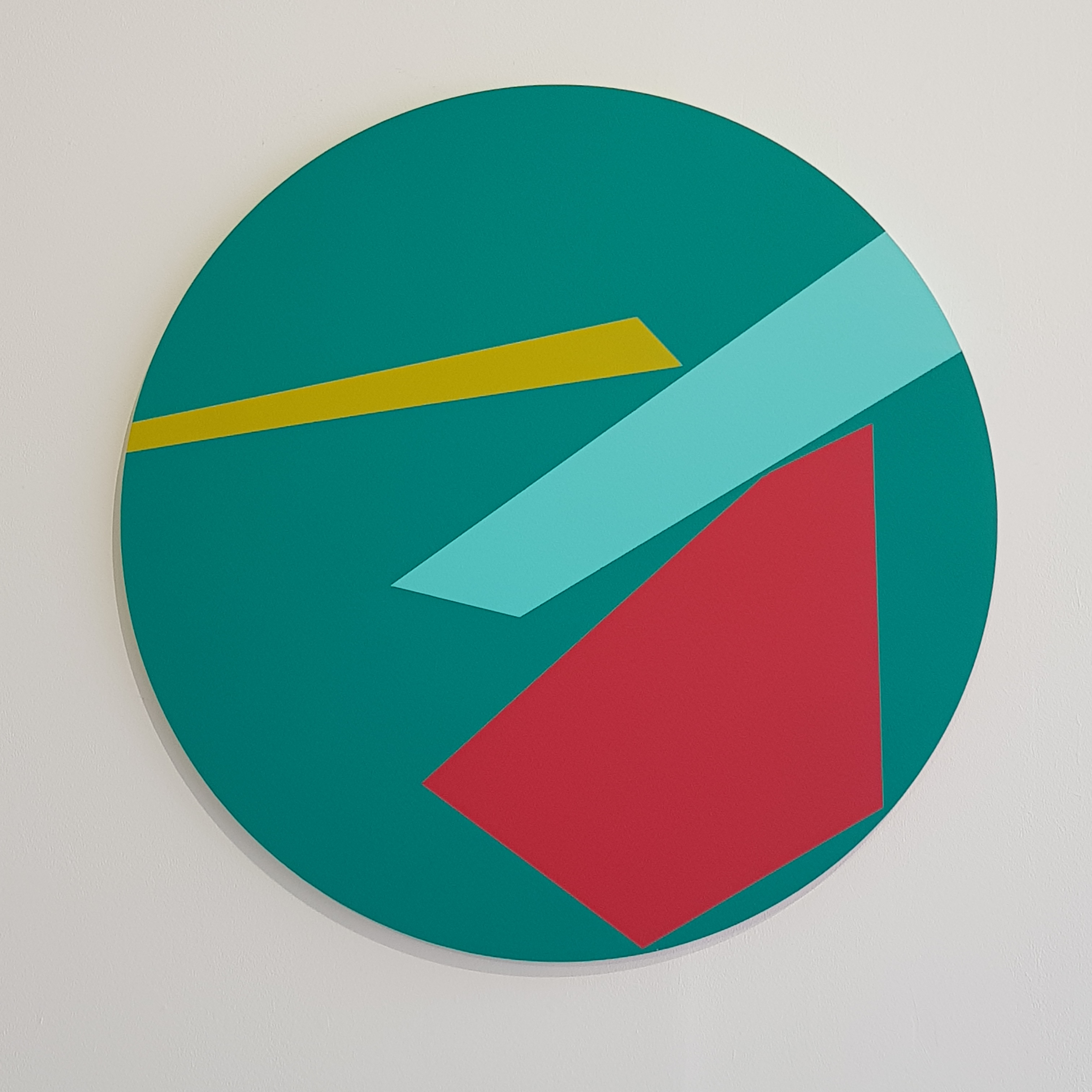
Patrick O’Donnell – ‘The Force Awakens (no.3)’ acrylic and emulsion on water resistant MDF
Patrick O’Donnell
Like June Frickleton, Patrick O’Donnell is also an artist and curator. His work has become increasingly non-figurative with an ongoing investigation into the perception of 2D shape in three-dimensional projected and real space creating a dynamic tension, both visually and conceptually, between the two phenomena.
O’Donnell has been largely working on tondos (circular paintings) for the last year after fellow tondo-enthusiast, Ian Boutell, kindly passed a batch his way. The circle was a blessing in disguise as it offered him a neutrally balanced compositional arena with multiple orientation options allowing him to focus his enquiry into boundaries and opacities of colour, line and edge. The distribution of shapes in a specific kind of space, without the visual weight of any physical corner of the picture support, avoided the more commonplace phenomena of a portrait or landscape format. In this sense the disc becomes a model form to challenge the ubiquitous rectangle, although such shapes will appear within the physical parameters of his work alongside triangles and rhomboids.
If this sounds a little too systematic and brings back memories of times spent struggling in geometry lessons (that was my experience anyway) a more personal and subjective element is formulated into the mix by O’Donnell’s use of either straight or torn edges of tape, or a combination of both, to devise and realise his compositions. When using a torn line the tear has to be intuitively right or else it fails to convince him as an image. He started experimenting with the tension between the torn and clean line in charcoal works in 2016. A key work from this period was ‘Seven Sisters’ which consisting of seven essentially abstract shapes that echoed rather than depicted the iconic landscape features of the Sussex Coast. Working this way offers him the freedom to explore a variety of ideas through simple formal elements, including a highly sensitive choice of colour contrasts and combinations.
The ‘Toe the line’ series that incorporates straight and torn edges was initially prompted by observations of boundaries and territories within domestic settings, to then later include ideas filtered from the book, ‘Prisoners of Geography’ by Tim Marshall of natural / geographical versus political borders, imposed and accepted (or not). As we see in Harrison’s more organically characteristic paintings, O’Donnell’s geometric configurations that suggest a built or even psychologically constructed environment, there is so much more than meets the eye however pleasurable this experience may be.
Philip Cole – ‘Slider9ws’ Polyester resin
Philip Cole
Philip Cole is a painter, maker and teacher. He has spent the past twelve years exploring the possibilities inherent in his chosen primary material, Polyester resin. As a Painter/Maker he uses unconventional materials and commonplace processes to produce qualitative painting objects. His use of polyester resin is intentional in order to elevate its status as a suitable material for ‘painting’. The work may be characterised by the use of simple colour combinations and tonal variations where the predominant geometric shapes are composed essentially of rectangles, and less frequently, discs. They sometimes suggest printers’ colour registration marks or aerial views of tins of paint, or even hints of perspectivally represented forms. But these associations are not necessarily of primary importance, even if a consequence is to reference similar organisations of colour and shape in the overlooked and marginal, or in architectural spaces (the interstices) of ‘real life’.
The production of a conventionally permanent object (a painting) is in contrast to the use of these materials to construct and mark temporary and throwaway vessels. His constructed, material/process-focused, object-type painting requires hard graft, perseverance and extended hours in the studio. Cole’s belief in the necessary work involved in the production of his paintings is rooted in deliberation and a craft aesthetic, rather than in a gestural approach to provide evidence of the painter or maker’s mark as a ‘personality’ is avoided. But the potential for a cold and indifferent outcome is avoided by the combination of wonderfully effective colours that could be contemplated forever and the sheer refined beauty of the ultra smooth surfaces.
From a review of ‘Making Painting +-’ at Phoenix Art Space in 2019 written for the Saturation Point website I commented:
“Cole’s practice may well have vestiges of the deconstructive and the reconstructive that more painterly practitioners might disdain, but this fascinating notion of ‘obtaining consciousness’ can be applied to Cole’s works from a viewer’s perspective. The experience of active looking takes the patient viewer into the work as a thing in itself, visually and physically, allowing the imagination space to breathe. Possibilities come alive, in explicitly authentic, concrete, non-virtual manifestations. These are characterised by instances of reduction and variation: geometry, regularity and logical developments, measuring and assaying exactitude, craft and reductive simplicity. Ingesting visually exciting combinations of colour and shape, with Cole’s carefully formulated contrasts, definitions and edges, produces end results which generate a rich and diverse encyclopaedic experience of possibilities.”
Geoff Hands – ‘Call Back The Garden II’ 2021 (100x100cm) oil on canvas
Geoff Hands
Since retiring from full-time teaching I have become involved in the short course programme at West Dean College near Chichester. I was asked to write a brief statement for potential students who might enrol on my ‘Abstracting from the Landscape’ three-day course. I wrote:
“I encourage students to work with a disciplined kind of freedom. As with writing you have to find your ‘voice’ and this often demands trial and error. The paint medium is on an equal footing with the potential subject matter and so you have to mediate and discover the real subject through the physical process of painting. Everyone will be encouraged to allow the paint to speak for itself.”
The paintings chosen for the Boom exhibition aim to fulfill this brief. I also chose oil paintings that I had not displayed publically before and which mark a shift in an even more ‘painterly’ approach to my practice.
Ian Boutell also curates Cottage of Modern Art at his home on the outskirts of Brighton. The gallery shows just one painting at a time inspired by Winifred Nicholson’s Cumbrian cottage with a Mondrian on the wall.
An exhibition of recent paintings by Julian Vilarrubi of the view from Studio 4S0 at Phoenix Art Space.
Window Gallery, Phoenix Art Space (2-25 April 2021)
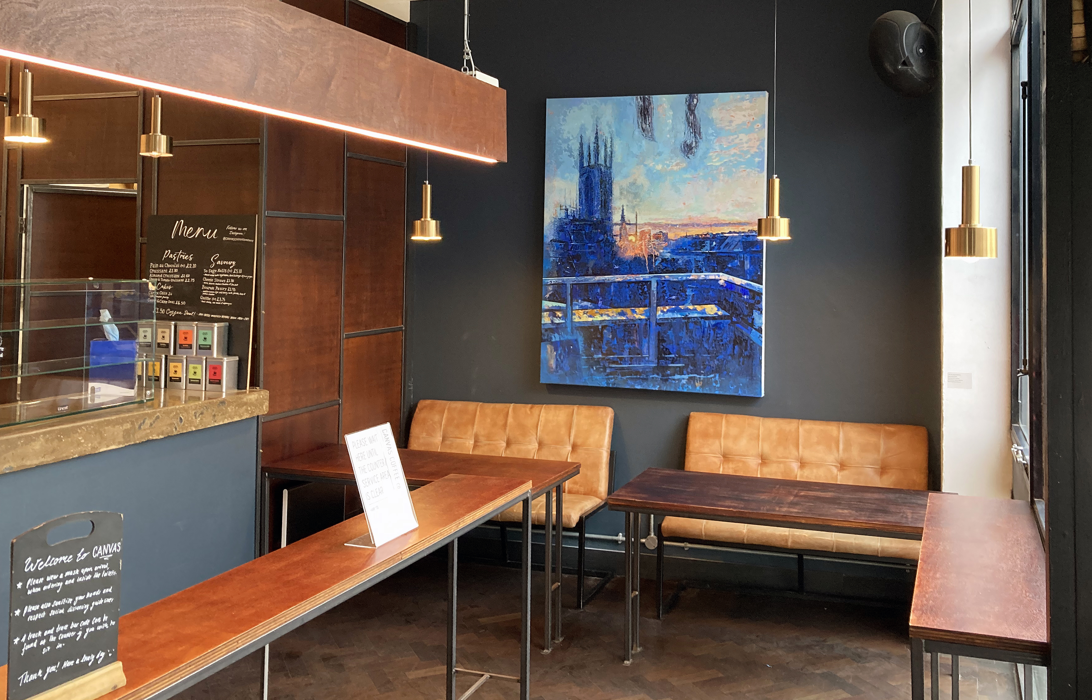
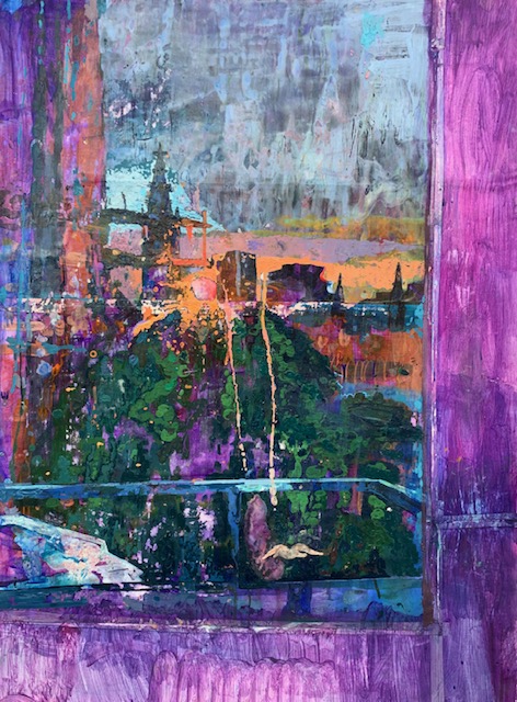
With covid-related requirements morphing slowly towards some kind of normality, public access to one section of the Window Gallery at the Phoenix Art Space is gained via the coffee shop entrance. Here the visitor will be confronted by the largest work in ‘Shifting Moments’, a one-person show from Phoenix studio member, Julian Vilarrubi. ‘St. Peter’s Sunset’ (2021), as its title implies, represents the end of the day and so fittingly completes the sequence of nineteen works on display. This appears to be the most recent painting in the presentation but ideally, the visitor would start their promenade along the stretch of the gallery from the main entrance, though the obligation is still to view the exhibition from street level.
Julian Vilarrubi – ‘St. Peter’s Sunset’ 2021 in the Canvas Cafe
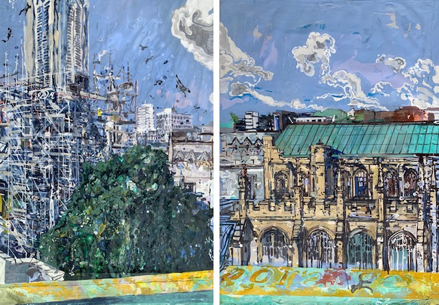
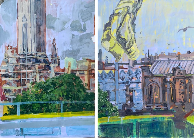
There is certainly a sense that the show begins, both logically and in a reminiscent spirit, from the northern end of the corridor where ‘Swan Hunter Shipyard I’ and ‘II’ are hung side by side. These are impressive observational exercises that Vilarrubi made at the University of Newcastle-Upon-Tyne in 1983 as a first year under-graduate. As monochromatic acrylic studies on paper they could be categorised as drawing or painting. Although made some 38 years ago they do not look out of place in relation to the recent paintings and drawings of St. Peter’s Church and its surroundings as they set the scene for the artist’s probing and inquisitive eye that has maintained such dedicated practice for almost four decades. The majority of the recent paintings are from 2021 and are essentially acrylic on paper (though sometimes with additional oil), although the project began in late 2020 and will continue beyond this exhibition.
Julian Vilarrubi – ‘Swan Hunter Shipyard II’ 1983
As if to press the point home that this project is also ‘contemporary’ in a technological sense, there is also a selection of six iPad drawings (or are they ink paintings?) on display. Notionally these are original studies drawn from strict observation on an iPad at the studio window and it is intriguing to consider how the virtual sketchbook/canvas is actually something non-virtual/actual, even before the resulting prints have been produced. These are not playful simulacrums imitating photographs either, but are hard-won images requiring extended periods of time to produce. Given the appropriate resources it would have been a bonus to have an iPad or screen on display too, as this would be an intriguing development for realising this expanding body of work with due consideration for the digital aspect. Should ‘Shifting Moments II’ follow at some point it would be of great interest to see the imagery pre-print, as it were.
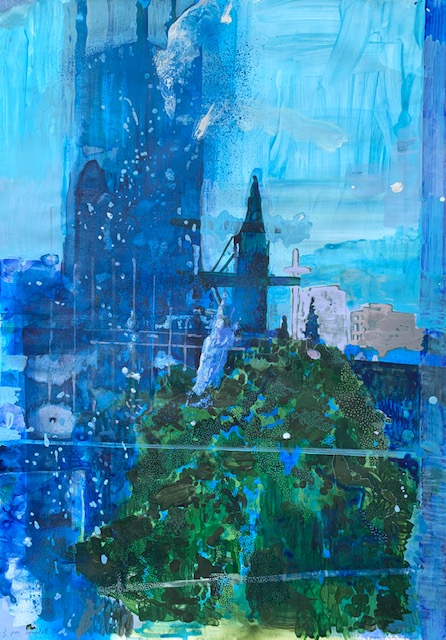
Julian Vilarrubi – ‘Sunset’ (2021) iPad drawing
‘Shifting Moments’ is certainly a thought provoking title for the exhibition, suggesting fixity and flux at once. When engaged in looking at a subject, in a time-based physical mode, it may well seem that there is some sense of the film-still being frozen in time out of a continuum of images that otherwise ceaselessly flow around us. Then there is our cultural obsession with the photograph as visual memento, abundantly developed by the shift from film to digital technologies, most especially now with the Smartphone that almost every person on the planet appears to own and which produces images that typically remain in a digital format only to be shared from screen to screen. Since the 1840s it has been claimed that painting is dead; is printing dead too?
When we view time-heavy projects such as ‘Shifting Moments’ (including the digital medium that Vilarrubi employs), we see that there is something experiential going on, for artist or viewer, that an immediate exposure or impression does not record – or create. These are works that could only have been produced over many days or weeks, culminating in one final state, which seems like a contradiction against any notion of ‘real time’ telling the whole story of appearances. Time therefore might be better understood as a meta-medium that can be physically manifested and explored in whatever forms the artist chooses. In the instance of Vilarubbi’s work, most especially the paintings, the notion of the moment inexorably ‘shifting’ becomes visually and psychologically experiential – demanding time and effort from the viewer. His paintings, in effect, offer a visual journey that puts the observer in the driving seat. But this is not an A to B linear trajectory, it’s an extended moment in the shifting continuum of the here and now where it would be best to avoid the cursory glance – for then we would be wasting our precious time.
In terms of mainstream art history we might recall the work of the French Impressionists (in the 1860s) gloriously attempting to record a particular scene at a specific time of day with their hog-hair brushes, canvases and oil paints. With the advent of photography (initially a scientific methodology) preceding the painters by 30 years or so it may be erroneous to connect the two historical developments in visual representation too keenly, but both endeavours are connected by an interest in recording ‘the everyday’, a kind of inversion and subversion of History and Salon painting that prevailed in the nineteenth century. In this respect the everyday is a subject matter that can engage us in reflections from the monotonous and unchanging (particularly in Covid-related lockdown periods) to the metaphysical and the philosophical. As the Greek philosopher Heraclitus informed us: “No man ever steps in the same river twice, for it’s not the same river and he’s not the same man.” Gender issues aside, no academic inclination towards an interest in Ancient Greek philosophy was necessary for those of us confined to a prolonged observation of life outside our places of confinement, for it is likely that we all noticed even more how ever-changing and plenteously detailed our world is when we are forced, or take time, to observe the view from the window – every day.
Vilarrubi’s imagery, irrespective of the chosen medium, offers this same range of pondering possibilities. The studios at the Phoenix Art Space, at least for those artists who have a studio to themselves, this self-isolation chamber or place of refuge became strangely significant and certainly not taken for granted, if it ever was. For Vilarrubi the adaptation to the vicissitudes of the pandemic prompted the ‘Shifting Moments’ series as an extension of his predominantly landscape based practice (Italy, France and Spain have been typical destinations) with the ‘stay at home’ simplicity of the view from the window.
Fortunately, perhaps, this view is from the fourth floor at the very top of the building and faces towards the impressive St. Peter’s Church and the cityscape beyond. The view is west facing too and so the daily sunset provided, at times, spectacular changes in light and would sometimes drench the backdrop to the church in colour. Add an equally glorious Elm tree to the foreground and the stage was set for a continuum of changing scenarios, underpinned by the still-life constancy of architectural structures and forms enveloped by an ever changing light show from dawn to dusk. Some expanded category of subject matter, beyond physical location, was always in plain sight.
Julian Vilarrubi – ‘St.Peter’s, Brighton IV [diptych]’ (2021)
On the face of it, what ‘Shifting Moments’ offers the viewer is a collection of views of St. Peter’s Church undergoing restoration, built, by coincidence, at the same time that Nicéphore Niépce invented the photographic process in the 1820s. As the church is slowly but surely being restored (these projects are typically of long duration and are probably never ending) the building might be considered as battling against the elements, erosion, and time itself – just as we are as mortal beings. But the church is not necessarily the main subject for this observational project. Vilarrubi also records the buildings (a block of flats and a multi-story car park) beyond the church, teasingly decorative in their modern, banal, mundanity, repeating the repetitive forms of the scaffolding on the church. The view of architectural structures, seemingly solid and formidable, under the canopy of the ever-changing sky is also foregrounded by the most wonderful tree. Along with the changing light, here is ‘nature’ epitomised by the leafy foliage of the tree – a subject that would seem a monumental task to record faithfully in any detail by drawing or painting: why not just take a photograph? But, as every artist understands, you inherit and invent a methodology: a visual system or language to approximate what is observed, or needs to be communicated as best you can.
Playing the devil’s advocate for a moment, the subject matter of the project is satisfyingly prosaic and, if it were this simple, a sequence of good quality photographs would surely have sufficed. But things (or observations) are never this straightforward. To give due credit, and appreciation, to any painter’s work the viewer must consume slowly. Vilarrubi’s paintings physically pull the viewer towards their surface and the detail of colours, shapes and patterns wherein they engage the eye to the point where the ostensible subject matter is secondary. Then again, step back, and the various scenarios are pictorially strong enough to engage the viewer just as satisfactorily. In this respect, Vilarrubi has painstakingly emphasised a multitude of often quite intricate shapes that ‘work’ from any normal viewing distance. Some are obvious brush marks, repeated or varied as the scene or prospect demanded for he is not enslaved to photorealism. The viewer could be struck by a fusion of minimalist repetition and a decorative Rococo-esque surface pattern that is Japanese in spirit, despite the use of western perspective. Engrossed in the paintings, the eye may rest only briefly as a dot or a dash with the brush invokes a visual dance routine taking the eye into a contrasting colour or tonal field where detail is replaced by a simple coating of thinned paint. One is constantly aware that these are paintings, rendered by hand, not illusionistic devices.
For example, in ‘St. Peter’s, Brighton I’ (2020), the image chosen for the exhibition poster, the viewer can start the journey I mentioned above anywhere. Centrally from the expected greens and surprising blues in the foreground tree; or in the architecture where there are various greys and blues in yellows (one mix with a hint of orange) are linked to the pinkish mauve on blue for the sky. Alternatively, start or finish at the bottom of the composition where a band of local and atmospheric colour creates a variegated ribbon of orange, brown and yellow on the top surface of a low wall. This slightly bending strip sits atop a wider band of blues and pinks that are echoing the early or mid-morning sky above, reflected on the inside of the wall on the terrace immediately outside the studio and (maybe) on the flat surface inside the window space – a watery blue stream that would only distract with additional detail.
Vilarrubi’s project is very localised both in terms of subject matter and his personal visual language that is forged from observation. Seeing so many studies of the same view (is it really the same view, Heraclitus may disagree) undergoing constant change helps to insist in the realisation that nothing is actually fixed – it’s an illusion that we sometimes fool ourselves to believe. ‘Shifting Moments’ strikes me as a meditation on time, place and seeing. The time-based act of seeing, especially through and making observational drawings and paintings – an active meditation – vastly extends the apparent immediacy of the photographic exposure: though perhaps 1/250th of a second is an eternity? The photographic references just will not go away. But this is not because of the inclusion of the iPad drawings (that I mistakenly regarded as being photographs when I first saw them) but more associatively from the suggestion of the viewfinder that crops the views provided by the window of the studio. Vilarrubi accepts what he sees, whereas painters from the past would re-arrange the ‘furniture’ (landscape props, most especially trees, glades or a mountain range) to represent the world idealistically or to conform to the Academy. From Degas onwards the view is conceptualised and modernised, thanks to the photograph.
The initial conflation with the photograph (whether from film or digital file) was also partly suggested by out an of focus representation of St. Peter’s church in some of the paintings and iPad drawings. In photographic parlance this is due to a limited ‘depth of field’, which is often how a camera ‘sees’ and distorts the focus by the physics of light and lens and is a commonplace phenomenon within the fiction of photographic representation. As a visual language the oddities of photographic imagery (the blur is another example) may well affect how we perceive the world but it could be that the reflective pane of glass in the studio window becomes a site or place of separation.
Julian Vilarrubi – ‘Midday’ (2021) iPad drawing
We are back to the metaphysical; take for example ‘Midday’ (2021), an iPad drawing that is at once viewfinder, window, portal, and self-reflective mirror. In the top half of the composition two vertical smudges of a glue-like substance are similarly rendered like the clouds beyond. Gravity wise there is a sense of falling, a downward movement split between arriving at the church and the tree. In the bottom third, placed more-or-less centrally (this is important) we might be seeing the artist observing, reflected on the iPad screen or in the window. The imagery here is so subtle and out of focus that it could be anyone: you or I.
Vilarrubi’s distance from the window portal alters slightly from study to study as he frames afresh for each session. A foregrounded shelf in his studio, sometimes visually tight to a safety railing just outside the window four floors above the pavement, makes brief appearances. Most content in the foreground is on the glass surface where inside and outside appears not to matter. This invites a meditation of sorts. The glass screen (no more than a filthy window) thwarts the connection with the outside world. Between the observer and the quite non-picturesque environment outside (tree and church appear to occlude and vie for attention, at the expense of a romanticised picture postcard vista) is the pane of glass. Smeared by rain, glue, sticky tape or bird shit mimicking an abstract expressionist gesture; or actually behind a knotted curtain, determined not to be sidelined, that soaks up and emanates the setting sun in one acrylic study (‘St. Peter’s Church I [diptych]’). These are predominantly outside views but we are always inside: trapped observers who will never freeze time into a moment.
Even if the notion of ‘outside’ needs the ‘inside’, celebrate and be amazed at what is outside the window, for solitude is a fiction. Here is the evidence.
Julian Vilarrubi – ‘St. Peter’s Church I [diptych]’ (2020)
Following the CVAN South East exhibition at Phoenix Art Space last year I wrote a speculative rumination about Ursula Vargas’ paintings. I say speculative because I have not been able to sit down and talk to her in person, although we have exchanged a few messages via Instagram. The speculation also pertains to the notion of Magical Realism in her work. It’s a labelling that enables a route into the work which might at first appear rather knocked-off, casual or relaxed. There’s a surrealist element too but I am loathe to misrepresent a body of work that essentially derives from her student work – although despite the move to a new studio there is developmental work in eager production. As what might be expected from a ‘mature student’ the work also has an established feel about it rather than the provisionality that can pertain to a younger graduate’s work.
Vargas has now included this writing on her new website and so I print it here, with the addition of a quotation from the artist at the start and finish. I include some recent images too, but for more details do visit her website.
“The road is always been a fascinating place for me… the drone of the tyres against the asphalt… becomes this hypnotic chorus taking me back to places I rarely go… places where my imagination goes wild while having all my senses in that place creating memories… realising that we cannot paint what we don’t see but we can paint the in-between.” (Ursula Vargas)
Vargas’ current engagement with pictorial narrative is clearly contemporary, presenting often eccentric and sometimes bizarre magic-realist scenarios. But the ‘contemporary’ of course is a symptom or consequence of the past and Vargas taps into a rich heritage from her cultural South American routes, plus her own childhood. The carefully selected visual material, assimilating characters, artefacts and landscapes, invented, appropriated, real or mythical from past and present cultures consolidate a pan-historical vision when presented within a story-like visual framework. After all, human societies have thrived on tales and fictions across millennia whether spoken, written or visualised. As a contemporary practitioner with an acute awareness of the challenges that face the planet today her bold visual narratives reference climate change, the human exploitation of natural resources and its effects on populations. In this sense the work is futuristic too, though maybe in the sense of a ticking time bomb given the possible consequences of environmental issues.
Her subject matter is characteristically personal and shared by many. From a family history, which included many extended motorway journeys and recollections of ancient archaeological sites, she is able to utilise various narrative sources into a kind of play for today, where “all the world’s a stage”. Yet the players can include often-humorous visual references to Coyote and Roadrunner cartoons or figures from pre-Columbian art. Landscape scenarios and often-repeated ingredients (mountains, tunnels and roads; San Pedro cactus and road signs) are principal ingredients in Vargas’ neo-surrealist scenes that invite and provoke personal readings and translations from the viewer. But this apparent playfulness, where visual engagement might feel direct, easy and uncomplicated, transforms into a conduit leading to a cinematic, cut and paste, sense of time and place of both experienced and imagined ‘reality’. Vargas is fascinated by and curious about the relation between what we see and what we think we know. Coercing a creative response that may never be settled or certain, her various works often challenge the viewer to suspend routine judgments to allow the imagination to play awhile.
For example, the road motif might represent modernity (albeit now linked with a post-industrial questioning of energy usage and air pollution) but also functions as a prompt to travel imaginatively into the past, present and future. This is a demanding journey where the medium grapples with the message, as paint and collage, or recycled cardboard waste replacing fine canvas, vies with potent imagery. Another motif-type prop is the San Pedro cactus, which the Incas used to drink to connect with their Gods. Nowadays, on a secular level, the placing of a cactus at the doorway of homes throughout Peru and surrounding countries acts as a guardian to protect against intruders. As content in Vargas’ imagery the association is truly more magic-realist, psychedelic even, in invoking rituals of the shaman. Affected by alucinaciones (hallucinations), from drinking mescaline derived from San Pedro, the intensity of the colours of the perceived world may well resemble the colour palette chosen by Vargas.
As a conjurer of such fascinating content in her work, Vargas utilises pictorial tropes as signs (simple instructions) to indicatively become symbols that we might now read as warnings. Spectacle may initially subvert substance but a strong semblance of narrative, however magical or super-real, prompts a desire to make sense of current times and places in which the existential realities of life on an endangered planet inexorably dominates the natural world from urban litter to oil pollution. Such a message could be conveyed subtly or associatively – or even ‘in our faces’ as the use of litter suggests in some works.
The viewer might read Vargas’ staged narratives as demonstrations of a contemporary folk tale, warning or prophecy that even the trickster Coyote would struggle to adapt to, comprehend and accept. For a moral allegory, in what might initially appear to be a linear narrative, turns out, on reflection, to resurrect rather than travel to the past and to conjoin eras initiating a sense of time that is overarching. These apparent flashbacks or hallucinations are repeated, cyclical echoes rather than fragments of memory – only now the end game becomes a reality.
The artist today might be best placed to address the task of leaving room for the viewer to engage and self-question. This goes against the grain of the mass media dominated political and economic terrain that binds us all as consumers to a capitalist system (conjoining the political evils of Left and Right) on the brink of self-destruction. A hopeful interpretation might be that the power and potential of the individual, armed with a fertile imagination, may well succeed in undermining the corporate hegemony that hurtles the planet towards a point of no return.
If you are willing to jump on board Vargas’ time machine, occupy a window view and be prepared to participate in the action. But be proactive, not passive: for only the audience can save the day.
“In my work I kept the same motif, the road trips, but now due to size restriction and sense of confinement, I put myself inside the car, creating these viewings of climate change landscapes from inside of it, bringing this way the viewer into the car and creating a stronger connection with the painting between them.” (Ursula Vargas)
Currently the best time of day to visit Phoenix Art Space would be at nightfall when the Window Gallery lights illuminate a display of works by Miranda Forrester and Emily Moore as the exhibition is only visible to the public from the outside of the building. Forrester (a painter) and Moore (an illustrator/animator) were awarded a studio residency with support from CASS Art at the Phoenix Art Space after graduating from the University of Brighton in 2019 and this work, a taster of their respective outputs, dates from 2020/21.
As fate would have it, much of Forrester’s and Moore’s time at the Phoenix was overshadowed by the ongoing Covid-19 pandemic. Fortunately their positive resolve to continue to develop their respective practices beyond graduation was maintained and the studio opportunity enabled them to bridge the potentially challenging gap from university life to self-sufficiency and the early stages of promising careers.
For the staff and some permanent studio members of the Phoenix however, there is still the added bonus of being able to see the works closer up as they enter or leave the building. But, as a significant number of the Phoenix community have been unable to visit their studios during the current lockdown restrictions a decision was made to hold the private view for the show as an in-house Zoom meeting. For this event I was asked to present the work to viewers, aided by the Director, Sarah Davies at the computer and Chloe Hoare, the Learning Programme Manager, on iPhone camera duty as she recorded my live talk and the work displayed.
For each of the exhibitors I started the Q&A session by reading out a ‘first impression statement’. What I present here is each statement developed further after the event.
For Emily Moore
“…But the space of thresholds must be distinguished from the concept of a boundary.A threshold’s territory is not exclusive but inclusive. It also includes what might in fact question it. In it mixtures and conflicts occur, but also mutations and rites of passage…”Michele Manzini
Emily Moore – ‘Dreamers’. Silk finish print from animation still. (Sizes variable)
From these six framed images I am being introduced to a world bathed in blueness. I like it.
Initially, I read these scenarios as fictive spaces that are manifested from the imagination with the aid of digital technology. A leap from a sub-conscious image bank that appears to have been partly formed by watching films and animations, and maybe comics too. It’s romantic, in a knowingly constructed kind of way. Presenting a dreamscape with an open narrative for the viewer to invent and make sense from. But the reflections on the glass in the frames act as a barrier, at least until I view my photographs of the install later and realise that your scenic locales are not so disembodied from the quotidian space that I think I occupy as a viewer. The two apparent worlds merge.
I return the next day with the reflections in mind and after a while I have a sense of both viewing and entering this unfamiliar land. It seems unknown but commonplace.
Emily Moore – ‘Deep Water Café’ with window reflections.
It’s not as alien as I first thought. This cinematic space is as real as what is outside the gallery windows now. And vice-versa. Might every-thing outside of the gallery space that is reflected on the blue surfaces (the trees, streetlights, and buildings) be props? The people who stroll past, heading home or towards the beach, despite the cold, are all actors – playing their roles unquestioningly. William Shakespeare was right, after all.
The mundanity of the near empty Brighton streets during this time of lockdown has the potential for enhancing a sense of a shared, communal territory. The gaze into these works employs a combined focus on the pictorial subject matter and, functioning as a rear view mirror onto the world outside. This double view was momentarily quite unnerving. I am not sure I want to look into a mirror too soon.
Emily Moore – ‘Deep Water Café’. Silk finish print from animation still. (Sizes variable)
Your use of distinctive tones and colour contrasts – particularly reds and blues – holds the series together, even if they tell different stories. It has always struck me that the most interesting ‘art’ prompts the viewer to see the world afresh. In the animation still, “Deepwater Café’ there’s a theatre-type space (the trees could be digital coulisse, flat cut-out forms, with blue and red projections suggesting shadow). The Café, a small homely looking construction, looks too small to accommodate very many visitors. The neon ‘Deepwater’ sign looks like it belongs in an urban setting, not in a woodland environment beneath snow-topped mountains. Is this a dream fiction? In such psychological spaces, like the ones we experience in early morning reverie that soon dissipate into the humdrum morning chores, rationality is suspended. This imagery might be built from lived experiences (a film or a family holiday) or render a premonition as yet unrealised. Either way, the scenes are uncannily real and imbue an emotive sense with a subtle quiet humour.
That earlier thought about props and human behaviour comes back, not to haunt, but to revitalise a notion of perception. From seeing your work the viewer might perceive their world to be as constructed as this, as if everything was a toy or commodity of sorts. Not just the small things, but also the complete environment, including the mountains. The point is, that whether intentional or not, seeing your artwork in this setting and context revealed the world to be a sort of construct and a theatre of operations, wherein boundaries are crossed in the imagination and in concrete reality to create a psychogeographic event.When I read your comments about your studies at Brighton I was intrigued by the journey you had made from “experimenting and panicking” in years 1 and 2, and doing what you thought you were supposed to be doing – this is very typical for visual arts students. By the third year you say you were following your “instincts”. You clearly had that ‘threshold experience’ at the right time, in the right place. Make sure that this instinct continues to grow. Nurture it with frustration and doubt if you have to. It’s a crucial element in the creative process.
Emily Moore – ‘The Forest’. Silk finish print from animation still. (Sizes variable)
For Miranda Forrester
“…blackness is a state of being punctuated by thoughtfulness, reflection, intimacy, community, and repose…. Yiadom-Boakye’s conscious decision to create images of black bodies in moments of atemporal pleasure and tranquillity is cathartic.”JaBrea Patterson-West
Miranda Forrester – Gallery view of ‘Adobe’ paintings.
From viewing the six small paintings I have a sense of the image ‘becoming’ – a kind of re-formation or birth. In the smaller works fragments build rather than deconstruct or diminish. The cut-out shapes and linear content takes on a decorative function with a short-hand, reductive engagement with actual surface and implied forms. The objectness of these three particular works is immediately apparent. Rendered simply and without fuss or detail. There is a minimalist palette of colour: reddish browns, a greyish blue, a pair of greens and a cream white. The light timber stretcher pieces add to the colour scheme. I might have dismissed these first three pieces, as they are so small and I was drawn to the slightly larger canvases. Perhaps they are studies for bigger pieces. Seeing the wood support, and even the staples, suggests that you are stating that there is no need for concealment. The front surface of two of these ‘opened up’ works protrudes barely a couple of centimetres from the white gallery wall surface, creating a space for shadows and this suggests early potential for installation work. Completed pieces are always works in progress.
Miranda Forrester – ‘Abode (Dancing Monstera)’ (18x13cm)
I am also struck by the smoothness and glossiness of surfaces in all six paintings as if these qualities are as relevant to the visual language as the more obvious, figurative, hand painted areas that depict a figure or a houseplant. The material and the process are in sync with the visual. Smoothness suggests the surface, and touch, of skin, or is this a reference to domestic, comfortable fabrics? The visual aesthetic is serene, simplified, and characteristically linear. Abstract tropes of flatness and painterly colour-shapes affect a visual simplicity. The literal spaces and the glossy smoothness combined with seeing through and between streamlined forms combines the figurative and the abstract nature of shapes.
You are observing the individual figure (perhaps this is your partner) but not voyeuristically. It’s more contemplative than furtive or secretive. It is matter of fact, open and loving. The implied viewer (who, in effect observes you both) takes in a relaxed ambience where there is a feeling of safety and an acceptance of self and other. This is a labile space where spontaneity is accepted and the arousal of emotions is not forced, but is organic. Behaviour is private and safe. But the implied narrative is not neutral. The implicit visual assertion, however visually appealing, is a proclamation of normality for the LGBTQ+ communities that have come to the forefront of culture and politics. This is a positive affirmation for the complexities of human relationships that contrasts with the simplistic binary notion of male/female and the patriarchal and androcentric nature of societies.
Miranda Forrester – ‘Stretch Fig 1’ (41x31cm)
The work also raises important questions about art’s subject matter(s) as well as the more broadly cultural and political. The ‘male gaze’ clearly has a dominating history in the tradition of Western art, especially painting. Is this okay, sometimes? So long as we acknowledge that there is a female gaze and a Queer gaze too? Forgive my clumsiness here, for I ask this as a white, heterosexual, sixty-something male who is on a learning curve.
Also, what of the Dancing Monstera in the Abode series? The commonplace Swiss Cheese plants that wilt or gather dust in many living rooms and offices that reveal the legacy of colonial botany under our very noses – was this intentional? The feminist voice encompasses so much more than elemental women’s rights. Let us celebrate diversity in skin colour too. Six little paintings say so much.
Mary Lloyd-Jones: Lliwio’ Gair / The Colour of Saying
Aberystwyth Arts Centre – May 2001
Introduction (2021)
In two previous reviews (Carol Bove and Shani Rhys James) that were written some time after viewing their respective exhibitions I had indulged in the unexpected relief, a mild catharsis perhaps, of being ‘better late than never’. After writing the Rhys James piece I recalled the second review I had ever written, which had not been published at all. This was in response to Mary Lloyd-Jones’ ‘The Colour of Saying’ at Aberystwth Arts Centre in 2001. I was an avid reader of Modern Painters magazine at the time and had submitted the review in the hope that Lloyd-Jones would receive some well deserved recognition in a major publication. Alas, the piece was not accepted, but as the review had been word processed I retained a copy that migrated from computer to computer. On a hunch I searched for it and found it almost immediately. So, if one can write about an exhibition a year or two after the event why not publish a review written 20 years ago?
I have not changed anything in the original text, except to split one lengthy paragraph into two. It was tempting to re-write some of the passages, but I resisted the urge. It is also worth noting that, in this time of the Covid pandemic, an uncanny atmosphere of absence was prevalent on road journeys. Hence a reference to MAFF – the Ministry of Agriculture, Fisheries and Food. In 2001 there was a widespread outbreak of foot and mouth disease in the UK and access to public rights of way across land were closed. This severely affected the tourist industry and people travelled far less than normal. The journey west from Shrewsbury, where I had been staying with my brother, was therefore very quiet as this is a well-travelled route to the Welsh coast.
Catalogue cover for The Colour of Saying
The Colour of Saying
Travelling on a near empty A458 between Shrewsbury and Welshpool the warning signs about foot and mouth disease lend an eerie feel to an otherwise pleasant journey. The kind of journey one makes to escape from the hustle and bustle of life, at work or play, in the towns and cities of England. Thankfully, for now at least, the MAFF signs slowly disappear as the roads of mid-Wales wind gently up and down towards the coast on a bright April day. Making a small detour via Machynlleth for its near deserted craft shops (tourists are few and far between these days) I am reminded of a treasured watercolour hanging in my Sussex home. The colours and shapes of the painting in my mind become the actual landscape that surrounds me. I have arrived, in the land of Mary Lloyd-Jones.
The work of many landscape painters have become associated with the regions in which they operated and in Britain it is Constable’s Suffolk that will first spring to mind. Moving west to ancient Celtic lands, in Peter Lanyon’s West Penwith, the landscape fuses inextricably with the man. In Chris Stephens’ study of the Cornish artist, At The Edge Of Landscape, he quotes Lanyon – “I paint places but always the Placeness of them.” This claim could also be applied to Lloyd-Jones’ paintings currently on display in the new and spacious Gallery 1 at the Aberystwyth Arts Centre. Many, though not all, of the works are representative of locations around Aberystwyth – Pontarfynach (Devil’s Bridge), Ystumtuen, and Cwmystwyth in the Rheidol Valley and other areas of Ceredigion. Although place names, or significant features such as lead mines or spoil tips, are regularly used for the titles in her paintings, the sense of a place or location adds up to far more than a picturesque view. These places are immersed in history and the collective rural memory – and in these paintings Lloyd-Jones reveals and interprets more than the purely scenic facts. Indeed many of these locations would only be known locally, for the visitor on his travels may pass them by en-route to more well known tourist destinations. Knowledge of these lesser known places – disused quarries, remote hillsides – may invite more visitors to this sparsely populated area of Wales; but in a Neo-Romantic spirit perhaps they are best left to poets and painters to explore and re-discover.
The gallery is large, light and spacious, and the architect, Peter Roberts, has integrated an inverted barrel vaulted ceiling to control what could have been an overwhelming space. The carefully arranged paintings, of various sizes, create a comfortable intimacy and envelope the viewer with walls of colour-filled landscape images. Suspended down the central axis of the gallery an avenue of acrylic-stained canvas pieces hang, inviting the viewer to stand between these great walls of colour and script, and to move from one to another transcending the conventional one-to-one relationship with an image. It is this installation that demands the viewer’s attention on entering the gallery.
Mary Lloyd-Jones – Banners fron Lliwio’ Gair
The images hang in Bardic procession – the poetic reference is apt – for integrated with the strongly coloured banners are inscribed words from a variety of sources. From the earliest times the magical power of the word has been made concrete, the audible made visible, through mark and alphabetical system. To all but the most learned visitor these ancient inscriptions are without obvious meaning and we have to rely on the accompanying publication, that gives its title to this exhibition, for explanation. However, we are brought up to date by the use of quotations from contemporary poets, including Janet Dubé and Gillian Clarke. Lines by R.S.Thomas also appear and it was he, arguably the most important Welsh poet after Dylan Thomas, who found much inspiration from the environs of his native north Wales. Yet, as a Welshman who had to express and deliver his poetic vision in the ‘foreign’ English language, a dialectical tension would be present throughout his life’s work as a poet – where authentic pessimism jostled with spiritual redemption.
Painting, however, speaks a more universal language – the visual language of colour, shape, gesture and texture. Of the Bard, Mary Sara explains in her essay in The Colour of Saying:
“It is an ancient role which began with the member of the tribe who lifted his or her eyes from the task of survival and said Look! or asked Why? How? What if? – then shaped with their hands or said, or sang, a celebration or proposed an answer.”
In Lloyd-Jones’ paintings she re-affirms the task of the artist to communicate and show us those things, feelings and experiences worth having and knowing. There is great optimism and we see commensurate skills in the handling of oil, acrylic and watercolour. In the most recent works, for example, in ‘Rhosdir’,colour is both localised to earth, rock and field colours and enhanced by stronger, vibrant colours – the hues of interpretation and transformation. The viewer’s eye moves with these colours as paint is carefully applied in smooth, opaque layers or thin washes of semi-transparent colour. Oil paint is used with the consistency of watercolour with supreme confidence. In this composition there is a palpable sense of movement in space. Zigs and zags that relate to the characteristics of streams, trees, fences, posts, sheep paths – they allude also to the calligraphic script of words. The visual features are both fixed and rhythmical. Natural and abstract signs and symbols are derived from the landscape.
Mary Lloyd-Jones – ‘Iaith Cofio’
In ‘Iaith Cofio’, one senses, again, a personal colour palette derived from the artist’s predilection for strong colour, and from the richly coloured landscape of her homeland. She employs this intuitive and carefully observed use of colour to interpret and transform the subjects captured in her sensitive scanning of the Ceredigion landscape. For this is an image distilled from the whole area, from a landscape memory (‘iaith cofio’), not from a particular location. Integrating and superimposing the Bardic Alphabet and remnants of the Ogham script (an ancient alphabet found on stone monuments that could be used by the Celts for passing coded messages) this painting suggests an aerial view of a landscape delineated by stone walls, natural fissures or the scars of industrial activity. The word is imprinted in the land – as if to impress on the viewer the fact, for better or worse, of the cultivated, industrialised and ‘cultured’ environment that is inextricably linked to the ‘natural’ world.
However, Lloyd-Jones’ work is not reliant on a narrative tradition in literature or painting. Nor is it ‘insular’, for her work is clearly related, and indebted, to European (and North American) Modernism. One senses the intuitive spirit of Kandinsky in her use of colour on the brush; and another influence may derive, both technically and inspirationally, from Helen Frankenthaler’s stained and gesturally configured works. But in Lloyd-Jones’ work we are not presented with a limited and shallow Greenbergian expressionism – because here the content of the human and cultural place of landscape is signified. At first glance her paintings are expressionist – in style and temperament. One is aware of the act of the painted mark forged in the shapes and passages of colour on the canvas surface. These echo the patchwork of medieval field systems that, in topographic features, re-shape and define the land.
In another impressive painting, ‘Can Wyllt (Wild Sound)’, the title prompts the viewer’s memory to re-call the mixture of aural, vibrating and flowing qualities of the landscape. The painting’s aeriformed weaving and flurry of colour-shapes and blue-purple improvised layers, winding and scurrying as if in flight, takes the eye on a journey within the painting’s glowing and atmospheric space. This disembodies the viewer and takes the ground from our feet. To such a painting as this we bring our own memories and experiences – albeit unconsciously – and ‘Can Wyllt’ reciprocates by returning the human experience of exposure to the elements.
Mary Lloyd-Jones – ‘Rhaeadr Nant Gwrtheyrn’
In ‘Mwyn Plwm (Lead Ore)’, a recent and memorable painting, the handling of oil paint is light and refined, proving that with maturity the best painters continue to improve. The skill of painting is hard-won, crafted, and controlled with the focused devotion that this timeless medium demands. However, for me, the most outstanding painting of the exhibition is, ‘Olion(Remains)’. In her catalogue essay Gillian Clarke refers to the transformative experience of a car journey made through Wales that reminded her of R.S.Thomas’ poem, Bright Field. Lloyd-Jones’ ‘Olion’ is, essentially, an indigo-blue and purple composition, incorporating flying orange ribbons to provide a complementary counterpoint to the mass of earth and rock that commands the centre of the image. Within its atmospheric boundaries it holds a green field or escarpment that also reminds one of Thomas’ account of this, literally, illuminating experience:
I have seen the sun break through
to illuminate a small field
for a while, and gone my way
and forgotten it. But that was the pearl
of great price, the one field that had
the treasure in it …
This seemingly spot lit feature sits alongside a disused lead mine, an image retrieved from an industrial past. The painting contains the cartographers’ signs for various topographical features, incorporating both a bird’s-eye view and a multi-perspectival rendering of space, and is accompanied by an understated graffito of Bardic signs. As in the poem, this painting re-presents the image to be given freely to those who take the time to look. This commanding, delightful and sensuous canvas becomes a precious object to contemplate too.
Mary Lloyd-Jones – ‘Jaipur III’
A profound interest in the transformative powers of colour is reflected in the artist’s interest in India. In the accompanying publication Lloyd-Jones explains that her “… aim in visiting India was to immerse myself in a culture where the use of colour is fluent, spontaneous and sophisticated.” Thus, a large and exuberant patchwork of mini-colourfields is presented in ‘Jaipur’ III’, painted after one such visit to India. Pictorial space is more up-front and shallower than in the landscape work, suggesting a more spatially enclosed, claustrophobic, urban environment. It is interesting to note that the colour scheme is essentially the same as in the Welsh images – as if there is a cross-cultural link between Jaipur and west Wales. I sense this in the almost uninhibited and joyous use of colour found in Indian culture and echoed in the proletarian evidence of the colourfully rendered houses and cottages of west Wales. This dominance of colour also suggests a singular vision for painting that comes from this artist who imposes her visual language, her way of seeing, wherever she is – carrying a visual accent, or filter, to a foreign land.
Mary Lloyd-Jones – ‘Jaipur I’
This prompts the question – what is meant by foreign? Other peoples, another land, a different culture. In what sense is Wales foreign – particularly to the industrialised Welsh communities in the north and south who are essentially English speakers? What, and where, is their cultural identity? But Welsh art is a European and a British art too. In Lloyd-Jones’ work we see an unmistakably Welsh identity that is self-confident, undivided, and specifically related to the tradition of painting. She contributes to a living landscape tradition born out of her authentic rural experience and enriched by a European trans-national humanism. Landscape is proven to be a positive subject for contemporary painting. It is not an anachronistic genre but can deal with the here and now. In this instance contemporary, relevant, overtly political and wonderfully sensual and visual – from a geology over 400 million years old.
There are various dichotomies that can be distilled from the scope of this exhibition: of the relationship between Wales and Britain (England?); in the vestiges of ancient cultures in ‘modern’ day society – embedded especially in the Welsh oral tradition; and in the autonomous visual and literary expressive arts that sometimes link to enhance each other. Such questions are not necessarily intended to be answered here but a demand is made for reflection on such matters.
Mary Lloyd-Jones – ‘Carn Menyn’
Lloyd-Jones’ work is, ultimately, a celebration. It is nationalistic in a positive and proud sense – it explores a collective identity, of a culture, a people through the landscape genre. We see to such powerful visual effect, the use of ancient and modern written languages linked to a heightened sensibility for employing colour with the language of abstraction. In her work and on her travels Lloyd-Jones becomes one with the genius loci – the spirit of a place. The landscape is transformed and interpreted in human terms – and we are invited to play a major role as viewers to verify her findings.
In conversation with Julia Brown, Helen Frankenthaler commented that, “True artistic creation of any kind is a very lonely process, a totally selfish act, and a totally necessary one that can become a gift to others. That’s when the painting finds its audience…” Mary Lloyd-Jones’ audience has grown steadily in the past few years and it is time that due recognition was given to her achievements by a broader public and on a truly national scale beyond the Welsh Borders. This exhibition in Aberystwyth is well worth the distance travelled.
Touring to Wrexham Arts Centre, 7 July to 18 August 2001.
Catalogue: ‘The Colour of Saying’ (Gomer Press, Llandysul, Ceredigion), £19.95.
Mary Lloyd-Jones also exhibits at the Martin Tinney Gallery, Cardiff in September 2001.
Notes (2021)
Images
The images for this review have been scanned from ‘The Colour of Saying’, with the exception of the Banners which appear in ‘Delweddau O’r Ymylon’ by Ceridwen Lloyd-Morgan (pub. Y Lolfa, Talybont).
‘The Colour of Saying’, edited by Eve Ropek (Gomer Press with Aberystwyth Arts Centre, 2001) was the first major publication on Mary-Lloyd Jones.
Martin Tinney Gallery – Mary Lloyd-Jones profile page
SHANI RHYS JAMES: TEA ON THE SOFA, BLOOD ON THE CARPET
Wolfson Gallery, Charleston, Firle
(1 February – 19 April 2020)
Shani Rhys James – ‘Two Gourds’ (2017) 100x100cm Courtesy the artist and Connaught Brown
A comment pops up on Shani Rhys James’ Instagram feed from newforestmutha asking if “…the Charleston show will be repeated?” This was in reference to ‘Tea on the Sofa, Blood on the Carpet’, staged in the Wolfson Gallery adjacent to the Sussex farmhouse where Vanessa Bell and Duncan Grant set up their home in 1916. By chance, I had mentioned to my daughter just the day before that I still regretted not writing about Shani Rhys James’ show almost a year ago. I also recall coming out of the exhibition and announcing to my companions that this was the best painting show of 2020. I was not joking. This was on 1st February, the opening day, less than five weeks into the New Year and the exhibition be prematurely curtailed just a few weeks later.
Later, in June, after the first lockdown and the closing or limited opening of galleries, I had indulged in writing a retrospective account of Carol Bove’s sculptures at David Zwirner from 2018. This provided a fascinating experience for writing about, and reminiscing, an experience I assumed had gone by and for breaking with the convention of reviewing exhibitions whilst they were still ‘live’. The delay had also allowed time for thoughts to maturate a little, an indulgence of sorts that has been especially opportune with Rhys James’ works that have lodged in my thoughts throughout the past year. As the anniversary of ‘Tea on the Sofa, Blood on the Carpet’ approaches, I feel compelled to write my review at long last.
Installation view. (Photo – James Bellorini)
Starting with an overall impression, there was a sense that the work could have stayed in the Wolfson gallery space permanently. It somehow felt ‘at home’. A display of 13 paintings in a fairly compact space, one large elongated rectangular room that felt like three, as there are 11 walls, made for a powerful and emotionally impactful experience. The works were hung close together under strong spotlights that emphasised a chiaroscuro effect on works that featured bold colour and distinct tonal contrasts. In whichever direction one turned, and with any of the individual paintings selected, the viewer would be confronted by powerful imagery from the whole composition and, by stepping closer to get a sniff of the paint, details from small sections of the canvases were just as absorbing and captivating.
Shani Rhys James – ‘Boy and Bouquet’ (2017) 152x152cm
‘Boy and Bouquet’
Take, for example, a close-up section from the vase of flowers in ‘Boy and Bouquet’. Before arriving at these few square inches of canvas and paint that renders the top half of the vase, a mass of colourful blooms virtually fill the composition, brashly commanding and demanding attention as a child might. The vase in the foreground stands firm beneath this explosion of colour and painterly texture, perched as it is on a narrow white band of white linen on the tabletop edge that forms a counterpoint to the much larger black square of silence behind. In the bottom left hand corner of the composition a young, plump-faced boy stares, it would appear, at the implied viewer – or he may substitute the artist herself confronting the observer. His face, especially the eyes, acts as a focal point in the composition but one could be equally drawn to the row of yellow flowers that form a horizontal band across the mid-centre of the canvas. But with a swift movement the observer’s eye could swoop down the drooping stem of what might be a yellow tulip falling over the top half of the chunky looking vase. Here the eye could stay awhile to explore the surface of the canvas, slipping down further to an indistinct landscape on one of the facets of the ceramic form. The paint handling could be considered crude, but knowing when to leave a section as (apparently) unpolished as this is no mean feat when enough has been said. What is spoken, visually and materially, is quietly of itself. Nothing beyond flower forms, observed from real or decorative surface pattern by the artist, is to be elucidated.
Shani Rhys James – ‘Boy and Bouquet’ (detail)
An observer could have simply enjoyed the painting for what it is. But with a glance to one side to read Rhys James’ additional caption for ‘Boy and Bouquet’ revealed further scope and potential for interpretation:
“A small boy is dwarfed by a giant bouquet of flowers. I had been looking at a painting Degas did of a woman beside an enormous vase of chrysanthemums. My grandchild said ‘boys don’t like flowers’.”
The connection with the boy is pertinent, and undoubtedly special, for Rhys James but she expands upon a particular familial event by invoking a work of one of the greatest of early Modernism’s painters by referencing, ‘A Woman Seated beside a Vase of Flowers’, held in the Metropolitan Museum in New York. Whilst Degas, from a pre-Feminist age, might be equating this ‘pretty young lady’ alongside the bouquet of dahlias, asters, and gaillardias, Rhys James is both cheekily and seriously planting this very young boy next to a gregariously joyful bouquet in her own home. Never underestimate, or take for granted, a bunch of flowers. Given an alternative reading they might offer some other commentary on notions of ‘maleness’ too.
Edgar Degas – ‘A Woman Seated beside a Vase of Flowers’ 1865
This effective curatorial decision, to include an explanation from Rhys James for all of the works in the show, broadened a reading of the images out of sync with the majority of ‘white cube’ affected exhibitions nowadays. In the context of a rural location, imbued with the fascinating history of a well known ‘extended’ family of sorts, there might be something unwittingly progressive about the inclusion of this text, as if Rhys James was at your shoulder, feeding you benevolent anecdotes as an additional narrative. The artist’s commentaries punctuate but do not interrupt the flow of imagery throughout the hanging. They vary in length too, which eschews any sense of strict curatorial guidelines to restrict this alternative conversation with the viewer.
Shani Rhys James – ‘Black Chandelier’ (2012) 183x317cm Courtesy the artist and Connaught Brown
‘Black Chandelier’
The longest text, at over a hundred words, accompanies ‘Black Chandelier’, an un-domestically large canvas that invited very close inspection despite almost doubling as a wall-based installation. This canvas offers a fairly stark composition from the correct viewing distance, presenting a black chandelier suspended from the top of the canvas in the left half and a female figure dressed in black attire sprouting up from the right hand section. These two elements create a dynamic diagonal visual tension within the rectangular format that strongly suggests an implied narrative between object and person. But it’s the background of Edwardian style floral wallpaper that flattens out the implied interior space despite logically knowing that the chandelier, a pseudo-candelabrum, is placed in the foreground, with the figure just a step or two behind. The patterned and stylised flower forms, that with a feminist reading might represent vulvas, are regimentally repeated across the canvas as a visual manifesto.
Shani Rhys James – ‘Black Chandelier’ (detail)
The lengthy wall text references a literary source: “Charlotte Perkins Gilman’s novella, The Yellow Wallpaper, as about a woman suffering from hysteria who was placed out of sight… at the top of the house… The walls are covered in yellow patterned wallpaper. She loathes the wallpaper and imagines a small black figure…” and that “This was one of the first feminist tracts…” This is serious literary and political content and we might think again about symbolism, culturally assigned gender-roles, the home, family and individual existential reality rendered so straightforwardly in this and other works in the exhibition.
Shani Rhys James – ‘Glass of Water’ (2017) 183x183cm
‘Glass of Water’ / ‘Oil of Ulay 2’
A relatively small jug of water and a piece of cloth placed in the bottom left hand corner of Degas’ aforementioned painting balances the gravitational weight of the woman on the right. Likewise, in Rhys James’, ‘Glass of Water’, a similar prop occupies the top right hand corner of a composition that suggests a late, minimalist/abstract, Rothko painting. This intimation of colour-field abstraction is also present in ‘Oil of Ulay 2’, where a backdrop screen of red extends three quarters of the way down the canvas and then continues its journey in vertical rivulets. In this lower quarter a hairbrush and a bottle of Oil of Ulay (now rebranded, ‘Olay’) float like flat constructivist forms from the 1950s. The elderly woman’s resting hand adds a third visual element that transforms object to subject. The red void provided was one route into the composition, but it is most likely that a viewer would enter via the subject’s arresting stare. These examples, the most compelling images in the show, pay homage of sorts to the artist’s mother. She appears to be an indomitable character, worthy of celebration within her daughter’s oeuvre. Her pictorial preservation in these works is surely a testament to the bond between mother and daughter. The raw, brutal honesty is strangely beautiful, but Rhys James does not go in for sentimentality.
Shani Rhys James – ‘Oil of Ulay 2’ 2018 182x213cm Courtesy the artist and Connaught & Brown
These two simple domestic tableau in ‘Oil of Ulay 2’, a hairbrush and a bottle of ‘beauty cream’ (as a child might innocently call it), allude to a remaining element of self-respect more than vanity. As for the glass of water in ‘Glass of Water’, it potentially speaks of more than refreshment throughout hours of rest or confinement. For water is a symbol of divine life and purity, and is especially emphasised against the blackest of backdrops. The narrative is both mundane and spiritual – is the bed a place of rest, confinement or refuge? The interpretation is up to the viewer in these and, indeed, all of the works selected for ‘Tea on the Sofa, Blood on the Carpet’. Depending on your age and experience in life these engrossing portraits might be read as ‘matter of fact’ or deeply disturbing. A child could recognise a grandparent, or an adult might detect a premonition of a stage in life not so far away. For a carer of a senior the impact could be felt most deeply and upsetting.
Shani Rhys James – ‘Two Gourds'(detail)
Paint
No one could have left this exhibition without lasting impressions. Rhys James’ practice is multifaceted, with conjoined matters of painting practice in a digital era (perhaps reminiscing, proclaiming or asserting painting); family orientated as it impacts on personal selfhood and changing generational roles (including cultural expectations); and in being assertively feminist with humour and pathos.
This was certainly a show for other painters to see as well, as any evidence of struggling with the medium of oil paint had been expertly disciplined to serve the needs of the compelling imagery that distinguishes this work. By ‘expertly’ I mean that the handling of the paint medium has not only been adeptly and skilfully realised through many years of experience and practice, notwithstanding Rhys James’ continuing exploration that reveals the contradiction of struggle as part of the deal, but is also attuned to the potential of the subject matter and the possibilities inherent in the materiality and visuality of the medium itself.
This sense of a dynamic embodiment of readings has, ideally, to be experienced by the viewer in the presence of the paintings, but the enlivening and stimulating combination of image, subject matter and a viscerally coloured and textured surface facture, endures beyond an initial viewing. Whilst the content goes far deeper than simply enjoying the paintings for their immediate visual impact, for viewed from half a yard or less there is always an engrossing content of captivatingly brushed, palette-knifed, dragged and drawn marks in every work that rewards inspection. This brings us back to the paint and its alchemical properties to become something or somewhere else in the memory, the here and now or beyond language or pronouncement. Where the visual is both animated and physical, time bound and fleeting; and space is past and present, inward as well as external.
I am reminded of a comment about the mystery and complexity of painting made by the American painter, Joe Bradley:
“I think it hopefully escapes language and kind of stops a linguistic read. I don’t think the idea is to be evasive or tricky, but I think one thing that painting does well is to broadcast contradictory content in a single view, as opposed to a book or movie that leads you through. Good painting sort of stops time and jams up the works – in a good way.”
“In this extraordinarily challenging year when universities and galleries have had to close their doors, support for graduates entering an uncertain landscape is needed more urgently than ever. The Platform Graduate Award 2020 enables us to join our network partners in revealing the high quality and diversity of practice that continues to emerge from the eleven participating art schools”
Sarah Davies, Director of Phoenix Art Space
Bucking the trend for cancelling actual physical exhibitions, or for only revealing works on-line, the Phoenix Art Space celebrates the work of five recent fine art graduates. Unfortunately, the public will not have access due to the current Covid related restrictions but for Brightonians who are passing by on their daily stroll to the seafront a pause outside the gallery will be well rewarded.
For the Platform Graduate Award (now in its 8th year) instigated by the South East Contemporary Visual Arts Network, four highly renowned regional institutions (Aspex, Portsmouth; Modern Art, Oxford; Turner Contemporary, Margate; and Phoenix Art Space) are promoting 28 graduate artists selected from 11 universities in the south-east (excluding London). Phoenix have selected five artists: Jessica Davis and Leanne Jones-Starr from East Sussex College, Hastings and Charlotte Guérard, Rachel Atkinson, and Ursula Vargas from the University of Brighton.
The work is typical of current tends in fine art education in that conceptual aspects generally steer studio practice and diverse outcomes are the norm. No one prevailing trend dominates these young artists’ works – unless sharing and expanding introspective inclinations whilst creatively questioning our shared relationships with culture, industry and the natural world can be classified as such. As examples of good practice the field remains open for traditions of painting and sculpture to be realised as subtle or shocking; contemplative or overtly performative; immediate or slow burning; issue lead or aesthetically and visually nuanced in this taster of degree level fine art. The visual presence of the works ultimately takes centre stage and whether the audience can see the work on-line (see the YouTube walk through video via the Phoenix website) or through the windows at the Phoenix, the considerable efforts made to go on with the show are justly rewarded.
My privilege, as one of the selectors for the final cohort has been in seeing the work close-up as the show was installed. This was a fascinating experience as the initial selection, in two stages, was carried out by looking at photographs of the works via on-line access and in reading statements. All along I was aware of a niggling dissatisfaction from not truly sensing any sense of size or scale; or of experiencing those visual and haptic qualities that can only be sensed in the presence of the works. Nor could I meet the final five shortlisted participants who might have been free to talk about their works without the restrictions and formalities of the endemic written statement. But I need not have had any apprehension about the quality of the work, or the diversity of content.
The visual and physical ‘hit’ of seeing the various works just brought home, as if it were needed, the importance of seeing the real thing. To my relief I was even more impressed with the various outcomes after sneaking into the install a couple of times and in seeing works of such disparity so successfully curated by Production Manager, Gabby Gilmore and her colleagues. Because of the variety of practices none of the five displays overpowers or embarrasses another – and there are no lame ducks. The final realisation of the works in a group exhibition format is impressive and, as can be expected from early career works, there is evidence of great potential from each participant.
Ursula Vargas – ‘Every Man for Himself’
Without proper access a viewer of the show from the roadside will probably see the works displayed from what is normally the final section of the gallery, as a left to right scan of the front windows initially presents three large paintings from Ursula Vargas. To the left is the 2 metre high, ‘Every Man For Himself’, a floor based triptych. The term ‘ACCIÓN POÉTICA’ has been scrawled onto a banner-like flap on the top of the centre panel that lends a contemporary reference to a movement in South America that encourages reading, most especially of poetry, via a positive form of tagging. The primary source of narrative in the paintings is visual of course and the landscape backdrop sets the scene for three foreground characters. The visual references to Coyote and Roadrunner cartoons are revealed by the rocky topography and a Coyote character on the right hand side that leaps across, or into, a chasm whilst holding three balloons. To the left a figure from pre-Columbian art (a visually rich culture without a writing system) appears be juggling items that look like snakes and rocks. Between these two, in the centre panel, a scaly bird-like creature stares with one eye at the viewer as if conveying a message of some importance. The long, winding road links foreground to background and disappears into a man-made tunnel. It’s a surreal scene that conjures cultural pasts and presents into personal experiences of the extensive road travel that Vargas has undertaken in her partly nomadic life.
Ursula Vargas – ‘Where the Braves Die’
Another work, ‘Where the Braves Die’, also presents three foreground features: cartoon Coyote, a road sign for an oil extraction pump and a pre-Columbian stone statue. Again, the landscape appears to be wrecked by human activity and the highway to hell takes the viewer’s gaze to a Shell sign on the far horizon. The colour palette, essentially yellow, orange and purple is purposefully crude, referencing street art (aka graffiti) as much as cartoon imagery. The third piece in this space is ‘Self Portrait’, one of the most memorable pieces from the initial selection process. The bold use of colour grabs the attention first and the dripping orange paint that depicts the outline of distant landforms behind which a yellow sun appears to rise, clearly rejects any romantic notions of the beautiful sublimity of nature. In fact the philosophical notions of the ‘sublime’ (surely an overused term in contemporary discourse) as postulated by Burke and Kant in the 18th century, referencing the potentially delightful and uplifting, but also the overwhelming and horrific physical and emotional affect of the powers of ‘nature’, are referenced by Vargas’ take on the western landscape tradition. To send an unequivocal message, with the addition of the actual contents of a recycle bin she introduces (now in a global context) the evidence of the environmental fuck-up that prevails. Subtlety and diplomacy in imagery, paint rendering or pleasing ‘aesthetic taste’ is suitably rejected for maximum effect.
Ursula Vargas – ‘Self Portrait’Ursula Vargas – ‘Me Llama La Llama (The llama Calls Me)’
Moving into the larger gallery space Vargas joins her four co-exhibitors with ‘Me Llama La Llama (The Llama Calls Me)’. This is a poignant work that adds a sentiment that rises above the cartoon simplicity of the visual language appropriated for this series of paintings. In anthropomorphic terms the Llama looks a friendly soul and, again, we see the road that will take the traveler away from her homeland and a view of distant snow-topped mountains that are picturesquely framed by a tunnel cut through the rock. That such romantic tropes provide such agency and emotional potency might bring some comfort after all.
Shifting to an encounter based on having permission to actually enter the gallery (avec masque) and entering the exhibition through the internal double-doors the first display is a surprising black wall in an otherwise ‘white-cube’ type showroom space. Here a row of five digital photographic prints produced by Leanne Jones-Starr stretch across the wall, which is fortuitously or by design, just the right width. The whole display, measuring about 3×5 metres, establishes a dark, minimalist colour-field of sorts. Within this apparent void the plant forms in the photographic panels emerge, suspended in the implied emptiness. Were it not for a larger image (unless that’s how one should ‘read’ the black wall) the five panels might function as an altarpiece predella from the Early Renaissance period. This would imply a narrative sequence related to the ‘bigger picture’, which might have to be provided by the viewer.
As with all other students across the country this final degree project from Jones-Starr was produced during the first period of the Coronavirus pandemic and is a collection entitled ‘Isolation Garden’. The images are inspired by the confinement of an urban space that must have taken on new and revived meaning and purpose. The fascination of the garden, art historically linked to the hortus conclusus from medieval times, has strong female associations, particularly in the Christian tradition relating to the Virgin Mary and a notion of the ‘untouched womb’. So I wonder if it is more than coincidence that the mirrored image (courtesy of Photoshop) suggests a vagina in the third and central panel. Symbolism is also provoked by two other images in the sequence, that are constructed again by using a mirror image and there is a suggestion of the Rorschach inkblot test about them. This potential for psychological interpretation very much places the imagery into the viewer’s court and for those of us fortunate enough to have such a space of refuge and potential solace, a period of introspection may well have prevailed at times in our gardens last Spring. In her explanation of this work, Jones-Starr states that she “explores the connection between memories, the uncanny and intuition… and challenges our sense of the familiar… the work invites us to question what it is we are viewing and to further consider the associations we build through our singular and collective memory.” It’s quite a claim, and a huge ambition to explore for what could be a long-term project, but the sense of the everyday appearing new or even unfamiliar may well have changed rather than confused the meaning and appearance of our enclosed spaces.
Jessica Davis – Installation of 3 photographs
This potentially illuminating and revelatory content in natural and/or private spaces was also echoed in Jessica Davis’ framed photographs on an adjacent wall. In these three images of a Great Tit that has been preserved, or reconstructed, by the taxidermy process, Davis is commenting on the treatment of wildlife by the ongoing development of modeling the world to our own (human) needs. Each of the set-up images conveys a specific message. ‘Bird Shit’ shows the heal of a boot about to crush the bird; a hand carefully picks up the creature in ‘Bye Bye Birdy’ as it is disposed of; and ‘Worthless’ presents the undeniably beautiful animal being inspected as an object that may have some sell-on value. The unpretentious scenarios facilitated by the arranged photographs give the imagery an almost forensic configuration, which very skillfully conveys the frustrated and distressed messages. The choice to employ the photographic process was not only expedient, as the same preserved bird could be used in a variety of simulations, but also added to a sense of distancing from the real animal kingdom which should be understood as a realm in which we are a part and not disconnected observers. Having mentioned the frames above, the clean and tidy domestic quality of the frames may have been selected to suggest the tendency to bring imagery of animals into our homes as innocent and innocuous decoration. But the underlying mockery and scorn is subtly powerful in this sequence.
Jessica Davis – ‘Couple of the Hunt’
In Davis’ most confrontational piece, ‘Couple of the Hunt’, a pair of foxes are ‘live’, as it were, in the gallery space. Not literally alive, the taxidermy process has been used yet again, but as actual bodies that uncannily greet the would-be visitor on entering the gallery and turning right. Each of the pair wears a black sock on its head, adorned by a plastic muzzle. As with Vargas’ Llama, mentioned earlier, there is an echo of anthropomorphism at play here. And unanswered questions: why the socks (is black relevant?) and what are the muzzles for – is this an ironic gesture at the hunting hounds that might now be muzzled so that ‘innocent’ pets are not killed by out of control hunts (never mind the poor old fox)? Or is there an attempt to make these animals tamed and domesticated – yet effectively blinded by the socks? And lastly, what does a pairing imply in anthropological terms, if we are to read the duo as a human-like couple? Clearly, this body of work is not restricted to Davis’ heartfelt narrative that is both shocking and emotional. The creation of more open interpretations for future works that trust less explicit but equally powerful imagery might be an area to explore.
Charlotte Guérard – Installation of paintings
It’s been quite a year for CharlotteGuérard, nominated for the new Freelands Painting Prize 2020 and having an interview with writer Kitty Bew published in the a-n review in April. This will have softened the blow of missing out on the University of Brighton degree show 2020, which has been a true highlight of the annual visual arts calendar in the city for decades. Guérard has selected three new works made after submitting images of her abstract paintings for the Platform Graduate Award. This is a great statement of intent, as she is clearly not resting on her laurels after been selected for the Phoenix exhibition. Due to their size (about two metres high), the canvases are well visible from the street but also demand close viewing and deserve far more than a mere glance or first impression. Often, abstract work of this sort is heavy on the colour impact and the application of paint, but these canvases are characterised by subtlety and understatement. Whilst the work is informed by painterly abstraction from the British and American traditions of the past 60 years (read her interview with Kitty Bew) there is a contemporaneous feel that places the work within the current mission in abstract painting for further development of the genre. This relates to both the attention to medium specificity (painterliness, materiality, colour impact and independence of imagery in portraying external content) and to countering the phenomenon of competing visual technologies, particularly lens-based, digital and ‘post-internet’ art.
Charlotte Guérard – ‘Marble Dawn on an Autumn Morning’Charlotte Guérard – ‘In her pink dress she swam under the bridges’
Although the titles may apparently point to subject matter (‘In her pink dress she swam under the bridges’ could alternatively be a line from an Imagist poem) I suspect that these are paintings one could live with and see afresh from day to day without identification with external subject matter. I get this impression most immediately from, ‘Marble Dawn on an Autumn Morning’. It’s an accomplished painting that wriggles with movement within the confines of the four sides. The disparity of forms are restrained and just about held back from over-indulgence. There is a hint of excess in the stream-like exuberance in the bottom left hand section where reds, greens and oranges interweave and overlap, but they are kept in check. The colours influence each other, especially when overlapping, but retain essential characteristics without mixing into muddiness. The implied visual space shifts from shallow to deep too, created by shape, colour and compositional proximity. There is an element of dance and vivacity about this work that gives it visual rather than the subject-matter type agency that we see in Vargas’ paintings. But this is not esoteric imagery, suggesting introverted or closed systems of self-containment. The viewer can be engaged with the abstract qualities of the compositions or take a more literal route that might attach to geographical or landscape scenarios. We may see the ocean in, ‘In Her Pink Dress…’ or aerial views of land and sea in, ‘Daddy Long Legs’ (which actually references the old electric railway that ran along the Brighton seafront at the very end of the nineteenth century) but these are paintings to write around rather than explain like visual texts. They are paintings to be open to and to ingest before judging. The conversation is purely visual, despite the intriguing titles. But they are serious too and demand attention so the viewer can indulge in their own realisation of time and space, preferably over a long period of contemplation.
Rachel Atkinson – Installation through the front window with Charlotte Guérard canvases in the background
In this setting Guérard’s canvases command the biggest wall space but still allow other works to hold their own attention. If anything physically dominates the floor space it’s Rachel Atkinson’s multi-media installation entitle ‘Exit, Stage left’, a contemporary example of the expanded field of sculpture first identified by Rosalind Krauss in 1979 and still informing and influencing fine art practice from the art schools to the major galleries. As, primarily, an object maker with a Sculpture degree Atkinson’s productivity may well be primarily manifested as a producer of ‘things’. But in art of course, such ‘things’ are not confined to the purely material, as ideas and concepts are manifested in and from them. In fact we can philosophically contend with ideas and situations as a category of object, not only because objects always have context, but also situations have consequences that affect the material and object-oriented world.
Without meaning to be condescending, Atkinson’s props might have been appropriated from a Level 2 BTEC trainee’s attempts at basic construction, but part of her project is to advocate notions of failure (or lack of expertise). The props are well made enough to look just about good enough to function, even if in an implied amateurish way. From a socially distanced Instagram exchange with me she revealed that her “… props all have their faults. They have wobbly edges and filled holes. They are makeshift. They are objects you can’t quite place. I want them to feel familiar yet out of place. The moment you think you’ve placed them somewhere, you find something new and strange that doesn’t quite add up.” So don’t be fooled too soon.
Rachel Atkinson – ‘Laughter Applause sign’
Atkinson’s constructed objects are hard or soft, humorous (‘Laughter Applause sign’) or a little menacing (a suspended rope). Some could be about to fall apart or simply not function effectively. Consequently we might consider all of the objects in our daily lives in this way, particularly in lockdown 2.0 as we spend yet more time at home with our hoarded artifacts of excessive consumption. (Though I really must buy a more comfortable computer chair and dispose of some of that junk from the attic.) As an expansion from sculpture as three-dimensional form, her time-based, fictional but spookily real presentation of human choices, actions and everyday melodrama, replete with film props, is a compelling ingredient in the 90-second video included in ‘Exit, Stage left’. On the screen, Atkinson utilises old and new media in a playful performance overlaid by a spoken soundtrack. A male voice appears to be commentating on the lonesome performer’s raison d’être: “And you can’t help but feel as if you should be doing something”,he intones. So aptly put in lockdown mode.
The text (written by Atkinson), and the physical actions of the awkwardly moving actor introduce a strong hint of a Samuel Beckett type purposeless absurdity, with implicit routes from Dada and Surrealism. One abiding image is of the actor self-consciously performing the gesture of taking off a top hat (so old school) and of approximating a grand, but melancholy and trite, performance. And again, in our role as ‘audience’, as innocent observers of all modes of media whether written, sound based, visual or performative, we have impressive skills in suspending belief to go along with the fantasies, good intentions and/or lies of our constructed existence. But our acts and behaviours have to be questioned. This constitutes the ethical dimension of Atkinsons’ burgeoning project, which suggests that freedom is frightening and therefore necessitates positive actions and reactions to the status quo, otherwise we descend into conformity and control by the state or other authority. This may sound heavy, but art is a serious business.
Rachel Atkinson -Cropped still from ‘Exit, Stage left’ video
It not just props, a video and a written script that Atkinson presents (and she may even be acting in her short film). Green is a major component too, as dark or light sheets of material for the soft sculptures, or for the green outfit of the actor in the video. For two crucial seconds the green room (a bunker of sorts) is purposefully empty in the opening shot. Clearly referencing the ‘Green Screen’ by including two oversized markers for editing for CGI purposes on the front and back of the hidden figure’s head covering, this is space into which any narrative or identity is possible. The green might also be read as representing growth or nature, which makes for a fascinating connection with the garden imagery from Leanne Jones-Starr’s work at the beginning of the show, or with the broader palette in Guérard’s paintings. Green certainly represents potential. Atkinson’s work is impressively sophisticated at such an early stage of her career as she delves into a lifetime’s journey of creativity with her peers. She will now contend with the graduates selected from the other regional institutions for a bespoke mentoring package and a £2000 bursary.
Before I leave, I notice several sheets of A4 paper on the gallery floor in close proximity to the props. It is a one-page script for ‘The Final Performance’, a conversation by seven actors named as ‘fools’. One of the lines provides the title for this review, which I hope is suitably ruminatory. By picking a sheet up I become an actor of sorts too: Fool 8, I guess.
35 North Gallery frontage with ‘In the top field’ (162x122cm). Oil, acrylic and sand on canvas.
It’s a dull morning in Brighton and heavy rain is expected, but the streets are busy as shoppers make the most of dull but dry weather conditions. The opportunities to see art in the flesh have, for obvious reasons, been few and far between these past six months. The Phoenix Art Space gallery is functioning again and now 35 North also opens its doors to visitors. As it happens, Michelle Cobbin’s studio is based at the Phoenix and so she is on home territory. This is not the largest of spaces, just the one room, but Tardis-like, the space has accommodated 16 paintings of various sizes without feeling congested. Cobbin last showed at the gallery in 2017, in both group and solo shows and now a new body of work is on view. Entitled Transitions, the collection suitably presents a subsequent period of time impacted by extraordinary and historical circumstances. But, true to character, the repercussions for Cobbin are subtle within a broader painting project to explore colour and its potentially meditative effects on both maker and viewer. The work is highly personal too, as Cobbin has revealed that, “…‘Transitions’ … best describes where I feel I am right now: in an in-between space; taking stock; moving my practice forward; embracing ageing; exploring ancestry and welcoming seasonal change.”
Cobbin is one of those painters who enjoys both strong, impactful colour and the materiality of paint without inhibition and whose work would be categorised as abstract. But she’s not averse to employing earthy or atmospheric colours either and there are clear references to the landscape, particularly horizons, and the titles reveal her wandering spirit and love of the natural world. Cobbin has been walking on the local Sussex downland that embraces the City of Brighton and Hove to the north and east. With the Covid lockdown her expeditions have been restricted to an area close to where she lives. This lack of autonomy to venture further afield has proved a bonus, as it happens. Even from a relatively small collection of works the varieties of visual memories and encounters recorded, experienced and visually ingested al fresco, then developed in the studio, are numerous in terms of colour combinations, tonal variations and implied explorations and experiences of local landscape spaces at various times of the day. That no space is inexhaustible, as visual phenomena or for prompting personal interpretation and meaning, might be a sub-theme to Transitions.
Michelle Cobbin – ‘Old path’ (30x60cm). Oil on canvas.
This title is most interesting, for transitions occur not just in the natural environment but also in terms of the self, as the artist’s revelation above identifies. In a more general sense, for many the enforced social isolation, where a deceleration in the daily engagement within society has not proved to be an overwhelming burden, this opportunity to slow down and to go inwards in daily active/walking meditations might have manifested a positive aspect in such troubled times. The daily 30-minute walk approved of and encouraged during full lockdown earlier in the year has certainly born fruit for the continuous developments and adjustments in Cobbin’s practice. The sometimes stark juxtapositions of colour and shape remain in her work, but the outcomes are now mediated with a more pronounced sense of finish and resolution. Even in ‘Bridge’, one of the larger canvases on view that could have originated from an earlier body of work (although described as a – “Spontaneous expression of summer” by the artist), there is a softer combination in the relationship between contrasting colour fields of reds, greens and yellows. This is partly due to the overall sensuousness of surface and brushwork that is quite restrained and, given the robust implications sometimes associated with complimentary pairs, quells overt contrasts of form. The monumentally dominant standing stone and lintel red/pink form is subsumed into an atmosphere of physical lightness by the modulated green-yellow backdrop and there is a sense of disembodied levitation. Or perhaps it’s a floating bridge of sorts, whereby the notion of a bridge is not so much a transitional or connecting motif but a specific time/space worth recollecting and monumentalising.
Michelle Cobbin – ‘Bridge’ (1oox150cm). Oil and acrylic on canvas.
Whilst shear size may assist in enveloping the viewer into an atmosphere of contemplation and visual engulfment, ‘Chalk meadow – high summer’, the largest work on view also had this effect, the smaller works were as compelling. Take for example the series consisting of ‘June’, ‘July’, ‘August’ and ‘September’ at just 20x20cm each. The compositions are identical but are rendered in a variety of colour palettes that record not just different months and times of day and/or weather conditions but may also register four quite different studio sessions. For these are not en plein air landscape paintings but they catalogue the engagement with the practice of painting within the confines and solitude of the studio – the peculiar but positive form of social distancing that many artists experience. The studio can be a difficult and challenging place to survive within and the endeavour to be productive without recourse to repetition and falling for the formulaic (and commercial) is a tough call. But this stubborn resilience is one of Cobbin’s strengths and accounts for diversity and range in her imagery.
Michelle Cobbin – ‘June’, ‘July’, ‘August’ and ‘September’ (each 20x20cm). Oil and acrylic on wooden panel.
The consistency and sense of development and transition – which should by its very nature traverse ups and downs in outcomes – embraces the contradictory successes and failures of the rough ride of studio practice. Arguably, it’s a condition of painting that maintains its protean and variable spirit in a media-driven world of formulaic pastiche and cliché (and painters of lesser talent). This is, unavoidably, a pertinently welcome aspect of a solo exhibition from a painter who is clearly making this sometimes arduous journey alone – but with a generous desire to share the endeavour with an audience in a spirit of celebration of visual observation and perceptive awareness of the natural world. But there are no weak paintings in Transitions, none are superfluous, for disciplined studio practice has probably buried less resolved and unsatisfactory paintings beneath the surface in the more built up layers of paint. The installation and curatorial achievement is spot on too.
Michelle Cobbin – ‘September’ (20x20cm). Oil and acrylic on wooden panel.
This link to an audience is partly initiated by the titles of the works. ‘Barley and chalk’, ‘Glimpse of Hawkweed’, ‘Dandelion Love’ and ‘Walking through Knapweed’. These experiences and subjects are available to anyone willing and able to make the effort. During lockdown many of us became aware of street weeds and there was a campaign originating in Nante (check out Frédérique Soulard and her Belles de Bitume project) that enabled us to appreciate the intriguing beauty of what was literally on our doorsteps. This active meditation, a tuning in to one’s surroundings, bares fruit. For a local audience we learn the lesson that the South Downs that extend into the city are a place of discovery. Not, so much, a place of escape, but of finding aspects of thought and feeling, from the sublime to the everyday; and potentially even from our personal geographical histories (for Cobbin, her native East Anglia) that collapses time and space into the here and now.
Michelle Cobbin – ‘Dandelion Love’ (50x50cm). Oil and acrylic on wooden panel.
But if that were too metaphysical, the best advice would be to visually savour the immediate spectacle of the paintings on view. There’s more than enough to contemplate and perhaps just one image would suffice. The painting I kept returning to was ‘Barley and chalk’, a square composition that intrigued me for its simple brushwork (from a wide, flat brush) and understated simplicity. The initial register of a subdivision into two dominant rectangles is given a slightly suspended, vertically floating sensation by the background of acidic yellow. The broad white horizontal stripe in the lower half calmly moves forward from a light grey/blue veil behind. There are subtle shades of pink that are barely noticeable too (confession: I only notice this contradiction of colour from looking at a photograph later on). ‘Barley and chalk’ demands more than a handful of short viewings: a lifetime of meditation might be in order. Such is the potential of a humble painting, or a walk on the Downs.
‘Barley and chalk’ (60x60cm). Oil and acrylic on panel.
Leaving the gallery some 45 minutes or so later the gloom has lifted, the expected storm has abated and it’s a glorious sunny day – right here, right now.
The initial working title for this essay was ‘Meditation on a Cross’. The religious connotation was tongue-in-cheek, but I first thought of the cross in general terms. On a mundane level a mark in the sand that a child could make with their foot or a stick came to mind. Getting deeper, the beginning of written languages, such as the scratched sign on a rock will forever fascinate. As if to say, “I was here”, the pre-historic hunters in Upper Paleolithic Europe 20,000 or more years ago may have been continuing to develop one of the earliest forms of code that have lead to what we now call visual culture.
In a refreshingly modern and contemporary environment provided by the saasfee*pavillon space, this body of new works from Dennis Loesch will surely feel at home. When I heard that Loesch’s new body of work was to be staged there it felt appropriate, not only because this is his home city and he studied at the Städelschule Academy of fine arts, but also because of his personal interest in avant-garde and cross-cultural musical genres.
It’s a late Friday afternoon in early-August, and Dennis Loesch and I exchange comments on WhatsApp about his forthcoming installation at the saasfee*pavilion. I have asked what will be in the show: “…all unique. 3 huge ones, 4 a bit smaller, 10 small ones… leaning, floor and hanging”, he replies. “X Cellant”, I respond, trying be clever with the X from the English word ‘excellent’ (ausgezeichnet in his native German). I don’t know if he gets my reference to Germano Celant and Arte Povera. It would have helped if I had spelled the Italian art critic’s name correctly. Not that the use of ‘poor materials’ are especially featured in Loesch’s work but there is something of the everyday in his choice of subject matter (including artefacts such as memory sticks and SD cards from digital technologies). As a contemporary artist with an attraction to bright, vivid colour and graphical, geometric visual forms with Photoshop quality gradations of colour or flat but painterly surfaces, Loesch embraces the digital realm, its appearances and production techniques, with great enthusiasm and ongoing engagement. Even in reproduction the form, surface qualities and colouration is attractive – even sexy.
One of the larger ‘State your position’ (SYP) forms has fascinated me for several weeks now. Not just as a visual artefact but for the title too. Is this a question, or an instruction? It could be a phrase requesting a point of view or it could be a geographic location that is sought for safety reasons. The titles of artworks typically pertain exclusively to the subject matter, as in a portrait or landscape work, but SYP purposely acknowledges the viewer who thus becomes a more activated, self-reflective, participant.
‘State Your Position’ presents seventeen ‘X’ forms in a configuration that will undoubtedly engage the audience both visually and physically as they negotiate the gallery space. Although for safety reasons none of the artworks can, after all, be positioned to lean against the walls, using the floor as well as the wall space will actively undermine pictorial notions that generally command wall-hung works. A degree of minimalist objecthood will possibly prevail, although the indicative subjecthood from such an open-ended and multiple meaning sign as an X is surely present, compliments of the viewer.
Despite being so skilfully manufactured with the aid of Computer Numerical Control to control the movement of the cutter and highly skilled technician assistance for completion, these particular ‘one-off’ Xs are unique. As objects that have been produced to Loesch’s specifications they each reproduce a digitally handwritten gesture made with the computer mouse – a fascinating contradiction of technologies. Another paradox I find is that the imagery suggests two-dimensional delineation, but these are also moveable three-dimensional forms that could as easily be defined as sculptures, albeit in the unmonumental camp. But any Dada-istic tendency is subverted by rather wonderful colours and subtle textures across the front and sides of the forms. They are eye-pleasingly pleasant with a decorative energy that induces enjoyment.
Alternatively, Loesch might be playing with his audience, commandeering an innate sense of humour that embraces irony. The X form, with all of its semiotic potential, can mean anything between the poles of seriousness and triviality, sign and symbol. Just how meaningful can a strong graphical and visual statement be? Placed into a gallery/fine art context do we assume profundity in whatever ‘message’ might be invoked by such a simple form? Or is the artist undermining the sophistication of an audience that is attracted to contemporary art by a token of innocent banality? Alternatively, art can be fun, like fashion clothing. At once visually entertaining and pleasingly simple, reminding us to accept that since Duchamp fixed formulas and old world hierarchies are now disempowered in art. Which leads me to wonder if Loesch’s Xs in SYP are paradoxical Readymades? Virtual digitally derived realities, returned to substance.
Unless the artist makes an honest statement of intent (and let’s hope he does not, for the sake of the viewer’s imagination) it appears that a speculative environment is made manifest by this assembly of Xs in the saasfee*pavillon space. After all, despite the high quality aesthetics and design profile of these forms, visitors will be encountering ‘art’ forms, not artefacts or a scattered stockpile of road signs from the Frankfurt City Council.
Returning to the notion of audience the context of the gallery/cultural space might shift the balance of interpretation for sign to symbol in the SYP collection/series. In Jung’s final piece of writing, aimed at a general readership, ‘Approaching the Unconscious – The Importance of dreams’ he explained that signs:
“… are meaningless in themselves, they have acquired a recognizable meaning through common usage or deliberate intent. Such things are not symbols.”
And that:
“What we call a symbol is a term, a name, or even a picture that may be familiar in daily life, yet that possesses specific connotations in addition to its conventional and obvious meaning… Thus a word or an image is symbolic when it implies something more than its obvious and immediate meaning.”
Loesch’s SYP Xs might be playing with this definition.
The adaptation and confident interest in digital processes and formulations certainly states the position that Loesch occupies as a contemporary practitioner. He accommodates the digital, whilst more than referencing the tactile visuality of form and the unashamed rapture of colour. One way to approach these works might be to follow Daniel Buren’s advice that, “My painting, at the limit, can only signify itself… It is. So much so, and so well, that anyone can make it and claim it.”
Works transcend themselves and individual experiences let us know we are here: it’s a sign o’ the times…
Despite holding reservations about on-line exhibitions, even in these days of full or partial Covid lockdown, I surprisingly found myself intrigued by John Taylor’s current website initiative. Ideally, exhibitions should be seen ‘in the flesh’ whenever possible, but of course since the reproduction of images became technically possible, this has never been sacrosanct – thank goodness. I last wrote about Taylor’s collage/paintings shown at the Jeannie Avent Gallery, East Dulwich in the Spring of 2018 after coming across his work via my iPhone, which prompted a day out to see if the actual works were as impressive as the miniature versions were on-screen.
As if to challenge the logic of the notion of a current show ‘The Circle’ brings together twenty-five unframed mixed media works from 2011 and is best viewed on a computer or tablet for decent sized reproductions of the works. Having not been able to attend his last show, ‘Abstract Realities’, at Westminster Reference Library just before last Christmas I was pleased at this opportunity to see more of Taylor’s work, albeit nine years after completion. Not that this time element is especially problematic and in fact there is a sense of circumstances being just right for this particular project to leave the studio. For though it’s not a retrospective in the conventional sense, it is something of a treat to see works that were made purely for their own sake, privately as it were, and not for commercial reasons.
Clearly with the convention of a small gallery in mind, the indicative model of the solo show has guided the simple but effective structure of this exhibition. In a sense the display or the event is not at all ‘virtual’ as it only exists in reality as a digital platform, although the original works are solidly ‘real’ as we would normally understand mixed media works on card. Divided into three rooms (there’s no need to use the term ‘virtual’ anymore), the similarly sized works are split into groups of eight or nine images that might be comfortably viewed in three modest salons or vestibules. Thankfully, the works have not been presented to look like they are hung on a wall with some clever Photoshop technique, but are photographed in a straightforward manner lying on sheets of paper with subtle shadows indicating the gentle curve of unstretched paper. They will not be perfectly flat until someone has one framed.
From a recent Instagram exchange of messages the artist confirmed that the works were produced on a daily basis throughout the year in question as a “365 project”. This daily assignment suggests a degree of perseverance, discipline and resolve that, if my own experience of similar tasks with collage and drawing is similar, calls for the contradictory necessity to often see what happens with the process in an informal manner before attending to other forms of studio practice. Taylor also revealed a usefully relaxed attitude in saying that, “It’s my kind of sketchbook really. Bits of cardboard and paper rather than a book of ideas.” But let’s not be deceived by any notion of indifference or impassiveness, as Taylor’s engagement with the selection, disparity and handling of the media constitutes an active form of research that allows for far more than a simple process-lead endeavour. Taylor’s undeniable Constructivist tendency also reveals a highly intelligent ‘eye’ that is a pure pleasure to witness in his work generally. In this selection of works, cutting up, colour-scribbling and the use of linear sub-divisions and boundaries is controlled by impressive skill in the placement of rectangular and circular forms to attain asymmetrical balance within the compositions. In other words, the works are highly sophisticated and exemplary examples of a particular territory of abstraction.
The works could well function as small studies for larger works, significantly grand and spacious canvases or even sculptures set in a large garden or parkland as a feel of the monumental pervades the imagery. Typically, the circular forms float in front of solid colour or sketchier, hand drawn backgrounds, although in two compositions, ‘Combinations’ and ‘Balance’, there are circular forms that might be described more appropriately as discs. By the time I had reached the penultimate image in Room 3, I started to read the titles and found ‘Circle Myth’. Having just read about the newly discovered giant Neolithic structure on the Salisbury Plain in Wiltshire, I could not avoid thinking about the fascination that many artists and writers still have for our ancient landscape. With the Summer Solstice just passed and Paul Nash’s ‘Landscape of the Summer Solstice’ also very much in mind a notion of landscape as a fundamental subject in art history (even if ‘landscape’ is at a low ebb at the moment) now imposes itself on my thinking. Nash’s ‘Equivalents for the Megaliths’ also springs to mind of course, which contains centrally placed geometric forms set in a simply rendered, painterly range of light yellows, ochres and greys that might be sensed in stronger colouration in some of the images in Room 3 of ‘The Circle’ (most especially ‘Sculptural Landscape’). Briefly letting my mind wander still further from the show for a while (an inevitable consequence of sitting at the computer rather than in a normal gallery context) I also recall the ‘Circle: International Survey of Constructivist Art’ publication involving Ben Nicholson, who surely must be a positive influence on Taylor’s work. In fact when I asked about a Nicholson link, Taylor confessed that he “…hesitated showing them for ages because of the inevitable comparison with Nicholson”. But he continued to explain that, “…they show my roots”. This is quite understandable and, I would argue, something to allow to unfold over time as a worthy lineage.
John Taylor – ‘Circle Myth’, 2011. (6.5 x 23.5cm)
Whatever the associations, intended or otherwise, one must always return to the work of course. So having become aware of the addition of titles (note: Taylor has revealed that the titles were added before going online, which is fascinating as I wonder if stepping back from production allowed a usefully distanced overview away from process and production for different a mode of contemplation) I returned to Room 1. This navigation of the exhibition is a habit I commonly adopt for actual exhibitions, as a sometimes hurried overview requires one to retrace the initial journey. To find myself doing this online was certainly a surprise, though a reassuring one.
John Taylor – ‘Circle Talk’, 2011. (14.5 x 19cm)
Looking again, giving more than cursory glances that may happen in walking around a show, an initial impression is formed of non-perspectival space compositions in which shape and placement is paramount. In these images visual space is essentially flat, although some of the rectangular forms could indicate perspective rendering. But on closer inspection vertical and horizontal lines also suggest spaces or areas receding. Occasionally a rectangular, trapezoid, form literally overlaps a drawn line to also create a sense of recession. Ins and outs, adjacent to, atmospheric backgrounds and bodily foregrounds are generated by the content. The circles, relatively large or small, often create a sense of floating but in a very slow motion akin to our experience of the moon or notions of the planetary. More forcefully intimating a notionally ‘real world’ are the titles. In Room 1 ‘Night Circles’ references a time of day and ‘Circle Talk’ could allude to a relationship between the three circular entities or the smallest group of people beyond a pair, with whatever narrative or consequences one might imagine. In the next room, ‘Sculpture Clouds’’ and ‘Sculpture Circles’ reference structures that could well be constructivist forms or ancient standing stones that predate what we culturally call ‘art’. ‘Dusk Moment’also summons a specific interval of time between day and night. Back in the final room, ‘Circle Myth’ again attracts my attention and now I am further intrigued by the various combinations of circular forms that feature in all of the works, but perhaps more emphatically here in Room 3. The works are suggestively intimate as two, three or four and a half discs converse in a rectangular environment. Perhaps these are conversation pieces, alluding ever so subtly to the eighteenth century English painting tradition of group portraiture in landscape or interiors. So, once more, the works take the observer on a digression by design or unintended intimation, fascinatingly open to the imagination.
John Taylor – ‘Sculpture Clouds’, 2011. (17 x 23.5cm)
‘The Circle’ prompts me to re-think my aversion to the online exhibition phenomenon – particularly as it’s here to stay, pandemic or no pandemic. But for an even more satisfying experience of the works another option would be to invest in one, and without a gallery mark up, there are bargains to be had from this show.
The Covid-19 pandemic has closed galleries for many weeks, and a plethora of online initiatives for displaying art, both contemporary and historical, have been taking place. From virtual tours of our major galleries to shows specifically curated for the digital platform there has been much to see, albeit in understandably compromised and impaired form. I must admit straightaway that the increased online content has not particularly engrossed me, probably because I have not tried hard enough, but in my defence, I just prefer to see the ‘real thing’. These would be not only the exhibitions I may have seen last week or even yesterday, where the experience would be fresh in my mind, or the shows I anticipate for tomorrow or next month, but also the shows from some time ago. This wishful thinking is due to focussed reminiscence, rather than some quirk of the lock-down effect on the deeper layers of consciousness, but is a welcome indulgence.
So, as I contemplate exhibitions I am now missing – most especially ‘Titian: Love, Desire, Death’ at the National Gallery in London and ‘Young Rembrandt’ at the Ashmolean Museum in Oxford – I also recollect exhibitions that I would love to travel back to see and to experience again. My initial wish list, though never possibly definitive but inevitably autobiographical, would include the tenth John Moores show at the Walker Art Gallery in Liverpool from 1976, where John Walker’s ‘Juggernaut with Plume – for P Neruda’ won first prize, and The Hayward Annual 1980, selected by John Hoyland.
In Liverpool, Walker’s ‘Juggernaut’, a collage of painted canvas segments is still lodged in my memory, albeit without detail or the ‘plume’ that I am reminded of by seeing it again on the gallery’s website. Along with a visit to Manchester Art Gallery and The Whitworth during the same academic year as a Foundation art student in Shrewsbury, the pigment encrusted surface and painterly physicality of a small Camille Pissarro landscape definitely propelled me towards applying for a fine art degree. The real thing, before the advent of the digital-visual and a more mainstream understanding of hyperreality (beyond anything the surrealists may have conceived), was physically and visually rendered as form, surface, colour and materiality. Not that this was an intellectual realisation for a fledgling art student; it was simply emotive and felt intuitively.
Having completed my Fine Art (Painting) degree at Farnham (WSCAD) the year before, the Hayward Gallery show rejuvenated my post-graduation period of rudderless struggle without the luxury of tutors, fellow students, workshops and a well-stocked library. Several decades on, a lingering sense of something significant about seeing canvases by the likes of Gillian Ayres, Frank Bowling, Jeff Dellow, John McLean, Mali Morris, Fred Pollock, Terry Setch, John Walker etal that was subsequently scuppered by the following years of conceptualism and a diminishing lack of faith in abstraction from the art world power brokers, still niggles. But Hoyland’s choice of Albert Irvin’s ‘Bodicea’ for the Annual made a great impression and this exuberant painting still resides prominently in my mind’s eye as an overwhelmingly visceral experience of paint, colour and shape celebrating an unashamed abstract visuality.
As I linger at the keyboard, there are other shows from the past that bob-up to resurface in a state of lock-down reverie: ‘Ian McKeever: Recent Paintings’, at the John Hansard Gallery, Southampton 1984; ‘Francis Bacon’ at the Tate in 1985; ‘Georg Baselitz’ at Wiener Secession, Vienna 1986 (the upside down imagery was clearly more than a gimmick when viewed in the flesh rather than in the magazines and catalogues); but I must stop here, as Constable, Blake and Patrick Heron shows from the Tate emerge from the depths of memory.
What links these exhibitions for me is not only the pictorial content but also the impact and tangibility of the materiality of paint (including Blakes’s watercolours). The pre-digital ‘medium specificity’ of art works, before reading Greenberg years later for consuming his purist/modernist angle, has never been quite satisfied by the digital screen. Hence my predilection for first hand experience.
A relatively recent show that I recollect, albeit from 2018, is Carol Bove at David Zwirner in London. Had I not been so busy on other projects I chose not to review this colourful and impactful show, despite the temptation. I was already fully committed to reporting on Patrick Heron at Tate St Ives for AbCrit and was on this particular day heading for Gagosian in Grosvenor Hill for ‘Howard Hodgkin: Last Paintings’ and later for the opening at Assembly Point in Peckham of ‘Everything – An artist multiples event’ in which my eldest daughter was participating. It must have been Thursday 26 July.
There was, I realise in retrospect, a personal conundrum implicit in this decision not to explore Bove’s work further, as I was not sure if the work was abstract or something else. Had I made a little more effort I would have reconciled any questions of abstract purity issues with Heron in mind as his work was so embedded in qualities of local landscape from Eagle’s Nest, his Cornish enclave, that references or echoes from the world beyond the canvas or sculptural form do not necessarily undermine abstract intent.
If there is already too much anecdotal content in the story so far I can only defend my position within what is still a semi-lockdown mode wherein subjectivity might understandably outweigh a more objective line of conversation. Whilst taking time out, as it were, recalled images of Bove’s objects resurface more than from other exhibitions. A faint memory, gaining visual strength as I ponder and allow something to come through, gains colour and form with a sense of a long-lost video replaying in piecemeal fashion. Deliberately letting the slenderest of re-imaginings take hold and become concrete is the luxurious order of the day, as these sculptures, as memory traces, somehow change from lying dormant to becoming visually active.
Though a little indeterminate, I can see the sculptures in my mind’s eye quite strongly. In terms of writing this down a handwritten list will have to suffice before flowing prose tidies things up. I sense ‘modern’, perhaps ‘abstract’, pre-formed architectural forms, at once toy-like and yet suggestive of a larger scale, carefully arranged and mounted on white plinths in two rooms. Elongated steel boxes set at various angles seem dominant. Previously vertical forms that are no longer upright, but now bent and twisted by gravity or some calamitous circumstance. Careful placement, a degree of deliberate arrangement holding back from over indulgence – yet not minimalist. Some component parts painted yellow and green (is there red?), or rusted, that’s not so clear. Is there orange too? Yes, and black. Out of the tin colour, decorators’ pigments I guess (hints of Caro), rather than organic and earthy; satin rather than gloss finish, although I think the rust was real. Where did the rust come from – can you paint it on? Here I am uncertain – and holding back from searching for Bove imagery on-line or visiting the gallery website too soon.
Related to and arising from the experience of seeing the works in situ, lasting impressions are generated: a sense of collapse, of degeneration held for a while. A sense of time stalled, at least apparently so. Natural change is often unnoticeable from a human perspective, as we seem to live too fast. Nothing is permanent, is this implication generated from the work intended by the artist or from my own interpretation two years on? Not so much the flux of nature that Heraclitus pondered, but the impermanence of the built environment comes to mind.
From form and imagery I have shifted to associations. The work is certainly suggestive – though this might be the beholder trying to make figurative sense, literal definition. This is always an imposition on the abstract in art, until you tune in to what you are actually looking at. But any judgment of the works in terms of a simplistic like or dislike; finding the purely formalistic or recognising narrative content; or suggesting (especially as this is sculpture) monumentality, perhaps undermined by a sense of the mundane are put on hold. Despite disparity of form and colour the works appear to be coming together rather than disintegrating. Pleasingly composite forms that reference industry and applied design rather than nature, but somehow neither too big nor too small for the human scale of experiencing, tie everything together. I am neither physically overawed nor obliged to enquire close-up. There’s something about these sculptures that give more joy than promote fear, despite knowing that collapsing steel would mercilessly crush my bones. The addition of colour seems to imbue lightness and movement.
Is this ‘abstract’ sculpture? The works appear to be constructed from recognisable artefacts, designed, ‘modern’ forms – architectural, toy-like. How are they assembled as if they are virtually weightless, cardboard box forms? These disparate but related parts feel kind of wholesome and complete in themselves, though they could as easily be 3-D fragments collected from a skip and reassembled by some chance process. Experiencing (as well as seeing) several together in the same space emphasizes the artist’s dexterity in combining forms with visual as well as physical balance. I get a sense of humour, or is this an engagement with the unmonumental? (Which I shall later discover that it is.) There’s a sense of refined sophistication on display, if only because the sculptures look effortless. Others may disagree, but these are seriously playful pieces.
So, if they are not abstract are they figurative? There is an essence of bodily physicality – a sense of lying down, fallen, at rest or in flight. The works could be made to live outside as well as inside a home, gallery or public space. The plinths could be discarded, though I see the forms placed on a surface beneath them rather than suspended or attached to a wall. They are confidently themselves and could look good in any environment; urban or rural; homely, public or corporate.
Recollection, particularly from memory, can appear crystal clear or play tricks. But when I finally allow myself to search on-line for these works I see that all I recollected was reasonably accurate. The interpretation of the works might be way off the mark but I am pleased that I allowed myself the indulgence to revisit the show via my memory and further gratified by seeing the works brought into sharp focus and clarity by the installation shots of the exhibition kindly sent to me from the gallery on request. There’s a purpose and place for the virtual after all.
Given the current Covid-19 lock-down gallery visits have been curtailed and so on-line presentations of exhibitions are a welcome substitute for the ‘real thing’. Or rather, a regular alternative as we are so used to viewing artworks on our mobile phones – perhaps even more than on the computer screen – that the ‘virtual’ experience of art during this pandemic constitutes a reinforced normality. But where this increased reliance on the tiny digital screen might prove salutary as we miss out on visiting the galleries is in emphasising the loss of the material reality of the work of art. We might need reminding that the physical impact, embracing surface qualities, visual weights and textures, the correct colour and the actual size of artworks in relation to the viewer is missing from the digital experience. In a curated space (let’s assume in one large room) we could view individual works close up and from afar, or consider one or more works in juxtaposition to others. We might be satisfied with the choice and arrangements of the artworks or critical of the curator’s decisions. Furthermore, we might be impatient and in a hurry, or ideally attuned to a slow contemplation that the best quality works inevitably deserve and demand. Either way, seeing and experiencing an object as curious as a work of art are beyond the capabilities of the digital, but creative and intriguing possibilities are still available to the medium.
Ruth Philo – ‘A Slow Parade’ (2018). Acrylic wax and graphite on paper, 28 x 38 cm.
It has been a few years since I last read the poetry of Rainer Maria Rilke, so a re-acquaintance with his works was timely when artist, curator and podcaster Lucy Cox invited me to contribute two images to her blog, ‘The Aura of Abstraction’. Presenting a recent translation of Rilke’s ‘I’m in a Window Mood’ (the original is in French) adds an intriguing dimension to the two-dozen images selected and presented by Cox. As arranged on the web page the poem serves as a thoughtful precursor to the images that follow, although the intention is clearly not to requisition them as illustrations, but perhaps to provide pointers and prompts to consider the works. Most usefully, a spoken recording of the poem is also provided with the text and you can read the poem as you listen, or close your eyes and truly experience the verse in your mind.
Laurence Noga – ‘Double Violet Filtered Blue’ (2020). Acrylic and collage on panel, 12 x 16.5 cm.
The 24 artworks that follow are, simply, to be looked at as no further commentary is added. Taking a prompt from Rilke’s poem, harmony will be perceived to varying degrees in the images, from the carefully arranged colour shape elements in Laurence Noga’s collages or EC’s more painterly conflations, in contrast to Ruth Philo’s or Johanna Melvin’s more pared down compositions.
Johanna Melvin – ‘Maquette 3’ (2020). Acrylic on linen, 50 x 40 cm.
Kuai Lianhui -‘White Noises 25 (painting series 3)’ (2020). Acrylic and ink on paper, 42 x 59 cm.
Elements of a purposeful and positive inconsistency (compatible contrasts) characterise Karl Bielik’s, Lisa Denyer’s and Jeff Dellow’s works. If the image or idea of the window frames a ruminatory and framing perspective, then the shallow spaces of Kuai Lianhui’s and Andrea V. Wright’s works press on the viewer’s eye space to create a tight and compressed sensation. Lucy Cox’s pieces echo the loosely geometric disclosures and ambiguous spaces of Melvin, Noga and Denyer to hint at a future collaboration that would be well in tune with current trends in abstraction. Huang Jun’s two works initially surprised me by their inclusion as they fuse figurative imagery with a painterly and gestural application of paint, but each is very cleverly interspersed with images from Denyer and EC to play off the visual liveliness found in their works. Seeing my own pieces in similar proximity to Dellow and Lianhui appropriately emphasised the interplay inherent in visual language that has been pared down to essentials where much, hopefully, can be implicit in inferred understatement.
Karl Bielik -‘Seek’ (2018). Oil on linen, 25 x 20 cm.
Andrea V. Wright -‘Empreinter 1-6’ (2018). Accreted latex and pigment, 28 x 28 cm.
A rewarding and worthwhile poem, like its visual counterpart, is always open to translation shifting meaning for a variety of potential readers. During the reading/viewing time we consider parts within the whole as well as the totality of the work. Responding to and ingesting a phrase within the structure might focus solely on a part in a text or an image, but the overall configuration has still to be resolved by the producer and the audience alike. For example, is the ‘bird’ appearing in the middle stanza of Rilke’s poem a thought that unexpectedly appears, asking for or wanting (depending on the translation) attention? Of course, the contemplative poet or reader is not the object of the bird’s attention. The bird is not aware of any observer, just as an incident in a visual image (abstract or figurative) has arrived devoid of relevance until the observer is primed to take something from any given situation when the conditions are right – by design or circumstance. Consequently, the actual and the imaginary meet the abstract, non-verbal conditions of contemplation with the promise of the unexpected integration beyond the self in concrete reality, avoiding the alienation commonplace between notions of ‘self’ and ‘other’. This is what Rilke consummately achieves.
Lisa Denyer -‘Rousseau’, 2017. Acrylic, emulsion and collage on panel, 30 x 30 cm.
Potentially, I’m in a window mood, whereby the implied frame of the rectangular screen, printed page or artwork becomes a portal that comforts me in these strange and unaccustomed times.
Lucy Cox -‘Construction (study)’ (2020). Watercolour on paper, 12 x 12 cm.
Jeff Dellow -‘Prospects’ (2020). Acrylic on panel, 18 x 23 cm.
Huang Jun -‘What Can I Do to Save You? (Mortal Diary series)’ (2020). Acrylic on canvas, 46 x 106 cm.
NOTES:
Two slightly different translations of Rilke’s poem are presented here. I have added the italics in the Petermann version to link with my comments above.
I’m in a Window Mood
I’m in a window mood today –
life seems to consist of simply looking.
I’m surprised by all the harmony I see,
intelligence as great as in a book.
Each bird that reaches into my view
with its flight asks for my consent.
And I give it. Inconsistency
used to terrify, now it comforts me.
You might find me in the middle of the night
having spent probably the entire day
surrendering to the inexhaustible window,
trying to be the other half of the world.
Poem: Rilke, R.M. (2017) When I Go: Selected French Poems. Translated from French by S. Petermann. Cascade Books.
EC -‘Are You Sitting Uncomfortably? Then Let me Begin’ (2017–20). Acrylic, oil, household paint, paper, collage and wood on canvas. 100 x 70 cm.
Earlier translation
Today I’m in a window mood,
to live seems just to look,
astonished by the better taste
of all, the fuller insight of a book.
Every bird that flies within
my reach wants me to consent.
I consent. Such an inconstant
force doesn’t surprise me now, it soothes.
And when night falls, who knows
perhaps I’ll find I’ve spent all day
given to you, inexhaustible window,
to be the other half of the world.
Poem: Rilke, R.M. (2002) The Complete French Poems of Rainer Maria Rilke. Translated from French by A. Poulin. Graywolf Press.
Geoff Hands -‘Night Monotype 3’, 2011. Ink on Fabriano paper, 20 X 15 cm.