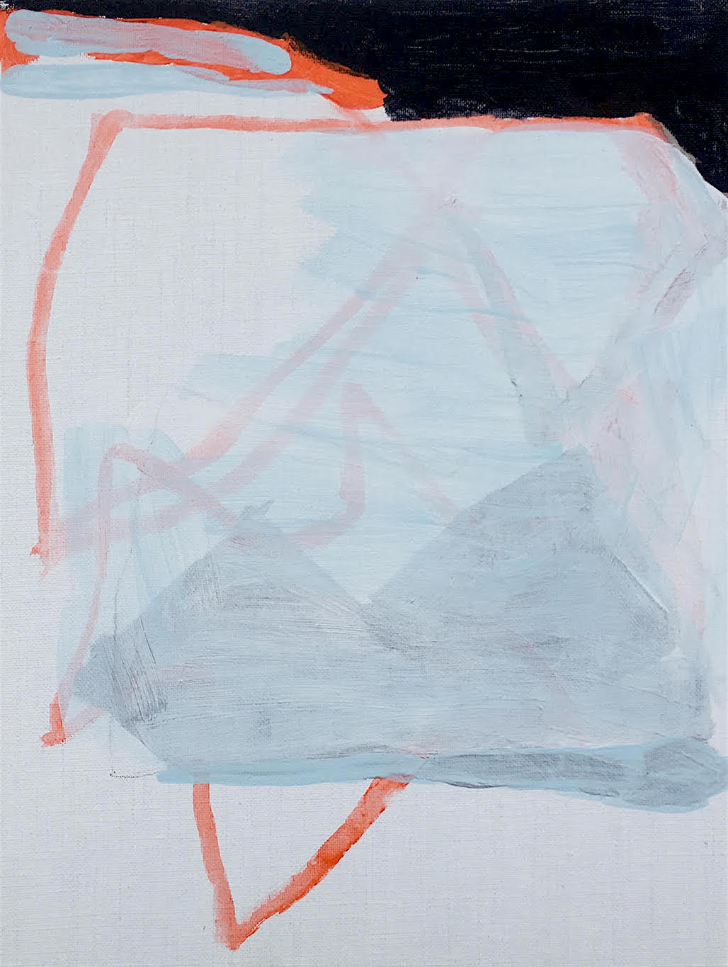
Brighton Walk
(5 April 2020) in chronological order
Work
And
Earth
Focus
Time
Please
No
Spring
Back
Infants
Outside
Garden
Playground
Allowed
Arms
In
Please


Work
And
Earth
Focus
Time
Please
No
Spring
Back
Infants
Outside
Garden
Playground
Allowed
Arms
In
Please
Part 2: 8 February – 1 March 2020
Opening Times: Wednesdays – Sundays 11:00 to 17:00
Part 2: Rana Begum, Ian Boutell, Philip Cole, Biggs & Collings, Deb Covell, Stig Evans, Jane Harris, Mali Morris, Jost Münster, Patrick O’Donnell, Carol Robertson and Daniel Sturgis.
“The title of this Painting exhibition does not dictate an aesthetic and it does not mean to imply a preference for one process or system of making work over another. It instead concerns itself with the elusive and critical nature of Contemporary Painting today; the complexities, the overlooked simplicities and the ‘wonder’ it can engender.”
(Curator’s statement in Press Release)

After writing about HardpaintingX2 (Part 1) and attending the recent mid-show Symposium at Phoenix Art Space I am still intrigued by what the term Hardpainting actually means. Would part 2 of this show clarify what, exactly, hardpainting is? For example, is ‘hardpainting’ an adjective or a verb? Or maybe it’s both, as doing and describing handily suggests theory and practice combined.
Or, imagine arriving late home from school on a Friday afternoon and mum asks what you’ve been up to in your art lesson today: “We’ve been displaying our Hardpainting exhibition in the school hall”, you reply with great enthusiasm.
Mum – Tell me all about it then.
It was great fun all week and we put up an exhibition at the end of the project. The usual teacher, Mr Wright, has been off sick so this young supply teacher, who only left University a couple of years ago, gave us the really good paints that the top class only get for their exams. She told us she was an ‘Installation Artist’ and went on for a while about the ‘expanded field of painting’ and also said that unpremeditated self-expression was an indulgence no longer fit for purpose in a post-digital era. I don’t have a clue what she was on about but she said that she had arranged for the 3-D workshops to be open for us as well.
We all felt a bit unprepared (except for Deb who loves to break rules) as it says ‘Self-Portrait Painting project’ on the timetable. This alternative project was called ‘Hardpainting’ and we had to find out what it was all about by making the work as a form of ‘research and exploration’, which was ‘planning in action’. There were no strict rules but her guidelines included exploring ‘colour, geometry and visuality’, and that ‘an application of making skills’ would be important elements to bear in mind. Anyhow, we like to be challenged and we were encouraged to produce work that was personal and so there would be similarities and differences in what we produced. She also said that we should avoid unnecessary figurative elements, as that’s what cameras are for these days. But we had to work neatly and with great care. The materials and processes of production should be regarded as important as any subject matter as well. Mr Wright would have choked on his cheroot if he had heard this! He says every picture should tell a story and that we should avoid that easy abstract nonsense that doesn’t get good grades in exams anyway.

Once the show was up I had a good look around. The Head Prefects, Jane and Mali, impressed everyone (as usual) with their equally skilful applications of thick and thin paint that embraced a painterly and methodical process, presenting decorative eyefuls of carefully placed brush marks and colour shapes. Both exploit great control in their paintings and explore colour, shape and configuration with astonishing expertise. Jane doesn’t use many colours in a composition, usually just three, and tonal nuances are created by the textures made by the brush, which uses natural light as a material of sorts. The imagery reminded me of flower heads or splashes in water, but that’s secondary to the constructive layering of the oil paint. The works display unbelievable confidence too, so she must be onto something.

Mali is obsessed with colour and she can put all of the colours, primaries and secondaries, together to create harmony. Mr Wright says that only one or two colours should dominate a picture, but Mali proves him wrong. Her works are also interestingly active, contrasting with the restfulness of Jane’s paintings. I think that they’re brave too, as she does not fuss about and lets the paint and colours interact as if truly separate from her ego. She must try really hard to not try hard.
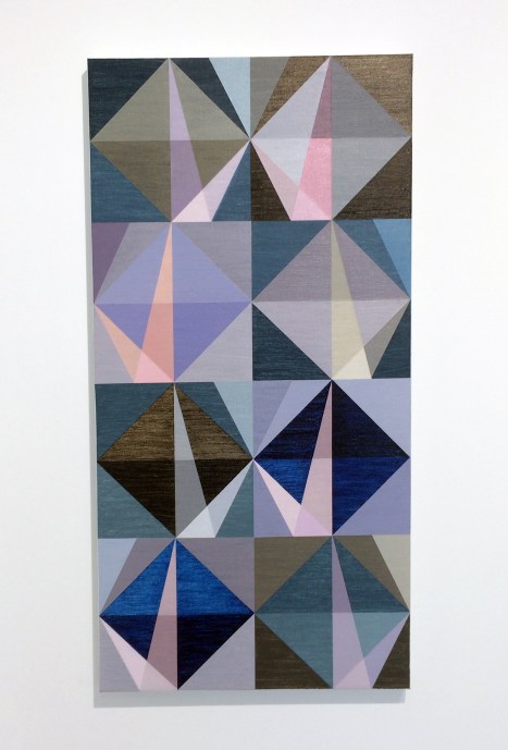
Matthew and Emma were getting on well by themselves as usual, especially as Matt likes being told what to do. Em really knows about colour and is usually timetabled for Ceramics, but the kiln is broken this week and the clay order has not arrived. Matt’s own paintings are usually bit a more textured and patchworky but he can be very careful at applying the paint when he’s in the right mood. They both like the geometric and abstract so start off with a neutral grid system that, weirdly, by subdividing and introducing diagonal lines ends up suggesting sea and landscapes which are punctuated by beams of light and colour that look kind of perspectivey. With left to right mirror images, held in check by a central spine, a geometric abstract field of tile-like segments become strangely earthly and atmospheric as opposed to architectural and assembled. This must be the colour doing something magical. I wish there had been more than one canvas on display.

Rana spent half of the week in the metalwork workshop but she was back in the art room just in time to use up some of the colours that Carol had left over from making her big triangle pictures. I’ll come back to Rana later, because the boys say that Carol is always so hard-edged and ‘reductive’, like it’s a problem. But the subtly striated yellow and orange backgrounds in her two paintings in our show made the geometric forms float out into the foreground of the canvas. The colour combinations within the forms she typically depicts create a visual equivalence to softness, cajoling a sort of mellow lightness. (She does circles, arcs and squares too – if only her boyfriend Trevor was in our class as well.)

Stig was a bit dreamy as usual, his paintings I mean. They’re rather fuzzy looking, like a camera lens is out of focus. But if you look long enough the flat forms eventually feel quite solid, almost hard, which surprised me. They deserve a great big dollop of time to ingest – and it’s worth the effort. He’s obsessed with colour and pigments and I can see him working in a museum conservation department in the future.

I think that’s why he gets on really well with Phil who is the coolest pupil from the science department (if only more kids would study art and science – and by the way his tie collection is amazing). Phil has been into resin for ages, but his colour combinations prove that he’s so much more than a patient fabricator, for he’s a painter with a greatly intuitive eye. Also, the drippy edges of his paintings give an arty edge to his works that emphasises the materiality of his incredibly silky-smooth works.

Ian (the lads call him ’laughing boy’, but he has a really serious side) and his new best friend Patrick were taking the hard-edged thing really seriously. Ian found a box of sticky tape and Perspex, which meant he didn’t get covered in paint like the new boy Jost usually does. Ian applies his acrylics really carefully, sometimes using a spraying devise. The Perspex, which reminded me of putting glass over a painting, is both ground and foreground. There’s an architectural vibe going on here, though maybe the reference is unconsciously to ‘60s fashion (I’m thinking Mary Quant with a touch of Bridget Riley) if we consider clothing as a form of body architecture combining surface pattern with form as an equal partner – only it’s essentially flattened out form becoming shape, albeit in shallow relief.

There’s a more organic kind of building and framework to Jost’s two pieces that seem to play with the waste materials that might have been collected from the studio floor (recycling is good) that embodies light and shadow with literal overlapping. Jost is a more organic sort of collagist than Ian. Mind you, their new friend Dan said he wanted to make things look simple but to slightly place his grids off-kilter and to unsettle the viewer a bit. Like when he puts two different reds next to each other; it does my head in but I kind of like it. Dan’s work seems to immediately hook the viewer into some kind of visual activity, though calling this a game would not do the work justice, as it’s more serious than a game implies. I’m always niggled, a little perturbed, by his work – but this sustains my interest. It was good that he had his paintings displayed together, particularly as the biggest of the three canvases (‘Not Fixed I’, 2019) felt like one big composition that could also be viewed as four in one.

Patrick loves painting but he also spent some time in the woodwork room where he was sawing up sections of birch ply and making some small constructions that could get him into University on an interior architecture course – unless he still wants to make some cool tent-like constructions for the Glastonbury Festival next summer, or maybe a Pavilion in a city park. But seriously, these would be great enlarged and developed beyond maquettes – only of course they’re not models as their handleable size makes them ideal for plinth or shelf display in an interior. Just like Rana, he activates the forms and the immediate white walls with reflected colour, only his shadows play a significant role too especially when shelving becomes part of the sculptural/constructional formation of the artwork with the wall or floor.

Rana and Deb are like chalk and cheese but not so much by their characters (I don’t know them that well), but this is based on first impressions of their artwork. They each construct their works in a spirit of positively affecting a sterile space such as a white walled gallery environment. Rana keeps her colours uncomplicated but juxtaposes them in two and three-dimensional configurations that you could live with and look at forever. Our teacher got a bit philosophical when she explained that Rana’s two vertically dominant wall pieces offered ‘perceptual and phenomenological experiences’. I think this means you see and feel the work physically and that we are part and parcel of that space, not just detached observers.

Sometimes people think Deb is the odd one out; not odd, odd – more of an anarchist (which makes Matt a bit jealous) as she always challenges our usual art teacher to justify why paintings should be fixed to stretcher bars or have boring old frames put around them. She likes to make these 3-D models that she attaches on to the walls when the teacher is out of the room doing some photocopying (though we all know he’s sneaked off for a ciggy in the bike sheds!). I think she might be a bit ‘expanded field’ – so our student teacher loved her work, but explained that these labels are less important than the work itself.

The teacher would not tell us what Hardpainting really means and I wanted to tell her that I didn’t think she knew anyway, but the bell rang and it was time to go home.
Mum – Thank goodness for that. Now then, are you having fish fingers or fishcakes, it’s Friday.
HARDPAINTINGX2 has been curated by Deb Covell, Stig Evans, Philip Cole, Patrick O’Donnell and Ian Boutell.
Links for pupils, in order of appearance:
Deb Covell https://www.debcovell.co.uk
Jane Harris http://www.janeharris.net
Mali Morris http://www.malimorris.co.uk/index.html
Emma Biggs and Matthew Collings http://emmabiggsandmatthewcollings.net
Rana Begum https://www.ranabegum.com
Carol Robertson https://www.flowersgallery.com/artists/73-carol-robertson/
Stig Evans https://www.stigevans.com
Philip Cole https://colecorner.com
Ian Boutell https://www.instagram.com/ianboutell/?hl=en
Jost Münster http://www.jostmuenster.net
Patrick O’Donnell http://www.patrick-odonnell.co.uk
Notes:
Mr Wright is partly based on my Head Teacher from Junior School who was so highly critical of a drawing I made (I was aged 10) that I should probably seek therapy, even now. He did not teach art (thank goodness). I don’t think he smoked cheroots either. Otherwise, all of my art teachers were brilliant.
The reference to ‘abstract nonsense’ is another autobiographical anecdote as I failed my O’ Level in Art at age 16 with my timed examination piece being an abstract composition. In the re-take for the examination a year later I painted a ‘realistic’ picture of a townscape. I passed and was able to attend Art School. I don’t recall painting a building ever again.
Please understand that this review is a little tongue-in-cheek. I have written about HARDPAINTINGX2 Parts 1 & 2 for AbCrit. Link
Trevor Sutton (mentioned but not in the exhibition) http://www.trevorsutton.com
Phoenix Art Space, Brighton
Part 1: 11 January – 2 February 2020
Opening Times: Wednesdays – Sundays 11:00 to 17:00
Part 1: Richard Bell, Katrina Blannin, John Carter, Catherine Ferguson, Della Gooden, Richard Graville, Morrissey & Hancock, Tess Jaray, Jo McGonigal, Lars Wolter and Jessie Yates

It’s chaos out there. You may be heading east from the railway station or the city centre so you have to deftly negotiate the human throng of the iPhone generation of distracted texters, Google mappers and Spotify listeners commanding narrow lanes that will eventually lead to the Phoenix Art Space. Eager gallery-goers and psycho-geographers beware too; for en-route to the gallery you may trip on uneven pavements and become confused as you navigate some way of crossing the maze of roads and temporary pathways that otherwise create a fascinating collage of concrete, stone and tarmac surfaces. Use the eyes in the back of your head as you navigate this terrain and inadvertently trespass upon leaf-covered cycle-lanes. But it’s worth the hassle.

But even as Brighton city centre is regenerated the Phoenix is currently a haven for some degree of peace and tranquillity as it hosts H_A_R_D_P_A_I_N_T_I_N_G_X2. We were here two years ago (courtesy of AbCrit) for the inaugural H_A_R_D_P_A_I_N_T_I_N_G exhibition. This time there are five curators (Patrick O’Donnell, Stig Evans, Philip Cole and Ian Boutell are joined by Della Gooden) and they have assembled a 2-part mini-survey of current reductive, colour-conscious (when employed), object-oriented, minimalist, what-you-see-is-what-you-get, bespoke painting. Defining ‘Hardpainting’ is a fascinating challenge, but looking and experiencing must initially supersede theoretical advocacy – and I suspect that the curators have defined their terms more critically through the ongoing curatorial journey now undertaken.
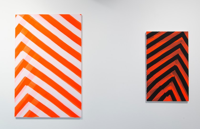
Richard Graville – ‘Blushing Phantom’ and ‘Red Banded’ (both 2019)
Based on the evidence of this show (and the accompanying catalogue that reproduces images representing each contributor’s paintings from parts 1 and 2), this, it appears, is what Hardpainters do. In an ‘un-expressive’, non-gestural manner they eschew the pictorial and representational and make work that is as equally visual (almost gratuitously in some instances) as it is skilled in construction and application of medium. Even Richard Graville’s pair of canvases, ‘Blushing Phantom’ and ‘Red Banded’, that come the closest to accruing accusations of painterly abstraction, have an aura of careful, premeditated control. That they echo the similar stripes on the workforce vans outside the building is either unfortunate or reminds us that abstract art is everywhere.
Understandably there is an emphasis on the viewer as active participant to make whatever sense or reasoning they can. But any burgeoning definition will not exclusively intend to suggest an orderly visual terrain in every instance, as some works quickly engage the eye and disrupt the gaze more than others. For example Richard Graville’s painterly, ‘Blushing Phantom’ and Morrissey and Hancock’s flat, hard edged ‘TPIAR’ possess dynamic Vorticist qualities; whilst John Carter and Catherine Ferguson offer a more restful, contemplative experience for the viewer that mixes up the range of visual encounters on display.

In some instances there are works that could qualify as ‘Slow Art’, to coin a phrase from the late Arden Reed. For whilst many of the 24 works on display appear to strive for visual simplicity and understatement the requirement to settle in for concentrated looking will allow the works to stage various scenarios of narrative-free, abstract, experiences. Or is a scenario a narrative of sorts?
![004 - HPX2pt1 - Tess Jaray - One Hundred Years [Green] & [Purple].jpg](https://fineartruminations.com/wp-content/uploads/2020/01/004-hpx2pt1-tess-jaray-one-hundred-years-green-purple.jpg?w=840)

Even at this early stage of a first visit, the message was becoming clear that the Hardpainting theme does not constitute a narrow range of styles, materials or appearances. For example, two contrasting, non-matching combinations of the selection each involve Jessie Yates’ textile/fabric uses of paint on canvas, augmented with stitch as an integral linear ingredient. ‘Untitled 1’, a collaged patchwork of variegated parts, hangs alongside Katrina Blannin’s geometrical four piece ‘Sequence #2/4 (P)’; whilst in an adjoining space Morrissey and Hancock’s systems inspired, ‘Rotational Drawing’ and ‘Untitled’ are hung adjacent to Yates’ miniature and piecemeal ‘Canvas Studies’. This clever, or fortuitous, curatorial ruse emphasises a sense of individual journeys being undertaken without recourse to a strict program or manifesto. Hardpainting is not a School of painting or a ‘movement’: maybe it’s an attitude.

By my third or fourth visit to see the show, as I took breaks from my studio upstairs, an unexpected sense of connection between Morrissey and Hancock’s geometric, maze-like ‘Rotational Drawing’ and Yates’ organically structured and curvy-edged ‘Canvas Studies’ installation brought out the underlying geometric randomness and systematic essence of the 30+ canvas collages.

My first exposure to Katrina Blannin’s paintings were from seeing her impressive solo show, ‘Annodam’ at Jessica Carlisle in 2016, where she actively acknowledged and employed (via Piero della Francesca) a carefully formulated mathematical intelligence towards a streamlined abstract outcome. The inherent geometry and visual impact of colour as shape (and vice versa) as a systemic component of the design aspect of painting is explored by Blannin in these four distinct panels that motivate physically active looking from left to right and in and out of a shallow visual space. Yet here, in ‘Sequence #2/4 (P)’ the content partly derives from the throwaway cardboard discs from pizza packaging, rather than art historical material. Even without knowing this (see Della Gooden’s essay in the catalogue) the ergonomic discs, not too big, not too small for specific uses, possess a degree of visual comfort and functional association. Because of the afterimages from Blannin’s work, due to the colour/tone combination, the flat shadowy forms on the viewer’s eye then track around the gallery as you blink ready to refocus on another exhibit.

A commanding and exquisite group of three paintings by Catherine Ferguson ‘Cieco’; ‘L’arresto del Tempo’and ‘Fango’ were probably enough without ‘H&P’ on the same wall (which would, in this context, have been better placed with works by Richard Bell and John Carter). Ferguson’s works were possibly the most indicative of a Slow Art suitability as they appeared to be stripped down or reductive manifestations from more complex compositions. These are immaculately painted compositions that present great dexterity in paint handling and even contain a hint of painterliness that I had not expected see in this show.

A more deliberate or obvious pairing (with Carter’s ‘Chapitau Three Identical Shapes’ making a cohesive triangulation on the opposite wall) is made between ‘Tectonic Plates (For A.H.)’ and Richard Bell’s ‘Equivalences (2 part painting)’. Possibly a diptych, due to the title, Bell’s pair of canvases could hang alone and appear complete. Following an initial impression of highly controlled rendering a multi-coloured and schematic sub-division of the rectangle; on closer inspection ‘Equivalences’ appears to only allow one coat of paint per shape, which means that in places (e.g. the white on red and green on black in the left-hand canvas) the single layer does not totally cover the underpainting opaquely as might be expected. As if to subtly emphasise an understated painterly approach the canvas edges are not overpainted by the colour shapes that leave a millimetre of an almost imperceptible edge.


Three interventions from Della Gooden add to the variety of approaches and intentions selected for HardpaintingX2. Two of the works, ‘for’ and ‘against’, might be easily missed on an initial tour of the exhibition, as these assemblages resemble doorbell chime covers and are placed on a pillar rather than a wall. ‘As’ physically intervenes in the space, although its placement on one of the larger walls enables a more conventional expectation. A hand-drawn graphite line is ejected out of the bottom left hand corner of the blue rectangle, which appears as a plane of semi-transparent colour that has temporarily found a space to occupy. Perhaps this is a portal of some sort as an ethereal feel prevails with the addition of a misty emanation of blue pigment to the right, although a square of wall or a thick wall tile is placed where it may or may not belong and brings one back to the solidity of the built environment. This tableau is applied to a larger white gesso background, which suggested an empty street shrine I had seen in Napoli some years ago. I cannot explain this last point as anything more than a peculiarly personal point of departure; or the sense of the blue as a reminder of a Gothic or Renaissance painter’s lapis lazuli for Mary’s cloak (even though it’s Prussian blue). There is something uncanny about this assemblage emanating from the gallery wall, for the artwork has a short life, as it will be painted out before Part 2 is installed.

If there is at least one curatorial surprise, or challenge to the audience in this show, ‘Kiss, Kiss, Bang, Bang’ by Jo McGonigal might be chosen. Perhaps this is the main Slow Art contender, as a narrative appears more likely in this painting-cum-sculpture. Is this yet another tableau of sorts (most pertinent to a form of Slow Art whereby a painting can be represented by real people dressed up as ‘fictive others’ and posing as constituents from a ‘real painting’) to link with the imaginative essence of Della Gooden’s ‘As’? Or is it a model of a theatrical, but virtual, stage set? Still searching for a context, a sense of the surreal bringing-together of unrelated components to create an alternative fiction, this work is anything but blandly minimal. Held aloft by two striding, leg-like forms a box-like, steel girder sort of construction makes a stage-set for various items including a balloon and a ball of putty. The suspended tangle of cord and its dim shadow or reflexion has a connection of some kind with the neon light that floats as a light gesture, or a whimsical cloud, to the left of the box. I am lost for finding meaning and understanding, but feel suitably challenged in an attempt to make sense of this absurd scenario.

Splitting the show into two parts is unfortunate to some extent, though curatorially useful for showing a wide range of works and avoiding over-congestion. As is typical of the white-cube aesthetic the context of the ‘art space’ as a neutral but active component to display the works, with full attention paid to the wall spaces between works, brings some coherence to a selection of artists who might not otherwise show together. Each work is indicatively related to every other, as an aura of focussed attention and control to the making and construction process permeates every artwork included here. This in turn invites inspection of each and every component part of the presence of each work.

Of course it might be that the exhibition title sets up the attentive and open-minded viewer to approach the show in a particular state of mind, for we can start the viewing with a proposition: that there is a varied field of abstraction that can be categorised under the umbrella term of ‘Hardpainting’. Here there is still enough of a mix to ensure that diversity within a particular aspect of abstraction, wherein the practice confirms an adamant attitude towards a certain quality of making and presentation. Nothing is superficial, slap dash or ‘expressive’; but an emphasis on visuality is paramount. This reminds me of a point made by Gillian Ayres (whose work I suspect would not be in this show as it is so instinctive and improvisatory), that in addition to any notion of painting as a visual phenomenon, it “is a physical and material project”.
Co-curator Ian Boutell summed this up succinctly when he stated in an interview for the Phoenix website that – “There are lots of ways of reading the show but for me the underlying theme is that it is about premeditation; careful forethought and high production value finishes.”
Hence an atmosphere of calm has been achieved in this carefully curated environment – in stark contrast to the developments outside of the building. Bring on part 2.
LINKS:
Richard Bell https://www.richardbellart.co.uk
Katrina Blannin http://www.katrinablannin.com
John Carter https://www.redfern-gallery.com/artists/38-john-carter-ra/biography/
Catherine Ferguson http://catherineferguson.co.uk
Della Gooden
Richard Graville http://richardgraville.com
Morrissey & Hancock www.patrickmorriseyhanz.co.uk
Tess Jaray www.karstenschubert.com
Jo McGonigal www.jomcgonigal.co.uk
Lars Wolter www.larswolter.de
Jessie Yates www.jessiejewyatespainter.com
AbCrit HARDPAINTING review (2018)
Slow Art art net.com article
Gillian Ayres: The quotation is from the introduction by Andrew Marr in the ART/BOOKS (2017) monograph.
SATURATION POINT Inside the Outside: saving up for the future by Della Gooden (from the catalogue)
HARDPAINTINGX2 (Part 2) will present works by: Rana Begum, Ian Boutell, Philip Cole, Biggs & Collings, Deb Covell, Stig Evans, Jane Harris, Mali Morris, Jost Münster, Patrick O’Donnell, Carol Robertson and Daniel Sturgis.
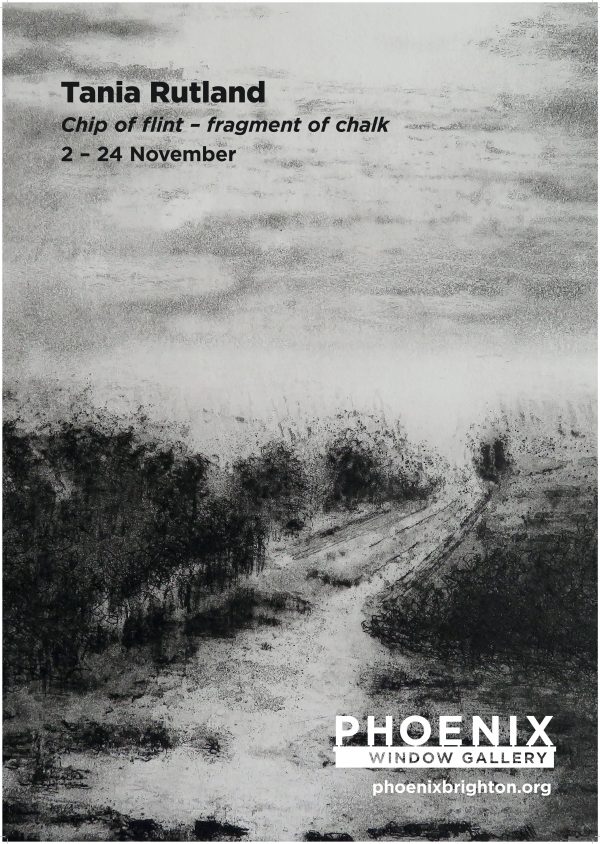
‘Crowding the solitude’, ‘Ghost white path’, ‘Night’s first light’, ‘Silent reach’ and ‘Restless lane’ might be headings in a list of poems from a collection that constituted a volume of landscape inspired verse, but they are selected from the titles of drawings and prints from Tania Rutland’s exhibition at the Phoenix Art Space.
Another title, ‘Chip of flint – fragment of chalk’, makes reference to commonplace Sussex downland geological material that could have been gathered from her visits to Iron age Mount Caburn and Neolithic Cissbury Ring in East and West Sussex and is the intriguing title of this exhibition.

The very idea of a ‘chip’ or a ‘flint’ suggests the collection of a memento, a physical token from a walk, picked up to place on a shelf when home. Such an item might be revered as a memory of a time and place spent in solitude or with a partner or friends from a Sunday walk. The cultural pursuit of walking might be a form of escape from everyday life, most especially the ‘working week’. A leisurely stroll or demanding hike, especially in the countryside, can be rejuvenating and refreshing. It might also be consoling during a time of stress. A walk is healthy for both mind and body; and for a landscape artist a place for research, inspiration and hard work.
Though superficially a landscape exhibition, on reflexion, ‘Chip of flint – fragment of chalk’ is loaded with speculative and thought provoking possibilities enabling the visitor to take away the non-physical souvenir: not to be placed on the mantelpiece but constituted in the form of ideas to consider and discuss further and, ultimately, leading to environmentally focussed action.
From the very start of the corridor space Window Gallery, making a de facto antechamber, two wall-mounted assemblies of small, unframed, preparatory drawings make it clear that drawing is at the core of Rutland’s practice. As an introductory display, sufficient in itself as a stand-alone exhibition, the 28 studies make an implied proposition that drawing is still of paramount importance towards painting, especially in landscape art. Whilst an en plein air approach is also possible, the drawing in advance of the essential schema for a final painting, even without colour content, provides the opportunity for intense consideration of composition and content; and for revision of the essential rectangular format. Rutland’s methodical approach also develops the initial ‘sketch’ to a more ‘finished’ state and therefore requires a more prolonged period of execution. In this respect, the lengthening of time to make what might simply become no more than a preliminary part of production, adds to the inherent conceptual aspect of Rutland’s greater project, namely that of time and duration.
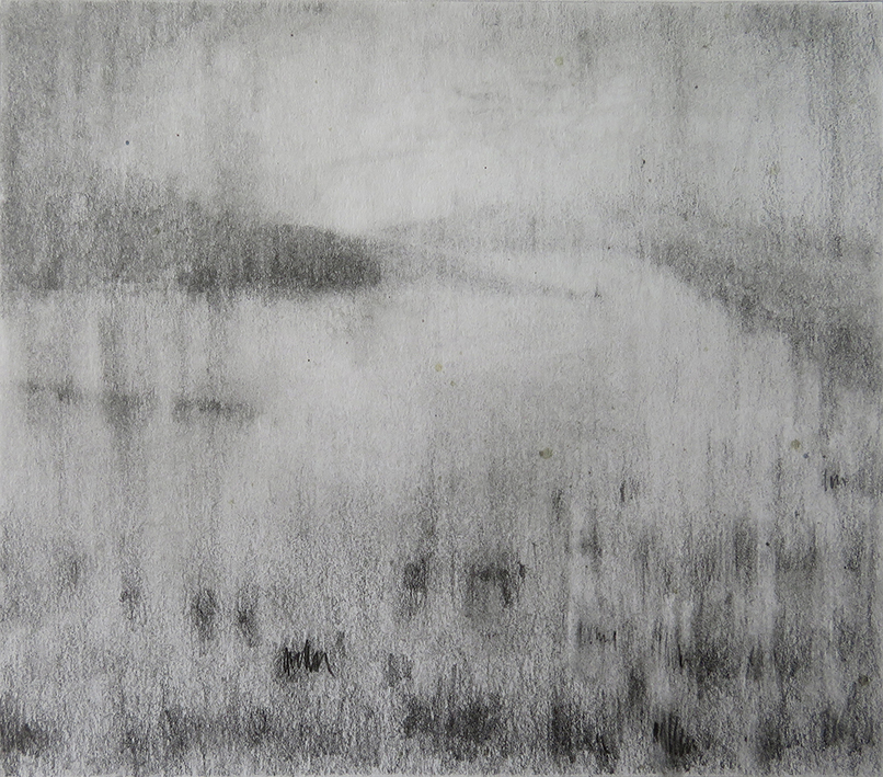
Annotated on half a dozen of these relatively intense drawings are more titles, including: ‘Ghost lines’, ‘Eroded slope’, ‘Frozen light’ and ‘Fatigue of early light’. Without mounts, but with clearly measured and demarcated perimeters for consequent development into paintings, these studies may have come straight from the studio wall in her Phoenix studio. This informality in presentation might have initially diminished an observer’s attentive reaction to these works, but throughout the opening evening many visitors could be seen both standing back to view each of the two groupings of drawings and then be observed stepping closer to scrutinise each image as if through a magnifying glass. In relation to time a second aspect, that of concentrated visual observation of various locations, loaded with evidence of human interaction in and on the land (and sea), also implied itself in the bigger project.
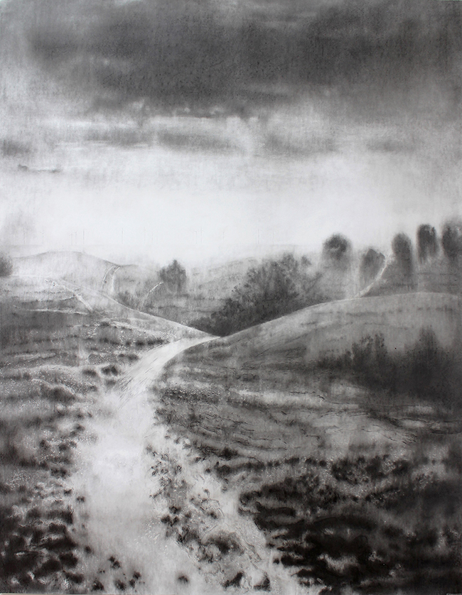
Continuing into the main display space the biggest piece in the show first greets the visitor in contrast to the small studies just encountered. The pencil and graphite ‘Ghost white path’ impresses not just by size alone (200x150cm), but also by a display of controlled elegance in mark making and an example of compositional skill in which the viewer might literally fall into this Downland vista. As a completed drawing, ‘Ghost white path’ is as consummate and exhaustive as a painting might be and therefore expands the notion of drawing as going beyond the supportive role that it often takes.
In this significant work the viewer will certainly gain a sense of the past and the present day in one hit. In the bright distance, where the intense light dissolves the sea from sight, the Rampion wind farm turbines that now dominate the view from the Sussex coast have been recorded. Whether these technological structures please the viewer or not, like the telegraph poles we may barely notice anymore, or the electricity masts that cannot always be buried beneath the ground, we will inevitably have to become accustomed to this burgeoning technology for generations to come.
The past and present (an ancient landscape and an off-shore development) combine in one monumental vista so that a viewer has to contemplate a challenging and controversial journey to the future in this era of climate change awareness and necessary proactive behaviour.
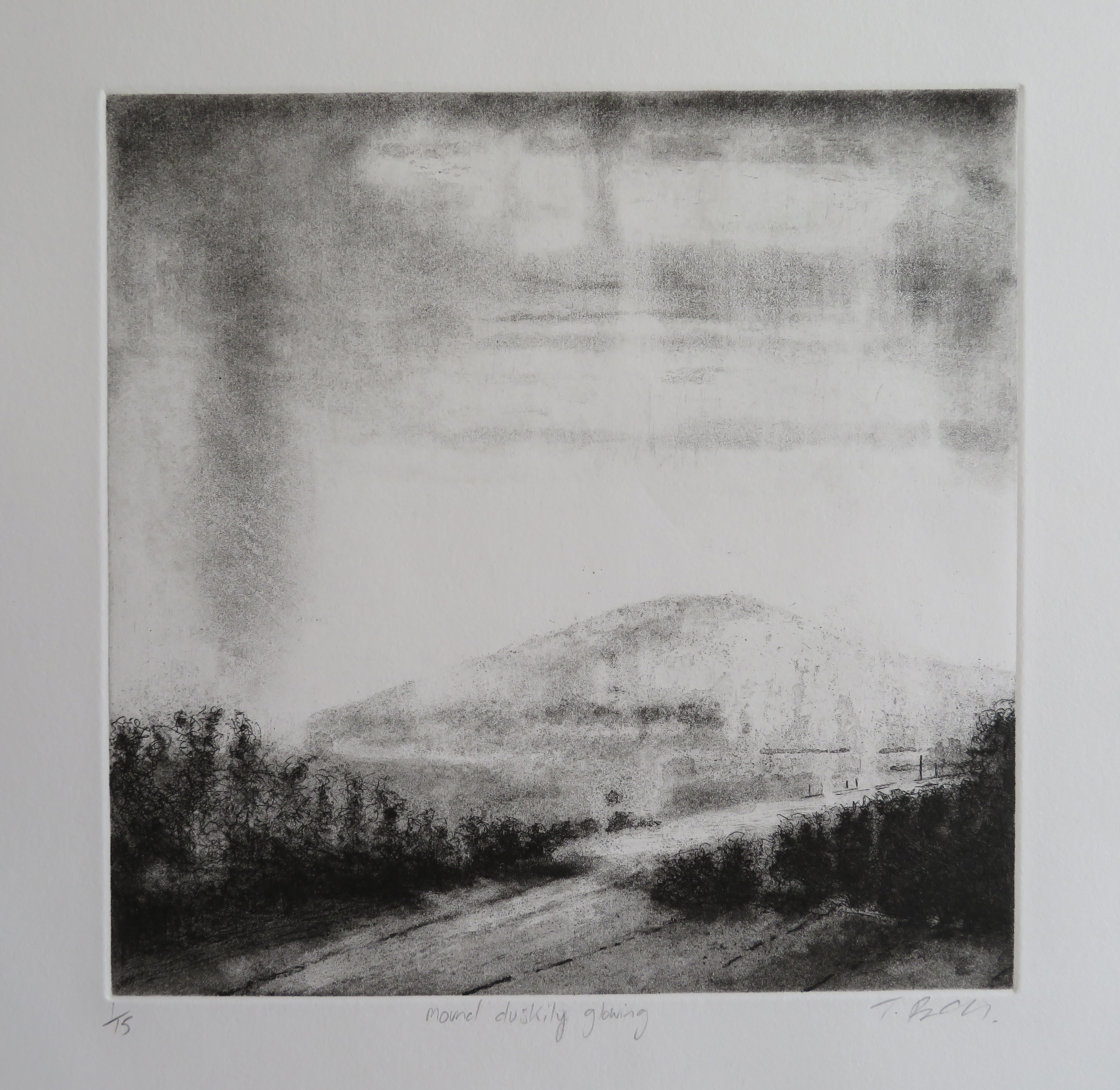
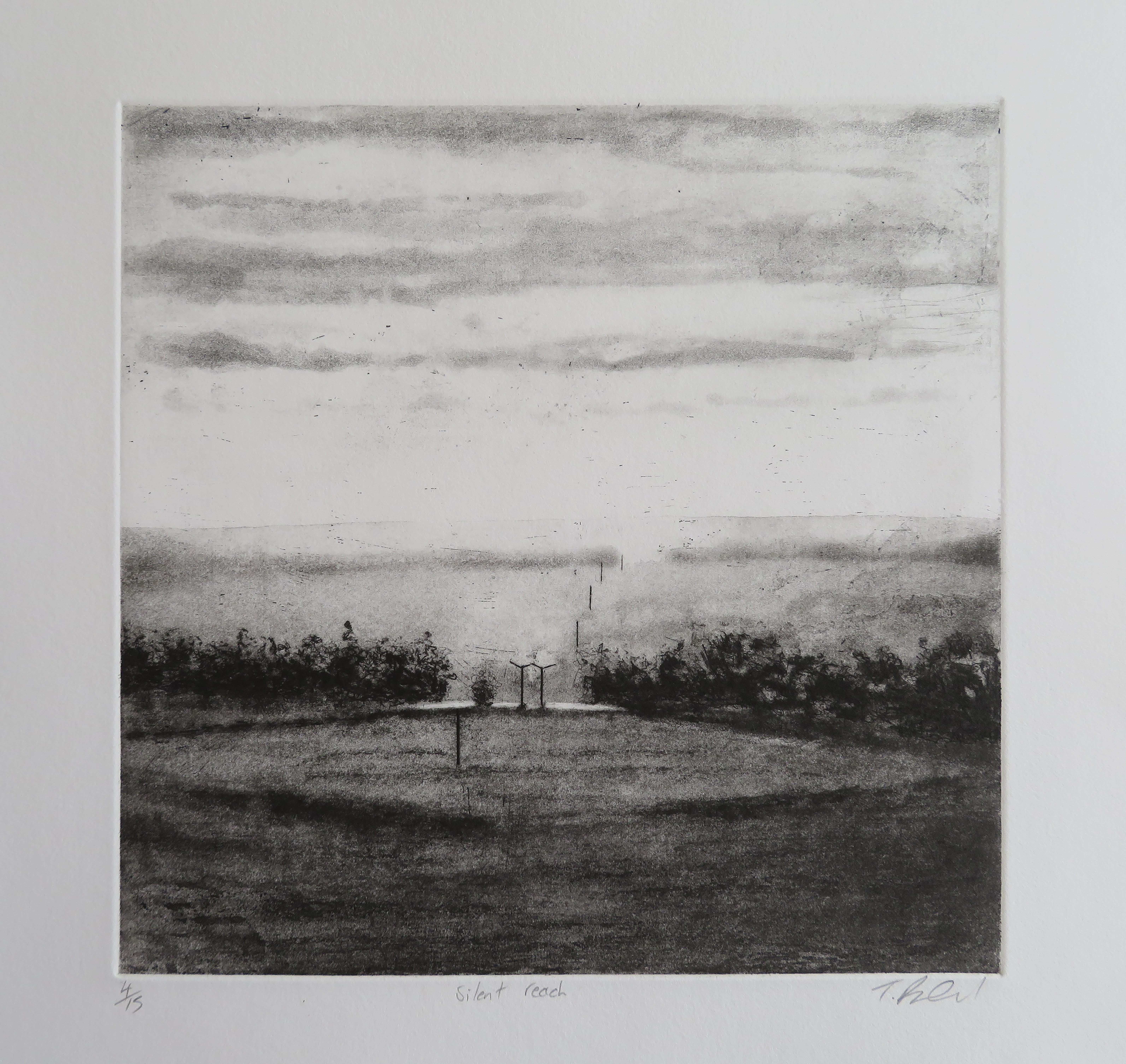
Four monochromatic etchings are displayed next, including ‘Mound duskily glowing’, a title merging topography with time and light, which again suggests a poetic counterpart (a haiku perhaps) that may one day be written. In ‘Silent reach’, telegraph poles located in a flattened mid-grey rhombus in the central area of the composition leads the eye from foreground to mid-distance. The poles could be traversing alongside a coastal area, or trace a communications route a few miles inland, leading to the next village or town. Very few regions of this relatively small island will be without such evidence of human habitation, as if such evidence of technology was as natural a phenomenon as the trees.
With a change of process and medium Rutland allows a weathered, washed-out look in the thinned ink layers transferred from the surface of the metal that she has etched with. For example, in ‘Selvedge edge’ the distant hills are visually subject to mist dissolving form, whilst rain falls as weather conditions change appearances. In the bottom section of the image fence posts create a small enclosure, a signifier of order and land ownership. A telegraph pole, like a crucifix, in middle ground, merges at its base into foliage. Dark parallel lines in the foreground, perhaps suggesting the selvedge edge of fabric for the title, foretell the flint seams in the set of the four ‘Flint Seam’ drawings that are to follow.

These more minimalist compositions, ‘Flint seam 1, 2, 3 and 4’, are placed at the centre of the show. They are undoubtedly complete in themselves but may well hold the prospect for further development as abstract paintings. Each is placed behind a clear acrylic sheet, rather than mounted in a conventional frame. Like its counterparts, ‘Flint seam 2’ is composed of a series of vertically placed horizontal bands of smudgy, burnished graphite drawn on to a gesso (i.e. chalky) coated, paper ground. Within these thin, dark, cloud-like strata are more defined linear marks suggesting a compressed handwriting with a slightly nervous, quivering organic edge.
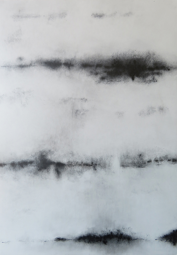
These often flat and smooth, mark-like shadow shapes are found in split flint nodules originating from sedimentary chalk that litter the farmland in Sussex and have been used as building materials for walls and buildings since the Roman era. Further back in time flint was fashioned as a Stone Age tool. But way beyond any human presence on earth they are a literal compression of geological time and materiality that seems beyond comprehension and may well suggest a natural kind of drawing. Dark and wave-like, these markings made from the chalk seabed reveal fissures of implied energy. As a form of visual poetics, the past is metaphysically now in these teasingly simple, but thought provoking and elegant drawings.

At what appears to be the end of the display, a group of five framed drawings (including the title piece of the exhibition) are presented in suitably mounted and framed studies that, like the etchings, read as ‘finished’ works. They include ‘Crowding the solitude’ which is a similar composition to the aforementioned ‘White ghost path’. In the mid-ground the land builds steeply to two bulbous hills; to the right on the implied horizon are the perspectival rows of 14 vertical masts from the Wind farm out at sea. In the space between the hillocks, and particularly on the left hand feature, is a meandering configuration of chalky pathways. The closer foreground is patterned by a gentle arrangement of subtle tones that visually pock mark the paper surface. The notion of the landscape as corporeal and libidinous is difficult to deny.

The last of these five drawings is titled ‘Flint’. Initially it could be a drawing that goes unnoticed, such is the insistent or subtle presence of so many of the other works. One feature, however, hooks the gaze as one might head for the coffee bar and the prospect of seeing a painting from Tania Rutland. Within this rendering of what may be a recently ploughed and almost featureless field, a tiny but visually dominant grid-like structure interrupts the shallow curve of the land, just before the dark masses of a thicket of trees on the close horizon, revealed contre-jour, emphasising a sense of infinite space beyond. Its identity is a mystery: could it be a wooden or metal framework? From the bottom right-hand corner of the drawing a purposely trodden pathway leads to the unknown construction and it could be that the track across the field has been rendered into the surface by either animals or humans.

Outside of the Window Gallery, but in a suitable display space that extends all of the exhibitions, one of Rutland’s oil paintings, ‘Remote dwellings’ is presented on a dark grey wall. This provides an example for those who do not already know her work and is now interestingly and more than adequately informed from seeing the drawings and prints. One painting is probably just enough exposure in this context and holds out the prospect of seeing a future exhibition of Rutland’s paintings.
Significantly, this work in the more ecologically minded attitudes of society today is made more potent by its combined references to the past, present and future. The human conquest of the environment is, of course, aided and abetted by the genius of technologies, open to interpretation and revision. The drawings and prints presented in ‘Chip of flint – fragment of chalk’ not only record and reflect the history of particularly special locations, but provoke the observer to contemplate the future too.
Geoff Hands (November 2019)
All images © Tania Rutland
Link: Tania Rutland’s website – http://www.taniarutland.com
“He came home from the war with a party in his head and an idea for a firework display.” (‘Swordfishtrombone’, Tom Waits)
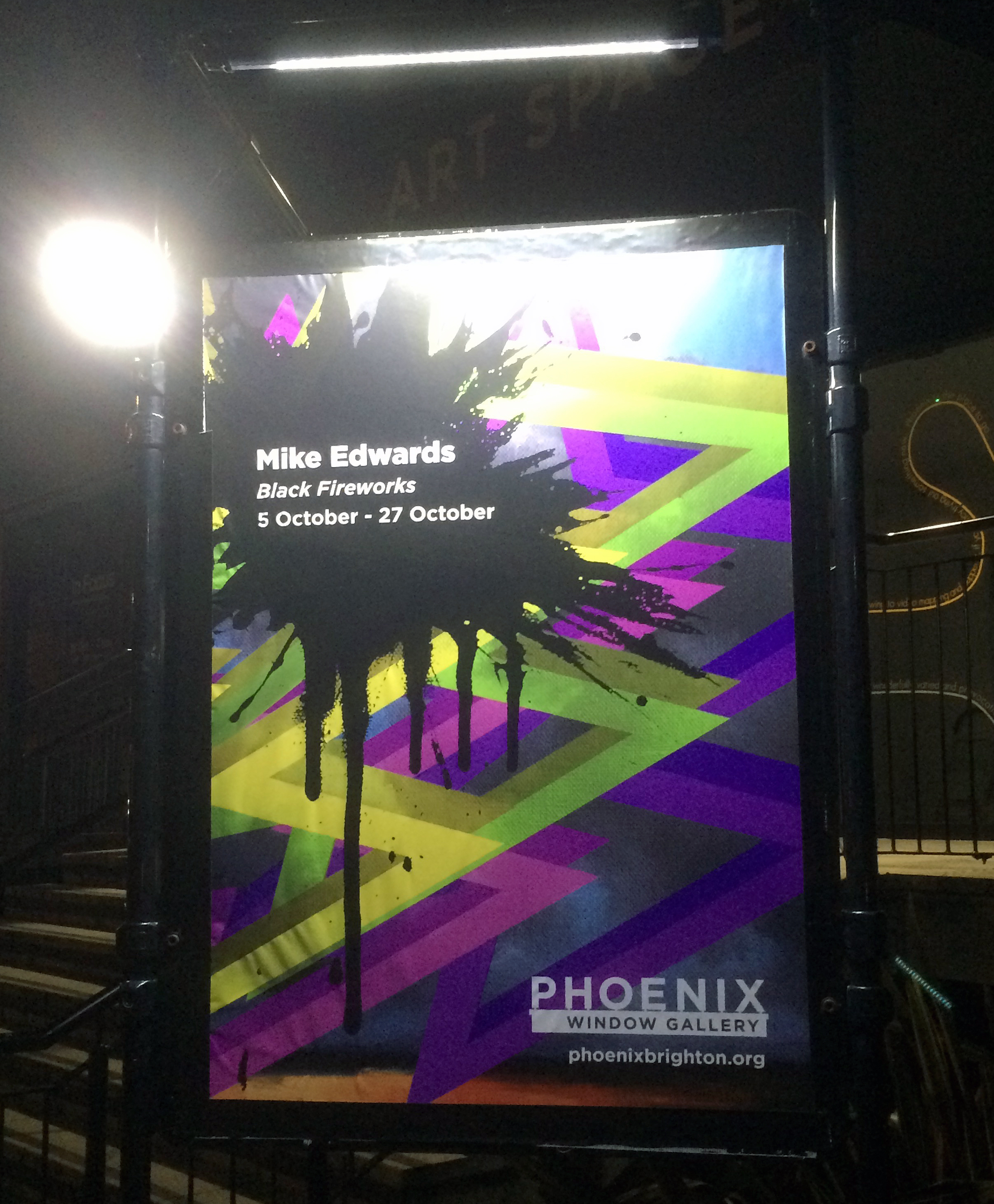
One of the earliest Black Fireworks paintings (‘Black Firework Painting’ – not exhibited here) was produced on 20 January 2017. Nearly three years later Mike Edwards has created a distinctive body of work throughout September 2019 from which eleven of the 30 paintings form the centrepiece of this show, plus three associated works. A potential benefit of a gallery at a studio complex is for displays to reveal explorations of new ideas and work in progress from the incumbents, rather than just exhibitions of fully realised periods from an individual’s practice. Arguably, any distinctive period of an artist’s oeuvre is still, in some way, a selection of work in progress but ‘Black Fireworks’, provides a fascinating departure by Edwards from his ‘bread and butter’ works. The change is not wholesale as there are undoubtedly connections with his earlier works, but current preoccupations and future possibilities have been examined and explored in what could turn out to be a preliminary body of work.
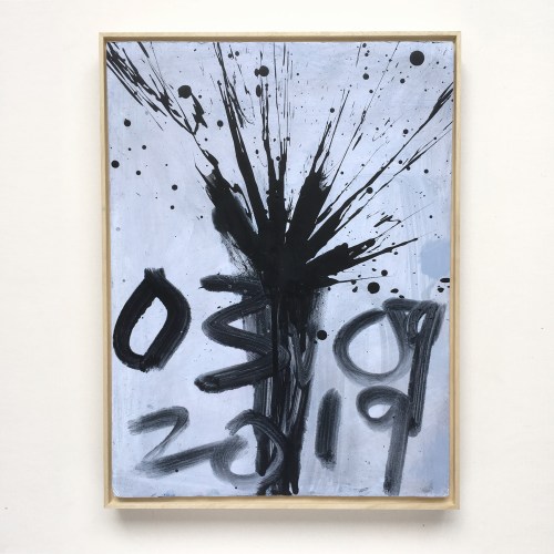
Edwards completed his September 2019 series of ‘Black Fireworks’ barely three days before the show opened – with framing still to do. Such a move may have been foolhardy or brave: either way the transitional nature of the collection provides an insight into the creative process that might often be overlooked by an audience expecting ‘the best selection’ from a body of work from a sustained period of time. It also provides a spur to other artists to revive their practice by encompassing the risk factor that may have lain dormant from their formative student years. This is not to suggest that ‘Black Fireworks’ is in any way reminiscent of an undergraduate’s body of work. It’s too sophisticated for that as, for example, the seemingly random splatters of black paint (burst from a paint filled balloon that might double as a fist or a cushion for comfort) that are repeated in the paintings are likely to have been washed off and reinstated, or carefully adjusted throughout the month-long project. There is also a distinct possibility that one or two ‘failures’ or unresolved compositions have been allowed to remain in the series (one of my favourites, ‘Black Firework Painting 21.09.19’) – though it’s all quite subjective.

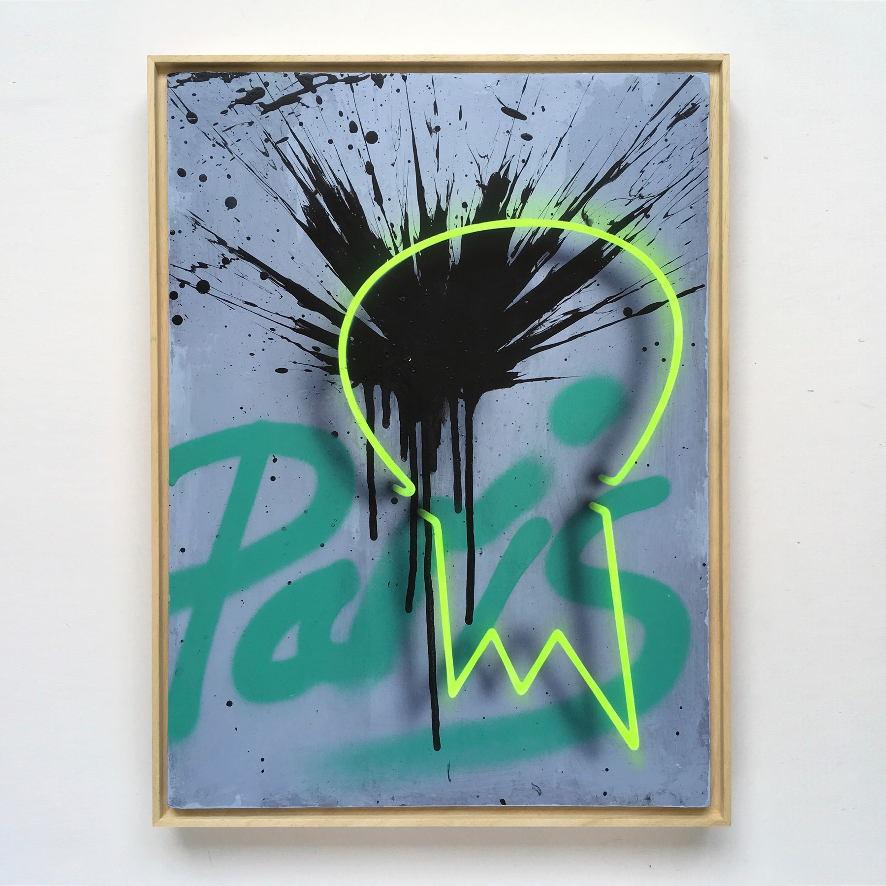
In some instances elements from older works resurface, most obviously the personal iconography of the skull and the energy inducing zigzag motif. Some, such as ‘Black Firework Painting 04.09.19’, have an additional graffiti-like rendering. In this work the word ‘Paris’ has been daubed onto the blue-grey ground before the black burst of acrylic paint was applied. The imagery is further enhanced, and completed, with a neon-like rendering of a primitive human skull, complete with cast shadow to visually push the skull into the viewer’s space. Purposely or not, the dot over the ‘i’ in Paris doubles as one eye for the skull. There is nothing slapdash or random about this painting as it combines a rendering of informal lexicography with abstract, mark making, intensity. Referencing Paris also gives the work a specific historical dimension after a year of protest in the French capital and beyond and is granted a little more particularity by the choice of yellow (from the gilets jaunes) for the two lines that constitute the street-art type skull. Edwards loosely appropriates, as visual metaphor, the skull for the mind that thinks about the world and what goes on in it. ‘Black Firework Painting 04.09.19’ is a visual morpheme, wherein differing language systems combine successfully to produce a coherent whole.
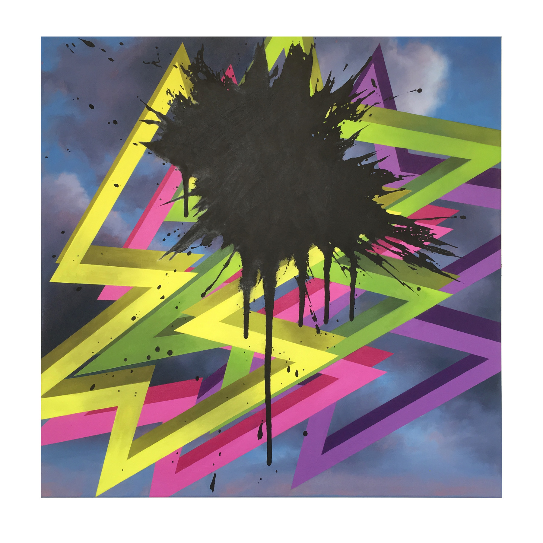
Frustrations at the way things are, or how others act, can irritate. We might literally hit out at others, shout out loud or scream inside. In painting, especially in an expressionist vein, one option to the artist is to throw the paint at the canvas, constituting a deliberate act of unbrushworthiness (sic). This ultimate and totemic symbol of pent up frustration may well be the splatter that smashes against the barrier between the inside and the outside: self and society, me and you, us and them. These Black Fireworks are sneakily contradictory as they appear as a personal (visual) attempt to be integrated into the ever developing body of the artist’s work, but as active participants with some impatience and informality in addition to the well established degree of control normally associated with his work. For example, the inclusion of ‘Magna Carta’ and ‘Thrills, Skills, Kills & Ills’ shows evidence of Edward’s highly disciplined painting abilities. So too does ‘Black Firework Painting September 2019’, a 60x60cm oil painting on canvas that is both completed and undermined by the particularly aggravating intrusion of a weighty black splatter over geometric zigzags and a sublimely dramatic cloudy sky as theatrical backdrop.
The smaller and more speculative acrylic on board ‘Black Fireworks’ (which at 40x30cm suggest the page of a sketchbook or preparatory study) are a productive response to external circumstances, proposing a painting surface that constitutes both a resistant skin and a site for testament beyond simple materiality. It’s the contradiction of the material and the mental that might be both engaging (for the viewer) and frustrating (for the producer). Even as personal exegesis to attempt to come to terms with current affairs, ‘Black Fireworks’ undoubtedly reflects contemporary events and potential states of mind (depending on your personal point of view, of course) at a time when the shift to extremes in politics and the burgeoning ecological crisis leave so many people feeling guilty, helpless or angry. The capricious and volatile scenes that the digital interface of the TV, iPhone or computer screen (perfect formats for the fictive) that can equally entertain and distress an audience, now creeps into lived daily experiences in many forms including the pernicious Brexit argument, poverty and homelessness, exaggerated weather conditions, constant surveillance and party-political turmoil, notwithstanding the acceptance of such conditions as perfectly acceptable from some sections of society and government. This compelling work has the hand mark and effect of the personal and provides evidence of a genuine sense of the visual artist who feels that he must respond/react in some way to the violence and unpredictability of the times in which we live. It’s a political act. That reaction may ultimately be fruitless or self-centred, even though shared and made public. But this provides the frisson of creative danger that hopefully results in a successful outcome. In his own way, as a popular and successful painter, Edwards makes a visual diary of sorts for the times we live in by using the metaphor of ‘black fireworks’, which paradoxically darken the sky, as oppose to illuminate it. These may not be paintings that sell as well as colourful and decorative popular-image-type paintings may often do – though here there is a contradictory polemic at work that is redolent of individual angst, but may well resonate more collectively and find space in personal collections that are more than superficial.

‘Black Fireworks’ may well constitute a period of transition – not necessarily to radically replace, but to refresh and invigorate an esteemed practice. These 30 little windows on to the world, including those not selected for the show due to space restrictions, through the non-digital medium of paint, initially stresses the handiwork of the individual who works with the seemingly chaotic explosive imprint of the painterly splash. Mediated by varying instances of additional images: the red lightening strike in ‘Black Firework Painting 19.09.19’, the scrawl that emerges from the black mess of ‘Black Firework Painting 29.09.19’, or the pin and balloon that remains in ‘Black Firework Painting 16.09.19’, indicate that this series clearly has plenty more mileage left to explore.
‘Black Fireworks’ are a History Painting of sorts, where facts vie with interpretation.

All images © Mike Edwards.
Links:
Mike Edwards – www.mikeedwardsartist.com
Phoenix Art Space – https://www.phoenixbrighton.org/events/mike-edwards-black-fireworks/
Tom Waits – ‘Swordfishtrombone’ – https://www.youtube.com/watch?v=rDGhJtEsmj8
Curated by Karl Bielik
19 September to 25 October 2019
It’s a warm September evening and on the big screens in the lounge bar Arsenal are on their way to beating Eintracht Frankfurt by a comfortable three goals to nil in the Europa League. Concurrently, in the rear annex of The William the Fourth public house located at the Walthamstow end of High Road Leyton, the reopening of Terrace Gallery has also kicked off. Both contexts demanded close scrutiny of the action, resulting in much delight and satisfaction at the final outcome.
Painter, curator and singer, Karl Bielik has selected this mix of artists to re-boot Terrace Gallery with a clear interest in abstract painting. ‘A Tapered Teardrop’ is the first of three group shows and these initiatives are to be welcomed, particularly in a climate where the artist as curator has become paramount in disseminating contemporary practice alongside the sometimes inaccessible and exclusive domain of the ‘gallery system’. It’s also fascinating to encounter an exhibition in a non-exclusive type of social space where the punters can socialise with the added option of visiting the gallery. Jo and Adam, the management team, are keen to make the Terrace Gallery part of the pub and not a disconnected add on and it will be interesting to see how this initiative develops with future shows.
There are 19 exhibitors, which constitute a healthy maximum for the space that is essentially one large room. With so many paintings on show there was bound to be a wide variety of approaches to image making on display, from the improvisatory to the meticulously planned and executed. To some extent the policy of one piece per person results in a series of de facto ‘calling cards’ and all of the exhibitors are well known contributors, to a greater or lesser extent, on the London art scene. Certainly, a (loosely knit) group show always has the potential to send the visitor off to see more by any favoured participant.
Should you view the works in sequence, from the implied start of the display you might turn immediately left on entering the Terrace space. Here, with some humour, Max Wade’s ‘Metronome’ appears to be throwing off what remains of a frame and a stretcher fragment, as a painted wooden limb gestures nonchalantly but pointedly towards EC’s ‘BOOM BACK’. This particular example from Wade’s studio has a sense of provisionality if you compare it with subsequent works made for his recent show at Sid Motion Gallery. ‘Metronome’ offers an impression of the unfinished, unrefined or abandoned, instigating a somewhat contained but punk-like sensibility that comes and goes throughout the show. Raw energy vies with measured and carefully nuanced processes, as each of the 19 paintings has to hold its own assured presence.
Almost immediately I found myself mentally rearranging the hang, not because of any inadequacy, but because the possibilities for new relationships are a feature of an intelligently selected body of works, constituting a multitude of new connections and associations. By suspending a typical, orderly walk through, a scan around the space soon picks up the mix of geometric, hard-edged abstraction intermingled with more gestural, spontaneous, painterly compositions. The sequencing mixes up similarities and contrasts alike, and the more overtly geometric examples from Katrina Blannin, David Webb and Shaan Syed have to hold their own within a strongly gestural demographic. From this changed vantage point one might decide to mix up the order of engagement by flitting purposefully from one wall to another – seeking initial security in a sense of order and immediate connection between similar attitudes in the works. But (viewer beware) first impressions must be challenged too, for the sense of an inherent provisionality of some works was initially perceived (though none were overworked) but it was eventually evident that, say, Katrina Blannin’s ‘Piero 5 (P)’, or Gabrielle Herzog’s ‘Untitled (Offbeat)’ were offering more than the sum of their parts.
Another early reaction might be a desire to see more examples from any one particular exhibitor, depending on personal preference or familiarity with the various artists. In this instance I would have liked to have seen a larger example or two by John Bunker to break the monotony of a conventional, though efficient hang. (Although a solo show, ‘Faint Young Suns’ is opening at Unit 3 Projects space at ASC studios in November.) But on a more constructive note there is ample opportunity for experiencing the visual hit from all of the exhibits, including Bunker’s ‘Shady Hill Fugue’, which suggests a spatial constellation far beyond its 43.5x34cms. This busy and colourful composition takes collage (with its painted elements) on a physical as well as a visual journey almost as intensely as EC’s ‘BOOM BACK’ that might have been displayed alongside – but two boisterous children are best given space apart.
‘BOOM BACK’ is somewhat typical of EC’s oeuvre, although she typically takes it to the max from a visual engagement point of view where distribution and layering is always uncompromising. At 20x25cm this is one of the smaller works in the show (although nothing is particularly big) but the inner space is maximal and the eye can take an engaging and meandering staccato-esque, psychogeographic journey in a sequence of 90°, stop-start, urban perambulations in this painterly, collaged environment.

Blannin’s ‘Piero 5 (P)’ offers her usual impressive exactitude of application of medium and an immaculate geometric organisation of flat forms. As I studied this engaging work another viewer, visiting artist Will Stein, offered his observation that the image sinks rather satisfactorily into the patchy light and atmosphere of the space. It’s a feature of the installation of the whole show that the painted grey walls avoid the typical starkness of the white cube aesthetic and helps to integrate the works to provide some degree of consistency. This might partly explain why the neighbouring work by Karl Bielik lessens its contrasting juxtaposition with Blannin’s canvas. Bielik’s ‘Net’ might inadvertently be indicatively figurative as a stage-like scenario is occupied by two diamond-like forms that refer the observer back to the pairings of discs in ‘Piero 5 (P)’.
Bielik’s self-confessed unplanned approach to painting (as revealed in an interview for Abstract Critical in 2011) and his modus operandi of making paintings/images as a kind of performance, albeit on many canvases at one time, might be seen as a sort of magic act in which images are produced from a state of activity within the strict parameters of time spent exclusively in the studio. It’s certainly the case that the studio can be a lonely place where subjectivity can drown in introverted self-doubt or, conversely, emerge into the light from where, in a exhibition an audience can engage with the fruits of this curious labour. Indeed, the title of the show, ‘A Tapered Teardrop’ might constitute an unintended misnomer.

I asked Karl Bielik about the title and he explained that “the title is a collage of many thoughts and things going on, I’d been listening to ‘Trout Mask Replica’ by Captain Beefheart a lot at the time of coming up with a name for the show. ‘Tapered’ crept into my notes, so teardrop just sounded good and I view it like titling an album and it fitted. So some automatic writing, mixed with stuff going on, and that’s what got thrown up. Then after deciding on that as the title, the words began to take on a different meaning, kind of how we all somehow make our sadness fit and work for and against us – to like the sadness, a measured sadness, a tapered teardrop. I mean we are all painters, not the most functional creatures…”
Bielik’s comment reveals a shrewd understanding of the creative process. Whatever transpires in the studio, maybe the flipside to apparent “sadness” is a quiet and positive contemplation – Bielik’s “tapering”. The paradox of the (apparently) dysfunctional is that it can work in tandem with a dynamic creativity, especially for abstract art that is concretely and psychologically located ‘in the world’ of experience and honest endeavour.
Also, I would posit that the external, social world often informs and seeps into works alongside the personal. For example, David Webb’s ‘Galata (Blue)’ is, on one level, a quiet and meditative affair depicting one flat white form on top another but is undoubtedly informed by his keen eye and relationship to places (including Galata – a village in Cyprus) as titles of so many of his other paintings often reveal. The human sense of balance, poise, lightness and weight, plus symmetrical and asymmetrical interrelationships between forms (geometric and organic), crucially relies on visual perception in his overall project. ‘Galata (Blue)’ possesses a 2D design aesthetic that nevertheless hints at the mass and three dimensionality of architecture. I was also fascinated by an easily missed small smudge of the blue acrylic paint that had thinly leaked from close to the apex of the triangular white base on to the rectangular shape above, as if to remind the observer that this is painting and not graphics. It also reminded me that all perception and thought is as sophisticated in simplicity of realisation as in sometimes necessary complexity.
Shaan Syed’s ‘Untitled’ also posses an architectonic and environmental, ‘built environment’ characteristic, despite an enclosed colour scheme of blue, green and sunset orange that hints of nature and landscape. Yet I have a feeling that I could be way off the mark here. The perfectly flat white surface that accounts for the majority of the composition’s frontal area is made from a filler of some sort and hides a primer or hidden background that is revealed almost surreptitiously around the edges.

A more overtly figurative element however is strongly suggested in Sharon Drew’s ‘Flip & Curl 6’, where a wide, flat brush has formed a curly breaking wave from the seashore. Set against an orange/red loosely striped backdrop the resulting image foregrounds a more independent, organic graphic that, in her own words evokes “the sensation of light, colour, rhythm and movement in the landscape…”

But associations with external subject matter are not always necessary or desirable. Kes Richardson’s ‘Uncletomcobley’ presents an essentially rectangular but jigsaw-like configuration, balancing a thinly applied, wobbly edged patchwork of colours. Figure-ground shifts create a shallow sense of space. The grid-like geometry is organic in nature rather than strictly formulated or measured out and it sits comfortably next to the Caterina Lewis and Mali Morris canvases. It would also be interesting to see this work next to Blannin’s ‘Piero 5 (P)’ as I find myself counting and comparing discs and squares from a ‘systems art’ perspective. On viewing ‘Piero 5 (P)’ for a second or third time I noticed the incredibly subtle tonal existence of grey on grey discs that reveal what is in effect a grid arrangement of 25 circular forms.
Johanna Melvin’s ‘Slipstream Dream’ straddles both camps of gestural and hard edge abstraction, as perhaps do EC’s and John Bunker’s hybrid collage/paintings. Though visually ‘busy’, the relationship between solid, flat forms (two bars of green and cream in this instance) and a deliberative and paced execution in the making seems apparent. If you know Melvin’s work already you will be aware that solid, flat shapes comingle within painterly arenas as forms shift between the positive and negative notions of space as visual experience.

The interstitial characteristics of space, the betweens as well as the withins, inherent in Melvin’s work makes an interesting juxtaposition with the overtly painterly and rich colours in Stephen Buckeridge’s, ‘The Bringing Together of what has been Parted’. But Buckeridge’s powerful and efficacious composition, which contains an element of collage and forms a challenging contrast with David Webb’s ‘Galata (Blue)’ which hangs alongside, suggests expansive proportions of territoriality despite the small size. The paintings are so different that neither interferes or segues into the other, yet each work has a similar characteristic of uncompromising boldness.
To varying degrees Nicky Hodge, Clare Price, Caterina Lewis, Sharon Drew and Mali Morris’ works add a luscious visuality that brings forms into more blended configurations. Hodge’s ‘Bereft’ is a restrained miniature colour field that might have been wrecked with the addition of another colour: it’s a brave decision. Likewise, Caterina Lewis holds back on the colour and knows how to not get carried away with overt enthusiasm for slapping on the paint.
Intriguingly, one of Lewis’ fellow exhibitors in ‘Stairway To Heaven: Abstraction Now’ (at Watson, Farley & Williams, presented by Coombs Contemporary until 18 October) Philip Allen, displays‘deepdrippings (hyper sensitive nose for the next new thing)’, just about the largest work in the show at 50x45cms. But the oil paint encrusted surface, tonally light and delicately coloured in pastel hues and frothily dense, is anything but slapped on. Despite the varied topography of the surface, the tactile nature of the work dominates visually, through the touch of the eye as if to conjoin senses. This sense of the bodily and the physical is also implicated in Clare Price’s, ‘This gossamer meniscus bomb’. On her Instagram feed the artist has described this as a “Fragile little painting”, which is revealing. A sense of a capricious, shifting and labile mode of thought and physicality appears to be directed by the work in a subtle use of acrylic that could be mistaken for watercolour.
Despite a diminutive 18x24cms, Mali Morris’ ‘Under and Over’ (the smallest work in the show) feels like it could be mural sized, possibly because three relatively large horizontal strokes of equally occluding, veiling and semi-transparent brushstrokes, set against three or four vertical gestures, dominate the ‘field’. In each corner of the composition almost similar green, crimson, orange and purple capsule-like markers lend an anti-clockwise sense of animation and a subtle kinetic force. An orange fingertip, to the right of the top centre edge, pins the image down.
An apt grouping of canvases from Gabrielle Herzog, Henry Ward and Tony Antrobus emphasizes some similarities of a materialising structural integrity with a marked linear component, which suggests the potential of a future three-person show. It may be this drawing type component that gives these three canvases a sense of activity that has been stopped in its tracks. Herzog’s ‘Untitled (Offbeat)’ shares some affinity with Caterina Lewis’ reductive display of shorthand mark making that if it were a sound would be a whisper.
The slight heaviness of a black top edge to Herzog’s composition hints at the desire to fill the canvas that is often difficult to resist in making a painting, whilst the overpainted (formerly) black double triangle in the bottom half of the composition creates a counterpoint of deliberate negation to the black above. Despite its simplicity, the work increases in visuality the more time one gives it as a kind of ‘slow art’ component.
Ward’s ‘Weekend’ also has this element of unhidden overpainting, which contributes to a sense of drawn deliberation, which is particularly emphasized by a thicket of leggy stumps drawn with oil stick in the lower horizontal quarter of the composition. The colour range is closer to Mali Morris’ palette, which suggests yet another potential combination, although an edginess in the application of paint and pictorial character makes ‘Weekend’ a suitable partner for Tony Antrobus’ ‘Untitled’, wherein a loose repetition of three blacked out uncompromising lozenge-ish shields, that release tail-like drips down the bottom half of the canvas, provide an echo from Herzog’s less emphatic painting. Antrobus’ linear motifs dance almost (but not quite) frenziedly over a background that suggests a history of earlier decisions that refuse to disappear. As with everyone else, you just want to see more.
On another day I may have discussed these paintings in a very different order and made alternative connections of familiarity or contrast between them. If you can visit for yourself, more the better, for after such commitment in the studio the works deserve to be seen, enjoyed and debated. Like the football fans back in the bar, we observe with our own biased point of view, where objectivity is always compromised by personal preference as we tell our tales of what happened that night.
Links:
Venue: http://williamthefourth.co.uk
Exhibitors in order of display:
Max Wade https://maxwade.co.uk/
EC https://untitledpainting.wordpress.com
Stephen Buckeridge https://stephenbuckeridge.com
David Webb http://www.davidwebbpaintings.co.uk
Phillip Allen http://www.phillipallenartist.com
Nicky Hodge https://www.nickyhodge.com/index.html
Katrina Blannin http://www.katrinablannin.com/index.php
Karl Bielik http://www.karlbielik.com
Abstract Critical interview https://vimeo.com/24881576
Gabriele Herzog https://www.gabrieleherzog.eu/work
Henry Ward http://www.henryhward.com/paintings-2/
Tony Antrobus https://tonyantrobus.com/recent-paintings/
Clare Price http://www.clareprice.com/#home
John Bunker https://patternsthatconnext.wordpress.com/tag/john-bunker/
Kes Richardson http://www.kesrichardson.com
Caterina Lewis http://caterinalewis.com
Mali Morris http://www.malimorris.co.uk/index.html
Shaan Syed http://shaansyed.com/2018-2/
Johanna Melvin http://www.johannamelvin-art.com
Sharon Drew https://www.sharondrew.com
All images © of the artist
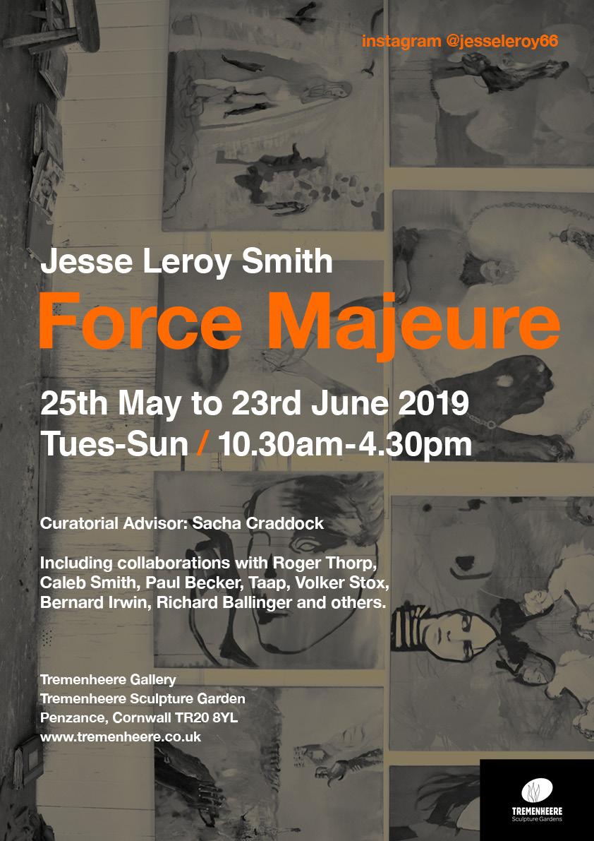
In anticipation of his forthcoming exhibition in the impressive, oak framed Tremenheere Gallery I have been fortunate enough to see some of the ongoing developments in Jesse Leroy Smith’s recent painting practice. The final selection, overseen by independent art critic Sacha Craddock as curatorial advisor, promises to be rich in imagery and content.
On the artist’s Instagram feed in the run up to the show we read that visitors will experience an “Immersive frieze of paintings across both gallery floors with (an) arcade of collages, photographs, drawings and prints.”
This selection of work draws upon a decade of experimental projects, which is apt as I was first introduced to Leroy Smith’s paintings, prints and drawings about nine years ago when we were both participating (separately) in a Brighton Festival event. My first impressions of his work were two-fold, with the most immediate visceral impact being for the powerful visual presence of the mainly portrait imagery developed from observations of his two children. These I found discomfortingly transgressive in the sense of looking and feeling both human and idol-like, as if to undermine notions of pure individuality or sedate portraiture. The portraits were not necessarily of the children so much as from their lives. Physical poses, looks and gestures transformed them from individuals to archetypes, for in those early years life has an imaginative and theatrical edge constructed through play and enhanced with costume.

The other impression had less to do with the immediate impact of the image (though essential to it) but was one of great admiration for his application of drawing skills. I recall thinking that, unusually for many contemporary figurative painters, here is someone who can draw within the painting – that is within the methodology of the practice, assuredly and authentically aligned to concept and execution. Undoubtedly the talent to make a mark intentionally, especially with a difficult medium like paint, relies as much on the artist’s psychic experience as of the result of an academic educational training. The manual nuances of painting, and drawing and printmaking, in Leroy Smith’s work encompass qualities of a physical and visual confrontation with the visual subject as both materiality (e.g. see how the paint behaves) and mark (painterliness and linear qualities evincing shape as form). The weak images made by so many others rely on look alone and are ethically redundant. Not so here, for in the latter stages of ‘Force Majeure’, as an unplanned project relating to real life circumstances, it appears that this ability to develop the potency of the figurative image persists, with a rawness exploited to the point of near destruction in the drawing content. Empirically, if this is not a contradiction, Leroy Smith reveals the facts of the imagination.
The two standard definitions of the term force majeure can be compounded into one seemingly paradoxical interpretation by this exhibition. For unforeseeable circumstances that prevent someone from fulfilling a contract, and/or utilising irresistible compulsion or superior strength, might be summarised by a well-worn cliché: from adversity comes strength. Despite the trials and tribulations of juggling relationships, purposeful endeavor, and self-worth, the results are impressive and uplifting.
An individual’s circumstances are personal, but the consequences and reactions to adversity have an impact that operates on (and with) one’s immediate family and friends, or in the case of creative outlets, can be transformed into the relevant art form. With compulsion, a veritable strength if channeled positively, generates, creates and realises ambition. If there is one thing an artist needs it is strength in commitment to image making and to finding a voice that speaks truths, however confused, damning and disheartening at times.
Interestingly, in a discussion with artist and writer Paul Becker, Leroy Smith has explained that the main focus of the show, a frieze of up to 18 paintings, his ten-year retrospective is a form of apologia:
“As a parent, son, friend, lover, teacher we fail. Let alone the environment. This frieze is an attempt to makes sense of how we can’t cope with being human. For me, painting is a medium of doubt and speculation, what is smeared away is the potential exhilaration.”
Doubt and speculation… these states of being can haunt us all, especially when attempting to progress and develop ideas and to finding meaning through our visual arts practice. In the most recent imagery of the frieze we see many figures, often in a state of becoming or disintegration. If you have followed Leroy Smith’s development this is not necessarily a new development for the individual figure, especially in his impressive range of portraiture over the years. But here the scenarios feel speculative, as the surrounding landscapes expand to a more dissonant environmental space that could be read as dystopian. I prefer to regard these spaces as potentially mythological (echoing and reviving the past) or even futuristic, where lessons might be learned. The sense of time is Bergsonian rather than Cartesian: mobile and fluid, impossible to measure and avoiding an exegesis of fully-fledged facts alone that might induce stasis. A cinematic quality pervades the frieze imagery that induces a sense of an unraveling of time without conclusive certainty – such is the experience of real life.

The imagery is very open to interpretation. For example, in one panel the father-like figure could be a form of self-portrait (for the male painter) or a fictionalized ‘other’. Or perhaps acknowledges a loss of one’s own childhood for the responsibilities of adulthood. Alternatively, on a mythological level, is the monstrous, colourless, male figure the Bogey Man (or the Green Man) lurking both in the subconscious and in the forest? Or is this a Greek god: Apollo, Ares, Dionysus or Hermes? When I checked with the artist he revealed that the character is transcribed from Jean Cocteau’s 1946 film, ‘La Belle et la Bête’ (Beauty and the Beast). From the IMDb trailer the epic lines: “Love can turn a man into a beast… Love can also make an ugly man beautiful”, add poignancy to looking again at Leroy Smith’s images. Certainly, the imagery from his paintings, prints and drawings continue an exploration of the poetics of the visual, where the formal and material qualities of the imagery subsume a narrative that is purposefully open to interpretation at a gut level. How else does one react to a mise en scène of psychological disintegration and ongoing, redemptive recovery? Might this exhibition represent a healthy period of change and of development – despite the sometimes fractured topology, where disembodied arms and lips, or the split-faced, mask-like vestiges inhabit these works?

And what of the animal parts? A bird’s head, a dog (domestic or wild, it may not matter), a pig, bears. We share this planet after all, despite our tendency to consider the world our own in anthropomorphic delusion. Soulful feeling is surely dispersed into all living things and the latent animism, however dispersed and distressed, envelops us all. Because all the world is (really not) a stage.

On a practical level, especially when considering the paintings, the medium is applied confidently, often generously but not necessarily thickly (though sometimes it is) but skillfully allowing the medium its own characteristics. This could be the flowing nature of thinned oils or an area of sticky mastication. Colour is as crucial as the linear/drawing content. Sometimes brash, though often subtle in effect, the colour creates the mood of spaces. Environments are liminal, characters pensive and ruminatory, though clearly part of the space and therefore the unfolding story. Literal, physical surfaces are visceral, compounding the mood. There is a confident interplay between the illustrative image and the qualities of the substance, its shapes, forms, tone and colour.
The sequencing of a frieze references storytelling of course, and from our Greek and Roman cultural heritage great stories and events are made public. In a modern context there is something of the poster too, whereby the format and sequencing of a display of paintings also becomes public in the gallery environment. But whereas the commercial poster is designed to clearly communicate, influence and bring attention to some circumstance or to graphically convey information, the richness of the narrative painting tradition insists on far more prolonged contemplation to enter the depths of novelistic truths and mythologies. The mystery must be shrouded in plain sight – must be emotional and experiential.
Despite reflecting on personal upheaval over a ten-year period, Leroy Smith’s paintings appear to be in a state of becoming, as opposed to the fragmented and unresolved. Contrary to a notion of personal or cultural history compromised by circumstances, change is the nature of things (and events). There can be, and is, a sense of the transitional within completed compositions. If a figure or an environment in his paintings sometimes appears piecemeal we might read this as necessary shorthand, implying a sense of time and a developing narrative despite the retrospective nature of ‘Force Majeure’.
Jesse Leroy Smith’s images appear to be found through the process of making the work, rather than pre-planned. There is also something of the theatre and the cinema about the scenarios, whereby we can safely relate if viewing from a distance, outside of events. We might all connect with sometimes playful, or challenging, imagery of relationships with others and ourselves and with accepted or expected norms that are ideal more than actual. These various narratives may not be exclusively social or familial worlds but are also shared, universal, psychological constructs. It is in the nature of truly contemporaneous art, that it constantly revives itself in and for the present and through the eyes of the beholder. This explains the over-arching humanity and relevance of art from all eras. ‘Force Majeure’ promises to be a blockbuster.
Links:
Jesse Leroy Smith http://www.jesseleroysmith.com
Instagram – @jesseleroy66
Tremenheere Gallery https://www.tremenheere.co.uk
Sacha Craddock http://www.sachacraddock.com
Paul Becker https://paulbecker1.xhbtr.com/THEKINKINTHEARC
IMDb – La Belle et la Bête https://www.imdb.com/title/tt0038348/videoplayer/vi1008515097?ref_=vp_pl
“A thin veneer of immediate reality is spread over natural and artificial matter…” (V. Nabokov)
In advance of her forthcoming exhibition, entitled ‘Coast’at the ONCA gallery in Brighton (opening 20 June, 2019), I paid a visit to Kate Sherman’s studio in Ditchling, just seven miles north of Brighton. I had anticipated landscape-type developments from a previous show, ‘Rendlesham – New Paintings’ (also at ONCA), which I responded to back in November 2016. A lasting impression from that body of work was of being impressed with a highly skilful painterly photorealism applied to representing the superficial banality of a Forestry England location. Sherman’s treatment and presentation of the subject matter gave rise to brooding possibilities about memory and longing, fixed and transfixed by the eternal phenomenon of painting.
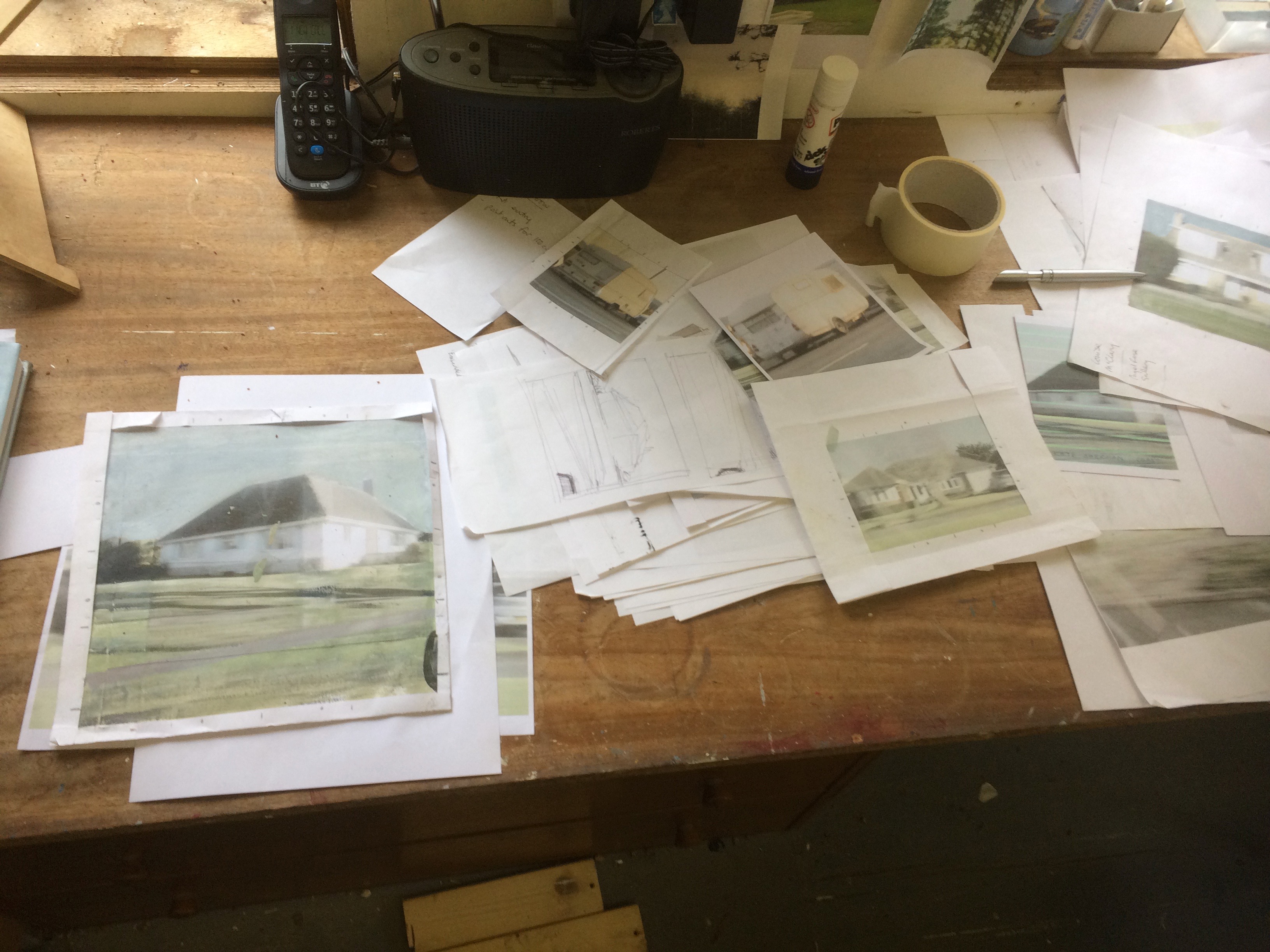
This metaphysical treatment of the ordinary and everyday continues apace in the Coast series. Seeing the new work, both finished and in progress, also reinforced expectations of Sherman’s continued evolvement of painting skills, utilised to registering a certain kind of ordinary yet uncanny subject matter that might represent far more than what is initially perceived. Coast, the exhibition, will undoubtedly invite the viewer to contemplate a potentially loaded subject matter that will emerge from first impressions of commonplace imagery. But this deeper field of enquiry will again demand a slightly abstracted, subjective response to aspects of the everyday and the unremarkable in the way that she re-presents them. Sherman’s paintings demand a slow looking – not the snapshot glance that the photograph often presents. But what they ‘give up’ to the viewer will oscillate between the nebulous and the clear.

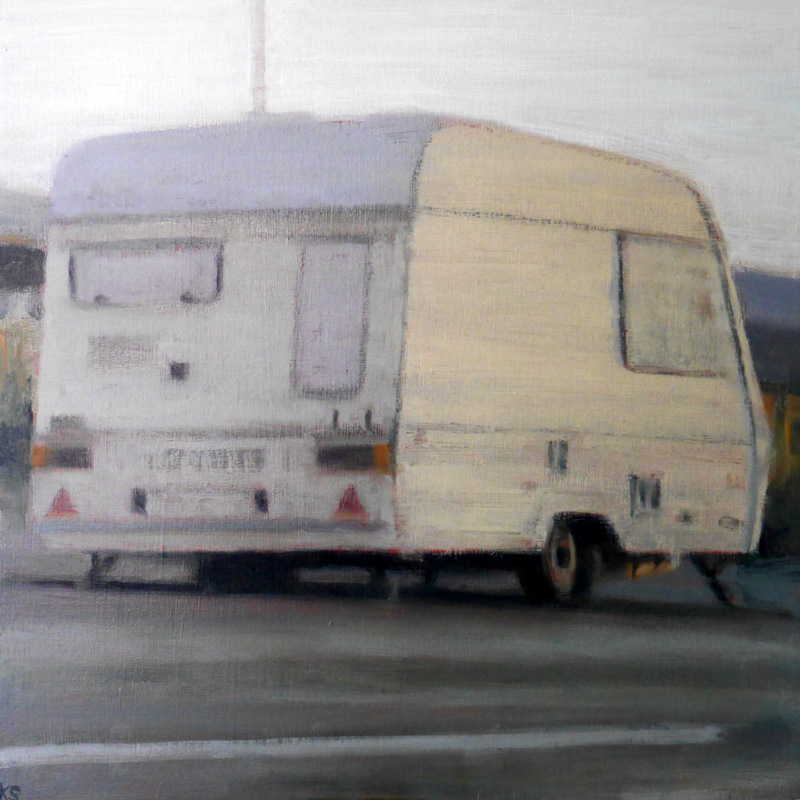
Sherman’s ‘drive-by’ house paintings do not explicitly present a series of coastal views, as there is no immediately obvious coastal scenery. An exception is ‘Coast 11’, where we possibly see a glimpse of beach sandwiched between two small vans. This slim portal may reveal the sea in the furthest distance; only the sky and sea is burnt out, overexposed in photographic terms, by a strong source of reflected light.
As for the potential inland vista of distant hills there is also little evidence, although the exception here might be ‘Coast 15’, which is a square format dominated by a parked caravan taking up at least 50% of the area of the composition. On the right hand edge, just into the top half of the mid-section, are two thin bands of grey. The bottom strip is the roof of a building and the top, lighter shape, could well be a strip of mid-distance hillside, toned down by aerial perspective. Or maybe it’s another rooftop?
The other paintings in the series suggest a looking to one side, or immediately ‘along the way’, en route to someplace or other. This lack of land or seascape views suggests the enclosed strip of the carriageway, a corridor of sorts, through the urbanised landscape. Here the mundane and the familiar, seen fleetingly as blurred, foregrounded swathes of tarmac, plus the odd picket fence, a section of the canopy of a tree and a variety of shadows, adds an aura of emptiness and anonymity – perhaps even loss or disappearance. For example, a number of vehicles (low budget cars, vans and caravans) appear as the main figures in the paintings, as there are no actual people or even animals, domestic or wild. These are matched in their dullness by drab bungalows and other unremarkable modern buildings generally enclosed by sections of public space, cut grass or monochromatic skies. We could be travelling the minor ‘A’ roads of southern England in a daydream or state of restrained, bearable ennui. These places, usually only glimpsed at mid-journey, are usefully fixed by the intervention of the camera in Sherman’s preparatory studies. Transformed into paintings, however, there might be more to the potentially humdrum and prosaic narrative.
In an interview with Jessica Wood (from Arts Media Contacts in Lewes), about these paintings, Sherman has explained that she “grew up on the coast in Dorset, and had quite an idyllic childhood by the sea. With this series I am trying to recapture some of the feelings of innocence and simplicity connected with childhood… There are also ideas around loss.”
So, this occlusion of the view of land and sea, where buildings and vehicles might block the view of a child returning to her routes (prompting the bored but yearning, “Are we nearly there yet?” soundtrack of many a long journey), could make some sense. Except that the artist is no longer a youngster, and she could be reflecting upon both an equally pleasing and poignant intermixing of emotions.
Time is certainly an element too. As the here and now is so impossible to pin down, only the past exists as something reasonably concrete (though surely the past is distorted by memory itself and can only be placed in the context of the present). That the artist, and by implication, the viewer, only see these types of empty but potent scenarios from the Coast series fleetingly, might suggest that, were it not for the ‘memory technology’ of the camera, such representations and views of places might be quickly forgotten or left unrecorded.
As we may recount, those early untroubled years that, ideally, most children have, may well have seemed like a golden age when time itself was stretched out into an almost endless ‘now’ – but from the perspective of adulthood we experience time as flowing faster and with greater urgency. This adds a tone of reversed premonition to the work, which activates and energises a feeling that we might sense in the subtle painterliness of the application and materiality of the paint. Message and medium are interconnected by varying qualitiesof light, colour, texture, composition and space, where content is associative and liminal rather than presenting a clearly defined narrative.

It’s also appears to be very quiet in these images; yet the silence of these physical ‘outside’ spaces and the mobile and immobile structures (homes, caravans and vehicles) that assign human ergonomics to a sense of place and space, might sonically echo or rekindle memories suggesting the fourth dimension of anthropic time. By this I mean the duration from the present to the personal past as experienced by reminiscence, or the unexpected surfacing of episodes of gentle trauma. In pictorial terms, the depth of distance is flattened and foregrounded, despite the occasional perspective and vanishing points of receding roads and orthogonal, architectural elements. There is a draining out of colour too and here the colour palette of Agnes Martin or Giorgio Morandi springs to mind, encompassing quietude and tonally meditative imagery. The Coast paintings juxtapose society’s urban clutter against flat, grey-blue skies, where greenery is controlled and piecemeal. This territory, viewed and reconstituted with cool restraint, makes for an agnostic, temporal and secular palimpsest in subjective Protestant tinctures.
Sherman’s reconstituted photo-album records urban dwellings that look somewhat off-track, where vehicles are often seen from the rear or in semi-private roads. These are places you might only visit if you had taken a wrong turn or you would only need to go to if friends or relatives lived there – or perhaps these are the real destinations, where the goal is to reach the people and not the picture postcard coastal resort.
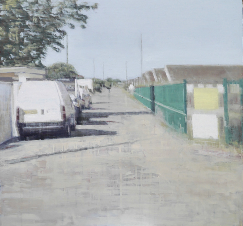
Initially, the imagery reminded me of a passage from ‘Transparent Things’, Vladimir Nabokov’s 1972 novel:
“Novices must learn to skim over matter if they want matter to stay at the exact level of the moment. Transparent things, through which the past shines! … A thin veneer of immediate reality is spread over natural and artificial matter, and whoever wishes to remain in the now, with the now, of the now, should please not break its tension.”
Nabokov’s quirkily written novella tells the story of the main character’s recollection of his four trips to a village in Switzerland over almost two decades. The author presents a journey through a kind of metaphysics of memory, where reminiscence is more than mere factual recall due to its subjective nature and has an immediate relationship to an immaterial sense of past reality based in time. Every object (a stone, a pencil…), or familial historical event, is loaded with known and unknown histories leading to consequences driven as much by chance or design as by desire.
In Sherman’s paintings for Coast, specific, personal history might be deliberately obscure or non-descript, as the author passes interpretation over to the onlooker, as if a potentially self-obsessed investigation is being deflected into a more shared experience. The thinned application of oil paint, gently hued and subtlety nuanced in interconnecting planes of conjoining perspectival and flattening shapes, acts as “a thin veneer of immediate reality” to evoke a response specific to a new witness.
As Sherman further explained to Jessica Wood:
“I want the viewer to respond to the experience or feeling in the painting, rather than a specific place; keeping it vague makes it more likely that something may trigger a memory and perhaps provoke an emotional response.”
These paintings also take the viewer on a journey of sorts, only this is a through the viewfinder snapshot revealing of the artist’s outings. Because of the blurring, indicating the observer’s speed in relation to the subject matter, and the predominant angle of view, there’s a sense too that the vantage point is from the side window of a car. In this sense, the commonplace is framed and composed, as a traveller would see it – not constructed or fabricated in the classical, 17thcentury landscape tradition from Claude Lorrain onwards. The cropped image, art historically, may owe something to Degas and his acceptance of the viewfinder framing of immediate reality for some of his compositions (e.g. see ‘Carriage at the Races’, 1872. Museum of Fine Arts, Boston); and throughout the 20th century to the burgeoning ascendancy of visual representation, and notions of realism, mediated by the camera lens in all its various manifestations and formats.
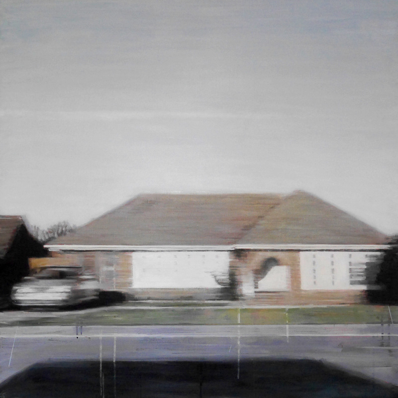
But Kate Sherman is not strictly a photorealist and a composition such as ‘Coast 18’, where barely hidden drips of paint disrupt the traits of photorealism, we see a painter (or rather, the work) in a positive, questioning state of transition. Coast promises to present a fascinating series of paintings; real physical images rendered by hand, that are not the result of a purely reproductive, mechanical or copying process. The attentive audience will become aware of a sense of time – not just in the time to patiently make and to craft the paintings in symbiotic relation to the source of the image from a particular mode of primary research, but to their own phenomenological experience of place and memory. In relation to photography, this almost expressionless painting may bare a greater verisimilitude to the veneer of the ‘real’, sparking personal and familial memory and associations enabling us to dig deep.
Geoff Hands (April 2019)

Links:
Kate Sherman: http://www.kateshermanpaintings.co.uk
‘Rendlesham – New Paintings’ review:
https://fineartruminations.com/2016/11/08/out-of-this-world-rendlesham/
ONCA: https://onca.org.uk
Jessica Wood at AMC: http://www.artsmediacontacts.co.uk
In the beginning was the Word… or was it the image or the object that enabled communication for the antecedents of Homo erectus? In terms of the evolution, invention and development of human communication (through shared language systems), how were thoughts as exclusively non-material manifestations related to things (signs and symbols) in the world? A sign cannot be a signifier devoid of meaning but it takes many forms. What role does art have in a world full of increasingly reactionary, fixed views and the post-modern impulse to mix things up? David Bellingham’s ‘Driving School’ prompts these thoughts – these ruminations.
Curated by David Shrigley, an element of wit and absurdity – with a dash of idiosyncratic character – might have been expected. For Shrigley fans, ‘Driving School’ will not disappoint as Bellingham’s visual/text/object works challenge and coax the observer’s intellect and sense of humour alike. The work is both fun and droll.
That Shrigley chose an artist who is not so well known is refreshing too. The exhibition title suggests that the viewer will be attending some kind of compulsory educational experience and the press release prepared visitors by stating that:
“Driving School offers lessons in unlearning and relearning, undoing and redoing and unmaking and remaking. To unlearn something is to take it apart, to relearn it is to put it back together examined and refreshed.”
The works in ‘Driving School’, currently installed at Phoenix Brighton, pose many questions based on what is perceived as well as read. The newly refurbished gallery is transformed into a learning zone wherein the dynamic learning situation generates questioning from the viewer (the student), which the artwork (the teacher) facilitates. The installation (the lesson plan in action) of various works lets go of total control (didacticism) to allow for debate (welcoming the student voice). The goal here is not to obtain a diploma, but to carry on thinking and looking as reward in itself.
Of course, we know that the standardisation of the conventional driving school must be instructive, objective and specific, leading to fixed outcomes of shared, collective knowledge without room for modification of the rules. But this is an art exhibition and an implied post-academy visual arts curriculum asserts its strengths on antithesis and fluid thinking. All that is fixed, flows. Absurdity is celebrated where certainty and bafflement are equal partners for our binary thinking habits. Bellingham conjoins word, image and object as one. The viewer can take the works at face value or extrapolate at will. To varying degrees there is paradox in all of the works displayed, but all is concrete and tangible despite the conceptual framework that might define this visual field of enquiry.

As the viewer enters the exhibition the first work encountered is ‘MATTER IN MOTION’, a wall text/drawing. It might be a super-enlarged photocopy of a sophisticated doodle. The work (as image) is made from thousands of near identical marks. It’s more than a doodle of course. The work is planned for this specific wall space as the whole wall is filled as a singular composition. Initially, the white letter-forms stand out against the background. But do the letters depict negative space, the space between or behind forms, or are the letters the foregrounded forms? Furthermore, is the phrase an object of sorts? Are the three words no more than 14 letters? Or should the drawn linear elements (albeit just the one sort) constitute a pictorial image? But this is a picture, of sorts, formed as an installation-type artwork on a wall. We simultaneously ‘read’ the words as image. The placement of the letters suggests time and motion too as the letters could be forming or displacing and deconstructing the words. The message is fixed on the wall but the implication is one of movement as the mind reacts to the visual dynamics.
In ‘Driving School’ contradiction is an essential characteristic. The Hegelian interpretive method (thesis and antithesis leading to synthesis) enshrines contradiction as an essential model of thought and debate. But synthesis (in the form of these conceptual artworks) might remain consistently contradictory. For example, ‘A circle in the mind prompted by a circle on the wall’ prompts the chicken-egg conundrum – which came first? Is the ‘artwork’ in the viewer’s mind and on the wall simultaneously? Admittedly the art-object was on the wall before entering the gallery, but the viewer attends pre-programmed with the notion of a circle already formed in the mind. Where did the circle originate and is the idea of a circle innate? (And was it a perfect circle? Plato’s theory of forms/ideas tells us there is no such thing…)
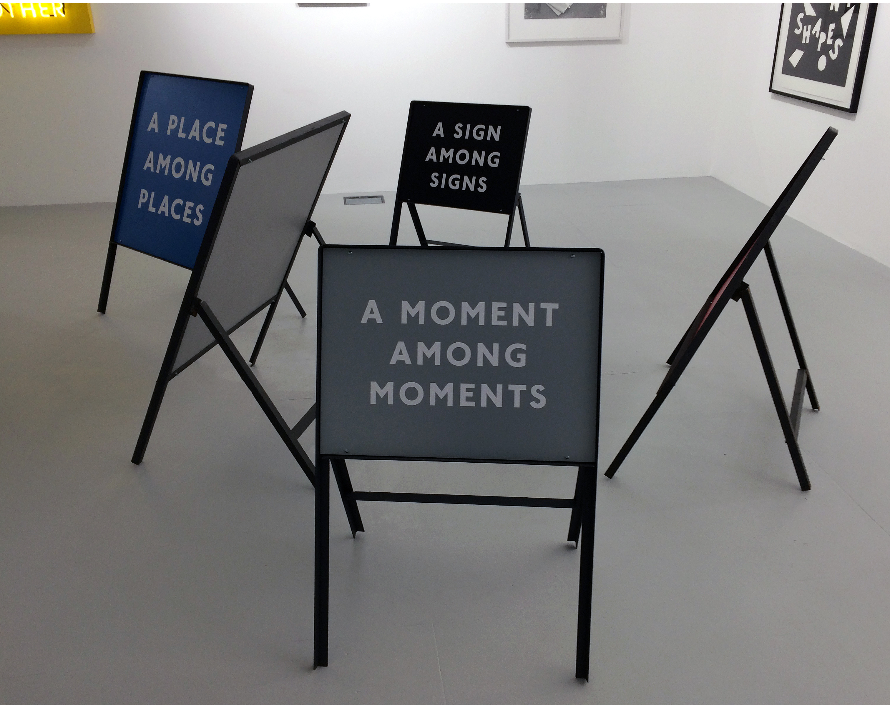
If this is too serious and weighty some humour to lighten the mood is welcome. Many viewers smile on encountering a grouping of five apparent road signs. There’s ‘NOT MUCH’except ‘DIGRESSION DISTRACTION DIVERSION’in ‘A PLACE AMONG PLACES’and ‘A MOMENT AMONG MOMENTS’with ‘A SIGN AMONG SIGNS’. In poetic mode you can order the instructions in any order you wish and as the temporary road sign is a moveable object it might be permissible to engage physically with the work.
Or you can escape up a ladder into the roof space and beyond. For in the beginning was the Imagination…
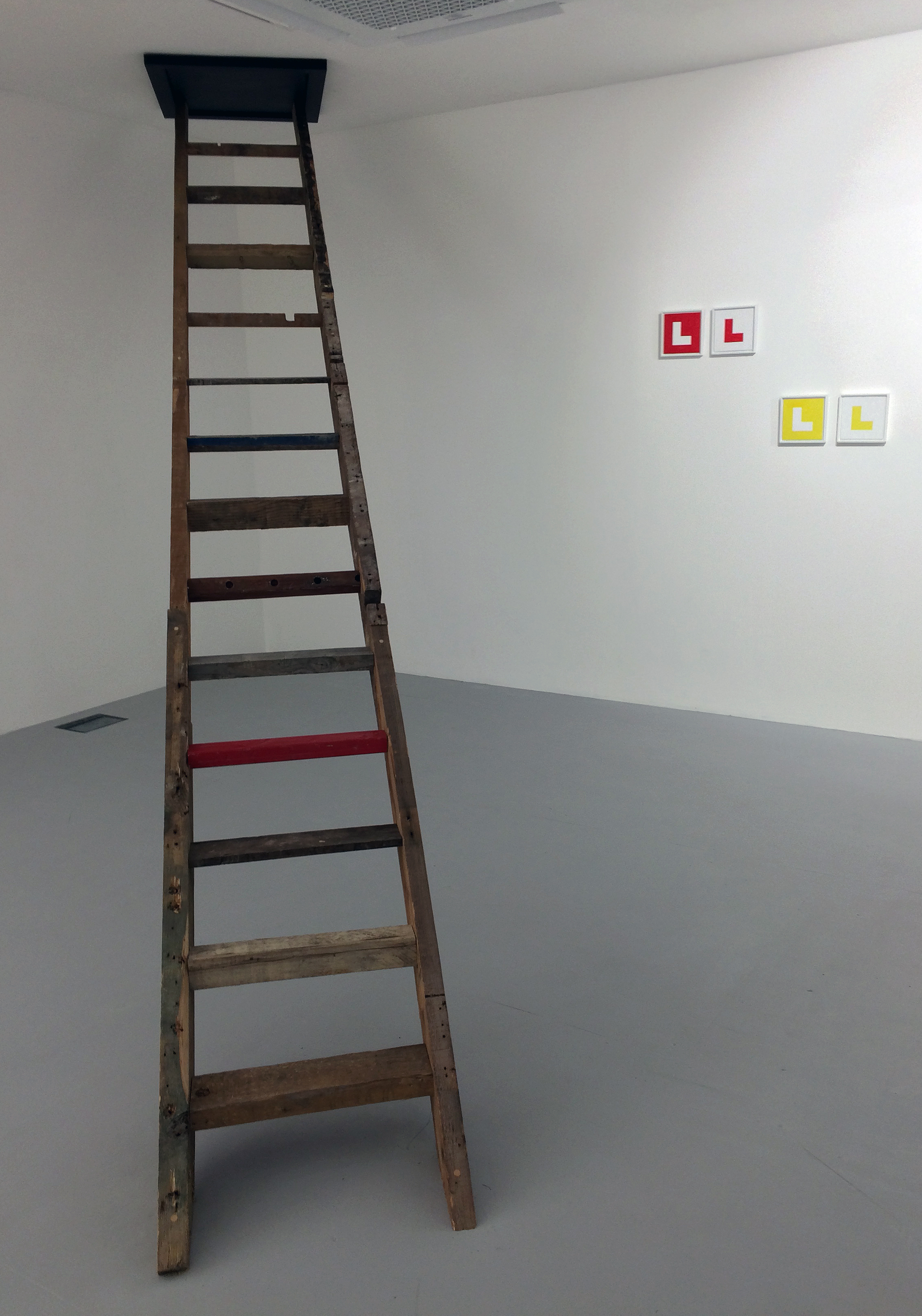
Homework (Links and further reading):
Phoenix Brighton – https://www.phoenixbrighton.org/events/driving-school/
David Bellingham – http://www.davidbellingham.com
David Bellingham interview with Lisa Otty – http://www.davidbellingham.com/texts/pdfs/For_Wall.pdf
Make your own signs available here – https://www.uksafetystore.com
Collage has a significant 20thcentury history. Inspired by Braque and Picasso, Kurt Schwitters typically utilised “used tram tickets, bits of driftwood, buttons and old junk from attics and rubbish heaps” and, long before re-cycling was a conservation matter, applied his alchemical process effectively. Henri Matisse utilised painted papers and cut out the shapes required for his decoupage that extended his exploration of painting, particularly in his latter years. In the era of the Abstract Expressionists, Robert Motherwell raised the medium of collage (and particularly the Gauloises packet) to an aesthetic height where it became conjoined with painting. With Duchampian whit, and challenging categorisations between painting and sculpture, Robert Rauschenberg produced a huge body of collage and assemblage works (aka ‘combines’) with explicit social and cultural content, introducing ironic reference to abstract painting and contemporaneous subject matter. Matisse aside, an underlying spirit of Dadaism and with a nod towards Arte Povera, a particular type of collage can still exploit a direct embracing of materials from the urban jungle.
Within the visuality of collage as material and process, which still has an aesthetic and fiscal purchase (i.e. material value), it appears evident from John Bunker’s ongoing project that, in the broadest context, collage engages with an interpretation of social reality that has more political and economic discomforts than might be desired. Crucially, this reading is best experienced from being in the presence of the work, which is both visually abstract and embodied in the material specificity of a re-constructive process. Like painting, in the flesh the collages possess a life force that is compromised in reproduction – rendering any notion of duplication as anything close to satisfactory, almost null and void.

One fascinating aspect of these new mixed media shaped collages (though the term ‘assemblage’ better categorises Bunker’s works as many of the parts are objects as much as surfaces) is that the base materials possess idiosyncrasies of substance and surface impossible to replicate on the ubiquitous screen. Materials and objects that had a previous life, used goods as it were, become fresh or new again as component parts of the subsequent artwork. So, in ‘Vilja’, one of twelve works presented in ‘Slam-Dunk’, items such as electrical cable, cardboard packaging or a printed poster are not those things anymore. Identity is reassigned to a very different functionality. Material hierarchy is certainly de-bunked.
In these works the deterioration of the physical conditions of found objects, street and studio detritus, are presented as if new and fresh; where for example, decomposition and fragmentation can be regarded as a primary state and not a proximate condition within a standard ontology of physical manifestations. So the various engineered metal components in ‘Tjádass’, one that may have functioned as part of a musical instrument, another as a sturdy wall fastening (replete with plastic rawl plug), survive destruction and redundancy in a form of re-incarnation. The connection with Schwitters’ synthesizing use of mixed media, which interchanged the material and the visual, is palpable in the ‘Slam-Dunk’ collages.
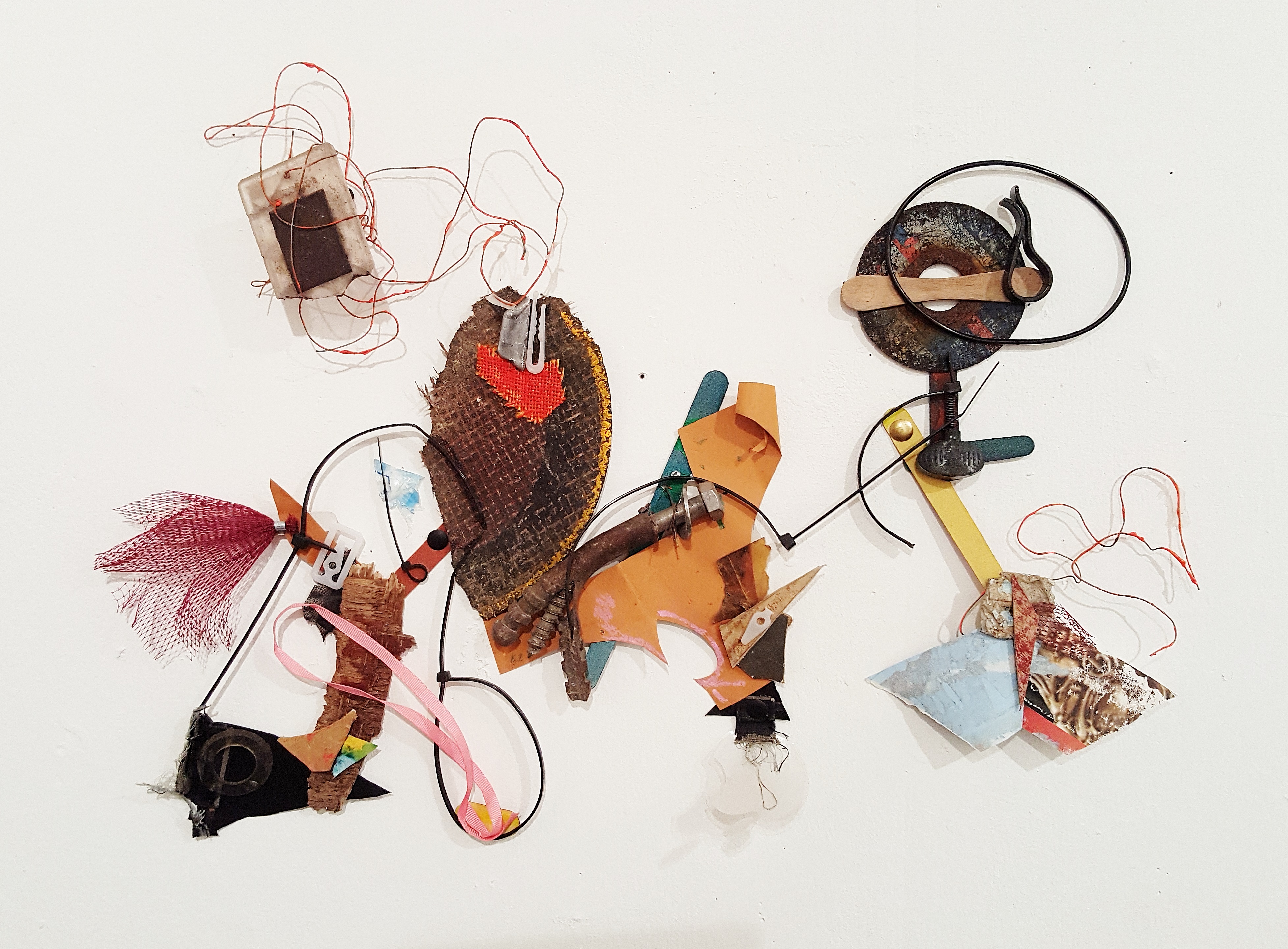
Twelve months on from Bunker’s last one-man show at Unit 3, the viewer is treated to these new works gathered together with quirky titles. For an Abcrit review for ‘Leave It’ in 2017, I had commented that, “I was reminded that collage is not a substitute for painting.” It was apparent that these collages were potent enough in themselves to stand alone from painting, albeit with similar characteristics – made for the wall; to be read by the eye across the surface, with various implications of spatial congress; shifting the visual interrogation from part to part; colours, shapes and surfaces refreshing the abstract mission; and prompting suggestions for personal interpretations on context or sufficing unadulterated visual pleasure.
‘Slam-Dunk (for Dennis)’, the largest work in the show that filled a whole wall, is something of a punk-mural as many of the various components are torn by hand, burnt and dishevelled. Though discarded, rejected and roughed up, the parts are now rescued and revived. But are the painted parts in ‘Slam-Dunk (For Dennis)’, a little disingenuous if they have been made to be unique collage components? Perhaps they are intended as simulacra of wastage from the production of other paintings/collages? Intermixed with all sorts of flotsam and jetsam, including found print, nylon string, fragments of plywood and plastic and cotton material of unknown origin, the inclusion of paint (industrial and artists’ quality?) might reference Rauschenberg’s expressionist painterly gestures – only now the paint might be a spill or composed bluntly from a cleaning of the brush, rather than a personalised action from the hand of a ‘master’.

All of the other works are much smaller (approximating 50 x 60cm each) and you can touch them with your eyes by standing close-to. Keeping your hands to yourself increases the visceral pleasure and tactile frisson of so many moving parts. Though nothing actually moves, except the viewer. Take, for example, ‘Fun Bobby’, which might suggest two dancers in full swing connected by a flash of red feather and white bunting. A wriggling line, with few breaks, starts with a ring at bottom centre, heads north-west into a patchwork maze then bridges east to a counterpart form that is characterised by a figure of eight, and a diamond framework placed over a black disc, overlapped in part by a second little shanty town of patches.
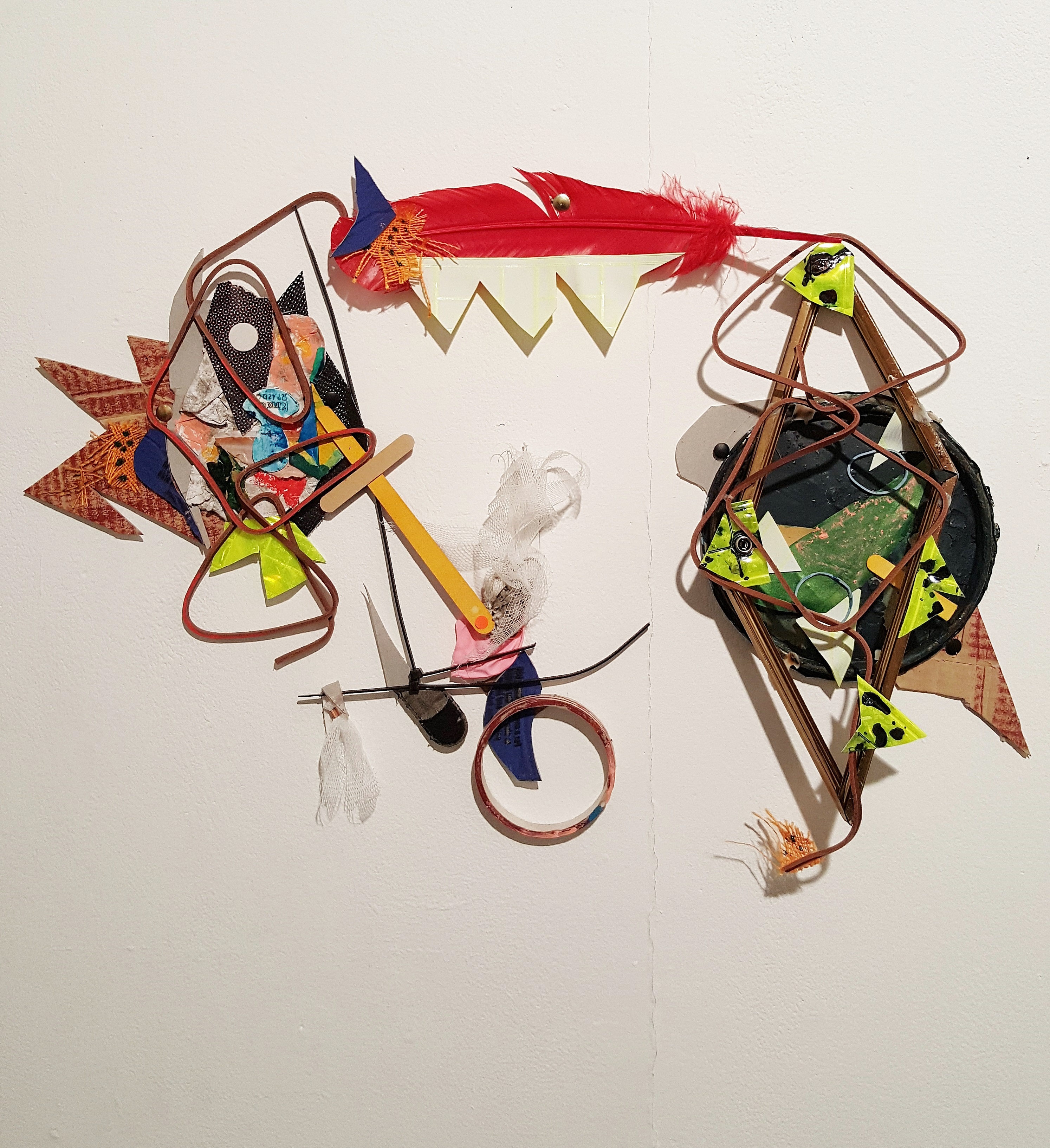
What is so impressive about the works in ‘Slam-Dunk’ is not only the inherent particularity of the stuff of the collages, but the selection and arrangement within the frameless compositions – the choreography as such. As with all of the works on show, there is visual dynamism in every composition. Bunker’s ‘expanded field’ of collage removes the omnipresence of the rectangle and eliminates the edge that preoccupies some abstract practitioners. The various colour-shapes echo spatial placements, propose latent moveability; physically conjoin, meander, occlude and reveal the specific abstract qualities that are somehow vital and fecund in an organic phraseology of materiality. Disjuncture is carefully balanced with ‘just rightness’, whilst visual rhythms unlock the still nature of the fixed parts and the condition of the arrangements are inherently organic, playing with a shift from the visual to the material and vice versa.
As installation, the wall behind each work in the gallery space, and the quality of light (particularly from the spotlights) that enhance low relief in millimetres, activates the collages, especially if the viewer approaches at close quarters. As is typical of Bunker’s collages, there is a painterly aesthetic at work in an agile distribution and handling of the materials. The works have edged towards resolution into an abstract condition that may well emulate painting, but still maintains the independence of collage in the same way that print is both independent of, but inextricably related to painting.
As medium and process, we might still debate the status of collage as an offshoot of painting (and sculpture in the form of assemblage), or as an independent medium. Current artspeak might label the kind of collage that John Bunker makes as ‘expanded field’ of painting. His work is certainly ‘painterly’ and I sometimes wonder what a new series of paintings would look like – although I would imagine that the canvas would simply get in the way.
In Bunker’s press statement for ‘Slam-Dunk’ a revived declaration from three years ago reiterates his contention that, “Collage allows me to constantly test the limits of what an abstract painting can be. I hope to find something like a new hybrid visual grammar in these clashes of matter and forms.”
This notion of hybridity is undeniable. So, is collage eternally bound to painting? The kind that Bunker cajoles and constructs from the detritus of the contemporary situation may well place his works in a broader societal context. Perhaps the medium is the message after all, especially if the collages predominantly employ the debris of the urban, suggesting a dystopian reading in its literal, material content. But if the various fragments appear to be resurrected from the waste bin or the gutter – places of superfluous cut-offs, rejection and abandon – the underlying message is a positive and uplifting one. For there is also visual refinement and elegance on display here. The viewer might also embrace the tangible qualities and materiality of the forms in Bunker’s collages in the spirit of Wabi-Sabi, a Japanese philosophy of beauty in imperfection, where the transient and imperfect is revered.
Or is this just too snowflake?
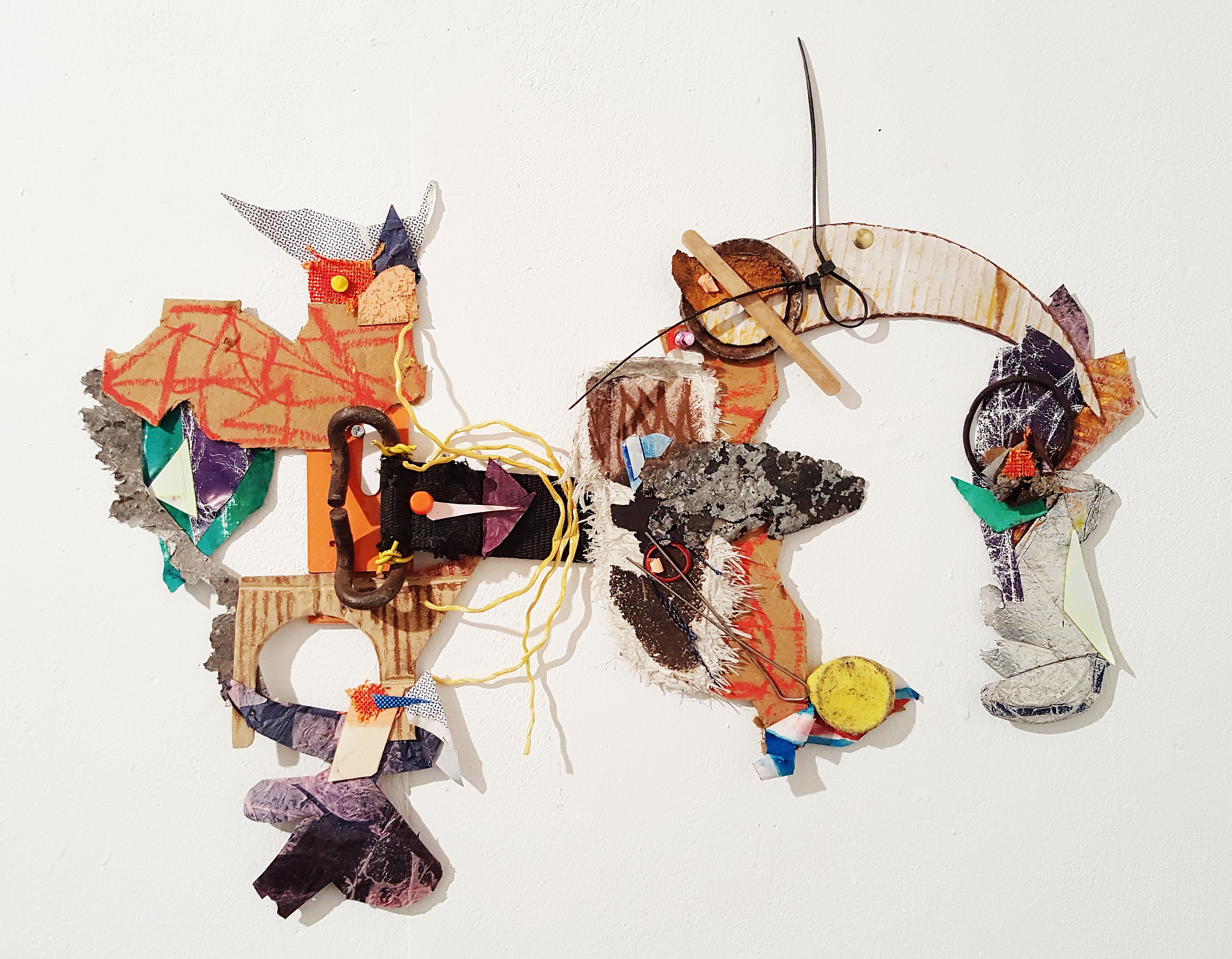
All images are © John Bunker.
A gallery above a council library seems an unlikely place to see an exhibition of prints by one of the most pre-eminent of British abstract painters. But Peter Riley, curator of the Young Gallery in Salisbury, has arranged an exhibition that constitutes the most comprehensive retrospective of Ian McKeever’s etchings, lithographs and woodcuts to date. All that were missing from the print category were his silver-gelatin photographic works, although two polymer gravure prints, which involve a photo-mechanical process, from ‘Eagduru’ (2015) were displayed.
Followers of McKeever’s career will know that, as with his various drawing and gouache series, the print output has been consistent in relation to his painting. The prints might be (mis)understood as extensions or preliminary exercises between painting periods, but the print editions stand alone too, forming coherent and independent bodies of work from well-defined periods of production. Not that the prints are necessarily unrelated to the paintings for the essential imagery of the prints are connected with the paintings in terms of sustained and evolving investigations into the visual dynamics of line, form and ‘abstract’, visual impact. So, if you love the paintings for their visceral and emotional effect, for prompting a meditative, slow pace of looking, and for following an authentic and active journey into a dialectically nuanced abstraction, the range of works in this exhibition will not disappoint.
The Young Gallery is divided into three rooms, and ‘Weight & Measure’ amply fills Galleries 1 and 2. Ideally the whole selection of prints would be distributed in one space to enable a manageable overview, but the extra wall space provided by Gallery 2 allowed for the rare showing of the monumental ‘Hartgrove Woodcut Monoprints’ made in 1994 with Hugh Stoneman. Printed on paper as strong as card (the sheets were originally reserved for Jim Dine), the four prints selected were pinned in line on one stretch of wall, unframed and benefitting from not having the glossy sheen of glass that can make viewing (and photographing) difficult, overlaying the surface.
The prints were made (or is manufactured a better term?) by cutting biomorphic, net-like shapes out of industrial plywood with a jigsaw. Coated with ink, the huge plates of thick laminate were passed through an etching press. The whole process engages a practicality of method and procedure, and an active awareness of the relationship between materials (wood, ink, paper) and process (cutting, placing, pressing), which is very much in keeping with McKeever’s association of the visual with the bodily and the corporeal. Most importantly, the combination of materials and processes leads to, and is lead by, an abstract visual aesthetic which transforms the medium and methodology into potent end results.

Even without a reflective layer, the black-on-black combination of printed ink impressions for ‘Woodcut Monoprint No.8’ required the viewer to adjust to a 45° viewpoint to make out the double layer of printing. This subtlety of surface, of ink and paper combining with the overall impact of a portcullis-like form fixed to the dark, flat plane not only invited an obligation to both stand back to take in and experience the pictorial space, but also to approach the picture surface as an immersive field to be visually traversed at close quarters. Smaller prints can function as objects one can pick up or leaf through in a portfolio, but these giant monoprints compel the whole body to engage, not just the eye and hand, as an architectural sense of edifice and entry might pull one in to its ‘space’. Conversely, the size of the works make the viewer more physically aware of height and width; density and vacuum; depth and surface. These palpable modalities are as just as consequential as intellectualised visual perception and abstract cognitive faculties. Or to put it more simply, the physical is the visual and the visual is physical.
The significant difference between printmaking and painting for McKeever lies in the experience of making the prints and the real time experience required for production. In the exhibition leaflet, quoting from his 2013 essay on Gunter Damisch, McKeever explains:
“To make prints (…) is to feel the weight and pressure of the moment. For the printed image is formed under pressure and is held in the moment. It is this difference of time, weight and feel which attracts so many painters to make prints. Providing as it does, precious respite from the incessant incertitude of paintings’ often meandering time.” [i]

Another characteristic of McKeever’s vocation as a painter/printmaker has been his interest in, and engagement with, the written word. In the same gallery space as the Woodcut Monoprints, ‘that which appears’ (1993), which generated 22 woodcut prints to go alongside, around and be placed in relation to a sequence of 80 poems by Thomas A. Clark, was represented by 15 of the 32 double page spreads. This is a particular treat as The Paragon Press produced just 50 numbered copies of the publication and so they are unlikely to be seen in public.
Responding to Clark’s poems in this publication in Modern Painters magazine in 1994, the author Iain Sinclair commented: “He delights, as does McKeever, in being at a distance, taking in the whole spread, horizon to horizon, and right up against the lichen on the granite: in the same instant.” [ii]
This sense of the expansive and the more confined was demonstrated by putting these very different sets of prints together making for a fascinating juxtaposition. Turning away from the larger ‘Woodcut Monoprints’ in the room, the black graphical forms of ‘that which appears’ are much reduced in size, transforming sheets of paper into pages, taking the viewer into the text for a more intimate and cerebral experience. On one such page we read: “in a wide / darkness / the touch / of rain”. In the imagination, small droplets of water might spatter and impress upon the skin. But the darkness is a shadow form, in an actual but poetic space on the page. The reader can relate the text to the images or vice-versa, for these are not illustrations to merely visualise the poem. Both elements are constituted as ink on paper and as disparate but related manifestations of language/sign made ready to be read, and interpreted, as one is able or prepared for – in a format that becomes personal and intimate.

The same could be said for McKeever’s visual explorations throughout his engagement with printmaking (his first prints, lithographs, were made in 1984) – where conjoined qualities, such as weight and measure, are factors of process and materiality that result in a particular visual and tactile consummation. The compulsive moods of light and dark, flow and stillness, essence and particularity are implicit, to varying degrees in the prints. From series to series, McKeever repeats, develops, lets go and introduces new features.

Moving into the larger Gallery 1, six or more print series were amply represented in part or whole and demonstrated this explorative journey. This included all ten ‘Colour Etchings’ (1996), works that were first shown at the Alan Cristea Gallery in Cork Street in 1997. The ‘Colour Etchings’ wall was as impressive and almost as impactful as the ‘Woodcut Monoprints’ already discussed, though more closely configured into two rows, one above the other, forming a larger rectangle. But these are black and white images. In the catalogue for the Cristea show McKeever is quoted by Pat Gilmour as explaining the reference to colour, “to feel a form’s aura, to make it luminous.” [iii]
That luminosity should replace or equate with colour is fascinating. On a simple level, luminosity means brightness but we know that with the right conditions light refracts into colour. Luminosity could also be considered as a lack of greyness – or darker tones. With varying degrees of contrast, McKeever creates grey tones from the combination of black ink on white paper to create and enable luminosity in the imagery. From constructing sometimes strong contrasts of black and white, with wiry grids and an inner rectangle with arms on each of the four corners of this shield-like form, the resultant ambient luminosity the aura is generated and appears within and around the proportionately large central motif.
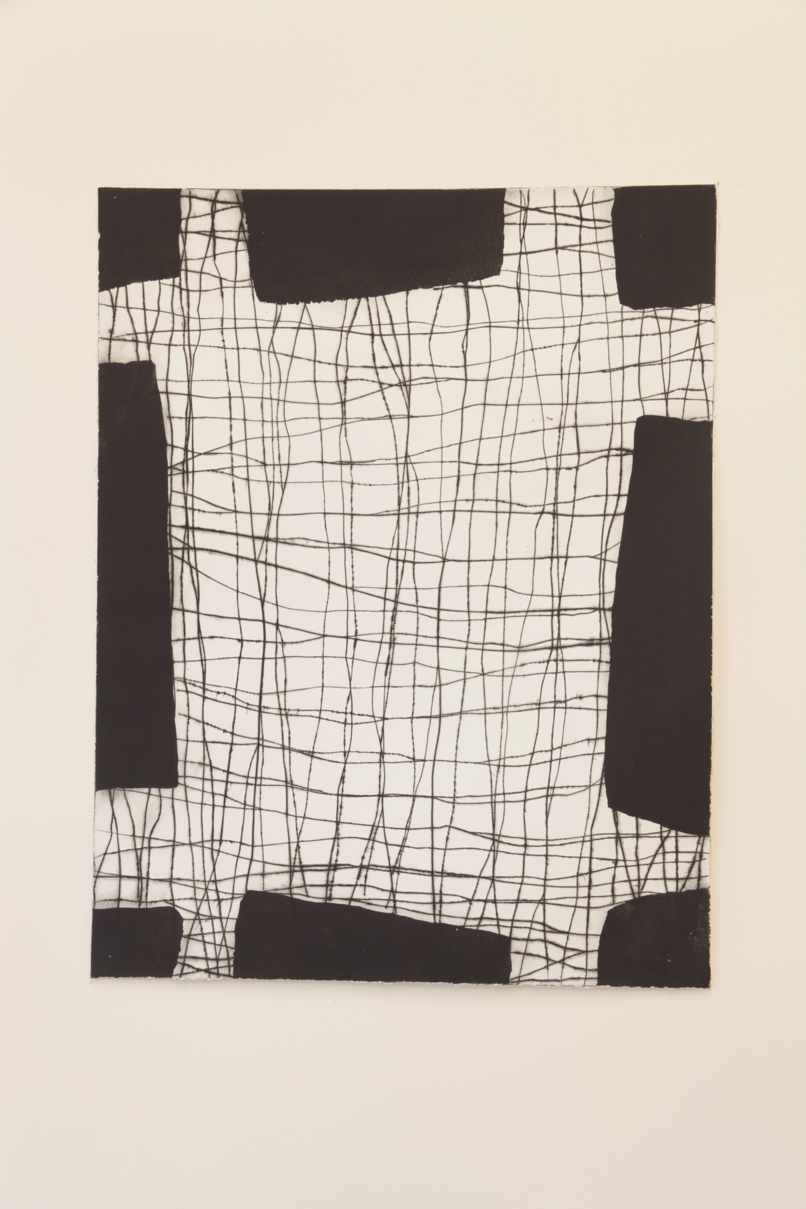
On the two adjoining walls in six frames were the colophon (a kind of title page) and five painterly ‘Sentinel’ (2005) lithographic prints, opposite five of the original nine etchings from ‘Between Space and Time’ (1998-99). The latter is a potentially significant series in that colour content appears as prominent as line, tone and form – although one of the two red prints and the orange print were not included here. This series was made in close proximity to the oil and acrylic ‘Assumptio’ canvases (just before and after starting the paintings, it would appear) and the ‘Pause’ gouache on paper series constituted the third and final stage of this cycle. In an interview with Jill Lloyd, in another classic Cristea Gallery catalogue for a show in 2000, the artist confirms the prints as a very direct forerunner to the paintings:
“Things are thrown up in the printmaking which allow me a much more direct access back into paintings and to taking them further than I could see by looking at the paintings themselves. It’s very symbiotic in that sense. For me printmaking has become invaluable as a counterpoint to the paintings.” [iv]
The prints were produced with Hugh Stoneman in Penzance, which would have necessitated a trip away from the painting studio in Dorset. This geographical remove presumably helps to create some degree of separation of procedure, although the psychic mindset for the whole two-year endeavour was as cohesive as the range of works produced.

‘Sentinel’, as the title implies, made for a commanding series of lithographs to confront the viewer, but any assertiveness was softened by the impact of the round cornered stone with the fine grain, mouldmade 270g BFK Rives paper. These prints cleverly delivered both subtlety and contrast of tone with imagery returned to and developed later on in ‘Assembly Etchings’ and ‘Six from Twelve’. So, although complete in itself, in retrospect ‘Sentinel’ is a taster of things to come.

The net-like weaves of organic structure in ‘Between Space and Time’ are also apparent in ‘Six from Twelve’ (2009), printed from three traditional lithographic stones, to make a set of six. The ‘Six from Twelve’ prints are quite pale if viewed from a distance and are somewhat problematic seen behind glass. But in close proximity the nets of grey strands, implicit gateways, and loose and fragile liminal doorways are as compelling as in any other series. Vertical buffers, in some instances displaced within the rectangular format, might represent form dissolving or becoming. These were the prints that I thought were not done justice by a typical exhibition wall display as they need more time for viewing, and their own unencumbered space, for the viewer to assimilate more adequately. The significance of ‘Six from Twelve’ is surely worth further investigation as they lead to the ‘Twelve Standing’ series of painting, where in a contrasting state, spaces become claustrophobic and black, red and white dominate. It might be that McKeever is still in the ‘Six from Twelve’ zone, as the painting series ‘Three’ (2013-2014) and ‘Portrait of a Woman’ (2014-2015) owe something to the lithographs, which indicates an ongoing presence originated in the prints.

Contrariwise, an adjacent wall displaying all five of the ‘Assembly Etchings’ (2007) which are characterised by bubble-like forms and overlapping discs, extend rather than pre-figure the ‘Temple Paintings’ (2004-2006) en route to the ‘Assembly Paintings’ (2006-2008). The print in McKeever’s oeuvre is something more than a substitute for painting. Certainly one cannot divorce the prints from the paintings totally and ‘Weight & Measure’ confirms the symbiotic and collusive relationship between all of McKeever’s various bodies of work.
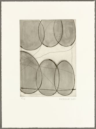
In the last section of the exhibition another image/text series confirms McKeever’s interest in this literary art form. Some 24 years on from the woodcut and text combinations of ‘that which appears’, the series of lithographs, entitled ‘The Measure’ (2017), made in response to a sequence of poems by the American poet Peter Levitt, are displayed alongside the ‘Henge’ lithographs. These prints were also produced far from home in the Faroe Islands, which again facilitates a way of standing back, positively removed, from the central preoccupation with painting in the studio.

A poem from ‘Stones of the Sky’ by Pablo Neruda was also translated for ‘The Measure’ sequence. The Neruda poem ends: “Before wind / stone was there, / before man and dawn: / Its first movement / the first movement / of the river.”
Here the juxtaposition of solid, seemingly immovable stone with the flow of water (or maybe ink for the printmaker and paint for the painter?) echoes visual qualities and tropes in McKeever’s work. The essentially flat and monochromatic colours (typically black, red and green) function as curtains or moveable sections in the recent prints which segue into ‘Henge’ (2017), a series of lithographs that follow paintings of a similar diptych format and, superficially at least, a colourfield/minimalist/abstract theme that reminded me of McKeever’s interest in Barnet Newman. ‘Henge’ also appears to have links to ‘Hours of Darkness, Hours of Light’, which demonstrates a shifting from one body of work to another where processes and media (including paper, canvas and wood as variable surfaces to work on with ink, paint or photographs) promises and prompts in a varying, ever-changing, morphology. Despite echoes and repetitions, the combinations can only increase the possibilities for more cycles of work in the various media and the importance of printmaking is duly espoused by ‘Weight and Measure’.

How do McKeever’s prints relate to his particular take on abstraction? All of this work looks abstract enough, from any stage of his career. Typically it appears to reference or be fed by personal (though not autobiographical) experience. In a concrete, material sense, whether we bare in mind his landscape references from the early days or from the ongoing allusions to the body in all manner of discussions about his paintings, a phenomenological framework appears pertinent. Not being well read on Husserl, Heidegger et al I now enter dangerous ground of course and I can only direct you to Wikipedia for a way into this area of philosophical theory and speculation. [v]
In the meantime we could rely on McKeever’s own explanations for his, and other’s, work. Returning to his essay on Damisch, he says of his printmaking:
“Perhaps the solution is not to look at the work as image-picture as such, but instead as evocations of thought or of simply manifestations of being in the world; as states of being.” [vi]
And, in his interview with Jill Lloyd, also referenced earlier, McKeever says:
“In a way I would see it as being a kind of post-abstract figuration. It is as if I’m trying to sense an image that is on the other side of abstraction and moving away from the abstract rather than towards it. I try to find a point where the prototype of this post-abstract figuration can be sensed lurking, ghosting. Where it’s suggesting a figurative edge, an edge of recognition.” [vii]
On one level ‘Weight & Measure’ provided an opportunity to look back at a quarter of a century of printmaking practice. To truly weigh up and measure McKeever’s various printmaking projects in relation to his painting the prints will ideally be shown again alongside his paintings in the future. For a debate, discussion and understanding of the continued development of abstract art we shall also have to take on board notions of post-abstraction figuration too.
Geoff Hands
All images © Ian McKeever.
Note: ‘Ian McKeever: Paintings 1992-2018’ will be displayed at Ferens Art Gallery, Hull, from 20 October 2012 to 13 January 2019
Links:
Young Gallery https://younggallerysalisbury.co.uk
Ian McKeever’s website http://www.ianmckeever.com/prints/
Alan Cristea Gallery https://www.alancristea.com/artists/67-ian-mckeever/
Paragon Press http://paragonpress.co.uk/works/that-which-appears
Ferens Art Gallery https://artinyorkshire.org.uk/events/ian-mckeever-paintings-1992-2018/
Endnotes:
[i]McKeever, I (2013) ‘Bouncing Back’ in Gunter Damisch: Macro Micro. Vienna, Albertina, Snoeck, p26
[ii]Sinclair, I. (1994) ‘Released By Light’ in Modern Painters,vol.7 no.4, pp38-41
[iii]Gilmour, P. (1997) Introduction for Ian McKeever Colour Etching. Alan Cristea Gallery Ltd., London
[iv]Lloyd, J. (2007) ‘Between Space and Time’ in Paintings and Works on Paper. Alan Cristea Gallery, London
[v]https://en.wikipedia.org/wiki/Phenomenology_(philosophy)
[vi]McKeever, I (2013) ‘Bouncing Back’ in Gunter Damisch: Macro Micro. Vienna, Albertina, Snoeck, p28
[vii]Lloyd, J. (2007) ‘Between Space and Time’ in Paintings and Works on Paper. Alan Cristea Gallery, London
Unit 9, 15 Lincoln Cottages, Brighton, BN2 9UJ (28 July – 3 August 2018)
Art galleries are constituted in various formats and serve different purposes for cultural and economic reasons.
The, sometimes fleeting, artists’ run space can both compliment and challenge the major institutions and the commercial gallery system as a showcase for contemporary art. As reputations develop and a degree of permanence and visitor expectation is established, a day-trip to the London galleries could well take in visits to ‘alternative venues’ such as Bermondsey and Cell Project Spaces in addition to the established galleries. In Brighton we still miss the Creative Arts Centre (originally called Grey Area – founded by Daniel Pryde-Jarman and Alice White) just off the Queens Road. Typically, as non-profit organisations, such venues might be few and far between. But given the significant number of artists living in Brighton and Hove it’s a little surprising that more of these initiatives have not yet developed in the city.
But just 15 minutes walk from Phoenix– fast becoming Brighton’s premier contemporary space alongside Fabrica– Niagara Falls Projects presents James William Murray & Alexander Glass: ideal-i. The fifth exhibition in less than two years, regular visitors will have witnessed an evolving space that now has a new roof (hence the name of the venue). Founded by James W. Murray and Martin Seeds, their policy is to present exhibitions focussed on solo and two person projects with early career artists.
The term ‘project’ is one that many an (ex) art student will rejoice or recoil over. Arguably, fine art projects are more open-ended than their design lead counterparts as the end product might still suspend judgements over notions of full realisation. Another way to understand any implied contradiction is that a body of work might be finished, but its success is constituted in opening up yet more potential for further development. In the studio, project or headspace (all are interchangeable), questions are asked by a combination of thoughts, materials and processes. Solutions are starting points for further investigation; end results are constituted in form and material and, later, in the response (often private) of the viewer and artist alike.
For example: Murray’s ‘Failed Circle’ (2015-18) sculpture of steel and gold leaf was once contrived from referencing the circle of Leonardo’s, ‘L’Uomo Vitruviano’ (Vitruvian Man) drawing. Now the piece is sub-divided into four parts (and displayed here in two pairs). The two sculptures are placed outside of the building with other works from the show. ‘Failed Circle’ still has the potential to reassemble or to fragment yet further – and whether this happens or not, the viewer can ponder over the possibilities. Furthermore, notions of failure could be applied to the subject of the sculpture, or more pertinently, to challenging an ideal notion of the geometric proportions of the human figure (notably, in this instance, the male). This questioning of the ideal permeates, and conceptualises, the whole show. As the exhibition statement explains:
“Departing from Lacan’s psychoanalytical concept of the ‘mirror stage’, ideal-i brings together two artist’s unique approaches to questions of desire, fragmentation, and projections of the idealised self-image.”
This notion of the ‘self’ as questionable and misjudged has been inherent in what we call ‘fine art’ for so long that we might take it for granted. The self-portrait (Rembrandt, van Gogh and Picasso have achieved iconic status in this regard) is a perennial subject that every viewer can relate to at any and every stage of life. Gazing at oneself in the mirror (or via the ’selfie’) is a universal experience that has its origins and repercussions for a sense of ‘self’ and personal identity. So, with the French philosopher Lacan in mind, and his concept of the Mirror Stage, the objectification of the self as an identity constructed from others (e.g. parents and, ultimately, society), Alexander Glass’, ‘Reaching’ (2018), a hand print in a blue pool of epoxy resin, certainly shifted the focus from the material to the psychological. This work, minimal in nature, is a trigger. The original mirror is the pool of water that reflects an individual’s image – especially the face if the gaze approaches the surface of the water and the rest of the body and other people and surrounding objects leave the frame of reference. One might place a hand in the water to touch the image and realise it lacks solidity and is immediately fragmented and apparently dispersed.
The exhibition catalogue also presents a quotation from Ovid’s, Metamorphoses:
“He fell in love with a bodiless dream, a shadow mistaken for substance. He gazed at himself in amazement, limbs and expression as still as a statue of Parian marble.”
As if to contradict this quotation, Murray’s ‘Untitled (Agamemnon & Argynnus) i’ and ‘Untitled (Bobby & River)’ (both 2018), framed and wall mounted graphite surfaces (applied to Carrara marble and beech wood, respectively) imply surfaces that should/might reflect. But all essentially absorb light, only reflecting a monochrome sheen of light that summarises rather than particularises surrounding surfaces or the gaze of a person/observer. The viewer is left to reflect upon a simple, minimalist geometry that, I suspect, represents love and friendship.
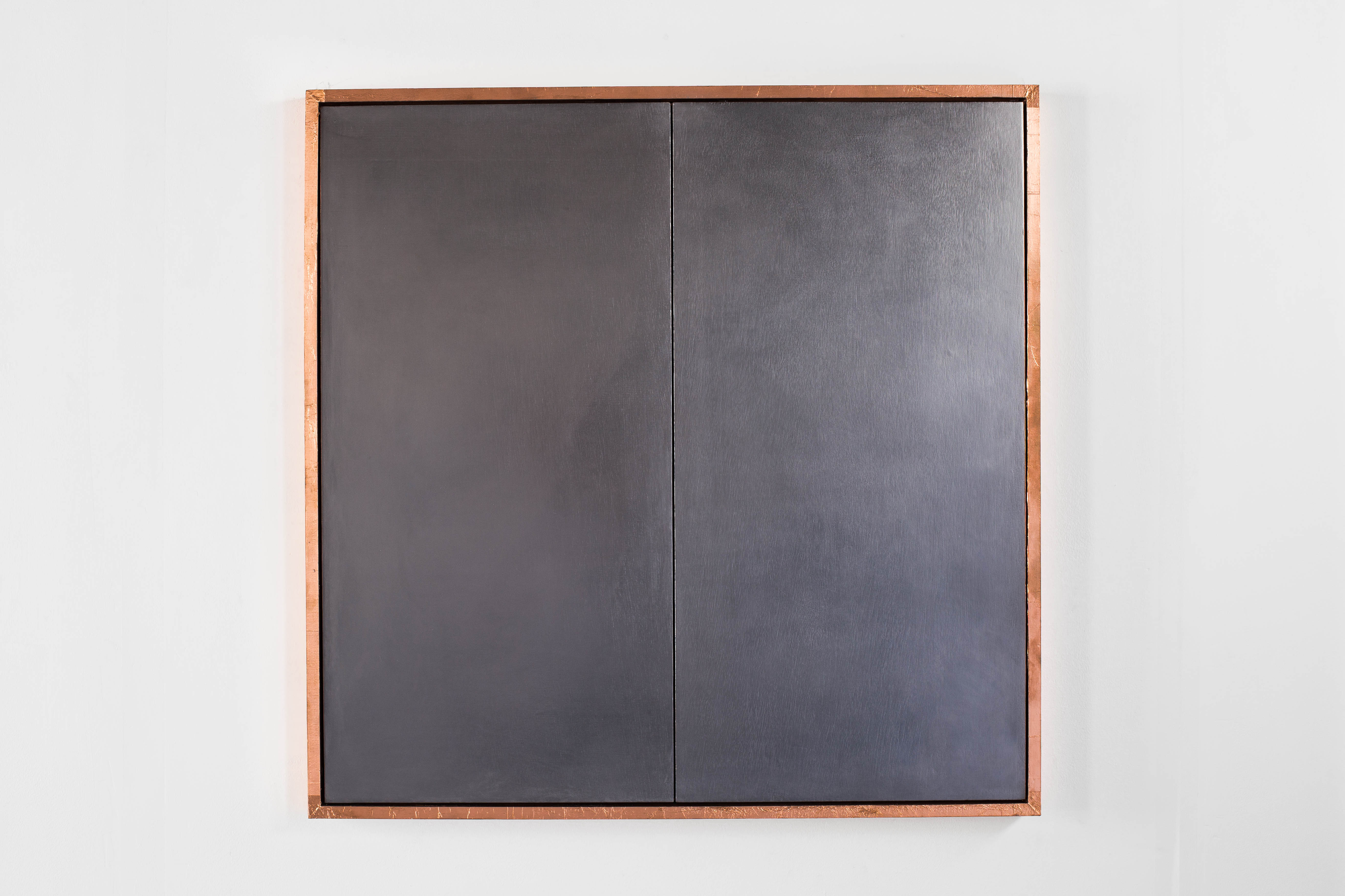
Murray’s,‘Untitled’ (2018), presenting a paraffin wax handprint on canvas that has the proportions of a head and the vertical format rectangle of a bathroom mirror, also suggests the pre-historic, ritualistic, handprint on a cave wall (which, interestingly may have been made by women). Again, the image is bodiless although recording the surface of things. The weave of the cotton duck has its own origins in craft and the handmade (albeit via the technology of the loom).
All of the works maintain a presence that cannot be ignored. For example, although diminutive in size, Glass’s ‘Death of Achilles’ (2018), an acrylic and wood construction smaller than A4, seems to offer a private conversation to the viewer. The size of the piece makes it suitable to be hand held and the small wall-mounted plinth on which it is presented seems to offer up the image as if it were on a mantelpiece in the home. Carefully etched images of a towel hanging from an implied wall and a fallen (naked) Achilles combine and invite interpretation. The figure of Achilles is drawn (etched) carefully, although the immediate and unchangeable nature of the medium and the process forbids change and amendment that drawing on paper would more freely allow to create a more sensuous image of the body.
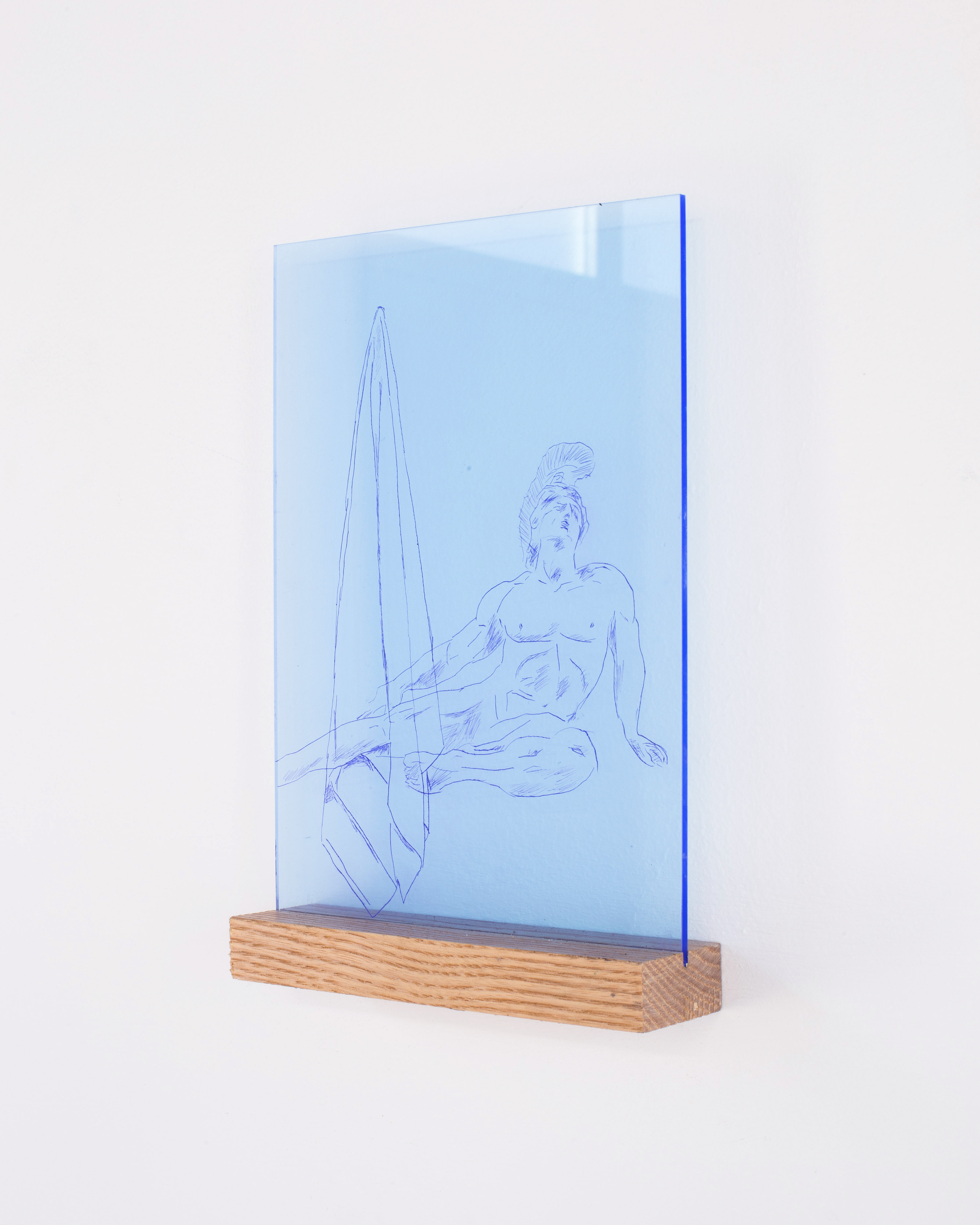
A collaborative piece from Glass and Murray, ‘Broken Bits of Boy’ (2018), presents three fragments of paraffin wax torso laid out on a pillow with copper leaf. The sculpture is laid on the floor, rather than a conventional plinth, which might reference the bedroom floor and not the art gallery environment. Along with, ‘Stood’(2017) a silver-leaf embellished bathmat, the everyday and the domestic stage is a strong/forceful feature of the exhibition.

But a broader social and generic public space (though confined to the male changing room with its homo-erotic implications) is implied by ‘Hang by the Pool (speedo #2)’ (2018), a bronze sculpture of Speedoswimming trunks. Another implication is one of nakedness, and the limpidity of the work could imply a more sexual connotation and humorous contradiction.
A physical notion of the self as portrait/facemask is explored in Glass’ ‘Cleanse & Repeat’ (2018) and ‘Peel & Relax’ (2018). Before making the connection with cleansing, peel-off, cucumber facemasks, I was pondering, by association, Greek theatre tragedy and comedy acting masks. The combined potentiality of the theatre of the everyday with classical, perhaps collective, memories and origins points to the inherent possibilities of reactions that could be activated or provoked by this and the other works in ideal-i. The exhibition is marked by a persistent visual poetics that combines images, found objects, material juxtaposition and ideas. The project is placed with a particular sexual orientation in mind but connects on a humanistic level nonetheless.

It’s worth mentioning that a limited edition of five ‘Peel & Relax’ works by Glass are offered for sale for just £100 to support future exhibitions at this venue. Ideally, Niagara Falls Projects will be with us for many more years and will help to encourage other small collectives and individuals to share contemporary practice in venues that are not bound or defined by strictly commercial values. This is a project in itself, of course.
Geoff Hands
All artwork images are © of the artists.
Links:
Niagara Falls Projects – https://www.instagram.com/niagara_falls_projects
https://www.facebook.com/niagarafallsprojects/
James William Murray – https://www.jameswilliammurray.com
Alexander Glass – http://www.alexanderglasssculpture.com
Bermondsey Project Space – http://project-space.london
Cell Project Space – http://cellprojects.org/home
Phoenix Brighton – https://www.phoenixbrighton.org
Fabrica – https://www.fabrica.org.uk
Jacques Lacan – https://plato.stanford.edu/entries/lacan/
7 June to 9 September 2018
After winning the Turner Prize in 2006 and providing the stand-out work in ‘Painting Now: five contemporary artists’ at Tate Britain in 2013-14, it has been interesting to see a presentation of Tomma Abts’ paintings from 2002-2018.
The current exhibition at Serpentine Sackler Gallery has attracted ample media coverage and Adrian Searle, writing for the Guardian, has waxed lyrical in his four star review: ‘Like fans in the hands of animated Andalucíans’. Fellow Guardian critic, Laura Cumming, goes one better and gives the show five stars. Neither critic labels the work ‘abstract’ – although Cumming introduces the term with a denial of sorts when she concludes that, “…with metaphor comes a kind of lyrical philosophy, to the effect that no painting seen or made by human beings can ever be wholly abstract.”
But are these abstract paintings? They might appear to be so at first glance. But what category of the abstract are we viewing? Hard edge, geometric shapes of planar colour-forms, distinctively characterised by purposely limited but expertly rendered colour palettes abound that could have antecedents from Kandinsky to Bridget Riley. But there are perspectival, trompe-l’œil elements too. Not only indicated by folded forms and shadows cast by ostensibly unidentifiable abstract structures, but figure/ground relationships create definite illusions of spatiality. A sense of voids into which the viewer might be able to place a hand between forms, or know that there are extensions to these constructs occluded by other structures and facades, suggests the still-life genre. If these are figurative images, we are perhaps looking at forms we have not seen before – or at least not noticed in our immediate environment.
The subject matter of Abts’ paintings may not be obvious and whether we read or understand these enigmatic images as figurative or abstract is clearly open to interpretation. Reading available literature appears necessary and is understandable. Explanation and elucidation helps to unlock barriers to understanding apparently abstract, non-figurative works – even if a counter-argument to trust one’s own eyes and personal interpretation is tempting. Ideally, one should visit the exhibition and buy the amply illustrated catalogue or download the press pack that includes an essay by art-historian Kate Nesin. Alternatively, pick up a bargain priced copy of the exhibition booklet for a pound. Lizzie Carey-Thomas’ informative introduction sets the scene perfectly. With a little history and quotations from the artist she describes the practicalities of Abts’ production lucidly and adds a curator’s note that the artist had full control over selection and arrangement of the works for the show. By now you could also have read Luke Elwes’ recent Instantloveland article, ‘How to write about Tomma Abts?’ Accounting for many and various interpretations and explanations of Abt’s paintings, the article’s diverse references will set the reader off on a journey that will expand how the viewer might choose to frame the works. Elwes’ final sentence, “Their origins are obscure, and their forms are strange: such is the lure of the uncanny”, had me considering that fascinating term at the end. The ‘uncanny’ could well be applied to Abts’ imagery whether we see the works as abstract or not. There is a familiarity about the forms and configurations, although anything unsettling is subtle and notions of the abject might be a step too far. Maybe there’s a quirky Kafkaesquesense of never quite arriving at a final interpretation – but minus any surreal horror or underlying commentary on institutionalised society. Although an anonymous atmosphere in the work sneakily underlies the initially pleasantly colourful and pristine imagery. Emotions are checked by a tightly controlled application of paint.
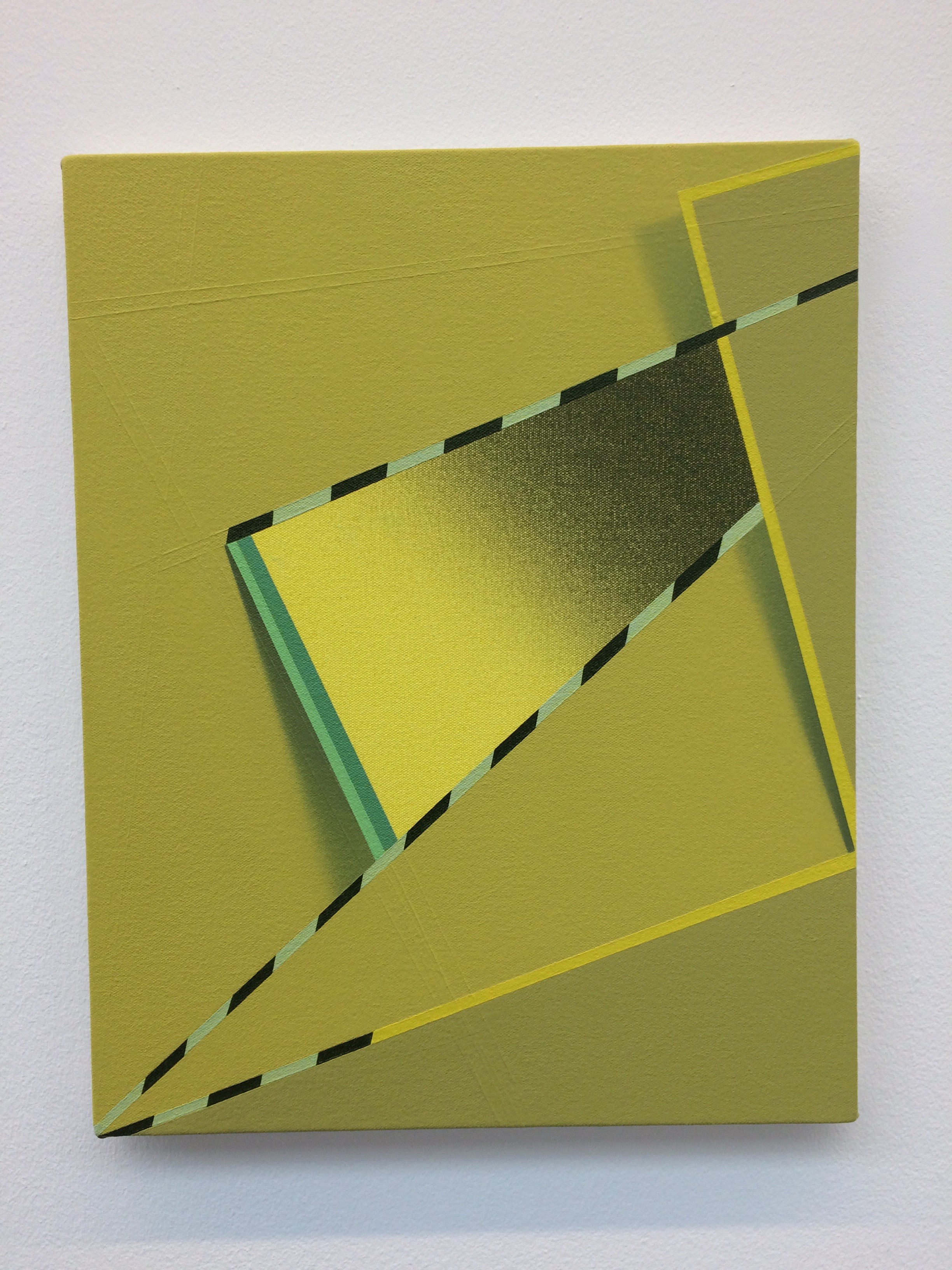
On my initial arrival (I returned later for the curator’s talk), an unexpected source of commentary was gleaned from listening to a language teacher who was taking a small group of her students around the show. Her lesson plan was clearly geared towards terminology, and considering these canvases as abstract paintings enabled a focus on formal and descriptive terms that may have been complicated by overtly figurative works. Defining visual forms and its specific multi-lingual language from the written and spoken word made for a fascinating discourse that the students handled really well. All forms of language make connections and create communities, for language is ultimately social in its constructive and relational purpose.
“If you can define it, it’s not abstract…. Your minds are set for classical art… What’s the story?” Looking at ‘Schwiddo’ (2018) the tutor-cum-guide referenced associations that a viewer might already have. Chopsticks and two bowls were suggested, as the participants had shared a meal earlier. (Or was it a record player, raffia mats – or an aerial view of mown grass?) I wondered – is painting a class of fiction? But whatever the implied narrative, or the opinions of others, the viewer is obliged to use their eyes too – for this is an absolutely visual body of work that reminded me of Patrick Heron’s maxim when he explained that, “Colour is both the subject and the means; the form and the content; the image and the meaning, in my paintings today.” Invoking Heron, who made quick decisions for his imagery after long hours of premeditation, followed by purist exactitude in application and adroit decision-making, could be a long shot. But equally, colour is inseparable from Abts’ forms, albeit with tonal rendering that Heron would have rejected.
I also recalled the work of Helene Appel and Peter Dreher. They are not to be categorised as ‘colourists’ (and the Germanic connection is superficial), but the ability to apply paint with craft-like precision over extended periods of time, and to be able to modulate colour without resorting to brashness or garishness are cohesive factors in their disparate practices. We might also wonder about the personality of the maker of these paintings because they are obviously handmade and cannot be confused with the printed or the digital. Quietly meditative, with virtues of patience and determination to complete tasks expertly, might befit all of these painters.
At the Serpentine the curation is simple and Abts has resisted the temptation to fill every available square metre with a canvas. (She even left some drawings out that were originally to be included.) Abts’ expert ‘eye’ for spatial distribution and visual calibration is subtly manifested in the slightly different measurements of intervals (about 2 to 3 metres) between each painting and might be as important as the sub-divisions of space within the various compositions. Add the illusionism of overlaps, curves and shadows to the tastefully coloured Euclidian, architectonic still-life-type spacescapes and the scope for a non-organic visual aesthetics opens up endless, exponential possibilities.
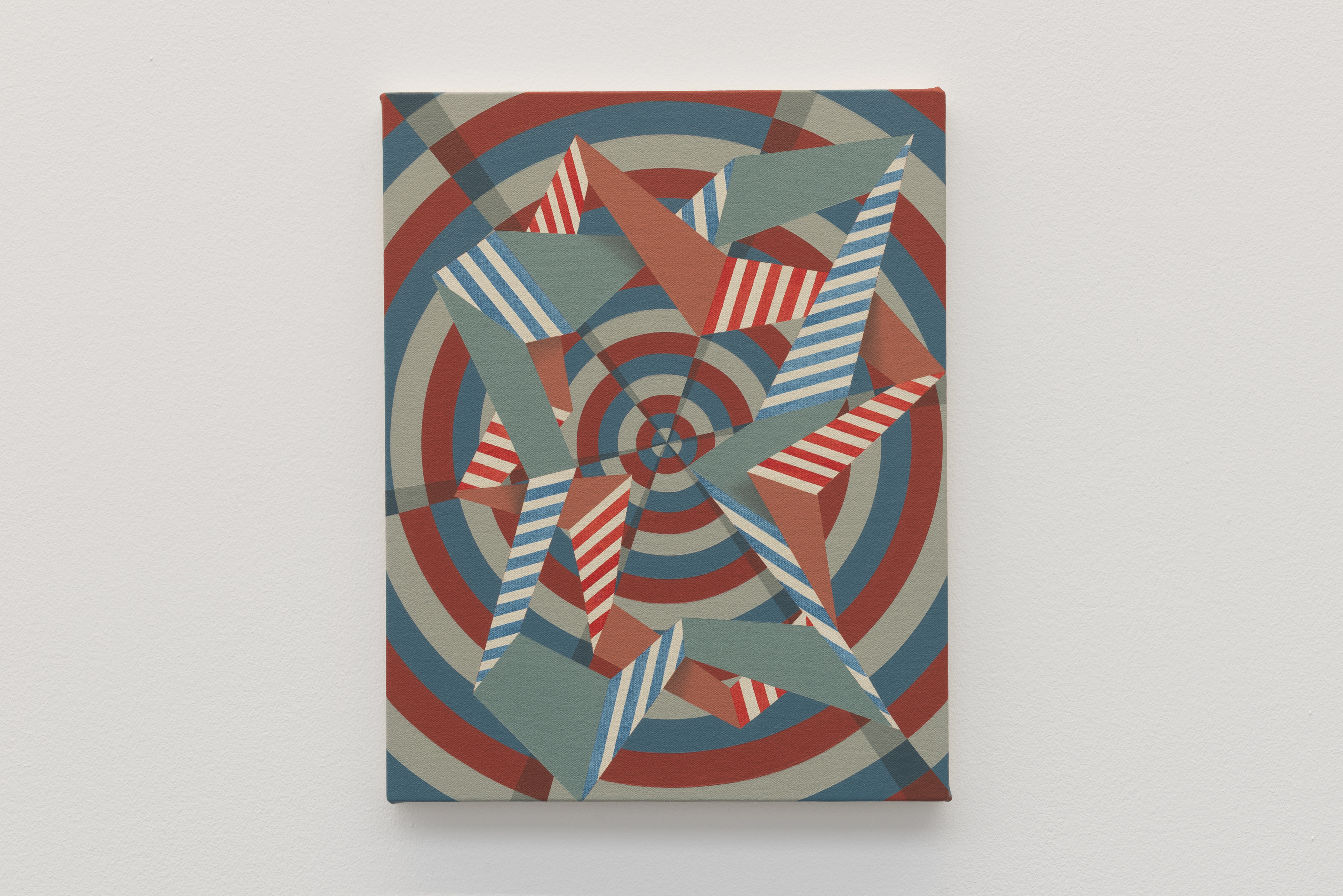
The work is not arranged chronologically but visitors were mostly starting at work no.1 – ‘Oeje’ (2016) – and finishing 25 canvases later at ‘II’ (2018), circumscribing the empty central gunpowder storerooms in a clock-wise journey of stops and starts. There is so much diversity – you can’t get bored with this show. The work is immaculately produced – a trademark feature of Abts’ literally painstaking working process. If you want variety there’s nothing to gripe about as there is variation and all content is clear and well defined. The images have an air of neutrality, but not in a disinterested or impartial sense. There is a visual concreteness about what is detected within Abts’ compositions and a geometric sense of substance and tangibility about her environments that are not mini-worlds, but could be portions or segments of something/somewhere bigger. Meaningfully social and expansive, rather than restricted to the closed world of the studio (just as Georges Braque avoided the hermetic dangers of the atelier by making paintings that are still visually alive), intimacy still is embodied in these paintings. My hunch is that the fictive spaces and forms are shared and communal. There is a familiarity implied by the various forms and spaces. For example, in ‘Fimme’ (2013) there is a packaging or greetings card allusion (probably unintended); and in ‘Feke’ (2013), a modernist architectural vibe might be referenced (but isn’t). The various infrastructures are not anonymous or obscure. But I can’t quite place them.
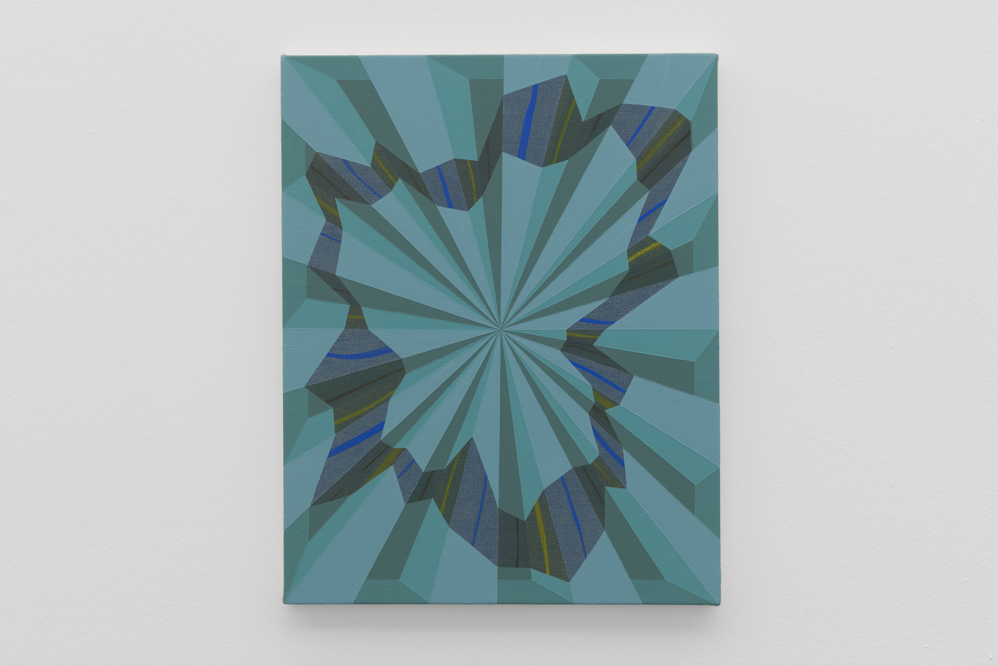
The structural geometry that pervades Abts’ imagery might be considered a form of Rorschach inkblot, testing the viewer’s imaginative capabilities. But the variable content is embedded in and referencing the designed and constructed world of the collective-conscious, rather than the liquid submergence of the inner mind. Throughout the work the various environs, marked by simply coloured interstices and generally flat but concrete structures: straight and curved edges; overlapping and broken forms; zigzags or graceful rhythms. These characteristics of content are acquired and fabricated intuitively from a state of flux, of forming and deconstructing over months or even years in the artist’s daily painting process. What fills and constructs our personal and communal psyches? As viewers, participants in much the same geographic, cultural and social spaces as Abts, mental and memory models of the built environment, containing patterns and paradigms, are both physically extended around and, psychologically, inside of us. Under certain conditions, barriers dissolve, merging the actual and the metaphysical – is this the implicit story? Form and content, however mysterious or hidden in plain sight, is resolved. The contradiction is strangely, and uncannily, satisfying.
Links:
Serpentine Galleries:
http://www.serpentinegalleries.org/exhibitions-events/tomma-abts
Instantloveland: Luke Elwes – ‘How To Write About Tomma Abts
Warning
All Rooms
Very Able
Yes please
Son Bring Cash
Bury In Open
EE Jork Fix
Friday
Load Our Network
Highway Star
Glorious Performance
Sit Down
Rise Sit
Note
OO Summer Trees
P Permit Rant
Sit
Solo Out


Welcome to The Heart Today
Time Precious Squeezed
32 Lode Tilt
Keep calm ‘ay me Scented English
No Nothing on the glass Nothing
Keep tidy Dirty Good days
We Join Zeal
Soul pose Over Easy
About Mermaid goals & Great art
Best Are kind I love
Anon XX


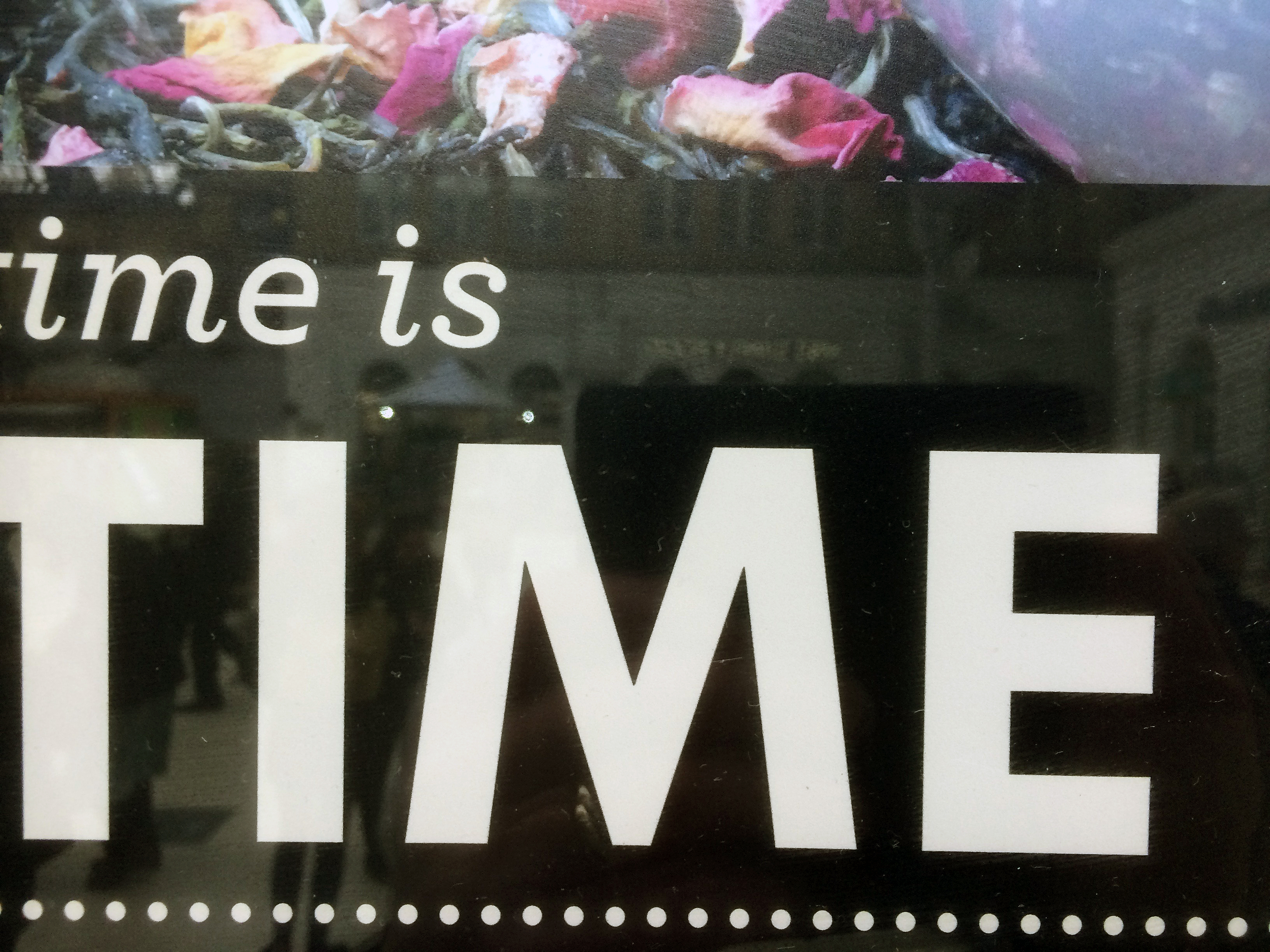
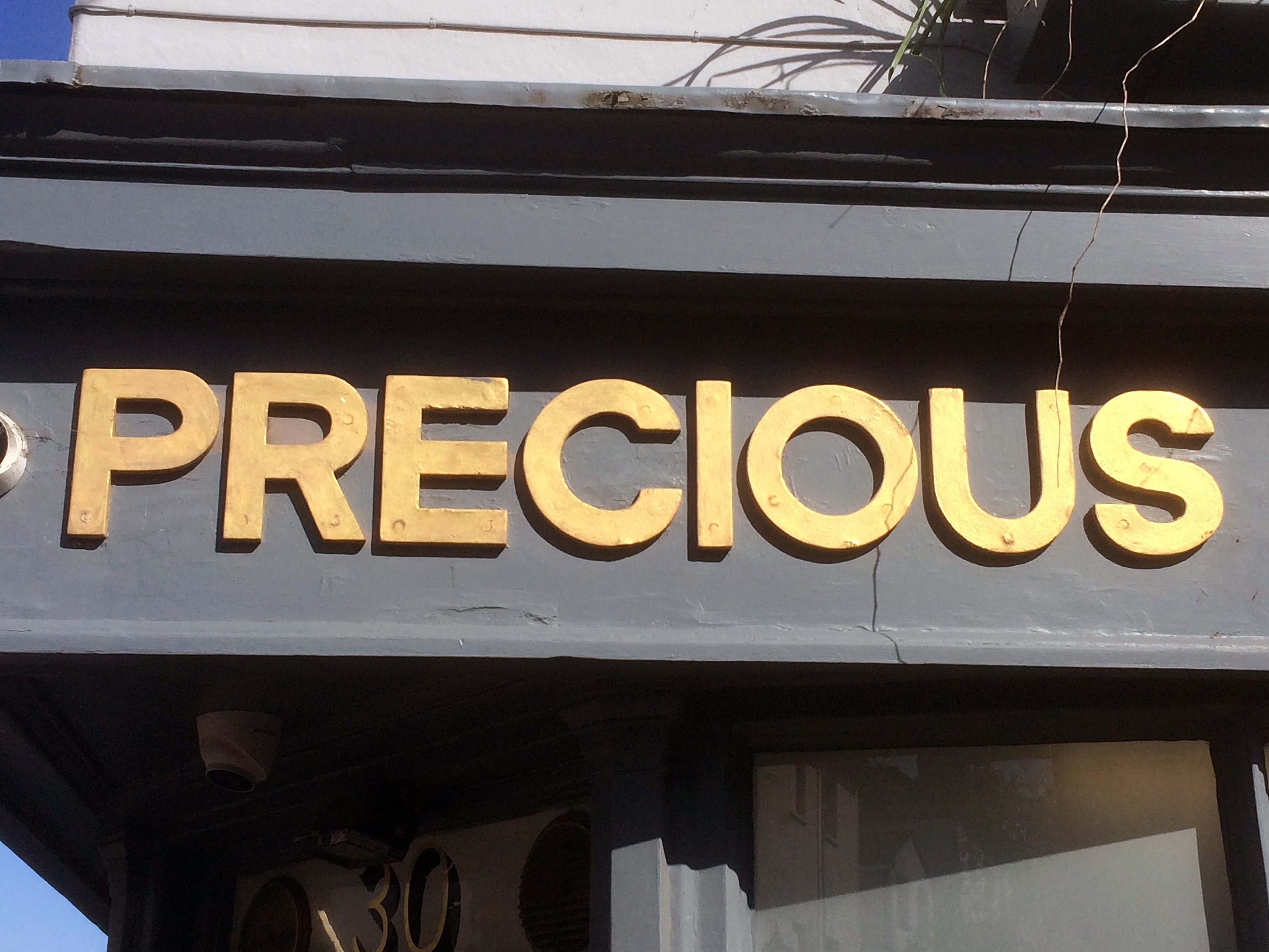


Hitting The Streets was a task set for the Foundation Diploma students from Northbrook Met (University Centre, Worthing) on a research visit to Brighton (May 2018). This also provided an opportunity for my own response to the theme.
Heather and John Corley developed Linden Hall Studio into a gallery space in 2014 and a visit to Transformations provides a good excuse to get out of the city and head for the Kent coast. Gazing out to sea from any location enhances our physical groundedness (literally) and we get a reinvigorated sense of that weird but ever-present phenomenon called ‘space’. Extended space is curious because of our own limited human dimensions, from which we perceptively judge all immediate senses of distance, size and scale. Distant space can be observed with some sense of safety, even if temporarily, as threats draw near. Looking to the distant horizon, especially when the sea has replaced the land, can evoke a mysterious sense of future times and places. Close space, within arms length, holds love and fear in equal measure.
Spatiality in visual art, especially painting, also provides an extending experience for the imagination, and the trickery of illusion (aided by the sophisticated perspectival inventions from Masaccio and Quattrocento painting onwards) has permeated the reception and reading of painting for a long, long time. Likewise, abstract painting engages with this experiential, psychological and forcefully visual engagement with notions of space. Colour and linearity, to varying degrees, are often a component part of this spatial scenario and Gary Wragg’s paintings have demonstrated this over several decades.
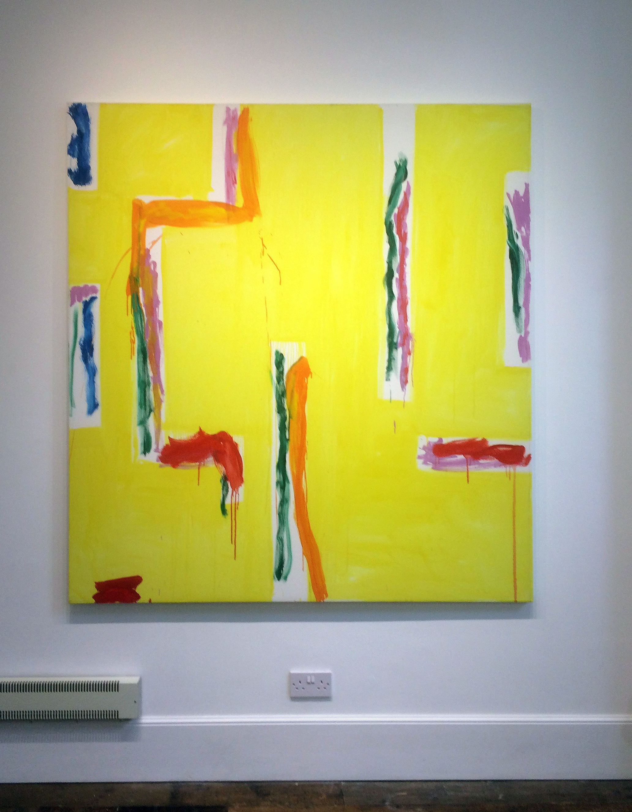
Sculpture is another matter, where form (involving volume, weight, mass and monumentality), rather than an abstract notion of spatiality, has dominated its production and development. Anthony Caro changed all that in the 1960s, with the fusion of material (typically steel) creating structure in space – as space. Robin Greenwood was a student of Caro’s at Saint Martin’s School of Art in the early ‘seventies and so a loosely woven School of Caro (from the New Generation and beyond) might still be discerned at times, despite the endemic plurality of late modernism/postmodernism that has created a mixed bag of avenues and cul-de-sacs for artists to explore.
Gary Wragg’s formative painting education was forged at Camberwell and the Slade Schools of Fine Art, respectively. Wragg’s abstract expressionist influences are clearly New York School (Jack Tworkov and Willem DeKooning spring to mind) but his paintings are unmistakably identifiable as ‘Gary Wraggs’ and reveal his personal relationship with the practice of drawing and Tai Chi.
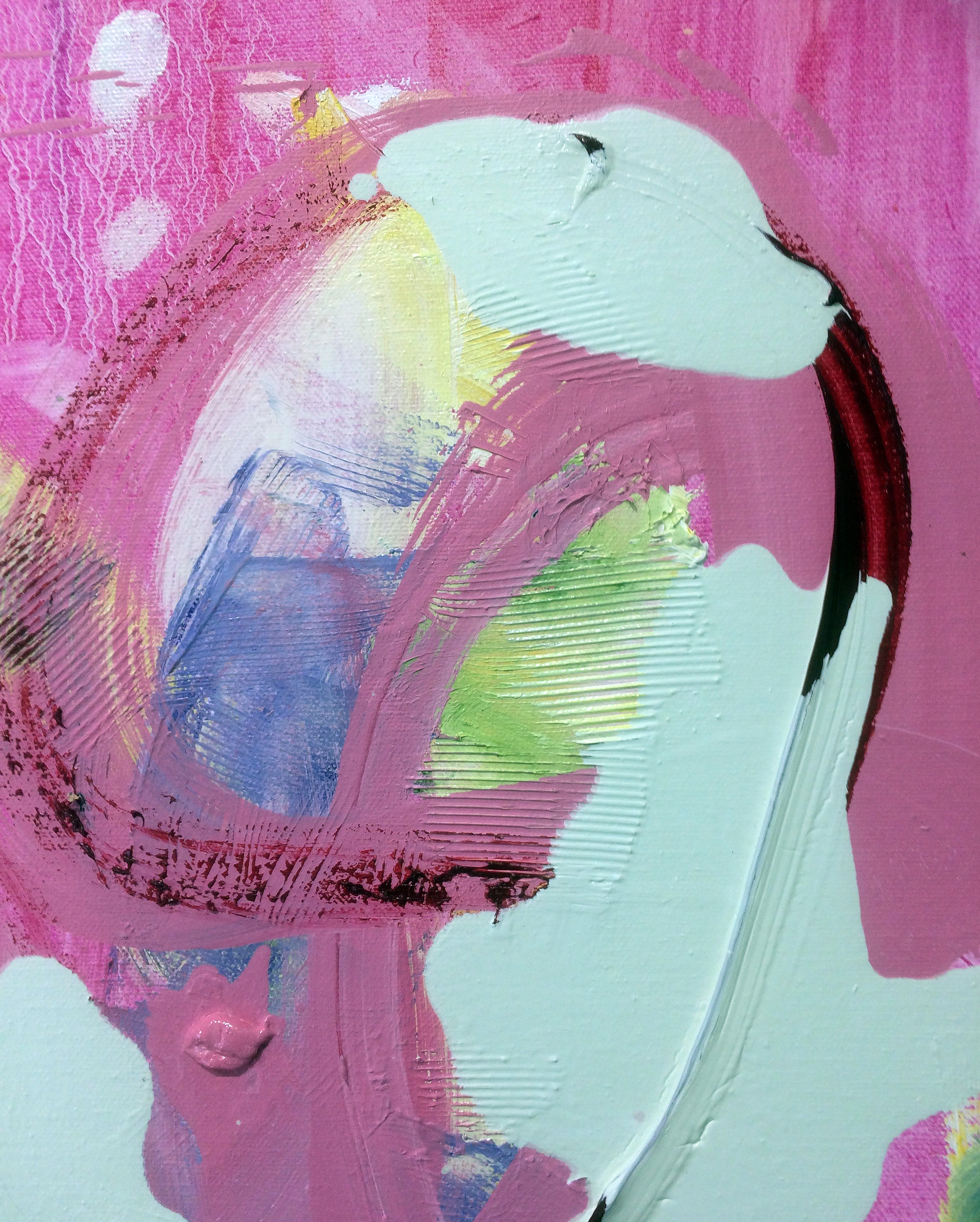
Wragg and Greenwood have evolved from the same generation and the Transformations exhibition, curated by Sam Cornish, provides a welcome combination of contrasting yet complimentary works. At Linden Hall Studio, the two exhibition floors are filled with natural and artificial light throughout the day. This light (as if it were a medium of the architecture) illuminates so effectively and is a feature of the gallery that presents the works exceptionally well.
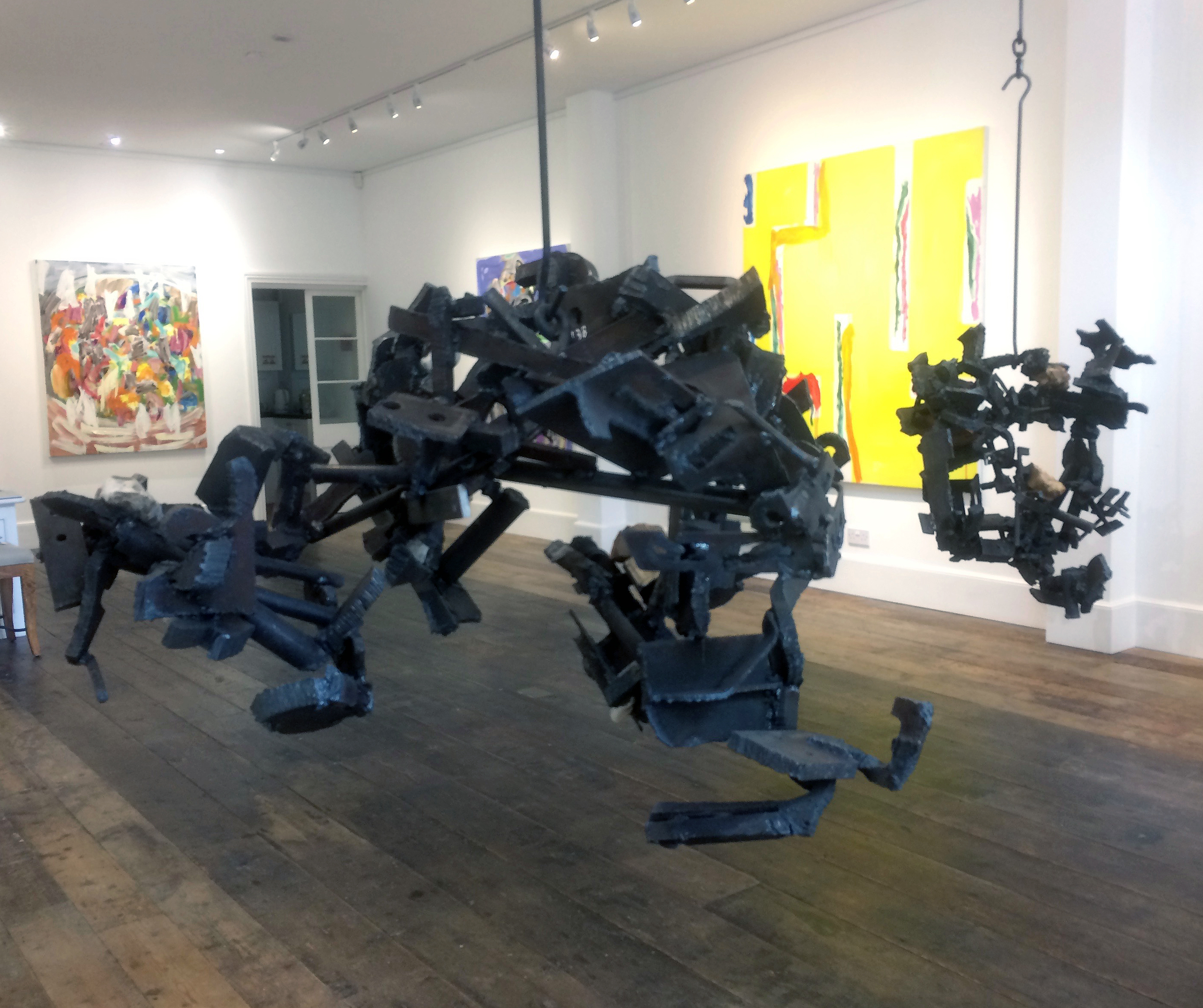
For a first impression, two of Wragg’s paintings have been placed in the front windows to give a taste of what will be inside the gallery. Above, on shelves, are six of John Corley’s glass ‘muffs’, or cylinders, of coloured glass. These are not part of the show but also hint at the colour and light that is a major feature of Wragg’s canvases. Entering through a double door, two of Greenwood’s sculptures have been placed to either side of this initial space and are bathed in natural light from windows above, where a mezzanine floor opens up the gallery space. Four of Wragg’s large canvasses (plus a tight configuration of eight small compositions on card that are from the same series as the works in the window) immediately create an impression of qualitative choice and arrangement. Although the building was originally a chapel, there is a comfortable domestic scale to the space and a staircase that takes visitors up to the first floor, with two more sculptures and over a dozen paintings, including three more large canvases, further hints at this homely aura.
There is much to see (39 works in total) and the surprisingly roomy walking area on each floor allows the viewer to stand back to find the correct viewing distance for each work. Except where paintings are purposely hung together (essentially the smaller compositions), the indicative relationship between paintings and sculptures in adjacent spaces are neither forced nor dependent upon each other. In addition to the obvious contrasts between painting and sculpture, Wragg’s colourful and light (in tone) paintings, and Greenwood’s dark and heavy (in weight) sculptures, creates a balance rather than a confrontation between very different works. The larger canvases relate to the sculptures particularly well as they occupy similar characteristics of size and presence, though any links will be circumstantial rather than programmatically devised.
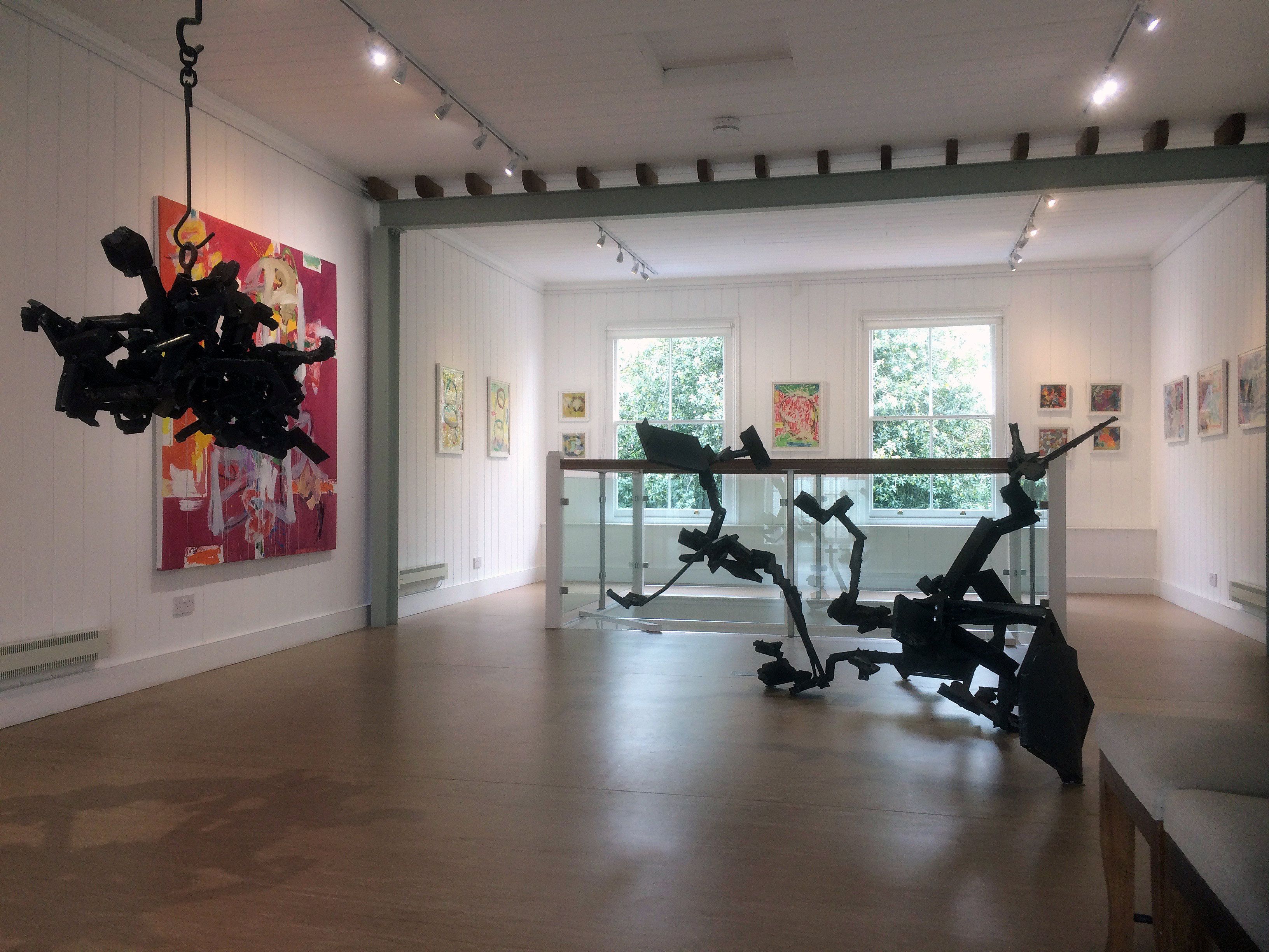
But whether intentionally or not, questions were raised in Transformations: Do we look at and experience abstract sculptures the same way as abstract painting? And are our expectations different? From this pairing for the exhibition both forms of abstract art contain a sense of rhythm and flow within their respective linear configurations. Each artist appears to work intuitively and without strict expectation of the final outcome in a spirit of freedom for what might transpire in the creative process. Both work in series (which can falsely suggest predetermined forms) and there is also a tactile sense of materiality of the mediums (of paint and steel) that counters illusionism and figurative forms. Greenwood and Wragg are committed abstract artists who have never waivered in their personal quests to develop visually emboldened works within the field of abstraction.
One distinction, which equates the viewer with the work (as much as the artist’s intention), might be in the way the work is looked at or apprehended. Greenwood’s sculptures, which are made to be engaged with visually, and experienced in the round, can be viewed either standing still and in movement. Momentary compositions, made from pausing to take in and consider the work, are endless as even the slightest readjustment of positioning changes how a three dimensional form is seen. In Greenwood’s sculptures there is a mysterious, subtlety aggressive, ‘Gothic’ persona to the works. This latter designation may be rather superficially attached, but the metallic darkness, the sense of weight and the uncompromising nature of hard metal, pertains to the uncompromising nature of the works, especially those suspended from the ceiling. Looking up at ‘Kwoke 166’put the bundle of steel (with a little wood and plastic) into stark contrast with the spotlights on the ceiling and felt quite menacing.
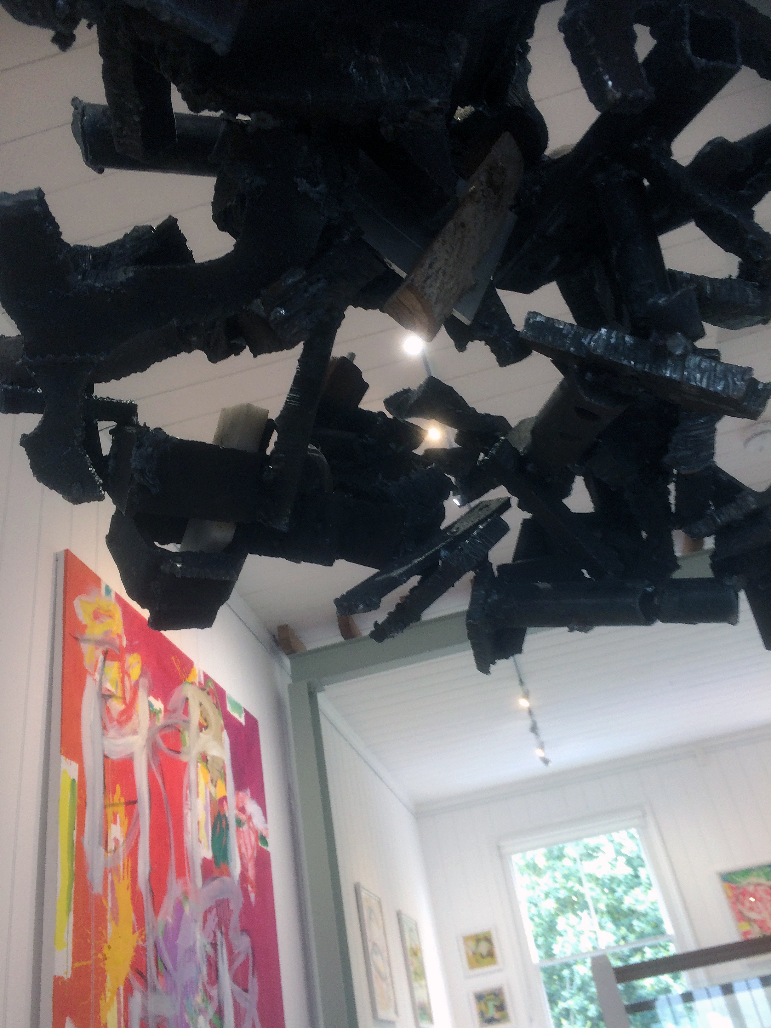
Returning to notions of spatiality, with sculpture that is big enough, the viewer’s own physical space is encroached upon. Is this where sculpture can surprise or unnerve the viewer? Like another being before them that activates real space – not just headspace. And as the viewer moves around the forms, careful not to walk into or too dangerously underneath, the changing compositional framing of looking can never rest. With the sculptures there is the issue of gravity too – especially potent for Greenwood’s suspended forms. But also of weight, which in ‘Tree of Ornans’, lifts defiantly from the level of the floor with dexterous and agile movement that is surprisingly lyrical, as the fragmented industrial component parts become gestural branches suggesting arms and legs. It is balletic and poised.
Interestingly, Greenwood’s three suspended sculptures contrast with ‘Tree of Ornans’ more than with Wragg’s paintings. There is a tighter configuration, in the almost head-like suspended sculptures. The allusion to the head probably has more to do with their positioning off the ground/floor (131, 138 and 166cm). The viewer meets these pieces head-on, rather than at knee and chest level with the ‘Tree of Ornans’. The physicality of the sculptures fixes the implied bursts and movement of stilled implosion/explosion and rotation. By contrast, it is the viewer who must move around the works. The viewer becomes the kinetic component in a spatial performance.
With painting there is an obligation to stand still, rooted to the spot. The viewer’s eyes, and sometimes the head, will move as the gaze surveys and wanders. Abstract (visual) space will take the viewer in to its implied space, with the flat canvas surface as counterpoint. Wragg’s paintings, typified by his signature gestural calligraphy, instinctive and freeform colour combinations, and (almost) dangerously undone configurations of marks and shapes, are always expressively lyrical. The kinetic features are in the painting’s virtual space. The viewer is a little more physically passive.
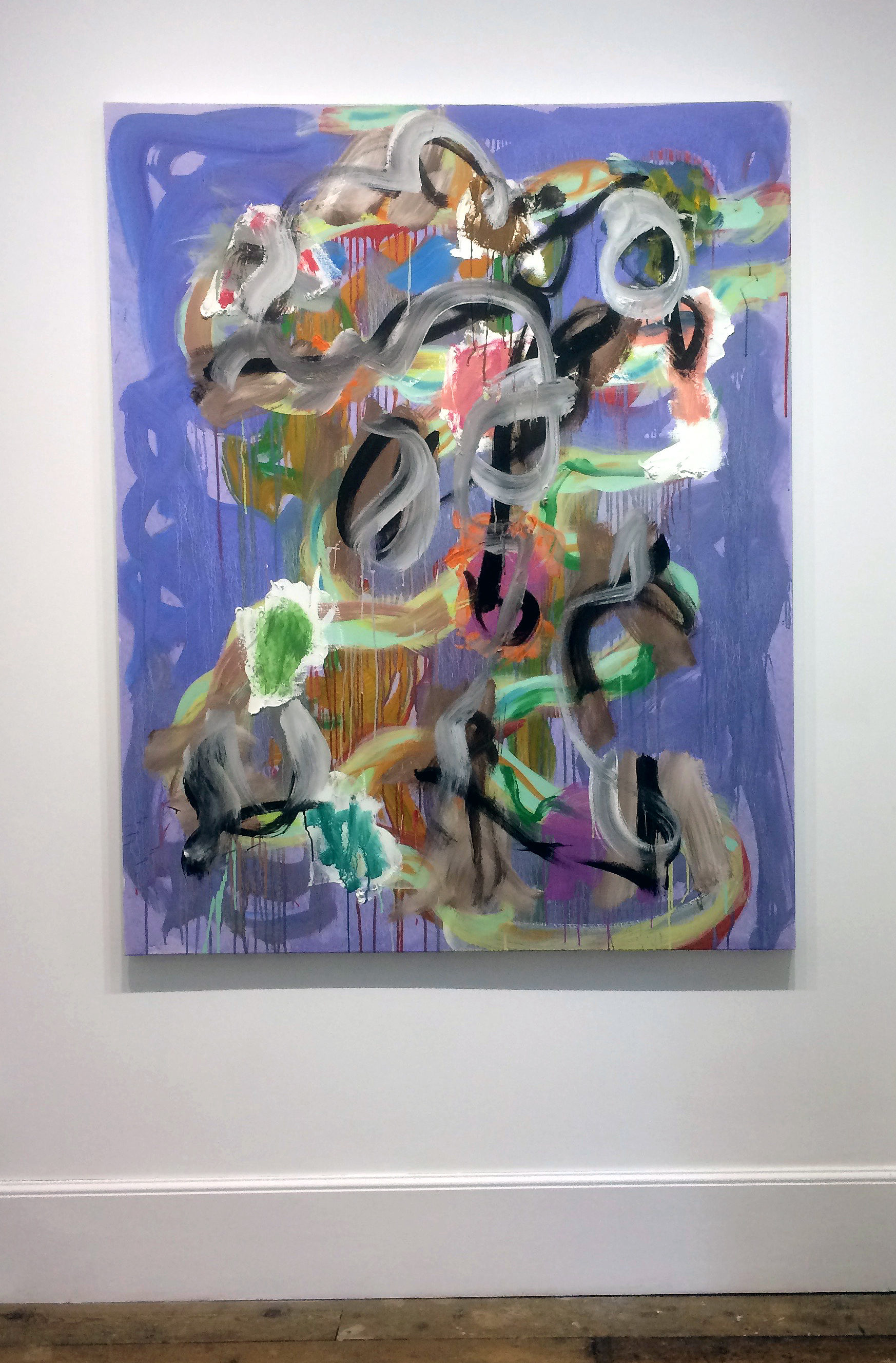
‘PL5’, exhibited downstairs and ‘OTBDG, 2, Yellow’, shown upstairs, are two works of Wragg’s that could be juxtaposed with the sculptures as there seemed to enough air around the gestural configurations to describe forms in space. Behind and within a freeform dance of linear gestures, Wragg creates a sense of shallow space. But in each work various colour patches, splatters and gestural swirls sit on the surface of the visual field to deny the illusion of concrete, representational form.
I suspect that, by convention, the viewer does not look at abstract sculptures in quite the same way as abstract painting because expectations are different. Paintings suggest physical, geographical distances and ‘otherness’. Because of illusionistic functioning (‘picturing’) and inherent subject matter (“what/where is it?”), painting is somehow conjured from virtual realities. But sculptures are more overtly, formally, here and now – occupying the viewer’s own physical space. Does the viewer meet a sculpture – and observe a painting? Whatever conclusions can be made, Transformations poses questions that do not have to be answered with certainty, just as abstraction is far from over as a major genre in contemporary art.
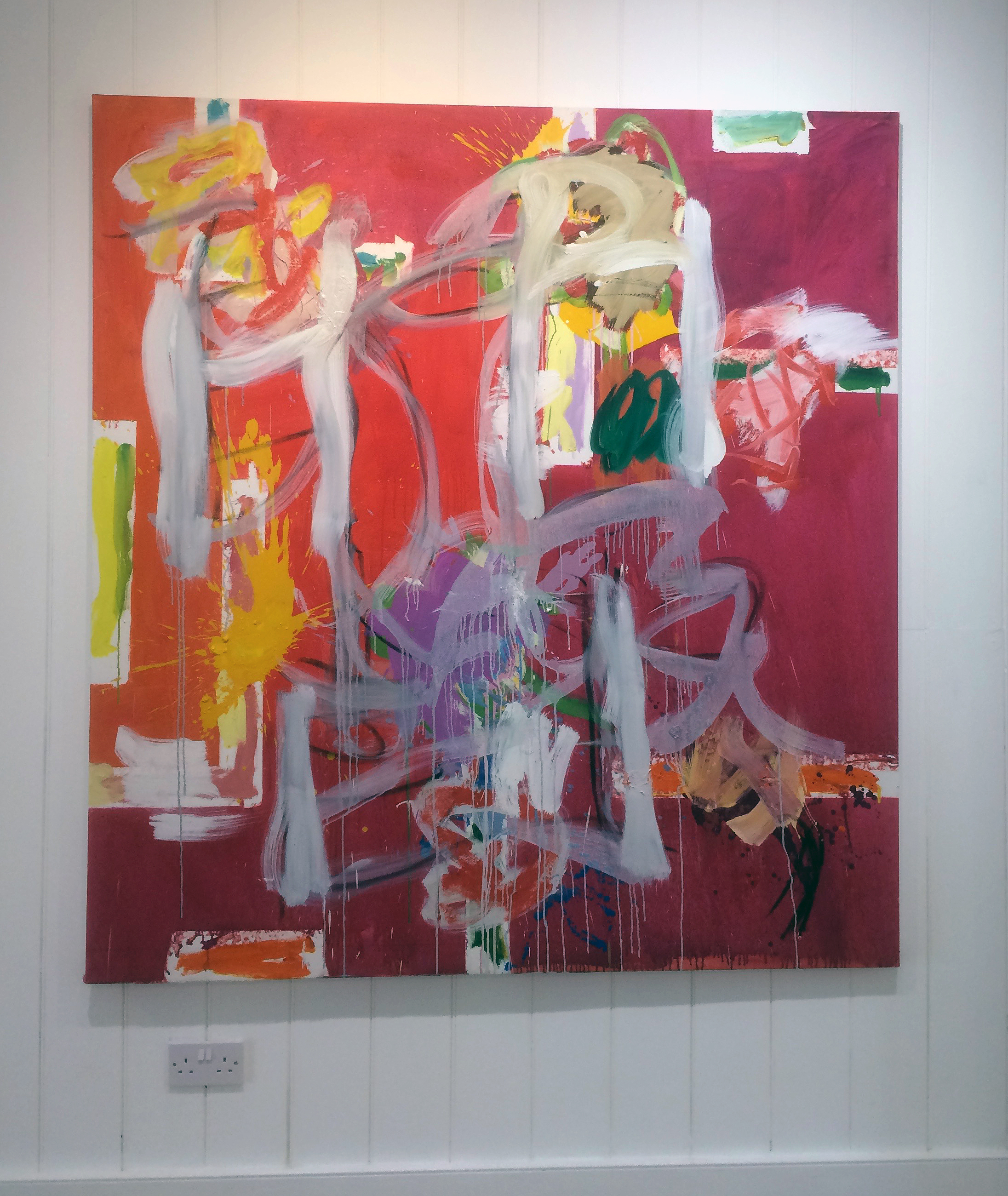
All artwork images © Robin Greenwood or Gary Wragg
Linden Hall Studio –
https://lindenhallstudio.co.uk/current-exhibitions-at-linden-hall-studio/
Sam Cornish discussing Transformations at Linden Hall Studio –
https://www.youtube.com/watch?v=_MYjVLdFjWo
Robin Greenwood –
http://www.poussin-gallery.com/site.php?artist=15
Gary Wragg –
9 – 27 May 2018 (closed Mondays and Tuesdays)
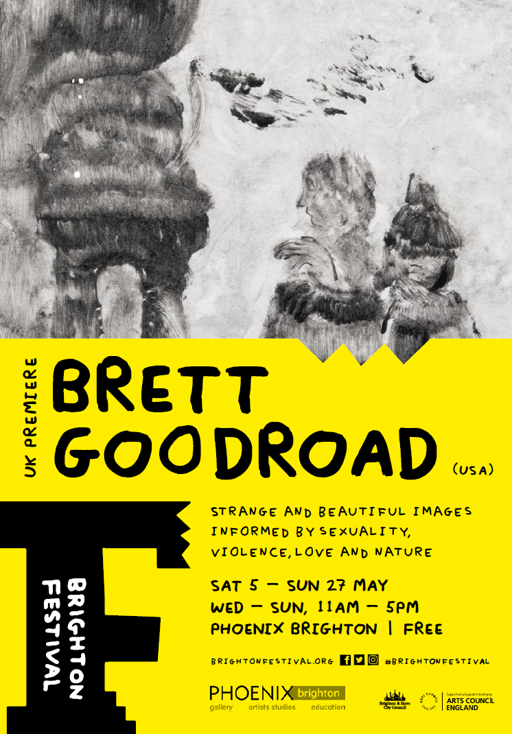
This is an exhibition that cannot fail to intrigue. American artist, Brett Goodroad, has produced a major sequence of small ink drawings and they are displayed in various groupings in the largest room at the Phoenix Gallery for the Brighton Festival. Inevitably, the available space dictates a splitting up of so many works. One wall holds 15 drawings (or are they paintings?) and another presents ten works. There are also two drawings in one corner and a temporary wall with four on one side but just one on the reverse. Another dozen framed works adds up to a total of 44, so there is much to see.
The arrangement has some chronological sequencing but the adjustment to the exhibition environment prompts a reading of the works both as a sequential narrative structure and as individual scenarios to be considered. This, as it happens, is appropriate for Toe Buoy. The implied linearity of the series (as in A to B or left to right) is given an added dimension, as the viewer is obliged to peer closely at individual works and can allow the eye to be drawn into monochromatic depths of inferred space. This tonal aspect lends itself to creating a sense of envelopment and atmosphere: a sense of place, albeit with some degree of mystery.
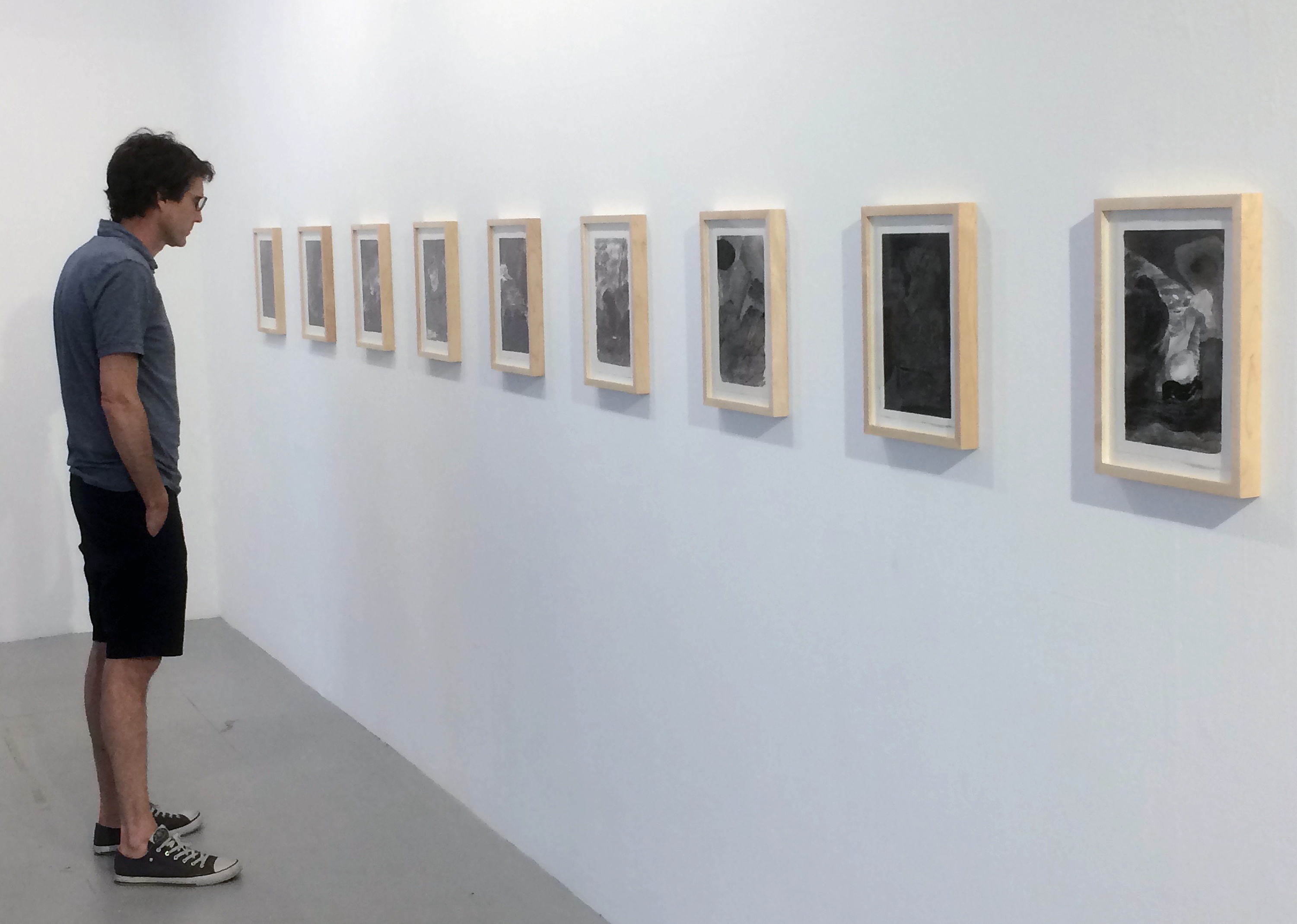
Placed in Goodroad’s virtual environments, the viewer must bring his or her own interpretation of events – or just take it in without the need for clarity of message. It’s a poetics of space that is presented, where one must ‘be’, rather than judge or search for specific meaning.
But of course, there is a context beyond the images. The artist is resident in San Francisco and is developing a reputation as a painter of landscapes. He works on his colour dominated paintings in his garden, in a local landscape that is often damp and misty. Of his painting he has said: “I want to handle colour like Ingres and end up in the Nabis.” This reveals Goodroad’s knowledge of art history and places him in a Modernist context (the Nabis acknowledged flatness in painting long before Clement Greenberg made it a dictum for painting).
To broaden his creative portfolio, Goodroad is also a writer. The exhibition title, Toe Buoy, originates from a poem that the artist wrote in 2015. In the exhibition leaflet the author has explained that:
This poem is one of a set of poems I have written over the past five years surrounding the fictional characters Elm and Aleen. The poems work around a central image of Aleen floating in an ocean and a boundary: the seam of water, the line making her contour. We see her toes, her skin drying in the air and the ocean taking it away from her.
The question is: Is Aleen about revery? Or of fish or mammals?
Aleen and Elm were painters who became sick because image and physical presence grew too much. She wrote: ‘when the world became oracular ecstasy left evening’.
Or is Aleen about painting? About bringing things together: let things be air and water. How can one compose them to make them musical? Or their history, the raising colour: resting nude under a tree, a leafy wink.
‘Or, my lyrical elephant, carry a lover’.
Goodroad is clearly leaving his poetry open to interpretation, but a notion of reverie and submersion has dream-like connotations. Visual content in Goodroad’s writing appears to be Imagistic (revealing his interest in the Wisconsin poet Lorine Niedecker – an Objectivist, Imagist, Surrealist writer) and as might be expected translates into actual imagery in his primary role as a visual artist. In the quieter, visual medium of the painter, the unspoken but revealed can be as equally clear or obscure as the written or spoken word.
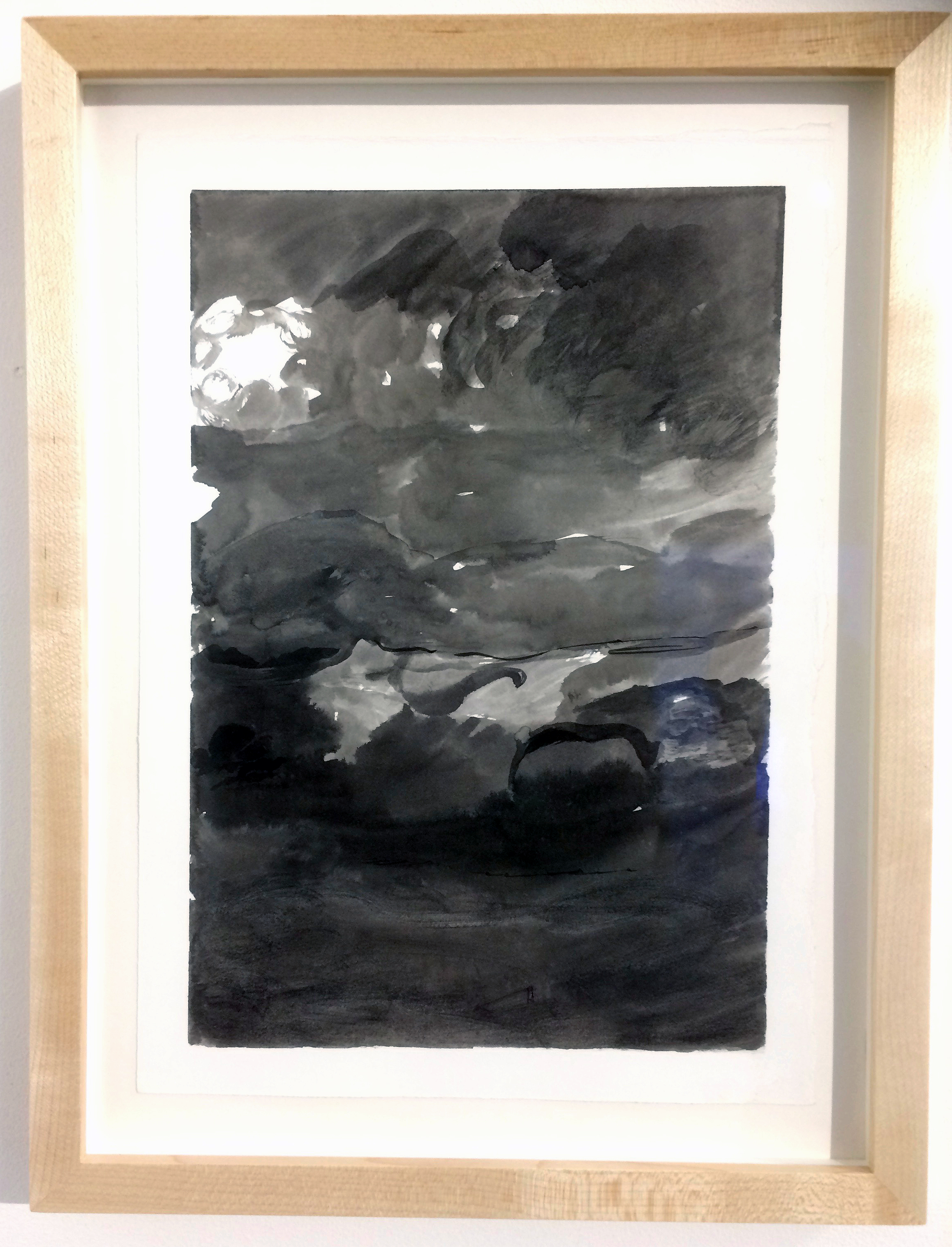
In Toe Buoy the painterly ink drawings have a sense of a state of becoming – rather like the process of under or over developing black and white photographic prints that were once produced in the darkroom before the advent of the digital medium. Some of the drawings even suggest multiple exposures, or the merging of normally disconnected events in a dream-state. This oblique coming together of imagery is relational in a cognitive and personal sense – but holds potential for notions of the collective unconscious that the Surrealist writers and artists explored in varying degrees.
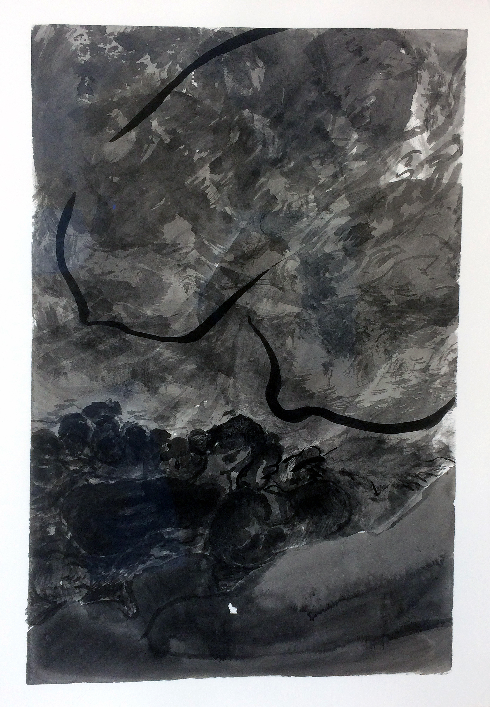
From the natural world, through which Goodroad channels his depictions, his tonal use of ink shows that the surroundings are constantly in a state of flux and continuously evolving. Distilled from the artist’s imagination, these are not necessarily strange lands. The sense of place might be from Europe as well as North America. The first impression is of a disturbing Goyaesque ambience to the imagery. But these might be stills from a low-budget film noir genre movie rather than etchings from the studio of a European master some 200 years ago. The works also have an air of immediacy that is often characteristic of what is essentially a drawing process. Working with Japanese Sumi ink, a medium favoured by Manga illustrators, Goodroad is making imagery that harks back to the European tradition of narrative ‘in’ painting. The works suggest a roster of influences, from Tiepolo (especially his drawings) to Titian’s tonally adjusted chromatic range of chiaroscuro in figures and environments: or from Watteau to Surrealism via Constable and Romanticism to Frederick Edwin Church and the 19thcentury Hudson River School.
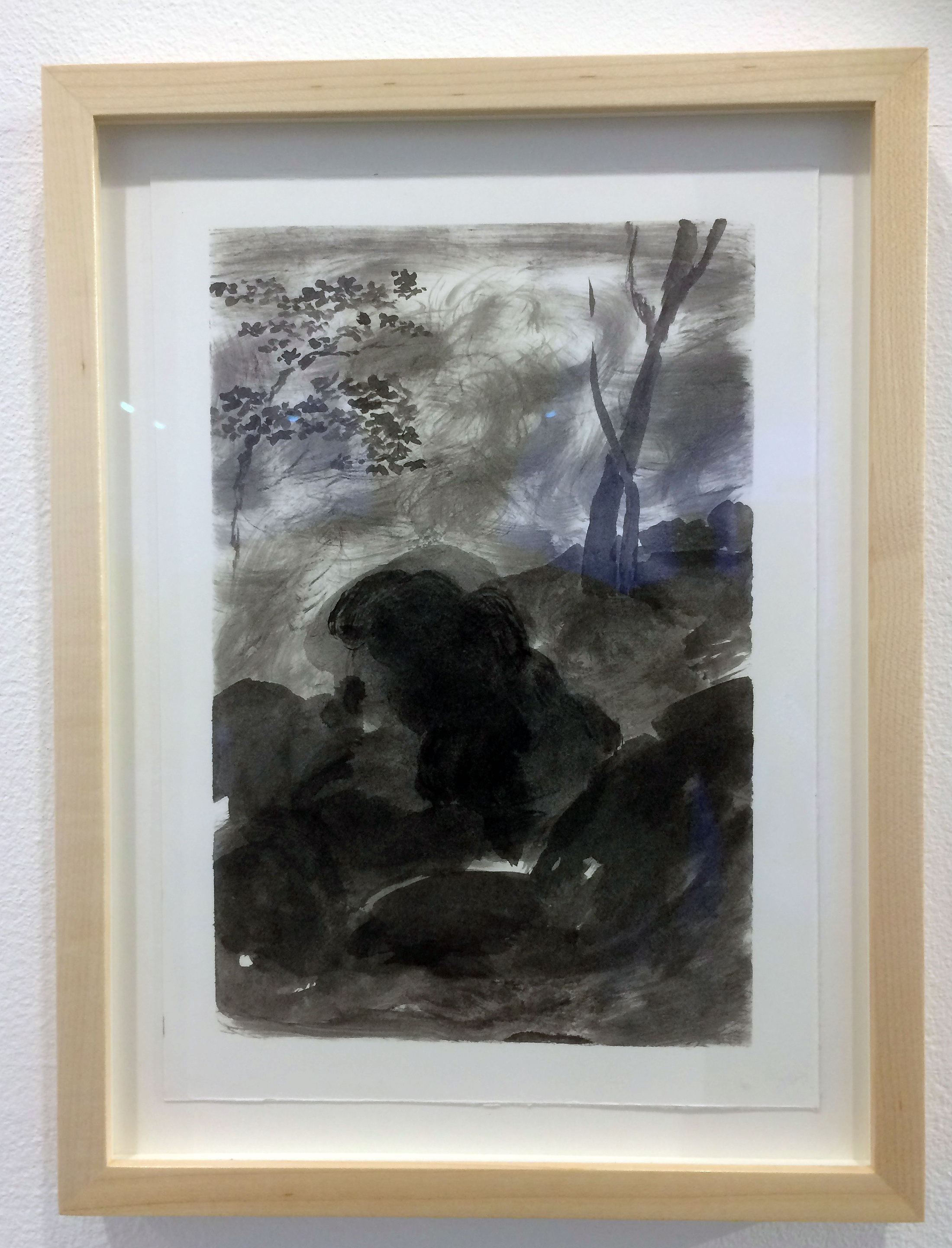
It may only be coincidental, but an intimate sense of the landscape – suggestive of Jean-Antoine Watteau, working a century before Goya, who produced fête galante canvases depicting outdoor entertainment and courtship, especially figures in wooded landscape – came to mind. But the Toe Buoy imagery is claustrophobic for the most part, especially when watery depths are depicted. In his introduction to the exhibition on the opening day, Goodroad said that ‘mold’ worked well as an analogy for the work. From this surprising off-the-cuff remark his organic approach to image making, in paint or ink, becomes apparent.
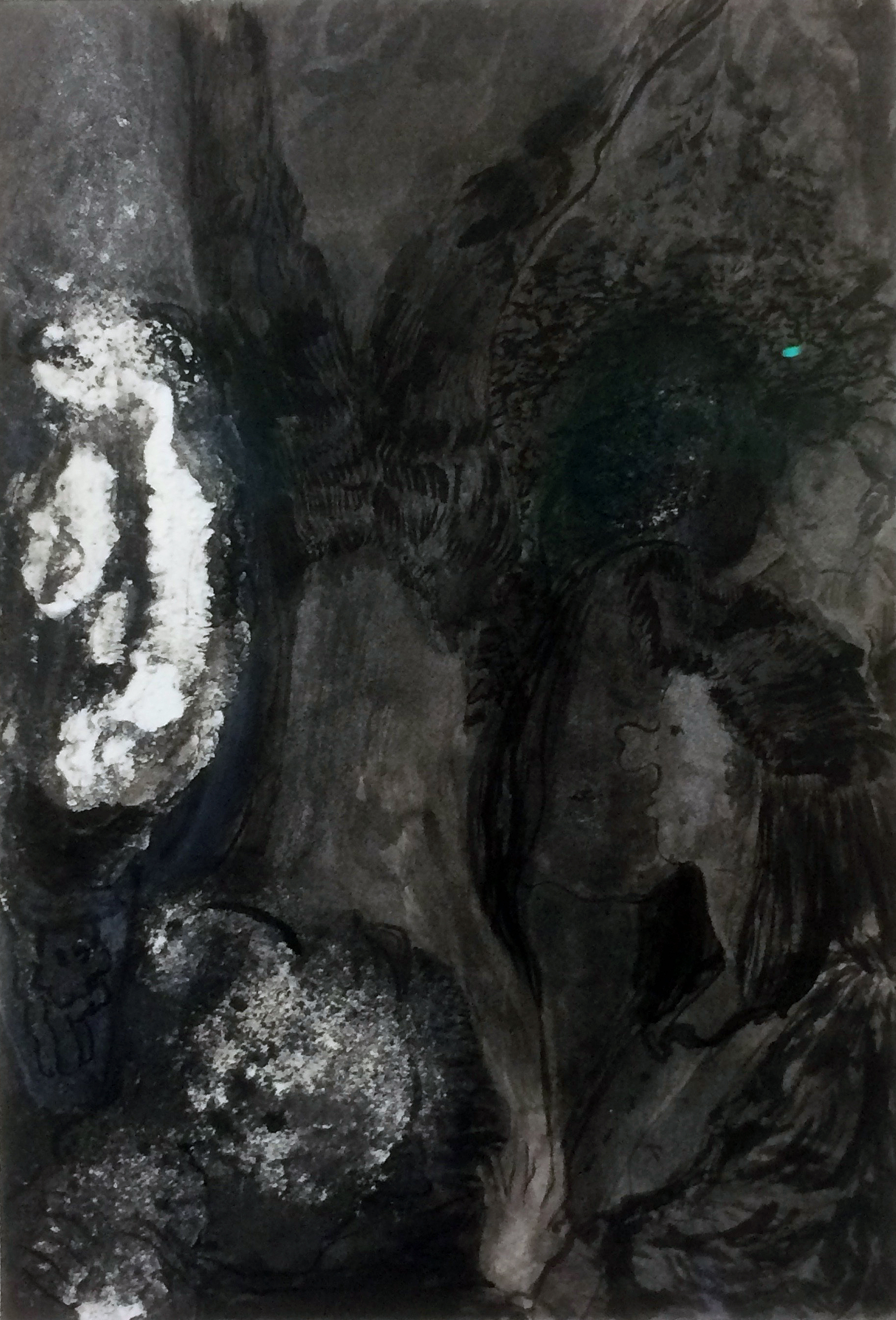
Sumi ink is a medium that dries matt, and on cold white Bristol board it lacks warmth. The imagery sinks in to the surface like they are secrets. Dark, indistinct and incongruous forms invite closer looking. In one particular image, initial obscurity reveals a naked figure in the gloomy shadow space. (An old friend once told me that he only dreamed in black and white – now I begin to understand the experience.) The unconscious is inferred where a poetic off-the-wall surrealism meets a narrative of the physical and the psychological: mixed with love and fear, homeland and wilderness. It’s all strangely perverse.
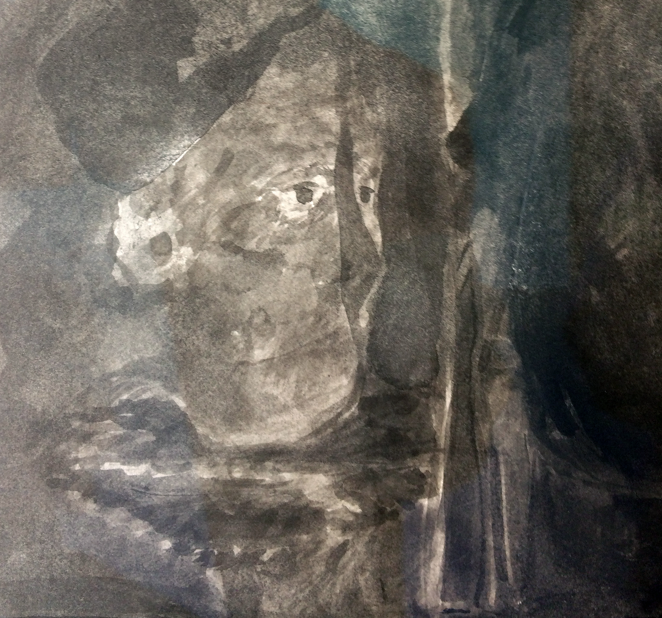
Some images give and have clarity. Others resist a reading or recognition. But not every image is located in the realm of the imagined. For example, one particular image referenced the Sun Dance Ceremony that the indigenous Plains Indians of North America once practiced. In this ceremony pain is tethered as an inducement to vision – and to healing.
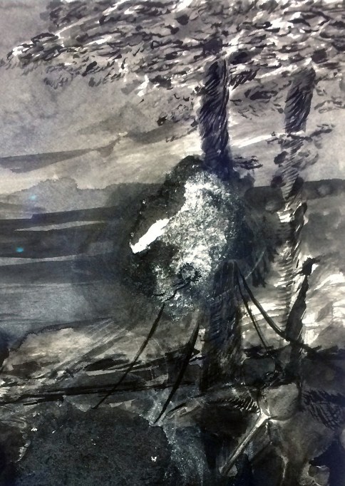
In a 2015 interview with writer Claudia La Rocco, Goodroad acknowledged the curative potential of his painting practice:
“I make the paintings and see illness and religion. I see that I am trying to heal something through my process, and that the solving is a part of this.”
Perhaps this related to Aleen and Elm’s sickness as painters in Goodroad’s poem? This might sound fanciful, but if healing in all societies is necessary, perhaps we need the painters, or more broadly, the creative and imaginative outpourings of writers, performers and visual artists to counter our increasingly technological and digitally controlled and neutered society?
The sequence of poetic illustrations demands that the viewer takes part in the storytelling by prodding at their own imaginative faculties. If you visit the show take your time to look at the work with an open mind – the reward might not be immediately felt, but the imagery will linger long after, and you can invent your own narratives and acknowledge your own creative powers.
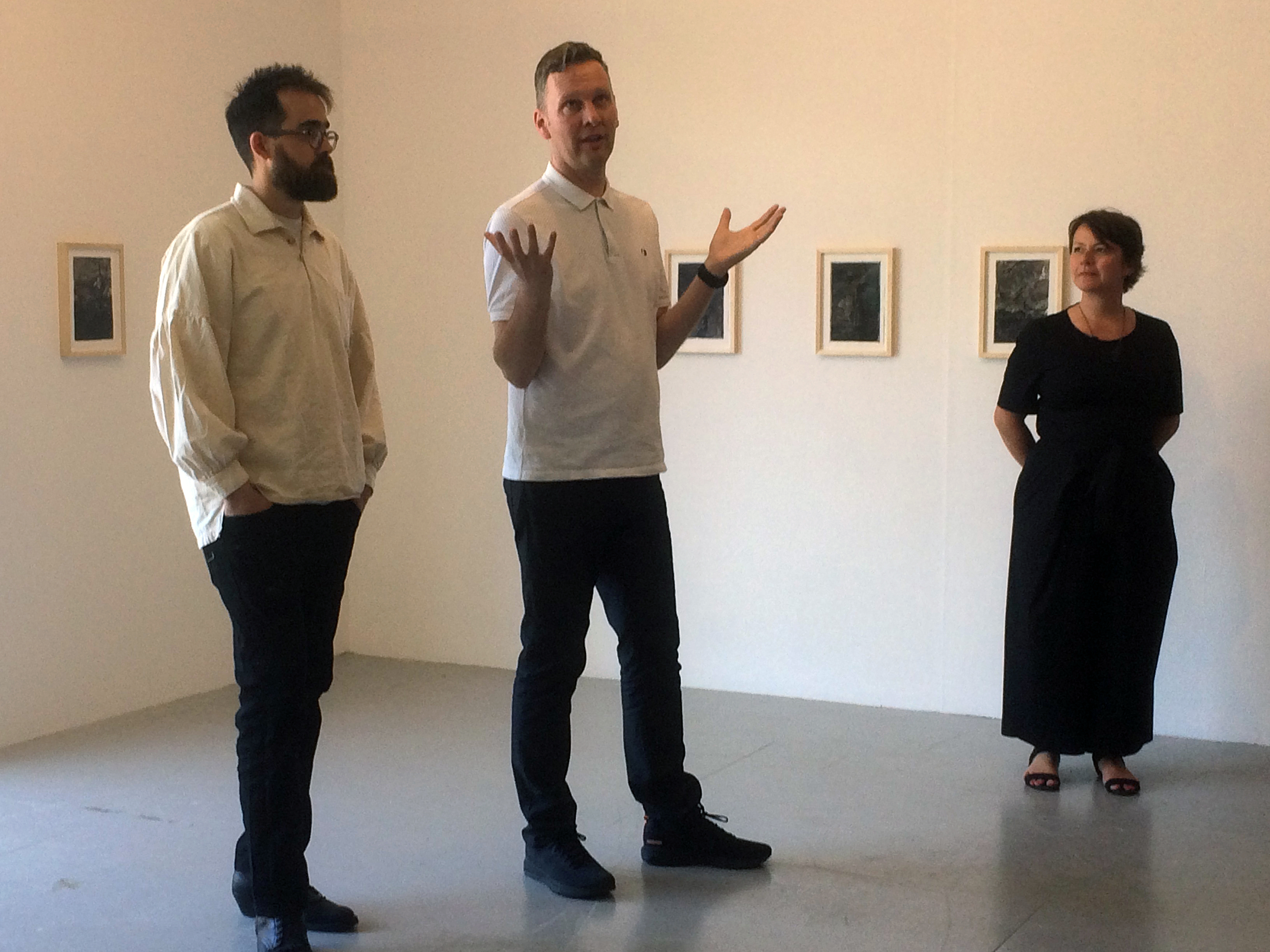
All artwork images © Brett Goodroad.
Links
Brett Goodroad’s website:
https://lifeofatruckdrivinpainter.wordpress.com/page/1/
Gregory Lind Gallery interview with Claudia La Rocco:
http://www.gregorylindgallery.com/news/reviews/artpractical_goodroad_0515.php
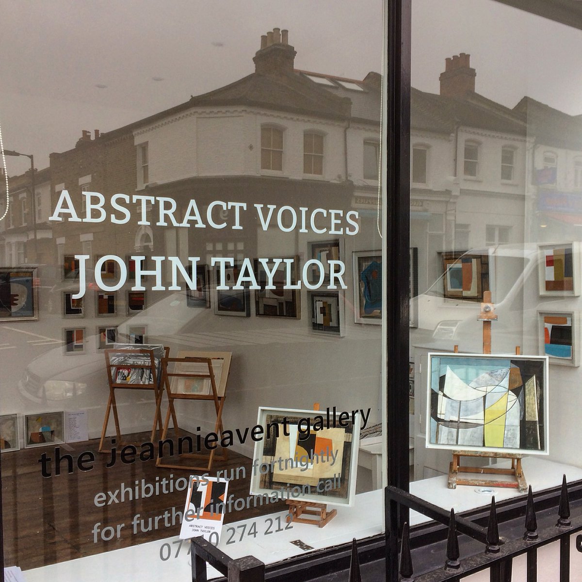
There’s a certain persuasion about digital platforms. Despite their omnipresence and commonplace presence in our everyday lives, the prevalence of images on-line still gain some sort of elevated credence. Our computers and other digital devices place virtual galleries in our hands.
I first discovered John Taylor’s work on Instagram (or was it Twitter?) last year and have followed his work with increasing interest. Little more than a week ago a tweet alerted me to his latest exhibition and, even on an iPhone screen, where the diminutive 9X5cm portal presented a 5X5cm image, I was especially struck by the combination of abstract, minimalist compositions in ‘Nine Collages’. This was the necessary bait to coax me along to the Jeannie Avent Gallery.
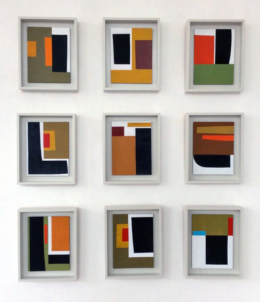
In this small but light and uncluttered gallery space (just the one room of a former corner shop) these works that I initially sought out lived up to my expectations. Seeing and experiencing the ‘real thing’ was even more satisfying than the initial digital representation, particularly in the context of the exhibition that was something of a mini-retrospective. The ‘Geometric Incidents’ that make up ‘Nine Collages’ are relatively small works, but they combine perfectly in this grid-like configuration (maybe four would work fine as well, but 12 would be too many). As they are so small there’s a suggestion of intimacy in these collages. Initially, the implied spatial play is confined and locked-in, but after a while the flat colour-forms take on a teasingly monumental impact and reveal a more expansive, architectural sense of structure that suggests asymmetrical order in apparent arbitrariness. The shapely and geometric forms in these collages could have been a pared down version of a number of the more complex works on show that do not deny, but celebrate, some indebtedness to Ben Nicholson and the abstract wing of the St.Ives School.
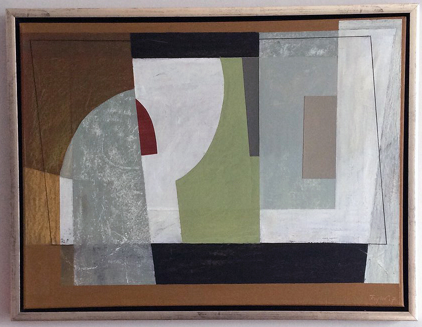
For example ‘Sense of Occasion’ features a modernist exploration of space on the picture plane. In this instance the visual play is typically both contained and fixed but with indications of a larger scaled environment of planar forms. There is enough information to suggest an interior arrangement on a tabletop and an airy opening (on the right hand side) where the grey forms bring in breathing space for the viewer’s imagination. A central window or mirror-type rectangle might suggest a head and shoulders – or a large goblet or other vessel. It probably doesn’t matter which, but this virtual and implicit content humanises the potentially anonymous abstract configurations.
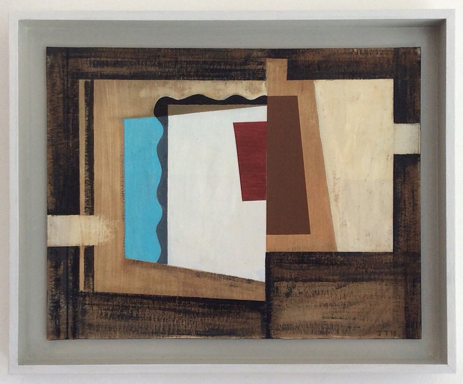
In another work, ‘After Barcelona’, these interspatial collusions also reveal Taylor’s predilection for a spatial harmonics that, through restraint and clarity, speaks quietly, though insistently. The constrained and limited palette of colour combinations is carefully juxtaposed (rather than undermined) by mildly surprising colour appearances. In this composition the light blue vertical strip, with a wavy edge, evoked my own abstracted memory of Barceloneta; and the brown structures suggested the tight alleyway spaces and tiled roofs of the Gothic Quarter. Or maybe there are suggestions of wooden furniture or tables in a small bar. This Hodgkinesque response, triggered by both the composition and the title, demonstrates that the personal is transferable, yet inevitably transformable.
On further reflection, particularly with access to this imagery after leaving the exhibition (another plus point with regard to digital reproductions), further looking and contemplation of Taylor’s paintings and collages confirms his talent for creating visual harmony. Interestingly, there is also a subtle sense of melancholia (ennui is too strong a term). Is there a positive, or amiable, form of melancholy? Are these the Abstract Voices alluded to in the title of the show? The works will have to speak for themselves, through the filters of the viewer’s personal experiences. Emotional responses to people and places have not only made the work – but are passed on.
Geoff Hands
All images © John Taylor.
“The ongoing development of my work continues as I constantly revisit, revise and explore abstraction. In my most recent works I have allowed my paintings to become their own voice. Simple shapes are used in a very simplified or modernist way.
I believe that by following my emotional response to the process of abstraction I am responding most genuinely to myself and my integrity as the artist. This is a challenging and sensitive process, a process with which I feel an increasingly emotional and confident connection.”
http://www.johntaylorpaintings.com
Additional images and information also on-line at:
http://www.rowleygallery.com/Artist-John-Taylor.aspx
and
Brighton has a vast artist community that we were excited to engage with in a new way. We knew we wanted to do something in an untraditional gallery environment. We wanted to engage with the problems traditional art spaces are facing today and look at how we can work around that in a productive and critical way. We were lucky in being able to approach a friend who owns a vape business based in Brighton and ask if he would be interested in housing our gallery and he was. We’re very happy to be engaging in contemporary art outside London and it’s great that more contemporary art spaces are opening around the UK. There are also lots of galleries opening in coastal cities/towns – in Margate, Newgate Gap (which is in a Victorian toilet block on the beach) will open next year and Maureen Paley’s summer space Morena di Luna is just around the corner from us in Hove. Brighton also offers a very open perspective which is welcoming to artists with more experimental practices and ideas – something we always support. There’s a sentimentality for both of us as well as we have had family here and spent a lot of time here as children. One of us (Tabitha) also studied at Sussex University.
As we say, a friend owns Mist and we were very fortunate that he was interested in our project. We see the fact that it’s located inside another business as a positive rather than a hindrance (which you can probably tell from the vape heavy design on our website). Of course, we’re trying to work around the lack of available space (especially in London) today but we’re also really into the unusual collaboration between this commercial business and our non-profit space. The vaping business is a really current phenomenon and it is interesting to see how such a contemporary business interacts with contemporary art. It raises questions about how art functions today, in terms of commerciality and commodity and how adaptive art and artists must be.
Yes. Currently, we are situated inside Mist Vape Shop for the foreseeable future and have an ongoing programme. Our current show with Jack Lavender closes on 16 March. We can’t say too much yet but our second show will open around the beginning of April and will be a group show of artists working at an intersection between art, clothing and fashion.
I first became aware of Jack Lavender’s work in Cura magazine in 2014; and later saw his work at Frieze London (2016) and his work clearly has a spirit of experimentation. Are there new developments in Jack’s work on display in this show?
Jack has always worked with sound, collage, drawing and found objects but in Sorry I haven’t been he has really pushed this into more of an installation rather than individual works – something he has not really done before. He has used his materials to construct an environment. Many of the themes are carried over from ongoing ideas in his practice, like objects imbued with memory, souvenirs and junk and this weird sense of spirituality that comes from such things. In 650mAh, he has constructed a space where you feel both like you’re looking into the future and looking back at the past and though this sense is similar to his show at BALTIC, the execution is totally different and new. He has also collaborated with Dul Fin Wah to make a full soundtrack for the exhibition which he has not done before. We always encourage experimentation in whoever we are working with. It was very natural for us to open with Jack as much of his work and aesthetic interests overlap with the aesthetics of the vape shop.
Coming from left-field: The future for the arts, in a broad sense, seems to be one that will specify and encourage more collaboration and cross-over between forms of expression and individuals. Maybe in line with positive notions of free access (including non-gallery spaces) and a meltdown of power-based hierarchies in a Post-Capitalist reaction to the Neo-Liberal agendas of the so-called free-West. Does this strike a chord for 650mAh?
We think it’s striking a chord with everyone currently but it’s another question as to whether anyone knows what to do about it. We’re being told that everything’s in turmoil (especially in the UK) but who knows what all of this will mean in 20, 50 or even 100 years? We’re not sure about the meltdown of power-based hierarchies – in actuality, is this happening at all? We guess cryptocurrency is the most likely way out towards free access and decentralisation but so was the Internet.
")
")
20 January to 16 March 2018
Walk from Brighton into Hove. Enter the Mist Vape Shop. Edge carefully through the throng of guests – are they here for the show, the vapes or the beer? Continue to the back of the room, turn the silver handle, push open the door and enter the exhibition.
What might you expect?
Is this a carport or a funeral parlor? A shrouded form, about the size of a small charabanc, takes up most of the floor space. Is it really a car? A waterproof, protective car protector covers the squarish, stolid form. Nothing moves, but it does not look heavy or monumental. A sheath of sorts creates a sense of mystery – but it has a feeling of commonplaceness about it. The perverse pleasure of not lifting the sheet to see what’s underneath overpowers any attempt to take a peep. Strange contradiction.
At each end of the greyish form two vaguely eye-like slits might be considered as a sad and a happy cartoon face. From the world of theatre it’s comedy (Thalia) and tragedy (Melpomene). Both were daughters of Zeus and Mnemosyne. The latter was (is?) the Greek Goddess of Memory. Have we met before?
Standing on top is a singular, thin Chinese figurine. He’s certainly not Greek – but appears ancient nonetheless. Is this a shrine? He is anonymous, but strangely sentinel. He has authority. People giggle.
Around the form that is approached with an attitude of unexpected awe, the air is coloured purple and is comfortingly atmospheric. The LED monochrome light source from the floor produces a deep violet to lavender, misty dreamscape. The space around the form is rendered airy and cushion-like. It’s an eternal dawn or an evening twilight.
An ambient soundtrack created by audio collaborator Dul Fin Wah! emanates from the centerpiece of the installation. What we see, hear and feel is one integrated whole.
Are memories dream-like?
The artist Jack Lavender is here; along with Tabitha Steinberg and Ella Fleck the co-curators. We’ll talk later – I want to form my own interpretation of this event. But I don’t want to understand. I want to take a ride: destination unknown.
Sorry I haven’t been? Pleased I went.
Geoff Hands (20 September, 2018)
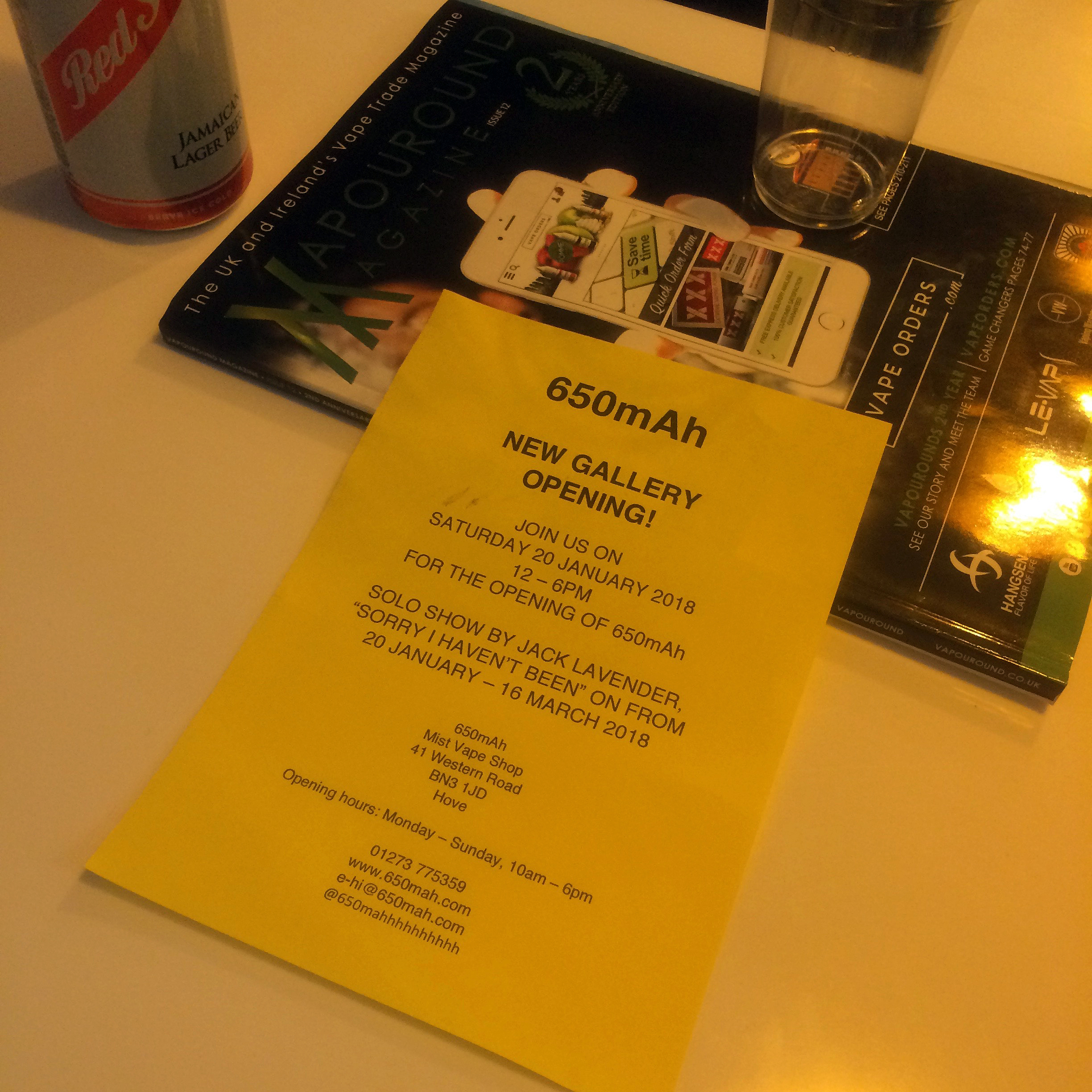
Links –
See more of Jack Lavender’s work at: https://theapproach.co.uk/artists/jack-lavender/images/
Hear Dul Fin Wah! on: https://soundcloud.com/dul-fin-wah
