H_A_R_D_P_A_I_N_T_I_N_G_x2 (Part 1)
Phoenix Art Space, Brighton
Part 1: 11 January – 2 February 2020
Opening Times: Wednesdays – Sundays 11:00 to 17:00
Part 1: Richard Bell, Katrina Blannin, John Carter, Catherine Ferguson, Della Gooden, Richard Graville, Morrissey & Hancock, Tess Jaray, Jo McGonigal, Lars Wolter and Jessie Yates

It’s chaos out there. You may be heading east from the railway station or the city centre so you have to deftly negotiate the human throng of the iPhone generation of distracted texters, Google mappers and Spotify listeners commanding narrow lanes that will eventually lead to the Phoenix Art Space. Eager gallery-goers and psycho-geographers beware too; for en-route to the gallery you may trip on uneven pavements and become confused as you navigate some way of crossing the maze of roads and temporary pathways that otherwise create a fascinating collage of concrete, stone and tarmac surfaces. Use the eyes in the back of your head as you navigate this terrain and inadvertently trespass upon leaf-covered cycle-lanes. But it’s worth the hassle.

But even as Brighton city centre is regenerated the Phoenix is currently a haven for some degree of peace and tranquillity as it hosts H_A_R_D_P_A_I_N_T_I_N_G_X2. We were here two years ago (courtesy of AbCrit) for the inaugural H_A_R_D_P_A_I_N_T_I_N_G exhibition. This time there are five curators (Patrick O’Donnell, Stig Evans, Philip Cole and Ian Boutell are joined by Della Gooden) and they have assembled a 2-part mini-survey of current reductive, colour-conscious (when employed), object-oriented, minimalist, what-you-see-is-what-you-get, bespoke painting. Defining ‘Hardpainting’ is a fascinating challenge, but looking and experiencing must initially supersede theoretical advocacy – and I suspect that the curators have defined their terms more critically through the ongoing curatorial journey now undertaken.
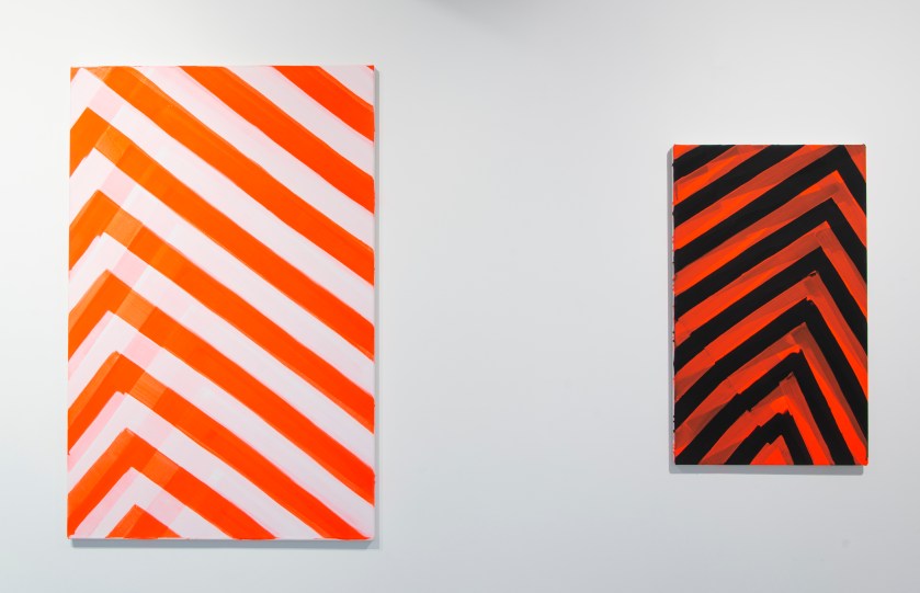
Richard Graville – ‘Blushing Phantom’ and ‘Red Banded’ (both 2019)
Based on the evidence of this show (and the accompanying catalogue that reproduces images representing each contributor’s paintings from parts 1 and 2), this, it appears, is what Hardpainters do. In an ‘un-expressive’, non-gestural manner they eschew the pictorial and representational and make work that is as equally visual (almost gratuitously in some instances) as it is skilled in construction and application of medium. Even Richard Graville’s pair of canvases, ‘Blushing Phantom’ and ‘Red Banded’, that come the closest to accruing accusations of painterly abstraction, have an aura of careful, premeditated control. That they echo the similar stripes on the workforce vans outside the building is either unfortunate or reminds us that abstract art is everywhere.
Understandably there is an emphasis on the viewer as active participant to make whatever sense or reasoning they can. But any burgeoning definition will not exclusively intend to suggest an orderly visual terrain in every instance, as some works quickly engage the eye and disrupt the gaze more than others. For example Richard Graville’s painterly, ‘Blushing Phantom’ and Morrissey and Hancock’s flat, hard edged ‘TPIAR’ possess dynamic Vorticist qualities; whilst John Carter and Catherine Ferguson offer a more restful, contemplative experience for the viewer that mixes up the range of visual encounters on display.

In some instances there are works that could qualify as ‘Slow Art’, to coin a phrase from the late Arden Reed. For whilst many of the 24 works on display appear to strive for visual simplicity and understatement the requirement to settle in for concentrated looking will allow the works to stage various scenarios of narrative-free, abstract, experiences. Or is a scenario a narrative of sorts?
![004 - HPX2pt1 - Tess Jaray - One Hundred Years [Green] & [Purple].jpg](https://fineartruminations.com/wp-content/uploads/2020/01/004-hpx2pt1-tess-jaray-one-hundred-years-green-purple.jpg?w=840)

Even at this early stage of a first visit, the message was becoming clear that the Hardpainting theme does not constitute a narrow range of styles, materials or appearances. For example, two contrasting, non-matching combinations of the selection each involve Jessie Yates’ textile/fabric uses of paint on canvas, augmented with stitch as an integral linear ingredient. ‘Untitled 1’, a collaged patchwork of variegated parts, hangs alongside Katrina Blannin’s geometrical four piece ‘Sequence #2/4 (P)’; whilst in an adjoining space Morrissey and Hancock’s systems inspired, ‘Rotational Drawing’ and ‘Untitled’ are hung adjacent to Yates’ miniature and piecemeal ‘Canvas Studies’. This clever, or fortuitous, curatorial ruse emphasises a sense of individual journeys being undertaken without recourse to a strict program or manifesto. Hardpainting is not a School of painting or a ‘movement’: maybe it’s an attitude.

By my third or fourth visit to see the show, as I took breaks from my studio upstairs, an unexpected sense of connection between Morrissey and Hancock’s geometric, maze-like ‘Rotational Drawing’ and Yates’ organically structured and curvy-edged ‘Canvas Studies’ installation brought out the underlying geometric randomness and systematic essence of the 30+ canvas collages.

My first exposure to Katrina Blannin’s paintings were from seeing her impressive solo show, ‘Annodam’ at Jessica Carlisle in 2016, where she actively acknowledged and employed (via Piero della Francesca) a carefully formulated mathematical intelligence towards a streamlined abstract outcome. The inherent geometry and visual impact of colour as shape (and vice versa) as a systemic component of the design aspect of painting is explored by Blannin in these four distinct panels that motivate physically active looking from left to right and in and out of a shallow visual space. Yet here, in ‘Sequence #2/4 (P)’ the content partly derives from the throwaway cardboard discs from pizza packaging, rather than art historical material. Even without knowing this (see Della Gooden’s essay in the catalogue) the ergonomic discs, not too big, not too small for specific uses, possess a degree of visual comfort and functional association. Because of the afterimages from Blannin’s work, due to the colour/tone combination, the flat shadowy forms on the viewer’s eye then track around the gallery as you blink ready to refocus on another exhibit.

A commanding and exquisite group of three paintings by Catherine Ferguson ‘Cieco’; ‘L’arresto del Tempo’and ‘Fango’ were probably enough without ‘H&P’ on the same wall (which would, in this context, have been better placed with works by Richard Bell and John Carter). Ferguson’s works were possibly the most indicative of a Slow Art suitability as they appeared to be stripped down or reductive manifestations from more complex compositions. These are immaculately painted compositions that present great dexterity in paint handling and even contain a hint of painterliness that I had not expected see in this show.

A more deliberate or obvious pairing (with Carter’s ‘Chapitau Three Identical Shapes’ making a cohesive triangulation on the opposite wall) is made between ‘Tectonic Plates (For A.H.)’ and Richard Bell’s ‘Equivalences (2 part painting)’. Possibly a diptych, due to the title, Bell’s pair of canvases could hang alone and appear complete. Following an initial impression of highly controlled rendering a multi-coloured and schematic sub-division of the rectangle; on closer inspection ‘Equivalences’ appears to only allow one coat of paint per shape, which means that in places (e.g. the white on red and green on black in the left-hand canvas) the single layer does not totally cover the underpainting opaquely as might be expected. As if to subtly emphasise an understated painterly approach the canvas edges are not overpainted by the colour shapes that leave a millimetre of an almost imperceptible edge.


Three interventions from Della Gooden add to the variety of approaches and intentions selected for HardpaintingX2. Two of the works, ‘for’ and ‘against’, might be easily missed on an initial tour of the exhibition, as these assemblages resemble doorbell chime covers and are placed on a pillar rather than a wall. ‘As’ physically intervenes in the space, although its placement on one of the larger walls enables a more conventional expectation. A hand-drawn graphite line is ejected out of the bottom left hand corner of the blue rectangle, which appears as a plane of semi-transparent colour that has temporarily found a space to occupy. Perhaps this is a portal of some sort as an ethereal feel prevails with the addition of a misty emanation of blue pigment to the right, although a square of wall or a thick wall tile is placed where it may or may not belong and brings one back to the solidity of the built environment. This tableau is applied to a larger white gesso background, which suggested an empty street shrine I had seen in Napoli some years ago. I cannot explain this last point as anything more than a peculiarly personal point of departure; or the sense of the blue as a reminder of a Gothic or Renaissance painter’s lapis lazuli for Mary’s cloak (even though it’s Prussian blue). There is something uncanny about this assemblage emanating from the gallery wall, for the artwork has a short life, as it will be painted out before Part 2 is installed.

If there is at least one curatorial surprise, or challenge to the audience in this show, ‘Kiss, Kiss, Bang, Bang’ by Jo McGonigal might be chosen. Perhaps this is the main Slow Art contender, as a narrative appears more likely in this painting-cum-sculpture. Is this yet another tableau of sorts (most pertinent to a form of Slow Art whereby a painting can be represented by real people dressed up as ‘fictive others’ and posing as constituents from a ‘real painting’) to link with the imaginative essence of Della Gooden’s ‘As’? Or is it a model of a theatrical, but virtual, stage set? Still searching for a context, a sense of the surreal bringing-together of unrelated components to create an alternative fiction, this work is anything but blandly minimal. Held aloft by two striding, leg-like forms a box-like, steel girder sort of construction makes a stage-set for various items including a balloon and a ball of putty. The suspended tangle of cord and its dim shadow or reflexion has a connection of some kind with the neon light that floats as a light gesture, or a whimsical cloud, to the left of the box. I am lost for finding meaning and understanding, but feel suitably challenged in an attempt to make sense of this absurd scenario.

Splitting the show into two parts is unfortunate to some extent, though curatorially useful for showing a wide range of works and avoiding over-congestion. As is typical of the white-cube aesthetic the context of the ‘art space’ as a neutral but active component to display the works, with full attention paid to the wall spaces between works, brings some coherence to a selection of artists who might not otherwise show together. Each work is indicatively related to every other, as an aura of focussed attention and control to the making and construction process permeates every artwork included here. This in turn invites inspection of each and every component part of the presence of each work.

Of course it might be that the exhibition title sets up the attentive and open-minded viewer to approach the show in a particular state of mind, for we can start the viewing with a proposition: that there is a varied field of abstraction that can be categorised under the umbrella term of ‘Hardpainting’. Here there is still enough of a mix to ensure that diversity within a particular aspect of abstraction, wherein the practice confirms an adamant attitude towards a certain quality of making and presentation. Nothing is superficial, slap dash or ‘expressive’; but an emphasis on visuality is paramount. This reminds me of a point made by Gillian Ayres (whose work I suspect would not be in this show as it is so instinctive and improvisatory), that in addition to any notion of painting as a visual phenomenon, it “is a physical and material project”.
Co-curator Ian Boutell summed this up succinctly when he stated in an interview for the Phoenix website that – “There are lots of ways of reading the show but for me the underlying theme is that it is about premeditation; careful forethought and high production value finishes.”
Hence an atmosphere of calm has been achieved in this carefully curated environment – in stark contrast to the developments outside of the building. Bring on part 2.
- Artwork images are © of the artist
- Photographs Geoff Hands and Bernard Mills
LINKS:
Richard Bell https://www.richardbellart.co.uk
Katrina Blannin http://www.katrinablannin.com
John Carter https://www.redfern-gallery.com/artists/38-john-carter-ra/biography/
Catherine Ferguson http://catherineferguson.co.uk
Della Gooden
Richard Graville http://richardgraville.com
Morrissey & Hancock www.patrickmorriseyhanz.co.uk
Tess Jaray www.karstenschubert.com
Jo McGonigal www.jomcgonigal.co.uk
Lars Wolter www.larswolter.de
Jessie Yates www.jessiejewyatespainter.com
AbCrit HARDPAINTING review (2018)
Slow Art art net.com article
Gillian Ayres: The quotation is from the introduction by Andrew Marr in the ART/BOOKS (2017) monograph.
SATURATION POINT Inside the Outside: saving up for the future by Della Gooden (from the catalogue)
HARDPAINTINGX2 (Part 2) will present works by: Rana Begum, Ian Boutell, Philip Cole, Biggs & Collings, Deb Covell, Stig Evans, Jane Harris, Mali Morris, Jost Münster, Patrick O’Donnell, Carol Robertson and Daniel Sturgis.
