H_A_R_D_P_A_I_N_T_I_N_G_x2 (Part2)
Phoenix Art Space, Brighton
Part 2: 8 February – 1 March 2020
Opening Times: Wednesdays – Sundays 11:00 to 17:00
Part 2: Rana Begum, Ian Boutell, Philip Cole, Biggs & Collings, Deb Covell, Stig Evans, Jane Harris, Mali Morris, Jost Münster, Patrick O’Donnell, Carol Robertson and Daniel Sturgis.
“The title of this Painting exhibition does not dictate an aesthetic and it does not mean to imply a preference for one process or system of making work over another. It instead concerns itself with the elusive and critical nature of Contemporary Painting today; the complexities, the overlooked simplicities and the ‘wonder’ it can engender.”
(Curator’s statement in Press Release)

After writing about HardpaintingX2 (Part 1) and attending the recent mid-show Symposium at Phoenix Art Space I am still intrigued by what the term Hardpainting actually means. Would part 2 of this show clarify what, exactly, hardpainting is? For example, is ‘hardpainting’ an adjective or a verb? Or maybe it’s both, as doing and describing handily suggests theory and practice combined.
Or, imagine arriving late home from school on a Friday afternoon and mum asks what you’ve been up to in your art lesson today: “We’ve been displaying our Hardpainting exhibition in the school hall”, you reply with great enthusiasm.
Mum – Tell me all about it then.
It was great fun all week and we put up an exhibition at the end of the project. The usual teacher, Mr Wright, has been off sick so this young supply teacher, who only left University a couple of years ago, gave us the really good paints that the top class only get for their exams. She told us she was an ‘Installation Artist’ and went on for a while about the ‘expanded field of painting’ and also said that unpremeditated self-expression was an indulgence no longer fit for purpose in a post-digital era. I don’t have a clue what she was on about but she said that she had arranged for the 3-D workshops to be open for us as well.
We all felt a bit unprepared (except for Deb who loves to break rules) as it says ‘Self-Portrait Painting project’ on the timetable. This alternative project was called ‘Hardpainting’ and we had to find out what it was all about by making the work as a form of ‘research and exploration’, which was ‘planning in action’. There were no strict rules but her guidelines included exploring ‘colour, geometry and visuality’, and that ‘an application of making skills’ would be important elements to bear in mind. Anyhow, we like to be challenged and we were encouraged to produce work that was personal and so there would be similarities and differences in what we produced. She also said that we should avoid unnecessary figurative elements, as that’s what cameras are for these days. But we had to work neatly and with great care. The materials and processes of production should be regarded as important as any subject matter as well. Mr Wright would have choked on his cheroot if he had heard this! He says every picture should tell a story and that we should avoid that easy abstract nonsense that doesn’t get good grades in exams anyway.

Once the show was up I had a good look around. The Head Prefects, Jane and Mali, impressed everyone (as usual) with their equally skilful applications of thick and thin paint that embraced a painterly and methodical process, presenting decorative eyefuls of carefully placed brush marks and colour shapes. Both exploit great control in their paintings and explore colour, shape and configuration with astonishing expertise. Jane doesn’t use many colours in a composition, usually just three, and tonal nuances are created by the textures made by the brush, which uses natural light as a material of sorts. The imagery reminded me of flower heads or splashes in water, but that’s secondary to the constructive layering of the oil paint. The works display unbelievable confidence too, so she must be onto something.

Mali is obsessed with colour and she can put all of the colours, primaries and secondaries, together to create harmony. Mr Wright says that only one or two colours should dominate a picture, but Mali proves him wrong. Her works are also interestingly active, contrasting with the restfulness of Jane’s paintings. I think that they’re brave too, as she does not fuss about and lets the paint and colours interact as if truly separate from her ego. She must try really hard to not try hard.
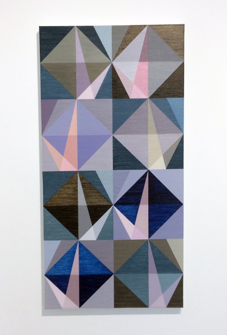
Matthew and Emma were getting on well by themselves as usual, especially as Matt likes being told what to do. Em really knows about colour and is usually timetabled for Ceramics, but the kiln is broken this week and the clay order has not arrived. Matt’s own paintings are usually bit a more textured and patchworky but he can be very careful at applying the paint when he’s in the right mood. They both like the geometric and abstract so start off with a neutral grid system that, weirdly, by subdividing and introducing diagonal lines ends up suggesting sea and landscapes which are punctuated by beams of light and colour that look kind of perspectivey. With left to right mirror images, held in check by a central spine, a geometric abstract field of tile-like segments become strangely earthly and atmospheric as opposed to architectural and assembled. This must be the colour doing something magical. I wish there had been more than one canvas on display.

Rana spent half of the week in the metalwork workshop but she was back in the art room just in time to use up some of the colours that Carol had left over from making her big triangle pictures. I’ll come back to Rana later, because the boys say that Carol is always so hard-edged and ‘reductive’, like it’s a problem. But the subtly striated yellow and orange backgrounds in her two paintings in our show made the geometric forms float out into the foreground of the canvas. The colour combinations within the forms she typically depicts create a visual equivalence to softness, cajoling a sort of mellow lightness. (She does circles, arcs and squares too – if only her boyfriend Trevor was in our class as well.)

Stig was a bit dreamy as usual, his paintings I mean. They’re rather fuzzy looking, like a camera lens is out of focus. But if you look long enough the flat forms eventually feel quite solid, almost hard, which surprised me. They deserve a great big dollop of time to ingest – and it’s worth the effort. He’s obsessed with colour and pigments and I can see him working in a museum conservation department in the future.

I think that’s why he gets on really well with Phil who is the coolest pupil from the science department (if only more kids would study art and science – and by the way his tie collection is amazing). Phil has been into resin for ages, but his colour combinations prove that he’s so much more than a patient fabricator, for he’s a painter with a greatly intuitive eye. Also, the drippy edges of his paintings give an arty edge to his works that emphasises the materiality of his incredibly silky-smooth works.

Ian (the lads call him ’laughing boy’, but he has a really serious side) and his new best friend Patrick were taking the hard-edged thing really seriously. Ian found a box of sticky tape and Perspex, which meant he didn’t get covered in paint like the new boy Jost usually does. Ian applies his acrylics really carefully, sometimes using a spraying devise. The Perspex, which reminded me of putting glass over a painting, is both ground and foreground. There’s an architectural vibe going on here, though maybe the reference is unconsciously to ‘60s fashion (I’m thinking Mary Quant with a touch of Bridget Riley) if we consider clothing as a form of body architecture combining surface pattern with form as an equal partner – only it’s essentially flattened out form becoming shape, albeit in shallow relief.

There’s a more organic kind of building and framework to Jost’s two pieces that seem to play with the waste materials that might have been collected from the studio floor (recycling is good) that embodies light and shadow with literal overlapping. Jost is a more organic sort of collagist than Ian. Mind you, their new friend Dan said he wanted to make things look simple but to slightly place his grids off-kilter and to unsettle the viewer a bit. Like when he puts two different reds next to each other; it does my head in but I kind of like it. Dan’s work seems to immediately hook the viewer into some kind of visual activity, though calling this a game would not do the work justice, as it’s more serious than a game implies. I’m always niggled, a little perturbed, by his work – but this sustains my interest. It was good that he had his paintings displayed together, particularly as the biggest of the three canvases (‘Not Fixed I’, 2019) felt like one big composition that could also be viewed as four in one.

Patrick loves painting but he also spent some time in the woodwork room where he was sawing up sections of birch ply and making some small constructions that could get him into University on an interior architecture course – unless he still wants to make some cool tent-like constructions for the Glastonbury Festival next summer, or maybe a Pavilion in a city park. But seriously, these would be great enlarged and developed beyond maquettes – only of course they’re not models as their handleable size makes them ideal for plinth or shelf display in an interior. Just like Rana, he activates the forms and the immediate white walls with reflected colour, only his shadows play a significant role too especially when shelving becomes part of the sculptural/constructional formation of the artwork with the wall or floor.

Rana and Deb are like chalk and cheese but not so much by their characters (I don’t know them that well), but this is based on first impressions of their artwork. They each construct their works in a spirit of positively affecting a sterile space such as a white walled gallery environment. Rana keeps her colours uncomplicated but juxtaposes them in two and three-dimensional configurations that you could live with and look at forever. Our teacher got a bit philosophical when she explained that Rana’s two vertically dominant wall pieces offered ‘perceptual and phenomenological experiences’. I think this means you see and feel the work physically and that we are part and parcel of that space, not just detached observers.

Sometimes people think Deb is the odd one out; not odd, odd – more of an anarchist (which makes Matt a bit jealous) as she always challenges our usual art teacher to justify why paintings should be fixed to stretcher bars or have boring old frames put around them. She likes to make these 3-D models that she attaches on to the walls when the teacher is out of the room doing some photocopying (though we all know he’s sneaked off for a ciggy in the bike sheds!). I think she might be a bit ‘expanded field’ – so our student teacher loved her work, but explained that these labels are less important than the work itself.

The teacher would not tell us what Hardpainting really means and I wanted to tell her that I didn’t think she knew anyway, but the bell rang and it was time to go home.
Mum – Thank goodness for that. Now then, are you having fish fingers or fishcakes, it’s Friday.
HARDPAINTINGX2 has been curated by Deb Covell, Stig Evans, Philip Cole, Patrick O’Donnell and Ian Boutell.
Links for pupils, in order of appearance:
Deb Covell https://www.debcovell.co.uk
Jane Harris http://www.janeharris.net
Mali Morris http://www.malimorris.co.uk/index.html
Emma Biggs and Matthew Collings http://emmabiggsandmatthewcollings.net
Rana Begum https://www.ranabegum.com
Carol Robertson https://www.flowersgallery.com/artists/73-carol-robertson/
Stig Evans https://www.stigevans.com
Philip Cole https://colecorner.com
Ian Boutell https://www.instagram.com/ianboutell/?hl=en
Jost Münster http://www.jostmuenster.net
Patrick O’Donnell http://www.patrick-odonnell.co.uk
Notes:
Mr Wright is partly based on my Head Teacher from Junior School who was so highly critical of a drawing I made (I was aged 10) that I should probably seek therapy, even now. He did not teach art (thank goodness). I don’t think he smoked cheroots either. Otherwise, all of my art teachers were brilliant.
The reference to ‘abstract nonsense’ is another autobiographical anecdote as I failed my O’ Level in Art at age 16 with my timed examination piece being an abstract composition. In the re-take for the examination a year later I painted a ‘realistic’ picture of a townscape. I passed and was able to attend Art School. I don’t recall painting a building ever again.
Please understand that this review is a little tongue-in-cheek. I have written about HARDPAINTINGX2 Parts 1 & 2 for AbCrit. Link
Trevor Sutton (mentioned but not in the exhibition) http://www.trevorsutton.com
